Justification vs. Transparency: Why and How Visual Explanations in a Scientific Literature Recommender System
Abstract.
Significant attention has been paid to enhancing recommender systems (RS) with explanation facilities to help users make informed decisions and increase trust in and satisfaction with the RS. Justification and transparency represent two crucial goals in explainable recommendation. Different from transparency, which faithfully exposes the reasoning behind the recommendation mechanism, justification conveys a conceptual model that may differ from that of the underlying algorithm. An explanation is an answer to a question. In explainable recommendation, a user would want to ask questions (referred to as intelligibility types) to understand results given by the RS. In this paper, we identify relationships between Why and How explanation intelligibility types and the explanation goals of justification and transparency. We followed the Human-Centered Design (HCD) approach and leveraged the What-Why-How visualization framework to systematically design and implement Why and How visual explanations in the transparent Recommendation and Interest Modeling Application (RIMA). Furthermore, we conducted a qualitative user study (N=12) to investigate the potential effects of providing Why and How explanations together in an explainable RS on the users’ perceptions regarding transparency, trust, and satisfaction. Our study showed qualitative evidence confirming that the choice of the explanation intelligibility types depends on the explanation goal and user type.
1. Introduction
Recommender systems (RS) have become an integral part of our daily lives, assisting users in discovering relevant items or services in various domains, such as e-commerce, social media, and entertainment. The success of a RS depends on its ability to accurately predict user preferences and recommend relevant items. However, as the underlying algorithms become more complex, the transparency and interpretability of the system decrease. Current RS often appear as “black boxes” by hiding important details from their users. As a consequence, users may not understand the system’s behavior and create an unfitting mental model of the RS, especially if the system behaves unexpectedly, causing a lack of confidence among users who may then lose trust, get frustrated, and eventually reject the system’s recommendations (Tintarev and Masthoff, 2015; Nunes and Jannach, 2017; Zhang et al., 2020; Kunkel et al., 2019). Hence, research increasingly has taken user-centric aspects such as transparency, trust, and user satisfaction with an RS into account, when assessing its quality (Pu et al., 2012; Knijnenburg et al., 2012; Konstan and Riedl, 2012). The lack of transparency in many AI systems and specifically recommendation techniques has sparked interest in incorporating explanation in RS, with the goal of making these RS more transparent and providing users with information that can aid in the development of an accurate mental model of the system’s behavior. This aspect is also important for RS providers to build and maintain user trust in the system. Therefore, equipping RS with explanation benefits both users and system designers (Tintarev and Masthoff, 2015; Nunes and Jannach, 2017; Zhang et al., 2020).
Explainable recommendation refers to personalized recommendation algorithms that not only provide users or system designers with recommendation results, but also explanations to clarify the reason for such items to be recommended. Explanations are a necessary condition to help users build an accurate mental model of the RS. Generally, an explanation seeks to answer questions, also called intelligibility types, such as What, Why, How, What if, and Why not (Lim and Dey, 2009) in order to achieve understanding. Lim and Dey (2013) found that users may exploit different strategies to understand AI systems and thus use different intelligibility types for the different explanation goals.
Primary goals of explainable recommendation include transparency, effectiveness, trust, persuasiveness, efficiency, scrutability, and debugging (Tintarev and Masthoff, 2007; Jannach et al., 2019). Transparency is a crucial goal that explanations can serve. It refers to exposing (parts of) the reasoning behind the recommendation mechanism to explain how the system works (Tintarev and Masthoff, 2015). Transparency is closely related to justification. There is, however, an important distinction between the two concepts. While transparency focuses on explaining the RS process and provides detailed insights into how the RS works, justification focuses on the RS output and merely gives a plausible abstract description that might be decoupled from the recommendation algorithm to answer the question of why items have been recommended without revealing the inner working of the RS (Tintarev and Masthoff, 2012, 2015; Balog et al., 2019; Vig et al., 2009).
In this work, we focus on the justification and transparency goals in explainable RS by providing Why and How explanations in an explainable RS. We are particularly interested in how to design and implement visual explanations. Visualizations are a popular medium to provide insight into data or how a system works (Lim et al., 2009). In general, humans can process visual information faster and much easier as compared to textual information (Munzner, 2014). Recognizing their benefits, visualizations are increasingly used to deliver explanations in RS (Herlocker et al., 2000; Gedikli et al., 2014; Nunes and Jannach, 2017; Zhang et al., 2020; Guesmi et al., 2021).
It has been shown in some works that users may benefit from How explanations while other works uncover that there are circumstances when these detailed explanations are not always beneficial and that Why explanations are often enough to help users understand the recommendations (Herlocker et al., 2000; Vig et al., 2009; Gedikli et al., 2014). It is thus important to provide explanations with enough details to allow users to build accurate mental models of how the RS operates without overwhelming them. However, in the existing literature on explainable recommendation, significant gaps remain when it comes to understanding when and if Why and How explanations are necessary or useful. Although there are studies addressing Why and How explanations in RS, to the best of our knowledge, there is no prior research that integrates both explanations side-by-side in the same RS. Moreover, little attention has been paid to how to systematically design Why and How explanations in RS, as well as how these explanations would affect user perception of transparency, trust, and satisfaction with the RS when they are provided together.
To address these research gaps, in this paper, we follow the Human-Centered Design (HCD) approach (Norman, 2013) and leverage Munzner’s What-Why-How visualization framework (Munzner, 2014) to systematically design Why and How visual explanations and provide them together in the transparent Recommendation and Interest Modeling Application (RIMA) that gives explanations of recommended scientific publications. Further, we conducted a qualitative user study (N=12) based on moderated think-aloud sessions and semi-structured interviews with students and researchers to explore how users perceive Why and How visual explanations in an explainable RS.
The objective of the study was to answer the following research question (RQ): What is the potential impact of Why and How visual explanations on the user perceptions regarding transparency, trust, and user satisfaction, when these two explanations are provided together in an explainable RS? The results of our study provide qualitative evidence that: (1) It is important to differentiate between objective transparency and user-perceived transparency; (2) The user perceptions of Why and How explanations in terms of transparency and trust depend on the user type (e.g., background knowledge); (3) there is a trade-off ”transparency/trust vs. satisfaction” when Why and How explanations are provided together in the RS; (4) The choice of the explanation intelligibility questions depends on the explanation goal.
In summary, this work makes the following three main contributions: First, we identify relationships between different intelligibility types (i.e., Why and How) and explanation goals (i.e., justification and transparency). Second, we systematically design Why and How explanations by following the HCD approach and the What-Why-How visualization framework and integrate both explanations in the same RS. Third, we investigate the potential impact of Why and How explanations on the perception of explainable recommendation in terms of transparency, trust, and user satisfaction.
2. Related Work
This section discusses related work on explainable recommendation in relation to the two explanation’s goals of justification and transparency and the two intelligibility types Why and How.
2.1. Justification vs. Transparency
System transparency is defined as the extent to which information about a system’s reasoning is provided and made available to users (Hosseini et al., 2018; Zhao et al., 2019). In the literature on AI and advice-giving systems (AGS), transparency is often linked to users’ understanding of systems’ inner logic (Pu et al., 2012). Zhao et al. (2019) suggests two alternative ways of measuring system transparency, namely from systems’ perspective and users’ perspective. The authors further distinguish between objective transparency (i.e., the extent to which systems release information about how they work), subjective transparency (i.e., the extent to which users perceive such information is available), and users’ perceived transparency (i.e., the extent to which users feel that they understand the meaning of the provided information). Providing transparency is generally considered to be beneficial to users and could enhance users’ trust in the system, which in turn could increase users’ acceptance of system’s outcomes (Cramer et al., 2008; Diakopoulos and Koliska, 2017; Hosseini et al., 2018; Harman et al., 2014; Kunkel et al., 2019; Ananny and Crawford, 2018; Zhao et al., 2019; Pu et al., 2012). However, various studies found that revealing too much detail about how the system’s inner logic may result in information overload, confusion, and a low level of perceived understanding, which may in turn reduce users’ trust in and acceptance of the system (Tintarev and Masthoff, 2007; Ananny and Crawford, 2018; Hosseini et al., 2018). For lay-users, revealing the system’s functionality at an abstract level would help them build an accurate mental model of the system, without overwhelming them. This suggests that there should be an optimal level of transparency which will generate the highest level of users’ perceived understanding of and trust in the system (Zhao et al., 2019).
Transparency in RS is related to the capability of a system to expose the reasoning behind a recommendation to its users (Herlocker et al., 2000), and is defined as users’ understanding of the RS’ inner logic (Tintarev and Masthoff, 2007; Pu et al., 2012). In the RS domain, Gedikli et al. (2014) also differentiate between objective transparency and user-perceived transparency. Objective transparency means that the RS reveals the actual mechanisms of the underlying algorithm. On the other hand, user-perceived transparency is based on the users’ subjective opinion about how well the RS is capable of explaining its recommendations. User-perceived transparency can be high even though the RS does not actually reveal the underlying recommendation algorithm (Herlocker et al., 2000). In some cases (e.g., high complexity of the algorithm) and for some users, it might be more appropriate to justify a recommendation output instead of revealing the inner working of the RS (Gedikli et al., 2014). Justification is the ability of the system to help the user understand why an item was recommended (Herlocker et al., 2000). These justifications are often more shallow and user-oriented (Vig et al., 2009). Transparency and justification are closely tied together. However, transparency differs from justification in that while the former faithfully represents and exposes the reasoning about how the recommendations are selected and how the system works, the latter merely provides a plausible reason why an item is recommended, that may be decoupled from the RS algorithm (Tintarev and Masthoff, 2007, 2015; Vig et al., 2009; Balog et al., 2019). Often, the underlying algorithm is too complex or not intuitive to explain, or may involve details that the RS provider wishes to protect. Thus, current RS often opt for presenting more user-oriented justifications, rather than offering genuine transparency by explaining the rationale of the recommendation algorithm (Balog et al., 2019; Gedikli et al., 2014; Vig et al., 2009; Zhang et al., 2020).
While many RS are considered as a “black box”, a transparent RS would also try to explain the reasoning behind a recommendation to the user (Gedikli et al., 2014). Generally, an explanation in RS seeks to show how a recommended item relates to user’s preferences (Vig et al., 2009). Two major goals that explanations can serve are to provide transparency (i.e., the ability to explain how the RS works (Tintarev and Masthoff, 2007)) or justification (i.e., the ability to justify the recommendations without revealing the actual mechanisms of the RS algorithm (Tintarev and Masthoff, 2012)). Justification is thus linked to post-hoc explanation, which aims at communicating understandable information about how an already developed model produces its predictions for any given input that may be decoupled from the initial model (Arrieta et al., 2020). For example, the recommendations of a black-box RS can be explained by making a post-hoc selection of the relevant features that have led to the recommendation, e.g., “We recommend you this because it has ¡features¿ you liked in the past” (Afchar et al., 2022).
At a high level, an explanation is an answer to a user’s questions that leads to understanding (Miller, 2019). Lim and Dey (2009) found that users ask a wide range of questions to understand AI systems. These questions, also called intelligibility queries or types, include Why, Why Not, How, What If, and How To (Lim and Dey, 2009; Liao et al., 2020). Lim and Dey (2013) found that users may exploit different strategies to understand AI systems and thus use different intelligibility types for the different explanation goals. Lim et al. (2019) described how to support three explanation goals (i.e., filter causes, generalize and learn, and predict and control) with the intelligibility explanation types and identified specific pathways mapping the use of these intelligibility types explicitly back to user goals. In the RS domain, pathways can also be established between intelligibility types and explanation goals. Specifically, How explanations are often used to explain the rationale of the recommendation algorithm, and are thus related to transparency. On the other hand, Why explanations are used to present more abstract and user-oriented justification.
2.2. Why and How Explanations
Why explanations serve as a justification rather than a description of the underlying recommender algorithm. This intelligibility type is commonly used in the RS domain, as the basic goal that any explanation needs to support is to give a plausible reason why an item was recommended. In general, Why explanations attempt to show why a recommended item fits one’s preferences, at an abstract level (e.g., ”users who are similar to you also like…”). For instance, ‘Tagsplanation’ recommends movies and explains them based on similar movie content (Vig et al., 2009). To justify the recommended movie based on community tags, ‘Tagsplanation’ uses bar charts to visualize each tag’s relevance in the movie and the user’s preference. ’HyPER’ (Kouki et al., 2019) is a music RS that explains recommended artists based on similarity with the artists in the user profile, artist’s popularity, and artists liked by similar users. ’HyPER’ uses a Venn diagram to recommend intersecting music artists between sets of artists from a user profile, popular artists, and artists liked by people listening to similar artists as the user. ’Relevance Tuner+’ (Tsai and Brusilovsky, 2019) explains recommended conference talks and potential scholars to collaborate with based on social and academic similarity. The tool uses a Venn diagram together with a tag cloud to explain the similarity between the publications of a user and attendee of a conference. We refer the interested reader to the excellent literature review by (Nunes and Jannach, 2017) for more examples on explainable RS that provide Why explanations.
Compared to providing Why explanations, relatively few explainable RS have proposed How explanations to provide transparency into the working of the recommendation process. This is mainly due to the fact that in contemporary RS, the underlying algorithm is too complex to be described in a human-interpretable manner (e.g., deep learning models) (Zhang et al., 2020). For instance, ‘PeerChooser’ (O’Donovan et al., 2008) uses a node-link diagram to explain the recommendation process by highlighting the relationships between user profile attributes (input), social connections, and the recommended items (output). ’SmallWorlds’ (Gretarsson et al., 2010) visualizes the inner logic of the recommendation process through a complex network visualization to explain the connection between the active user and the recommended friends. Similarly, ‘TasteWeights’ (Bostandjiev et al., 2012) and ‘LinkedVis’ (Bostandjiev et al., 2013) use a node-link diagram in form of a layer-based interface (three layers) connected via outgoing links to visually explain the connections between the user profile and the recommended items.
In the literature on explainable recommendation, Why and How explanations are considered as essential to increase transparency (Vig et al., 2009; Alshammari et al., 2019; Tsai and Brusilovsky, 2019; Kouki et al., 2019; Ma et al., 2021; O’Donovan et al., 2008; Bostandjiev et al., 2012, 2013; Jin et al., 2016; Parra et al., 2014), develop trust (Ma et al., 2021; O’Donovan et al., 2008), and improve user satisfaction (Alshammari et al., 2019; Tsai and Brusilovsky, 2019; Kouki et al., 2019; Ma et al., 2021; Bostandjiev et al., 2012, 2013) toward the explainable RS. In summary, much work has been conducted on the generation and provision of Why and How explanations in RS, separately. Even though Why and How explanations are provided in many explainable RS, less attention has been paid to how to systematically design these explanation intelligibility types. Moreover, providing both explanation types at the same time within the same RS, and comparing their impacts on the users’ perceptions of transparency, trust, and user satisfaction are under-explored in the literature on explainable recommendation. As pointed out by Lim et al. (2009), different intelligibility types have different impacts on users’ mental models of the system and would result in changes in users’ perceptions of trust and user experience. Partly, the reason is that the effectiveness of an explanation is relative to the question asked (Liao et al., 2020). Our work aims to fill that gap. We deal with providing and comparing the value of explanations that address Why and How intelligibility questions to investigate when and if these explanations are beneficial to users. Concretely, we look into how to systematically design and provide both Why and How explanations side-by-side in the transparent Recommendation and Interest Modeling Application (RIMA) and explore the potential effects of these two explanation intelligibility types on users’ perceptions of transparency, trust, and user satisfaction with the application.
3. RIMA Application
To answer our research question, we developed the transparent Recommendation and Interest Modeling Application (RIMA) that offers explainable interest models and recommendations. RIMA is a content-based RS that produces content-based explanations. It offers explanations on demand by allowing users to decide whether to inspect the explanation or not, and empowering them to steer the explanation process as desired. In this work, we focus on recommending scientific publications and use explanatory visualizations to provide Why and How visual explanations, aiming to clarify the background behavior of the RS by (a) making users aware of the inputs, (b) revealing the system’s inner workings, and (c) justifying the recommendation results. The user interest models in RIMA are automatically inferred from users’ publications. The recommendation engine uses these generated interest models to provide scientific publication recommendations. Specifically, the system utilizes the top five interests, based on their respective weights, as the initial input for the recommendation process. The semantic scholar API is employed to retrieve candidate publications that are related to one or more of the user interests. A keyphrase extraction algorithm is then applied to extract keywords from the title and abstract of the fetched publications. Word embedding techniques are utilized to generate vector representations of the user interest model (based on user’s top five interests) and the extracted publication (based on the set of keywords generated from it). After that, the cosine similarity between these two embedding representations is calculated to determine the semantic similarity score. The top ten publications with a semantic similarity score exceeding a threshold of 40% are displayed to the user.
4. Designing Why and How Explanations in RIMA
As an elegant translation of explanations should be carefully designed so that they are satisfying and easy for humans to understand (Mohseni et al., 2021), we decided to use the Human-Centered Design (HCD) approach (Norman, 2013) and the What-Why-How visualization framework (Munzner, 2014) to systematically design interactive visualizations of the why and How explanations in RIMA. The HCD approach consists of four consecutive activities, namely Observation, Ideation, Prototyping, and Testing. Designing with the HCD ensures that the needs and requirements of the user are taken into consideration as it is based on involving users from the very beginning and regularly consulting them for incremental prototype evaluations. The What-Why-How visualization framework is a high-level framework for analyzing visualizations in terms of three questions: ”What” data the user sees (i.e. data), ”Why” the user intends to use the visualization (i.e., task), and ”How” the visual encoding and interactions are constructed in terms of design choices (i.e., idiom) (Munzner, 2014). In order to evaluate different prototypes for each explanation, a group of potential users (i.e., researchers and students who were interested in scientific literature) was selected to participate in the design process. For each design iteration, five different users were involved to test and give feedback on the provided prototypes, as recommended by Nielsen (Nielsen, 2000). We arrived at the final design of the Why and How explanations after three HCD iterations, which are described below in detail.
4.1. First Iteration
Through this initial step, we aimed at understanding users’ needs and requirements to initiate the first low-fidelity prototypes for the Why and How explanations.
4.1.1. Observation:
We started by conducting interviews with five potential users in order to determine the requirements for Why and How explanations in a scientific literature RS. Through the interviews, we investigated (1) users’ expectations from Why and How explanations, and (2) what kind of visualizations would help them most to understand these explanations. The outcomes of the interviews have led to a deeper understanding of the end-users’ needs and expectations.
For the Why explanation, the interviewees reached a consensus that the explanation should show keywords similar to the user’s interests. They suggested that such keywords should be either highlighted using distinctive colors, bold font, or underlining. In terms of the expected content of an explanation, the participants expressed interest in knowing the frequency of their preferred keywords in the recommended publications and proposed the use of a tooltip to display the frequency that can be accessed by hovering over the keywords. They also suggested illustrating the similarity between the user interests and the recommended publication using simple visualizations such as a bar chart or word cloud diagram. To simplify the presentation of the information and avoid any confusion by the amount of information, they suggested displaying similar keywords initially, with supplementary details (e.g., frequency) becoming available upon clicking on the keywords (i.e., detail on demand).
Regarding the How explanation, the interviewees expected that this explanation should contain information on the system’s functionality and the underlying algorithm. They proposed using a simple flow chart depicting how the recommendations are generated using their real data (i.e., interests). They suggested that the flow chart should be interactive, such that additional details would become available upon interaction, as users preferred not to be overwhelmed with too much information at once (i.e., detail on demand). Furthermore, they mentioned that they want to see the algorithm’s name and that it should be clickable, allowing them to obtain more information about it.
4.1.2. Ideation:
The ideation phase was focused on generating ideas on how to provide interactive visual Why and How explanations that address the users’ preferences and needs identified during the observation phase. A brainstorming session was conducted involving five authors and eight students from the local university with expertise in RS and information visualization to generate as many ideas as possible for each explanation. The primary objective of the brainstorming session was to focus on quantity rather than quality. For both why and the how explanation, each idea was discussed following a “pitch and critique” approach in order to gather positive and negative feedback. Subsequently, these ideas were analyzed using the What-Why-How visualization framework. As each what-why-how question has a corresponding data-task-idiom answer, every idea for each explanation was presented as a visualization instance defined by its data and task abstraction and the corresponding visual encoding idioms and interaction idioms. The last step was the voting process to select the best ideas. After conducting the ideation phase and analyzing the data types and users’ {action, target} pairs, a decision was made to present information in a step-by-step manner to enhance user comprehension of explanations. Following the information visualization rules of thumb proposed in (Munzner, 2014), for both Why and How explanations we start with an overview first, then through interaction mechanisms we provide details on demand. This approach was chosen to prevent overwhelming the users with an excessive amount of information and minimize confusion.
For the Why explanation, the data to be shown include the user’s interests (categorical data), the keywords extracted from the publications’ title and abstract (categorical data), and the similarity score between them (quantitative data). The possible tasks, expressed as {action, target} pairs, that an idiom for Why explanation could provide are {Present, Similarity}, {Discover, Dependency}, and {Summarize, Dependency} between the recommended publication and the user’s interests. Depending on the data to be shown and the aimed task, potential idioms were selected. Starting by providing an overview, visual elements such as coloring and highlighting were used to indicate the relevance between a recommended publication and the user’s interests. A similarity score is also provided, which can be either between all the keywords and the interests or a particular keyword and its related interests. The former similarity score is displayed next to the recommended publication, while the latter will appear by hovering over a particular keyword, where a pop-up will show up displaying the similarity score between that keyword and its related interests. More details about the reason for recommending a specific publication are provided on demand through a bar chart and word cloud as idioms. Interactions provided in these visualizations allow users to manipulate the view by selecting elements (e.g., keywords) from within the view, facet data between views by juxtaposing and coordinating multiple views (e.g., bar chart and word cloud), and reduce the data within a single view by slicing the data attributes and showing only items that match a specific value for the given attribute.
In the How explanation, the data to be shown is the user’s interests (categorical data), the keywords extracted from the publications’ title and abstract (categorical data), the similarity score between the two (quantitative data), and vector representations of both interests and keywords (quantitative data). The possible tasks expressed as {action, target} pairs) that an idiom for Why explanation could provide are The tasks that an idiom for How explanation could provide include {Discover, Dependency}, {Present, path}, and {Summarize, path} of the process of generating the recommendation outcomes. Depending on the data to be shown and aimed task, the flow chart idiom was selected to visualize the inner working of the system. Flow charts have been found to be an effective tool for illustrating complex processes for users of all skill levels, increasing their engagement with and understanding of a topic (Jin et al., 2016). The provided interactions in these visualizations enable users to manipulate the visualization by navigating within the view using a navigation panel to facilitate the movement from an overview explanation to a more detailed one, and facet data between different views by partitioning data between them (e.g., set of interests and set of keywords).
4.1.3. Prototyping:
Following the analysis of user requirements obtained from interviews and the outcome of our brainstorming session, a series of low-fidelity prototypes were created using a digital pen and tablet. We asked the users to select the most appropriate prototypes in terms of content (i.e., information) and display (i.e., visualization). Low-fidelity prototypes are considered to be essential due to their simplicity and quick creation process, which enable non-designers to effectively communicate their ideas in real time.
For the Why explanation low-fidelity prototype, users leaned toward the idea of starting with ”overview first” by presenting an overview through the use of color bands next to each publication, with the same colors used for the user interests at the top, where the height of each color band reflects the relevance of the publication to the related interest (Figure 1(a)). The user can interact with this view by hovering over the keywords, where a tooltip will indicate the interests to which a keyword is similar based on their similarity scores. To provide a more detailed explanation, a ”why” button is included, leading to more detailed visualizations, including a word cloud as an initial view containing all the keywords extracted from the publication abstract, and a bar chart that appears upon hovering over a keyword from the initial view illustrating the similarity between the selected keyword and the corresponding relevant user’s interests (Figure 1(b)).
Likewise, users preferred beginning the How explanation with an ”overview first” and then providing ”detail on demand”. The user can access this explanation from the Why explanation view by clicking on a ”how” button. Initially, the How explanation provides an overview of the inner working of the system by explaining how recommendations are generated using a flow chart illustrating the main steps of the algorithm (Figure 2(a)). In addition, a navigation panel is available to the user, which displays the main steps of the algorithm. By clicking on each step, the user can access more information and adjust their view accordingly. Similarly, the flow chart idiom is selected for visualizing each step in more detail (Figure 2(b)).
4.1.4. Testing:
The objective of evaluating the initial low-fidelity prototypes is twofold: First, to obtain feedback that can be used to improve and optimize the design, and second, to understand to what extent each of the selected visualizations was able to convey the intended purposes of the explanations to the user. This feedback was collected through a qualitative evaluation with the same five users who participated in the observation phase, using a think-aloud approach. Furthermore, we used open-ended questions to ask users about their thoughts on each of the selected visualizations and their opinion towards the proposed initial low-fidelity prototypes for the Why and How explanations.
For the Why explanation, the users demonstrated a preference for the coloring feature over the keyword highlighting feature and to present keywords in a bold font in addition to being colored. Moreover, they suggested using the same colors in the word cloud idiom and having the legends outside the bars in the bar chart idiom. Furthermore, the users expressed a desire to compare a specific keyword with each relevant interest instead of one similarity score provided. Overall, all users agreed on the selected idioms and felt satisfied with the explanation content. Regarding the How explanation, the users expressed disagreement with the labels in the navigation panel and suggested using a clearer naming. Moreover, they proposed simplifying the overview flow chart by presenting it with fewer levels of information.
4.2. Second Iteration
At this stage, we aimed to address the shortcomings of the previous designs by considering users’ feedback collected from the testing phase. In this iteration, prototypes are designed using the Figma tool, but they are still considered to be low-fidelity.
4.2.1. Prototyping:
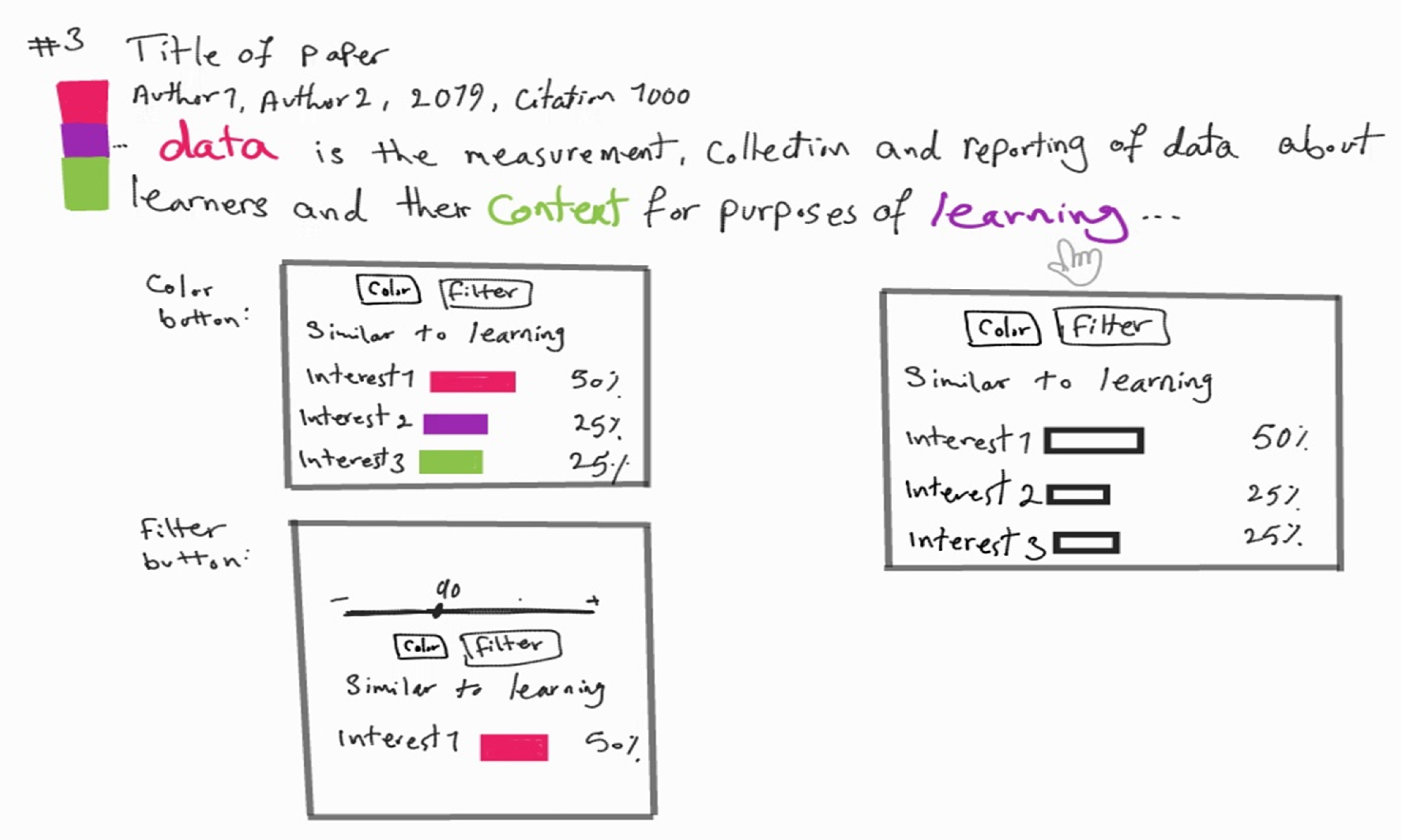
In the Why explanation, the keywords are presented in bold and colored in the initial view (Figure 3(a)). Additionally, the similarity score previously shown when hovering over a keyword in the abstract has been replaced with a bar chart that allows users to easily visualize the degree of similarity between a given keyword and all relevant interests. Upon clicking on the ”Why this paper?” button, users are directed to a second visualization where colored keywords are displayed within a word cloud (Figure 3(b)). By hovering over any given keyword, users can view a corresponding bar chart that illustrates the degree of similarity between the selected keyword and all five user’s interests.
Regarding the How explanation, as suggested by users, we initially provide a flow chart with two levels of information detail illustrating an overview of the main steps of the inner working of the system and explaining how recommendations are generated. Users can toggle between the two levels of the flow chart using an arrow button (Figure 4). For the detailed view, users can navigate through the three main steps (i.e., Keyword Extraction, Vectorization, Similarity Calculation) of the underlying algorithm using the left navigation panel where we updated the labels of the buttons in order to make them more understandable (Figure 5).
4.2.2. Testing:
In the second evaluation round, five new users were asked to provide feedback to the Figma prototypes. For the why explanation, users were satisfied with the provided visualizations and they reported that it helped them understand the reason behind getting a certain recommendation. Nevertheless, for the bar chart appearing after hovering over a keyword in the abstract, they suggested displaying only three interests with the highest similarities to the selected keyword instead of all interests in order to avoid showing low similarities.
As for the How explanation, users mentioned that the labels used are still confusing even after changing them. Additionally, users found the information provided in different steps unclear and suggested adding a description for each step of the algorithm to make the process easier to understand. They also preferred to keep using the same color for interests and keywords in the flow charts.
4.3. Third Iteration
After incorporating users’ feedback from the second iteration, we proceeded to develop high-fidelity prototypes for the Why and How explanations using Figma (Figures 6, 7, 8). A description of each node has been added in form of a tooltip when hovering over the nodes in the flow chart in the How explanation. We then repeated the evaluation process with five new users who were now able to interact with the explanations. We asked the users to think aloud while interacting with the prototypes to gain in-depth feedback. We made minor changes to the prototypes in response to user feedback. Overall, the prototypes were understandable and well received by the users.
4.4. Implementation
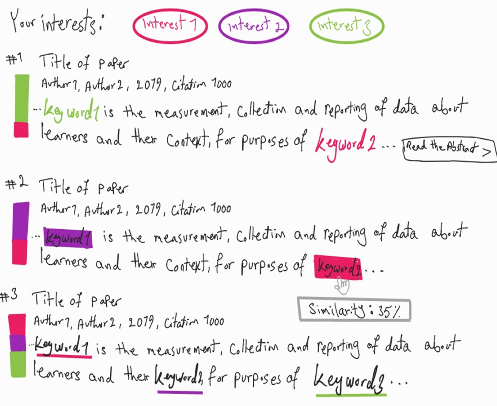
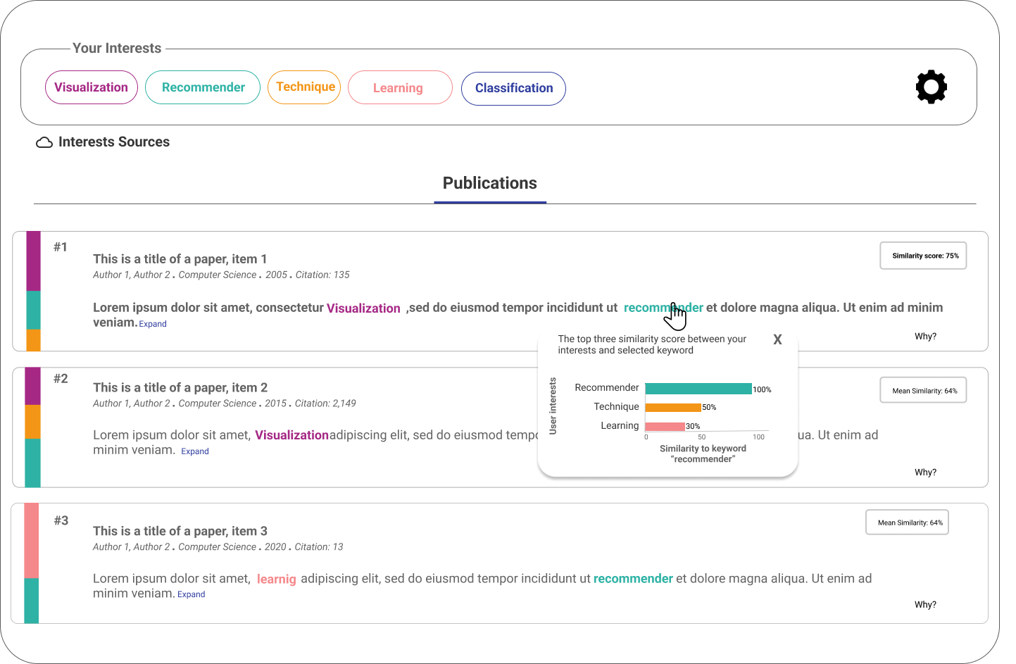
We implemented the final prototypes of the Why and How visual explanations in the RIMA application after incorporating users’ feedback from previous design iterations. The main interface consists of a navigation panel where the user can access all RIMA services including the explainable recommendation of publications (Figure 9(a)-A); a list of the top five user’s interests generated automatically by the system with a unique color for each interest to easily identify the interests and their impact on the recommended publications (Figure 9(a)–B); and a list of the recommended publications in the form of separate boxes (Figure 9(a)–C).
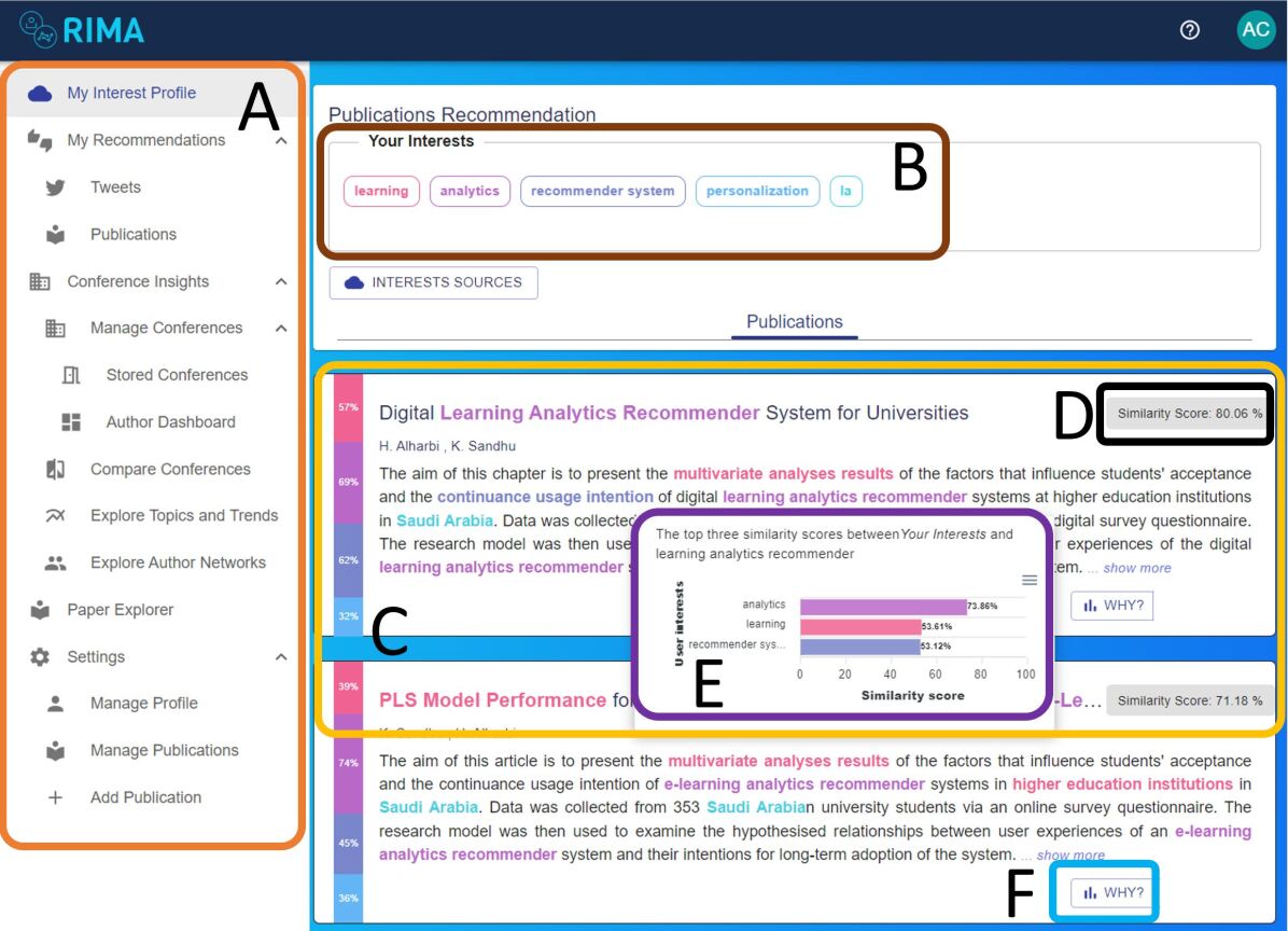
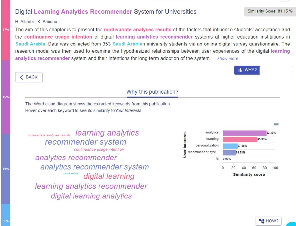
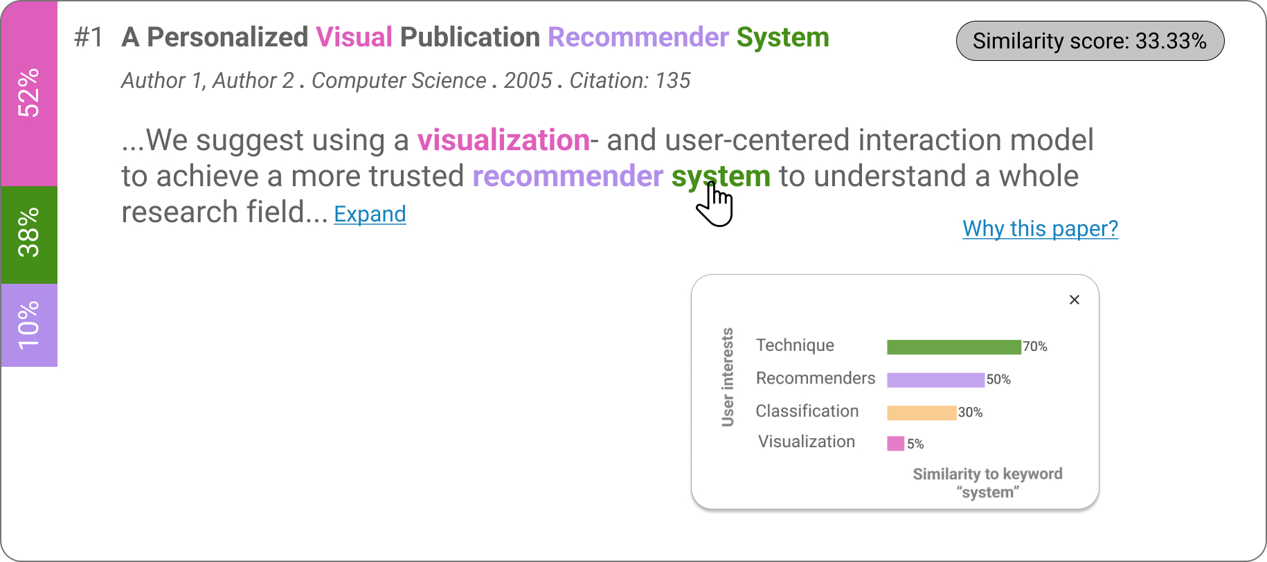
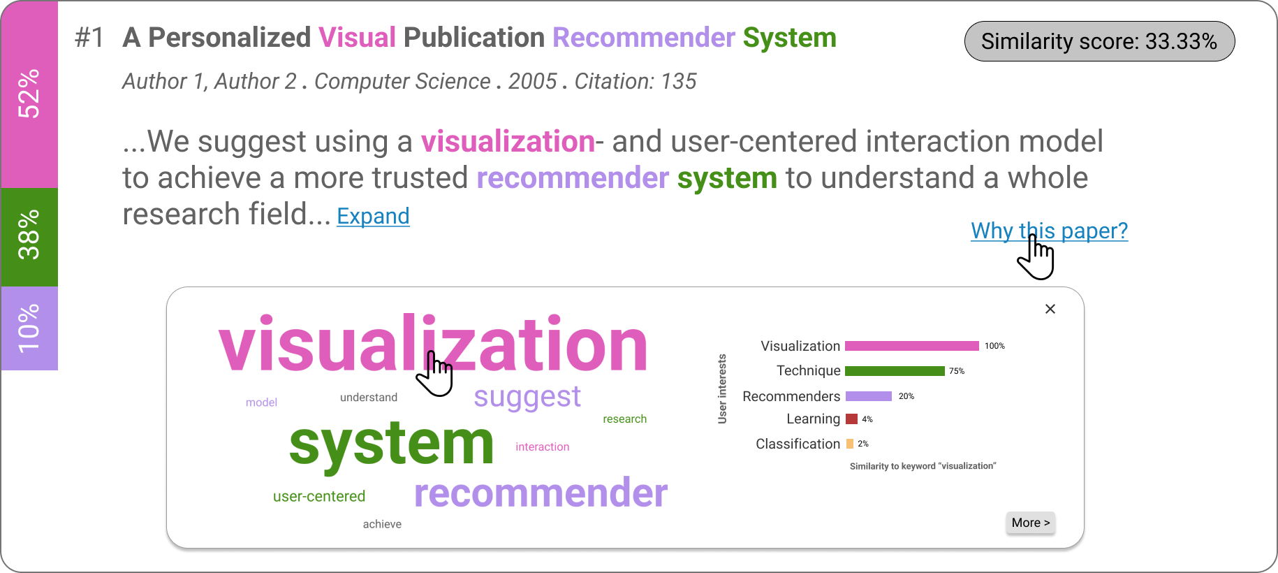
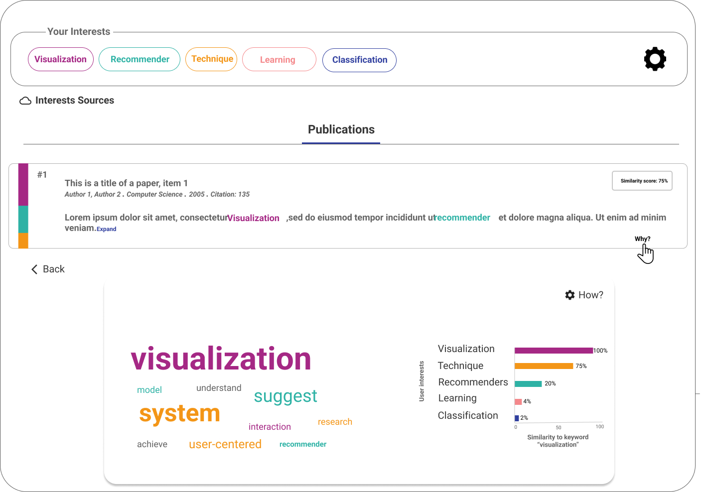
In the Why explanation, we provide an overview explanation using color bands within each recommendation to show the relevance of recommended publications to user’s interests, where the height of each color band indicates how relevant is this publication to the related interest. Additionally, we provide a relevance score for each publication (Figure 9(a)-D). For each recommended publication, a set of keywords are extracted and highlighted in the abstract. Users can interact with these keywords by either hovering over them to see a similarity score to the user interest model or by clicking on them so that a bar chart is shown in a pop-up displaying similarity scores between the clicked keyword and the top three similar interests (Figure 9(a)-E). In order to provide more details, we included a ”WHY” button in these boxes (Figure 9(a)-F) which lead to a more detailed Why explanation (Figure 9(b)). In this visualization, we provide the information in two steps. Firstly, users are presented with a word cloud that displays the extracted keywords from the current publication. The sizes of these keywords reflect their similarity scores with the user interest model, and they are color-coded to correspond with the most similar user’s interest for each keyword. Secondly, by hovering over each keyword, a bar chart will appear, which depicts the similarity scores between the keyword and all five user’s interests.
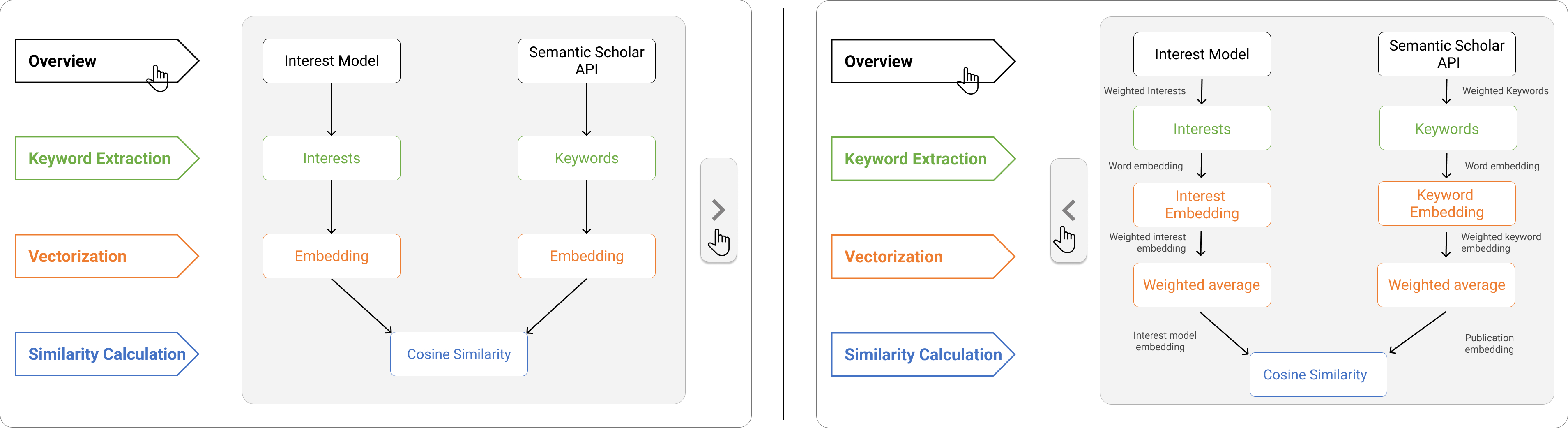
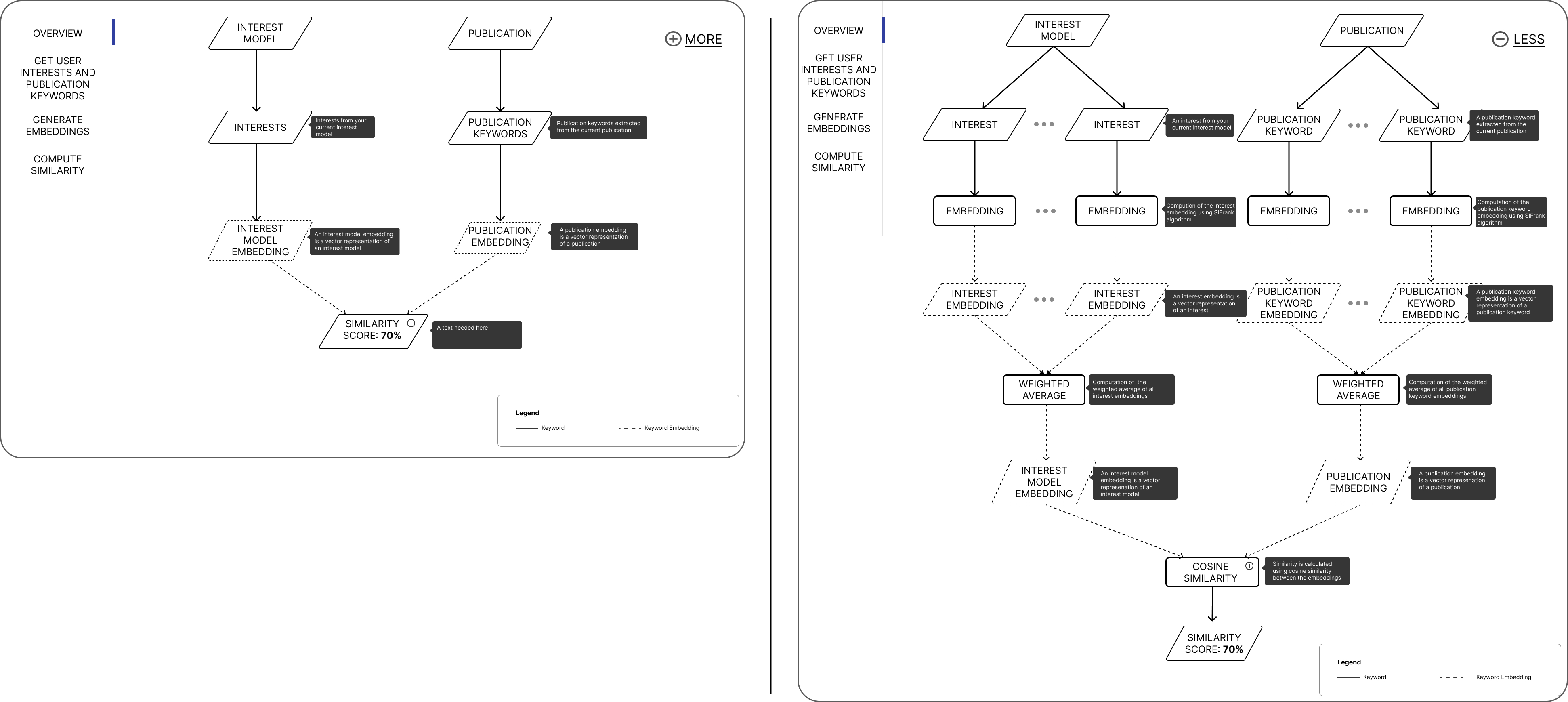
In the How explanation, users can learn more about the inner working of the system and how the recommendations are generated by clicking on the ”HOW” button in the Why explanation interface. Following the method of ”overview first, details on demand”, we start by presenting an abstract overview of the algorithm, followed by a detailed breakdown of each step using user’s actual data (i.e., interests). A flow chart is used to illustrate the process, with buttons and components arranged in a top-down flow for ease of comprehension. Starting with the ”overview first”, we offer the How explanation with two levels of information detail, accessible via ”MORE” and ”LESS” buttons, to provide an abstract description of the system’s processes (Figure 10).
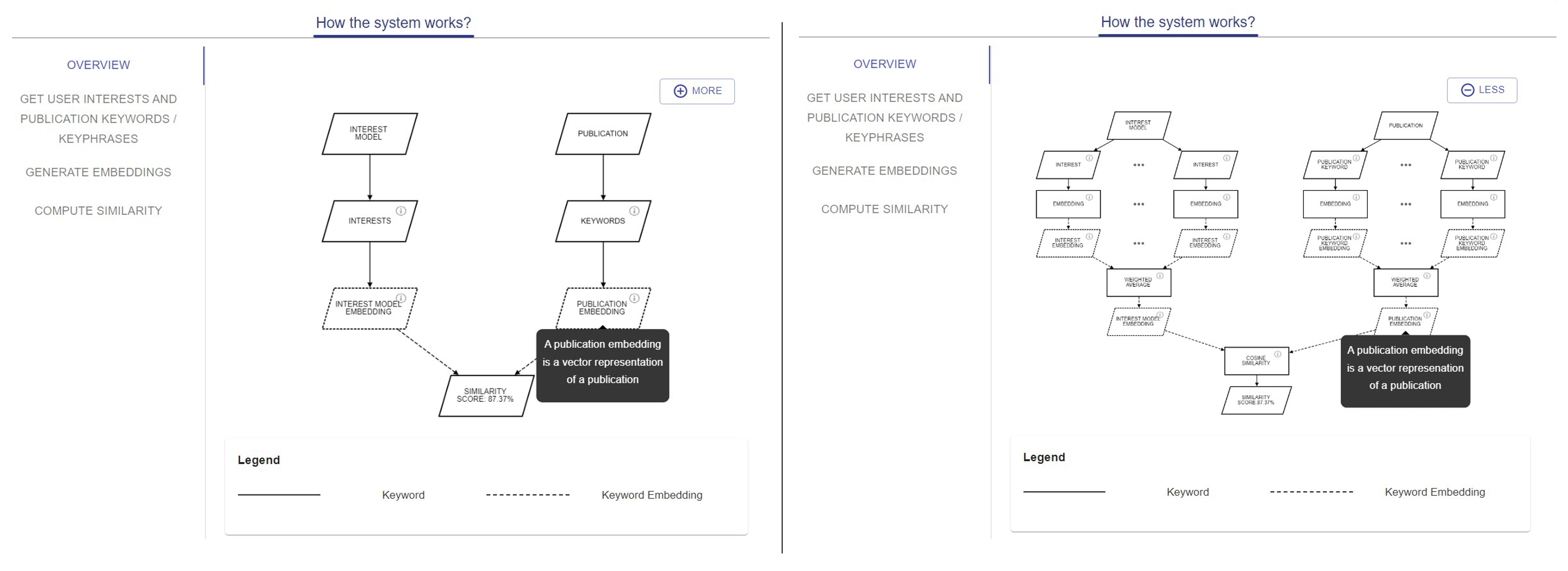
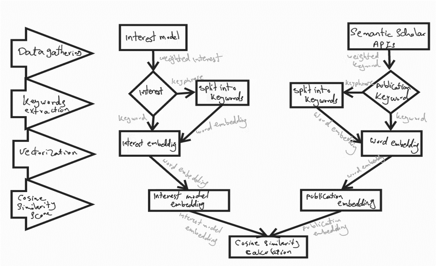
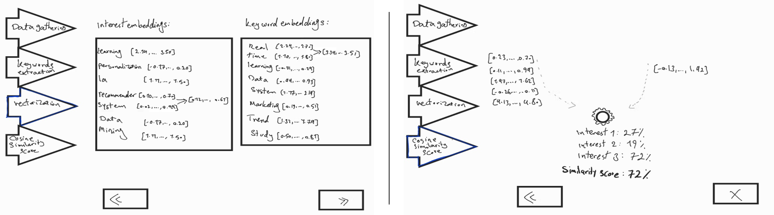
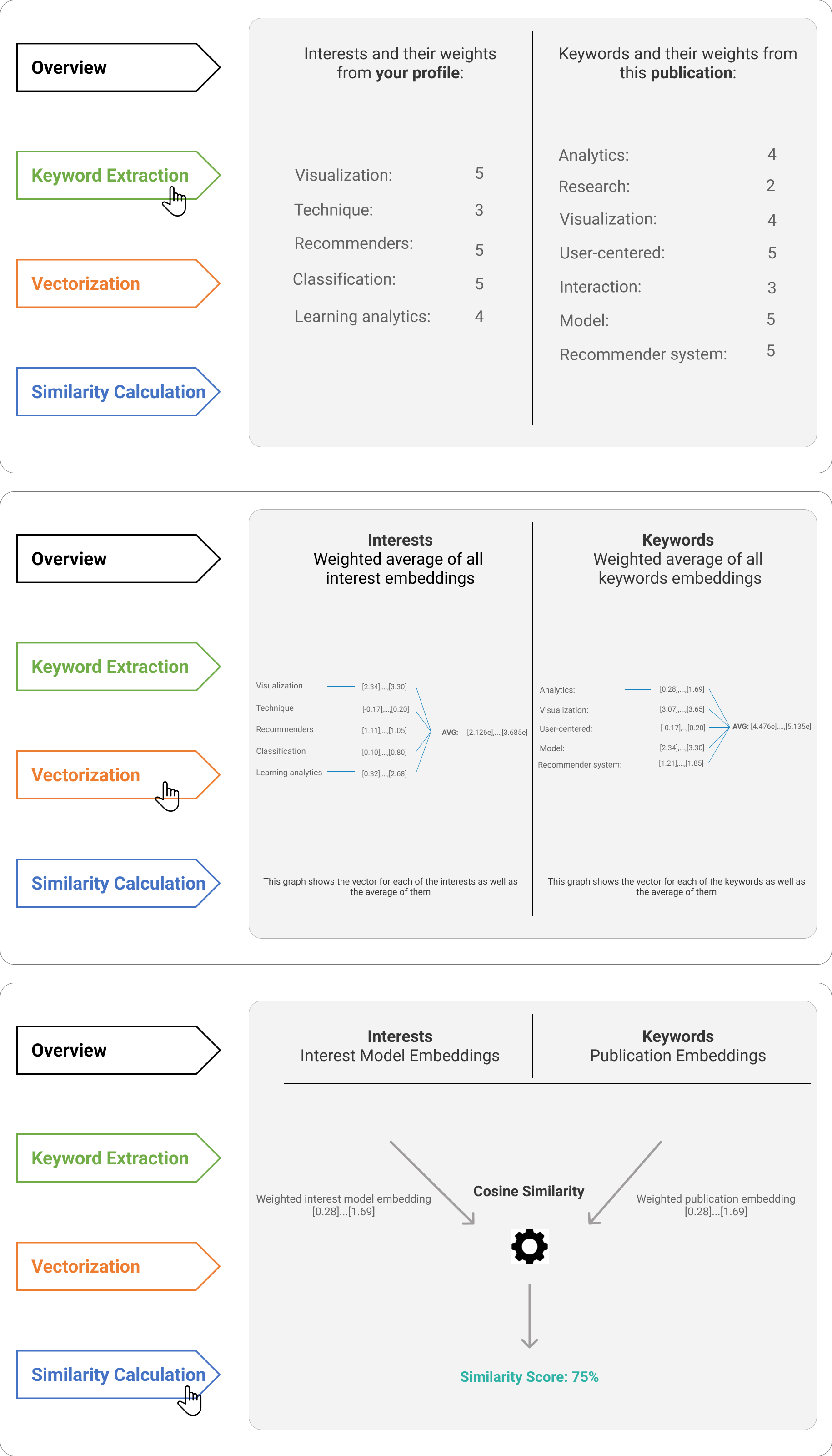
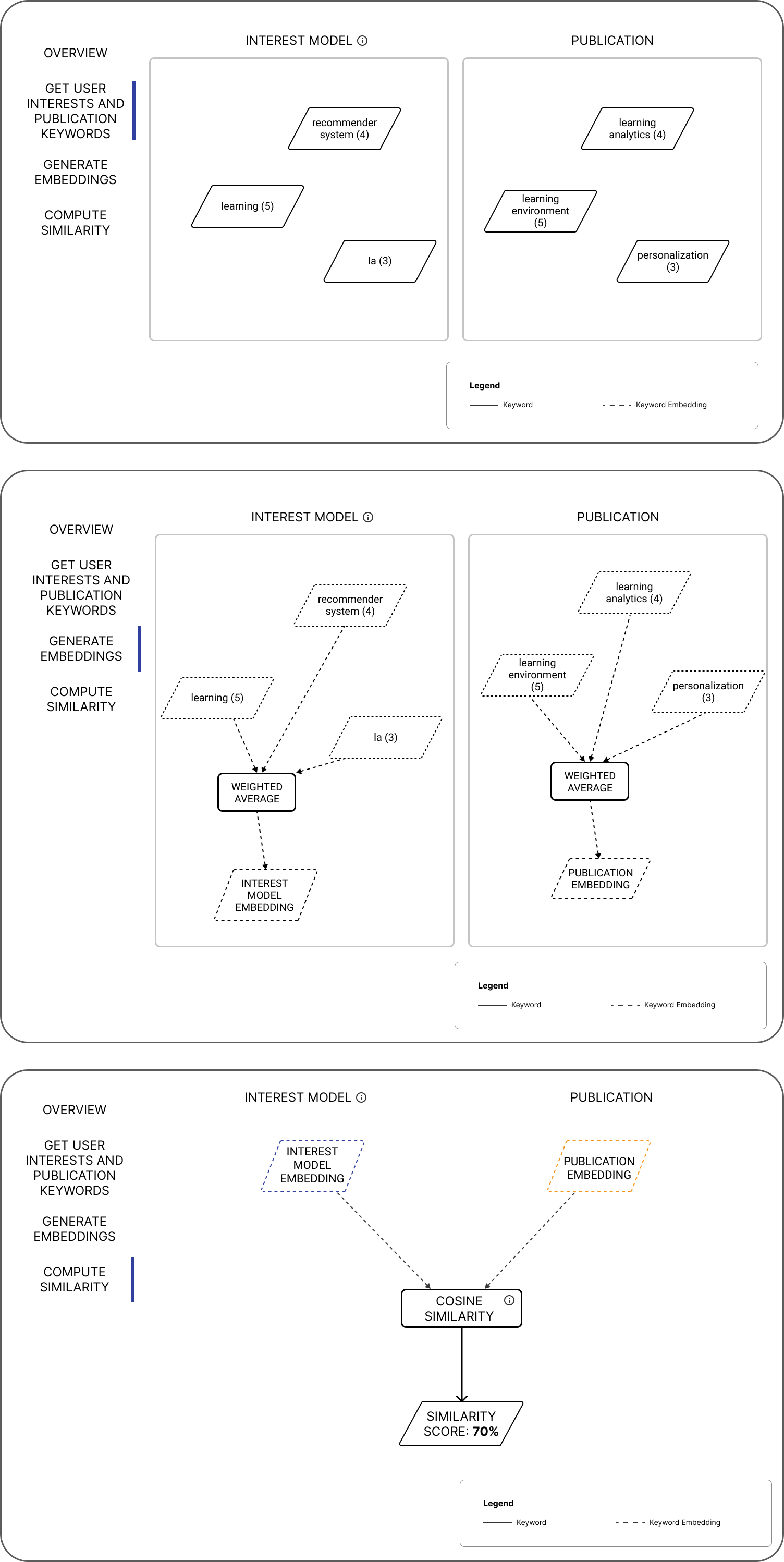
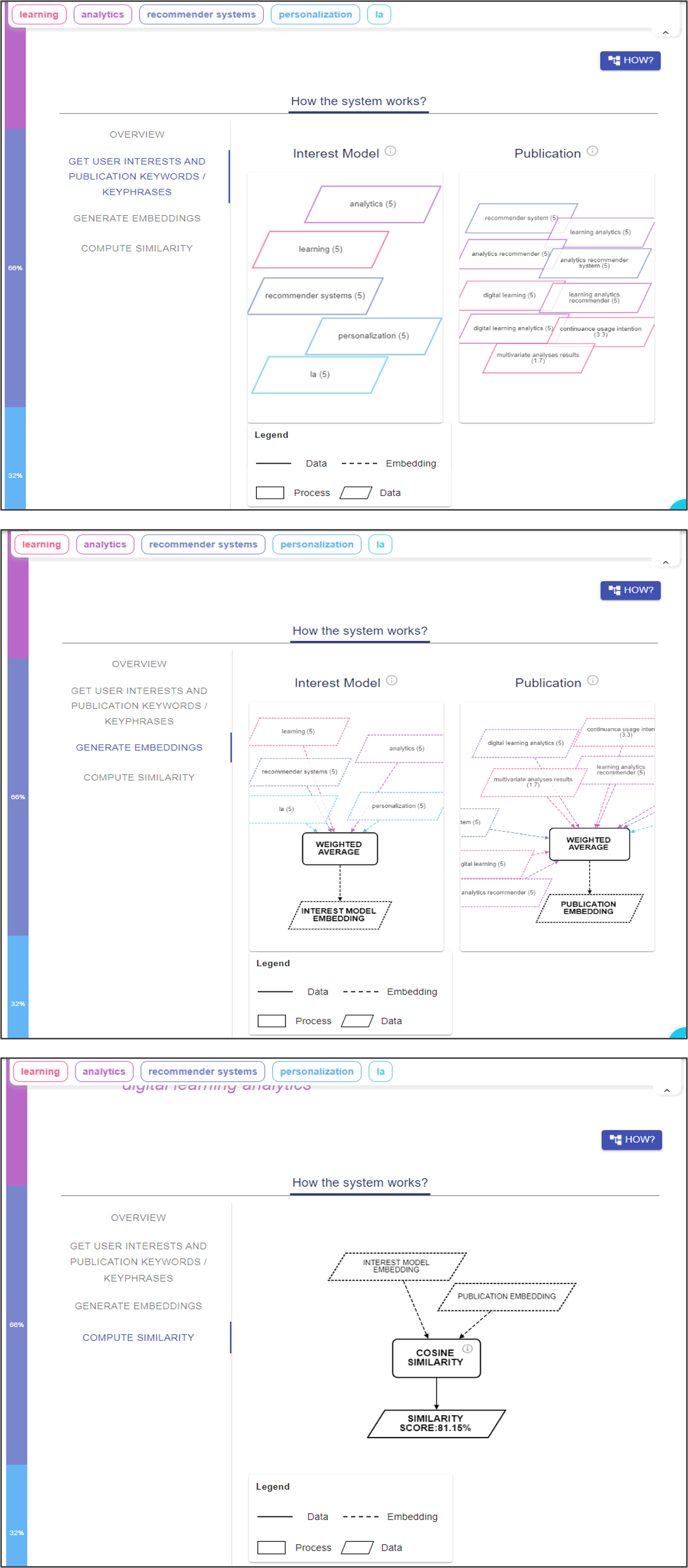
In addition to the abstract overview, the left navigation panel displays three distinct steps that illustrate the inner working of the RS algorithm with more technical details, using actual user and publication data (Figure 11). Users are able to interact with each step through hovering, zooming, dragging, and dropping. Furthermore, brief descriptions of each node can be viewed by hovering over them. The first step, labeled ”Get user interests and publication keywords/keyphrases”, displays a visualization of the actual user’s interests and the extracted keywords from the publication along with their corresponding weights. The second step, labeled ”Generate embeddings”, depicts the process of creating vector representations (i.e., embeddings) of the user interest model and the publication. The final step, labeled ”Compute similarity”, shows how similarity scores are calculated between the interest model and the publication embeddings.
5. Evaluation
After systematically designing the Why and How explanations and implementing them in the RIMA application, we conducted a qualitative user study to explore the usage and attitudes towards our scientific literature RS, considering the Why and How explanations. We believe that following a qualitative approach is beneficial to investigate in-depth the users’ unique perspectives and expectations from an explainable RS providing Why and How explanations together.
5.1. Study Design
Researchers and students interested in scientific literature were invited to participate. In total, 12 participants (five females) agreed to take part in this study. Participants were between 20 and 39 years old, where half of them were master’s graduates or higher, and the other half were master’s students. The study included participants from different countries (Germany, Iran, India, Palestine) and study fields (Computer Science, Statistics, Chemical Engineering). All participants gave informed consent to study participation. Participants were initially given a short introductory video about the RIMA application in general, and another short demo video about the Why and How explanation features in the application. Next, they answered a questionnaire in SoSci Survey which included questions about their demographics and familiarity with RS and visualization. Afterwards, we conducted moderated think-aloud sessions where participants were asked to (1) create an account using their Semantic Scholar ID (users who do not have Semantic Scholar IDs can generate their interest models manually) in order to create their interest models, (2) interact with the application based on given tasks, and (3) take a closer look at the Why and How explanations provided by the system. Following a think-aloud approach, participants were also asked to say anything that comes to their mind during each interaction. After that, we conducted semi-structured interviews to gather in-depth feedback. The interviews took place online and were recorded with the consent of the participants. They lasted 10 to 15 minutes with the following questions: (1) What do you like the most about the provided (Why / How) explanations? (2) What do you like the least about the provided (Why / How) explanations? (3) Which of the provided explanations (Why / How) helped you more to make a decision? Why? (4) Which explanation (Why / How) is sufficient for you to make a decision? (5) Which explanation (Why / How) do you prefer? Why? (6) Which explanation (Why / How) gives you a better sense of transparency of the recommender system? Why? (7) Which explanation (Why / How) gives you a better sense of trust in the recommender system? Why? (8) Do you have any suggestions to improve the system? After the semi-structured interviews, participants were also invited to fill out a questionnaire containing questions regarding usability aspects and attitudes towards the RS, based on the ResQue evaluation framework (Pu et al., 2011). To note that by using the ResQue framework, we are not aiming at conducting a quantitative evaluation and generalizing our conclusions, but rather to use participants’ answers to the ResQue questionnaire as a starting point to collect their opinions towards the RS, which are then explored in-depth through our qualitative study.
5.2. Analysis and results
The results of the ResQue questionnaires are summarized in Figure 12. We conducted a qualitative analysis of the moderated think-aloud sessions and the semi-structured interviews to gain further insights into the reasons behind the individual differences in the perception of the RS in terms of the Why and How explanations. We followed the instruction proposed by Braun and Clarke (2006) to code the data and identify patterns to organize the codes into meaningful groups. Notes and transcripts of the interview recordings were made for the analysis. The analysis was rather deductive as we aimed to find additional explanations for the users’ opinions towards the three themes/goals that we are addressing with our research question, namely Transparency, Trust, and Satisfaction.
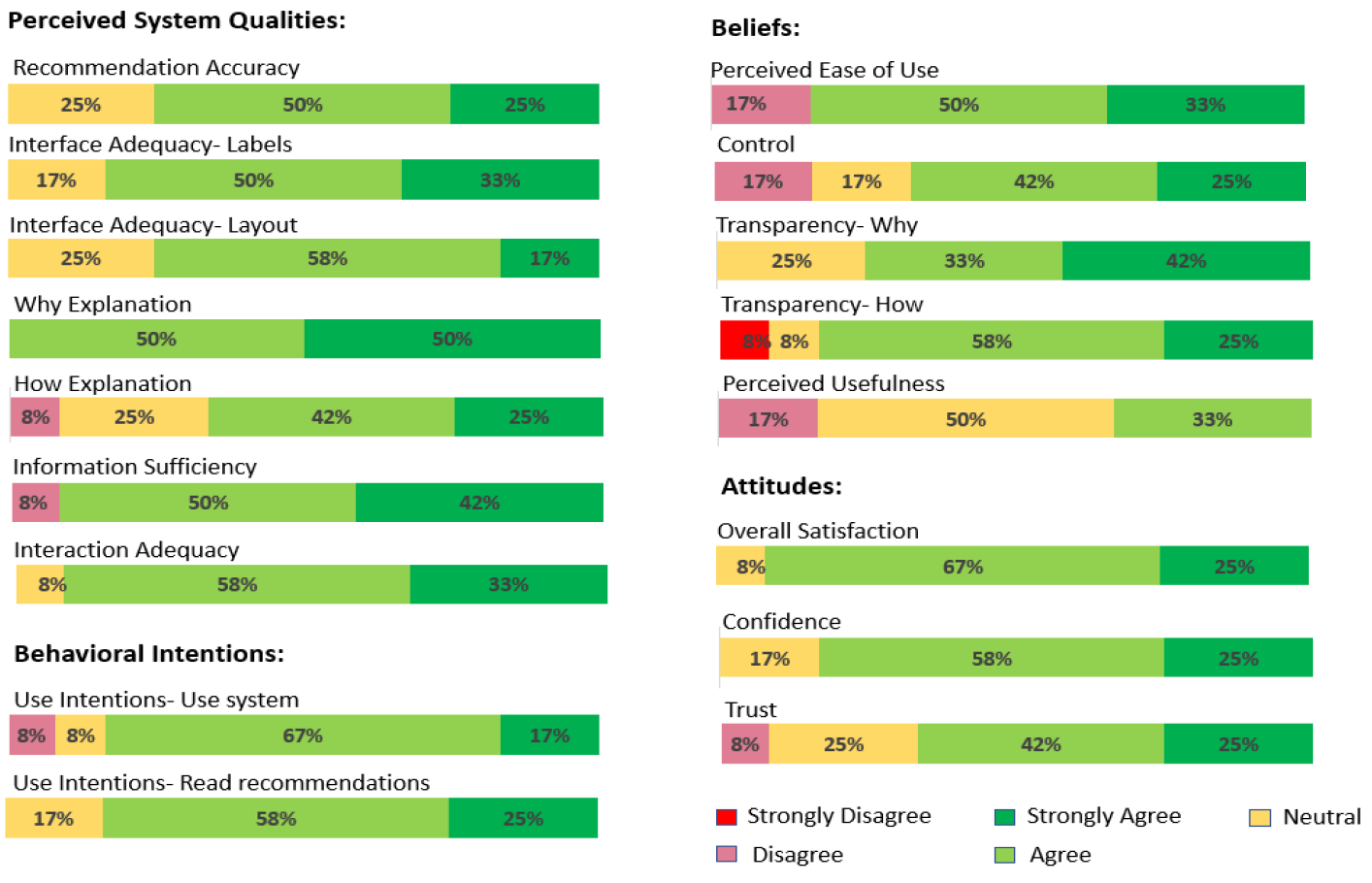
5.2.1. Transparency
This theme concerns the perception of the Why and How explanations in terms of transparency. In this regard, ten participants (respectively nine participants) stated that the How explanation (respectively the Why explanation) had an overall good effect on the transparency of the system (see Figure 12). When we concretely asked about which explanation gave them a better sense of transparency of the RS, the majority of participants agreed that they perceived the RS as more transparent through the How explanation, as the system’s inner working was evident to them (see Figure 13). For instance, participant P6 mentioned that ”How explanation shows me the process of the system and lets me know what is happening behind it. Moreover, I can choose how much information I want to see”. Also, P7 reported “As an engineer, I always use mathematical formulas. So, if I know how the similarity scores are calculated, the system is more transparent for me”. On the other hand, only two participants reported that the system was transparent because of the Why explanation, as it provided enough information for them to understand the RS functionality. For instance, P2 pointed out that “Why explanation increases the system’s transparency to me. It highlights the extracted keywords from the paper’s abstract with the same color as the relevant interest and also displays a similarity score to each one of them”. These two participants further claimed that, by contrast, the How explanation is difficult to understand as it contains very technical details that are difficult for non-computer scientists to comprehend.
5.2.2. Trust
Regarding the perceived trust in the RS, eight participants found that the Why and How explanations had a positive impact on trust in general (see Figure 12). When we specifically asked which explanation gave them a better sense of trust in the RS, most participants agreed that the How explanation increased their trust in the system, because the system’s inner working was transparent to them (see Figure 13). For instance, P6 indicated that ”I would trust the system because it provides me exactly what is happening there via the how explanation”. On the other hand, two participants expressed that the Why explanation made them feel more confident in the RS and that the How explanation was overwhelming for them, which hurts their understanding and trust in the system. For instance, P4 mentioned ”What does a chemical engineer have to do with this flow chart? I mean, I have some programming background and it can be interesting for me, but it is complicated for people who do not know how the algorithm works”.
5.2.3. Satisfaction
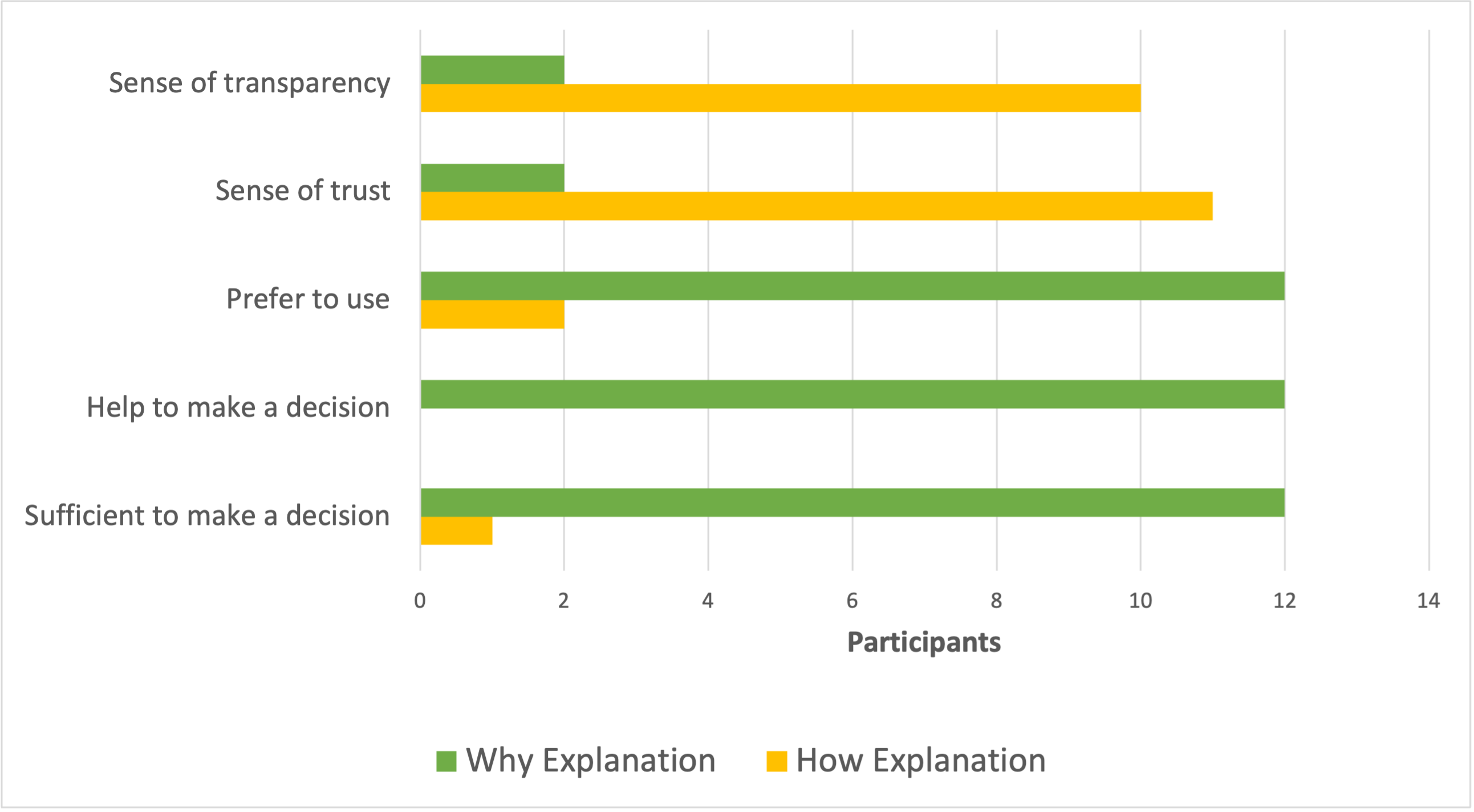
Most participants expressed high overall satisfaction with the RS (see Figure 12). As pointed out by Tintarev and Masthoff (2007), satisfaction can also be measured indirectly, measuring user loyalty. Thus, users’ use intentions can be seen as an indirect measure of loyalty and satisfaction with the system. In this regard, the majority of participants expressed their intention to use the system in the future or read the publications recommended by the system (see Figure 12). Moreover, beside the satisfaction with the system as a whole, one can also measure the user’s quality perception of the explanations themselves as an indication of user’s satisfaction with the system (Tintarev and Masthoff, 2012; Gedikli et al., 2014). Figure 12 shows that the system’s ratings related to the perceived system qualities, including recommendation accuracy, interface adequacy, explanation quality, information sufficiency, and interaction adequacy are relatively high, indicating that the overall satisfaction and user experience are positive toward having the Why and How explanations in the RS (see Figure 12). All participants showed high satisfaction with the Why explanation. For instance, P4 expressed “I like the simplicity and how things explain themselves in the why explanation. No tutorials are needed. Even if I didn’t really watch the video that you provided earlier, I still would be able to get to the same conclusion”. For the How explanation, eight users mentioned that they were satisfied with it because they could see the amount of information that they preferred to see. In addition, they appreciated the feature of providing tooltips displayed on each node of the flow chart to provide additional information. Participants liked that they could learn how the system works: “P3: I am able to follow the system process in the How explanation from both the interest model and the publication side”, as well as that the How explanation is personalized to their individual data: “P1: It’s great to see my own data used to explain how the system works”. On the other hand, four participants did not speak very confidently about their satisfaction with the How explanation. These participants reported complexity as the main reason: “P6: ”too technical” and “P12: ”might be overwhelming”. Nunes and Jannach (2017) noted that satisfaction is not considered as a single goal, but can be split into sub-goals of ease to use and usefulness. Figure 12 shows that perceived ease of use of the Why and How explanations scored high. On the other hand, perceived usefulness received relatively lower ratings. All participants reported that they found the Why explanation useful, but they had diverse opinions regarding the usefulness of the How explanation. In the interview session, we gathered feedback concerning the usefulness of the Why and How explanations, the situations where each explanation could be used, and the usage frequency for each explanation. As shown in Figure 13), the Why explanation was perceived as the more effective explanation by the majority of participants. They assumed that this explanation was helpful and sufficient for them to make a decision on whether the recommended publication was relevant to them or not. Consequently, they would prefer to use the Why explanation more frequently than the How explanation. Most participants agreed that the How explanation is an interesting option that they would use in some concrete situations, but not frequently. For instance, P6 said ”At a higher level, I want to know how the system works. I will click on the HOW button, but I would say not so frequently”. Two participants (P2 and P7) stated that they would look at the How explanation only if they had difficulty understanding the Why explanation.
6. Discussion
The primary research question we address in this work is: What is the potential impact of Why and How visual explanations on the user perceptions regarding transparency, trust, and user satisfaction, when these two explanations are provided together in an explainable RS?
Most participants agreed that providing Why and How explanations in the RS had a positive impact on their perceived transparency of the system, which confirms earlier findings that incorporating explanation is essential to make RS more transparent (Herlocker et al., 2000; Tintarev and Masthoff, 2015; Nunes and Jannach, 2017; Zhang et al., 2020). Moreover, our results showed that the How explanation offered users a better sense of transparency of the RS, since it reveals the inner working of the system. This indicates that the How explanation is the right choice, if the goal is to increase objective transparency. Our results further showed that for some users, the Why explanation provided a better sense of transparency, as it provided enough information for them to understand the RS functionality, compared to the How explanation which was difficult to understand. This suggests that the How explanation increases the system’s objective transparency but is also associated with a risk of reducing the user-perceived transparency, depending on the user’s background knowledge. This confirms findings in previous studies showing that, for some users, it is enough to provide a Why explanation to justify a recommendation output instead of revealing the inner working of the RS (e.g., (Gedikli et al., 2014; Zhao et al., 2019). This further suggests that for assessing transparency in RS, it is necessary to view transparency as a multi-faceted concept and to differentiate objective transparency from user-perceived transparency (Gedikli et al., 2014; Hellmann et al., 2022).
Regarding the perceived trust in the RS, most participants found that the system is trustworthy through the How explanation, which is in line with findings in e.g., (Tintarev and Masthoff, 2012; Kunkel et al., 2019; Pu et al., 2012; Vig et al., 2009), considering transparency as an important factor that contributes to users building trust in the RS, as it can enhance users’ perceived understanding of the system. On the other hand, few participants identified the Why explanation as more trustworthy, mainly because the How explanation was overwhelming for them. Our findings imply a relationship between the user type (e.g., background knowledge) and the needed amount of information in an explanation. This is in line with the findings in e.g., (Guesmi et al., 2022; Chatti et al., 2022; Kouki et al., 2019; Millecamp et al., 2019; Szymanski et al., 2021; Martijn et al., 2022), showing that personal characteristics have an effect on the perception of RS explanations. Our findings also confirm the results of previous research on explainable recommendation and XAI showing that the detailed explanation does not automatically result in higher trust because the provision of additional explanations increases cognitive effort (Kulesza et al., 2015; Kulesza et al., 2013; Yang et al., 2020; Zhao et al., 2019; Kizilcec, 2016; Chatti et al., 2022). This line of research stresses that there is a trade-off between the amount of information in an explanation and the level of perceived trust users develop when interacting with the system and concludes that designing for trust requires balanced system transparency: “not too little and not too much” (Kizilcec, 2016) and ”be sound”, “be complete” but “don’t overwhelm” (Kulesza et al., 2015; Kulesza et al., 2013). In summary, it is vital to find an optimal level of transparency that will generate the highest level of users’ trust in RS (Zhao et al., 2019) and to provide personalized explanations with the right level of detail by tailoring the explanation intelligibility type to the user’s context, i.e., goals and personal characteristics (Chatti et al., 2022; Ain et al., 2022).
Overall, our results show that providing Why and How explanations together within an RS leads to increased transparency, trust, and overall satisfaction. This is in line with earlier studies which found that the user’s overall satisfaction with an RS is assumed to be strongly related to transparency and trust. Gedikli et al. (2014), for example, reported results from experiments with different explanations clearly showing that transparency – independent of the used explanation – has a significant positive effect on user satisfaction. Similarly, Balog and Radlinski (2020) found that satisfaction is positively correlated with transparency and trust. Regarding the users’ perceptions of the Why and How, we observed a trade-off between transparency and trust on the one hand and satisfaction on the other hand ”transparency/trust vs. satisfaction”. Concretely, How explanations can lead to higher transparency and trust, but lower satisfaction. Why explanations, by contrast, are perceived as less transparent and trustworthy, but can contribute to increased satisfaction. One possible implication of this finding is to provide Why explanations (by default) and How explanations (on-demand) in order to increase transparency, trust, and overall satisfaction with the RS, at the same time. Furthermore, the fact that, while the How explanation offered users a better sense of transparency and trust, the Why explanation had a higher positive impact on users’ satisfaction with the RS, confirms that there are inter-dependencies between explanation goals and intelligibility types and that different intelligibility types can be used for different explanation goals (Lim and Dey, 2013; Lim et al., 2009, 2019; Liao et al., 2020). In our study, we identified specific pathways mapping the use of Why and How explanations back to the explanation goals of transparency, trust, and satisfaction. Concretely, While How explanations can be mapped back to transparency and trust, Why explanations are more linked to satisfaction.
In general, participants were more satisfied with the Why explanation which was also perceived as relatively simple, yet more effective than the How explanation to make a decision. These observations are in line with those made in previous work. Herlocker et al. (2000), for example, found in their study that the most satisfying explanations were simple and conclusive methods, such as stating the neighbors’ ratings, and that complex explanations such as a full neighbor graph scored significantly lower. Similarly, Putnam and Conati (2019) and Conati et al. (2021) reported that students want to know why more than they want to know how AI-driven hints are provided in intelligent tutoring systems (ITS). This suggests that, if an explainable RS only provides a single explanation, the focus should rather be on providing a Why explanation (i.e., justification).
7. Limitations
As a first analysis of the impact of Why and How explanations on users’ perceptions, when these two explanations are provided together in an explainable RS, this study is not without limitations. First, we performed this analysis in a single domain. It must be verified that our findings transfer to domains beyond scientific literature RS. From the perspective of evaluation, we conducted a qualitative user study with 12 participants. Therefore, the results of the study should be interpreted with caution and cannot be generalized. A quantitative user study with a larger sample would probably have yielded more significant and reliable results.
8. Conclusion and Future Work
In this paper, we identified relationships between the Why and How explanation intelligibility types and the explanation goals of justification and transparency. We followed the Human-Centered-Design (HCD) approach and leveraged the What-Why-How visualization framework to systematically design Why and How visual explanations and provide them side-by-side in the transparent Recommendation and Interest Modeling Application (RIMA). Further, we presented a qualitative investigation of users’ perceptions of Why and How explanations in terms of transparency, trust, and satisfaction. As a high level summary, we found qualitative evidence confirming that Why and How explanations have different effects on users and that the choice of these explanation intelligibility types depends on the explanation goal and user type. Moreover, we identified potential dependencies and trade-offs between the different explanation goals of transparency, trust, and satisfaction, when Why and How explanations are provided together in an explainable recommender system (RS).
This work contributes to the literature on user-centered explanations. While we are aware that our results are based on one particular RS and the results cannot be generalized, we are confident that they represent a necessary step towards a richer understanding of the relationships between explanation intelligibility types and explanation goals in explainable RS. Future directions concern the generalization of findings to other application domains. Moreover, we plan to validate our findings through quantitative research to investigate in more depth the effects of providing Why and How explanations together on the perception of and interaction with explainable RS, with different user groups and in different contexts. Furthermore, we consider identifying more pathways mapping the different explanation intelligibility types back to the different explanation goals to be an important next step in our future work.
References
- (1)
- Afchar et al. (2022) Darius Afchar, Alessandro B Melchiorre, Markus Schedl, Romain Hennequin, Elena V Epure, and Manuel Moussallam. 2022. Explainability in Music Recommender Systems. arXiv preprint arXiv:2201.10528 (2022).
- Ain et al. (2022) Qurat Ul Ain, Mohamed Amine Chatti, Mouadh Guesmi, and Shoeb Joarder. 2022. A Multi-Dimensional Conceptualization Framework for Personalized Explanations in Recommender Systems. In Proceedings of the Joint 27th International Conference on Intelligent User Interfaces, Helsinki, Finland. 22–25.
- Alshammari et al. (2019) Mohammed Alshammari, Olfa Nasraoui, and Scott Sanders. 2019. Mining semantic knowledge graphs to add explainability to black box recommender systems. IEEE Access 7 (2019), 110563–110579.
- Ananny and Crawford (2018) Mike Ananny and Kate Crawford. 2018. Seeing without knowing: Limitations of the transparency ideal and its application to algorithmic accountability. new media & society 20, 3 (2018), 973–989.
- Arrieta et al. (2020) Alejandro Barredo Arrieta, Natalia Díaz-Rodríguez, Javier Del Ser, Adrien Bennetot, Siham Tabik, Alberto Barbado, Salvador García, Sergio Gil-López, Daniel Molina, Richard Benjamins, et al. 2020. Explainable Artificial Intelligence (XAI): Concepts, taxonomies, opportunities and challenges toward responsible AI. Information fusion 58 (2020), 82–115.
- Balog and Radlinski (2020) Krisztian Balog and Filip Radlinski. 2020. Measuring recommendation explanation quality: The conflicting goals of explanations. In Proceedings of the 43rd international ACM SIGIR conference on research and development in information retrieval. 329–338.
- Balog et al. (2019) Krisztian Balog, Filip Radlinski, and Shushan Arakelyan. 2019. Transparent, scrutable and explainable user models for personalized recommendation. In Proceedings of the 42nd International ACM SIGIR Conference on Research and Development in Information Retrieval. 265–274.
- Bostandjiev et al. (2012) Svetlin Bostandjiev, John O’Donovan, and Tobias Höllerer. 2012. TasteWeights: a visual interactive hybrid recommender system. In Proceedings of the sixth ACM conference on Recommender systems. 35–42.
- Bostandjiev et al. (2013) Svetlin Bostandjiev, John O’Donovan, and Tobias Höllerer. 2013. LinkedVis: exploring social and semantic career recommendations. In Proceedings of the 2013 international conference on Intelligent user interfaces. 107–116.
- Braun and Clarke (2006) Virginia Braun and Victoria Clarke. 2006. Using thematic analysis in psychology. Qualitative research in psychology 3, 2 (2006), 77–101.
- Chatti et al. (2022) Mohamed Amine Chatti, Mouadh Guesmi, Laura Vorgerd, Thao Ngo, Shoeb Joarder, Qurat Ul Ain, and Arham Muslim. 2022. Is More Always Better? The Effects of Personal Characteristics and Level of Detail on the Perception of Explanations in a Recommender System. In Proceedings of the 30th ACM Conference on User Modeling, Adaptation and Personalization. 254–264.
- Conati et al. (2021) Cristina Conati, Oswald Barral, Vanessa Putnam, and Lea Rieger. 2021. Toward personalized XAI: A case study in intelligent tutoring systems. Artificial intelligence 298 (2021), 103503.
- Cramer et al. (2008) Henriette Cramer, Vanessa Evers, Satyan Ramlal, Maarten Van Someren, Lloyd Rutledge, Natalia Stash, Lora Aroyo, and Bob Wielinga. 2008. The effects of transparency on trust in and acceptance of a content-based art recommender. User Modeling and User-adapted interaction 18 (2008), 455–496.
- Diakopoulos and Koliska (2017) Nicholas Diakopoulos and Michael Koliska. 2017. Algorithmic transparency in the news media. Digital journalism 5, 7 (2017), 809–828.
- Gedikli et al. (2014) Fatih Gedikli, Dietmar Jannach, and Mouzhi Ge. 2014. How should I explain? A comparison of different explanation types for recommender systems. International Journal of Human-Computer Studies 72, 4 (2014), 367–382.
- Gretarsson et al. (2010) Brynjar Gretarsson, John O’Donovan, Svetlin Bostandjiev, Christopher Hall, and Tobias Höllerer. 2010. Smallworlds: visualizing social recommendations. In Computer graphics forum, Vol. 29. Wiley Online Library, 833–842.
- Guesmi et al. (2021) Mouadh Guesmi, Mohamed Amine Chatti, Laura Vorgerd, Shoeb Joarder, Shadi Zumor, Yiqi Sun, Fangzheng Ji, and Arham Muslim. 2021. On-demand personalized explanation for transparent recommendation. In Adjunct Proceedings of the 29th ACM Conference on User Modeling, Adaptation and Personalization. 246–252.
- Guesmi et al. (2022) Mouadh Guesmi, Mohamed Amine Chatti, Laura Vorgerd, Thao Ngo, Shoeb Joarder, Qurat Ul Ain, and Arham Muslim. 2022. Explaining User Models with Different Levels of Detail for Transparent Recommendation: A User Study. In Adjunct Proceedings of the 30th ACM Conference on User Modeling, Adaptation and Personalization. 175–183.
- Harman et al. (2014) Jason L Harman, John O’Donovan, Tarek Abdelzaher, and Cleotilde Gonzalez. 2014. Dynamics of human trust in recommender systems. In Proceedings of the 8th ACM Conference on Recommender systems. 305–308.
- Hellmann et al. (2022) Marco Hellmann, Diana C Hernandez-Bocanegra, and Jürgen Ziegler. 2022. Development of an Instrument for Measuring Users’ Perception of Transparency in Recommender Systems. In Joint Proceedings of the ACM IUI Workshops, Helsinki, Finland.
- Herlocker et al. (2000) Jonathan L Herlocker, Joseph A Konstan, and John Riedl. 2000. Explaining collaborative filtering recommendations. In Proceedings of the 2000 ACM conference on Computer supported cooperative work. 241–250.
- Hosseini et al. (2018) Mahmood Hosseini, Alimohammad Shahri, Keith Phalp, and Raian Ali. 2018. Four reference models for transparency requirements in information systems. Requirements Engineering 23 (2018), 251–275.
- Jannach et al. (2019) Dietmar Jannach, Michael Jugovac, and Ingrid Nunes. 2019. Explanations and user control in recommender systems. In Proceedings of the 23rd International Workshop on Personalization and Recommendation on the Web and Beyond. 31–31.
- Jin et al. (2016) Yucheng Jin, Karsten Seipp, Erik Duval, and Katrien Verbert. 2016. Go with the flow: effects of transparency and user control on targeted advertising using flow charts. In Proceedings of the international working conference on advanced visual interfaces. 68–75.
- Kizilcec (2016) René F Kizilcec. 2016. How much information? Effects of transparency on trust in an algorithmic interface. In Proceedings of the 2016 CHI Conference on Human Factors in Computing Systems. 2390–2395.
- Knijnenburg et al. (2012) Bart P Knijnenburg, Martijn C Willemsen, Zeno Gantner, Hakan Soncu, and Chris Newell. 2012. Explaining the user experience of recommender systems. User modeling and user-adapted interaction 22 (2012), 441–504.
- Konstan and Riedl (2012) Joseph A Konstan and John Riedl. 2012. Recommender systems: from algorithms to user experience. User modeling and user-adapted interaction 22, 1 (2012), 101–123.
- Kouki et al. (2019) Pigi Kouki, James Schaffer, Jay Pujara, John O’Donovan, and Lise Getoor. 2019. Personalized explanations for hybrid recommender systems. In Proceedings of the 24th International Conference on Intelligent User Interfaces. 379–390.
- Kulesza et al. (2015) Todd Kulesza, Margaret Burnett, Weng-Keen Wong, and Simone Stumpf. 2015. Principles of explanatory debugging to personalize interactive machine learning. In Proceedings of the 20th international conference on intelligent user interfaces. 126–137.
- Kulesza et al. (2013) Todd Kulesza, Simone Stumpf, Margaret Burnett, Sherry Yang, Irwin Kwan, and Weng-Keen Wong. 2013. Too much, too little, or just right? Ways explanations impact end users’ mental models. In 2013 IEEE Symposium on visual languages and human centric computing. IEEE, 3–10.
- Kunkel et al. (2019) Johannes Kunkel, Tim Donkers, Lisa Michael, Catalin-Mihai Barbu, and Jürgen Ziegler. 2019. Let me explain: Impact of personal and impersonal explanations on trust in recommender systems. In Proceedings of the 2019 CHI conference on human factors in computing systems. 1–12.
- Liao et al. (2020) Q Vera Liao, Daniel Gruen, and Sarah Miller. 2020. Questioning the AI: informing design practices for explainable AI user experiences. In Proceedings of the 2020 CHI Conference on Human Factors in Computing Systems. 1–15.
- Lim and Dey (2009) Brian Y Lim and Anind K Dey. 2009. Assessing demand for intelligibility in context-aware applications. In Proceedings of the 11th international conference on Ubiquitous computing. 195–204.
- Lim and Dey (2013) Brian Y Lim and Anind K Dey. 2013. Evaluating intelligibility usage and usefulness in a context-aware application. In Human-Computer Interaction. Towards Intelligent and Implicit Interaction: 15th International Conference, HCI International 2013, Las Vegas, NV, USA, July 21-26, 2013, Proceedings, Part V 15. Springer, 92–101.
- Lim et al. (2009) Brian Y Lim, Anind K Dey, and Daniel Avrahami. 2009. Why and why not explanations improve the intelligibility of context-aware intelligent systems. In Proceedings of the SIGCHI conference on human factors in computing systems. 2119–2128.
- Lim et al. (2019) Brian Y Lim, Qian Yang, Ashraf M Abdul, and Danding Wang. 2019. Why these explanations? Selecting intelligibility types for explanation goals.. In IUI Workshops.
- Ma et al. (2021) Boxuan Ma, Min Lu, Yuta Taniguchi, and Shin’ichi Konomi. 2021. CourseQ: the impact of visual and interactive course recommendation in university environments. Research and practice in technology enhanced learning 16, 1 (2021), 1–24.
- Martijn et al. (2022) Millecamp Martijn, Cristina Conati, and Katrien Verbert. 2022. “Knowing me, knowing you”: personalized explanations for a music recommender system. User Modeling and User-Adapted Interaction 32, 1-2 (2022), 215–252.
- Millecamp et al. (2019) Martijn Millecamp, Nyi Nyi Htun, Cristina Conati, and Katrien Verbert. 2019. To explain or not to explain: the effects of personal characteristics when explaining music recommendations. In Proceedings of the 24th International Conference on Intelligent User Interfaces. 397–407.
- Miller (2019) Tim Miller. 2019. Explanation in artificial intelligence: Insights from the social sciences. Artificial Intelligence 267 (2019), 1–38.
- Mohseni et al. (2021) Sina Mohseni, Niloofar Zarei, and Eric D Ragan. 2021. A multidisciplinary survey and framework for design and evaluation of explainable AI systems. ACM Transactions on Interactive Intelligent Systems (TiiS) 11, 3-4 (2021), 1–45.
- Munzner (2014) Tamara Munzner. 2014. Visualization analysis and design. CRC press.
- Nielsen (2000) Jakob Nielsen. 2000. Why You Only Need to Test with 5 Users. https://www.nngroup.com/articles/why-you-only-need-to-test-with-5-users/. Accessed: 2022-05-20.
- Norman (2013) Don Norman. 2013. The design of everyday things: Revised and expanded edition. Basic books.
- Nunes and Jannach (2017) Ingrid Nunes and Dietmar Jannach. 2017. A systematic review and taxonomy of explanations in decision support and recommender systems. User Modeling and User-Adapted Interaction 27, 3 (2017), 393–444.
- O’Donovan et al. (2008) John O’Donovan, Barry Smyth, Brynjar Gretarsson, Svetlin Bostandjiev, and Tobias Höllerer. 2008. PeerChooser: visual interactive recommendation. In Proceedings of the SIGCHI Conference on Human Factors in Computing Systems. 1085–1088.
- Parra et al. (2014) Denis Parra, Peter Brusilovsky, and Christoph Trattner. 2014. See what you want to see: visual user-driven approach for hybrid recommendation. In Proceedings of the 19th international conference on Intelligent User Interfaces. 235–240.
- Pu et al. (2011) Pearl Pu, Li Chen, and Rong Hu. 2011. A user-centric evaluation framework for recommender systems. In Proceedings of the fifth ACM conference on Recommender systems. 157–164.
- Pu et al. (2012) Pearl Pu, Li Chen, and Rong Hu. 2012. Evaluating recommender systems from the user’s perspective: survey of the state of the art. User Modeling and User-Adapted Interaction 22, 4 (2012), 317–355.
- Putnam and Conati (2019) Vanessa Putnam and Cristina Conati. 2019. Exploring the Need for Explainable Artificial Intelligence (XAI) in Intelligent Tutoring Systems (ITS). In Joint Proceedings of the ACM IUI 2019 Workshops, Los Angeles, USA, March 20, 2019, 7 pages.
- Szymanski et al. (2021) Maxwell Szymanski, Martijn Millecamp, and Katrien Verbert. 2021. Visual, textual or hybrid: the effect of user expertise on different explanations. In 26th International Conference on Intelligent User Interfaces. 109–119.
- Tintarev and Masthoff (2007) Nava Tintarev and Judith Masthoff. 2007. A survey of explanations in recommender systems. In 2007 IEEE 23rd international conference on data engineering workshop. IEEE, 801–810.
- Tintarev and Masthoff (2012) Nava Tintarev and Judith Masthoff. 2012. Evaluating the effectiveness of explanations for recommender systems: Methodological issues and empirical studies on the impact of personalization. User Modeling and User-Adapted Interaction 22 (2012), 399–439.
- Tintarev and Masthoff (2015) Nava Tintarev and Judith Masthoff. 2015. Explaining recommendations: Design and evaluation. In Recommender systems handbook. Springer, 353–382.
- Tsai and Brusilovsky (2019) Chun-Hua Tsai and Peter Brusilovsky. 2019. Explaining recommendations in an interactive hybrid social recommender. In Proceedings of the 24th international conference on intelligent user interfaces. 391–396.
- Vig et al. (2009) Jesse Vig, Shilad Sen, and John Riedl. 2009. Tagsplanations: explaining recommendations using tags. In Proceedings of the 14th international conference on Intelligent user interfaces. 47–56.
- Yang et al. (2020) Fumeng Yang, Zhuanyi Huang, Jean Scholtz, and Dustin L Arendt. 2020. How do visual explanations foster end users’ appropriate trust in machine learning?. In Proceedings of the 25th International Conference on Intelligent User Interfaces. 189–201.
- Zhang et al. (2020) Yongfeng Zhang, Xu Chen, et al. 2020. Explainable recommendation: A survey and new perspectives. Foundations and Trends® in Information Retrieval 14, 1 (2020), 1–101.
- Zhao et al. (2019) Ruijing Zhao, Izak Benbasat, and Hasan Cavusoglu. 2019. Do users always want to know more? Investigating the relationship between system transparency and users’ trust in advice-giving systems. In Proceedings of the 27th European Conference on Information Systems.