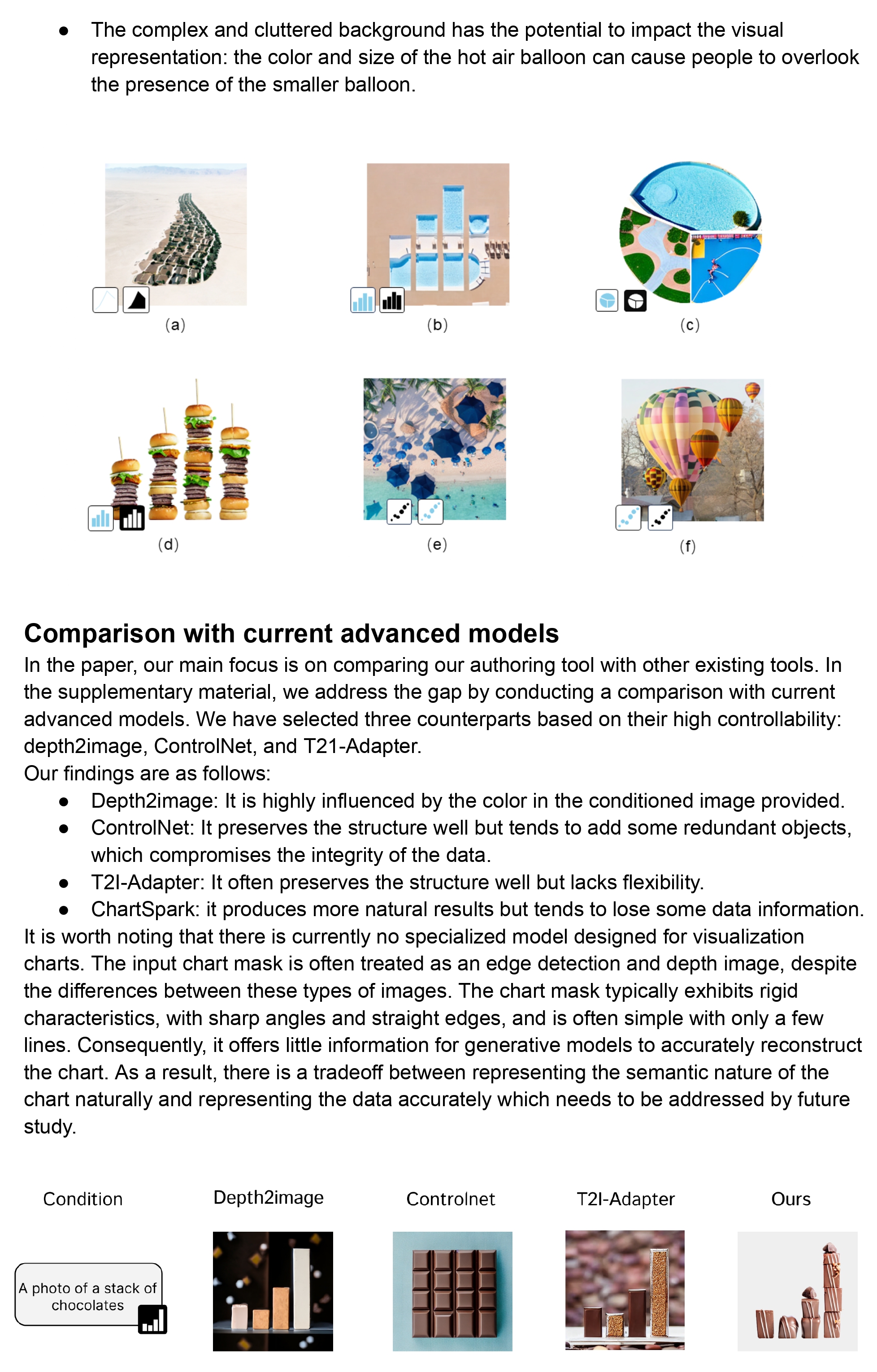
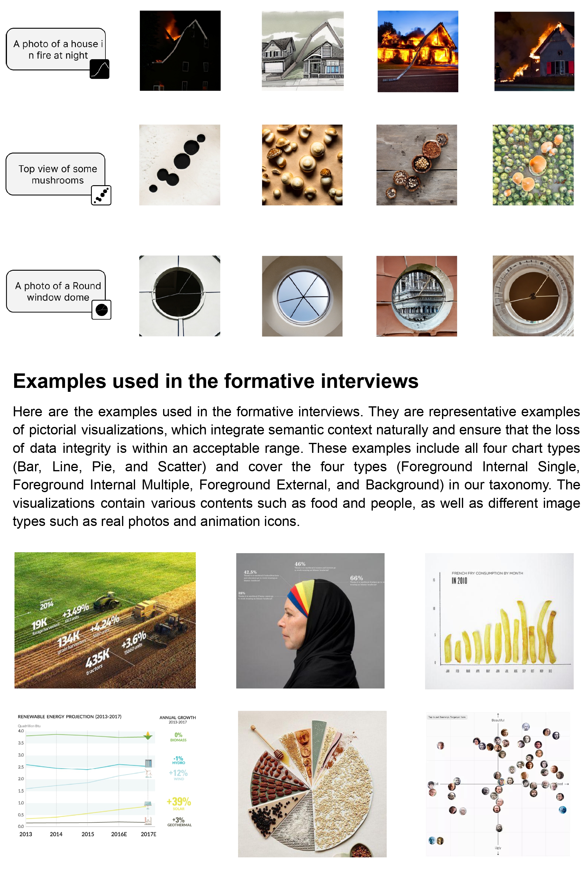
1292 \vgtccategoryRepresentations & Interaction \authorfooter Shishi Xiao, Suizi Huang, Yue Lin, Yilin Ye, and Wei Zeng are with the Hong Kong University of Science and Technology (Guangzhou), Guangzhou, China. Yilin Ye and Wei Zeng are also with the Hong Kong University of Science and Technology, Hong Kong SAR, China. E-mail: {sxiao713@connect., shuang310@connect., ylin491@connect., yyebd@connect., weizeng@}hkust-gz.edu.cn Wei Zeng is the corresponding author.
Let the Chart Spark: Embedding Semantic Context into Chart with Text-to-Image Generative Model
Abstract
Pictorial visualization seamlessly integrates data and semantic context into visual representation, conveying complex information in an engaging and informative manner. Extensive studies have been devoted to developing authoring tools to simplify the creation of pictorial visualizations. However, mainstream works follow a retrieving-and-editing pipeline that heavily relies on retrieved visual elements from a dedicated corpus, which often compromise data integrity. Text-guided generation methods are emerging, but may have limited applicability due to its predefined entities. In this work, we propose ChartSpark, a novel system that embeds semantic context into chart based on text-to-image generative model. ChartSpark generates pictorial visualizations conditioned on both semantic context conveyed in textual inputs and data information embedded in plain charts. The method is generic for both foreground and background pictorial generation, satisfying the design practices identified from an empirical research into existing pictorial visualizations. We further develop an interactive visual interface that integrates a text analyzer, editing module, and evaluation module to enable users to generate, modify, and assess pictorial visualizations. We experimentally demonstrate the usability of our tool, and conclude with a discussion of the potential of using text-to-image generative model combined with interactive interface for visualization design.
keywords:
pictorial visualization, generative model, authoring tool![[Uncaptioned image]](/html/2304.14630/assets/x1.png)
Pictorial visualizations created by ChartSpark. (a) a line chart depicts the date of cherry blossom in High Park each year, embedded with the tree branch while also preserving the trend. (b) A pie chart shows the area of Kubuqi desert and its restoration in 2021, with the three types of land embedded in the corresponding sectors in a consistent style. (c) A line chart shows the amount of glacier mass balance per year, coherently presented with the background glacier structure in compliance with the data trend.
1 Introduction
In the contemporary era of data explosion, visualization technology has become increasingly ubiquitous due to its ability to present complex data in a clear and vivid manner. Pictorial visualization is one of essential techniques used to embed semantic context into chart, enhancing the visual representation hidden in the data[23, 48, 20]. The advantages of pictorial visualization are manifold, including improvements to long-term recall, user engagement and enjoyment, and information acquisition[18, 2, 19, 35]. The aesthetic and practical values make the technique become widely adopted across a diverse range of applications, including advertisement, education, and entertainment[24, 34, 3, 1, 4].
Creating a visually appealing and informative chart requires a certain level of design expertise. Recently, some studies approach the problem with more involved techniques and authoring tools that allow users to select graphic elements and then bind data to them. These approaches typically follow a retrieving-and-editing pipeline, which involves retrieving a suitable image from a large corpus and then adapting it to the visualization. In the retrieving stage, the methods retrieve appropriate visual elements from a large image corpus, using the guidance that can be specified by a data file[11] or an image[60]. The retrieved visual elements are then semi-automatically composed together, with users’ refinements enabled by an interactive interface, in the editing stage. For instance, Infomages[11] retrieves an image containing the target visual subject, and then applies filling or overlaying techniques to adapt the data to fit the image. Alternatively, the retrieved image can serve as a reference with style mimicked for new content[37, 48]. For instance, Vistylist[48] decomposes the style of the reference chart into a tuple of color, font, and icon to guide the creation of new designs. In the process, deep learning techniques (e.g.,[10, 37]) can be employed, to facilitate the maintenance of the visual structure in the reference chart while extending it with new information. With the rise in popularity of language models, numerous works[42, 12, 52, 28] have delved into the automatic generation of charts from text, bridging the gap between visualization and natural language.
Nonetheless, these methods share some common issues. First, retrieving an appropriate visual design that accurately aligns with the data requires a large-scale and high-quality image corpus, which is challenging to construct. Studies in this direction often create new datasets, resulting in various datasets (e.g., [12, 32, 48, 29, 36]) that do not meet each other’s requirements. Second, editing image to bind it with data is an error-prone task due to the trade-off between fitting and adapting the chart into the image. Additionally, current text-guided methods are often limited by a predefined set of recognized entities and specific data types, such as proportion-related statistics [12].
To alleviate these limitations, we propose ChartSpark, a novel pictorial visualization authoring tool that embeds semantic context into charts based on text-to-image generative model, while preserving important visual attributes such as trend. We first extract the target visualized object from the title of chart through a text analyzer. The generation process will then be guided by the object and its corresponding description provided by the user. As an initial step towards utilizing generation techniques for creating visualization charts, we conducted a preliminary study that examines the different display formats of pictorial visualization. Drawing from this study, we categorized the embedded objects into foreground and background, with two types of generation methods for each, namely conditional and unconditional. Unlike their definition in the natural image domain, we determine whether the method is conditional based on whether it takes into account chart information. In addition, we offer an editing module for modifying and adding information, as well as an evaluation module for providing users with feedback on distortion perspectives. By utilizing generation techniques instead of searching for images, we have three advantages over previous methods: 1) Eliminate the tediousness of searching and the possibility of not finding suitable images, 2) Allows for a more natural combination of semantic information and charts with robust generative ability, 3) Cover more visual elements and support flexible text instructions. Therefore, our approach enables a text-guided generation and reduces the complexity of creating a pictorial visualization. In all, our contributions are three-fold:
-
•
We create pictorial visualization based on generative model that can be conditioned by both semantic context and structure information.
-
•
We construct an interface with text analyzer, editing module, and evaluation module to assist user in creation process.
-
•
The case study and expert interview demonstrate the effectiveness of our method.
2 Related Works
Pictorial Visualization. Pictorial visualization incorporates dedicated visual semantics to deliver complex data in an attention-grabbing manner. Except for the original form as ISOTYPE proposed by Otto and Marie Neurath[20], there are various types of expressive visual forms emerging, including icon-based graph[48], proportion-related chart[37], and timeline diagram[10]. Compared to plain charts, the aesthetic appeal of pictorial visualization can envision the topic[7], increase engagement[19, 24, 34], and enhance information absorption[2, 35] and memorability[18, 3, 1]. Bateman et al.[1] revealed that visually figurative charts could increase long-term recall by quantifying memorability attributes, including data-ink ratios and visual densities, without sacrificing interpretation accuracy. Borkin et al.’s[3] “beyond memorability” study concluded that properly used pictograms do not interfere with understanding and can improve recognition.
These pictographs are hailed as “charthelp” [23], which arouses researchers’ interest in exploring the design space for pictorial visualization. Some studies[5, 36] focus on expanding the design space and propose various design dimensions as guidelines for practice. Recently, more efforts have been devoted to investigating the embedding types of combining semantic context and data. Byrne et al.[8] showed the role of figurative background in hybrid visualization as a detailed description of data content. Some researchers[58, 60] focus on replacing the data representation in the foreground of chart. For instance, Ying et al.[58] automated the glyph design that encodes visual metaphor. In line with these research directions, our work aims to categorize and organize the various embedding types from a large pictorial visualization corpus and endeavor to support flexible generation.
Visualization Authoring Tool. Numerous authoring tools have been devised to streamline the creation of pictorial visualizations. Previous works[27, 56, 54] focus on mapping visual elements to data using suitable visual encoding channels, which require the expertise of a trained designer. To simplify the process of designing visual elements, many approaches implement a retrieving-and-editing pipeline to draw inspiration from a vast repository of dedicated resources. There are two types of designs based on retrieval: content-based design and example-based design. Content-based designs[60, 11] involve searching for an image that shares semantic context with the original chart, and merging its visual representation with the chart. For instance, Infomages[11] retrieves an image that contains the target visualization object and subsequently applies filling or overlay techniques to adapt the chart to fit the image. These methods can be time-consuming and compromise data integrity due to manual collation. Example-based designs[48, 37, 10, 53] focus on retrieving a well-crafted chart as a reference and emulating its style for creating new content. Vistylist[48] disentangles the style and elements from a retrieved example and applies them to a new chart.
Despite their apparent simplicity, these approaches still require visualization design expertise that may be challenging for novice users. Some recent works decrease the barrier of creating pictographs by employing language models to guide the creation process[12] or highlight the intended information[52]. Nonetheless, such methods heavily depend on a predetermined set of recognition entities and specific data types, such as only being able to recognize proportion-related statistics[12]. In this work, we develop an authoring tool that simplifies the creation process, mitigating challenges associated with retrieving appropriate images and potential errors when manually editing the visual design. Rather than relying on predefined recognition entities, our tool supports flexible text input to accommodate the diverse requirements.
Text-guided Image Generation. Text-to-image diffusion models have demonstrated great success in producing high-quality images, surpassing previous mainstream GAN models[26, 17] and autoregressive models [59, 41]. Pilot works[22, 13, 49] use a hierarchy of denoising autoencoders with desirable properties such as a stationary training objective and good generalization, laying a solid foundation for following research. To enable text conditions, Rombach et al.[43] incorporate cross-attention layers[21, 9]. Stable Diffusion[40] achieves zero-shot performance through the utilization of CLIP’s multi-modality space[39], while Imagen[45] discovers that pretrained language models can serve as a practical text encoder for generation purposes. However, plain text-guided generation lacks control, leading to the development of models that emphasize controllable manipulation. Some studies[16, 44] finetune generative models with a set of images to maintain consistent style in newly synthesized images. Recent advancements in conditional models[31, 61], which incorporate text as well as additional grounding concepts such as bounding boxes and keypoints, have made it feasible to tackle the issues of layout and composition.
The methods above focus on natural images, while we are pioneering the use of text-to-image generative models in visualization. Some works[57, 55, 46] also discuss the promise of applying vision-language models in visualization. Wu et al.[55] devised several pipelines but are limited by presetting an image with arranged semantic objects and color, and hard to evaluate the data integrity. We propose a universal generative pipeline that includes comprehensive embedding types and generation methods for several different types of charts. This pipeline offers an end-to-end generation process, which frees users from manually designing an initial chart. Furthermore, we integrate the modification and evaluation of the generated charts to enhance performance.
3 Preliminary Study
We conducted a preliminary study to comprehend crafting a pictorial representation. From the formative interviews, we learned the design workflow (Sect. 3.1), and received concerns and expectations that are summarized as design requirements. We collected a corpus of pictorial visualizations and examined the design patterns (Sect. 3.2).
3.1 Formative Interviews
To ensure our authoring tool is accessible to a wide range of users, we conducted formative interviews with people from three different backgrounds: two artists (A1, A2) ![]() who mostly use Adobe Illustrator and P5.js in daily work and have infographic design experience for art track of some conferences, two visualization experts (V1, V2)
who mostly use Adobe Illustrator and P5.js in daily work and have infographic design experience for art track of some conferences, two visualization experts (V1, V2) ![]() who have around 3-year data analysis and dashboard design experience, and two individuals (P1, P2)
who have around 3-year data analysis and dashboard design experience, and two individuals (P1, P2) ![]() without relevant training in art or visualization.
Both artists and experts are familiar with pictorial visualization, as they have learned, seen, and created this type of visual representation. The other two individuals were unfamiliar with the professional term "pictorial visualization," but remembered seeing this type of visualization in daily life after we showed some examples.
without relevant training in art or visualization.
Both artists and experts are familiar with pictorial visualization, as they have learned, seen, and created this type of visual representation. The other two individuals were unfamiliar with the professional term "pictorial visualization," but remembered seeing this type of visualization in daily life after we showed some examples.
Each participant was interviewed individually, and the length of each interview varied from 30 minutes to an hour. The interview consisted of three stages. First, we introduced the concept of pictorial visualization and presented several examples. Please see the Supplementary for detail. During the second stage, participants were provided with data on the global change in a desert area, which included an x-axis for time, a y-axis for the area, and a title. They were then instructed to describe their design workflow using rough sketches on iPad while vocalizing their thought process. It’s flexible and allows for easy import of visual elements into the sketch, as well as manipulation such as rotation and scaling. Throughout the process, we follow the think-aloud protocol, recording each step the user takes in the sketch. Finally, we asked the participants the following questions: 1) What are the key steps involved in creating a pictorial visualization? 2) Which step in the pictorial visualization creation process do you find the most challenging, and why? 3) What expectations and concerns would you have if a generative model were involved in creating pictorial visualizations?
3.1.1 General Workflow
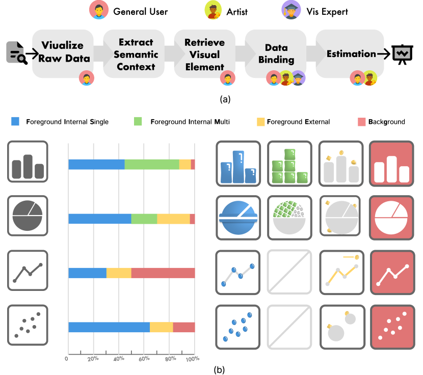
The participants’ workflows in creating pictorial visualizations revealed that there was a general pattern to the process, as shown in Fig. 1 (a). Firstly, participants recognized the theme and data features by reading the title and observing the trend to quickly comprehend the data. Next, they draw or retrieve some visual elements reflecting the theme. Once the visual elements were confirmed, participants attempted to bind the data with these elements using techniques such as rotation, scaling, deformation, and stretching. At the end of the creation process, some participants evaluated the final design to ensure the accuracy of data binding and avoid the error of manual manipulation.
Based on the interviews, we found that participants all mentioned that it was tedious and challenging to bind data with visual elements. “I need to repeat the same operation for each single element,” A2 commented, “If I want to change visual materials, I have to start my work from the scratch. It is not good for creation iteration.” Meanwhile, P1 noted that “The image cutout and anti-aliasing need to use professional software that is hard to use. It is also complicated to deform the visual element to adjust the shape of charts.” Furthermore, both P1 and P2 stated that it was difficult to find images that matched with the theme. “I can barely find any concrete elements, especially for abstract vocabulary,” mentioned by P2. However, neither artists nor visualization experts thought that would be a potential issue. As for evaluating visualization performance, visualization experts raised up the concern about the visual distortion and data integrity compared with the original chart.
3.1.2 Design Requirements
Besides the discussion about the conventional workflow, participants also expressed their expectations and concerns about involving generative models in creating pictorial visualizations. All participants believed that it was essential to capture appropriate semantic context and significant data features before starting to design. They emphasized the necessity of offering visualization preview for raw data so that they could evaluate if the portrayal of data by the generative model was faithful. Participants hoped that the generative model could allow flexible customization in design. Specifically, some participants wanted a controllable generative result including its shape and color while others wanted a large variety of styles in visual elements. Moreover, participants expected generated image can integrate both visual elements and data simultaneously. “Recent text-to-picture models work well in general,” V2 acknowledged, “However, particularly for pictorial visualization, we must consider information encoded by visual channel like the trend for line plot and height for bar chart.” All participants anticipated an evaluation module to validate the quality of their works once the visualization was completed, which provided the visual distortion from the original data including height, area, and angle.
Following the workflow, there are four design requirements based on participants’ concerns (R1 and R4) and expectations (R2 and R3).
-
R1.
Preview data and theme. Visualizing the raw data and obtaining semantic description before starting visualization design.
-
R2.
Personalize visual element. Customizing pictorial visualization, such as color and shape by controllable manipulation, while expanding design space with various styles of visual elements.
-
R3.
Embed semantic context into chart. Integrating the visual element and data automatically and naturally, while supporting flexible embedding methods for the semantic context.
-
R4.
Evaluate the performance. Evaluating visualization design in visual distortion, which indicates the loss of data integrity.
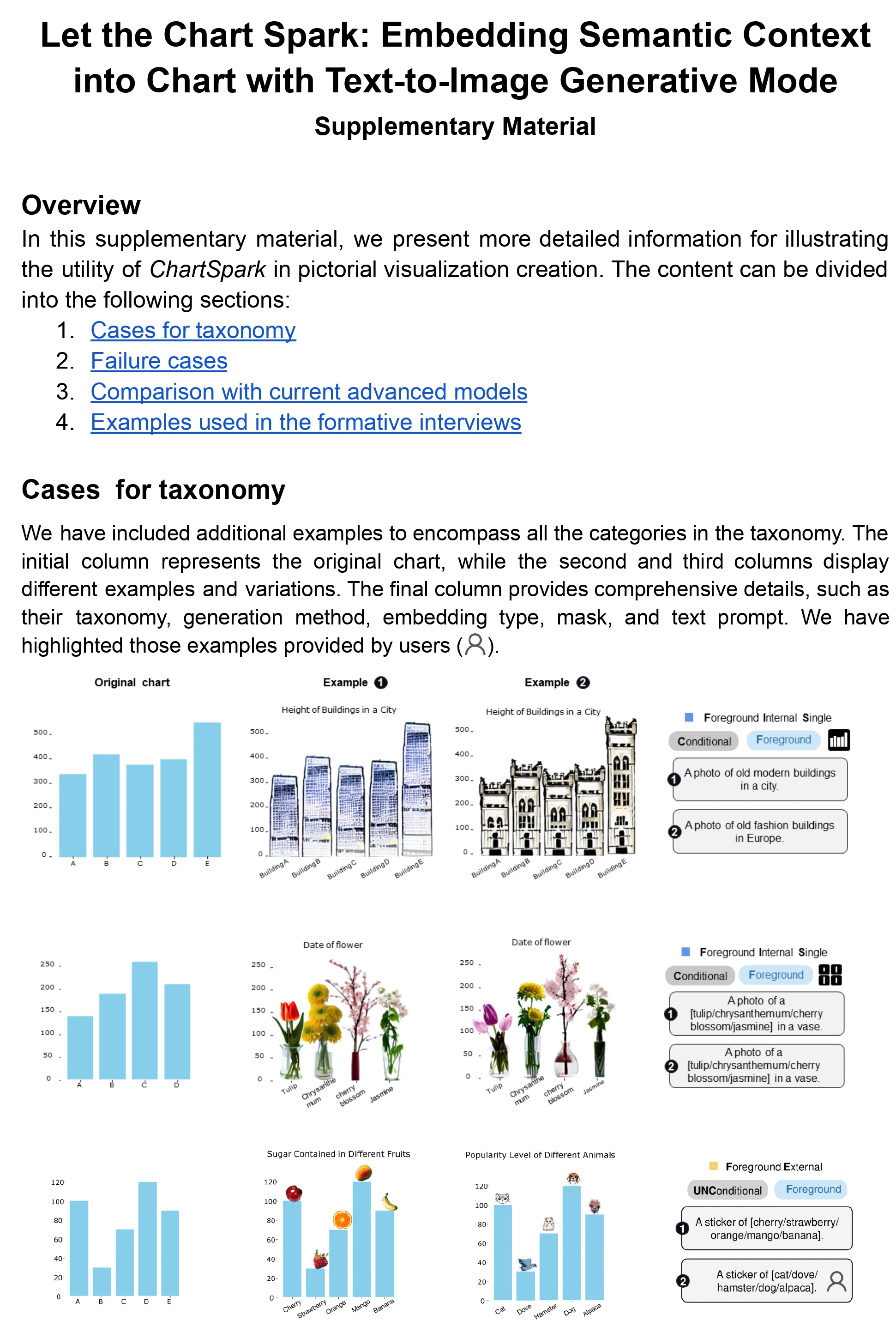
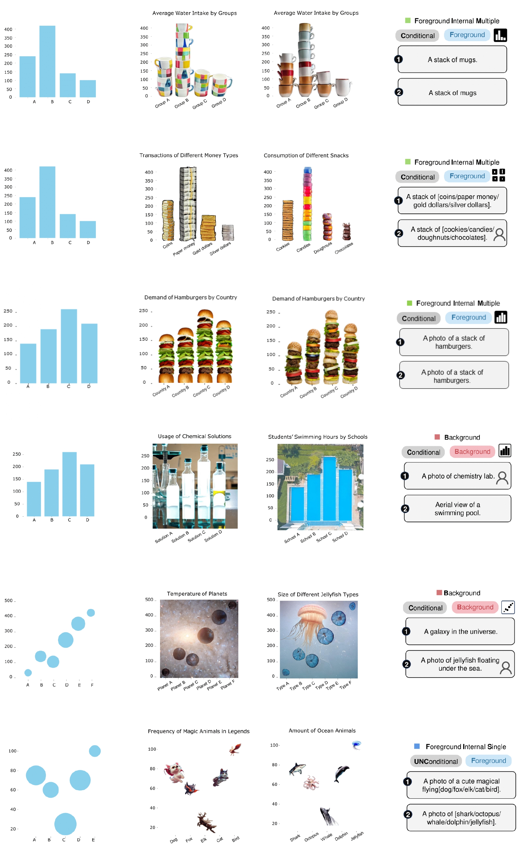
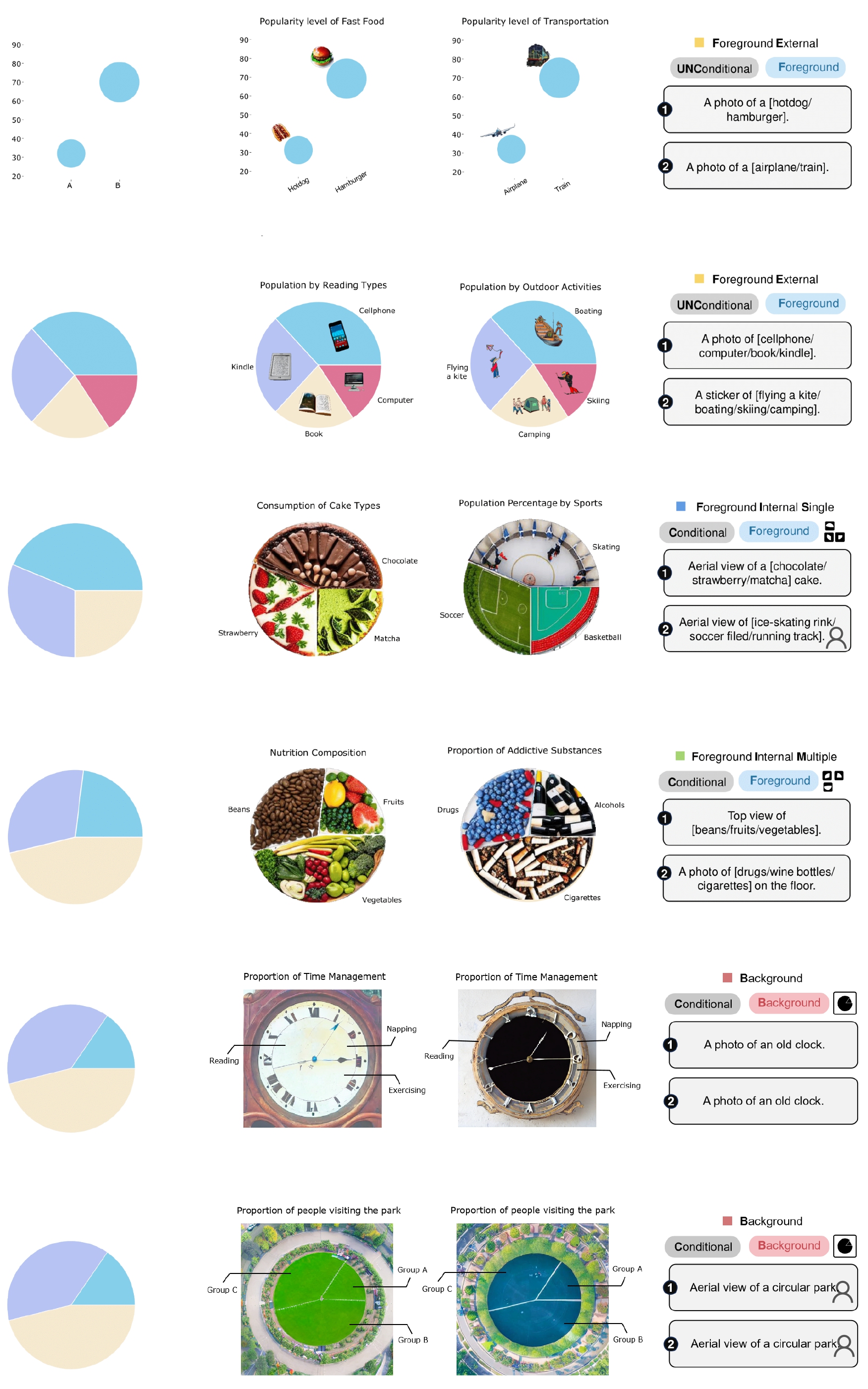
3.2 Pictorial Visualization Corpus
Our preliminary study also unveils systematic patterns for integrating semantic context with data in pictorial visualizations. To collect the sample, we drew upon datasets provided by prior research [11, 48, 29] and manually selected some typical charts, resulting in 587 charts to constitute part of our data. As some of the collected pictographs overly focused on a specific type such as icon-based[48], we also retrieved additional examples from Pinterest and Google to supplement our corpus, comprising 869 samples. We then classified them based on embedding types. To minimize individual judgment bias, each visualization was appraised and categorized by two authors, with a double-check process. As depicted in Fig. 1 (b), we employ various shapes of candy icons to represent this taxonomy.
-
•
Foreground Internal Single (395, 45.5%). The semantic context is embedded in foreground, encoding the visual element in a single manner as the chart itself. Examples include rectangular candies for bars in a bar chart and round candies for points in a scatter plot.
-
•
Foreground Internal Multiple (290, 33.4%). The semantic context is embedded in foreground, encoding the visual element in a multiple manner as the chart itself. For example, a stack of the same candies to form a bar in a bar chart.
-
•
Foreground External (121, 13.9%). The semantic context is embedded in foreground, encoding the visual element in a single manner and locating it externally. For instance, there is a candy next to each sector in a pie chart.
-
•
Background (63, 7.2%). The semantic context is embedded by visual elements in the background. Some examples use an image as a background to depict the theme.
Overall, the design pattern concerning the embedded object can be divided into foreground and background. While the visual representations are diverse, we observe a significant difference in these examples: whether the data can be reflected in the visual element. For foreground external representations, the data information is often not included. In contrast, some examples in the other three types would comply with the data’s inherent trend or magnitude.
4 Method
4.1 Overview
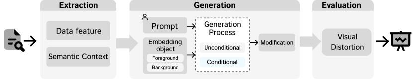
The proposed ChartSpark framework’s workflow is depicted in Fig. 2, comprising three primary stages. In the initial stage, data features are visualized and semantic context is extracted from the raw data, offering users a visual preview and thematic topic to enhance their comprehension of the data (R1). Subsequently, users employ prompt-driven generation to acquire visual elements, embedding the semantic context into the foreground or background in either a conditional or unconditional manner (R2, R3). Ultimately, the evaluation module furnishes a suggestion mechanism to indicate data distortion (R4). In comparison to the workflow depicted in Fig. 1 (a), ChartSpark streamlines the process by supplanting the retrieval and data binding stages with the generation, which mitigates the inconvenience of retrieving visual elements and integrating them with charts. Instead, users provide prompts regarding their preferred style and embedding technique to steer this automatic generation. The ChartSpark framework features a sandwich structure, with the first and last stages ensuring optimization of the middle stage’s performance and augmenting the faithfulness in data and expressiveness in visual representation. The preview presented in the initial stage enables users to intuitively discern the potential distortion of the generated chart, while the evaluation in the final stage delivers more accurate values and explicitly visualizes the error.
4.2 Feature Extraction
User input is tabular data in JSON or CSV format, typically including numerical values for describing x- and y-axis, and a title optionally for conveying the theme. To provide users with a preview of their data, we extract both data features and semantic context, respectively.
Data feature. We offer several chart types from which users can choose to visualize (Fig. 7 ()). To help them efficiently identify patterns and trends concealed within the raw data, we initially visualize them as plain charts (Fig. 7 ()). These data previews function as an indicator to detect any deviations in the subsequent generation process. Furthermore, we extract the data annotation encompassing the and axes and the title in an SVG format, making it editable on the interface.
Semantic context. To extract semantic context, we employ a two-step approach, namely keyword extraction and relevant word retrieval. Initially, we use MPNet[50], a pretrained model with a sentence transformer, to extract keywords from the title provided in the raw data. Moreover, we provide relevant words to stimulate users’ creativity, especially those with limited design expertise, according to Fig. 1 (a). We estimate word similarity using Word2Vec[33] and convert words to vectors. The corpus for retrieval is the English Wikipedia Dump from November 2021, which consists of 199,430 words, each with a 300-dimensional vector representation. However, the retrieved results based solely on similarity may contain proper nouns, such as "NASDAQ", a brand of the financial institute. Using such proper nouns in charts may not be easily recognizable. Instead, we expect general concepts to make pictorial visualization more memorable. Therefore, the frequency of occurrence of the word in the corpus is leveraged to rank the order of the retrieved results, see Fig. 7 ().
4.3 Generation
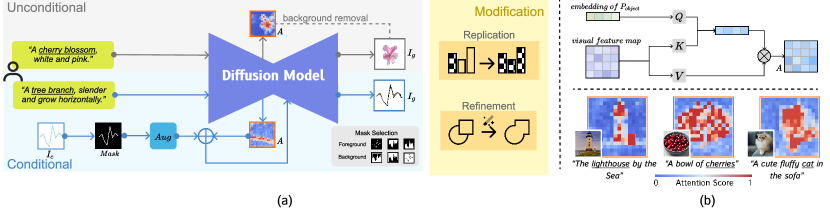
Based on the preliminary study, we identify four embedding types, along with foreground and background as the two main embedding objects. A key observation is that some examples only require visual embellishment containing semantic context, while others need to comply with the inherent data to make it part of the chart itself. In light of this, we devise a generation methodology that employs unconditional and conditional approaches. The fundamental distinction between these approaches hinges on whether the chart information is factored into the generation process. As illustrated in Fig. 3(a), the generation stage consists of three core modules. The unconditional module adopts the fundamental text-to-image diffusion model, subsequently generating a corresponding visual element. For the conditional module, we inject the chart image into the attention map, serving as guidance for the ensuing generation process, as shown in Fig. 3 (b). Lastly, the modification module is tasked with replication and refinement to accommodate the four embedding types and enhance its details.
4.3.1 Unconditional Generation
Diffusion-based generation methods outperform previous generation methods in the quality of generated images and semantic comprehension. In this work, we develop our framework based on the Frozen Latent Diffusion Model (LDM) [43]. Below, we outline the core structure and generation process of LDM to provide some preliminary knowledge. Similar to the previous diffusion models[22, 13, 49], LDM follows a forward process that incorporates Gaussian noise using a Markov process, and a reverse process that denoises to recover the original distribution from reconstructing the image. However, LDM distinguishes itself from other diffusion models by employing compressed and low-dimensional latent space instead of pixel-based diffusion, thereby reducing computational costs for inference. The LDM architecture includes an autoencoder that converts pixel images into latent representations and a UNet that predicts noise and performs denoising in the latent space. To enable text-guided generation, LDM enhances the underlying UNet backbone with a cross-attention mechanism, facilitating the integration of multimodal guidance.
Foreground. In our preliminary analysis of existing pictorial visualization, the foreground is the common object to embed the semantic context and can exhibit various representations. The unconditional generation can produce visual elements to embellish the chart, which closely matches the semantics but does not contain information about underlying data. We achieve this by utilizing the prompt-driven method. The text prompt provided by the user consists of an object and its corresponding description . In Fig. 3 (a), the term with an underline represents , while the term without an underline represents . Given the generated image , our objective is to extract the visual element related to the semantic context from the image. To accomplish this, we use cross-attention between object and to locate the target region, and then remove the background to obtain . As shown in the top of Fig. 3 (b), we obtain the visual feature map of the generated image from the autoencoder and embedding of . Next, we use linear projections to transform them into and . We then multiply and to obtain the attention score, which is subsequently multiplied with to generate the final attention map. In summary, the process can be described as follows:
| (1) |
where the represents the dimension of the latent projection dimension of and , and the function is utilized to normalize the attention score. As shown in the bottom of Fig. 3 (b), the attention score is directly proportional to the strength of the relevance between the image and text. As a result, we can extract the object of interest from a cluttered background by comparing pixel differences. To accomplish this, we first calculate the threshold to distinguish the object and background, obtaining a mask. Next, we perform a pixel-wise comparison at the corresponding positions in to obtain a rough object region, denoted as . Lastly, to achieve a more refined result, we utilize ISNet[38], a state-of-the-art segmentation neural network, to eliminate redundant information. The process can be described through the following equations:
| (2) |
| (3) |
| (4) |
where is the element-wise indicator function on the matrix, represents the total number of pixels in attention map , and is calculated as a matrix with a value of 1 at the object’s location and 0 elsewhere. Since has the same dimensions as , we employ an upsample technique to resize its shape to match that of . represents the redundant information removal operation. The symmetric and hierarchical structure of the UNet involves both downsampling and upsampling, resulting in cross-attention layers being present at different resolutions. In our experiments, we observed that the middle layer exhibited better performance, and empirically set the as 16.
Background. In unconditional background generation, the aim is to incorporate semantic context without extracting objects. To achieve this, we employ a straightforward text-to-image generation by the fundamental diffusion model.
4.3.2 Conditional Generation
Compared with unconditional generation, conditional generation involves integrating chart image to make the generated visual element comply with the data information, such as trend and contour. There are two principal challenges that require addressing[15, 25]: 1) Enhancing generational diversity. As illustrated in Fig. 3, the same line chart can exhibit various types of masks. These masks are provided to enhance result diversity and cater to user customization. We also introduce an augmentation module to expand the possible fusion directions. This allows for a wider range of design options and the iteration of the design process. Nevertheless, we have discovered that conventional augmentation operations used in natural image domains, such as cropping and flipping, are inappropriate for charts and may ultimately jeopardize the data integrity of the chart[30]. 2) Integrating the semantic context and the chart. This entails determine how to condition the generation process by merging the attention map containing semantic context and chart with the data information.
Foreground. The conditional foreground generation emphasizes the integration of semantic context into the visual marks in the chart, while adhering to the data represented within the chart. Intuitively, the semantic context needs to be integrated into the rectangle, line, sector, and bubble for the bar chart, line chart, pie chart, and scatter plot, respectively. Initially, we randomly augment with various manipulations, including Gaussian blur, dynamic blur, and image warp, as depicted in Fig. 3 (a). The augmentation module is established based on the principle of enhancing the diversity of chart element shapes while maintaining data integrity. Then, we obtain the attention map concerning the from the generation process (Eq. 1). To infuse the data information from into the attention map, we utilize as a mask, ensuring the attention map possesses the same shape as the element in . To maximize the fused image by including as much semantic context as possible, we employ two common affine transformations, scaling and rotating. The optimization function can be expressed as:
| (5) |
where is the affine transformation parameterized by scaling parameter and rotation parameter . Finally, we take as input, which integrates semantic context and chart information, yielding .
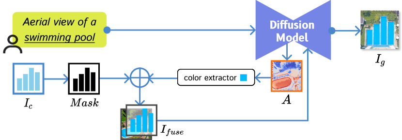
Background. The background serves not only as a container of semantic context but also as a part of the chart that conveys data information. To ensure seamless integration between the chart’s features and the background component, we devise a novel fuse strategy incorporating color and context semantics. In practice, we extract the dominant color based on the attention map, and then synthesize a color mask with the injection of . The resulting color mask is concatenated with the semantic information to obtain . Then we injected the into the generation procedure to achieve reconstruction, yielding the .
4.3.3 Modification
To improve the harmony and consistency of generated results, we devise two modification methods. At the element level, we reuse the generated elements to encode other visual marks in the chart, enhancing its reproducibility and adaptability. At the chart levels, we refine the image details to ensure a cohesive overall design, particularly when merging independently generated visual elements. The main technology we use for these modifications lies in image-to-image generation, which injects the initial image as a condition and we take it to improve the overall consistency of the output image.
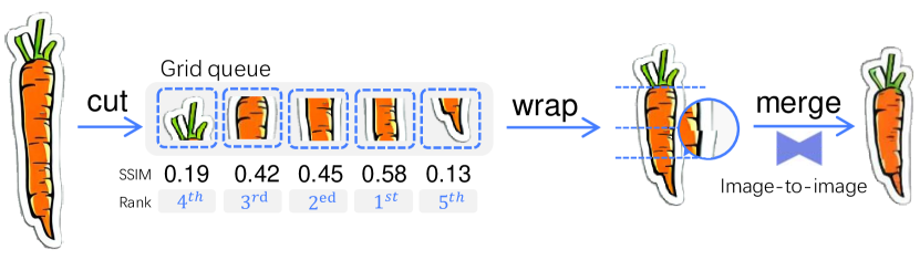
Replication. To apply the visual element to other visual marks in a chart, traditional tools require copying each individual element which is tedious and can cause distortion. We propose a warp-and-merge strategy shown in Fig. 5 to overcome these challenges, especially for bar charts. We start by using the tallest bar in the chart as a reference point to generate the fundamental visual element. This simplifies the task of adapting the element to the shorter bars in the chart. We cut the visual element into five equally elevated grids and compute the structural similarity (SSIM) amid each pair, with higher SSIM indicating greater editability. When wrapping the grids, we scale their height to match the new bar. However, this can result in artifacts and rigid junctions, which are addressed by using a generative model’s image-to-image pipeline to merge the grids seamlessly. This also helps to make each visual mark unique instead of simply replicating them.
Refinement.
During the generation process, users may integrate multiple embedding methods, yielding several independent generation results.
Directly concatenating them can give rise to incoherent styles, as depicted one the left side of the canvas of Fig. 7.
To solve this, we also take an image-to-image pipeline to harmonize the style of the image while preserving its layout and semantic context.
The refined examples in the Fig. 7 which can be triggered by button ![]() .
.
4.4 Evaluation
Generation in data visualization can raise concerns about compromising the integrity of the data and collapsing as “chartjunk”[51, 14]. As stated in requirement R4, it is essential to provide an evaluation module to inform users of any potential distortions that affect data integrity. There are two ways to achieve it: 1) The plain chart with each element editable in canvas (Fig. 7) can be used to compare with the generated results including conditional and unconditional. 2) A evaluation module displays global distortion value and local regions with errors (Fig. 7 ()). We elaborate on the latter method in the following graph.
The evaluation module is designed for conditional generation which considers data in its generation process. Given that each chart employs distinct visual channels to encode data, we tailor our methodology to guarantee reliable evaluation for each chart type. For bar charts, we concentrate primarily on height as an indicator of distortion. For line charts, the portrayal of the trend is of paramount importance. For pie charts, we measure the angle for each sector. For scatter charts, we estimate the size of each point. Compared with the approach in [11], ChartSpark not only provides numerical values but also displays locations with high errors to facilitate modification.
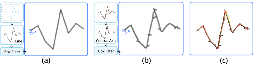
Foreground. It is relatively simple to compute the distortion for bar, pie, and scatter charts, as we can directly calculate the metrics and then compare them with the origin data. However, it’s not straightforward to compare the trend between generated visual element and the line chart (Fig. 6). Unlike Infomages[11], which focus on the line slope, we take the evaluation in pixel-wise. We extract the central axis from the generated element, smooth the pixel values with a box filter, and use a window to slide along the chart and generated element. In each window, we will compute the mean pixel values to get the score as follows:
| (6) |
The higher the score, the greater the similarity between the two windows. Additionally, We visualize the window of this score, with a red square representing the distortion region. We get the global score by averaging each window score along the line.
Background. To simplify the evaluation process, we utilize edge detection techniques that effectively identify prominent boundaries and edges within the image. It allows us to eliminate any redundant and distracting details, enabling us to focus on capturing the precise outline of the target object. Furthermore, to improve the saliency of data-related semantic objects in the image, we use the chart mask to filter out irrelevant objects. Now the problem is simplified and can be approached similarly to the foreground evaluation.
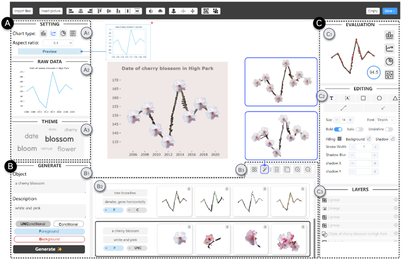
5 Interface
The user interface (Fig. 7) is divided into three core modules that correspond to the process of feature extraction (), generation (), and evaluation and editing (). The central canvas of the interface allows users to flexibly manipulate elements, such as rotating and scaling.
Feature extraction. To begin, the user uploads a data file and selects a desired chart type and aspect ratio in the settings panel (). The raw data is displayed in , and the relevant semantic context is shown in . The data annotation information will also be rendered on the canvas. Both the visual representation of the raw data and the semantic context aid users in understanding the data and supplying a design precedent before creation. They are displayed throughout the creation process, enabling users to compare the generated visualizations with the original data (R1).
Generation. The Generation module comprises three components: generation options (), gallery (), and modification (). In , users can customize the generation object and generation styles utilizing text boxes and select the generation target and method through two sets of buttons (R2, R3). The generation results are displayed in , labeled with the generation options. Users can choose whether to preserve or discard the generation element in the , and regeneration can be performed from . The view is closely linked to , as the content in the row user clicks in will accordingly be shown in , promoting the backtrack of generation. The first two buttons of serve as modifications in the generation process, corresponding to the replication and refinement functions described in Sect. 4.3.3.
Evaluation and editing. offers users data distortion evaluation with both explicit qualitative value and error visualization (R4). comprises several tools allowing users to edit their visualizations, including font (such as type, size, and bolding), basic shapes, effects, and strokes. displays the layers of elements, and provides the ability to adjust the layer order and visibility.
6 Evaluation
In order to comprehensively evaluate the efficacy of ChartSpark, we performed three distinct analyses, including example applications, a user study, and an expert interview.
6.1 Example Applications
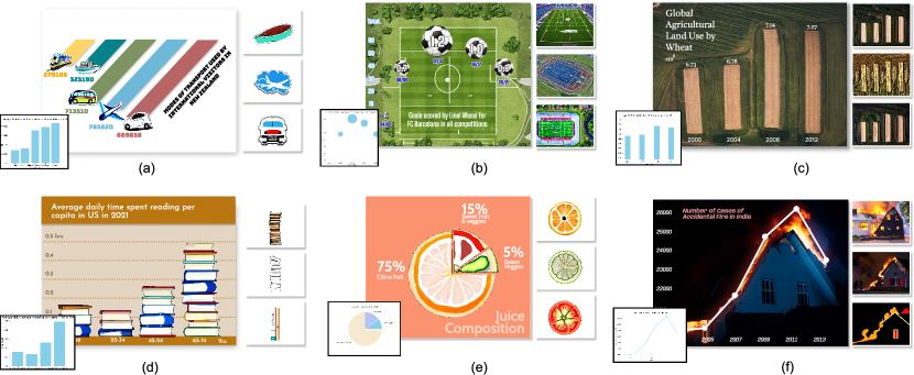
Based on the taxonomy used in the preliminary study, we utilized ChartSpark to generate the four primary categories of pictorial visualizations. As illustrated in Fig. 8, we present the basic chart for each pictograph in the lower left corner, while showcasing the alternative visual elements generated on the right side.
Foreground External. As shown in Fig. 8 (a), the shape of visual elements in this pictorial visualization is not constrained by the data. Instead, they function as embellishments to the chart. To generate these elements, we have adopted the unconditional foreground mode, which enables us to extract the target through , while using the same , which we have defined as “a well-designed sticker”, ensures consistency in the style of different transportation representations.
Foreground Internal Single. Fig. 8 (b) and (e) show using the generated visual element to replace the original visual mark. In (b), the generated pictograph employs the same encoding as the original chart, with height signifying goals scored during a specific season and size indicating the average goal. Football elements replace the bubbles, and a football pitch is generated to complement the foreground. Fig. 8 (e) displays the cross-section of each fruit and vegetable supplanting the original fan-shaped segments in the pie chart.
Foreground Internal Multiple. Fig. 8 (d) involves multiple replication units within a single bar. ChartSpark provides various visually diverse elements that fit the height of the bar using the same prompt, “the pile of books”. Each book in the element is unique, circumventing monotonous duplication. Moreover, each bar is filled with the element naturally and automatically without manual manipulation.
Background. In Fig. 8 (c) and (f), the chart has been merged into the image in a more natural manner under the mode of background and conditional, which encodes both the semantic and data information. In case (c), as the data describes the land use of wheat, the prompt is utilized as “aerial view of wheat field”. In case (f), the fire trend of the generated image aligns with the original chart.
6.2 User Study
We conducted a user study to evaluate the usability and effectiveness of our tool to facilitate creation of pictorial visualization. The study consists of a survey, succeeded by a semi-structured interview to obtain more in-depth qualitative feedback.
Participants: We recruited 8 participants aged between 21 to 28, who are visualization users interested in pictorial visualization. The participants are graduate students majoring in different disciplines from computer science, business, art and design, to architecture. All participants have used or designed pictorial visualization.
Procedure: The study was conducted in a one-on-one and face-to-face manner. First, we showed some examples of pictorial visualization and introduced to the participants the basic concepts including the embedding objects (foreground and background) and embedding techniques (conditional and unconditional). Next, we presented the interface to the participant and introduced the functionalities. We then guided the participant through a step-by-step process of creating a pictorial visualization. Finally, we encouraged them to independently explore the authoring tool for 10 minutes to gain further familiarity. Afterwards, participants were asked to make a pictorial visualization from given data files. We carefully observed their creation process and documented their inquiries and remarks. Upon finishing the creation, the participant took the survey and answered four 5-point Likert scale questions. The survey was followed by a short interview for additional feedback. Each study lasted for about 50 minutes. Participant were compensated with a gift of 10$ after completing the study.
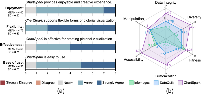
Result Analysis: We report our survey results here, see Fig. 9 (a).
-
•
Enjoyment: Notably, the novel creative experience provided by our tool proved to be delightful for the majority of participants (). P1 stated, “I really enjoy engaging with the AI and see all the interesting possibilities generated by the tool.” “I have tried many popular text-to-image tools, this is the first that enables me to employ AI in visualization. It has heightened my engagement in the creative process,” commented P8.
-
•
Flexibility: The majority of participants praised the flexibility of our tool (). P3 said, “I could freely switch between foreground elements and background elements and combine them to create a variety of interesting pictorial visualizations.” P7 added, “This tool driven by AI generative model helped me find design materials of diverse styles which are not easily available in traditional design pipeline where I had to spend much time searching for various references.”
-
•
Effectiveness: All participants acknowledged the effectiveness of our system for creating pictorial visualization (). “As I am not adept at professional graphic design tools like Adobe Illustrator, this tool makes it possible to many people like me,” P6 remarked. “I’m amazed that the generated elements can comply with the data trend, and there is a wide variety of options.”
-
•
Ease of use: Most participants agreed that the authoring tool is easy to use (). “Most of the functions are intuitive, easy to understand and use,” P5 commented. “The whole creation process is smooth because of the simple design of the interface and the convenient functions supported by AI such as the replication button,” P1 said. “However, I think the object and description can be put into one text entry box to make it more convenient,” P2 suggested.
Feedback: We summarize the feedback from the interview as follows.
-
•
One-shot generation vs. more intermediate control: Some novice users may prefer quick generation without much human intervention. For example, P4 said, “It would be really efficient if I only need to import the data and the tool just generate ready-made pictorial visualization for me.” However, users who are more experienced in design favor more control of the intermediate process and the results. “Even though AI can provide impressive inspiration, it is better for me if I can still pick what materials I want to use like in this tool. But I guess more control such as by sketch would also be beneficial.”
-
•
Faithful evaluation: The users also talked about CharSpark supporting reliable data presentation. P3 said, “I worry that pictorial visualizations may overly emphasize aesthetics, sacrificing readability. Thus, I value the design featuring editable data annotations, saving me the trouble of adding sticks and labels manually.” P5 mentioned, “The evaluation view displays precise error location, allowing me to easily identify problematic areas, which is far more intuitive than simply presenting numerical values.”
-
•
Integrated tool: Users also pointed out the importance of an integrated tool. “Nowadays many AI applications do not come with post-editing functions. As a result, I often have to export the AI-generated result to external tool like Photoshop for editing. So I appreciate the effort to add several editing functions, but I also suggest adding more advanced functions like those in Photoshop or develop a plugin for Photoshop,” P1 commented.
6.3 Expert Interview
To conduct a thorough comparison of the performance of ChartSpark with previous tools, including DataQuilt [60] and Infomages [11], we engaged four designers and experts with extensive experience in information design to evaluate these tools. Designer 1 (D1) has expertise in graphic design and has been working in the information design field across both print and digital media for over six years. Designer 2 (D2) specializes in UX/UI design and has been working in this field for over three years. Designer 3 (D3) focuses on data storytelling and interactive art, and is familiar with AI-driven techniques for creating engaging visual content. Expert 1 (E1) has been engaged in both academic and industry projects for over four years, focusing on the development and evaluation of visualization techniques and tools.
We established six metrics that comprehensively cover the creation of pictorial visualizations for detailed assessment of each tool. Data Integrity evaluates the system’s response to data errors and the tool’s ability to communicate the errors to users. Generalization examines the tool’s ability to support a broad range of methods to incorporate semantic context into charts. Fitness reflects the successful integration of visual elements and charts, taking into account aspects such as trend. Customization evaluates the tool’s capacity to tailor visual elements and offer a diverse set of customization options. Accessibility depicts the ease with which visual elements can be obtained for design purposes. Manipulation measures how effective the tool is to help users alter visual elements for the specific needs of charts. The first metric focused on faithfulness, while the second to fourth metrics focused on the expressiveness of pictorial visualization. The last two metrics evaluated the usability of the tools. To begin the evaluation process, we presented several cases to each participant, revealing embedding techniques that merge semantic context and data information in pictorial visualizations. Next, we showed a video of each tool, demonstrating the overall operation process and main function modules in a randomized order. We then presented additional cases to the participants and asked them how to create a pictorial visualization if they use these tools following the think-aloud protocol. After completing the evaluation process, each participant provided a score for each tool based on the six evaluation metrics. The results are shown in Fig. 9 (b).
Faithfulness. D1 mentioned that “It is challenging to check the accuracy of data binding in DataQuilt as there is no evaluation offered.” On the other hand, D3 pointed out that “ChartSpark offers both numerical evaluation results and shows the error location, which can guide users on how to improve the visualization.”
Expressiveness. Regarding expressiveness, all participants agreed that ChartSpark is more versatile in embedding semantic context to both foreground and background, whereas Infomages focus on the background and DataQuilt on the foreground. D2 commented that “Infomages use an image as the main component, which makes customizability weak and compatibility with chart types limited.” D1 appreciated Infomages’ design and found that the merge of elements and charts seems very natural. However, she also mentioned that “it is difficult to find an image with the same trend as the plain chart.” D4 commented on the embedding methods of DataQuilt and Infomages, describing them as “unidirectional and full of compromises”. They explained that “DataQuilt extracts visual elements from images and adapts them to fit the height or area of the original chart, while Infomages alters the chart’s shape to accommodate the semantic image.” In contrast, ChartSpark’s generation results represent a bilateral merge, reshaping the visual elements intrinsically. D3 said that “There is no much room for me to change the shape or color in elements in Infomages and DataQuilt.” D2 praised ChartSpark’s customization capabilities, noting that “If I want to change the number or color of visual elements, I can achieve it by modifying the description prompt. I find the alternative element in the gallery is important for design iteration.” But D2 worried that the generated element may not meet the high resolution requirement. If so, she will prefer to upload the visual element.
Usability. All participants mentioned the “difficulty to retrieve the element containing the exact same encoding as the given data, particularly for Infomages”. Especially the overlay performance of Infomages “heavily relies on the retrieved image”. D4 expressed appreciation for ChartSpark: “It eliminates the need to search for images and allows to generate as many visualizations as desired.” However, D1 raised concerns about potential copyright issues arising from AI-generated content. Regarding the manipulation of these tools, D2 said, “Infomages requires the least manual intervention among the tools but meanwhile limits the combination ways of merging the visual element and chart. DataQuilt primarily automates batch operations for mapping elements to data, but users still need to consider how to adapt the visualizations. ChartSpark, on the other hand, incorporates data consideration when providing visual elements.” Furthermore, D3 pointed out that data annotation and axis automation are available in ChartSpark, which could decrease the workload during the creation.
7 Discussion
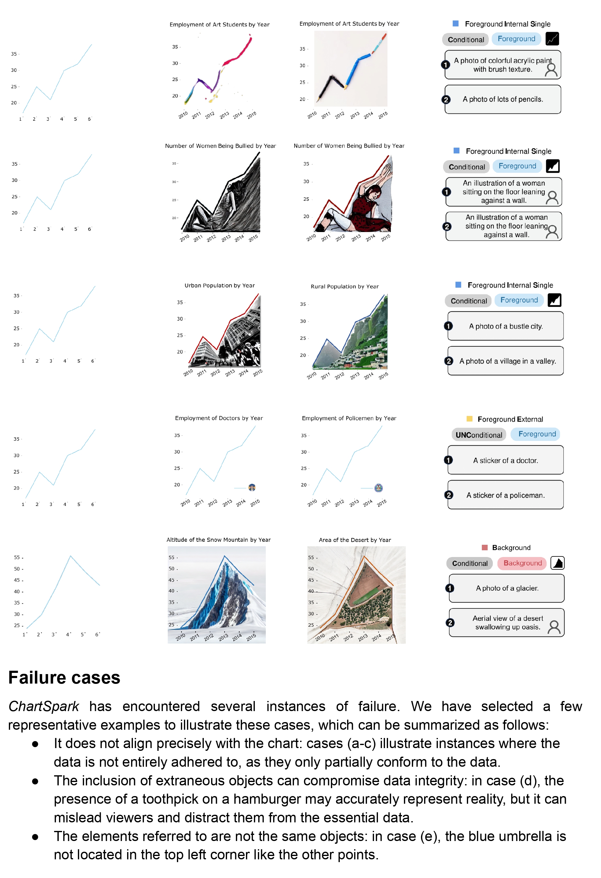
By utilizing the generative model, we can embed both semantic context and data in crafting a pictorial visualization. However, our system still has several limitations that should be addressed in future work.
7.1 Limitation
Diversity of supported visualization. Currently, ChartSpark only supports a limited set of chart types, including bar charts, line plots, pie charts, and scatter plots. This limitation can be problematic when users require more diverse chart types to communicate their data effectively.
Controllability of generative model. The results generated by our tool may be unexpected for users due to various factors. The design of the prompt plays a crucial role in meeting specific requirements, but even minor changes to the prompt can have a significant impact on the generated output. Additionally, there may be inconsistencies in style as the visual elements are generated independently. Making adjustments for generated elements is not flexible. For example, a user may want to modify the color of a generated object while preserving other attributes.
Ethics and responsibility of generative model. The generative model may face potential criticism on copyright or bias issues, as the training process digests a huge amount of data obtained from the web, which is unfiltered and imbalanced. The accessibility of such models may also have downside as it increases the risk of deceptive content and copyright infringement. Recent research[47] aims to suppress inappropriate generation like pornography and racially-charged content. However, it is crucial for both creators and viewers of AI-generated content to adopt a critical mindset.
Faithfulness in data expression. A trade-off exists between maintaining data integrity and crafting a visually appealing design. Accurately preserving the data is hard for the model as it’s rare for the object in real life to have such a rigid and unnatural outline.
7.2 Future Work
Enrich the design space. To enhance the practicality of ChartSpark, we should consider integrating more types of infographics. Furthermore, the embedding object can be subdivided into more granular and targeted categories for each specific type of chart to achieve better data communication and stronger visual expressiveness. Currently, our augmentation modules utilize the same manipulation techniques for all types of charts. However, due to differences in visual encoding among chart types, a more targeted design is necessary to ensure effective data communication and stronger visual expressiveness.
Improve controllability of generative model. To improve the controllability of the generation process, we can incorporate different forms of prior knowledge and allow for editing and iteration of generated results. Besides prompt-based input, other inputs like sketches and semantic maps can be included to provide more flexible and diverse information. Furthermore, we can enhance the iteration process by allowing users to select satisfactory results as a baseline for future generations, instead of generating independently each time. To address the trade-off between a more natural semantic context and data integrity, we can add a slider to the interface for users to adjust the level of emphasis on each aspect to their specific needs and preferences. Additionally, we can enable users to edit the generated visual elements through an instruction-based approach [6] for localized editing instead of regenerating from scratch.
Enhance faithfulness in data expression. To enhance the faithfulness of ChartSpark, there can be two areas of improvement. One is to further enhance the evaluation module, as numerical values and error locations may not be explicit enough to guide them in rectifying visual elements, and more detailed inferences and specific suggestions should be provided. The other way to improve faithfulness is to mitigate potential distortions that may occur during the creation process. It is important to conduct thorough detection and analysis at each stage of the generation process for identifying potential issues like unsuccessful element extraction or poor background removal. By detection and analysis, users can get better generated images avoiding various failures that can compromise the overall quality and accuracy of the visualizations.
8 Conclusion
In this paper, we propose a novel framework named ChartSpark to create pictorial visualizations. The framework employs a text-to-image generative model to integrate both the semantic context and chart information. ChartSpark is flexible and compatible with both unconditional and conditional methods to fuse the semantic context with charts. It is also versatile and can be applied to both foreground and background visualizations. Additionally, we have developed a user interface that integrates feature extraction, generation, and evaluation to facilitate the creation process. To evaluate the effectiveness of ChartSpark, we present several cases covering the four main forms of pictorial visualizations. The feedback from user studies and expert interviews demonstrates the framework’s effectiveness. Source code of the model and interface, and the pictorial visualization corpus are released at https://github.com/SerendipitysX/ChartSpark to promote future work in this direction.
References
- [1] S. Bateman, R. L. Mandryk, C. Gutwin, A. Genest, D. McDine, and C. Brooks. Useful junk? the effects of visual embellishment on comprehension and memorability of charts. In Proc. ACM CHI, pp. 2573–2582, 2010. doi: 10 . 1145/1753326 . 1753716
- [2] R. Borgo, A. Abdul-Rahman, F. Mohamed, P. W. Grant, I. Reppa, L. Floridi, and M. Chen. An empirical study on using visual embellishments in visualization. IEEE Trans. Vis. Comput. Graph., 18(12):2759–2768, 2012. doi: 10 . 1109/TVCG . 2012 . 197
- [3] M. A. Borkin, Z. Bylinskii, N. W. Kim, C. M. Bainbridge, C. S. Yeh, D. Borkin, H. Pfister, and A. Oliva. Beyond memorability: Visualization recognition and recall. IEEE Trans. Vis. Comput. Graph., 22(1):519–528, 2015. doi: 10 . 1109/TVCG . 2015 . 2467732
- [4] M. A. Borkin, A. A. Vo, Z. Bylinskii, P. Isola, S. Sunkavalli, A. Oliva, and H. Pfister. What makes a visualization memorable? IEEE Trans. Vis. Comput. Graph., 19(12):2306–2315, 2013. doi: 10 . 1109/TVCG . 2013 . 234
- [5] J. Boy, A. V. Pandey, J. Emerson, M. Satterthwaite, O. Nov, and E. Bertini. Showing people behind data: Does anthropomorphizing visualizations elicit more empathy for human rights data? In Proc. ACM CHI, pp. 5462–5474, 2017. doi: 10 . 1145/3025453 . 3025512
- [6] T. Brooks, A. Holynski, and A. A. Efros. InstructPix2Pix: Learning to follow image editing instructions. In Proc. CVPR, pp. 18392–18402, 2023.
- [7] A. Burns, C. Xiong, S. Franconeri, A. Cairo, and N. Mahyar. Designing with pictographs: Envision topics without sacrificing understanding. IEEE Trans. Vis. Comput. Graph., 28(12):4515–4530, 2021. doi: 10 . 1109/TVCG . 2021 . 3092680
- [8] L. Byrne, D. Angus, and J. Wiles. Figurative frames: A critical vocabulary for images in information visualization. Information Visualization, 18(1):45–67, 2019. doi: 10 . 1177/1473871617724
- [9] H. Chefer, Y. Alaluf, Y. Vinker, L. Wolf, and D. Cohen-Or. Attend-and-excite: Attention-based semantic guidance for text-to-image diffusion models. arXiv preprint arXiv:2301.13826, 2023.
- [10] Z. Chen, Y. Wang, Q. Wang, Y. Wang, and H. Qu. Towards automated infographic design: Deep learning-based auto-extraction of extensible timeline. IEEE Trans. Vis. Comput. Graph., 26(1):917–926, 2019. doi: 10 . 1109/TVCG . 2019 . 2934810
- [11] D. Coelho and K. Mueller. Infomages: Embedding data into thematic images. Comput. Graph. Forum, 39(3):593–606, 2020. doi: 10 . 1111/cgf . 14004
- [12] W. Cui, X. Zhang, Y. Wang, H. Huang, B. Chen, L. Fang, H. Zhang, J.-G. Lou, and D. Zhang. Text-to-Viz: Automatic generation of infographics from proportion-related natural language statements. IEEE Trans. Vis. Comput. Graph., 26(1):906–916, 2019. doi: 10 . 1109/TVCG . 2019 . 2934785
- [13] P. Dhariwal and A. Nichol. Diffusion models beat gans on image synthesis. In Proc. NIPS, vol. 34, pp. 8780–8794, 2021.
- [14] S. Few and P. Edge. The chartjunk debate. Visual Business Intelligence Newsletter, pp. 1–11, 2011.
- [15] K. Frans, L. Soros, and O. Witkowski. CLIPDraw: Exploring text-to-drawing synthesis through language-image encoders. In Proc. NIPS, vol. 35, pp. 5207–5218, 2022.
- [16] R. Gal, Y. Alaluf, Y. Atzmon, O. Patashnik, A. H. Bermano, G. Chechik, and D. Cohen-Or. An image is worth one word: Personalizing text-to-image generation using textual inversion. In Proc. ICML, 2023.
- [17] R. Gal, O. Patashnik, H. Maron, A. H. Bermano, G. Chechik, and D. Cohen-Or. StyleGAN-NADA: CLIP-guided domain adaptation of image generators. ACM Trans. Graph., 41(4):1–13, 2022. doi: 10 . 1145/3528223 . 3530164
- [18] S. Haroz, R. Kosara, and S. L. Franconeri. ISOTYPE visualization: Working memory, performance, and engagement with pictographs. In Proc. ACM CHI, pp. 1191–1200, 2015. doi: 10 . 1145/2702123 . 2702275
- [19] L. Harrison, K. Reinecke, and R. Chang. Infographic aesthetics: Designing for the first impression. In Proc. ACM CHI, pp. 1187–1190, 2015. doi: 10 . 1145/2702123 . 2702545
- [20] F. Hartmann. Visualizing social facts: Otto Neurath’s ISOTYPE project. In European Modernism and the Information Society, pp. 279–293. Routledge, 2017.
- [21] A. Hertz, R. Mokady, J. Tenenbaum, K. Aberman, Y. Pritch, and D. Cohen-Or. Prompt-to-prompt image editing with cross attention control. In Proc. ICML, 2023.
- [22] J. Ho, A. Jain, and P. Abbeel. Denoising diffusion probabilistic models. In Proc. NIPS, vol. 33, pp. 6840–6851, 2020.
- [23] N. Holmes. Joyful Infographics: A Friendly, Human Approach to Data. CRC Press, 2022.
- [24] J. Hullman, E. Adar, and P. Shah. Benefitting InfoVis with visual difficulties. IEEE Trans. Vis. Comput. Graph., 17(12):2213–2222, 2011. doi: 10 . 1109/TVCG . 2011 . 175
- [25] S. Iluz, Y. Vinker, A. Hertz, D. Berio, D. Cohen-Or, and A. Shamir. Word-as-image for semantic typography. arXiv preprint arXiv:2303.01818, 2023.
- [26] T. Karras, S. Laine, and T. Aila. A style-based generator architecture for generative adversarial networks. In Proc. CVPR, pp. 4401–4410, 2019.
- [27] N. W. Kim, E. Schweickart, Z. Liu, M. Dontcheva, W. Li, J. Popovic, and H. Pfister. Data-driven guides: Supporting expressive design for information graphics. IEEE Trans. Vis. Comput. Graph., 23(1):491–500, 2016. doi: 10 . 1109/TVCG . 2016 . 2598620
- [28] C. Lai, Z. Lin, R. Jiang, Y. Han, C. Liu, and X. Yuan. Automatic annotation synchronizing with textual description for visualization. In Proc. ACM CHI, pp. 1–13, 2020. doi: 10 . 1145/3313831 . 3376443
- [29] X. Lan, Y. Shi, Y. Zhang, and N. Cao. Smile or scowl? looking at infographic design through the affective lens. IEEE Trans. Vis. Comput. Graph., 27(6):2796–2807, 2021. doi: 10 . 1109/TVCG . 2021 . 3074582
- [30] H. Li, Y. Wang, A. Wu, H. Wei, and H. Qu. Structure-aware visualization retrieval. In Proc. ACM CHI, pp. 1–14, 2022. doi: 10 . 1145/3491102 . 3502048
- [31] Y. Li, H. Liu, Q. Wu, F. Mu, J. Yang, J. Gao, C. Li, and Y. J. Lee. GLIGEN: open-set grounded text-to-image generation. In Proc. CVPR, pp. 22511–22521, 2023.
- [32] M. Lu, C. Wang, J. Lanir, N. Zhao, H. Pfister, D. Cohen-Or, and H. Huang. Exploring visual information flows in infographics. In Proc. ACM CHI, p. 1–12, 2020.
- [33] T. Mikolov, K. Chen, G. Corrado, and J. Dean. Efficient estimation of word representations in vector space. arXiv preprint arXiv:1301.3781, 2013.
- [34] A. V. Moere and H. Purchase. On the role of design in information visualization. Information Visualization, 10(4):356–371, 2011. doi: 10 . 1177/1473871611415996
- [35] A. V. Moere, M. Tomitsch, C. Wimmer, B. Christoph, and T. Grechenig. Evaluating the effect of style in information visualization. IEEE Trans. Vis. Comput. Graph., 18(12):2739–2748, 2012. doi: 10 . 1109/TVCG . 2012 . 221
- [36] L. Morais, Y. Jansen, N. Andrade, and P. Dragicevic. Showing data about people: A design space of anthropographics. IEEE Trans. Vis. Comput. Graph., 28(3):1661–1679, 2020. doi: 10 . 1109/TVCG . 2020 . 3023013
- [37] C. Qian, S. Sun, W. Cui, J.-G. Lou, H. Zhang, and D. Zhang. Retrieve-then-adapt: Example-based automatic generation for proportion-related infographics. IEEE Trans. Vis. Comput. Graph., 27(2):443–452, 2020. doi: 10 . 1109/TVCG . 2020 . 3030448
- [38] X. Qin, H. Dai, X. Hu, D.-P. Fan, L. Shao, and L. Van Gool. Highly accurate dichotomous image segmentation. In Proc. ECCV, pp. 38–56, 2022.
- [39] A. Radford, J. W. Kim, C. Hallacy, A. Ramesh, G. Goh, S. Agarwal, G. Sastry, A. Askell, P. Mishkin, J. Clark, et al. Learning transferable visual models from natural language supervision. In Proc. ICML, pp. 8748–8763, 2021.
- [40] A. Ramesh, P. Dhariwal, A. Nichol, C. Chu, and M. Chen. Hierarchical text-conditional image generation with CLIP latents. arXiv preprint arXiv:2204.06125, 2022.
- [41] A. Ramesh, M. Pavlov, G. Goh, S. Gray, C. Voss, A. Radford, M. Chen, and I. Sutskever. Zero-shot text-to-image generation. In Proc. ICML, pp. 8821–8831, 2021.
- [42] M. M. Rashid, H. K. Jahan, A. Huzzat, R. A. Rahul, T. B. Zakir, F. Meem, M. S. H. Mukta, and S. Shatabda. Text2chart: A multi-staged chart generator from natural language text. In Proc. PAKDD, pp. 3–16, 2022.
- [43] R. Rombach, A. Blattmann, D. Lorenz, P. Esser, and B. Ommer. High-resolution image synthesis with latent diffusion models. In Proc. CVPR, pp. 10684–10695, 2022.
- [44] N. Ruiz, Y. Li, V. Jampani, Y. Pritch, M. Rubinstein, and K. Aberman. Dreambooth: Fine tuning text-to-image diffusion models for subject-driven generation. arXiv preprint arXiv:2208.12242, 2022.
- [45] C. Saharia, W. Chan, S. Saxena, L. Li, J. Whang, E. Denton, S. K. S. Ghasemipour, B. K. Ayan, S. S. Mahdavi, R. G. Lopes, et al. Photorealistic text-to-image diffusion models with deep language understanding. In Proc. NIPS, pp. 36479–36494, 2022.
- [46] V. Schetinger, S. Di Bartolomeo, M. El-Assady, A. M. McNutt, M. Miller, and J. L. Adams. Doom or deliciousness: Challenges and opportunities for visualization in the age of generative models. Comput. Graph. Forum, 42(3):423–435, 2023. doi: 10 . 1111/cgf . 14841
- [47] P. Schramowski, M. Brack, B. Deiseroth, and K. Kersting. Safe latent diffusion: Mitigating inappropriate degeneration in diffusion models. In Proc. CVPR, pp. 22522–22531, 2023.
- [48] Y. Shi, P. Liu, S. Chen, M. Sun, and N. Cao. Supporting expressive and faithful pictorial visualization design with visual style transfer. IEEE Trans. Vis. Comput. Graph., 29(1):236–246, 2022. doi: 10 . 1109/TVCG . 2022 . 3209486
- [49] J. Song, C. Meng, and S. Ermon. Denoising diffusion implicit models. 2022.
- [50] K. Song, X. Tan, T. Qin, J. Lu, and T.-Y. Liu. MPNet: Masked and permuted pre-training for language understanding. In Proc. NIPS, vol. 33, pp. 16857–16867, 2020.
- [51] E. R. Tufte. The Visual Display of Quantitative Information. Graphics Press, USA, second ed., 2001.
- [52] Y. Wang, Z. Hou, L. Shen, T. Wu, J. Wang, H. Huang, H. Zhang, and D. Zhang. Towards natural language-based visualization authoring. IEEE Trans. Vis. Comput. Graph., 29(1):1222–1232, 2022. doi: 10 . 1109/TVCG . 2022 . 3209357
- [53] Y. Wang, Z. Sun, H. Zhang, W. Cui, K. Xu, X. Ma, and D. Zhang. DataShot: Automatic generation of fact sheets from tabular data. IEEE Trans. Vis. Comput. Graph., 26(1):895–905, 2020. doi: 10 . 1109/TVCG . 2019 . 2934398
- [54] Y. Wang, H. Zhang, H. Huang, X. Chen, Q. Yin, Z. Hou, D. Zhang, Q. Luo, and H. Qu. InfoNice: Easy creation of information graphics. In Proc. ACM CHI, pp. 1–12, 2018. doi: 10 . 1145/3173574 . 3173909
- [55] J. Wu, J. J. Y. Chung, and E. Adar. viz2viz: Prompt-driven stylized visualization generation using a diffusion model. arXiv preprint arXiv:2304.01919, 2023.
- [56] H. Xia, N. Henry Riche, F. Chevalier, B. De Araujo, and D. Wigdor. DataInk: Direct and creative data-oriented drawing. In Proc. ACM CHI, pp. 1–13, 2018. doi: 10 . 1145/3173574 . 3173797
- [57] S. Xiao, Y. Hou, C. Jin, and W. Zeng. WYTIWYR: A user intent-aware framework with multi-modal inputs for visualization retrieval. Comput. Graph. Forum, 42(3):311–322, 2023. doi: 10 . 1111/cgf . 14832
- [58] L. Ying, X. Shu, D. Deng, Y. Yang, T. Tang, L. Yu, and Y. Wu. MetaGlyph: Automatic generation of metaphoric glyph-based visualization. IEEE Trans. Vis. Comput. Graph., 29(1):331–341, 2023. doi: 10 . 1109/TVCG . 2022 . 3209447
- [59] J. Yu, Y. Xu, J. Y. Koh, T. Luong, G. Baid, Z. Wang, V. Vasudevan, A. Ku, Y. Yang, B. K. Ayan, et al. Scaling autoregressive models for content-rich text-to-image generation. arXiv preprint arXiv:2206.10789, 2022.
- [60] J. E. Zhang, N. Sultanum, A. Bezerianos, and F. Chevalier. DataQuilt: Extracting visual elements from images to craft pictorial visualizations. In Proc. ACM CHI, pp. 1–13, 2020. doi: 10 . 1145/3313831 . 3376172
- [61] L. Zhang and M. Agrawala. Adding conditional control to text-to-image diffusion models. arXiv preprint arXiv:2302.05543, 2023.