Perceptual Pat: A Virtual Human Visual System for Iterative Visualization Design
Abstract.
Designing a visualization is often a process of iterative refinement where the designer improves a chart over time by adding features, improving encodings, and fixing mistakes. However, effective design requires external critique and evaluation. Unfortunately, such critique is not always available on short notice and evaluation can be costly. To address this need, we present Perceptual Pat, an extensible suite of AI and computer vision techniques that forms a virtual human visual system for supporting iterative visualization design. The system analyzes snapshots of a visualization using an extensible set of filters—including gaze maps, text recognition, color analysis, etc—and generates a report summarizing the findings. The web-based Pat Design Lab provides a version tracking system that enables the designer to track improvements over time. We validate Perceptual Pat using a longitudinal qualitative study involving 4 professional visualization designers that used the tool over a few days to design a new visualization.
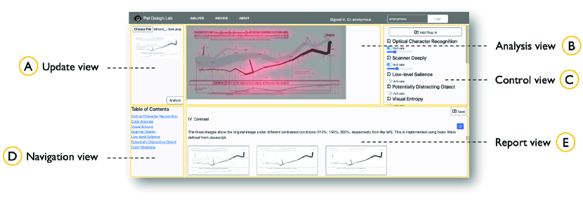
This teaser shows a screenshot of the Pat Design Lab applied to Charles Minard’s famous Napoleon’s March to Russia diagram. We broke up the system into 5 parts. These are update view, analysis view, control view, navigation view, and report view.
1. Introduction
Visualization design, just like any other design discipline, is inherently iterative (Munzner, 2014). During the course of designing a novel visualization, a designer may go through dozens or even hundreds of ideas, sketches, and prototypes before settling on a final composition. However, while experienced designers have developed the ability to view their own work through the eyes of their intended audience, it is clear that all designers would benefit from having access to an objective and unbiased audience to use as a sounding board for each design iteration. Is this label readable? Are the peaks and troughs in this line-series chart salient? Would a non-expert recognize this chart type? Being able to answer such questions at the drop of a hat would be invaluable, but fellow designers are not always available to provide feedback and empirical evaluation is unfortunately so costly in terms of time and money that it is impractical.
That is, until Pat came along. Pat is always game to take a look at a new version of your visualization, regardless of the time of day. Pat will tell you honestly what he thinks of your visualization design. In fact, Pat will be precise and give you a detailed breakdown of the colors, saliency, and legibility of your design. And, what’s more, Pat doesn’t sleep or take breaks. In fact, Pat can be invoked with a mere click of your mouse button.
In this paper, we present Perceptual Pat: an extensible suite of image processing, computer vision, and machine learning models that taken together forms a virtual human visual system suitable for supporting visualization design and evaluation. While we obviously do not intend for Perceptual Pat to be a drop-in replacement for a real human by a long shot, the Pat suite provides a collection of perceptually-inspired image filters that combine to yield a comprehensive picture of what a person would see when viewing a visualization. Examples of such filters include the virtual gaze maps, such as the Scanner Deeply virtual eyetracker (Shin et al., 2023), color vision deficiency filters, text legibility and optical character recognition (OCR) scanning, color analysis, etc. Inspired by the virtual human known as “Virtual Jack” (Badler et al., 1993) (or just “Jack”), which has long been a staple in ergonomics design, Perceptual Pat is a complement and not a replacement for human testing. Instead, the purpose of Pat is to provide easy access to multiple rounds of quick and cheap feedback before a design is evaluated in a focus group, expert review, or usability study.
At its core, the Perceptual Pat suite is held together by the Pat Design Lab, a web-based software system for managing iterative visualization design. Using the Design Lab, a designer can upload evolving versions of a design over time, each time running the Perceptual Pat tests and receiving an interactive report in response. The Design Lab allows for analyzing and studying the output of the tests as overlays display on top of the visualization itself. The tool also has functionality for designers to add their own annotation and notes to the report. Finally, different reports can be interactively compared using the tool, enabling the designer to see how their design has evolved over time. Furthermore, the Pat suite is based on a flexible plugin architecture, enabling the Design Lab to be easily extended with third-party image filters.
We validated the Perceptual Pat suite and the Pat Design Lab in a longitudinal user study involving 4 expert visualization designers using the tool for their own design project. We first met with our participants in individual meetings to introduce the tool and its functionality, and then again a week later at the conclusion of their design project. During this time, the participants were asked to design and refine a new visualization from scratch using the tool. Our analysis of the resulting reports and user annotations indicate that a majority of causes for change in the design were attributed to our system. During the exit interviews, participants acknowledged the effectiveness of the Perceptual Pat in detecting problems within visualizations, as well as its convenience in providing design feedback.
The contribution of this paper are as follows:
-
•
The concept of a virtual human visual system (VHVS) as a suite of models providing feedback on a visualization image indicative of human perception;
-
•
The Perceptual Pat implementation of a virtual human visual system for iterative visualization design;
-
•
The Pat Design Lab for supporting iterative evaluation of visualization design using the Perceptual Pat suite;
-
•
Qualitative findings from a longitudinal study involving four expert designers using our prototype implementation in their own design projects; and
-
•
Findings from external evaluators who assessed the design process and outcomes from the longitudinal study.
2. Background
Here we provide an overview of the background for our work on the Perceptual Pat suite by first explaining how visualization is a design discipline and reviewing systems that scaffold the design process. We then review work in vision science and visualization that shows how understanding perception can also support visualization design.
2.1. The Role of Feedback in Visualizations
Data visualization is still a largely empirical research field, and iterative design is thus a key component in authoring a new visualization (Munzner, 2014). It has also entailed a focus within the field on design heuristics and rules of thumb, such as Edward Tufte’s reviews of effective visualizations (Tufte, 1983), visualization textbooks with a design emphasis (Munzner, 2014), and many blog posts and practical handbooks drawn from practice.
All design benefits from external feedback. There are two main mechanisms for feedback: user and usage feedback vs. peer and supervisor feedback. The former is more common in academia and focuses on validation, often through empirical evaluation. Munzner present a nested model for visual design and validation (Munzner, 2009) that incorporates primarily the former through various forms of validation. She presents four design layers for creating visualizations: (1) domain problem characterization, (2) data/operation abstraction design, (3) encoding/interaction technique design, and finally (4) algorithm design. Sedlmair et al. (Sedlmair et al., 2012) develop a nine-stage design study framework (consisting of three higher level category), and provide practical guidance for conducting design studies. The three high-level categories are: (1) personal (precondition), (2) inward-facing (core), and (3) outward-facing (analysis). Peer feedback, on the other hand, is more common in industry and design practice, where critique is critical when authoring visualizations intended for mass consumption. It has also reached academia within the general interaction design community. Bardzell et al. (Bardzell et al., 2010; Bardzell, 2011) talk about the importance of criticisms in designing interfaces, and assert that they raise people’s perceptual ability, which over time constitutes a heightened sensibility or competence.
Comparison.
Obtaining external feedback requires time and money and is not always accessible. In contrast, Perceptual Pat provides external feedback using automated methods, and is thus quick, always available, and virtually cost-free.
2.2. Facilitating the Chart Design Process
External feedback helps to improve chart design, but there exist many different ways to provide such feedback. One method is based on practical visualization recommendation. Building on seminal automatic visualization work by Jock Mackinlay (Mackinlay, 1986), Tableau’s Show Me (Mackinlay et al., 2007) feature recommends charts based on data types as well as best practices. Since then, various types of recommendation tools have been developed, such as those based on data properties (Key et al., 2012; Wongsuphasawat et al., 2016), perceptual principles (Wongsuphasawat et al., 2016), expert feedback (Luo et al., 2018), large-scale dataset-visualization pairs (Hu et al., 2019), and design knowledge (Moritz et al., 2019).
Another method is to directly aid iterative design for visualization. The data visualization saliency (DVS) (Matzen et al., 2018) model is a general-purpose saliency heatmap generator for visualizations. This saliency map enables designers to understand a viewer’s attention on a chart. Recently, there is also a rising interest in techniques that provide automated design feedback on visualizations using a linting or sanity check metaphor. Examples are tools for detecting chart construction errors (Hopkins et al., 2020), visualization mirages (McNutt et al., 2020), and deceptively-designed line charts (Fan et al., 2022). Finally, VizLinter (Chen et al., 2022) even provides solutions to help chart designers.
Comparison.
Our Perceptual Pat suite is similar to many of these techniques, but it does not recommend visualizations to be authored, leaving authoring entirely in the hands of the designer. Instead, our approach is to provide a toolbox of different filters that together can give the user multiple lenses through which to view the visualization artifact they are designing. This is akin to a supertool (Shneiderman, 2022) augmenting the capabilities of the designer a hundredfold.
2.3. Understanding Human Perception for Visualization
Understanding how humans perceive charts is vital to supporting design, and has been an active area of interest within vision science. These efforts began as early as the end of the 19th Century in work done by the so-called “Berlin School” of experimental psychology. This eventually led to the development of Gestalt psychology (Koffka, 1922), a theory of mind based on a holistic view of human visual perception where the sum of the perceived “gestalt” is qualitatively different than its component parts, and in effect has an identity of its own.
Experimental work within vision science has also spent significant effort collecting empirical data on how humans perceive charts. In 1926, Eells et al. (Eells, 1926) study how people viewed statistical graphics. Croxton et al. (Croxton and Stryker, 1927) compare bar charts with pie charts in 1927 and study the effectiveness other shapes for comparison in 1932 (Croxton and Stein, 1932). In 1954, Peterson et al. (Peterson and Schramm, 1954) perform experiments for eight different statistical graphics. These findings, and many more, were summarized in Cleveland and McGill’s seminal 1984 paper (Cleveland and McGill, 1984) on graphical perception of statistical graphics.
Empirical work on sophisticated visualization mechanics has continued at a rapid pace; an exhaustive survey is beyond the scope of this paper. Bateman (Bateman et al., 2010) study the impact of visual embellishment compared to minimalistic chart design, finding memorability improvements. Chalbi et al. (Chalbi et al., 2020) extend the original Gestalt laws for dynamic graphical properties. Michal and Franconeri (Michal and Franconeri, 2017) present findings on the order readers follow when viewing visualizations (e.g., looking at the tallest bar when reading bar charts). Many of these detailed empirical findings have been condensed into specific design rules in a recent paper by Franconeri et al. (Franconeri et al., 2021), listing both visualizations that succeed in effectively communicating data through visualizations and those that fail to do so because of illusion and misperception.
With the introduction of high-performance eye tracking devices, researchers use eye movement data (Bylinskii et al., 2019) to understand human perception. This provides us with new knowledge about what causes confusion in charts (Lallé et al., 2016), visual patterns that benefit recall (Borkin et al., 2016), visual saliency as a measure of attention (Riche et al., 2013), and assessment methods for visualization proficiency (Toker et al., 2014). It is even possible to infer one’s personality with eye movement patterns during chart reading (Toker et al., 2013).
Comparison.
All this work are candidates for inclusion into our pragmatic take on a virtual human visual system.
2.4. Modeling Human Perception
Our work is inspired by the concept of Jack, a human simulation system devised by Badler et al. (Badler et al., 1993) in 1999. Jack is an abstracted version of a human body, with special focus on the body’s physical properties and its movements. In general, simulating humans as virtual agents provides a virtual experience that can be used to detect and prevent many of problems in a preemptive manner during early design.
We propose an approach for modeling not the physical body of a human, but its visual system for the purposes of supporting visualization design. In 1993, Lohse propose the first simulation of a human perceptual system based on a cognitive modeling approach drawn from both experimental and theoretical findings up to that date (Lohse, 1993). More recently, Haehn et al. (Haehn et al., 2019) study the use of convolutional neural networks (CNNs) as a possible candidate model for a human perceptual system. While they were able to replicate several of Cleveland and McGill’s seminal graphical perception results, they ultimately decide that CNNs are currently not a good model for human perception. Finally, Shin et al. (Shin et al., 2023) use crowdsourced eyetracking data to build a bespoke deep learning model that simulates human eye movement to generate gazemaps on any uploaded data visualization presented to it.
Comparison.
Perceptual Pat is different from all of this prior work because it integrates and synthesizes many models based on image processing and computer vision. In fact, many of the aforementioned tools have already been integrated into the Perceptual Pat suite. However, we are aware of no design-oriented virtual human visual system similar to ours.
3. Design: Virtual Human Visual System
We informally define the concept of a virtual human visual system (VHVS) as a simulated human perceptual system based on computer software filters that use imagery as their main input channel and outputs information about the expected human visual response to this input. In our implementation, we think of these image filters as perceptually-inspired to indicate the pragmatic and practical approach we adopt in this paper; instead of attempting a high fidelity simulation of the human visual system, our goal is to provide actionable information to a designer iterating on a visualization artifact.
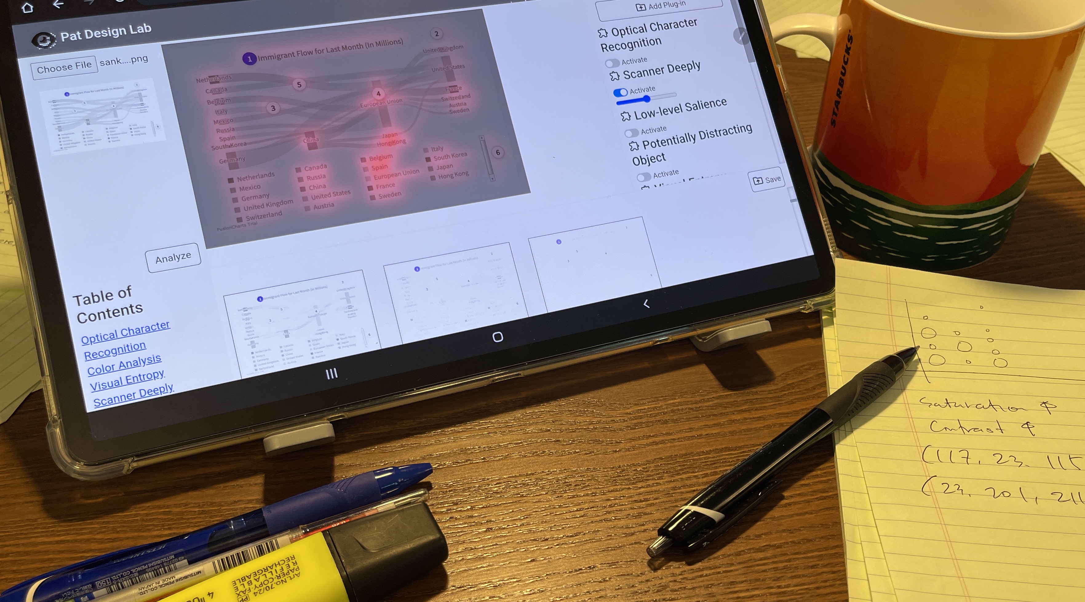
Photograph of a desk with an Apple iPad showing the Perceptual Pat interface being used to analyze a Sankey diagram. There are various pens and highlighters on the desk as well as a legal pad and a coffee cup.
3.1. Motivation
There are many potential reasons for designing a virtual human visual system (VHVS), ranging from vision science—e.g., the ability to completely simulate the human visual system at high fidelity—to more practical applications for specific design and evaluation situations. Our goal in this paper is the latter: while the overall VHVS goal may seem lofty, we are primarily interested in providing pragmatic and actionable feedback to designers through a suite of image filters “inspired by” human perception (see Fig. 2 for a demonstration of its intended use). In other words, we do not purport to faithfully model the human visual system, but rather to pragmatically support iterative visualization design.
3.2. Scope
The scope of our VHVS implementation is to serve as a supertool (Shneiderman, 2022) that uses AI and computer vision to augment, amplify, and extend the capabilities of a human designer during iterative visualization refinement. While our intended user is a visualization designer of any skill level, we note that our approach is not currently to suggest fixes to identified concerns. This means that while the feedback is useful to anyone, an expert designer will often be in a better situation to address it because of their greater experience. We organize the external design feedback into two main types:
-
•
Design feedback and critique: This form of external feedback involves receiving criticism—preferably constructive, i.e., focused on improvement, rather than merely pointing out flaws—from peer designers or supervisors. Designers often work in teams or at least as part of organizations with multiple designers, so critique is intrinsic to design (Bardzell, 2011). However, receiving feedback from peers can be time-consuming because (a) the process is laborious in itself, and (b) peers are often not immediately available because of their own commitments. Furthermore, feedback from an uninitiated peer can often be general and not sufficiently detailed. Nevertheless, design feedback remains important, not only for designers working alone on a project, but also for teams who can benefit from an outside and unbiased critical eye on their work.
-
•
Empirical evaluation: Given that visualization is a primarily empirical discipline, evaluation involving human participants is essential (Plaisant, 2004). This is true for both academia as well as industry and practice (Isenberg et al., 2013; Sedlmair et al., 2011). However, even small-scale empirical evaluation studies are costly in terms of time, money, and preparation—they certainly cannot provide answers to specific questions designers have about their visual design at short notice. For this reason, empirical evaluation is conducted at a time granularity of days or, more likely, weeks.
3.3. Design Requirements
Because of the automated nature of the VHVS that we are proposing, it is important to note that we are not replacing but augmenting human feedback. This means that the fidelity requirements are lower because our automated feedback is meant for guidance rather than enforcing specific perceptual or design rules. We summarize our design requirements from the motivation and scope above as follows:
-
DR1
Rapid: To facilitate a conversation between the designer and the VHVS, feedback must be rapid, preferably yielding output in less than a minute or two (the faster, the better).
-
DR2
Inexpensive: Similarly, to promote frequent iteration, the feedback cannot require costly investment, or ideally any investment at all. This likely precludes crowdsourced critique, which still incurs some cost.
-
DR3
Automated: The feedback should be mostly automated and not require intricate configuration or setup; ideally, the user should be able to submit the current state of their visualization artifact.
-
DR4
Progressive: In recognition of the iterative refinement commonplace in visualization design, the feedback should track the evolution of an artifact over time.
-
DR5
Constructive: The feedback provided should be organized to help the designer improve their artifact.
3.4. Practical Perceptual Feedback
Focusing on pragmatic, actionable, and practical perceptual feedback on a visualization artifact frees us from having to design a fully comprehensive and accurate model of the human visual system. Instead we choose types of feedback that will aid the designer in making improvements to a visualization that will directly benefit viewers. We summarize the main types of such feedback below. Note that this is a suggestion and not an exhaustive list.
-
\faSun
Visual saliency: Saliency is a measure of the patterns and parts of a visual scene that attracts a viewer’s eyes (Riche et al., 2013), and has long been a core part of vision science (Itti et al., 1998; Harel et al., 2006; Bruce and Tsotsos, 2005). However, visual saliency is also a highly practical and pragmatic aspect of visualization design in helping the designer determine which parts of a visualization will attract the viewer and in what order, and, analogously, which parts will not. Receiving unbiased and objective feedback on the visual saliency can certainly help a designer iterate on their visualization to ensure that the saliency is consistent with their intent.
-
–
Eyetracking: Eye trackers empirically measure saliency by collecting eye movement data from the real world (Kim et al., 2012). Eyetracking technology is now becoming cheaper and increasingly available, enabling designers to use themselves as test subjects. However, such hardware solutions are beyond the scope of our work.
-
–
Virtual eye trackers: A virtual eye tracker is trained on eye movement data to generate artificial gaze maps, enabling the designer to conduct a virtual eye tracking experiment. Large-scale eye movement data can be used to build eye movement prediction models, such as the work by Itti et al. (Itti et al., 1998), the CAT2000 benchmark (Bylinskii et al., 2012), and SALICON (Jiang et al., 2015). While gaze prediction models can be used for this purpose, the Scanner Deeply (Shin et al., 2023) tracker is specifically trained on visualization images.
-
–
Information theory: Information-theoretic approaches to visualization (Chen and Jänicke, 2010) measure the ratio of raw data that are communicated using a visual representation. Calculating the local entropy across a visualization image can thus be seen as a theoretical measure of its visual saliency; its information content.
-
–
-
\faPalette
Color perception: Color is a basic building block of any image, data visualization in particular (Munzner, 2014; Rhyne, 2016). Effective use of color is therefore a key factor in any design projects involving data visualization.
-
–
Color statistics: Understanding dominant color schemes, color distribution, and color scale choices is a useful mechanism for any visualization designer.
- –
-
–
Opponent processing: Opponent process theory casts color perception as balances between three pairs of colors (Hering, 1964; Hurvich and Jameson, 1957); while the exact constituent colors are disputed, these are often held to be red vs. green, blue vs. yellow, and black vs. white. Pragmatic visualization would promote avoiding color combinations that involve both parts drawn from one of these pairs.
-
–
-
\faFont
Text: Most visualizations incorporate text in some form, much of it central to understanding the scale, extents, names, and details of the visualized data. Textual characters are obviously visual objects that are modeled by other vision models, but because of their special meaning in visualization, text is worth studying on its own. We propose several specialized forms of text identification and classification feedback.
-
–
Legends: Some visualizations require legends to enable deciphering color allocations or color scales. Identifying the legend, or notifying the designer that none is present, would therefore be useful feedback.
-
–
Labels: Axis labels, titles, and tick marks are central to comprehending a visualization.
-
–
Textual content: Disregarding the visual representation of the text, what about its actual content? Feedback on spelling, grammar, and meaning can help the designer here.
-
–
-
\faChartBar
Visual representation: Some perceptual feedback may be specific to the visualization technique being used. While some of this type of feedback may stray into visualization linting (Chen et al., 2022; Hopkins et al., 2020) for finding chart design and construction errors, we here focus our feedback on perceptual aspects.
-
–
Chart type: Merely using an automatic classifier to identify the chart type can be useful feedback to a designer. If the designer is working on a non-standard visualization and the classifier does not recognize it, this may be indicative to change representation, or to better signpost the representation. Alternatively, if the designer is using a standard chart type and it is not recognized (or incorrectly so), this may be a signal that they need to improve and standardize their visual design.
-
–
Data extraction: Taking chart recognition a step further would be to use automatic methods to recover the data from a visualization, essentially reverse-engineering the visualization (Choi et al., 2019; Poco and Heer, 2017; Savva et al., 2011). This would enable the designer to determine if the visual encoding is lossy by recovering symbolic data that has been encoded.
-
–
Visual embellishment (“chart junk”): Visual embellishments to charts—sometimes referred to as “chart junk” (Tufte, 1983)—while potentially beneficial to the memorability of a chart (Bateman et al., 2010), may detract from the chart or even distract the viewer compared to a more minimalistic visual representation (Cleveland, 1985). Automated object recognition can inform the designer about any visual embellishments and their potential for distraction.
-
–
-
\faEye
Vision science: Beyond the visual saliency discussed above, there are many useful metrics from vision science that we may pragmatically adopt for visualization design feedback. As stated above, since our goal is not to accurately model the visual system, we can instead choose concepts that lend themselves to iterative design.
-
–
Preattentiveness: Preattentive features (Treisman and Gelade, 1980; Treisman, 1985; Wolfe and Utochkin, 2019) are those that guide the viewer’s attention so that they “pop out” in a visual scene, and that cannot be decomposed into simpler features. Automatically detecting and highlighting preattentive features in a visualization would be highly useful, because they can help the designer confirm conscious design choices and discover—and likely address—inadvertent ones.
-
–
Ensemble processing: How do people estimate characteristics from a group of visual objects, such as marks in a scatterplot? Ensemble processing (Alvarez, 2011) models how the visual system computes averages of visual features in a group with even complex shapes and configurations. Implementing an ensemble processing filter could help designers understand how groups of visual marks would likely be interpreted by the viewer.
-
–
Shape identification: Recognizing and identifying shapes in a visualization artifact may be another confirmatory piece of feedback for a designer. If shapes are not correctly identified, perhaps due to scale or overplotting, the designer may use this feedback to make revisions to their artifact.
-
–
Image segmentation: More of a computer vision than a vision science tool, image segmentation (Minaee et al., 2022; Shapiro and Stockman, 2001) is the process of partitioning an image into segments or regions based on image content. These segments may help a designer to understand about the fundamental structure of the visualization artifact being designed.
-
–
Moving object tracking: While our approach in this paper is based on static screenshots of a visualization, a dynamic animation may yield further perceptual information about a visualization. In particular, providing feedback on moving objects may be useful given human perceptual limits on tracking multiple objects (Cavanagh and Alvarez, 2005; Pylyshyn and Storm, 1988). It could also be used to understand temporal aspects of an animation (Dragicevic et al., 2011), which can aid perception.
-
–
-
\faAccessibleIcon
Accessibility: The accessibility of visualizations has recently become an area of burgeoning research within the community (Choi et al., 2019; Chundury et al., 2022), and many visualization designers are in dire need of assistance in making their charts accessible. Here we review some specific forms of feedback that can help.
-
–
Color vision deficiency: An estimated 300 million people in the world suffer from some form of color vision deficiency where their ability to distinguish colors is diminished. There are already websites and native tools to show what a visualization tool looks like depending on the form of color vision deficiency; integrating such feedback into a framework would help further. In addition, Angerbauer et al. (Angerbauer et al., 2022) present several findings drawn from a large-scale crowdsourced assessment of color vision deficiency in visualization that could be operationalized for a virtual human visual system.
-
–
General accessibility: The Chartability framework by Elavsky et al. (Elavsky et al., 2022) provides heuristics for evaluating and auditing visualizations based on their accessibility to people with different disabilities, including visual, motor, vestibular, neurological, and cognitive ones. However, the framework must currently be applied manually during an accessibility audit. Operationalizing these heuristics into an automated model would enable integrating it into a framework such as ours.
-
–
4. The Perceptual Pat Suite
Perceptual Pat is an implementation for a virtual human visual system designed for iterative design of data visualization artifacts. In this section, we describe its system architecture, components, and implementation.
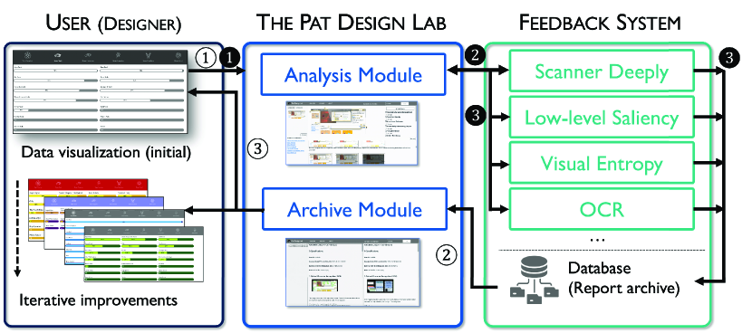
This figure is a diagram showing an overview of our system. We present this in three parts. The first is a user part, the second is the Pat Design Lab (PDL) part, and the third is the feedback system part. The user part describes the role the designer is doing during the design process. They conduct iterative designs to improve the visualization. The Pat Design Lab presents two modules, the analysis module, and the archive module. The analysis module provides analysis from various machine-learning-steered tools that analyze the visualization. The design lab also provides the archive module, where the designer can refer to past versions of their design. The feedback system provides analysis to the analysis module. The feedback system consists of a list of image filters and a database for storing reports.
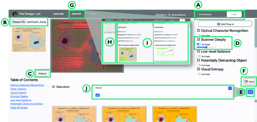
This image shows various interface tools deployed for the Pat Design Lab. The user can log in to the system by signing in. The sign in interface is at the top rightmost part of the interface. Then, they can upload images by clicking the button ‘choose file’, and start the analysis process by clicking the ‘analyze’ button, which is below the ‘choose file’ button. After the designer clicks ‘Analyze,’ an enlarged version of the image shows at the center of the interface. They can choose which filters to show on top of the large image from the control view, and at the same time control the opacity of the filter. A report is shown below the large image. To take notes in the report, there is a blue button with a ‘document’ icon below the title of each section of the report, and they need to click it. Then, they can add texts and click the button ‘add.’ The designers have to manually press the save button to keep record of them report with notes. They can check past versions of the design by clicking the hyperlink ‘archive’ at the navigation bar, which is situated at the top of the interface. The archive view consists of three parts. The first is the list view, where past versions are listed. Then, there two window views that show two archived versions of the design. In the list view, they can select a version of their interest, and the most-recently chosen version will appear at the left window view, pushing the old one into the right.
The report contains information about filters used for the analysis of the updated chart images. It consists of 8 sections. These include the chart’s basic properties, results from OCR filter, visual entropy filter, a Scanner Deeply filter, low-level salience filter, potentially distracting object filter, also known as Chartjunk, and color vision deficiency filter.
4.1. System Overview
The Perceptual Pat suite is designed to meet the requirements
in Sec 3.3 (see Figure 3 for an overview; the black and white circles refer to the steps in the figure).
The suite consists of two components: a web-based user interface (the Pat Design Lab) and a feedback system.
The user interface (PDL) contains analysis and archive modules—see the following subsection for more details.
The analysis module receives a chart image from a user
in a graphics format (e.g., .png, .jpeg, or .jpg).
This action automatically triggers the feedback system to generate a report containing the results of the diverse visual analysis we develop in Sec 4.3 (DR1, DR2 and DR3).
The report will be shown to the user, and is also stored in the database for future reference.
The archive module is designed to support the iterative chart design process of a user (DR4 and DR5). It allows a user to retrieve the report that they generated before or to compare two or more reports at the same time. The user will have a list of report names shown in chronological order. By clicking those report names, the user interface requests all reports from the feedback system. The feedback system will pull those reports from the database. Reports are shown in a single view side-by-side and are scrolled up/down together.
4.2. The Pat Design Lab
The Pat Design Lab (PDL) is a web-based single-page application. At its core, PDL consists of three functions: upload, analyze, and save. Users can upload a screenshot of their chart image. Then, they can analyze the image using the perceptual components provided by the PDL. Finally, users can save their versions for comparison with past designs.
To initialize the Pat Design Lab, the user needs to login to the system (Fig. 4(A)). Once they have signed in, Pat Design Lab activates and the update view (Fig. 1(A)) appears. In the update view, they can choose a file to upload into the main interface. They can start the analysis process by pressing the ‘analyze’ button in Fig. 4(C).
When PDL completes the analysis, the analysis report is displayed in the report view (Fig. 1(E)). Users can toggle filters that are overlaid on top of the visualization image, as shown in Fig. 4. The filter opacity can be controlled using a slider (Fig. 4(D)). Multiple filters can be overlaid at once to enable studying compound effects.
The report view in Fig. 1(E) provides access to the full analysis report; Fig. 5 shows an example. The component names in the navigation view provides easy access to corresponding report sections 1(D). Users can also add notes about each component for each section by clicking the document button in Fig. 4(E), which displays a text input interface (Fig. 4(J)). They can save the version with the notes by clicking the blue-colored button with a document icon in Fig. 4(F).
The archives tab provides access to saved reports (Fig. 4(G)). This page provides a full list of past reports and notes (Fig. 4(H)). It also shows two windows that lets users compare two reports of their choice (Fig. 4(I)).
| Component Name | Feedback Type | Implementation |
|---|---|---|
| Scanner Deeply | \faSun Visual Saliency | Scanner Deeply (Shin et al., 2023) |
| Low-level Salience | \faSun Visual Saliency | Trained SimpleNet (Reddy et al., 2020) using Salicon dataset (Jiang et al., 2015) |
| Visual Entropy | \faSun Visual Saliency | SciPy library (Virtanen et al., 2020) |
| Color Suggestions | \faPalette Color perception | CSS filters, Python Image, OpenCV libraries |
| OCR | \faFont Text | Google PyTesseract-OCR (Kay, 2007; Tesseract-OCR, 1999) |
| Chartjunk/Visual Embellishment | \faChartBar Visual Representation | YoloR (Wang et al., 2021a) |
| Color Vision Deficiency | \faAccessibleIcon Accessibility | Python Color-blindness library (Elrefaei, 2018) |
This table provides information about the tools used in implementing Perceptual Pat. The list of component names is Scanner Deeply, low-level salience, visual entropy, color suggestions, optical character recognition, chartjunk and lastly, color vision deficiency. Per tool, we provide its feedback type and its implementation source.
4.3. Current Perceptual Pat Components
Table 1 shows the components in Pat’s feedback system, drawn from Sec. 3.4. The focus of this work is not primarily in evaluating the performance of these components, but in exploring how access to a virtual human visual system can help users during iterative design. For this reason, our goal was not to exhaustively cover the entire design space in Section 3.4, but to find a representative sample of components.
Towards this end, we chose several perceptual components that cover a wide range of the feedback types in Section 3.4 and are readily adaptable from existing computer vision and machine learning libraries. Note that Pat uses a plugin system, so adding new components is straightforward. Below we explain how we implemented the seven components.
Optical Character Recognition (OCR)
Optical character recognition is a computer vision technique (Shi et al., 2017) that detects text characters from natural images. This technique gives the designer an “smoke test” of the legibility of the text; if the OCR technique fails to detect the text, there may be a legibility problem and redesign may be needed.
A Scanner Deeply
Scanner Deeply (Shin et al., 2023) is a virtual eyetracker; a gaze heatmap generator using a neural network model trained on more than 10K instances of eye movement data with chart images as the visual stimuli. The model will generate a simulated heatmap predicting where a person’s attention will be directed when viewing a visualization.
Low-level Salience
This salience heatmap generator uses a neural network model trained on the Salicon dataset (Jiang et al., 2015), which contains fixation maps for a natural image dataset (i.e., Microsoft COCO (Lin et al., 2014)). The component is particularly useful in showing viewer attention for visualizations that contain natural image data, or in visualizations that are situated within the world, such as for a visualization embedded in Augmented Reality.
Visual Entropy
This components generates a heatmap showing visual entropy; pixels whose RGB values differ from neighboring ones. This can potentially give designers awareness of the data distribution in the image.
Color Vision Deficiency
This filter component provides color overlays to enable the designer to see how people suffering from different types of color vision deficiency (CVD) would see the visualization. The component supports three types of CVD: (1) deuteranopia, (2) protanopia, and (3) tritanopia.
Chartjunk/Visual Embellishment
Our component for detecting chart junk is implemented using the YoloR object detection algorithm (Wang et al., 2021a, b), which detects real-world objects visible in the visualization image. The model is limited by its training, which may cause it to fail to detect all objects, but this functionality can still serve as early warning.
Color Suggestions
Our color suggestions component is implemented using CSS filters and include blur, gamma, grayscale, contrast, and saturation. It enables envisioning how a visualization would look under different color themes.
4.4. Implementation Notes
The Perceptual Pat suite is implemented as a client/server web application. The Pat Design Lab was built using HTML, CSS, JavaScript, and JQuery. We implemented the feedback system using the Python Flask web framework111https://palletsprojects.com/p/flask/; the analysis components were implemented server-side in Python 3. We store data in MongoDB.222https://www.mongodb.com/ During the user study, the platform was hosted on a Ubuntu Linux server equipped with an Intel i7-12800K processor, 32GB RAM, 2 Pascal Titan RTX GPUs, and 2TB of flash memory.
5. User Study
We conducted a user study to assess the utility of the Perceptual Pat suite and the web-based Pat Design Lab implementation. The study asked participants to use the Pat Design Lab in support of a visualization design task spanning between three and five days. Rather than compare our approach to an existing tool, our study is mostly qualitative in nature and focuses on understanding how professional visualization designers might use the tool to iteratively refine a visualization artifact. We motivate this choice by the fact that there exists no directly comparable tool that would serve as a useful baseline.
Here we describe the participants, methods, and metrics of this study. In the next section, we report on the results.
| ID | Gender | Age | Education | Job Title | Years in Vis |
|---|---|---|---|---|---|
| P1 | Male | 28 | Master’s Degree | Software Engineer | More than 3 years |
| P2 | Female | 27 | Master’s Degree | Ph.D. Student in Visualization | More than 3 years |
| P3 | Female | 43 | Master’s Degree | UX/UI/Visualization Designer | More than 5 years |
| P4 | Female | 24 | Bachelor’s Degree | Freelance Visualization Designer | More than 1 year |
| P5 | Male∗ | – | (no information) | (no information) | (no information) |
This table has demographics information about the participants that participated in our experiment. Participants are given US $ 40 as compensation. We provide the participants’ gender, age, education status, job title, and visualization experience. The first participant is a male, 28 years old, holds a master’s degree, is a software engineering and has more than three years of experience in visualization. The second participant is a female, 27 years old, holds a master’s degree, and is a Ph.D. student in visualization and has more than three years of experience in visualization. The third participant is a female, 43 years old, holds a master’s degree, is a UX/UI/Visualization designer and has more than five years of experience in visualization. The fourth participant is a female, 24 years old, holds a bachelor’s degree, is a freelance visualization designer and has more than one year of experience in visualization.
5.1. Participants
We recruited 5 professional visualization designers using the Data Visualization Society Slack channel. Table 2 presents an overview of the participant demographics. All participants were paid a total of $40 as an Amazon gift card upon completing the study (or its equivalent in the participant’s requested currency). Unfortunately, one participant abandoned the study after a week without producing any design artifacts; their demographic data is shown in Table 2, but in no other part of the paper.
5.2. Apparatus
The study was conducted online in its entirety using the participant’s own computers. We imposed no specific hardware on the study, only that the participant would use a personal computer, and not a mobile device such as a smartphone or tablet for the design task. We recommended them to use the website in Google Chrome. Since the Pat Design Lab is designed to use only screenshots of data visualization tools, participants were free to use their own preferred visualization tool and workflows.
5.3. Design Task
Participants were asked to do only one thing during the 3-5 days of the study: to design a new visualization from scratch using the Pat Design Lab as supporting software. The visualization could be anything: use any dataset, any representation, and for any use (including merely for the purpose of this study). They were asked to record at least 5 versions of their visualization into the Design Lab. Ideally the five stored versions would be taken from representative stages in the design process. Participants were instructed to read the reports, write at least one annotation, and to endeavor to use the reports to improve their designs.
As stated above, we placed no restriction on the design workflow or visualization tools used in the process—participants could use whatever tool they preferred, or even switch tools during the process. For example, a participant could start with a pen-based sketch and then proceed to using Tableau, Excel, or Spotfire. We only stipulated that the participant spent a total of at least two hours on the design process.
In summary, we made the following requirements on the visualization design process:
-
•
Resolution minimum 400300, maximum 10001000 pixels in resolution (higher resolutions were downscaled).
-
•
At least 5 versions stored into the Pat Design Lab.
-
•
Artifact must include at least one chart (any form of chart), and could could include multiple charts.
-
•
Artifacts may include text.
-
•
Artifacts may not include photographs.
-
•
No confidential or identifying information or data is to be included.
-
•
Participants give permission for publishing images of their created artifacts in academic papers about the work.
5.4. Procedure
Our study was approved by our university’s IRB. The study consisted of three phases that spanned over three to five days, followed by an independent fourth phase involving external evaluators. We scheduled the dates for each phase during initial recruitment. The fourth phase was independent of the preceding three and did not involve the designer participants. Below we describe each of the four phases in detail.
Phase I: Initial Interview.
During our initial interview (Phase I), we gave a brief introduction of the study and then asked participants to provide informed consent (signature waived due to the online format) using an online form according to stipulations from our IRB. We then collected participants demographics using another form. The remainder of the initial interview consisted of training during which time the experiment administrator (the first author of this paper) demonstrated how to create an account in the Pat Design Lab, authenticate and log in, and then upload a screenshot of a visualization into the tool. The administrator then showed how to run a Perceptual Pat analysis and interpret the resulting report, as well as how to compare two different reports.
After finishing demonstrations, the experimenter asked the participant to repeat each step, and answered any questions that the participant had. Then the experimenter gave the participant their design charge, including the requirements listed above. The participant was given the design task in electronic form. Finally, the session ended by confirming the date and time for the exit interview (Phase III). Each session lasted approximately 30 minutes.
Phase II: Individual Design Process.
During the intervening time between the initial interview (Phase I) and the exit interview (Phase III), the design process (Phase II) consisted of the participant working on the visualization artifact they were designing. Participants were free to spend this time in any way they wished—we only asked that they spent at least a total of two hours on the design work and that they used the Pat Design Lab to support the process. They were instructed to reach out to the experimenter with any questions or problems that arose during the study; none of them did, and the system was stable during the time period of the experiment.
Phase III: Exit Interview.
The exit interview (Phase III) involved asking the participant about their experiences using the Pat Design Lab, their feedback about its strengths and weaknesses, and their design process using the tool. The experiment administrator then stepped through the participant’s version history in the Pat Design Lab, one version at a time and asking about details for each version. In case the participant had stored more than five versions, the experimenter asked the participant to identify the five most significant versions. Each session lasted approximately 30 minutes.
Phase IV: External Assessment.
Finally, we recruited three external evaluators to objectively assess the visualization design process. All evaluators were senior visualization faculty or researchers with experience in teaching data visualization and/or designing their own visualizations. They gave informed consent and were then given access to the sequence of visualization versions for each of the participants. They were then asked to provide their assessment of the quality of changes for each pair of versions (i.e., from version 1 to 2, 2 to 3, etc) as well as from the initial (version 1) to the final (version 5) design using a 1-5 Likert scale (1 = significant decline in quality, 3 = neutral, 5 = significant improvement in quality). They were also asked to motivate their assessment using free text.
5.5. Data Collection
Interviews were video and audio recorded, and the audio was transcribed for later analysis. Furthermore, demographics, subjective preferences, and tool rankings were collected using online forms. The Pat Design Lab itself was the main source of data collection. This data encompasses each of the visualization versions uploaded into the Pat Design Lab by the participants, including the screenshot of the visualization, the resulting Pat design report, and the annotations added by the participant. These annotations were augmented with the spoken comments that participants made about each version during the version walkthrough in Phase III.
While we included all versions uploaded by participants in our analysis, we also asked participants to identify the five most significant versions in case they had uploaded more than five.
6. Results
Here we report on the results from our user study. First, we introduce participants’ responses on interviews prior to starting the experiment. Then, we analyze the evolution of the visualization artifacts and the impact of Perceptual Pat on the iterative design. Finally, we present participants’ comments after conducting the experiment.
6.1. Results from the Initial Interview
Besides overall instructions and a demographics survey during the initial interview in Phase I, we also asked the participants three questions to understand how they usually get feedback for visualizations; see Table 3 for the questions and responses. As is clear from the table, the majority of participants receive feedback from people who are easily reachable, such as peers, colleagues, or supervisors (P2, P3). If the visualization is upon a client’s request, then these designers tend to get feedback directly from clients to confirm that their work is acceptable, as it is the most direct way to understand the client’s intentions (P1, P4).
| P# | Q1: How do you currently get feedback to improve a visualization? | Q2: Are you familiar with any tools that provide design feedback? | Q3: If such a tool existed, would you find it useful? |
|---|---|---|---|
| P1 | clients | not familiar | somewhat useful |
| P2 | peers, friends | not familiar | very useful |
| P3 | supervisors, managers, peers | not familiar | somewhat useful |
| P4 | client, peers | not familiar | somewhat useful |
This table provides questions we asked during the initial interview with participants. We asked 5 questions, and this table answers three questions. The first question we asked was ‘How do you currently get feedback to improve a visualization?’ The second question we asked was ‘Are you familiar with any tools that provide design feedback?’ The third question we asked was ‘If such a tool existed, would you find it useful?’ For the first question, P1 answered as clients, P2 answered as peers and friends, P3 answered as supervisors, managers and peers, and P4 answered as client and peers. For the second question, all participants answered as ‘not familiar.’ For the third question, P1, P3, and P4 answered as somewhat useful, and P2 answered as very useful.
When asked whether they were familiar with tools that provide design feedback, no participant was familiar with any such tool. All participants felt, however, that such a tool would be useful. As a main reason for this, all participants pointed out that receiving timely feedback is sometimes a challenge and there are only a few people who can provide feedback in visualizations. Asking the same people over and over can be problematic. P2 provided us another reason—that it is difficult to verbally communicate about visualizations with peers and by using a machine, she might not have such a problem.
P3 did raise an issue about the credibility and transparency of the system. She felt that such a tool would be useful, but said, “I am not sure if I can 100% trust the feedback provided by a machine. If the machine makes a comment, I would like to know why, in detail, it provided that comment, so that I can decide whether or not to trust it.”
| Version 1 | Version 2 | Version 3 | Version 4 | Version 5 | |
|---|---|---|---|---|---|
| P1 |  |
 |
 |
 |
 |
| P2 | 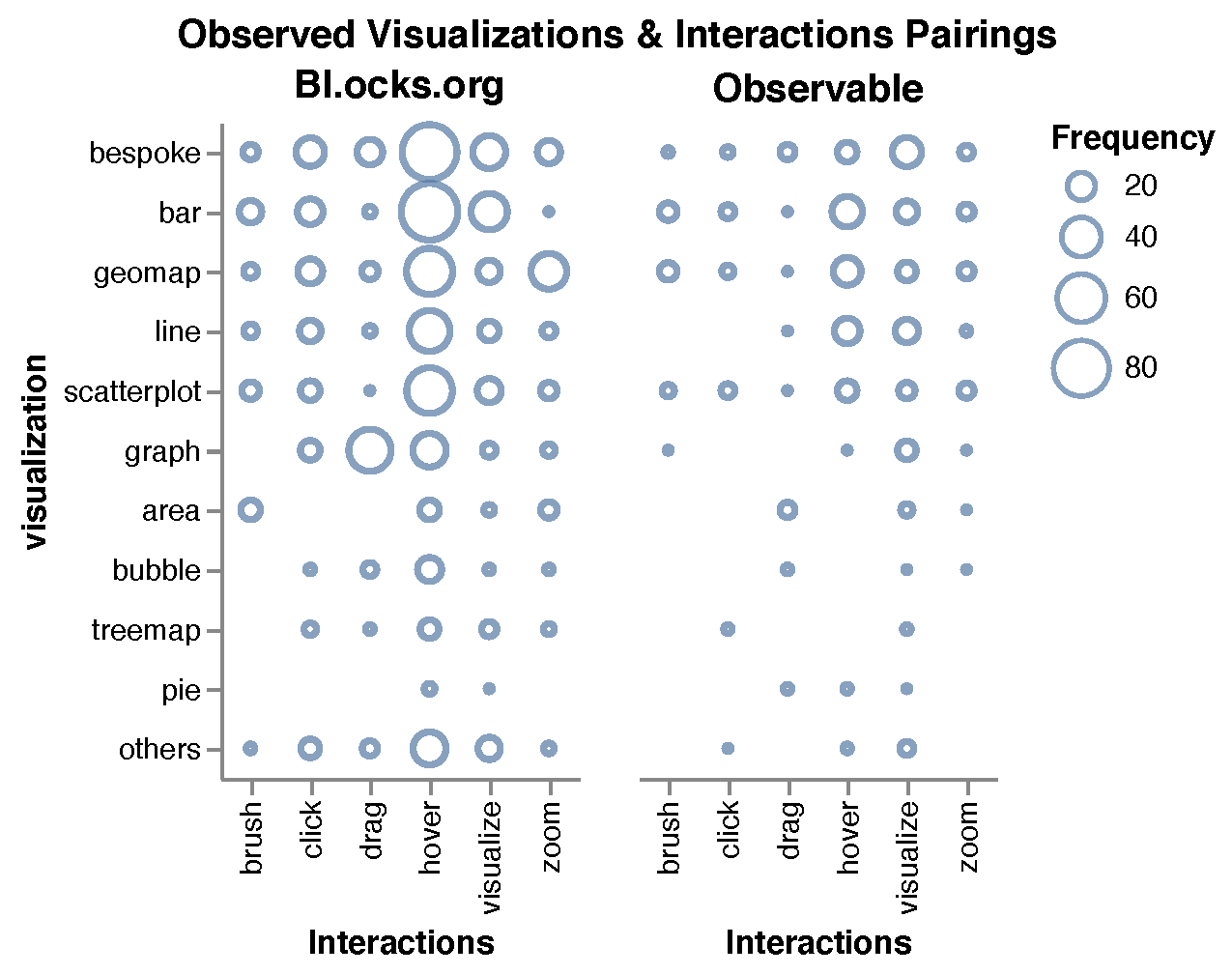 |
 |
 |
 |
 |
| P3 | 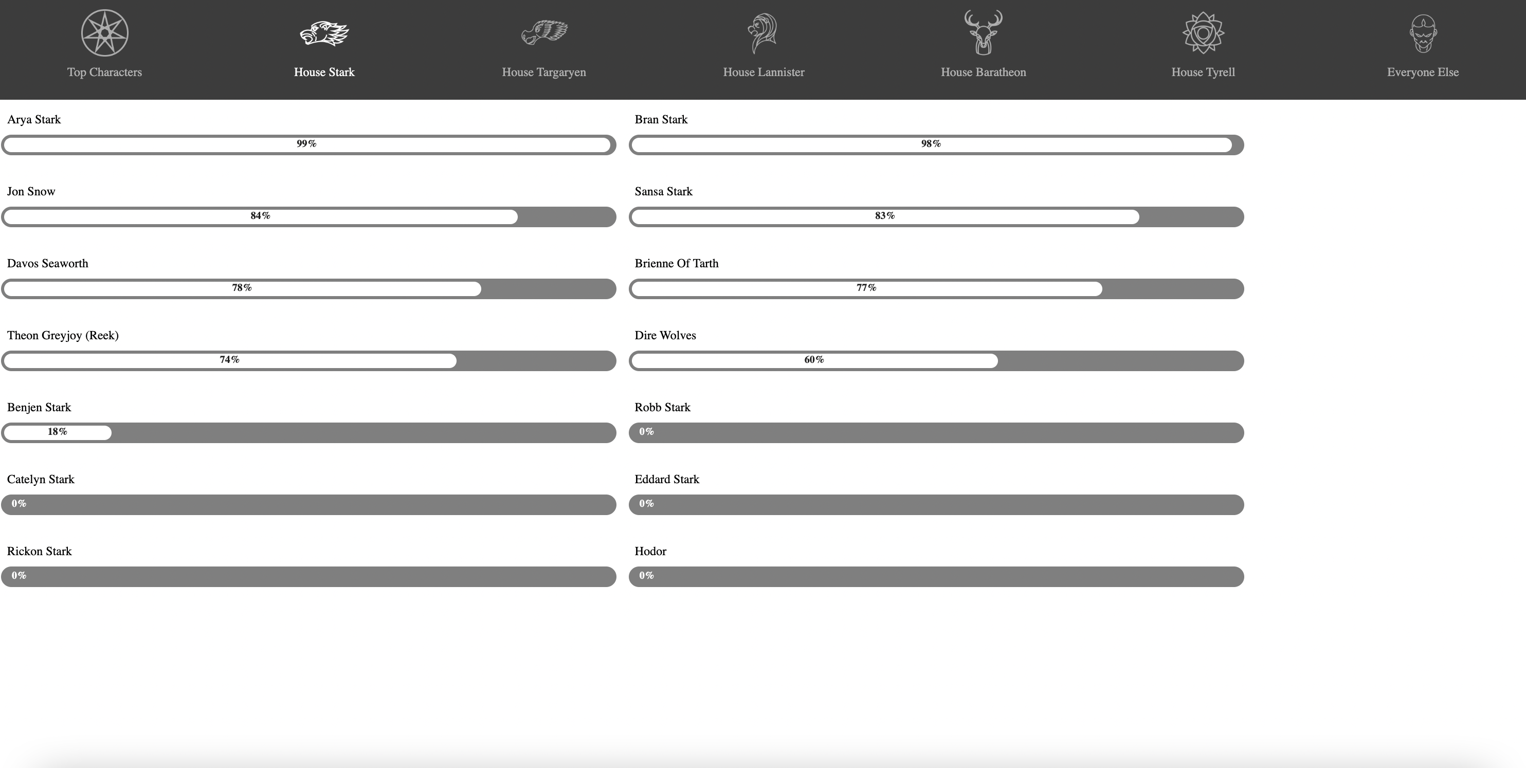 |
 |
|||
| P4 | 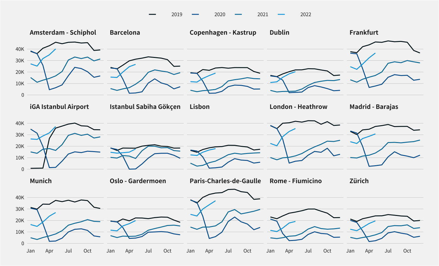 |
 |
 |
 |
This figure shows how 4 participants’ chart designs have evolved over 4 iterative processes using our tool, the Pat Design Lab. For each participant, we provide 5 updated versions.
6.2. Evolution of Visualization Snapshots
Fig. 6 shows how visualizations of the four participants evolved over 5 iterations of designs. Here we describe how each participant changed their design based entirely on the uploaded images. In the following subsection we explore the rationale behind each change.
Participant 1.
Originally, P1 created his chart using Matplotlib, a Python library for drawing charts. The first version of the chart was the initial version that Matplotlib creates, without any manual constraints involved. In the second and third versions, he enlarged the fonts of the letters within in the heatmap, the title, and axis labels. In the fourth version, he changed the heatmap from a bipolar to a unipolar color scheme. At last, he removed the potentially disturbing icons next to the labels, to keep from disrupting the readability of the chart.
Participant 2.
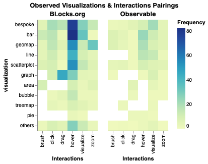
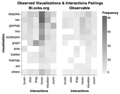
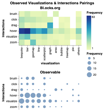
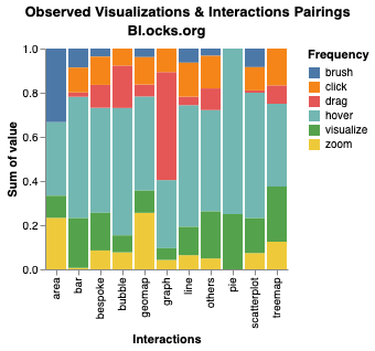
P2 selected a research dataset classifying the interactions commonly used for specific chart types. Initially, she started off with a 2-axis grid scatterplot (version 1), where the horizontal axis represents the types of interactions (e.g., hover, brush, click, etc.), and the vertical axis represents the types of charts (e.g., bar, line, etc.). The size of the blue-outlined circle in each point refers to the frequency of charts. In the next version, she changed her chart into a heatmap (version 2), and then into a grayscale (version 3). Then, in the fourth version, she created both a heatmap and a grid scatterplot. This time, she filled the circle with blue. Finally, in the fifth version, she created a stacked bar chart, where each column represents the proportion of different interactions and interactions are represented as different colors of the bar.
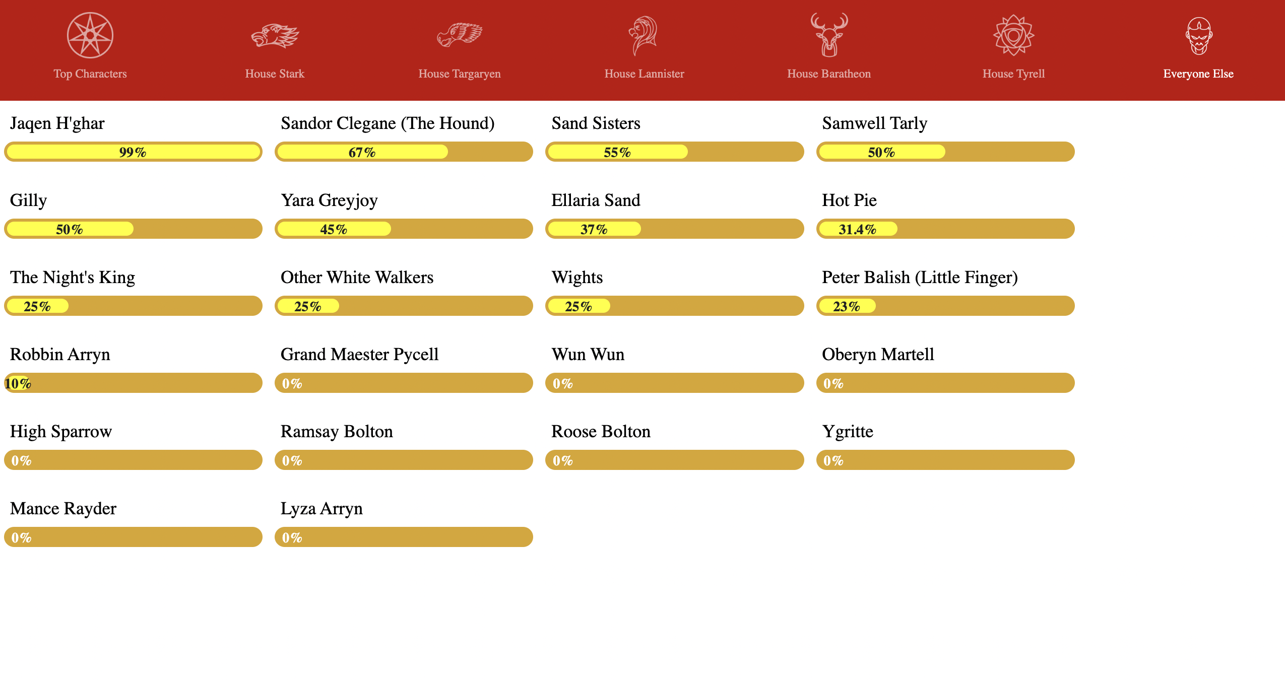
Participant 3.
P3 used a dataset on characters in a video game. She used D3 to create a visualization. She started by creating a bar chart with 2 columns using grayscale (version 1). Afterwards, she tried, in an iterative manner, different designs by changing the number of columns, sizes of bars, and color (versions 2, 3, 4). She finalized her visualization using green-colored bars on a gray background (version 5).
Participant 4.
P4 wanted to visualize air passenger traffic data of 15 different cities. She decided immediately to use line charts displayed in a 3 by 5 grid format. The initial version had gray charts with a white background and a legend at the right side of the visualization. In the second version, she moved the legend to the top and removed grids that are drawn in each chart. In the next version, she added a title in black, subtitle in dark gray, and source information about the chart a the right end of the chart. In the fourth version, she added a small airplane embellishment to the image. In her final version, she performed finishing touches by changing the color of the chart to a more saturated blue.
6.3. Evolution Rationale
Recall that in the report we asked the participants to record what influenced them to refine their design. These descriptions, intentions, and reasons for the change are based on both these annotations as well as the interviews conducted with each participant.
Participant 1.
P1 was conducting feature analysis of a deep neural network, and wanted to create a chart to share with his peers in the company. He initially looked at the OCR to see if the component could detect letters in the chart. He consistently checked the size of the font in the chart, and left notes below the report on OCR. For example, he left a note below the report on OCR in the third version, as “Increased the font size, after knowing that the label size of the chart is too small.” Then he noted that the pink-colored areas in the heatmap were not visible for people with deuteranopia, and that the icons next to the label were detected by the potentially distracting object. This led him in the last version to change from pink and green color palettes to green palettes, and to removed small icons next to the labels.
Participant 2.
P2 wanted to construct a visualization that is capable of effectively contrasting the different types of interfaces used for each chart. She was interested in searching for the chart that can best show the types of interactions per each type of chart. In the first version, she noted that she was not satisfied with using size as the only encoding type. Then, in her second version, she changed her scatterplot into a heatmap. She noted two points: (1) increasing the brightness past a certain threshold can lead to information loss, and (2) the visual entropy was overly focused towards the labels. In her third version, she converted the chart into a grayscale version and found that the grayscale version did not have colorblind issues. In her fourth version, she added two different types of charts to the design. She was also concerned about the results of the Scanner Deeply, noting that gazemaps focused on textual information such as labels and titles when she wanted people to focus more on the data representation. However, she noted that while this concerned her, she was unsure whether this was a good sign or not. Finally, in the last version, she replaced the two charts with one stacked bar chart with each bar representing the proportion of different interaction per each chart. Then she noted that (1) it did not make sense to have the data encoded as either points or a square in a heatmap, and that (2) the Scanner Deeply finally focused on the data representation more than the labels and legends.
Participant 3.
P3’s goal in creating the visualization was to find the proper size of columns for the bar chart and the proper color. In the initial version, she left notes on all filters except the color vision deficiency component. In the second version, she changed the color using red palette, and created 4 columns to present bars from 2 columns. Here, she discussed the visual entropy and low-level salience results, noting that there is more visual entropy because of the icons in the navigation bar. She was also concerned that the low-level salience concentrated on specific parts of the bars, but was unsure how to change the design. In the third and fourth versions, she tried to change the colors and the number of columns in the main view. In the third version, she noted that the new low saturated colors helped reduce user attention and instead focus on the view with bars. In the fourth version, she noted that this version looked like the worst design, considering the results form visual entropy, Scanner Deeply, and low-level salience. In the final version, she used these findings to change to a highly saturated green to represent bars and to darken the navigation bar.
Participant 4.
After receiving a report on his initial version, P4 left remarks about all components in the report. In particular, she noted that the Scanner Deeply focuses only on the center of the chart, and that the grids installed in each chart raised the complexity of the charts. Consequently, she removed grids in each chart, and placed the legend at the top of the charts in the next version. Again, she left a note that the attention from the Scanner Deeply is still focused too much on the center of the visualization. So in the third version, she added a title, subtitle, and caption to the chart to see if they help divert the attention to other parts of the chart. On the report from the third version, she made comments on OCR and Scanner Deeply. Using OCR, she identified that title, subtitle and captions are noticed by the OCR component, and also that the attention of the chart diverged after putting in title and subtitle. In the fourth version, she slightly modified the heights of each chart and added a small airplane icon in the chart. Here, she mentioned that image with higher saturation improved the visibility of line charts. At last, in the final version, she changed the colors of the lines with more saturated blue. From this, she observed that the increased saturation also helped diverge the attention of gaze heatmaps from the center to charts in various locations.
6.4. External Assessment
Table 4 summarizes the quality change ratings of the external evaluators in the final phase (Phase IV) of our experiment. As can be seen from the results, the evaluators mostly felt that all four participants had successfully improved on their visualization designs over the course of the design process. Only P2’s design received an average rating below the neutral; evaluators were split in their assessment of this design process.
The evaluators also provided qualitative feedback on the changes they saw. Even if the evaluators only saw the visualization designs (and not the Perceptual Pat reports), their written feedback often called out specific design improvements, such as more salient color scales, more legible fonts, and better visual layouts that seemed inspired by Perceptual Pat feedback. For example, they noted several instances of increased legibility, larger font sizes for labels, improved color scales, better visual layout, and better visual encodings. We were able to match the majority of these qualitative observations to the feedback that the individual participants received in the longitudinal user study.
| Participant | v1 v2 | v2 v3 | v3 v4 | v4 v5 | Overall |
|---|---|---|---|---|---|
| P1 | 4.50 (0.71) | 3.50 (0.71) | 3.50 (2.12) | 4.50 (0.71) | 4.50 (0.71) |
| P2 | 4.50 (0.71) | 2.00 (1.41) | 2.00 (0.00) | 3.00 (2.83) | 2.50 (2.12) |
| P3 | 3.00 (0.00) | 3.00 (0.00) | 3.00 (0.00) | 4.00 (1.41) | 3.50 (0.71) |
| P4 | 4.00 (0.00) | 4.33 (0.58) | 3.33 (0.58) | 2.33 (0.58) | 3.67 (0.58) |
| All | 4.00 (0.71) | 3.21 (0.98) | 2.96 (0.67) | 3.46 (0.98) | 3.54 (0.82) |
This table measures the improvement of the design per each update from participants. The assessment is done by external evaluators. All evaluators were senior visualization faculty or researchers with experience in teaching data visualization and/or designing their own visualizations. To sum up, in Likert Scale, from 1 to 5, the overall improvement of P1’s design is 4.33, P2’s is 3.33, P3’s is 3.33 and P4’s is 3.67.
6.5. Post-experimental Interview
After the experiment, we asked the participants six questions with regards to their experience in Perceptual Pat. Q1, Q4, Q5, and Q6 are shown in Table 5, and Q2 and Q3 are described in Table 6.
| P# | Q1: How useful was the Pat Design Lab? | Q4: What tool(s) was the most useful? | Q5: What tool(s) was the least useful? | Q6: What tool would you most like to add? |
|---|---|---|---|---|
| P1 | very useful | OCR, color vision deficiency | chart junk, color suggestions | suggestion tool |
| P2 | somewhat useful | Scanner Deeply, color vision deficiency, visual entropy | color suggestions (except contrast) | suggestion tool, result interpreter |
| P3 | somewhat useful | Scanner Deeply, low-level salience | color suggestions | suggestion tool |
| P4 | somewhat useful | Scanner Deeply, OCR | color suggestions (except saturation) | suggestion tool, result interpreter |
This place has information about 4 post-experimental questions as well as answers from the participants. These questions are how useful the tool was, what tool was the most or least useful, and what tool would you most like to add. About the first question, P1 answered as very useful, while the others responded as somewhat useful. About the second question, P1 answered as OCR and color vision deficiency. P2 answered as Scanner Deeply, color vision deficiency, and visual entropy. P3 answered as Scanner Deeply and low-level salience. P4 answered as OCR and the Scanner Deeply. About the third question, most participants answered as color suggestions. About the fourth question, they are all interested in adding a suggestion tool that could guide them for additional design, and additional information to interpret the filters.
| Q2: Advantages of Perceptual Pat | Q3: Disadvantages of Perceptual Pat |
|---|---|
| Detects problems within a chart (P1, P2, P3, P4) | No guidance for improvement (P1, P2, P3, P4) |
| Convenience in asking for feedback (P1, P2, P3, P4) | Difficulty in interpreting results (P2, P3) |
| Feedback on general audience reaction (P2, P3, P4) | Unclear target audience (P3) |
| Helps overcome biases in visualizations (P2, P3) | |
| Acts as a checklist for improving visualizations (P1, P4) |
This table presents the advantages and disadvantages of the Perceptual Pat that the participants mentioned in the post-experimental interview. As for the advantages, all participants mentioned of the capability of detecting problems within a chart, and of the convenience in asking for feedback. Other advantages include providing feedback about how a general audience would react, helping overcome biases in visualizations, and acting as a checklist for improving visualizations. As for the disadvantage, all participants mentioned that it does not provide guidance for improvement. Other disadvantages include the difficulty in interpreting the result and unclear target audience.
When asked again about whether the tool was useful, all of them answered positively about the system, answering either ‘somewhat useful’ or ‘very useful.’ Then we asked for the advantages as well as the disadvantages of Perceptual Pat. As for advantages, all participants agreed that the tool is capable of detecting problems within the chart. We could identify from their notes in the report that many changes in the design were based on these reports. Another advantage shared among all participants was that it is convenient to obtain feedback compared to when asking to get feedback from clients, peers, and supervisors. P2 and P4 liked that it provides feedback quickly without having to ask peers for feedback. P3 thought it could thus save time in getting feedback. Three participants liked the fact that tools such as Scanner Deeply provide feedback on how general audience would react to their visualizations. Also, both P2 and P3 thought that the tool help overcome their biases in visualizations. For example, P3 originally thought that high levels of saturation would make the chart look bad aesthetically, but when changing the saturation value higher using Pat Design Lab, she felt that adding saturation to the visualization was a choice worth considering. Finally, another advantage P1 and P4 pointed out was that the tools work as a checklist in evaluating the design, including factors that are otherwise easily overlooked (e.g., inclusive designs for the color blind).
In total, participants listed three disadvantages about the Perceptual Pat. All participants were looking for not just detecting problems, but actual guidance on how to improve a chart. While the filters provided can help detect problems in the design, it is up to the designers to find the right solution to the problem. The participants thought that a guidance could facilitate the process of their design processes. Also, P2 and P3 expressed concerns about the difficulty in interpreting the results. P2 said that while some feedback is easy to address, some of the filters are not easy to interpret. She said, “some of the feedback, such as changing contrast or brightness is easy, but some aren’t. Consider the Scanner Deeply, for example. It is sometimes difficult to judge whether the heatmap is a good or bad. ” P3 also talked about the importance of interpreting the tool. To use Perceptual Pat in industry, she said, “one must be fully comfortable with the mechanisms behind how the tool works, so that when something is wrong, we know how to fix it.” Last but not least, P3 asserted that visualizations are designed differently by different target audience, and the tool will become more useful if it suggested a specific group of components according to the target audience.
In Q4 and Q5, when asked about the most/least useful component, three participants thought that the Scanner Deeply was the most useful component, being followed by OCR and color vision deficiency. All participants thought that the color analysis and suggestions were the least useful. As for which new component people would most like to add (Q6), all participants asked for a functionality that could provide design suggestions. In addition, P2 and P4 thought that a component that can provide interpretation about the result could also help in improving a visualization design.
7. Discussion
We here discuss the findings and implications from our user study, followed by the limitations of our work, as well as our plans for future work.
7.1. Benefits of the Perceptual Pat Suite
Shorten the feedback loop.
All the participants commented on the convenience of getting immediate feedback from Perceptual Pat. In their regular workflows, participants reported their common practice for receiving design feedback was to ask their peers or supervisors, which is time-consuming and resource-intensive. In contrast, Pat gives them to receive feedback within a minute or two, thus saving time and resources for actual design activities. This confirms our rationale for embarking on this project in the first place.
Provide design guidance.
Results from our user study confirmed that the Pat Suite indeed helped our user study participants to improve their visualization design. The quality assessments by the external evaluators show a positive improvement trajectory for each of the four participants even if there were inevitable setbacks during the process.
The Perceptual Pat feedback was seen as direct and actionable. P3, for example, mentioned that the gaze map predicted by Scanner Deeply caused them to avoid users mostly focusing on the center of their visualization. To tackle this issue, they raised the saturation of the chart. After changing the colors to those with high saturation, they re-ran the analysis and found that the Scanner Deeply predicted that the user’s attention would be more equally distributed across the whole chart. Based on notes left in their reports, we also found that that the majority of improvements—such as increasing font size, changing the color scale, or reorganizing the spatial layout—were made based on the feedback received from Pat.
7.2. Limitations and Future Work
Interpretability.
Perceptual Pat’s feedback system contains components that utilize deep neural networks for generating feedback, such as Scanner Deeply or chart junk detection. The decision-making process of those models, while accurate, is opaque, and therefore developing interpretable models and tools is an active area of research (Selvaraju et al., 2017; Kaya et al., 2019; Ghandeharioun et al., 2021; Adebayo et al., 2020). P3 pointed out that for designers to be able to trust tools such as Perceptual Pat requires significant knowledge of how those models work. Despite our best effort in providing the technical details of Scanner Deeply, P3 wanted to know more about the factors that led to the model’s feedback responses. Said P3, “In the end, it is the designer who decides whether to take advantage of this tool or judge whether what I am looking at is a real problem. I must be able to know the extent I can trust when I see a tool so that I can properly judge.” Thus, we hope to improve the Perceptual Pat suite in the future by explaining the design feedback it generates.
Recommendations.
Perceptual Pat can be seen as an early-warning sanity checker for visualization designs (i.e., a perception-based visualization linter (Chen et al., 2022)) similar to the unit-tests that software engineers use to ensure the functionality of the software they develop. However, just like unit-tests, while Pat provides a list of potential issues for a specific visualization, it does not offer recommendations for how to fix them. P1 said “I know my design has several issues, but Pat does not show suggestions for fixes.” P2 pointed out by saying that “I love this approach, but it would have been better if Pat could tell me ’these are the issues and here is how you can fix them.’” Participants also mentioned that, for less experienced designers, giving concrete guidance would reduce the duration of the design process. However, experienced visualization designers may not need such guidance, as they generally know how to refine their designs from Pat’s feedback. Thus, a future research direction is to add design recommendations to the Perceptual Pat suite.
Accuracy
As with any automated method, there is always a risk for erroneous results. False positives can be particularly problematic, since it may give the designer the impression that everything is fine, and thus not investigate further. A false negative, on the other hand, means that the designer will inspect the problem manually. This should only be a problem if the number of false negatives flagged is excessive.
As a case in point, applying an OCR filter to extract all of the textual labels in a chart may yield some recognition failures that a human would not make. That is acceptable: the OCR filter is acting as a canary in a coal mine by indicating possible concerns that may not be a problem in practice, or which may only be a problem for people with diminished visual acuity. For this reason, Perceptual Pat has been designed with the philosophy of favoring false negatives over false positives; it is better to highlight many potential problems than to run the risk of missing a real one.
Bias
Similarly, automation may also give rise to bias. Paradoxically, the fact that Perceptual Pat currently does not provide design recommendations may actually reduce this effect. On the other hand, even the mere reporting of perceptual aspects cannot be said to be entirely unbiased; for example,highlighting one type of issue (visual attention, text legibility, or color saturation) and not other types (such as animation, use of visual channels, or Gestalt Law groupings; all examples of components not currently supported by Perceptual Pat) means that the former issues will tend to get highlighted and thus fixed, whereas the latter ones won’t. In other words, Perceptual Pat clearly has blind spots (no pun) that will have an impact on visualization designs iterated using the tool. The only remedy—besides progressively adding new components to the suite to eliminate each of these gaps—is to at least make users aware of their existence. Thus, in our future deployments of the tool, we will inform users not only which perceptual errors the suite checks for, but also which ones it does not.
Generality vs. Specificity.
While all the participants in our study felt that Perceptual Pat’s feedback helped improve their designs, some pointed out that this “one-size-fits-all” strategy may not be effective for all audiences. Said P3, “it would be helpful if Pat would suggest not only which chart to use, but also which tool to use depending on the audience and domain.” In fact, we see the potential for taking this idea to its limit by providing customized “flavors” of Pat—or Steve, Susan, and Xian—that embody specific audiences, domains, and visual design philosophies. We leave such integration and customization as future work, however.
8. Conclusion
We have presented Perceptual Pat, a virtual human visual system designed for iterative visualization design. Pat comprises a suite of image filters that are built using computer vision and related technologies to provide design feedback akin to what a designer may receive from both peer designers and supervisors as well as perceptual evaluation results collected from an empirical usability evaluation. The Pat Design Lab provides a web-based interface to Perceptual Pat, enabling a user to track the evolution of their design work by repeatedly uploading new screenshots of their work, analyzing it with Pat, and viewing the results in a design report. To assess the utility of Pat and his Design Lab, we conducted a longitudinal evaluation involving four professional visualization designers who used the tool to support the design of a new visualization artifact. Our findings showcase the utility of receiving quick turnaround feedback from the Pat suite in the design process.
Acknowledgements.
We thank the anonymous reviewers for their feedback on this paper. We also thank Young-Ho Kim and Sunghyo Chung for their comments on our work. This work was partly supported by grant IIS-1901485 from the U.S. National Science Foundation. Any opinions, findings, and conclusions or recommendations expressed here are those of the authors and do not necessarily reflect the views of the funding agency.References
- (1)
- Adebayo et al. (2020) Julius Adebayo, Michael Muelly, Ilaria Liccardi, and Been Kim. 2020. Debugging Tests for Model Explanations. CoRR abs/2011.05429 (2020), 64 pages. arXiv:2011.05429 https://arxiv.org/abs/2011.05429
- Alvarez (2011) George A. Alvarez. 2011. Representing multiple objects as an ensemble enhances visual cognition. Trends in Cognitive Sciences 15, 3 (2011), 122–131. https://doi.org/10.1016/j.tics.2011.01.003
- Angerbauer et al. (2022) Katrin Angerbauer, Nils Rodrigues, René Cutura, Seyda Öney, Nelusa Pathmanathan, Cristina Morariu, Daniel Weiskopf, and Michael Sedlmair. 2022. Accessibility for Color Vision Deficiencies: Challenges and Findings of a Large Scale Study on Paper Figures. In Proceedings of the ACM Conference on Human Factors in Computing Systems. ACM, New York, NY, USA, 134:1–134:23. https://doi.org/10.1145/3491102.3502133
- Badler et al. (1993) Norman I. Badler, Cary B. Phillips, and Bonnie Lynn Webber. 1993. Simulating Humans: Computer Graphics, Animation, and Control. Oxford University Press, Oxford, United Kingdom. https://doi.org/10.1093/oso/9780195073591.001.0001
- Bardzell (2011) Jeffrey Bardzell. 2011. Interaction criticism: An introduction to the practice. Interacting with Computers 23, 6 (2011), 604–621. https://doi.org/10.1016/j.intcom.2011.07.001
- Bardzell et al. (2010) Jeffrey Bardzell, Jay D. Bolter, and Jonas Löwgren. 2010. Interaction criticism: three readings of an interaction design, and what they get us. Interactions 17, 2 (2010), 32–37. https://doi.org/10.1145/1699775.1699783
- Bateman et al. (2010) Scott Bateman, Regan L. Mandryk, Carl Gutwin, Aaron Genest, David McDine, and Christopher A. Brooks. 2010. Useful junk?: the effects of visual embellishment on comprehension and memorability of charts. In Proceedings of the ACM Conference on Human Factors in Computing Systems. ACM, New York, NY, USA, 2573–2582. https://doi.org/10.1145/1753326.1753716
- Borkin et al. (2016) Michelle A. Borkin, Zoya Bylinskii, Nam Wook Kim, Constance May Bainbridge, Chelsea S. Yeh, Daniel Borkin, Hanspeter Pfister, and Aude Oliva. 2016. Beyond Memorability: Visualization Recognition and Recall. IEEE Transactions on Visualization and Computer Graphics 22, 1 (2016), 519–528. https://doi.org/10.1109/TVCG.2015.2467732
- Bruce and Tsotsos (2005) Neil Bruce and John Tsotsos. 2005. Saliency Based on Information Maximization. In Proceedings of the Advances in Neural Information Processing Systems, Vol. 18. Curran Associates, Inc., Red Hook, NY, USA, 8 pages.
- Bylinskii et al. (2012) Zoya Bylinskii, Tilke Judd, Ali Borji, Laurent Itti, Frédo Durand, Aude Oliva, and Antonio Torralba. 2012. MIT Saliency Benchmark. http://saliency.mit.edu/.
- Bylinskii et al. (2019) Zoya Bylinskii, Tilke Judd, Aude Oliva, Antonio Torralba, and Frédo Durand. 2019. What Do Different Evaluation Metrics Tell Us About Saliency Models? IEEE Transactions on Pattern Analysis and Machine Intelligence 41, 3 (2019), 740–757. https://doi.org/10.1109/TPAMI.2018.2815601
- Cavanagh and Alvarez (2005) Patrick Cavanagh and George A. Alvarez. 2005. Tracking multiple targets with multifocal attention. Trends in Cognitive Sciences 9, 7 (2005), 349–354. https://doi.org/10.1016/j.tics.2005.05.009
- Chalbi et al. (2020) Amira Chalbi, Jacob Ritchie, Deokgun Park, Jungu Choi, Nicolas Roussel, Niklas Elmqvist, and Fanny Chevalier. 2020. Common Fate for Animated Transitions in Visualization. IEEE Transactions on Visualization and Computer Graphics 26, 1 (2020), 386–396. https://doi.org/10.1109/TVCG.2019.2934288
- Chen and Jänicke (2010) Min Chen and Heike Jänicke. 2010. An Information-theoretic Framework for Visualization. IEEE Transactions on Visualization and Computer Graphics 16, 6 (2010), 1206–1215. https://doi.org/10.1109/TVCG.2010.132
- Chen et al. (2022) Qing Chen, Fuling Sun, Xinyue Xu, Zui Chen, Jiazhe Wang, and Nan Cao. 2022. VizLinter: A Linter and Fixer Framework for Data Visualization. IEEE Transactions on Visualization and Computer Graphics 28, 1 (2022), 206–216. https://doi.org/10.1109/TVCG.2021.3114804
- Choi et al. (2019) Jinho Choi, Sanghun Jung, Deok Gun Park, Jaegul Choo, and Niklas Elmqvist. 2019. Visualizing for the Non-Visual: Enabling the Visually Impaired to Use Visualization. Computer Graphics Forum 38, 3 (2019), 249–260. https://doi.org/10.1111/cgf.13686
- Chundury et al. (2022) Pramod Chundury, Biswaksen Patnaik, Yasmin Reyazuddin, Christine Tang, Jonathan Lazar, and Niklas Elmqvist. 2022. Towards Understanding Sensory Substitution for Accessible Visualization: An Interview Study. IEEE Transactions on Visualization and Computer Graphics 28, 1 (2022), 1084–1094. https://doi.org/10.1109/TVCG.2021.3114829
- Cleveland (1985) William S. Cleveland. 1985. The Elements of Graphing Data. Wadsworth, Monterey, CA, USA.
- Cleveland and McGill (1984) William S. Cleveland and Robert McGill. 1984. Graphical Perception: Theory, Experimentation and Application to the Development of Graphical Methods. J. Amer. Statist. Assoc. 79, 387 (1984), 531–554. https://doi.org/10.2307/2288400
- Croxton and Stein (1932) Frederick E. Croxton and Harold Stein. 1932. Graphic Comparisons by Bars, Squares, Circles, and Cubes. J. Amer. Statist. Assoc. 27, 177 (1932), 54–60. https://doi.org/10.2307/2277880
- Croxton and Stryker (1927) Frederick E. Croxton and Roy E. Stryker. 1927. Bar charts versus circle diagrams. J. Amer. Statist. Assoc. 22, 160 (1927), 473–482. https://doi.org/10.2307/2276829
- Dragicevic et al. (2011) Pierre Dragicevic, Anastasia Bezerianos, Waqas Javed, Niklas Elmqvist, and Jean-Daniel Fekete. 2011. Temporal distortion for animated transitions. In Proceedings of the ACM Conference on Human Factors in Computing Systems. ACM, New York, NY, USA, 2009–2018. https://doi.org/10.1145/1978942.1979233
- Eells (1926) Walter C. Eells. 1926. The relative merits of circles and bars for representing component parts. J. Amer. Statist. Assoc. 21, 154 (1926), 119–132. https://doi.org/10.2307/2277140
- Elavsky et al. (2022) Frank Elavsky, Cynthia L. Bennett, and Dominik Moritz. 2022. How accessible is my visualization? Evaluating visualization accessibility with Chartability. Computer Graphics Forum 41, 3 (2022), 57–70. https://doi.org/10.1111/cgf.14522
- Elrefaei (2018) Lamiaa A. Elrefaei. 2018. Smartphone Based Image Color Correction for Color Blindness. International Journal of Interactive Mobile Technologies 12, 3 (2018), 104–119. https://doi.org/10.3991/ijim.v12i3.8160
- Fan et al. (2022) Arlen Fan, Yuxin Ma, Michelle Mancenido, and Ross Maciejewski. 2022. Annotating Line Charts for Addressing Deception. In Proceedings of the ACM Conference on Human Factors in Computing Systems. ACM, New York, NY, USA, 80:1–80:12. https://doi.org/10.1145/3491102.3502138
- Franconeri et al. (2021) Steven L. Franconeri, Lace M. Padilla, Priti Shah, Jeffrey M. Zacks, and Jessica Hullman. 2021. The Science of Visual Data Communication: What Works. Psychological Science in the Public Interest 22, 3 (2021), 110–161. https://doi.org/10.1177/15291006211051956
- Ghandeharioun et al. (2021) Asma Ghandeharioun, Been Kim, Chun-Liang Li, Brendan Jou, Brian Eoff, and Rosalind W. Picard. 2021. DISSECT: Disentangled Simultaneous Explanations via Concept Traversals. https://arxiv.org/abs/2105.15164
- Haehn et al. (2019) Daniel Haehn, James Tompkin, and Hanspeter Pfister. 2019. Evaluating ‘Graphical Perception’ with CNNs. IEEE Transactions on Visualization and Computer Graphics 25, 1 (2019), 641–650. https://doi.org/10.1109/TVCG.2018.2865138
- Harel et al. (2006) Jonathan Harel, Christof Koch, and Pietro Perona. 2006. Graph-Based Visual Saliency. In Proceedings of the Advances in Neural Information Processing Systems, Vol. 19. Curran Associates, Inc., Red Hook, NY, USA, 8 pages. https://papers.nips.cc/paper/2006/file/4db0f8b0fc895da263fd77fc8aecabe4-Paper.pdf
- Healey (1996) Christopher G. Healey. 1996. Choosing Effective Colours for Data Visualization. In Proceedings of the IEEE Visualization Conference. IEEE, Piscataway, NJ, USA, 263–270. https://doi.org/10.1109/VISUAL.1996.568118
- Hering (1964) Ewald Hering. 1964. Outlines of a Theory of the Light Sense. Harvard University Press, Cambridge, MA, USA.
- Hopkins et al. (2020) Aspen K. Hopkins, Michael Correll, and Arvind Satyanarayan. 2020. VisuaLint: Sketchy In Situ Annotations of Chart Construction Errors. Computer Graphics Forum 39, 3 (2020), 219–228. https://doi.org/10.1111/cgf.13975
- Hu et al. (2019) Kevin Hu, Michiel A. Bakker, Stephen Li, Tim Kraska, and César Hidalgo. 2019. VizML: A Machine Learning Approach to Visualization Recommendation. In Proceedings of the ACM Conference on Human Factors in Computing Systems. ACM, New York, NY, USA, 128:1–128:12. https://doi.org/10.1145/3290605.3300358
- Hurvich and Jameson (1957) Leo M. Hurvich and Dorothea Jameson. 1957. An opponent-process theory of color vision. Psychological Review 64, 6, Pt.1 (1957), 384–404. https://doi.org/10.1037/h0041403
- Isenberg et al. (2013) Tobias Isenberg, Petra Isenberg, Jian Chen, Michael Sedlmair, and Torsten Möller. 2013. A Systematic Review on the Practice of Evaluating Visualization. IEEE Transactions on Visualization and Computer Graphics 19, 12 (2013), 2818–2827. https://doi.org/10.1109/TVCG.2013.126
- Itti et al. (1998) Laurent Itti, Christof Koch, and Ernst Niebur. 1998. A model of saliency-based visual attention for rapid scene analysis. IEEE Transactions on Pattern Analysis and Machine Intelligence 20, 11 (1998), 1254–1259. https://doi.org/10.1109/34.730558
- Jiang et al. (2015) M. Jiang, S. Huang, J. Duan, and Q. Zhao. 2015. SALICON: Saliency in Context. In Proceedings of the IEEE Conference on Computer Vision and Pattern Recognition. IEEE, Piscataway, NJ, USA, 1072–1080. https://doi.org/10.1109/CVPR.2015.7298710
- Kay (2007) Anthony Kay. 2007. Tesseract: An Open-Source Optical Character Recognition Engine. Linux J. 2007, 159 (2007), 2.
- Kaya et al. (2019) Yigitcan Kaya, Sanghyun Hong, and Tudor Dumitras. 2019. Shallow-deep networks: Understanding and mitigating network overthinking. In Proceedings of the International Conference on Machine Learning. PMLR, Long Beach, CA, United States, 3301–3310.
- Key et al. (2012) Alicia Key, Bill Howe, Daniel Perry, and Cecilia Aragon. 2012. VizDeck: Self-Organizing Dashboards for Visual Analytics. In Proceedings of the ACM Conference on Management of Data. ACM, New York, NY, USA, 681–684. https://doi.org/10.1145/2213836.2213931
- Kim et al. (2012) Sung-Hee Kim, Zhihua Dong, Hanjun Xian, Benjavan Upatising, and Ji Soo Yi. 2012. Does an Eye Tracker Tell the Truth about Visualizations?: Findings while Investigating Visualizations for Decision Making. IEEE Transactions on Visualization and Computer Graphics 18, 12 (2012), 2421–2430. https://doi.org/10.1109/TVCG.2012.215
- Koffka (1922) Kurt Koffka. 1922. Perception: An introduction to the Gestalt-theorie. Psychological Bulletin 19 (1922), 531–585.
- Lallé et al. (2016) Sébastien Lallé, Cristina Conati, and Giuseppe Carenini. 2016. Predicting Confusion in Information Visualization from Eye Tracking and Interaction Data. In Proceedings of the International Joint Conference on Artificial Intelligence. AAAI Press, New York, New York, USA, 2529–2535.
- Lin et al. (2014) Tsung-Yi Lin, Michael Maire, Serge Belongie, James Hays, Pietro Perona, Deva Ramanan, Piotr Dollár, and C. Lawrence Zitnick. 2014. Microsoft COCO: Common Objects in Context. In Proceedings of the European Conference on Computer Vision. Springer International Publishing, Cham, 740–755.
- Lohse (1993) Gerald L. Lohse. 1993. A cognitive model for understanding graphical perception. Human-Computer Interaction 8, 4 (1993), 353–388. https://doi.org/10.1207/s15327051hci0804_3
- Luo et al. (2018) Yuyu Luo, Xuedi Qin, Nan Tang, and Guoliang Li. 2018. DeepEye: Towards Automatic Data Visualization. In Proceedings of the IEEE International Conference on Data Engineering. IEEE, Piscataway, NJ, USA, 101–112. https://doi.org/10.1109/ICDE.2018.00019
- Mackinlay (1986) Jock Mackinlay. 1986. Automating the Design of Graphical Presentations of Relational Information. ACM Transactions on Graphics 5, 2 (1986), 110–141.
- Mackinlay et al. (2007) Jock Mackinlay, Pat Hanrahan, and Chris Stolte. 2007. Show Me: Automatic Presentation for Visual Analysis. IEEE Transactions on Visualization and Computer Graphics 13, 6 (2007), 1137–1144. https://doi.org/10.1109/TVCG.2007.70594
- Matzen et al. (2018) Laura E. Matzen, Michael J. Haass, Kristin M. Divis, Zhiyuan Wang, and Andrew T. Wilson. 2018. Data Visualization Saliency Model: A Tool for Evaluating Abstract Data Visualizations. IEEE Transactions on Visualization and Computer Graphics 24, 1 (2018), 563–573. https://doi.org/10.1109/TVCG.2017.2743939
- McNutt et al. (2020) Andrew McNutt, Gordon Kindlmann, and Michael Correll. 2020. Surfacing Visualization Mirages. In Proceedings of the ACM Conference on Human Factors in Computing Systems. ACM, New York, NY, USA, 1–16. https://doi.org/10.1145/3313831.3376420
- Michal and Franconeri (2017) Audrey L. Michal and Steven L. Franconeri. 2017. Visual routines are associated with specific graph interpretations. Cognitive Research: Principles and Implications 2, 1 (2017), 1–10. https://doi.org/10.1186/s41235-017-0059-2
- Minaee et al. (2022) Shervin Minaee, Yuri Boykov, Fatih Porikli, Antonio Plaza, Nasser Kehtarnavaz, and Demetri Terzopoulos. 2022. Image Segmentation Using Deep Learning: A Survey. IEEE Transactions on Pattern Analysis and Machine Intelligence 44, 7 (2022), 3523–3542. https://doi.org/10.1109/TPAMI.2021.3059968
- Moritz et al. (2019) Dominik Moritz, Chenglong Wang, Greg L. Nelson, Halden Lin, Adam M. Smith, Bill Howe, and Jeffrey Heer. 2019. Formalizing Visualization Design Knowledge as Constraints: Actionable and Extensible Models in Draco. IEEE Transactions on Visualization and Computer Graphics 25, 1 (2019), 438–448. https://doi.org/10.1109/TVCG.2018.2865240
- Munzner (2009) Tamara Munzner. 2009. A Nested Model for Visualization Design and Validation. IEEE Transactions on Visualization and Computer Graphics 15, 6 (Nov. 2009), 921–928. https://doi.org/10.1109/TVCG.2009.111
- Munzner (2014) Tamara Munzner. 2014. Visualization Analysis and Design. CRC Press, Boca Raton, FL, USA.
- Peterson and Schramm (1954) Lewis V. Peterson and Wilbur Schramm. 1954. How accurately are different kinds of graphs read? Educational Technology Research and Development 2, 3 (June 1954), 178–189. https://doi.org/10.1007/BF02713334
- Plaisant (2004) Catherine Plaisant. 2004. The challenge of information visualization evaluation. In Proceedings of the ACM Conference on Advanced Visual Interfaces. ACM, New York, NY, USA, 109–116. https://doi.org/10.1145/989863.989880
- Poco and Heer (2017) Jorge Poco and Jeffrey Heer. 2017. Reverse-Engineering Visualizations: Recovering Visual Encodings from Chart Images. Computer Graphics Forum 36, 3 (June 2017), 353–363. https://doi.org/10.1111/cgf.13193
- Pylyshyn and Storm (1988) Zenon W. Pylyshyn and R. W. Storm. 1988. Tracking multiple independent targets: Evidence for a parallel tracking mechanism. Spatial Vision 3 (1988), 179–197. https://doi.org/10.1163/156856888x00122
- Reddy et al. (2020) Navyasri Reddy, Samyak Jain, Pradeep Yarlagadda, and Vineet Gandhi. 2020. Tidying Deep Saliency Prediction Architectures. In Proceedings of the IEEE/RSJ International Conference on Intelligent Robots and Systems. IEEE, Piscataway, NJ, USA, 10241–10247. https://doi.org/10.1109/IROS45743.2020.9341574
- Rhyne (2016) Theresa-Marie Rhyne. 2016. Applying Color Theory to Digital Media and Visualization. CRC Press, Boca Raton, FL, USA.
- Riche et al. (2013) Nicolas Riche, Matthieu Duvinage, Matei Mancas, Bernard Gosselin, and Thierry Dutoit. 2013. Saliency and Human Fixations: State-of-the-Art and Study of Comparison Metrics. In Proceedings of the IEEE International Conference on Computer Vision. IEEE, Piscataway, NJ, USA, 1153–1160. https://doi.org/10.1109/ICCV.2013.147
- Savva et al. (2011) Manolis Savva, Nicholas Kong, Arti Chhajta, Li Fei-Fei, Maneesh Agrawala, and Jeffrey Heer. 2011. ReVision: Automated Classification, Analysis and Redesign of Chart Images. In Proceedings of the ACM Symposium on User Interface Software and Technology. ACM, New York, NY, USA, 393–402. https://doi.org/10.1145/2047196.2047247
- Sedlmair et al. (2011) Michael Sedlmair, Petra Isenberg, Dominikus Baur, and Andreas Butz. 2011. Information visualization evaluation in large companies: Challenges, experiences and recommendations. Information Visualization 10, 3 (2011), 248–266. https://doi.org/10.1177/1473871611413099
- Sedlmair et al. (2012) Michael Sedlmair, Miriah D. Meyer, and Tamara Munzner. 2012. Design Study Methodology: Reflections from the Trenches and the Stacks. IEEE Transactions on Visualization and Computer Graphics 18, 12 (2012), 2431–2440. https://doi.org/10.1109/TVCG.2012.213
- Selvaraju et al. (2017) Ramprasaath R. Selvaraju, Michael Cogswell, Abhishek Das, Ramakrishna Vedantam, Devi Parikh, and Dhruv Batra. 2017. Grad-CAM: Visual Explanations from Deep Networks via Gradient-Based Localization. In Proceedings of the IEEE International Conference on Computer Vision. IEEE, Piscataway, NJ, USA, 618–626. https://doi.org/10.1109/ICCV.2017.74
- Shapiro and Stockman (2001) Linda G. Shapiro and George C. Stockman. 2001. Computer Vision. Prentice-Hall, Hoboken, NJ, USA.
- Shi et al. (2017) Baoguang Shi, Xiang Bai, and Cong Yao. 2017. An End-to-End Trainable Neural Network for Image-Based Sequence Recognition and Its Application to Scene Text Recognition. IEEE Transactions on Pattern Analysis and Machine Intelligence 39, 11 (2017), 2298–2304. https://doi.org/10.1109/TPAMI.2016.2646371
- Shin et al. (2023) Sungbok Shin, Sunghyo Chung, Sanghyun Hong, and Niklas Elmqvist. 2023. A Scanner Deeply: Predicting Gaze Heatmaps on Visualizations Using Crowdsourced Eye Movement Data. IEEE Transactions on Visualization and Computer Graphics 29, 1 (2023), 11 pages.
- Shneiderman (2022) Ben Shneiderman. 2022. Human-Centered AI. Oxford University Press, Oxford, United Kingdom.
- Szafir (2018) Danielle Albers Szafir. 2018. Modeling Color Difference for Visualization Design. IEEE Transactions on Visualization and Computer Graphics 24, 1 (2018), 392–401. https://doi.org/10.1109/TVCG.2017.2744359
- Tesseract-OCR (1999) Tesseract-OCR. 1999. Performance of Tessarct-OCR v.4.0. https://github.com/tesseract-ocr/tessdoc/blob/main/tess4/4.0-Accuracy-and-Performance.md.
- Toker et al. (2013) Dereck Toker, Cristina Conati, Ben Steichen, and Giuseppe Carenini. 2013. Individual User Characteristics and Information Visualization: Connecting the Dots through Eye Tracking. In Proceedings of the ACM Conference on Human Factors in Computing Systems. ACM, New York, NY, USA, 295–304. https://doi.org/10.1145/2470654.2470696
- Toker et al. (2014) Dereck Toker, Ben Steichen, Matthew Gingerich, Cristina Conati, and Giuseppe Carenini. 2014. Towards Facilitating User Skill Acquisition: Identifying Untrained Visualization Users through Eye Tracking. In Proceedings of the International Conference on Intelligent User Interfaces. ACM, New York, NY, USA, 105–114. https://doi.org/10.1145/2557500.2557524
- Treisman (1985) Anne Treisman. 1985. Preattentive Processing in Vision. Computer Vision, Graphics and Image Processing 31 (1985), 156–177. https://doi.org/10.1016/S0734-189X(85)80004-9
- Treisman and Gelade (1980) Anne M. Treisman and Garry Gelade. 1980. A feature-integration theory of attention. Cognitive Psychology 12, 1 (1980), 97–136. https://doi.org/10.1016/0010-0285(80)90005-5
- Tufte (1983) Edward R. Tufte. 1983. The Visual Display of Quantitative Information. Graphics Press, Cheshire, CT, USA.
- Virtanen et al. (2020) Pauli Virtanen, Ralf Gommers, Travis E Oliphant, Matt Haberland, Tyler Reddy, David Cournapeau, Evgeni Burovski, Pearu Peterson, Warren Weckesser, Jonathan Bright, Stéfan J. van der Walt, Matthew Brett, Joshua Wilson, K. Jarrod Millman, Nikolay Mayorov, Andrew R. J. Nelson, Eric Jones, Robert Kern, Eric Larson, C. J. Carey, İlhan Polat, Yu Feng, Eric W. Moore, and Jake VanderPlas. 2020. SciPy 1.0: fundamental algorithms for scientific computing in Python. Nature Methods 17, 3 (2020), 261–272. https://doi.org/10.1038/s41592-019-0686-2
- Wang et al. (2021a) Chien-Yao Wang, I-Hau Yeh, and Hong-Yuan Mark Liao. 2021a. You Only Learn One Representation: Unified Network for Multiple Tasks. CoRR abs/2105.04206 (2021), 11 pages. arXiv:2105.04206 https://arxiv.org/abs/2105.04206
- Wang et al. (2021b) Chien-Yao Wang, I-Hau Yeh, and Hong-Yuan Mark Liao. 2021b. Performance of YoloR. https://github.com/WongKinYiu/yolor.
- Wolfe and Utochkin (2019) Jeremy M. Wolfe and Igor S. Utochkin. 2019. What is a preattentive feature? Current Opinion in Psychology 29 (2019), 19–26. https://doi.org/10.1016/j.copsyc.2018.11.005
- Wongsuphasawat et al. (2016) Kanit Wongsuphasawat, Dominik Moritz, Anushka Anand, Jock Mackinlay, Bill Howe, and Jeffrey Heer. 2016. Voyager: Exploratory Analysis via Faceted Browsing of Visualization Recommendations. IEEE Transactions on Visualization and Computer Graphics 22, 1 (2016), 649–658. https://doi.org/10.1109/TVCG.2015.2467191