THERIF: A Pipeline for Generating Themes for Readability with Iterative Feedback
Abstract
Digital reading applications give readers the ability to customize fonts, sizes, and spacings, all of which have been shown to improve the reading experience for readers from different demographics. However, tweaking these text features can be challenging, especially given their interactions on the final look and feel of the text. Our solution is to offer readers preset combinations of font, character, word and line spacing, which we bundle together into reading themes. To arrive at a recommended set of reading themes, we present our THERIF pipeline, which combines crowdsourced text adjustments, ML-driven clustering of text formats, and design sessions. We show that after four iterations of our pipeline, we converge on a set of three COR themes (Compact, Open, and Relaxed) that meet diverse readers’ preferences, when evaluating the reading speeds, comprehension scores, and preferences of hundreds of readers with and without dyslexia, using crowdsourced experiments.
1 Introduction
From the moment we wake up to the moment we put down our personal devices at night, we consume most of our information in digital form: news and social media on mobile devices, work emails and documents on our computers, and leisurely reading on our e-readers. Increasingly, applications we use for reading are tailored to these devices and our preferences. Amazon’s Kindle allows for text setting adjustments like font size and screen contrast; Microsoft’s Immersive Reader increases the accessibility of the text through increased character spacing and text-to-speech options; Adobe Acrobat’s Liquid Mode hands control of font size, line, and character spacing to the reader. Customization and accessibility go hand in hand, as readers increasingly gain control of the format in which they consume information.
Findings and best practices from education, design, user interface, and human vision communities point to features of the text — like serifs, particular stroke widths, font sizes, and spacings — that can benefit readers with dyslexia, readers of old age, children learning to read, etc. (Rello et al., 2012; Franken et al., 2015; Dogusoy et al., 2016; Beymer et al., 2008; Li et al., 2020; Bernard et al., 2001; Hanson and Crayne, 2005; Banerjee and Bhattacharyya, 2011; Tai et al., 2012). At the same time, a body of literature is emerging to demonstrate that large reading gains are possible by individuating font and other text characteristics to each reader, young or old, proficient or struggling (Calabrèse et al., 2016; Chatrangsan and Petrie, 2019; Smither and Braun, 1994; Rello and Baeza-Yates, 2015; Cai et al., 2022; Wallace et al., 2022; Banerjee et al., 2011; Beier, 2009; Rello et al., 2016; Rello and Baeza-Yates, 2013; Beier and Larson, 2013; Beymer et al., 2008; Bernard et al., 2002; Bernard et al., 2003; Bhatia et al., 2011; Boyarski et al., 1998; Poulton, 1965; Wilkins et al., 2009). However, aside from increasing text size to be more legible, readers may not know which text settings may affect their reading the most. Moreover, many of the features are interrelated, where adjustments to character spacing, for example, may require further adjustments to word or line spacing to feel comfortable. This is a difficult text formatting problem to leave in the hands of casual readers.
To close this gap and bring readers closer to text formats that are best for them, we bundle fonts and spacings together to offer readers starting points for their custom reading formats that we call reading themes. Recognizing that we want the reading themes to both fit diverse readers’ preferences and be well-designed for future use in reading applications, we follow established approaches in crowdsourcing design and inclusive design guidelines to introduce a pipeline for generating themes for readability with iterative feedback, that we refer to as THERIF. In this pipeline, we continually iterate through crowdsourced text setting refinements, automatic clustering, and design sessions (Figure 1). With a focus on English reading, we show that each such iteration improves the reading themes, which become more representative of diverse reader preferences, require fewer refinements, and are perceived as more likable by readers. After four iterations, we converge on three reading themes that can be deployed in reading applications. We also show that the THERIF-generated themes can offer improvements to comfort, comprehension, and speed compared to baseline reading experiences.
Our main contributions include: (1) an open-source prototype to customize text formats (available at therif.netlify.app), (2) the THERIF pipeline for generating reading themes through multiple iterations of crowdsourcing, automatic clustering, and design sessions; and (3) a proposed set of three COR (Compact, Open, Relaxed) reading themes representative of diverse reader preferences (CSS available in Appendix D).
2 Related Work
2.1 A multitude of factors influence digital reading
A variety of text settings affect individuals’ comfort and performance when reading digitally. Font can significantly affect readability (Banerjee et al., 2011; Beier, 2009; Rello et al., 2016; Rello and Baeza-Yates, 2013; Beier and Larson, 2013; Beymer et al., 2008; Bernard et al., 2002; Bernard et al., 2003; Bhatia et al., 2011; Boyarski et al., 1998; Poulton, 1965; Wilkins et al., 2009), which may be attributed to characteristics such as font weight (Oderkerk et al., 2020), stroke contrast (Beier and Oderkerk, 2021; Beier et al., 2021b; Beier et al., 2021a), and character width (Minakata and Beier, 2021; Ohnishi and Oda, 2021). Serif and sans serif fonts do not differ significantly in legibility (Ali et al., 2013; Arditi and Cho, 2005), but the increase in spacing due to the inclusion of serifs has been shown to have a positive effect on reading (Arditi and Cho, 2005). Importantly, font characteristics affect different individuals differently, and there is no one-size-fits-all font (Calabrèse et al., 2016; Cai et al., 2022; Wallace et al., 2022).
Spacings affect digital reading, and their effects similarly vary by reader. Larger character spacing may benefit readers with dyslexia (Rello and Baeza-Yates, 2015; Marinus et al., 2016; Zorzi et al., 2012), with low vision (Beier et al., 2021b), and those reading unfamiliar content (Tai et al., 2012). Rello and Baeza-Yates (2015) found larger character spacing to also benefit readers without dyslexia, while Korinth et al. (2020) found it to hinder proficient readers. Compared to character spacing, word spacing has received less attention. Reynolds and Walker (2004) studied children learning to read and found larger word spacing to produce positive reading outcomes. Past work recommended increasing word spacing proportionally with character spacing to avoid compromising reading performance (Reynolds and Walker, 2004; Galliussi et al., 2020). To our knowledge, no consistent recommendation for line spacing exists, but previous work and guidelines often recommended maintaining at least a single line spacing (Rello et al., 2016; Kirkpatrick et al., 2018; Dyson, 2004). Other text formatting factors including text alignment, paragraph indent, and paragraph spacing have been shown by prior work to have little effect on reading performance (Miniukovich et al., 2017; Association, 2012; Barrow et al., 2010; Rainger, 2003; Husni et al., 2013; de Santana et al., 2012).
2.2 Personalizing text settings is challenging
Many recommendations exist for tailoring text settings to individuals (§2.1), but adopting them can be challenging for casual readers. Reader characteristics such as dyslexia and language fluency vary on a continuous spectrum (Cooper and Miles, 2011; Snowling et al., 2012), but recommendations for text settings are largely made based on demographic categories (e.g., dyslexia fonts, child-friendly formats, etc.), without consideration for overlap in reader needs and reader characteristics that vary on a continuum. Additionally, recommendations often do not account for relevant contexts, such as time of day, type of reading, or situationally-induced impairments and disabilities (SIIDs) (Darroch et al., 2005; Keenan et al., 2008; Yamabe and Takahashi, 2007). For instance, Yamabe and Takahashi (2007) found that individuals reading on their mobile devices while walking may benefit from larger font sizes, similar to low-vision readers. Furthermore, existing reading studies often focus on objective measures such as reading comprehension and speed (Cai et al., 2022; Wallace et al., 2022; Chatrangsan and Petrie, 2019; Zhu et al., 2021; Rello et al., 2016; McKoon and Ratcliff, 2016). However, factors such as comfort and personal preference are equally important to readers when reading digitally, although consistent criteria may not always exist (Zhu et al., 2021; Bernard et al., 2003; Kulahcioglu and de Melo, 2020). Recommending text settings while balancing multiple objectives and meeting diverse readers’ preferences is a challenging problem, which may explain why there is limited work beyond personalized font recommendation (Cai et al., 2022).
Guiding readers but leaving them with agency over the final reading formats may offer greater flexibility to their local context (Bentley and Dourish, 1995). However, the reading and text setting interfaces available today are not well suited for this purpose, as continuous adjustments to spacing and long drop-down menus of fonts are challenging for casual readers to navigate. O’Donovan et al. (2014) highlighted that the font selector is often alphabetically ordered with limited guidance on which font works the best. Hanson and Crayne (2005) found that when offered the ability to adjust spacing and zoom levels, participants were often unfamiliar with these settings and reluctant to make changes without explicitly understanding how they may affect reading formats. These problems point to the need to guide readers towards presets, and give them good defaults, or starting points for further customization.
2.3 Clustering into presets can simplify the space of options
Previous literature proposed ways to adapt interfaces to individual needs, but these recommendations were often inflexible to the varied circumstances readers find themselves in (Darroch et al., 2005; Keenan et al., 2008; Yamabe and Takahashi, 2007; Cooper and Miles, 2011; Snowling et al., 2012). On the other hand, providing too many text customization options may be overwhelming for casual readers (§2.2). One solution is to bundle settings into several presets for users to select from, a common approach in similar situations (Nebeling et al., 2021; Ackerman and Mainwaring, 2005; Grudin, 2004; Olson et al., 2004). For instance, Nebeling et al. (2021) found that the creation of video presets allows video editors to conveniently export footage to a suitable platform without fine-tuning audio, video, and caption settings individually. By offering multiple presets, designers can tailor the same interface to groups of users with different preferences. Grudin (2004) identified the need to offer different presets of software configurations based on the user’s job functions. In the absence of explicit user grouping, researchers clustered users with similar characteristics and presented them with tailored interfaces to help them more easily configure complicated settings (Ackerman and Mainwaring, 2005; Olson et al., 2004). Leveraging these learnings, we developed presets of text settings and assessed their effectiveness for reading. We refer to these presets as “reading themes”.
Clustering user preferences allows for the development of interface experiences that meet diverse preferences (Pruitt and Grudin, 2003). Researchers have experimented with clustering approaches with and without human intervention. While unsupervised learning algorithms can automatically cluster similar user preferences to facilitate interface design (Salminen et al., 2020; Guan et al., 2016; Gasparetti and Micarelli, 2007), frequently, collaborations between experimenters, experts, and unsupervised algorithms are necessary when clustering based on unstructured information, such as audio and visual data (Chuang et al., 2012). On the other end of the spectrum, Pruitt and Grudin (2003), for instance, used an experimenter-driven approach that clustered qualitative and quantitative evidence to identify groups of user preferences.
Recruiting human expertise may be time-consuming and unaccommodating to large data sets (Chilton et al., 2013; Chang et al., 2016), but it may be necessary when a semantic understanding of the user experience is important. There is a variety of approaches to efficiently involve experts when clustering. For instance, Preston et al. (2010) invited experts to construct a matrix of constraints to facilitate cluster convergence. Awasthi et al. (2014) involved users to improve existing cluster partitions by performing “merge-and-split”. In this work, we considered expert designer feedback to supplement our automatic clustering procedure, but eventually found that our automatic clustering was able to achieve comparable results.
2.4 Crowdsourced design processes capture user preferences
Individual readers may struggle to converge on optimal reading formats due the complexity of existing text setting interfaces (§2.2). An entirely designer-driven process has the risk of failing to represent varied reading needs (§2.1) (Bennett and Rosner, 2019). Therefore, we explore ways to combine designer and participant input by drawing learnings from prior works on crowdsourcing design, expert participation, and scalable feedback.
Crowdsourcing design
Previous works explored large-scale user participation in individual design steps (Salganik and Levy, 2015; Cranshaw and Kittur, 2011; Xu and Bailey, 2012), and in the entire design process (Yu and Nickerson, 2011; Park et al., 2013). Crowdworkers have shown that they can collectively create designs with high originality and quality despite having little design expertise (Chen et al., 2013; Yu and Nickerson, 2011; Nickerson et al., 2008). For instance, Yu and Nickerson (2011) showed that workers from Amazon Mechanical Turk could construct creatively designed chairs. Komarov et al. (2013) found that crowdsourcing helps achieve similar results as in-lab participation while facilitating greater participant diversity, an important consideration in our study due to the importance of individuated reading (§2.1).
Designer participation
Although researchers have crowdsourced effective designs in the absence of designers (Yu and Nickerson, 2011), design input can improve design quality (Spinuzzi, 2005). In the design of reading formats, such input can ensure alignment with typographical guidelines (§2.2). Additionally, involving designers may help break ties when multiple designs emerge as possibilities (Briggs et al., 2003; Merz et al., 2016; Park et al., 2013). For instance, Park et al. (2013) paired teams of crowdworkers with designers, and found that involving designers helped encourage exploration of diverse ideas and convergence on final crowdsourced designs which were rated highly by external experts. However, involving expert participation may be infeasible for reviewing crowdsourced designs at scale (Park et al., 2013; Head et al., 2017; Glassman et al., 2015b).
Scalable feedback
To elicit expert feedback on large scale submissions, previous work explored submission clustering so that experts can contribute their knowledge more efficiently (Glassman et al., 2015a; Glassman et al., 2015b; Moghadam et al., 2015; Head et al., 2017). For instance, Head et al. (2017) used program synthesis to cluster programming code based on the similarity of the underlying issue such that instructors could provide feedback about a cluster (or its representative) rather than doing it for each submission. We leverage a similar approach but utilize a convolutional neural network when clustering the crowdsourced designs of reading formats, since it allows perception-based clustering. By clustering crowdsourced designs for designer feedback, we explore ways to balance crowdsourcing designs at scale with the inclusion of designers’ expertise in the creation process (§4). Additionally, we repeat the design process iteratively since multiple design iterations have been shown to lead to improved design solutions over time in crowdsourcing design setting (Gulley, 2001; Resnick et al., 2009; Yu and Nickerson, 2011; Xu et al., 2015).
These three components - a combination of crowdsourcing, design iterations, and automated clustering for scalability - form the foundations of our THERIF pipeline for generating reading themes.
3 Eliciting reading preferences
Different reading applications offer control over different text settings such as font choice and size, character, word and line spacing. At the same time, prior work has shown that tuning the text format to the individual reader can significantly improve reading performance (§2.1). However, the space of possible text adjustment settings is large, and systematically iterating over combinations of these text features would be intractable. We leverage the volume and diversity of crowdworkers to sample this space based on their preference (§2.4). For this purpose, we built a prototype that offers readers fine-grained control over their text settings, and put this text settings prototype in front of crowdworkers to discover which settings are most commonly adjusted and used together to arrive at their preferred reading formats. In this section we describe our prototype and how its design evolved with learnings from the pilot study. The final prototype design was used in our THERIF pipeline for generating reading themes (§4). Data from the pilot study were also used to initialize the reading themes in THERIF (§4.1.1).
3.1 Text settings pilot study
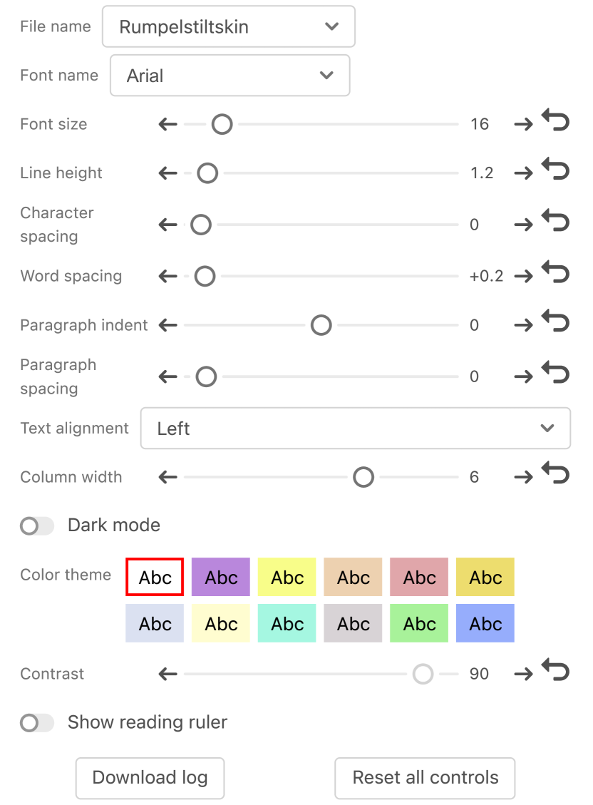
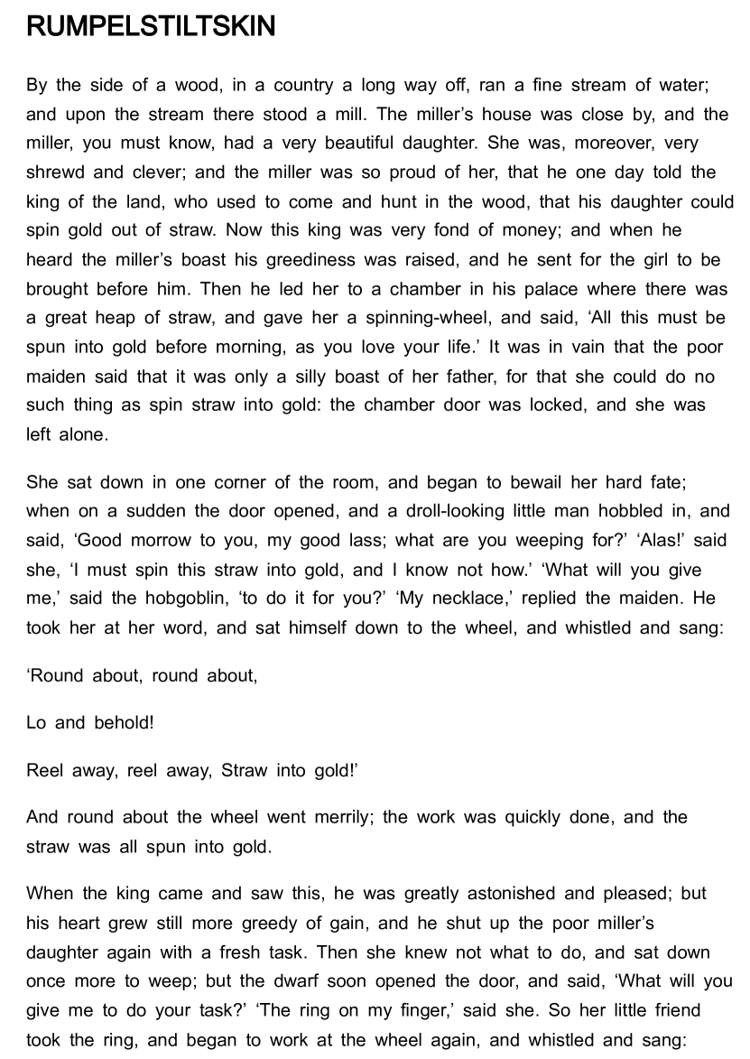
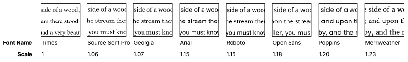
The first version of our text settings prototype offered participants an exhaustive list of 11 possible text adjustments based on prior literature (§2.1) (Miniukovich et al., 2017, 2019; Hanson and Crayne, 2005), including fonts, sizes, spacings, text alignments, and color themes, among others (Figure 2). We offered eight fonts: Montserrat, Open Sans, Arial, Roboto, Merriweather, Georgia, Source Serif Pro, and Times, based on previous literature showing that they are diverse, prevalent, and readable, with characteristics generalizable to other fonts (Cai et al., 2022). Participants could adjust these settings in the text settings panel (Figure 2(a)) and preview the changes to the text in a reading panel (Figure 2(b)) preloaded with four Creative Commons passages in English (723-2934 words each). All text settings included wide ranges of possible values and supported adjustments in both step increments and with a continuous slider. In later parts of our study, a theme review panel also allowed participants to review and rate text setting presets (Figure 6(a)).
We conducted a pilot study with the prototype to assess its ability to support the THERIF pipeline (introduced in §4). The study included four iterations and was conducted on the UserTesting platform (UserTesting, 2023), using the think-aloud protocol to collect participants’ feedback. The study involved 271 crowdworkers and design sessions with four designers throughout four iterations. Iterations included 100, 51, 60, and 60 crowdworkers, respectively. Studies lasted an average of 40 minutes, with each participant compensated $30 hourly.
The four designers111Designers were similar to the population they design for (Newell and Gregor, 2000; Wobbrock et al., 2011). Based on their responses to the dyslexia questionnaire administered, we found that two designers had above-average chances of having dyslexia. were recruited from the same large U.S. corporation: D1: Man with 27 years of design experience; D2: Man with 20 years of design and typography experience; D3: Woman with 10 years of design experience; D4: Woman with 8 years of design experience. Only full-time work experience was reported.
In each iteration, crowdworkers used the text settings panel to design their preferred reading formats, machine learning clustered reading formats into groups containing similar formats, and the designers selected group representatives as the reading themes for the next iteration (§4.2). Two authors used descriptive codes (Saldaña, 2021) to summarize participants’ design process and their think-aloud feedback, identifying frequently used text settings and adjustment patterns. The authors then met with all four designers to review the descriptive codes, relate them to participants’ designs, and develop high-level learnings (§3.2). We incorporated learnings from the pilot to refine both the prototype and study design for the implementation of THERIF in the next section (§4).
3.2 Initial learnings
3.2.1 Fewer text settings
While the first version of our prototype included a comprehensive set of text settings (Figure 2), the pilot study helped us narrow down the text settings that would form the foundation of our reading themes in the following sections. We removed the setting for paragraph spacing and indent because neither designers interviewed in the pilot study nor previous literature considered them important for reading performance. We also removed text alignment because almost all participants chose left alignment, a default supported by typographers and past work (Miniukovich et al., 2019; Ling and van Schaik, 2007). We removed settings for background color, contrast, dark mode, and column width due to a lack of consistent patterns in participants’ preferences: these settings tended to be dependent on reading context and content, and we imagine that reading applications would add them as customization features alongside the reading themes. The revised prototype is therefore limited to font selections, character, word and line spacing — the key properties of our reading themes. These settings are also those identified to affect web readability by WCAG 2.1 (Kirkpatrick et al., 2018). During discussion, designers similarly mentioned that the combination of glyph and spacing characteristics helps tailor messages to different audiences, and that striking a balance among these variables is challenging. Appendix Table 4 lists the eleven settings originally included and the four that remained after the pilot study.
3.2.2 Normalize font sizes
The viewing distance, screen size, and resolution that participants use for reading (and for this study) are all variable and confounded with the optimal font size (Li et al., 2020). Similarly, when reviewing the reading formats designed by crowdworkers in the pilot study, designers attributed variations in font size settings to device and environment-specific idiosyncrasies. Therefore, we opted to fix the font size in the final prototype.
Even at the same pixel size, fonts with taller x-heights may bias participant preferences (Wallace et al., 2022). Designers pointed out that taller fonts in our set, such as Poppins and Merriweather, are up to 23% taller in x-height than the shortest, and result in a perceptually tighter spacing between lines of text, despite the same spacing setting (Figure 3). Therefore, similar to previous remote readability studies (Wallace et al., 2022), we normalized all fonts to help them appear perceptually similar, and reduce confounds.222“x-height” measures the average height of lowercase characters of a font. We performed normalization by x-height rather than glyph height because x-height is one of the key factors that affect the readability of a font (Cai et al., 2022). In the main study, all fonts have the same x-height as Times at 17px, the most popular font size based on our pilot data.
3.2.3 Initialize the prototype with more variety
In the pilot study, we started all participants with the default setting of Arial font at 16px, 1.2 line spacing, and default values of character and word spacing (0em), and we asked them to explore the text settings to arrive at a preferred format. Designers commented that initializing with the same default setting for everyone may limit the full space of text settings participants end up exploring. On the other hand, starting participants with randomly initialized values for each text setting would lead to many unreadable experiences. Therefore, we utilized the text setting values selected by participants in the pilot study to initialize the prototype in the main study (§4.1.1). Based on clustering the reading formats generated by pilot study participants, we obtained six combinations of (character spacing (em), word spacing (em), line spacing): (0, 0.2, 1.9), (0, 0.2, 1.6), (0, 0.1, 1.6), (0, 0.1, 1.5), (0, 0, 1.6), (0, 0, 1.5). In the main study, participants in the first iteration of THERIF started with one of these six spacing presets, randomly paired with one of our eight study fonts. Because previous studies showed diverse preferences for reading fonts (Wallace et al., 2022), we randomize the font to ensure all fonts have an equal chance of being chosen.
3.2.4 Other improvements
By analyzing participants’ think-aloud feedback as they used the text settings prototype in the pilot studies, we made additional improvements to the interface.
Some participants mentioned that the left text settings panel can be distracting when previewing the reading format after adjusting the settings. We updated the prototype design so that the settings panel hides from view when the cursor was moved away, to allow participants to preview the reading passage in isolation of any other UI components, mimicking a naturalistic reading application. In the main study, participants were instructed to move their cursor away from the text settings panel whenever they made adjustments to the text.
We also observed that participants exhibited a higher likelihood of selecting fonts and reading passages positioned towards the top of their respective dropdown lists. To mitigate the positional bias, we randomized the order of fonts and reading passages for each participant in the main study. This final version of the text settings prototype was used in all the iterations of the THERIF pipeline, as described in the next section.
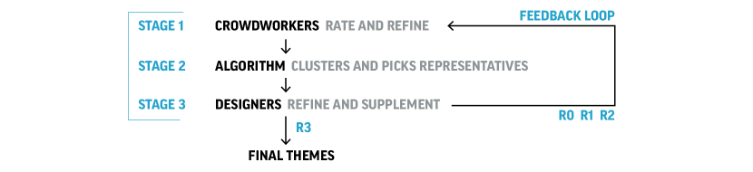
4 Introducing THERIF
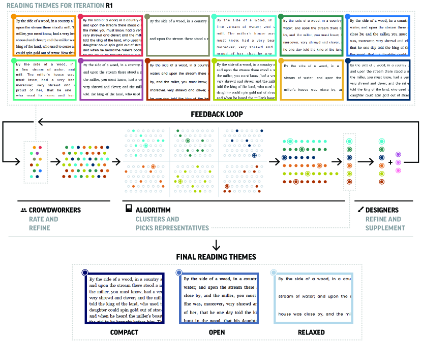
In this section, we introduce the THERIF pipeline for producing reading themes. The pipeline includes an iterative feedback loop that allows collaboration between crowdworkers, a machine learning algorithm, and designers (Figure 4). Components of the THERIF pipeline are motivated by established evidence in crowdsourcing design, designer participation, and scalable feedback systems (§2.4).
Each iteration of our THERIF pipeline includes three stages: (1) Crowdworkers customize text settings to create diverse reading formats (§4.1); (2) ML algorithms automatically cluster the resulting formats and designate cluster representatives as reading themes for the next iteration (§4.2); (3) Designers supplement additional reading themes in order to incorporate any design considerations into the process of theme creation (§4.3). Stage 1 was motivated by user-centered design and participatory design practices (Spinuzzi, 2005), and prior work demonstrating the successful use of crowdsourcing for design studies (Salganik and Levy, 2015; Cranshaw and Kittur, 2011; Xu and Bailey, 2012; Yu and Nickerson, 2011; Nickerson et al., 2008; Park et al., 2013; Chen et al., 2013). Stage 2 leveraged machine learning to simplify collaboration between the crowd and the expert (Head et al., 2017). Stage 3 was intended to ensure good design practices were followed in the design of readable text formats (Spinuzzi, 2005; Park et al., 2013). THERIF is run iteratively to help refine designs over time (Gulley, 2001; Resnick et al., 2009; Yu and Nickerson, 2011; Xu et al., 2015).
We repeat these three stages of THERIF over multiple iterations. We refer to the iterations by R0, R1, R2, and R3. Each iteration starts with a group of crowdworkers adjusting text settings from the provided defaults to their liking. The very first refinement iteration (R0) is initialized with themes that are based on data from the pilot study. All subsequent iterations (R1-R3) are initialized with the themes obtained from the previous iteration, after automatic clustering and design sessions. While we ran four iterations to produce the final set of themes in this paper, this pipeline is extensible to future iterations. For every iteration, we recruit a new set of crowdworkers that have not participated in this study before, to ensure that the reading themes evolve to be representative of diverse readers’ preferences rather than fine-tuned to the preferences of a few.
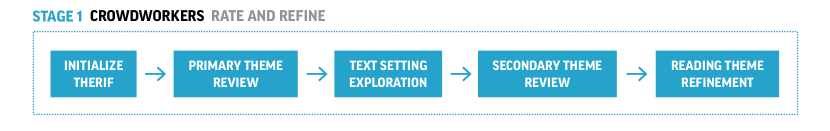
4.1 Stage 1: Crowdworkers rate and refine
Every iteration of THERIF starts with a new population of crowdworkers using the reading settings prototype (Figure 6) to refine the text settings based on their reading preference. The prototype is initialized with the set of reading themes from the last iteration of THERIF, except for the very first iteration (R0), which is initialized with a single reading theme for each participant, randomly selected from the pilot study themes. This section describes how we familiarize participants with the text settings and reading themes, and guide them through the process of customizing a desirable reading format.
4.1.1 Initializing THERIF
On the very first iteration (R0) of THERIF, our goal was to initialize the reading prototype with some basic text settings that participants could refine further. At the same time, we did not want to bias or anchor participants to any one selection of settings, nor present them with an unreadable default. For this purpose, we used the data from the pilot study to generate six representative combinations of (character spacing, word spacing, line spacing) that we sampled from and randomly paired with one of our eight study fonts (§3.2.3), to generate a variety of starting points for participants’ text formats.
4.1.2 Primary theme review
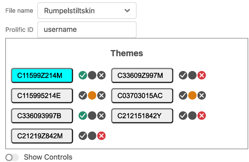
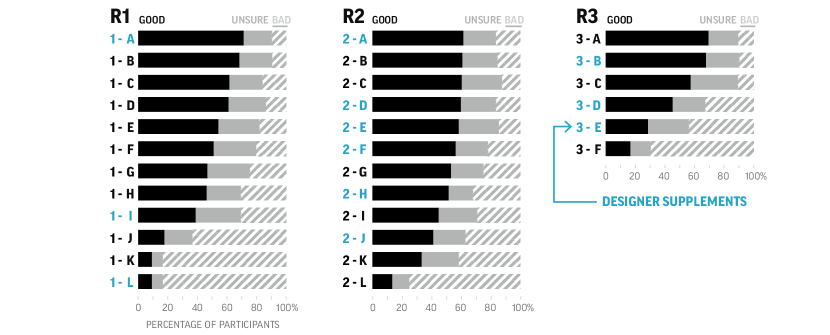
Participants in THERIF iterations R1-R3 first reviewed the reading themes from the previous iteration. They were instructed to review and rate each theme (good, unsure, or bad). We always included a validation theme, intended to represent a poor reading format, in the mix. We selected 11 validation themes from the pilot study design sessions, where we had asked designers to point out poor reading formats from the full set of formats generated by pilot study participants. One of these 11 themes was presented at random along with the other reading themes participants rated. Participants in R0 do not complete the theme rating step because they refine from a randomly initialized reading theme. Afterward, we asked participants to “identify your favorite reading theme and click on it”. Their selected reading theme would then be highlighted in the theme rating panel (Figure 6(a)).
4.1.3 Text setting exploration
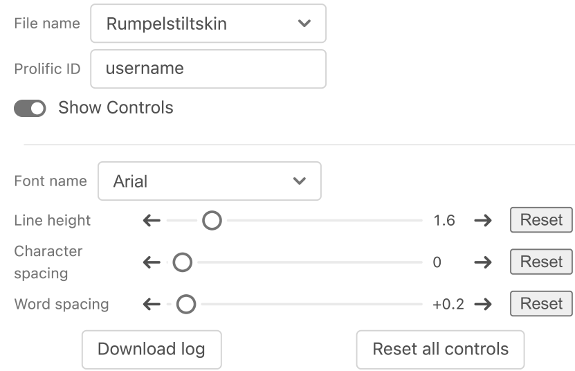
Starting with their preferred theme (iterations R1-R3) or a randomly initialized theme (R0), participants were then instructed to click a button to uncover the previously hidden text settings for further text refinements. In this part of the study, the theme rating panel (Figure 6(a)) was replaced by the text settings panel (Figure 6(b)). We instructed participants to try out each setting individually and observe how it affected the text using a think-aloud protocol. This ensured that participants gained familiarity with all the text settings before the next step.
4.1.4 Secondary theme review
After getting acquainted with the various text settings possible in our reading prototype, we reset the interface. Participants in R0 were now presented with another randomly initialized reading theme, while participants in R1-R3 were once again presented with the theme rating panel (Figure 6(a)) preloaded with the same themes as before, but in a randomly shuffled order. Participants were asked to rate all the themes once again, and then select their preferred theme. This secondary theme review step allowed participants to make their ratings and selections with awareness of the further text adjustments possible once a theme was selected.
4.1.5 Reading theme refinement
Starting with the selected reading theme from the last step, we then asked participants to refine the theme further “to their liking”, by toggling to the text settings panel (Figure 6(b)) one last time. As they customized their reading format, we recorded every adjustment, the time elapsed, and the final text settings into a refinements log file for further analysis.
4.2 Stage 2: Algorithm clusters and picks representatives
To converge on a handful of reading themes that represent diverse reader preferences, we cluster all the reading formats generated by participants in Stage 1 of THERIF, and select cluster representatives to serve as reading themes for the next iteration. Since hundreds of different readers can arrive at similar formats, reducing this set of formats to representative examples makes evaluation of different format choices more tractable (Head et al., 2017).
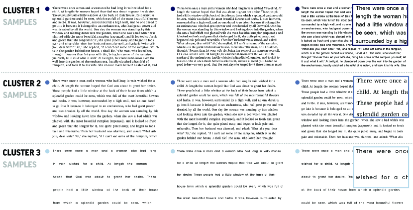
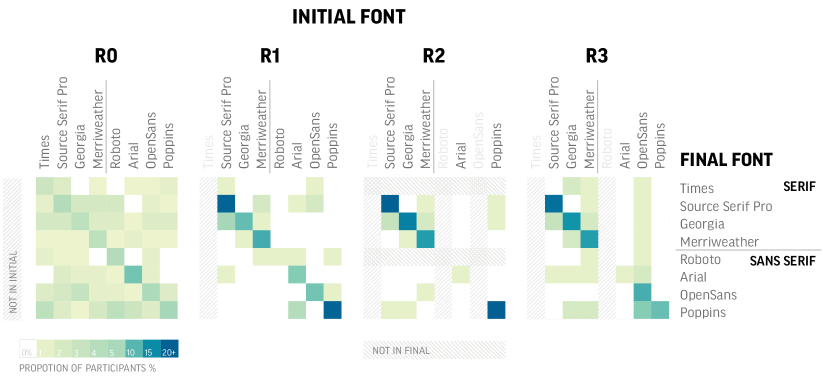
We tried a few different approaches to cluster similar reading formats together. In one approach, we used the values of the text settings (fonts, spacings) as the features for clustering. However, it is not clear how to weight these different features, as they have different effects on the final text appearance. Instead, we found that more interpretable clusters formed when we used screenshots of the reading formats. We trained a convolutional neural network (CNN) on crops of the reading format screenshots to learn to group similar reading formats together (see Figure 7 and Appendix B for details). We use the trained CNN to produce feature vectors for the reading formats, which we then cluster using the k-Means algorithm (see Figure 8 for cluster examples) (Vassilvitskii and Arthur, 2006). To choose the number of clusters, based on the trade-off between the number of clusters and the quality of the clusters, we used silhouette scores and knee point heuristics (Rousseeuw, 1987).
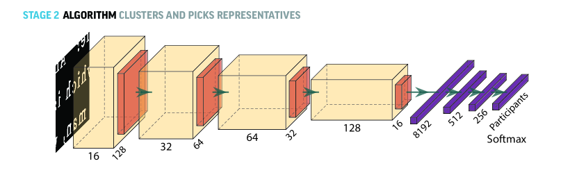
Given the clusters of similar reading formats obtained in the previous step, our next step was to select a representative format from each cluster to serve as a reading theme. During the pilot study, we had asked designers to help us select cluster representatives, but this was a time-consuming process that did not achieve consensus across designers. Because we considered a reduced set of text adjustments for the main study, automatically selected cluster centroids from the k-Means algorithm ended up being good cluster representatives; when shown to designers for validation, designers indicated that they would have made similar choices.
4.3 Stage 3: Designers refine and supplement
Document formatting, especially getting the combination of fonts and spacings to look and feel right, is an involved design task. During the pilot design sessions, D2 commented that designing reading formats that respond to different people “compound the variables designers have to consider”, including but not limited to “glyph characteristics and a variety of spacing features”. To incorporate design considerations into the theme feedback loop, we asked designers to evaluate the reading themes selected after automatic clustering, by allowing them to view each theme and refine it further using the text settings panel. Designers could then save their refinements as additional themes (Figure 9). We used the designers from the pilot study. To keep the task tractable, one designer reviewed the themes after each iteration: D1 added 3 themes after R0, D2 added 6 themes after R1, and D3 added 3 themes after R2. In the last iteration (R3), we chose not to involve designers in creating additional themes or modifying the existing ones, to directly evaluate the crowdsourced themes generated by THERIF.
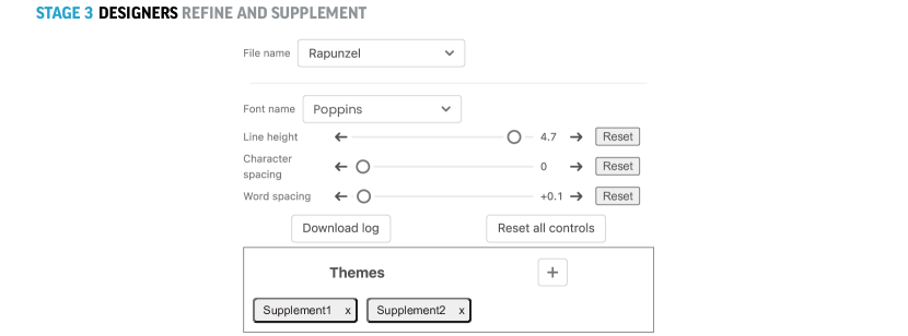
The themes generated from the automatic clustering supplemented by the designers’ themes formed the full set of reading themes presented to participants in the next iteration of THERIF (a total of 12 themes in R1, 12 in R2, and 6 in R3). By involving both designers and new sets of crowdsourced participants in evaluating themes generated after each iteration, we continued improving the themes over time.
4.4 Study Participants
We used the Prolific platform to recruit participants who used English as their first language. We recruited 200 participants for the first iteration (R0) and 100 for each subsequent iteration (R1-R3), for a total of 500 participants. The larger number of participants in R0 was to allow the presets to deviate from the reading themes initialized from the pilot study, thus increasing the diversity of the formats in future iterations.
Dyslexia and age are important factors requiring interface adaptations when reading (Rello and Bigham, 2017; Rello and Baeza-Yates, 2015; Li et al., 2019; Rello and Baeza-Yates, 2013; Rello et al., 2020; Miniukovich et al., 2017; Wilkins et al., 2009; Bernard et al., 2001; Cai et al., 2022; Calabrèse et al., 2016). In each iteration, we recruited roughly 50% participants with dyslexia and 50% without.333Readers with symptoms of dyslexia account for about 15-20% of the world population (Association, 2020). We maintained equal representation to ensure that their reading preferences were also adequately considered. Disclaimer: for convenience, in addition to those diagnosed with dyslexia, we will refer to participants who scored highly on a dyslexia questionnaire (see §4.4.1) as “participants with dyslexia” in the following paragraphs, although they may not have been formally diagnosed nor are willing to self-label as such.
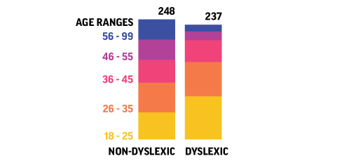
We recruited participants without dyslexia equally from different age brackets: 18-25, 26-35, 36-45, 46-55, and 56-87.444Participants’ age information reflects their age at the time of data export rather than the time of the study. However, when recruiting participants with dyslexia, we were unable to recruit equally from each age group due to the limited number of participants with dyslexia on the crowdsourcing platform. Nonetheless, compared to previous readability studies (Rello and Baeza-Yates, 2015; Rello and Bigham, 2017; Li et al., 2019), our study has significantly more participants with dyslexia, a more balanced representation across age groups, and overall, a larger number of participants. These participants are not intended to be a representative sample of the population in age and dyslexia, but instead to explicitly include diverse readers.
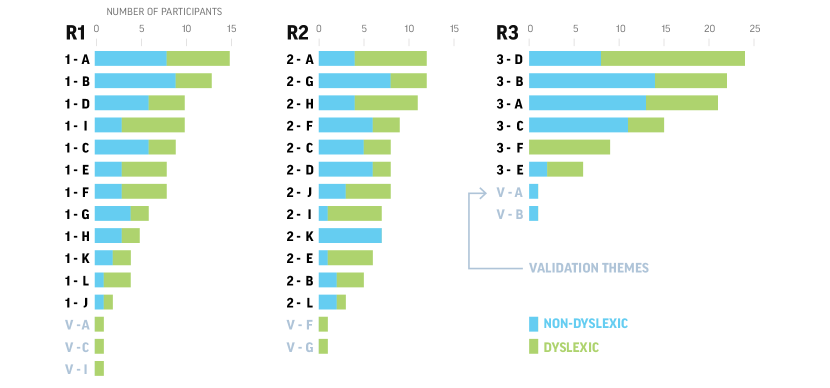
For data quality purposes, we removed participants who (1) failed the attention check question (“Do you bike across the pacific to get to work each day?”), (2) did not complete the full study, (3) did not correctly fill in their username, or (4) finished the study exceptionally fast (three standard deviations faster than the mean of their age group). 485 participants remained after data removal, 237 (49%) with dyslexia and 248 (51%) without (Figure 10). Among the participants, 287 (59%) are women, 196 (40%) are men, and 2 () did not answer. Studies lasted around 30 minutes on average, and participants were compensated $13.5 hourly.
4.4.1 Identifying participants with dyslexia
Identifying participants with dyslexia is challenging because access to comprehensive assessments for dyslexia can be expensive (Sood et al., 2018; Bell, 2013), and many with language difficulties go undiagnosed (Germanò et al., 2010; Pennington, 2006; Adlof and Catts, 2015; Nation et al., 2004). To mitigate these challenges, we identified participants with a higher than average chance of having dyslexia using a questionnaire developed by Cooper and Miles (2011). This questionnaire has shown effectiveness at identifying readers with dyslexia and was adopted by past readability studies (Snowling et al., 2012; Helland et al., 2011; Wolff and Lundberg, 2002; Zorzi et al., 2012). We conducted a screening study with 1,608 Prolific participants who reported having difficulty reading. Among them, we identified 397 (25%) participants who may have dyslexia, and 237 took part in our study.
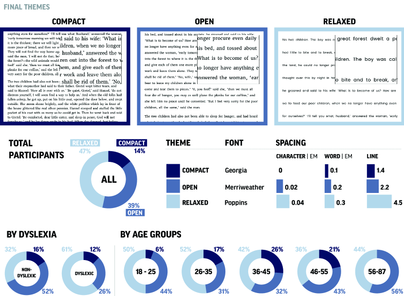
4.5 Final themes
Each iteration of THERIF results in a set of reading themes, obtained by clustering crowdsourced text adjustments (§4.2). The cluster representatives, which are the reading themes obtained from a given iteration, are then used as input to the next iteration. After four iterations of THERIF, three clusters remained, and their corresponding cluster representatives are our final three reading themes, without any further designer inputs or adjustments. Although additional THERIF iterations could have been run, we noticed minimal changes from the third to the fourth iteration (see §5.2 and §5.3). Although additional designer input and adjustments could have been made, we found no significant differences between designer-curated themes and the automatically selected cluster representatives in earlier iterations (§5.1.6). In the next section, we evaluate these three themes, and offer them as a crowdsourced design contribution of this work.
Each of the three themes represents a distinct reading format. Reading themes with larger line spacing also have correspondingly larger character and word spacing. For convenience, we name them the COR themes: Compact, Open, and Relaxed. We visualize what text looks like when rendered in these three themes in Figure 11 and include CSS to reproduce the themes in Appendix D. We additionally include the demographics of the crowdworkers whose text formats were clustered together to produce the COR reading themes (Figure 11). We observed that more participants ended up in the cluster with larger spacing, although 14% of participants preferred the most compact reading format, which is slightly below the recommended web accessibility spacing guidelines (Kirkpatrick et al., 2018; Rello et al., 2012). Most of the participants preferring the compact setting were 26-45, representing the portion of the population more likely to be working professionals. In our pilot study, we found that this cohort of the population was more likely to read for work and have to navigate text quickly, so a more compact format could suit these needs. Participants older than 55 seldom chose a more compact text setting. Formats preferred by participants with dyslexia were more likely part of the reading theme with the largest spacing, supported also by previous literature (Rello and Baeza-Yates, 2015). Noteworthy is that this format was also preferred by a number of participants without dyslexia.
5 Analysis and Evaluation
The role of reading themes is to improve the reading experience. Because both preference and performance are part of the reading experience, in this section, we evaluate both. However, our focus on this paper is skewed towards preference (i.e., whether users like the text presets bundled with a reading theme) because the design process for themes was preference-driven to begin with. In §5.1-5.3 (preference evaluation), we evaluate the effectiveness of THERIF at producing reading themes that are generally likable, match diverse reader preferences, and require limited further customization (i.e., the defaults are “good enough”). In §5.4 (performance evaluation), we also assess the COR themes’ impact on reading comfort, comprehension, and speed to relate our work to prior work on font readability showing that preference and performance are often different (Wallace et al., 2022).
5.1 Different readers have different preferences
Participants had a variety of preferences when reading digitally, as demonstrated by the text settings that different readers adjusted and the final values they selected. We found some of this variation to be linked to participants’ demographics. This reinforces the importance of providing multiple reading themes that fit readers’ diverse preferences.
5.1.1 There is no one-size-fits-all
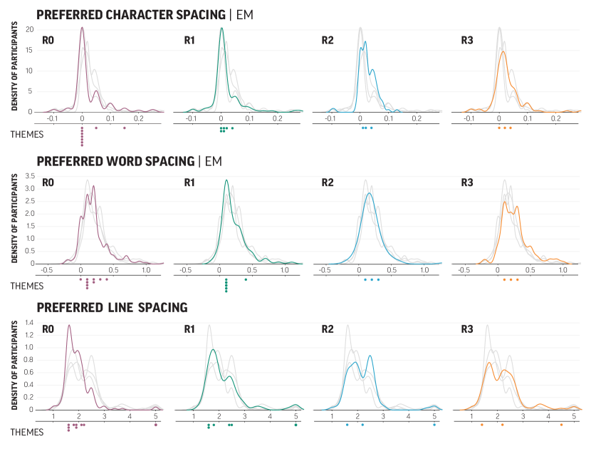
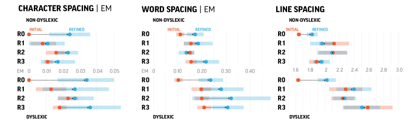
Distributions of preferred text settings were multi-modal; i.e., there was no single spacing or font that every participant preferred (Figures 12 and 13). Additionally, as the iterations of THERIF progressed, text settings became increasingly varied. This is in part because the themes that participants used as starting points diverged, allowing more of the text formatting space to be explored. Additional iterations helped consolidate the theme values, forming distinct text settings that stabilized by the fourth iteration (Figure 12).
5.1.2 Comparison across age groups
When comparing the preferred text settings between age groups using a one-way ANOVA, we did not find a statistically significant difference in the preferred character spacing or line spacing . However, the preferred word spacing settings differed between groups . We used the TukeyHSD pairwise test for post hoc analysis. Compared to participants in the age groups of 26-35 and 46-55, those 18-25 preferred larger word spacing, averaging 0.30em compared to 0.21em and 0.20em respectively .
5.1.3 Comparison with and without dyslexia
Compared to participants without dyslexia, those with dyslexia preferred larger character spacing , word spacing , and line spacing (Table 1). The significant difference in reading preferences between readers with and without dyslexia necessitates the inclusion of both groups of readers when designing reading experiences.
Participants with and without dyslexia had similarly different preferences for themes across the THERIF iterations. Themes that were downvoted by participants without dyslexia were more likely to be preferred by those with dyslexia (see Figure 15), a trend also reflected in the COR themes (Figure 11). Nonetheless, large overlap in preference exists.
| Character Spacing (em) | Word Spacing (em) | Line Spacing | ||||
| mean | std | mean | std | mean | std | |
| Non-Dyslexic | 0.02 | 0.05 | 0.18 | 0.18 | 1.93 | 0.52 |
| Dyslexic | 0.03 | 0.07 | 0.28 | 0.35 | 2.25 | 0.73 |
5.1.4 Comparison across iterations
Comparing iterations, we found that the participants’ average preferred line spacing increased from 1.92 to 2.18 from R0 to R1 . However, no statistically significant difference in other text settings existed between iterations. This finding indicates that the participants had consistent spacing preferences throughout iterations of the study.
Font choices did not differ significantly among participants from different age groups or between participants with and without dyslexia . However, between iterations, the distributions of the preferred fonts varied . The evolving theme settings may cause such variation. In R0, where fonts are randomly paired with spacing settings from the pilot, only 36.6% of the participants stayed with the theme’s default font. However, in R1-R3, where participants selected from 12, 12, and 6 themes respectively, 76.3%, 87.8%, and 66.7% respectively chose not to refine the font choice from the theme default despite the fewer number of themes available to choose from (Figure 13).
5.1.5 Preference for themes is diverse
After each THERIF iteration, the combination of the crowdsourced and designer-created themes formed the set of reading themes shown to new participants in the next iteration. Both crowdsourced and designer-created themes received similarly positive responses, with most themes receiving more positive votes than unsure or negative (Figure 14). No single theme was a winner by a large margin, an unsurprising finding given participants’ preference for diverse text settings (Figure 12). As a sanity check that participants’ ratings are not random, all the validation themes (§4.1.2) received predominantly negative votes (see supplementary material), and only 2.4% (7 out of 294) participants from R1 - R3 indicated that they preferred a validation theme.
5.1.6 THERIF themes and designer-created themes are similarly preferred
Similar to prior literature (Park et al., 2013; Yu and Nickerson, 2011), including a related iterative design crowdsourcing pipeline (Yu and Nickerson, 2011), we compare designer creations with designs (i.e., themes) that automatically emerge from our THERIF pipeline. Specifically, participants in iterations R1-R3 of THERIF were presented with themes that were both automatically selected and manually created by designers, and we leveraged their feedback to compare these two sets of themes. Across R1-R3, the number of good, unsure, and bad votes received by designed themes and THERIF-generated themes did not differ significantly . In R1 and R3, THERIF-generated themes received more positive votes per theme (43.8 votes in R1, 42.7 in R2, 45.3 in R3) compared to designed themes (37.7 in R1, 52.8 in R2, 44.3 in R3). When asked to select a favorite theme, similar numbers of participants selected the THERIF-generated themes (on average 7 participants per theme in R1, 8 in R2, 15 in R3) and the designed themes (on average 9 participants per theme in R1, 7 participants in R2, 17 participants in R3.
5.2 Themes converge over iterations to concisely represent diverse formats
Next, we evaluated the ability of the clusters automatically computed in the THERIF pipeline to be representative of the formats customized by participants using the provided text settings. We first evaluated the individual clusters visually with designers. All four designers confirmed that our automatic approach effectively grouped formats together, where formats in a cluster were more similar than formats across clusters.
We also evaluated the quality of the clusters using silhouette scores, which assign higher scores to clusters of reading formats with higher intra-cluster similarity and lower inter-cluster similarity. In Table 2 we see that the silhouette scores for the clustering improved with additional iterations of THERIF, indicating that the formats created by participants were converging to a handful of similar experiences, that the reading themes could represent well.
Keeping the clustering criteria the same, the total number of clusters decreased over the THERIF iterations (Table 2). A smaller number of clusters, which translates to a smaller number of themes, makes the process of selecting a comfortable reading format easier. However, we wanted to ensure that even with the smaller number of clusters, diverse text settings were still represented. Indeed, we observed that the ranges of the text settings values remained relatively stable between iterations (Figure 12). The settings between R2 and R3 were more similar compared to the previous iterations, suggesting convergence. With additional iterations, themes with similar text settings were grouped, leading to increasingly distinct settings. For instance, R0 and R1 saw clusters of character spacing and line spacing settings similar in value. However, they were later grouped into the same theme (Figure 12).
| Iteration | Number of Clusters | Silhouette Score |
| R0 | 9 | 0.19 |
| R1 | 6 | 0.22 |
| R2 | 3 | 0.20 |
| R3 | 3 | 0.26 |
5.3 Themes in later iterations require less customization
During the initial refinement iteration (R0), we observed that all participants increased character, word, and line spacing from the default theme, resulting in a set of diverse formats (Figure 16). Participants with dyslexia increased word spacing during R1 and R3, and participants without dyslexia increased character spacing in R2 and word spacing in R3, respectively (Table 3). As the THERIF iterations progressed, participants made fewer refinements to the provided themes (Figure 16), indicating that the defaults were “good enough”, i.e., meeting their preferences.
| Iteration | Dyslexic | Text Setting | df | t | p | Cohen’s d |
| R0 | Yes | Character Spacing | 90 | 4.03 | 0.00 | 0.60 |
| R0 | Yes | Line Spacing | 90 | 6.15 | 0.00 | 0.89 |
| R0 | Yes | Word Spacing | 90 | 5.47 | 0.00 | 0.72 |
| R0 | No | Character Spacing | 99 | 3.94 | 0.00 | 0.56 |
| R0 | No | Line Spacing | 99 | 4.59 | 0.00 | 0.62 |
| R0 | No | Word Spacing | 99 | 3.64 | 0.00 | 0.44 |
| R1 | Yes | Word Spacing | 47 | 2.18 | 0.04 | 0.33 |
| R2 | No | Character Spacing | 48 | 4.14 | 0.00 | 0.37 |
| R3 | Yes | Word Spacing | 48 | 3.42 | 0.00 | 0.54 |
| R3 | No | Word Spacing | 49 | 2.58 | 0.01 | 0.41 |
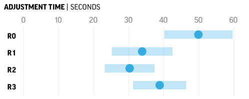
Apart from examining the text settings themselves, we also considered the time participants spent making adjustments to the default themes. Comparing iterations, we found that participants in R1 spent significantly less time on refinement than R0 .555We applied Welch’s t-test to compare adjustment times between R0 and R1 due to their unequal variances and sample sizes. We applied t-tests of equal variance for subsequent comparisons. Only time spent on refinement after the “Secondary Theme Review” step is considered adjustment time (Figure 5). Refinement time may be related to the number of themes presented. The fewer theme defaults available, the more likely participants will spend more time making refinements, which explains why participants in R0 with one default setting spent the most time customizing their reading format. However, despite the decreasing number of themes from 12 in R1 to 6 in R3, participants did not spend more time on refinements. No significant difference existed when comparing the refinement time between R1 and R2 or R2 and R3 (Figure 17), indicating that the smaller number of themes were nevertheless meeting participant preferences.
5.4 Reading themes can improve reading performance
While the focus of this work is on offering reading themes that match participants’ preferences as shown in the previous evaluation sections, in this section we also consider how themes can contribute to reading performance.
When identifying participants with dyslexia in our screening study (§4.4.1), we also surveyed them about factors they considered most important when reading digitally. Of the 1,608 respondents, 75.6% and 71.1% respectively considered reading comprehension and comfort important, while 34.9% cared about speed.666This was administered as a multiple-choice question. Participants could provide additional free-form text answers; no other consistent criteria surfaced. Here we evaluate whether themes summarized from crowdsourced, preference-based designs can also improve reading performance, measured by these three objectives readers considered important.
5.4.1 Methods
We conducted readability tests using an interface modeled after the one in Wallace et al. (2022). During the study, participants read in the three COR themes, as well as a control theme that mimics standard digital reading defaults in Microsoft Word and Google Doc (Arial font, 0em character, 0em word, 1 line spacing). Consistent with prior readability studies, we choose a fixed control theme to help compare themes’ effect across participants across age and dyslexia spectrums (Li et al., 2019; Wallace et al., 2022; Kadner et al., 2021; Wery and Diliberto, 2017).
Participants read an 8th-grade passage in each theme, presented in a randomized order. Passages averaged 150-250 words in length, and they were split across four separate screens to capture more robust reading speed measurements while maintaining comparable numbers of words per screen (Cai et al., 2022; Wallace et al., 2022). Each passage was followed by four comprehension questions (Wallace et al., 2022). To quickly transition between screens, participants made a key press. To get acquainted with the interface, participants completed a warm-up study round (in a format different from the four tested themes).
We measured a reading theme’s performance using three metrics: reading comfort, comprehension, and speed. We measured the comfort score using a 5-point Likert scale answer (“not at all” to “extremely”) to the question “how comfortable is the reading experience you’ve just seen?”, speed using WPM (Words Per Minute), and comprehension as the percentage of questions answered correctly.
5.4.2 Study Participants
We recruited crowdworkers on Prolific who speak English as their first language. We removed participants who (1) did not complete any given portion of the study, (2) attempted the study multiple times, or (3) had taken part in similar reading studies or had participated in the THERIF iterations. Based on recommendations from prior work (Carver, 1990, 1992; Wallace et al., 2022; Cai et al., 2022), we removed individual reading speed measurements above 650 or below 50 to remove participants who may be skimming or not paying attention to a given screen. 140 participants remained after data removal, 72 with dyslexia and 68 without. Participants without dyslexia came from a balanced age group resembling those from the main study. The study lasted 30 minutes on average, and participants were compensated $15 hourly.
5.4.3 Results
Comfort, Comprehension, and Speed
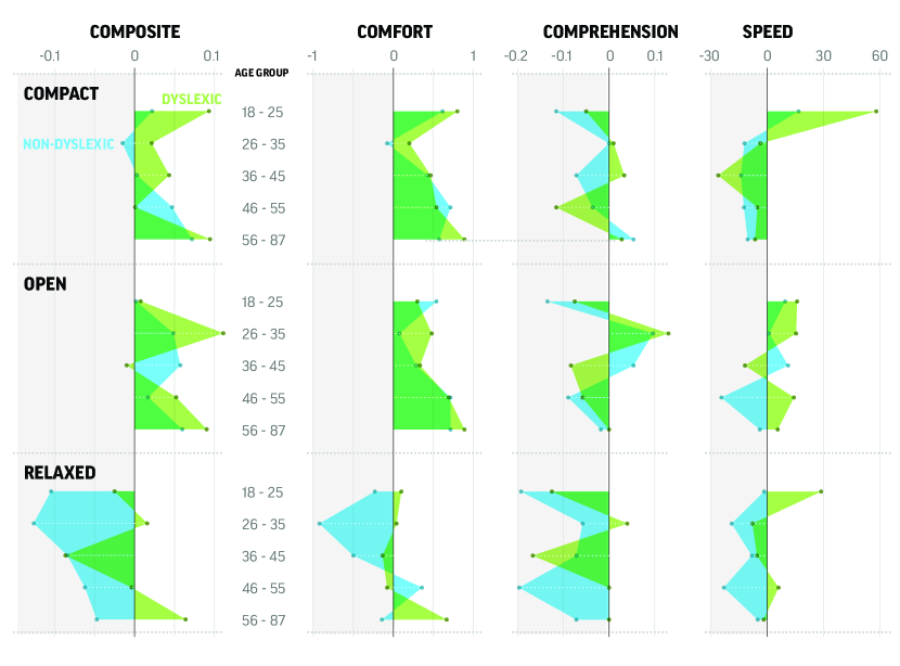
When evaluated by individual performance metrics, participants generally considered COR (Compact, Open, Relaxed) themes to be more comfortable than the control theme (Figure 18). Across participants, 91% of them rated at least one of the COR themes to be at least as comfortable as the control theme, and 61% of them rated a COR theme as strictly more comfortable. Themes’ effects on comprehension and speed differed by age and dyslexia. Participants with dyslexia generally read faster with the Open theme. However, the Compact theme lead to faster reading speeds for participants with dyslexia aged 18-25 (Figure 18). We hypothesize that this may be due to narrow character spacing reducing saccades (Arditi et al., 1990; Minakata and Beier, 2021). No other consistent effect of reading themes on speed and comprehension was observed, as there is likely to be a speed-comprehension trade-off at play (Foraker and McElree, 2011; Wallace et al., 2021; Reed, 1973; MacKay, 1982).
To examine whether the effect of COR themes differs by participant demographics, we constructed linear mixed effect models (LMEs) to predict each of the performance metrics with age, dyslexia, and reading theme as fixed effects, and participant ID as crossed random effects. LME results showed that age significantly affected reading speed in the Compact theme, reducing speed by 0.7 WPM per year . This finding is consistent with our observation in THERIF iterations, where few older readers preferred the Compact theme (Figure 11). We did not find statistically significant variation in comfort or comprehension across age or dyslexia. See Appendix F for the full results.
Combining performance metrics
Evaluating reading performance with individual metrics does not account for trade-offs and interactions, such as between reading speed and comprehension (Foraker and McElree, 2011; Wallace et al., 2021; Reed, 1973; MacKay, 1982). There is no right answer when it comes to combining the metrics, which depends on the application and scenario. In an attempt to combine the metrics into a single composite score according to what readers consider important, we use the results of our survey and convert participant votes into scalar weights to trade-off comfort, comprehension, and speed: .
For each of the participant groups, at least one of the COR reading themes performed better than the control theme (Figure 18). Results differed with participants’ demographics. Participants aged 18-25 performed better with the Compact reading theme, whose line spacing is larger than the control theme (1.4 instead of 1). Participants aged 26-45 performed better with the Open reading theme. Participants over 45 benefited from multiple reading themes, where the Relaxed theme especially benefited older participants with dyslexia. Generally, themes brought larger improvements to readers with dyslexia and the youngest and oldest of readers in our study population.
6 Discussion
In this paper, we showed that by iterating between crowd-generated text formats (through setting adjustments), automatic clustering, and design sessions, we converged on a handful of representative reading formats, which we call themes. This outcome was not guaranteed at the outset of the study, since another possible outcome could have been a growing and continually diverging set of formats. After four iterations (R0-R3) of our THERIF pipeline, multiple pieces of evidence suggested convergence: (1) The settings between iterations R2 and R3 stabilized (Figure 12), (2) the number of unique clusters (i.e., themes) decreased across the iterations and then stopped changing (Table 2), and (3) the adjustments participants made to the themes provided — in terms of both absolute value (Figure 16) and time (Figure 17) decreased. In other words, participants were able to select out of the defaults provided and were satisfied enough with the initial theme settings to not have to make further changes. As iterations progressed, themes that were poorly rated earlier fell out of consideration, even though we did not explicitly filter by likability. Instead, this happened naturally as a byproduct of the automatic clustering of the most common formats study participants selected.
Importantly, each iteration of our THERIF pipeline involved a new group of participants, meaning that the themes generated from the text settings of the prior’s iterations participants remained representative. If we had used the same participants for all four iterations, we would be limited to claiming that our themes converged to represent the preferences of a particular group; instead, we can be more confident in claiming that our themes represent the preferences of a population across age and dyslexia spectrums.
By recruiting participants with different reading and learning abilities, and a variety of ages, we end up converging on a set of themes that meet diverse readers’ preferences. While some segments of the population tend to get more benefits from the reading themes (e.g., older participants and those who score higher on the dyslexia questionnaire both preferred, and performed better in, the themes with larger spacing), the themes are intended to be universal. Another way to look at these results is that while the effects of text settings on reading may be governed by some demographic characteristics, reading preferences and performances are highly variable across individuals, as found also by prior work (Beier et al., 2021a; Wallace et al., 2022; Cai et al., 2022; Chatrangsan and Petrie, 2019; Zhu et al., 2021; Rello et al., 2016; McKoon and Ratcliff, 2016; Korinth et al., 2020).
6.1 Learnings
The learnings from this work are based on evidence that has come together from multiple sources, over the duration of our experiments: (1) the pilot studies and initial design iterations (§3); (2) four iterations of the THERIF pipeline (§4), which included (i) text settings manually adjusted by crowdsourced participants, (ii) clusters automatically computed from all the crowdsourced formats, and (iii) design refinements along with the additional comments provided by designers; and (4) a performance evaluation of the COR themes according to multiple criteria (§5). We took care to avoid having participants participate in our studies more than once, since we had many iterations and evaluations to complete; the cumulative learnings come from the participation of 896 total crowdworkers777Out of 896 crowdsourced participants, 271 took part in the pilot study (§3), 485 in the main study (§4.4), and 140 in the reading performance study (§5.4.2). aged 18-87 and the involvement of 4 designers with 8 - 27 years of design and typography experience.
Larger character, word, and line spacing go hand-in-hand
Considering the text setting values in the COR themes, spacing monotonically increased from one theme to the next, in line with common typographical considerations and past research (Highsmith, 2020; Reynolds and Walker, 2004), and similar to patterns observed in spacing combinations obtained from the pilot study (§3.2.3). This was not enforced but fell out naturally from the THERIF iterations. The variation in spacing between the themes is what led to our naming convention: Compact, Open, and Relaxed (Figure 11). This result mirrors the importance designers and participants placed on varying spacing. For instance, when refining reading themes, designers emphasized their focus on varying spacing to achieve different visual “textures” and “density” in order to support different readers. Participants favoring a “compact reading experience” cited the need to “fit as much information on a page as possible”. In contrast, participants opting for larger line spacing did so to “focus on each line of the text” when reading. Some user interfaces, such as Gmail, already allow users to adjust spacing settings to achieve different “information density” (Inc., 2011). However, to our knowledge, this is the first time such a rigorous process has been undertaken to arrive at a set of spacing presets based on diverse reader preferences.
Larger spacing benefits readers with dyslexia
Participants that scored high on the dyslexia questionnaire preferred larger character, word, and line spacing (Table 1), reinforcing the finding that the three types of spacing go hand in hand. Simultaneously, a sizable proportion of the participants without dyslexia had a similar preference for increased spacing. Spacing preferences vary even among participants with dyslexia. The Relaxed theme has a line spacing of 4.5, larger than the average 2.25 setting manually selected by participants with dyslexia (Table 1), and corresponds to a subset of participants preferring line spacing of 4-5 (Figure 12). This setting is also larger than prior recommendations, although previous work focused on performance while we focused on reader preference (Rello and Baeza-Yates, 2015; Association, 2012). In our reading performance study, we found that older participants with dyslexia especially benefited from the Relaxed theme due to its positive effect on reading comfort and comprehension (§5.4.3).
Font choice varied with spacing
Theme fonts varied with the spacing settings (Figure 11). Both Compact and Open themes are paired with serif fonts. While the tighter spacing in these themes increases information density, the need to accommodate serifs introduces additional horizontal spacing beyond existing text settings to support glyph legibility (Arditi and Cho, 2005). On the other hand, Poppins, a sans serif font, was paired with the Relaxed theme. Previous research showed that sans serif fonts can better support readers with low vision and those with dyslexia (Russell-Minda et al., 2007; Rello and Baeza-Yates, 2016). Similarly, Korinth et al. (2020) found large character spacing to support language learners. Previous work has shown that a font’s impact on reading is driven by characteristics such as x-height, character width, stroke contrast, etc. (Cai et al., 2022). Therefore, the recommended fonts in our COR themes may be replaceable by others with similar attributes (in case there are application, device, or branding constraints).
Themes agree with accessibility guidelines and previous work
WCAG recommends character, word, and line spacing values of 0.12em, 0.16em, and 1.5 respectively (Kirkpatrick et al., 2018). The settings of the Compact theme are slightly below the recommendation but are nonetheless above modern browsers’ default settings (Network, 2022). Both Open and Relaxed themes conform to the recommendations for word and line spacing. Interestingly, participants in our study preferred narrower character spacing than recommended by WCAG.
The fonts selected for our reading themes have been shown by previous work to correspond to participant preference or good reading performance. Cai et al. (2022) used the same eight fonts we started our THERIF iterations with and reported that Merriweather (Open theme) was the most preferred font by participants, Georgia (Compact theme) resulted in the largest improvement in reading performance, and Poppins (Relaxed theme) led to speed improvements, especially for language learners (Cai et al., 2022; Korinth et al., 2020).888 Cai et al. (2022) did not normalize font sizes.
Participants overlapped in their theme preferences
THERIF did not produce separate reading themes tailored to readers with dyslexia and those without (Figure 15). Instead, all three COR reading themes reflected both cohorts’ preferences. The overlap in theme preferences shows that creating separate designs based solely on different demographics (e.g., “a font for people with dyslexia”) may be shortsighted. Unsurprisingly, our preliminary experiments were unable to predict preferred text settings based on demographic information alone (see supplementary material for results). Previous work similarly showed that individual abilities vary on a spectrum (Cooper and Miles, 2011; Snowling et al., 2012), and a separate design for a specific cohort may not meet the full range of user needs. This leads to the realization that designing a wide enough range of experiences can meet the needs of many without needing to assign labels to people.
6.2 Limitations and future work
We have presented a pipeline for designing reading themes that meet the diverse preferences of English-speaking readers by iterating on crowdsourced designs, designer refinements, and an automated clustering algorithm. Below, we discuss several limitations of our current study and provide recommendations for future research directions.
Participants
Our efforts were focused on adult readers (ages 18-87) who speak English as their first language. We were not able to recruit enough participants with dyslexia that were in the older age groups (46 and above) due to the limited number of such participants on the crowdsourcing platform we used. Additionally, compared to a professional diagnosis, the dyslexia questionnaire used may fail to differentiate between participants with dyslexia and those with ADHD because they exhibit similar reading difficulties. We did not explicitly recruit participants with other conditions, such as those with low vision. Future research can expand recruitment efforts and deploy more comprehensive questionnaires to include readers that were not represented in our studies and better understand their preferences and needs.
Reading platform
Our reading themes were developed in a desktop reading setting. Future work may consider generalizing the THERIF pipeline to other platforms, such as mobile devices, tablets, and e-readers, or even beyond digital reading to printed material. In Appendix G, we report the results of a survey showing participants’ willingness to use the themes in other contexts. Some of these platforms may be better suited to specific audiences, like children in the classroom or readers in under-served communities where mobile devices may be the default reading device.
Reading contexts and tasks
Previous studies reported that preferred reading formats may differ by context, such as time of day, type of reading, etc. We recruited a large number of participants to capture not only a variety of demographics but also diverse reading contexts. Future work may consider explicitly matching reading formats to specific contexts or tasks. Whereas we focused on general reading of page-length texts, other formats may be more suitable for glanceable reading (Sawyer et al., 2020), long-form reading (Ali et al., 2013; Sawyer et al., 2020; Srivastava et al., 2021), and reading on complex backgrounds (e.g., in video captioning and AR environments) (Hall and Hanna, 2004; Beier et al., 2021a; Bednarski and Pietruszka, 2013; Rello and Bigham, 2017; Sawyer et al., 2020; Beier et al., 2021a), or in the context of document elements like figures and tables (Beier et al., 2021a).
Typographical considerations
We normalized the sizes of our study fonts to obtain comparable x-height (§3.2.2), an important factor influencing readability (Cai et al., 2022; Wallace et al., 2022; Wilkins et al., 2009; Rolo, 2021; Sheedy et al., 2005; Highsmith, 2020). Previous literature and typographers interviewed for this study believed that such normalization leads to more perceptually similar reading experiences across fonts (Wallace et al., 2022). However, such normalization does not account for inconsistencies in character width, a factor influencing readability (Minakata and Beier, 2021; Beier et al., 2021b), and may lead to slight variations in spacing settings, which generally correlate with font sizes rather than x-heights (Network, 2022). Our CNN-based approach for clustering reading formats makes the THERIF pipeline robust against the effect of font normalization and changes in CSS units. Nonetheless, future work seeking finer control over the reading interface may consider tracing the glyphs’ vector path data for more precise text measurements (Cai et al., 2022), or conducting perceptual user studies for more accurate normalization (Wallace et al., 2022). Additionally, adjustments in character and word spacing may obscure the typographer’s design considerations, such as kerning and ligature. Future work may consider preserving these properties when exploring the effect of font and spacing on reading.
Extensions to the THERIF pipeline
The THERIF pipeline can be extended in a number of ways, and to suit other applications. For instance, increasing the number of iterations over a longer period may help adapt reading themes to changing reader preferences. Similar to Yu and Nickerson (2011), our evidence suggests that the iterations can also proceed without explicit designer input, if it is not available, particularly because we did not find differences in participants’ preferences for automatically-selected and designed themes. On the other hand, designers’ involvement can help steer reading formats towards certain parts of the space, for instance, if there are any specific design needs (Park et al., 2013). Further, because clustering is performed automatically using machine learning algorithms, THERIF can scale to any number of participants and iterations.
7 Conclusion
The digital reading applications available today occasionally offer readers custom control over certain text settings like font, size, or spacing. Prior readability research has moreover demonstrated the benefits of personalization on reading performance itself, as measured by reading speed and comprehension (Cai et al., 2022; Wallace et al., 2022; Chatrangsan and Petrie, 2019; Zhu et al., 2021; Rello et al., 2016; McKoon and Ratcliff, 2016). However, for the casual reader, adjusting these text settings can be cumbersome (§2.2). For instance, adjustments to character or word spacing can change the look and feel of the text, which may in turn require compensatory adjustments to the other spacing or font parameters. Instead of leaving this text tuning process in the hands of the casual reader, we propose providing readers with reading themes: preset combinations of fonts and spacings. To arrive at reading themes that would cater to readers across age and dyslexia spectrums, we used an iterative feedback loop, involving crowdworkers, automatic clustering, and designer input, similar to relevant pipeline in (Nickerson et al., 2008; Yu and Nickerson, 2011; Park et al., 2013; Gulley, 2001; Resnick et al., 2009). We demonstrated that our pipeline, called THERIF, was successful in producing themes that met the preferences of diverse readers, bringing them to their preferred reading formats faster.
Four iterations of our THERIF pipeline converged on three themes with increasing character, word, and line spacing when moving from Compact to Open and Relaxed themes. Font also varied between the themes, with serif (Georgia and Merriweather) fonts selected for the first two themes, and a sans serif font (Poppins) selected for the Relaxed theme. In our studies, participants over 55 preferred the two themes with the larger spacings, and a significant proportion of participants with high scores on the dyslexia questionnaire preferred the Relaxed theme. Nevertheless, all three COR themes catered to readers’ diverse preferences. The THERIF iterations were run on a total of 485 participants, and the earlier pilot studies featured another set of 271 participants, all of whom contributed to the learnings that shaped the COR themes. A survey of 1,608 participants showed that comfort and comprehension outweigh speed as the key measures for reading performance, and a group of 140 participants achieved better reading outcomes with reading themes developed by THERIF than a control theme similar to a default web browser format.
While professional designers participated in our iterative feedback loop, we did not find that their inputs significantly affected the outcome of our study. In particular, themes that were tweaked by designers were equally likely to be chosen by crowdsourced participants as the automatically suggested themes (§5.1.6). The THERIF pipeline is extendable to future iterations, and our evidence points to the fact that it can be run without further designer intervention.
In our studies, participant demographics were correlated with text setting preferences. On the one hand, this points to a possible future of automatically suggesting reading themes to readers, similar to the individualized font predictions in Cai et al. (2022). On the other hand, there is no one-to-one mapping between participant characteristics and reading formats. So unlike the approach of designing for a subset of the population (e.g., dyslexic fonts, or speed reading tools), our pipeline has led to themes that cater to diverse readers’ preferences, and would not require readers to be explicitly labeled or to label themselves. Our work brings us a step closer to allowing every reader, struggling or proficient, young or old, to read comfortably. Where most reading today occurs on digital surfaces, text that caters to individual reader needs should be the rule, not the exception. This is where customization and inclusivity go hand-in-hand.
Acknowledgements
We thank Surabhi Bhargava, Jose Echevarria, Narendra nath Joshi, Joy Kim, Qisheng Li, Mauli Pandey, Shaun Wallace, and Yi-le Zhang for their valuable feedback and edits. We thank Tim Brown, Natalie Dye, Astha Kabra for sharing their perspectives on design and typography.
Appendix A Text settings in pilot and main studies
See Table 4.
| Text Settings | Pilot | Main |
| Character Spacing | + | + |
| Word Spacing | + | + |
| Line Spacing | + | + |
| Font Name | + | + |
| Font Size | + | – |
| Paragraph Indent | + | – |
| Paragraph Spacing | + | – |
| Column Width | + | – |
| Text Alignment | + | – |
| Color and Contrast | + | – |
| Dark Mode | + | – |
Appendix B Cluster crowdsourced reading formats with CNN and K-Means
We trained a convolutional neural network (CNN) on crops of reading format to group similar reading formats together in a self-supervised way. We reproduced screenshots of participants’ reading formats from their refinements log files (similar to the examples in Figure 1; see supplementary material for real samples). We then used random crops of the screenshots to train a CNN to predict the source (participant ID) of each crop, i.e., a self-supervised training approach (Figure 7). This ensured that the CNN model learned to associate crops from the same reading formats, which would allow it to later group similar formats together. Diversity in participant preferences made self-supervised training viable. The model was trained on data from R0, where 191 participants created 174 (91%) distinct reading formats. We experimented with the crops and selected a size (128px per side, equivalent to 3.36 deg of visual angle) that captured multiple lines of text at varied spacings. The final model achieved an accuracy of 79% on the test set. We then used the feature vectors from the penultimate layer of the trained CNN for clustering.
We ran the k-Means algorithm on feature vectors of each crop to group together similar formats designed by different participants (Figure 8) (Vassilvitskii and Arthur, 2006). We used 1000 random crops from each reading format to thoroughly represent the format and increase clustering robustness. We followed the knee point heuristics to select the appropriate number of clusters using the algorithm from Satopaa et al. (2011), with a smoothing factor of 2. We did not consider results from more than 20 clusters, as it would be unrealistic for real-world readers to choose from this many reading themes.
Appendix C Comparison of text settings in THERIF
See Table 5.
| Age Group | Dyslexia | Study Iteration | |
| Character Spacing | w/ dyslexia>w/o dyslexia | ||
| Word Spacing | 18-25>26-35 and 46-55 | w/ dyslexia>w/o dyslexia | |
| Line Spacing | w/ dyslexia>w/o dyslexia | R1>R1 | |
| Font | Differed between iterations |
Appendix D COR Themes in CSS
See Table 6.
| Compact | Open | Relaxed | |
| characterSpacing (em) | 0 | 0.02 | 0.04 |
| wordSpacing (em) | 0.1 | 0.2 | 0.3 |
| lineHeight | 1.4 | 2.2 | 4.5 |
| fontName | Georgia | Merriweather | Poppins |
| fontSize (px) | 15.8 | 15.8 | 14.1 |
Appendix E Performance Consistency between 8th and 12th-grade Passages
A week later after the study with 8th-grade passages, we re-recruited 25 out of 140 participants to read four 12th-grade passages in the same four themes. 12th-grade passages averaged 250-350 in length (Wallace et al., 2022), and they were split across six separate screens followed by four comprehension questions. For the 25 participants that completed both studies (with 8th and 12th-grade passages), we evaluated whether their reading performance improved consistently when reading with the same theme both times. In 88% of cases, the theme that improved the reading speed of a participant in the first study (with 8th-grade passages) also improved the reading speed of the same participant in the second study (with 12th-grade passages) relative to the control theme. In 52% of cases comprehension scores were consistent — i.e., the same theme led to comprehension improvements relative to the control in both studies. In 72% of the cases the same theme was rated as more comfortable to read in compared to the control in both studies. While this is a limited study with only 25 repeat participants, these initial results provide some evidence that the benefits participants receive from the themes that work best for them are consistent over time and reading levels (at least comparing 8th to 12th-grade reading).
Appendix F Results of Linear Mixed-Effect Models
We constructed linear mixed effect models (LMEs) to predict each of the performance metrics with age, dyslexia, and reading theme as fixed effects, and participant ID as crossed random effects. A participant-level random effect creates separate intercepts per participant to reflect their varying reading performance. We included interaction terms between age, reading theme, and dyslexia to understand how the effect of themes on reading performance may differ by participant’s age and dyslexia. See Tables 7, 8, and 9.
| Coef. | Std.Err. | z | [0.025 | 0.975] | ||
| Intercept | 3.134 | 0.313 | 10.009 | 0.000 | 2.520 | 3.747 |
| theme=compact | 0.196 | 0.378 | 0.519 | 0.604 | -0.544 | 0.936 |
| theme=open | 0.135 | 0.378 | 0.359 | 0.720 | -0.605 | 0.876 |
| theme=relaxed | -0.674 | 0.378 | -1.783 | 0.075 | -1.414 | 0.067 |
| dyslexic | -0.231 | 0.191 | -1.214 | 0.225 | -0.605 | 0.142 |
| dyslexic:theme=compact | 0.047 | 0.230 | 0.204 | 0.839 | -0.404 | 0.498 |
| dyslexic:theme=open | 0.065 | 0.230 | 0.281 | 0.778 | -0.386 | 0.515 |
| dyslexic:theme=relaxed | 0.374 | 0.230 | 1.626 | 0.104 | -0.077 | 0.825 |
| age | -0.005 | 0.007 | -0.735 | 0.462 | -0.018 | 0.008 |
| age:theme=compact | 0.006 | 0.008 | 0.764 | 0.445 | -0.010 | 0.022 |
| age:theme=open | 0.008 | 0.008 | 0.985 | 0.325 | -0.008 | 0.024 |
| age:theme=relaxed | 0.009 | 0.008 | 1.158 | 0.247 | -0.007 | 0.025 |
| Group Var | 0.343 | 0.083 |
| Coef. | Std.Err. | z | [0.025 | 0.975] | ||
| Intercept | 0.792 | 0.066 | 11.920 | 0.000 | 0.662 | 0.922 |
| theme=compact | -0.104 | 0.094 | -1.104 | 0.270 | -0.288 | 0.080 |
| theme=open | 0.017 | 0.094 | 0.178 | 0.858 | -0.167 | 0.201 |
| theme=relaxed | -0.180 | 0.094 | -1.917 | 0.055 | -0.364 | 0.004 |
| dyslexic | -0.048 | 0.040 | -1.176 | 0.240 | -0.127 | 0.032 |
| dyslexic:theme=compact | 0.024 | 0.057 | 0.414 | 0.679 | -0.088 | 0.136 |
| dyslexic:theme=open | 0.023 | 0.057 | 0.403 | 0.687 | -0.089 | 0.135 |
| dyslexic:theme=relaxed | 0.083 | 0.057 | 1.459 | 0.145 | -0.029 | 0.196 |
| age | -0.000 | 0.001 | -0.151 | 0.880 | -0.003 | 0.003 |
| age:theme=compact | 0.002 | 0.002 | 0.835 | 0.404 | -0.002 | 0.006 |
| age:theme=open | -0.001 | 0.002 | -0.415 | 0.678 | -0.005 | 0.003 |
| age:theme=relaxed | 0.001 | 0.002 | 0.739 | 0.460 | -0.002 | 0.005 |
| Group Var | 0.000 | 0.009 |
| Coef. | Std.Err. | z | [0.025 | 0.975] | ||
| Intercept | 292.151 | 24.655 | 11.850 | 0.000 | 243.828 | 340.474 |
| theme=compact | 22.585 | 15.251 | 1.481 | 0.139 | -7.306 | 52.476 |
| theme=open | 14.072 | 15.251 | 0.923 | 0.356 | -15.819 | 43.963 |
| theme=relaxed | -6.322 | 15.251 | -0.415 | 0.678 | -36.213 | 23.569 |
| dyslexic | -8.326 | 15.009 | -0.555 | 0.579 | -37.742 | 21.091 |
| dyslexic:theme=compact | 4.433 | 9.284 | 0.477 | 0.633 | -13.763 | 22.629 |
| dyslexic:theme=open | 8.852 | 9.284 | 0.954 | 0.340 | -9.344 | 27.048 |
| dyslexic:theme=relaxed | 12.036 | 9.284 | 1.296 | 0.195 | -6.160 | 30.232 |
| age | -0.921 | 0.531 | -1.736 | 0.083 | -1.962 | 0.119 |
| age:theme=compact | -0.699 | 0.328 | -2.130 | 0.033 | -1.343 | -0.056 |
| age:theme=open | -0.372 | 0.328 | -1.134 | 0.257 | -1.016 | 0.271 |
| age:theme=relaxed | -0.120 | 0.328 | -0.367 | 0.714 | -0.764 | 0.523 |
| Group Var | 6313.625 | 24.140 |
Appendix G Themes could generalize to other devices and contexts
When asked what kind of reading they would use their chosen themes for, 37.1% of participants expressed willingness to use their preferred reading theme on a variety of platforms and content. Separately, 23.8% and 17.3% of participants expressed interest in using themes for reading on a computer or reading long passages, two use cases included in our study setup (Table 10).
| Application | Percentage |
| All of the above | 37.1 |
| Reading on computer | 23.8 |
| Reading long passage | 17.3 |
| Reading on mobile devices | 6.8 |
| Reading on tablet | 6.5 |
| Reading email | 4.8 |
| Reading short passage | 2.7 |
| Reading social media post | 0.3 |
| Others | 0.7 |
References
- (1)
- Ackerman and Mainwaring (2005) Mark S Ackerman and Scott D Mainwaring. 2005. Privacy issues and human-computer interaction. Computer 27, 5 (2005), 19–26.
- Adlof and Catts (2015) Suzanne M. Adlof and Hugh W. Catts. 2015. Morphosyntax in poor comprehenders. Read. Writ. 28, 7 (April 2015), 1051–1070. https://doi.org/10.1007/s11145-015-9562-3
- Ali et al. (2013) Ahmad Zamzuri Mohamad Ali, Rahani Wahid, Khairulanuar Samsudin, and Muhammad Zaffwan Idris. 2013. Reading on the Computer Screen: Does Font Type has Effects on Web Text Readability? International Education Studies 6, 3 (Jan. 2013), 26–35. https://doi.org/10.5539/ies.v6n3p26
- Arditi and Cho (2005) Aries Arditi and Jianna Cho. 2005. Serifs and font legibility. Vision Res. 45, 23 (Nov. 2005), 2926–2933. https://doi.org/10.1016/j.visres.2005.06.013
- Arditi et al. (1990) Aries Arditi, Kenneth Knoblauch, and Ilana Grunwald. 1990. Reading with fixed and variable character pitch. J. Opt. Soc. Am. A 7, 10 (Oct. 1990), 2011. https://doi.org/10.1364/josaa.7.002011
- Association (2012) British Dyslexia Association. 2012. Dyslexia Style Guide. British Dyslexia Association (2012).
- Association (2020) International Dyslexia Association. 2020. Dyslexia basics. https://dyslexiaida.org/dyslexia-basics/
- Awasthi et al. (2014) Pranjal Awasthi, Maria Balcan, and Konstantin Voevodski. 2014. Local algorithms for interactive clustering. In International Conference on Machine Learning. PMLR, 550–558.
- Banerjee and Bhattacharyya (2011) Jayeeta Banerjee and Moushum Bhattacharyya. 2011. Selection of the optimum font type and size interface for on screen continuous reading by young adults: An ergonomic approach. J Hum Ergol (Tokyo) 40, 1-2 (2011), 47–62. https://doi.org/10.11183/jhe.40.47
- Banerjee et al. (2011) Jayeeta Banerjee, Deepti Majumdar, Madhu Sudan Pal, and Dhurjati Majumdar. 2011. Readability, Subjective Preference and Mental Workload Studies on Young Indian Adults for Selection of Optimum Font Type and Size during Onscreen Reading. Al Ameen Journal of Medical Sciences 4, 2 (2011), 131–143.
- Barrow et al. (2010) Rozanne Barrow, M Bolger, Frances Casey, Sarah Cronin, Teresa Gadd, Karen Henderson, A Aileagáin, S O’Connor, Deirdre O’Donoghue, A Quinnm, et al. 2010. Make it Easy: A guide to preparing Easy to Read Information.
- Bednarski and Pietruszka (2013) Radosław Bednarski and Maria Pietruszka. 2013. The Computer-Aided Estimate of the Text Readability on the Web Pages. In Advances in Intelligent Systems and Computing, Aleksander Zgrzywa, Kazimierz Choroś, and Andrzej Siemiński (Eds.). Vol. 183 AISC. Springer Berlin Heidelberg, Berlin, Heidelberg, 211–220. https://doi.org/10.1007/978-3-642-32335-5_20
- Beier (2009) Sofie Beier. 2009. Typeface Legibility : Towards defining familiarity. Ph. D. Dissertation.
- Beier et al. (2021a) Sofie Beier, Sam Berlow, Esat Boucaud, Zoya Bylinskii, Tianyuan Cai, Jenae Cohn, Kathy Crowley, Stephanie L Day, Tilman Dingler, Jonathan Dobres, et al. 2021a. Readability Research: An Interdisciplinary Approach. arXiv preprint arXiv:2107.09615 (2021). https://doi.org/10.48550/arXiv.2107.09615
- Beier and Larson (2013) Sofie Beier and Kevin Larson. 2013. How does typeface familiarity affect reading performance and reader preference? Information Design Journal 20, 1 (Sept. 2013), 16–31. https://doi.org/10.1075/idj.20.1.02bei
- Beier and Oderkerk (2021) Sofie Beier and Chiron A.T. Oderkerk. 2021. High letter stroke contrast impairs letter recognition of bold fonts. Appl. Ergon. 97 (Nov. 2021), 103499. https://doi.org/10.1016/j.apergo.2021.103499
- Beier et al. (2021b) Sofie Beier, Chiron A. T. Oderkerk, Birte Bay, and Michael Larsen. 2021b. Increased letter spacing and greater letter width improve reading acuity in low vision readers. Information Design Journal 26, 1 (April 2021), 73–88. https://doi.org/10.1075/idj.19033.bei
- Bell (2013) Sheena Bell. 2013. Professional development for specialist teachers and assessors of students with literacy difficulties/dyslexia: ‘to learn how to assess and support children with dyslexia’. Journal of Research in Special Educational Needs 13, 1 (Jan. 2013), 104–113. https://doi.org/10.1111/1471-3802.12002
- Bennett and Rosner (2019) Cynthia L Bennett and Daniela K Rosner. 2019. The Promise of Empathy: Design, Disability, and Knowing the” Other”. In Proceedings of the 2019 CHI conference on human factors in computing systems. 1–13.
- Bentley and Dourish (1995) Richard Bentley and Paul Dourish. 1995. Medium versus mechanism: Supporting collaboration through customisation. In Proceedings of the Fourth European Conference on Computer-Supported Cooperative Work ECSCW’95. Springer, 133–148.
- Bernard et al. (2001) Michael Bernard, Chia Hui Liao, and Melissa Mills. 2001. The effects of font type and size on the legibility and reading time of online text by older adults. Conference on Human Factors in Computing Systems - Proceedings (2001), 175–176. https://doi.org/10.1145/634067.634173
- Bernard et al. (2002) Michael Bernard, Bonnie Lida, Shannon Riley, Telia Hackler, and Karen Janzen. 2002. A Comparison of Popular Online Fonts: Which Size and Type is Best? Usability News 4, 1 (2002), 8.
- Bernard et al. (2003) Michael L. Bernard, Barbara S. Chaparro, Melissa M. Mills, and Charles G. Halcomb. 2003. Comparing the effects of text size and format on the readibility of computer-displayed Times New Roman and Arial text. Int. J. Hum. Comput. Stud. 59, 6 (Dec. 2003), 823–835. https://doi.org/10.1016/s1071-5819(03)00121-6
- Beymer et al. (2008) David Beymer, Daniel Russell, and Peter Orton. 2008. An eye tracking study of how font size and type influence online reading. , 15–18 pages. https://doi.org/10.14236/ewic/hci2008.23
- Bhatia et al. (2011) Sanjiv K. Bhatia, Ashok Samal, Nithin Rajan, and Marc T. Kiviniemi. 2011. Effect of font size, italics, and colour count on web usability. International Journal of Computational Vision and Robotics 2, 2 (2011), 156. https://doi.org/10.1504/ijcvr.2011.042271
- Boyarski et al. (1998) Dan Boyarski, Christine Neuwirth, Jodi Forlizzi, and Susan Harkness Regli. 1998. A study of fonts designed for screen display. In Proceedings of the SIGCHI conference on Human factors in computing systems - CHI ’98. ACM Press, Los Angeles, California, United States, 87–94. https://doi.org/10.1145/274644.274658
- Briggs et al. (2003) Robert O Briggs, Gert-Jan De Vreede, and Jay F Nunamaker Jr. 2003. Collaboration engineering with ThinkLets to pursue sustained success with group support systems. Journal of management information systems 19, 4 (2003), 31–64.
- Cai et al. (2022) Tianyuan Cai, Shaun Wallace, Tina Rezvanian, Jonathan Dobres, Bernard Kerr, Samuel Berlow, Jeff Huang, Ben D. Sawyer, and Zoya Bylinskii. 2022. Personalized Font Recommendations: Combining ML and Typographic Guidelines to Optimize Readability. In Designing Interactive Systems Conference. ACM, 1–25. https://doi.org/10.1145/3532106.3533457
- Calabrèse et al. (2016) Aurélie Calabrèse, Allen M. Y. Cheong, Sing-Hang Cheung, Yingchen He, MiYoung Kwon, J. Stephen Mansfield, Ahalya Subramanian, Deyue Yu, and Gordon E. Legge. 2016. Baseline MNREAD Measures for Normally Sighted Subjects From Childhood to Old Age. Investigative Opthalmology &; Visual Science 57, 8 (July 2016), 3836. https://doi.org/10.1167/iovs.16-19580
- Carver (1990) Ronald P Carver. 1990. Reading rate: A review of research and theory. Academic Press.
- Carver (1992) Ronald P Carver. 1992. Reading rate: Theory, research, and practical implications. J. Reading 36, 2 (1992), 84–95.
- Chang et al. (2016) Joseph Chee Chang, Aniket Kittur, and Nathan Hahn. 2016. Alloy. In Proceedings of the 2016 CHI Conference on Human Factors in Computing Systems. ACM, 3180–3191. https://doi.org/10.1145/2858036.2858411
- Chatrangsan and Petrie (2019) Maneerut Chatrangsan and Helen Petrie. 2019. The effect of typeface and font size on reading text on a tablet computer for older and younger people. In Proceedings of the 16th International Web for All Conference. ACM, San Francisco CA USA, 1–10. https://doi.org/10.1145/3315002.3317568
- Chen et al. (2013) Bingxin Chen, Rebecca Jablonsky, Jack Benjamin Margines, Raunaq Gupta, and Shailie Thakkar. 2013. Comic circuit: an online community for the creation and consumption of news comics. In CHI’13 Extended Abstracts on Human Factors in Computing Systems. 2561–2566.
- Chilton et al. (2013) Lydia B. Chilton, Greg Little, Darren Edge, Daniel S. Weld, and James A. Landay. 2013. Cascade. In Proceedings of the SIGCHI Conference on Human Factors in Computing Systems. ACM, 1999–2008. https://doi.org/10.1145/2470654.2466265
- Chuang et al. (2012) Jason Chuang, Daniel Ramage, Christopher Manning, and Jeffrey Heer. 2012. Interpretation and trust. In Proceedings of the SIGCHI Conference on Human Factors in Computing Systems. ACM, 443–452. https://doi.org/10.1145/2207676.2207738
- Cooper and Miles (2011) R Cooper and T. R. Miles. 2011. Revised Adult Dyslexia Organisation screening. Outsider Software Web site (2011), 2–3.
- Cranshaw and Kittur (2011) Justin Cranshaw and Aniket Kittur. 2011. The polymath project: lessons from a successful online collaboration in mathematics. In Proceedings of the SIGCHI conference on human factors in computing systems. 1865–1874.
- Darroch et al. (2005) Iain Darroch, Joy Goodman, Stephen Brewster, and Phil Gray. 2005. The effect of age and font size on reading text on handheld computers. In IFIP conference on human-computer interaction. Springer, 253–266.
- de Santana et al. (2012) Vagner Figueredo de Santana, Rosimeire de Oliveira, Leonelo Dell Anhol Almeida, and Maria Cecília Calani Baranauskas. 2012. Web accessibility and people with dyslexia. In Proceedings of the International Cross-Disciplinary Conference on Web Accessibility - W4A ’12. ACM Press, 1–9. https://doi.org/10.1145/2207016.2207047
- Dogusoy et al. (2016) Berrin Dogusoy, Filiz Cicek, and Kursat Cagiltay. 2016. How serif and sans serif typefaces influence reading on screen: An eye tracking study. In Lecture Notes in Computer Science (including subseries Lecture Notes in Artificial Intelligence and Lecture Notes in Bioinformatics), Vol. 9747. Springer, 578–586. https://doi.org/10.1007/978-3-319-40355-7_55
- Dyson (2004) Mary C. Dyson. 2004. How physical text layout affects reading from screen. Behaviour &; Information Technology 23, 6 (Nov. 2004), 377–393. https://doi.org/10.1080/01449290410001715714
- Foraker and McElree (2011) Stephani Foraker and Brian McElree. 2011. Comprehension of Linguistic Dependencies: Speed-Accuracy Tradeoff Evidence for Direct-Access Retrieval From Memory. Language and linguistics compass 5, 11 (2011), 764–783.
- Franken et al. (2015) Gregor Franken, Anja Podlesek, and Klementina Možina. 2015. Eye-tracking Study of Reading Speed from LCD Displays: Influence of Type Style and Type Size. Journal of Eye Movement Research 8, 1 (March 2015), 8. https://doi.org/10.16910/jemr.8.1.3
- Galliussi et al. (2020) Jessica Galliussi, Luciano Perondi, Giuseppe Chia, Walter Gerbino, and Paolo Bernardis. 2020. Inter-letter spacing, inter-word spacing, and font with dyslexia-friendly features: Testing text readability in people with and without dyslexia. Ann. Dyslexia 70, 1 (March 2020), 141–152. https://doi.org/10.1007/s11881-020-00194-x
- Gasparetti and Micarelli (2007) Fabio Gasparetti and Alessandro Micarelli. 2007. Exploiting web browsing histories to identify user needs. In Proceedings of the 12th international conference on Intelligent user interfaces - IUI ’07. ACM Press, 325–328. https://doi.org/10.1145/1216295.1216358
- Germanò et al. (2010) Eva Germanò, Antonella Gagliano, and Paolo Curatolo. 2010. Comorbidity of ADHD and Dyslexia. Dev. Neuropsychol. 35, 5 (Aug. 2010), 475–493. https://doi.org/10.1080/87565641.2010.494748
- Glassman et al. (2015a) Elena L Glassman, Lyla Fischer, Jeremy Scott, and Robert C Miller. 2015a. Foobaz: Variable name feedback for student code at scale. In Proceedings of the 28th Annual ACM Symposium on User Interface Software & Technology. 609–617.
- Glassman et al. (2015b) Elena L Glassman, Jeremy Scott, Rishabh Singh, Philip J Guo, and Robert C Miller. 2015b. OverCode: Visualizing variation in student solutions to programming problems at scale. ACM Transactions on Computer-Human Interaction (TOCHI) 22, 2 (2015), 1–35.
- Grudin (2004) J. Grudin. 2004. Managerial use and emerging norms: Effects of activity patterns on software design and deployment. In 37th Annual Hawaii International Conference on System Sciences, 2004. Proceedings of the. IEEE, IEEE, 10–pp. https://doi.org/10.1109/hicss.2004.1265111
- Guan et al. (2016) Congying Guan, Shengfeng Qin, Wessie Ling, and Guofu Ding. 2016. Apparel recommendation system evolution: An empirical review. Int. J. Cloth. Sci. Tech. 28, 6 (Nov. 2016), 854–879. https://doi.org/10.1108/ijcst-09-2015-0100
- Gulley (2001) Ned Gulley. 2001. Patterns of innovation: a web-based MATLAB programming contest. In CHI’01 extended abstracts on Human factors in computing systems. 337–338.
- Hall and Hanna (2004) Richard H Hall and Patrick Hanna. 2004. The impact of web page text-background colour combinations on readability, retention, aesthetics and behavioural intention. Behaviour &; Information Technology 23, 3 (May 2004), 183–195. https://doi.org/10.1080/01449290410001669932
- Hanson and Crayne (2005) Vicki L. Hanson and Susan Crayne. 2005. Personalization of Web browsing: Adaptations to meet the needs of older adults. Universal Access Inf. 4, 1 (July 2005), 46–58. https://doi.org/10.1007/s10209-005-0110-9
- Head et al. (2017) Andrew Head, Elena Glassman, Gustavo Soares, Ryo Suzuki, Lucas Figueredo, Loris D’Antoni, and Björn Hartmann. 2017. Writing reusable code feedback at scale with mixed-initiative program synthesis. In Proceedings of the Fourth (2017) ACM Conference on Learning@ Scale. 89–98.
- Helland et al. (2011) Turid Helland, Elena Plante, and Kenneth Hugdahl. 2011. Predicting Dyslexia at Age 11 from a Risk Index Questionnaire at Age 5. Dyslexia 17, 3 (July 2011), 207–226. https://doi.org/10.1002/dys.432
- Highsmith (2020) Cyrus Highsmith. 2020. Inside Paragraphs: Typographic fundamentals. Chronicle Books.
- Husni et al. (2013) Husniza Husni, Zulikha Jamaludin, and Fakhrul Anuar Aziz. 2013. Dyslexic Children’S Reading Application: Design For Affection. Journal of Information and Communication Technology (April 2013). https://doi.org/10.32890/jict.12.2013.8134
- Inc. (2011) Google Inc. 2011. Changing information density in Gmail’s new look. https://gmail.googleblog.com/2011/11/changing-information-density-in-gmails.html
- Kadner et al. (2021) Florian Kadner, Yannik Keller, and Constantin Rothkopf. 2021. AdaptiFont: Increasing Individuals’ Reading Speed with a Generative Font Model and Bayesian Optimization. In Proceedings of the 2021 CHI Conference on Human Factors in Computing Systems. ACM, New York, NY, USA, 1–11. https://doi.org/10.1145/3411764.3445140 arXiv:2104.10741
- Keenan et al. (2008) Janice M. Keenan, Rebecca S. Betjemann, and Richard K. Olson. 2008. Reading Comprehension Tests Vary in the Skills They Assess: Differential Dependence on Decoding and Oral Comprehension. Sci. Stud. Read. 12, 3 (July 2008), 281–300. https://doi.org/10.1080/10888430802132279
- Kirkpatrick et al. (2018) Andrew Kirkpatrick, Joshue O Connor, Alastair Campbell, and Michael Cooper. 2018. Web content accessibility guidelines (WCAG) 2.1. Retrieved July 31 (2018), 2018.
- Komarov et al. (2013) Steven Komarov, Katharina Reinecke, and Krzysztof Z Gajos. 2013. Crowdsourcing performance evaluations of user interfaces. In Proceedings of the SIGCHI conference on human factors in computing systems. 207–216.
- Korinth et al. (2020) Sebastian P. Korinth, Kerstin Gerstenberger, and Christian J. Fiebach. 2020. Wider Letter-Spacing Facilitates Word Processing but Impairs Reading Rates of Fast Readers. Front. Psychol. 11 (March 2020), 444. https://doi.org/10.3389/fpsyg.2020.00444
- Kulahcioglu and de Melo (2020) Tugba Kulahcioglu and Gerard de Melo. 2020. Semantics-aware typographical choices via affective associations. Lang. Resour. Eval. 55, 1 (July 2020), 105–126. https://doi.org/10.1007/s10579-020-09499-0
- Li et al. (2020) Qisheng Li, Sung Jun Joo, Jason D. Yeatman, and Katharina Reinecke. 2020. Controlling for Participants’ Viewing Distance in Large-Scale, Psychophysical Online Experiments Using a Virtual Chinrest. Sci. Rep. 10, 1 (Jan. 2020), 1–11. https://doi.org/10.1038/s41598-019-57204-1
- Li et al. (2019) Qisheng Li, Meredith Ringel Morris, Adam Fourney, Kevin Larson, and Katharina Reinecke. 2019. The Impact of Web Browser Reader Views on Reading Speed and User Experience. In Proceedings of the 2019 CHI Conference on Human Factors in Computing Systems. ACM, Glasgow Scotland Uk, 1–12. https://doi.org/10.1145/3290605.3300754
- Ling and van Schaik (2007) Jonathan Ling and Paul van Schaik. 2007. The influence of line spacing and text alignment on visual search of web pages. Displays 28, 2 (April 2007), 60–67. https://doi.org/10.1016/j.displa.2007.04.003
- MacKay (1982) Donald G MacKay. 1982. The problems of flexibility, fluency, and speed–accuracy trade-off in skilled behavior. Psychological review 89, 5 (1982), 483.
- Marinus et al. (2016) Eva Marinus, Michelle Mostard, Eliane Segers, Teresa M. Schubert, Alison Madelaine, and Kevin Wheldall. 2016. A Special Font for People with Dyslexia: Does it Work and, if so, why? Dyslexia 22, 3 (May 2016), 233–244. https://doi.org/10.1002/dys.1527
- McKoon and Ratcliff (2016) Gail McKoon and Roger Ratcliff. 2016. Adults with poor reading skills: How lexical knowledge interacts with scores on standardized reading comprehension tests. Cognition 146 (Jan. 2016), 453–469. https://doi.org/10.1016/j.cognition.2015.10.009
- Merz et al. (2016) Alexander Benedikt Merz, Isabella Seeber, Ronald Maier, Alexander Richter, Robert Schimpf, Johann Füller, and Gerhard Schwabe. 2016. Exploring the effects of contest mechanisms on idea shortlisting in an open idea competition. (2016).
- Minakata and Beier (2021) Katsumi Minakata and Sofie Beier. 2021. The effect of font width on eye movements during reading. Appl. Ergon. 97 (Nov. 2021), 103523. https://doi.org/10.1016/j.apergo.2021.103523
- Miniukovich et al. (2017) Aliaksei Miniukovich, Antonella De Angeli, Simone Sulpizio, and Paola Venuti. 2017. Design Guidelines for Web Readability. In Proceedings of the 2017 Conference on Designing Interactive Systems. ACM, 285–296. https://doi.org/10.1145/3064663.3064711
- Miniukovich et al. (2019) Aliaksei Miniukovich, Michele Scaltritti, Simone Sulpizio, and Antonella De Angeli. 2019. Guideline-Based Evaluation of Web Readability. In Proceedings of the 2019 CHI Conference on Human Factors in Computing Systems. ACM, 1–12. https://doi.org/10.1145/3290605.3300738
- Moghadam et al. (2015) Joseph Bahman Moghadam, Rohan Roy Choudhury, HeZheng Yin, and Armando Fox. 2015. AutoStyle: Toward coding style feedback at scale. In Proceedings of the Second (2015) ACM Conference on Learning@ Scale. 261–266.
- Nation et al. (2004) Kate Nation, Paula Clarke, Catherine M. Marshall, and Marianne Durand. 2004. Hidden Language Impairments in Children. J Speech Lang Hear Res 47, 1 (Feb. 2004), 199–211. https://doi.org/10.1044/1092-4388(2004/017)
- Nebeling et al. (2021) Michael Nebeling, Shwetha Rajaram, Liwei Wu, Yifei Cheng, and Jaylin Herskovitz. 2021. XRStudio: A Virtual Production and Live Streaming System for Immersive Instructional Experiences. In Proceedings of the 2021 CHI Conference on Human Factors in Computing Systems. ACM, 1–12. https://doi.org/10.1145/3411764.3445323
- Network (2022) Mozilla Developer Network. 2022. Web Technology References: Css. Mozilla Developer Network (2022). Https://developer.mozilla.org/en-us/docs/web
- Newell and Gregor (2000) Alan F. Newell and Peter Gregor. 2000. “User sensitive inclusive design”— in search of a new paradigm. In Proceedings on the 2000 conference on Universal Usability - CUU ’00. ACM Press. https://doi.org/10.1145/355460.355470
- Nickerson et al. (2008) Jeffrey V Nickerson, James E Corter, Barbara Tversky, Doris Zahner, and Yun Jin Rho. 2008. The spatial nature of thought: understanding systems design through diagrams. ICIS 2008 Proceedings (2008), 216.
- Oderkerk et al. (2020) Chiron Oderkerk, Katsumi Minakata, and Sofie Beier. 2020. Fonts of wider letter shapes improve legibility. J. Vision 20, 11 (Oct. 2020), 1285. https://doi.org/10.1167/jov.20.11.1285
- O’Donovan et al. (2014) Peter O’Donovan, Janis Libeks, Aseem Agarwala, and Aaron Hertzmann. 2014. Exploratory font selection using crowdsourced attributes. ACM Trans. Graphics 33. Issue 4. https://doi.org/10.1145/2601097.2601110
- Ohnishi and Oda (2021) Madoka Ohnishi and Koichi Oda. 2021. The effect of character stroke width on legibility: The relationship between duty ratio and contrast threshold. Vision Res. 185 (Aug. 2021), 1–8. https://doi.org/10.1016/j.visres.2021.03.006
- Olson et al. (2004) Judith Olson, Jonathan Grudin, and Eric Horvitz. 2004. Toward Understanding Preferences for Sharing and Privacy. Technical Report MSR-TR-2004-138. 10 pages. https://www.microsoft.com/en-us/research/publication/toward-understanding-preferences-for-sharing-and-privacy/
- Park et al. (2013) Cheong Ha Park, KyoungHee Son, Joon Hyub Lee, and Seok-Hyung Bae. 2013. Crowd vs. crowd: large-scale cooperative design through open team competition. In Proceedings of the 2013 conference on Computer supported cooperative work. 1275–1284.
- Pennington (2006) B Pennington. 2006. From single to multiple deficit models of developmental disorders. Cognition 101, 2 (Sept. 2006), 385–413. https://doi.org/10.1016/j.cognition.2006.04.008
- Poulton (1965) E. C. Poulton. 1965. Letter differentiation and rate of comprehension in reading. J. Appl. Psychol. 49, 5 (1965), 358–362. https://doi.org/10.1037/h0022461
- Preston et al. (2010) Dan R. Preston, Carla E. Brodley, Roni Khardon, Damien Sulla-Menashe, and Mark Friedl. 2010. Redefining class definitions using constraint-based clustering. In Proceedings of the 16th ACM SIGKDD international conference on Knowledge discovery and data mining - KDD ’10. ACM Press, 823–832. https://doi.org/10.1145/1835804.1835908
- Pruitt and Grudin (2003) John Pruitt and Jonathan Grudin. 2003. Personas. In Proceedings of the 2003 conference on Designing for user experiences - DUX ’03. ACM Press, 1–15. https://doi.org/10.1145/997078.997089
- Rainger (2003) Peter Rainger. 2003. A dyslexic perspective on e-content accessibility.
- Reed (1973) Adam V Reed. 1973. Speed-accuracy trade-off in recognition memory. Science 181, 4099 (1973), 574–576.
- Rello and Baeza-Yates (2013) Luz Rello and Ricardo Baeza-Yates. 2013. Good fonts for dyslexia. In Proceedings of the 15th International ACM SIGACCESS Conference on Computers and Accessibility. ACM, 1–8. https://doi.org/10.1145/2513383.2513447
- Rello and Baeza-Yates (2015) Luz Rello and Ricardo Baeza-Yates. 2015. How to present more readable text for people with dyslexia. Universal Access Inf. 16, 1 (Nov. 2015), 29–49. Issue 1. https://doi.org/10.1007/s10209-015-0438-8
- Rello and Baeza-Yates (2016) Luz Rello and Ricardo Baeza-Yates. 2016. The Effect of Font Type on Screen Readability by People with Dyslexia. ACM Trans. Accessible Comput. 8, 4 (May 2016), 1–33. https://doi.org/10.1145/2897736
- Rello et al. (2020) Luz Rello, Ricardo Baeza-Yates, Abdullah Ali, Jeffrey P. Bigham, and Miquel Serra. 2020. Predicting risk of dyslexia with an online gamified test. PLoS One 15, 12 (Dec. 2020), e0241687. https://doi.org/10.1371/journal.pone.0241687 arXiv:1906.03168
- Rello and Bigham (2017) Luz Rello and Jeffrey P. Bigham. 2017. Good Background Colors for Readers. In Proceedings of the 19th International ACM SIGACCESS Conference on Computers and Accessibility. ACM, 72–80. https://doi.org/10.1145/3132525.3132546
- Rello et al. (2012) Luz Rello, Gaurang Kanvinde, and Ricardo Baeza-Yates. 2012. Layout guidelines for web text and a web service to improve accessibility for dyslexics. In Proceedings of the international cross-disciplinary conference on web accessibility. ACM, New York, NY, 1–9.
- Rello et al. (2016) Luz Rello, Martin Pielot, and Mari-Carmen Marcos. 2016. Make It Big!. In Proceedings of the 2016 CHI Conference on Human Factors in Computing Systems. ACM, San Jose California USA, 3637–3648. https://doi.org/10.1145/2858036.2858204
- Resnick et al. (2009) Mitchel Resnick, John Maloney, Andrés Monroy-Hernández, Natalie Rusk, Evelyn Eastmond, Karen Brennan, Amon Millner, Eric Rosenbaum, Jay Silver, Brian Silverman, et al. 2009. Scratch: programming for all. Commun. ACM 52, 11 (2009), 60–67.
- Reynolds and Walker (2004) Linda Reynolds and Sue Walker. 2004. ’You can’t see what the words say’: Word spacing and letter spacing in children’s reading books. J. Res. Read. 27, 1 (Feb. 2004), 87–98. https://doi.org/10.1111/j.1467-9817.2004.00216.x
- Rolo (2021) Elisabete Rolo. 2021. Type to Be Seen and Type to Be Read. In Lecture Notes in Networks and Systems, Vol. 220. Springer, New York, NY, USA, 334–341. https://doi.org/10.1007/978-3-030-74605-6_42
- Rousseeuw (1987) Peter J. Rousseeuw. 1987. Silhouettes: A graphical aid to the interpretation and validation of cluster analysis. J. Comput. Appl. Math. 20 (Nov. 1987), 53–65. https://doi.org/10.1016/0377-0427(87)90125-7
- Russell-Minda et al. (2007) Elizabeth Russell-Minda, Jeffrey W. Jutai, J. Graham Strong, Kent A. Campbell, Deborah Gold, Lisa Pretty, and Lesley Wilmot. 2007. The Legibility of Typefaces for Readers with Low Vision: A Research Review. Journal of Visual Impairment &; Blindness 101, 7 (July 2007), 402–415. https://doi.org/10.1177/0145482x0710100703
- Saldaña (2021) Johnny Saldaña. 2021. The coding manual for qualitative researchers. The coding manual for qualitative researchers (2021), 1–440.
- Salganik and Levy (2015) Matthew J Salganik and Karen EC Levy. 2015. Wiki surveys: Open and quantifiable social data collection. PloS one 10, 5 (2015), e0123483.
- Salminen et al. (2020) Joni Salminen, Kathleen Guan, Soon-Gyo Jung, Shammur A. Chowdhury, and Bernard J. Jansen. 2020. A Literature Review of Quantitative Persona Creation. In Proceedings of the 2020 CHI Conference on Human Factors in Computing Systems. ACM, 1–14. https://doi.org/10.1145/3313831.3376502
- Satopaa et al. (2011) Ville Satopaa, Jeannie Albrecht, David Irwin, and Barath Raghavan. 2011. Finding a ”Kneedle” in a Haystack: Detecting Knee Points in System Behavior. In 2011 31st International Conference on Distributed Computing Systems Workshops. IEEE, IEEE, 166–171. https://doi.org/10.1109/icdcsw.2011.20
- Sawyer et al. (2020) Ben D. Sawyer, Benjamin Wolfe, Jonathan Dobres, Nadine Chahine, Bruce Mehler, and Bryan Reimer. 2020. Glanceable, legible typography over complex backgrounds. Ergonomics 63, 7 (May 2020), 864–883. https://doi.org/10.1080/00140139.2020.1758348
- Sheedy et al. (2005) James E. Sheedy, Manoj V. Subbaram, Aaron B. Zimmerman, and John R. Hayes. 2005. Text Legibility and the Letter Superiority Effect. Human Factors: The Journal of the Human Factors and Ergonomics Society 47, 4 (Dec. 2005), 797–815. https://doi.org/10.1518/001872005775570998
- Smither and Braun (1994) Janan Al-Awar Smither and Curt C. Braun. 1994. Readability of prescription drug labels by older and younger adults. J. Clin. Psychol. Med. S. 1, 2 (June 1994), 149–159. https://doi.org/10.1007/bf01999743
- Snowling et al. (2012) Margaret Snowling, Piers Dawes, Hannah Nash, and Charles Hulme. 2012. Validity of a Protocol for Adult Self-Report of Dyslexia and Related Difficulties. Dyslexia 18, 1 (Jan. 2012), 1–15. https://doi.org/10.1002/dys.1432
- Sood et al. (2018) Mariam R Sood, Annet Toornstra, Martin I Sereno, Mark Boland, Daniele Filaretti, and Anuj Sood. 2018. A Digital App to Aid Detection, Monitoring, and Management of Dyslexia in Young Children (DIMMAND): Protocol for a Digital Health and Education Solution. JMIR Research Protocols 7, 5 (May 2018), e135. https://doi.org/10.2196/resprot.9583
- Spinuzzi (2005) Clay Spinuzzi. 2005. The methodology of participatory design. Technical communication 52, 2 (2005), 163–174.
- Srivastava et al. (2021) Namrata Srivastava, Rajiv Jain, Jennifer Healey, Zoya Bylinskii, and Tilman Dingler. 2021. Mitigating the Effects of Reading Interruptions by Providing Reviews and Previews. In Extended Abstracts of the 2021 CHI Conference on Human Factors in Computing Systems. ACM, New York, NY, USA, 1–6. https://doi.org/10.1145/3411763.3451610
- Tai et al. (2012) Yu-Chi Tai, Shun-nan Yang, John Hayes, and James Sheedy. 2012. Effect of Character Spacing on Text Legibility. Technical Report. Vision Performance Institute, Pacific University, Oregon, USA. 24 pages.
- UserTesting (2023) UserTesting. 2023. UserTesting. https://www.usertesting.com/
- Vassilvitskii and Arthur (2006) Sergei Vassilvitskii and David Arthur. 2006. k-means++: The advantages of careful seeding. In Proceedings of the eighteenth annual ACM-SIAM symposium on Discrete algorithms. 1027–1035.
- Wallace et al. (2022) Shaun Wallace, Zoya Bylinskii, Jonathan Dobres, Bernard Kerr, Sam Berlow, Rick Treitman, Nirmal Kumawat, Kathleen Arpin, Dave B. Miller, Jeff Huang, and Ben D. Sawyer. 2022. Towards Individuated Reading Experiences: Different Fonts Increase Reading Speed for Different Individuals. ACM Trans. Comput.-Hum. Interact. 29, 4 (Aug. 2022), 1–56. https://doi.org/10.1145/3502222
- Wallace et al. (2021) Shaun Wallace, Jonathan Dobres, and Ben D Sawyer. 2021. Considering the speed and comprehension trade-off in reading mediated by typography. Journal of Vision 21, 9 (2021), 2249–2249.
- Wery and Diliberto (2017) Jessica J Wery and Jennifer A Diliberto. 2017. The effect of a specialized dyslexia font, OpenDyslexic, on reading rate and accuracy. Annals of dyslexia 67, 2 (2017), 114–127.
- Wilkins et al. (2009) Arnold Wilkins, Roanna Cleave, Nicola Grayson, and Louise Wilson. 2009. Typography for children may be inappropriately designed. J. Res. Read. 32, 4 (Nov. 2009), 402–412. https://doi.org/10.1111/j.1467-9817.2009.01402.x
- Wobbrock et al. (2011) Jacob O. Wobbrock, Shaun K. Kane, Krzysztof Z. Gajos, Susumu Harada, and Jon Froehlich. 2011. Ability-Based Design. ACM Trans. Accessible Comput. 3, 3 (April 2011), 1–27. https://doi.org/10.1145/1952383.1952384
- Wolff and Lundberg (2002) Ulrika Wolff and Ingvar Lundberg. 2002. The prevalence of Dyslexia among art students. Dyslexia 8, 1 (Jan. 2002), 34–42. https://doi.org/10.1002/dys.211
- Xu and Bailey (2012) Anbang Xu and Brian Bailey. 2012. What do you think? A case study of benefit, expectation, and interaction in a large online critique community. In Proceedings of the acm 2012 conference on computer supported cooperative work. 295–304.
- Xu et al. (2015) Anbang Xu, Huaming Rao, Steven P Dow, and Brian P Bailey. 2015. A classroom study of using crowd feedback in the iterative design process. In Proceedings of the 18th ACM conference on computer supported cooperative work & social computing. 1637–1648.
- Yamabe and Takahashi (2007) Tetsuo Yamabe and Kiyotaka Takahashi. 2007. Experiments in Mobile User Interface Adaptation for Walking Users. In The 2007 International Conference on Intelligent Pervasive Computing (IPC 2007). IEEE, IEEE, 280–284. https://doi.org/10.1109/ipc.2007.94
- Yu and Nickerson (2011) Lixiu Yu and Jeffrey V Nickerson. 2011. Cooks or cobblers? Crowd creativity through combination. In Proceedings of the SIGCHI conference on human factors in computing systems. 1393–1402.
- Zhu et al. (2021) Shangshang Zhu, Xinyu Su, and Yenan Dong. 2021. Effects of the Font Size and Line Spacing of Simplified Chinese Characters on Smartphone Readability. Interact. Comput. 33, 2 (March 2021), 177–187. https://doi.org/10.1093/iwc/iwab020
- Zorzi et al. (2012) Marco Zorzi, Chiara Barbiero, Andrea Facoetti, Isabella Lonciari, Marco Carrozzi, Marcella Montico, Laura Bravar, Florence George, Catherine Pech-Georgel, and Johannes C. Ziegler. 2012. Extra-large letter spacing improves reading in dyslexia. Proc. Natl. Acad. Sci. 109, 28 (June 2012), 11455–11459. https://doi.org/10.1073/pnas.1205566109