Mortality Rates of US Counties: Are they Reliable and Predictable?
Abstract
We examine US County-level observational data on Lung Cancer mortality rates in 2012 and overall Circulatory Respiratory mortality rates in 2016 as well as their “Top Ten” potential causes from Federal or State sources. We find that these two mortality rates for US Counties have remarkably little in common. Thus, for predictive modeling, we use a single compromise measure of mortality that has several advantages. The vast majority of our new findings have simple implications that we illustrate graphically.
KEYWORDS: Non-parametric Supervised Learning; Recursive Partitioning Tree Models; Random Forests; Partial Dependence Plots; Individual Conditional Expectation Plots.
1 Introduction
We use functions from CRAN-packages, R Core Team (2023), to apply cutting-edge statistical computing and graphical methods. The “radon” and “pmdata” data frames stored within the LocalControlStrategy package, Obenchain (2022c), provide detailed information for individual US Counties. When these frames of observational data are merged using fips-codes, data for a total of US Counties have no missing values for all variables listed in Table 2 on page 4. The “radon” data.frame was originally amassed by Kristic (2017), while the “pmdata” frame contains data from both Pye et al. (2021) and CDC Wonder for the year 2016. The analyses described here update and extend those previously discussed in Obenchain, Young and Krstic (2019) and Obenchain and Young (2023).
2 US County Data Availability
Mortality rates for individual US Counties collected during the years of 2012 through 2016 apparently provide the most recent rates not impacted by the COVID-19 pandemic. On the other hand, the (low) 2012 rates count only deaths due specifically to lung cancer, while the higher 2016 rates of Circulatory and/or Respiratory mortality count deaths attributed to all relevant diseases rather than cancers alone.
| TABLE 1 – Summary Statistics for lcanmort and CRmort | ||||||
|---|---|---|---|---|---|---|
| First | Third | |||||
| Variable | Minimum | Quartile | Median | Mean | Quartile | Maximum |
| lcanmort (2012) | 6.762 | 67.31 | 79.16 | 78.13 | 89.71 | 205.75 |
| CRmort (2016) | 64.83 | 360.95 | 451.96 | 458.00 | 544.23 | 1564.08 |
Note that 2012 cancer mortality rates generally exceed of their corresponding Circulatory-Respiratory mortality rate in 2016. Thus, 2012 cancer mortality rates could be multiplied by a factor of simply to make them more comparable to 2016 rates of Circulatory-Respiratory mortality that already include cancers.
3 Year-to-Year Variability in Mortality within US Counties
Traditional methods for dimensionality reduction, such as “principal components”, could be used to define a univariate compromise measure of Circulatory-Respiratory mortality from the available 2012 and 2016 rates. Unfortunately, the fundamental difficulty in doing this is that computed “principal coordinates” have (by definition) a mean-value of ZERO. Let denote the absolute value of the most-negative computed coordinate within a single component, . Thus some numerical value strictly larger than would need to be added to to define a mortality “rate” consisting of strictly positive numerical values. There appears to be no clearly objective (or otherwise “meaningful” way) to do this.
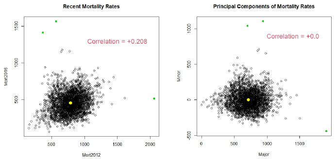
Key points are illustrated by the vertical (Minor) coordinates in the right-hand scatter of Figure 1 on page 2. We added to the horizontal (Major) coordinates in the right-hand scatter simply because the minimum of the original computed Major coordinates was . Readers may find that the three relatively extreme points that are colored green in both scatters help them see similarities between these two scatters. Major (horizontal) coordinates in the right-hand scatter are much more strongly associated (correlation ) with 2012 cancer mortality rates than with 2016 CR mortality rates (correlation ).
3.1 A Simple “Compromise” Mortality Rate
The “compromise” measure of mortality, , that we will use in our analyses is simply the average of [1] the relatively high 2016 rates and [2] the relatively low rates of multiplied by . This definition is simple, (hopefully) intuitive, and yields strictly positive mortality rates. The pair of plots displayed in Figure 2 below show how these new rates compare with the rescaled and raw mortality rates.

Our new analyses will focus on alternative models for prediction of these compromise rates. Our “Top Ten” explanatory variables are described in the final rows of Table 2. In Obenchain, Young and Krstic (2019), we used a logarithmic transformation of that we avoid here. Thus, there will be no need to “Winsorize” the levels reported for US Counties.
| TABLE 2 – Variable Information | ||
|---|---|---|
| Name | Description | Range |
| fips | Federal Information Processing Std code ( or digits) | 1001-56043 |
| State | Two Character State ID Code | “AL” - “WY” |
| County | County Name (Character String) | |
| lcanmort | 2012 Lung Cancer Mortality / 100K Residents | |
| CRmort | 2016 Circulatory-Respiratory Mortality / 100K Residents | |
| Cmort | “Compromise” Mortality / 100K Residents | |
| Smoking | Percentage of Residents who Currently Smoke | |
| Elderly | Percentage of Residents Over 65 | |
| Radon | Average Indoor Radon Level in pica-Curies per Liter | |
| NO2 | Nitrogen Dioxide Percentage | |
| Ozone | O3 Percentage | |
| Sulfates | SO4 Percentage in Particulate Matter | |
| PremDeath | Premature Death Rate | |
| ChildPov | Children Living in Poverty | |
| Avoc | Anthropocentric Volatile Organic Compounds | |
| Bvoc | Biogenic Volatile Organic Compounds | |
3.2 Predicting Mortality using a Single Potentially Causal Variable
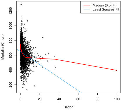
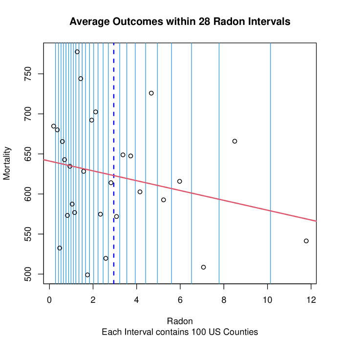
A good place to start our discussion of alternative ways to predict our outcome, , is provided by Figure 3. We start with an example that uses a single potentially causal variable because both the input data and the resulting predictions can then be displayed in two dimensions. Horizontal coordinates in Figure 3 below are indoor levels in pica-Curies per Liter (pCi/L).
Our primary “Take Away” from Figure 3 is simply that modern statistical methods for fitting predictive models that are both non-linear and highly flexible tend to provide much more realistic and practically useful predictions than rigid traditional methods that assume linearity.
3.3 Multiple Linear Regression Models using our Top Ten Predictors
Although we will ultimately focus on “Black Box” methods that are highly-flexible, let us start by fitting a multiple linear regression simply to assess the overall “extent of ill-conditioning” (confounding) among our ten potential predictor variables. The Generalized Ridge Regression Trace display in Figure 4 shows regression coefficient estimates from the eff.ridge() function within the RXshrink R-package of Obenchain (2022b). This family of linear models that are fit using maximum-likelihood under Normal distribution-theory attempt to predict rates using our “Top Ten” potentially causal-variables variables. This family of estimators is indexed by the scalar parameter that varies continuously: , where is the traditional least-squares solution and all estimates are shrunken to zero at .
Due to missing values in the predictor variable for US Counties, these models and all remaining models for predicting rates will be based upon data from only US Counties. The “Black Box” models of Section suggest that is easily the single most important of our “Top Ten” potentially causal determinants of rates.
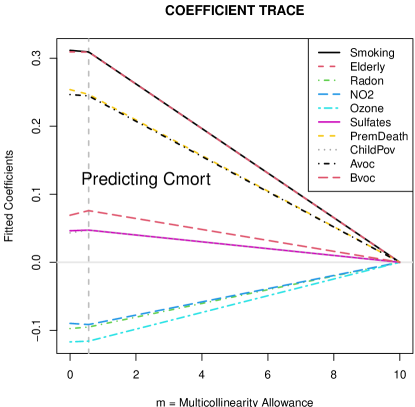
Our Random Forest analyses described next will yield “Black Box” models that are distinctly Non-Linear, make minimal realistic assumptions, and provide much improved predictions of Mortality. In other words, we will see that several of the relative magnitudes of the simplistic coefficient estimates in Figure 3 are rather misleading. For example, all coefficient estimates for (Red long-dash) are positive but smaller than those for (Black dot-dash) coefficients in Figure 3, but will prove to be more predictive of than is with non-linear (more realistic) models.
Our “Take Away” from Figure 4 is simply that ill-conditioning (inter-correlations among) our “Top Ten” potentially causal variables is apparently not a serious problem.
4 Our Non-parametric Supervised Learning “Black Box” Model
We generated a random forest of tree models, Breiman (2001,2002), for prediction of from our “Top Ten” potentially causal X-variables using default settings in the randomForest package of Liaw and Wiener (2002-2022). Using the corresponding Partial Dependence Plots, Friedman (2001), that are both generated and ranked on “importance” by this software, we studied the ten marginal relationships that result from averaging over the other nine potential predictors. These marginal relationships ignore potential interaction effects and can be linear, monotonic or more complex.
In addition to a Partial Dependance Plot (PDP), Figures to also display a companion Individual Conditional Expectation (ICE) plot, Goldstein et al. (2015). The “rugs” (nine vertical tick-marks extending above the bottom axis) on each PDP plot mark boundaries between observed deciles for each potential predictor of . On the corresponding ICE-plot, note that these deciles are uniformly spaced. Thus, individual ICE-plots transform the horizontal range displayed by its companion PDP.
Table 3 summarizes PDP characteristics of our pairs of PDP and ICE plots in Figures to .
| TABLE 3 – Importance Statistics for the “Top Ten” predictors of Cmort Rates | ||
| Variable | %IncMSE | IncNodePurity |
| PremDeath | 53.73973 | 9752125 |
| Elderly | 48.96057 | 3557815 |
| Smoking | 43.43565 | 5740271 |
| Bvoc | 39.45565 | 5798775 |
| Ozone | 34.36222 | 2487499 |
| ChildPov | 32.29134 | 4976096 |
| Avoc | 28.95409 | 3349377 |
| Sulfates | 27.97395 | 2739202 |
| NO2 | 25.06410 | 1366603 |
| Radon | 19.69432 | 1408827 |
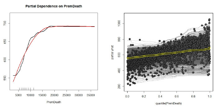
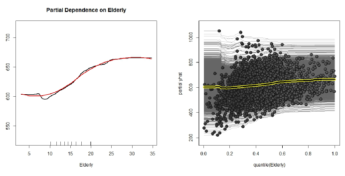

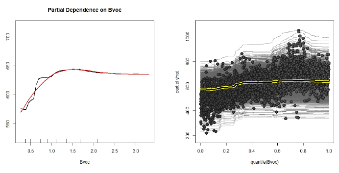
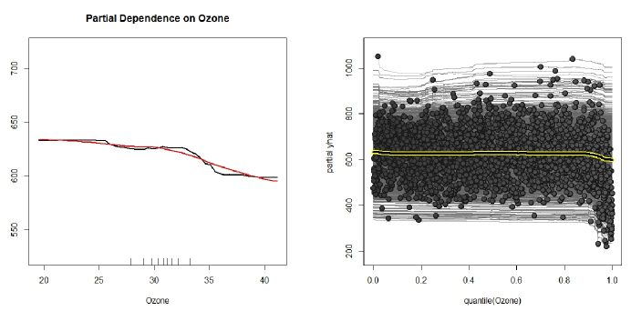

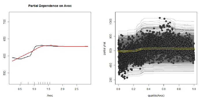
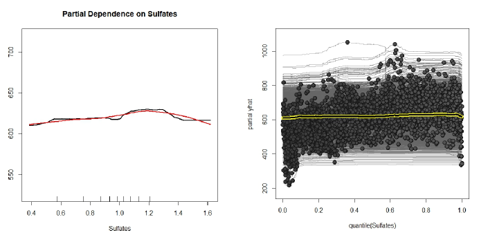
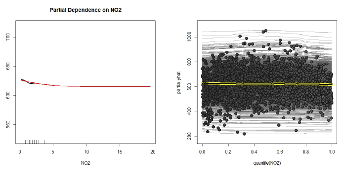
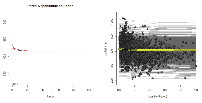
In summary, our PDP and ICE plots display ten potentially causal predictors of rates; all of these relationships are distinctly non-linear. Two of these Ten predictors concern aging ( and ), two more are socioeconomic factors ( and ), while the other six concern chemicals in the air.
5 Four Main Factors associated with Mortality
Our pairs of PDP and ICE plots in Figures 5 to 14 have encouraged us to group our “Top Ten” predictors into just four main “Factors” that impact the health of the US population: [1] Longevity, [2] Socio-Economic Issues, [3] Regulated Chemicals in indoor or outdoor Air and [4] Volatile Organic Compounds within Air Pollution [detectable via satellite images].
5.1 Many Effects of Longevity are Obvious
It certainly is not surprising that the most important predictor of turned out to be each County’s percentage of residents (age 65 or over). All we have learned here is that this relationship is not purely linear; i.e. genetic factors may help some people age more “gently” than others. Perhaps Metformin or future medicines will actually help increase longevity; see Barzilai et al. (2016).
5.2 Socio-Economic Effects
The Second, Third and Fifth most important predictors of are [2] the Premature-Death Rate, [3] (Adult) Smoking Percentages and [5] Children Living in Poverty. While many Socio-Economic problems have rather clear effects, what is not clear is how to most effectively change them among citizens of a constitutional republic.
5.3 Effects of Regulated Chemicals
The predictors ranked Seventh through Tenth here are: [7] Ozone (), [8] Sulfates (), [9] Nitrogen Dioxide (), and [10] Radon (). Both the general US population and EPA regulations essentially assume that these chemical elements in the air we breathe have highly detrimental effects. However, all but Sulfates have PDP and ICE profiles showing that tends to decrease monotonically as their presence increases! For Sulfates, the PDP profile appears to peak somewhere near ; see Figure 12.
The profile depicted in Figure 13 strongly re-enforces our published findings, Obenchain, Young and Krstic (2019). We fear that many humans harbor an almost irrational fear of even rather low doses of ionizing radiation. Thus, we now focus on in indoor air even though both of the “more important” predictors in outdoor air, and , have the essentially same profiles as .
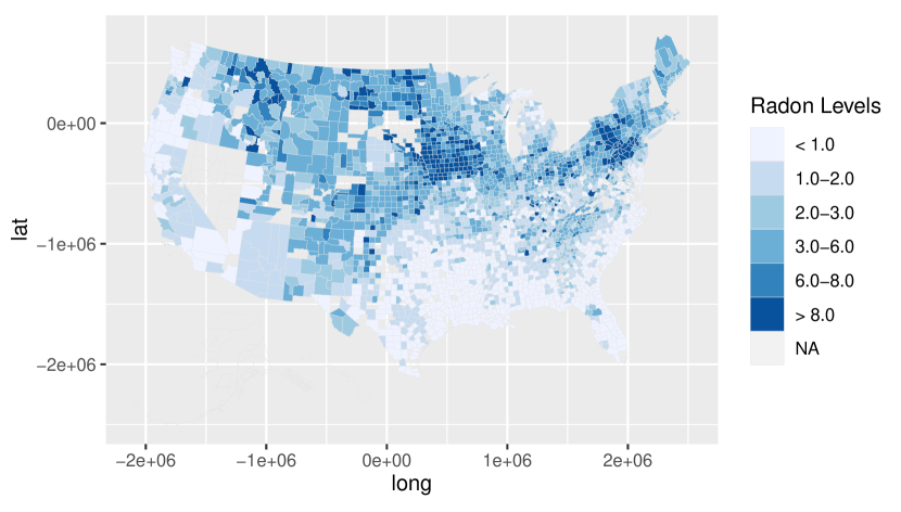
Figure 15 depicts clear differences between three types of potential relationships between the intensity of ionizing radiation and its effects on Mortality rates: [1] a “Linear No Threshold” (LNT) model, [2] a three-part model (first“no effect” then a “sharp threshold effect” followed by a “linearly increasing trend”), and [3] a fully realistic “radiation hormesis” model under which undesirable radiation levels are either too low or else much too high. Our Random Forest of Tree Models generated the profile depicted in Figure 14 on page that implies hormesis.
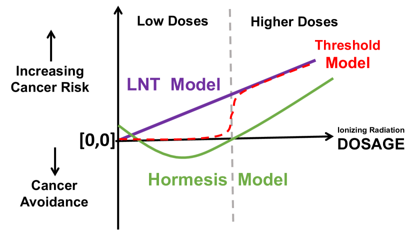
Many published papers support hormesis. Cohen (1989,1995,1997,2008) maintained that the most desirable indoor levels are between 7 and 10 ; also, see Parsons (2002) and Calabrese et al. (2007). More recent work, Castillo et al. (2015) and (2017), notes that bacteria deprived of background levels of ionizing radiation suffer a stress response; this more recent work signals actual causation, rather than mere association.
5.4 Effects of Secondary Organic Aerosols
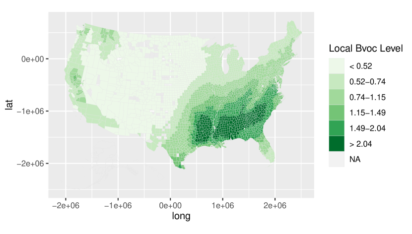
Pye et al. (2021) stated: “Underlying medical conditions like heart disease as well as CR [Circulatory/Respiratory] disease mortality are also higher in the Southeast than the rest of the U.S. as a result of multiple socioeconomic and behavioral factors.”
We ask: What is it that US Counties with an abundance of Bvoc consistently lack? By comparing Figures 15 and 16, we have come to the following conclusion: Most lack sufficient indoor Radon levels to benefit from ionizing radiation hormesis!
6 Summary
We have illustrated Statistical Learning using a Random Forest of Tree models for analysis of cross-sectional observational data from US Counties. This approach helps readers literally “see” potentially causal marginal relationships between our Top Ten explanatory variables and Mortality outcomes. Our analyses pay special attention to indoor Radon levels because, contrary to the long-standing EPA requirement that Radon levels must be below 4.0 pica-Curies per Liter, we confirm that Mortality rates tend to actually be lower for US Counties with average indoor Radon levels above this threshold than below it. In other words, ionizing radiation tends to be beneficial (hormetic) rather than detrimental to human health. On the other hand, our analyses also confirm that Secondary Organic Aerosols in Air Pollution appear to consistently increase Mortality rates.
To reduce rates, desirable indoor levels appear to be not only above roughly 4 but also below roughly 30 . In other words, undesirable indoor Randon levels can be either too low or much too high.
Our PDP and ICE plots for the “Top Ten” predictors of Mortality yield Random Forest “Black Box” models that provide much more realistic information than can be gained simply by examining coefficient estimates from multiple linear regression, as in Figure 3. True effects among the many potentially relevant variables considered here are definitely more complex than simple linear models with homoscedastic measurement errors! Furthermore, these new Supervised learning results appear to be compatible with those from the Non-parametric Unsupervised approach of Obenchain and Young (2023).
It certainly appears worthwhile to collect and report mortality rates for individual US States and Counties, and it does “sound good” that many of these rates have apparently been decreasing recently. On the other hand, we have seen that these sources of Observational Data tend to be much too highly variable (both across locations and year-to-year) to be truly valuable in making accurate comparisons and forecasts.
Conflict of Interest
As independent and self-funded researchers, the authors declare that no competing interests exist.
References
- [1] Barzilai, N., Crandall, J.P., Kritchevsky, S.B. and Espeland, M.A. (2016), “Metformin as a Tool to Target Aging”, Cell Metabolism, 23(6), 10601065. https://doi.org/10.1016/j.cmet.2016.05.011.
- [2] Breiman, L. (2001), “Random Forests”, Machine Learning, 45, 532. https://doi.org/10.1023/A:1010933404324.
- [3] Breiman, L. (2002), “Manual On Setting Up, Using, And Understanding Random Forests, V3.1”. https://www.stat.berkeley.edu/~breiman/Using_random_forests_V3.1.pdf.
- [4] Calabrese, E.J., Bachmann, K.A., Bailer, A.J., et al., (2007), “Biological Stress Response Terminology: integrating the concepts of adaptive response and preconditioning stress within a hermetic dose-response framework”, Toxicol. Appl. Pharmacol. 222, 122128.
- [5] Castillo, H., Schoderbek, D., Dulal, S., et al., (2015). “Stress induction in the bacteria Shewanella oneidensis and Deinococcus radiodurans in response to below-background ionizing radiation”, Int. J. Radiat. Biol. 91(9), 749756. https://doi.org/10.3109/09553002.2015.1062571.
- [6] Castillo, H., Li, X, Schilkey, F. and Smith, GB. (2018) “Transcriptome analysis reveals a stress response of Shewanella oneidensis deprived of background levels of ionizing radiation”, PLoS ONE. 13(5), https://doi.org/10.1371/journal.
- [7] Centers for Disease Control and Prevention, National Center for Health Statistics. Compressed Mortality File 1999-2016 on CDC WONDER Online Database, released June 2017. Data are from the Compressed Mortality File 1999-2016 Series 20 No.2U, 2016, as compiled from data provided by the 7 vital statistics jurisdictions through the Vital Statistics Cooperative Program. Accessed by Obenchain on 19 April 2022, http://wonder.cdc.gov/cmf-icd10.html.
- [8] Cohen, B.L. (1989), “Expected indoor 222 Rn levels in counties with very high and very low lung cancer rates”, Health Phys. 57, 897907.
- [9] Cohen, B.L. (1995), “Test of the linear-no threshold theory of radiation carcinogenesis for inhaled radon decay products”, Health Phys. 68, 157174.
- [10] Cohen, B.L. (1997), “Lung cancer rate vs. mean radon level in U.S. counties of various characteristics”, Health Phys. 72, 114119.
- [11] Cohen, B.L. (2008), “The linear no-threshold theory of radiation carcinogenesis should be rejected”, J. Am. Physicians Surg. 13, 7076.
- [12] Friedman, J. (2001), “Greedy function approximation: the gradient boosting machine”, Annals of Statistics, 29(5), 11891232, https://doi.org/10.1214/aos/1013203451.
- [13] Goldstein, A., Kapelner, A., Bleich, J., and Pitkin, E. (2015), “Peeking Inside the Black Box: Visualizing Statistical Learning With Plots of Individual Conditional Expectation”, Journal of Computational and Graphical Statistics, 24(1), 4465, https://doi.org/10.1080/10618600.2014.907095.
- [14] Kahle, D. and Wickham, H. (2013), “ggmap: Spatial Visualization with ggplot2.”, The R Journal, 5, 144161. http://journal.r-project.org/archive/2013-1/kahle-wickham.pdf.
- [15] Koenker, R. (2005 - 2022), “quantreg: Quantile Regression”, ver 5.94, https://CRAN.R-project.org/package=quantreg.
- [16] Krstic, G. (2017), “Radon versus other lung cancer risk factors: how accurate are the attribution estimates?”, J. Air Waste Manag. Assoc. 67(3), 261266. https://doi.org/10.1080/10962247.2016.1240725.
- [17] Liaw, A. and Wiener, M. (2002 - 2022) “randomForest: Breiman and Cutler’s Random Forests for Classification and Regression”, ver 4.7-1, https://CRAN.R-project.org/package=randomForest.
- [18] Obenchain, R.L. (2022a), “Efficient Generalized Ridge Regression, Open Statistics, 3, 118. https://doi.org/10.1515/stat-2022-0108.
- [19] Obenchain, R.L. (2022b), “RXshrink: Maximum Likelihood Shrinkage using Generalized Ridge or Least Angle Regression Methods”, ver 2.2, https://CRAN.R-project.org/package=RXshrink.
- [20] Obenchain, R.L. (2022c), “LocalControlStrategy: R-package for robust analysis of cross-sectional data”, ver 1.4, https://CRAN.R-project.org/package=LocalControlStrategy.
- [21] Obenchain, R.L., Young, S.S. and Krstic, G. (2019), “Low-level Radon Exposure and Lung Cancer Mortality”, Regulatory Toxicology and Pharmacology, 107, 18, https://doi.org/10.1016/j.yrtph.2019.104418.
- [22] Obenchain, R.L. and Young, S.S. (2023), “EPA Particulate Matter Data - Analyses using Local Control Strategy”, North Carolina Journal of Mathematics and Statistics, 9, 124, ISSN 2380-7539. http://libjournal.uncg.edu/ncjms/article/view/2299/1671
- [23] Parsons, P.A. (2002), “Radiation hormesis: challenging LNT theory via ecological and evolutionary considerations”, Health Phys. 82, 513516. https://doi.org/10.1097/00004032-200204000-00011. PMID: 11906140
- [24] Pye, H.O.T., Ward-Caviness, C.K., Murphy, B.N., Appel, K.W. and Seltzer, K.M. (2021), “Secondary organic aerosol association with cardiorespiratory disease mortality in the United States”. Nature Communications 12, 7215. https://doi.org/10.1038/s41467-021-27484-1.
- [25] R Core Team. (2022), “R: A language and environment for statistical computing”. https://www.R-project.org
- [26] Wickham, H. (2016), “ggplot2: Elegant Graphics for Data Analysis”. New York: Springer-Verlag.
- [27] van der Laan, M. and Rose, S. (2010), “Statistics ready for a revolution: Next generation of statisticians must build tools for massive data sets”. AMStat News, September, 38–39. https://magazine.amstat.org/blog/2010/09/01/statrevolution/.
- [28] Young, S.S., Smith, R.L. and Lopiano, K.K. (2017), “Air Quality and Acute Deaths in California, 20002012”, Regulatory Toxicology and Pharmacology, 88, 173184. https://doi.org/10.1016/j.yrtph.2017.06.003.
- [29] Young, S.S., Kindzierski, W. and Randall, D. (May 2021), “Shifting Sands: Unsound Science and Unsafe Regulation. Report : Keeping Count of Government Science – P-Value Plotting, P-Hacking, and PM2.5 Regulation”. National Association of Scholars. https://files.eric.ed.gov/fulltext/ED616199.pdf.