Word-As-Image for Semantic Typography
Abstract.
A word-as-image is a semantic typography technique where a word illustration presents a visualization of the meaning of the word, while also preserving its readability. We present a method to create word-as-image illustrations automatically. This task is highly challenging as it requires semantic understanding of the word and a creative idea of where and how to depict these semantics in a visually pleasing and legible manner. We rely on the remarkable ability of recent large pretrained language-vision models to distill textual concepts visually. We target simple, concise, black-and-white designs that convey the semantics clearly. We deliberately do not change the color or texture of the letters and do not use embellishments. Our method optimizes the outline of each letter to convey the desired concept, guided by a pretrained Stable Diffusion model. We incorporate additional loss terms to ensure the legibility of the text and the preservation of the style of the font. We show high quality and engaging results on numerous examples and compare to alternative techniques.
Code will be available at our project page.

1. Introduction
Semantic typography is the practice of using typography to visually reinforce the meaning of text. This can be achieved through the choice of typefaces, font sizes, font styles, and other typographic elements. A more elaborate and engaging technique for semantic typography is presented by word-as-image illustrations, where the semantics of a given word are illustrated using only the graphical elements of its letters. Such illustrations provide a visual representation of the meaning of the word, while also preserving the readability of the word as a whole.
The task of creating a word-as-image is highly challenging, as it requires the ability to understand and depict the visual characteristics of the given concept, and to convey them in a concise, aesthetic, and comprehensible manner without harming legibility. It requires a great deal of creativity and design skills to integrate the chosen visual concept into the letter’s shape (Lee, 2011). In Figure 2 we show some word-as-image examples created manually. For example, to create the “jazz” depiction, the designer had to first choose the visual concept that would best fit the semantics of the text (a saxophone), consider the desired font characteristics, and then choose the most suitable letter to be replaced. Finding the right visual element to illustrate a concept is ill-defined as there are countless ways to illustrate any given concept. In addition, one cannot simply copy a selected visual element onto the word – there is a need to find subtle modifications of the letters shape.
Because of these complexities, the task of automatic creation of word-as-image illustrations was practically impossible to achieve using computers until recently. In this paper, we define an algorithm for automatic creation of word-as-image illustrations based on recent advances in deep-learning and the availability of huge foundational models that combine language and visual understanding. Our resulting illustrations (see Figure 1) could be used for logo design, for signs, in greeting cards and invitations, and simply for fun. They can be used as-is, or as inspiration for further refinement of the design.
Existing methods in the field of text stylization often rely on raster textures (Yang et al., 2018), place a manually created style on top of the strokes segmentation (Berio et al., 2022), or deform the text into a pre-defined target shape (Zou et al., 2016) (see Figure 3). Only a few works (Tendulkar et al., 2019; Zhang et al., 2017) deal with semantic typography, and they often operate in the raster domain and use existing icons for replacement (see Figure 3E).
Our word-as-image illustrations concentrate on changing only the geometry of the letters to convey the meaning. We deliberately do not change color or texture and do not use embellishments. This allows simple, concise, black-and-white designs that convey the semantics clearly. In addition, since we preserve the vector-based representation of the letters, this allows smooth rasterization in any size, as well as applying additional style manipulations to the illustration using colors and texture, if desired.

Given an input word, our method is applied separately for each letter, allowing the user to later choose the most likeable combination for replacement. We represent each letter as a closed vectorized shape, and optimize its parameters to reflect the meaning of the word, while still preserving its original style and design.
We rely on the prior of a pretrained Stable Diffusion model (Rombach et al., 2021) to connect between text and images, and utilize the Score Distillation Sampling approach (Poole et al., 2022) (see Section 3) to encourage the appearance of the letter to reflect the provided textual concept. Since the Stable Diffusion model is trained on raster images, we use a differentiable rasterizer (Li et al., 2020) that allows to backpropagate gradients from a raster-based loss to the shape’s parameters.
To preserve the shape of the original letter and ensure legibility of the word, we utilize two additional loss functions. The first loss regulates the shape modification by constraining the deformation to be as-conformal-as-possible over a triangulation of the letter’s shape. The second loss preserves the local tone and structure of the letter by comparing the low-pass filter of the resulting rasterized letter to the original one.
We compare to several baselines, and present many results using various typefaces and a large number of concepts. Our word-as-image illustrations convey the intended concept while maintaining legibility and preserving the appearance of the font, demonstrating visual creativity.
2. Related Work
Text Stylization
One approach to text stylization is artistic text style transfer, where the style from a given source image is migrated into the desired text (such as in Figure 3A). To tackle this task, existing works incorporate patch-based texture synthesis (Yang et al., 2017; Fish et al., 2020) as well as variants of GANs (Azadi et al., 2018; Wang et al., 2019; Jiang et al., 2019; Yang et al., 2022; Mao et al., 2022). These works operate within the raster domain, a format that is undesirable for typographers since fonts must be scalable. In contrast, we operate on the parametric outlines of the letters, and our glyph manipulation is guided by the semantic meaning of the word, rather than a pre-defined style image.
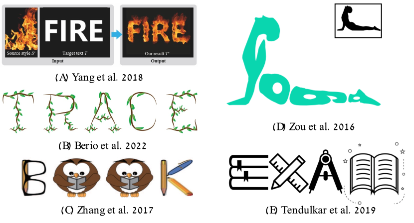
A number of works (Ha and Eck, 2018; Lopes et al., 2019; Wang and Lian, 2021) tackle the task of font generation and stylization in the vector domain. Commonly, a latent feature space of font’s outlines is constructed, represented as outline samples (Campbell and Kautz, 2014; Balashova et al., 2019) or parametric curve segments (Ha and Eck, 2018; Lopes et al., 2019; Wang and Lian, 2021). These approaches are often limited to mild deviations from the input data. Other methods rely on templates (Suveeranont and Igarashi, 2010; Lian et al., 2018) or on user guided (Phan et al., 2015) and automatic (Berio et al., 2022) stroke segmentation to produce letter stylization (such as in Figure 3B). However, they rely on a manually defined style, while we rely on the expressiveness of Stable Diffusion to guide the modification of the letters’ shape, to convey the meaning of the provided word. In the task of calligram generation (Zou et al., 2016; Xu and Kaplan, 2007) the entire word is deformed into a given target shape. This task prioritises shape over the readability of the word (see Figure 3D), and is inherently different from ours, as we use the semantics of the word to derive the deformation of individual letters.
Most related to our goal, are works that perform semantic stylization of text. Tendulkar et al. (2019) replace letters in a given word with clip-art icons describing a given theme (see Figure 3E). To choose the most suitable icon for replacement, an autoencoder is used to measure the distance between the letter and icons from the desired class. Similarly, Zhang et al. (2017) replace stroke-like parts of one or more letters with instances of clip art to generate ornamental stylizations. An example is shown in Figure 3C. These approaches operate in the raster domain, and replace letters with existing icons, which limits them to a predefined set of classes present in the dataset. Our method, however, operates in the vector domain, and incorporates the expressiveness of large pretrained image-language models to create a new illustration that conveys the desired concept.
Large Language-Vision Models
With the recent advancement of language-vision models (Radford et al., 2021) and diffusion models (Ramesh et al., 2022; Nichol et al., 2021; Rombach et al., 2021), the field of image generation and editing has undergone unprecedented evolution. Having been trained on millions of images and text pairs, these models have proven effective for performing challenging vision related tasks such as image segmentation (Amit et al., 2021), domain adaptation (Song et al., 2022), image editing (Avrahami et al., 2022; Hertz et al., 2022; Tumanyan et al., 2022a), personalization (Ruiz et al., 2022; Gal et al., 2023, 2022), and explainability (Chefer et al., 2021). Despite being trained on raster images, their strong visual and semantic priors have also been shown to be successfully applied to other domains, such as motion (Tevet et al., 2022), meshes (Michel et al., 2021), point cloud (Zhang et al., 2021), and vector graphics. CLIPDraw (Frans et al., 2021) uses a differentiable rasterizer (Li et al., 2020) to optimize a set of colorful curves w.r.t. a given text prompt, guided by CLIP’s image-text similarity metric. Tian and Ha (2021) use evolutionary algorithms combined with CLIP guidance to create abstract visual concepts based on text. Other works (Vinker et al., 2022b, a) utilize the image encoder of CLIP to generate abstract vector sketches from images.
Diffusion models have been used for the task of text guided image-to-image translation (Choi et al., 2021; Tumanyan et al., 2022b). In SDEdit (Meng et al., 2022), an adequate amount of noise is added to a reference image, such that its overall structure is preserved, and then the image is denoised in a reverse process with a guiding text. Pretrained diffusion models have also been used to generate 3D objects (Poole et al., 2022; Metzer et al., 2022), or vector art (Jain et al., 2022) conditioned on text.
In our work we also utilize the strong visual and semantic prior induced by a pretrained Stable Diffusion model (Rombach et al., 2021), however, for the task of semantic typography. For that purpose we add new components to the optimization process to preserve the font’s style and text legibility.

3. Background
3.1. Fonts and Vector Representation
Modern typeface formats such as TrueType (Penney, 1996) and PostScript (Inc., 1990) represent glyphs using a vectorized graphic representation of their outlines. Specifically, the outline contours are typically represented by a collection of lines and Bézier or B-Spline curves. This representation allows to scale the letters and rasterize them in any desired size similar to other vector representations. This property is preserved by our method as our output preserves the vectorized representations of the letters.
3.2. Latent Diffusion Models
Diffusion models are generative models that are trained to learn a data distribution by the gradual denoising of a variable sampled from a Gaussian distribution.
In our work, we use the publicly available text-to-image Stable Diffusion model (Rombach et al., 2021). Stable Diffusion is a type of a latent diffusion model (LDM), where the diffusion process is done over the latent space of a pretrained image autoencoder. The encoder is tasked with mapping an input image into a latent vector , and the decoder is trained to decode such that .
As a second stage, a denoising diffusion probabilistic model (DDPM) (Ho et al., 2020) is trained to generate codes within the learned latent space. At each step during training, a scalar is uniformly sampled and used to define a noised latent code , where and are terms that control the noise schedule, and are functions of the diffusion process time .
The denoising network which is based on a UNet architecture (Ronneberger et al., 2015), receives as input the noised code , the timestep and an optional condition vector , and is tasked with predicting the added noise . The LDM loss is defined by:
| (1) |
In Stable Diffusion, for text-to-image generation, the condition vector is the text embedding produced by a pre-trained CLIP text encoder (Radford et al., 2021). At inference time, a random latent code is sampled, and iteratively denoised by the trained until producing a clean latent code, which is passed through the decoder to produce the image .
3.3. Score Distillation
It is desirable to utilize the strong prior of pretrained large text-image models for the generation of modalities beyond rasterized images. In Stable Diffusion, text conditioning is performed via the cross-attention layers defined at different resolutions in the UNet network. Thus, it is not trivial to guide an optimization process using the conditioned diffusion model.
DreamFusion (Poole et al., 2022) proposed a way to use the diffusion loss to optimize the parameters of a NeRF model for text-to-3D generation. At each iteration, the radiance field is rendered from a random angle, forming the image , which is then noised to form . The noised image is then passed to the pretrained UNet model of Imagen (Saharia et al., 2022), that outputs the prediction of the noise . The score distillation loss is defined by the gradients of the original diffusion loss:
| (2) |
where is the condition text prompt, are the NeRF’s parameters and is a constant multiplier that depends on . During training, the gradients are back-propagated to the NeRF parameters to gradually change the 3D object to fit the text prompt. Note that the gradients of the UNet are skipped, and the gradients to modify the Nerf’s parameters are derived directly from the LDM loss.
3.4. VectorFusion
Recently, VectorFusion (Jain et al., 2022) utilized the SDS loss for the task of text-to-SVG generation. The proposed generation pipeline involves two stages. Given a text prompt, first, an image is generated using Stable Diffusion (with an added suffix to the prompt), and is then vectorized automatically using LIVE (Ma et al., 2022). This defines an initial set of parameters to be optimized in the second stage using the SDS loss. At each iteration, a differentiable rasterizer (Li et al., 2020) is used to produce a image, which is then augmented as suggested in CLIPDraw (Frans et al., 2021) to get a image . Then is fed into the pretrained encoder of Stable Diffusion to produce the corresponding latent code . The SDS loss is then applied in this latent space, in a similar way to the one defined in DreamFusion:
| (3) |
We find the SDS approach useful for our task of producing semantic glyphs, and we follow the technical steps proposed in VectorFusion (e.g. augmentations and the added suffix).
4. Method
Given a word represented as a string with letters , our method is applied to every letter separately to produce a semantic visual depiction of the letter. The user can then choose which letters to replace and which to keep in their original form.
4.1. Letter Representation
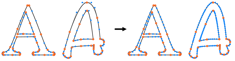
We begin by defining the parametric representation of the letters in . We use the FreeType font library (FreeType, 2009) to extract the outline of each letter. We then translate each outline into a set of cubic Bézier curves, to have a consistent representation across different fonts and letters, and to facilitate the use of diffvg (Li et al., 2020) for differentiable rasterization.
Depending on the letter’s complexity and the style of the font, the extracted outlines are defined by a different number of control points. We have found that the initial number of control points affects the final appearance significantly: as the number of control points increases, there is more freedom for visual changes to occur. Therefore, we additionally apply a subdivision procedure to letters containing a small number of control points. We define a desired number of control points for each letter of the alphabet (shared across different fonts), and then iteratively subdivide the Bézier segments until reaching this target number. At each iteration, we compute the maximum arc length among all Bézier segments and split each segment with this length into two (see Figure 6). We analyse the effect of the number of control points in Section 5.3.
This procedure defines a set of control points representing the shape of the letter .
4.2. Optimization
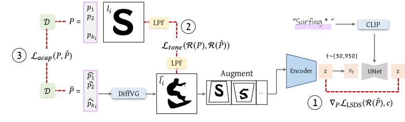
The pipeline of our method is provided in Figure 5. Since we are optimizing each letter separately, for brevity, we will omit the letter index in the following text and define the set of control points for the input letter as .
Given and the desired textual concept (both marked in purple in Figure 5), our goal is to produce a new set of control points, , defining an adjusted letter that conveys the given concept, while maintaining the overall structure and characteristics of the initial letter .
We initialize the learned set of control points with , and pass it through a differentiable rasterizer (Li et al., 2020) (marked in blue), which outputs the rasterized letter . The rasterized letter is then randomly augmented and passed into a pretrained Stable Diffusion (Rombach et al., 2021) model, conditioned on the CLIP’s embedding of the given text . The SDS loss is then used as described in Section 3 to encourage to convey the given text prompt.
To preserve the shape of each individual letter and ensure the legibility of the word as a whole, we use two additional loss functions to guide the optimization process. The first loss limits the overall shape change by defining as-conformal-as-possible constraint on the shape deformation. The second loss preserves the overall shape and style of the font by constraining the tone (i.e. amount of dark vs. light areas in local parts of the shape) of the modified letter not to diverge too much from the original letter (see Section 4.3).
The gradients obtained from all the losses are then backpropagated, to update the parameters . We repeat this process for 500 steps, which takes minutes to produce a single letter illustration on RTX2080 GPU.
4.3. Loss Functions
Our primary objective of encouraging the resulting shape to convey the intended semantic concept, is utilized by loss (described in Section 3). We observe that using solely can cause large deviations from the initial letter appearance, which is undesired. Hence, our additional goal is to maintain the shape and legibility of the letter , as well as to keep the original font’s characteristics. For that purpose we use two additional losses.
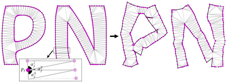
As-Conformal-As-Possible Deformation Loss
To prevent the final letter shape from diverging too much from the initial shape, we triangulate the inner part of the letter and constrain the deformation of the letter to be as conformal as possible (ACAP) (Hormann and Greiner, 2000). We use constrained Delaunay triangulation (Delaunay et al., 1934; Barber and Huhdanpaa, 1995) on the set of control points defining the glyph. It is known that Delaunay triangulation can be used to produce the skeleton of an outline (Prasad, 1997; Zou et al., 2001), so the ACAP loss also implicitly captures a skeletal representation of the letter form.
The Delaunay triangulation splits the glyph represented by into a set of triangles. This defines a set of size of corresponding angles for each control point (see Figure 7). We denote this set of angles as . The ACAP loss encourages the induced angles of the optimized shape not to deviate much from the angles of the original shape , and is defined as the L2 distance between the corresponding angles:
| (4) |
where and are the angles induced by .
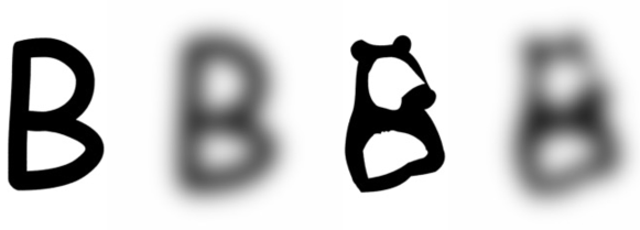
Tone Preservation Loss
To preserve the style of the font as well as the structure of the letter we add a local-tone preservation loss term. This term constrains the tone (amount of black vs. white in all regions of the shape) of the adjusted letter not to deviate too much from tone of the original font’s letter. Towards this end, we apply a low pass filter (LPF) to the rasterized letter (before and after deformation) and compute the L2 distance between the resulting blurred letters:
| (5) |
An example of the blurred letters is shown in Figure 8, as can be seen, we use a high value of standard deviation in the blurring kernel to blur out small details such as the ears of bear.
Our final objective is then defined by the weighted average of the three terms:
| (6) | |||
where and depends on the step as described next.
4.4. Weighting
Choosing the relative weights of the three losses presented above is crucial to the appearance of the final letter. While the loss encourages the shape to deviate from its original appearance to better fit the semantic concept, the two terms and are responsible for maintaining the original shape. Hence, we have two competing parts in the formula, and would like to find a balance between them to maintain the legibility of the letter while allowing the desired semantic shape to change.
We find that can be very dominant. In some cases, if it is used from the beginning, no semantic deformation is performed. Therefore, we adjust the weight of to kick-in only after some semantic deformation has occurred. We define as follows:
| (7) |
with . We analyse the affect of various weighting in Section 5.3. Note that the same hyper-parameter choice works for various words, letters, and fonts.

5. Results
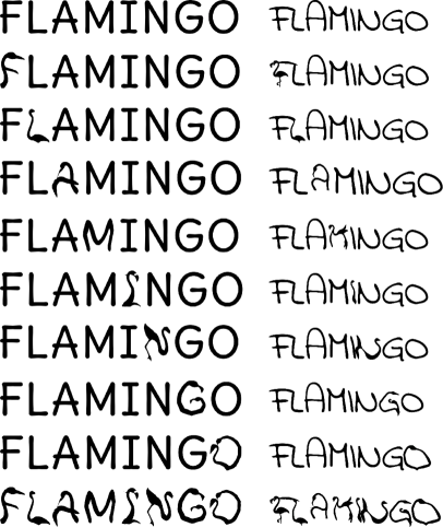
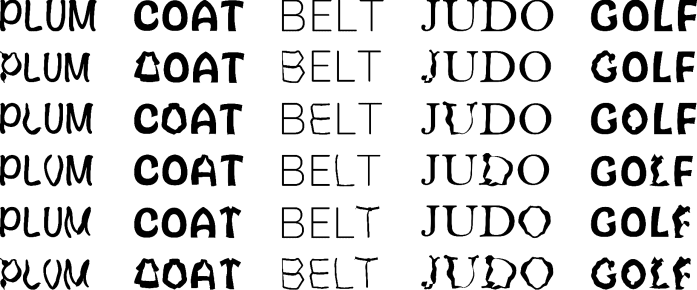
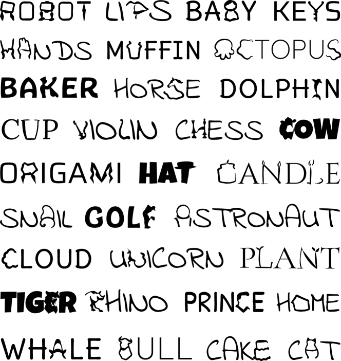
The robustness of our approach means it should be capable of handling a wide range of input concepts as well as supporting different font designs. Figures 1, 4, 33, 17, and more results in the supplemental file demonstrate that our approach can handle inputs from many different categories and various fonts, and that the generated results are legible and creative. Figure 9 demonstrate how the illustrations created by our method for the same word follow the characteristics of different fonts. Although the perceived aesthetics of a word-as-image illustration can be subjective, we define three objectives for an effective result: (1) it should visually capture the given semantic concept, (2) it should maintain readability, and (3) it should preserve the original font’s characteristics.
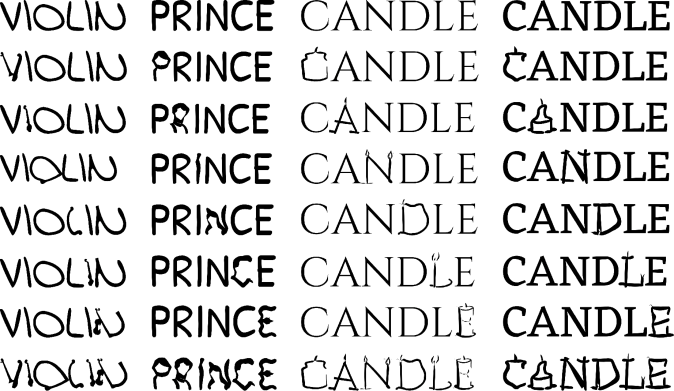
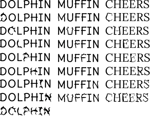
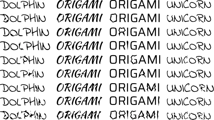
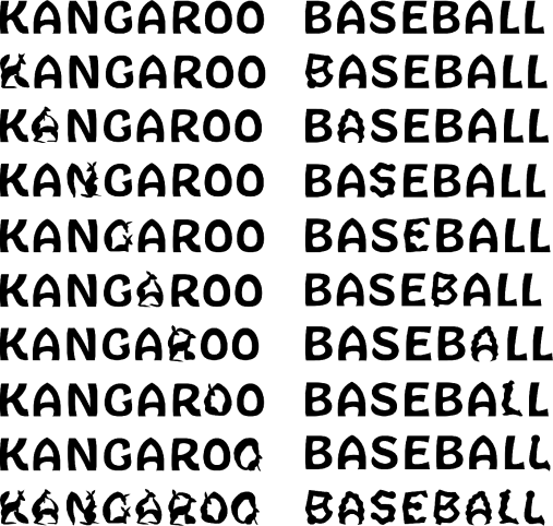
We evaluate the performance of our method on a randomly selected set of inputs. We select five common concept classes - animals, fruits, plants, sports, and professions. Using ChatGPT, we sample ten random instances for each class, resulting in 50 words in total. Next, we select four fonts that have distinct visual characteristics, namely Quicksand, Bell MT, Noteworthy-Bold, and HobeauxRococeaux-Sherman. For each word, we randomly sampled one of the four fonts, and applied our method to each letter. For each word with letters we can generate possible word-as-images, which are all possible combinations of replacements of illustrated letters. A selected subset of these results is presented in Figure 33. The results of all letters and words are presented in the supplementary material.
As can be seen, the resulting word-as-image illustrations successfully convey the given semantic concept in most cases while still remaining legible. In addition, our method successfully captures the font characteristics. For example, in Figure 33, the replacements for the “DRESS” and “LION” are thin and fit well with the rest of the word. In addition, observe the serifs of the letter A used for the fin of the shark in the “SHARK” example. We further use human evaluation to validate this as described below.
5.1. Quantitative
We conduct a perceptual study to quantitatively assess the three objectives of our resulting word-as-images. We randomly select two instances from each of the resulting word-as-image illustrations for the five classes described above, and visually select one letter from each word, resulting in 10 letters in total. In each question we show an isolated letter illustration, without the context of the word. To evaluate the ability of our method to visually depict the desired concept, we present four label options from the same class, and ask participants to choose the one that describes the letter illustration best. To evaluate the legibility of the results, we ask participants to choose the most suitable letter from a random list of four letters. To asses the preservation of the font style, we present the four fonts and ask participants to choose the most suitable font for the illustration. We gathered answers from 40 participants, and the results are shown in Table 1. As can be seen, the level of concept recognizability and letter legibility are very high, and the of style matching of the letter illustration to the original font is well above random, which is . We also test our algorithm without the two additional structure and style preserving losses ( and ) on the same words and letters (“Only SDS” in the table). As expected, without the additional constraints, the letter deforms significantly resulting in higher concept recognizability but lower legibility and font style preservation. More details and examples are provided in the supplementary material.
| Method |
|
|
|
|||
| Ours | 0.8 | 0.9 | 0.51 | |||
| Only SDS | 0.88 | 0.53 | 0.33 |
| The word BIRD and the letter R |
|
|
|
|
||||
| The word DRESS and the letter E |
|
|
|
|
||||
| The word TULIP and the letter U |
|
|
|
|
||||
| Input | SD | SDEdit | DallE2 | DallE2+letter | CLIPDraw | Ours | ||
5.2. Comparison
In the absence of a relevant baseline for comparison, we define baselines based on large popular text-to-image models. Specifically, we use (1) SD Stable Diffusion (Rombach et al., 2021), (2) SDEdit (Meng et al., 2022), (3) DallE2 (Ramesh et al., 2022) illustrating the word, (4) DallE2+letter illustrating only the letter, and (5) CLIPDraw (Frans et al., 2021). We applied the methods above (details can be found in supplemental material) to three representative words – “bird”, “dress”, and “tulip”, with the fonts Bell MT, Quicksand, and Noteworthy-Bold, respectively. The results can be seen in Figure 10.
In some cases Stable Diffusion (SD) did not manage to produce text at all (such as for the bird) and when text is produced, it is often not legible. The results obtained by SDEdit preserve the font’s characteristics and the letter’s legibility, but often fail to reflect the desired concept, such as in the case of the bird and the dress. Additionally, it operates in the raster domain and tends to add details on top of the letter, while our method operates directly on the vector representation of the letters with the objective of modifying their shape. DallE2 manages to reflect the visual concept, however it often fails to produce legible text. When applied with a dedicated prompt to produce the word-as-image of only one letter (fifth column), it manages to produce a legible letter, but there is less control over the output – it is impossible to specify the desired font or to control the size, position, and shape of the generated letter. Therefore, it is not clear how to combine these output illustrations into the entire word to create a word-as-image.
CLIPDraw produces reasonable results conveying the semantics of the input word. However, the results are non-smooth and the characteristics of the font are not preserved (for example observe how the letter ”E” differs from the input letter). We further examine CLIPDraw with our shape preservation losses in the next Section.
5.3. Ablation
Figure 11 illustrates the impact of the letter’s initial number of control points. When less control points are used ( is the original number of control points), we may get insufficient variations, such as for the gorilla. However, this can also result in more abstract depictions, such as the ballerina. As we add control points, we get more graphic results, with the tradeoff that it often deviate from the original letter. In Figure 15 we show the results of using only the loss. As can be seen, in that case the illustrations strongly convey the semantic concept, however at the cost of legibility. In Figure 16 we analyze the effect of the weight applied to . Ranging from to . When is too dominant, the results may not enough reflect the semantic concept, while the opposite case harms legibility. Figure 13 illustrates a change in the parameter of the low pass filter. When almost no blur is applied, resulting in a shape constraint that is too strong.
In Figure 14 we show the results of replacing the loss with a CLIP based loss, while using our proposed shape preservation terms. Although the results obtained with CLIP often depict the desired visual concept, we find that using Stable Diffusion leads to smoother illustrations, that capture a wider range of semantic concepts.
By using the hyperparameters described in the paper, we are able to achieve a reasonable balance between semantics and legibility. The parameters were determined manually based on visual assessments, but can be adjusted as needed based on the user’s personal taste and goals.
| ”Ballet” |
|
|||
| ”Gorilla” |
|
|||
| ”Gym” |
|
|||
| Input | ||||
6. Conclusions
We presented a method for the automatic creation of vector-format word-as-image illustrations. Our method can handle a large variety of semantic concepts and use any font, while preserving the legibility of the text and the font’s style.
There are limitations to our method. First, our method works letter by letter, and therefore, it cannot deform the shape of the entire word. In the future we can try to optimize the shape of several letters. Second, the approach works best on concrete visual concepts, and may fail with more abstract ones. This can be alleviated by optimizing the shape of letters using different concepts than the word itself. Third, the layout of letters can also be automated for example, using methods such as (Wang et al., 2022).
Our word-as-image illustrations demonstrate visual creativity and open the possibility for the use of large vision-language models for semantic typography, possibly also adding human-in-the-loop to arrive at more synergistic design methods of ML models and humans.

| ”Bear” |
|
|||||
| ”Singer” |
|
|||||
| ”Giraffe” |
|
|||||
| Input | 1 | 5 | 30 | 200 | Without | |
| Input Letter |
|
||||
| CLIP loss |
|
||||
| SDS loss |
|
||||
| ”Snail” | ”Skirt” | ”Socks” | ”Queen” | ”Strawberry” |
| Input Letter | |||||
| Ours | |||||
| Only SDS | |||||
| ”Cat” | ”Music” | ”Robot” | ”Cup” | ”Hands” |
| ”Bear” |
|
|||||
| ”Singer” |
|
|||||
| ”Giraffe” |
|
|||||
| Input | 1 | 0.75 | 0.5 | 0.25 | Without | |
7. Acknowledgments
We are grateful to Richard Hao Zhang for the early discussion of the text-as-image problem. Ali Mahdavi-Amiri and Oren Katzir for reviewing earlier versions of the manuscript and to Anran Qi for assisting in evaluating the Chinese words. This research was supported in part by the Israel Science Foundation (grants no. 2492/20 and 3441/21), Len Blavatnik and the Blavatnik family foundation, and the Tel Aviv University Innovation Laboratories (TILabs).
References
- (1)
- Amit et al. (2021) Tomer Amit, Tal Shaharbany, Eliya Nachmani, and Lior Wolf. 2021. SegDiff: Image Segmentation with Diffusion Probabilistic Models. https://doi.org/10.48550/ARXIV.2112.00390
- Avrahami et al. (2022) Omri Avrahami, Dani Lischinski, and Ohad Fried. 2022. Blended Diffusion for Text-Driven Editing of Natural Images. In Proceedings of the IEEE/CVF Conference on Computer Vision and Pattern Recognition (CVPR). 18208–18218.
- Azadi et al. (2018) Samaneh Azadi, Matthew Fisher, Vladimir G. Kim, Zhaowen Wang, Eli Shechtman, and Trevor Darrell. 2018. Multi-Content GAN for Few-Shot Font Style Transfer. In Proceedings of the IEEE Conference on Computer Vision and Pattern Recognition (CVPR). IEEE, Salt Lake City, UT, USA, 7564–7573.
- Balashova et al. (2019) Elena Balashova, Amit H. Bermano, Vladimir G. Kim, Stephen DiVerdi, Aaron Hertzmann, and Thomas Funkhouser. 2019. Learning a Stroke-Based Representation for Fonts. Computer Graphics Forum 38, 1 (2019), 429–442.
- Barber and Huhdanpaa (1995) Brad Barber and Hannu Huhdanpaa. 1995. QHull. The Geometry Center, University of Minnesota, http://www. geom. umn. edu/software/qhull (1995).
- Berio et al. (2022) Daniel Berio, Frederic Fol Leymarie, Paul Asente, and Jose Echevarria. 2022. StrokeStyles: Stroke-Based Segmentation and Stylization of Fonts. ACM Trans. Graph. 41, 3, Article 28 (apr 2022), 21 pages. https://doi.org/10.1145/3505246
- Campbell and Kautz (2014) Neill DF Campbell and Jan Kautz. 2014. Learning a Manifold of Fonts. ACM Transactions on Graphics (TOG) 33, 4 (2014). https://doi.org/10.1145/2601097.2601212 Article no. 91.
- Chefer et al. (2021) Hila Chefer, Shir Gur, and Lior Wolf. 2021. Transformer Interpretability Beyond Attention Visualization. In Proceedings of the IEEE/CVF Conference on Computer Vision and Pattern Recognition (CVPR). 782–791.
- Choi et al. (2021) Jooyoung Choi, Sungwon Kim, Yonghyun Jeong, Youngjune Gwon, and Sungroh Yoon. 2021. ILVR: Conditioning Method for Denoising Diffusion Probabilistic Models. CoRR abs/2108.02938 (2021). arXiv:2108.02938 https://arxiv.org/abs/2108.02938
- Delaunay et al. (1934) Boris Delaunay et al. 1934. Sur la sphere vide. Izv. Akad. Nauk SSSR, Otdelenie Matematicheskii i Estestvennyka Nauk 7, 793-800 (1934), 1–2.
- Fish et al. (2020) Noa Fish, Lilach Perry, Amit Bermano, and Daniel Cohen-Or. 2020. SketchPatch: Sketch Stylization via Seamless Patch-Level Synthesis. ACM Trans. Graph. 39, 6, Article 227 (nov 2020), 14 pages. https://doi.org/10.1145/3414685.3417816
- Frans et al. (2021) Kevin Frans, Lisa B Soros, and Olaf Witkowski. 2021. Clipdraw: Exploring text-to-drawing synthesis through language-image encoders. arXiv preprint arXiv:2106.14843 (2021).
- FreeType (2009) FreeType. 2009. FreeType library. https://freetype.org/
- Gal et al. (2022) Rinon Gal, Yuval Alaluf, Yuval Atzmon, Or Patashnik, Amit H. Bermano, Gal Chechik, and Daniel Cohen-Or. 2022. An Image is Worth One Word: Personalizing Text-to-Image Generation using Textual Inversion. https://doi.org/10.48550/ARXIV.2208.01618
- Gal et al. (2023) Rinon Gal, Moab Arar, Yuval Atzmon, Amit H. Bermano, Gal Chechik, and Daniel Cohen-Or. 2023. Designing an Encoder for Fast Personalization of Text-to-Image Models. https://doi.org/10.48550/ARXIV.2302.12228
- Ha and Eck (2018) David Ha and Douglas Eck. 2018. A Neural Representation of Sketch Drawings. In Sixth International Conference on Learning Representations (ICLR). https://arxiv.org/abs/1704.03477.
- Hertz et al. (2022) Amir Hertz, Ron Mokady, Jay Tenenbaum, Kfir Aberman, Yael Pritch, and Daniel Cohen-Or. 2022. Prompt-to-prompt image editing with cross attention control. (2022).
- Ho et al. (2020) Jonathan Ho, Ajay Jain, and Pieter Abbeel. 2020. Denoising Diffusion Probabilistic Models. CoRR abs/2006.11239 (2020). arXiv:2006.11239 https://arxiv.org/abs/2006.11239
- Hormann and Greiner (2000) Kai Hormann and Günther Greiner. 2000. MIPS: An efficient global parametrization method. Technical Report. Erlangen-Nuernberg Univ (Germany) Computer Graphics Group.
- Inc. (1990) Adobe Systems Inc. 1990. Adobe Type 1 Font Format. Addison Wesley Publishing Company.
- Jain et al. (2022) Ajay Jain, Amber Xie, and Pieter Abbeel. 2022. VectorFusion: Text-to-SVG by Abstracting Pixel-Based Diffusion Models. arXiv preprint arXiv:2211.11319 (2022).
- Jiang et al. (2019) Yue Jiang, Zhouhui Lian, Yingmin Tang, and Jianguo Xiao. 2019. SCFont: Structure-Guided Chinese Font Generation via Deep Stacked Networks. Proceedings of the AAAI Conference on Artificial Intelligence 33, 01 (Jul. 2019), 4015–4022. https://doi.org/10.1609/aaai.v33i01.33014015
- Lee (2011) Ji Lee. 2011. Word As Image. Adams Media, London.
- Li et al. (2020) Tzu-Mao Li, Michal Lukáč, Gharbi Michaël, and Jonathan Ragan-Kelley. 2020. Differentiable Vector Graphics Rasterization for Editing and Learning. ACM Trans. Graph. (Proc. SIGGRAPH Asia) 39, 6 (2020), 193:1–193:15.
- Lian et al. (2018) Zhouhui Lian, Bo Zhao, Xudong Chen, and Jianguo Xiao. 2018. EasyFont: A style learning-based system to easily build your large-scale handwriting fonts. ACM Transactions on Graphics (TOG) 38, 1 (2018), 1–18.
- Lopes et al. (2019) Raphael Gontijo Lopes, David Ha, Douglas Eck, and Jonathon Shlens. 2019. A Learned Representation for Scalable Vector Graphics. In Proceedings of the IEEE/CVF International Conference on Computer Vision (ICCV).
- Ma et al. (2022) Xu Ma, Yuqian Zhou, Xingqian Xu, Bin Sun, Valerii Filev, Nikita Orlov, Yun Fu, and Humphrey Shi. 2022. Towards Layer-wise Image Vectorization. https://doi.org/10.48550/ARXIV.2206.04655
- Mao et al. (2022) Wendong Mao, Shuai Yang, Huihong Shi, Jiaying Liu, and Zhongfeng Wang. 2022. Intelligent Typography: Artistic Text Style Transfer for Complex Texture and Structure. IEEE Transactions on Multimedia (2022), 1–15. https://doi.org/10.1109/TMM.2022.3209870
- Meng et al. (2022) Chenlin Meng, Yutong He, Yang Song, Jiaming Song, Jiajun Wu, Jun-Yan Zhu, and Stefano Ermon. 2022. SDEdit: Guided Image Synthesis and Editing with Stochastic Differential Equations. In International Conference on Learning Representations.
- Metzer et al. (2022) Gal Metzer, Elad Richardson, Or Patashnik, Raja Giryes, and Daniel Cohen-Or. 2022. Latent-NeRF for Shape-Guided Generation of 3D Shapes and Textures. https://doi.org/10.48550/ARXIV.2211.07600
- Michel et al. (2021) Oscar Michel, Roi Bar-On, Richard Liu, Sagie Benaim, and Rana Hanocka. 2021. Text2Mesh: Text-Driven Neural Stylization for Meshes. arXiv preprint arXiv:2112.03221 (2021).
- Nichol et al. (2021) Alex Nichol, Prafulla Dhariwal, Aditya Ramesh, Pranav Shyam, Pamela Mishkin, Bob McGrew, Ilya Sutskever, and Mark Chen. 2021. Glide: Towards photorealistic image generation and editing with text-guided diffusion models. arXiv preprint arXiv:2112.10741 (2021).
- Penney (1996) Laurence Penney. 1996. A History of TrueType. https://www.truetype-typography.com/.
- Phan et al. (2015) Huy Quoc Phan, Hongbo Fu, and Antoni B Chan. 2015. Flexyfont: Learning Transferring Rules for Flexible Typeface Synthesis. Computer Graphics Forum 34, 7 (2015), 245–256.
- Poole et al. (2022) Ben Poole, Ajay Jain, Jonathan T Barron, and Ben Mildenhall. 2022. Dreamfusion: Text-to-3d using 2d diffusion. arXiv preprint arXiv:2209.14988 (2022).
- Prasad (1997) Lakshman Prasad. 1997. Morphological analysis of shapes. CNLS newsletter 139, 1 (1997), 1997–07.
- Radford et al. (2021) Alec Radford, Jong Wook Kim, Chris Hallacy, Aditya Ramesh, Gabriel Goh, Sandhini Agarwal, Girish Sastry, Amanda Askell, Pamela Mishkin, Jack Clark, Gretchen Krueger, and Ilya Sutskever. 2021. Learning Transferable Visual Models From Natural Language Supervision. CoRR abs/2103.00020 (2021). arXiv:2103.00020 https://arxiv.org/abs/2103.00020
- Ramesh et al. (2022) Aditya Ramesh, Prafulla Dhariwal, Alex Nichol, Casey Chu, and Mark Chen. 2022. Hierarchical text-conditional image generation with clip latents. arXiv preprint arXiv:2204.06125 (2022).
- Rombach et al. (2021) Robin Rombach, Andreas Blattmann, Dominik Lorenz, Patrick Esser, and Björn Ommer. 2021. High-Resolution Image Synthesis with Latent Diffusion Models. arXiv:2112.10752 [cs.CV]
- Ronneberger et al. (2015) Olaf Ronneberger, Philipp Fischer, and Thomas Brox. 2015. U-net: Convolutional networks for biomedical image segmentation. In International Conference on Medical image computing and computer-assisted intervention. Springer, 234–241.
- Ruiz et al. (2022) Nataniel Ruiz, Yuanzhen Li, Varun Jampani, Yael Pritch, Michael Rubinstein, and Kfir Aberman. 2022. DreamBooth: Fine Tuning Text-to-image Diffusion Models for Subject-Driven Generation. (2022).
- Saharia et al. (2022) Chitwan Saharia, William Chan, Saurabh Saxena, Lala Li, Jay Whang, Emily Denton, Seyed Kamyar Seyed Ghasemipour, Burcu Karagol Ayan, S. Sara Mahdavi, Rapha Gontijo Lopes, Tim Salimans, Jonathan Ho, David J Fleet, and Mohammad Norouzi. 2022. Photorealistic Text-to-Image Diffusion Models with Deep Language Understanding. https://doi.org/10.48550/ARXIV.2205.11487
- Song et al. (2022) Kunpeng Song, Ligong Han, Bingchen Liu, Dimitris Metaxas, and Ahmed Elgammal. 2022. Diffusion Guided Domain Adaptation of Image Generators. https://doi.org/10.48550/ARXIV.2212.04473
- Suveeranont and Igarashi (2010) Rapee Suveeranont and Takeo Igarashi. 2010. Example-Based Automatic Font Generation. In Smart Graphics. Number LNCS 6133 in Lecture Notes in Computer Science. 127–138.
- Tendulkar et al. (2019) Purva Tendulkar, Kalpesh Krishna, Ramprasaath R. Selvaraju, and Devi Parikh. 2019. Trick or TReAT: Thematic Reinforcement for Artistic Typography. https://doi.org/10.48550/ARXIV.1903.07820
- Tevet et al. (2022) Guy Tevet, Brian Gordon, Amir Hertz, Amit H Bermano, and Daniel Cohen-Or. 2022. Motionclip: Exposing human motion generation to clip space. In Computer Vision–ECCV 2022: 17th European Conference, Tel Aviv, Israel, October 23–27, 2022, Proceedings, Part XXII. Springer, 358–374.
- Tian and Ha (2021) Yingtao Tian and David Ha. 2021. Modern Evolution Strategies for Creativity: Fitting Concrete Images and Abstract Conceptst. arXiv:2109.08857 [cs.NE]
- Tumanyan et al. (2022a) Narek Tumanyan, Michal Geyer, Shai Bagon, and Tali Dekel. 2022a. Plug-and-Play Diffusion Features for Text-Driven Image-to-Image Translation. https://doi.org/10.48550/ARXIV.2211.12572
- Tumanyan et al. (2022b) Narek Tumanyan, Michal Geyer, Shai Bagon, and Tali Dekel. 2022b. Plug-and-Play Diffusion Features for Text-Driven Image-to-Image Translation. https://doi.org/10.48550/ARXIV.2211.12572
- Vinker et al. (2022a) Yael Vinker, Yuval Alaluf, Daniel Cohen-Or, and Ariel Shamir. 2022a. CLIPascene: Scene Sketching with Different Types and Levels of Abstraction. https://doi.org/10.48550/ARXIV.2211.17256
- Vinker et al. (2022b) Yael Vinker, Ehsan Pajouheshgar, Jessica Y. Bo, Roman Christian Bachmann, Amit Haim Bermano, Daniel Cohen-Or, Amir Zamir, and Ariel Shamir. 2022b. CLIPasso: Semantically-Aware Object Sketching. ACM Trans. Graph. 41, 4, Article 86 (jul 2022), 11 pages. https://doi.org/10.1145/3528223.3530068
- von Platen et al. (2022) Patrick von Platen, Suraj Patil, Anton Lozhkov, Pedro Cuenca, Nathan Lambert, Kashif Rasul, Mishig Davaadorj, and Thomas Wolf. 2022. Diffusers: State-of-the-art diffusion models. https://github.com/huggingface/diffusers.
- Wang et al. (2019) Wenjing Wang, Jiaying Liu, Shuai Yang, and Zongming Guo. 2019. Typography With Decor: Intelligent Text Style Transfer. In Proceedings of the IEEE/CVF Conference on Computer Vision and Pattern Recognition (CVPR).
- Wang and Lian (2021) Yizhi Wang and Zhouhui Lian. 2021. DeepVecFont: Synthesizing High-Quality Vector Fonts via Dual-Modality Learning. ACM Transactions on Graphics 40, 6 (Dec. 2021), 1–15. https://doi.org/10.1145/3478513.3480488
- Wang et al. (2022) Yizhi Wang, Guo Pu, Wenhan Luo, Yexin Wang, Pengfei Xiong, Hongwen Kang, and Zhouhui Lian. 2022. Aesthetic Text Logo Synthesis via Content-Aware Layout Inferring. In Proceedings of the IEEE/CVF Conference on Computer Vision and Pattern Recognition (CVPR). 2436–2445.
- Xu and Kaplan (2007) Jie Xu and Craig S. Kaplan. 2007. Calligraphic Packing. In Proceedings of Graphics Interface 2007 on - GI ’07. ACM Press, Montreal, Canada, 43. https://doi.org/10.1145/1268517.1268527
- Yang et al. (2017) Shuai Yang, Jiaying Liu, Zhouhui Lian, and Zongming Guo. 2017. Awesome Typography: Statistics-Based Text Effects Transfer. In Proceedings of the IEEE Conference on Computer Vision and Pattern Recognition (CVPR).
- Yang et al. (2018) Shuai Yang, Jiaying Liu, Wenhan Yang, and Zongming Guo. 2018. Context-Aware Unsupervised Text Stylization. In Proceedings of the 26th ACM International Conference on Multimedia (Seoul, Republic of Korea) (MM ’18). Association for Computing Machinery, New York, NY, USA, 1688–1696. https://doi.org/10.1145/3240508.3240580
- Yang et al. (2022) Shuai Yang, Zhangyang Wang, and Jiaying Liu. 2022. Shape-Matching GAN++: Scale Controllable Dynamic Artistic Text Style Transfer. IEEE Transactions on Pattern Analysis and Machine Intelligence 44, 7 (2022), 3807–3820. https://doi.org/10.1109/TPAMI.2021.3055211
- Zhang et al. (2017) Junsong Zhang, Yu Wang, Weiyi Xiao, and Zhenshan Luo. 2017. Synthesizing Ornamental Typefaces: Synthesizing Ornamental Typefaces. Computer Graphics Forum 36, 1 (Jan. 2017), 64–75. https://doi.org/10.1111/cgf.12785
- Zhang et al. (2021) Renrui Zhang, Ziyu Guo, Wei Zhang, Kunchang Li, Xupeng Miao, Bin Cui, Yu Qiao, Peng Gao, and Hongsheng Li. 2021. PointCLIP: Point Cloud Understanding by CLIP. https://doi.org/10.48550/ARXIV.2112.02413
- Zou et al. (2016) Changqing Zou, Junjie Cao, Warunika Ranaweera, Ibraheem Alhashim, Ping Tan, Alla Sheffer, and Hao Zhang. 2016. Legible Compact Calligrams. ACM Transactions on Graphics 35, 4 (July 2016), 1–12. https://doi.org/10.1145/2897824.2925887
- Zou et al. (2001) Ju Jia Zou, Hung-Hsin Chang, and Hong Yan. 2001. Shape skeletonization by identifying discrete local symmetries. Pattern Recognition 34, 10 (2001), 1895–1905.
Supplementary Material
Appendix A Implementation Details
In this section we provide further implementation details. We intend to release the code to promote future research in this domain.
Our method is based on the pre-trained Stable Diffusion model (Rombach et al., 2021), which we use through the diffusers (von Platen et al., 2022) Python package. We optimize only the control points’ coordinates (i.e. we do not modify the color, width, and other parameters of the shape). We use the Adam optimizer with , , . We use learning rate warm-up from to over iterations and exponential decay from to over the rest iterations, iteration in total. The optimization process requires at least 10GB memory and approximately 5 minutes to produce a single letter illustration on RTX2080 GPU.
Before we feed the rasterized letter image into the Stable Diffusion model, we apply random augmentations as proposed in CLIPDraw (Frans et al., 2021). Specifically, perspective transform with a distortion scale of , with probability , and a random crop. We add the suffix ”a [word]. minimal flat 2d vector. lineal color. trending on artstation.” to the target word , before feeding it into the text encoder of a pretrained CLIP model.
Appendix B Comparisons
As described in Section 5.2 we define five baselines to compare with. In this section we provide more details about the evaluation and more qualitative results. For (1) SD, we run Stable Diffusion (Rombach et al., 2021) with the default hyper parameters of inference steps and a guidance scale of . We use the prompt “Word as image of the word [word]. [font] font. minimal flat 2d vector. lineal color. black and white style”.
For (2) SDEdit (Meng et al., 2022), we utilized the diffusers (von Platen et al., 2022) implementation, using the prompt “A [word]. minimal flat 2d vector. lineal color. black and white style”, and the rasterized input letter as the reference image. We use the default values of inference steps and a guidance scale of . We use a strength value of . The strength value determines the quantity of noise added to the input image – a value close to results in higher degree of variation in the output, and vice versa.
We use the official website of OpenAI to run (3) DallE2 (Ramesh et al., 2022), using the prompt “Word as image of the word [word]. Where the letter [letter] looks like a [word]. [font] font. minimal flat 2d vector. lineal color. black and white style”. To encourage the manipulation of a specific letter, for (4) DallE2+letter we use the prompt “The letter [letter] in the shape of a [word]. [font] font. minimal flat 2d vector. lineal color. black and white style”. For (5) CLIPDraw (Frans et al., 2021), we use the author’s official implementation with the recommended hyper-parameters. Instead of using randomly initialized strokes, we use our vectorized letter as input, along with the prompt “A [word]. [font] font. minimal flat 2d vector. lineal color. black and white style”. We provide more comparisons to the methods described above in Figure 20.

Appendix C Perceptual Study
In this section, we provide more details about the perceptual study described in Section 5.1. The randomly chosen objects, fonts, and letters are shown in Table 2. A few visual examples are shown in Figure 19.
| Ours | Only SDS | |
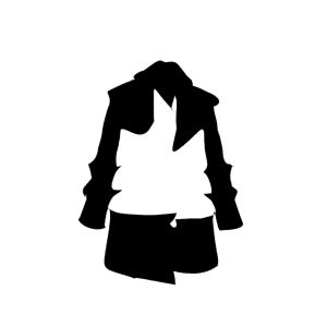
| ”Coat” |  |
 |
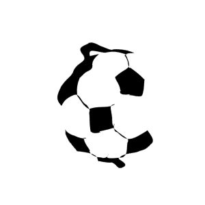
| ”Soccer” | 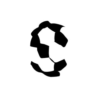 |
 |
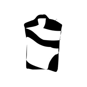
| ”Shirt” |  |
 |
| ”Rugby” | 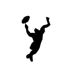 |
 |
| Font Rec. | 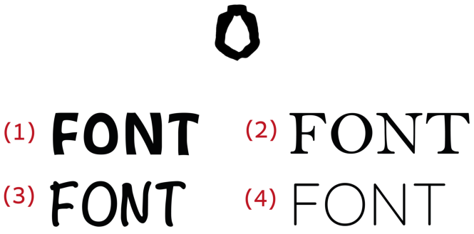 |
|
| Object |
|
|
||
| Pineapple | P | Noteworthy-Bold | ||
| Orange | O | Quicksand | ||
| Rugby | Y | Noteworthy-Bold | ||
| Soccer | S | Noteworthy-Bold | ||
| Bear | B | Bell MT | ||
| Lion | O | Quicksand | ||
| Singer | N | Noteworthy-Bold | ||
| Pilot | P | Noteworthy-Bold | ||
| Coat | O | HobeauxRococeaux-Sherman | ||
| Shirt | S | Bell MT |
| ”Muffin” |
|
|
|
|
|||
| ”Tiger” |
|
|
|
|
|||
| ”Octopus” |
|
|
|
|
|||
| ”Plant” |
|
|
|
|
|||
| ”Astronaut” |
|
|
|
|
|||
| ”Robot” |
|
|
|
|
|||
| ”Bunny” |
|
|
|
|
|||
| ”Flamingo” |
|
|
|
|
|||
| ”Paris” |
|
|
|
|
|||
| ”Owl” |
|
|
|
|
|||
| ”Swan” |
|
|
|
|
|||
| ”Mermaid” |
|
|
|
|
|||
| Input | SD | SDEdit | DallE2 | DallE2+letter | CLIPDraw | Ours | |
Appendix D Additional Results
We provide additional results of our generated word-as-images. In Figures 21-32 we show results of selected words and unique fonts. In Figures 33-48 we show the results obtained for the random set of words.