A comprehensive review of visualization methods for association rule mining: Taxonomy, Challenges, Open problems and Future ideas
Abstract
Association rule mining is intended for searching for the relationships between attributes in transaction databases. The whole process of rule discovery is very complex, and involves pre-processing techniques, a rule mining step, and post-processing, in which visualization is carried out. Visualization of discovered association rules is an essential step within the whole association rule mining pipeline, to enhance the understanding of users on the results of rule mining. Several association rule mining and visualization methods have been developed during the past decades. This review paper aims to create a literature review, identify the main techniques published in peer-reviewed literature, examine each method’s main features, and present the main applications in the field. Defining the future steps of this research area is another goal of this review paper.
keywords:
association rule mining , numerical association rule mining , data mining , visualization , plots1 Introduction
Association Rule Mining (ARM) is definitely one of the most important and popular data mining techniques for discovering unknown knowledge from transaction databases. The ARM is also a part of Machine Learning (ML) with the task to discover interesting relationships between items in large transaction datasets. The relationships are expressed by association rules determining how and why certain items are connected. The story of ARM started with a seminal paper of Agrawal et al. [1994]. Agrawal set the theoretical foundations for the process of ARM, and proposed the first algorithm, called Apriori. Apriori is a deterministic algorithm for mining association rules, and is still today featured as one of the top algorithms in the DM domain [Wu et al., 2008], as well as a member of an unprecedented scale in student textbooks.
In the following years, the ARM gained huge interest in the ML community. Its popularity was proven with many practical applications, especially, in the domains such as market-based analysis [Nisbet et al., 2018], medical diagnosis [Xu et al., 2022], census data [Malerba et al., 2002] or protein sequences [Gupta et al., 2006], among others.
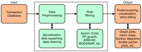
Data analysis pipelines typically consist of data cleanup and minimizing data imputations (also data pre-processing), data collection and exploration design, and comprehending the mined knowledge. Thus, the whole ARM pipeline is complex (see Fig. 1), because it consists of three steps, as follows: the pre-processing, the ARM, and the post-processing. The input to the pipeline presents the transaction database, which consists of rows and columns, where each row presents a transaction, and columns the attributes. In the pre-processing step, some optional substeps can be applied to make the data more robust, i.e., data cleaning and missing data imputation, where some outliers, or rows with a lot of missing data can even be removed. On the other hand, some other operations, for example, data squashing [Fister et al., 2022], can help reduce the transaction dataset. Then, the ARM process itself is performed. In line with this, several algorithms, e.g., Apriori or Eclat, exist and are, as mentioned, some of the most used. The output of this step is usually a huge collection of mined/identified/found association rules. Usually, researchers present these rules as a table, or summarize them using some metrics. However, visualization of the association rules needs to be conducted for the best insights.
Nowadays in ML, there is a trend to go for easier representation of the results obtained by ML/AutoML (automated ML) pipelines. This intention also coincides with the emerging research area of eXplainable Artificial Intelligence (XAI) [Barredo Arrieta et al., 2019, Arrieta et al., 2020]. XAI has become an important part of the future of AI, because XAI models explain the reasoning behind their decisions. This provides an increased level of understanding between humans and machines, which can help build trust in AI systems [Kumar, 2022]. In summary, XAI is a set of processes and methods to comprehend and trust the results created by the ML algorithms. In line with this, it tries to describe an AI model’s impact on the one hand, and exposes its potential biases on the other. Thus, the ML model is estimated according to its accuracy, fairness, transparency, and outcomes of AI-powered decision-making [Borrego-Díaz & Galán-Páez, 2022].
XAI can be manifested in several forms: text explanation, visualization, local explanation, explanation by example, explanation by simplification, and feature relevance [Barredo Arrieta et al., 2019, Bennetot et al., ]. Thus, there is an increased interest of researchers in developing new methods for easier representation of the results. Definitely, one of the most important parts of these efforts is visualization methods [Arrieta et al., 2020].
Typically, ARM algorithms generate a huge number of association rules. Frequently, the results are opaque for ordinary users, and need some explanations to understand their meaning. On the other hand, visualization of the results has a huge explanation power. Although a lot of visual methods have been proposed for ARM, to the best of our knowledge, no review for dealing with this problem from the XAI point of view exists nowadays.
Therefore, the aim of this paper is to collect and discuss visualization techniques for ARM that have appeared from its advent to the present day. Each method is studied in detail and features are compared with each other in the sense of XAI. The contributions of this review paper are summarized as follows:
-
•
The evolution of ARM visualization methods is presented.
-
•
The features of each of the methods are defined.
-
•
The advantages/disadvantages of each method are outlined.
-
•
An example is presented for each of the surveyed methods.
-
•
Explaining models using the ARM visualization are summarized.
The review of the ARM visualization methods is based on papers published from three different main sources: the ACM Digital Library, IEEEXplore, and Google Scholar. The analyse of the methods are highlighted from the following points of view: (1) characteristics, (2) visualization focus, and (3) attribute type. The taxonomies of the ARM visualization methods are introduced based on the highlights.
The structure of the paper is organized as follows: Section 2 deals with the ARM problem in a nutshell. The mathematical definition of the ARM visualization is the subject of Section 3. A detailed overview of traditional ARM visualization methods is reviewed in Section 4. New ideas in the ARM visualization are the subject of Section 5. The subject of Section 6 is a review of graphical systems, while Section 7 introduces challenges and open problems. The review concludes with Section 8 that summarizes the performed work and outlines potential ideas for the future work.
2 Association rule mining in a nutshell
The ARM problem is defined formally as follows: Let us suppose a set of items and transaction database are given, where each transaction is a subset of objects . Thus, the variable designates the number of items, and the number of transactions in the database. Then, an association rule can be defined as an implication:
| (1) |
where (left-hand-side or LHS), (right-hand-side or RHS), and . The following four measures are defined for evaluating the quality of the association rule [Agrawal et al., 1994]:
| (2) |
| (3) |
| (4) |
| (5) |
where denotes the support, the confidence, the lift, and the conviction of the association rule . There, in Eq. (2) represents the number of transactions in the transaction database , and is the number of repetitions of the particular rule within . Additionally, denotes minimum support and minimum confidence, determining that only those association rules with confidence and support higher than and are taken into consideration, respectively.
The interpretations of the measures are as follows: The support measures the proportion of transactions in the database which contain the item. The confidence estimates the conditional probability , denoting the probability to find the of the rule in transaction under the condition that this transaction also contains the . The lift is the ratio of the observed support that and arose together in the transaction if both set of items are independent. The conviction evaluates the frequency with which the rule makes an incorrect prediction.
2.1 Numerical association rule mining
Numerical Association Rule Mining (NARM) extends the idea of ARM, and is intended for mining association rules where attributes in a transaction database are represented by numerical values. Usually, traditional algorithms, e.g., Apriori, require a discretization of numerical attributes before they are ready to use. The discretization is sometimes trivial, and thus does not affect the results of mining positively.
On the other hand, many methods for ARM exist that do not require the discretization step before applying the process of mining. Most of these methods are based on population-based nature-inspired metaheuristics, such as, for example, Differential Evolution (DE) [Storn & Price, 1997] or Particle Swarm Optimization (PSO) [Kennedy & Eberhart, 1995]. Consequently, the NARM has recently showed an importance in the data revolution era that has been confirmed by some review papers [Altay & Alatas, 2019, Telikani et al., 2020] tackling the solving this class of problems.
Each numerical attribute is determined in NARM by an interval of feasible values limited by its lower and upper bounds. The more association rules are mined the broader the interval. The narrower the interval, the more specific relations are discovered between attributes. Introducing intervals of feasible values has two major effects on the optimization: To change the existing discrete search space to continuous, and to adapt these continuous intervals to suit the problem of interest better.
Mined association rules can be evaluated according to several criteria, like support and confidence. For the NARM, however, additional measures must be considered, in order to evaluate the mined set of association rules properly.
2.2 Time Series Association Rule Mining
TS-ARM is a new paradigm, which treats a transaction database as a time series data. The formal definition of the NARM problem needs to be redefined in line with this. In the TS-ARM, the association rule is defined as an implication:
| (6) |
where , , and . The variable determines the sequence of the transactions which have arisen within the interval and , where denotes the start and the end time of the observation. The measures of support and confidence are redefined as follows:
| (7) |
| (8) |
where and denotes the confidence and support of the association rule within the same time interval .
3 Visualization of association rule mining
Visualization of ARM can be described mathematically as a set of triplets:
| (9) |
where denotes an antecedent, a consequent, and a vector of available interestingness measures (e.g., support, confidence, etc.) for . In a nutshell, different visualization methods depend on:
-
•
the number of interstingness measures to display,
-
•
the visualization focus,
-
•
the rule set size.
The number of interestingness measures to display is limited by the number of dimensions that can be visualized (i.e., 2D or 3D). The visualization focus determines how the association rule defines the neighborhood of rules to be visualized. In line with this, the neighborhood is defined by: interestingness measure, items, similarity of RHS and LHS, or time series’ visualization. The rule set size limits the number of association rules that are included into a specific visualization method.
3.1 Study design
For conducting the systematic literature review, we followed the guidelines presented in the Systematic Literature Review Guidelines in Software Engineering [Kitchenham et al., 2007]. Our primary goal was to identify the frequency of the ARM visualization methods, the main features of these methods, and the applications in which these methods were applied. According to our goals, we developed the following Research Questions (RQ)s:
-
•
RQ1: Which methods are developed for the ARM visualization?
-
•
RQ2: Which challenges and open problems are placed behind the ARM visualization?
-
•
RQ3: Which software packages are available to users tackling these problems?
-
•
RQ4: What awaits the methods for visualization of association rules in the future?
We conducted a literature search using major databases from 18 to 22 November, 2022. The main search strings that were used for searching the databases were as follows: “association rule mining” AND “visualization” OR “visualisation”. The search string was also modified according to the search formats of different databases.
Table 1 presents the results of our search 111Note that we also checked the citing articles of results from Google Scholar manually.. Each of the papers was prescreened according to its abstract and keywords.
| Database name | URL | Total | Included |
|---|---|---|---|
| ACM Digital Library | dl.acm.org | 6 | 4 |
| IEEEXplore | ieeexplore.ieee.org | 214 | 21 |
| Google Scholar | scholar.google.com | 16,100 | 25+ |
| Total | 16,320 | 25+ |
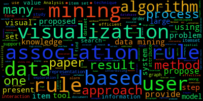
When the results were collected, we also filtered out the duplicates. Additionally, when searching through the Google scholar we checked for citing articles of each paper, so that additional results were then identified and included in this review paper. We also specified the selection and exclusion criteria as well as limitations. The selection criteria were the follows: (1) research paper addresses any kind of ARM and its connection with visualization, and the research must be peer reviewed, i.e., published in a referred conference, journal paper, book chapter or monograph. The search was conducted with exclusion criteria as follows: “The research paper is not written in the English language”, and limitations such as: “The literature review search was limited to only three databases”. The summary of abstracts from IEEEXplore and ACM Digital Library publications is shown in the wordcloud Fig. 2.
4 A detailed overview of traditional ARM visualization methods
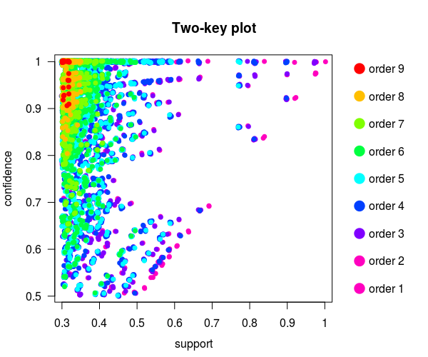
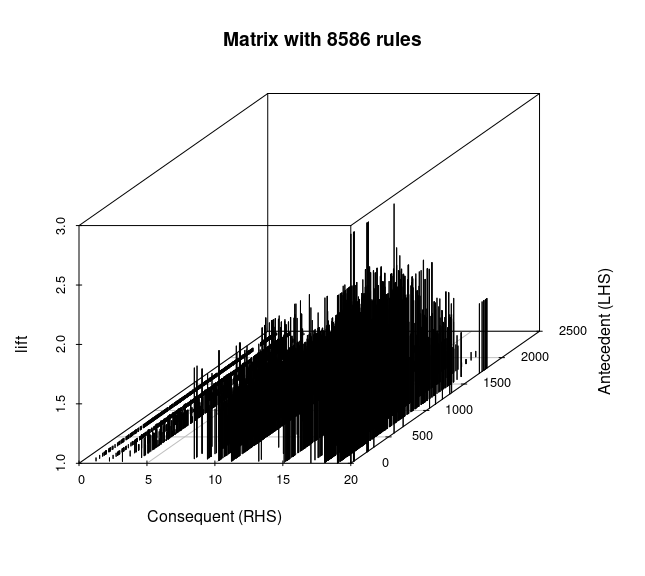
In the following subsections, each of the methods is outlined, followed by a summary of related work, while several methods are also illustrated by an example. The examples of the particular visualization are implemented in arulesViz [Hahsler et al., 2011] on a set of 11,267 association rules produced by the Apriori algorithm [Agrawal et al., 1994] mining the Mushroom UCI ML dataset [UC Irvine ML Repository, 1987] using the following limitations: and .
Table 2 presents a summary of the traditional ARM visualization methods that were found in our systematic literature review. It is divided into four columns that present: a sequence number (column ’Nr.’), a class (column ’Class’), a variant (column ’Variant’), and the method’s developer (column ’Reference’).
| Nr. | Class | Variant | Reference |
| 1 | Scatter | Scatter plot | Bayardo & Agrawal [1999] |
| Two key plot | Unwin et al. [2001] | ||
| 2 | Graph | Graph-based | Klemettinen et al. [1994] |
| 3 | Matrix | Matrix-based | Hian-Huat Ong et al. [2002] |
| Grouped matrix-based | Hahsler & Karpienko [2017] | ||
| 4 | Mosaic | Mosaic plot | Hofmann [2008] |
| Double decker plot | Hofmann & Wilhelm [2001] |
As can be seen from the table, we are focused on eight classes of visualization methods and their variants (together 7 visualization methods). In the remainder of the paper, the aforementioned visualization methods are illustrated in a nutshell.
4.1 Scatter plot
A Scatter plot (Fig. 3(a)) was firstly used for visualizing mined association rules by [Bayardo & Agrawal, 1999].
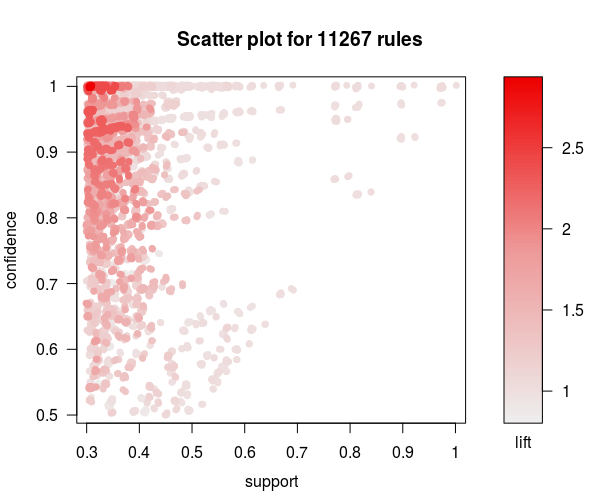
In general, this plot is used to display an association or relationship between interestingness measures (usual support and confidence) that are presented as dots in the Scatter plot. Additionally, the third measure (usual lift) is included as a color key. Thus, rules with similar values of interestingness measures are placed closer to each other, while the correlation can be established between dependent and independent variables. Typically, the so-called regression line is drawn in the Scatter plot, representing the trend of the relationship between two observed variables. This line can also be used as a predictive tool in some circumstances.
4.1.1 Twokey plot
A two-key plot (Fig. 3(b)) is a special kind of Scatter plot that was developed by Unwin et al. [2001], especially, for analyzing association rules. It consists of a two dimensional Scatter plot displaying an association between two measures of interestingness (usually support and confidence), while the third measure is represented by the color of the points (i.e., support/confidence pairs), where the color corresponds to the length of the rule (also order). Interestingly, 2-order association rules describe trails moving from the upper right side (perfect result) to the left lower side of the same plot (lesser support and lesser confidence).
4.2 Graph-based
Graph-based techniques (Fig. 4) identify how rules share individual item [Klemettinen et al., 1994, Rainsford & Roddick, 2000, Buono & Costabile, 2005, Ertek & Demiriz, 2006]. They visualize
association rules using vertices and edges, where vertices annotated with item labels represent items, and itemsets or rules are represented as a second set of vertices. The items are connected with itemsets/rules using arrows. For rules, arrows pointing from items to rule vertices indicate LHS items, and an arrow from a rule to an item indicates the RHS. Interestingness measures are typically added to the plot by using the color or the size of the vertices representing the itemsets/rules. Graph-based visualization offers a very clear representation of rules but they tend to become cluttered easily, and, thus, are only viable for very small sets of rules.
4.3 Matrix-based
Matrix-based visualization [Hian-Huat Ong et al., 2002] (Fig. 5(a)) identifies associations between antecedent (LHS) and consequent (RHS) items.
Thus, association rules are organized as a square matrix of dimension , in which distinct antecedent items for and distinct consequent items for are included. The values of some interestingness measure (e.g., lift) are then assigned to the corresponding position of the matrix. Typically, the antecedent itemset of the rules is ordered by increasing support, while the consequent itemset by increasing confidence before visualization.
However, the matrix visualization is limited by the rule set size (i.e., ), especially in the case of a huge matrix, which makes the exploration of the matrix much harder.
4.3.1 Grouped matrix-based visualization
The grouped matrix-based visualization [Hahsler & Karpienko, 2017] (Fig. 5(b)) is a variant of the original matrix-based visualization, where the large set of different antecedents (the columns in matrix ) are grouped into the smaller set of groups using clustering. Mathematically, the set of antecedents is grouped into a set of groups according to minimizing the sum of squares within the particular cluster, in other words:
| (10) |
where for is a column of matrix which represents all values with the same antecedent, and is the center of the cluster . Thus, the -means algorithm [Hartigan & Wong, 1979] is applied 10-times with random initialization of the centroids. The best solution is then used for an ARM visualization. The motivation behind the ARM visualization method is to reduce the antecedent’s dimension that enables more informative visualization of the association rules.
4.4 Mosaic plot
A mosaic plot [Hartigan & Kleiner, 1984] is applied for visualizing the interesting rule, consisting primarily of categorical attributes (Fig. 6(a)). It is based on the so-called contingency table, in which the frequencies of the attribute appearances in the interesting rule are assigned to each position , where denotes the corresponding the antecedent attribute and the consequent attribute .
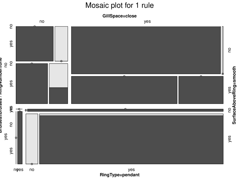
The interesting rule is determined as follows: Let us assume that each rule is a tuple , where denotes the attributes belonging to the antecedent, to the consequent, is a set of interestingness measures, and . Then, the interesting rule for visualizing with mosaic plot is defined as
| (11) |
where , , and , for which the difference of confidence (doc) for rule and is the maximum, in other words:
| (12) |
Mosaic plots were introduced as a graphical analogy of multivariate contingency tables [Hofmann et al., 2000]. This means that the position (also a cell in a contingency table) is presented in a mosaic plot as an area divided into the highlighted part (colored) that is proportional to the support of the rule and the unhighlighted part of the rule . Thus, the confidence is proportional to the height of the highlighted part of the area.
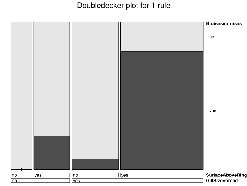
4.4.1 Double Decker plot
Double Decker plot [Hofmann, 2000] allows comparing the proportions of the highlighted heights referring to confidence measure more easily (Fig. 6(b)). While the original mosaic plot splits tiles in vertical and horizontal directions, the Double Decker splits these only horizontally. As a result, the antecedent of the interesting rule is now expressed mathematically as:
i.e., the proportions of the highlighted heights are presented in each tile of the mosaic plot, while the widths of the tiles are represented as labels denoting the antecedent’s attributes. Thus, the highlighted shades illustrate relations with an outcome set to ’True’, while the white shades refer to relations, whose outcome leads to ’False’.
5 New ideas in the visualization of association rules
This section reviews papers dealing with ARM visualization methods that accumulate new ideas in this domain. The ideas are collected in Table 3,
| Nr. | Class | Variant | Reference |
|---|---|---|---|
| 1 | Fishbone | Ishikawa diagram | Tsurinov et al. [2021] |
| 2 | Molecular | Molecular representation | Said et al. [2013] |
| 3 | Lattice | Concept lattice | Shen et al. [2020] |
| 4 | Metro | Metro map | Fister & Fister [2022b] |
| 5 | Sankey | Sankey diagram | Fister & Fister [2022a] |
| 6 | Ribbon | Ribbon plot | Fister et al. [2020] |
| 7 | Glyph | Glyph-based | Hrovat et al. [2015] |
from which it can be seen that, here, we were focused on the seven ARM visualization methods, which, in our opinion, best reflect the development in this domain. In the remainder of the section, the selected ARM visualization methods are illustrated in detail.
5.1 Ishikawa diagram
Typically, the Ishikawa diagram [Tague, 2005] is applied as a cause analysis tool appropriate for describing the structure of a brainstorming session, in which a development team tries to identify possible reason causing a specific effect. Consequently, the Ishikawa chart is also called a cause/effect diagram. As a result of the brainstorming process, a fishbone diagram is constructed as an arrow with an arc directing to the effect (i.e., a problem statement). Then, the possible causes of the problem need to be identified that are presented as branches originating from the main arrow.
The diagram has also been applied in ARM visualization. For instance, the authors Tsurinov et al. [2021] have established that ARM algorithms produce a large number of mined association rules in unstructured form. This means that there is no information about which features are more relevant for a user. In this sense, they proposed the Fishbone ARM (FARM) that is able to introduce a hierarchical structure for rules. The structure enables that the priority of features becomes clearly visible.
The fishbone structure presents a basis for visualization with FARM. In this structure, features, inserted as ribs in a symbolic fishbone, are ordered such that the conviction metric values grow from the rear toward the head. Thus, the complexity of the structure increases by adding additional attributes. On the other hand, the statistical significance of the results also needs to be increased. In line with this, cross-validation is employed for evaluating the significance that splits the result dataset into two different portions (i.e., test and validation), and then re-sampled during more iterations.
5.2 Molecular representation
A molecule is a group of two or more atoms connected together with chemical bounds (e.g., covalent, ionic) [Ebbing & Gammon, 2016]. Therefore, a molecule representation refers to a connected graph with nodes denoting atoms and edges denoting the chemical bounds between them. The representation inspired Said et al. [2013] into developing a new ARM visualization method that is devoted for visualizing items arising in the antecedent and consequent of the selected association rule. Thus, two characteristics need to be determined: (1) the contribution of each item to the rule, and (2) the correlation between each pair of antecedents and each pair of consequents from an archive of association rules. The association rules are explored before visualization according to one of the interestingness measures selected by the user, e.g., support, confidence, and lift.
The contribution of an item in the selected association rule is calculated with measuring the Information Gain (IG) defined by Freitas [1998]:
| (13) |
where
| (14) | ||||
Thus, it holds that attributes with higher values of are good predictors of the selected rule. In contrast, if items with low or negative values are encountered, the selected rules are estimated as irrelevant. On the other hand, the lift interestingness measure (Eq. 4) is applied for determining the correlations between pairs of items in the antecedent and consequent, respectively.
The visualization of molecular representation is typically realized using sphere 3D graphs (also powered by R), where spheres present items and edges of the different distances’ connection between them. The calculated characteristics of items into the selected rule are captured in a sphere graph as follows:
-
•
the size of the sphere is proportional to the value of ,
-
•
the positive value of is a plot in a sphere of one color (e.g., blue), while the negative one in a sphere of another color (e.g., white),
-
•
the distance between two spheres is proportional to the measure lift.
However, authors Said et al. [2013] simplified the visualization of association rules based on a molecular representation by developing a tool for VISual mining and Interactive User-Centred Exploration of Association Rules (IUCEARVis).
In summary, the main weakness of the molecular structure is that it shows the importance of items to rules, and cannot show the distribution of association rules.
5.3 Concept lattice
A concept lattice is a tool for extracting specific information from massive data. It is obtained after a concept analysis that belongs to the domain of applied mathematics [Truong & Tran, 2010]. The results of the concept analysis are aggregated in a data structure that is, typically, presented in a Hasse graph. The Hasse graph consists of concepts representing as nodes in a 2-dimensional lattice, and edges expressing the generalization and instantiation of relationships between the concepts [Shen et al., 2020].
Formally, the concept lattice is defined as a triple , where denotes a set of objects, a set of attributes, and is a binary relationship matrix denoting that an object and attribute are in a relationship, if . Thus, a node in the concept lattice is defined as a pair , where the former member is also called an extension (i.e., a collection of objects), and the latter a connotation (i.e., collection of attributes). Indeed, a combination of objects and attributes is needed for a more comprehensive analysis of the association rules.
The task of the ARM visual algorithms based on the context is to display association rules extracted from concept lattice. Thus, the central area of the visualization interface consists of a 2-dimensional lattice, within which the concepts are positioned as points according to their values of support and confidence. Two lines are attached below and above the lattice: The former represents the objects which have arisen in the antecedent, while the latter the same in the consequent of the potential association rule. Indeed, if there is a relationship between particular object and attribute in the relationship matrix , the object is connected with the node (concept) using an edge.
The advantages of the ARM visualization based on a concept lattice can be summarized as follows: (1) a deeper understanding of association rules at the conceptual level, and (2) analyzing the relationships between concepts more comprehensively. However, the main weakness of the visualization is that this is only appropriate for visualizing the binary values of objects. In order to overcome the problem, Yang [2005] proposed generalized association rules capable of visualizing the frequent rules in an itemset lattice that presents one item in parallel coordinates. In this way, many-to-many rules can be visualized on the one hand, and the large number of rules as selected by the user can be displayed on the other. Obviously, the advantage of the ARM visualization methods is that the user can limit the number of association rules for visualization interactively by specifying the parameters and .
5.4 Metro maps
The concept of information maps enables analysis of data having a ”geographical look” [Shahaf et al., 2012, 2015]. The look can also be prescribed to mined association rules. Therefore, the idea to visualize these in the form of metro maps has become appreciated [Fister & Fister, 2022b]. This means, similar as the metro map can help a user to orientate him/herself in the environment, the information map can help them to understand the information hidden in the mined association rules. Thereby, the metro map is divided into more metro lines, consisting of various metro stops. In the information sense, each metro stop represents an attribute, while the metro lines a linear sequence of the attributes (also different association rules). Mutual connections between the metro lines reveal how an attribute in one association rule affects an attribute in the other, and vice versa. Finally, understanding the linear sequences of attributes and connections between them can even tell stories about the specific information domain.
The metro map is defined mathematically as , where denotes an attribute graph of vertices , representing attributes and edges representing simple rules (i.e., rules with one antecedent attribute and one consequent attribute), together with incident function that associates an ordered pair denoting the implication , and is a set of metro lines [Fister & Fister, 2022b]. The evolutionary algorithm was applied in Fister & Fister [2022b] for constructing a metro map that must obey the following four objectives: (1) maximum path length , (2) maximum map size , (3) high coverage, and (4) high structure quality.
Indeed, the maximum path length refers to the maximum number of metro stops (i.e., attributes) in a linear sequence. The maximum map size limits the number of metro lines. The coverage is proportional to the lift interestingness measure, where we were interested in rules with a lift value , determining the degree to which the probability of occurrence of the antecedent, and this of the consequent are dependent on one another. The structure quality ensures that the linear sequences of the metro stops are coherent in all metro lines.
An example of a metro map obtained by mining the Mushroom dataset, that was constructed using the parameters and , is illustrated in Fig. 7.
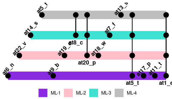
| Tag | Attribute |
|---|---|
| at1_e | class_edible |
| at1_p | class_poisonous |
| at5_f | bruises?_no |
| at5_t | bruises?_bruises |
| at6_n | odor_none |
| at7_f | gill-attachment_free |
| at8_c | gill-spacing_close |
| at9_b | gill-size_broad |
| at11_t | stalk-shape_tapering |
| at13_s | stalk-surface-above-ring_smooth |
| at14_s | stalk-surface-below-ring_smooth |
| at17_p | veil-type_partial |
| at18_w | veil-color_white |
| at19_o | ring-number_one |
| at20_p | ring-type_pendant |
| at22_v | population_several |
Let us notice that the figure is divided into two parts, i.e., a diagram and a table. The diagram presents the visualized metro map, while the table the meaning of the metro stops (attributes).
5.5 Sankey diagram
Similar to the metro map, the Sankey diagram is also focused on ”geographical data”. Additionally, the kind of visualization enables visualization of hierarchical multivariate data. It is represented as a graph consisting of nodes representing attributes and edges representing connectivity by flows across time. In this diagram, the quality of each connection is distinguished by its weight that is proportional to some of the interestingness measures.
Mathematically, the Sankey diagram is defined as a directed graph , where denotes the maximum path length and is a set of similar rules Fister & Fister [2022a]. The rules in this diagram are presented by the antecedent , representing a set of source nodes, consequent , representing a set of sink nodes, and interestingness measure , reflecting the quality of a particular connection. The quality can also be expressed with a linear combination of the measures. The similarity between two rules and is defined as:
| (15) |
where denotes a set of antecedent attributes, and a set of consequent ones. However, the , where the value 0 means that the rules are not similar, and 1 that the rules are absolutely similar. The similarities are then combined into an adjacency matrix , defined as follows:
| (16) |
The problem of searching for the most similar set of association rules is defined as a Knapsack 0/1 problem [Kellerer et al., 2010].
The construction of the Sankey diagram visualization is divided into two steps: (1) searching for a set of the most similar association rules, and (2) visualization using Sankey diagrams. In Fister & Fister [2022a], the authors proposed a DE meta-heuristic algorithm using the Knapsack 0/1 deterministic algorithm for determining the set of the most similar rules, while the R programming language for statistical computing was applied to solve the second step.
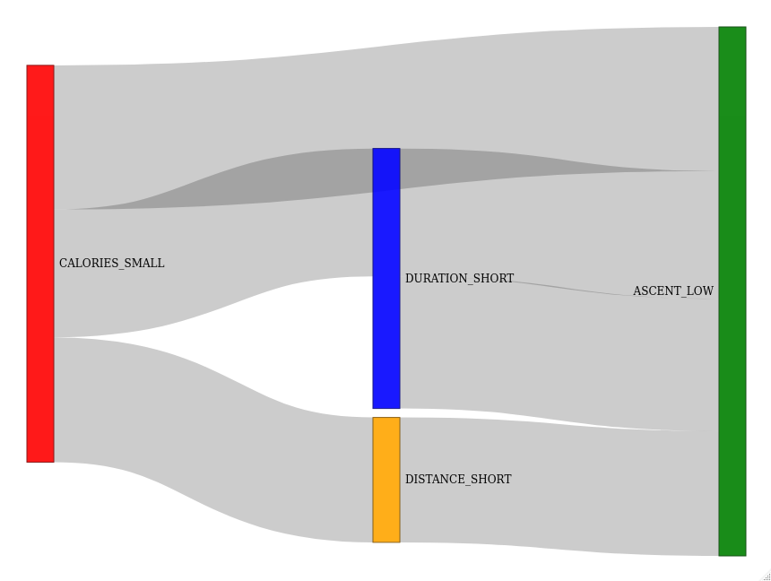
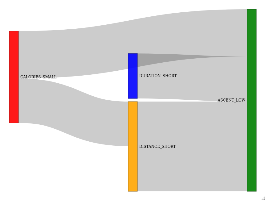
that refer to mining the sport training database obtained in more seasons (i.e., years). This database consists of training load indicators measured during an implementation of a sport training session. The visualization is divided into two parts: The first part (Fig. 8(a)) presents the results of the ARM visualization on sport training data captured during one season, while the second (Fig. 8(b)) highlights the data obtained during the next season.
In this way, two historical insights are served to a sport trainer: (1) In what proportion do the training load indicators contribute to the whole? and (2) What changes can be observed in the sense of training load indicators by athletes who have already had the main portion of training sessions during the previous seasons?
Interestingly, Hlosta et al. [2013] proposed a visualization of evolving association rules using graphs, where the nodes of the graphs represent items and edges specific association rules. Thus, the graph-based diagram shows how evolving models mined using the ARM algorithms and stored into a transaction database can be filtered and visualized.
5.6 Ribbon plot
Ribbon plots are appropriate for visualizing data without self-intersections, where linearized simplification of events exposes the significant ones. Although the plot is ideal for analyzing linearized sequences, it can be applied successfully for visualizing the best association rule in NARM, where the proper boundaries need to be discovered between the numerical attributes. Thus, the attribute with the best support is compared with the other attributes in the association rule according to support and confidence. The attributes are ordered into linear sequence according to the closeness of the first attribute regarding the others.
The inspiration behind the visualization is presented by the Tour De France (TDF), i.e., the most famous cycling race in the world. Similar as in the TDF, where the best hill climbers have more chance to win the race, the attribute with the higher support also has the most decisive role in a decision-making process. Indeed, virtual hill slopes are visualized as triangles situated on a plain, where the left leg denotes an ascent and the right leg a descent of the virtual hill in a linear sequence, starting from the left to the right side. In the paper of Fister et al. [2020], the ascent of the virtual hill is proportional to the attribute’s support, while the descent to the confidence of the simple association rule.
Mathematically, the best rule consists of an antecedent and a consequent
, where the denotes the best attribute according to the support, and simple association rules for are ordered as:
| (17) |
where is a permutation of the attributes belonging to the consequent. Moreover, the distances between the virtual hills are also proportional to .
An example of a ribbon plot is illustrated in Fig. 9(a) representing a visualization of the best association rule mined by the uARMSolver [Fister & Jr., 2020] (i.e., the framework for NARM using the nature-inspired algorithms).
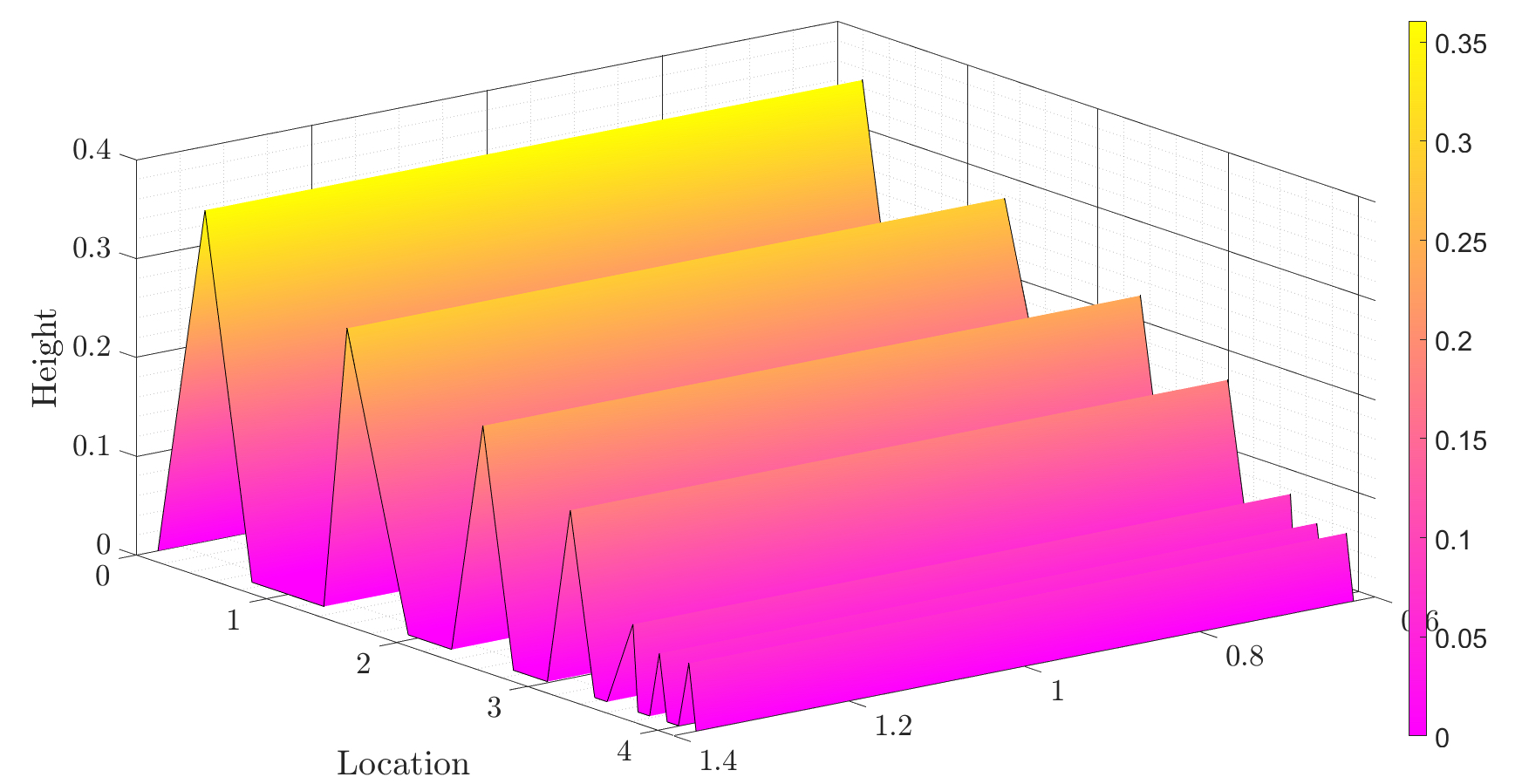
The framework was applied for mining a database consisting of transactions obtained by cycling training sessions. Thus, the best transaction is composed from seven attributes ordered into the association rule:
Seven virtual hills can be observed as can be seen from the figure. While the first three virtual hills are of comparable height to the first one, the remainder of the hills are of lower height, and, thus, reflect the lower inter-dependence.
5.7 Glyph-based plots
Glyph-based plots are suitable for visualizing multivariate data with more than two attribute dimensions, where different data variables are presented by a set of visual channels (i.e., shape, size, color, orientation, curvature, etc.) [Borgo et al., 2013]. Indeed, glyphs are devoted for depicting attributes of data that, typically, appear in collections of visualized objects. They are founded on the basics of a semiotic theory that is, in fact, the science of signs [Lagopoulos & Boklund-Lagopoulou, 2020]. According to this theory, signs have emerged in three forms: icons, indices, and symbols. Icons reflect a physical correlation to the sign. The index expresses a space and time correlation to the object. In other words, they have an indirect effect on the object. A meta-physic correlation (i.e., no real correlation) exists between the symbol and the sign.
An example of glyph-based visualization for ARM was performed by Hrovat et al. [2015] that analyzed the time series data gathered from a single athlete (i.e., a cyclist) during a large time period of training (i.e., the whole season). In this study, the sequential pattern mining algorithm [Agrawal et al., 1994] was exploited, where the sequential patterns were discovered by employing the novel trend interestingness measure for mining sequential patterns. Thus, a time-series sequences were discovered from a transaction database consisting of sport training performed by a single athlete.
Two trend interestingness measures are defined in the study as follows: (1) the duration trend , and (2) the daily trend . The former discovers trends within a trend database on a monthly, while the latter on a daily basis. The trend database is constructed from the original transaction database by dividing each training session into -time series. Then, the permutation test is performed, after which those sequential patterns are selected with a minimum -value. Obviously, the -value is obtained as a result of the permutation test, and serves as a trend interestingness measure.
Both trend interestingness measures are visualized using glyphs in order to depict how trends increase or decrease during a specific training period (Fig. 9(b)). Thus, two glyph symbols are used by the visualization: (1) level, and (2) variable. The level’s symbol depicts the trend interestingness measure using an optical channel (i.e., color), where the intensity training load indicators are presented in different colors, depending on low, moderate, intensity, and high intensity levels. The variable’s symbol addresses the geometric channels, like: the cyclist’s speed (as maximum, average or standard deviation), average heart rate (as minimum, maximum, average and standard deviation), and altitude (as standard deviation). These symbols are depicted using different shapes.
5.8 Other ideas in ARM visualization
The characteristics of the remainder of the analyzed papers can be summarized in the present section as follows: The majority of the papers were published for various data mining conferences. As a result, these include ideas more on the conceptual level, and, therefore, the solutions that they reveal are not robust enough for using in the everyday real-world environment. On the other hand, these ideas are not included into some recognizable ARM visualization system. However, they could be interesting for the potential readers for sure.
The principles of ARM visualization methods, as found in the observed collections of analyzed papers, can be classified into the following two classes (Table 4):
-
•
reducing a rule set,
-
•
visual data mining.
Indeed, the first two principles of ARM visualization are used commonly in the ARM community: Thereby, the association rules are mined using some of the known mining algorithms. These algorithms produce a lot of association rules that need to be reduced (also rummaged) into an association rule set necessary for visualization. The second principle is more goal-oriented, and mines the association rules either in a visualization context, or tries to reduce their number by avoiding occlusions using optimization. In this way, the association rule set does not need to be reduced further before visualization. Interestingly, the first principle is characterized for papers which emerged at the beginning of the ARM visualization domain, while the second one is typical for papers of the new age, where the ARM exploration is part of the visualization process.
| Principles of ARM visualization | |||
| 1 Reducing rule set | Attribute | Reference | |
| 1 | Relational SQL | Categorical | Chakravarthy & Zhang [2003] |
| 2 | Conditional AR analysis | Categorical | Yamada et al. [2015] |
| 3 | Rummaging model | Categorical | Blanchard et al. [2003] |
| 4 | Rummaging model | Categorical | Menin et al. [2021] |
| 5 | Correlation rule visualization | Categorical | Zheng et al. [2017] |
| 6 | Weighted association rules | Categorical | Saeed et al. [2011] |
| 7 | Multiple antecedent | Text | Wong et al. [1999] |
| 8 | Weighted association rules | Text | Kawahara & Kawano [1999] |
| 9 | Hierarchical structure | Boolean | Jiang et al. [2008] |
| 2 Visual data mining | |||
| 1 | Correlation visualization alg. | Categorical | Xu et al. [2009] |
| 2 | Integrated framework | Categorical | Couturier et al. [2007] |
| 3 | Occlusion reducing | Categorical | Couturier et al. [2008] |
| 4 | Contextual exploration | Categorical | Yahia & Nguifo [2004a] |
| 5 | Generic association rule set | Categorical | Yahia & Nguifo [2004b] |
| 6 | 3D visualization engine | Categorical | Ounifi et al. [2016] |
| 7 | Rule-to-items mapping | Categorical | Wang et al. [2017] |
Obviously, the reducing can be performed on many ways. For instance, Chakravarthy & Zhang [2003] proposed a relational SQL query language, with which a user can select the suitable association rule set for visualization interactively from the collection of association rules stored in tables. Yamada et al. [2015] applied the conditional association rule analysis and the association rule analysis with user attributes for the comprehending questionnaire data. Blanchard et al. [2003] introduced the rummaging model for filtering association rules interactively, and included into an experimental prototype called ARVis. A similar model was recommended by Menin et al. [2021], devoted to exploring the RDF data that employed the traditional methods for visualizing and was incorporated into the prototype ARViz. The gray correlation rule visualization algorithm was advised by Zheng et al. [2017] that is suitable for considering the influence of the association rules on the visualization. Saeed et al. [2011] mined a collection of documents consisting of metadata with the Apriori algorithm, and selected an association rule set for visualization according to the calculated weights.
On the other hand, Wong et al. [1999] visualized an association rule set with multiple antecedents using a 3-dimensional graph, and applied their solution to a text mining study on a large corpora. Kawahara & Kawano [1999] developed the web search engine for manipulating weighted association rules. Thus, the text mining algorithm derived appropriate keywords, while the ROC graph served for the visualization of association rules. Boolean association rules were visualized by Jiang et al. [2008] using the hierarchical structure for all of them and depicted in a Hasse diagram.
Visual data mining can be performed in various ways, as found in our study: The correlation visualization algorithm was proposed for mining the alarm association rules by Xu et al. [2009]. Couturier et al. [2007] recommended the integrated framework for association rule extraction and visualization in one step, which integrated previous methods of association rule visualization. Occlusion optimization was proposed by Couturier et al. [2008]. Contextual exploration of an association rule set was developed by Yahia & Nguifo [2004a] and Yahia & Nguifo [2004b], where the additional knowledge needed for visualization was constructed using the fuzzy meta-rules. Ounifi et al. [2016] solved the problem of extraction and visualization by a 3-dimensional visualization engine, while Wang et al. [2017] introduced a 3-dimensional matrix-based visualization system, where the basic matrix-based approach was extended by rule-to-items mapping.
5.9 Taxonomies of the ARM visualization
The ARM visualization methods can be classified according to many aspects. These aspects depend on the various standpoints from which they are observed. Indeed, the following questions reflect those standpoints more precisely:
-
•
How to visualize?
-
•
Which visualization methods to use?
-
•
Which characteristics of association rules are essential to visualize?
-
•
What to visualize?
-
•
Which type of attributes to display?
In the remainder of the section, these queries are described in detail.
5.9.1 How to visualize?
The aspect ”How to visualize?” refers to the mode of how the exploration and visualization are performed. In line with this, four different methods are distinguished, as follows (Fig. 10):
-
•
reducing the item set,
-
•
visual data mining,
-
•
a concept lattice,
-
•
evolving association rules.
Reducing the item set means that the exploration of association rules is performed with traditional ARM methods (e.g., Apriori, Eclat, evolutionary algorithms), after which the visualization is performed using some traditional or new age visualization methods.
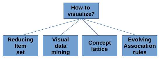
Visual data mining comprises those ARM visualization methods that perform the exploration and visualization phases in one step. These methods mine association rules more directionally, where mining can be performed from some concept, can use meta rules, or can be able to limit the number of occlusions. The concept lattice enables displaying the structure of the association rules (i.e., attributes) beside the single rules. However, this visualization method is reserved for displaying the binary association rules only. The evolving association rules are appropriate for visualizing either warehouse data cubes stored in a multidimensional data model, or data suitable for displaying by Sankey diagrams.
5.9.2 Which visualization methods to use?
This aspect is focused on the question, which visualization method to use? In line with this, we can consider that the methods are divided into traditional and new age visualization methods. The former consists of charts, like scatter plot, group-based, matrix-based and mosaic plots, and their variants, like two-key, grouped-matrix and double Decker plots (see Table 5 under the column ”Method”). The new age visualization methods are comprised of an Ishikawa diagram, molecular representation, a concept lattice, metro maps, Sankey diagrams, ribbon plots, and glyph-based charts.
| Nr. of interesting meas. | Rule set size | Interactive | Interesting measure | Rule length | Items | RHS+LHS | Time-series | Categorical | Numerical | Binary | ||||
| Scatter plot | 3 | ❹ | ⚫ | ▲ | ◼ | |||||||||
| Two key plot | 2+ | ❹ | ⚫ | ▲ | ◼ | |||||||||
| Graph-based | 2 | ❸ | ▲ | ◼ | ||||||||||
| Matrix-based | 1 | ③ | ⚫ | ▲ | ◼ | |||||||||
| Grouped matrix | 2 | ❺ | ⚫ | ▲ | ◼ | |||||||||
| Mosaic plot | 2 | ❶ | ⚫ | ▲ | ◼ | |||||||||
| Double Decker | 2 | ❶ | ⚫ | ▲ | ◼ | |||||||||
| Ishikawa diagram | 1 | ❷ | ▲ | ◼ | ◼ | |||||||||
| Molecular representation | 3 | ❶ | ⚫ | ▲ | ◼ | |||||||||
| Concept lattice | 1 | ❷ | ▲ | ▲ | ◼ | |||||||||
| Metro map | 1 | ❷ | ▲ | ▲ | ◼ | ◼ | ||||||||
| Sankey map | 2 | ❷ | ▲ | ◼ | ||||||||||
| Ribbon plot | 2 | ❶ | ▲ | ◼ | ◼ | |||||||||
| Glyph-based chart | 1 | ❶ | ▲ | ◼ | ◼ | |||||||||
| Method | Characteristics | Focus | Attribute | |||||||||||
5.9.3 Which characteristics of association rules are essential to visualize?
The characteristics of the ARM visualization methods refer to: (1) the number of displayed interestingness measures, (2) the rule set size, and (3) the interactivity tools. The number of displayed interestingness rules determines, how many of the interestingness measures are included into the representation for user. For instance, the scatter plot is able to display three interestingness measures, while the two-key plot actually only two, but the third measure is presented indirectly by a color. In general, the number of measures by various visualization methods are typically in the range . The rule set size determines the number of association rules to be displayed by the definite visualization method. This number is denoted in Table 5 in the column ”Rule set size” in circles with numbers within them. The numbers present the powers of base 10. This means that the grouped matrix can display association rules. The column ”Interactive” shows if specific visualization method supports interactive tools (e.g., hover, zoom, pan, drill down, etc.) or not. Interestingly, although the new age visualization methods do not support interactive tools in general, they allow tuning of parameter settings that enable users some kind of interactivity.
5.9.4 What to visualize?
The aspect, answering to the question ”What to visualize?”, deals with the focus, which an ARM visualization is presenting. Actually, the ARM visualization can be focused on illustrating: (1) number of interestingness measures, (2) rule length, (3) items, (4) RHS and LHS, and (5) time series data. The first focus is devoted to displaying the number if interestingness measures. The rule length refers to the number of attributes in the visualized association rules. The item focuses on depicting the attributes of the association rules, while the RHS+LHS focus is concentrated on the structure of the more important rules. Finally, the last focus considers the time series data.
Interestingly, the concept lattice and metro maps even cover two focuses of displaying association rules, i.e., items (i.e., attributes) and their structure. On the other hand, the glyph-based visualization is dedicated for presenting the time series data.
5.9.5 Which type of attributes to display?
The aspect ”Which type of attributes to display?” is focused on visualization based to distinguish the attribute types. In the ARM exploration/visualization, three attribute types can be identified as follows: (1) categorical, (2) numerical, and (3) binary. Interestingly, the majority of the traditional visualization methods are suitable for displaying the categorical type of attributes. Usually, displaying attributes of the numerical type is performed by these visualization methods by discretizing the numerical attributes into discrete classes. Obviously, the new age visualization methods are capable of working with the numerical and binary attributes directly as well.
6 ARM visualization systems
The section aims to compile a list of specialized ARM visualization systems and software packages for any of the ARM visualization methods. Obviously, this does not present the other visualization libraries, from which we can develop some methods (e.g., matplotlib in Python, or ggplot2 in R). The study focused on presenting only the collection of graphics system that are used more nowadays in the ARM community. The collection of systems is illustrated in Table 6.
| R packages | |
|---|---|
| arulesViz https://cran.r-project.org/web/packages/arulesViz/index.html | 1.1 probably the only state-of-the-art tool that supports many visualization methods up to this date 1.2 includes also interactive tools |
| Python packages | |
| pycaret https://github.com/pycaret/pycaret | 2.1 basically low-code machine learning library in Python 2.2 association rule mining is a part of this library 2.3 library supports 2D and 3D plots of association rules |
| NiaARM (https://github.com/firefly-cpp/NiaARM) | 3.1 minor module devoted for visualization 3.2 for now supports only ribbon plots |
| PyARMViz https://github.com/Mazeofthemind/PyARMViz | 4.1 Python Association Rule Visualization Library that is loosely based on ArulesViz 4.2 Development probably stalled (no commits in the last 2.5 years) |
| C++ packages | |
| uARMSolver https://github.com/firefly-cpp/uARMSolver | 5.1 small part of this package is devoted to the visualization 5.2 provides the coordinates for metro plots which can be later visualized using metro map algorithms |
As can be seen from the table, the arulesViz graphics system is the most complete, due to covering the majority of the visualization methods dealt with in this review paper. This is an extensive toolbox in the R-extension package [Hahsler et al., 2011], and works in two phases: (1) exploration using known ARM methods to which tools for reducing the huge number of association rules are applied (e.g., filtering, zooming and rearranging), and (2) visualization of results. The current version of the software supports the following visualization methods (i.e., graphics): scatter plots, network plots, matrix-based, graph-based, mosaic plots and parallel coordinate plots.
The other libraries are just a smaller drop in the ocean and, typically, they solve only limited ARM exploration/visualization approaches. For example, while the NiaARM is focused at this moment on only one visualization method (i.e., ribbon plot), the PyARMviz graphics system tends to be what is arulesViz for R, but in Python. Unfortunately, the development of this graphics software has probably stalled since the last commit was done almost three years ago. On the other hand, the development of the NiaARM is not finished yet, due to the unfinished inclusion of the new ideas in ARM visualization (e.g., metro maps, Sankey diagram, etc.) that should shortly widen the usability of the graphics system.
7 Challenges and open problems
After deep analysis of the ARM visualization methods, we can conclude that a universal method for covering all the ARM visualization problems does not exist. As a result, the arulesViz software package offers a spectrum of solutions useful for visualization with traditional ARM visualization methods. In this package, the scatter plot is applied as an entry point for an analysis of how to distinguish the similarity of association rules according to interestingness measures, like support and confidence. Then, the matrix-based visualization can be applied, capable of organizing association rules into a matrix, where the antecedent and consequent items can be distinguished. Finally, the graph-based methods are recommended by authors, in order to get the user the broadest view of the relationships between individual items reflecting, their memberships in different association rules.
In summary, the problems caused by using the traditional ARM visualization methods can be aggregated as follows [Shen et al., 2020]:
-
•
the domain knowledge is not displayed sufficiently, i.e., the rules are displayed from a single point of view,
-
•
the visualization of background knowledge is not enough for sharing, i.e., the role and relationship of global information is lost in the context of the background knowledge,
-
•
the use and exploration of potential knowledge hidden in non-connected attributes are reduced.
However, the new age ARM visualization methods tries to reveal the aforementioned problems. Moreover, some of these methods are even able to tell stories in mined data (e.g., metro maps), while the others are able to analyze the information from the history point of view (e.g., Sankey diagrams).
Although searching for a new age ARM visualization methods almost stopped after the rapid development of the traditional ARM visualization methods in the past, in our opinion, the future of the ARM visualization remains in the development of the new age ARM visualization methods. These methods might consolidate displaying items as well as the structure of the association rules. Additionally, these need to be independent of the attribute types.
The main advantage of the ARM visualization undoubtedly presents the interactivity of the ARM visualization methods. Interactive visualization improves the user’s experience and interpretation of the results. Although several popular implementations of the traditional ARM visualization methods (e.g., arulesViz R-package by Hahsler & Karpienko [2017], and InterVisAR by [Cheng et al., 2016]) already offer some interactive tools (e.g., hover, zoom, pan, drill down, inspect, brush), these tools are usually missing in the observed new age ARM visualization methods.
8 Conclusions
Data mining methods today suffer from a lot of comprehension of the mass results they produce. In line with this, a new domain of AI, the so-called XAI, has emerged that searches for methods which will be suitable to present these results clearly to the user. The visualization methods are one of the useful tools for helping users understand the results of different data mining methods better.
The present study has revised the most important visualization methods associated with ARM. Consequently, the most important ARM visualization methods, published in research papers, have been identified, analyzed, and classified. The ARM visualization methods are divided into traditional and new age methods. Moreover, they have been classified according to the characteristics of the displayed association rules, the focus of visualization, and the types of attributes.
The potential reader of this work will be able to get deeper overview of the ARM exploration/visualization process. Furthermore, it encourages readers to open new avenues of potential research. According to the research paper review, there is a huge opportunity to use the knowledge, especially in biological/medical sciences.
Acknowledgements
This research has been supported partially by the project PID2020-115454GB-C21 of the Spanish Ministry of Science and Innovation (MICINN).). The authors acknowledge the financial support from the Slovenian Research Agency (Research Core Funding No. P2-0057 & P2-0042).
References
- Agrawal et al. [1994] Agrawal, R., Srikant, R. et al. (1994). Fast algorithms for mining association rules. In Proc. 20th int. conf. very large data bases, VLDB (pp. 487–499). volume 1215.
- Altay & Alatas [2019] Altay, E. V., & Alatas, B. (2019). Performance analysis of multi-objective artificial intelligence optimization algorithms in numerical association rule mining. Journal of Ambient Intelligence and Humanized Computing, (pp. 1–21).
- Arrieta et al. [2020] Arrieta, A. B., Díaz-Rodríguez, N., Del Ser, J., Bennetot, A., Tabik, S., Barbado, A., García, S., Gil-López, S., Molina, D., Benjamins, R. et al. (2020). Explainable artificial intelligence (xai): Concepts, taxonomies, opportunities and challenges toward responsible ai. Information fusion, 58, 82–115.
- Barredo Arrieta et al. [2019] Barredo Arrieta, A., Díaz-Rodríguez, N., Del Ser, J., Bennetot, A., Tabik, S., Barbado, A., García, S., Gil-López, S., Molina, D., Benjamins, R. et al. (2019). Explainable artificial intelligence (xai): Concepts, taxonomies, opportunities and challenges toward responsible ai. arXiv, (pp. arXiv–1910).
- Bayardo & Agrawal [1999] Bayardo, R. J., & Agrawal, R. (1999). Mining the most interesting rules. In Proceedings of the Fifth ACM SIGKDD International Conference on Knowledge Discovery and Data Mining KDD ’99 (pp. 145–154). New York, NY, USA: Association for Computing Machinery. URL: https://doi.org/10.1145/312129.312219. doi:10.1145/312129.312219.
- [6] Bennetot, A., Donadello, I., El Qadi, A., Dragoni, M., Frossard, T., Wagner, B., Saranti, A., Tulli, S., Trocan, M., Chatila, R. et al. (). A practical guide on explainable ai techniques applied on biomedical use case applications. Available at SSRN 4229624, .
- Blanchard et al. [2003] Blanchard, J., Guillet, F., & Briand, H. (2003). A user-driven and quality-oriented visualization for mining association rules. In Third IEEE International Conference on Data Mining (pp. 493–496). IEEE.
- Borgo et al. [2013] Borgo, R., Kehrer, J., Chung, D. H., Maguire, E., Laramee, R. S., Hauser, H., Ward, M., & Chen, M. (2013). Glyph-based visualization: Foundations, design guidelines, techniques and applications. Eurographics State of the Art Reports, (pp. 39–63). URL: https://www.cg.tuwien.ac.at/research/publications/2013/borgo-2013-gly/. Http://diglib.eg.org/EG/DL/conf/EG2013/stars/039-063.pdf.
- Borrego-Díaz & Galán-Páez [2022] Borrego-Díaz, J., & Galán-Páez, J. (2022). Explainable artificial intelligence in data science. Minds and Machines, 32, 485–531. URL: https://doi.org/10.1007/s11023-022-09603-z. doi:10.1007/s11023-022-09603-z.
- Buono & Costabile [2005] Buono, P., & Costabile, M. F. (2005). Visualizing association rules in a framework for visual data mining. In M. Hemmje, C. Niederée, & T. Risse (Eds.), From Integrated Publication and Information Systems to Information and Knowledge Environments: Essays Dedicated to Erich J. Neuhold on the Occasion of His 65th Birthday (pp. 221–231). Berlin, Heidelberg: Springer Berlin Heidelberg. URL: https://doi.org/10.1007/978-3-540-31842-2_22. doi:10.1007/978-3-540-31842-2_22.
- Chakravarthy & Zhang [2003] Chakravarthy, S., & Zhang, H. (2003). Visualization of association rules over relational dbmss. In Proceedings of the 2003 ACM symposium on Applied computing (pp. 922–926).
- Cheng et al. [2016] Cheng, C.-W., Sha, Y., & Wang, M. D. (2016). Intervisar: An interactive visualization for association rule search. In Proceedings of the 7th ACM International Conference on Bioinformatics, Computational Biology, and Health Informatics (pp. 175–184).
- Couturier et al. [2008] Couturier, O., Dubois, V., Hsu, T., & Nguifo, E. M. (2008). Optimizing occlusion appearances in 3d association rules visualization. In 2008 4th International IEEE Conference Intelligent Systems (pp. 15–42). IEEE volume 2.
- Couturier et al. [2007] Couturier, O., Hamrouni, T., Yahia, S. B., & Nguifo, E. M. (2007). A scalable association rule visualization towards displaying large amounts of knowledge. In 2007 11th International Conference Information Visualization (IV’07) (pp. 657–663). IEEE.
- Ebbing & Gammon [2016] Ebbing, D., & Gammon, S. (2016). General Chemistry. Cengage Learning. URL: https://books.google.nl/books?id=BnccCgAAQBAJ.
- Ertek & Demiriz [2006] Ertek, G., & Demiriz, A. (2006). A framework for visualizing association mining results. In A. Levi, E. Savaş, H. Yenigün, S. Balcısoy, & Y. Saygın (Eds.), Computer and Information Sciences – ISCIS 2006 (pp. 593–602). Berlin, Heidelberg: Springer Berlin Heidelberg.
- Fister et al. [2020] Fister, I., Fister, D., Iglesias, A., Galvez, A., Osaba, E., Del Ser, J., & Fister, I. (2020). Visualization of numerical association rules by hill slopes. In C. Analide, P. Novais, D. Camacho, & H. Yin (Eds.), Intelligent Data Engineering and Automated Learning – IDEAL 2020 (pp. 101–111). Cham: Springer International Publishing.
- Fister & Fister [2022a] Fister, I., & Fister, I. (2022a). Association rules over time. In M. Khosravy, N. Gupta, & N. Patel (Eds.), Frontiers in Nature-Inspired Industrial Optimization (pp. 1–16). Singapore: Springer Singapore. URL: https://doi.org/10.1007/978-981-16-3128-3_1. doi:10.1007/978-981-16-3128-3_1.
- Fister & Fister [2022b] Fister, I., & Fister, I. (2022b). Information cartography in association rule mining. IEEE Transactions on Emerging Topics in Computational Intelligence, 6, 660–676. doi:10.1109/TETCI.2021.3074919.
- Fister et al. [2022] Fister, I., Fister Jr., I., Novak, D., & Verber, D. (2022). Data squashing as preprocessing in association rule mining. In 2022 IEEE Symposium Series on Computational Intelligence (SSCI) (pp. 1720–1725). IEEE.
- Fister & Jr. [2020] Fister, I., & Jr., I. F. (2020). uarmsolver: A framework for association rule mining. CoRR, abs/2010.10884. URL: https://arxiv.org/abs/2010.10884.
- Freitas [1998] Freitas, A. A. (1998). On objective measures of rule surprisingness. In J. M. Żytkow, & M. Quafafou (Eds.), Principles of Data Mining and Knowledge Discovery (pp. 1–9). Berlin, Heidelberg: Springer Berlin Heidelberg.
- Gupta et al. [2006] Gupta, N., Mangal, N., Tiwari, K., & Mitra, P. (2006). Mining quantitative association rules in protein sequences. In G. J. Williams, & S. J. Simoff (Eds.), Data Mining: Theory, Methodology, Techniques, and Applications (pp. 273–281). Berlin, Heidelberg: Springer Berlin Heidelberg. URL: https://doi.org/10.1007/11677437_21. doi:10.1007/11677437_21.
- Hahsler et al. [2011] Hahsler, M., Chelluboina, S., Hornik, K., & Buchta, C. (2011). The arules r-package ecosystem: Analyzing interesting patterns from large transaction data sets. Journal of Machine Learning Research, 12, 2021–2025. URL: http://jmlr.org/papers/v12/hahsler11a.html.
- Hahsler & Karpienko [2017] Hahsler, M., & Karpienko, R. (2017). Visualizing association rules in hierarchical groups. Journal of Business Economics, 87, 317–335. URL: https://doi.org/10.1007/s11573-016-0822-8. doi:10.1007/s11573-016-0822-8.
- Hartigan & Kleiner [1984] Hartigan, J. A., & Kleiner, B. (1984). A mosaic of television ratings. JSTOR: The American Statistician, 38, 32–35. doi:https://doi.org/10.2307/2683556.
- Hartigan & Wong [1979] Hartigan, J. A., & Wong, M. A. (1979). A k-means clustering algorithm. JSTOR: Applied Statistics, 28, 100–108.
- Hian-Huat Ong et al. [2002] Hian-Huat Ong, K., leong Ong, K., keong Ng, W., & peng Lim, E. (2002). Crystalclear: active visualization of association rules. In International Workshop on Active Mining, AM2002.
- Hlosta et al. [2013] Hlosta, M., Šebek, M., & Zendulka, J. (2013). Approach to visualisation of evolving association rule models. In 2013 Second International Conference on Informatics & Applications (ICIA) (pp. 47–52). IEEE.
- Hofmann [2000] Hofmann, H. (2000). Exploring categorical data: interactive mosaic plots. Metrika, 51, 11–26. doi:https://doi.org/10.1007/s001840000041.
- Hofmann [2008] Hofmann, H. (2008). Mosaic plots and their variants. In Handbook of Data Visualization (pp. 617–642). Berlin, Heidelberg: Springer Berlin Heidelberg. URL: https://doi.org/10.1007/978-3-540-33037-0_24. doi:10.1007/978-3-540-33037-0_24.
- Hofmann et al. [2000] Hofmann, H., Siebes, A. P. J. M., & Wilhelm, A. F. X. (2000). Visualizing association rules with interactive mosaic plots. In Proceedings of the Sixth ACM SIGKDD International Conference on Knowledge Discovery and Data Mining KDD ’00 (p. 227–235). New York, NY, USA: Association for Computing Machinery. URL: https://doi.org/10.1145/347090.347133. doi:10.1145/347090.347133.
- Hofmann & Wilhelm [2001] Hofmann, H., & Wilhelm, A. F. X. (2001). Visual comparison of association rules. Comput. Stat., 16, 399–415. URL: https://doi.org/10.1007/s001800100075. doi:10.1007/s001800100075.
- Hrovat et al. [2015] Hrovat, G., Jr., I. F., Yermak, K., Stiglic, G., & Fister, I. (2015). Interestingness measure for mining sequential patterns in sports. J. Intell. Fuzzy Syst., 29, 1981–1994. URL: https://doi.org/10.3233/IFS-151676. doi:10.3233/IFS-151676.
- Jiang et al. [2008] Jiang, B., Han, C., & Hu, X. (2008). A finite ranked poset and its application in visualization of association rules. In 2008 IEEE International Conference on Granular Computing (pp. 322–325). IEEE.
- Kawahara & Kawano [1999] Kawahara, M., & Kawano, H. (1999). Performance evaluation and visualization of association rules using receiver operating characteristic graph. In Proceedings 1999 International Symposium on Database Applications in Non-Traditional Environments (DANTE’99)(Cat. No. PR00496) (pp. 74–83). IEEE.
- Kellerer et al. [2010] Kellerer, H., Pferschy, U., & Pisinger, D. (2010). Knapsack Problems. Springer Berlin Heidelberg. URL: https://books.google.si/books?id=Mi5bcgAACAAJ.
- Kennedy & Eberhart [1995] Kennedy, J., & Eberhart, R. (1995). Particle swarm optimization. In Proceedings of ICNN’95 - International Conference on Neural Networks (pp. 1942–1948 vol.4). volume 4. doi:10.1109/ICNN.1995.488968.
- Kitchenham et al. [2007] Kitchenham, B., Charters, S. et al. (2007). Guidelines for performing systematic literature reviews in software engineering version 2.3. Engineering, 45, 1051.
- Klemettinen et al. [1994] Klemettinen, M., Mannila, H., Ronkainen, P., Toivonen, H., & Verkamo, A. I. (1994). Finding interesting rules from large sets of discovered association rules. In Proceedings of the Third International Conference on Information and Knowledge Management CIKM ’94 (p. 401–407). New York, NY, USA: Association for Computing Machinery. URL: https://doi.org/10.1145/191246.191314. doi:10.1145/191246.191314.
- Kumar [2022] Kumar, A. (2022). What is explainable ai? concepts & examples. URL: https://vitalflux.com/what-is-explainable-ai-concepts-examples/.
- Lagopoulos & Boklund-Lagopoulou [2020] Lagopoulos, A., & Boklund-Lagopoulou, K. (2020). Theory and Methodology of Semiotics: The Tradition of Ferdinand de Saussure. Semiotics, Communication and Cognition [SCC]. De Gruyter. URL: https://books.google.si/books?id=LXcGEAAAQBAJ.
- Malerba et al. [2002] Malerba, D., Lisi, F. A., Appice, A., & Sblendorio, F. (2002). Mining spatial association rules in census data: a relational approach. In Proceedings of the ECML/PKDD (pp. 80–93). volume 2.
- Menin et al. [2021] Menin, A., Cadorel, L., Tettamanzi, A., Giboin, A., Gandon, F., & Winckler, M. (2021). Arviz: Interactive visualization of association rules for rdf data exploration. In 2021 25th International Conference Information Visualisation (IV) (pp. 13–20). IEEE.
- Nisbet et al. [2018] Nisbet, R., Miner, G., & Yale, K. (2018). Advanced algorithms for data mining. In R. Nisbet, G. Miner, & K. Yale (Eds.), Handbook of Statistical Analysis and Data Mining Applications (Second Edition) (pp. 149–167). Boston: Academic Press. (Second edition ed.). URL: https://www.sciencedirect.com/science/article/pii/B9780124166325000086. doi:https://doi.org/10.1016/B978-0-12-416632-5.00008-6.
- Ounifi et al. [2016] Ounifi, M. S., Amdouni, H., Elhoussine, R. B., & Slimane, H. (2016). New 3d visualization and validation tool for displaying association rules and their associated classifiers. In 2016 20th International Conference Information Visualisation (IV) (pp. 152–158). IEEE.
- Rainsford & Roddick [2000] Rainsford, C. P., & Roddick, J. F. (2000). Temporal interval logic in data mining. In Proceedings of the 6th Pacific Rim International Conference on Artificial Intelligence PRICAI’00 (p. 798). Berlin, Heidelberg: Springer-Verlag.
- Saeed et al. [2011] Saeed, Z., Sadaf, A., & Muhammad, S. (2011). Activity-based correlation of personal documents and their visualization using association rule mining. In 2011 7th International Conference on Emerging Technologies (pp. 1–7). IEEE.
- Said et al. [2013] Said, Z. B., Guillet, F., Richard, P., Picarougne, F., & Blanchard, J. (2013). Visualisation of association rules based on a molecular representation. In 2013 17th International Conference on Information Visualisation (pp. 577–581). IEEE.
- Shahaf et al. [2012] Shahaf, D., Guestrin, C., & Horvitz, E. (2012). Trains of thought: Generating information maps. In Proceedings of the 21st International Conference on World Wide Web WWW ’12 (p. 899–908). New York, NY, USA: Association for Computing Machinery. doi:10.1145/2187836.2187957.
- Shahaf et al. [2015] Shahaf, D., Guestrin, C., Horvitz, E., & Leskovec, J. (2015). A metro map can tell a story, as well as provide good directions. Communications of the ACM, 58, 62–73.
- Shen et al. [2020] Shen, X., Bao, L., & Zhang, L. (2020). Research on visualization algorithm of association rules based on concept lattice. In Proceedings of the 2020 International Conference on Cyberspace Innovation of Advanced Technologies (pp. 22–27).
- Storn & Price [1997] Storn, R., & Price, K. (1997). Differential evolution – a simple and efficient heuristic for global optimization over continuous spaces. J. of Global Optimization, 11, 341–359. doi:10.1023/A:1008202821328.
- Tague [2005] Tague, N. (2005). The Quality Toolbox, Second Edition. ASQ Quality Press. URL: https://books.google.si/books?id=G3c6S0mzLQgC.
- Telikani et al. [2020] Telikani, A., Gandomi, A. H., & Shahbahrami, A. (2020). A survey of evolutionary computation for association rule mining. Information Sciences, .
- Truong & Tran [2010] Truong, T. C., & Tran, A. N. (2010). Structure of set of association rules based on concept lattice. In N. T. Nguyen, R. Katarzyniak, & S.-M. Chen (Eds.), Advances in Intelligent Information and Database Systems (pp. 217–227). Berlin, Heidelberg: Springer Berlin Heidelberg. URL: https://doi.org/10.1007/978-3-642-12090-9_19. doi:10.1007/978-3-642-12090-9_19.
- Tsurinov et al. [2021] Tsurinov, P., Shpynov, O., Lukashina, N., Likholetova, D., & Artyomov, M. (2021). Farm: hierarchical association rule mining and visualization method. In Proceedings of the 12th ACM Conference on Bioinformatics, Computational Biology, and Health Informatics (pp. 1–1).
- UC Irvine ML Repository [1987] UC Irvine ML Repository (1987). Uci machine learning repository. URL: https://archive-beta.ics.uci.edu/.
- Unwin et al. [2001] Unwin, A., Hofmann, H., & Bernt, K. (2001). The twokey plot for multiple association rules control. In L. De Raedt, & A. Siebes (Eds.), Principles of Data Mining and Knowledge Discovery (pp. 472–483). Berlin, Heidelberg: Springer Berlin Heidelberg.
- Wang et al. [2017] Wang, B., Zhang, T., Chang, Z., Ristaniemi, T., & Liu, G. (2017). 3d matrix-based visualization system of association rules. In 2017 IEEE International Conference on Computer and Information Technology (CIT) (pp. 357–362). IEEE.
- Wong et al. [1999] Wong, P. C., Whitney, P., & Thomas, J. (1999). Visualizing association rules for text mining. In Proceedings 1999 IEEE Symposium on Information Visualization (InfoVis’ 99) (pp. 120–123). IEEE.
- Wu et al. [2008] Wu, X., Kumar, V., Quinlan, J. R., Ghosh, J., Yang, Q., Motoda, H., McLachlan, G. J., Ng, A., Liu, B., Philip, S. Y. et al. (2008). Top 10 algorithms in data mining. Knowledge and information systems, 14, 1–37.
- Xu et al. [2009] Xu, Q., Li, C., Xiao, B., & Guo, J. (2009). A visualization algorithm for alarm association mining. In 2009 IEEE International Conference on Network Infrastructure and Digital Content (pp. 326–330). IEEE.
- Xu et al. [2022] Xu, W., Zhao, Q., Zhan, Y., Wang, B., & Hu, Y. (2022). Privacy-preserving association rule mining based on electronic medical system. Wireless Netw., 28, 303–320. doi:10.1007/s11276-021-02846-1. PMCID: PMC8720560.
- Yahia & Nguifo [2004a] Yahia, S. B., & Nguifo, E. M. (2004a). Contextual generic association rules visualization using hierarchical fuzzy meta-rules. In 2004 IEEE International Conference on Fuzzy Systems (IEEE Cat. No. 04CH37542) (pp. 227–232). IEEE volume 1.
- Yahia & Nguifo [2004b] Yahia, S. B., & Nguifo, E. M. (2004b). Emulating a cooperative behavior in a generic association rule visualization tool. In 16th IEEE International Conference on Tools with Artificial Intelligence (pp. 148–155). IEEE.
- Yamada et al. [2015] Yamada, S., Funayama, T., & Yamamoto, Y. (2015). Visualization of relations of stores by using association rule mining. In 2015 13th International Conference on ICT and Knowledge Engineering (ICT & Knowledge Engineering 2015) (pp. 11–14). IEEE.
- Yang [2005] Yang, L. (2005). Pruning and visualizing generalized association rules in parallel coordinates. IEEE Transactions on Knowledge and Data Engineering, 17, 60–70.
- Zheng et al. [2017] Zheng, Z.-y., Guo, J.-z., Fu, Y., Li, L., & Li, D. (2017). Visualization of association rules based on a gray correlation analysis model. In 2017 13th International Conference on Natural Computation, Fuzzy Systems and Knowledge Discovery (ICNC-FSKD) (pp. 638–643). IEEE.