Dynamic Adaptation of User Preferences and Results in a Destination Recommender System
Abstract.
Studying human factors has gained a lot of interest in recommender systems research recently. User experience plays a vital role in tourism recommender systems since user satisfaction is the main factor that guarantees the success of such recommender systems. In this work, we have designed and implemented a destination recommender system in which the recommendations adapt instantly based on the user preferences. The recommendations can be explored on a world map with additional information. This interface addresses common visualization challenges in recommender systems, such as transparency, justification, controllability, explorability, the cold-start problem, and context awareness. We have conducted a user study to evaluate different aspects of this recommender system from the users’ perspective.
In 2023 WSDM Workshop on Interactive Recommender Systems, Singapore, March 3rd, 2023
1. Introduction
Nowadays, travelers use various online services and recommender systems to plan their trips. Recommender systems allow users to deal with data overload and make better decisions in a personalized way (Jannach et al., 2010). Academic research often focuses on recommendation algorithms to generate more accurate recommendations. Nevertheless, user experience is a crucial factor that guarantees user satisfaction and, thus, the success of the recommender system (Konstan and Riedl, 2012). In tourism, the recommender system needs to be highly interactive and context-aware (Jannach and Zanker, 2020).
Choosing a destination is a main part of travel arrangements. Users have different expectations, budgets, and needs when traveling. Travelers should be able to revise their preferences and instantly get recommendations based on their input. Furthermore, transparency in such recommender systems plays a vital role in gaining users’ trust. Even though systems with this application exist, usually, the destination recommenders lack interactivity, context awareness, and transparency. These factors have an immense impact on user experience and they can help users in their decision-making process.
We have designed and implemented a destination recommender system called Destination Finder (Noubari, 2020). The application is highly interactive and recommendations adapt instantly when user preferences are modified. In this paper, we first explain the background of our work including visualization challenges and related work. Then, we describe the Destination Finder application and the ideas behind the user interface elements in Section 3. We have conducted a user study to test the usability of our approach, the setup and results will be presented in Section 4, before concluding the paper with a brief summary and outlook.
2. Background
2.1. Visualization Challenges
Recommender systems pose challenges concerning visualization as follows:
-
(1)
Transparency of the recommendation techniques: recommender systems often have a black-box nature, but the user needs to know how the system is working to be able to trust its recommendations.
-
(2)
Justification of the reason behind the recommendations: justification (or explanation) helps the user understanding why an item or a list of items was recommended. Many recommender approaches include some form of explanation to justify their results.
-
(3)
Controllability as user control over the user model: allows the user to be involved directly with the recommender systems’ results.
-
(4)
Explorability of the item space: Explorability can be defined as providing the user with the visualizations to browse the entire information space and not just the recommended items.
-
(5)
The cold-start problem: learning new users’ preferences is always challenging in recommender systems. Different ways have been proposed to elicit user preferences with minimal effort.
-
(6)
Acquiring contextual information and context-awareness: incorporating contextual information into the recommendation process has gained a lot of interest over the past years. For example, recommender systems on mobile devices use the user’s location, current time, or the weather to recommend appropriate items in the vicinity.
2.2. Related Work
(Jannach and Zanker, 2020) reviews interactive and context-aware systems in tourism, where recommender systems play an important role. These systems include the recommendation of destinations, hotels, events, restaurants, or points-of-interests in general. Thereby, most research approach focuses on recommendation algorithms and offline experimentation. In the context of tourism, traditional approaches cannot be directly applied because, firstly, interactive acquisition of users’ needs and preferences is required (Jannach and Zanker, 2020). Secondly, the suitability of a recommendation depends on the given context of the user such as the current location (Jannach and Zanker, 2020). (Ricci, 2022) discusses important dimensions for recommender systems in the scenario of travel and tourism.
(Keck and Kammer, 2018) is an approach in a different domain that influenced our design. Their presented application allows for choosing a movie for one person and a group of people with different tastes. The system recommends a movie based on the whole group’s taste but also visualizes individual preferences. This is done by first showing clusters of items that are zoomable and explorable for the users. In addition, circles with different colors are used to represent the individual preferences and the weights of a user in contributing to the overall score of the item.
The PARIS (Jin et al., 2016) recommender system allows the user to control the recommendation process by adjusting their profile with input controls such as drop-down lists and checkboxes. This system works with the user’s characteristics such as age, gender, and personality, which are received from the user input, and describes which data is used in which step to select the recommended items. The movie recommender by Loepp et al. (2014) (Loepp et al., 2014) allows users to iteratively choose between two movie choices to elicit their preference when new to the system.
Map-based interfaces can resolve some of the mentioned visualization challenges including transparency, explorability, and context-awareness (Kunkel et al., 2019; Averjanova et al., 2008). (Kunkel et al., 2019) proposes a method to make recommendations more comprehensible and controllable even in application areas with items that are not location-based (e.g. movies). The item space is visualized using a map-like interface to improve the users’ overview of the domain. The user can then directly interact with the map interface to adjust preferences and thus refine recommendations. Their conducted user studies with prototypes showed good potential of the proposed method to increase overview, transparency and control in recommender systems.
Many existing recommender applications address some of the presented challenges well. For example, whichbook recommends books based on mood and emotion111https://www.whichbook.net/mood-emotion. The interesting part is that once you change the sliders on the left, the recommendation on the right adapts immediately without further user input. So the application offers good controllability, mitigates the cold start problem, and is context-aware. However, other challenges are not addressed.
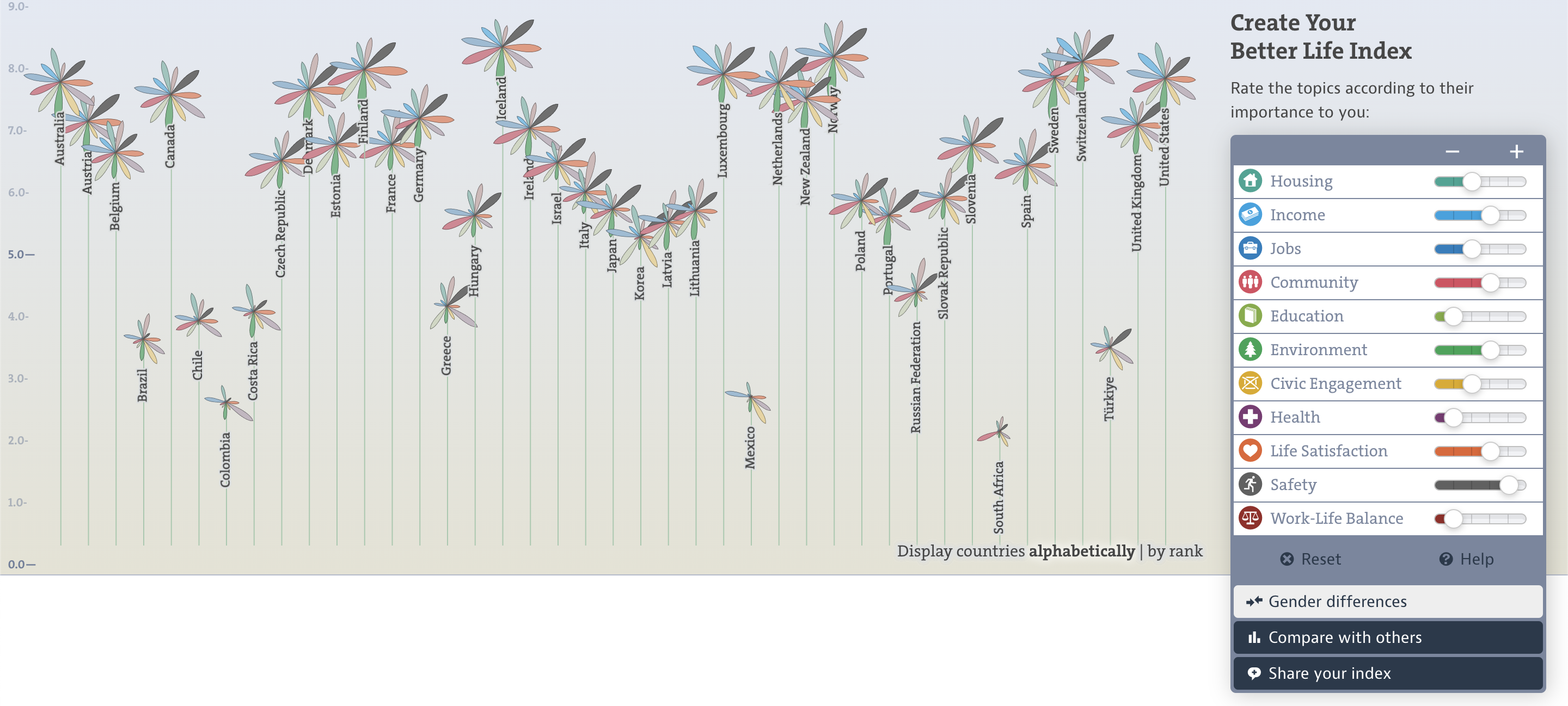
OECD Better Life Index222https://www.oecdbetterlifeindex.org is an application that calculates the life index of all countries based on the user’s preferences and priorities (Fig. 1). The user should rate the above topics based on their importance to them. They can instantly see the effect of their preference customization on the results. The results demonstrate a set of graphs for each country, showing the score of each topic for that specific country and how close those scores are to the user’s ratings. These topics are differentiated by the colors which match the sliders that contain users’ ratings. However, the user interface is not intuitive and lacks transparency.
3. The Destination Finder Web Application
Our application Destination Finder allows for specifying travel budget, intended duration, and user preferences for activities and visualizes recommended destinations on a map 333The source code of the application can be found here: https://github.com/asalnesar/destination-finder.
3.1. Main Elements of the User Interface
Figure 2 shows the main interface of the Destination Finder application 444A demo of the application can be accessed here: https://destination-finder.netlify.app/. The application has three main panels: the preference customization panel, the map panel, and the result panel.
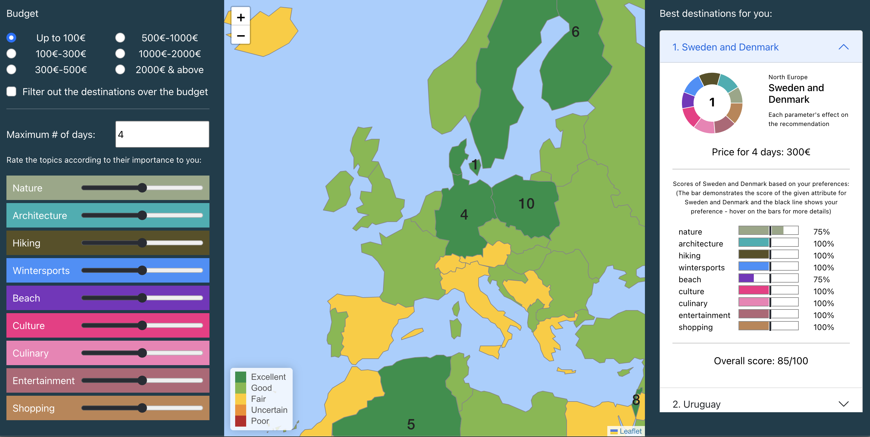
The system uses the user input with the preference customization panel (Fig. 2, left) to instantly revise the recommendations based on the region attributes and user preference, and reflect them on the map panel as well as present the 10 best matching results in the results panel on the right. The preference customization panel allows inputting budget, and activity preferences. Users can specify a budget level using radio buttons, the maximum number of days and whether destinations over the budget limit are eliminated from consideration. Users can also indicate their preferences about nine activities or topics with sliders: nature, architecture, hiking, winter sports, beach, culture, culinary, entertainment, and shopping.
The map panel (Fig. 2, center) illustrates how well a travel region matches the user preferences. Our region model is not solely based on country borders. Bigger countries such as the United States of America, Canada or Australia are divided into several regions because of the attribute variation in different locations within them. Smaller countries are merged, e.g. the Netherlands, Belgium and Luxembourg form one travel region. The map panel has all the standard user controls, the user can move the map or zoom in or out using the handles available on the top left of the map or by scrolling. Regions are scored based on the similarity of their attributes to the user’s preferences. The regions’ colors indicate their score range. Green means that the region has an excellent score, light green means the region has a good score, yellow means a fair score, orange regions have an uncertain score, and regions with red background color have a poor score. These categories are visible on the legend located on the bottom left of the map panel. Furthermore, the 10 best matching destinations based on the user’s preferences are labeled with their ranks, so they are more distinct on the map. Clicking on the map opens a popup window with more information about the respective travel regions. Our map panel visualizes the whole item space for good explorability.
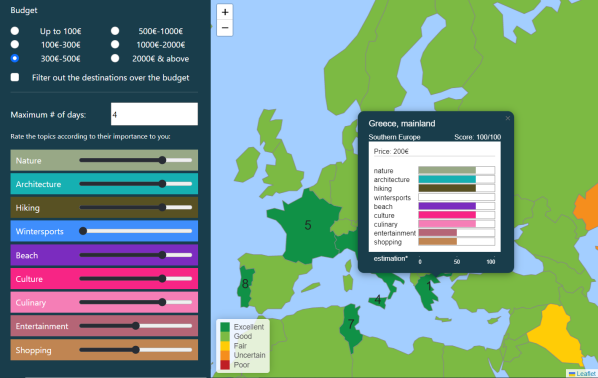
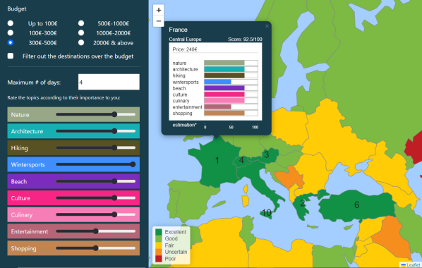
Note that changing the user preferences instantly change the recommendation scores and map visualization. For example in 3, Greece is the best matching region according to the user preferences. When moving the slider for ”winter sports” from the left (not important) to the right (important), France replaces Greece as the best matching region and several other regions have changed score ranges as indicated by the colors on the map.
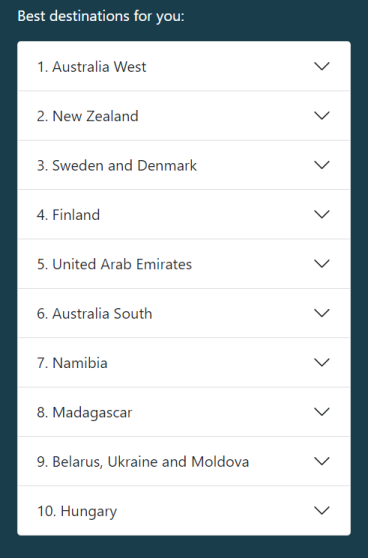

The results panel (Fig. 2, left) shows the 10 best matching regions in a list (Fig. 4a). The items can be expanded to present more information about that region (Fig. 4b).
The pie chart displayed in Figure 4b shows the effect of each attribute on the destination’s success in making it to the 10 best matching recommendations. For example, in figure 4b, the user can observe that the region is recommended because its architecture, culture and entertainment matches their corresponding preferences. The pie chart’s colors are the same as the attribute sliders’ backgrounds in the preference customization panel (Fig. 2, left).
The bar charts displayed in Figure 4b provide the most important information about the recommendation. Each attribute has a bar chart with the same color as the attribute sliders’ backgrounds in the preference customization panel. Furthermore, each bar chart has a benchmark (a vertical black line) that indicates the user’s preference for that attribute. This value is the same as the value of the slider of that specific attribute, which was customized by the user in the preference customization panel. So the users can easily compare the region attributes with their preferences. For example in Figure 4b, the region Australia West has a score of 75/100 for nature (first bar chart), while the user has set the corresponding slider to the middle value 50/100. The application provides a tooltip explaining the scoring when hovering over a bar chart. At the bottom of the panel, the overall score of the recommended country is displayed. Thus, the application offers good justification and the users know why a destination was recommended.
3.2. Architecture, Data and Recommendation Algorithm
The software is based on the Model-View-Controller (MVC) architectural pattern. MVC divides the application into three corresponding parts and increases the reusability and maintainability of the software. For the model, the system uses preferences as specified in the user interface, data about travel regions and also GeoJSON information to implement the interactive map. GeoJSON is a format for encoding various geographic data structures that uses a geographic coordinate reference system. This data is static and does not change in the application. The Destination Finder web application is a single-page application with some interfaces for receiving user input, an interactive map panel, and a list containing recommendations and detailed scoring and information. This is the View of the MVC pattern. The Controller triggers whenever a preference is changed by the user. It then calculates the recommendation scores for all regions based on the user input and the regions’ information and modifies the view based on the new results.
Currently, the application does not have a back-end server part. The project’s focus is on the user interface and to recommend items instantly. Therefore, the whole application logic has been implemented on the client side to improve performance and interactivity. The front-end application (View) has been implemented with ReactJS, an open-source JavaScript library built by Facebook.
The application utilizes data about travel regions and their suitability for travel attributes, along with price level estimates and other characteristics. This data was gathered from different sources for earlier research (Wörndl, 2017). As the main focus in this work was on the dynamic adaptation of user control in the user interface, a simple linear similarity formula is used to calculate a score of each destination region. The users rate activity attributes based on their importance to them between 0 to 100. On the other hand, each region has a score for each of these attributes. The algorithm calculates the difference between both numbers and the average difference over all attributes. For the budget, the data model has basic estimates for minimum costs, this number is compared to the user preferences with regard to total budget and minimum number of days. If the estimated minimum costs are below the budget, this attribute is assumed to be fulfilled and included in the score calculation. The user has the option to specific ”filter out the destinations over the budget” in the user interface. If this is selected, the score of all regions above the budget is set to 0. Finally, all regions are ranked according to the calculated scores.
4. User Study
We have evaluated our application in a preliminary user study.
4.1. Methodology and Setup
The evaluation was based on the ResQue framework (Pu et al., 2011) using a questionnaire. ResQue is an evaluation framework that measures a recommender system’s quality from a user’s perspective through criteria such as the recommendations’ quality but also the system’s usability, and the users’ intention to reuse the system. Our adapted questionnaire included 19 questions on a five-point Likert Scale in categories such as:
-
•
Perceived Ease of Use (e.g. ”I became familiar with the recommender system very quickly, and I found it easy to use.”)
-
•
Interface Adequacy (e.g. ”I found it intuitive to modify my preferences in the recommender using the sliders.”)
-
•
Perceived Usefulness e.g. ”The impact of the number of staying days on recommendations was clear and easy to understand.”)
-
•
Interaction Adequacy (e.g. ”The available travel topics are sufficient for me to make a decision about my travel destination.”)
-
•
Control, Explanation & Transparency (e.g. ”The information provided for the recommended destinations helped me understand why the items were recommended to me.”)
The participants were asked to use the Destination Finder application and answer the survey questions. An invitation was sent on platforms like a university forum, Linkedin, and university groups on Facebook and Telegram, so almost 93% of the participants were between ages 20-40 and familiar with similar web applications. Overall, 70 users participated in the study.
4.2. Results Overview
The user study showed that most participants (90%) were generally satisfied with the recommender system and found the Destination Finder application helpful for deciding on their future travel destinations555Due to space constraints in the paper, we can only summarize the study outcomes, more detailed results can be found in (Noubari, 2020).. The survey responses also indicated that the Destination Finder application was easy to use from the user’s point of view. 97% of the participants became familiar with the application quickly. More than 85% stated that the recommendations matched their preferences.
Furthermore, most participants felt in control while using the Destination Finder application, and they noticed how their input instantly changed the recommendations. This result means that the implemented recommender system could resolve the controllability in visualization challenges. Most participants found the interaction with the recommender system adequate to make decisions. More than 87% of the participants stated that the information provided helped them understand why the items were recommended to them. This result shows that the Destination Finder addressed the visualization challenges of transparency and justification. More than 80% stated that the provided information was sufficient for them to decide on their travel destination, while only a few complained about the insufficiency of data or information overload.
Most of the user interface pasts were perceived as positive with regards to interface adequacy. The pie chart in the recommendation panel (Figure 4b) was the only interface element with significant negative or neutral responses. Responses indicated that the design of the filtering over-budget destinations should improve to some extent to be more intuitive. Similarly, the evaluation of perceived usefulness also showed the users found the bar charts in the recommendation panel useful; however, they were not sure about the usefulness of the pie chart.
We also asked about the users’ favorite features of the Destination Finder application. The option ”Instantly seeing the impact of my choices in the map and the results panel” came in first with 81.4% of the votes, followed by ”Having control over the recommendations by customizing my preferences” with 67.1%. In contrast, the options ”Having the result displayed on a map” and ”Transparency as to why and how the destinations are ranked” reached 64.3% and 31.4%, respectively.
5. Conclusion
In this paper, we have presented the Destination Finder application which allows for interactive elicitation and refinement of user preferences for the scenario of finding a destination to travel to. Results are visualized on a map and color codes are used to illustrate the suitability of a region in comparison to the user’s request. An important feature of the application is that the visualization of the item space and its suitability to the user preferences adapts dynamically and instantly when preferences are refined. We have conducted a user study to evaluate various aspects of the system, including interface adequacy, explanation and transparency, perceived ease of use, and perceived usefulness. Results indicated that our approach was successful and thus contributing to transparency, controllability, explanation, and explorability.
Future work could involve the improvement of the underlying data, especially concerning prices and cost. Since most people travel in groups, the application could also be extended to support group recommendations. Members of the group would elicit their preferences individually and different aggregation strategies can be tested to generate reasonable recommendations for the whole group. Group recommendations in this scenario pose interesting visualization challenges, e.g. showing each member’s effect on generating that recommendation. To support group recommendations, our application would need a back-end part to store and manage the information from multiple clients.
Other ideas for future work are to make the user interface more configurable by for example offering a novice or an export mode with different levels of detail and control. In addition, context-awareness can be improved by considering the user’s location and estimated transportation costs to destinations, or by taking the destination’s weather during the desired travel period into account.
References
- (1)
- Averjanova et al. (2008) Olga Averjanova, Francesco Ricci, and Quang Nhat Nguyen. 2008. Map-based interaction with a conversational mobile recommender system. In 2008 the second international conference on mobile ubiquitous computing, systems, services and technologies. IEEE, 212–218.
- Jannach and Zanker (2020) Dietmar Jannach and Markus Zanker. 2020. Interactive and context-aware systems in tourism. Handbook of e-Tourism (2020), 1–22.
- Jannach et al. (2010) Dietmar Jannach, Markus Zanker, Alexander Felfernig, and Gerhard Friedrich. 2010. Recommender systems: an introduction. Cambridge University Press.
- Jin et al. (2016) Yucheng Jin, Karsten Seipp, Erik Duval, and Katrien Verbert. 2016. Go with the flow: effects of transparency and user control on targeted advertising using flow charts. In Proceedings of the international working conference on advanced visual interfaces. 68–75.
- Keck and Kammer (2018) Mandy Keck and Dietrich Kammer. 2018. Exploring Visualization Challenges for Interactive Recommender Systems. VisBIA@ AVI (2018), 22–31.
- Konstan and Riedl (2012) Joseph A Konstan and John Riedl. 2012. Recommender systems: from algorithms to user experience. User modeling and user-adapted interaction 22, 1 (2012), 101–123.
- Kunkel et al. (2019) Johannes Kunkel, Tamara Feldkamp, and Jürgen Ziegler. 2019. Map-based Visualization of Item Spaces for Increasing Transparency and Control in Recommender Systems. In Proceedings of Mensch und Computer 2019. 695–699.
- Loepp et al. (2014) Benedikt Loepp, Tim Hussein, and Jüergen Ziegler. 2014. Choice-based preference elicitation for collaborative filtering recommender systems. In Proceedings of the SIGCHI Conference on Human Factors in Computing Systems. 3085–3094.
- Noubari (2020) Asal Nesar Noubari. 2020. Dynamic Adaptation of User Preferences and Results in Complex Recommender Systems. Master’s thesis. Technical University of Munich (TUM), Germany.
- Pu et al. (2011) Pearl Pu, Li Chen, and Rong Hu. 2011. A user-centric evaluation framework for recommender systems. In Proceedings of the fifth ACM conference on Recommender systems. 157–164.
- Ricci (2022) Francesco Ricci. 2022. Recommender systems in tourism. In Handbook of e-Tourism. Springer, 457–474.
- Wörndl (2017) Wolfgang Wörndl. 2017. A web-based application for recommending travel regions. In Adjunct Publication of the 25th Conference on User Modeling, Adaptation and Personalization. 105–106.