2021
[1]\fnmRuben \surBauer
[1]\orgdivVISUS, \orgnameUniversity of Stuttgart, \orgaddress \countryGermany
2]\orgdivIWS, \orgnameUniversity of Stuttgart, \orgaddress \countryGermany
3] \orgnameUniversity of Groningen, \orgaddress \countrythe Netherlands
4] \orgnameUniversity of Bergen, \orgaddress \countryNorway
Visual Ensemble Analysis of Fluid Flow in Porous Media across Simulation Codes and Experiment
Abstract
We study the question of how visual analysis can support the comparison of spatio-temporal ensemble data of liquid and gas flow in porous media. To this end, we focus on a case study, in which nine different research groups concurrently simulated the process of injecting CO2 into the subsurface. We explore different data aggregation and interactive visualization approaches to compare and analyze these nine simulations. In terms of data aggregation, one key component is the choice of similarity metrics that define the relation between the different simulations. We test different metrics and find that a fine-tuned machine-learning based metric provides the best visualization results. Based on that, we propose different visualization methods. For overviewing the data, we use dimensionality reduction methods that allow us to plot and compare the different simulations in a scatterplot. To show details about the spatio-temporal data of each individual simulation, we employ a space-time cube volume rendering. We use the resulting interactive, multi-view visual analysis tool to explore the nine simulations and also to compare them to data from experimental setups. Our main findings include new insights into ranking of simulation results with respect to experimental data, and the development of gravity fingers in simulations.
keywords:
Porous media, fluid flow, visual analytics, benchmark study, simulation ensemble1 Introduction
Injecting CO2 into subsurface reservoirs might be a key approach in the future to mitigate climate change Bachu:2007:CSC ; Pacala:2004:SWS ; Metz:2005:ISR . Toward this approach, however, it is fundamental to gain a better understanding of fluid flow and transport in porous media, an area which has attracted substantial attention in many research fields Bear:2018:MPF ; Sahimi:2011:FTP ; Kamrava2021 . Concerning geological carbon storage, large experimental efforts have been undertaken at potential storage sites to collect information about, for example, the geology and formation fluids as well as their respective dynamics Lindeberg:2009:DCS ; Niemi:2016:HES . These efforts are costly though and often limited to very specific conditions. To overcome these problems, simulation studies such as Class:2009:BSP have become popular, taking advantage of the increasing computational capabilities. To validate the respective simulation models, they should be compared to existing experimental data. In the absence of such ground truth experiment data, however, the validation necessitates the careful exploration and analysis of simulations with different settings to capture all potential phenomenal patterns of fluid flow in porous media.
The main goal of our work is to explore how interactive visualization can support exploring, comparing, and analyzing different simulations in this domain. To this end, we focus on a benchmark study of geological storage of CO2 in the subsurface Nordbotten2022BenchmarkStudy ; Flemisch:2023:SAS . In a larger project consortium, nine different research groups around the globe were tasked with simulating this process. The result of each individual simulation is spatio-temporal data (2D+time) that predicts the behavior of CO2 flow starting from a joint, pre-defined condition. More precisely, the output of each simulation constitutes 2D spectral images containing saturation and concentration of CO2 in each cell of a uniform Cartesian grid discretizing the 2D spatial domain, recorded in ten-minute intervals. This spatio-temporal data is complemented by additional measurables such as the pressure at a specified location or the CO2 mass integrated over a specific region, each providing a separate scalar time series.
After the individual simulations were run, the main challenge is now to explore the resulting ensemble of simulations, to compare similarities and differences between them, and to set them into context to the underlying experimental simulation that was conducted along with the simulations. This set of exploratory tasks leans itself toward a visual analysis approach in general munzner2014visualization , and ensemble visualization in particular Sedlmair2014VisualParamSpaceAnalysis ; DBLP:journals/cgf/FofonovL19 . In an interdisciplinary team of visualization experts and a porous media domain expert, we set out to better understand how ensemble visualization can benefit this area, and how respective visualizations should be designed. Over the course of 1.5 years, we followed a joint design study process sedlmair2012design and explored different data aggregation and visualization approaches for the data at hand.
The main idea behind most ensemble visualizations is to derive a quantitative similarity metric that allows to relate different ensemble members to each other and to visually compare them in the same space survey2019 . The choice of metrics largely depends on the domain application though, and so far no universal similarity metrics exist for fluid flow data in porous media. We found, for instance, that metrics such as the Euclidean and Wasserstein distance, which are commonly used in porous media simulation, become increasingly inaccurate with increasing time steps and number of dimensions, and might fail to capture important details in the data. To address this issue, we leverage a machine-learning based approach to define the similarity between ensemble members, which we adapt for the domain problem at hand. Still, there seems to be no one-size-fits-all solution. Different metrics have different benefits and drawbacks. Here, we can again leverage interactive data visualization that allows to see and analyze the data through these different angles.
The similarity metrics can then be used in an overview visualization. To this end, we split simulation results into different timeslots (patches) and project them as time curves bach2015time into a 2D scatterplot. This visualization allows us to find similarities between different simulations at different times. We additionally embed the experimental data into the same space, which allows us to put the nine different simulations into a global context. We extend this overview visualization with different detail visualizations. We use a space-time cube volume rendering Bach2017DescFrameworkForSpaceTimeCubes to present the full spatio-temporal simulation results of each ensemble member. Another juxtaposed view is used to display the respective scalar time series, and interaction allows to dive deeper into specific questions.
When using the resulting interactive visualization tool on the benchmark study data, we discovered several novel findings that suggest further investigations for domain scientists, such as comparisons of the length, shape and development behavior of gravity fingers and interesting quantifications of similarities between simulation results and experimental data.
In summary, we make the following contributions:
-
1.
We propose a visual comparative analysis approach utilizing a variety of similarity metrics for ensemble data of simulating fluid flow in porous media.
-
2.
Using our approach, we explore data from a benchmark study, revealing new insights about the underlying domain.
2 Background and Related Work
This section provides background on the simulation benchmark study and related work. We first provide some background on the modelled CO2 injection process, and briefly summarize the data generation process of the benchmark study. We then discuss various examples of how related work has dealt with the visual analysis of similar simulation ensembles.
2.1 Benchmark Study
We focus on analyzing simulation ensemble data provided from a recent benchmark study of Nordbottenet al. Nordbotten2022BenchmarkStudy . The benchmark study is inspired by a climate change research problem, which concerns the injection of CO2 into subsurface reservoirs. Subsurface reservoirs are geological structures below ground that are suitable for long-term storage of fluids. They usually consist of layers with different porosity and permeability such as a coarse-grained highly permeable region which is suited for storing a large amount of fluid, and a fine-grained low permeable caprock above which prevents the stored fluid from escaping. In these naturally occurring subsurface reservoirs, possibly large amounts of CO2 can be injected and captured first below the caprock. Over time, more and more of the CO2 dissolves into the formation water and the CO2-saturated water sinks downward, increasing long-term storage security Bachu:2007:CSC ; Metz:2005:ISR ; Pacala:2004:SWS . This process of convective mixing is driven by the density difference of the original formation water and the CO2-saturated water and usually manifests itself in the form of so-called “gravity fingers” Nordbotten2022BenchmarkStudy .
For such large-scale real-world scenarios, it is important to assess potential risks and opportunities by trying to model and forecast them Pruess:2004:CIB ; Class:2009:BSP . Even with a good understanding of the complex physical processes during and after injection of CO2 into porous media, the lack of knowledge about the precise conditions in the subsurface introduces many uncertainties. As experiments are costly and field-scale real-time measurements are prohibitive due to the targeted long time spans, this problem is often addressed by uncertainty quantification approaches which require running many forward simulations that cover different conditions Walter:2012:BMR ; Sun:2019:DAU .
The main goal of the benchmark study was to “provide a full-physics validation of the state-of-the-art simulation capabilities” Nordbotten2022BenchmarkStudy for such CO2 injection processes. With the help of an experimental rig for repeated multiphase 2D flow experiments111The FluidFlower Concept: Operating Flow Rigs https://fluidflower.w.uib.no/large-scale/, a laboratory-scale CO2 injection experiment was conducted which served as reference for the benchmark study. In the beginning of the study, the most important boundary conditions, like geometry, operation process of the injection, and other physical parameters of the experimental rig, were specified and provided to nine simulation expert groups. These groups were then asked to model, simulate, and forecast the actual experiments that were performed with the rig, but without having access to the experimental data. The experiments were run by an independent experimental group and serve as ground truth for the analysis and validation of the simulation data.
Appropriate analysis and comparison methods are required that allow to inspect and compare different simulations with each other and with the experimental data. This is a non-trivial problem, especially for spatio-temporal and multivariate data. We address this problem with our visual approach which is designed to support the analysis of such ensemble data.
2.2 Related Work
From the data types and design methodology perspective, we review in this section related work about visual comparative analysis of ensemble spatio-temporal data. Particularly, we focus on similarity metrics and visual analysis methods.
2.2.1 Similarity Metrics for Ensemble Spatiotemporal Data
Visual parameter space/ensemble analysis Sedlmair2014VisualParamSpaceAnalysis normally concerns how parameter configurations influence the outcome of a simulation system by comparing ensemble members. One of the main challenges in spatio-temporal ensemble analysis is finding a suitable similarity/distance metric for an assisted or automated ensemble member comparison. While a manually performed visual comparison of spatio-temporal data can be employed for pattern recognition and comparison of complex time series in the details, it is not suitable for large data sets such as simulation ensembles. A similarity metric could support providing an abstraction overview of the ensemble in form of a scatterplot. The overview is the context that enables us to efficiently and automatically compare, filter, rank, and cluster ensemble members before performing a time-intensive manual analysis and comparison of-and-between individual members. In our visual approach, we utilize various similarity metrics, including an unsupervised machine learning-based approach.
Tkachevet al. Tkachev2022S4 presented S4—an ML-driven similarity metric, which is based on the assumption that spatial proximity implies similar behavior. We utilize their approach for our use-case to learn a similarity metric on the provided simulation data. However, we change the patch sizes and network size to address the problem of overfitting with respect to our limited amount of available data. In a recent work, Huesmann and Linsen proposed SimilarityNet Huesmann2022SimilarityNet , which is a ML model trained in an autoencoder-like fashion on a generated phantom dataset to learn to encode arbitrary spatio-temporal data into a 1D space representation that preserves spatio-temporal behavior. Due to the limitation of only producing 1D embeddings, we exclude this approach from our design, as we use 2D overviews for other metrics.
2.2.2 Visual Analysis for Ensemble Spatiotemporal Data
We refer here to a survey by Obermaier and Joy ObermaierFutureChallenges2014 which categorized existing ensemble visualizations into “feature-based visualization”, and “location-based visualization”. Our visual approach supports analysis components that fall into both categories. A recent survey of Wanget al. WangSurvey2019 categorizes ensemble visualization from two perspectives: the proposed visualization techniques, and the involved analytic tasks. Technique-wise, we consider multivariate data and mainly address linked juxtaposed views including two views for direct volume rendering. Regarding tasks, we address most of the mentioned tasks directly, except “clustering” and “parameter analysis”.
Existing work also provides different design applications for a variety of ensemble spatio-temporal data types and respective domain application tasks. Demiret al. DemirComp3dEnsVis2020 presented a chart-based approach showing statistical properties of 3D volume ensemble members to support comparative analysis. Hölltet al. Hoellt2016VisualAnalysisofReservoirSimEns contributed a visual analysis tool for reservoir simulation ensembles, utilizing statistical measures. Potteret al. PotterEnsembleVis2009 built a visualization framework focusing on statistical measures of simulation ensemble data. Bachet al. Bach2017DescFrameworkForSpaceTimeCubes provided a descriptive framework for temporal data visualizations based on generalized space-time cubes. Fofonov and Linsen Fofonov2018MultiVisAVA focused their work on multi-run physical simulation data, analyzing the impact of initial conditions and parameter settings on simulation results. Our ensemble consists of only few members with a variety of different parameter settings which makes it unsuitable for a quantitative parameter space analysis. We focus on an interactive visual comparison analysis of the ensemble members using variety of similarity metrics instead of statistical properties of ensemble data.
3 Problem Characterization
We characterize our problem by providing the description of the data, our research questions, and the respective analysis tasks.
3.1 Data
We consider an ensemble of nine different simulations of CO2 injection processes into porous structures from nine research groups that participated in the benchmark study, labeled austin, csiro, delft-DARSim, delft-DARTS, lanl, heriot-watt, melbourne, stanford, and stuttgart. From each of the reported simulation data, we consider a series of 2D spatial maps, which represent the recorded CO2 saturation and concentration values for the first 24 hours in ten-minute intervals. A saturation value is the ratio of the volume occupied by the gaseous phase to the available void space for each considered reporting cell, while a concentration value indicates the mass of dissolved CO2 per volume of liquid phase in that cell.
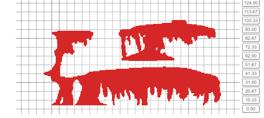
At each time step, additional measurables such as local pressure values from sensors and integrated quantities for three different regions of interest are reported, which we consider as time series information. The three regions of interest correspond to predefined rectangular regions in the benchmark study: Box A, Box B, and Box C, see Figure 1.
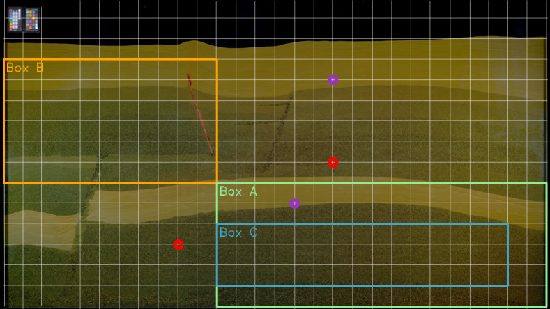
They are defined to capture and express specific features and events during the simulations and experiments. In particular, the research groups were requested to provide the total mass of CO2 inside the domain, pressure at two locations, phase composition in Boxes A and B, as well as convection in Box C.
Besides the simulation groups, there was also one experimental group which performed the actual reference experiments with the setup mentioned in Section 2.1. We have access to the segmentation data of four experiment runs which we integrated in our visual approach. In contrast to the simulation data, which provides saturation and concentration values at each grid cell, the experimental data only provides ternary information about whether there is (i) only pure water, (ii) water with dissolved CO2 or (iii) also gaseous CO2 in a cell, due to the difficult process of post-processing the experimental data. In the post-processing, saturation and concentration values have to be derived from photographs of the experiment by analyzing the CO2-induced coloring of the water. The time series data was not available to us for the experimental runs.
3.2 Research Questions and Tasks
We work alongside a domain expert who has been working with flow and transport processes in porous media for years with whom we had a regular bi-weekly meeting. In a series of multiple focus group meetings, we jointly derived a set of research questions that should be possible to analyze with the target visualization tool.
-
•
: How similar are simulation outcomes across research groups and what are the differences?
-
•
: Which groups’ simulation outcomes match most closely the available experimental data?
-
•
: Is there any correlation between the scalar time series data and the dynamics of the spatial saturation and concentration distribution?
-
•
: Concerning features of particular interest: When do the “fingers” (2.1) reach a certain length? When is the spilling point reached? (Here, the spilling point is the location where CO2 “spills” over the edge of the modelled reservoir (Figure 1, Box A) after reaching its maximum capacity of mobile free CO2 gas.)
We derive a list of tasks for the analysis of fluid flow on an ensemble of porous media simulations.
Comparative analysis of ensemble members: -compare simulations of different groups on a certain level of abstraction, to answer Q1. -rank simulations with regard to the experimental results, to answer Q2. -find correlations between saturation and concentration over time, to answer Q3. Spatial detail tasks: -find areas having an interesting CO2 concentration/saturation. Temporal detail tasks: -find out when certain events happen. Both and are to address Q4.
4 Visual Analysis Approach
In our design process, we considered the requirements and derived tasks from Section 3.2 as well as the provided data as described in Section 3.1. As such, our visual analysis approach will follow the overview first, details on demand mantra Schneiderman1996Mantra . Below, we first introduce the data processing employed for our visual approach. Second, we discuss the similarity metrics that we use to compare simulation outcomes. Third, we describe the proposed data representation, interaction, and controls components of our visual analysis tool. Fourth, we finally provide an example workflow for a visual analysis using our visual approach.
4.1 Data Processing
The data processing happens at two stages: the pre-processing required for our visual approach, and the extraction of so-called patches.
4.1.1 Pre-Processing
To make it easier to observe spatio-temporal patterns, we propose to use a static view of the data from each group, namely space-time cube visualization hagerstrand_what_1970 . The spatial maps then have to be densely packed and transformed to a volume (a 3D texture) in which the uniform grid of the spatial maps as well as their time components map to indices of the resulting volume.
For a proper visual comparison, the resulting volume should be of equal size and cover the same geometric and temporal extents for all ensemble members. However, the amount of time steps and the geometric extents of the spatial maps between different groups in the first h varies slightly, though mostly by a difference of one time step or grid cell. To align the data in the volumes, we first fill in missing time steps by repeating the data of the preceding time step, if available. If there is no previous time step, we fill the time step with zeroes. We set the target geometric extents of the volumes to the extents as described by the benchmark description. The width and height of the resulting volumes represent the benchmark geometry from m to m, and from m to m with a step size of m in - and direction. The depth of the volume represents the time from s to s (= h) with a step size of s (= min).
We perform the same procedure to fill missing values in the time series as we do for the spatial maps. Missing time steps at the beginning become zero. The remaining gaps are filled by repeating the previous existing value. The resulting time series span the full range from h to h with one measurement every ten minutes.
4.1.2 Processing of Patches
We utilize the S4 Tkachev2022S4 ML model as a similarity metric for spatio-temporal behavior (see Section 4.2). The S4 model trains on so-called spatio-temporal “patches” of the data. A patch is a subset in the original spatio-temporal data. Considering the spatial maps of the benchmark study as a 3D volume with , , and dimension, a patch in this 3D volume context could be any 3D cuboid in it. We empirically chose the temporal patch size (dimension ) to be always three, which equals minutes in our data. This size allows the model to integrate the temporal component during the computation of latent space features without introducing too much change between two consecutive non-overlapping patches. We utilize two versions of the S4 model with each a different spatial patch size, which we further specify in Section 4.2.
4.2 Similarity Metrics
In the visualization community, similarity metrics are applied to evaluate how similar data items are. The similarity information is often fed to a dimensionality reduction (DR) TSNE-vanDerMaaten2008 ; UMAP-McInnes2018 ; MDS-kruskal1964nonmetric that provides a 2D mapping of the data items. This mapping’s outcome is then represented in a scatterplot to serves as an overview of the dataset in a visual analysis pipeline.
In this work, multiple similarity metrics are utilized to potentially capture more information with respect to some potential features of the simulation outcomes . Each metric computes the similarity between two patches with respect to their multivariate facets in general. By using similarity metrics to automatically compute a similarity value between simulations of different groups, we can compare them in an abstract manner without inspecting the spatio-temporal manually, but to view it in a projection instead. The projection then provides hints for a more detailed, manual analysis of individual patches and groups.
Euclidean Distance and Manhattan Distance
Euclidean distance and Manhattan distance are two of the most popular but simple metrics to compute distances between feature vectors. In our case, to compute the distance between two patches, we linearize both patches to a feature vector and apply the corresponding metric. While this is a common process, it is not exactly suited to use Euclidean distance or Manhattan distance to compare spatio-temporal data with patterns that might change in size, (spatio-temporal) position, or orientation, which physical phenomena often exhibit. If two patches capture the exact same pattern, a small change in any of those properties may result in a large distance between these two patches, since the indices of the corresponding elements in the feature vector that capture the patterns might change completely. However, we will show that Euclidean distance still yields reasonable results on the benchmark study ensemble (Section 5.1).
ML Model for Comparing Spatiotemporal Behavior
S4 is a ML model for “Self-Supervised Learning of Spatiotemporal Similarity”, which was recently proposed by Tkachev et al. Tkachev2022S4 . We expect the S4 model to be a more advanced and better-suited metric for comparing data by its spatio-temporal behavior. The model has to be trained first, before it can be applied to the data. It is trained on patches of the data and learns to encode them into a latent-space feature representation in which two vectors are close by Manhattan distance if their corresponding patches have similar spatio-temporal behavior. The training exploits the assumption that two patches that are close in space and time are also close in terms of their spatio-temporal behavior and vice versa, and thus can be applied to unlabeled data.
We trained the model on a spatially downsampled volume by a factor of two. The patch size is chosen to be the remaining full spatial size and a temporal size of three time steps. During inference, we compute the non-overlapping patches of each group and use S4 to compute a feature vector for each patch. The S4 distance between two patches is then the Manhattan distance between their corresponding feature vectors. Even though we expect this model to be a more meaningful similarity metric for spatio-temporal data, our results will show that choosing the full spatial size as patch size yields too few data points and variations for the amount of trainable parameters which results in strong overfitting. Thus, we trained another model with smaller patch size by spatially subdividing the patches, and reducing the amount of trainable parameters by slightly adjusting the models’ hyperparameters to decrease the risk of strong overfitting.
To distinguish between both models in our analysis, we will refer to the first one as just “S4”, and to the latter one as “S4 with subdivided patches”. For the “S4 with subdivided patches”, we chose the spatial patch size to roughly capture the average finger width and length of the simulations in the first h. We hope that besides increasing the amount of data points and reducing the risk of overfitting, this allows the model to better capture local features, especially the finger development. During inference with “S4 with subdivided patches”, to now compare two patches of full spatial size with each other, we first spatially subdivide these patches in non-overlapping sub-patches and compute the sum of the distances between sub-patches at the same positions instead.
Wasserstein Distance
The Wasserstein distance kantorovich1960WassersteinDistance is well-known for flow simulation data. It is a measure of the distance between two probability distributions, which in our case, is the distribution of concentration or saturation values in a single patch. First, we compute a histogram of a patch’s saturation values and a histogram of a patch’s concentration values by binning the values into bins from min to max saturation/concentration. We divide the histograms by the total amount of elements in the patch, which yields a probability distribution of the saturation and concentration values in a patch. Now we can apply the Wasserstein distance between the two saturation distributions and concentration distributions. We average the two distances to get a combined final result of our metric. We emphasize that this Wasserstein distance is different from the one employed in Flemisch:2023:SAS , where two-dimensional distributions over the spatial domain and the corresponding Euclidean metric are used.
4.3 Data Views
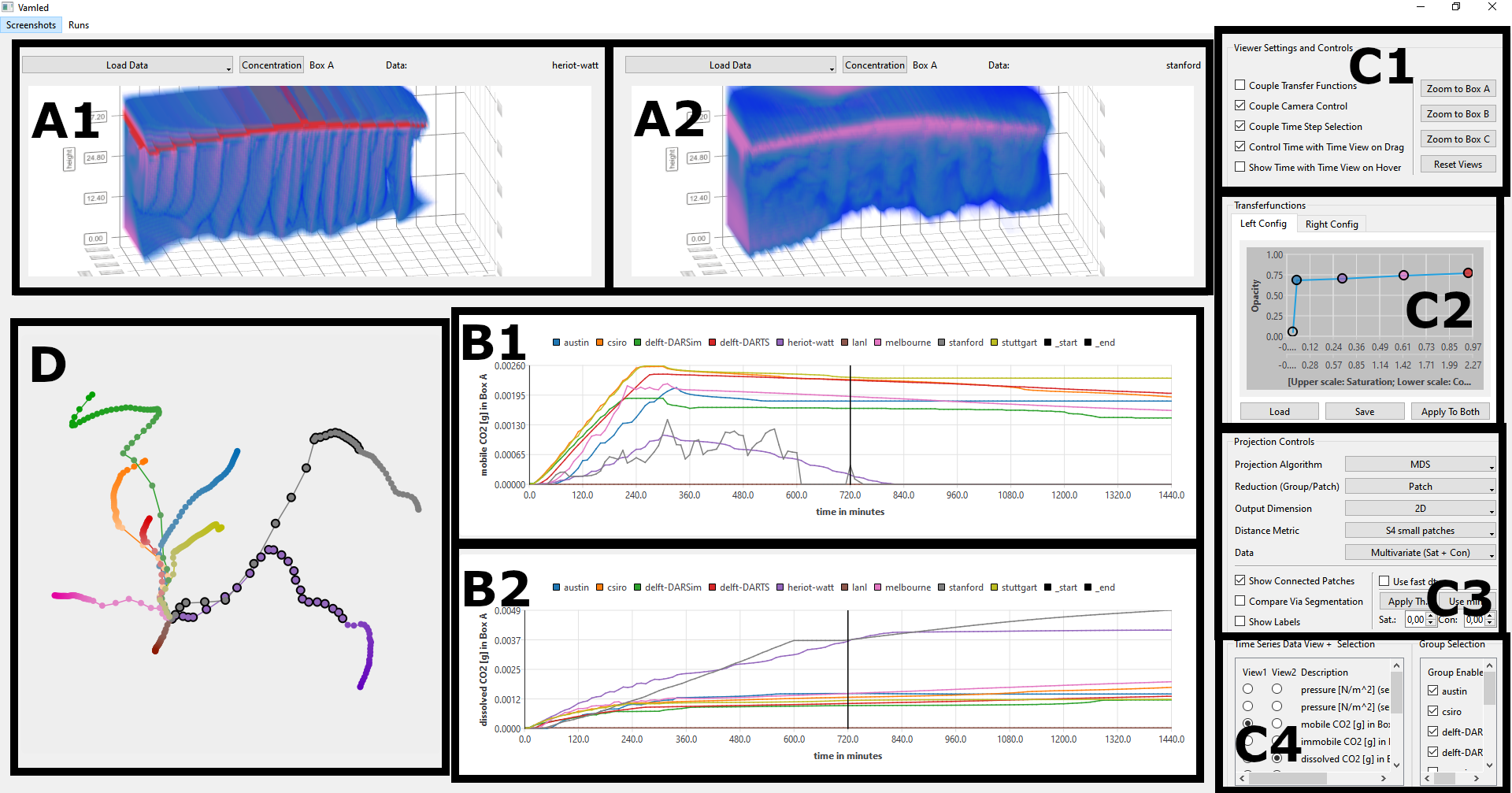
In this subsection, we describe the different views representing our proposed data visual encodings and respective interaction controls in showing how they relate to each other as well as to our defined tasks in Section 3.2. An overview of our implementation instance for all views is provided in Figure 2. Besides the similarity plot, which provides an overview of the similarity of the full ensemble, we provide views to link the projected ensemble members or their patches to the actual data from spatial maps or time series information.
4.3.1 Similarity View
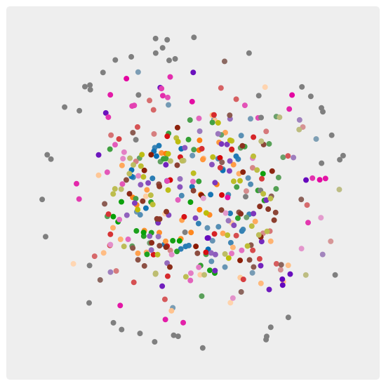
Following the overview first, zoom-and-filter, details-on-demand mantra Schneiderman1996Mantra , we project the ensemble’s similarity in a similarity plot to provide an overview of the full ensemble. The similarity metric information among patches or ensemble members (by getting average similarity metrics of sub-patches in the ensemble members) is fed to a DR technique to derive the similarity plot in forms of a 2D scatterplot. Each point in the scatterplot represents either one patch or one ensemble member (in the case of using average similarity metrics of sub-patches in ensemble members), and the distances among the points visually reflect the similarity among the patches or ensemble members. The similarity plot in Figure 2 (D) provides hints as to which groups are outliers or if small clusters have formed, decreasing the mental workload of manually going through the whole ensemble to compare them .
Furthermore, inspired by Machicao et al. MACHICAO20211 , we include the experimental data in the projection, which allows us to visually rank the simulation groups by comparing their similarities to the experimental data . As experimental data is only available in the form of segmentation maps, we have to transform the simulation data into segmentation maps to get them into the same format for comparison. The segmentation maps of the experimental groups were computed by choosing a certain threshold in the image analysis when analysing the original photographs of the experiment. This threshold relates to how much concentration or saturation exists in the image grid cell. Therefore, we also choose a threshold to transform the simulation data into segmentation maps before computing the similarity matrix with our selected similarity metric. We set the default threshold to consider a grid cell to contain CO2 saturation or CO2 concentration to close to zero () to avoid the segmentation of actually empty cells due to numerical errors.
Like similarity metrics, DR algorithms may differ in the revealed features and quality of results TSNE-vanDerMaaten2008 ; UMAP-McInnes2018 ; MDS-kruskal1964nonmetric . We chose to integrate three popular DR algorithms that are often used for projecting data into 2D space. We figure multidimensional scaling (MDS) MDS-kruskal1964nonmetric to be one of the most important DR algorithms in our context, as it tries to preserve distances between data points. Besides MDS, we also integrate uniform manifold approximation and projection (UMAP) UMAP-McInnes2018 and t-distributed stochastic neighbor embedding (t-SNE) TSNE-vanDerMaaten2008 . These two DR techniques try to preserve the neighborhoods of data points.
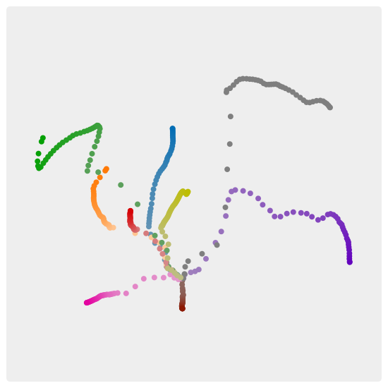
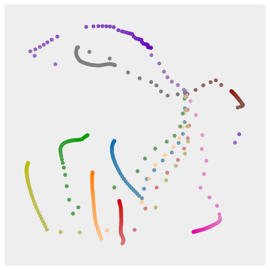
As mentioned above, we provide two types of similarity plots in this work. Choosing “group” mode (in the case of using average similarity metrics of sub-patches in ensemble members) aggregates the data to project only one point per group, which makes it easier to detect clusters or outliers in the ensemble. The “patch” mode projects all patches and gives hints about the temporal similarity between the groups. Figure 4 shows MDS projections of the ensemble using the “group” option, while Figure 6 shows MDS projections of the ensemble using the “patch” option.
4.3.2 Space-Time Cube View
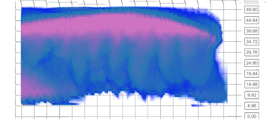

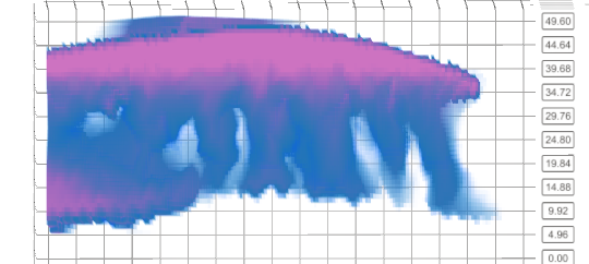
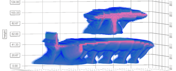
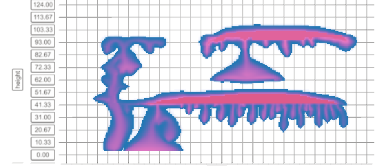
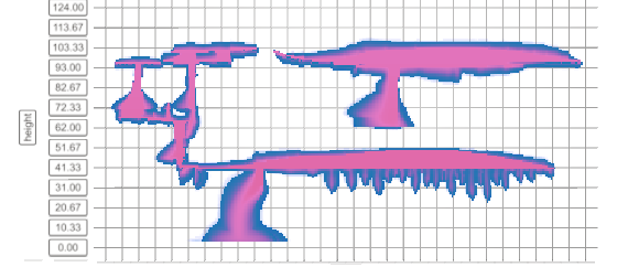
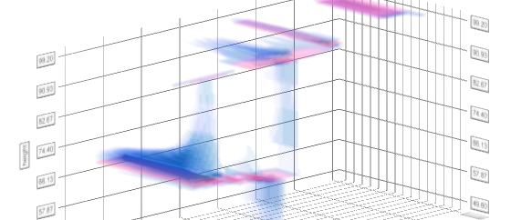
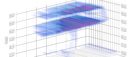
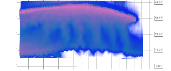
To support focusing on details for spatio-temporal patterns of each ensemble member, we propose to use a static view representing a series of 2D maps as a volume with time as the third dimension. The space-time cube rendering Bach2017DescFrameworkForSpaceTimeCubes renders the processed volume (Section 4.1.1) of either saturation or concentration information of data. The saturation or concentration values of the space-time cube are mapped to colors with respective luminance and opacity defined by a color transfer function, see Figure 2 (A1 & A2). We argue that this representation of the data provides better insight than juxtaposing 2D spatial data representation images in a sequence as it smoothly maintains the temporal evolution pattern of the data.
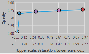
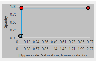
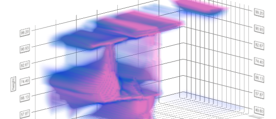
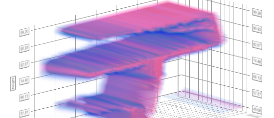
To make it more domain-application friendly, we propose to allow the user to interactively change/define the transfer function while analyzing the data using the view. Particularly, the user can choose colors and opacity for any saturation or concentration values in our data by using the transfer function diagram, see Figure 2 (C2). Values that do not have an explicit value have the linearly interpolated color and opacity between their left and right point applied to them. By properly configuring the transfer function, the user can highlight or hide ranges of saturation and concentration values of the space-time cube volume. In Figure 3, we show two examples of a space-time cube rendering with different transfer functions that each show different concentration values. Besides the interactive transfer function, the view also provides fundamental interaction such as rotation, zoom-in, and zoom-out to make it easier for the user to analyze and study the data cube.
The space-time cube view alone can support the user to target tasks and . Being static, the view supports comparing the spatial distribution of concentration/saturation of different time steps globally . From the comparison, the user can look for the area of interest and can determine the time steps at which certain events happen .
We propose to use two space-time cube views in our design to target and , see Figure 2 (A1 & A2). When the two views are used to represent concentration and saturation information of the same ensemble data, the user can analyze and study if there exists a correlation/relationship between the two types of information . Together with the similarity view, if the two views are used to represent one type of information for two ensemble members, the user can comparatively analyze and study in detail the two ensemble members .
4.3.3 Line Charts View
We use line charts to visualize the time series data of the given three regions of interest, i.e., regions Box A, Box B, and Box C. Each line chart is used to represent one measurable of one group over time. The line charts with different colors for different groups are superimposed in one view, see Figure 2 (B1 & B2). This allows us to visually compare the development of a measurable among different groups over time.
We propose to contain two juxtaposed views in which each can visualize one of those line charts for one measurable at a time, see Figure 2 (B1 & B2). This provides a convenient side-by-side comparison pattern over simulation groups of two different measurables of different regions. As a decluttering mean, we provide the user the ability to interactively select and deselect one or more groups and to choose the selected measurable of interest that are shown in the views, see Figure 2 (C1). To target , we propose to link the saturation and concentration of the spatial maps that are visualized in the space-time cubes to the corresponding time series measurables mobile CO2 and dissolved CO2. The detail of the interaction operation will be presented in Section 4.3.4. By analyzing line charts of different regions of interest, the user can also identify events of interest and respective regions related to the provided measurables, i.e., targeting and .
4.3.4 Interaction
Besides the interaction operations that we designed for each aforementioned view, we use brushing and linking to coordinate among views. The similarity view is linked to the space-time cube view and the time series view to support the top-down analysis approach . The user can select two patches or two ensemble members of interest to be displayed in the two space-time cube views, e.g., Figure 2 (A1 & A2), to compare them in detail. When the similarity displays the patches, hovering over the patches’ representations will slice the space-time cube of the corresponding group to the selected patches. The similarity view is further linked to the time series view and vice versa. Hovering over a patch’s representation in the similarity view will select the range of this patch in the line charts view, e.g., Figure 2 (B1 & B2). Selecting a time range in the time series views will highlight the corresponding patches of the groups in the similarity view which are also currently visible in the space-time cube view.
By providing a convenient interaction to inspect the measurables and spatial maps at different time steps simultaneously, the interlinking of the three views effectively targets tasks , , and . Linking between the time-cube view and the line charts view allows the user to analyze correlation between time series input and saturation and concentration information . Meanwhile, linking the similarity view with the other two views allows the user to observe the overview pattern before focusing on details about some specific group, the specific time step, and the specific spatial region that constitutes the pattern, i.e., targeting , and .
4.4 Workflow
Based on the overview first – zoom and filter – details on demand mantra, we propose the following workflow with our visual analysis approach.
Step 1: Analyze the Similarity View
Regarding overview first, the user can take a look at the similarity view showing the “group” mode of the ensemble. The similarity plot encodes the different groups by color. The user can identify clusters of some groups being closer to each other than others, or identify outliers.
If the user is interested in the temporal development of the ensemble members or how they diverge throughout the simulation, the “patch” mode can be enabled. Hovering over a patch of one group can highlight the corresponding patches of the other group at the same time step (Figure 7(a)). By doing that, the user can see how fast and when two groups diverge.
If the user is interested in how well simulation data compares to the experimental results, the experimental data can be included in the projection results.
The user can further inspect the overview under the changing similarity metrics and DR techniques to see how the results change.
Step 2: Link Similarity View To Detail Views
From observing the similarity pattern of ensemble members in the similarity view with “group” mode, the user can compare the details pair of the members using space-time cube views. The space-time cube rendering shows the whole outer shape of the simulation at once and makes it easy to roughly estimate if the two simulations behave visually similar over time. Inspecting the space-time cube might verify if one outlier in the projection indeed has a completely different behaviors in the spatial maps than the others.
If the similarity view is in “patch” mode, the user can navigate the resulting projection via zooming to inspect early time steps that greatly overlap. By hovering over the patches, the user can compare the corresponding actual spatial maps in the space-time cube views. The time series view reveals the corresponding time steps of the hovered patches, allowing the user to see whether close patches are also similar in the given time series data.
Step 3: Analyze Each Ensemble Member in Detail Views
Having got a broad overview of the ensemble, the user can analyze the ensemble members in more detail. The user can investigate the difference between concentration and saturation data by comparing the respective two time-space cube views (Figures 10(a), 10(c)). Next, the user can inspect how the CO2 concentration evolves over time in the simulations by interactively defining the transfer function. When the user is interested in the CO2 concentration and wants to better inspect the finger development in the different boxes of the simulation geometry, they can zoom to the respective boxes by spatially slicing the volume to contain only the box of interest. After that the user can select the line chart that shows the corresponding dissolved CO2 in our box of interest. The user can select the range where the line chart first indicates existing dissolved CO2 in the box of interest up to when the amount of dissolved CO2 does not seem to change anymore. This slices the space-time cube temporally to the selected range. With that, the user can now inspect the space-time cube and its early stages of finger development in the box of interest.
5 Results
In this section, we provide anecdotes showing the answers to the aforementioned research questions in Section 3.2 as well as other findings by using our visual analysis approach. We first provide the results related to comparing the groups and finding similarities/differences by using our similarity metrics . The outcomes related to ranking with respect to experimental data is mentioned after that. Finally, we present several findings related to and .
5.1 Different Similarity Metrics Capture Different Patterns of the Dataset – Q1


| • | austin | • | csiro | • | delft-DARSim | • | delft-DARTS | • | lanl |
|---|---|---|---|---|---|---|---|---|---|
| • | heriot-watt | • | melbourne | • | stanford | • | stuttgart | ||
| ★ | exp. run1 | ★ | exp. run2 | ★ | exp. run3 | ★ | exp. run4 |


| • | austin | • | csiro | • | delft-DARSim | • | delft-DARTS | • | lanl |
|---|---|---|---|---|---|---|---|---|---|
| • | heriot-watt | • | melbourne | • | stanford | • | stuttgart | ||
| ★ | exp. run1 | ★ | exp. run2 | ★ | exp. run3 | ★ | exp. run4 |
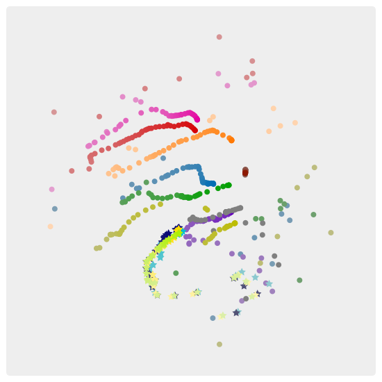
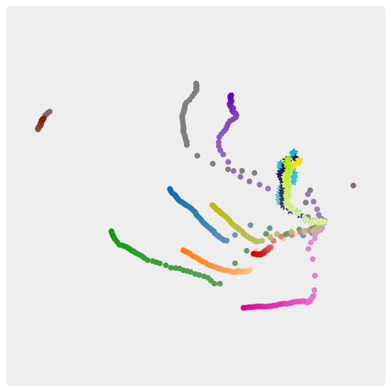
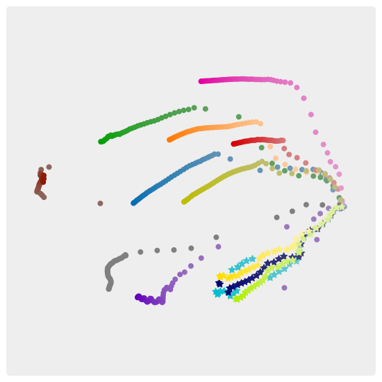
Using different similarity metrics helps us to identify several differences in the simulation outcomes. Figure 4 shows an overview of the ensemble with and without experimental data in “group” mode. First, we receive a striking observation that the experimental data representation appear close to each other in the overviews with every similarity metric (Figures 4(f)-4(j)). This outcome validates the correctness of the overviews. Looking closely at the overviews without embedding experimental data, e.g., Figures 4(a)-4(e), we also can see similar pattern deriving from the different metrics, e.g., two sites heriot-watt and stanford are formed in one group, lanl always stands alone, and the other site forms one group with the same spatial arrangement in each view except for Figure 4(e). We find that these patterns align with the manual visual comparison of the space-time cube renderings. In Figure 5, we show the projection using the “S4 with subdivided patches” side-by-side to the space-time-cube renderings of austin, stuttgart, stanford, and heriot-watt. Overall, the projections in Figure 4 show few differences among the different similarity metrics. Only the Wasserstein distance shows quite a different distribution of the groups in the projection.
Figure 6 shows the corresponding projections of the ensemble in “patch” mode. For most metrics, the projection of all patches results in prominent time-curves with the time curve arrangements representing a similar pattern to the aggregated counterparts of Figure 4. Though, the time curve representations differ more clearly for different similarity metrics. For example, the projections for S4 with small patches and Euclidean distance in Figure 6(b) and Figure 6(c), show a common starting point for all groups. This is also true when applying segmentation and including the experiment results (Figures 6(g)-6(h)). For the projection using Manhattan distance without the experimental data, we also find time curves, but this time with a less clear common starting point (Figure 6(d)). In contrast to the above, the projection using the S4 metric in Figure 6(a) differentiates the groups quite well, but it does not reveal any common starting point. We also find no clear time-curves or starting point for the Manhattan distance with experimental data (Figure 6(i)), as well as in both projections which use the Wasserstein distance (Figures 6(e) and 6(j)).

We find that the projections which use the “S4 with subdivided patches” similarity metric match closest to the perceived differences in the spatial maps. The projections which use Euclidean distance show similar patterns. The time curve overview in Figures 6(b) and 6(c) reveal that the simulations progresses at different speeds. The time curves of the simulations all start close to each other and move away from the center over time. While some take big steps to extent far from the center like delft-DARSim and stanford, others like csiro and delft-DARTS stay rather close. For example, the projection in Figure 6(b) suggests that the last time step of csiro is one of the closest time steps to delft-DARSim. Looking at the space-time cube rendering of both patches side-by-side, we can visually verify that the last patch of csiro at h is indeed quite similar to delft-DARSim at h (Figure 7). After h, delft-DARSim’s simulation progresses and changes further which is also reflected in the simulation. Given the matching between the context view applying the two metrics and the detail view, we argue that the two similarity metrics work best with our data.
5.2 Visual Comparison with Experiment Groups – Q2
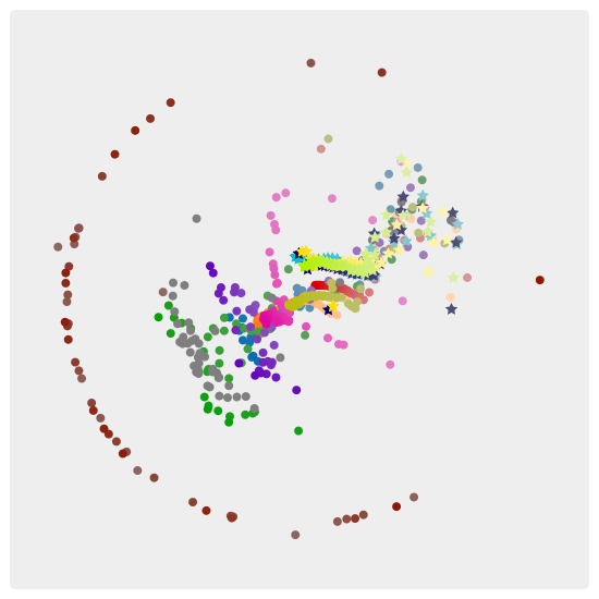
The main difference when comparing the simulation groups with each other versus the comparison including the experimental group is that the experimental data is only available to us as segmentation maps. In the experimental grid, a chemical ingredient was added which changes its color in contact with CO2. This allows to visually detect the presence of CO2 during image processing, by applying appropriate thresholds on the amount of color per grid cell. For our computational comparison, we also have to apply a segmentation on the simulation groups based on a specific threshold. In Figures 4(f)-4(j) and Figures 6(f)-6(j), we use a segmentation threshold of and include the experiment runs in the projection.
We find in “group” mode (Figures 4(f)-4(j)) that the experimental runs form one cluster that is distant from the rest of the groups. When projecting all patches (Figures 6(f)-6(j)), the experimental runs still form a separate cluster and stick together. However, they appear to be rather close to the groups stanford and heriot-watt, though, only for the very first few patches, after which stanford and heriot-watt then quickly diverge from them.
At this point, we cannot say whether any of the groups are actually close to the experiments based on our metrics and projections. Our ML-model was not trained on segmentation data and we cannot expect the results to be reliable for such data. Applying the Wasserstein metric on segmentation maps essentially comes down to counting ones and zeros and comparing the countings among the groups which ignores any potential shapes in the spatial maps. While Manhattan distance and Euclidean distance are better suited for comparing spatial shapes, they are still heavily affected from the chosen threshold for the segmentation.
Therefore, we instead try to verify the projection by visually comparing the experimental runs with the different simulation groups in the space-time cube renderings. By adjusting the transfer function to a function which maps all concentration values to either fully transparent or fully opaque colors depending on a threshold, we can see how the simulation data would look like if it were transformed to segmentation maps by applying this threshold. Thus, we can visually figure out which threshold, if applied to the simulation data, most closely resembles the experimental data. For example, delft-DARSim visually resembles the experiment run 1 at h far better with a threshold of on the concentration data instead of a threshold of (Figure 8). Though, we do not find any suitable threshold for neither stanford nor heriot-watt. We find that both, especially stanford, seem to be quite different to the experiments and that the other groups, with the exception of lanl, look more similar to the spatio-temporal behavior of the experiment runs.
5.3 Correlation between Saturation, Concentration, and Time Series Data – Q3


Temporal Differences between Saturation and Concentration: By using saturation and concentration separately in similarity metric computation, we find significant differences in the temporal behavior of saturation compared to concentration. Figure 9 shows two MDS projections using the “S4 with subdivided patches” as similarity metric. The projection in Figure 9(a) with “patch” mode relates to the saturation data and Figure 9(b) shows the projection of the concentration data. We find that in both projections, the time curves have a common point of origin but behave increasingly differently throughout the simulation. For the concentration data, the time curves keeps mostly moving away from the center, such that the latest patches are one of the out-most points in the projection. However, for the saturation data, they first briefly diverge, but then make a turn back in the direction of the origin. By interacting with the similarity view and the line charts views, we find that this turnaround happens right after injection stop at h when the saturation, i.e., mobile CO2, has reached its maximum in all of the boxes. Hovering over the saturation maximum data of any of the boxes highlights the most distant patches in the similarity view (Figure 9(a)). The mobile CO2 only decreases after injection stop, which explains that the patches after this point become more similar again to the previous patches. We validate this by visually inspecting the space-time cube renderings for the saturation data.
Although the patches in the concentration plot keep diverging, they diverge much slower after the injection stop, which can be seen in Figure 9(b) where the patches around the injection stop are highlighted via black halos.
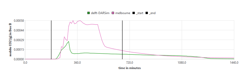
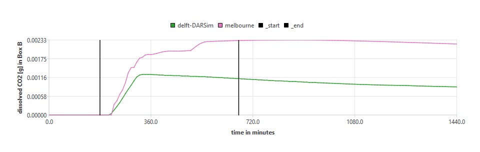
Correlation between Spatial Maps and Time Series Data: By zooming to the boxes of interest and interacting with the time series views and the space-time cube renderings, we can inspect the boxes of interest in more detail and detect when certain events happen. For example, the visual inspection of Box B allows to see when the spilling point of Box A is reached. When Box A has reached its maximum capacity of CO2 gas, injecting more CO2 results the CO2 gas to “spill” over the spilling point and leak into Box B through a coarse-grained riff (Figure 1 to the left of Box A). If this happens, we can see increasing CO2 saturation and concentration in the space-time cube rendering of Box B which should also correlate to increasing mobile CO2 and dissolved CO2 time series data in Box B. We find that this correlation between spatial maps and time series data matches well, which we show for groups delft-DARSim and melbourne in Figure 10. There, we notice that the first saturation in Box B is visible after minutes for delft-DARSim and after minutes for melbourne (not considering outlier lanl). Most other groups start showing CO2 saturation at around minutes in Box B.
While it would be possible to use the time series data itself for detecting when the spilling point is reached, the visualization provides an convenient approach to validate the time series data and that the measured CO2 in Box B is indeed due to leakage from Box A. Furthermore, this approach also provides means to quickly identify when the spilling point is reached for the experiment runs for which no time series data is available to us. We identify the time of reaching the spilling point to be after min, min, min, min for the experiment runs 5, 2, 1, and 3 respectively.
5.4 Shape and Development of Fingers Differ Throughout the Ensemble – Q4
| Groups |
|---|
| Stuttgart |
| Stanford |
| Melbourne |
| Heriot-Watt |
| Delft-DARSim |
| Delft-DARTS |
| Csiro |
| Austin |
| Experiment Run 1 |
| Shape | ||
|---|---|---|
| Thin | Wide | Diffusive |
| • | ||
| • | ||
| • | ||
| • | ||
| • | ||
| • | ||
| • | ||
| • | ||
| • | ||
| Length | |
|---|---|
| Short | Long |
| • | |
| • | |
| • | |
| • | |
| • | |
| • | |
| • | |
| • | |
| • | |
| Development Behavior | ||
|---|---|---|
| Initial | Recurring | Continuous |
| • | ||
| • | ||
| • | ||
| • | ||
| • | ||
| • | ||
| • | ||
| • | ||
| • | ||


By slicing into the volume for Box A, we find different shapes and types of developments of the fingers that are visible by looking at the concentration data of the different groups. We categorize them by overall shape, length, and development behavior. The individual categories are further subdivided as follows: overall shape in “thin”, “wide”, and “diffusive”; length in “short” or “long”; and development behavior in “initial pulse”, “recurring pulses”, and “continuous pulses”. We provide our classification in Table 1. Based on our classification, we find that most groups develop thin and long fingers, and consider only stanford and melbourne to have neither long nor thin fingers. Melbourne has rather short and wide fingers, while for stanford they appear short and diffusive. With “diffusive” we describe the fingers to have no clear shape in the early stages, and that the distribution of CO2 concentration in Box A seems to be fuzzy.
During the analysis of the fingers in Box A, we noticed that instead of the CO2 gradually dissolving into the water and dropping down in the form of fingers, this dissolving process often happens in the form of “pulses”. We therefore classify the groups in “initial”, “recurring” and “continuous” regarding the development behavior of fingers. With “initial” we refer to groups for which the fingers develop suddenly and only once in one initial “drop”. “Recurring” refers to groups for which we noticed recurring pulses, where each pulse introduces more CO2 concentration which developed in a short time period. “Continuous” refers to the groups where we cannot find recurring behavior or an initial fast dop, but for which the CO2 instead gradually dissolves into fingers which thus continuously grow.
We find that only stanford has one initial fast drop. The other groups have either recurring pulses or a continuous growth of the fingers.
We provide some examples for different fingers in Figure 11. After further investigating the pulsing behavior, we also find that we see a brief period of low saturation during each pulse for the groups which have pulsing behavior, as we show in Figure 11(c). Compared to groups with continuous finger development, we see a continuous trail of low saturation over time instead, as we show in Figure 11(f).
6 Discussion
In this section we discuss some strengths and shortcomings and potential future work.
6.1 Strengths and Shortcomings
Similarity Metric: In the previous section, we provided multiple results, which show the utility of our visual approach. Our visual approach incorporates multiple commonly used similarity metrics like Euclidean, Manhattan, and Wasserstein distances. One strength of our approach is the incorporation of multiple such similarity metrics, but also of a more sophisticated ML approach as similarity metric, which can be used to project the full ensemble into an overview. While the incorporation of the ML model as a similarity metric allows integrating a metric that should consider features in the data such as spatio-temporal behavior, it is not clear what the model actually computes, as it acts as a black box to us. Furthermore, it may not be suited to be used on segmentation data, although it produces promising results.
Dimensionality Reduction: Another strength is the interactive linking between our overview, space-time cube renderings, and line charts. While the overview in the projection view allows to quickly understand similar groups overall and how the simulations of the groups temporally relate to each other, it hides all the details of the actual simulation data. Also, the overview does not show the projection quality such as the remaining stress of the MDS projection. We addressed both issues by linking the views in our visual approach which enables efficient navigation and exploration of the ensemble dataset on different levels of detail by brushing in the overview or line charts. Hence, it is possible to manually verify the correctness of the projections to a certain degree by visually comparing the data details. Though, a proper visualization of the projection quality might be a good fit for future work.
Volume Rendering: One additional benefit in our visual approach was the selection of space-time cubes for the visual representation of the spatial maps. A space-time cube is well suited for 2D+T data to provide a static overview of multiple 2D spatial maps that shows how saturation and concentration propagates through the geometry. However, a transfer function is necessary to properly leverage the capabilities of a space-time cube representation and configuring a transfer function can be difficult. It introduces many pitfalls in the visual analysis when a transfer function is not properly configured. Nevertheless, we showed the flexibility of the space-time cube rendering with an interactive transfer function and how it can be used to visually compare simulation to experiment runs with different thresholds on the saturation or concentration data.
Generalization: Even though we developed our approach in regard to the data of the benchmark study, it can be generalized to other data as well. Proper pre-processing as described in Section 4.1.1 might be required. For the overview, it is just a matter of choosing a similarity metric that is capable of computing the similarity between patches in the data that relate to a time component. The concept of patches can easily be extended to 3D+T(ime)+V(ariables) data which can also be processed by our chosen ML model. A drawback is that the ML model has to be trained on the data before it can be used with our visual approach and that too little data and poor hyperparameter settings can introduce overfitting. Euclidean, Manhattan, and Wasserstein distances do not have these issues and are still viable options for 3D+T+V data.
One core strength of choosing a space-time cube for visualizing the data is that we can show a static overview of multiple time steps at once, even for 2D+T data. We can still use the same concept for 3D+T data, although at least one dimension has to be collapsed or limited to one slice of it before we can render the remaining data as a 3D volume. Furthermore, our visual approach currently visualizes only one variables of the simulation data per space-time cube rendering. In our implementation, we chose two such renderings as juxtaposed views, which allows a side-by-side comparison of two space-time cube renderings. This limits the capabilities of visualizing more than two ensemble members or variables at once. The interaction with space-time cubes allows to zoom to specific regions of interests that are defined by the benchmark study description. Other data might not have these specific regions of interests and this interaction should be changed to allow to zoom to arbitrary regions of interests.
Scalability: In terms of ensemble size, we figure that bigger ensembles might introduce visual clutter in the overview and line chart views. Besides that, our approach lacks techniques for parameter space analysis Sedlmair2014VisualParamSpaceAnalysis , which is a common task for big ensembles. We discuss options to address these limitations and other future work below.
6.2 Future Work
The previous discussion and mentioned issues and drawbacks provide multiple directions to extend our visual approach in future work. For example, it is currently necessary to train the ML model we use as similarity metric. This model could be replaced with another model that does not require retraining but still captures spatio-temporal features, such as Huesmann2022SimilarityNet .
Furthermore, our visual approach should be able to naturally process arbitrary 3D+T+V spatio-temporal data. For a better integration of more variables in the space-time cube visualizations, we propose to superimpose multiple space-time cubes of different variables. Combined with a transfer function that can be configured for each space-time cube individually, this superimposition can extend the space-time cube visualization to show multivariate data in a single view.
In addition to our research questions (Section 3.2), the domain experts have expressed great interest to not only discover and analyze the outcome but also understand the reason behind why simulation outcomes vary. However, the differences between two model runs can be manifold and range from possibly different underlying balance equations, discretization approaches and constitutive relations over varying spatial parameters and grid resolutions up to diverse numerical solution approaches and parameters. Therefore, we leave this research question for future work where possibly more selected variations of a computational model are evaluated.
Our current work focused on an in-depth analysis of the ensemble of different simulation runs. Our hope is that this analysis will serve as a starting point for the next steps to agglomerate the ensemble into joint insights and decisions. For that, further extensions of our approach to make it amenable for broad communication will be necessary munzner2014visualization . Meaningful physical interpretations of the applied similarity metrics will be of particular interest.
7 Conclusion
We presented an approach for the interactive visual analysis of simulation codes and experiment ensembles of porous media fluid flows. An overview with a variety of similarity metrics allows to identify and compare spatio-temporal patterns, such as the differences in the development of gravity fingers, and also to identify correlations among attributes measured from the spatial maps, such as the mobile CO2 and dissolved CO2 in different regions of interest. Detail views display CO2 concentration and saturation in a space-time cube format, and support the navigation through the ensemble data.
We applied our approach to data from a benchmark study with nine different simulation models. Our analysis revealed new insights into ranking of simulation results with respect to experimental data, correlation between CO2 saturation and concentration, and gravity finger development. As next steps, we plan to expand our collaboration to involve domain experts from all nine research sites and to jointly derive decisions and lessons learned from this large scale simulation endeavor.
Acknowledgments
Funded by Deutsche Forschungsgemeinschaft (DFG, German Research Foundation) under Germany’s Excellence Strategy - EXC 2075 – 390740016 and Project Number 327154368 – SFB 1313. We acknowledge the support by the Stuttgart Center for Simulation Science (SimTech). Parts of this work have been done in the context of CEDAS, the Center for Data Science at the University of Bergen.
Declarations
Funding
Funded by Deutsche Forschungsgemeinschaft (DFG, German Research Foundation) under Germany’s Excellence Strategy - EXC2075 – 390740016 and Project Number 327154368 – SFB 1313.
Competing interest
The authors have no relevant financial or non-financial interests to disclose.
Author contributions
All authors contributed to the conceptual design of our work, and made substantial contributions in writing and revising this manuscript. The implementation of the concepts, data preparation, analysis, and writing of the first draft were performed by R. Bauer. All authors read and approved the final manuscript.
Corresponding author
Correspondence to Ruben Bauer.
Data availability
The datasets which are used in this manuscript, mainly the benchmark study results, are available in the Fluidflower repositories, https://github.com/fluidflower.
References
- \bibcommenthead
- (1) Bachu, S., Bonijoly, D., Bradshaw, J., Burruss, R., Holloway, S., Christensen, N.P., Mathiassen, O.M.: CO2 storage capacity estimation: Methodology and gaps. International Journal of Greenhouse Gas Control 1(4), 430–443 (2007). https://doi.org/10.1016/S1750-5836(07)00086-2
- (2) Pacala, S., Socolow, R.: Stabilization wedges: Solving the climate problem for the next 50 years with current technologies. Science 305(5686), 968–972 (2004). https://doi.org/10.1126/science.1100103
- (3) Metz, B., Davidson, O., De Coninck, H., Loos, M., Meyer, L.: IPCC Special Report on Carbon Dioxide Capture and Storage. Cambridge University Press, Cambridge (2005)
- (4) Bear, J.: Modeling Phenomena of Flow and Transport in Porous Media vol. 1. Springer, Swiss (2018)
- (5) Sahimi, M.: Flow and Transport in Porous Media and Fractured Rock: from Classical Methods to Modern Approaches. John Wiley & Sons, USA (2011)
- (6) Kamrava, S., Sahimi, M., Tahmasebi, P.: Simulating fluid flow in complex porous materials by integrating the governing equations with deep-layered machines. npj Computational Materials 7(1), 127 (2021). https://doi.org/10.1038/s41524-021-00598-2
- (7) Lindeberg, E., Vuillaume, J.-F., Ghaderi, A.: Determination of the CO2 storage capacity of the Utsira formation. Energy Procedia 1(1), 2777–2784 (2009). https://doi.org/10.1016/j.egypro.2009.02.049. Greenhouse Gas Control Technologies 9
- (8) Niemi, A., Bensabat, J., Shtivelman, V., Edlmann, K., Gouze, P., Luquot, L., Hingerl, F., Benson, S.M., Pezard, P.A., Rasmusson, K., et al.: Heletz experimental site overview, characterization and data analysis for CO2 injection and geological storage. International Journal of Greenhouse Gas Control 48, 3–23 (2016)
- (9) Class, H., Ebigbo, A., Helmig, R., Dahle, H.K., Nordbotten, J.M., Celia, M.A., Audigane, P., Darcis, M., Ennis-King, J., Fan, Y., Flemisch, B., Gasda, S.E., Jin, M., Krug, S., Labregere, D., Naderi Beni, A., Pawar, R.J., Sbai, A., Thomas, S.G., Trenty, L., Wei, L.: A benchmark study on problems related to CO2 storage in geologic formations. Computational Geosciences 13(4), 409–434 (2009). https://doi.org/10.1007/s10596-009-9146-x
- (10) Nordbotten, J.M., Fernø, M., Flemisch, B., Juanes, R., Jørgensen, M.: Final benchmark description: Fluidflower international benchmark study (2022). https://doi.org/10.5281/zenodo.6807102
- (11) Flemisch, B., Nordbotten, J.M., Fernø, M., Juanes, R., Class, H., Delshad, M., Doster, F., Ennis-King, J., Franc, J., Geiger, S., Gläser, D., Green, C., Gunning, J., Hajibeygi, H., Jackson, S.J., Jammoul, M., Karra, S., Li, J., Matthäi, S.K., Miller, T., Shao, Q., Spurin, C., Stauffer, P., Tchelepi, H., Tian, X., Viswanathan, H., Voskov, D., Wang, Y., Wapperom, M., Wheeler, M.F., Wilkins, A., Youssef, A.A., Zhang, Z.: The FluidFlower international benchmark study: Process, modeling results, and comparison to experimental data. Transport in Porous Media, this S.I. (2023)
- (12) Munzner, T.: Visualization Analysis and Design. CRC press, Boca Raton, Florida, USA (2014)
- (13) Sedlmair, M., Heinzl, C., Bruckner, S., Piringer, H., Möller, T.: Visual parameter space analysis: A conceptual framework. IEEE Transactions on Visualization and Computer Graphics 20(12), 2161–2170 (2014). https://doi.org/10.1109/TVCG.2014.2346321
- (14) Fofonov, A., Linsen, L.: Projected field similarity for comparative visualization of multi-run multi-field time-varying spatial data. Comput. Graph. Forum 38(1), 286–299 (2019). https://doi.org/10.1111/cgf.13531
- (15) Sedlmair, M., Meyer, M., Munzner, T.: Design study methodology: Reflections from the trenches and the stacks. IEEE Transactions on Visualization and Computer Graphics 18(12), 2431–2440 (2012)
- (16) Wang, J., Hazarika, S., Li, C., Shen, H.-W.: Visualization and visual analysis of ensemble data: A survey. IEEE Transactions on Visualization and Computer Graphics 25(9), 2853–2872 (2019). https://doi.org/10.1109/TVCG.2018.2853721
- (17) Bach, B., Shi, C., Heulot, N., Madhyastha, T., Grabowski, T., Dragicevic, P.: Time curves: Folding time to visualize patterns of temporal evolution in data. IEEE Transactions on Visualization and Computer Graphics 22(1), 559–568 (2015)
- (18) Bach, B., Dragicevic, P., Archambault, D., Hurter, C., Carpendale, S.: A descriptive framework for temporal data visualizations based on generalized space-time cubes. Comput. Graph. Forum 36(6), 36–61 (2017). https://doi.org/10.1111/cgf.12804
- (19) Pruess, K., Garciia, J., Kovscek, T., Oldenburg, C., Rutqvist, J., Steefel, C., Xu, T.: Code intercomparison builds confidence in numerical simulation models for geologic disposal of CO2. Energy 29(9–10), 1431–1444 (2004). https://doi.org/10.1016/j.energy.2004.03.077
- (20) Walter, L., Binning, P.J., Oladyshkin, S., Flemisch, B., Class, H.: Brine migration resulting from CO2 injection into saline aquifers – an approach to risk estimation including various levels of uncertainty. International Journal of Greenhouse Gas Control 9, 495–506 (2012). https://doi.org/10.1016/j.ijggc.2012.05.004
- (21) Sun, W., Durlofsky, L.J.: Data-space approaches for uncertainty quantification of CO2 plume location in geological carbon storage. Advances in Water Resources 123, 234–255 (2019). https://doi.org/10.1016/j.advwatres.2018.10.028
- (22) Tkachev, G., Frey, S., Ertl, T.: S4: Self-supervised learning of spatiotemporal similarity. IEEE Transactions on Visualization and Computer Graphics 28(12), 4713–4727 (2022). https://doi.org/10.1109/TVCG.2021.3101418
- (23) Huesmann, K., Linsen, L.: Similaritynet: A deep neural network for similarity analysis within spatio-temporal ensembles. Computer Graphics Forum 41(3), 379–389 (2022). https://doi.org/10.1111/cgf.14548
- (24) Obermaier, H., Joy, K.I.: Future challenges for ensemble visualization. IEEE Computer Graphics and Applications 34(3), 8–11 (2014). https://doi.org/10.1109/MCG.2014.52
- (25) Wang, J., Hazarika, S., Li, C., Shen, H.-W.: Visualization and visual analysis of ensemble data: A survey. IEEE Transactions on Visualization and Computer Graphics 25(9), 2853–2872 (2019). https://doi.org/10.1109/TVCG.2018.2853721
- (26) Demir, I., Dick, C., Westermann, R.: Multi-charts for comparative 3d ensemble visualization. IEEE Transactions on Visualization and Computer Graphics 20(12), 2694–2703 (2014). https://doi.org/10.1109/TVCG.2014.2346448
- (27) Höllt, T., Ravanelli, F.M.d.M., Hadwiger, M., Hoteit, I.: Visual analysis of reservoir simulation ensembles. In: Rink, K., Middel, A., Zeckzer, D. (eds.) Workshop on Visualisation in Environmental Sciences (EnvirVis). The Eurographics Association, Groningen, the Netherlands (2016). https://doi.org/10.2312/envirvis.20161099
- (28) Potter, K., Wilson, A., Bremer, P.-T., Williams, D., Doutriaux, C., Pascucci, V., Johnson, C.R.: Ensemble-vis: A framework for the statistical visualization of ensemble data. In: 2009 IEEE International Conference on Data Mining Workshops, pp. 233–240 (2009). https://doi.org/10.1109/ICDMW.2009.55
- (29) Fofonov, A., Linsen, L.: Multivisa: Visual analysis of multi-run physical simulation data using interactive aggregated plots. In: VISIGRAPP (2018)
- (30) Shneiderman, B.: The eyes have it: a task by data type taxonomy for information visualizations. In: Proceedings 1996 IEEE Symposium on Visual Languages, pp. 336–343 (1996). https://doi.org/10.1109/VL.1996.545307
- (31) Hägerstrand, T.: What about people in Regional Science? Papers of the Regional Science Association 24(1), 6–21 (1970). https://doi.org/%****␣sn-article.bbl␣Line␣575␣****10.1007/BF01936872
- (32) van der Maaten, L., Hinton, G.: Visualizing data using t-sne. Journal of Machine Learning Research 9(86), 2579–2605 (2008)
- (33) McInnes, L., Healy, J., Melville, J.: UMAP: Uniform Manifold Approximation and Projection for Dimension Reduction. arXiv (2018). https://doi.org/10.48550/ARXIV.1802.03426
- (34) Kruskal, J.B.: Nonmetric multidimensional scaling: a numerical method. Psychometrika 29(2), 115–129 (1964)
- (35) Kantorovich, L.V.: Mathematical methods of organizing and planning production. Management science 6(4), 366–422 (1960)
- (36) Machicao, J., Ngo, Q.Q., Molchanov, V., Linsen, L., Bruno, O.: A visual analysis method of randomness for classifying and ranking pseudo-random number generators. Information Sciences 558, 1–20 (2021). https://doi.org/10.1016/j.ins.2020.10.041