Diagrammatization: Rationalizing with diagrammatic AI explanations
for abductive-deductive reasoning on hypotheses
Abstract.
Many visualizations have been developed for explainable AI (XAI), but they often require further reasoning by users to interpret. We argue that XAI should support diagrammatic and abductive reasoning for the AI to perform hypothesis generation and evaluation to reduce the interpretability gap. We propose Diagrammatization to i) perform Peircean abductive-deductive reasoning, ii) follow domain conventions, and iii) explain with diagrams visually or verbally. We implemented DiagramNet for a clinical application to predict cardiac diagnoses from heart auscultation, and explain with shape-based murmur diagrams. In modeling studies, we found that DiagramNet not only provides faithful murmur shape explanations, but also has better prediction performance than baseline models. We further demonstrate the interpretability and trustworthiness of diagrammatic explanations in a qualitative user study with medical students, showing that clinically-relevant, diagrammatic explanations are preferred over technical saliency map explanations. This work contributes insights into providing domain-conventional abductive explanations for user-centric XAI.
1. Introduction
The need for AI accountability has spurred the development of many explainable AI (XAI) techniques (Abdul et al., 2018; Adadi and Berrada, 2018; Arrieta et al., 2020; Guidotti et al., 2018; Hohman et al., 2018). However, current approaches tend to use rudimentary, off-the-shelf visualizations, such as bar or line charts and heat maps, that assume users are analytically-driven to study the visualizations. Consequently, these are difficult to make sense of (Kaur et al., 2022), too simplistic to provide effective feedback (Poursabzi-Sangdeh et al., 2021), or require significant subsequent effort to interpret (Dhanorkar et al., 2021).
Additionally, since machine learning models make predictions on learned rules, many XAI techniques produce explanations that also reason deductively. However, humans can also reason with other processes (Peirce, 1903). Abductive reasoning is a particularly powerful approach to first generate hypotheses, then test them to determine why an observation or event occurred (Popper, 2014). Hoffman et al. (Hoffman and Klein, 2017; Hoffman et al., 2020, 2022), Wang et al. (Wang et al., 2019), and Miller (Miller, 2023) argued for XAI to also support abductive explanations. Abduction will allow the user and AI to reason with hypotheses from a shared domain, and save user effort to contextualize low-level explanations. Towards the goal of human-like XAI (Wang et al., 2019; Zhang and Lim, 2022; Matsuyama et al., 2023), we propose an approach to leverage abduction to provide hypothesis-driven explanations for complex real world problems.
Yet, hypotheses of challenging tasks tend to be complex, thus we need expressive representations for AI explanations. Diagrams are used in many domains to explain sophisticated observations and events. In physics, force diagrams can explain how objects move when interacting with other objects or fields. In medicine, diagrams can describe physiological mechanisms of diseases. Diagrams are distinct from visualization since they can encode inherent constraints based on hypotheses (Shimojima, 1999), and provide a systematic approach to read it, thus simplifying interpretation. Indeed, diagrams are a generalization of visual and verbal representations (Peirce and Eisele, 1976), thus expanding the diversity of explanations. Extending abductive reasoning, people engage in diagrammatic reasoning (Hoffmann, 2010; Magnani, 2009) to: I) construct diagrams as consistent systems of representation, II) perform experiments based on the rules of the diagrams, and III) note the experiment results.
Therefore, to reduce interpretation burden, we propose XAI diagrammatization to use abductive inference and generate explanations in expressive and constrained diagrams. Towards this goal, we made the following contributions:
-
1)
Introduced Diagrammatization as a design framework for diagrammatic reasoning in XAI to i) support abductive reasoning with hypotheses, ii) follow domain conventions, and iii) can be represented visually or verbally.
-
2)
Proposed DiagramNet, a deep neural network to provide diagram-based, hypothesis-driven, abductive-deductive explanations by inferring to the best explanation while inferring the prediction label.
-
3)
Targeted a clinical application and proposed clinically-relevant explanations to diagnose cardiac disease using murmur diagrams. We mathematically formalized murmur shapes to predict them as explanations in DiagramNet.
-
4)
Evaluated DiagramNet using a real-world heart auscultation dataset (Yaseen et al., 2018) with multiple studies.
-
a)
Demonstration study to illustrate that diagrammatization can demonstrate abductive-deductive reasoning that follows domain conventions with abductive, contrastive, counterfactual, and case (example-based) explanations.
-
b)
Modeling study to show that abductive-deductive reasoning in DiagramNet improves both prediction performance and explanation faithfulness compared to baseline and alternative models, and
-
c)
Qualitative user study with medical domain experts to show that diagram-based explanations are more clinically sound, useful, and convincing than saliency map explanations.
-
a)
-
5)
Discussed implications for XAI and generalization of diagrammatization to other application domains.
2. Conceptual background: Abductive and diagrammatic reasoning
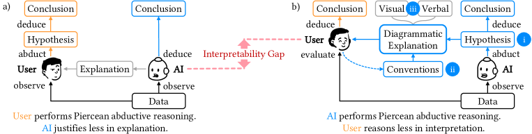
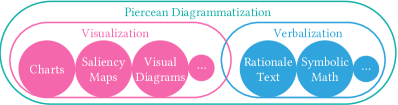
Current XAI explanations show common visualizations (e.g., charts, saliency maps), but these require users to form their own hypotheses to evaluate. This leaves an interpretability gap. We propose ante-hoc diagrammatic reasoning to close this gap. Instead of drawing a diagram post-hoc, the AI performs abductive-deductive reasoning ante-hoc to generate and evaluate its own hypotheses to justify its prediction. The explanation adheres to conventions in the target application domain and represents domain hypotheses whether visually or verbally. Fig. 1 illustrates how explaining with diagrammatization can reduce the interpretability burden for users through three capabilities:
Diagrammatization = \small{i}⃝ Peircean abduction + \small{ii}⃝ Domain conventions + \small{iii}⃝ Peircean diagrams
Next, we introduce the human reasoning processes of abductive and diagrammatic reasoning, to distinguish their nuances from reasoning processes and representations typical in XAI.
2.1. Inferential Reasoning
On observing an object or event, people engage in various reasoning processes. Philosopher Charles S. Peirce defined 3 types of inferential reasoning: induction, deduction, and abduction (Peirce, 1903). Fig. 2 shows how they differ. For pedagogical clarity, we use a stylized scenario of recognizing cats and dogs based on ear shape, and concept-based rather than causal explanations. Later, we describe reasoning on a complex case of cardiac diagnosis with causal hypotheses in Fig. 5.
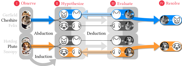
2.1.1. Induction
People infer general rules of objects and events by using inductive reasoning. In Fig. 2 (lower-left), after observing several instances of the same label (cat or dog), one infers the rules that cats have pointy ears (Cat Pointy Ears) and dogs have floppy ears (Dog Floppy Ears). Machine learning trains models using induction.
2.1.2. Deduction
This process uses predefined rules for inference. Fig. 2 (middle) shows that deductive reasoning starts with predefined rules (Cat Pointy Ears, Dog Floppy Ears) and evaluates them against the observation. Cheshire has ears that are pointy (Pointy Ears Cheshire’s Ears) not floppy (Floppy Ears Cheshire’s Ears). When dealing with continuous variables (vs. discrete), each rule is evaluated by a continuous score to determine its likelihood.
2.1.3. Abduction
Harman defined abduction as ”inference to the best explanation” (Harman, 1965); instead of inferring a label, this infers the underlying reason, which could be causal or non-causal (Williamson, 2016). Peirce and later Popper describe abduction as ”guessing” hypotheses (Peirce, 1903; Popper, 2014) that need to be evaluated for plausibility. Combining abduction with deduction supports the hypothetico-deductive reasoning method (Popper, 2014) of forming and testing hypotheses. This is equivalent to the Peircean abduction process that Hoffman et al. (Hoffman and Klein, 2017; Hoffman et al., 2020) and Miller (Miller, 2019, 2023) highlight as relevant to XAI, which we elaborate:
-
I.
Observe event, noting relevant cues for further reasoning.
-
II.
Generate plausible explanations via abduction as potential causes of the observation, e.g., identities, states, diseases. We focus on a set of explanations that are known a priori, rather than generated creatively.
-
III.
Evaluate and judge plausibility of explanations by applying a system of rules via deduction to compare evaluation results. This allows ranking of how well each explanation fits the observation (from Step I).
-
IV.
Resolve explanation by using the best inferred explanation with the best fit to the observation.
Fig. 2 (top) illustrates the abduction process: I) when we observe the cat Cheshire, II) we hypothesize via abduction that it could be a cat or a dog. From this, we recall the rules for the ear shapes based on animal type (Cat Pointy Ears, Dog Floppy Ears). III) Next, we evaluate the hypotheses by performing deduction on each rule against the observation, and determine that the ears are more pointy (Pointy Ears Cheshire’s Ears) than floppy (Floppy Ears Cheshire’s Ears). IV) Hence, we resolve with the ear evidence that Cheshire is most probably a cat (Cheshire Cat).
This illustrates how people use abduction to retrieve and test hypotheses to understand their observations. Therefore, like (Hoffman and Klein, 2017; Hoffman et al., 2020; Miller, 2023; Wang et al., 2019), we argue that XAI should integrate abductive-deductive reasoning to convey how the AI considered multiple hypotheses before arriving at the predicted inference Specifically, we implemented the Peircean abductive reasoning process in our technical approach (Section 4.4).
There is a long history of abductive reasoning in AI, starting with Pople (Pople, 1973), followed by much work in the 1980s and 1990s (e.g., (Josephson and Josephson, 1996; Mooney, 2000)). Works on intelligent tutoring using abductive reasoning to align with human understanding (e.g., (Fraser et al., 1989; Makatchev et al., 2004b, a)) share similar objectives as our work. More recently, there has been work that developed abductive reasoning in machine learning to explain neural networks (Ignatiev et al., 2019), provide probabilistic explanations (Izza et al., 2023), interpolate plausible visual events (Liang et al., 2022), and infer with abstraction patterns in medical diagnosis (Teijeiro et al., 2018, 2016). However, these works remain highly mathematical and inaccessible to non-technical users. Our work adds to this body of work by applying abductive reasoning to complex real-world data without explicit propositional rules, contextualizing the need to integrate with diagrammatic domain conventions, and evaluating with domain experts in a user study.
2.2. Diagrammatization as a general XAI representation for domain-specific conventions
Next, we articulate how diagrammatic reasoning applies abduction on diagram representations for complex domains. As a literature review, we first introduce current XAI methods based on visualization and verbalization, articulate how diagrammatization is a broader paradigm encompassing both, and how diagrams can be more expressive and constrained to efficiently convey hypotheses and concepts to domain experts (see Fig. 3 and Table 1).
2.2.1. Visualization
Leveraging visualization to augment human cognition, many XAI techniques are rendered in visual form. We organize them into four broad categories based on their semantic structures rather than visual format:
-
a)
Model-free explanations use generic, off-the-shelf, low-level visualizations. These assume linear or univariate relationships between variables, and are meant to be accessible to a broad audience, though lay users may struggle to comprehend them (Abdul et al., 2020). Techniques include: Bar charts to show feature attributions (Ribeiro et al., 2016), and weights of evidence (Kulesza et al., 2009; Lim and Dey, 2011). Extensions use point clouds to show data distributions (Lundberg and Lee, 2017), or violin plots to show uncertainty (Wang et al., 2021). Line graphs to show nonlinear relationships, which can be estimated with partial dependence plots (Krause et al., 2016), modeled with generalized additive models (GAM) (Caruana et al., 2015; Abdul et al., 2020), etc. Scatter plots to show multivariate relationships (Cavallo and Demiralp, 2018) and clusters (Ahn and Lin, 2019). Saliency maps to show important regions as heatmaps on images (Selvaraju et al., 2017; Bach et al., 2015; Zhou et al., 2016) or highlights on text (Wang et al., 2022).
-
b)
Model-based explanations visualize the data structure of the prediction model or a simplified proxy. Many use graph network or rule-based data structures, which are complex but known to data scientists. Techniques include: Neural network activations (Kahng et al., 2017), canonical filters in CNNs (Olah et al., 2017), or distilled networks (Bau et al., 2017; Hohman et al., 2019). Decision trees to show nodes and decision branches to explain system decisions (Lim et al., 2009), medical diagnoses (Wu et al., 2018), and step count behavior (Lim et al., 2019).
- c)
-
d)
Concept-based explanations increase interpretability by explaining with semantically meaningful concept vectors (Kim et al., 2018), conceptual attributes (Koh et al., 2020), or relatable cues (Zhang and Lim, 2022). Interactive editing also helps with understanding (Cai et al., 2019b; Kahng et al., 2018; Zhang and Banovic, 2021).
| Representation System | Representation Properties | ||||||||||||||
|---|---|---|---|---|---|---|---|---|---|---|---|---|---|---|---|
| Consistency | Rules |
|
Homomorphism |
|
|
||||||||||
| Verbalization | |||||||||||||||
| Symbolic | High | Formalized | Categorical | Low (mathematical) | Bounded | Logical, math | |||||||||
| Template-based | High | Bounded | Categorical | Low (descriptive) | Bounded | Taxonomical | |||||||||
| NL Generative | Low | Implicit | Categorical | Low (may be spurious) | Unbounded | None | |||||||||
| Visualization | |||||||||||||||
| Model-free | Low | None | Continuous | Low (by data type) | Some bounds | None | |||||||||
| Model-based | High | Formalized | Continuous | High (conceptual) | Bounded | Topological | |||||||||
| Example-based | Low | Implicit | Continuous | High (physical) | Some bounds | None | |||||||||
| Concept-based | Medium | Bounded | Continuous | Low (semantic) | Bounded | Taxonomical | |||||||||
| Diagrammatization | High | Formalized | Continuous |
|
Some bounds |
|
|||||||||
2.2.2. Verbalization
Instead of visual representations, explanations can also be written (or spoken) verbally. This is done with logical syntax (symbolic) or more ”naturally” with text. We organize verbalization explanations as follows.
-
a)
Symbolic explanations use mathematical notation to describe logical relationships. Since math is written sequentially, it is sentential and verbal (Chandrasekaran, 2005). Rules are popular to explain the AI’s decision logic and can be simplified with various regularizations (Letham et al., 2015; Lakkaraju et al., 2016). They are useful to provide counterfactual explanations (Ribeiro et al., 2018; Wachter et al., 2017). Formal logic can also provide abductive explanations with prime implicants (Ignatiev et al., 2019) and constraining deep models towards abductive rules (Dai et al., 2019), though these explanations remain highly mathematical and inaccessible to non-technical users.
-
b)
Template-based text explanations are a straightforward way to convert symbolic expressions into text with a mapping function. They produce text explanations with fixed terms and sentence structures (e.g., (Abujabal et al., 2017)).
-
c)
Natural Language Generative (NLG) explanations are ”natural” by emulating how humans communicate and explain (Ehsan et al., 2018; Rajani et al., 2019; Rosenthal et al., 2016). These are trained by showing a machine state (e.g., game state, text and hypotheses) to human annotators who rationalize an explanation. Training is labor intensive, and yet may be spurious, since human annotators reason independently of the machine. Moreover, annotation correctness cannot be easily validated.
Ehsan et al.’s definition of rationalization is particularly instructive: an NLG explanation justifies a model’s decision ”based on how a human would think”, but does ”not necessarily reveal the true decision making process” (Ehsan et al., 2019). In contrast, diagrammatization extends this to include visual diagrams and also reveals the true decision making process of the AI.
2.2.3. Diagrammatization
Peirce considered diagrams as a general framework that encompasses graphical (visual), symbolic (equations), and sentential (verbal) representations with several elements: an ontology that defines the entities and their relations, conventions that prescribe how to interpret diagrams, and rules to evaluate experiments (Peirce and Eisele, 1976). Hoffman determined 5 steps for diagrammatic reasoning (Hoffmann, 2010) which align with the Peircean abduction process:
-
I.
Construct a diagram by means of a consistent system of representation.
-
II.
Perform experiments upon this diagram according to the rules of the chosen system of representation.
-
III.
Note the results of those experiments.
From this, we analyze representations by their consistency and rules. Generative text verbalization is open-ended with low consistency and rules implicit to language and tacit knowledge. Symbolic and template-based verbalizations have high consistency and are bounded formally or implicitly to rules due to their predefined structure. Model-free and example-based visualizations have low consistency to render any data that fit their formats, though examples are bounded by natural variations. Concept-based visualizations are more consistent to restrict to fixed concepts. Model-based visualizations and diagrams have high consistency and formal rules that obey conventions of their formats.
Shimojima identified dimensions to distinguish linguistic and graphical representations (Shimojima, 1999). We found some instructive and adapt them to differentiate diagrammatization, verbalization, and visualization representations for XAI.
-
A.
Level of states describe whether the representions can be ”analog” (categorical) or ”digital” (continuous). Verbalizations impose categorical representation, while visualizations and diagrams also support continuous quantities.
-
D.
Homomorphism refers to how analogous the diagram is to the represented domain. Verbal representations have low homomophism, since people have to translate text to symbols and structures. Model-free visualizations may have formats irrelevant to the domain (e.g., spectrogram of heart sounds). Model-based visualizations may be homomorphic with the domain if chosen appropriately. Example-based visualizations of instances in their native format are highly homomorphic. Concept-based explanations must be interpreted verbally, so have low homomorphism. Diagrams can represent physical notions that are familiar to domain experts, thus can have high homomorphism.
-
E.
Content expressivity refers to whether the representation limits information expressiveness. Generative text verbalization is unbounded, since any text could be predicted. Model-free and example-based visualizations limit the visual format, but any relevant value can be rendered. Other representations are bounded by the graphical, symbolic, or template formats. High expressivity is useful to show nuances for experts, but is overwhelming to non-experts.
-
F.
Inherent constraints. All representations share extrinsic constraints of the represented domain, but can impose differing inherent constraints. Generative text verbalizations can include any words, so have no inherent constraints, while template-based text is bounded to the taxonomy in the template. Concept-based visualizations are also constrained by the taxonomy of concepts. Model-based visualizations are constrained by topological structure (e.g., decision tree). Diagrams can be constrained by topological or geometric constraints (e.g., physics, time sequence).
2.2.4. Diagrammatization for various explanation types
Since various users may require various explanation types under various conditions (Lim and Dey, 2009; Liao et al., 2020; Lim and Dey, 2011), Diagrammatization supports multi-faceted explanations, namely:
-
a)
Abductive explanations to select the best-fitting hypothesis and show that as the explanation for the prediction.
-
b)
Contrastive explanations (Miller, 2019) to describe the evidence for alternative model outcomes. By generating a hypothesis for each outcome (cause), this can show how well (or poorly) each hypothesis fits the current instance observation.
- c)
-
d)
Case (example-based) explanations to show examples of similar or counterfactual predictions (Cai et al., 2019a) for comparison. Note that case explanations do not represent abductive reasoning for the current instance, but for other cases. They allow one to examine the similarity in the structure of hypotheses, to be used for reference, but this is not as definitive as abductive reasoning on the current observation.
3. Domain Application: Clinical background
Cardiovascular diseases cause an estimated 17.9 million worldwide deaths, accounting for 32% of deaths in 2019 (World Health Organization, 2021). We aim to develop an early diagnosis AI system for heart disease to augment clinicians with deficient auscultation skills (Alam et al., 2010). When predictions impact people’s lives, it is critical to provide explanations for review by relevant experts. Here, we describe the background to clarify how our AI explanations are clinically-relevant for practicing clinicians.
3.1. Heart auscultation
Fig. 4 (Upper-Left) shows a partial heart cycle with blood flowing into the left atrium, pumped into the left ventricle through the mitral valve, and pumped out through the aortic valve. Valves prevent blood from flowing backward. Their closing produces a ”lub-dub” sound: the 1st heart sound (commonly termed S1) ”lub” is from the mitral valve, and the 2nd heart sound (S2) ”dub” is from the aortic valve. S1 and S2 demarcate the systolic (between S1 and S2) and diastolic phases of the heart cycle. In heart auscultation, a standard first-line diagnostic approach, the clinician uses a stethoscope to listen for normal or abnormal sounds, and makes initial cardiac diagnoses by listening only (Judge and Mangrulkar, 2015; Lilly, 2012).
3.2. Murmur diagrams to diagnose cardiac valvular diseases
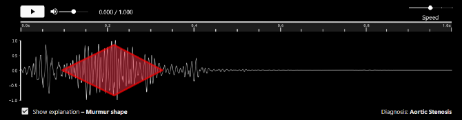
Abnormal heart sounds — ”murmurs” — may indicate heart disease. Clinicians make diagnoses by listening to changes in loudness. These are commonly represented in murmur diagrams (Judge and Mangrulkar, 2015) (Fig. 4, Right). We describe four prevalent diseases: aortic stenosis (AS), mitral regurgitation (MR), mitral valve prolapse (MVP), and mitral stenosis (MS).
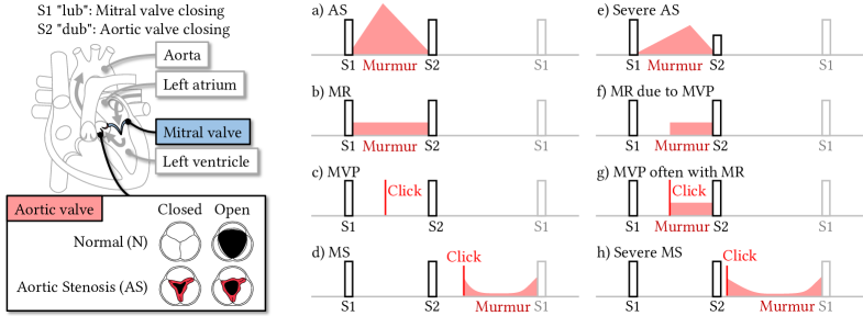
-
1)
Aortic Stenosis (AS): the aortic valve leaflets stiffen due to calcification (Fig. 4, Lower-Left), narrowing the valve opening (i.e., stenosis), resulting in a high-pitched noise that increases in loudness as the valve opens and decreases as it closes. This produces a crescendo-descresendo murmur during the systolic heart phase, visualized as a diamond shape (Fig. 4a). In severe AS, the shape apex shifts later and is lower, due to delayed valve closure and weaker heart performance (Fig. 4e).
-
2)
Mitral Regurgitation (MR): the mitral valve fails to fully close, allowing blood to flow backward (i.e., regurgitation). This reverse flow is heard as a constant, high-pitched murmur during the systolic heart phase, and is visualized as a uniform low amplitude sound (Fig. 4b). Sometimes, the mitral valve remains closed until mid-systole (Fig. 4f).
-
3)
Mitral Valve Prolapse (MVP): the tendons keeping the mitral valve closed fails, causing the valve to pop open (prolapse), allowing blood to regurgitate. This opening is heard as a mid-systolic ”click”, visualized as a vertical line (Fig. 4c). Often the regurgitation is audible as a uniform, high-pitched murmur, which is MVP with MR (Fig. 4g).
-
4)
Mitral Stenosis (MS): the mitral valve leaflets fuse (i.e., stenosis) due to rheumatic heart disease, reducing blood flow during the diastolic heart phase (Fig. 4d). After the S2 ”dub”, the valve snaps open with a ”click” sound, enabling large blood flow, followed by a decrescendo as flow reduces, then a constant low-pitch ”rumble”, and a crescendo before the next S1. Severe MS has an earlier ”click” during diastole and longer murmur decrescendo (Fig. 4h).
Note that heart auscultation can only provide an initial diagnosis of cardiac diseases, since it is based on resultant audio evidence. Through auscultation, the clinician can narrow down to distinct types of cardiac diseases and decide if specific elective clinical tests are needed to evaluate biomolecular changes. As these follow-up tests are costly and require long wait to schedule (e.g., echocardiogram, invasive angiogram), the low-cost and fast turnaround of heart auscultation makes it an important first-line diagnostic approach.
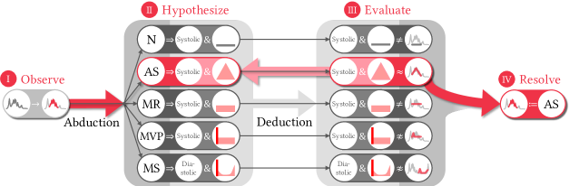
3.3. Abductive-deductive inference of best murmur shape explanation for cardiac diagnosis
With the aforementioned medical knowledge, the domain expert can diagnose using abductive-deductive reasoning. Fig. 5 applies the Peircean abduction process to cardiac diagnosis. On hearing a heart sound, the clinician I) observes an abnormal murmur (red amplitude segment), II) abductively hypothesizes possible diagnoses (N, AS, MS, MVP, MR) with corresponding heart cycle phase and murmur shape, III) deductively evaluates all hypotheses by whether the murmur heart phase was systolic or diastolic and whether the murmur fits certain shapes, and IV) resolves the diagnosis as AS based on the evidence that the murmur is systolic and best fits the crescendo-decrescendo shape ().
3.4. Current XAI for medicine and heart auscultation
With the critical nature of medical AI (Lim and Dey, 2009), several works have pursued XAI for medicine. Wang et al. showed how XAI can mitigate cognitive biases in medical diagnoses (Wang et al., 2019). Cai et al. identified requirements for trust in medical AI, including needing to ”compare and contrast AI schemas relative to known human decision-making schemas” (Cai et al., 2019c). Cai et al. designed SMILEY to find similar pathology cases by region, example and concept (Wang et al., 2019). Lundberg et al. proposed tree-based explanations to address ”model mismatch – where the true relationships in data do not match the form of the model” (Lundberg et al., 2020), though models take more forms than trees. Tjoa and Guan’s review of medical XAI identified several challenges, including the lack of human interpretability, explanations unfaithfulness, and need for data science training in medical education (Tjoa and Guan, 2020). In contrast, Vellido argued for the ”need to integrate the medical experts in the design of data analysis interpretation strategies” (Vellido, 2020). Similarly, we use diagrammatization to imbue medical expertise into XAI.
In this work, we focus on AI for diagnosing cardiac disease. Much work has been on electrocardiogram (ECG) data (e.g., (Siontis et al., 2021)) and less on phonocardiograms (PCG) of heart auscultations. Yet, the few works on PCGs focus on classifying normal or abnormal sounds (e.g., (Rubin et al., 2017)) or segmentating time (e.g., (Dwivedi et al., 2018)). These lack clinical usefulness, since they do not provide a differential diagnosis to rank multiple plausible diagnoses. Work on XAI for PCGs is even more sparse, focusing on saliency maps on spectrograms (Dissanayake et al., 2020; Raza et al., 2022; Ren et al., 2022); we show later how clinicians are unconvinced with this format.
3.5. Diagrammatization for murmur diagrams
The complexity of biological processes demands diagrammatic reasoning in medicine. Furthermore, clinical diagnosis is indeed a form of abductive reasoning, where the clinician infers the best disease cause (explanation) based on symptoms (observation). Therefore, heart auscultations and murmur diagrams provide an ideal use case to study and demonstrate diagrammatization. We characterize murmur diagrams in terms of the diagrammatization design dimensions:
-
•
Consistent system of representation (ontology). Key concepts are audio volume (amplitude) over time, normal ”lub” (S1) and ”dub” (S2) sounds, and abnormal murmur sounds. Murmurs, can be systolic or diastolic, have shape categories with specific slopes (crescendo, decrescendo, uniform) and may include ”clicks”.
-
•
Rules to interpret representation. Base: represent heart sounds with phonocardiograms (PGC) and draw amplitude over time. Annotations: S1 and S2 positions are demarcated as tall rectangles, and murmur shapes are drawn with multi-part straight lines. These conventions help with drawing, reading, and evaluating the diagrams.
-
•
Categorical and continuous level of states. For each diagnosis, the murmur shape must fit a categorical profile, but there is some flexibility (e.g., slope steepness, time span length) to support continuous variation in observations.
-
•
Bounded content expressivity. Murmur diagrams emphasize murmur shapes, and are bounded to show the amplitude. They do not represent other information, such as pitch, stethoscope position, and sound radiation.
-
•
High physical and conceptual homomophism. All clinicians are trained to interpret murmur diagrams, these diagrams can be overlaid on PCGs and intuitively represent how sound volume changes over time.
-
•
Geometrical inherent constraints. Murmur shapes are geometrically constrained to be between S1-S2 or S2-S1 and have positive, negative, or flat slopes. The shapes should also fit the amplitude data optimally.
These describe how diagrams are expressive, constrained, and conventional to convey murmur shape hypotheses from heart sounds to explain cardiac diagnosis. Next, we describe our technical approach for the AI to perform abductive and diagrammatic reasoning, and generate diagrammatic explanations. By demonstrating the AI’s independent ante-hoc reasoning, which is clinician-like, we aim to increase its trustworthiness for clinicians.
4. Technical approach
We developed an explainable model to predict cardiac diagnosis from phonocardiograms (PCG). Following clinical practice, the model generates diagrammatic explanations with murmur diagrams based on sound. We discuss generalization to other applications later in Discussion. We describe our data source, data preparation, baseline modeling, problem formulation of murmur shapes, proposed DiagramNet model, and alternative model for cardiac diagnosis prediction.
4.1. Heart auscultation dataset, data preparation, and annotation
4.1.1. Dataset
We trained models to predict cardiac diagnoses using the dataset by Yaseen et al. (Yaseen et al., 2018). It comprises 1000 audio recordings of heart cycles, each 1.15-3.99s long, sampled at 8 kHz. There are 200 recordings of each diagnosis: normal (N), AS, MR, MVP, and MS. We next describe how we preprocess the 1000 recordings into 14.7k instances which is sufficiently large for deep learning (achieving 86.0% for a base CNN, and 96.8% for our proposed model).
4.1.2. Preprocessing
We processed each .wav audio file into multiple time series 1D tensors. To classify auscultations starting at any time point, we created instances based on sliding windows, with window length 1.0s (8000 samples) and stride 0.1s. The window length was chosen such that each instance will likely contain only one heart cycle with 0 or 1 murmur, thus simplifying predictions. In total, we have 14,672 instances, which we split into training and test sets with a 50% ratio. We ensured that all time windows for the same original audio files only occur in the training or test set, not both. We further extract the amplitude of the audio time series which is key to estimate murmur shapes.
4.1.3. Annotation
The dataset only contains diagnosis labels, but lacked annotations about murmur locations. Thus, we manually annotated the segments of when the murmur occurs to derive and as the murmur start and end (last) times, respectively. These are used for the supervised training of the murmur segment predictions. Using this segment, we fit a nonlinear function describing the correct murmur shape to the data. This provides ground truth estimates of shape parameters , where and are time and slope parameters, respectively. Details are described later.
The annotations were performed and verified in consultation with our clinical collaborators who are cardiologists. Since it was prohibitively expensive to recruit clinicians as annotators, we trained ourselves (computer scientists) to understand the domain concepts of auscultation and murmurs. We took care to minimize annotation errors. Two annotators checked the annotations for consistency with each diagnosis as described in Section 3.2 using time series visualizations of all annotated PCGs. Any discrepancy between annotators were reconciled through discussions. Our clinical collaborators verified a subset of annotations. All mislabeled annotations were corrected. Our detailed description of the clinical background demonstrates our acquired domain knowledge. Our results (discussed later) suggest that annotation errors were limited, since we demonstrated improved model accuracy for all diagnoses.
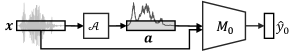
4.2. Base prediction model for cardiac diagnosis prediction
We treat each audio time series like a 1D image, since all instances are fixed-length and single-channel. We further concatenate displacement and amplitude into a 2-channel ”image”. To compare with our full proposed model, we trained a base convolutional neural network (CNN) (Hershey et al., 2017) as model on to predict cardiac disease (see Fig. 6). Although can indicate the probability-like disease risk of diagnoses, this could be spurious, since it does not consider the murmur shapes of each diagnosis. Instead, a more reliable model should explicitly encode constraints that are domain relevant.
4.3. Formalization of murmur shapes as piecewise linear functions
To enable our model to predict various murmur shapes, we formulated them as parametric nonlinear functions over time . Since murmur shapes are defined with crescendo, decrescendo, and uniform slopes, we approximate each slope as a line. Thus, we model the total murmur shape as a piecewise linear function, instead of other less relevant families of functions, e.g., sum of polynomials (Taylor series) or sine/cosine (Fourier series). A Taylor series would include spurious artifacts due to the mathematical fit being clinically irrelevant, and be unintuitive to interpret for non-mathematical applications. A Fourier series, which spectrograms actually represent, would capture important frequency information in murmurs, but does not emphasize the recognizable murmur shapes.
| Diagnosis | Murmur Diagram | Heart Phase | Shape Function | Parameters | ||||||||
|---|---|---|---|---|---|---|---|---|---|---|---|---|
| N | n.a. | 0 | ||||||||||
| AS | Systolic |
|
|
|||||||||
| MR | Systolic |
|
||||||||||
| MVP | Systolic |
|
|
|||||||||
| MS | Diastolic |
|
|
All candidate murmur shapes share the murmur segment start and end time parameters, but can have varying number of time and slope parameters depending on the complexity of the shape. Crescendos are modeled as lines with positive slope, decrescendos as lines with negative slope, and uniform with 0 slope. Table 2 illustrates the murmur shapes mathematically with relevant parameters, and their shape function equations:
-
1)
Normal (N) has no murmurs, so murmur segment start and end are undefined , and by definition.
-
2)
Aortic stenosis (AS) has a crescendo-decrescendo murmur defined with positive slope from to and negative slope from to . The vertical position of the shape is anchored by the intercept term .
-
3)
Mitral regurgitation (MR) has a uniform murmur between and at amplitude level .
-
4)
Mitral valve prolapse (MVP) murmurs start with a ”click” which we model as a short crescendo-decrescendo with slopes and from through to . The uniform murmur spans from to with 0 slope. If there is no subsequent MR murmur, then the region with uniform slope would just have 0 amplitude.
-
5)
Mitral stenosis (MS) has a very similar shape to that of MVP, but it ends with a crescendo with positive slope from to . Also note that this murmur happens in the diastolic heart phase, not systolic.
4.4. DiagramNet: Diagrammatic network with abductive explanations of murmur shapes
We introduce DiagramNet, a deep neural network meta-architecture to infer a prediction and perform abductive-deductive reasoning to infer the best explanations that is consistent with the observation and prediction. While standard neural networks tend to learn spurious and unintelligible neural activation, our modular approach satisfies domain constraints. This shares a similar goal as physics-informed neural networks (PINNs) (Karniadakis et al., 2021; Raissi et al., 2019), but we encode human mental models instead of physical laws. We implement this for the application of diagnosing cardiac diseases, but note that the architecture is generalizable to other domains with formalized hypotheses. Fig. 7 shows that the model has 7 stages that correspond in sequence to the 4-step Peircean abductive reasoning process described in Section 2.1.3.
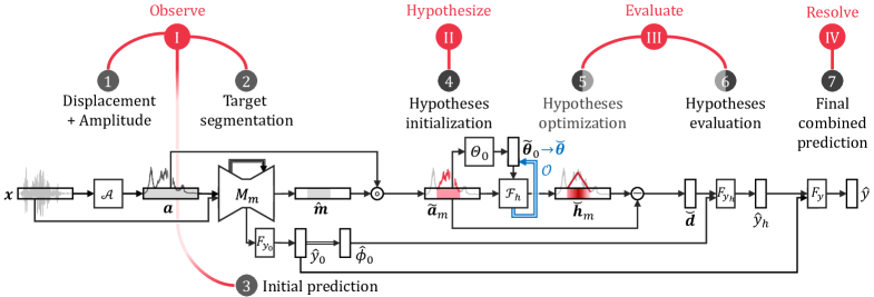
4.4.1. Audio displacement and amplitude inputs
Given the 1-sec (8000-sample) audio data as displacement , we extract the amplitude , concatenate them as a 2-channel 1D tensor. Although the convolutional layers of the CNN could learn frequency information from , explicitly computing makes it easier for the model to learn patterns from amplitude.
4.4.2. Murmur segmentation
Next, we input into a U-Net (Ronneberger et al., 2015) model to predict the time region of the murmur , defined as a mask vector. We applied U-Net, a popular model for image segmentation (Kohl et al., 2018; Ronneberger et al., 2015), to time series data by treating the data as a 1D ”image” and leveraging its convolutional filters to find temporal motifs as spatial patterns. However, this suffers from over-segmentation by inferring multiple regions of murmurs in a single instance, although there should only be one. As in (Farha and Gall, 2019), we resolve this with a smoothing loss regularization using the truncated mean squared error: , where is the squared of log differences and is the truncation hyperparameter. This may still result in ¿1 segments, so we choose the longest among remaining segments.
4.4.3. Initial prediction
Now, we exploit the embedding representation learned from murmur segmentation by feeding it into fully-connected layers to predict initial diagnosis . This would be more accurate than a base CNN, since it benefits from the added multi-task learning to predict too. This is equivalent to System I thinking of the dual process theory (Kahneman, 2011) that is intuitive and quick, while the full Peircean abduction process is equivalent to System II thinking that is rationale and slower. Additionally, we infer the murmur heart phase as diastolic or not (systolic).
4.4.4. Hypotheses initialization
We then perform abduction by enumerating possible hypotheses (N, AS, MR, MVP, MS) and retrieving their corresponding murmur shape functions and parameters . We first extract the murmur amplitude by applying murmur segment as a mask on the full amplitude, i.e., , where is the Hadamard element-wise multiplication. We can then estimate murmur shapes focused on this region from to . We initialize the shape parameter values using heuristics based on typical characteristics defined in Table 3. These do not have to be very accurate, since we will optimize them later. We briefly describe the heuristics:
-
1)
Normal (N). No parameters are estimated, since no murmur is expected.
-
2)
Aortic stenosis (AS). We estimate the apex of the crescendo-decresendo to occur at the time of highest amplitude . is just the amplitude at , is the slope from the murmur start to apex, and .
-
3)
Mitral regurgitation (MR). The shape is a flat line at the average amplitude of the murmur segment .
-
4)
Mitral valve prolapse (MVP). We estimate the apex at in the same way as for AS, to occur at twice the distance from to . and are calculated the same way as for AS.
-
5)
Mitral stenosis (MS). Estimating time parameters is poor using heuristics, so we use a data-driven approach by using the median of time differences from the training dataset. These are calculated for and relative to the murmur start and end times. , and are calculated the same way as for MVP.
4.4.5. Hypotheses optimization
Using the initial shape parameter values , we compute the murmur shapes for all diagnoses . These may not fit well, so we optimize the fit using L-BFGS (Nocedal and Wright, 2006) to minimize the shape fit MSE, i.e., . This optimization is similar to approaches used in activation maximization (Nguyen et al., 2016) and CLIP (Radford et al., 2021), and obtains murmur shapes for all diagnoses that best fit the murmur amplitude.
| Initial Time Parameters | Initial Slope Parameters | |||||||||
|---|---|---|---|---|---|---|---|---|---|---|
| N | ||||||||||
| AS | ||||||||||
| MR | ||||||||||
| MVP | ||||||||||
| MS | ||||||||||
4.4.6. Hypotheses evaluation
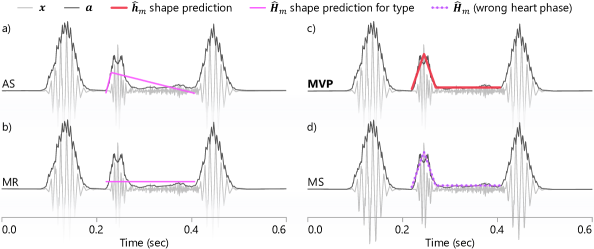
We calculate the MSE lack-of-fit for each each murmur shape function for each diagnosis to the amplitude of the inferred murmur segment , i.e., . This stage performs deductive reasoning to evaluate how well each murmur shape fits the observed instance. We note that more expressive shape functions can subsume simpler ones, i.e., , leading to hypothesis overfitting. For example, Fig. 10d shows MS overfitting for MVP; but this omits the rule that MS murmurs only occur in diastole not systole, which can distinguish between MVP and MS. Hence, we leverage the inferred heart phase to resolve hypothesis overfitting. We input and into fully-connected layers to predict the hypothesis-driven prediction . This inference only uses shape fit and heart phase information, and does not need detailed amplitude information.
4.4.7. Final combined prediction
Finally, we perform ensemble learning with fully-connected layers using both the hypothesis-driven and initial predictions to predict the final diagnosis, i.e., . This completes the model decision making process as: a) initial prediction, b) explanatory hypothesis and evaluation, c) resolved prediction and explanation.
In summary, the technical approach (Stages 1-7) follows the Peircean abduction process:
-
I.
Observe event by observing displacement to interpret its amplitude (Stage 1), perceive the murmur location (2), and infer the heart phase in which the murmur occurred (3).
-
II.
Generate plausible explanations by enumerating diagnoses, retrieving respective murmur shape functions, and initializing their corresponding shape hypotheses (4).
-
III.
Evaluate plausibility by fitting each hypothesis to the observation (5), evaluating the rules in terms of shape goodness-of-fit in conjunction with matching the murmur heart phase (6).
-
IV.
Resolve explanation with the hypothesis-fitted inference (System II thinking) and the initial inference (System I thinking) to make a final inferred diagnosis (7).
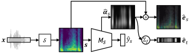
4.5. Alternative prediction model with spectrogram input and saliency map explanation
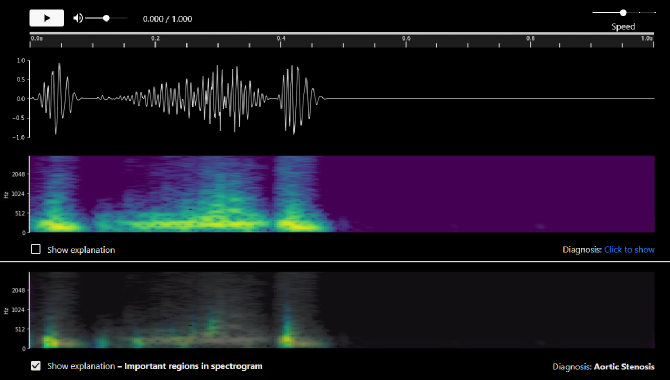
To compare our proposed method with current XAI, we implemented a spectrogram-based CNN classifier (Fig. 8). Spectrograms are popular to extract features from high-frequency time series data, and have been used to extract features from heart auscultation (Dissanayake et al., 2020; Ren et al., 2022). They show how the frequency (pitch) of the signal (y-axis) changes over time (x-axis), by indicating the magnitude of specific frequency components at each pixel. We represented each spectrogram as a 3D tensor for (frequency, time, magnitude) with raw magnitude numeric values, rather than as a colored 2D image that would be biased by the color map used. To capture the temporal motifs of frequency patterns in spectrograms, we trained a CNN to learn convolutional filters that activate if specific spatial patterns are detected. Specifically, we used the mel spectrogram , since it is more sensitive to variations in lower frequencies.
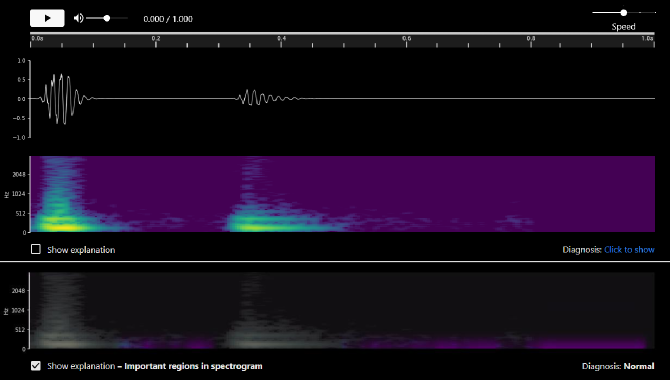
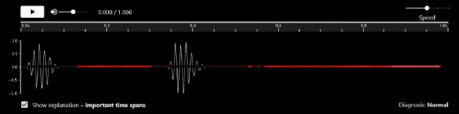
Saliency maps are popular to explain which pixels were important for image-based predictions with CNNs (Simonyan et al., 2014; Selvaraju et al., 2017; Zhou et al., 2016). For spectrograms, this indicates the frequencies at specific times that the model focused on. We implemented Grad-CAM (Selvaraju et al., 2017) to generate saliency explanation . Despite their popularity, we argue that using saliency maps neglects the interpretability needs of domain experts. Specifically, clinicians are not trained on spectrograms, thus we hypothesize that this saliency map, spectrogram-saliency, is less appropriate than the murmur-shape diagrammatic explanation. Also, similar to (Zhang and Lim, 2022), we provide simplified saliency map explanations to show importance by time, time-saliency , by aggregating all saliency across frequencies . This is simpler and does not require the user to understand spectrograms or note frequencies. These explanations were used as baseline comparisons in our qualitative user study.
Despite their use for AI heart auscultation (Dissanayake et al., 2020; Ren et al., 2022), we do not advocate explaining with saliency maps on spectrograms. Indeed, they are overly technical, non-relatable (Zhang and Lim, 2022), less interpretable, and less trustworthy (as evidenced in our user study). Instead, clinical AI explanations need to be abductive and diagrammatic to be more trustworthy.
5. Evaluations
We evaluated diagrammatization and DiagramNet in multiple stages: 1) a demonstration study showing the interpretability of abductive explanations; 2) a quantitative modeling study comparing DiagramNet against the baseline CNN models and other reasonable approaches; and 3) a qualitative user study with medical students investigating the usefulness of diagrammatic explanations compared to more common, but overly-technical saliency map explanations.
5.1. Demonstration study: predictions and explanations
5.1.1. Demonstration results
We demonstrate how diagrammatization can produce abductive (best), alternative contrastive, counterfactual, and case explanations.
-
a)
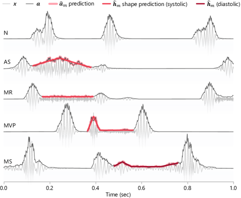
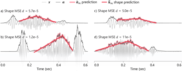
Abductive explanations. DiagramNet selects the most consistent murmur shape with its prediction, thus inferring to the best explanation. Fig. 9 shows the best explanation for each diagnosis type. Users can see the predicted murmur segment by the coverage (or absence) of the red shape, and how the shape fits the amplitude time series optimally.
-
b)
Contrastive explanations. Fig. 10 shows contrastive explanations for a case with MVP. The murmur shape for MVP and MS fit best among all diagnoses. However, note that the MS murmur shape function has a higher degree than for MVP, so it overfits to this murmur data. Furthermore, the murmur segment occurs during the systolic heart phase, not diastolic, so this cannot be an MS murmur. Thus, the diagnosis is MVP. See Appendix Table 6 for predicted shape parameters and goodness-of-fit MSE for each murmur shape.
-
c)
Counterfactual explanations. These can be derived from the contrastive explanations to show how the murmur amplitude could be slightly different to be predicted as due to another diagnosis. See Appendix Fig. 19 for examples.
-
d)
Case (example-based) explanations. We can retrieve instances that have good fits for specific murmur shapes. Fig. 11 demonstrates several cases of the crescendo-decrescendo murmurs representative of AS. These can be used to compare with the current case, to review how diverse the shapes of the same hypothesis could be.
5.1.2. Explanations interpretation
Each diagram in Figs. 9 - 11 is not in-and-of-itself an explanation or abductive reasoning, but has to be interpreted in context of knowing that the AI can do diagrammatic, abductive reasoning. A user can be told how DiagramNet performs abductive-deductive reasoning in general: I) on observing the heart sound, II) hypothesize multiple diagnoses (AS, MR, MVP, MS) and conceive corresponding murmur shapes, III) evaluate how well the shapes fit the observation, and IV) resolve the most-likely diagnosis due to its best fit (MVP for Fig. 10).
For the specific case in Fig. 10, the user can interpret as follows. 1a) Given the observed PCG, 1b) DiagramNet predicts a diagnosis MVP. 2a) The user asks for an explanation, and 2b) is presented with a murmur diagram as in Fig. 10c, which visualizes what the AI predicted as the most likely explanation, i.e., the murmur shape that best fits the murmur amplitude. 3a) The user may ask for contrastive explanations of why alternative diagnoses were not made, and 3b) be shown multiple murmur diagrams with alternative hypotheses and their poor fits (Figs. 10a, b, d). To supplement the murmur diagram explanation, the system could provide a verbal explanation with physical causes: “Mitral valve prolapse (MVP) is suspected from this phonocardiogram, because the tendon chords of the mitral valve are likely loose, causing the valve to snap open during systole (heard as a mid-systolic ”click” sound), and allowing blood regurgitation (heard as a uniform low volume, high-pitch murmur). Further examination by echocardiography is recommended to confirm diagnosis.”
Fully interpreting the abductive process requires seeing the evaluation of multiple hypotheses (Fig. 10), while each diagram in Fig. 9 only gives an abbreviated view showing the best fit. Hence, from the diagrammatic explanations, the clinician can verify that DiagramNet performed hypothesis testing of multiple diagnoses and selected the most likely diagnosis based on evidence that its corresponding murmur heart phase and shape best-fit the audio observation.
5.2. Modeling study
Since we implemented DiagramNet as an ante-hoc explainable model, imbued with hypotheses (i.e., murmur shapes for each diagnosis), we expect it to perform better than other less-knowledgeable models. Hence, we quantitatively compared the prediction performance and explanation faithfulness of DiagramNet against other models. We describe the models compared, evaluation metrics, and results.
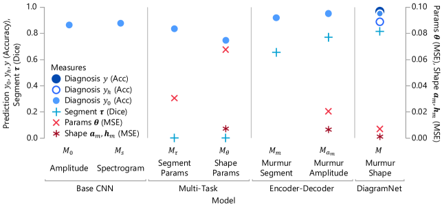
5.2.1. Comparison models
For models that are a subset of DiagramNet ( and ), this also serves as an ablation study to examine how adding new architectural features improve performance. We included alternative models that seem reasonable to predict murmur shapes, but we found them to be inadequate, and omit showing their resulting murmur shapes. Appendix, Fig. 20 shows the architectures of these models. The models evaluated are:
-
1)
, base CNN model trained on displacement and amplitude to predict diagnosis.
-
2)
, base CNN model trained on spectrogram to predict diagnosis, which is used in our user study.
-
3)
, multi-task model to predict diagnosis, and murmur segment start and end times. This is trained with supervised learning from labels and annotations. This does not consider spatial information.
-
4)
, multi-task model to predict diagnosis, and murmur shape parameters. This is trained with labels and annotations. This does not consider spatial or geometrical information.
-
5)
, encoder-decoder model to predict diagnosis, and murmur segment. Like , this identifies the murmur start and end times, but by using U-Net (Ronneberger et al., 2015) to predict pixel locations of the murmur. This models spatial information through the transpose-CNN layers, so we expect it to be more accurate than .
-
6)
, encoder-decoder model to predict diagnosis, and murmur amplitude. This explanation indicates that the model can “see” where the murmur is and attempt to reconstruct it.
-
7)
, DiagramNet with initial and final predicted diagnoses, and hypotheses explanations .
5.2.2. Evaluation metrics
We compared the models using various measures of prediction performance (accuracy, sensitivity, specificity) and explanation faithfulness (murmur overlap, murmur parameters estimation errors). These were evaluated on a dataset of 7,262 1-sec instances. For each instance, we calculated:
-
•
Prediction correctness ( better) of whether the predicted diagnosis matches the actual diagnosis, i.e., . We aggregated metrics for each diagnosis and included common metrics used in medicine.
-
Accuracy is calculated by averaging correctness over the test set.
-
Sensitivity () measures how likely the model can detect the actual disease.
-
Specificity () measures how likely the model will not cause a false alarm.
-
-
•
Murmur segment Dice coefficient ( better) measures the overlap between predicted and actual murmur segments, i.e., . For and that only predict parameters, we computed .
-
•
Murmur segment parameter MSE ( better) indicates how well the model predicted the start and end time parameters of the murmur, i.e., .
-
•
Murmur shape parameters MSE ( better) indicates how well the model predicted the murmur shape function parameters, i.e., , where and are the actual and predicted for the correct diagnosis .
-
•
Murmur shape fit MSE ( better) indicates how well the predicted murmur shape (or reconstructed murmur amplitude ) fits the ground truth murmur amplitude , i.e., or .
5.2.3. Results
Fig. 12 shows the performance of all 7 models for four evaluation metrics. See Appendix Table 7 for numeric details. For base CNN models, predicting on the spectrogram () improved performance only very slightly over predicting on amplitude (), suggesting that CNNs can already model frequency information with its convolution filters. Multi-task models (, ) sacrificed diagnosis prediction accuracy to predict segment and shape parameters, yet still had high estimation errors, and very inaccurate segment prediction. This suggests that merely treating parameters as stochastic variables to predict is less reliable than explicitly modeling spatial and geometric information. Encoder-decoder models (, ) performed better by more accurately predicting diagnoses than base CNN models, could reasonably locate segment regions, and had moderately low shape parameter and fit estimation errors. DiagramNet was the best performing with highest diagnosis prediction accuracy, and very low shape parameter and fit estimation errors. Due to training with backprop from and , even its initial diagnosis was better than that of other models, though its hypothesis-driven prediction was weaker. Interestingly, despite murmur shape prediction being less expressive than murmur amplitude prediction , since it predicts straight lines, its fit is still better (lower MSE). Hence, imbuing diagrammatic constraints in DiagramNet improved both its prediction performance and interpretability (Rudin, 2019).
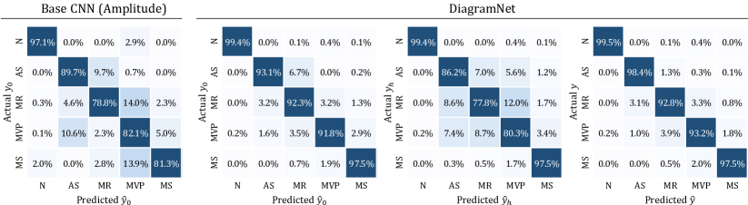
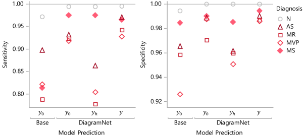
Next, we examined the diagnostic performance for each cardiac disease. Fig. 13 shows the confusion matrices for the base CNN model and the three diagnostic stages of DiagramNet. Base CNN often confuses different diseases, unlike DiagramNet. Particularly, note how it confuses between MVP and MS due to their similar murmur shapes. When predicting on the murmur shape fits , DiagramNet does confuse between systolic murmurs (AS, MR, MVP), but can accurately distinguish between MVP and MS due to considering the murmur heart phase . The combined diagnosis prediction ameliorates weaknesses in the initial and fit-based predictions to produce a very clean confusion matrix. Finally, Fig. 14 shows that DiagramNet has higher final sensitivity and specificity for all diagnoses than the base CNN.
5.3. Qualitative user study
We evaluated the usefulness of diagrammatic explanations with a qualitative user study. We recruited medical students as domain experts, due to their training on auscultation to diagnose heart murmurs. We did not conduct a summative evaluation due to limited recruitment. Our key research questions were:
-
RQ1)
How do clinicians diagnose heart disease from auscultation without AI?
-
RQ2)
How do clinicians accept AI-based diagnosis without XAI?
-
RQ3)
How do clinicians interpret AI-based diagnosis with XAI? With diagrammatic or saliency explanations?
5.3.1. Experiment conditions and apparatus
Participants used different user interfaces (UI) of our heart auscultation diagnosis software tool based on XAI condition. All UI were implemented on a black background to increase the visibility of the saliency maps. In addition to the non-explainable baseline, there were three explainable UI variants:
-
0)
Baseline to play the heart sound audibly and visually examine the phonocardiogram (PCG). After providing an initial diagnosis, the participant can click to reveal the AI’s predicted diagnosis.
-
1)
Murmur-diagram XAI that explains diagnosis prediction by overlaying a red murmur shape on the predicted murmur region (Fig. 15). This aligns with clinical training, so we expect it to be the most useful and trusted explanation type.
-
2)
Spectrogram-saliency XAI that shows the PCG and overlays a saliency map as a transparency mask on the corresponding spectrogram (Fig. 16). Despite its popularity, we expect saliency maps to be less trusted due to non-use in clinical practice, spectrograms being overly-technical, and saliency maps being potentially spurious.
-
3)
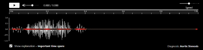
Time-saliency XAI that explains diagnosis based on time saliency (Fig. 17), which is presented in 1D along the time axis to indicate important regions. This simpler saliency map does not require users to know of spectrograms.
5.3.2. Experiment method and procedure
The study was conducted by presenting several cases to each participant, where we observed how he/she interacted with the UI, and described his/her thoughts using the think aloud protocol, and performed a structured interview. We verified that participants had decent headphones to carefully hear the heart sounds. We obtained ethics approval from our institution before commencing the study. For each participant, the procedure was:
-
1)
Introduction about the experiment objective and procedure, and give a primer on the cardiac diagnoses used in the study (N, AS, MVP, MR, or MS). We confirmed that the participant is familiar with these diagnoses.
-
2)
Consent to participate and have their voice and interactions recorded.
-
3)
Tutorial on the UI variants including how to interpret their explanations. Since spectrograms are rather technical, we took care to teach how to interpret them, check for understanding later during think aloud, and clarify as needed.
-
4)
Three UI sessions with
-
•
Condition randomly assigned to an XAI type (Murmur-diagram, Time-saliency, Spectrogram-saliency).
-
•
Up to two patient case trials, where
-
Case is randomly chosen with a specific diagnosis (N, AS, MVP, MR, or MS). As clinicians also use patient information (e.g., age, symptoms, medical history) when making diagnoses, we provide it on request.
-
i)
Initial diagnosis is elicited from the participant to learn their decision and rationale based only on the audio and PCG. Participants using Spectrogram-saliency also see the spectrogram at this stage.
-
ii)
AI diagnosis is revealed, and the participant is asked whether he/she agreed or disagreed, and why.
-
iii)
XAI explanation is revealed, showing an explanation based on Condition. The participant interprets the explanation, describes helpful and unhelpful aspects, and provides suggestions for improvement.
-
-
•
-
5)
XAI ranking where we ask the participant to judge XAI types by convincingness and explain why.
-
6)
Debrief and conclusion. We thank the participant for their time and feedback, and conclude with compensation.
5.4. User study findings
We recruited 7 medical students using snowball sampling. They were 5 females, 2 males, with ages 20-23 years old. All were in year 4 or 5 of their MBBS undergraduate degree. It was difficult to recruit more due to their busy schedules. The study took 30 minutes, and each participant was compensated with a $10 gift card.
Participants completed 40 cases collectively. We briefly describe quantitative results elicited from participant comments. They were good at diagnosing independently (32/40 = 80% correct), generally agreed with the AI (36/40 = 90% agreement) before seeing explanations (i.e., independent of XAI method). Participants trusted murmur diagram explanations more than saliency explanations (see Table 4). For simplicity, we only included cases where the AI made correct diagnoses, so participants diagnosed correctly if they agreed with the AI and wrongly if they disagreed. However, they may still not fully trust the various AI explanations as indicated in the trust results. Note that the results are only formative and not conclusive due to the small sample size and high variance. Since participants were thinking aloud and discussing with the experimenter, it was not meaningful to evaluate task times. We performed a thematic analysis on the sessions and identified several key themes with regards to XAI usage, which we discuss next.
| Murmur | Saliency | ||
| Diagram | Spectrogram | Time | |
| Total trials | 14 | 13 | 13 |
| Pre-AI correct | 8 | 11 | 12 |
| Post-AI correct | 12 | 11 | 13 |
| (ve to correct, ve to wrong) | (, ) | (, ) | (, ) |
| Post-XAI trust of AI | 12 | 5 | 8 |
5.4.1. Diagrammatic explanations were most domain-aligned, helpful and trusted.
After diagnosing multiple cases across all XAI types, all but one participant ranked Murmur-diagram XAI to be the most convincing. Commenting on an AS case, P2 mentioned that “when I see crescendo-decrescendo, I trust the AI diagnosis is correct, compared to if the [Time-saliency] interface shows straight line … I can understand this without having to think … When I see this [shape] outline given by the AI, then I realised that the [amplitude] waveform does depict crescendo-decrescendo better, but before I saw the red thing I would have looked at this and see that the volume is very level, I blocked out the fact that this is an up-slope/down-slope but I now clearly see its there.” P4 noticed the that “there is a linear murmur [between S1 and S2], which makes it pansystolic” and agreed that the explanation “aligns with my understanding”. P6 remarked how the murmur shapes “aligns to what I learnt in school”. The exception was P3, who felt that “systolic murmurs are better differentiated by the spectrograms”, and that some shape-based explanations “did not really conform to usual shapes”, referring to an MS case where he “was expecting more of a rectangular [shape]” but saw a decrescendo-uniform-crescendo shape instead.
5.4.2. Unfamiliar and unconventional explanations are less interpretable and trustworthy
Participants were unfamiliar with spectrograms initially, though many could eventually understand them. P1 “didn’t really look at the frequency much” and felt that it was unconventional for diagnosis: “it kind of is different from what we will use in real life”. P5 “personally am not used to a spectrogram… so kind of… no I don’t think it makes me trust the AI because I don’t understand it myself”. In contrast, P7 “agreed with [the XAI], lower pitch meaning that it’s the sounds of regular valve closure, and murmur is higher pitch than regular S1 and S2”. She remarked that the “underlying theory of the spectrogram explanation makes sense to me, but [I’ve] never seen or learnt the spectrogram explanation. However, quite intuitive after brief introduction.”
In contrast, participants found the simpler Time-saliency XAI intuitive. P5 noticed the salient time regions and thought “that [its decision] was fair, since the AI pays attention to the S1, S2, and the ”click”.” However, participants were not taught to diagnose with this unconventional time-saliency, and struggled to interpret it; P7 felt that “this is more confusing to me, therefore I trust the AI less … I didn’t understand what it was saying just by reading important time spans.”
5.4.3. Some benefits of rich technical XAI
Some participants wanted detailed explanations. P5 thought that “the spectrogram makes me trust the AI more [than Time-saliency]; it is really very intricate in differentiating between high or low pitch … spectrogram can be quite unconventional but it has the most answer out of all, most details out of all 3 of them, but the extra details are useful.” P4 liked the experimenter-provided “verbal explanation of spectrograms, since the more information can be obtained to increase the user’s interpretation ability… if someone can give a clearer interpretation, the frequency information will be more valuable than the time-span one.” Hence, explanations need to be relatable (Zhang and Lim, 2022).
5.4.4. Need for supplementary information
Some participants used information beyond what the model processed. P2 remarked that, with a real patient, “I would be confirming [the diagnosis] based on the position of stethoscope, anti-apex, is the apex the loudest part I’m hearing this sound. That’s the first thing, time with pulse check if really pan-systolic, [since] other murmurs can be pan-diastolic.” On examining an MS case, P3 diagnosed it as either AS or MS and wanted a differential diagnosis (with additional tests or observations) to eliminate which would be less likely.
5.4.5. Limitations and future work
We have compared diagrammatic explanation against saliency maps (Dissanayake et al., 2020; Ren et al., 2022) for a clinical use case. However, we did not conduct a controlled study to specifically evaluate various aspects of diagrammatization: abductive/non-abductive, domain-specific/domain-free, diagram/conceptual. Hence, future work could investigate these specific variables to determine which aspect is more essential for interpretable XAI. Furthermore, the weaknesses of saliency maps (Boggust et al., 2022) make them a clearly weak baseline, despite their popularity. Instead, it would be interesting to compare concept-based explanations (Kim et al., 2018; Koh et al., 2020; Zhang and Lim, 2022) (e.g., explaining ”crescendo-decrescendo murmur” for ”AS”) to diagrammatization (with murmur diagram). This would investigate the usefulness of producing a detailed diagram with domain constraints on data, rather than just providing associated terms. However, if each diagnosis is only associated with one concept, then this is merely explaining synonymously. Finally, we had evaluated with clinical experts familiar with the domain conventions of reading murmur diagrams. Yet, the diagrammatic explanations could be useful to train lay users to interpret and trust the AI. Future work can investigate this to help with the adoption of AI-based remote auscultation for patients (Lee et al., 2022).
6. Discussion
We discuss the implication, limitations, and generation of our work on diagrammatization.
6.1. Diagrammatization to support human cognition and user domain knowledge
Despite myriad XAI techniques, many have neglected the domain knowledge of users, thus leaving an interpretability gap. This goes beyond supporting human-centric XAI at the cognitive level by tailoring explanations to support specific reasoning processes (Wang et al., 2019), cognitive load limitations (Abdul et al., 2020; Lage et al., 2019), uncertainty aversion (Wang et al., 2021), preferences (Lage et al., 2018; Ross et al., 2017; Erion et al., 2021), or relatability (Zhang and Lim, 2022). This goes beyond social factors (Ehsan et al., 2021; Liao et al., 2020; Veale et al., 2018), or fitting contextual situations (Lim and Dey, 2009). Diagrammatization provides a basis to support user-centric XAI that satisfies human cognition and user domain expertise (Matsuyama et al., 2023; Lyu et al., 2023). This will allow users to interpret the AI explanations at a more useful, higher level, further fostering human-AI collaboration.
Our key proposal was for the AI explanation to be hypothesis-driven (with murmur shapes), rather than deferring to users to abductively infer their own hypotheses. While we compared segment-based () vs. shape-based () models in our modeling study (Section 5.2), we did not compare the model explanations in the user study. That would have specifically evaluated user vs. AI abduction. Instead, we focused on evaluating diagrammatic explanations against popular saliency map explanations to clearly show the latter’s poor fit. In addition to reducing the user interpretability burden for abductive reasoning, this evaluates the need to follow diagrammatic conventions of the expert domain.
We note that segmentation is a common prediction task in AI, yet some application developers may not immediately consider them explanations. However, saliency maps are a specific form of image localization (Selvaraju et al., 2017), which also includes segmentation. Thus segmentation is a valid approach for explaining image predictions (Tjoa and Guan, 2020). Our approach uses segmentation integrally for the AI prediction. A similar argument can be made for shape-fitting hypotheses being merely fitted lines. Yet, clinicians explain their diagnoses on PCGs by drawing simplified line diagrams describing murmur shapes (Judge and Mangrulkar, 2015), thus DiagramNet automates this explanatory process. Our technical approach creates an intelligent AI to apply its knowledge of known murmur shapes to real data, thus performing abduction to the best murmur shape on its own. The shape fitting is not done post-hoc after the AI has made its prediction, but rather explicitly encoded as part of its reasoning ante-hoc. Collectively, the murmur shape diagram explanations from DiagramNet mimic the clinician reasoning process to identify where the murmur is (segmentation), abductive-deductively infer the most likely murmur shape (hypothesis evaluation), and resolve the explanations to make a coherent diagnosis. Thus, with diagrammatization, the AI can autonomously generate its hypotheses and evaluate them to derive its prediction.
6.2. Modeling and evaluating domain-relevant explanations with domain experts
Developing concrete explanations for complex domains requires significant effort in formulation and evaluation. We had investigated diagrammatization for one application — heart auscultation; future work can validate it for other domains. We had conducted a small qualitative study due to challenges in recruiting domain experts. This is a perennial challenge when recruiting busy professionals with rare expertise, and will intensify as we develop more useful, domain-relevant explanations. Nevertheless, we identified strengths and some weaknesses in our approach; a larger, summative study would have limited value despite high cost. To model diagrammatic XAI, we formalized murmur shapes with amplitude, but omitted other concepts such as pitch, position, and radiation. Yet, our model performance and convincingness are already superior. Incorporating these features is left to future work for a more complete engineered solution.
6.3. Generalizing diagrammatization to other domains
Our approach for diagrammatization requires tailoring to specific applications. This helps to solve practical problems more concretely. We describe the general approach of diagrammatization to apply to other applications:
-
1)
Study the concepts and decision processes in the application domain.
-
•
Identify the system of representation, its conventions for interpretation and rules for evaluation.
-
•
Identify the structured hypotheses for abductive-deductive reasoning.
-
•
-
2)
Formalize the representation and rules mathematically, so that we can compute on them.
-
3)
Implement the formal specifications in a predictive AI model, taking note to identify specific stages.
-
4)
Evaluate with domain experts to check consistency with the user mental model of the domain problem.
Abduction is inference to the best explanation, which we have implemented as hypothesis fitting. This goes beyond curve fitting of line graphs, and can include rule fitting as with our conjunction with heart phases and in prior works (Dai et al., 2019; Ignatiev et al., 2019). Abduction can also be implemented for other domains that reason with other representations. We discuss another application to generalize diagrammatization. Consider skin cancer diagnosis using computer vision and explaining with the ABCDE criteria. Instead of merely rendering a saliency map or stating concept influences for XAI, we can draw explanatory diagrams. Asymmetry can be explained by bisecting the image and showing whether each half differs from each other more than a threshold. Border smoothness can be shown by tracing the lesion outline, calculating the curvature of the curve, and comparing against a threshold. Color can be assessed by highlighting parts of the lesion with different pigments and comparing to a threshold of contrast ratio. Diameter can be shown by drawing a bounding circle and diameter with length reading, and comparing against the 6mm threshold. Thus, the model would be more trustworthy, since it can demonstrate the same geometrical measurements as a medical expert.
6.4. Generalizing DiagramNet to other applications
The modularity of DiagramNet helps in its generality, since each module has a distinct purpose as described in Section 4.4. Steps I, III, and IV of the Peircean abduction process can be performed automatically in DiagramNet, while Step II requires hand-coding by the developer, since this requires creative abduction to conceive potential hypotheses which is an open research challenge. Although implementing diagrammatization requires substantial formulation for each application, DiagramNet is generalizable to applications that use line diagrams. This requires extracting a line representation from the input instance, formulating the a parametric function for each hypothesis, segmenting the diagram to identify the region to fit, and fitting the best hypothesis to the instance data. We discuss three examples summarized in Table 5.
| a) ECG cardiac diagnosis | b) Stock price prediction | c) Skin cancer detection | ||
|---|---|---|---|---|
| i. | Diagram |
|
![[Uncaptioned image]](/html/2302.01241/assets/x24.png)
|
![[Uncaptioned image]](/html/2302.01241/assets/x25.png)
|
| ii. | Data type | Time series (over msec) | Time series (over years) | Image |
| iii. | Base data | Electrocardiogram (ECG) | Candlestick chart | Photograph |
| iv. | Diagram line | ECG trace signal | Key prices over time | Lesion outline |
| v. | Explanation | Sawtooth wave | Descending triangle | Asymmetrical outline |
| vi. | Prediction | Atrial flutter | Breakdown imminent | Malignant tumor |
-
a)
Electrocardiograms (ECG) are another clinical diagram for cardiac diagnosis. Clinicians diagnose atrial flutter by inferring a ”sawtooth” pattern (Table 5a). Like PCG, ECG is time series with high sampling rate, but instead of extracting amplitude from the signal wave, we directly use the ECG trace signal . On segmenting the region of interest, we can model the sawtooth pattern as a piecewise linear function. Most of DiagramNet can be reused (Stages 2, 5-7 in Fig. 7) and only input (Stage 1) and hypothesis functions (Stage 5) need to be redefined.
-
b)
Candlestick charts are a time series diagram used to analyse stock price. Unlike PCG, it represents time at a lower sampling rate (e.g., days, years). Each candlestick represents low, opening, closing, and high prices for each time period. Analysts look for chart patterns like “broadening top”, “descending triangle”, and “rising wedge” to anticipate how a stock would change (Bulkowski, 2021) (Table 5b). To explain an imminent breakdown, a “descending triangle” explanation could be fit to a segment with two lines . We can estimate the bottom line with the low price 10%-tile , and hypotenuse line from the linear fit of high prices , where and are fit from data. Changes to DiagramNet are similar as with ECG , where only Stages 1 and 5 in Fig. 7 need to be changed, and hypotheses are formulated with two linear functions instead.
-
c)
Photographs of skin lesions with ABCDE annotations are an image-diagram method to diagnose skin cancer. This representation is very different from the audio time series of our work. Consider the analysis of lesion Asymmetry (Table 5c): 1) extract the lesion outline as a geometric shape via edge detection (e.g., Sobel filter), 2) reflect the outline across a bisecting axis, and 3) compute the non-overlapping area between the original and reflected outlines. The lesion is asymmetrical if is larger than a threshold (i.e., ), thus explaining the malignant prediction. Changes to DiagramNet is also modest as it already models time as a 1D image. Here, the image is a 2D tensor, the outline extraction and reflection can be implemented heuristically to extract area (Step 1 in Fig. 7). The hypothesis can be evaluated with a statistical 1-tail t-test, i.e., against null hypothesis (combined Stages 4 and 5).
Specific technical details for each application is left for future work. The aforementioned domains rely on custom diagrams for diagrammatic explanations. However, off-the-shelf visualizations may be used, subjected to inherent domain constraints. Finally, in its current implementation and from this discussion, DiagramNet can generalize to line diagrams, such as line graphs and geometric shapes. Indeed, Diagrammatization can be applied to other hypotheses that can be defined with functions. Future work is needed to investigate its general applicability and performance.
6.5. Comparing diagrammatization to visualization
While diagrams can refer to drawings or visualizations, we define diagrammatization as comprising three aspects: i) Peircean abduction, ii) Domain conventions, and iii) Peircean diagrams. Each aspect has specific benefits for XAI technical development and user experience. First, with diagrammatization, the AI performs Peircean abductive reasoning to generate and evaluate specific hypotheses. This improves user trust, since the AI’s reasoning is human-like. This improves user experience by reducing the burden on users to have to do their own abduction and deduction. Current use of visualizations in XAI are typically of convenient or basic charts and heatmaps that do not exploit domain hypotheses, thus requiring users to perform additional reasoning. There are also modeling benefits. Used in our ante-hoc approach, the hypotheses regularize and constrain the AI prediction, thus the AI’s reasoning and explanation would be less spurious than current XAI (Zhang et al., 2022), and its prediction performance improved. Post-hoc visualization explanations do not change the original AI prediction, and hence do not improve the AI performance.
Second, diagrammatic explanations should be constrained by diagram conventions in the target domain. Thus, domain experts would be familiar with them and can interpret them efficiently and effectively. Current XAI visualizations typically use off-the-shelf charts and heatmaps that, while simple to read, are not necessarily relevant to domain experts who have been trained to use specific or sophisticated diagrams with implicit ontologies, conventions, and rules. In our case, despite murmur shapes taking the rudimentary form of line charts, this work is the first to explain with shape-based murmur diagrams that are clinically-relevant, since XAI developers overrely on traditional charts and heatmaps that are more suited for data scientists. With diagrammatization, we encourage XAI developers to consider how domain experts explain with their own conventions to develop more sophisticated, domain-relevant visualizations.
Third, we follow the definition of diagrams by Pierce and other philosophers (Peirce and Eisele, 1976; Hoffmann, 2010) to encompass graphical (visualization), symbolic (math, equations), sentential (verbalization) representations (see Fig. 3). In this work, we have examined diagrammatization with the visualization of murmur diagrams. Although we have not studied how to generate symbolic or text-based ”diagrams”, the framing of diagrammatization can support this future research.
6.6. Comparing diagrammatization to rationalization
We have shown that diagrammatic explanations are useful, but other forms are also useful. We discuss this with a compelling verbal explanation. In heart auscultation, a clinician may explain that a patient has aortic stenosis (AS) because “the aortic valve leaflets are abnormally stiff due to calcification, causing the valve to have difficulty opening and closing, producing a crescendo-decrescendo murmur sound”. This verbal explanation is comprehensive, and actually consists of multiple representation types. We discuss how each representation compares with diagrammatization.
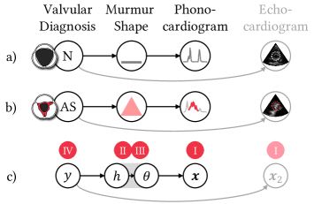
-
1)
The verbal explanation is a rationalization (Ehsan et al., 2018) which makes assumptions beyond the direct evidence (PCG) of the observation, since the clinician did not directly observe the calcification of the aortic valve; that would require an echocardiogram to confirm, which is a different causal pathway than what is available from the first line auscultation (see Fig. 18). Besides, automatic rationalization may be spurious or irrelevant since it depends on unbounded text.
-
2)
It only explains at the low-level from the physical concepts to murmur shape description; there remains a gap from the shape description to the audio observation. DiagramNet overlays its explanation (the murmur shape) on the audio representation (PCG) to explicitly show its hypothesis in context of the observation.
-
3)
It is a concept-based explanation that requires the knowledge of valves, their properties and location, and the causal pathway from calcification to stiffness to valve opening/closing to murmur shape. This requires modeling knowledge bases and causal networks, which is very costly to construct, and beyond the scope of our work.
Since we focused on developing XAI for clinicians who already know how to extrapolate from disease to murmur shape, we omitted providing the low-level, concept-based, rationalization explanation in this work. Nevertheless, a more useful deployed XAI system should combine diagrams and conceptual rationalization to explain deeply.
6.7. Comparing diagrammatization to Bayesian generative modeling
The causal pathway described in Fig. 18c illustrates that diagnostic inference can be represented as a Markov chain for Bayesian generative modeling. The causal sequence is somewhat reversed from Peircean abduction that we used in diagrammatization, illustrating the backward reasoning process of abduction, though deduction from Steps II-III is in forward direction. The variables of diagnosis , murmur shape hypotheses , murmur shape parameters , and observation can be described as a joint probability . Inferring the diagnosis would then involve computing the posterior distribution . Similarly, the best murmur shape hypothesis can also be inferred by computing the posterior . However, this is different from our approach of abductive inference. DiagramNet has a higher inductive bias than the Bayesian model, since it imposes geometric constraints on the murmur shapes by specifying linear piecewise functions. It also does not need to learn how to predict the shape parameters at training time, but can estimate them using test-time optimization. This simplifies its training and enables it to be trained on less data and be more accurate.
6.8. Diagrammatization for confirmatory analysis
Diagrammatization uses abductive-deductive reasoning to generate specific hypotheses and test them. It requires hypotheses to be mathematically formulated with defined goodness-of-fit evaluation metrics. Diagrammatization is unsuitable for 1) exploratory analysis without hypotheses, such as when data scientists debug models by looking for spurious effects rather than explicitly hypothesizing bugs. Open-ended representations like feature attribution or saliency map would be more suitable here. It is also unsuitable for 2) unbounded representations like natural language explanations that acquire open-ended text from people without expectations on a finite set of explanations, so the number of hypotheses may also be unbounded. However, categorizing the text responses into a discrete taxonomy would simplify identifying key hypotheses for abductive reasoning, and this could then be suitable for diagrammatization.
7. Conclusion
We presented diagrammatization as a general representation paradigm for XAI to support diagrammatic reasoning with i) Peircean abduction, ii) domain conventions, and iii) Peircean diagrams to narrow the interpretability gap. We developed DiagramNet, a modular explainable deep neural network with multiple stages aligned with the 4-step Peircean abduction process, and trained it to predict cardiac disease from heart sounds and generate murmur diagram explanations. Our demonstrations showed that it can provide support diverse abductive, contrastive, counterfactual, and case (example) explanations. Our modeling evaluations found that DiagramNet not only had more faithful explanations but also better prediction performance than several baseline models. Our qualitative user study found that clinicians prefer diagram-based explanations than saliency map explanations on spectrograms, since these are aligned with their medical training and consider explicit medical notions that they were familiar with. This work gives insights into diagram-based, abductive explainable AI, and contributes a new basis towards user-centered XAI.
References
- (1)
- Abdul et al. (2018) Ashraf Abdul, Jo Vermeulen, Danding Wang, Brian Y Lim, and Mohan Kankanhalli. 2018. Trends and trajectories for explainable, accountable and intelligible systems: An hci research agenda. In Proceedings of the 2018 CHI conference on human factors in computing systems. 1–18.
- Abdul et al. (2020) Ashraf Abdul, Christian von der Weth, Mohan Kankanhalli, and Brian Y Lim. 2020. COGAM: measuring and moderating cognitive load in machine learning model explanations. In Proceedings of the 2020 CHI Conference on Human Factors in Computing Systems. 1–14.
- Abujabal et al. (2017) Abdalghani Abujabal, Rishiraj Saha Roy, Mohamed Yahya, and Gerhard Weikum. 2017. Quint: Interpretable question answering over knowledge bases. In Proceedings of the 2017 Conference on Empirical Methods in Natural Language Processing: System Demonstrations. 61–66.
- Adadi and Berrada (2018) Amina Adadi and Mohammed Berrada. 2018. Peeking inside the black-box: a survey on explainable artificial intelligence (XAI). IEEE access 6 (2018), 52138–52160.
- Ahn and Lin (2019) Yongsu Ahn and Yu-Ru Lin. 2019. Fairsight: Visual analytics for fairness in decision making. IEEE transactions on visualization and computer graphics 26, 1 (2019), 1086–1095.
- Alam et al. (2010) Uazman Alam, Omar Asghar, Sohail Q Khan, Sajad Hayat, and Rayaz A Malik. 2010. Cardiac auscultation: an essential clinical skill in decline. British Journal of Cardiology 17, 1 (2010), 8.
- Arrieta et al. (2020) Alejandro Barredo Arrieta, Natalia Díaz-Rodríguez, Javier Del Ser, Adrien Bennetot, Siham Tabik, Alberto Barbado, Salvador García, Sergio Gil-López, Daniel Molina, Richard Benjamins, et al. 2020. Explainable Artificial Intelligence (XAI): Concepts, taxonomies, opportunities and challenges toward responsible AI. Information Fusion 58 (2020), 82–115.
- Bach et al. (2015) Sebastian Bach, Alexander Binder, Grégoire Montavon, Frederick Klauschen, Klaus-Robert Müller, and Wojciech Samek. 2015. On pixel-wise explanations for non-linear classifier decisions by layer-wise relevance propagation. PloS one 10, 7 (2015), e0130140.
- Bau et al. (2017) David Bau, Bolei Zhou, Aditya Khosla, Aude Oliva, and Antonio Torralba. 2017. Network dissection: Quantifying interpretability of deep visual representations. In Proceedings of the IEEE conference on computer vision and pattern recognition. 6541–6549.
- Boggust et al. (2022) Angie Boggust, Benjamin Hoover, Arvind Satyanarayan, and Hendrik Strobelt. 2022. Shared interest: Measuring human-ai alignment to identify recurring patterns in model behavior. In Proceedings of the 2022 CHI Conference on Human Factors in Computing Systems. 1–17.
- Bulkowski (2021) Thomas N Bulkowski. 2021. Encyclopedia of chart patterns. John Wiley & Sons.
- Cai et al. (2019a) Carrie J Cai, Jonas Jongejan, and Jess Holbrook. 2019a. The effects of example-based explanations in a machine learning interface. In Proceedings of the 24th international conference on intelligent user interfaces. 258–262.
- Cai et al. (2019b) Carrie J Cai, Emily Reif, Narayan Hegde, Jason Hipp, Been Kim, Daniel Smilkov, Martin Wattenberg, Fernanda Viegas, Greg S Corrado, Martin C Stumpe, et al. 2019b. Human-centered tools for coping with imperfect algorithms during medical decision-making. In Proceedings of the 2019 chi conference on human factors in computing systems. 1–14.
- Cai et al. (2019c) Carrie J Cai, Samantha Winter, David Steiner, Lauren Wilcox, and Michael Terry. 2019c. ” Hello AI”: uncovering the onboarding needs of medical practitioners for human-AI collaborative decision-making. Proceedings of the ACM on Human-computer Interaction 3, CSCW (2019), 1–24.
- Caruana et al. (2015) Rich Caruana, Yin Lou, Johannes Gehrke, Paul Koch, Marc Sturm, and Noemie Elhadad. 2015. Intelligible models for healthcare: Predicting pneumonia risk and hospital 30-day readmission. In Proceedings of the 21th ACM SIGKDD international conference on knowledge discovery and data mining. 1721–1730.
- Cavallo and Demiralp (2018) Marco Cavallo and Çağatay Demiralp. 2018. A visual interaction framework for dimensionality reduction based data exploration. In Proceedings of the 2018 CHI Conference on Human Factors in Computing Systems. 1–13.
- Chandrasekaran (2005) B Chandrasekaran. 2005. What makes a bunch of marks a diagrammatic representation, and another bunch a sentential representation?. In AAAI Spring Symposium: Reasoning with Mental and External Diagrams: Computational Modeling and Spatial Assistance. 83–89.
- Dai et al. (2019) Wang-Zhou Dai, Qiuling Xu, Yang Yu, and Zhi-Hua Zhou. 2019. Bridging machine learning and logical reasoning by abductive learning. Advances in Neural Information Processing Systems 32 (2019).
- Dhanorkar et al. (2021) Shipi Dhanorkar, Christine T Wolf, Kun Qian, Anbang Xu, Lucian Popa, and Yunyao Li. 2021. Who needs to know what, when?: Broadening the Explainable AI (XAI) Design Space by Looking at Explanations Across the AI Lifecycle. In Designing Interactive Systems Conference 2021. 1591–1602.
- Dissanayake et al. (2020) Theekshana Dissanayake, Tharindu Fernando, Simon Denman, Sridha Sridharan, Houman Ghaemmaghami, and Clinton Fookes. 2020. A robust interpretable deep learning classifier for heart anomaly detection without segmentation. IEEE Journal of Biomedical and Health Informatics 25, 6 (2020), 2162–2171.
- Dwivedi et al. (2018) Amit Krishna Dwivedi, Syed Anas Imtiaz, and Esther Rodriguez-Villegas. 2018. Algorithms for automatic analysis and classification of heart sounds–a systematic review. IEEE Access 7 (2018), 8316–8345.
- Ehsan et al. (2018) Upol Ehsan, Brent Harrison, Larry Chan, and Mark O Riedl. 2018. Rationalization: A neural machine translation approach to generating natural language explanations. In Proceedings of the 2018 AAAI/ACM Conference on AI, Ethics, and Society. 81–87.
- Ehsan et al. (2021) Upol Ehsan, Q Vera Liao, Michael Muller, Mark O Riedl, and Justin D Weisz. 2021. Expanding explainability: Towards social transparency in ai systems. In Proceedings of the 2021 CHI Conference on Human Factors in Computing Systems. 1–19.
- Ehsan et al. (2019) Upol Ehsan, Pradyumna Tambwekar, Larry Chan, Brent Harrison, and Mark O Riedl. 2019. Automated rationale generation: a technique for explainable AI and its effects on human perceptions. In Proceedings of the 24th International Conference on Intelligent User Interfaces. 263–274.
- Erion et al. (2021) Gabriel Erion, Joseph D Janizek, Pascal Sturmfels, Scott M Lundberg, and Su-In Lee. 2021. Improving performance of deep learning models with axiomatic attribution priors and expected gradients. Nature machine intelligence 3, 7 (2021), 620–631.
- Farha and Gall (2019) Yazan Abu Farha and Jurgen Gall. 2019. Ms-tcn: Multi-stage temporal convolutional network for action segmentation. In Proceedings of the IEEE/CVF Conference on Computer Vision and Pattern Recognition. 3575–3584.
- Fraser et al. (1989) Jane M Fraser, Patricia Strohm, Jack W Smith, John R Svirbely, Sally Rudmann, TE Miller, Janice Blazina, Melanie Kennedy, and Philip J Smith. 1989. Errors in abductive reasoning. In Conference Proceedings., IEEE International Conference on Systems, Man and Cybernetics. IEEE, 1136–1141.
- Guidotti et al. (2018) Riccardo Guidotti, Anna Monreale, Salvatore Ruggieri, Franco Turini, Fosca Giannotti, and Dino Pedreschi. 2018. A survey of methods for explaining black box models. ACM computing surveys (CSUR) 51, 5 (2018), 1–42.
- Harman (1965) Gilbert H Harman. 1965. The inference to the best explanation. The philosophical review 74, 1 (1965), 88–95.
- Hershey et al. (2017) Shawn Hershey, Sourish Chaudhuri, Daniel PW Ellis, Jort F Gemmeke, Aren Jansen, R Channing Moore, Manoj Plakal, Devin Platt, Rif A Saurous, Bryan Seybold, et al. 2017. CNN architectures for large-scale audio classification. In 2017 ieee international conference on acoustics, speech and signal processing (icassp). IEEE, 131–135.
- Hoffman et al. (2020) Robert R Hoffman, William J Clancey, and Shane T Mueller. 2020. Explaining AI as an exploratory process: The peircean abduction model. arXiv preprint arXiv:2009.14795 (2020).
- Hoffman and Klein (2017) Robert R Hoffman and Gary Klein. 2017. Explaining explanation, part 1: theoretical foundations. IEEE Intelligent Systems 32, 3 (2017), 68–73.
- Hoffman et al. (2022) Robert R Hoffman, Timothy Miller, and William J Clancey. 2022. Psychology and AI at a Crossroads: How Might Complex Systems Explain Themselves? The American journal of psychology 135, 4 (2022), 365–378.
- Hoffmann (2010) Michael Hans Georg Hoffmann. 2010. Diagrams as scaffolds for abductive insights. In Workshops at the Twenty-Fourth AAAI Conference on Artificial Intelligence.
- Hohman et al. (2018) Fred Hohman, Minsuk Kahng, Robert Pienta, and Duen Horng Chau. 2018. Visual analytics in deep learning: An interrogative survey for the next frontiers. IEEE transactions on visualization and computer graphics 25, 8 (2018), 2674–2693.
- Hohman et al. (2019) Fred Hohman, Haekyu Park, Caleb Robinson, and Duen Horng Polo Chau. 2019. S ummit: Scaling deep learning interpretability by visualizing activation and attribution summarizations. IEEE transactions on visualization and computer graphics 26, 1 (2019), 1096–1106.
- Huang et al. (2021) Zhe Huang, Gary Long, Benjamin Wessler, and Michael C Hughes. 2021. A new semi-supervised learning benchmark for classifying view and diagnosing aortic stenosis from echocardiograms. In Machine Learning for Healthcare Conference. PMLR, 614–647.
- Ignatiev et al. (2019) Alexey Ignatiev, Nina Narodytska, and Joao Marques-Silva. 2019. Abduction-based explanations for machine learning models. In Proceedings of the AAAI Conference on Artificial Intelligence, Vol. 33. 1511–1519.
- Izza et al. (2023) Yacine Izza, Xuanxiang Huang, Alexey Ignatiev, Nina Narodytska, Martin Cooper, and Joao Marques-Silva. 2023. On computing probabilistic abductive explanations. International Journal of Approximate Reasoning 159 (2023), 108939.
- Josephson and Josephson (1996) John R Josephson and Susan G Josephson. 1996. Abductive inference: Computation, philosophy, technology. Cambridge University Press.
- Judge and Mangrulkar (2015) Richard Judge and Rajesh Mangrulkar. 2015. Heart Sound and Murmur Library. https://www.med.umich.edu/lrc/psb_open/html/repo/primer_heartsound/primer_heartsound.html. [Online; accessed 14-Sep-2022].
- Kahneman (2011) Daniel Kahneman. 2011. Thinking, fast and slow. Macmillan.
- Kahng et al. (2017) Minsuk Kahng, Pierre Y Andrews, Aditya Kalro, and Duen Horng Chau. 2017. A cti v is: Visual exploration of industry-scale deep neural network models. IEEE transactions on visualization and computer graphics 24, 1 (2017), 88–97.
- Kahng et al. (2018) Minsuk Kahng, Nikhil Thorat, Duen Horng Chau, Fernanda B Viégas, and Martin Wattenberg. 2018. Gan lab: Understanding complex deep generative models using interactive visual experimentation. IEEE transactions on visualization and computer graphics 25, 1 (2018), 310–320.
- Karniadakis et al. (2021) George Em Karniadakis, Ioannis G Kevrekidis, Lu Lu, Paris Perdikaris, Sifan Wang, and Liu Yang. 2021. Physics-informed machine learning. Nature Reviews Physics 3, 6 (2021), 422–440.
- Kaur et al. (2022) Harmanpreet Kaur, Eytan Adar, Eric Gilbert, and Cliff Lampe. 2022. Sensible AI: Re-imagining Interpretability and Explainability using Sensemaking Theory. In 2022 ACM Conference on Fairness, Accountability, and Transparency.
- Kim et al. (2016) Been Kim, Rajiv Khanna, and Oluwasanmi O Koyejo. 2016. Examples are not enough, learn to criticize! criticism for interpretability. Advances in neural information processing systems 29 (2016).
- Kim et al. (2018) Been Kim, Martin Wattenberg, Justin Gilmer, Carrie Cai, James Wexler, Fernanda Viegas, et al. 2018. Interpretability beyond feature attribution: Quantitative testing with concept activation vectors (TCAV). In International conference on machine learning. PMLR, 2668–2677.
- Koh and Liang (2017) Pang Wei Koh and Percy Liang. 2017. Understanding black-box predictions via influence functions. In International Conference on Machine Learning. PMLR, 1885–1894.
- Koh et al. (2020) Pang Wei Koh, Thao Nguyen, Yew Siang Tang, Stephen Mussmann, Emma Pierson, Been Kim, and Percy Liang. 2020. Concept bottleneck models. In International Conference on Machine Learning. PMLR, 5338–5348.
- Kohl et al. (2018) Simon Kohl, Bernardino Romera-Paredes, Clemens Meyer, Jeffrey De Fauw, Joseph R Ledsam, Klaus Maier-Hein, SM Eslami, Danilo Jimenez Rezende, and Olaf Ronneberger. 2018. A probabilistic u-net for segmentation of ambiguous images. Advances in neural information processing systems 31 (2018).
- Krause et al. (2016) Josua Krause, Adam Perer, and Kenney Ng. 2016. Interacting with predictions: Visual inspection of black-box machine learning models. In Proceedings of the 2016 CHI conference on human factors in computing systems. 5686–5697.
- Kulesza et al. (2009) Todd Kulesza, Weng-Keen Wong, Simone Stumpf, Stephen Perona, Rachel White, Margaret M Burnett, Ian Oberst, and Amy J Ko. 2009. Fixing the program my computer learned: Barriers for end users, challenges for the machine. In Proceedings of the 14th international conference on Intelligent user interfaces. 187–196.
- Lage et al. (2019) Isaac Lage, Emily Chen, Jeffrey He, Menaka Narayanan, Been Kim, Sam Gershman, and Finale Doshi-Velez. 2019. An evaluation of the human-interpretability of explanation. arXiv preprint arXiv:1902.00006 (2019).
- Lage et al. (2018) Isaac Lage, Andrew Ross, Samuel J Gershman, Been Kim, and Finale Doshi-Velez. 2018. Human-in-the-loop interpretability prior. Advances in neural information processing systems 31 (2018).
- Lakkaraju et al. (2016) Himabindu Lakkaraju, Stephen H Bach, and Jure Leskovec. 2016. Interpretable decision sets: A joint framework for description and prediction. In Proceedings of the 22nd ACM SIGKDD international conference on knowledge discovery and data mining. 1675–1684.
- Lee et al. (2022) Sung Hoon Lee, Yun-Soung Kim, Min-Kyung Yeo, Musa Mahmood, Nathan Zavanelli, Chaeuk Chung, Jun Young Heo, Yoonjoo Kim, Sung-Soo Jung, and Woon-Hong Yeo. 2022. Fully portable continuous real-time auscultation with a soft wearable stethoscope designed for automated disease diagnosis. Science Advances 8, 21 (2022), eabo5867.
- Letham et al. (2015) Benjamin Letham, Cynthia Rudin, Tyler H McCormick, and David Madigan. 2015. Interpretable classifiers using rules and bayesian analysis: Building a better stroke prediction model. The Annals of Applied Statistics 9, 3 (2015), 1350–1371.
- Liang et al. (2022) Chen Liang, Wenguan Wang, Tianfei Zhou, and Yi Yang. 2022. Visual abductive reasoning. In Proceedings of the IEEE/CVF Conference on Computer Vision and Pattern Recognition. 15565–15575.
- Liao et al. (2020) Q Vera Liao, Daniel Gruen, and Sarah Miller. 2020. Questioning the AI: informing design practices for explainable AI user experiences. In Proceedings of the 2020 CHI Conference on Human Factors in Computing Systems. 1–15.
- Lilly (2012) Leonard S Lilly. 2012. Pathophysiology of heart disease: a collaborative project of medical students and faculty. Lippincott Williams & Wilkins.
- Lim and Dey (2009) Brian Y Lim and Anind K Dey. 2009. Assessing demand for intelligibility in context-aware applications. In Proceedings of the 11th international conference on Ubiquitous computing. 195–204.
- Lim and Dey (2011) Brian Y Lim and Anind K Dey. 2011. Design of an intelligible mobile context-aware application. In Proceedings of the 13th international conference on human computer interaction with mobile devices and services. 157–166.
- Lim et al. (2009) Brian Y Lim, Anind K Dey, and Daniel Avrahami. 2009. Why and why not explanations improve the intelligibility of context-aware intelligent systems. In Proceedings of the SIGCHI conference on human factors in computing systems. 2119–2128.
- Lim et al. (2019) Brian Y Lim, Judy Kay, and Weilong Liu. 2019. How Does a Nation Walk? Interpreting Large-Scale Step Count Activity with Weekly Streak Patterns. Proceedings of the ACM on Interactive, Mobile, Wearable and Ubiquitous Technologies 3, 2 (2019), 1–46.
- Lundberg et al. (2020) Scott M Lundberg, Gabriel Erion, Hugh Chen, Alex DeGrave, Jordan M Prutkin, Bala Nair, Ronit Katz, Jonathan Himmelfarb, Nisha Bansal, and Su-In Lee. 2020. From local explanations to global understanding with explainable AI for trees. Nature machine intelligence 2, 1 (2020), 56–67.
- Lundberg and Lee (2017) Scott M Lundberg and Su-In Lee. 2017. A unified approach to interpreting model predictions. Advances in neural information processing systems 30 (2017).
- Lyu et al. (2023) Yan Lyu, Hangxin Lu, Min Kyung Lee, Gerhard Schmitt, and Brian Y Lim. 2023. IF-City: Intelligible Fair City Planning to Measure, Explain and Mitigate Inequality. IEEE Transactions on Visualization and Computer Graphics (2023).
- Magnani (2009) Lorenzo Magnani. 2009. Abductive cognition: The epistemological and eco-cognitive dimensions of hypothetical reasoning. Vol. 3. Springer.
- Makatchev et al. (2004b) Maxim Makatchev, Pamela W Jordan, Umarani Pappuswamy, and Kurt VanLehn. 2004b. Abductive Proofs as Models of Students’ Reasoning about Qualitative Physics.. In ICCM. 166–171.
- Makatchev et al. (2004a) Maxim Makatchev, Pamela W Jordan, and Kurt VanLehn. 2004a. Abductive theorem proving for analyzing student explanations to guide feedback in intelligent tutoring systems. Journal of Automated Reasoning 32 (2004), 187–226.
- Matsuyama et al. (2023) Hitoshi Matsuyama, Nobuo Kawaguchi, and Brian Y Lim. 2023. IRIS: Interpretable Rubric-Informed Segmentation for Action Quality Assessment. In Proceedings of the 28th International Conference on Intelligent User Interfaces. 368–378.
- Miller (2019) Tim Miller. 2019. Explanation in artificial intelligence: Insights from the social sciences. Artificial intelligence 267 (2019), 1–38.
- Miller (2023) Tim Miller. 2023. Explainable AI is Dead, Long Live Explainable AI! Hypothesis-Driven Decision Support Using Evaluative AI. In Proceedings of the 2023 ACM Conference on Fairness, Accountability, and Transparency (Chicago, IL, USA) (FAccT ’23). Association for Computing Machinery, New York, NY, USA, 333–342. https://doi.org/10.1145/3593013.3594001
- Mooney (2000) Raymond J Mooney. 2000. Integrating abduction and induction in machine learning. Abduction and Induction: essays on their relation and integration (2000), 181–191.
- Nguyen et al. (2016) Anh Nguyen, Alexey Dosovitskiy, Jason Yosinski, Thomas Brox, and Jeff Clune. 2016. Synthesizing the preferred inputs for neurons in neural networks via deep generator networks. Advances in neural information processing systems 29 (2016).
- Nocedal and Wright (2006) Jorge Nocedal and Stephen J Wright. 2006. Numerical optimization. Springer.
- Olah et al. (2017) Chris Olah, Alexander Mordvintsev, and Ludwig Schubert. 2017. Feature visualization. Distill 2, 11 (2017), e7.
- Peirce (1903) Charles S Peirce. 1903. Harvard lectures on pragmatism. Collected Papers 5 (1903), 188–189.
- Peirce and Eisele (1976) Charles Sanders Peirce and Carolyn Eisele. 1976. The new elements of mathematics. Vol. 4. Mouton The Hague.
- Pople (1973) Harry E Pople. 1973. On the mechanization of abductive logic.. In IJCAI, Vol. 73. Citeseer, 147–152.
- Popper (2014) Karl Popper. 2014. Conjectures and refutations: The growth of scientific knowledge. routledge.
- Poursabzi-Sangdeh et al. (2021) Forough Poursabzi-Sangdeh, Daniel G Goldstein, Jake M Hofman, Jennifer Wortman Wortman Vaughan, and Hanna Wallach. 2021. Manipulating and measuring model interpretability. In Proceedings of the 2021 CHI conference on human factors in computing systems. 1–52.
- Radford et al. (2021) Alec Radford, Jong Wook Kim, Chris Hallacy, Aditya Ramesh, Gabriel Goh, Sandhini Agarwal, Girish Sastry, Amanda Askell, Pamela Mishkin, Jack Clark, et al. 2021. Learning transferable visual models from natural language supervision. In International Conference on Machine Learning. PMLR, 8748–8763.
- Raissi et al. (2019) Maziar Raissi, Paris Perdikaris, and George E Karniadakis. 2019. Physics-informed neural networks: A deep learning framework for solving forward and inverse problems involving nonlinear partial differential equations. Journal of Computational physics 378 (2019), 686–707.
- Rajani et al. (2019) Nazneen Fatema Rajani, Bryan McCann, Caiming Xiong, and Richard Socher. 2019. Explain yourself! leveraging language models for commonsense reasoning. arXiv preprint arXiv:1906.02361 (2019).
- Raza et al. (2022) Ali Raza, Kim Phuc Tran, Ludovic Koehl, and Shujun Li. 2022. Designing ecg monitoring healthcare system with federated transfer learning and explainable ai. Knowledge-Based Systems 236 (2022), 107763.
- Ren et al. (2022) Zhao Ren, Kun Qian, Fengquan Dong, Zhenyu Dai, Wolfgang Nejdl, Yoshiharu Yamamoto, and Björn W Schuller. 2022. Deep attention-based neural networks for explainable heart sound classification. Machine Learning with Applications (2022), 100322.
- Ribeiro et al. (2016) Marco Tulio Ribeiro, Sameer Singh, and Carlos Guestrin. 2016. ” Why should i trust you?” Explaining the predictions of any classifier. In Proceedings of the 22nd ACM SIGKDD international conference on knowledge discovery and data mining. 1135–1144.
- Ribeiro et al. (2018) Marco Tulio Ribeiro, Sameer Singh, and Carlos Guestrin. 2018. Anchors: High-precision model-agnostic explanations. In Proceedings of the AAAI conference on artificial intelligence, Vol. 32.
- Ronneberger et al. (2015) Olaf Ronneberger, Philipp Fischer, and Thomas Brox. 2015. U-Net: Convolutional networks for biomedical image segmentation. In International Conference on Medical image computing and computer-assisted intervention. Springer, 234–241.
- Rosenthal et al. (2016) Stephanie Rosenthal, Sai P Selvaraj, and Manuela M Veloso. 2016. Verbalization: Narration of Autonomous Robot Experience.. In IJCAI, Vol. 16. 862–868.
- Ross et al. (2017) Andrew Slavin Ross, Michael C Hughes, and Finale Doshi-Velez. 2017. Right for the right reasons: training differentiable models by constraining their explanations. In Proceedings of the 26th International Joint Conference on Artificial Intelligence. 2662–2670.
- Rubin et al. (2017) Jonathan Rubin, Rui Abreu, Anurag Ganguli, Saigopal Nelaturi, Ion Matei, and Kumar Sricharan. 2017. Recognizing abnormal heart sounds using deep learning. arXiv preprint arXiv:1707.04642 (2017).
- Rudin (2019) Cynthia Rudin. 2019. Stop explaining black box machine learning models for high stakes decisions and use interpretable models instead. Nature Machine Intelligence 1, 5 (2019), 206–215.
- Selvaraju et al. (2017) Ramprasaath R Selvaraju, Michael Cogswell, Abhishek Das, Ramakrishna Vedantam, Devi Parikh, and Dhruv Batra. 2017. Grad-cam: Visual explanations from deep networks via gradient-based localization. In Proceedings of the IEEE international conference on computer vision. 618–626.
- Shimojima (1999) Atsushi Shimojima. 1999. The graphic-linguistic distinction exploring alternatives. Artificial Intelligence Review 13, 4 (1999), 313–335.
- Simonyan et al. (2014) Karen Simonyan, Andrea Vedaldi, and Andrew Zisserman. 2014. Deep inside convolutional networks: Visualising image classification models and saliency maps. (2014).
- Siontis et al. (2021) Konstantinos C Siontis, Peter A Noseworthy, Zachi I Attia, and Paul A Friedman. 2021. Artificial intelligence-enhanced electrocardiography in cardiovascular disease management. Nature Reviews Cardiology 18, 7 (2021), 465–478.
- Teijeiro et al. (2016) Tomás Teijeiro, Paulo Félix, Jesús Presedo, and Daniel Castro. 2016. Heartbeat classification using abstract features from the abductive interpretation of the ECG. IEEE journal of biomedical and health informatics 22, 2 (2016), 409–420.
- Teijeiro et al. (2018) Tomás Teijeiro, Constantino A García, Daniel Castro, and Paulo Félix. 2018. Abductive reasoning as a basis to reproduce expert criteria in ECG atrial fibrillation identification. Physiological measurement 39, 8 (2018), 084006.
- Tjoa and Guan (2020) Erico Tjoa and Cuntai Guan. 2020. A survey on explainable artificial intelligence (xai): Toward medical xai. IEEE transactions on neural networks and learning systems 32, 11 (2020), 4793–4813.
- Veale et al. (2018) Michael Veale, Max Van Kleek, and Reuben Binns. 2018. Fairness and accountability design needs for algorithmic support in high-stakes public sector decision-making. In Proceedings of the 2018 chi conference on human factors in computing systems. 1–14.
- Vellido (2020) Alfredo Vellido. 2020. The importance of interpretability and visualization in machine learning for applications in medicine and health care. Neural computing and applications 32, 24 (2020), 18069–18083.
- Wachter et al. (2017) Sandra Wachter, Brent Mittelstadt, and Chris Russell. 2017. Counterfactual explanations without opening the black box: Automated decisions and the GDPR. Harv. JL & Tech. 31 (2017), 841.
- Wang et al. (2019) Danding Wang, Qian Yang, Ashraf Abdul, and Brian Y Lim. 2019. Designing theory-driven user-centric explainable AI. In Proceedings of the 2019 CHI conference on human factors in computing systems. 1–15.
- Wang et al. (2021) Danding Wang, Wencan Zhang, and Brian Y Lim. 2021. Show or suppress? Managing input uncertainty in machine learning model explanations. Artificial Intelligence 294 (2021), 103456.
- Wang et al. (2022) Yunlong Wang, Priyadarshini Venkatesh, and Brian Y Lim. 2022. Interpretable Directed Diversity: Leveraging Model Explanations for Iterative Crowd Ideation. In CHI Conference on Human Factors in Computing Systems. 1–28.
- Williamson (2016) Timothy Williamson. 2016. Abductive philosophy. In The Philosophical Forum, Vol. 47. Wiley Online Library, 263–280.
- Woods et al. (2019) Walt Woods, Jack Chen, and Christof Teuscher. 2019. Adversarial explanations for understanding image classification decisions and improved neural network robustness. Nature Machine Intelligence 1, 11 (2019), 508–516.
- World Health Organization (2021) World Health Organization. 2021. Cardiovascular diseases (CVDs) fact sheet. https://www.who.int/news-room/fact-sheets/detail/cardiovascular-diseases-(cvds). [Online; accessed 14-Sep-2022].
- Wu et al. (2018) Mike Wu, Michael Hughes, Sonali Parbhoo, Maurizio Zazzi, Volker Roth, and Finale Doshi-Velez. 2018. Beyond sparsity: Tree regularization of deep models for interpretability. In Proceedings of the AAAI conference on artificial intelligence, Vol. 32.
- Yaseen et al. (2018) Yaseen, Gui-Young Son, and Soonil Kwon. 2018. Classification of heart sound signal using multiple features. Applied Sciences 8, 12 (2018), 2344.
- Zhang and Banovic (2021) Enhao Zhang and Nikola Banovic. 2021. Method for Exploring Generative Adversarial Networks (GANs) via Automatically Generated Image Galleries. In Proceedings of the 2021 CHI Conference on Human Factors in Computing Systems. 1–15.
- Zhang et al. (2022) Wencan Zhang, Mariella Dimiccoli, and Brian Y Lim. 2022. Debiased-CAM to mitigate image perturbations with faithful visual explanations of machine learning. In CHI Conference on Human Factors in Computing Systems. 1–32.
- Zhang and Lim (2022) Wencan Zhang and Brian Y Lim. 2022. Towards Relatable Explainable AI with the Perceptual Process. In CHI Conference on Human Factors in Computing Systems. 1–24.
- Zhou et al. (2016) Bolei Zhou, Aditya Khosla, Agata Lapedriza, Aude Oliva, and Antonio Torralba. 2016. Learning deep features for discriminative localization. In Proceedings of the IEEE conference on computer vision and pattern recognition. 2921–2929.
Appendix A Appendix
A.1. Demonstration study
A.1.1. Contrastive explanation details
| Time Parameters (sec) | Slope Parameters | Shape MSE | Predictions | |||||||||||||
|---|---|---|---|---|---|---|---|---|---|---|---|---|---|---|---|---|
| Diagnosis | (1e6) | |||||||||||||||
| N | 0.36 | 0.56 | 0 | 7.5 | 0.0000 | 0.000 | 0.000 | |||||||||
| AS | 0.36 | 0.38 | 0.56 | 0.03 | 27.0 | 1.8 | 2.5 | 0.0000 | 0.000 | 0.000 | ||||||
| MR | 0.36 | 0.56 | 0.13 | 4.3 | 0.0000 | 0.000 | 0.000 | |||||||||
| MVP | 0.36 | 0.39 | 0.42 | 0.56 | 0.03 | 20.5 | 3.3 | 0.9998 | 0.952 | 1.000 | ||||||
| MS | 0.36 | 0.39 | 0.42 | 0.56 | 0.56 | 0.03 | 20.5 | 0.9 | 3.3 | 0.0001 | 0.048 | 0.000 | ||||
A.1.2. Counterfactual explanations
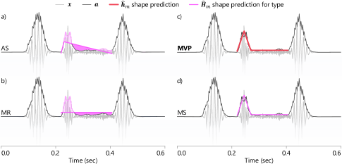
A.2. Modeling study
A.2.1. Other baseline models
We examined various model architectures as soft classifiers to predict the murmur shapes. These were all evaluated to perform worse than our proposed DiagramNet method.
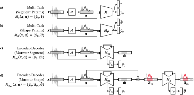
A.2.2. Performance results
| Prediction Accuracy | Explanation Faithfulness | ||||||||||||||||||
| Model |
|
|
|
||||||||||||||||
| Base CNN | Amplitude | 86.0% | - | - | - | - | - | ||||||||||||
| Base CNN | Spectrogram | 87.3% | - | - | - | - | - | ||||||||||||
| Multi-task | Segment params | 83.2% | - | - | 0.000 | 0.030 | - | ||||||||||||
| Multi-task | Shape params | 74.3% | - | - | 0.000 | 0.067 | 0.0069 | ||||||||||||
| Encoder-decoder | Murmur segment | 91.7% | - | - | 0.654 | - | - | ||||||||||||
| Encoder-decoder | Murmur amplitude | 94.8% | - | - | 0.769 | 0.020 | 0.0062 | ||||||||||||
| DiagramNet | Murmur shape | 95.9% | 84.8% | 96.8% | 0.815 | 0.007 | 0.0008 | ||||||||||||
A.3. User study
A.3.1. Other explanation cases