TSExplain: Explaining Aggregated Time Series
by Surfacing Evolving Contributors
Abstract.
Aggregated time series can be generated effortlessly everywhere, e.g., “total confirmed covid-19 cases since 2019”, “S&P500 during the year 2020”, and “total liquor sales over time”. Understanding “how” and “why” these key performance indicators(KPI) evolve over time is critical to making data-informed decisions. Existing explanation engines focus on explaining the difference between two relations. However, this falls short of explaining KPI’s continuous changes over time, as it overlooks explanations in between by only looking at the two endpoints. Motivated by this, we propose TSExplain, a system that explains aggregated time series by surfacing the underlying evolving top contributors. Under the hood, we leverage the existing work on two-relations diff as a building block and formulate a -Segmentation problem to segment the time series such that each segment after segmentation shares consistent explanations, i.e., contributors. To quantify consistency in each segment, we propose a novel within-segment variance design based on top explanations; to derive the optimal -Segmentation scheme, we develop a dynamic programming algorithm. Experiments on synthetic and real-world datasets show that our explanation-aware segmentation can effectively identify evolving explanations for aggregated time series and outperform explanation-agnostic segmentation. Further, we proposed an optimal selection strategy of and several optimizations to speed up TSExplain for interactive user experience, achieving up to efficiency improvement.
1. Introduction
Time series data is gaining increasing popularity these days across sectors ranging from finance, retail, IoT to DevOps. Time series analysis is crucial for uncovering insights from time series data and helping business users make data-informed decisions. A business analyst typically focuses on three questions: “what happened” to understand the changes in key performance indicator (KPI), “why happened” to reason why KPI changes, and “now what” (Berit Hoffmann, 2021) to guide what actions should be taken. “What” questions have been extensively studied both academia-wise (Gray et al., 1997) and industry-wise (Tableau, 2021a; Microsoft, 2021; Google Trend, 2020). “Why” questions are starting to attract wide attentions (Wu and Madden, 2013; Wang et al., 2015; Bailis et al., 2017). Existing explanation engines focus on explaining (1) one aggregated value (Joglekar et al., 2017; Google Trend, 2020) or (2) differences between two given relations: a test relation and a control relation (Sarawagi, 2001; Wu and Madden, 2013; Bailis et al., 2017; Roy and Suciu, 2014; Wang et al., 2015; Abuzaid et al., 2018; Ruhl et al., 2018; Miao et al., 2019; Li et al., 2021; Tableau, 2021b; PowerBI, 2021a; Sisu Data, 2021; Imply, 2021; Google Trend, 2020).
However, KPIs are typically monitored continuously, reporting some aggregated time series. Simply explaining one aggregated value overlooks the trend of time series, e.g. “why up/down”; merely focusing on its two endpoints and explaining their difference overlooks the evolving explanations in between. As evidence, although key influencer feature which explains the difference between two given relations is well received in PowerBI community, a highly voted feature request in PowerBI Idea Forum is called key influencer111Influencer corresponds to explanation in our notion. over time (PowerBI, 2021b). Below are some quotes from the user: “the mix of factors/influencers tends to be more dynamic than static over time…It would be nice to add a time dimension to the Key Influencers analysis to understand how the top key influencers evolve over the evaluated period” (PowerBI, 2021b). In time-series scenarios, it is often more desired to explain the evolving dynamics over time than only to consider two end timestamps.
Disclaimer. We remark that identifying the root cause of “why” questions in general is only plausible when combining human interpretations with tools. Quoted from Tableau ExplainData homepage (Tableau, 2021b): “The tool uncovers and describes relationships in your data. It can’t tell you what is causing the relationships or how to interpret the data.” Following the literature (Abuzaid et al., 2018; Wu and Madden, 2013; Wang et al., 2015; Bailis et al., 2017), the explanation in our work does not equate to “cause”, instead it corresponds to the data slice that contributes most to the overall change as we will describe in our Background Section (Definition 3.1).
Motivating Examples. We now describe three application scenarios of explaining changes in continuously evolving KPIs.
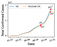
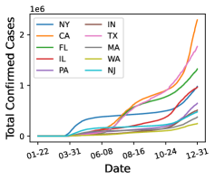
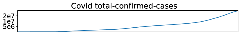
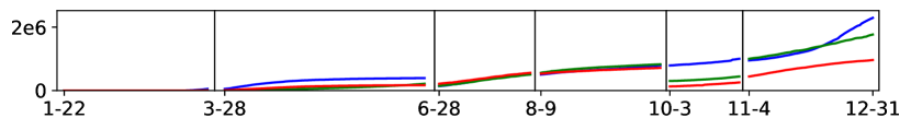
COVID-19. Figure 1(a) depicts the total number of covid-19 confirmed cases during year 2020. This time series is obtained by performing a groupby-aggregate query over the original table (Johns Hopkins University, 2021), which consists of attributes like state, total_confirmed_cases, and daily_confirmed_cases. By looking at Figure 1(a), users can get an understanding of how overall trend evolves over time. One natural followup question is “what makes the increase” – how different states contribute to the increase as time went along? Manual drill-down and browsing are laborious and overwhelming especially when there is a large number of attributes and each attribute is of high cardinality. Figure 1(b) illustrates a sample drill-down view along attribute state: first, looking at these sampled 10 states is already distracting, let alone full 58 states in the US; more importantly, it is still not clear what the answer to the above question is, though we do observe that each state contributes differently as time moves along. For instance, state=NY drives the initial outbreak in the US, while state=CA contributes most during the end of 2020.
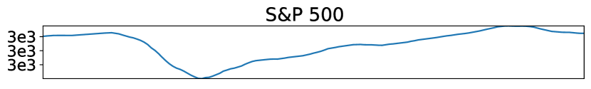
S&P500. S&P500 (Wikipedia, the free encyclopedia, 2021b) is a stock market index tracking the performance of around 500 companies in the US. In a nutshell, S&P500 is calculated as the weighted average of these companies’ stock prices. After seeing how S&P500 evolves during 2020, users might be interested in explaining the movement of S&P500 by stock category. Intuitively, different stock categories drive the drop and rebound of S&P500. For instance, Category=Financial plays a significant role in the drop during early covid-19 outbreak, but does not contribute to the rebound that much during the second quater of 2020.
Liquor-sales. The liquor-sales time series corresponds to query SELECT date, SUM(Bottles_Sold) FROM Liquor GROUP BY date, where each row in relation Liquor represents a liquor purchase transaction with attributes including date, Bottle_Volume(ml), Pack, Category_Name, and Bottles_Sold. Data analysts may wonder why the total bottles sold turns up since mid-January-2020 and how drinking behavior changes during pandemic. As we will show in our experiment, it turns out that people favors large pack liquor during pandemic, leading to sharp sales increase of Pack=12 and Pack=24; and that people increase the purchase of large volume liquor such as Bottle_Volume(ml)=750 and Bottle_Volume(ml)=1750.
Problem and Challenges. These motivating examples can all be abstracted as the same problem: given a relation , a set of explain-by attributes from , and a time series aggregated from , identify the top explanations, i.e., conjunctions of predicates over explain-by attributes, that contribute to the changes in the given aggregated time series. Let us illustrate the motivating example of covid-19 using this problem formulation. Given a relation Covid-19, where each row records the total number of confirmed cases in a state on a particular date, a set of explain-by attributes, e.g., [state], and a time series aggregated from , e.g., Figure 1(a) corresponding to query “SELECT date, SUM(total_confirmed_cases) FROM Covid-19 GROUP BY date”, our goal is to identify explanations, e.g., state=NY, that explains the surge in Figure 1(a). There are two main challenges in solving this problem: (a) explanations evolve over time; (b) interactivity is critical for data exploration and analytics.
Challenge (a): explanations tend to change over time. For instance, by looking at Figure 1(b), we can observe that the increase in New York(NY) is the main reason of the total increase in Figure 1(a) during 2020-04 and 2020-05, while California(CA) is the driving force during December 2020. Similarly, different stock categories are responsible for the surges and declines of S&P500 during different periods. Specifically, technology and financial industries play leading role in the sink of S&P500 during the initial covid-19 outbreak (around 2020-02-06 to 2020-03-24); while technology industry is the top-contributor for S&P500’s bounce back since 2020-03-24, but financial industry is not. Having observed that explanations evolve along the time, our first technical challenge lies in how to identify time period with consistent explanations and how to derive explanations for each consistent time period.
Challenge (b): data analysts typically explore “what” and “why” questions iteratively to understand data and uncover insights. Studies (Liu and Heer, 2014) have shown that low latency is critical in fostering user interaction, exploration, and the extraction of insights. It is desired that each query, including both “what” and “why” queries, can get answered in a second to ensure interactivity. Thus, how to reduce the latency for deriving explanations poses another challenge.
Prior Works. “Why” questions are gradually gaining attraction both academia-wise and industrial-wise. However, instead of explaining the continuous changes in a time series, existing works focus on explaining either (1) one aggregated value (Joglekar et al., 2017), e.g., point in Figure 1(a); or (2) the difference between two given relations (Wu and Madden, 2013; Bailis et al., 2017; Li et al., 2021; Sarawagi, 2001; Tableau, 2021b; PowerBI, 2021a), e.g., a test relation and a control relation corresponding to point and respectively in Figure 1(a). Reiterating the “Disclaimer” above, these tools can recommend and expedite answering “why” questions, but the human-in-the-loop interpretation is still required for true root cause analysis. To summarize, no prior works have studied the problem of explaining the evolving changes in time series as depicted in our motivating examples. Please refer to Section 2 for detailed comparison.
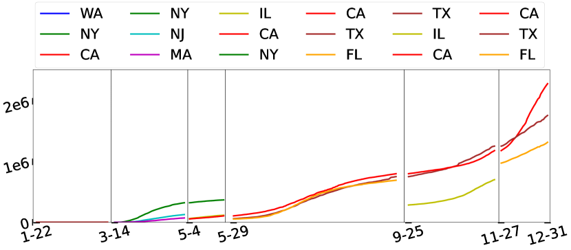
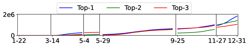
Our Solution. We propose TSExplain, a system to explain the continuous changes in aggregated time series. In TSExplain, given a relation, users can freely perform OLAP operations, including drill-down, roll-up, slicing, and dicing, and visualize what has happened to some KPI. To explain, users can then specify the time period they are interested as well as a set of explain-by attributes based on their domain knowledge. For the COVID-19 example, TSExplain returns a trendline visualization in Figure 2, where the whole input time series get partitioned into a few non-overlapping time periods and each time period is associated with the KPI trendlines for top explanations. We can see that in early stage, NY and WA are the main contributors to the case increase; while CA, TX, IL,and FL become the main contributors later 2020.
Technically, to tackle challenge (a) of deriving evolving explanations, we formulate a K-Segmentation problem, aiming to partition the input time period into smaller time periods such that each time period shares consistent top explanations. Furthermore, since is hard to specify in practice, TSExplain employs “Elbow method” (Satopaa et al., 2011) for identifying the optimal . We demonstrate the effectiveness of our problem formulation with both synthetic and real-world datasets. As for challenge (b) of interactivity, we first analyze the complexity of each step in TSExplain, identifying the bottleneck in the whole pipeline. Next, we propose several optimizations for reducing the bottlenecks in TSExplain. In our experiments, TSExplain has successfully answered all queries within one second.
Contributions. The contributions of this paper are as follows:
-
•
We formulate -Segmentation problem for explaining the continuous changes in an aggregated time series. (Section 3)
-
•
We propose a novel within-segment variance design based on top explanations to quantify consistency in each segment and experimentally prove its effectiveness. (Section 4)
-
•
We develop a dynamic program algorithm, perform complexity analysis, propose optimal selection strategy of , and develop several optimizations for improving efficiency. (Section 5)
- •
2. Related Work
Data Explanation Existing data explanation engines mainly focuses on explaining (1) one aggregated value (Joglekar et al., 2017; Google Trend, 2020) or (2) the difference between two relations (Sarawagi, 2001; Wu and Madden, 2013; Bailis et al., 2017; Roy and Suciu, 2014; Wang et al., 2015; Abuzaid et al., 2018; Ruhl et al., 2018; Miao et al., 2019; Li et al., 2021; Tableau, 2021b; Sisu Data, 2021; Imply, 2021; PowerBI, 2021a; Google Trend, 2020). In academia, SmartDrillDown (Joglekar et al., 2017) explains one aggregated value by identifying explanations (called rules in SmartDrillDown) that have high aggregate value. IDIFF (Sarawagi, 2001) identifies the differences between two instances of an OLAP cube. Scorpion (Wu and Madden, 2013) and Macrobase (Bailis et al., 2017) aim to find the difference between outlier and inlier data. RSExplain (Roy and Suciu, 2014) proposes an intervention-based framework to explain why SQL expression’s result is high (or low). X-Ray (Wang et al., 2015) tries to reveal the common properties among all incorrect triples versus correct triples. Abuzaid et al. (Abuzaid et al., 2018) unified various explanation engines and abstracted out a logical operator called diff. The cascading analysts algorithm (Ruhl et al., 2018) provides top non-overlapping explanations accounting for the major difference of two specified sets. Li et al. (Li et al., 2021) also compares two set differences but with augmented information from other related tables. In industry, Google Trend integrates an explanation component for single value and two relation; Tableau (Tableau, 2021a) provides Explain data (Tableau, 2021b) feature; PowerBI (Microsoft, 2021) supports functionality like Key Influener (PowerBI, 2021a); startups like SisuData (Sisu Data, 2021) is built to support “why” questions natively and scalably. However, all prior works fall short of explaining aggregated time series because (1) only explaining one aggregated value overlooks the trend of time series -“why up/down”; (2) only focusing on two set differences (i.e., two endpoints in time series) dismisses the explanation in between. Our TSExplain aims to identify the evolving explanations for aggregated time series over time.
Time Series Segmentation Time series segmentation has been studied for decades. We note that the word “segmentation” is somewhat overloaded in the literature. One line of segmentation works focuses on visual-based piecewise linear approximation. Specifically, (Koski et al., 1995; Vullings et al., 1997) use the sliding windows algorithm, which anchors the left point of a potential segment, then attempts to approximate the data to the right with increasing longer segments. Douglas et al., (Douglas and Peucker, 1973) and Ramer et al., (Ramer, 1972) designs top-down algorithms to partition the visualization. (Keogh et al., 1997) and (Hunter and McIntosh, 1999) have used the bottom-up algorithm to merge from the finest segments. Keogh et al. (Keogh et al., 2004) show that the bottom-up algorithm achieves the best results compared with sliding window and top-down, and further introduced a new online algorithm that combines the sliding window and bottom-up to avoid rescanning of the data when streaming.
Another line of work is semantic segmentation including FLUSS (Gharghabi et al., 2017, 2019), AutoPlait (Matsubara et al., 2014), NNSegment proposed in LimeSegment (Sivill and Flach, 2022), which aims to divide a time series into internally consistent subsequences, e.g., segmenting the heartbeat cycles when a person switches from running to walking. Thus, these algorithms require an extra input called subsequence length, e.g., a heartbeat cycle. However, our task is to explain the trends in the aggregated time series (e.g., the trend of total covid cases) instead of explaining or identifying the periodic difference in one time-series instance. Hence, our segmentation does not rely on the period length.
To conclude, unlike all above, TSExplain is the first to segment time series based on segments’ explanations.
Time-series ML Model Explanation The time-series ML model takes a univariate or multivariate time series as input and outputs a prediction label. Unlike text or image models, there is limited literature on black box Time-series ML Model explainability. FIT (Tonekaboni et al., 2020) is an explainability framework that defines the importance of each observation based on its contribution to the black box model’s distributional shift. Similarly, Rooke et al. (Rooke et al., 2021) extend FIT into WinIT, which measures the effect on the distribution shift of groups of observations. Labaien et al. (Labaien et al., 2020) finds the minimum perturbation required to change a black box model output. Recently, LimeSegment (Sivill and Flach, 2022) selects representative input time series segments as explanations for time-series classifier’s output. In these works, the “explain target” is the prediction label and the time series serves as the “explain feature”. Contrarily, the “explain target” in TSExplain is the up/down trend in an aggregated time series and the explain-by attributes are our “explain features”. Unlike explaining instance-level prediction of the black box ML model, TSExplain is aggregation-level explanation for white-box aggregation.
3. Problem Overview
In this section, we start with existing works on two-relations diff and how they fall short for explaining aggregated time series, followed by formal formulations of our problem: K-Segmentation.
3.1. Background
3.1.1. Two-Relations Diff.
Diff operator (Abuzaid et al., 2018) focuses on identifying the difference between two relations. Given a test relation and a control relation , the diff operator returns explanations describing how these two relations differ.
Definition 3.0 (Explanation (Abuzaid et al., 2018)).
Given a set of explain-by attributes , an explanation of order is defined as a conjunction of predicates, denoted as == where .
Explain-by attributes can be specified by users based on their domain knowledge; otherwise, dimension attributes from are used. Intuitively, an explanation corresponds to a data slice satisfying the predicate, and this data slice contributes to the overall difference between and . To quantify how well an explanation explains the difference between and , diff operator (Abuzaid et al., 2018) provides a difference metric abstraction, denoted as . Such abstraction is capable of encapsulating the semantics of many prior explanation engines (Bailis et al., 2017; Wu and Madden, 2013; Wang et al., 2015). Commonly used include absolute-change, relative-change, risk-ratio. Throughout this paper, we focus on absolute-change. Other metrics can be applied similarly.
Definition 3.0 (Absolute-change).
Given a test relation , a control relation , an aggregate function on some measure attribute in relation , and an explanation , the absolute change refers to the absolute difference between before and after removing records that explanation corresponds to, i.e., , where and denote records satisfying the predicate in relation and respectively.
As the name indicates, absolute-change only cares about the absolute change of no matter the change is an increase or decrease. To distinguish an increase from a decrease, we use to denote the change effect caused by including data that corresponds to: intuitively, if including leads to an increase in , ; otherwise, .
Definition 3.0 (Change Effect).
Following the setting in Definition 3.2, the change effect of an explanation is defined as .
Now we have described Absolute-change as an example of . With a difference metric , we can then rank each candidate explanation and return top-m explanations with the highest . However, these top-m explanations may contain overlapping records. Consequently, the effects of these records get duplicated, introducing bias in the top-m explanations. Alternatively, we can constrain these explanations to be non-overlapping and define top-m non-overlapping explanations as in Definition 3.5. Two explanations and are said to be non-overlapping if their correspondent records are non-overlapping in any relation , i.e., .
| Symb. | Definition | Mathematical Expression |
| explain-by attributes | = | |
| an explanation | === | |
| difference score of | Definition 3.2 | |
| change effect of | Definition 3.3 | |
| m non-overlap | = | |
| top-m non-overlap | = | |
| time series | = over | |
| cutting position | at time | |
| segment | = from to | |
| -segment scheme | = | |
| evolving explanations | = |
Definition 3.0 (m Non-Overlapping Explanations).
Given a difference metric and an explanation order threshold , let denote a set of non-overlapping explanations, i.e., , where each has its order and is non-overlapping with , .
Definition 3.0 (Top-m Non-Overlapping Explanations 222Definition 3.5 is defined over . Alternatively, we can define top-m as at most explanations, i.e., =. Our proposed solution in Section 4 and 5 can work with it in a similar way.).
Top-m non-overlapping explanations are defined as with the highest accumulative diff score, i.e., =.
Cascading analyst algorithm (Ruhl et al., 2018) is designed for returning top-m non-overlapping explanations. We will use term top-explanation for simplicity whenever there is no ambiguity.
Example 3.6 (Two-Relations Diff).
Consider the two points and in Figure 1(a) — the underlying data corresponds to and constitute a control relation and a test relation respectively. Two-relations diff aims to explain the difference between and . First, users can specify a set of explain-by attributes, e.g., [state, County]. Take explanation =(state=CA) as an example. It is of order one, i.e., and its difference score can be calculated as using absolute-change as shown in Figure 1(a). We can then obtain Top-3 non-overlapping explanations for differing and using cascading analyst algorithm (Ruhl et al., 2018) — ==(state=CA), =(state=TX), =(state=FL).
3.1.2. Aggregated Time Series.
Time series is a series of data points indexed in time order. An aggregated time series refers to a special type of time series, where each point is associated with a timestamp and an aggregated value , derived by aggregating all records at timestamp . Essentially, an aggregated time series corresponds to the result of some group-by query. Consider a relation with dimension attributes and measure attributes, and a group-by query in the form of {SELECT , f(M) FROM R GROUP BY }, where denotes some time-related ordinal dimension (), and is some aggregate function on measure (). The query result can be denoted by an aggregated time series with value over time dimension .
Definition 3.0 (Aggregated Time Series).
An aggregated time series over time is a series of points ordered by time dimension and each point’s value is an aggregated number from a list of records with the same time .
Data analysts often visualize aggregated time series to help understand data’s overall trend as time goes along as shown in Figure 1(a). A natural follow-up question is “what makes ups and downs”. Different from two-relations diff described in Section 3.1.1, this ”explain” question focuses on the whole time horizon and the underlying top-explanation tends to evolve dynamically along the time even when the overall trend looks the same visually.
Definition 3.0 (Evolving Explanations).
Given and an aggregated time series over time , evolving explanations is a sequence of top-explanation at different periods, denoted as , where , , denote the - cutting positions in between, and each denotes top-explanation from to .
Example 3.9 (Evolving Explanations).
Figure 1(a) depicts an aggregated time series that corresponds to a groupby-aggregate query with =SUM(total_confirmed_cases) on table Covid-19. Figure 2 illustrates the underlying evolving explanations for the increase in Figure 1(a). We have six different time periods, where each period shares the same intrinsic explanations while neighboring periods have different ones. For instance, the top-3 contributors are ==(state=NY), =(state=NJ), =(state=MA) during =2020-3-14 and =2020-5-4; ==(state=CA), =(state=TX), =(state=FL) from 2020-11-27 to 2020-12-31.
3.2. Problem Definition
Motivated by the observation that top contributor (i.e., explanation) evolves over time, we study the problem of identifying evolving explanations for the continuous changes happened in an aggregated time series. The overall problem of identifying evolving explanations can be decomposed into two sub-problems: (a). segmentation; (b). find the explanations that contributes most in each segment. These two sub-problems are intertwined with each other: the goodness of a segmentation scheme depends on how cohesive top-explanations are within each segment; meanwhile, top-explanation are derived for each segment after obtaining the optimal segmentation scheme. We remark that performing segmentation without considering explanation information is insufficient, as we will demonstrate experimentally in Section 7.
Segmentation. To explain the continuous change in an aggregated time series over time , we need to partition the whole time domain into non-overlapping segments, such that each segment = during time and shares the same intrinsic explanations while neighboring segments have different ones. This resembles the well-studied clustering problem, whose goal is to minimize within-cluster variance and maximize inter-cluster variance. In particular, given a segment number , we abstract our problem as a K-Segmentation problem, adapting the optimization formula from K-Means (Hartigan and Wong, 1979). Let denote a K-segmentation scheme: ===, where =, =, and are - cutting positions. In Example 3.9 (Figure 2), =6 and the cutting positions correspond to time {3-14, 5-4, 5-29, 9-25, 11-27}. Next, we formulate K-Segmentation problem as below:
Problem 1 (-Segmentation).
Given an aggregated time series and a segmentation number , identify the optimal segmentation scheme where denotes the variance in segment .
We remark that the design of within-segment variance is critical to the effectiveness of -Segmentation. No prior works have studied with the goal of quantifying explanation consistency. This is challenging as we will dive into in Section 4.
Explain trend in each segment. Given a fixed segment from time to , we will now describe how to explain the trend in with only one static top-explanation — static top-explanation is a special case of evolving explanations with segment number . If is cohesive, meaning that has consistent top-explanation during and , we can simply focus on its two endpoints and then employ prior works on two-relations diff (Section 3.1). The derived top-explanation explains the changes from time to . However, when is not cohesive, there exists no single static top-explanation that is capable of explaining the whole trend evolvement in . Nevertheless, we can still derive some static top-explanation by looking at its two endpoints and using two-relations diff (Ruhl et al., 2018), though the explanation quality might be poor. As we will elaborate in Section 4.1, each segment in the optimal K-segmentation is deemed to be cohesive, and the case of incohesive segment would only occur during the exploration phase over candidate segmentation schemes. In all, when given a segment , we first obtain a control relation ={SELECT * FROM R WHERE } and a test relation ={SELECT * FROM R WHERE } at two endpoints, and then derive top-explanation with cascading analyst algorithm (Ruhl et al., 2018).
Now that we can exploit existing works for deriving static top-explanation within each segment, our problem of identifying evolving explanations boils down to a K-segmentation problem. As is not easy to specify in practice, TSExplain identifies the optimal for users by default, as we will discuss in Section 6.
4. K-Segmentation
Designing a good within-segment variance to quantify explanation consistency is the key to our work’s success and it is definitely non-trivial. In this section, we will start with our design of in Problem 1, followed by an experiment illustrating its effectiveness.
4.1. Design of Within-Segment Variance
Per our definition in 1, K-Segmentation is similar to K-Means clustering. We carefully design the within-segment variance through making analogy to K-Means algorithm. However, different from K-Means or any existing variance design, in K-Segmentation should be regarding the variance of top-explanations within each segment .
First, let us review the problem formulation of K-Means. Given a set of objects as inputs, where each object is a -dimensional vector, K-Means aims to partition these objects into partitions = minimizing the within-cluster variance:
| (1) |
| (2) |
where is the centroid of partition and denotes the distance between an object and the centroid in , e.g., distance. Comparing Problem 1 with Eq. 1, we can see K-Segmentation employs the same optimization objective as K-Means but with a customized . To develop a good in K-Segmentation, careful thoughts are required around: (1) what is an “object”; (2) what is the centroid of a segment; and (3) how to measure the distance between object and centroid based on explanations.
4.1.1. Object in K-Segmentation.
Given an aggregated time series , K-Segmentation aims to segment into partitions such that explanations are shared within each partition. Since each single point itself cannot reveal any time series trend, the atomic unit for partitioning is a segment of size two, i.e., . That is, an object in K-Segmentation refers to a segment of size two as shown in Figure 3 and there is in total objects, i.e., .
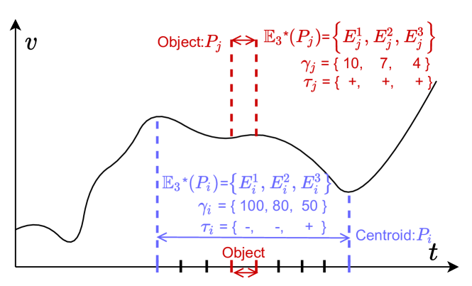
4.1.2. Centroid of a partition.
Different from the general K-Means, objects in K-Segmentation follows a time ordering where , and a partitioning scheme in K-Segmentation is only valid when objects in each partition form a segment. Hence, a partition in K-Segmentation can be denoted as with objects ==. Naturally, we can use segment as the centroid of partition .
4.1.3. Distance between object and centroid.
In essence, both object and centroid are segments of the input time series . Next, we focus on the design of distance between segments. Distance between two objects or between an object and a centroid follow naturally.
High-Level Idea. As our goal is to group objects with the same top-explanations into one partition, the distance between two segments shall be based on their top-explanations. Given two segments and , their top-explanations and can be derived based on Section 3.1. Each is a ranked list of explanations, i.e., and as shown in Figure 3. Strawman approaches like measuring the Jaccard distance between and fall short when there are multiple explain-by attributes. For instance, it is unclear how to quantify the partial overlap between ={state=WA} and ={state=WA and age>50}. Alternatively, we can measure the distance between and by how well explains and how well explains .
How well explains . We draw inspirations from information retrieval community. Normalized discounted cumulative gain (NDCG) is a commonly used measure for ranking quality in information retrieval and we adapt NDCG to quantify how well explains . To model our scenario after the web search setting, we can treat each segment as a query and each explanation as a document. corresponds a ranked list of retrieved documents returned by the search engine, while is the ideal retrieved document list. The relevance between a segment and an explanation is quantified by the difference metric . As illustrated in Table 2 (row in blue), given an explanation with rank , the relevance of towards can be calculated as . However, explanation might make KPI increase in segment , but lead to a decrease in segment (see Definition 3.3). Thus, when has opposite effects on and , we shall rectify the relevance to zero as our ultimate goal is to measure the distance between with . Formally, we denote the rectified relevance as and we have =. Take in Table 2 as an example, contributes the increase in segment but the decrease in , thus the relevance is rectified to 0.
| How well explains | |||||
| Rank | Expl | Effect (+/-) | Relevance | Rectified | |
| on | on | on | Relevance | ||
| r | |||||
| 1 | + | + | |||
| 2 | + | + | |||
| 3 | + | - | 0 | ||
| Discounted cumulative gain (DCG): | |||||
Now we have mapped our scenario to query-document retrieval setting, i.e., query , retrieved document list , and the rectified relevance formula , can be calculated using Eq. 3, 4, and 5. It quantifies how well explains , with ranges from 0 to 1. At an extreme, when is exactly the same as and with the same effect on and , =1, meaning explains perfectly.
| (3) |
| (4) |
| (5) |
Calculating Distance. We can then define the distance between and as in Eq. 6, where quantifies how well explains and quantifies how well explains .
| (6) |
Eq. 6 averages and to obtain the similarity between and , followed by a complement to get the distance. is symmetric with ranges .
4.1.4. Putting all together.
Given a partition , it contains a continuous list of objects where and its centroid is . Using Eq. 6 and 2, we can derive our variance of as in Eq. 7.
| (7) |
4.2. Effectiveness of Variance
In this subsection, we evaluate the effectiveness of our variance design. We term our variance metric in Equation 7 tse. Since real-world datasets lack its ground truth of evolving explanations, we synthesize datasets with ground truths and evaluate how tse performs compared with other alternatives. We will evaluate the end-to-end effectiveness in Section 7.
4.2.1. Synthetic datasets
We synthesize datasets and generate their ground truth -Segmentation . Each dataset is one relation with schema: , sales, category. The aggregated time series represents how the total sales changes along the time — SELECT , count(sales) FROM R GROUP BY . We set the explain-by attributes = and there are three categories: , , . Each predicate e.g., {category=} denotes an explanation .
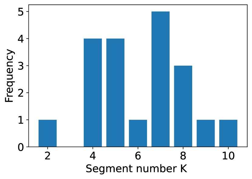
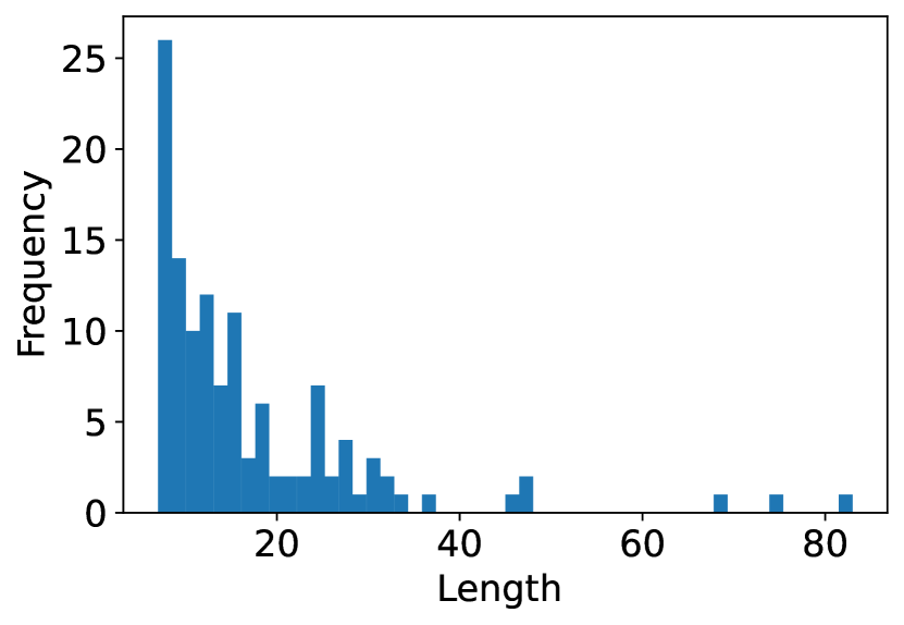
Synthesize Procedure The aggregated sales time series can be viewed as a summation of each category’s time series. We start by synthesizing each category’s time series. In detail, we first randomly pick cutting points for each category ’s time series — {SELECT , count(sales) FROM R WHERE category= GROUP BY }. For each segment defined by these cutting points, we synthesize either an upward or downward trend in linear shape. We restrict the adjacent segments to have different up or down trends. We can then derive the ground truth segmentation’s cutting points of the aggregated time series as the union of each category’s cutting points, i.e., . We treat as our ground truth because (1) each predicate has a consistent up or down trend in each segment; (2) our restriction that adjacent segments have different trend direction guarantees that every cutting point is necessary and is the minimal coherent segmentation method. We set the time series’ length at 100 and synthesize 20 datasets with seven different levels of . The lower the is, the noisier the time series is. We remark that the number K and the length of each segment are diverse in our synthetic datasets, with segment number K varying from 2 to 10 and segment length varying from 6 to 84 as shown in Figure 4.
Signal-to-Noise Ratio Real-world data is quite noisy. For our synthetic dataset, we add Gaussian Noise to each predicate’s time series to simulate noisy time series. We quantify the noise level using signal-to-noise level, namely SNR (Wikipedia, the free encyclopedia, 2021a). We add different noise to each dataset. The lower the is, the noisier the time series is.
Example 4.1 (Synthetic Dataset and Ground Truth Segmentation).
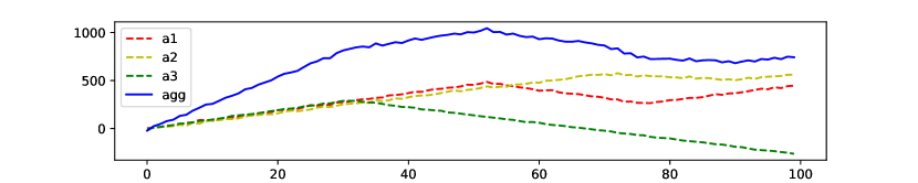
In Figure 5, the dash lines illustrate each predicate’s time series, and the noise level is SNR = 35. The predicate category = a1 has its cutting points at 52, 76, the predicate category = a2 has its cutting point at 70, 90, and the predicatecategory = a3 has its cutting point at 31. Thus, in this example, we can derive the aggregated time series cutting point as the union of three predicates’ – { 31, 52, 70, 76, 90 }.
4.2.2. Effectiveness
We compare tse with other alternatives in terms of effectiveness.
Alternatives We design our alternatives by enumerating other reasonable distance metrics and variance structures.
Change definition and keep the variance structure. Different from our metric in eq. 6, if we only consider how well each object’s explanation explains the centroid , we can derive dist1 in eq. 8; or if we only consider how well the centroid’s explains each object , we can derive dist2 in eq. 9.
| (8) |
| (9) |
Change the variance structure and keep the definition. Instead of comparing the centroid with each object, we compare all possible object pairs. We name this metric allpair.
| (10) |
Based on tse, dist1, dist2, allpair, if we further change the second term in the distance metric to its l2 norm, we can derive Stse/Sallpair, Sdist1 and Sdist2 correspondingly. Till now, we have eight different forms of metrics.
Evaluation As shown in eq. 1, our problem is to find the segmentation that minimizes the objective score. Thus, the effectiveness criteria of variance design is whether the ground truth can score the lowest or close to the lowest in noisy datasets.
We compare tse with all other alternatives. Given one metric and one dataset with its ground truth, the K-segmentation search space is huge and each segmentation scheme has its metric score. We study how the ground truth segmentation’s score ranks among all possible segmentation schemes: the higher the rank is, the better the metric is. Because space is huge, we sample 10000 random segmentation schemes, and rank the ground truth among all the samples, denoted as ground truth rank. On this dataset , we calculate all eight metric’s ground truth rank following the same method. To compare all the metrics on , we rank across all the eight metrics from rank 1 (highest rank) to rank 8 (lowest rank) ascendingly based on their own ground truth rank. The higher a metric’s rank is, the fewer segmentation schemes have lower variance than the ground truth, indicating that this metric is more effective on . Figure 6 averages each metric’s rank over all datasets at the same SNR level and shows how different metrics’ ranks change along with the noisy level. When SNR = 50dB, we can see that all metrics rank 1st because the ground truth all achieves the lowest score. What’s more, tse metric always has the highest rank compared with other metrics no matter what level the SNR is.
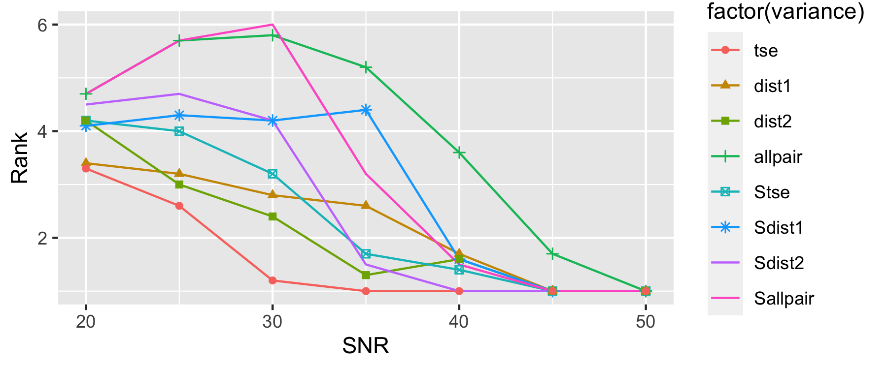
Takeaway. Compared with other alternative metrics, tse is the most effective one.
5. Our Solution: TSExplain
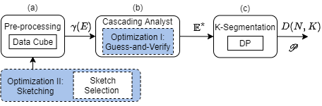
Now we have formulated our K-Segmentation problem (Problem 1), together with the designed within-segment variance in Eq. 7. In this section, we will present our solution TSExplain: we will start with a dynamic programming (DP) algorithm for solving K-Segmentation, assuming is available for each partition ; next, we will describe our solution pipeline (Figure 7) – steps for preparing and DP – together with complexity analysis; last, we propose several optimizations for speeding up TSExplain.
5.1. DP for K-Segmentation
Different from K-Means, which is computationally intractable (NP-Hard), K-Segmentation is polynomial solvable. At a high-level, the search space in K-Means is , while it is in K-Segmentation as the task is essentially to identify cutting positions among the non-endpoints of a given time series .
Intuitively, K-segmentation exhibits optimal substructure — the optimal solution of K-segmentation can be constructed from the optimal solutions of its subproblems. Thus, we can use dynamic programming for solving K-Segmentation. Let denote the minimal total within-segment variance of -segments over time range , i.e., . To derive , we can enumerate different positions of the last cut and calculate the smallest total variance among all possible . When the last cut is fixed at position , the minimal total variance of -segments can be decomposed into two parts: the minimal total variance of -segments over time range and the variance of the segment during , i.e., . The DP recursion function is expressed in Eq. 11.
| (11) |
is recursively computed with Eq. 11, which involves calculating variance for all segment where . Given a segment , its is computed via the distance between centroid segment and each object segment where as shown in Eq. 7. Now to calculate , we need to identify the top-explanations in segment and . Top-explanations is derived with Cascading Analyst algorithm (Ruhl et al., 2018), which requires computing the diff score for each explanation . In Section 5.2, we will present our solution pipeline consisting of three modules: (a.) Preprocessing module for calculating ; (b.) Cascading Analyst module for deriving ; and (c.) K-Segmentation module for computing , , and finally . We will also analyze the time complexity for each module, pinpointing the bottleneck in the whole pipeline for optimizations in Section 5.3.
5.2. Solution Pipeline and Complexity Analysis
The overall solution pipeline is depicted in Figure 7 with module (a) Preprocessing, (b) Cascading Analyst, and (c) K-Segmentation. In the following, we will dive into each module and analyze its computational complexity. The optimization modules with blue background in Figure 7 will be introduced in Section 5.3.
Precomputation. Module (a) is responsible for computing the diff score for each candidate explanation over every segment where . Given an explanation order threshold , we can enumerate all candidate explanations — each is in the form of == where . Let be the total number of candidate explanations. By default, is set as 3.
As illustrated in Figure 7, given an explanation and a segment , the difference score , i.e., absolute-change in Definition 3.2, can be calculated by looking at the points at time and of the aggregated time-series and , i.e., the aggregated time-series from relation when excluding data with predicate . As most aggregate function is decomposable, e.g., SUM, AVG, Variance, we can derive by using and . Since TSExplain is designed to integrate with existing interactive data analysis tools like PowerBI, data cube is typically maintained in memory and thus we can easily access and from the data cube.
Time complexity: for each segment and explanation , it takes for computing the difference score . There is in total segments and explanations, thus the total time complexity for module (a) is .
The Cascading Analysts (CA) Algorithm. Module (b) is responsible for calculating top-explanation for each segment . TSExplain employs (Ruhl et al., 2018) to identify top-explanation (Definition 3.5). In a nutshell, the CA algorithm simulates what a data analyst would perform during data analysis: recursively perform drill-down operations in dimensions and select data slices they are interested in. Each data slice is summarized by some conjunction predicate, i.e., an explanation in our context. Different from manual data analytics, here the drill-down dimensions and data slices are selected via dynamic programming to maximize the total diff score under the constraint that the number of data slices is .
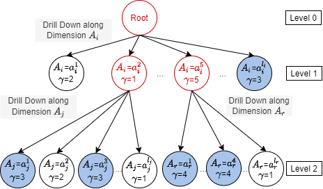
Given three explain-by attributes =, Figure 8 illustrates the CA algorithm for identifying top-5 explanations. Each node in Figure 8 corresponds to an explanation and is associated with its diff score obtained from module (a). For instance, the left-most node at level one denotes explanation = and the left-most node at level two denotes explanation ==. To identify top-m non-overlapping explanations, the algorithm starts from the root node with quotas. It enumerates the first drill-down dimension, e.g., dimension as shown in Figure 8, as well as the quota assigned to each drill-down sub-tree, e.g., two out of five is assigned to the subtree rooted at node = and = respectively and another one is assigned to the subtree rooted at node =. Again, for the sub-tree rooted at node = with two quotas, the algorithm enumerates next dimension to drill down (i.e., in Figure 8), and assigns quota to each drill-down sub-tree (i.e., one to == and one to ==). This process is conducted recursively. The enumeration of drill-down dimension and quota assignment are performed via dynamic programming to maximize the total score under the constraint that the total quota is . In Figure 8, the algorithm returns top-5 explanations (nodes in blue) with maximum =3+3+4+4+3=. Please refer to (Ruhl et al., 2018) 333(Ruhl et al., 2018) also works with the alternative Definition 3.5 in footnote 1. for details.
Time complexity: the CA algorithm (Ruhl et al., 2018) takes per segment, where is the total number of candidate explanations, is the number of explain-by attributes, and is a user-specified explanation number. By default, is set as 3. Since there are in total segments, the total time complexity is
K-Segmentation. Module (c) is responsible for identifying the best K-segmentation scheme that minimizes the total variance. As described in Section 4.1 (Eq. 6), we first compute based on the top-explanations on centroid segment = and object = obtained from module (b); next, is calculated for every segment based on Eq. 7; lastly, DP is utilized for deriving and the optimal segmentation scheme .
Time complexity: for each pair of , calculating takes in looking at top- explanations. There are - centroid segments of length 444A segment has length . where ¡ and each of length contains objects . In total, we have = pairs of and thus the time complexity for calculating all distance is . Similarly, the total time complexity for calculating variance of all is . With available, DP takes , as each step in Eq. 11 involves for enumerating the last cut’s position and there is in total steps. Thus, the complexity of module (c) is .
Takeaway. To sum up, the total time complexity is +++ — it grows linearly to and , quadratic to , and cubed to . In general, , , and are small due to user’s limited perception. Thus, the runtime depends mostly on the number of candidate explanations and the size of the aggregated time series . Next, we focus on reducing and for speedup.
5.3. Optimizations
As the takeaway above describes, the runtime largely depends on the number of candidate explanations and the time series length . For Liquor dataset used in Section 7, is around 5000 even when only two explain-by attributes are considered, i.e., =2, and is around 300. Next, we introduce two optimizations for speedup: (I.) guess-and-verify to reduce and (II.) sketching to reduce .
5.3.1. Guess-and-verify
As discussed in Section 5.2, the CA algorithm is one of the bottlenecks in our pipeline. Guess-and-verify is designed to reduce the input explanation number () in CA.
High-level Idea. To ensure non-overlapping, CA algorithm recursively drills down dimensions and selects data slices (explanations) as shown in Figure 8. The intuition behind guess-and-verify is that explanation with higher diff score is more likely to be in the top- non-overlapping explanations . Thus, instead of using all candidate explanations as the input of CA algorithm, we can take a guess and limit the input to only include top explanations with the highest diff score. A smaller input size can dramatically reduce the runtime of the CA algorithm, but the returned results may not be the optimal top- non-overlapping explanations . To mitigate this, we verify whether the returned result is optimal. This process is repeated until the result is verified to be optimal.
Specifically, we first sort all explanations in descending order of , denoted as . Next, we go through the following two phases iteratively: (1) guess and (2) verify. In each iteration, first take a guess on the input size ; then run the CA algorithm with the first explanations in and obtain the result ; verify if is optimal.
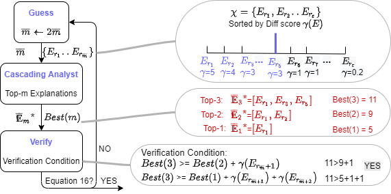
Guess. Naively selecting the first explanations in might result in explanations that overlap with each other, though the total difference score is the largest. Alternatively, we hypothesize that the answer of the CA algorithm comes from the top candidate explanations in . If the returned result passes the verification condition, terminate; otherwise, increase to as shown in Figure 9.
Verify. Taking the first explanations in as the input, the result returned by CA algorithm is not guaranteed to be optimal since some explanation might rank after in . To ensure the optimality, we design a sufficient condition such that once this condition is satisfied, it is guaranteed that the returned result is optimal. Let = be the ordered explanation list ranked by . With as input, let be the top- non-overlapping explanations returned by CA algorithm and be the corresponding total difference score. Given , the CA algorithm not only returns , but also for every 1 ¡ as a side product of dynamic programming. . With these notations, we can now present the verification condition in Eq. 12. The high-level idea is that each explanation can be categorized into the following two classes: (1) with rank , and (2) with rank ¿. Thus, we can upper bound the total difference score of each candidate non-overlapping explanations by the right-hand side of Eq. 12, where the first term corresponds to the score of class (1) and the second term upper bounds the score of class (2). Hence, if we ensure that the current best solution (left-hand side of Eq. 12) has higher total score than all candidate solutions (right-hand side of Equation 12), we can safely terminate and output the optimal top-explanation. Proofs are omitted due to space limitation.
| (12) |
Time complexity: guess-and-verify decreases the complexity from to at the best case. Empirically, when , we initialize .
5.3.2. Sketching
As discussed in Section 5.2, the time complexity in each module is at least quadratic to the time series size . This is because each point is treated as a candidate cutting position in K-Segmentation and thus the total number of segments involved in each module is . Hence, reducing the number of candidate cutting positions can dramatically improve the efficiency. Sketching is designed for this purpose, as depicted in Figure 7.
High-level Idea. Given a time series with points, K-Segmentation aims to select - cutting points out of - non-endpoints. Our intuition is that some points are worse-suitable to be used as the cutting points and can be eliminated in a more cost-effective manner; next, since the remaining points is of a much smaller size, it is affordable to input them in our solution pipeline (Section 5.2). We call the remaining points sketch, as its role is to represent the original points in the given time series. In particular, Sketching consists of two phases: (I.) sketch selection and (II.) pipeline with sketch. We propose to select sketch using our proposed pipeline in Section 5.2, but with the constraint that each segment’s length to be within , where .
Sketch Selection. There are two main requirements for sketch selection. First, the process should be efficient; second, the selected sketch should contain promising points for small-variance K-segmentation scheme (Eq. 7). Strawman approaches like random sampling or evenly spaced sampling are fast, but does not meet requirement two. To satisfy both, we propose to utilize our proposed pipeline in Section 5.2, but with some constraint. As we will detail below, the constraint is used to reduce the pipeline runtime (requirement one); and the pipeline is used to identify promising cutting points for minimizing the total variance in Eq. 7 (requirement two).
As discussed, the number of segments considered in our solution pipeline (Section 5.2) is . To alleviate this bottleneck, we can restrict each segment’s length to be within , where . In this way, we only need to compute the diff score (module a), top-explanations (module b), distance and variance (module c) for segments with length . This reduces the total number of considered segments from to . More specifically, to derive a sketch of size , we set in our K-segmentation pipeline and set the maximum segment length threshold as . Empirically, we set = and =.
Time complexity: In phase I (sketch selection), module (a): the time of computing the diff scores turns to ; module (b): the time of CA algorithm turns to ; module (c): the time of computing distance and variance turns to , and the time of DP turns to . The total time complexity is reduced by at least , compared to the pipeline without constraint. In phase II (pipeline with Sketch), module (a): the time of computing the diff scores turns to ; module (b): the time of cascading analyst turns to ; Module (c): the time of computing distance and variance scores turns to , and the time of DP turns to . The total time complexity is reduced by , compared to the pipeline without sketch.
6. Optimal Selection of
In real-world datasets, it is hard for users to specify the number of segments in advance. By varying segment number , TSExplain outputs segmentation schemes with different variance scores, generating a - curve. The left-hand side of Figure 12 illustrates an example. Intuitively, - curves decrease monotonically as the increase of . At an extreme, when =-, the total variance reaches a minimum score of zero. Furthermore, the total variance score drops quickly when is small and slows down when grows larger. This indicates that the marginal improvement of increasing becomes smaller when is large. Also, a larger brings about too many segments, which would exceed user perception limitations. Thus, our goal is to identify the optimal with relatively low variance and keep the segmentation scheme concise.
Such a task is well-studied in the machine learning community (Kodinariya and Makwana, 2013). We borrow the idea of a well-known method named the “Elbow method” (Ng, 2012; Kodinariya and Makwana, 2013) which picks the “elbow point” of the - curve as the optimal . We use a task-agnostic algorithm (Satopaa et al., 2011) to automatically determine the “elbow point” of our - curve. This algorithm first normalizes the curve to be from to . Then, it picks = as the “elbow point” where denotes the normalized total variance when the segment number is .
In our implementation, we collect the dynamic programming results varying from 1 to 20, plot the - curve, and then choose the elbow point. We note that compared to calculating , collecting with varying from 1 to 20 does not add extra cost, since gets generated for during the dynamic programming process of . We constrain to be at most 20 due to user perception limitation: when is too large, e.g., , it would be hard for users to interpret the explanation results. We admit that when the time series is long, i.e., is large, restricting under 20 might not return the explanations at the finest granularity, but we argue that explanations at coarse grain with is a better choice considering user perception limit. Empirically, we observe that TSExplain chooses 6 or 7 segments in most cases in our real-world experiments (Section 7.4).
7. Experiments
In this section, we answer two questions: (1) how effective is TSExplain in identifying the evolving explanations; (Section 7.3 and 7.4) (2) how fast is TSExplain (Section 7.5).
The current TSExplain is implemented in C++. All experiments below are run single-threaded on a Macbook Air 2020 with Apple M1 chip 8‑core CPU and 16GB memory.
7.1. Datasets
We introduce the datasets used in the experiments.
7.1.1. Synthetic datasets
We synthesize 20 different datasets with 7 different levels of (section 4.2.1). In total, we have 140 different datasets. The aggregated time series is SELECT , count(sales) FROM R GROUP BY and the explain-by attribute is category.
7.1.2. Real-world datasets
We use the three real-word datasets in the motivating examples of Section 1. Here, we briefly go through the aggregated time series, explain-by attributes. In practice, we expect users to provide explain-by attributes based on their domain knowledge.
Covid
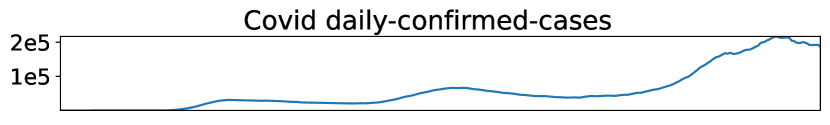
(Dong et al., 2020) records the daily/total confirmed cases of 58 states. Naturally, there are two aggregated time series: ① the covid total confirmed cases trend, SELECT date, SUM(total-confirmed-cases) FROM Covid GROUP BY date; ② the covid daily confirmed cases trend, SELECT date, SUM(daily-confirmed-cases) FROM Covid GROUP BY date. We choose state as our explain-by attribute to answer ”which states are the main contributors to the rises or drops?”.
S&P 500
contains 503 company555S&P 500 has 505 components and the components are adjusted along the time. We select the 503 companies that are in the component list during the whole period. stock price (price) and free-float shares (share) from 2020-1-1 to 2020-10-1. Based on the S&P 500 index formula(CHAD LANGAGER, 2021), we derive the S&P 500 index’s time serie as SP500-index FROM Sp500 GROUP BY date, where divisor is a constant. We try to explain the S&P 500 index’s crashes and rebound using the hierarchical explain-by features - category, subcatagory, stock.
Liquor
contains liquor purchase transactions in Iowa from 2020-1-2 to 2020-6-30. The time series is SELECT date, SUM(Bottles Sold) FROM Liquor GROUP BY date. We pick four attributes out of 24 attributes as our explain by features: Bottle Volume (ml) – the size of each bottle in a purchase (e.g., 750ml); Pack – the number of bottles per pack (e.g., 6); Category Name – the category of the purchased liquor (e.g., American Flavored Vodka); Vendor Name – the vendor of the purchased liquor (e.g. Phillips Beverage). Below, we use BV, P, CN, and VN to represent them respectively for short.
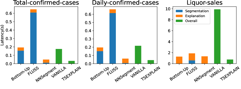
7.2. Baseline
TSExplain is the first explanation-aware segmentation to surface the evolving explanations for time series. The closest segmentation works are the bottom up algorithm (Bottom-Up) which performs best overall in piecewise linear approximation (Keogh et al., 2004) and recent semantic segmentation algorithm - FLUSS (Gharghabi et al., 2017) and NNSegment (Sivill and Flach, 2022). All these methods are explanation-agnostic, partition time series solely based on the visual shapes, and require segment number as input. For a fair comparison, the for baselines is either given or borrowed from TSExplain’s results. Implementation wise, we reproduce Bottom-Up based on the pseudo-code in Keogh et al (Keogh et al., 2004). FLUSS is implemented using Stump library (Law, 2019) and NNSegment is implemented using the authors’ code (Sivill and Flach, 2022).
7.3. Explanations of Synthetic Datasets
We evaluate TSExplain’s effectiveness on synthetic datasets and perform quantitative comparisons between TSExplain and the three baselines. For fair comparison, we adopt the oracle segment number of the ground truth, and we run TSExplain and baselines with known .
Metric We propose a metric to compare the effectiveness of these methods by quantifying the distance between these methods’ output and ground truth. We calculate the edit distance between outputs and ground truth. Since different datasets have different segment number and time series lengths , we normalize our edit distance by and . The lower the metric is, the more effective the method is. We term this metric .
Figure 10 shows the comparison between TSExplain and baselines. As FLUSS and NNSegment both involves parameter, i.e. period and window size, we try mutiple parameters and report the best overall results we found. The x-axis is SNR, and the y-axis is the . We report the average distance percent for each SNR level. As we can see, TSExplain always has the best performance than all three baselines and Bottom-Up is the most comparable baseline among all three. When SNR 35, the of TSExplain is close to 0, indicating for cleaner datasets, TSExplain’s output is almost the same as ground truth. However, the baselines are incapable to detect ground truth even with clean datasets.
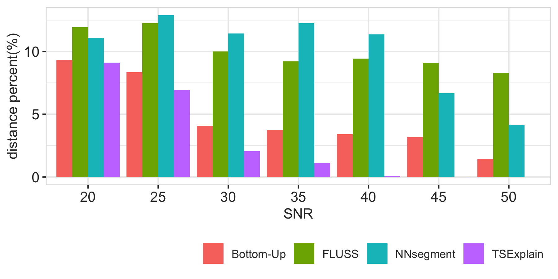
Takeaway. For synthetic datasets, TSExplain performs much more effectively than all baselines. Bottom-Up is the most comparable baseline. For less noisy dataset, TSExplain can accurately detect the ground truth, while baselines can not.
7.4. Case Study on Real-World Datasets
This subsection demonstrates TSExplain’s effectiveness on three different real-world datasets: Covid, S&P500, and Liquor, and gives an illustrative comparison between TSExplain and baselines. For fair comparison, TSExplain recommends the and our baseline uses the same segment number . In this experiments, we focus on the top three explanations and set each explanation’s order as 3. For very fuzzy datasets, we apply a moving average to smooth it before explaining it. The moving average window can be customized in the interface’s panel as shown in the demo (Chen and Huang, 2021).
7.4.1. Covid
We explain the two time series in Covid dataset, total-confirmed-cases and daily-confirmed-cases separately.
Total-confirmed-cases
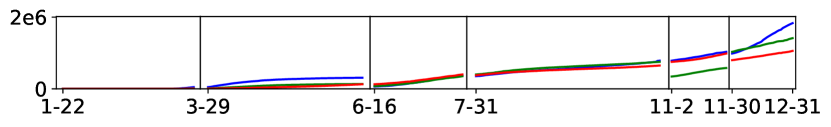
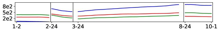
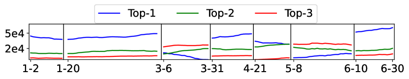
TSExplain identifies that the optimal equals 6 based on the optimal selection of K in Section 6. Figure 12 shows TSExplain’s output segmentation scheme with the top three explanations’ trend and three baselines’ output. Please refer to the legend of Figure 2 for the top-3 explanations of TSExplain. In TSExplain’s output, the first segment is from 1/22 to 3/14, where the increase of total-confirmed-cases is due to WA, NY, CA’s increase. From 3/14 to 5/4, NY increases the most, followed by NJ and MA. Then, between 5/4 and 5/29, IL, CA, NY slowly increase. Later on, the confirmed cases surge mainly because of the sharp increase in CA, TX, FL, and IL, especially IL increases quickly
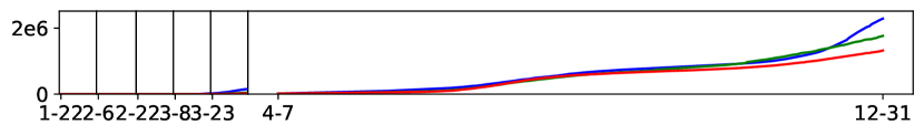
Contrarily, in the baselines, some neighboring segments’ explanations are exactly the same, i.e., 6/16–7/31 and 7/31–11/2 in Bottom-Up, 6/28–8/9 and 8/9–10/3 in NNSegment, as shown in Figure 12(c) and Figure 12(e); while FLUSS segmentation (Figure 12(d)) segments the early time into a lot of small segments which is hard to interpret. In addition, none of the baselines detect the top-explanations’ changes from NY during 3/14-5/4 to IL during 5/4-5/29 as reported in news(WTTW, 2020).
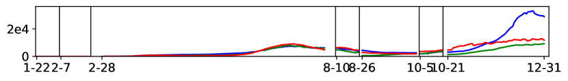
| Segment | Top-1 Expl | Top-2 Expl | Top-3 Expl |
| 1/22 ~3/7 | Washington + | New York + | California + |
| 3/7 ~4/7 | New York + | New Jersey + | Massachusetts + |
| 4/7 ~5/25 | New York - | New Jersey - | California + |
| 5/25 ~7/16 | Florida + | Texas + | California + |
| 7/16 ~9/9 | Florida - | Texas - | California - |
| 9/9 ~11/10 | Illinois + | Texas + | Wisconsin + |
| 11/10 ~12/31 | California + | New York + | Illinois - |
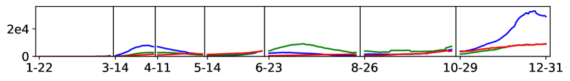
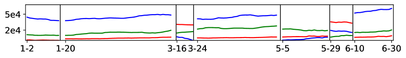
Daily-confirmed-cases
In Figure 14 and table 3, TSExplain segments this time series into seven periods. Specifically, from 3/7 to 4/6, NY, NJ, and MA’s rises contribute to the overall rise in the US. From 4/7 to 5/25, NY and NJ decline dramatically, and TSExplain captures an interesting pattern that CA starts to rise. During the holiday season in 2020, namely the last segment, CA and NY surge again while IL declines. Compared to TSExplain, the Bottom-Up segmentation does not detect the changes during 3/7 - 5/25. The FLUSS performs very poorly without revealing the explanation during 2/28-9/10 at all. The NNSegment segmentation is similar to our TSExplain explanation. However, it segments the up and down trend during 6/23 -8/26 to a whole segment which makes it users hard to interpret the explanations.
| Segment | Top-1 Expl | Top-2 Expl | Top-3 Expl |
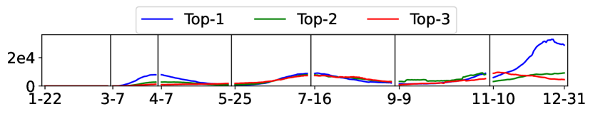
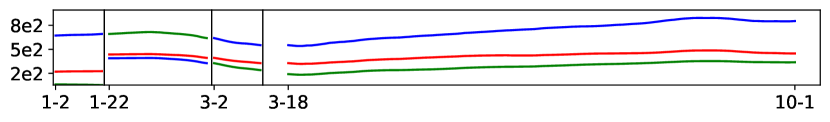
| 1/2 ~2/6 | technology + | energy - | internet retail + |
| 2/6 ~3/24 | technology - | financial - | communication - |
| 3/24 ~8/25 | technology + | consumer cyclical + | communication + |
| 8/25 ~10/1 | technology - | communication - | financial - |
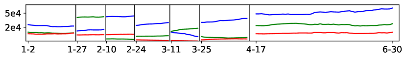
7.4.2. S&P 500
Figure 16 and Table 4 show TSExplain explanation results. TSExplain finds the elbow point at four and segments the time series into four small segments. Before the market crash from 1/2 to 2/6, the S&P 500 rises mainly due to the rises of category technology and subcategory internet retail; meanwhile, category energy slightly drops. Also, TSExplain recognizes the market crash at 3/24. TSExplain explains that stocks belonging to category technology, financial, and communication contribute the most to the crash. After that, the category technology contributes most to the recovery during 3/24 ~8/25 and the drop during 8/25 ~10/1. We can also discover an interesting fact that financial category drops dramatically from 2/6 to 3/24, but does not bounce back a lot as technology and communication category do during the stock market recovery. In the Bottom-Up approach, although it detects the market crashing point on 3/24, however, the decreasing influencers – technology, financial, communication service categories are detected starting from 2/24 which is much later than TSExplain. And FLUSS and NNSegment do not detect the crash point well and also can not recognize the drop from Aug to Oct.
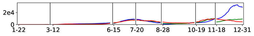
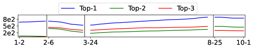
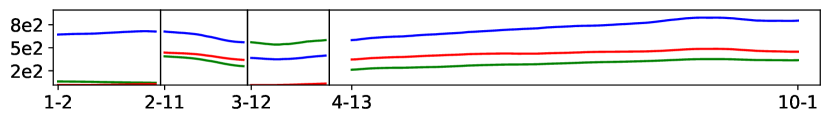
7.4.3. Liquor
Figure 18 shows that TSExplain segments the time series into seven segments and Table 5 shows each segment’s explanations. TSExplain recognizes that overall, from 1/20 to 4/21, the large pack liquor increases a lot, i.e., pack = 12, 24, 48. These indicate that people favor large-pack liquor at the beginning of the pandemic. We also remark that the underlying top explanations can be a combination of up and down trends. For example, the main reasons for the overall increase from 3/6 to 3/31 are BV=1000(-), BV=1750&P=6(+) and BV=750&P=12(+). TSExplain explains this in such way that ① BV=1000 decreases sharply, otherwise the overall bottles sold can increase much more; ② BV=1750&P=6(+) and BV=750&P=12(+) directly contribute to the increase. Moreover, with some background knowledge, we find that liquor with BV=1000 is mainly sold in independent stores. In March, Iowa’s close down proclamation(Iowa Government, 2020) requires restaurants and bars to shut down, and most indepen dent retailers rely on selling liquor to bars and restaurants. As a result, their business significantly declined. In late April, Iowa Governor issued a proclamation reopening restaurants, and the business of independent liquor stores gradually recovered. We can see TSExplain recognizes that from 4/21 to 5/8, BV=1000ml&Pack=12 increases a lot and from 5/8 to 6/10, BV=1000 becomes the top increasing explanation indicating that independent stores benefited from the reopening policy. In comparison, the explanations of the Bottom-Up results look flat, as shown at the bottom of Figure 18(c), indicating the detected explanations change subtly. This is similar with FLUSS and NNSegment. Moreover, the top-2 and top-3 explanations during 3/25-4/17 returned by FLUSS have only subtle changes in bottles sold. For NNSegment, the explanations during 1/23-2/7 and 2/7-2/25 are exactly the same, and the changes made by top-2 and top-3 explanations of the last segment are very small as well. Also, we remark that although we specify four explain-by attributes, the results are only about BV and P. This indicates that TSExplain is able to identify interesting attributes and ignore the less interesting ones, i.e. VN and CN.
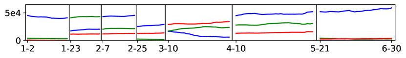
| Segment | Top-1 Expl | Top-2 Expl | Top-3 Expl |
| 1/2 ~1/20 | P=12 - | P=6 - | BV=375&P=24 - |
| 1/20 ~3/6 | P=12 + | P=6 + | P=48 + |
| 3/6 ~3/31 | BV=1000 - | BV=1750&P=6 + | BV=750&P=12 + |
| 3/31 ~4/21 | P=12 + | BV=1750&P=6 - | P=24 + |
| 4/21 ~5/8 | BV=1750&P=12 - | P=6 + | BV=1000&P=12 + |
| 5/8 ~6/10 | BV=1000 + | BV=1750&P=6 - | BV=750&P=12 - |
| 6/10 ~6/30 | P=12 + | BV=1750&P=6 + | P=24 + |
7.4.4. Sensitivity to K
TSExplain adopts the elbow method to detect the optimal . We observe that a slight change of the optimal will only bring up a slight shift in the results, e.g., remove or add one cutting point if K minuses/adds 1.
Takeaway. TSExplain effectively explains real-world datasets while the baseline defects in that:
-
•
Less explanation diversity: the neighboring segments have the same explanations.
-
•
Less effectiveness: the underlying key explanations can not be detected, and explanations are detected relatively late.
-
•
Less significance: The explanations detected change subtly.
7.5. Efficiency Evaluation
We conduct three experiments to evaluate the efficiency. In the first experiment, we report the breakdown latency and study the impact of our optimization strategies. In the second experiment, we compare the end-to-end runtime between TSExplain and all three baselines. In the third experiment, we study the scalability of TSExplain.
7.5.1. Latency Breakdown and Quality
Methods
Besides the two optimizations in Section 5.3, we introduce another straight-forward optimization - filter. The filtering protocol works as follows: given an explanation , if each point in its aggregated time series has value smaller than a ratio of the corresponding value in the overall aggregated time series, we filter this explanation as its support is low and thus insignificant. We set ratio as 0.001 by default.
We study TSExplain with different optimizations: VanillaTSExplain (short as Vanilla) is the plain version without any optimization; w filter filters out the explanations below the default ratio; O1 represents the algorithm which applies guess-and-verify after filtering; likewise, O2 applies sketching and O1+O2 applies both optimizations. Table 6 summarizes the statistics of the datasets. is the total candidate explanation number, is the time series length, and #record is the dataset record number. We also report the filtered . We remark that in this experiment, is unspecified, and the time of selecting the optimal via the Elbow Method (Section 6) is included in the latency (Figure 19).
| dataset | filtered | n | |
| total-confirmed-cases | 58 | 54 | 345 |
| daily-confirmed-cases | 58 | 55 | 345 |
| S&P 500 | 610 | 329 | 151 |
| Liquor | 8197 | 1812 | 128 |
Latency
Figure 19 illustrates the breakdown latency of TSExplain. The overall latency breaks down into three parts – precomputation(blue), the cascading analysts algorithm(orange), K-segmentation(green) corresponding to three modules in section 5.2.
For Covid total and daily-confirmed-cases dataset, the filtering strategy only slightly improves since the predicate number does not change a lot before and after filtering. In contrast, the sketching in O2 significantly reduces the latency of the cascading analysts algorithm and K-segmentation. Overall, O1+O2 reduces the latency of total-confirmed-cases from 175 ms to 33ms, and the latency of daily-confirmed-cases from 217ms to 43ms. For S&P 500 dataset, the filtering strategy reduces the latency to half. Guess-and-verify slightly reduces the latency, and together with sketching optimization, the overall latency is only 102 ms. For the Liquor dataset, the predicate number is very large even after filtering. The cascading analyst algorithm is the bottleneck. The Vanilla version takes 9.888s. After filtering, it still takes 2.59s. Since the predicate number is large, O1 (Guess-and-verify) takes big effect in this case. Each optimization O1 or O2 alone can significantly shrink the runtime to around 1.1s. The two optimizations together reduce the runtime to 756 ms. Although the precomputation is inevitable, the time of the cascading analyst algorithm has been reduced from vanilla — 8.754s to O1+O2 — around 200ms.
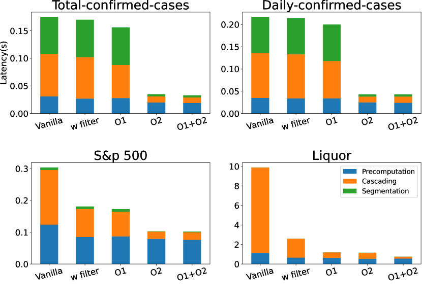
Quality
Except guess-and-verify, filter and sketching both approximate the results without formal guarantee. Thus, we study the impact of optimizations in terms of the result quality.
Table 7 illustrates the segmentation scheme’s total variance of O1+O2 compared with the Vanilla version. The variances and output segmentation of both algorithms are exactly the same for S&P 500 and Liquor datasets. For the Covid datasets, the difference is less than 1% and in the output segmentation, only two cutting points are slightly different — the corresponding distances are less than four days. Such a small discrepancy demonstrates that our optimization’s effect on result quality is neglectable.
| dataset | Variance(Vanilla) | Variance(O1+O2) |
| total-confirmed-cases | 22.602 | 22.744 |
| daily-confirmed-cases | 91.619 | 91.994 |
| S&P 500 | 5.002 | 5.002 |
| Liquor | 33.6533 | 33.6533 |
7.5.2. End-to-end Efficiency Comparison with Baselines
Methods
The three baselines in Section 7.2 solely focus on visual shape based segmentation without providing any explanations and require the segmentation number as an input. To make them comparable, first, after segmenting using each baseline, we add the explanation module using the CA algorithm in Section 5.2; second, we reuse the optimal TSExplain finds in Section 7.4, and then run all baselines and TSExplain with this given optimal . We also remark that the latency of determining the optimal K is very low, around 2ms in our experiments.
Results
Figure 20 reports the end-to-end efficiency comparison. For each baseline, we report the segmentation and explanation time separately, while for TSExplain, we show the overall time since our segmentation module interleaves with the explanation module. To illustrate the effectiveness of our proposed optimizations, we also report VanillaTSExplain (VANILLA). We can tell that for different datasets, FLUSS is always the slowest, NNSegment and Bottom-Up rank in the middle. VanillaTSExplain is similar to the Bottom-Up on the COVID-19 datasets and becomes slow when the predicate number goes up in the Liquor-sales dataset. Yet, combined with all the proposed optimizations, TSExplain is the fastest compared to all baselines on all datasets.
7.5.3. Scalability
In the scalability experiment, we synthesized new time series following the procedure in Sec VII.A of different lengths = 100, 200, 400, 800, 1600, 3200, 6400. For each length, we synthesize five different time series. We explain these time series using VanillaTSExplain (without any optimizations) and TSExplain with all optimizations mentioned in the paper. Figure 21 reports the average latency of different time series lengths. We terminate when the latency is greater than 100s. VanillaTSExplain’s latency increases exponentially. With optimizations, TSExplain’s latency increases much slower when the time series becomes longer. In particular, TSExplain can interactively explain the synthetic time series with length = 3200 in 982 ms.
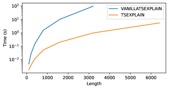
Takeaway. TSExplain can explain these three time series within 800ms, and our optimizations have accelerated the running time up to 13 with neglectable effects on quality. What’s more, TSExplain is faster than all the baselines.
8. Discussion
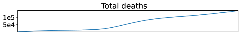
Time-varying Attribute. Different from non-temporal attributes, time-varying attributes are those whose values may change over time (Jensen and Snodgrass, 1996). Augmenting dataset with time-varying attributes can sometimes add insights in explaining trends. Below we demonstrate an example of using TSExplain with time-varying attributes.
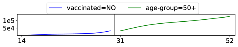
The covid death dataset (CDC COVID-19 Response, Epidemiology Task Force, 2022) records weekly deaths of different age groups and different vaccinated status from week 14 to 52 in 2021. The vaccinated attribute is a time-varying attribute since a person of vaccinated=NO can shift to vaccinated=YES in the near future. However, age-group is a static attribute because one person belonging to a specific age group will not change within a year. We explain the total death trend in Figure 22(top) using the attributes age-group and vaccinated. Figure 22(bottom) shows the result that before week 31, the main contributor is the unvaccinated people and after week 32, the main contributor shifts to elder people with age-group=50+. Combined with human knowledge that the vaccinated population is gradually becoming large along the time, we can get the insight that at the beginning, unvaccinated people (including unvaccinated elders) are the major factor of total deaths since unvaccinated young people also face high risk. Later on, elder people no matter vaccinated or not are the major reason as more young people get protected from vaccines while elder people do not get protected that well even vaccinated.
Real-time Time Series. We briefly discuss how TSExplain can be extended to support real-time time series explanation. TSExplain first gives users the segmentation results of existing time series and meanwhile, caches all unit segments’ top explanations. When new data arrives, it incrementally computes the top explanations for the new time series, runs the segmentation algorithm based on the existing time series’ cutting point and newly arrived data points, and updates the segmentation results.
Seasonal Datasets For seasonality datasets, TSExplain can explain the seasonality dataset directly and detect the repeated pattern of evolving explanations which indicates the periodicity property. Users can also first decompose the seasonal datasets (Hyndman and Athanasopoulos, 2018) and explain the seasonality and trend separately.
9. Conclusion
This work introduces TSExplain, the first explanation engine that identifies the evolving explanations for aggregated time series. We formulate the problem for deriving evolving explanations as a K-Segmentation problem, aiming to partition the input time series into K smaller segments such that each period has consistent top explanations. We propose a novel variance metric to quantify the consistency in each segment and develop a dynamic programming algorithm for identifying the optimal K-Segmentation scheme. TSExplain can automatically identify the optimal using the ”elbow method”. In the experiments, we show TSExplain can effectively discover the evolving explanation on synthetic and real-world datasets. We propose optimizations that enable TSExplain to answer all our queries interactively within one second. Several future work directions include extending the difference metric library, recommending explain-by attributes, adding hints for segments with higher variance for further inspection.
References
- (1)
- Abuzaid et al. (2018) Firas Abuzaid, P. Kraft, Sahaana Suri, Edward Gan, E. Xu, Atul Shenoy, Asvin Anathanaraya, John Sheu, E. Meijer, Xi Wu, J. Naughton, Peter Bailis, and M. Zaharia. 2018. DIFF: A Relational Interface for Large-Scale Data Explanation. Proc. VLDB Endow. 12 (2018), 419–432.
- Bailis et al. (2017) Peter Bailis, Edward Gan, S. Madden, D. Narayanan, Kexin Rong, and Sahaana Suri. 2017. MacroBase: Prioritizing Attention in Fast Data. Proceedings of the 2017 ACM International Conference on Management of Data (2017).
- Berit Hoffmann (2021) Berit Hoffmann. 2021. Unveiling Sisu’s vision for Decision Intelligence. https://sisudata.com/blog/unveiling-vision-decision-intelligence.
- CDC COVID-19 Response, Epidemiology Task Force (2022) CDC COVID-19 Response, Epidemiology Task Force. 2022. Rates of COVID-19 Deaths by Age Group and Vaccination Status. https://data.cdc.gov/Public-Health-Surveillance/Rates-of-COVID-19-Cases-or-Deaths-by-Age-Group-and/3rge-nu2a.
- CHAD LANGAGER (2021) CHAD LANGAGER. 2021. How Is the Value of the S&P 500 Calculated? https://www.investopedia.com/ask/answers/05/sp500calculation.asp. [Online; accessed 5-October-2021].
- Chen and Huang (2021) Yiru Chen and Silu Huang. 2021. TSExplain: Surfacing Evolving Explanations for Time Series. In Proceedings of the 2021 International Conference on Management of Data. 2686–2690.
- Dong et al. (2020) Ensheng Dong, Hongru Du, and Lauren Gardner. 2020. An interactive web-based dashboard to track COVID-19 in real time. The Lancet infectious diseases 20, 5 (2020), 533–534.
- Douglas and Peucker (1973) David H Douglas and Thomas K Peucker. 1973. Algorithms for the reduction of the number of points required to represent a digitized line or its caricature. Cartographica: the international journal for geographic information and geovisualization 10, 2 (1973), 112–122.
- Gharghabi et al. (2017) Shaghayegh Gharghabi, Yifei Ding, Chin-Chia Michael Yeh, Kaveh Kamgar, Liudmila Ulanova, and Eamonn Keogh. 2017. Matrix profile VIII: domain agnostic online semantic segmentation at superhuman performance levels. In 2017 IEEE international conference on data mining (ICDM). IEEE, 117–126.
- Gharghabi et al. (2019) Shaghayegh Gharghabi, Chin-Chia Michael Yeh, Yifei Ding, Wei Ding, Paul Hibbing, Samuel LaMunion, Andrew Kaplan, Scott E Crouter, and Eamonn Keogh. 2019. Domain agnostic online semantic segmentation for multi-dimensional time series. Data mining and knowledge discovery 33, 1 (2019), 96–130.
- Google Trend (2020) Google Trend. 2020. Taylor Swift compared with Kim Kardashian. https://trends.google.com/trends/explore?q=%2Fm%2F0dl567,%2Fm%2F0261x8t&date=now%207-d&geo=US.
- Gray et al. (1997) Jim Gray, Surajit Chaudhuri, Adam Bosworth, Andrew Layman, Don Reichart, Murali Venkatrao, Frank Pellow, and Hamid Pirahesh. 1997. Data cube: A relational aggregation operator generalizing group-by, cross-tab, and sub-totals. Data mining and knowledge discovery 1, 1 (1997), 29–53.
- Hartigan and Wong (1979) John A Hartigan and Manchek A Wong. 1979. Algorithm AS 136: A k-means clustering algorithm. Journal of the royal statistical society. series c (applied statistics) 28, 1 (1979), 100–108.
- Hunter and McIntosh (1999) Jim Hunter and Neil McIntosh. 1999. Knowledge-based event detection in complex time series data. In Joint European Conference on Artificial Intelligence in Medicine and Medical Decision Making. Springer, 271–280.
- Hyndman and Athanasopoulos (2018) Rob J Hyndman and George Athanasopoulos. 2018. Forecasting: principles and practice. OTexts.
- Imply (2021) Imply. 2021. Imply Explain Feature. https://docs.imply.io/latest/explain/.
- Iowa Government (2020) Iowa Government. 2020. Gov. Reynolds issues a State of Public Health Disaster Emergency. https://idph.iowa.gov/News/ArtMID/646/ArticleID/158309/Gov-Reynolds-issues-a-State-of-Public-Health-Disaster-Emergency-31720?fbclid=IwAR1gjXuRQH37snyHWqL7-GlI4DOsRLAliqd94DD7m_sJaJr38lSOC4I7pwE. [Online; accessed 5-October-2021].
- Jensen and Snodgrass (1996) Christian S Jensen and Richard T Snodgrass. 1996. Semantics of time-varying information. Information Systems 21, 4 (1996), 311–352.
- Joglekar et al. (2017) Manas Joglekar, Hector Garcia-Molina, and Aditya Parameswaran. 2017. Interactive data exploration with smart drill-down. IEEE Transactions on Knowledge and Data Engineering 31, 1 (2017), 46–60.
- Johns Hopkins University (2021) Johns Hopkins University. 2021. COVID-19 Data Repository. https://github.com/CSSEGISandData/COVID-19.
- Keogh et al. (2004) Eamonn Keogh, Selina Chu, David Hart, and Michael Pazzani. 2004. Segmenting time series: A survey and novel approach. In Data mining in time series databases. World Scientific, 1–21.
- Keogh et al. (1997) Eamonn J Keogh, Padhraic Smyth, et al. 1997. A probabilistic approach to fast pattern matching in time series databases.. In Kdd, Vol. 1997. 24–30.
- Kodinariya and Makwana (2013) Trupti M Kodinariya and Prashant R Makwana. 2013. Review on determining number of Cluster in K-Means Clustering. International Journal 1, 6 (2013), 90–95.
- Koski et al. (1995) Antti Koski, Martti Juhola, and Merik Meriste. 1995. Syntactic recognition of ECG signals by attributed finite automata. Pattern Recognition 28, 12 (1995), 1927–1940.
- Labaien et al. (2020) Jokin Labaien, Ekhi Zugasti, and Xabier De Carlos. 2020. Contrastive explanations for a deep learning model on time-series data. In International Conference on Big Data Analytics and Knowledge Discovery. Springer, 235–244.
- Law (2019) Sean M Law. 2019. STUMPY: A powerful and scalable Python library for time series data mining. Journal of Open Source Software 4, 39 (2019), 1504.
- Li et al. (2021) Chenjie Li, Zhengjie Miao, Qitian Zeng, Boris Glavic, and Sudeepa Roy. 2021. Putting Things into Context: Rich Explanations for Query Answers using Join Graphs. In Proceedings of the 2021 International Conference on Management of Data. 1051–1063.
- Liu and Heer (2014) Zhicheng Liu and Jeffrey Heer. 2014. The Effects of Interactive Latency on Exploratory Visual Analysis. IEEE Trans. Vis. Comput. Graph. 20, 12 (2014), 2122–2131. https://doi.org/10.1109/TVCG.2014.2346452
- Matsubara et al. (2014) Yasuko Matsubara, Yasushi Sakurai, and Christos Faloutsos. 2014. Autoplait: Automatic mining of co-evolving time sequences. In Proceedings of the 2014 ACM SIGMOD international conference on Management of data. 193–204.
- Miao et al. (2019) Zhengjie Miao, Andrew Lee, and Sudeepa Roy. 2019. LensXPlain: Visualizing and explaining contributing subsets for aggregate query answers. Proceedings of the VLDB Endowment 12, 12 (2019), 1898–1901.
- Microsoft (2021) Microsoft. 2021. PowerBI. https://powerbi.microsoft.com/en-us/.
- Ng (2012) Andrew Ng. 2012. Clustering with the k-means algorithm. Machine Learning (2012).
- PowerBI (2021a) PowerBI. 2021a. Create Key Influencers Visualizations. https://docs.microsoft.com/en-us/power-bi/visuals/power-bi-visualization-influencers.
- PowerBI (2021b) PowerBI. 2021b. Key Influencer Over Time. https://ideas.powerbi.com/ideas/idea/?ideaid=57440365-96af-4362-9b8f-5d096bd92788.
- Ramer (1972) Urs Ramer. 1972. An iterative procedure for the polygonal approximation of plane curves. Computer graphics and image processing 1, 3 (1972), 244–256.
- Rooke et al. (2021) Clayton Rooke, Jonathan Smith, Kin Kwan Leung, Maksims Volkovs, and Saba Zuberi. 2021. Temporal Dependencies in Feature Importance for Time Series Predictions. arXiv preprint arXiv:2107.14317 (2021).
- Roy and Suciu (2014) Sudeepa Roy and Dan Suciu. 2014. A formal approach to finding explanations for database queries. In Proceedings of the 2014 ACM SIGMOD international conference on Management of data. 1579–1590.
- Ruhl et al. (2018) M. Ruhl, M. Sundararajan, and Qiqi Yan. 2018. The Cascading Analysts Algorithm. Proceedings of the 2018 International Conference on Management of Data (2018).
- Sarawagi (2001) Sunita Sarawagi. 2001. idiff: Informative summarization of differences in multidimensional aggregates. Data Mining and Knowledge Discovery 5, 4 (2001), 255–276.
- Satopaa et al. (2011) Ville Satopaa, Jeannie Albrecht, David Irwin, and Barath Raghavan. 2011. Finding a” kneedle” in a haystack: Detecting knee points in system behavior. In 2011 31st international conference on distributed computing systems workshops. IEEE, 166–171.
- Sisu Data (2021) Sisu Data. 2021. Augmented Analytics for Strategic Data Teams. https://sisudata.com/.
- Sivill and Flach (2022) Torty Sivill and Peter Flach. 2022. LIMESegment: Meaningful, Realistic Time Series Explanations. In International Conference on Artificial Intelligence and Statistics. PMLR, 3418–3433.
- Tableau (2021a) Tableau. 2021a. BI and Analytics Software. https://www.tableau.com/.
- Tableau (2021b) Tableau. 2021b. Explain Data. www.tableau.com/products/new-features/explain-data.
- Tonekaboni et al. (2020) Sana Tonekaboni, Shalmali Joshi, Kieran Campbell, David K Duvenaud, and Anna Goldenberg. 2020. What went wrong and when? Instance-wise feature importance for time-series black-box models. Advances in Neural Information Processing Systems 33 (2020), 799–809.
- Vullings et al. (1997) HJLM Vullings, MHG Verhaegen, and Henk B Verbruggen. 1997. ECG segmentation using time-warping. In International Symposium on Intelligent Data Analysis. Springer, 275–285.
- Wang et al. (2015) Xiaolan Wang, X. Dong, and A. Meliou. 2015. Data X-Ray: A Diagnostic Tool for Data Errors. In SIGMOD ’15.
- Wikipedia, the free encyclopedia (2021a) Wikipedia, the free encyclopedia. 2021a. Signal-to-noise ratio. https://otexts.com/fpp2/classical-decomposition.html.
- Wikipedia, the free encyclopedia (2021b) Wikipedia, the free encyclopedia. 2021b. S&P500 Index. https://en.wikipedia.org/wiki/S%26P_500.
- WTTW (2020) WTTW. 2020. Illinois Seeing More and More COVID-19 Cases as Testing Continues to Increase. https://news.wttw.com/2020/05/02/illinois-seeing-more-and-more-covid-19-cases-testing-continues-increase.
- Wu and Madden (2013) E. Wu and S. Madden. 2013. Scorpion: Explaining Away Outliers in Aggregate Queries. Proc. VLDB Endow. 6 (2013), 553–564.