MethodsMethods References
Human mobility networks reveal increased segregation in large cities
Abstract
A long-standing expectation is that large, dense, and cosmopolitan areas support socioeconomic mixing and exposure between diverse individuals[1, 2, 3, 4, 5, 6]. It has been difficult to assess this hypothesis because past approaches to measuring socioeconomic mixing have relied on static residential housing data rather than real-life exposures between people at work, in places of leisure, and in home neighborhoods[7, 8]. Here we develop a new measure of exposure segregation (ES) that captures the socioeconomic diversity of everyday encounters. Leveraging cell phone mobility data to represent 1.6 billion exposures among 9.6 million people in the United States, we measure exposure segregation across 382 Metropolitan Statistical Areas (MSAs) and 2829 counties. We discover that exposure segregation is 67% higher in the 10 largest Metropolitan Statistical Areas (MSAs) than in small MSAs with fewer than 100,000 residents. This means that, contrary to expectation, residents of large cosmopolitan areas have significantly less exposure to diverse individuals. Second, we find evidence that large cities offer a greater choice of differentiated spaces targeted to specific socioeconomic groups, a dynamic that accounts for this increase in everyday socioeconomic segregation. Third, we discover that this segregation-increasing effect is countered when a city’s hubs (e.g. shopping malls) are positioned to bridge diverse neighborhoods and thus attract people of all socioeconomic statuses. Overall, our findings challenge a long-standing conjecture in human geography and urban design, and highlight how built environment can both prevent and facilitate exposure between diverse individuals.
Introduction
In the U.S., economic segregation is very high, with income affecting where one lives[9], who one marries[10], and who one meets and befriends[11]. This extreme segregation is costly: it reduces economic mobility[12, 13, 14, 15], fosters a wide range of health problems[16, 17], and increases political polarization[18]. Although there are all manner of reforms designed to reduce economic segregation (e.g., subsidized housing), it has long been argued that one of the most powerful segregation-reducing dynamics is rising urbanization[19] and the happenstance mixing that it induces[1, 3, 4, 5, 2, 6]. This “cosmopolitan mixing hypothesis” anticipates that in large cities the combination of increased population diversity, constrained space, and accessible public transportation will bring diverse individuals into close physical proximity with one another[2]—reducing everyday socioeconomic segregation. The NYC subway has been lauded, for example, as a mixing bowl of diversity[20].
As plausible as the cosmopolitan mixing hypothesis might seem, big cities also provide new opportunities for self-segregation, given that they’re large enough to allow people to seek out and find others like themselves[21]. These contrasting hypotheses about the relationship between urbanization and socioeconomic mixing remain untested because it has been difficult to measure real-world exposure among individuals[7, 22, 23, 24]. Cell phone geolocation data provide an exciting opportunity to do so, as they have been used for many research purposes[25, 26, 27, 28, 29, 30, 31, 32, 33, 34, 35], but a nationwide study of socioeconomic mixing and urbanization has not been undertaken because of difficulties in ascertaining individual-level socioeconomic status, determining when dyadic exposures occur, and amassing the data needed to compare across cities or counties[25, 26, 27, 29, 30, 31, 32, 33].
Here, we undertake the first credible test of the “cosmopolitan mixing hypothesis” and the dynamics underlying it. To assess this hypothesis and understand the relationship between urbanization and segregation, we use cell phone data to link geolocated individual-level exposures between people with individual-level socioeconomic status. This allows us to develop a measure of segregation for an area (e.g., MSA or county) that captures where people go, when they go there, and whom they encounter on the way. We first construct a dynamic exposure network that captures each individual’s exposures to other individuals in the real world. Our network contains 1.6 billion exposures among 9.6 million people across 382 Metropolitan Statistical Areas (MSA) and 2829 counties in the United States. Then, we determine the socioeconomic status of a person (i.e., the cell phone) by identifying their home location and its monthly rent value. We link these data to define a measure of exposure segregation (ES) that extends a traditional static segregation measure by capturing the diversity of person-to-person exposures localized in space and time.
Results
We estimate exposure segregation (ES), defined as the extent to which individuals of different economic statuses are exposed to one another, for each geographic area in the U.S. (e.g., MSA, county). This entails building a dynamic exposure network with 9,567,559 nodes (representing individuals) and 1,570,782,460 edges (representing exposures in physical space).
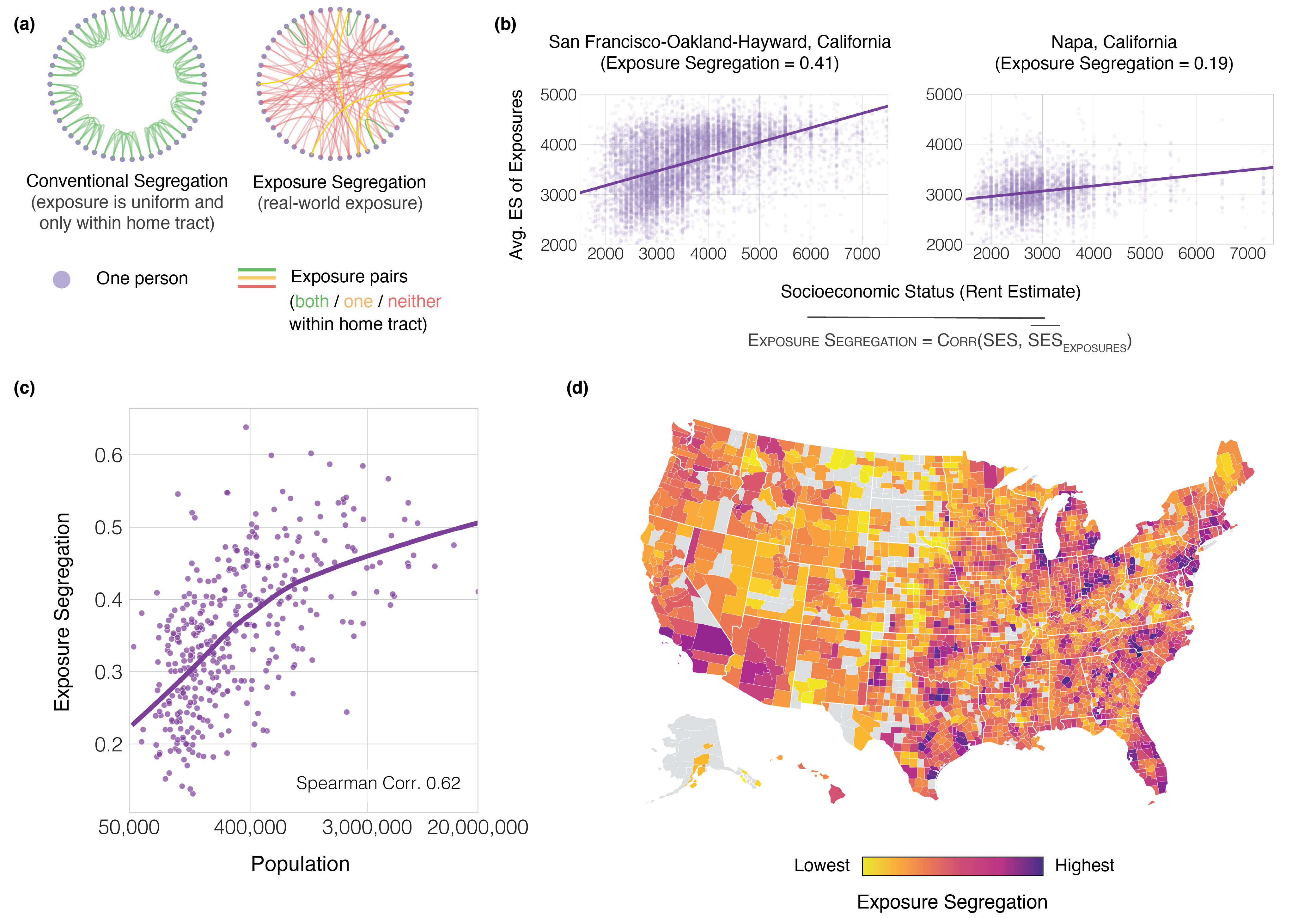
Developing a more realistic measure of socioeconomic segregation.
To estimate each person’s socioeconomic status (SES), we first infer their night-time home location from cell phone mobility data, and we then recover the estimated monthly rent value of the home at this location (Methods M2). This method is more accurate than the convention of proxying individual SES with neighborhood-level Census averages[27, 28]. The economic segregation of each geographic region is measured by the correlation between a person’s SES and the mean SES of everyone they cross paths with (unweighted by edge strength). This correlation is estimated by fitting a linear mixed effects model that eliminates attenuation bias and secures unbiased estimates of exposure segregation even when observed exposures are sparse (Methods M3). The resulting measure of exposure segregation (Figure 1a-b), which ranges from 0 (perfect integration) to 1 (complete segregation), is a generalization of a widely used measure of socioeconomic segregation, the Neighborhood Sorting Index (NSI)[7]. The NSI is equivalent to the correlation between each person’s SES and the mean SES of all people in their Census tract, whereas the ES is equivalent to the correlation between each person’s SES and the mean SES of all people they have crossed paths with, either inside or outside their census tract. Like the NSI, the ES measures cross-class exposure of any type, rather than focusing on ties that are persistent or strong (such as friendship ties)[11]. We opt for this approach because the cosmopolitan mixing hypothesis dictates this expansive test, and we find that our results are robust to tie strength (Supplementary Figure S7).
Exposure segregation is extremely high in large cities.
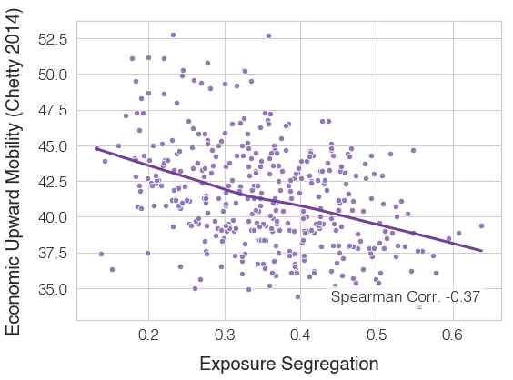
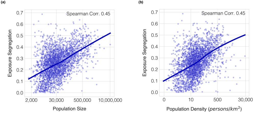
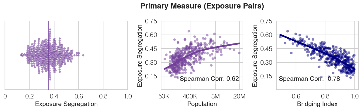
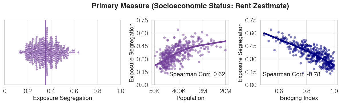
We discover that, contrary to the “cosmopolitan mixing hypothesis”, exposure segregation is higher in large MSAs (Figure 1c). The Spearman correlation between MSA population and MSA segregation is 0.62 (), and the 10 largest MSAs by population size are 67% (, 95% CI 49-87%) more segregated than small MSAs with less than 100,000 residents. This result is robust: we validate it by recalculating the correlation with a measure of density rather than population size (Spearman Correlation 0.45, , Supplementary Table S7), by controlling for relevant covariates (Extended Data Table 1 and Supplementary Table S7), by varying the granularity of the analysis (Figure 1d, Extended Data Figure 3), and by testing a variety of specifications of exposure segregation (Supplementary Table S6, Supplementary Figures S2-S9). The consistent result that larger, denser cities are more segregated runs counter to the hypothesis that such cities promote socioeconomic mixing by attracting diverse individuals and constraining space in ways that oblige them to cross paths with each other[1, 3, 4, 5, 2, 6]. Our results support the opposite hypothesis: big cities allow their inhabitants to seek out people who are more like themselves. The key advancement that enables this discovery is our realistic fine-grained measure of proximity with respect to both time and space (Extended Data Figure 9).
Exploring exposure segregation.
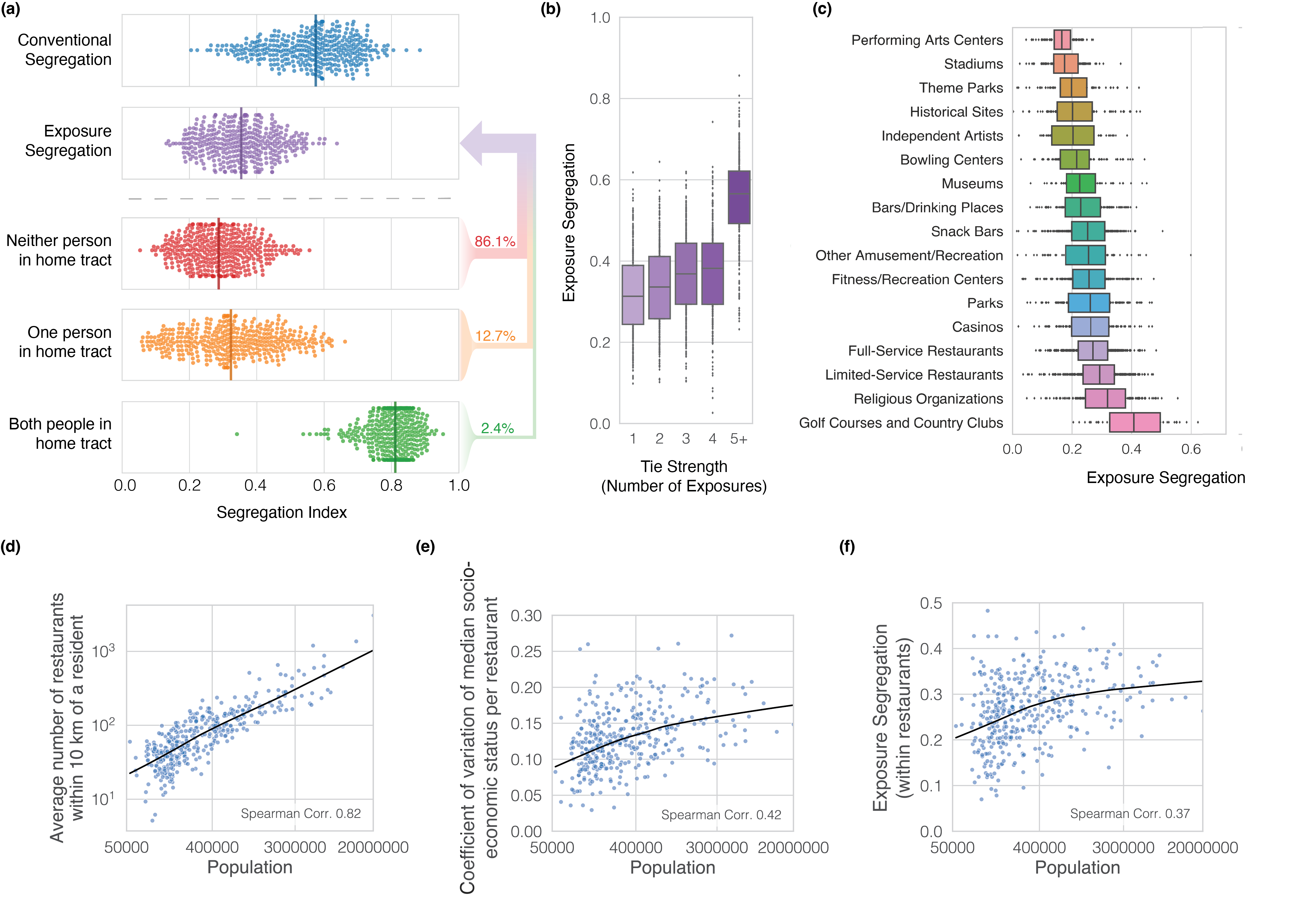
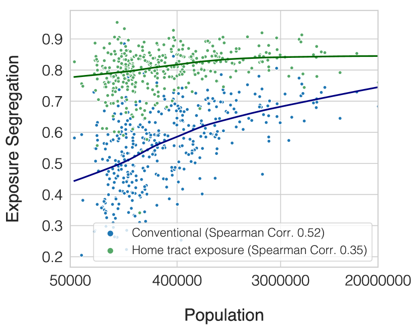
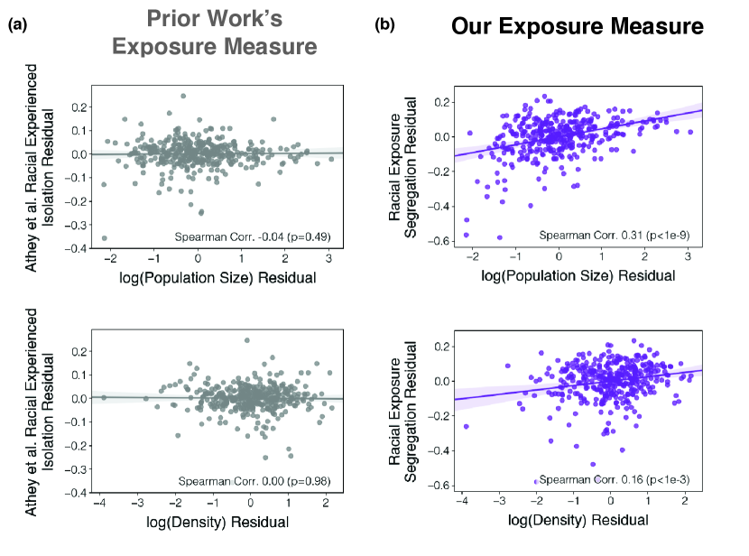
Our methodology further allows for comparisons between a conventional static measure of segregation (Neighborhood Sorting Index, NSI) and our dynamic measure. The median level of exposure segregation across all MSAs is 38% lower (, 95% confidence interval ) than the corresponding value for a conventional static estimate (NSI; Figure 2a top)[28]. Exposure segregation is lower because when people venture outside their home tract, they experience more diversity (Figure 2a bottom). For instance, exposures are 50% less segregated when both people are outside the home tract (, 95% CI ). An important caveat is that exposures that occur when both people are within their home Census tract are 41% more segregated (, 95% CI ) than under the hypothetical that residents are exposed uniformly to all people in the same tract (as the NSI assumes). This implies that even within their own neighborhood, people interact with neighbors who are socioeconomically most similar to them. In prior work pertaining to racial segregation (rather than economic segregation), it was likewise found that a static measure overstates segregation, while segregation within home tracts exceeds static estimates[28]. Unique to our study, we find that each component of exposure segregation is elevated in large cities (Extended Data Figure 5, Supplementary Figure S4), showing the robustness of our rejection of the cosmopolitan mixing hypothesis.
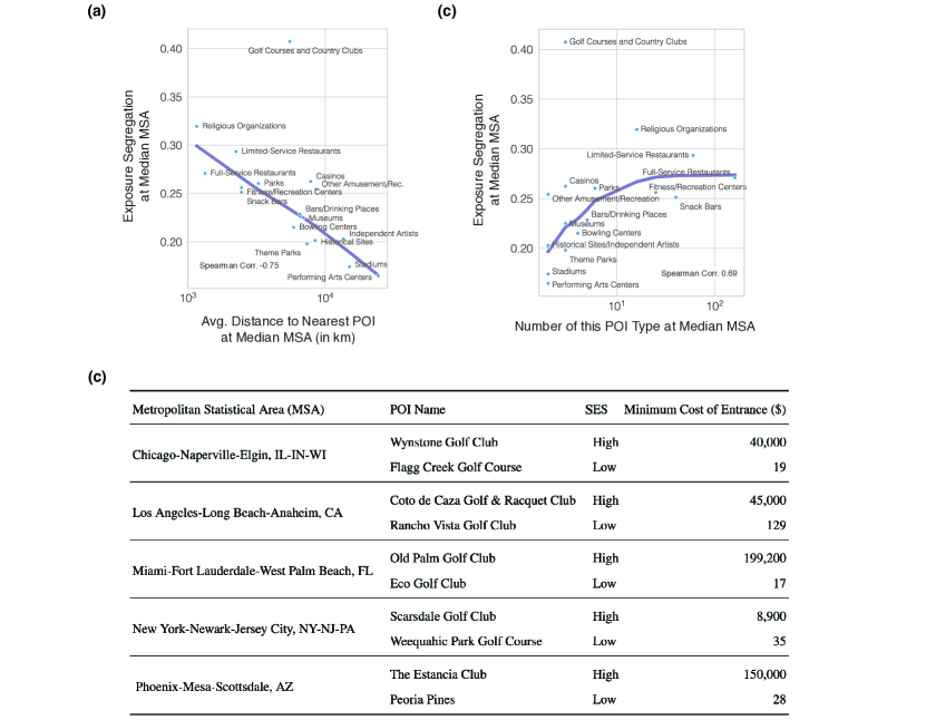
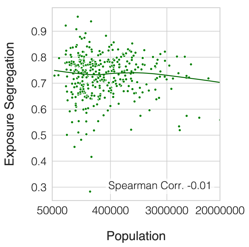
We also quantify variability in exposure segregation both by tie strength (Figure 2b-c) and across different points of interest (POIs). Stronger ties are more segregated (Figure 2b)[36, 37]. We also find much variability in POI-level segregation[27, 11] (Figure 2c). We explain variability in POI-level segregation (Figure 2c) by the degree to which POIs service small and thereby socioeconomically homogeneous communities, operationalized as average travel distance to nearest POI[27] and # of POIs (Spearman Corr. -0.75, for travel distance, Spearman Corr. 0.69, for # of POIs, Extended Data Figure 2a,b). For instance, in the median MSA, religious organizations require 92% (, 95% CI ) less travel distance and are 16 (, 95% CI ) more numerous than stadiums, and are thus 75% (, 95% CI ) more segregated. In rare cases, a POI with few venues may still be highly segregated (e.g., golf courses) because cross-venue economic differentiation is generated through other mechanisms, such as a public-private distinction (Extended Data Figure 2c).
Differentiation of space in large cities.
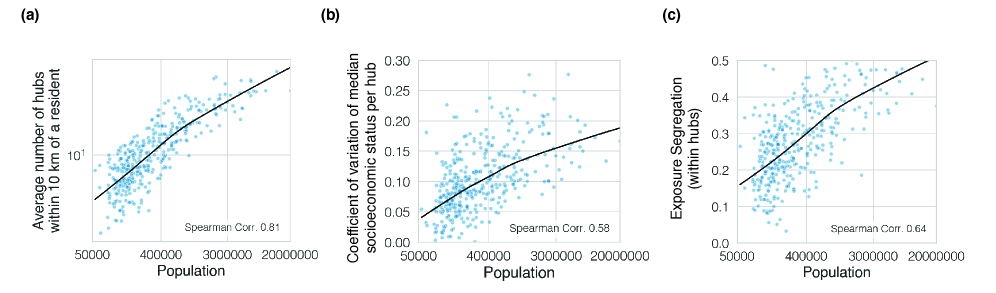
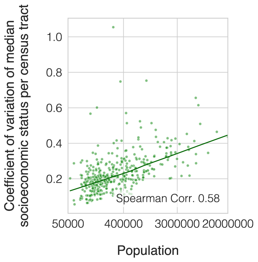
To understand why large metropolitan areas support homophily, we present an example of segregation within leisure POIs. Full-service restaurants provide an illustrative example (Figure 2d,e,f) of a segregation-inducing dynamic that holds widely across other leisure sites (Supplementary Figure S22) and other scales of analysis (Extended Data Figure 4-5). We find that larger MSAs offer their residents a greater number of leisure choices: the average resident of one of the 10 largest MSAs has 22 (, 95% CI 11-39) more restaurants within 10 kilometers of their home than an average resident of a small MSA (where a “small MSA” is defined as one with less than 100,000 residents; Figure 2d). These choices are also more socioeconomically differentiated. When a restaurant’s SES is defined as the median SES of all people who cross paths within it, the coefficient of variation of “restaurant SES” in the 10 largest MSAs is 63% (, 95% CI 37-100%) larger than that in small ones (Figure 2e). Thus, large MSAs not only offer their residents a larger choice of restaurants, but these restaurants are also more socioeconomically differentiated. These processes are associated with a 29% (, 95% CI 8-49%) increase in exposure segregation at restaurants in the 10 largest MSAs relative to those in small MSAs (Figure 2f). We also find analogous results at higher levels of scale: hubs (e.g. plazas, malls, shopping centers, boardwalks) (Extended Data Figure 4) as well as neighborhoods (Extended Data Figure 5) and across different many POI types (Supplementary Figure S22).
Mitigating segregation via urban design.
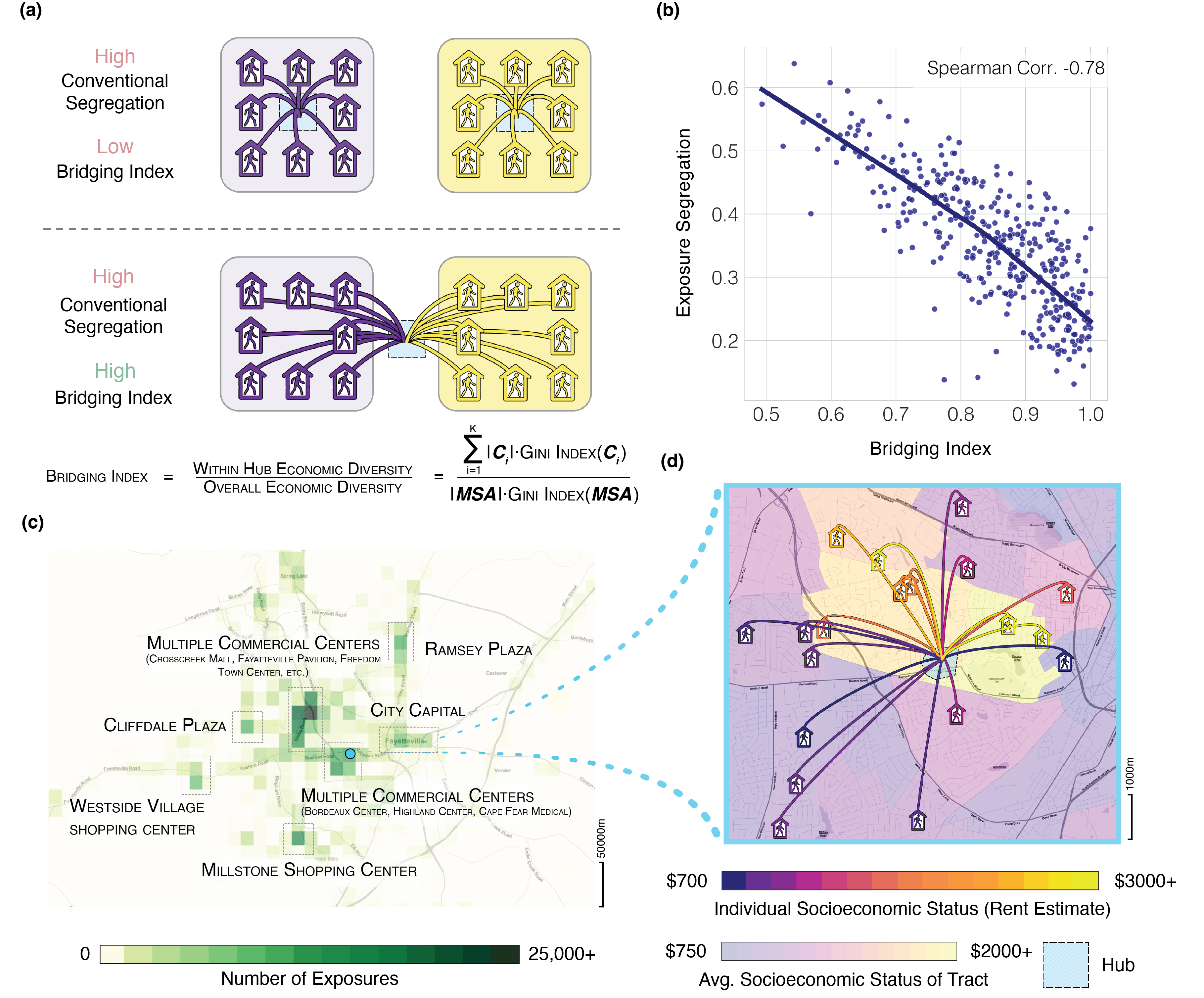
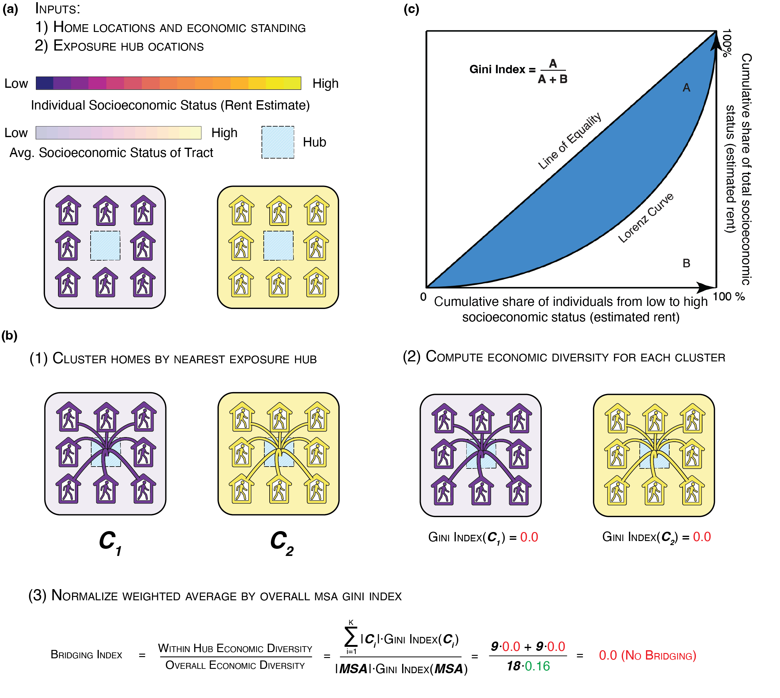
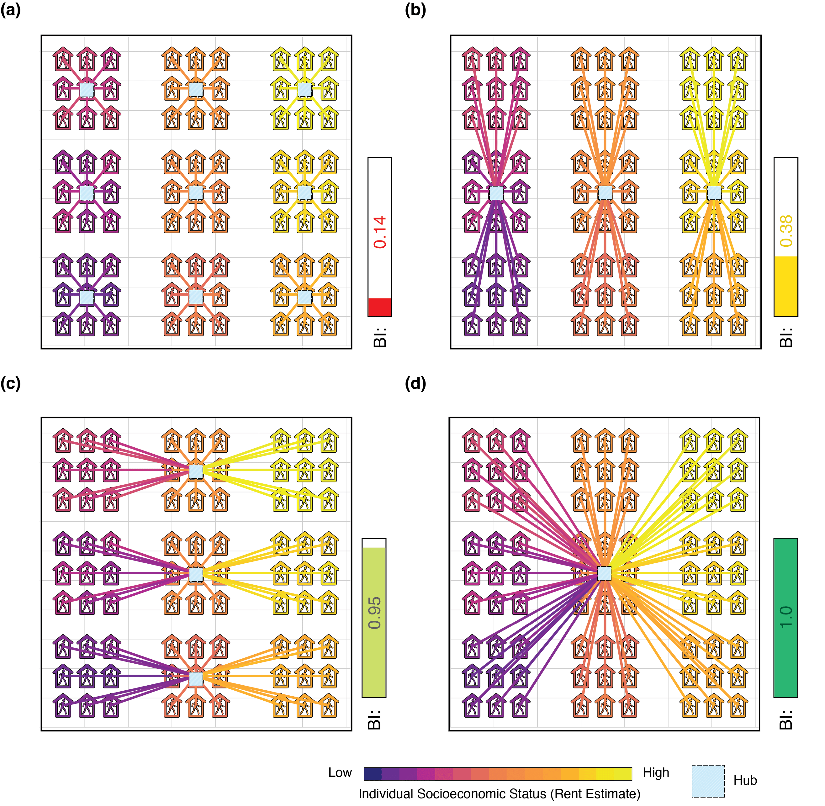
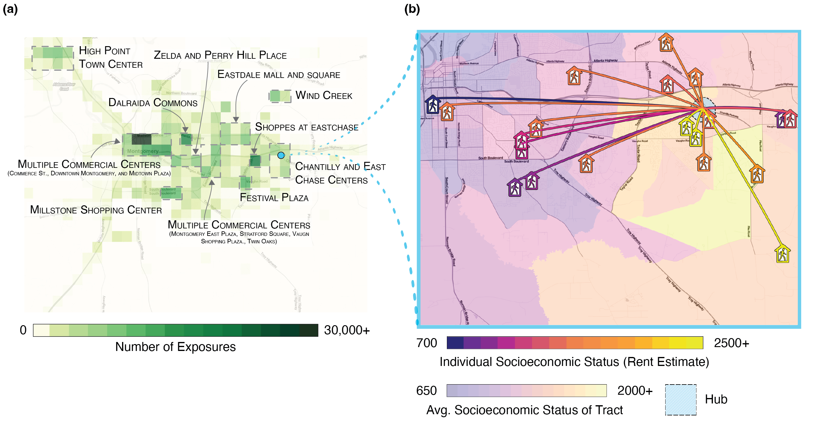
Our results so far suggest that segregation could be mitigated via urban design by placing frequently-visited POIs to act as bridges between diverse neighborhoods, which would allow residents of nearby high-SES and low-SES neighborhoods to easily visit and cross paths (Figure 3c)[38, 39, 40]. We develop the Bridging Index (BI; Methods M3) to measure whether hubs (i.e., highly-visited POIs) are located in such bridging positions. This index, which measures the economic diversity of the groups that would be exposed to each other if everybody visited only their nearest hub, is computed by clustering individuals by the nearest hub to their home and then measuring the economic diversity within these clusters (Extended Data Figure 6). The resulting index ranges from 0 to 1, where 0 means that individuals near each hub have uniform SES, and 1 means that individuals near each hub are as diverse as the overall area (Extended Data Figure 7). We compute BI for commercial centers (e.g. plazas, malls, shopping centers, boardwalks) because we find that they are common hubs of exposure: the majority (56.9%, 95% CI 56.9%-56.9%) of exposures across all 382 MSAs occur in close proximity (within 1km) of a commercial center, even though only 2.5% of land area is within 1km of a commercial center. (see Figure 3c). The results show that BI is strongly associated with exposure segregation (Spearman Correlation -0.78, p; Figure 3d). The top 10 MSAs with the highest BI are 53.1% (, 95% CI 44-60%) less segregated than the 10 MSAs with the lowest BI. This finding is again robust: the effect of BI is strong and significant () even after including controls for race, population size, economic inequality, and many other variables (Extended Data Tables 2 and 3; see also Supplementary Table S6; Supplementary Figures S2 and S8; Supplementary Figure S12). It follows that policies (e.g., zoning laws) that encourage developers to locate hubs, such as shopping malls, between diverse residential neighborhoods may reduce exposure segregation. We have identified several large cities that increase integration in this way (Supplementary Table S8) and present an illustrative example (Figure 3c-d) in which well-placed hubs bridge diverse individuals in Fayetteville, North Carolina.
Discussion
As big cities continue to grow and spread, it is important to ask whether they are increasing socioeconomic mixing. Although it is often argued that big cities promote mixing by increasing density, in fact we find that exposure diversity and city size are negatively related. This result means that scale matters. Because large cities can sustain venues that are targeted to thin socioeconomic slices of the population, they have become homophily-generating machines that are more segregated than small cities. We also find that some cities are able to mitigate this segregative effect because their hubs are located in bridging zones that can draw in people from diverse neighborhoods. We were able to detect these pockets of homophily (and the counteracting effects of bridging hubs) because we have developed a dynamic measure of economic segregation that captures everyday socioeconomic mixing at home, work, and leisure.
This new methodology for measuring exposure segregation, while an improvement over static approaches, of course has limitations. Because we use physical proximity as a proxy for exposure, it is difficult to ascertain exactly how weak or strong the ties are[41]. It is reassuring, however, that our core results persist under stricter time, distance, and tie-strength thresholds (Supplementary Table S6, Supplementary Figures S5-S8), and are associated with downstream outcomes (Extended Data Figure 1(d), Supplementary Figure 24(b)). It is likewise important to locate and analyze supplementary datasets that cover subpopulations (e.g., homeless subpopulations) that aren’t as well represented in our dataset[42]. The available evidence indicates that our sample is well-balanced on many key racial, economic, and demographic variables[43], but cellphone market penetration is still not complete, and GPS ping data is unevenly distributed by time. Lastly, our measure of SES relies on housing consumption, an indicator that does not exhaust the concept of SES. It is again reassuring that our analytic approach, which improves on conventional neighborhood-level imputations, is robust under a range of alternative measures of SES (Supplementary Figure S3).
This is all to suggest that dynamic segregation data are rich enough to overcome many seeming limitations. The dynamic approach that we have taken here could further be extended to examine cross-population differences in the sources of segregation and to develop a more complete toolkit of approaches to reducing segregation and improving urban design.
References
References
- [1] Jacobs, J. The Death and Life of Great American Cities (Random House, 1961).
- [2] Wirth, L. Urbanism as a way of life. American Journal of Sociology 44, 1–24 (1938).
- [3] Milgram, S. The experience of living in cities. Science 167, 1461–1468 (1970).
- [4] Derex, M., Beugin, M.-P., Godelle, B. & Raymond, M. Experimental evidence for the influence of group size on cultural complexity. Nature 503, 389–391 (2013).
- [5] Gomez-Lievano, A., Patterson-Lomba, O. & Hausmann, R. Explaining the prevalence, scaling and variance of urban phenomena. Nature Human Behaviour 1, 1–6 (2016).
- [6] Stier, A. J. et al. Evidence and theory for lower rates of depression in larger us urban areas. Proceedings of the National Academy of Sciences 118, e2022472118 (2021).
- [7] Jargowsky, P. A. Take the money and run: Economic segregation in us metropolitan areas. American Sociological Review 984–998 (1996).
- [8] Massey, D. S. & Eggers, M. L. The spatial concentration of affluence and poverty during the 1970s. Urban Affairs Quarterly 29, 299–315 (1993).
- [9] Reardon, S. F., Bischoff, K., Owens, A. & Townsend, J. B. Has income segregation really increased? bias and bias correction in sample-based segregation estimates. Demography 55, 2129–2160 (2018).
- [10] Schwartz, C. R. Earnings inequality and the changing association between spouses’ earnings. American journal of sociology 115, 1524–1557 (2010).
- [11] Chetty, R. et al. Social capital: Determinants of economic connectedness. Nature 608, 122–34 (2022).
- [12] Massey, D. & Denton, N. A. American apartheid: Segregation and the making of the underclass (Harvard university press, 1993).
- [13] Chetty, R., Hendren, N. & Katz, L. F. The effects of exposure to better neighborhoods on children: New evidence from the moving to opportunity experiment. American Economic Review 106, 855–902 (2016).
- [14] Chetty, R. & Hendren, N. The impacts of neighborhoods on intergenerational mobility ii: County-level estimates. The Quarterly Journal of Economics 133, 1163–1228 (2018).
- [15] Chetty, R. et al. Social capital: Measurement and associations with economic mobility. Nature 608, 108–21 (2022).
- [16] Bor, J., Cohen, G. H. & Galea, S. Population health in an era of rising income inequality: Usa, 1980–2015. The Lancet 389, 1475–1490 (2017).
- [17] Do, D. P., Locklar, L. R. & Florsheim, P. Triple jeopardy: The joint impact of racial segregation and neighborhood poverty on the mental health of black americans. Social psychiatry and psychiatric epidemiology 54, 533–541 (2019).
- [18] Brown, J. R., Enos, R. D., Feigenbaum, J. & Mazumder, S. Childhood cross-ethnic exposure predicts political behavior seven decades later: Evidence from linked administrative data. Science Advances 7, eabe8432 (2021).
- [19] of Economic, U. N. D. World urbanization prospects: The 2018 revision, vol. 216 (United Nations Publications, 2018).
- [20] Ocejo, R. E. & Tonnelat, S. Subway diaries: How people experience and practice riding the train. Ethnography 15, 493–515 (2014).
- [21] Fischer, C. S. To dwell among friends: Personal networks in town and city (University of chicago Press, 1982).
- [22] Jargowsky, P. A. & Kim, J. A measure of spatial segregation: The generalized neighborhood sorting index. National Poverty Center Working Paper Series (2005).
- [23] Massey, D. S. & Denton, N. A. The dimensions of residential segregation. Social forces 67, 281–315 (1988).
- [24] Brown, J. R. & Enos, R. D. The measurement of partisan sorting for 180 million voters. Nature Human Behaviour 1–11 (2021).
- [25] Matthews, S. A. & Yang, T.-C. Spatial polygamy and contextual exposures (spaces) promoting activity space approaches in research on place and health. American behavioral scientist 57, 1057–1081 (2013).
- [26] Zenk, S. N. et al. Activity space environment and dietary and physical activity behaviors: a pilot study. Health & place 17, 1150–1161 (2011).
- [27] Moro, E., Calacci, D., Dong, X. & Pentland, A. Mobility patterns are associated with experienced income segregation in large us cities. Nature communications 12, 1–10 (2021).
- [28] Athey, S., Ferguson, B. A., Gentzkow, M. & Schmidt, T. Experienced segregation. Tech. Rep., National Bureau of Economic Research (2020).
- [29] Candipan, J., Phillips, N. E., Sampson, R. J. & Small, M. From residence to movement: The nature of racial segregation in everyday urban mobility. Urban Studies 58, 3095–3117 (2021).
- [30] Phillips, N. E., Levy, B. L., Sampson, R. J., Small, M. L. & Wang, R. Q. The social integration of american cities: Network measures of connectedness based on everyday mobility across neighborhoods. Sociological Methods & Research 50, 1110–1149 (2021).
- [31] Wang, Q., Phillips, N. E., Small, M. L. & Sampson, R. J. Urban mobility and neighborhood isolation in america’s 50 largest cities. Proceedings of the National Academy of Sciences 115, 7735–7740 (2018).
- [32] Levy, B. L., Phillips, N. E. & Sampson, R. J. Triple disadvantage: Neighborhood networks of everyday urban mobility and violence in us cities. American Sociological Review 85, 925–956 (2020).
- [33] Levy, B. L., Vachuska, K., Subramanian, S. & Sampson, R. J. Neighborhood socioeconomic inequality based on everyday mobility predicts covid-19 infection in san francisco, seattle, and wisconsin. Science advances 8, eabl3825 (2022).
- [34] Xu, Y., Belyi, A., Santi, P. & Ratti, C. Quantifying segregation in an integrated urban physical-social space. Journal of the Royal Society Interface 16, 20190536 (2019).
- [35] Abbiasov, T. Do urban parks promote racial diversity? evidence from new york city (2020).
- [36] McPherson, M., Smith-Lovin, L. & Cook, J. M. Birds of a feather: Homophily in social networks. Annual review of sociology 27, 415–444 (2001).
- [37] Granovetter, M. S. The strength of weak ties. American journal of sociology 78, 1360–1380 (1973).
- [38] Zipf, G. K. The p 1 p 2/d hypothesis: on the intercity movement of persons. American sociological review 11, 677–686 (1946).
- [39] Simini, F., González, M. C., Maritan, A. & Barabási, A.-L. A universal model for mobility and migration patterns. Nature 484, 96–100 (2012).
- [40] Schläpfer, M. et al. The universal visitation law of human mobility. Nature 593, 522–527 (2021).
- [41] Dietze, P. & Knowles, E. D. Social class and the motivational relevance of other human beings: Evidence from visual attention. Psychological Science 27, 1517–1527 (2016).
- [42] Coston, A. et al. Leveraging administrative data for bias audits: Assessing disparate coverage with mobility data for covid-19 policy. In Proceedings of the 2021 ACM Conference on Fairness, Accountability, and Transparency, 173–184 (2021).
- [43] Squire, R. F. What about bias in the safegraph dataset? Safegraph (2019).
Methods
In Methods M1, we explain the datasets used in our analysis; in Methods M2, we explain data processing procedures we leverage to infer socioeconomic status and exposures; and in Methods M3, we explain the analysis underlying our main results.
M1 Datasets
SafeGraph
Our primary mobility and location data comprise GPS locations from a sample of adult smartphone users in the United States, provided by the company SafeGraph. The data are de-identified GPS location pings from smartphone applications which are collected and transmitted to SafeGraph by participating users\citeMethodssafegraph. While the sample is not random sample, prior work has demonstrated that SafeGraph data is geographically well-balanced (i.e. an approximately unbiased sample of different census tracts within each State), and well-balanced along the dimensions of race, income, and education\citeMethodssquire2019, chang2021mobility. Furthermore, SafeGraph data is a widely used standard in large-scale studies of human mobility across many different areas including COVID-19 modeling\citeMethodschang2021mobility, political polarization\citeMethodschen2018effect, and tracking consumer preferences\citeMethodsathey2018estimating. All data provided by SafeGraph was de-identified and stored on a secure server behind a firewall. Data handling and analysis was conducted in accordance with SafeGraph policies and in accordance with the guidelines of the Stanford University Institutional Review Board.
The raw data consists of 91,755,502 users and 61,730,645,084 pings (one latitude and longitude for one user at one timestamp) from three evenly spaced months in 2017: March, July, and November. The mean number of raw pings associated with a user is 667 and the median number of pings is 12. We apply several filters to improve the reliability of the SafeGraph data, and subsequently link each user to an estimated rent (i.e. Zillow Zestimate) using their inferred home location (i.e. CoreLogic address), as described in Methods M2.
We apply several filters to improve the reliability of the SafeGraph data. To ensure locations are reliable, we remove pings whose location is estimated with accuracy worse than 100 meters as recommended by SafeGraph\citeMethodssafegraph_visit. We filter out users with fewer than 500 pings, as these are largely noise. Since we incorporate a user’s home value and rent in measuring their socioeconomic status, we filter out users for whom we are unable to infer a home. Finally, to avoid duplicate users, we remove users if more than 80% of their pings have identical latitudes, longitudes, and timestamps to those of another user; this could potentially occur if, for example, a single person in the real world carries multiple mobile devices. After the initial filters on ping counts and reliability, we are able to infer home locations for 12,805,490 users in the United States (50 states and Washington D.C.), leveraging the CoreLogic database. Of users for whom we can infer a home location, we are able to successfully link 9,576,650 to an estimated rent value via the Zillow API. Section Methods M2 provides full details on the use of CoreLogic database to infer home locations and the use of the Zillow API to link these home locations to estimated rent values. Finally, after removing users where % of their pings are duplicates with another user, we reduce the number of users from 9,576,650 to 9,567,559 (i.e., we remove about 0.1% of users through de-duplication).
CoreLogic
We use the CoreLogic real estate database to link users to home locations\citeMethodscorelogic. The database provides information covering over 99% of US residential properties (145 million properties), over 99% of commercial real estate properties (26 million properties), and 100% of US county, municipal, and special tax districts (3141 counties). The CoreLogic real estate database includes the latitude and longitude of each home, in addition to its full address: street name, number, county, state, and zip code.
Zillow
We use the Zillow property database to query for rent estimates\citeMethodszillow (our primary measure of socioeconomic status). The Zillow database contains rent data (“rent Zestimate”) for 119 million US residential properties. We were able to determine a rent Zestimate, the primary measure of socioeconomic status (SES) used in our analysis, for 9,576,650 out of 12,183,523 inferred SafeGraph user homes (a 79% hit rate).
SafeGraph Places
Our database of US business establishment boundaries and annotations comes from the SafeGraph Places database\citeMethodssafegraph, which indexes the names, addresses, categories, latitudes, longitudes, and geographical boundary polygons of 5.5 million US points of interest (POIs) in the United States. SafeGraph includes the NAICS (North American Industry Classification System) category of each POI, which is standard taxonomy used by the Federal government to classify business establishments\citeMethodskelton2008using. For instance, the NAICS code 722511 indicates full service restaurants. We identify relevant leisure sites using the prefixes 7, which includes arts, entertainment, recreation, accommodation, and food services, and supplement these POIs with the prefix 8131 to include religious organizations such as churches. We restrict our analysis of leisure sites to the top most frequently visited POI categories within these NAICS code prefixes (Figure 1d): full service restaurants, snack bars, limited-service restaurants, stadiums, etc. SafeGraph Places also includes higher-level “parent” POI polygons which encapsulate smaller POIs. Specifically, we identified exposure hubs with the NAICS code 531120 (lessors of non-residential real estate) which we find in practice corresponds to commercial centers such as shopping malls, plazas, boardwalks, and other clusters of businesses. We provide illustrative examples of such exposure hubs in Supplementary Figures S15-S17.
US Census
We extract demographic and geographic features from the 5-year 2013-2017 American Community Survey (ACS)\citeMethodscensusreporter. This allows us, as described below, to link cell phone locations to geographic areas including census block group, census tract, and Metropolitan Statistical Area (MSA), as well as to infer demographic features corresponding to those demographic areas including median household income.
A census block group (CBG) is a statistical division of a census tract. CBGs are generally defined to contain between 600 and 3,000 people. A CBG can be identified on the national level by the unique combination of state, county, tract, and block group codes.
A census tract is a statistical subdivision of a county containing an average of roughly 4,000 inhabitants. Census tracts range in population from 1,200 to 8,000 inhabitants. Each tract is identified by a unique numeric code within a county. A tract can be identified on the national level by the unique combination of state, county, and tract codes.
Census tracts and block groups typically cover a contiguous geographic area, though this is not a constraint on the shape of the tract or block group. Census tract and block group boundaries generally persist over time so that temporal and geographical analysis is possible across multiple censuses.
Most census tracts and CBGs are delineated by inhabitants who participate in the Census Bureau’s Participant Statistical Areas Program. The Census Bureau determines the boundaries of the remaining tracts and block groups when delineation by inhabitants, local governments, or regional organizations is not possible \citeMethodscensus_glossary.
A Metropolitan Statistical Area (MSA) is a US geographic area defined by the Office of Management and Budget (OMB) and is one of two types of Core Based Statistical Area (CBSA). A CBSA comprises a county or counties associated with a core urbanized area with a population of at least 10,000 inhabitants and adjacent counties with a high degree of social and economic integration with the core area. Social and economic integration is measured through commuting ties between the adjacent counties and the core. A Micropolitan Statistical Area is a CBSA whose core has a population of between 10,000 and 50,000; a Metropolitan Statistical Area is a CBSA whose core has a population of over 50,000. In our primary analysis, we follow Athey et al\citeMethodsathey and focus on Metropolitan Statistical Areas, excluding Micropolitan Statistical Areas due to data sparsity concerns.
TIGER
Road and transportation feature annotations come from the Census-curated Topologically Integrated Geographic Encoding and Referencing system (TIGER) database\citeMethodstiger. The TIGER databases are an extract of selected geographic and cartographic information from the U.S. Census Bureau’s Master Address File / Topologically Integrated Geographic Encoding and Referencing (MAF/TIGER) Database (MTDB). We use the MAF/TIGER Feature Class Code (MTFCC) from the TIGER Roads and TIGER Rails databases to identify road and railways. TIGER data is in the format of Shapefiles, which provide the exact boundaries of roads and railways as latitude/longitude coordinates.
M2 Data processing
For each individual, we first infer their home location and subsequently estimate socioeconomic status based on their home rent value (see Inferring home location and subsequently Inferring socioeconomic status). We then calculate all exposures between individuals (see Constructing exposure network), which we then annotate based on the location, i.e. if the exposure occurred in both, one, or neither individual’s home tract, and whether it occurred inside of a fine-grained POI such as a specific restaurant or a “parent” POI such as an exposure hub (see Annotating exposures). Details on all inferences and exposure calculations are provided below.
Inferring home location
We first infer a user’s home latitude and longitude using the latitude and longitude coordinates of their pings during local nighttime hours, based on best practices established by SafeGraph[safegraph_pattern]. We first remove users with fewer than 500 pings to ensure that we have enough data to reliably infer home locations. We then interpolate each person’s location for each one-hour window (eg, 6-7 PM, 7-8 PM, and 8-9 PM) using linear interpolation of latitudes and longitudes, to ensure we have timeseries at constant time resolution. We perform interpolation using the package of the library. We filter for hours between 6 PM and 9 AM where the person moves less than 50 meters until the next hour; these stationary nighttime observations represent cases when the person is more likely to be at home. We filter for users who have stationary nighttime observations on at least 3 nights and with at least 60% of observations within a 50 meter radius. Finally, we infer home latitude and longitude as the median latitude and longitude of these nighttime home locations (after removing outliers outside the 50 meter radius). We choose the thresholds above because they yield a good compromise between inferring the home location of most users and inferring home locations with high confidence. Overall, we are able to infer home locations for 70% of users with more than 500 pings, and these locations are inferred with high confidence; 89% of stationary nighttime observations are within 50 meters of the inferred home latitude and longitude.
Inferring socioeconomic status from home latitude and longitude
Having inferred home location from nighttime GPS pings, we link their latitude and longitude to a large-scale housing database (Zillow) to infer the estimated rent of each user’s home, which we use as a measure of socioeconomic status. We do this in two steps. First, we link the inferred user’s home latitude and longitude to the CoreLogic property database (Methods M1), a comprehensive database of properties in the United States, by taking the closest CoreLogic residential property (single family residence, condominium, duplex, or apartment) to the user’s inferred home latitude and longitude. Second, we use the CoreLogic address to query the Zillow database, which provides estimated home rent and price for each user. (The Zillow database does not allow for queries using raw latitude and longitude, which it is necessary to leverage to CoreLogic to obtain an address for each user.) We use Zillow’s estimated rent for the user’s home as our main measure of socioeconomic status. We apply several quality control filters to ensure that the final set of users we use in our main analyses have reliably inferred home locations and socioeconomic statuss: 1) we remove a small number of users whose inferred nighttime home latitude and longitude are identical to another user’s, since we empirically observe that these people have unusual ping patterns; 2) we remove users for whom we are lacking an Zillow rent estimate, since this constitutes our primary socioeconomic status measure; 3) we winsorize Zillow rent estimates which are greater than $20,000 to avoid spurious results from a small number of outliers; 4) we remove a small number of users who are missing Census demographic information for their inferred home location; 5) we remove users whose Zillow home location is further than 100 meters from their CoreLogic home location, or whose CoreLogic home location is further than 100 meters from their nighttime latitude and longitude; 6) we remove a small number of users in single family residences who are mapped to the exact same single family residence as more than 10 other people, since this may indicate a data error in the Zillow database.
The set of users who pass these filters constitute our final analysis set of 9,567,559 users. We confirm that the Census demographic statistics of these users’ inferred home locations are similar to those of the US population in terms of income, age, sex, and race.
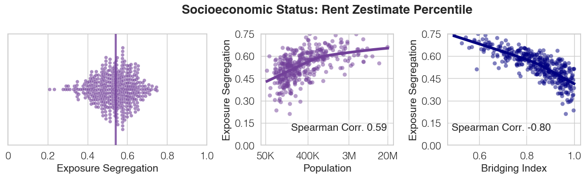
Any individual quantitative measure provides only a partial picture of a person’s socioeconomic status. Recognizing this, we conduct robustness checks in which rather than using the Zillow estimated rent of the user’s home as a proxy for socioeconomic status, we use 1) the median Census Block Group household income in that area; and 2) the percentile-scored rent of the home, to account for long-tailed rent distributions. Our main results are robust to using these alternate measures of socioeconomic status (Supplementary Figure S3).
Constructing exposure network
We construct a fine-grained, dynamic exposure network between all 9,567,559 individuals across 382 MSAs and 2829 counties, which is represented as an undirected graph with time-varying edges. Each node in the graph represents one of the individuals in our study, such that the set of nodes is . Each node has a single attribute , representing the inferred socioeconomic status (estimated rent) of the individual.
Individuals and are connected by one edge per exposure, with indicating the th exposure between individuals and . Each edge has three attributes , , indicating the timestamp, latitude, and longitude of the exposure respectively. We now focus our discussion on explaining how each of the exposures edges of the network is calculated.
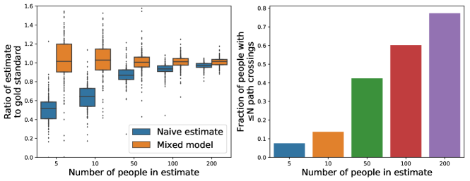
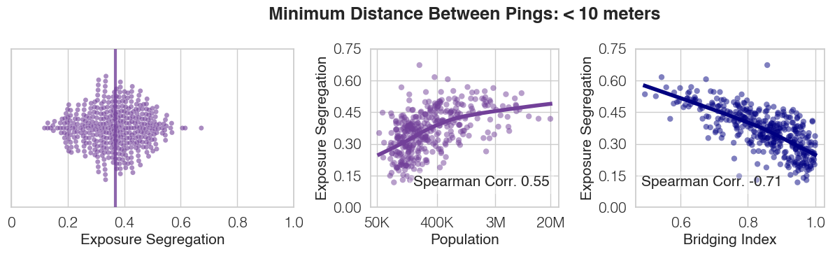
We define an exposure to occur when two users have GPS pings which are close (according to a fixed threshold) in both physical proximity and time. Specifically if user has a GPS ping with (indicating the timestamp, latitude, and longitude of the ping respectively), and user has a GPS ping with , then we users are said to have shared an exposure if and , where represents the time threshold (i.e. maximum time distance the two pings can be apart to count as an exposure) and represents the distance threshold (i.e. maximum physical distance the two pings can be apart to count as an exposure). We filter for both distance and time simultaneously to ensure that our exposure network only includes pairs of users who are likely to have come into contact with each other. This contrasts to other methods which consider all individuals to visit the same location, irrespective of time\citeMethodsmoro2021mobility, to have an equal likelihood of exposure, an assumption which may prove unrealistic in many cities (e.g. demographics of individuals visiting public parks varies starkly by time of day\citeMethodsmadge1997public). We use a threshold of 5 minutes, which is a stringent threshold on time as the mean number of pings per person per hour during day time is approximately one ping; we use a distance threshold of 50 meters, following prior work which shows that even exposure to individuals from afar is linked to long term outcomes\citeMethodsbrown2021childhood. Our network is validated by correlation to external, gold-standard datasets (Extended Data Figure 1(d)). Furthermore, we show through a series of robustness checks that our key results in Figure 1, Figure 2, and Figure 3 are highly robust to varying thresholds (i.e. 1 minute or 2 minutes time threshold, as well as 10 meters or 25 meters distance threshold), as well as additional criteria to increase tie strength (i.e. requiring multiple consecutive exposures, or multiple exposures on unique days)—and under all observed circumstances the main findings remain consistent (see Supplementary Table S6, Supplementary Figures S2-S8).
To efficiently calculate the exposures between all users, we implement our exposure threshold as a k-d tree\citeMethodsbentley1975multidimensional, a data structure which allows one to efficiently identify all pairs of points within a given distance of each other. In total, we identify 1,570,782,460 exposures. The timestamp of the exposure is the minimum ping timestamp in the pair of individuals’ ping timestamps (,), and the location , of the exposure is the average latitude and longitude of pair of pings belonging to the two individuals (,) and (,). We implement our exposure detection system to parallelize across multiple cores, allowing us to efficiently construct the network using a single supercomputer (with 12TB RAM, and 288 cores) in under a week. By contrast, a naive implementation (without k-d trees or parallelization) would necessitate on the order of 1̃0 years of compute time.
Annotating exposures
Exposures are annotated to indicate whether they occurred at or near features of interest: e.g., near a user’s home. Annotations are not mutually exclusive in that an exposure may be simultaneously tagged as having occurred near multiple features from multiple data sources. We describe the specific annotations below.
We annotate a user’s exposure as having occurred in their home if it occurs within 50 meters of the user’s home location. An exposure is annotated with a TIGER road/railway if it occurs within 20 meters from that feature. An exposure is annotated as having occurred within a SafeGraph Places point-of-interest (POI) if the exposure occurs within the polygon defined for the POI. Polygons are provided by the SafeGraph Places database for both fine-grained POIs (e.g. individual restaurants) as well as “parent” POIs (e.g. exposure hubs). We focus our analysis of fine-grained POIs (Figure 1e, Extended Data Figure 2) on the most visited fine-grained POIs: full-service restaurants, snack bars, limited-service restaurants (e.g. fast food), stadiums, etc (see Figure 1e for full list). These categories roughly align with those used by prior work \citeMethodsathey.
M3 Analysis
Exposure Segregation
We define the exposure segregation (ES) of a specified geographical area (i.e. Metropolitan Statistical Area, County) as the Pearson correlation between the socioeconomic status (SES) of individuals residing in that geographical area, and the mean SES those that they cross paths with.
Our metric captures the extent to which an individual’s SES predicts the SES of their immediate exposure network. Thus, in a perfectly integrated area in which individuals cross paths randomly with others regardless of SES, exposure segregation would equal 0.0. In a perfectly segregated area in which individuals cross paths with only those of the exact same SES, exposure segregation would equal 1.0.
Exposure segregation nests a classic definition residential segregation, the Neighborhood Sorting Index\citeMethodsjargowsky1996take, jargowsky2005measure (NSI), which is equivalent to the Pearson correlation across between each person’s SES and the mean SES in their Census tract. The NSI is widely used because it can be calculated directly from Census data on the SES of people living in each tract. However, a fundamental limitation of NSI as a measure segregation is that the Census tract in which people live is a weak proxy for who they cross paths with. Census tracts are static and artificial boundaries which fail to capture socioeconomic mixing as individuals move throughout the cityscape during work, leisure time, and schooling.
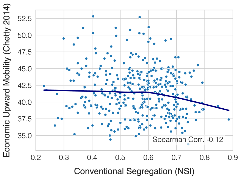
We design our exposure segregation (ES) metric such that it accommodates any exposure network, and thus NSI is a special case of our metric. Specifically, if exposure segregation is computed for a synthetic exposure network under the unrealistic assumptions that a) people only cross paths with those in their home Census tract and b) they do so uniformly at random—then it is equivalent to NSI (Supplementary Figure S18). However, constructing such a synthetic exposure network from Census tracts has limited applicability to measuring segregation in the real world, because people may also be exposed to more heterogeneous populations as they visit other Census tracts for work, leisure, or other activities, a phenomenon we refer to as the visitor effect. Furthermore, even within home tract, individuals may cross paths non-uniformly as they seek out people of similar socioeconomic status; we refer to this as the homophily effect. Thus, we instead leverage dynamic mobility data from cell phones to captures the extent of contact between diverse individuals throughout the day, and apply our metric, exposure segregation (ES), to this real-world exposure network. An advantage of exposure segregation is that it allows for direct comparability to NSI, because both measures are of the same underlying statistical quantity, but differ in their definition of the exposure network. Our results indicate that this choice of exposure network matters; ES is a stronger predictor of upward economic mobility (Extended Data Figure 1(d)) as the two metrics are shown to be distinct (Supplementary Figure S19).
To calculate the exposure segregation of a specified geographical area (i.e. Metropolitan Statistical Area, County), we first select the set of all individuals who reside in area: . For instance, to calculate exposure segregation for Napa, California (Figure 1c Top), is the 3707 individuals with home locations inside the geographical boundary of the Napa, CA MSA. Subsequently, for each individual resident of the area we query the population exposure network () for the SES of the set of individuals they cross paths with, : . We then aim to estimate the Pearson correlation between the SES of each individual and the mean SES of those they are exposed to, .
Estimating exposure segregation
Here, we first motivate why a “naive” approach to estimating exposure segregation via a standard Pearson correlation on the observed exposure network is problematic (resulting in downwardly biased estimates of exposure segregation). We then elaborate on how we leverage a linear mixed effects model to compute a corrected Pearson correlation, allowing us to obtain unbiased estimates of exposure segregation even in areas where data is sparse.
A “naive” approach to estimate exposure segregation would be to compute the observed sample mean SES of who each person is exposed to. Then, exposure segregation could be estimated using a sample Pearson correlation111 between individual SES () and the sample mean SES of those they are exposed to (). This approach is problematic because naively computing such a correlation based on limited data (in counties or MSAs with low population sizes) will result in estimates that are downward biased. To illustrate why naive estimates of exposure segregation are downward biased, imagine that we compute the correlation between a person’s SES and the “true” mean SES of the people they are exposed to. Now, we add noise to the mean SES values, which represents the noisy mean estimates given limited data. As the noise is increased, the correlation is decreased. Thus, because estimates of each person’s mean SES will be more noisy in geographical areas with less data, there will be a downward bias to naive estimates of the Pearson correlation in these areas.
We instead compute a corrected Pearson correlation, using a linear mixed effects model to accurately estimate exposure segregation: the correlation between a person’s SES and the mean SES of the people they are exposed to. Our linear mixed effects model is an unbiased estimator of the Pearson correlation. We compare the unbiased estimates from our linear mixed effects model to naive estimates of exposure segregation in Methods Figure 2.
Our mixed model models the distribution of datapoints (, through the following equation:
Above, the true mean SES of the exposure set for each person is modeled as . Individual exposures , are then modeled as noisy draws from a distribution centered at this true mean. The Pearson correlation coefficient between person ’s SES and the mean SES of the people they were exposed to is then computed as follows. We assume that has a variance of through data preprocessing and that is uncorrelated with .
We estimate and by fitting the mixed model using the R lme4 package, optimizing the restricted maximum likelihood (REML) objective.
Decomposing segregation by time
Each exposure edge () in our exposure network is timestamped with a time of exposure . This allows us to decompose our overall exposure segregation into fine-grained estimates of segregation during different hours of the day, by filtering for exposures that occurred within a specific hour. In Supplementary Figures S20, we partition estimates of segregation by 3 hour windows to illustrate how segregation varies throughout the day (see Supplementary Information).
Decomposing segregation by activity
Each exposure edge () in our exposure network occurs at a specific location , . Thus, it is possible to annotate exposures by the fine-grained POI (e.g. specific restaurant) they occurred in, as well as the by the higher-level “parent” POI (e.g. commercial center) in which the POI was located (Methods M2). This allows us to decompose our overall exposure segregation into fine-grained estimates of segregation by specific leisure activity. We do so by filtering the network for all exposures that occurred in a specific POI category, and re-calculating exposure segregation for the MSA or county, using only those exposures. In Figure 1e, we show the variation in exposure segregation by leisure site, and further explain these variations in Extended Data Figure 2.
Bridging Index
We seek to identify a modifiable, extrinsic aspect of a city’s built environment which may reduce exposure segregation. One promising candidate is the location of a city’s hubs of exposure. We define a new measure, the Bridging Index (BI), which measures the extent to which a particular set of exposure hubs (i.e. high-exposure POIs, ) may facilitate the integration of individuals of diverse socioeconomic status within a geographic area (i.e. MSA or county). Specifically, BI measures the economic diversity of the groups that would cross paths if everybody visited only their nearest hub from —based on the observation that physical proximity significantly influences which hubs individuals visit[38, 39, 40].
We compute the Bridging Index (BI) via two steps (Extended Data Figure 6).
-
1.
Cluster all individuals who live in an area (i.e. MSA or county residents, ) into clusters () according to the exposure hub from closest to their home location. is the number of hubs in .
-
2.
Bridging Index is computed as the weighted average of the economic diversity (i.e. Gini Index) of these clusters of people, relative to the area’s overall economic diversity.
We illustrate the intuition for BI and how it captures the relationship between home and hub locations in Extended Data Figure 7. A BI of 1.0 indicates that if everybody visits their nearest exposure hub, each person will be exposed to a set of people as economically diverse as the overall city they reside in. Thus, a BI of 1.0 signifies perfect bridging, i.e. even if individuals live in segregated neighborhoods, hubs are located such that individuals must leave their neighborhoods and cross paths with diverse others. On the other hand, a BI of 0.0 signifies the opposite extreme; a city with a BI of 0.0 is one in which, if everybody visits the nearest exposure hub, each person will be exposed to only people of the exact same socioeconomic status.
The economic diversity of each cluster is quantified using the Gini Index: , a well-established measure of economic statistical dispersion (Extended Data Figure 6c)\citeMethodsdorfman1979formula, although results are robust to choice of economic diversity measure such as using variance instead of Gini Index (Supplementary Figure S13). The denominator of BI normalizes for the baseline economic diversity observed in the city, allowing for direct comparisons between cities.
In our primary analysis, we identify hubs of exposure via commercial centers (e.g. shopping malls, plazas, etc. which are higher-level clusters of individual POIs) because they are associated with a high density of exposures. Specifically, the majority (56.9%) of exposures happen inside of or within 1km of a commercial center (e.g. shopping mall, plaza, etc.) even though only 2.5% of the land area of MSAs is within 1km of a commercial center. We thus compute BI using the set of all commercial centers within each MSA. We discover that BI strongly predicts exposure segregation (Spearman Correlation , Figure 3d). The top 10 MSAs with the highest BI are 53.1% less segregated than the 10 MSAs with the lowest BI. BI predicts segregation more accurately than population size, racial demographics SES inequality, NSI, and racial demographics, and is significantly associated with segregation after controlling for all aforementioned variables (Extended Data Tables 2-3).
Hypothesis Testing and Confidence Intervals
Unless otherwise noted, confidence intervals and hypothesis tests were conducted using a bootstrap with 10,000 replications[bootstrap]. Steiger’s Z-test was used to compare different predictors of segregation indices, and hypothesis tests for Spearman correlation coefficients were computed using two-sided Student’s t-tests[myers2004spearman, steiger, corder2014nonparametric].
naturemag \bibliographyMethodsmain
Extended Data
.
| Dependent variable: Exposure Segregation | ||||||
| (1) | (2) | (3) | (4) | (5) | (6) | |
| Intercept | 0.355∗∗∗ | 0.355∗∗∗ | 0.355∗∗∗ | 0.355∗∗∗ | 0.355∗∗∗ | 0.355∗∗∗ |
| (0.004) | (0.004) | (0.003) | (0.003) | (0.003) | (0.003) | |
| Log(Population Size) | 0.059∗∗∗ | 0.041∗∗∗ | 0.044∗∗∗ | 0.026∗∗∗ | 0.028∗∗∗ | |
| (0.004) | (0.004) | (0.004) | (0.004) | (0.004) | ||
| Gini Index (Estimated Rent) | 0.064∗∗∗ | 0.050∗∗∗ | 0.051∗∗∗ | 0.045∗∗∗ | 0.047∗∗∗ | |
| (0.004) | (0.004) | (0.004) | (0.003) | (0.003) | ||
| Political Alignment (% Democrat in 2016 Election) | 0.004 | 0.004 | ||||
| (0.004) | (0.004) | |||||
| Racial Demographics (% non-Hispanic White) | 0.001 | 0.006∗ | ||||
| (0.004) | (0.003) | |||||
| Mean SES (Estimated Rent) | -0.012∗∗∗ | -0.005 | ||||
| (0.004) | (0.004) | |||||
| Walkability (Walkscore) | 0.002 | 0.001 | ||||
| (0.003) | (0.003) | |||||
| Commutability (% Commute to Work) | -0.011∗∗∗ | -0.010∗∗∗ | ||||
| (0.003) | (0.004) | |||||
| Conventional Segregation (NSI) | 0.042∗∗∗ | 0.041∗∗∗ | ||||
| (0.003) | (0.003) | |||||
| Observations | 382 | 382 | 382 | 376 | 382 | 376 |
| 0.350 | 0.419 | 0.567 | 0.578 | 0.704 | 0.705 | |
| Adjusted | 0.348 | 0.417 | 0.565 | 0.573 | 0.701 | 0.698 |
| ∗p0.1; ∗∗p0.05; ∗∗∗p0.01 | ||||||
| Dependent variable: Exposure Segregation | |||||
| (1) | (2) | (3) | (4) | (5) | |
| Intercept | 0.355∗∗∗ | 0.355∗∗∗ | 0.355∗∗∗ | 0.355∗∗∗ | 0.355∗∗∗ |
| (0.003) | (0.003) | (0.003) | (0.003) | (0.003) | |
| Bridging Index | -0.078∗∗∗ | -0.059∗∗∗ | -0.058∗∗∗ | -0.035∗∗∗ | -0.036∗∗∗ |
| (0.003) | (0.005) | (0.005) | (0.006) | (0.006) | |
| Log(Population Size) | 0.003 | 0.008∗ | 0.010∗∗ | 0.017∗∗∗ | |
| (0.004) | (0.005) | (0.004) | (0.006) | ||
| Gini Index (Estimated Rent) | 0.031∗∗∗ | 0.032∗∗∗ | 0.035∗∗∗ | 0.036∗∗∗ | |
| (0.003) | (0.003) | (0.003) | (0.003) | ||
| Political Alignment (% Democrat in 2016 Election) | 0.001 | 0.002 | |||
| (0.004) | (0.004) | ||||
| Racial Demographics (% non-Hispanic White) | 0.003 | 0.005 | |||
| (0.003) | (0.003) | ||||
| Mean SES (Estimated Rent) | -0.009∗∗ | -0.005 | |||
| (0.004) | (0.003) | ||||
| Walkability (Walkscore) | 0.002 | 0.001 | |||
| (0.003) | (0.003) | ||||
| Commutability (% Commute to Work) | -0.011∗∗∗ | -0.009∗∗ | |||
| (0.003) | (0.004) | ||||
| Conventional Segregation (NSI) | 0.028∗∗∗ | 0.026∗∗∗ | |||
| (0.004) | (0.004) | ||||
| # of Exposure Hubs | -0.006 | ||||
| (0.005) | |||||
| Observations | 382 | 382 | 376 | 382 | 376 |
| 0.620 | 0.686 | 0.693 | 0.733 | 0.736 | |
| Adjusted | 0.619 | 0.684 | 0.688 | 0.729 | 0.729 |
| ∗p0.1; ∗∗p0.05; ∗∗∗p0.01 | |||||
| Measure | Spearman | Pearson |
|---|---|---|
| Bridging Index | 0.60 | 0.62 |
| Log(Population Size) | 0.39 | 0.35 |
| Gini Index (Estimated Rent) | 0.41 | 0.42 |
| Political Alignment (% Democrat in 2016 Election) | 0.06 | 0.05 |
| Racial Demographics (% non-Hispanic White) | 0.09 | 0.05 |
| Mean SES (Estimated Rent) | 0.09 | 0.05 |
| Walkability (Walkscore) | 0.01 | 0.02 |
| Commutability (% Commute to Work) | 0.04 | 0.03 |
| Conventional Segregation (NSI) | 0.44 | 0.42 |
| # of Exposure Hubs | 0.44 | 0.16 |
.
(1) The locations of exposure hubs — If hubs are located in between diverse neighborhoods, BI will be high as hubs will bridge together diverse individuals.
(2) The # of exposure hubs — as # of hubs decreases, BI increases (e.g if there is only 1 hub in a city, BI will be 1.0 as all individuals are unified by a single hub)
(3) Residential segregation, i.e. the locations of homes and their associated economic standing — as residential segregation decreases we can expect that individuals residing near each hub will be more diverse.
This figure builds intuition for BI by showing how BI may vary for a single simulated city, consisting of highly segregated neighborhoods. We hold residential segregation (3) constant, and vary the location (1) and number (2) of exposure hubs across panels (a), (b), (c), (d), in order of increasing BI. Note that BI in (c) is substantially higher than BI in (b), because hubs in (c) are better positioned to bridge diverse neighborhoods—even though the number of hubs remains constant.
Supplementary Information
Descriptive statistics. We include high-level descriptive statistics of exposure network, users, and MSAs in Supplementary Table S1 and Supplementary Figure S1. For detailed descriptive statistics of the exposure network see:
-
•
Supplementary Table S8 Distribution of number of exposures
-
•
Supplementary Table S9 Distribution of number of exposures (per active day)
-
•
Supplementary Table S10 Distribution of tie strength
-
•
Supplementary Table S17 Distribution of number of distinct exposures
-
•
Supplementary Table S18 Distribution of number of distinct exposures (per active day)
-
•
Supplementary Figure S28 Average number of exposures over time
-
•
Supplementary Figure S27 Number of active individuals over time
-
•
Supplementary Figure S30 Total exposures over time
For descriptive statistics of robustness checks over time, distance, and length of exposure thresholds, see Supplementary Tables S19 and S20, and Supplementary Figures S38-S61.
For descriptive statistics of POIs (count, average SES, average exposure segregation, and average number of exposures) see Supplementary Tables S2-S5.
Robustness Checks. For a high-level overview of all robustness checks, see Supplementary Table S6. For details of each robustness check, including nationwide correlations between exposure segregation, population size, and Bridging Index, see:
-
•
Supplementary Figure S2 Weighting exposures by repetition
-
•
Supplementary Figure S3 Varying definitions of socioeconomic status
-
•
Supplementary Figure S4 Excluding exposures within roads, with residents of the same home, and in non-work/leisure contexts
-
•
Supplementary Figure S5 Varying minimum distance between pings
-
•
Supplementary Figure S6 Varying minimum time between pings
- •
-
•
Supplementary Figure S9 Controlling for background density
-
•
Supplementary Figure S34 Racial segregation and economic segregation within race groups
-
•
Supplementary Figure S62 Varying minimum stationary nights
Null models. For null models of alternative homophily mechanisms, which do not explain segregation in large cities, see Supplementary Figures S10 and S11
Bridging Index. For an explanation of why Bridging Index predicts exposure segregation, see S12. Supplementary Figure S13 shows that the hub bridging finding is robust to definition of SES diversity, and Supplementary Figure S14 shows null results for other alternatives to the hub bridging finding. Supplementary Figures S15-S17 show illustrative examples of exposure hubs.
Comparisons to conventional segregation measures. Supplementary Figures S18 and S19 compared exposure segregation (ES) to conventional Neighborhood Sorting Index (NSI).
Associations with downstream outcomes. Supplementary Figure 24(b) shows that exposure segregation predicts political polarization. Finally, Supplementary Figures S32 and Supplementary Tables S22-S23 show that our exposure network predicts friendship formation, even when controlling for distance.
Robustness to noise. We show that our network size is sufficient to draw statistical comparisons between large and small cities, and that our findings are robust to noise via bootstrapped confidence intervals (Supplementary Figure S25) and by downsampling the network and reproducing our findings (Supplementary Figure S26).
Types of exposures by tie strength. We show how different venues vary by exposure reptition, length, and distance in Supplementary Tables S14, S15, and S16. Supplementary Figure S23 shows that exposure segregation predicts upward economic mobility, regardless of threshold on tie strength.
Race. Supplementary Figure S35 shows how POIs segregation varies by racial and economic segregation. Supplementary Figure S34 compares economic segregation to racial segregation, and splits economic segregation by race group.
Temporal heterogeneity in segregation. Supplementary Figure S20 shows that exposure segregation varies by time, which is further illustrated by examples in Supplementary Figures S63-S64.
Miscellaneous. For additional anlayses, see:
-
•
Supplementary Figure S22 POI differentiation in large cities is robust to POI category
-
•
Supplementary Table LABEL:tab:longtable Exposure Segregation and related variables (i.e. # Exposures, Mean ES, NSI, Gini Index, Population Size, and Bridging Index (BI) for all 382 MSAs
-
•
Supplementary Figure S7 Population density finding robustness
-
•
Supplementary Figure S31 Findings generalize to rural counties
|
|
|
|
|
|
|
||||||||
|---|---|---|---|---|---|---|---|---|---|---|---|---|---|---|
| count | 8,609,406 | 8,609,406 | 8,527,115 | 8,527,115 | 382 | 382 | 382 | |||||||
| mean | 3,273 | 35 | 184 | 363 | 73,757,695 | 2,577,322 | 4,845,144 | |||||||
| std | 16,507 | 20 | 374 | 1,073 | 163,848,305 | 8,872,464 | 16,838,938 | |||||||
| min | 11 | 2 | 1 | 1 | 2,196,084 | 27,326 | 53,350 | |||||||
| 10% | 570 | 13 | 8 | 17 | 8,398,875 | 140,251 | 313,803 | |||||||
| 50% | 1,471 | 30 | 76 | 141 | 22,054,930 | 504,525 | 1,031,691 | |||||||
| 90% | 5,857 | 63 | 436 | 785 | 175,295,175 | 4,573,152 | 8,954,800 | |||||||
| max | 4,755,081 | 95 | 42,323 | 193,193 | 1,605,070,032 | 94,140,015 | 215,183,409 |
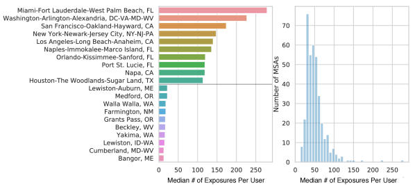
(a) Ten Metropolitan Statistical Areas (MSAs) with the highest and lowest median number of exposures per user.
(b) Overall distribution of median number of exposures per user over MSAs.
| display_name | # POIs (25%) | # POIs (50%) | # POIs (75%) | # POIs (max) | # POIs (mean) | # POIs (min) | # POIs (std) |
|---|---|---|---|---|---|---|---|
| Full-Service Restaurants | 75.5 | 160.0 | 424.0 | 24,689.0 | 609.8 | 12.0 | 1,820.05 |
| Snack Bars | 18.0 | 40.0 | 110.0 | 6,266.0 | 169.76 | 1.0 | 511.17 |
| Limited-Service Restaurants | 33.0 | 60.0 | 145.5 | 4,847.0 | 192.14 | 5.0 | 434.78 |
| Stadiums | 1.0 | 2.0 | 4.0 | 43.0 | 3.67 | 1.0 | 4.32 |
| Performing Arts Centers | 1.0 | 2.0 | 4.0 | 28.0 | 3.25 | 1.0 | 3.41 |
| Fitness/Recreation Centers | 10.0 | 25.0 | 72.0 | 4,877.0 | 126.6 | 1.0 | 414.26 |
| Historical Sites | 1.0 | 2.0 | 7.0 | 206.0 | 9.16 | 1.0 | 21.65 |
| Theme Parks | 1.0 | 3.0 | 6.0 | 158.0 | 7.64 | 1.0 | 16.77 |
| Bars/Drinking Places | 2.0 | 5.0 | 13.0 | 447.0 | 19.52 | 1.0 | 45.91 |
| Parks | 3.0 | 6.0 | 17.0 | 793.0 | 28.69 | 1.0 | 80.44 |
| Religious Organizations | 7.0 | 16.0 | 41.25 | 2,644.0 | 63.28 | 1.0 | 196.97 |
| Bowling Centers | 2.0 | 4.0 | 8.0 | 204.0 | 9.77 | 1.0 | 20.52 |
| Museums | 1.0 | 3.0 | 6.0 | 137.0 | 6.78 | 1.0 | 13.99 |
| Casinos | 1.0 | 3.0 | 7.0 | 188.0 | 8.05 | 1.0 | 17.22 |
| Independent Artists | 1.0 | 2.0 | 5.0 | 130.0 | 7.55 | 1.0 | 17.42 |
| Other Amusement/Recreation | 1.0 | 2.0 | 7.0 | 525.0 | 10.17 | 1.0 | 36.13 |
| Golf Courses and Country Clubs | 2.0 | 3.0 | 7.0 | 101.0 | 8.07 | 1.0 | 13.77 |
| display_name | POI SES (25%) | POI SES (50%) | POI SES (75%) | POI SES (max) | POI SES (mean) | POI SES (min) | POI SES (std) |
|---|---|---|---|---|---|---|---|
| Full-Service Restaurants | 1,210.96 | 1,395.0 | 1,674.27 | 3,628.06 | 1,493.04 | 763.0 | 430.99 |
| Snack Bars | 1,229.73 | 1,412.35 | 1,684.69 | 3,621.34 | 1,513.61 | 788.12 | 433.86 |
| Limited-Service Restaurants | 1,174.84 | 1,351.64 | 1,587.4 | 3,501.19 | 1,440.15 | 771.34 | 410.95 |
| Stadiums | 1,310.0 | 1,500.0 | 1,775.0 | 3,585.25 | 1,593.21 | 795.0 | 424.77 |
| Performing Arts Centers | 1,395.0 | 1,583.1 | 1,832.4 | 3,632.78 | 1,659.56 | 875.0 | 431.06 |
| Fitness/Recreation Centers | 1,230.03 | 1,431.79 | 1,703.94 | 3,749.05 | 1,528.73 | 700.0 | 453.4 |
| Historical Sites | 1,325.0 | 1,527.94 | 1,793.75 | 3,618.58 | 1,627.62 | 757.5 | 452.96 |
| Theme Parks | 1,300.0 | 1,498.75 | 1,750.0 | 3,900.0 | 1,612.58 | 700.0 | 501.79 |
| Bars/Drinking Places | 1,220.02 | 1,420.25 | 1,676.4 | 3,656.17 | 1,505.86 | 750.0 | 440.08 |
| Parks | 1,279.82 | 1,470.15 | 1,748.12 | 3,748.11 | 1,562.62 | 725.0 | 454.13 |
| Religious Organizations | 1,269.27 | 1,459.86 | 1,677.08 | 3,670.38 | 1,529.02 | 754.0 | 428.42 |
| Bowling Centers | 1,180.08 | 1,368.75 | 1,621.15 | 3,504.36 | 1,457.96 | 725.0 | 434.56 |
| Museums | 1,275.0 | 1,490.83 | 1,775.36 | 3,606.66 | 1,585.92 | 800.0 | 474.37 |
| Casinos | 1,200.0 | 1,400.0 | 1,655.54 | 3,606.17 | 1,503.88 | 725.0 | 469.68 |
| Independent Artists | 1,374.38 | 1,611.5 | 1,904.6 | 3,691.68 | 1,725.42 | 850.0 | 528.33 |
| Other Amusement/Recreation | 1,266.0 | 1,450.0 | 1,700.74 | 4,053.39 | 1,549.13 | 758.0 | 462.03 |
| Golf Courses and Country Clubs | 1,399.06 | 1,648.4 | 1,964.19 | 4,248.5 | 1,765.92 | 900.0 | 542.13 |
| display_name | ES (25%) | ES (50%) | ES (75%) | ES (max) | ES (mean) | ES (min) | ES (std) |
|---|---|---|---|---|---|---|---|
| Full-Service Restaurants | 0.22 | 0.27 | 0.32 | 0.48 | 0.27 | 0.08 | 0.07 |
| Snack Bars | 0.2 | 0.25 | 0.31 | 0.5 | 0.25 | 0.01 | 0.08 |
| Limited-Service Restaurants | 0.24 | 0.29 | 0.34 | 0.47 | 0.29 | 0.04 | 0.08 |
| Stadiums | 0.14 | 0.17 | 0.22 | 0.36 | 0.18 | 0.02 | 0.06 |
| Performing Arts Centers | 0.14 | 0.16 | 0.19 | 0.27 | 0.17 | 0.05 | 0.05 |
| Fitness/Recreation Centers | 0.2 | 0.26 | 0.31 | 0.47 | 0.25 | 0.03 | 0.08 |
| Historical Sites | 0.15 | 0.2 | 0.27 | 0.43 | 0.21 | 0.0 | 0.09 |
| Theme Parks | 0.16 | 0.2 | 0.25 | 0.42 | 0.2 | 0.02 | 0.08 |
| Bars/Drinking Places | 0.18 | 0.23 | 0.3 | 0.42 | 0.23 | 0.06 | 0.08 |
| Parks | 0.19 | 0.26 | 0.33 | 0.47 | 0.26 | 0.05 | 0.09 |
| Religious Organizations | 0.24 | 0.32 | 0.38 | 0.55 | 0.31 | 0.05 | 0.1 |
| Bowling Centers | 0.16 | 0.21 | 0.26 | 0.44 | 0.22 | 0.03 | 0.08 |
| Museums | 0.18 | 0.22 | 0.28 | 0.45 | 0.24 | 0.06 | 0.08 |
| Casinos | 0.2 | 0.26 | 0.32 | 0.47 | 0.26 | 0.02 | 0.09 |
| Independent Artists | 0.13 | 0.2 | 0.27 | 0.39 | 0.21 | 0.02 | 0.09 |
| Other Amusement/Recreation | 0.18 | 0.25 | 0.31 | 0.71 | 0.25 | 0.02 | 0.12 |
| Golf Courses and Country Clubs | 0.33 | 0.41 | 0.5 | 0.62 | 0.4 | 0.2 | 0.11 |
| display_name | # Exposures (25%) | # Exposures (50%) | # Exposures (75%) | # Exposures (max) | # Exposures (mean) | # Exposures (min) | # Exposures (std) |
|---|---|---|---|---|---|---|---|
| Full-Service Restaurants | 23,060.75 | 54,219.5 | 156,645.0 | 19,540,673.0 | 398,304.04 | 6,112.0 | 1,634,147.68 |
| Snack Bars | 15,582.0 | 38,954.0 | 120,225.0 | 14,128,466.0 | 291,523.01 | 5,233.0 | 1,205,873.07 |
| Limited-Service Restaurants | 16,485.5 | 38,444.0 | 106,515.0 | 10,453,353.0 | 227,378.5 | 4,122.0 | 878,243.0 |
| Stadiums | 53,077.5 | 96,487.5 | 336,479.75 | 8,942,618.0 | 348,920.85 | 17,024.0 | 988,719.72 |
| Performing Arts Centers | 66,712.0 | 120,256.0 | 384,770.0 | 6,972,326.0 | 403,378.22 | 27,589.0 | 932,589.88 |
| Fitness/Recreation Centers | 11,165.25 | 21,541.5 | 62,380.5 | 5,630,299.0 | 158,025.53 | 3,740.0 | 573,788.93 |
| Historical Sites | 18,351.5 | 47,793.0 | 98,385.5 | 6,362,665.0 | 187,978.09 | 5,147.0 | 684,470.65 |
| Theme Parks | 34,989.0 | 61,553.0 | 135,744.0 | 1,883,136.0 | 157,622.73 | 14,460.0 | 290,329.93 |
| Bars/Drinking Places | 11,592.5 | 21,401.0 | 63,929.0 | 1,266,235.0 | 84,752.14 | 4,553.0 | 181,978.58 |
| Parks | 10,050.75 | 22,301.0 | 61,492.75 | 1,520,092.0 | 88,789.84 | 5,383.0 | 193,888.94 |
| Religious Organizations | 6,014.0 | 13,002.0 | 35,157.25 | 2,206,316.0 | 60,683.34 | 2,739.0 | 212,948.46 |
| Bowling Centers | 16,423.5 | 26,517.0 | 65,563.5 | 1,030,970.0 | 92,515.06 | 5,874.0 | 174,876.21 |
| Museums | 14,807.5 | 27,802.0 | 66,729.75 | 681,994.0 | 87,797.02 | 4,310.0 | 146,495.57 |
| Casinos | 13,844.0 | 23,109.0 | 60,222.0 | 826,676.0 | 68,012.52 | 7,474.0 | 124,063.14 |
| Independent Artists | 8,795.0 | 23,789.5 | 56,736.75 | 1,106,402.0 | 87,662.95 | 3,951.0 | 198,394.53 |
| Other Amusement/Recreation | 6,923.0 | 14,349.0 | 42,793.0 | 365,436.0 | 38,640.52 | 2,929.0 | 56,964.16 |
| Golf Courses and Country Clubs | 4,765.75 | 7,836.5 | 15,555.0 | 58,348.0 | 13,047.42 | 2,636.0 | 13,348.76 |
| Pearson Corr. w/ Primary | Spearman Corr. w/ Primary | Median | Mean | % Pairs | % People | |
| Feature | ||||||
| Primary Measure | — | — | 0.35 | 0.35 | 100.00 | 100.00 |
| Primary Measure (+ Up-weight Multiple Exposures) | 0.89 | 0.91 | 0.46 | 0.45 | 100.00 | 100.00 |
| SES Definition: Rent Zestimate Percentile | 0.88 | 0.89 | 0.42 | 0.42 | 100.00 | 100.00 |
| SES Definition: Within-MSA Rent Zestimate Percentile | 0.81 | 0.83 | 0.54 | 0.53 | 100.00 | 100.00 |
| SES Definition: Census Median Household Income | 0.75 | 0.77 | 0.47 | 0.46 | 100.00 | 100.00 |
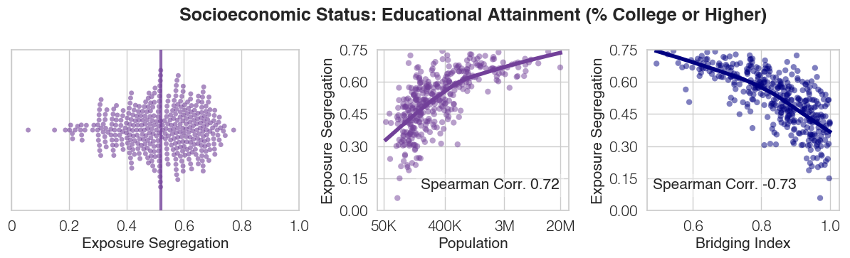
| SES Definition: Educational Attainment (% College or Higher) | 0.70 | 0.71 | 0.52 | 0.52 | 100.00 | 100.00 |
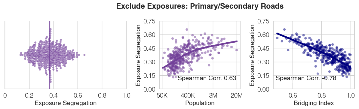
| Exclude Pri/Sec Roads | 0.99 | 0.99 | 0.37 | 0.37 | 74.30 | 99.87 |
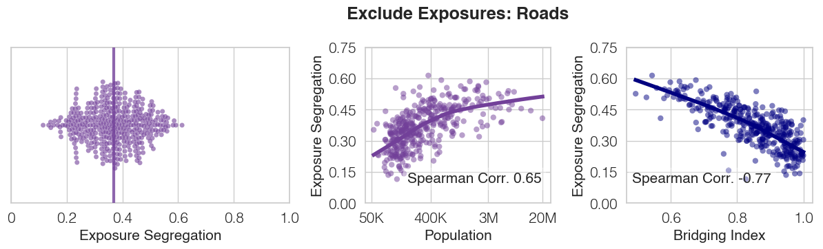
| Exclude Roads | 0.98 | 0.98 | 0.37 | 0.37 | 38.66 | 98.56 |
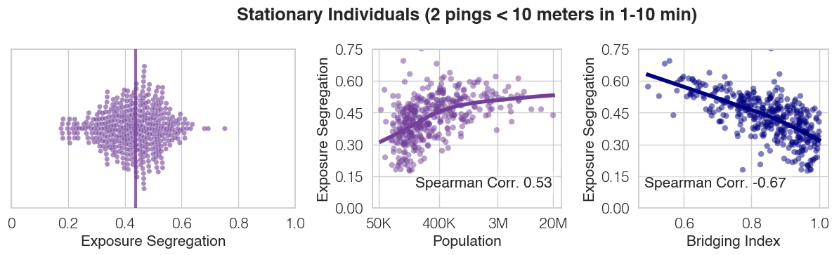
| Stationary Individuals (2 pings 10 meters in 1-10 min) | 0.86 | 0.87 | 0.44 | 0.43 | 5.39 | 79.46 |
| Exclude Same-home exposures | 0.98 | 0.98 | 0.34 | 0.34 | 99.71 | 99.78 |
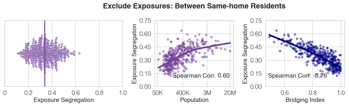
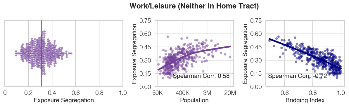
| Work/Leisure (Neither in Home Tract) | 0.93 | 0.93 | 0.31 | 0.31 | 86.26 | 95.55 |
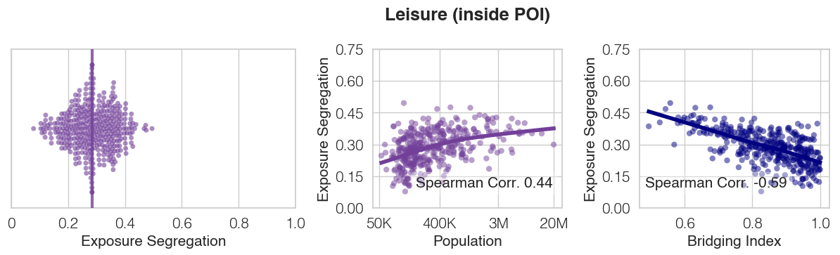
| Leisure (inside POI) | 0.85 | 0.84 | 0.28 | 0.29 | 16.15 | 76.32 |
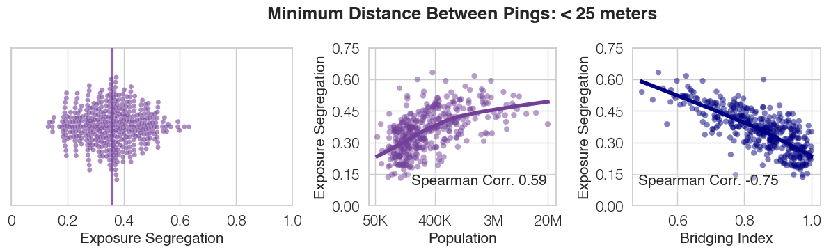
| Minimum Distance Between Pings: 25 meters | 0.97 | 0.97 | 0.34 | 0.34 | 49.53 | 97.71 |
| Minimum Distance Between Pings: 10 meters | 0.95 | 0.94 | 0.33 | 0.33 | 20.93 | 92.28 |
| Minimum Time Between Pings: 2 minutes | 0.97 | 0.97 | 0.34 | 0.34 | 53.59 | 98.92 |
| Minimum Time Between Pings: 60 seconds | 0.97 | 0.97 | 0.35 | 0.35 | 33.67 | 97.83 |
| Minimum Tie Strength: 2 consecutive exposures | 0.94 | 0.95 | 0.35 | 0.35 | 18.25 | 94.80 |
| Minimum Tie Strength: 3 consecutive exposures | 0.83 | 0.83 | 0.37 | 0.37 | 3.06 | 65.46 |
| Minimum Tie Strength: 2 unique days of exposure | 0.88 | 0.90 | 0.47 | 0.46 | 7.46 | 83.56 |
| Minimum Tie Strength: 3 unique days of exposure | 0.73 | 0.77 | 0.56 | 0.54 | 2.32 | 62.81 |
| Dist. 25 meters, Time 2 min., 2 consec. exposures | 0.92 | 0.93 | 0.36 | 0.35 | 8.80 | 86.64 |
| Dist. 25 meters, Time 2 min., 2 unique days | 0.87 | 0.89 | 0.46 | 0.44 | 3.84 | 70.57 |
| Dist. 10 meters, Time 60 sec., 3 consec. exposures | 0.78 | 0.79 | 0.39 | 0.38 | 0.94 | 38.16 |
| Dist. 10 meters, Time 60 sec., 3 unique days | 0.68 | 0.68 | 0.52 | 0.51 | 0.58 | 28.92 |
| Downweight Simultaneous Exposures | 0.97 | 0.97 | 0.34 | 0.34 | 99.99 | 99.99 |
| Exclude Simultaneous Exposures | 0.94 | 0.95 | 0.46 | 0.46 | 22.87 | 99.61 |
| Tie Strength: 1 Exposure | 0.97 | 0.98 | 0.31 | 0.32 | 74.24 | 98.66 |
| Tie Strength: 2 Exposures | 0.95 | 0.96 | 0.33 | 0.33 | 16.14 | 93.20 |
| Tie Strength: 3 Exposures | 0.89 | 0.90 | 0.36 | 0.36 | 4.09 | 74.67 |
| Tie Strength: 4 Exposures | 0.85 | 0.86 | 0.37 | 0.36 | 1.82 | 58.51 |
| Tie Strength: 5+ Exposure | 0.83 | 0.85 | 0.45 | 0.45 | 3.42 | 70.62 |
| Minimum Stationary Nights: 6 nights | 0.99 | 0.99 | 0.35 | 0.35 | 77.45 | 83.91 |
| Minimum Stationary Nights: 9 nights | 0.99 | 0.99 | 0.35 | 0.36 | 68.64 | 73.42 |
| Minimum Stationary Nights: 12 nights | 0.98 | 0.98 | 0.35 | 0.36 | 59.16 | 63.66 |
| Racial Segregation (% Non-White) | 0.59 | 0.60 | 0.46 | 0.46 | 100.0 | 100.0 |
| Economic Segregation (White Overall) | 0.94 | 0.95 | 0.34 | 0.34 | 55.97 | 63.83 |
| Economic Segregation (White Within-group) | 0.93 | 0.94 | 0.34 | 0.34 | 39.84 | 63.69 |
| Economic Segregation (Non-White Overall) | 0.55 | 0.52 | 0.28 | 0.28 | 43.76 | 35.50 |
| Economic Segregation (Non-White Within-group) | 0.47 | 0.44 | 0.28 | 0.30 | 27.50 | 35.31 |
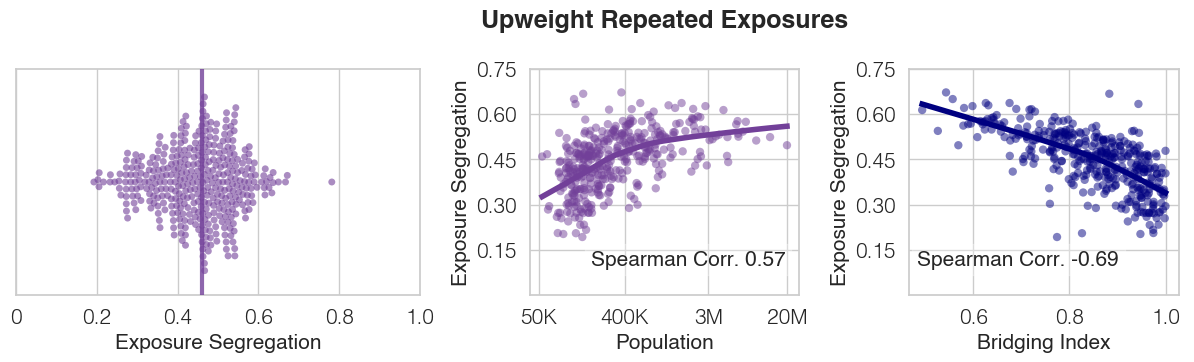
Primary Measure: Exposures are defined as pairs of users who have ever crossed paths within the study observation window (three months of 2017). We de-duplicate repeated exposures, as frequency of pings varies across smartphone users, to reduce bias from users with a higher frequency of pings. For instance, if an individual A with an individual B (ES $1000) two times and individual C (ES $2000) one, we compute the mean SES of individual A’s network as $1500.
Upweight Repeated Exposures: Repeated exposures are unweighted when calculating the mean SES of an individual’s exposure network. For instance, if an individual A with an individual B (ES $1000) two times and individual C (ES $2000) once, we compute the mean SES of individual A’s network as $1333.


Primary Measure: Our primary measure leverages estimated monthly rent value (Zillow Rent Zestimate).
Census Block Group (CBG) Median Household Income: We define the SES of an individual is the median household income in the CBG in which they reside.
Rent Zestimate Percentile: We normalize Rent Zestimate values across all individuals.
Primary measure Relative to MSA: We normalize Rent Zestimate values across all individuals within an MSA, independent of other MSAs, to account for differences in cost of living across cities.
Educational Attainment: We define the SES of an individual as their educational attainment (% with college education or higher).
Primary Measure: Our primary measure includes all exposures, aiming to give a complete account of an individual’s exposure network including path crossings on roads as well as those they share a home with.
Excluding (primary/secondary) roads: We filter to exclude exposures occurring on all roads, or only primary/secondary roads.
Only stationary pings: We filter to include only exposures occurring when individuals are stationary (i.e. have two pings within 1-10 minutes and 10 meters apart).
Same home residents: We filter to include only exposures occurring between two people residing in different homes.
Work/Leisure: We filter to include only exposures likely to take place in the context of work or leisure, by excluding exposures which occurred when either individuals were located within their home tracts.
Leisure: We filter for leisure exposures by including only exposures ocurring inside of the POIs categorized as related to leisure (Figure 2c).

Primary Measure: Our primary measure uses a threshold of 50 meters, based on prior literature which shows that even distant exposure to diverse individuals is predictive of long-term behaviors[18].
Alternative measures: We alternatively consider more conservative thresholds of 25 meters and 10 meters, with 10 meters being the lowest threshold due to limitations of GPS ping accuracy[merry2019smartphone, menard2011comparing].

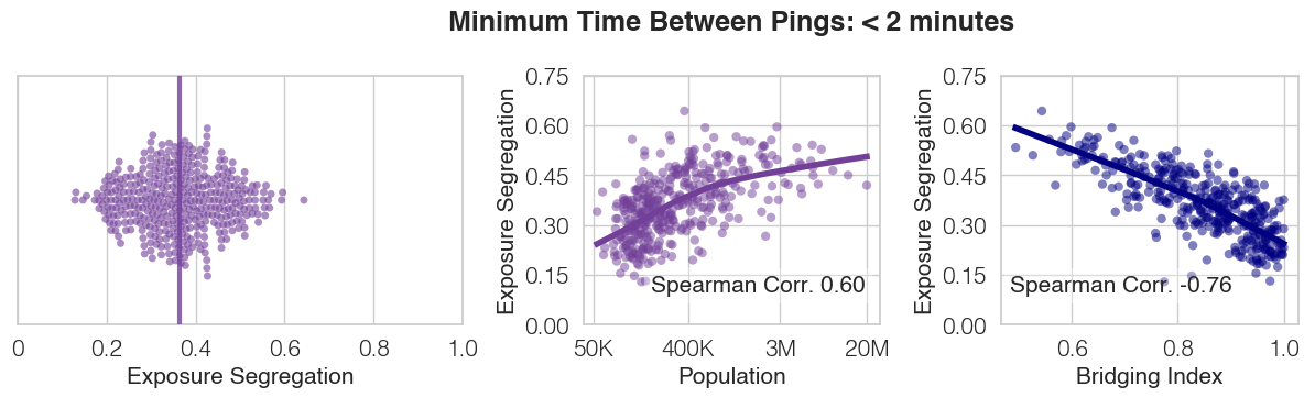
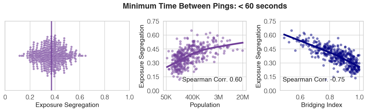
Primary Measure: Our primary measure uses a threshold of 5 minutes, to be inclusive of users with sparse pings (e.g., for a subset of users, we only have 1 ping per day, while for others we have 100+ pings per day) while maintaining a reasonable confidence that an exposure may have occurred.
Alternative measures: We alternatively consider more conservative thresholds of 2 minutes and 1 minute.
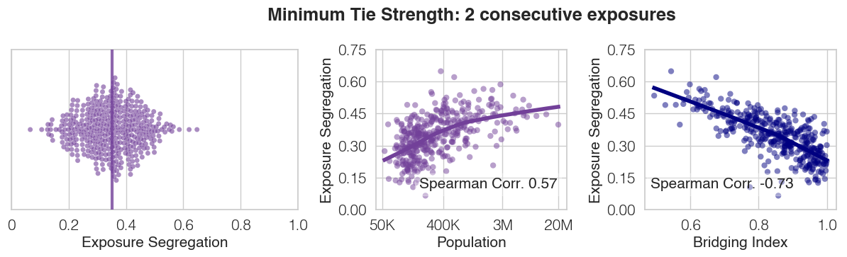
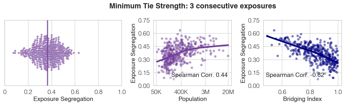
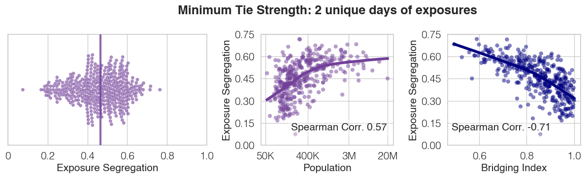
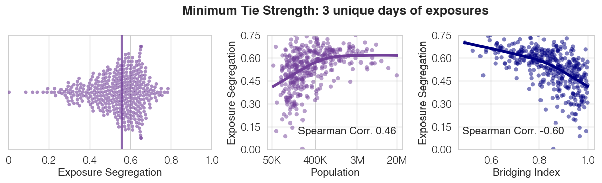
Primary Measure: Our primary measure only requires a single pair of pings between users to constitute an exposure, to be inclusive of users with sparse pings (e.g., for a subset of users, we only have 1 ping per day, while for others we have 100+ pings per day).
Alternative measures: We alternatively consider more conservative thresholds of 2 or 3 consecutive exposures, as well as 2 or 3 exposures across unique days. Requiring consecutive exposures increases the likelihood that individuals actually came into contact together; exposures across unique days increases the likelihood that exposures are not merely path crossings, but social exposures between individuals who are familiar with each other. (continued on next page)
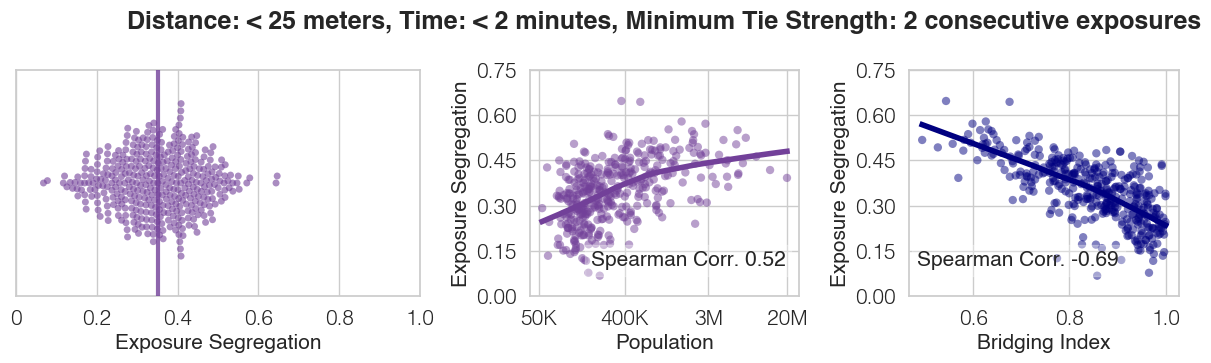
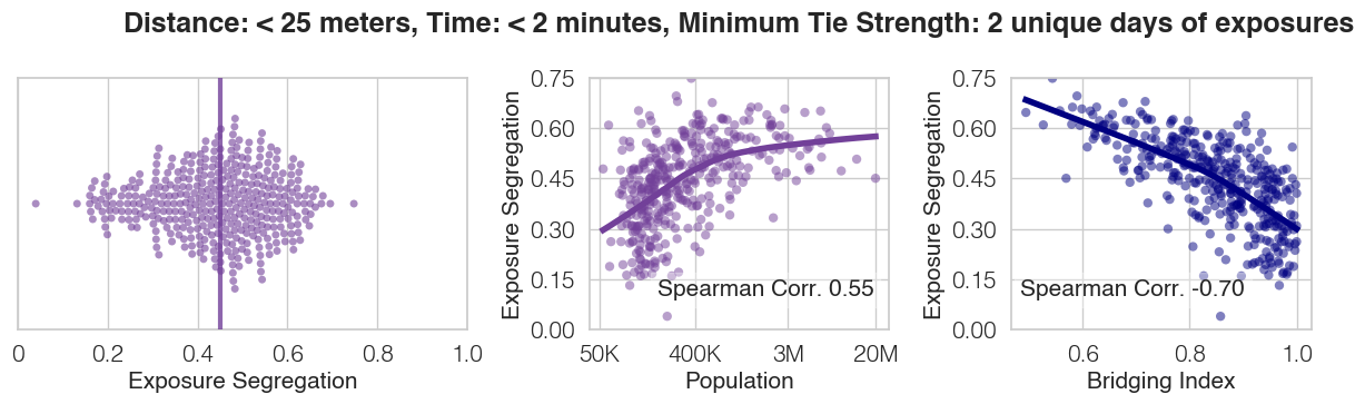

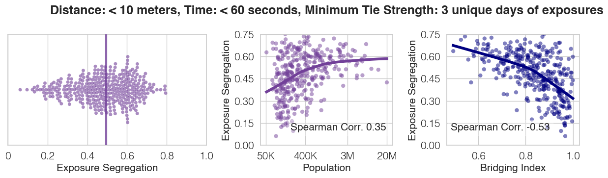
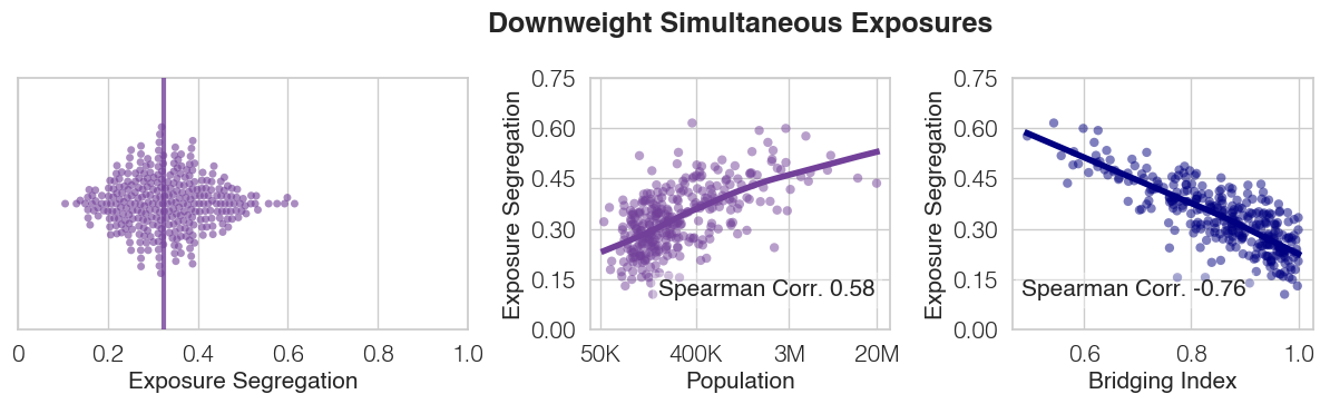
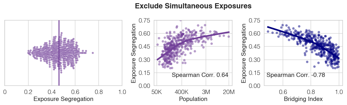
Exclude Simultaneous Exposures: For all exposures between two people (Person A and Person B), we exposures in which either person was simultaneously exposed to an additional individual (i.e. Person C was observed within 50 meters and 5 minutes of either Person A or Person B).
Downweight Simultaneous Exposures: For each exposure between Person A and Person B, we compute the total number of additional people that Person A and Person B are simultaneously exposed to (within a 5 minute window of their pings). Exposures are then weighted by , i.e. exposure weight decreases as there are more simultaneous individuals exposed, and exposures with more than 25 people are excluded entirely
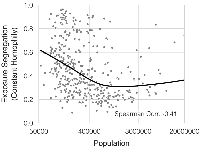
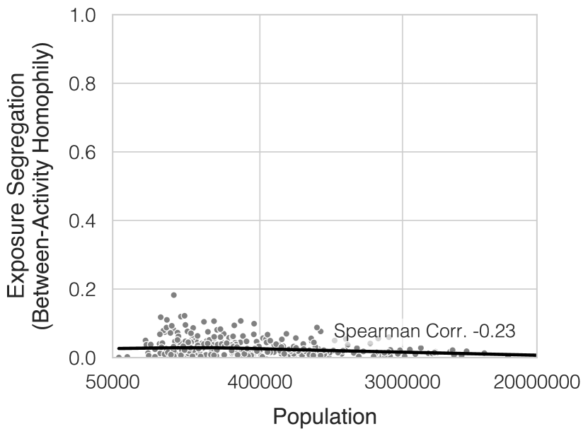
(a) Constant Homophily: i.e. individuals have the same proclivity for crossing paths with individuals of similar SES regardless of if they live in large or small cities, and it is instead change in distribution of socioeconomic status that drives segregation in large cities (e.g. in large cities there may be a greater supply of people in the same economic class available to cross paths with). We test this hypothesis via a null network model, in which which we preserve network nodes (individuals and their SES values) but randomize edges[barabasi2013network, maslov2002specificity]. We randomly assign exposures between pairs of people, weighting the likelihood of exposure between people of similar SES higher according to a constant homophily function. Specifically, the probability of exposure () between two individuals of and is weighted by their similarity in ES, defined as the complement of the normalized Euclidean distance in ES: . We choose 75 exposures per person such that the mean number of exposures per person is 150, which corresponds to Dunbar’s number[dunbar2010many]. We find that under this null model, there is no positive association between exposure segregation and population size; in fact, larger cities are less segregated on average, as there is an increase in supply of diverse individuals in socioeconomic status in larger cities. These findings are also robust to a variety of null model specifications (Supplementary Figure S11).
(b) Between Activity Homophily: i.e. it is not the differentiation of individual venues that drives segregation, but rather that in large cities individuals choose different categories of activities which results in segregation (e.g. in small cities, there are less country clubs so everybody visits restaurants to socialize, whereas in large cities high-SES individuals segregate by spending a higher proportion of time in exclusive venues such as country clubs). We test this hypothesis via a configuration model [barabasi2013network, maslov2002specificity], a prominent null network model in which node degree is preserved. Specifically, by applying a configuration model to reconfigure network edges for each leisure category separately, we preserve network nodes (individuals and their SES values) as well as the number of exposures they had in each category of POI (node degree), but randomize the specific venue in which each exposure occurred. For instance, if an individual crosses paths with 5 people inside of restaurants and 100 people inside of a fitness center, they will be randomly assigned to cross paths with 5 people from all of those who visited restaurants, and 100 people from all of those who visited fitness centers. This null model preserves between-activity homophily which results from activity choices (e.g. whether to visit a country club or restaurant), but erases within-activity homophily (e.g. individuals who visit any restaurant are equally likely to cross paths). We find that under this null model, there is no positive association between exposure segregation and population size; in fact, there is minimal segregation across all cities as variation between activity categories is insufficient to retain segregation. This is further supported by Supplementary Table S3, which shows relatively small differences in SES between participants in different categories of leisure activity (e.g. the lowest SES activity, limited service restaurants has a median visitor SES of $1,352, the highest SES activity, golf courses and country clubs has a median visitor SES of $1,648.4).
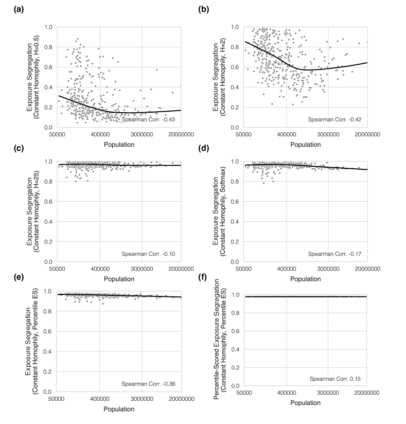
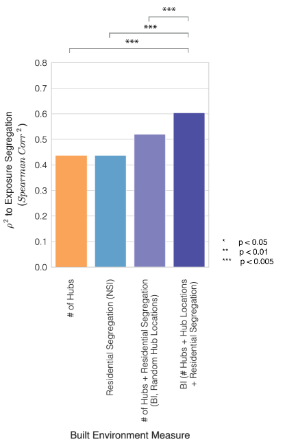
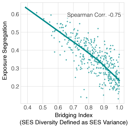
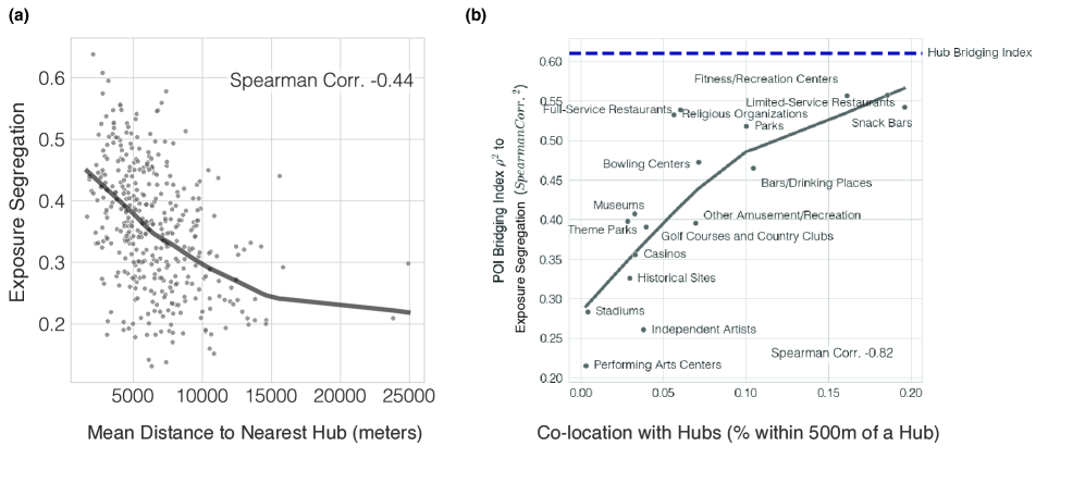
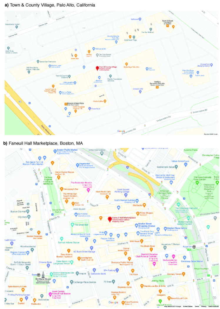
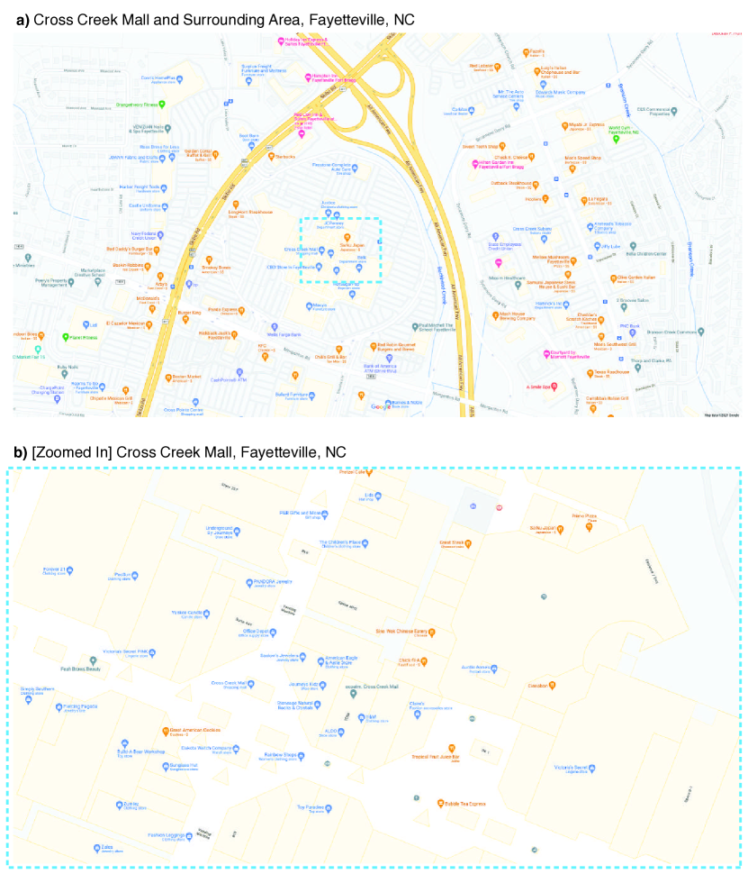
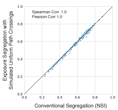
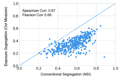
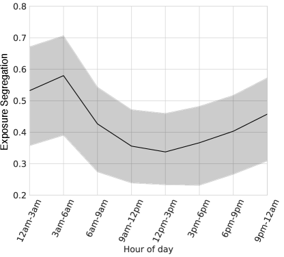
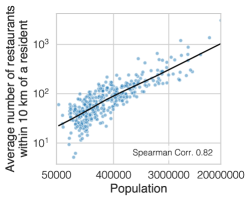
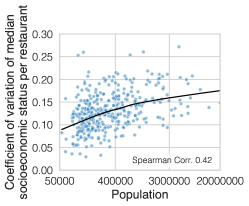
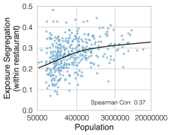
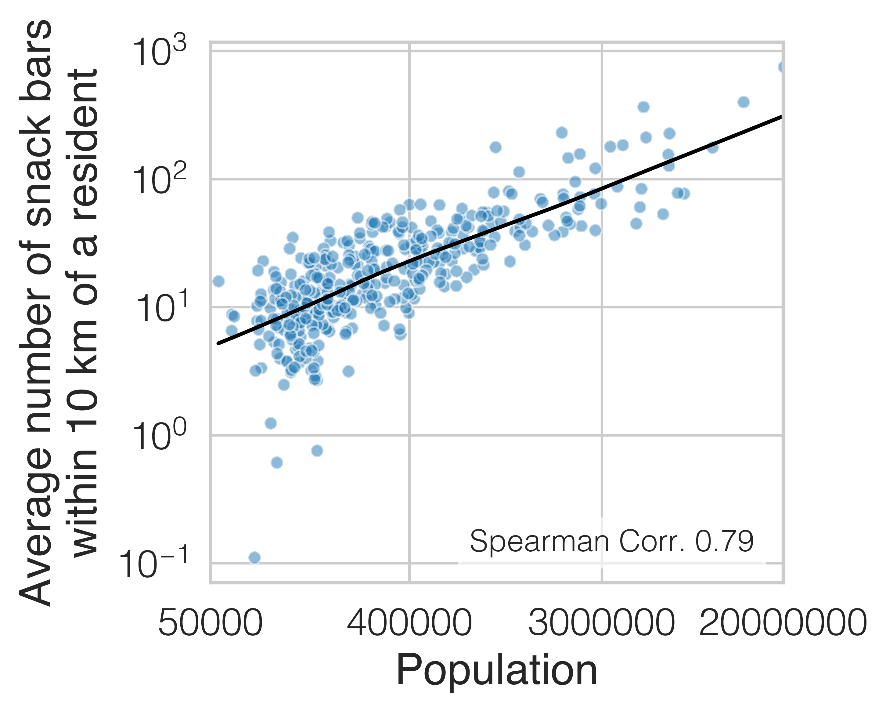
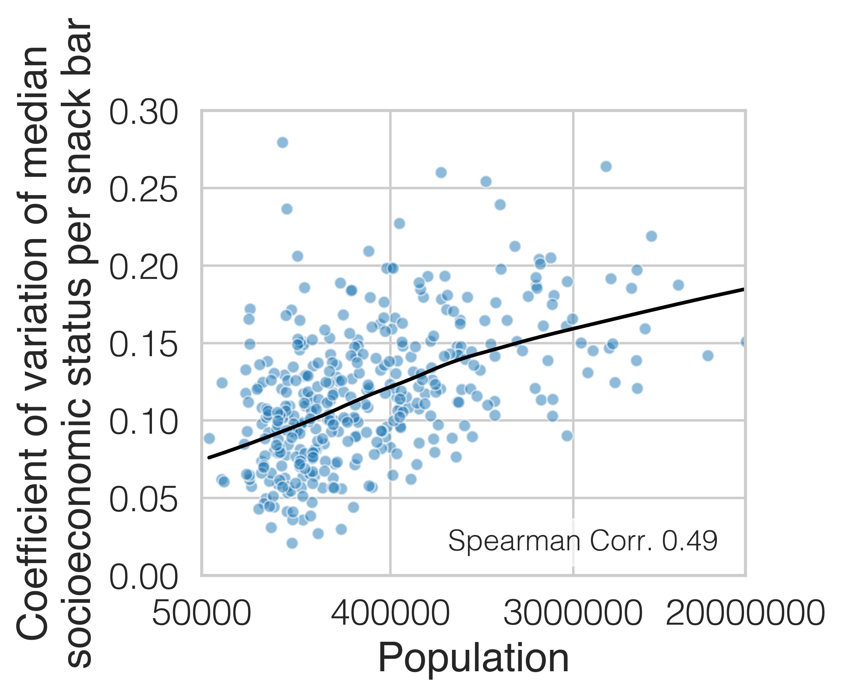
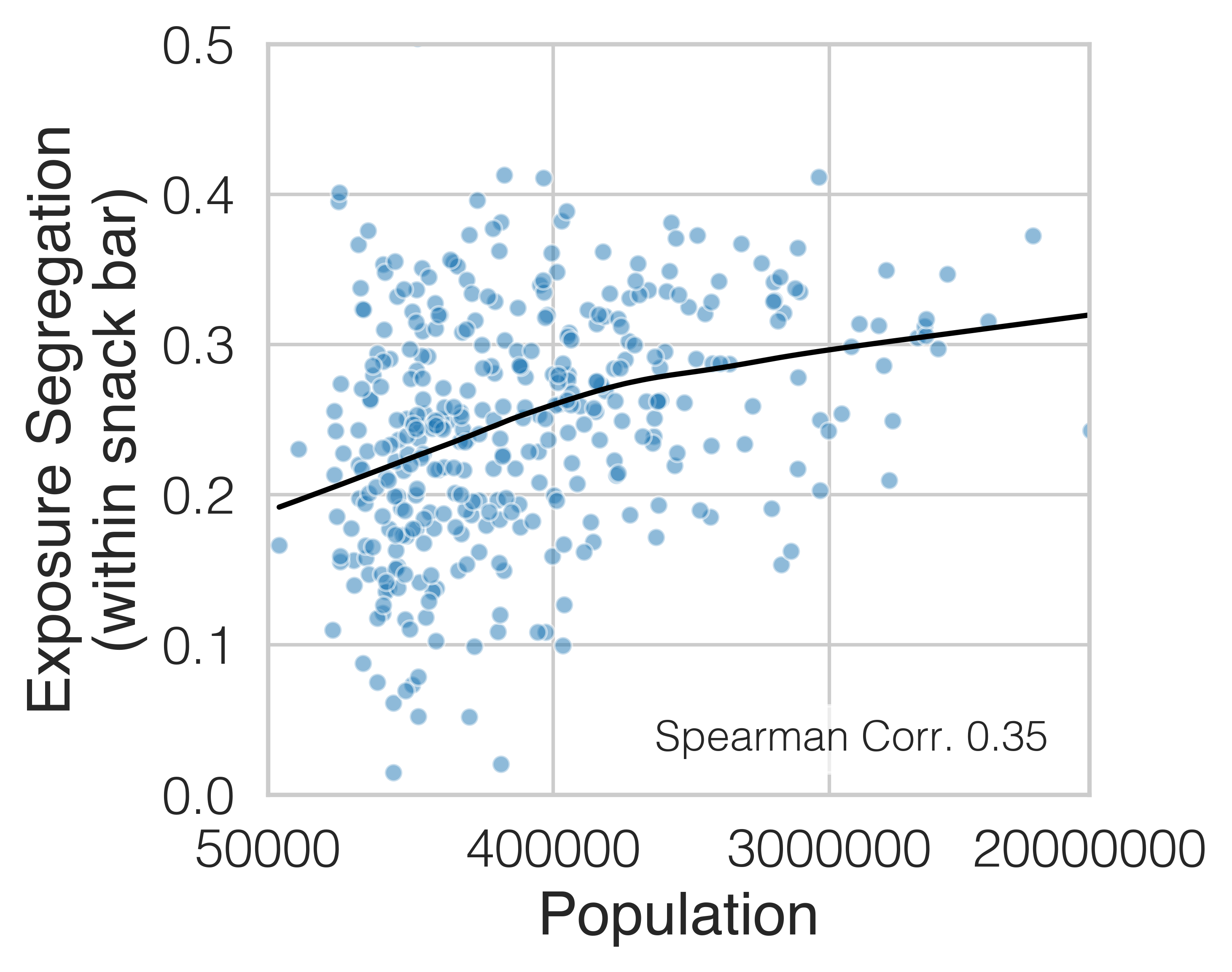
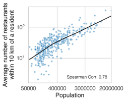
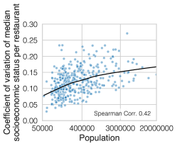
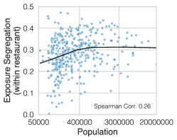
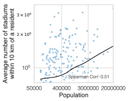
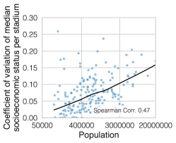
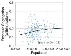
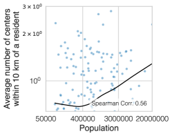
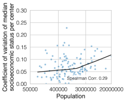
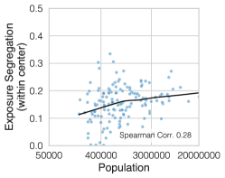
| Dependent variable: Exposure Segregation | ||||||
| (1) | (2) | (3) | (4) | (5) | (6) | |
| Intercept | 0.355∗∗∗ | 0.355∗∗∗ | 0.355∗∗∗ | 0.356∗∗∗ | 0.355∗∗∗ | 0.355∗∗∗ |
| (0.005) | (0.004) | (0.004) | (0.004) | (0.003) | (0.003) | |
| Population Density | 0.039∗∗∗ | 0.024∗∗∗ | 0.022∗∗∗ | 0.017∗∗∗ | 0.017∗∗∗ | |
| (0.005) | (0.004) | (0.004) | (0.004) | (0.004) | ||
| Gini Index (Estimated Rent) | 0.064∗∗∗ | 0.058∗∗∗ | 0.059∗∗∗ | 0.049∗∗∗ | 0.050∗∗∗ | |
| (0.004) | (0.004) | (0.004) | (0.003) | (0.003) | ||
| Political Alignment (% Democrat in 2016 Election) | 0.009∗ | 0.006 | ||||
| (0.005) | (0.004) | |||||
| Racial Demographics (% non-Hispanic White) | -0.005 | 0.003 | ||||
| (0.004) | (0.003) | |||||
| Mean SES (Estimated Rent) | -0.009∗ | -0.003 | ||||
| (0.005) | (0.004) | |||||
| Walkability (Walkscore) | 0.002 | 0.001 | ||||
| (0.003) | (0.004) | |||||
| Commutability (% Commute to Work) | -0.012∗∗∗ | -0.013∗∗∗ | ||||
| (0.004) | (0.004) | |||||
| Conventional Segregation (NSI) | 0.048∗∗∗ | 0.047∗∗∗ | ||||
| (0.003) | (0.003) | |||||
| Observations | 382 | 382 | 382 | 376 | 382 | 376 |
| 0.151 | 0.419 | 0.475 | 0.490 | 0.682 | 0.680 | |
| Adjusted | 0.149 | 0.417 | 0.472 | 0.483 | 0.678 | 0.673 |
| ∗p0.1; ∗∗p0.05; ∗∗∗p0.01 | ||||||
| Percentile | # of Exposures | Percentile | # of Exposures |
|---|---|---|---|
| 0.0 | 1.0 | 51.0 | 146.0 |
| 1.0 | 2.0 | 52.0 | 152.0 |
| 2.0 | 4.0 | 53.0 | 157.0 |
| 3.0 | 5.0 | 54.0 | 163.0 |
| 4.0 | 7.0 | 55.0 | 168.0 |
| 5.0 | 8.0 | 56.0 | 174.0 |
| 6.0 | 10.0 | 57.0 | 181.0 |
| 7.0 | 12.0 | 58.0 | 187.0 |
| 8.0 | 14.0 | 59.0 | 194.0 |
| 9.0 | 16.0 | 60.0 | 201.0 |
| 10.0 | 17.0 | 61.0 | 208.0 |
| 11.0 | 19.0 | 62.0 | 215.0 |
| 12.0 | 21.0 | 63.0 | 223.0 |
| 13.0 | 23.0 | 64.0 | 231.0 |
| 14.0 | 25.0 | 65.0 | 240.0 |
| 15.0 | 28.0 | 66.0 | 249.0 |
| 16.0 | 30.0 | 67.0 | 258.0 |
| 17.0 | 32.0 | 68.0 | 268.0 |
| 18.0 | 34.0 | 69.0 | 278.0 |
| 19.0 | 36.0 | 70.0 | 289.0 |
| 20.0 | 39.0 | 71.0 | 300.0 |
| 21.0 | 41.0 | 72.0 | 312.0 |
| 22.0 | 44.0 | 73.0 | 325.0 |
| 23.0 | 46.0 | 74.0 | 338.0 |
| 24.0 | 49.0 | 75.0 | 353.0 |
| 25.0 | 51.0 | 76.0 | 368.0 |
| 26.0 | 54.0 | 77.0 | 384.0 |
| 27.0 | 57.0 | 78.0 | 402.0 |
| 28.0 | 59.0 | 79.0 | 420.0 |
| 29.0 | 62.0 | 80.0 | 440.0 |
| 30.0 | 65.0 | 81.0 | 462.0 |
| 31.0 | 68.0 | 82.0 | 485.0 |
| 32.0 | 71.0 | 83.0 | 511.0 |
| 33.0 | 74.0 | 84.0 | 539.0 |
| 34.0 | 77.0 | 85.0 | 569.0 |
| 35.0 | 81.0 | 86.0 | 603.0 |
| 36.0 | 84.0 | 87.0 | 640.0 |
| 37.0 | 88.0 | 88.0 | 683.0 |
| 38.0 | 91.0 | 89.0 | 731.0 |
| 39.0 | 95.0 | 90.0 | 786.0 |
| 40.0 | 98.0 | 91.0 | 851.0 |
| 41.0 | 102.0 | 92.0 | 927.0 |
| 42.0 | 106.0 | 93.0 | 1018.0 |
| 43.0 | 110.0 | 94.0 | 1133.0 |
| 44.0 | 114.0 | 95.0 | 1280.0 |
| 45.0 | 118.0 | 96.0 | 1482.0 |
| 46.0 | 123.0 | 97.0 | 1781.0 |
| 47.0 | 127.0 | 98.0 | 2291.0 |
| 48.0 | 132.0 | 99.0 | 3480.0 |
| 49.0 | 136.0 | 100.0 | 194243.0 |
| 50.0 | 141.0 |
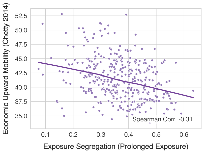
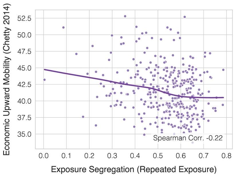
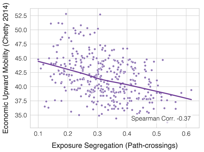
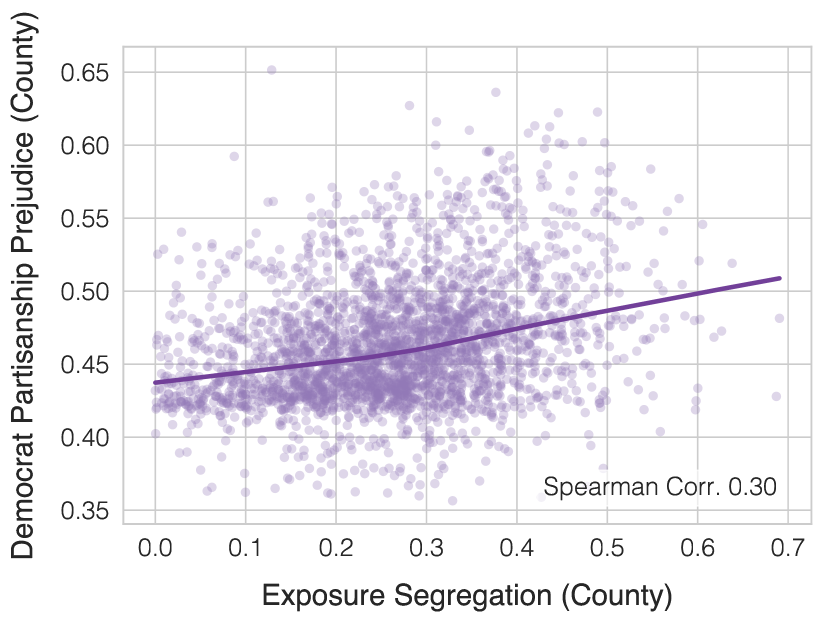
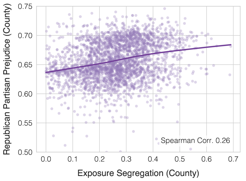
.
.
| Percentile | # of Exposures | Percentile | # of Exposures |
|---|---|---|---|
| 0.0 | 1.00 | 51.0 | 7.10 |
| 1.0 | 1.00 | 52.0 | 7.27 |
| 2.0 | 1.29 | 53.0 | 7.44 |
| 3.0 | 1.50 | 54.0 | 7.62 |
| 4.0 | 1.60 | 55.0 | 7.81 |
| 5.0 | 1.73 | 56.0 | 8.00 |
| 6.0 | 1.86 | 57.0 | 8.20 |
| 7.0 | 2.00 | 58.0 | 8.40 |
| 8.0 | 2.00 | 59.0 | 8.62 |
| 9.0 | 2.17 | 60.0 | 8.83 |
| 10.0 | 2.27 | 61.0 | 9.06 |
| 11.0 | 2.38 | 62.0 | 9.30 |
| 12.0 | 2.50 | 63.0 | 9.54 |
| 13.0 | 2.57 | 64.0 | 9.80 |
| 14.0 | 2.67 | 65.0 | 10.06 |
| 15.0 | 2.77 | 66.0 | 10.33 |
| 16.0 | 2.88 | 67.0 | 10.62 |
| 17.0 | 3.00 | 68.0 | 10.93 |
| 18.0 | 3.05 | 69.0 | 11.25 |
| 19.0 | 3.17 | 70.0 | 11.57 |
| 20.0 | 3.26 | 71.0 | 11.93 |
| 21.0 | 3.36 | 72.0 | 12.29 |
| 22.0 | 3.47 | 73.0 | 12.68 |
| 23.0 | 3.57 | 74.0 | 13.09 |
| 24.0 | 3.67 | 75.0 | 13.52 |
| 25.0 | 3.77 | 76.0 | 14.00 |
| 26.0 | 3.88 | 77.0 | 14.49 |
| 27.0 | 4.00 | 78.0 | 15.00 |
| 28.0 | 4.08 | 79.0 | 15.58 |
| 29.0 | 4.19 | 80.0 | 16.19 |
| 30.0 | 4.30 | 81.0 | 16.83 |
| 31.0 | 4.41 | 82.0 | 17.55 |
| 32.0 | 4.52 | 83.0 | 18.32 |
| 33.0 | 4.64 | 84.0 | 19.17 |
| 34.0 | 4.75 | 85.0 | 20.09 |
| 35.0 | 4.87 | 86.0 | 21.12 |
| 36.0 | 5.00 | 87.0 | 22.27 |
| 37.0 | 5.11 | 88.0 | 23.57 |
| 38.0 | 5.23 | 89.0 | 25.04 |
| 39.0 | 5.36 | 90.0 | 26.74 |
| 40.0 | 5.50 | 91.0 | 28.71 |
| 41.0 | 5.62 | 92.0 | 31.06 |
| 42.0 | 5.75 | 93.0 | 33.92 |
| 43.0 | 5.89 | 94.0 | 37.48 |
| 44.0 | 6.00 | 95.0 | 42.10 |
| 45.0 | 6.17 | 96.0 | 48.46 |
| 46.0 | 6.31 | 97.0 | 57.88 |
| 47.0 | 6.46 | 98.0 | 74.00 |
| 48.0 | 6.62 | 99.0 | 112.19 |
| 49.0 | 6.77 | 100.0 | 5351.00 |
| 50.0 | 6.94 |
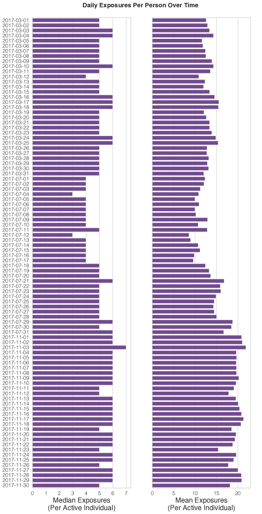
| Percentile | Tie Strength | Percentile | Tie Strength |
|---|---|---|---|
| 0.0 | 1 | 51.0 | 1 |
| 1.0 | 1 | 52.0 | 1 |
| 2.0 | 1 | 53.0 | 1 |
| 3.0 | 1 | 54.0 | 1 |
| 4.0 | 1 | 55.0 | 1 |
| 5.0 | 1 | 56.0 | 1 |
| 6.0 | 1 | 57.0 | 1 |
| 7.0 | 1 | 58.0 | 1 |
| 8.0 | 1 | 59.0 | 1 |
| 9.0 | 1 | 60.0 | 1 |
| 10.0 | 1 | 61.0 | 1 |
| 11.0 | 1 | 62.0 | 1 |
| 12.0 | 1 | 63.0 | 1 |
| 13.0 | 1 | 64.0 | 1 |
| 14.0 | 1 | 65.0 | 1 |
| 15.0 | 1 | 66.0 | 1 |
| 16.0 | 1 | 67.0 | 1 |
| 17.0 | 1 | 68.0 | 1 |
| 18.0 | 1 | 69.0 | 1 |
| 19.0 | 1 | 70.0 | 1 |
| 20.0 | 1 | 71.0 | 1 |
| 21.0 | 1 | 72.0 | 1 |
| 22.0 | 1 | 73.0 | 1 |
| 23.0 | 1 | 74.0 | 1 |
| 24.0 | 1 | 75.0 | 2 |
| 25.0 | 1 | 76.0 | 2 |
| 26.0 | 1 | 77.0 | 2 |
| 27.0 | 1 | 78.0 | 2 |
| 28.0 | 1 | 79.0 | 2 |
| 29.0 | 1 | 80.0 | 2 |
| 30.0 | 1 | 81.0 | 2 |
| 31.0 | 1 | 82.0 | 2 |
| 32.0 | 1 | 83.0 | 2 |
| 33.0 | 1 | 84.0 | 2 |
| 34.0 | 1 | 85.0 | 2 |
| 35.0 | 1 | 86.0 | 2 |
| 36.0 | 1 | 87.0 | 2 |
| 37.0 | 1 | 88.0 | 2 |
| 38.0 | 1 | 89.0 | 2 |
| 39.0 | 1 | 90.0 | 2 |
| 40.0 | 1 | 91.0 | 3 |
| 41.0 | 1 | 92.0 | 3 |
| 42.0 | 1 | 93.0 | 3 |
| 43.0 | 1 | 94.0 | 3 |
| 44.0 | 1 | 95.0 | 4 |
| 45.0 | 1 | 96.0 | 4 |
| 46.0 | 1 | 97.0 | 5 |
| 47.0 | 1 | 98.0 | 7 |
| 48.0 | 1 | 99.0 | 11 |
| 49.0 | 1 | 100.0 | 11644 |
| 50.0 | 1 |
| Percentile | Accurate Pings | Raw Pings | Percentile | Accurate Pings | Raw Pings |
|---|---|---|---|---|---|
| 0 | 11 | 500 | 51 | 1,507 | 1,668 |
| 1 | 370 | 513 | 52 | 1,544 | 1,706 |
| 2 | 424 | 526 | 53 | 1,582 | 1,745 |
| 3 | 458 | 541 | 54 | 1,621 | 1,786 |
| 4 | 483 | 555 | 55 | 1,661 | 1,827 |
| 5 | 501 | 571 | 56 | 1,702 | 1,869 |
| 6 | 514 | 586 | 57 | 1,745 | 1,913 |
| 7 | 528 | 602 | 58 | 1,789 | 1,958 |
| 8 | 542 | 618 | 59 | 1,834 | 2,004 |
| 9 | 556 | 634 | 60 | 1,880 | 2,052 |
| 10 | 570 | 651 | 61 | 1,927 | 2,101 |
| 11 | 585 | 668 | 62 | 1,976 | 2,152 |
| 12 | 600 | 686 | 63 | 2,027 | 2,204 |
| 13 | 616 | 703 | 64 | 2,080 | 2,259 |
| 14 | 631 | 721 | 65 | 2,134 | 2,315 |
| 15 | 647 | 739 | 66 | 2,190 | 2,374 |
| 16 | 664 | 757 | 67 | 2,249 | 2,434 |
| 17 | 680 | 776 | 68 | 2,310 | 2,498 |
| 18 | 697 | 795 | 69 | 2,373 | 2,565 |
| 19 | 714 | 814 | 70 | 2,440 | 2,634 |
| 20 | 731 | 833 | 71 | 2,509 | 2,708 |
| 21 | 749 | 852 | 72 | 2,582 | 2,785 |
| 22 | 767 | 872 | 73 | 2,659 | 2,867 |
| 23 | 785 | 892 | 74 | 2,740 | 2,955 |
| 24 | 803 | 913 | 75 | 2,827 | 3,048 |
| 25 | 822 | 933 | 76 | 2,919 | 3,148 |
| 26 | 842 | 955 | 77 | 3,019 | 3,256 |
| 27 | 861 | 976 | 78 | 3,125 | 3,372 |
| 28 | 881 | 998 | 79 | 3,241 | 3,498 |
| 29 | 901 | 1,021 | 80 | 3,367 | 3,636 |
| 30 | 922 | 1,043 | 81 | 3,504 | 3,788 |
| 31 | 944 | 1,067 | 82 | 3,656 | 3,954 |
| 32 | 966 | 1,090 | 83 | 3,824 | 4,139 |
| 33 | 988 | 1,114 | 84 | 4,011 | 4,344 |
| 34 | 1,011 | 1,139 | 85 | 4,220 | 4,576 |
| 35 | 1,034 | 1,164 | 86 | 4,460 | 4,837 |
| 36 | 1,058 | 1,190 | 87 | 4,733 | 5,137 |
| 37 | 1,083 | 1,216 | 88 | 5,051 | 5,479 |
| 38 | 1,108 | 1,243 | 89 | 5,420 | 5,873 |
| 39 | 1,134 | 1,271 | 90 | 5,857 | 6,327 |
| 40 | 1,160 | 1,300 | 91 | 6,370 | 6,862 |
| 41 | 1,187 | 1,329 | 92 | 6,987 | 7,492 |
| 42 | 1,215 | 1,360 | 93 | 7,735 | 8,258 |
| 43 | 1,244 | 1,391 | 94 | 8,669 | 9,211 |
| 44 | 1,274 | 1,423 | 95 | 9,885 | 10,444 |
| 45 | 1,304 | 1,456 | 96 | 11,543 | 12,116 |
| 46 | 1,336 | 1,489 | 97 | 14,011 | 14,602 |
| 47 | 1,369 | 1,523 | 98 | 18,150 | 18,735 |
| 48 | 1,402 | 1,558 | 99 | 27,407 | 27,938 |
| 49 | 1,436 | 1,594 | 100 | 4,755,081 | 4,777,213 |
| 50 | 1,471 | 1,630 |
| Percentile | Unique Days | Percentile | Unique Days |
| 0 | 2 | 51 | 30 |
| 1 | 5 | 52 | 31 |
| 2 | 7 | 53 | 31 |
| 3 | 8 | 54 | 31 |
| 4 | 9 | 55 | 31 |
| 5 | 9 | 56 | 31 |
| 6 | 10 | 57 | 31 |
| 7 | 11 | 58 | 32 |
| 8 | 11 | 59 | 32 |
| 9 | 12 | 60 | 32 |
| 10 | 13 | 61 | 32 |
| 11 | 13 | 62 | 32 |
| 12 | 14 | 63 | 33 |
| 13 | 15 | 64 | 34 |
| 14 | 15 | 65 | 34 |
| 15 | 16 | 66 | 35 |
| 16 | 16 | 67 | 37 |
| 17 | 17 | 68 | 38 |
| 18 | 17 | 69 | 39 |
| 19 | 18 | 70 | 40 |
| 20 | 18 | 71 | 41 |
| 21 | 19 | 72 | 43 |
| 22 | 19 | 73 | 44 |
| 23 | 20 | 74 | 45 |
| 24 | 20 | 75 | 47 |
| 25 | 21 | 76 | 48 |
| 26 | 21 | 77 | 49 |
| 27 | 22 | 78 | 51 |
| 28 | 22 | 79 | 52 |
| 29 | 23 | 80 | 53 |
| 30 | 23 | 81 | 54 |
| 31 | 24 | 82 | 56 |
| 32 | 24 | 83 | 57 |
| 33 | 25 | 84 | 58 |
| 34 | 25 | 85 | 59 |
| 35 | 25 | 86 | 60 |
| 36 | 26 | 87 | 61 |
| 37 | 26 | 88 | 62 |
| 38 | 26 | 89 | 62 |
| 39 | 27 | 90 | 63 |
| 40 | 27 | 91 | 64 |
| 41 | 27 | 92 | 67 |
| 42 | 27 | 93 | 70 |
| 43 | 28 | 94 | 74 |
| 44 | 28 | 95 | 78 |
| 45 | 28 | 96 | 82 |
| 46 | 29 | 97 | 86 |
| 47 | 29 | 98 | 90 |
| 48 | 29 | 99 | 93 |
| 49 | 30 | 100 | 95 |
| 50 | 30 |
| Percentile | Time Elapsed Between Pings (seconds) | Percentile | Time Elapsed Between Pings (seconds) |
| 0 | 1 | 51 | 6 |
| 1 | 1 | 52 | 7 |
| 2 | 1 | 53 | 8 |
| 3 | 1 | 54 | 9 |
| 4 | 1 | 55 | 9 |
| 5 | 1 | 56 | 11 |
| 6 | 1 | 57 | 14 |
| 7 | 1 | 58 | 18 |
| 8 | 1 | 59 | 24 |
| 9 | 1 | 60 | 31 |
| 10 | 1 | 61 | 40 |
| 11 | 1 | 62 | 50 |
| 12 | 1 | 63 | 60 |
| 13 | 1 | 64 | 65 |
| 14 | 1 | 65 | 73 |
| 15 | 1 | 66 | 83 |
| 16 | 1 | 67 | 96 |
| 17 | 2 | 68 | 112 |
| 18 | 2 | 69 | 124 |
| 19 | 2 | 70 | 138 |
| 20 | 2 | 71 | 154 |
| 21 | 2 | 72 | 172 |
| 22 | 2 | 73 | 182 |
| 23 | 3 | 74 | 190 |
| 24 | 3 | 75 | 203 |
| 25 | 3 | 76 | 221 |
| 26 | 3 | 77 | 241 |
| 27 | 4 | 78 | 261 |
| 28 | 4 | 79 | 288 |
| 29 | 4 | 80 | 300 |
| 30 | 4 | 81 | 304 |
| 31 | 5 | 82 | 322 |
| 32 | 5 | 83 | 357 |
| 33 | 5 | 84 | 402 |
| 34 | 5 | 85 | 473 |
| 35 | 5 | 86 | 561 |
| 36 | 5 | 87 | 603 |
| 37 | 5 | 88 | 640 |
| 38 | 5 | 89 | 742 |
| 39 | 5 | 90 | 897 |
| 40 | 5 | 91 | 1,081 |
| 41 | 5 | 92 | 1,355 |
| 42 | 5 | 93 | 1,679 |
| 43 | 5 | 94 | 1,888 |
| 44 | 5 | 95 | 2,418 |
| 45 | 5 | 96 | 3,482 |
| 46 | 5 | 97 | 4,732 |
| 47 | 5 | 98 | 8,185 |
| 48 | 5 | 99 | 21,454 |
| 49 | 6 | 100 | 23,053,986 |
| 50 | 6 |
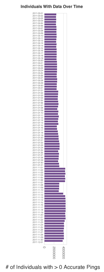
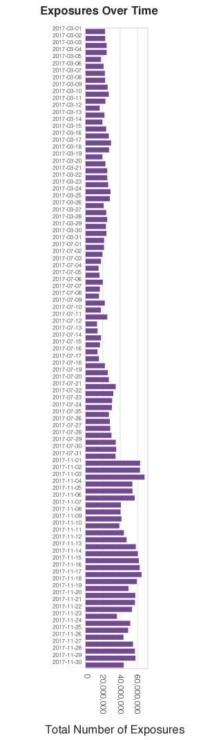
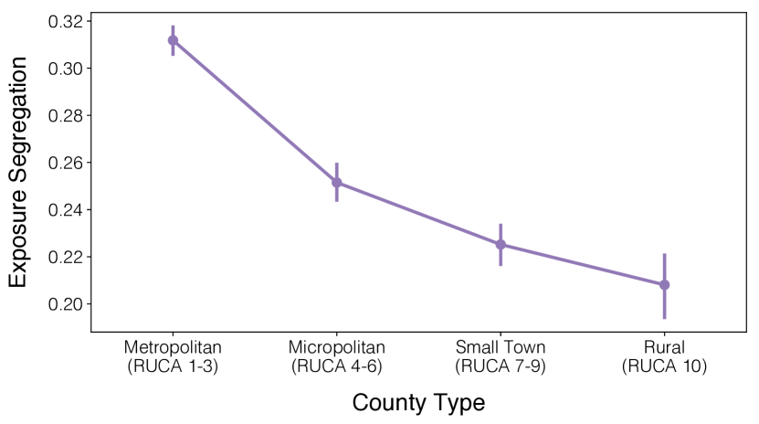
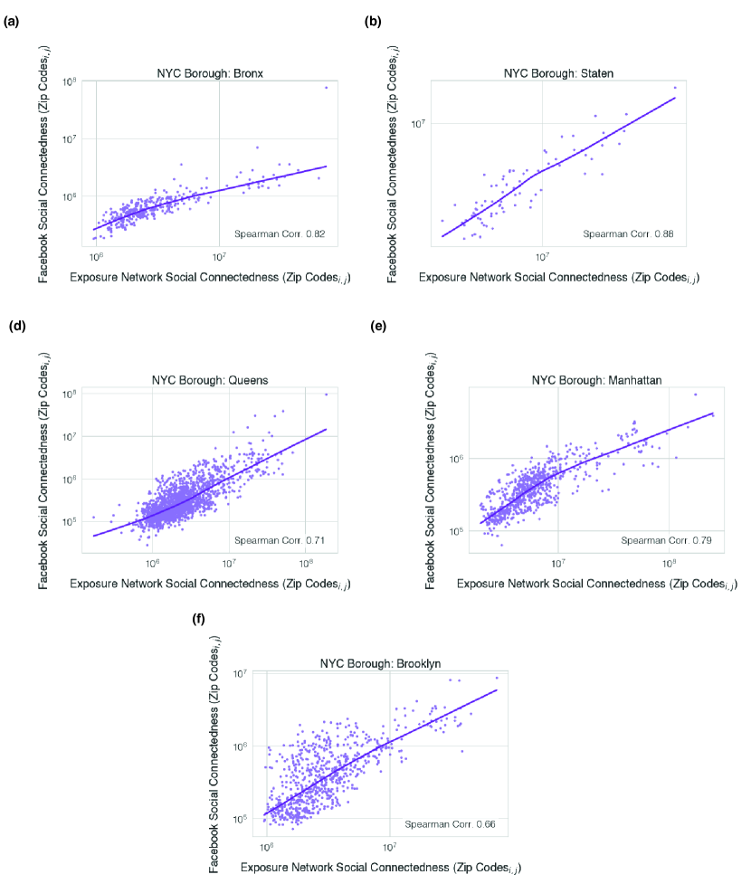
| Mean # of Unique Days of Exposure | POI Type |
|---|---|
| 1.027096 | Performing Arts Centers |
| 1.029548 | Stadiums |
| 1.036697 | Theme Parks |
| 1.044692 | Bowling Centers |
| 1.050582 | Other Amusement/Recreation |
| 1.054688 | Bars/Drinking Places |
| 1.068597 | Museums |
| 1.068676 | Historical Sites |
| 1.073173 | Independent Artists |
| 1.087597 | Casinos |
| 1.089572 | Limited-Service Restaurants |
| 1.092399 | Parks |
| 1.097890 | Snack Bars |
| 1.102125 | Full-Service Restaurants |
| 1.117464 | Fitness/Recreation Centers |
| 1.147761 | Golf Courses and Country Clubs |
| 1.153269 | Religious Organizations |
| Mean Exposure Distance (meters) | POI Type |
|---|---|
| 14.148335 | Museums |
| 20.783428 | Historical Sites |
| 23.343675 | Golf Courses and Country Clubs |
| 24.539538 | Religious Organizations |
| 24.954691 | Stadiums |
| 25.063481 | Performing Arts Centers |
| 25.168213 | Bowling Centers |
| 25.765411 | Full-Service Restaurants |
| 25.845487 | Parks |
| 25.973838 | Other Amusement/Recreation |
| 26.080283 | Bars/Drinking Places |
| 26.102137 | Fitness/Recreation Centers |
| 26.214838 | Theme Parks |
| 26.305469 | Limited-Service Restaurants |
| 26.423661 | Snack Bars |
| 26.775229 | Independent Artists |
| 27.048224 | Casinos |
| Mean Length (# of consecutive five minute intervals) | POI Type |
|---|---|
| 1.617740 | Museums |
| 1.620565 | Theme Parks |
| 1.693283 | Other Amusement/Recreation |
| 1.748765 | Bars/Drinking Places |
| 1.776146 | Independent Artists |
| 1.782905 | Limited-Service Restaurants |
| 1.840704 | Full-Service Restaurants |
| 1.851464 | Snack Bars |
| 1.871852 | Casinos |
| 1.882052 | Fitness/Recreation Centers |
| 1.910205 | Historical Sites |
| 2.039442 | Parks |
| 2.061254 | Religious Organizations |
| 2.082550 | Golf Courses and Country Clubs |
| 2.209579 | Bowling Centers |
| 2.436712 | Stadiums |
| 2.464210 | Performing Arts Centers |
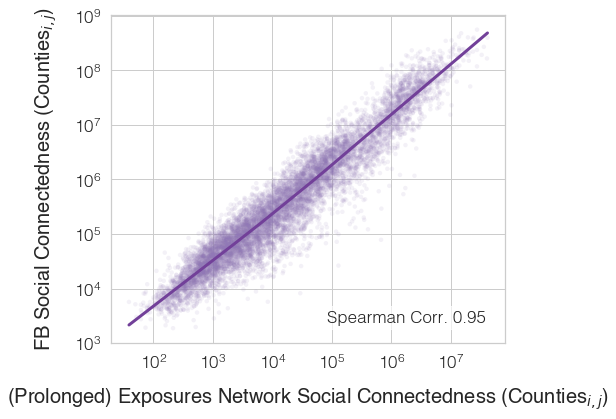
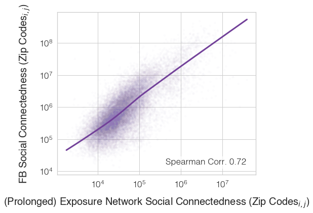
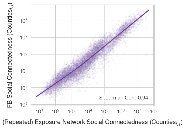
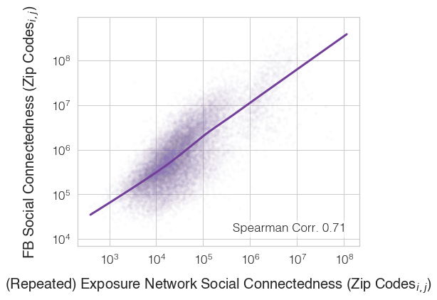
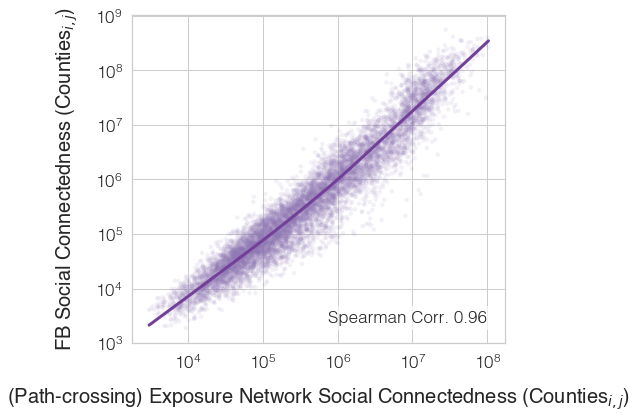
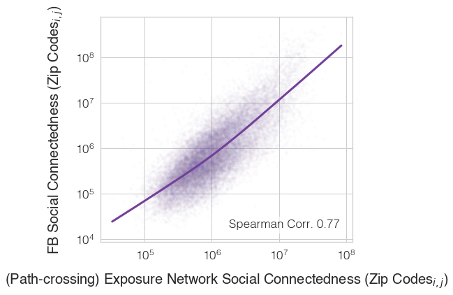
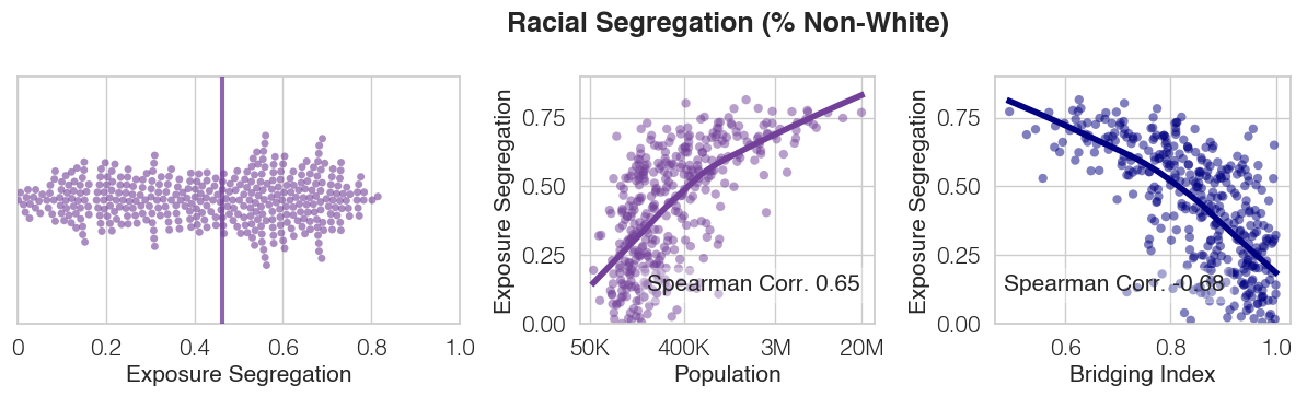
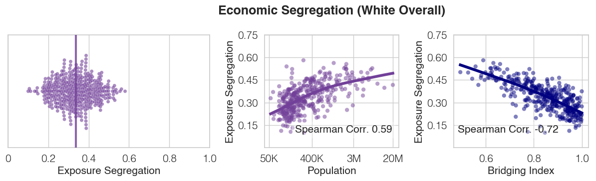
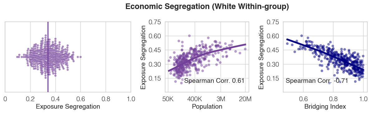
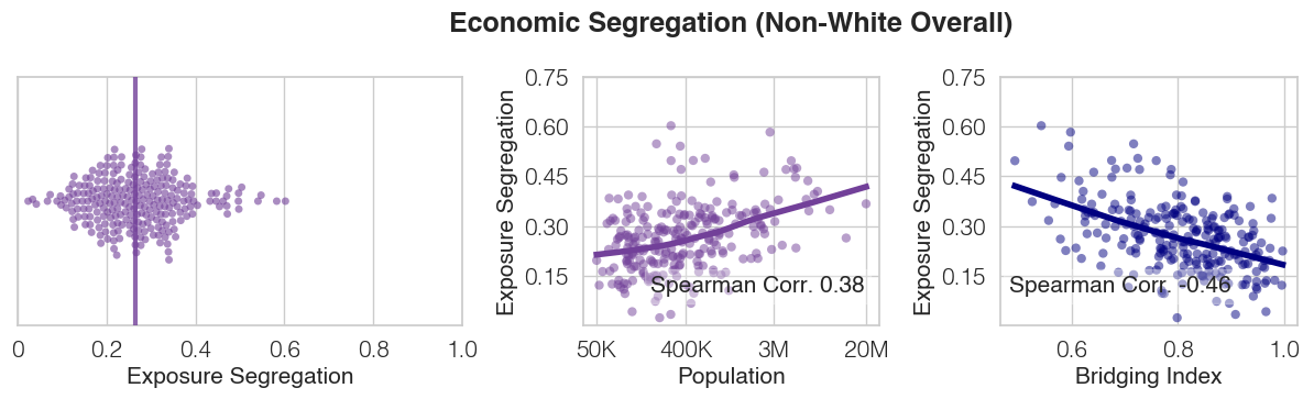
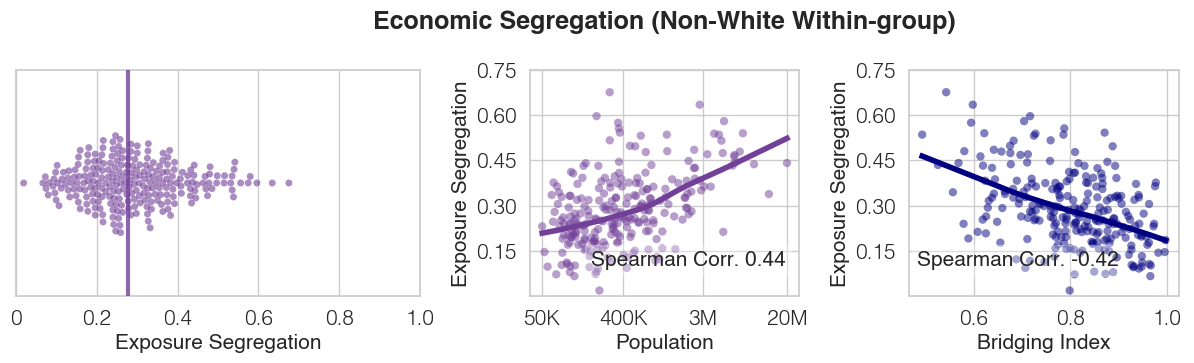
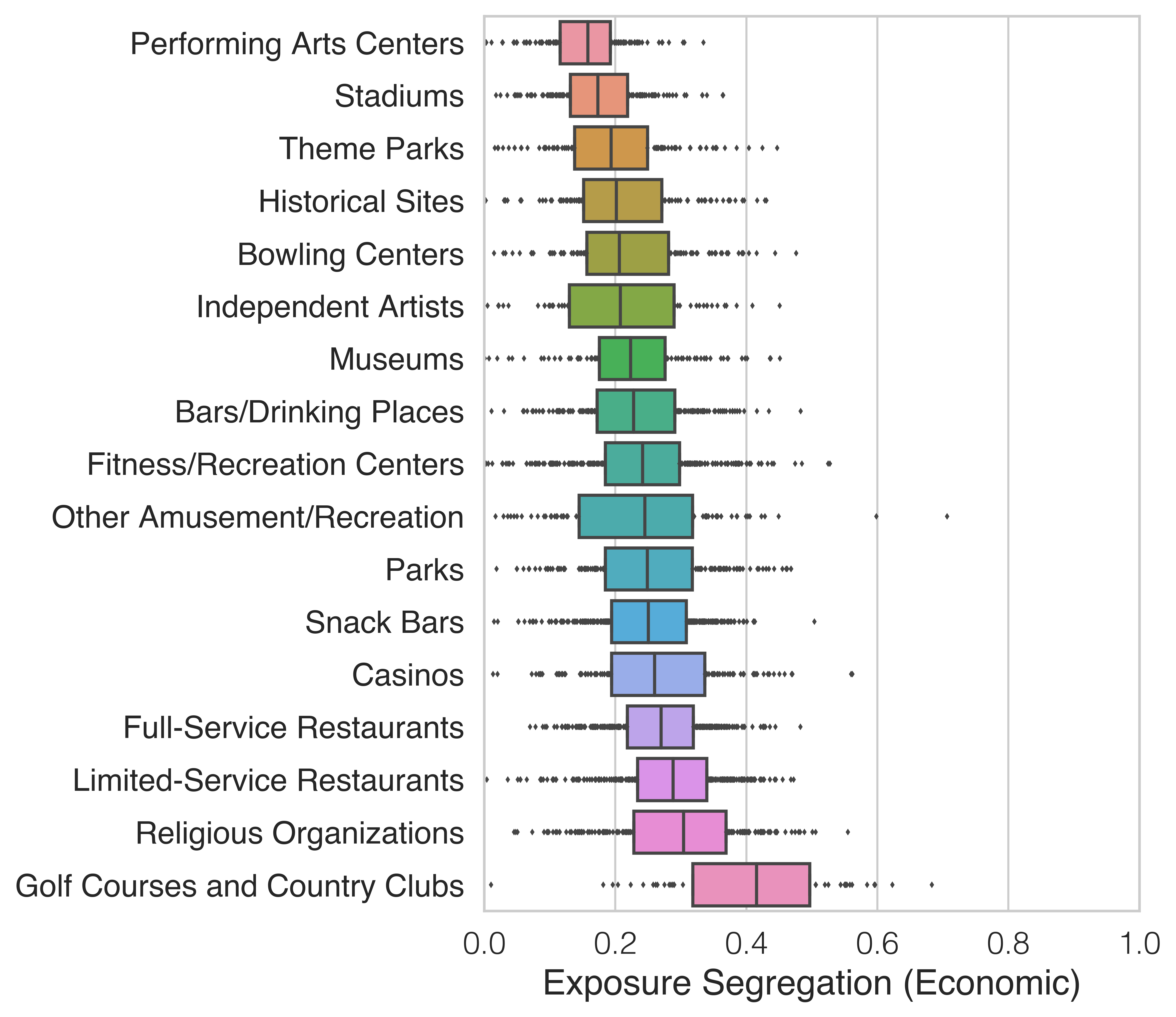
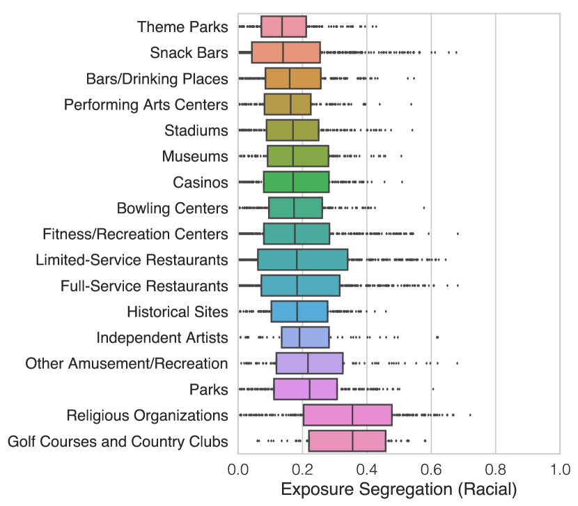
| Percentile | # Distinct Exposures | Percentile | # Distinct Exposures |
|---|---|---|---|
| 0.0 | 1.0 | 51.0 | 79.0 |
| 1.0 | 1.0 | 52.0 | 81.0 |
| 2.0 | 2.0 | 53.0 | 85.0 |
| 3.0 | 3.0 | 54.0 | 88.0 |
| 4.0 | 3.0 | 55.0 | 91.0 |
| 5.0 | 4.0 | 56.0 | 94.0 |
| 6.0 | 5.0 | 57.0 | 98.0 |
| 7.0 | 6.0 | 58.0 | 102.0 |
| 8.0 | 7.0 | 59.0 | 106.0 |
| 9.0 | 8.0 | 60.0 | 109.0 |
| 10.0 | 8.0 | 61.0 | 114.0 |
| 11.0 | 9.0 | 62.0 | 118.0 |
| 12.0 | 10.0 | 63.0 | 122.0 |
| 13.0 | 11.0 | 64.0 | 127.0 |
| 14.0 | 12.0 | 65.0 | 132.0 |
| 15.0 | 13.0 | 66.0 | 137.0 |
| 16.0 | 14.0 | 67.0 | 142.0 |
| 17.0 | 15.0 | 68.0 | 148.0 |
| 18.0 | 17.0 | 69.0 | 154.0 |
| 19.0 | 18.0 | 70.0 | 160.0 |
| 20.0 | 19.0 | 71.0 | 167.0 |
| 21.0 | 20.0 | 72.0 | 173.0 |
| 22.0 | 21.0 | 73.0 | 181.0 |
| 23.0 | 23.0 | 74.0 | 188.0 |
| 24.0 | 24.0 | 75.0 | 196.0 |
| 25.0 | 25.0 | 76.0 | 205.0 |
| 26.0 | 27.0 | 77.0 | 214.0 |
| 27.0 | 28.0 | 78.0 | 224.0 |
| 28.0 | 30.0 | 79.0 | 234.0 |
| 29.0 | 31.0 | 80.0 | 245.0 |
| 30.0 | 33.0 | 81.0 | 257.0 |
| 31.0 | 34.0 | 82.0 | 271.0 |
| 32.0 | 36.0 | 83.0 | 285.0 |
| 33.0 | 38.0 | 84.0 | 300.0 |
| 34.0 | 40.0 | 85.0 | 317.0 |
| 35.0 | 41.0 | 86.0 | 336.0 |
| 36.0 | 43.0 | 87.0 | 357.0 |
| 37.0 | 45.0 | 88.0 | 380.0 |
| 38.0 | 47.0 | 89.0 | 406.0 |
| 39.0 | 49.0 | 90.0 | 436.0 |
| 40.0 | 51.0 | 91.0 | 471.0 |
| 41.0 | 53.0 | 92.0 | 511.0 |
| 42.0 | 55.0 | 93.0 | 560.0 |
| 43.0 | 58.0 | 94.0 | 620.0 |
| 44.0 | 60.0 | 95.0 | 695.0 |
| 45.0 | 62.0 | 96.0 | 796.0 |
| 46.0 | 65.0 | 97.0 | 939.0 |
| 47.0 | 67.0 | 98.0 | 1171.0 |
| 48.0 | 70.0 | 99.0 | 1655.0 |
| 49.0 | 73.0 | 100.0 | 42323.0 |
| 50.0 | 76.0 |
| Percentile | # of Distinct Exposures | Percentile | # of Distinct Exposures |
|---|---|---|---|
| 0.0 | 1.00 | 51.0 | 4.55 |
| 1.0 | 1.00 | 52.0 | 4.65 |
| 2.0 | 1.00 | 53.0 | 4.76 |
| 3.0 | 1.00 | 54.0 | 4.87 |
| 4.0 | 1.14 | 55.0 | 5.00 |
| 5.0 | 1.23 | 56.0 | 5.09 |
| 6.0 | 1.30 | 57.0 | 5.21 |
| 7.0 | 1.36 | 58.0 | 5.33 |
| 8.0 | 1.43 | 59.0 | 5.46 |
| 9.0 | 1.50 | 60.0 | 5.60 |
| 10.0 | 1.56 | 61.0 | 5.73 |
| 11.0 | 1.62 | 62.0 | 5.87 |
| 12.0 | 1.67 | 63.0 | 6.00 |
| 13.0 | 1.75 | 64.0 | 6.17 |
| 14.0 | 1.80 | 65.0 | 6.32 |
| 15.0 | 1.87 | 66.0 | 6.49 |
| 16.0 | 1.94 | 67.0 | 6.66 |
| 17.0 | 2.00 | 68.0 | 6.83 |
| 18.0 | 2.00 | 69.0 | 7.00 |
| 19.0 | 2.10 | 70.0 | 7.21 |
| 20.0 | 2.17 | 71.0 | 7.41 |
| 21.0 | 2.23 | 72.0 | 7.62 |
| 22.0 | 2.29 | 73.0 | 7.86 |
| 23.0 | 2.36 | 74.0 | 8.09 |
| 24.0 | 2.42 | 75.0 | 8.33 |
| 25.0 | 2.50 | 76.0 | 8.61 |
| 26.0 | 2.55 | 77.0 | 8.89 |
| 27.0 | 2.62 | 78.0 | 9.20 |
| 28.0 | 2.68 | 79.0 | 9.52 |
| 29.0 | 2.75 | 80.0 | 9.87 |
| 30.0 | 2.82 | 81.0 | 10.24 |
| 31.0 | 2.89 | 82.0 | 10.65 |
| 32.0 | 3.00 | 83.0 | 11.08 |
| 33.0 | 3.00 | 84.0 | 11.57 |
| 34.0 | 3.10 | 85.0 | 12.09 |
| 35.0 | 3.17 | 86.0 | 12.67 |
| 36.0 | 3.25 | 87.0 | 13.33 |
| 37.0 | 3.33 | 88.0 | 14.05 |
| 38.0 | 3.40 | 89.0 | 14.88 |
| 39.0 | 3.48 | 90.0 | 15.83 |
| 40.0 | 3.56 | 91.0 | 16.94 |
| 41.0 | 3.64 | 92.0 | 18.25 |
| 42.0 | 3.72 | 93.0 | 19.83 |
| 43.0 | 3.81 | 94.0 | 21.78 |
| 44.0 | 3.89 | 95.0 | 24.31 |
| 45.0 | 4.00 | 96.0 | 27.71 |
| 46.0 | 4.07 | 97.0 | 32.71 |
| 47.0 | 4.16 | 98.0 | 41.00 |
| 48.0 | 4.25 | 99.0 | 59.00 |
| 49.0 | 4.35 | 100.0 | 1740.25 |
| 50.0 | 4.45 |
| Measure | Mean | std | min | 10% | 25% | 50% | 75% | 90% | max |
| Primary Measure | 184.21 | 373.98 | 1.0 | 8.0 | 25.0 | 76.0 | 196.0 | 436.0 | 42323.0 |
| Minimum Distance Between Pings: 25m | 93.23 | 200.13 | 1.0 | 4.0 | 12.0 | 37.0 | 97.0 | 219.0 | 26778.0 |
| Minimum Distance Between Pings: 10m | 41.47 | 99.99 | 1.0 | 2.0 | 5.0 | 14.0 | 38.0 | 94.0 | 12907.0 |
| Minimum Time Between Pings: 2 minutes | 99.92 | 212.03 | 1.0 | 5.0 | 14.0 | 41.0 | 104.0 | 232.0 | 26592.0 |
| Minimum Time Between Pings: 60 seconds | 63.50 | 141.10 | 1.0 | 4.0 | 9.0 | 26.0 | 65.0 | 144.0 | 18912.0 |
| Minimum Tie Strength: 2 consecutive exposures | 35.51 | 91.98 | 1.0 | 2.0 | 5.0 | 13.0 | 33.0 | 78.0 | 13513.0 |
| Minimum Tie Strength: 3 consecutive exposures | 8.53 | 23.31 | 1.0 | 1.0 | 1.0 | 3.0 | 7.0 | 18.0 | 3107.0 |
| Minimum Tie Strength: 2 unique days | 16.39 | 54.78 | 1.0 | 1.0 | 2.0 | 5.0 | 13.0 | 33.0 | 15454.0 |
| Minimum Tie Strength: 3 unique days | 6.74 | 22.04 | 1.0 | 1.0 | 1.0 | 3.0 | 6.0 | 13.0 | 7685.0 |
| Dist. 25m, Time 2 minutes, Length 2+ unique days | 9.83 | 33.09 | 1.0 | 1.0 | 2.0 | 3.0 | 8.0 | 19.0 | 9951.0 |
| Dist. 25m, Time 2 minutes, Length 2+ consecutive exposures | 18.62 | 49.25 | 1.0 | 1.0 | 3.0 | 7.0 | 17.0 | 41.0 | 8447.0 |
| Dist. 10m, Time 1 minutes, Length 3+ unique days | 3.30 | 10.72 | 1.0 | 1.0 | 1.0 | 1.0 | 3.0 | 6.0 | 2019.0 |
| Dist. 10m, Time 1 minutes, Length 3+ consecutive exposures | 4.31 | 12.40 | 1.0 | 1.0 | 1.0 | 2.0 | 4.0 | 9.0 | 2893.0 |
| Measure | Mean | std | min | 10% | 25% | 50% | 75% | 90% | max |
|---|---|---|---|---|---|---|---|---|---|
| Primary Metric | 7.90 | 13.90 | 1.0 | 1.56 | 2.50 | 4.45 | 8.33 | 15.83 | 1740.25 |
| Minimum Distance Between Pings: 25 meters | 3.25 | 5.39 | 1.0 | 1.00 | 1.25 | 1.90 | 3.20 | 6.06 | 907.75 |
| Minimum Distance Between Pings: 10 meters | 2.54 | 4.58 | 1.0 | 1.00 | 1.00 | 1.40 | 2.17 | 4.33 | 510.14 |
| Minimum Time Between Pings: 2 minutes | 3.17 | 5.25 | 1.0 | 1.00 | 1.29 | 1.95 | 3.23 | 5.86 | 973.75 |
| Minimum Time Between Pings: 60 seconds | 2.49 | 3.79 | 1.0 | 1.00 | 1.13 | 1.62 | 2.50 | 4.33 | 674.50 |
| Minimum Tie Strength: 2 consecutive exposures | 2.19 | 3.59 | 1.0 | 1.00 | 1.00 | 1.40 | 2.11 | 3.67 | 622.00 |
| Minimum Tie Strength: 3 consecutive exposures | 1.61 | 2.18 | 1.0 | 1.00 | 1.00 | 1.00 | 1.50 | 2.45 | 344.00 |
| Dist. 25 meters, Time 2 minutes, Length 2+ consecutive exposures | 1.76 | 2.30 | 1.0 | 1.00 | 1.00 | 1.18 | 1.75 | 2.89 | 1148.00 |
| Dist. 10 meters, Time 60 minutes, Length 3+ consecutive exposures | 1.43 | 2.03 | 1.0 | 1.00 | 1.00 | 1.00 | 1.30 | 2.00 | 342.00 |

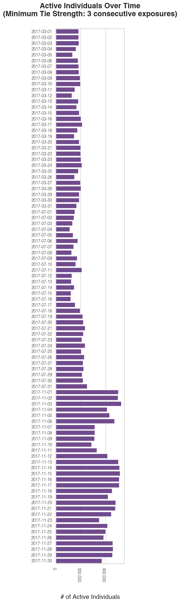
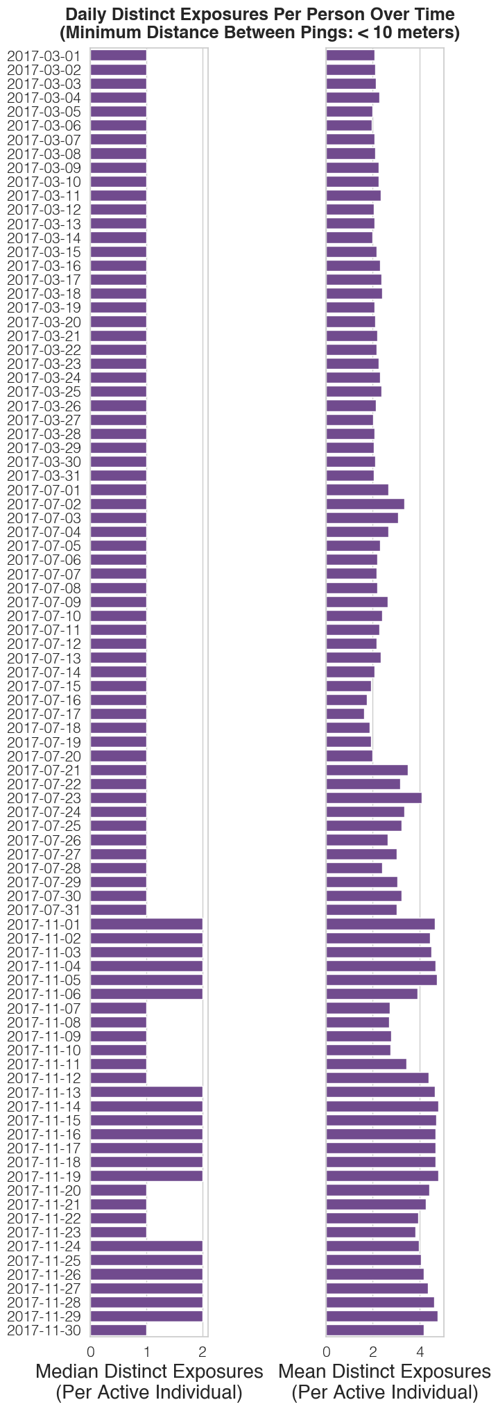
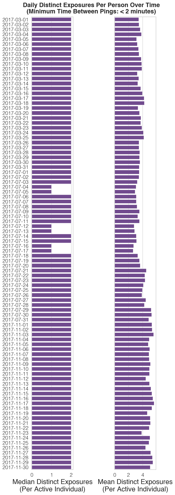
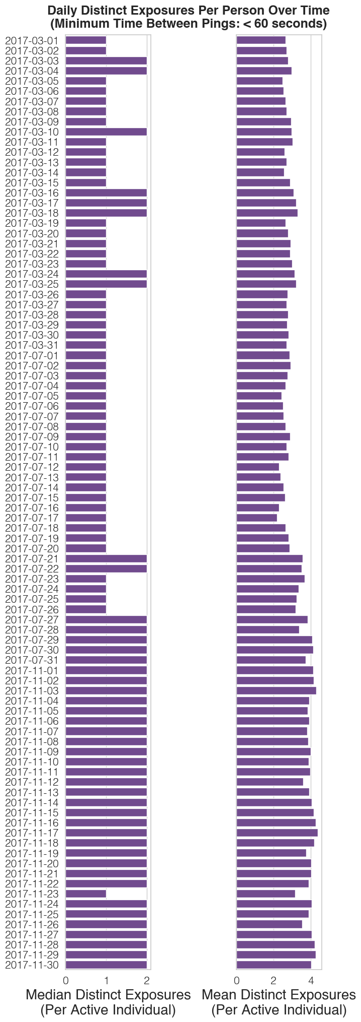
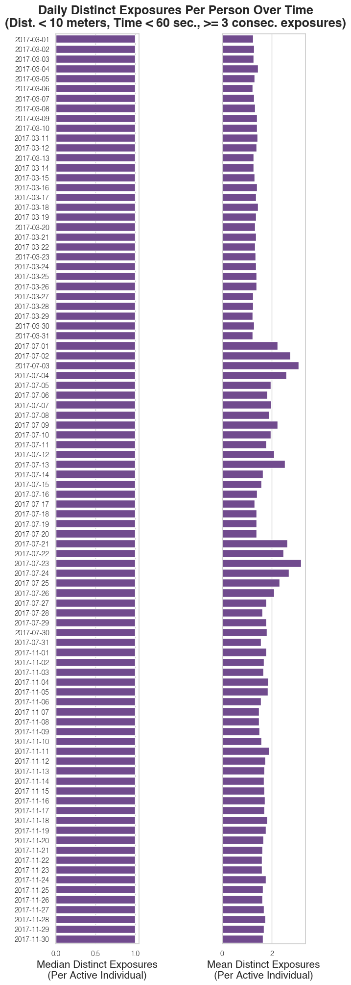
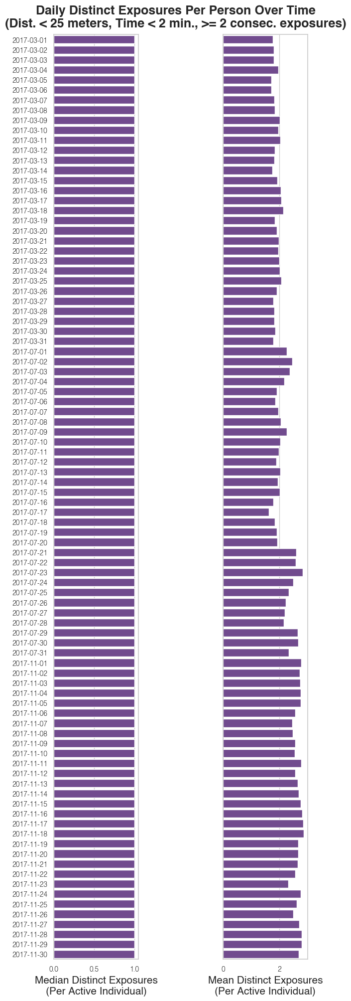
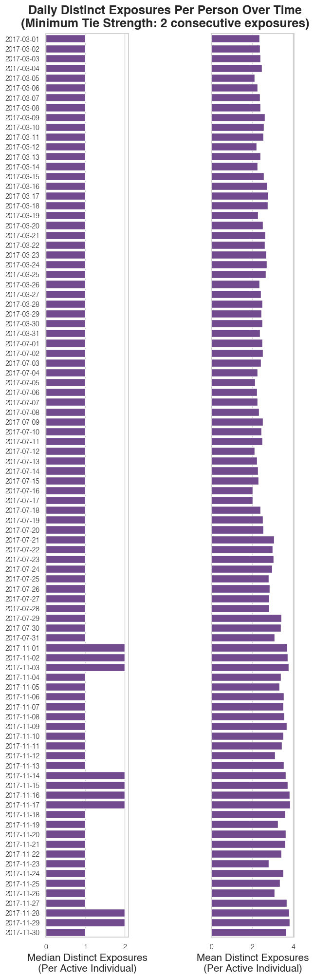


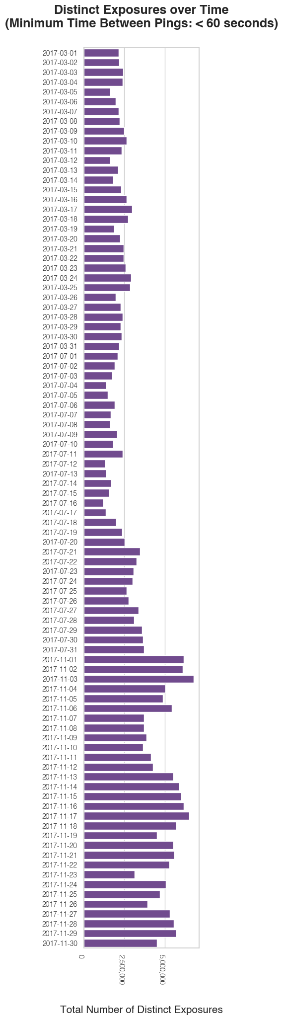

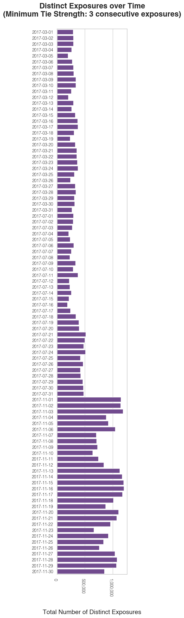
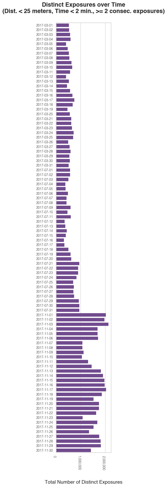
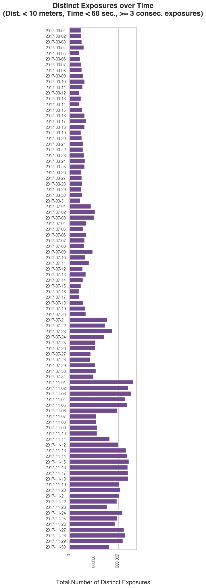
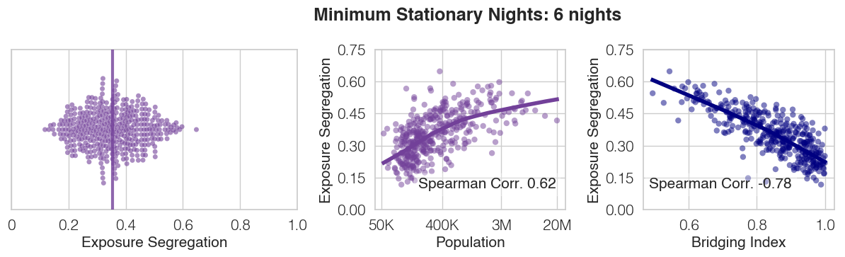
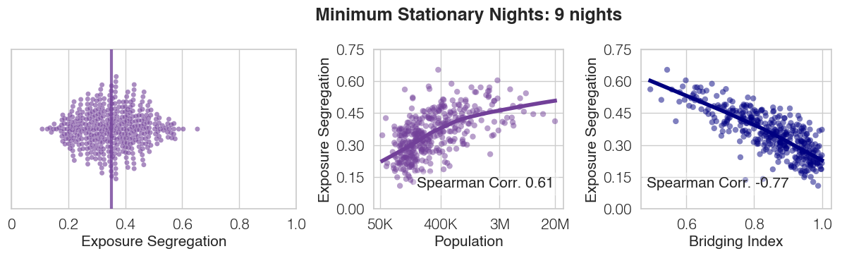
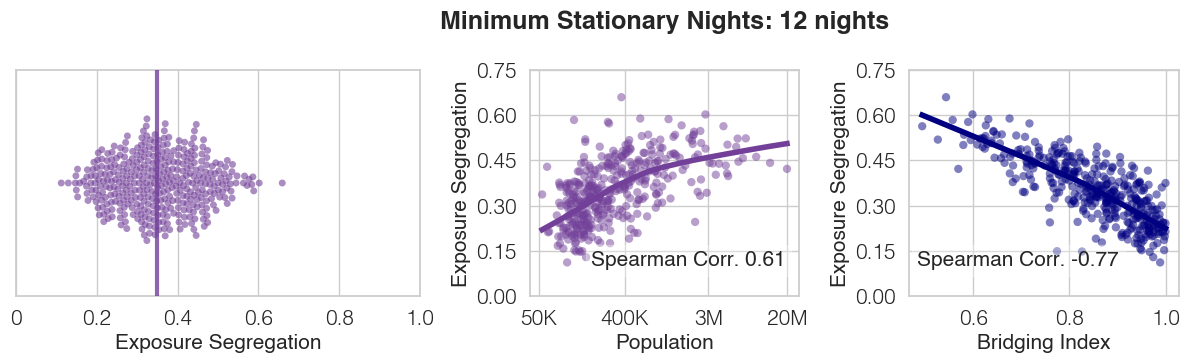
| Dependent variable: Exposure Segregation | ||||||
| (1) | (2) | (3) | (4) | (5) | (6) | |
| Intercept | 0.355∗∗∗ | 0.355∗∗∗ | 0.355∗∗∗ | 0.356∗∗∗ | 0.355∗∗∗ | 0.355∗∗∗ |
| (0.004) | (0.004) | (0.004) | (0.003) | (0.003) | (0.003) | |
| log(POI Density) | 0.055∗∗∗ | 0.035∗∗∗ | 0.039∗∗∗ | 0.020∗∗∗ | 0.022∗∗∗ | |
| (0.004) | (0.004) | (0.005) | (0.004) | (0.004) | ||
| Gini Index (Estimated Rent) | 0.064∗∗∗ | 0.051∗∗∗ | 0.052∗∗∗ | 0.046∗∗∗ | 0.047∗∗∗ | |
| (0.004) | (0.004) | (0.004) | (0.003) | (0.003) | ||
| Political Alignment (% Democrat in 2016 Election) | 0.004 | 0.003 | ||||
| (0.005) | (0.004) | |||||
| Racial Demographics (% non-Hispanic White) | -0.003 | 0.002 | ||||
| (0.004) | (0.003) | |||||
| Mean SES (Estimated Rent) | -0.015∗∗∗ | -0.006 | ||||
| (0.004) | (0.004) | |||||
| Walkability (Walkscore) | 0.003 | 0.003 | ||||
| (0.003) | (0.004) | |||||
| Commutability (% Commute to Work) | -0.010∗∗∗ | -0.010∗∗ | ||||
| (0.004) | (0.004) | |||||
| Conventional Segregation (NSI) | 0.045∗∗∗ | 0.043∗∗∗ | ||||
| (0.003) | (0.003) | |||||
| Observations | 382 | 382 | 382 | 376 | 382 | 376 |
| 0.307 | 0.419 | 0.526 | 0.540 | 0.690 | 0.688 | |
| Adjusted | 0.305 | 0.417 | 0.524 | 0.534 | 0.685 | 0.681 |
| ∗p0.1; ∗∗p0.05; ∗∗∗p0.01 | ||||||
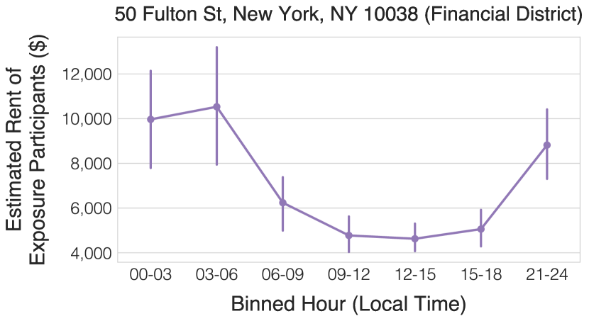
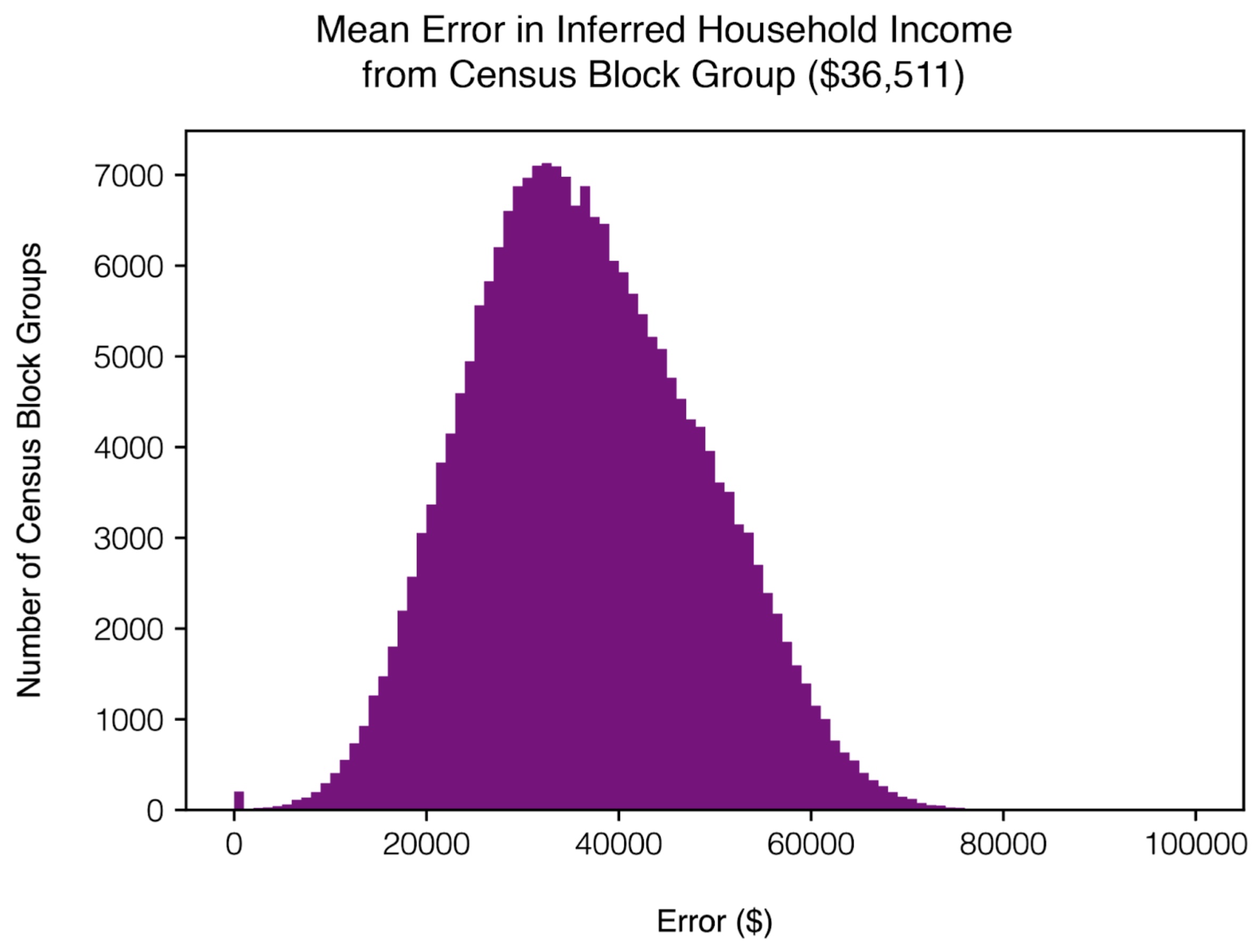
| Dependent variable: Log(FB Social Connectedness) | |||
| (1) | (2) | (3) | |
| const | 11.123∗∗∗ | 11.123∗∗∗ | 11.123∗∗∗ |
| (0.003) | (0.002) | (0.002) | |
| Log(Distance km) | -1.163∗∗∗ | -0.253∗∗∗ | |
| (0.003) | (0.003) | ||
| Log(Exposure Network Social Connectness) | 1.383∗∗∗ | 1.190∗∗∗ | |
| (0.002) | (0.003) | ||
| Observations | 118,559 | 118,559 | 118,559 |
| 0.539 | 0.763 | 0.773 | |
| Adjusted | 0.539 | 0.763 | 0.773 |
| ∗p0.1; ∗∗p0.05; ∗∗∗p0.01 | |||
| Dependent variable: Log(FB Social Connectedness) | |||
| (1) | (2) | (3) | |
| const | 12.372∗∗∗ | 12.372∗∗∗ | 12.372∗∗∗ |
| (0.001) | (0.001) | (0.001) | |
| Log(Distance km) | -0.965∗∗∗ | -0.175∗∗∗ | |
| (0.001) | (0.002) | ||
| Log(Exposure Network Social Connectness) | 1.183∗∗∗ | 1.051∗∗∗ | |
| (0.001) | (0.002) | ||
| Observations | 1,038,424 | 1,038,424 | 1,038,424 |
| 0.335 | 0.503 | 0.508 | |
| Adjusted | 0.335 | 0.503 | 0.508 |
| ∗p0.1; ∗∗p0.05; ∗∗∗p0.01 | |||