/csteps/inner ysep=3pt \pgfkeys/csteps/inner xsep=3pt \onlineid1394 \vgtccategoryResearch \vgtcpapertypealgorithm/technique \authorfooter Z. Li, R. Shi, Y. Liu, S. Long, Z. Guo, S. Jia, and J. Zhang are with College of Intelligence and Computing, Tianjin University. E-mail: {lzytianda, shiruizhi, 3019244195, 3019244112, sygzh6, jsc, jwzhang}@tju.edu.cn. \shortauthortitleBiv et al.: Global Illumination for Fun and Profit
Dual Space Coupling Model Guided Overlap-Free Scatterplot
Abstract
The overdraw problem of scatterplots seriously interferes with the visual tasks. Existing methods, such as data sampling, node dispersion, subspace mapping, and visual abstraction, cannot guarantee the correspondence and consistency between the data points that reflect the intrinsic original data distribution and the corresponding visual units that reveal the presented data distribution, thus failing to obtain an overlap-free scatterplot with unbiased and lossless data distribution. A dual space coupling model is proposed in this paper to represent the complex bilateral relationship between data space and visual space theoretically and analytically. Under the guidance of the model, an overlap-free scatterplot method is developed through integration of the following: a geometry-based data transformation algorithm, namely DistributionTranscriptor; an efficient spatial mutual exclusion guided view transformation algorithm, namely PolarPacking; an overlap-free oriented visual encoding configuration model and a radius adjustment tool, namely . Our method can ensure complete and accurate information transfer between the two spaces, maintaining consistency between the newly created scatterplot and the original data distribution on global and local features. Quantitative evaluation proves our remarkable progress on computational efficiency compared with the state-of-the-art methods. Three applications involving pattern enhancement, interaction improvement, and overdraw mitigation of trajectory visualization demonstrate the broad prospects of our method.
keywords:
Scatterplot, overdraw, overlap-free, scalability, circle packingK.6.1Management of Computing and Information SystemsProject and People ManagementLife Cycle;
\CCScatK.7.mThe Computing ProfessionMiscellaneousEthics
\teaser
![[Uncaptioned image]](/html/2208.09706/assets/x1.png) Results of our method and several representative methods on a dataset containing data points and 5 categories. Sampling and transparency adjustment cannot fundamentally eliminate overdraw. The color blending induced by transparency seriously impedes the understanding of local details\Circlede. HaGrid and DGrid suffer from distortion in shape and density in high density regions\Circleda\Circledb. Our method can accurately characterize the density distribution globally and locally while highlighting outliers\Circledc\Circledd.
\vgtcinsertpkg
Results of our method and several representative methods on a dataset containing data points and 5 categories. Sampling and transparency adjustment cannot fundamentally eliminate overdraw. The color blending induced by transparency seriously impedes the understanding of local details\Circlede. HaGrid and DGrid suffer from distortion in shape and density in high density regions\Circleda\Circledb. Our method can accurately characterize the density distribution globally and locally while highlighting outliers\Circledc\Circledd.
\vgtcinsertpkg
Introduction
For 2D scatterplot visualization, maintaining high-quality data distribution while avoiding overdraw is still an unsolved problem.
Depending on the space in which the core operation is performed, existing solutions toward overdraw problem can be classified into three categories: data space, visual space, and hybrid methods. First, data space methods perform data transformation such as trimming, filtering, sampling, or aggregating operation, on the original data points to reduce the data volume. However, the asymmetrical correspondence between the data points and the visual units in visual space objectively introduces an endogenous contradiction between reducing overdraw and maintaining a lossless and unbiased data distribution. Second, visual space methods mainly focus on applying visual encoding adjustment and view transformation by elaborately configuring the size, position, transparency, or other visual channels of visual units. These methods can then be further classified into three sub-categories: node appearance adjustment[51][27] whose strategy is to reduce the size and transparency of nodes; node dispersion[18][20][38][47] which distributes nodes in an iteration process based on a physical or a mathematical optimization model; sub-space mapping [24][15][19] which injects the data nodes into a partition of visual space. However, adjusting the appearance of nodes cannot strictly avoid overlap, and the color blending caused by transparency leads to severe visual complexity. The two latter sub-categories may introduce serious distortions because they disregard the density preservation. Third, hybrid methods, such as bin aggregation[23][1][30] and contour map[14][32][28], relieve overdraw by replacing visual units that originally correspond to individual data points with visual objects, such as polygons and paths with higher level of visual abstraction. Abstraction leads to the loss of details.
The two major drawbacks of the existing methods lie in the asymmetrical correspondence between the data points and visual units and the inconsistency between the original data distribution and the distribution presented in the scatterplot. To obtain a complete solution to scatterplot overdraw problem, first, the data-visual space mapping should be unbiased or lossless. No data points can be discarded, and all data points should correspond to a unique visual unit. Second, principles and guidelines should also be carefully developed to ensure the strict overlap elimination and safe interaction111no overlap occurs during the interaction to handle the scalability issue of data and support interactive exploration in visual space. Third, as the fundamental goal, the final scatterplot should accurately reflect the original data distribution. The existing overlap removal methods also pursue similar objectives but they always seriously sacrifice one of them, leading to the realization of some goals but accompanied by serious negative effects.
In this paper, after re-examining the overdraw problem through a theoretical perspective, we regard it as an informal optimization problem under four formal criteria. In addition to emphasizing the safety of operations performed within a single space, a dual space coupling model is also proposed to represent the complex bilateral relationship between data and visual spaces analytically. Under the guidance of this model, we develop an overlap-free scatterplot visualization method comprising an unbiased and lossless geometry-based transcriptor that transcribes the data distribution into a set of discrete circles, an efficient circle packing algorithm that re-layouts these circles in visual space to ensure spatial mutual exclusion and reproduce the transcribed distribution to a tangible scatterplot, and a visual encoding configuration model to optimize the visual quality of the new scatterplot and ensure interaction safety. The proposed method can ensure complete and accurate information transfer between the data and visual spaces, maintaining consistency between the newly created scatterplot and the original data points on global and local features. Quantitative evaluations are conducted to compare with the state-of-the-art methods on time cost and five metrics that are designed for measuring the capability to preserve the features of original scatterplots. Three applications demonstrate the capability of our method to reveal the pattern hidden by overdraw, improve the efficiency of interactive exploration, and mitigate the overdraw problem in trajectory visualization.
The contributions of this paper can be summarized as follows:
-
•
We propose a dual-space coupling model to represent the complex relationship and design considerations within and between the data and visual spaces theoretically and analytically. The model introduces a new design space for promising overlap removal algorithms and interaction paradigms.
-
•
We propose an overlap-free scatterplot method which integrates DistributionTranslator (a geometry-based data transformation algorithm), PolarPacking (an efficient circle packing algorithm), and a visual encoding configuration model.
-
•
We develop an easy-to-use radius adjustment tool on the basis of the configuration model to improve the visual quality of scatterplot and ensure interaction safety.
1 related work
Under the topic of visual enhancement of scatterplots[46][8], this paper focuses on methods to mitigate overdraw.
1.1 Data Space Methods
Data space methods simply focus on data operation and completely ignore the stuff on visual units. Therefore, these methods simply pertain to the data transformation described in the classic visualization pipeline[7]. Data reduction and jitter are two typical data space methods.
Data reduction methods alleviate overdraw by reducing data points, thus decreasing the visual units to be placed in visual space. Data sampling and aggregation are two commonly used data reduction strategies. Data sampling selects representative samples from the full set, while data aggregation aggregates subsets of the full set into newly created data points. However, they both suffer from inherent flaws on data loss, data bias, and visualization. The data loss is straightforward, while the data bias is caused by the unavoidable selection of data or/and goal. For example, data sampling methods have developed diverse sampling strategies but have all been designed for specific goals, such as maintaining relative density among regions [3][13][26][4], emphasizing the spatial separation of samples [11][50][2], and preserving outliers[29][12][52]. No one-size-fits-all sampling strategy exists. Hence, the choice of a goal/strategy causes bias. Data reduction methods pose a fundamental conflict between avoiding overdraw and preserving unbiased and lossless data distribution. Moreover, data reduction methods cannot eliminate overlaps because they completely ignore the size of visual units.
Typical jitter[48] alleviates overdraw by randomly spreading data points in data space. However, jitter is unstable and cannot materially overcome overdraw. Instead, jitter may lose meaningful data features or even cause more serious overlap.
1.2 Visual Space Methods
In contrast to data space methods, visual space methods focus entirely on visual units in visual space, reducing overlap by optimizing their appearance or position. These methods ensure one-to-one correspondence between data points and visual units, avoiding information loss at the data level. Therefore, these methods come down to visual encoding and view transformation operation following the classic visualization pipeline[7]. Appearance adjustment, node dispersion, and subspace mapping are three common visual space methods.
Appearance adjustment reduces overdraw by decreasing the size and transparency of nodes[51][27]. However, the adjustment usually binds with data, requiring time-consuming customization. Several recent semi-automatic techniques[34][40] reduce the workload but are currently focused on single-class scatterplots. For multi-class scatterplots, transparency opens Pandora’s box of color blending, which markedly increases the visual complexity and significantly hinders visual tasks, such as cluster identification and class density comparation. Essentially, appearance adjustment cannot eliminate overdraw.
Node dispersion relieves overlap by spreading nodes from their original positions. Many dispersion strategies have been proposed for different layout goals in graph visualization. For example, VPSC[18], PFS[35], PFS′[22], PRISM[20], and FTA[25] iteratively approach an ideal dispersion through force-directed or gradient descent techniques. These methods are good at preserving the orthogonal order of input nodes. GTree[38] declares a better dispersion on efficiency and shape preservation by growing a minimum spanning tree built on the Delaunay triangulation of nodes. However, GTree reduces space utilization. By contrast, RWordle-L[47] achieves a compact layout by placing nodes along a spiral curve under the constraint of mutual exclusion. Diamond[33] develops a stable layout process but sacrifices shape and density preservation. Overall, node dispersion methods usually suffer from three common problems. First, severe distortion frequently occurs, preventing basic visual tasks, such as cluster identification and trend analysis, because these methods do not consider density and shape preservation as mandatory constraints. Second, these methods cannot eliminate overlap due to early termination or falling into local optimum. Third, these methods are computationally inefficient; thus they are only applicable to small data sets. The three problems are exposed by the quantitative evaluation in Section 4.1.
Subspace mapping methods developed in recent years are the few ones that can eliminate overlap. Typically, these methods first divide visual space into a set of mutually-exclusive subspaces and then map each data point to a subspace by aligning the spatial proximity of two spaces. Subspaces can be generated by isometric grids (DGrid[24], IsoMatch[19], Oodanalyzer[9]), space-filling curves (HaGrid[15]), or space-filling treemaps (Nmap [17]). Compared with node dispersion methods, subspace mapping methods are generally faster and perform better in shape and density preservation. However, the loose coupling of space partition and data distribution leads to severe distortion on shape and density in regions with high density. The distortion can be observed in the qualitative evaluation in Section 4.2. By contrast, our method is even faster and maintains a high quality data distribution.
1.3 Hybrid Methods
Hybrid methods perform data processing and conduct visual encoding or/and view transformation. Bin aggregation[23][1][30] and contour map[14][32][28] are two representative hybrid methods. In data space, bin aggregation performs data aggregation on data subsets divided by location, while contour map extracts a series of density stairs and corresponding boundaries according to density distribution. Information loss inevitably occurs. In visual space, the two methods discard circular nodes and encode extracted abstract information into visual units with higher level abstraction, such as polygons and paths. Consequently, the one-to-one correspondence between data points and visual units is destroyed. Our method is a hybrid method because it performs data and view transformations. Nevertheless, our method avoids the two aforementioned problems.
2 Theory Formulation
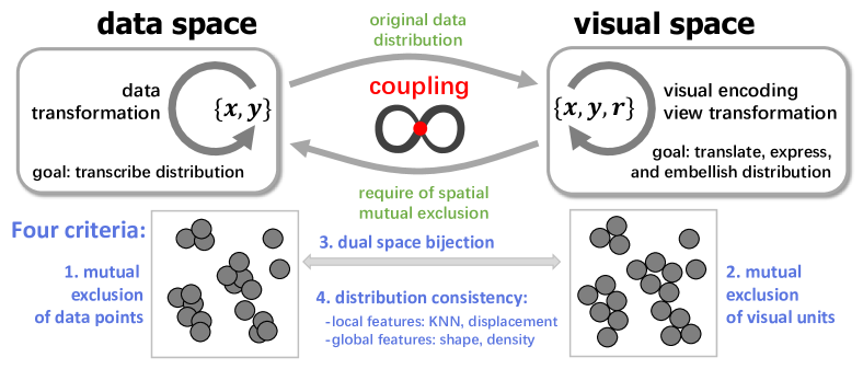
2.1 Dual Space Coupling Model
The overdraw problem substantially damages the effectiveness of scatterplot visualization which is reflected by severely hampered common visual tasks of scatterplots, such as cluster identification, shape examination, trend analysis, outlier detection, similar data query, and point value reading[43][53][5][44][31][16][21]. Numerous studies have been conducted to alleviate overdraw, but a complete and detailed analysis of the root cause and a way to eliminate the overlap strictly are still lacking. However, if we re-examine the overdraw and evaluate the existing methods from the perspective of the bilateral relationship between data and visual spaces, then the root cause of the overdraw rises evidently; thus finding a way to solve it theoretically and practically.
The root cause of the overdraw lies in the contradiction between the scale-free and immaterial characteristics of data points and the measurable and corporeal size of visual units. Existing methods have proved that overcoming the conflict (overlaps) inside a single space while ignoring the essential opposition and unity (consistency of data distribution) of the two spaces leads to the non-correspondence and inconsistency between the data points and visual units. The overdraw can be fundamentally solved only by fully considering the unity of opposites between the two spaces, cooperatively solving the contradiction caused by opposites, and maintaining the unity required by visual tasks. Nevertheless, the premise is guaranteeing data integrity.
Assuming the data set in data space is and the visual unit set in visual space is . and form the coordinates of a specific object and maybe different in two spaces. denotes the radius of a specific visual unit which defaults to a circular node. The above considerations can then be formalized into four criteria as follows:
-
.
Mutual Exclusion of Data Points:
-
.
Mutual Exclusion of Visual Units:
-
.
Data-Visual Space Bijection:
-
.
Data-Visual Space Distribution Consistency:
and represent the original and presented data distributions in data and visual spaces, respectively. The first two criteria require overlap-free within a single space. The mutual exclusion of data points is not mandatory because no assumptions should be made regarding the data and it should be satisfied by mandatory mutual exclusion performed in visual space even if nothing is performed in data space. The latter two criteria require the correspondence and consistency between data and visual spaces and are mandated.
Therefore, the goal of a desired scatterplot overdraw solution can be expressed as obtaining a high-quality reconstruction of the data distribution in visual space while ensuring mutual exclusion of data points (optional), mutual exclusion of visual units (mandatory), and data-visual space bijection. This goal can be formalized as:
| (1) |
| Categories / Criteria | C1 | C2 | C3 | C4 | |
| Data space methods | data sampling | ✓ – | ✓ – | \usym2715 | ✓ – |
| data aggregation | \usym2715 | ✓ – | \usym2715 | \usym2715 | |
| jitter | \usym1F5F8 | ✓ – | \usym1F5F8 | \usym2715 | |
| Visual space methods | appearance adjustment | \usym2715 | ✓ – | \usym1F5F8 | \usym2715 |
| node dispersion | \usym2715 | ✓ – | \usym1F5F8 | \usym2715 | |
| subspace mapping | \usym2715 | \usym1F5F8 | \usym1F5F8 | ✓ – | |
| Hybrid methods | visual abstraction | \usym2715 | \usym1F5F8 | \usym2715 | \usym2715 |
| Our method | \usym1F5F8 | \usym1F5F8 | \usym1F5F8 | \usym1F5F8 | |
Based on this formulation, we set up a theoretical framework to evaluate overlap removal methods. Table.1 presents a summary for comparison between our method and the existing methods. Most existing methods do not meet at least one criterion, which alleviate the overlap but are accompanied by serious negative effects. Then, we propose a dual space coupling model to represent the complex operations, transformations, and design considerations within and between data space and visual space. The model is conceptually illustrated in Fig.1.
The proposed model analytically and theoretically clarifies the design and evaluation principles for feasible solutions. In addition to accommodating the existing techniques, our model introduces a new design space for promising overlap removal algorithms and interaction paradigms and further provides several guidelines for design practice. First, the mutual exclusion of data points cannot guarantee the mutual exclusion of visual units, and the latter can only be achieved by assigning a reasonable size and location for visual units. Furthermore, the latter should not presuppose the former. Second, pursuing the data distribution preservation of visual space is a good starting and driving force to achieve an ideal assignment under the premise of ensuring data lossless and unbiased. Third, visual quality, or visual prominence of visual units, is another important consideration, requiring a trade-off between large visual units and little disruption to distribution preservation. A safe and fast interactive radius configuration tool is necessary to achieve a customized trade-off. The distribution consistency between data and visual spaces is not trivial, and we will discuss metrics of consistency in the next section.
2.2 Metrics
In this section, we present a measurement framework to measure the in Formula 1 quantitatively. The framework is inspired by the visual task of scatterplots and the existing metrics [10][24]. This framework comprises an overall metric and four sub-metrics. The overall metric presents a general perspective to measure the similarity of two scatterplots, while each sub-metric has a clear and independent semantics toward visual tasks. Specifically, displacement minimization and KNN preservation measure the local feature of scatterplots, which are closely related to the visual task of querying and inspecting similar data points. Density preservation and shape preservation focus on the global feature of scatterplots. The two metrics are designed for visual tasks such as cluster identification, outlier detection, and trend analysis.
Given the original scatterplot and the re-layouted scatterplot , where and are a pair of corresponding data points in the two scatterplots and denotes the number of data points. Each metric is briefly described below.
Displacement minimization is the same as [10]. We calculate the average of the Euclidean distance between all pairs of and after scaling and to the same size and aligning their centers. Then the relative displacement, that is, the ratio of the average to the width of the bounding box of , is taken as the final score. The score ranges in ; a small score is superior.
KNN preservation is simply calculated by , where represents the k-nearest neighbors of point in . The score ranges in . The is effectively preserved when the score is close to 1.
Shape preservation extends from [47] by expanding the measured shape from the outermost contour of the scatterplot to a global scope. We first construct a standard shape in , and then observe whether the shape can be maintained in . Specifically, as shown in the left, we first construct a group of concentric circles in , and then find a group of points near each circle in . The denotes the index of circles. Next, we compute the variance of the distance () between and the corresponding center in for each circle. Obviously, a small average of the variances facilitates superior shape preservation. The score ranges in .
![[Uncaptioned image]](/html/2208.09706/assets/x4.png)
Density preservation is a new metric that measures the global density preservation by measuring the preservation of relative position of all points in an ordered sequence. Specifically, as shown in the left, for each point , we regard the reciprocal of its average distance from its KNN, that is , as its local density. Then we calculate the quantile of the point in the ordered sequence of all points sorted by the average distance. Therefore, the density preservation score is the average of the difference between the quantiles of all paired points in and . The score ranges in . A score close to 0 is superior.
![[Uncaptioned image]](/html/2208.09706/assets/x5.png)
Overall similarity If and look similar from multiple viewing angles, then they are similar overall. As shown in the left, we first project and on the same set of directions, forming a series of paired ordered index sequences: and . These directions act as the viewing angles. The Kendall correlation coefficient[45] is then computed for each pair of the sequences as the similarity between and on the corresponding angle. The final score is the average of all similarities and ranges from to . A score close to 1 indicates a high overall similarity between and .
3 Methods
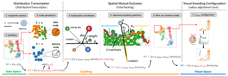
On the basis of the dual-space model, we propose a method to build an overlap-free scatterplot and ensure its interaction safety. The core idea is to use a set of closely tangent circles () in visual space to imitate the original data distribution in data space ( in Formula 1). Some of these circles act as placeholders, filling the blank areas of . These circles are called dummy nodes and will not be rendered in visual space. The remaining circles, which are called data nodes, are in one-to-one correspondence with the data points. In addition to the radius used for packing, each data node has another radius used for rendering. and are designed to guarantee mutual exclusivity and visibility of nodes, respectively.
The core idea refers to the following three questions: (1) How to generate a set of circles that can record intact ; (2) How to pack these circles sequentially in visual space to express the recorded as observable ; (3) How to configure to ensure no overlap occurs (safety) during rendering and interaction. Borrowing concepts from genetics, the first question aims to transcribe the original data distribution from data space to visual space; the second question aims to translate the transcribed distribution from an algebraic and intangible form into a visible and tangible form; the third question aims to express and embellish the distribution in visual space. Fig.2 shows the pipeline of our method. A geometry-based data distribution transcription, an efficient spatial mutual exclusion guided view transformation, and an overlap-free oriented visual encoding configuration with an easy-to-use radius adjustment tool are the solutions to the three aforementioned problems. In the following, they will be introduced one by one.
3.1 Geometry-Based Data Distribution Transcription
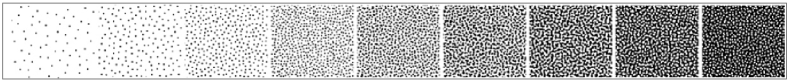
The transcription must maintain the relative position of nodes and the relative density among regions. For the former, we simply inherit the original coordinates of the input data points; for the latter, we borrow the idea of frequency modulation (FM) halftoning, a technique widely used in traditional printing industry[6]. Fig.3 shows an example of FM halftoning. The example simulates continuous-tone imagery through the use of dots that are frequency varying in spacing, thus generating a gradient-like effect.
We use the similar idea to rebuild varying densities. First, We divide the space into square grids, and then fill each grid with circles. The grid containing data points will be filled with circles. The packing radius of each circle is equal, given by line 6 of Algorithm 1. Herein denotes the size of grids, and is a threshold representing the minimum number of nodes to be packed in a grid. and are all the parameters of our method. is set to prevent potential distortions in sparse regions. Extra dummy nodes acting as placeholders are generated for the grid with less than data points. The radius of these dummy nodes is also . We assign an attribute called to each data node. The attribute value is given by the ratio of the number of nodes in the corresponding grid and the maximal — . The default value of is , that is, the minimum , obtained in the case of the density is 1. The above settings globally ensure the relative density among regions.
We call a collection of points with the same coordinates thus causing overlaps in data space a singularity. As shown in the upper left corner of Fig.2, we spread each singularity into phyllotaxis to achieve the mutual exclusion of data points. Note that as stated in Section 2.1, the spread operation is not mandatory. It can be optionally performed before the gridding. However, the spread induces the appearance of singularities as circular agglomerate fogs in visual space which stand out from regular nodes, as if highlighting anomalies.
Algorithm 1 provides the specific steps of the transcription. The input of the algorithm is the original 2D dataset , where is the number of data points. The output is , where is the number of nodes to be packed. Hence, is the number of generated dummy nodes. The red highlights the changes in compared with .
3.2 Spatial Mutual Exclusion Guided View Transformation
Directly rendering the from the previous step in visual space is not feasible because the current coordinates and of nodes cannot guarantee the mutual exclusion of nodes. This section presents PolarPacking (Algorithm 2), an algorithm that achieves the required mutual exclusion while maintaining the relative position of nodes. The idea behind the algorithm is to reconstruct the distribution transcribed in in polar coordinates.
PolarPacking is modified from CirclePacking[49]. CirclePacking is a layout technique that compactly packs circles without considering their relative positions. PolarPacking must maintain the relative position of the nodes while packing them compactly. As shown in the middle of Fig.2, we first calculate the distance and angle of each node relative to the center of the nodes to convert the relative position encoded in the Cartesian to the polar coordinate system. We then individually pack the nodes in ascending order by their distance. Each node is placed tangent to the outline shaped by the already packed nodes, following its desired angle and packing radius . In this way, all nodes, including dummy nodes, are packed from the inside out. During the process, the distance and angle play key roles in maintaining the relative position of nodes, and the and tangency guarantee strict mutual exclusion. The detailed packing process is presented in Supplementary Material 1.
After filtering out dummy nodes, we get the output of PolarPacking . The coordinates of nodes in are updated, while the value of other attributes is simply inherited from the previous . As this point, the goal defined by Formula 1 is achieved if a scatterplot is rendered using .
3.3 Overlap-Free Oriented Visual Encoding Configuration
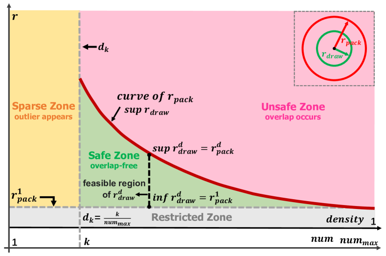
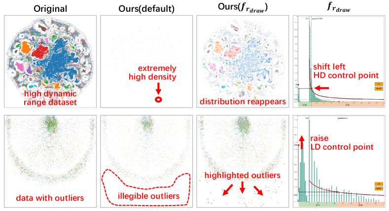
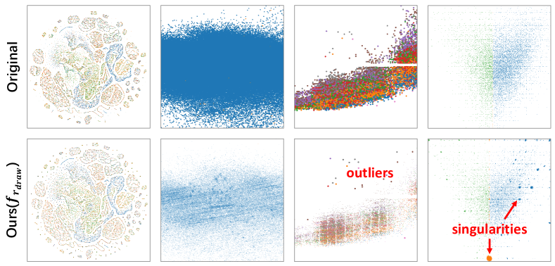
The goal defined by Formula 1 can be achieved using , but the default , that is, , is inappropriate in some scenarios. For example, consider a high dynamic range dataset (HDR dataset) embedded with regions with extremely high density, which is common for large-scale datasets, its default may seriously reduce the visual quality of the corresponding scatterplot. The first row of Fig.6 shows an example, where the “contrast” of the entire scatterplot is sharply reduced. The reason behind this is that the default is usually very small for HDR datasets, leading to an extremely low fill rate of colored informative pixels in most regions. Moreover, outliers are likely to be ignored in this case. In this section, we present a visual encoding configuration model and an interactive radius adjustment tool based on the model to solve the two problems by safely configuring at a expense of distorting density distribution of extraordinary regions.
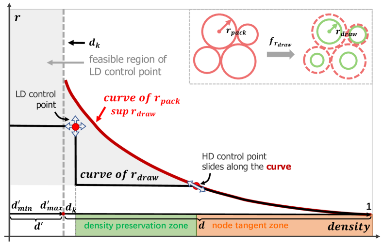
The configuration model is shown in Fig.4. The X-axis and Y-axis represent the and of nodes, respectively. The relationship between and given by line 6 and 7 of Algorithm 1 is a smooth decreasing curve when . The curve depicts the safe supremum of . is the infimum of . The line and divide the entire quadrant into four zones. is the density of the grid with data points. Donate and are the specific and of regions with density , then satisfies in the safe zone; therefore, no overlap occurs. The case is the opposite in the unsafe zone. In the sparse zone, and the that acts as the supremum of no longer exists. The restricted zone indicates that should not be less than .
Based on the configuration model, we designed an interactive radius adjustment tool called . As shown in Fig.5, by moving the high-density (HD) and low-density (LD) control points, we can build a curve of to quickly configure for all nodes. The HD control point can only slide along the curve of , while the LD control point can move freely within the gray feasible zone. Therefore, in the right side of the line , the curve of is always under the curve of ; thus arbitrary configuration here is safe. In the left side, the density of each node is re-assigned to , which is the reciprocal of the average distance from its five nearest neighbors. Therefore, the range of is divided into two independent segments: and . Further, the rendering radius in the two cases, where the LD control point is located in the left or right side of the line , is given by Formulas 2 and 3, respectively. In the formulas, and represent the coordinates of the two control points.
The density distribution of the region with density between and is preserved, while that of the remaining extraordinary regions is distorted. In the region whose density is larger than , nodes are closely tangent to each other, and the fill rate of the colored informative pixel is 100%. In the region with density less than , that is, the region where outliers appear, slight overlaps may present due to the absence of a mandatory safe supremum. Notably, the adjustment of using our tool is independent of the previous transcription and translation steps; thus, the adjustment can be performed in real-time with a WebGL renderer even for large-scale scatterplots.
The last column of Fig.6 presents two examples of using . The embedded histogram depicts the node distribution along the density. The second and third columns show the rendering results with the default and adjusted , respectively. The visual quality of the scatterplot of HDR datasets (the first row) and the visual prominence of outliers (the second row) have been markedly improved.
| (2) |
| (3) |
4 Evaluation
Quantitative evaluation compares the performance of our method with state-of-the-art methods on time cost and the five metrics introduced in Section 2.2 using 50 real-world scatterplots with entirely different distributions. The effectiveness of our method is further demonstrated in qualitative evaluation by showing scatterplots of several representative datasets and the improvements we made in three applications.
4.1 Quantitative Evaluation
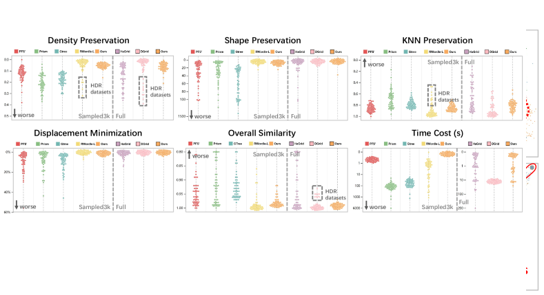
Competing Algorithms, Datasets and Settings Competing algorithms include node dispersion methods, namely PFS′[22], PRISM[20], GTree[38], and RWordle-L[47], and subspace-mapping methods, namely HaGrid[15] and DGrid[24]. Related algorithms, such as VPSC[18] and Diamond[33], are disregarded due to their unacceptable time costs in practice.
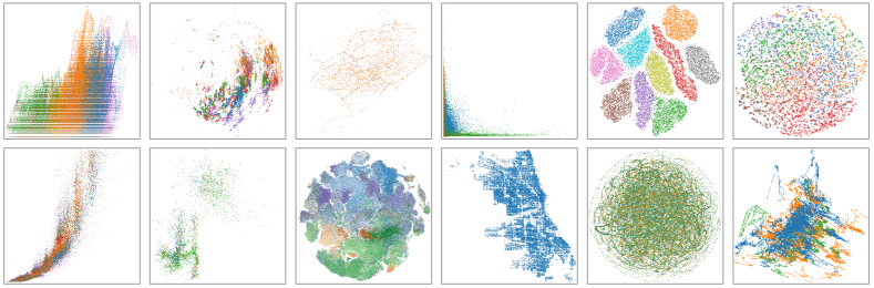
We collected 50 real-world datasets from [53], [12], UCI data repository, network repository, and our previous visualization projects. The datasets mainly involve the following four types: regular scatterplots with two semantic axes, projection results of high-dimensional data, coordinates from geographic space, and layout results of large-scale graphs. The number of data points ranges from to . Fifteen of them exceed 100k. The data distribution of these datasets are distinct and some are quite challenging, such as the datasets embedded with extremely high density regions and those with significant features, such as clusters, paths, and textures. Some datasets are shown in Fig.7.
In addition to the full datasets, we created a relatively small data collection, namely Sampled3k, due to the unbearable low computational efficiency of the competing node dispersion methods. This collection is built by randomly sampling 3000 points from each full dataset. The comparison with the node dispersion methods and sub-space mapping methods is performed on the Sampled3k and full datasets, respecitively. All scatterplots are rendered in an canvas. We take 2.4 as the size of nodes for the node dispersion methods because it strikes a balance between overdraw mitigation and outlier observability.
The implementations of the node dispersion methods are all from [10], with default parameters. The implementation of HaGrid comes from [15]. We chose Hilbert curve as the space filling curve and set the depth level of the curve to as suggested by the original paper[15]. DGrid is implemented by ourselves. Considering the volume of the collected datasets, the number of rows and columns are set to and the size of the convolution kernel is set to , which is a trade-off between computational efficiency and the visibility of local details. The and parameters of our method are fixed to 3 and 5, respectively. All the above algorithms are written in JavaScript. The experiment environment is Intel(R) Core(TM) i9-10900K CPU @ 3.70GHz, 64G RAM. The metrics used include time cost and the five metrics introduced in Section 2.2. The nearest neighbor parameter used in KNN Preservation and Density Preservation is set to 10. The number of circles of Shape Preservation and the number of directions of Overall Similarity are set to 20 and 30, respectively.
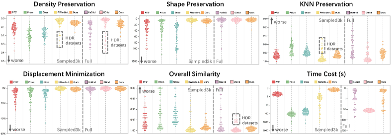
Results Fig.8 shows the results of the quantitative evaluation. The left and right parts of each subfigure correspond to the Sampled3k and full datasets, respectively. The results are shown by beeswarm222https://observablehq.com/@fil/experimental-plot-beeswarm, wherein each point represents a dataset. First, we note that our method takes excellent scores on all metrics, indicating its effective preservation of semantic features on the whole. Furthermore, for Sampled3k, our method prominently outperforms PFS′, PRISM, and GTree in almost all metrics but is equal to or slightly worse than RWordle-L. The average time cost (average on 20 runs) is (median ) of the second fastest algorithm PFS′ and (median ) of the RWordle-L which performs best on Overall Similarity. In addition, our method shows better adaptiveness on data distribution compared with RWordle-L, as reflected by its excellent performance on HDR datasets. For the full datasets, our method performs prominently better than HaGrid on Density Preservation and KNN Preservation and has evident advantages on Shape Preservation and Displacement Minimization for HDR datasets. Moreover, the average time cost of our method is of HaGrid (median ). Compared with DGrid, our method is slightly weaker on KNN Preservation, but performs better on Overall Similarity and prominently better on Density preservation for HDR datasets. The average time cost of our method is of DGrid (median ). Generally, our algorithm achieves the best or near the best scores on all metrics compared with the state-of-the-art algorithms. In particular, our method takes great advantage on computational efficiency and presents strong adaptability to HDR datasets. The later will be reconfirmed in qualitative evaluation.
The collected datasets, the implementation of our method and the five metrics, the detailed scores, and the scatterplots created by all algorithms are all available in GitHub333https://github.com/diyike/scatterplotUnfold. The latter two are also presented in Supplementary Material 2. In addition, we implemented a demo444https://diyike.github.io/scatterplotUnfold to interact with the tool and visually inspect the created scatterplots.
Time Complexity The time complexity of DistributionTranscriptor is , where is the number of nodes to be packed. For PolarPacking, the time complexity of sorting nodes is . However, to find the packing position of a given node, time is spent to determine a truncated , time to search the final position, and time to update the . Hence, the overall time complexity of PolarPacking is . Additional details can be found in Supplementary Material 1.
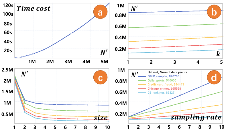
Impact of Parameters To investigate the impact of parameters , , and (number of points, equivalent to ) on the time cost of PolarPacking in practice, we first studied the relationship between and time cost, and then the relationship between the parameters and . We built a total of 28 simulated datasets whose volume ranges from 5k to 5M. The coordinates and radius of each node are randomly sampled from a unit circle and an interval between 1 and 10, respectively. Fig.9\Circleda shows the -Time cost curve. The figure reveals that PolarPacking algorithm is fairly fast, only taking 10s to pack 1 million nodes. Then we selected five representative datasets in volume from the collected datasets, and plotted their - curves (Fig.9\Circledb\Circledc\Circledd, respectively). As the interested parameter changes, others are fixed to their defaults (3, 5, and 1 for , , and , respectively). As expected, increases as and rise and decreases. The paramter shows a quadratic-like impact which is considerably larger than the linear-like impact of and .
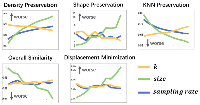
In addition to time cost, we also investigate the impact of the parameters on the five metrics in our measurement framework. Fig.10 presents the results. The range of , , and is set to [1, 10], [1, 20], and [0, 1], respectively. By mapping these ranges linearly to the same length, the impact curves of all parameters corresponding to the same metric can be aligned in one subfigure. For each curve, the value of the corresponding metric increases along the X-axis, while the others are fixed at their defaults. Noticing the small fluctuation ranges of all metrics on the Y-axis and recalling their intrinsic ranges, we declare that the impact of the parameters on all metrics are controllable, gentle, and reassuring. In other words, our method is fairly robust. Furthermore, we notice that the parameter has a larger impact than and , and all metrics get worse as it raises. This observation is reasonable because , representing the size of grids, determines the global resolution of the captured structures hidden in the data distribution. A small facilitates the detection and depiction of refined structures by our method. Accordingly, the parameter , representing the minimum number of nodes to be placed in a grid, acts as a local resolution and only shows a notable impact on Density Preservation and KNN Preservation that depict local features. Interestingly, similar to , only affects Density Preservation and KNN Preservation; and the two metrics get worse as it raises.
4.2 Qualitative Evaluation
Compared with quantitative metrics, viewing scatterplots is an intuitive evaluation method. As shown in the first column of Fig.11, our method preserve global and local features of the original dataset, such as paths and textures. The subtle textures, equidistant intervals, and circular singularities shown in the last three columns prove the capability of our method to “reproduce” the intrinsic details covered by overdraw.
Fig.Dual Space Coupling Model Guided Overlap-Free Scatterplot and Fig.12 show the comparison of our method with others. Fig.Dual Space Coupling Model Guided Overlap-Free Scatterplot shows that, ostensibly, other methods can reduce the distortion of the density distribution and preserve the overall shape to some extent. However, in fact, their distortions still exist, hiding deceptively, and even new distortions arise. Specifically, neither the sampling nor the transparency adjustment could substantially prevent overlap, and the color blending caused by the latter prevents inspecting details by zooming (Fig.Dual Space Coupling Model Guided Overlap-Free Scatterplot\Circlede). HaGrid and DGrid locally damage the shape and density preservation. Fig.Dual Space Coupling Model Guided Overlap-Free Scatterplot offers the evidence, in which HaGrid and DGrid cannot properly handle regions with extremely high density (Fig.Dual Space Coupling Model Guided Overlap-Free Scatterplot\Circleda\Circledb). The solid blocks cover up all details, including relative density and textures. Moreover, the sharp and straight boundaries are artifacts. We call this issue crowding. It is caused by the failure of the two subspace mapping methods in allocating adequate subspaces for high density regions. By contrast, our method performs well in density and shape preservation (Fig.Dual Space Coupling Model Guided Overlap-Free Scatterplot\Circledc) and supports seamless zoom to view details (Fig.Dual Space Coupling Model Guided Overlap-Free Scatterplot\Circledd). Fig.12 presents two additional examples, in which the crowding issue of HaGrid and DGrid leads to misunderstandings. In addition, our radius adjustment tool can highlight outliers to facilitate observations (Fig.Dual Space Coupling Model Guided Overlap-Free Scatterplot\Circledf).
4.3 Applications
Three applications demonstrate the capabilities of our method in pattern enhancement, interaction improvement, and expandability.
Pattern enhancement in semantic space
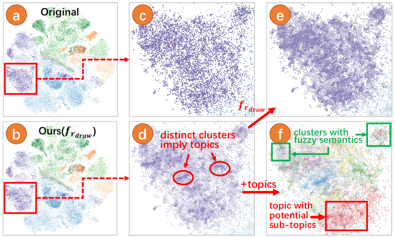
Fig.13\Circleda shows a science map of computer science created by [28] using 86k scientific literatures. This map acts as the original scatterplot. Fig.13\Circledb reveals the new scatterplot created by our method. The differences between \Circleda and \Circledb and \Circledc and \Circledd show the power of our method to enhance the visual prominence of potential clusters. Fig.13\Circlede shows that our radius adjustment tool can safely change the intensity and scope of the enhancement without overlaps. These enhanced clusters, like landmarks in cities, quickly attract the visual attention of analysts and elicit their interest, serving as navigators. In Fig.13\Circledf, we color each literature by its leading topic which is determined by a probability topic model. The consistency of the spatial distribution between clusters and topics shown in Fig.13\Circlede and Fig.13\Circledf proves that these clusters can uncover potential topics hidden in the semantic space. More importantly, the semantics provided by the topic model and the spatial structure revealed by the clusters complement each other, jointly promoting the understanding of the semantic space. The reason is two-fold. (1) Clusters remedy the inadequate resolution of topics. As shown in the red box in Fig.13\Circledf, the distinct sub-clusters indicate that the red topic can be further divided into sub-topics. (2) Topics help verify whether the clusters have specific, coherent, and understandable semantics. As shown in the green box in Fig.13\Circledf, the chaotic distribution of topics implies vague semantics of the focused clusters. We emphasize that all the aforementioned benefits arise from the capability of our method to transfer the correct density distribution from data space to visual space.
Interaction improvement in semantic space
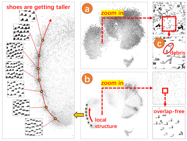
In some scenarios, data points are encoded as snapshots, tiny charts, small multiples, or other glyphs in visual space to support direct observation or statistical analysis of the original data. Fig.14\Circleda shows a 2D projection of the famous Fashion-MNIST dataset, which includes gray-scale images. The original visualization suffers a severe overdraw, making the valuable structure invisible. More importantly, overlap markedly reduces the efficiency of interactive exploration. The debris (Fig.14\Circledc) severely disturbs the reading and even leads to a complete distortion of local semantics. To avoid disturbance, the analyst must place the mouse exactly on the interested image to raise it up and then constantly make movements as the interest changes, which are time-consuming and laborious works. Moreover, the annoying problems cannot be mitigated by a simple geometric zooming. By contrast, without overlaps, our visualization easily reveals the semantic structures (Fig.14\Circledb) and enables the analyst to grasp the insights hidden in the data quickly by free zoom and pan.
Overdraw mitigation of trajectory visualization
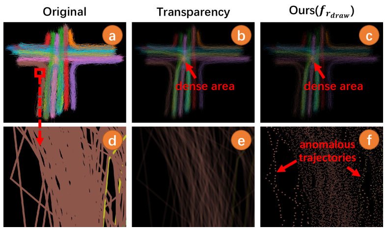
Theoretically, our method can be extended to solve the overdraw of any 2D visualization that can be represented by 2D nodes, such as large-scale time series curves[36], parallel coordinate axis[41][39], trajectories[54], and scalar fields[42]. Here, we take the trajectory visualization as an example. Fig.15\Circleda presents an original visualization of vehicle trajectories near a four-lane intersection. The data is taken from the CVPR trajectory clustering dataset[37]. We sampled massive data points at equal intervals along each trajectory to form the input to our method. Fig.15\Circledb and Fig.15\Circledc show that both transparency adjustment and our method can reveal regions under great traffic pressure. As shown in Fig.15\Circledd, two yellow anomalous trajectories on the right tend to be drowned in massive regular brown trajectories due to the overlap. Unfortunately, reducing transparency does not help, but only increases the likelihood of missing the two brown anomalous trajectories on the left (Fig.15\Circledd). By contrast, our method retains both kinds of anomaly (Fig.15\Circledd). Though transforming continuous trajectories into discrete points dramatically reduces informative colored pixels, leading to less “contrast” of our visualization, the potential of our method in mitigating overdraw of other data types has been successfully demonstrated.
5 Conclusion and Future Work
In this paper, we contribute a dual space coupling model to represent the complex relationship within and between data space and visual space analytically to solve the scatterplot overdraw problem. The proposed model introduces a new design space for promising overlap removal algorithm and interaction paradigm. We also develop an overlap-free scatterplot visualization method on the basis of the model, which shows competitive advantages compared with the state-of-the-art methods.
The algorithms described in this paper are not perfect. The hard partition of space caused by gridding may result in observable regular boundaries, especially when the parameter is large. A promising solution of this problem is to replace the regular grids with a semantic partition that follows the distribution features, such as superpixels. We leave this idea for future work. Another interesting idea is to extend our algorithms to solve the scalability issues of 3D visualization.
Acknowledgements.
The authors want to thank anonymous reviewers. This work was supported in part by a grant from National Natural Science Foundation of China (# 62172295).References
- [1] C. Beilschmidt, M. Mattig, T. Fober, and B. Seeger. An efficient aggregation and overlap removal algorithm for circle maps. GeoInformatica, 23(3):473–498, 2019.
- [2] M. Berger, K. McDonough, and L. M. Seversky. cite2vec: Citation-driven document exploration via word embeddings. IEEE transactions on visualization and computer graphics, 23(1):691–700, 2016.
- [3] E. Bertini and G. Santucci. By chance is not enough: preserving relative density through nonuniform sampling. In Proceedings. Eighth International Conference on Information Visualisation, 2004. IV 2004., pp. 622–629. IEEE, 2004.
- [4] E. Bertini and G. Santucci. Improving 2d scatterplots effectiveness through sampling, displacement, and user perception. In Ninth International Conference on Information Visualisation (IV’05), pp. 826–834. IEEE, 2005.
- [5] L. A. Best, A. C. Hunter, and B. M. Stewart. Perceiving relationships: A physiological examination of the perception of scatterplots. In International Conference on Theory and Application of Diagrams, pp. 244–257. Springer, 2006.
- [6] O. Bryngdahl. Halftone images: Spatial resolution and tone reproduction. JOSA, 68(3):416–422, 1978.
- [7] M. Card. Readings in information visualization: using vision to think. Morgan Kaufmann, 1999.
- [8] Y.-H. Chan, C. D. Correa, and K.-L. Ma. Flow-based scatterplots for sensitivity analysis. In 2010 IEEE Symposium on Visual Analytics Science and Technology, pp. 43–50. IEEE, 2010.
- [9] C. Chen, J. Yuan, Y. Lu, Y. Liu, H. Su, S. Yuan, and S. Liu. Oodanalyzer: Interactive analysis of out-of-distribution samples. IEEE transactions on visualization and computer graphics, 27(7):3335–3349, 2020.
- [10] F. Chen, L. Piccinini, P. Poncelet, and A. Sallaberry. Node overlap removal algorithms: an extended comparative study. Journal of Graph Algorithms and Applications, 2020.
- [11] H. Chen, W. Chen, H. Mei, Z. Liu, K. Zhou, W. Chen, W. Gu, and K.-L. Ma. Visual abstraction and exploration of multi-class scatterplots. IEEE Transactions on Visualization and Computer Graphics, 20(12):1683–1692, 2014.
- [12] X. Chen, T. Ge, J. Zhang, B. Chen, C.-W. Fu, O. Deussen, and Y. Wang. A recursive subdivision technique for sampling multi-class scatterplots. IEEE transactions on visualization and computer graphics, 26(1):729–738, 2019.
- [13] X. Chen, J. Zhang, C.-W. Fu, J.-D. Fekete, and Y. Wang. Pyramid-based scatterplots sampling for progressive and streaming data visualization. IEEE Transactions on Visualization and Computer Graphics, 28(1):593–603, 2021.
- [14] C. Collins, G. Penn, and S. Carpendale. Bubble sets: Revealing set relations with isocontours over existing visualizations. IEEE Transactions on Visualization and Computer Graphics, 15(6):1009–1016, 2009.
- [15] R. Cutura, C. Morariu, Z. Cheng, Y. Wang, D. Weiskopf, and M. Sedlmair. Hagrid—gridify scatterplots with hilbert and gosper curves. In The 14th International Symposium on Visual Information Communication and Interaction, pp. 1–8, 2021.
- [16] M. E. Doherty, R. B. Anderson, A. M. Angott, and D. S. Klopfer. The perception of scatterplots. Perception & Psychophysics, 69(7):1261–1272, 2007.
- [17] F. S. Duarte, F. Sikansi, F. M. Fatore, S. G. Fadel, and F. V. Paulovich. Nmap: A novel neighborhood preservation space-filling algorithm. IEEE transactions on visualization and computer graphics, 20(12):2063–2071, 2014.
- [18] T. Dwyer, K. Marriott, and P. J. Stuckey. Fast node overlap removal. In International Symposium on Graph Drawing, pp. 153–164. Springer, 2005.
- [19] O. Fried, S. DiVerdi, M. Halber, E. Sizikova, and A. Finkelstein. Isomatch: Creating informative grid layouts. In Computer graphics forum, vol. 34, pp. 155–166. Wiley Online Library, 2015.
- [20] E. Gansner and Y. Hu. Efficient, proximity-preserving node overlap removal. Journal of Graph Algorithms and Applications, 14(1):53–74, 2010.
- [21] M. Gleicher, M. Correll, C. Nothelfer, and S. Franconeri. Perception of average value in multiclass scatterplots. IEEE transactions on visualization and computer graphics, 19(12):2316–2325, 2013.
- [22] K. Hayashi, M. Inoue, T. Masuzawa, and H. Fujiwara. A layout adjustment problem for disjoint rectangles preserving orthogonal order. In International Symposium on Graph Drawing, pp. 183–197. Springer, 1998.
- [23] F. Heimerl, C.-C. Chang, A. Sarikaya, and M. Gleicher. Visual designs for binned aggregation of multi-class scatterplots. arXiv preprint arXiv:1810.02445, 2018.
- [24] G. M. Hilasaca, W. E. Marcílio-Jr, D. M. Eler, R. M. Martins, and F. V. Paulovich. Overlap removal of dimensionality reduction scatterplot layouts. arXiv preprint arXiv:1903.06262, 2019.
- [25] X. Huang, W. Lai, A. Sajeev, and J. Gao. A new algorithm for removing node overlapping in graph visualization. Information Sciences, 177(14):2821–2844, 2007.
- [26] P. Joia, F. Petronetto, and L. G. Nonato. Uncovering representative groups in multidimensional projections. In Computer Graphics Forum, vol. 34, pp. 281–290. Wiley Online Library, 2015.
- [27] J. Li, J.-B. Martens, and J. J. van Wijk. A model of symbol size discrimination in scatterplots. In Proceedings of the SIGCHI Conference on Human Factors in Computing Systems, pp. 2553–2562, 2010.
- [28] Z. Li, C. Zhang, S. Jia, and J. Zhang. Galex: Exploring the evolution and intersection of disciplines. IEEE transactions on visualization and computer graphics, 26(1):1182–1192, 2019.
- [29] S. Liu, J. Xiao, J. Liu, X. Wang, J. Wu, and J. Zhu. Visual diagnosis of tree boosting methods. IEEE transactions on visualization and computer graphics, 24(1):163–173, 2017.
- [30] M. Luboschik, A. Radloff, and H. Schumann. A new weaving technique for handling overlapping regions. In Proceedings of the International Conference on Advanced Visual Interfaces, pp. 25–32, 2010.
- [31] J. Matejka, F. Anderson, and G. Fitzmaurice. Dynamic opacity optimization for scatter plots. In Proceedings of the 33rd Annual ACM Conference on Human Factors in Computing Systems, pp. 2707–2710, 2015.
- [32] A. Mayorga and M. Gleicher. Splatterplots: Overcoming overdraw in scatter plots. IEEE transactions on visualization and computer graphics, 19(9):1526–1538, 2013.
- [33] W. Meulemans. Efficient optimal overlap removal: Algorithms and experiments. In Computer Graphics Forum, vol. 38, pp. 713–723. Wiley Online Library, 2019.
- [34] L. Micallef, G. Palmas, A. Oulasvirta, and T. Weinkauf. Towards perceptual optimization of the visual design of scatterplots. IEEE transactions on visualization and computer graphics, 23(6):1588–1599, 2017.
- [35] K. Misue, P. Eades, W. Lai, and K. Sugiyama. Layout adjustment and the mental map. Journal of Visual Languages & Computing, 6(2):183–210, 1995.
- [36] D. Moritz and D. Fisher. Visualizing a million time series with the density line chart. arXiv preprint arXiv:1808.06019, 2018.
- [37] B. T. Morris and M. M. Trivedi. Trajectory learning for activity understanding: Unsupervised, multilevel, and long-term adaptive approach. IEEE transactions on pattern analysis and machine intelligence, 33(11):2287–2301, 2011.
- [38] L. Nachmanson, A. Nocaj, S. Bereg, L. Zhang, and A. Holroyd. Node overlap removal by growing a tree. In International Symposium on Graph Drawing and Network Visualization, pp. 33–43. Springer, 2016.
- [39] H. Nguyen and P. Rosen. Dspcp: a data scalable approach for identifying relationships in parallel coordinates. IEEE Transactions on Visualization and Computer Graphics, 24(3):1301–1315, 2017.
- [40] G. J. Quadri and P. Rosen. Modeling the influence of visual density on cluster perception in scatterplots using topology. IEEE Transactions on Visualization and Computer Graphics, 27(2):1829–1839, 2020.
- [41] G. Richer, J. Sansen, F. Lalanne, D. Auber, and R. Bourqui. Hiepaco: Scalable hierarchical exploration in abstract parallel coordinates under budget constraints. Big Data Research, 17:1–17, 2019.
- [42] R. Roveri, D. J. Lehmann, M. H. Gross, and T. Günther. Correlated point sampling for geospatial scalar field visualization. In VMV, pp. 119–126, 2018.
- [43] A. Sarikaya and M. Gleicher. Scatterplots: Tasks, data, and designs. IEEE transactions on visualization and computer graphics, 24(1):402–412, 2017.
- [44] M. Sedlmair, A. Tatu, T. Munzner, and M. Tory. A taxonomy of visual cluster separation factors. In Computer Graphics Forum, vol. 31, pp. 1335–1344. Wiley Online Library, 2012.
- [45] Springer Verlag GmbH, European Mathematical Society. Encyclopedia of Mathematics. Website. URL: https://www.encyclopediaofmath.org/. Accessed on 2016-10-11.
- [46] J. Staib, S. Grottel, and S. Gumhold. Enhancing scatterplots with multi-dimensional focal blur. In Computer Graphics Forum, vol. 35, pp. 11–20. Wiley Online Library, 2016.
- [47] H. Strobelt, M. Spicker, A. Stoffel, D. Keim, and O. Deussen. Rolled-out wordles: A heuristic method for overlap removal of 2d data representatives. In Computer Graphics Forum, vol. 31, pp. 1135–1144. Wiley Online Library, 2012.
- [48] M. Theus and S. Urbanek. Interactive graphics for data analysis: principles and examples. CRC Press, 2008.
- [49] W. Wang, H. Wang, G. Dai, and H. Wang. Visualization of large hierarchical data by circle packing. In Proceedings of the SIGCHI conference on Human Factors in computing systems, pp. 517–520, 2006.
- [50] L.-Y. Wei. Multi-class blue noise sampling. ACM Transactions on Graphics (TOG), 29(4):1–8, 2010.
- [51] L. Wilkinson. The grammar of graphics. In Handbook of computational statistics, pp. 375–414. Springer, 2012.
- [52] S. Xiang, X. Ye, J. Xia, J. Wu, Y. Chen, and S. Liu. Interactive correction of mislabeled training data. In 2019 IEEE Conference on Visual Analytics Science and Technology (VAST), pp. 57–68. IEEE, 2019.
- [53] J. Yuan, S. Xiang, J. Xia, L. Yu, and S. Liu. Evaluation of sampling methods for scatterplots. IEEE Transactions on Visualization and Computer Graphics, 27(2):1720–1730, 2020.
- [54] H. Zhou, P. Xu, X. Yuan, and H. Qu. Edge bundling in information visualization. Tsinghua Science and Technology, 18(2):145–156, 2013.