Comparing informativeness of an NLG chatbot vs graphical app in diet-information domain
Abstract
Visual representation of data like charts and tables can be challenging to understand for readers. Previous work showed that combining visualisations with text can improve the communication of insights in static contexts, but little is known about interactive ones. In this work, we present an NLG chatbot that processes natural language queries and provides insights through a combination of charts and text. We apply it to nutrition, a domain communication quality is critical. Through crowd-sourced evaluation, we compare the informativeness of our chatbot against traditional, static diet apps. We find that the conversational context significantly improved users’ understanding of dietary data in various tasks and that users considered the chatbot more useful and quick to use than traditional apps.
Comparing informativeness of an NLG chatbot vs graphical app in diet-information domain
Simone Balloccu University of Aberdeen, UK simone.balloccu@abdn.ac.uk Ehud Reiter University of Aberdeen, UK e.reiter@abdn.ac.uk
1 Introduction
Visual representations of data are commonly used to communicate insights to the reader. However, understanding the meaning of charts or other visualisations can be challenged by visual deficit, information context, or just the required cognitive effort. Previous research investigated on generating textual explanations of data and comparing them with visualisations Gatt et al. (2009); Molina et al. (2011); Gkatzia et al. (2017). Approaches like these are particularly useful in healthcare, where lots of data get produced and communication plays a critical role Zolnierek and DiMatteo (2009); Brock et al. (2013). Most of these works showed that combining text and visuals improves users’ understanding of data but they explored static contexts only, where information is presented in a fixed way and there is no active interaction with the reader. Little is known about the effects of text and charts combination in dynamic scenarios, such as conversational ones. Since chatbots are emerging as tools for healthcare Zhang et al. (2020), it is important to assess if they can provide better communication than static tools (e.g. e-health apps).
In this work, we develop and evaluate an NLG-chatbot that generates insights explanations by combining graphics and text. Using our chatbot, users do not need to explore or interpret data themselves, as they can directly ask what they’re looking for and get it, along with an explanation. We apply it to diet coaching, a domain where communication quality is critical Van Dorsten and Lindley (2008); Savolainen (2010); Michie et al. (2011) and often overlooked by existing tools Balloccu et al. (2021); Balloccu and Reiter (2022). To assess the effectiveness of this approach, we run a human evaluation in which we compare our chatbot with traditional diet apps. Participants were assigned to either our chatbot or an app and used it to take a 10-point quiz concerning the extraction of insights from a simulated food diary. In the end, participants expressed feedback on the assigned tool. Results show that using our chatbot led to significantly higher scores compared to using traditional apps, both in general and with regard to particular sub-topics. Feedback analysis also reveal that participants perceived our chatbot as more useful for finding diet problems and quicker to use than traditional diet apps.
2 Related work
In this section, we recap past research on charts and text combination for insight explanation. We first look at more general work, then move to healthcare and diet-coaching.
2.1 Text vs Graphics in NLG
Previous work investigated how NLG can enhance the understanding of data by combining textual content and images. Work on weather data Gkatzia et al. (2017), showed mixed text and pictures improving decision-making over images alone. Dashboards Ramos-Soto et al. (2017) benefit from textual explanation of charts as well, as it helps assess learning in students. Combining charts with explanation of sensor data Molina et al. (2011) helps insight understanding for general users. Driving reports Braun et al. (2015) are more helpful if presented as a mix of pictures and text. Healthcare data can also be explained through NLG Pauws et al. (2019). Experiments in NICU Law et al. (2005); van der Meulen et al. (2010) suggest that combining charts and text could be the preferred approach by clinicians.
2.2 Text vs Graphics in diet-coaching
Information quality and communication play a big role in diet Van Dorsten and Lindley (2008); Savolainen (2010); Michie et al. (2011). This applies to apps as well: comprehensibility showed to be a predictor of prolonged app use Lee and Cho (2017). Sub-optimal communication can confuse and demotivate users, leading to early abandonment Murnane et al. (2015); Mukhtar (2016). Despite this, diet apps (like MyFitnessPal 111www.myfitnesspal.com or FatSecret222https://www.fatsecret.com/) typically come as calorie counters, where users log their meals to obtain insights. These tools adopt very limited textual communication and make extensive use of visualisations that must be interpreted by users themselves Balloccu and Reiter (2022). Considering the relationship between numeracy and nutrition literacy Mulders et al. (2018), this poses a barrier between users and the delivered information. Our previous work Balloccu et al. (2021) showed similar issues for conversational agents: chatbots adopt fixed educational material Casas et al. (2018); Stephens et al. (2019); Davis et al. (2020), such as PDFs containing guidelines, and expose a lack of reasoning over user queries Maher et al. (2020). Similarly to apps, chatbots show plain reports, with little to no feedback on goals, progress or mistakes Casas et al. (2018); Prasetyo et al. (2020).
3 NLG chatbot to improve communication quality
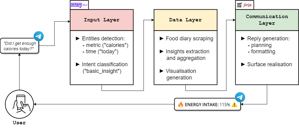
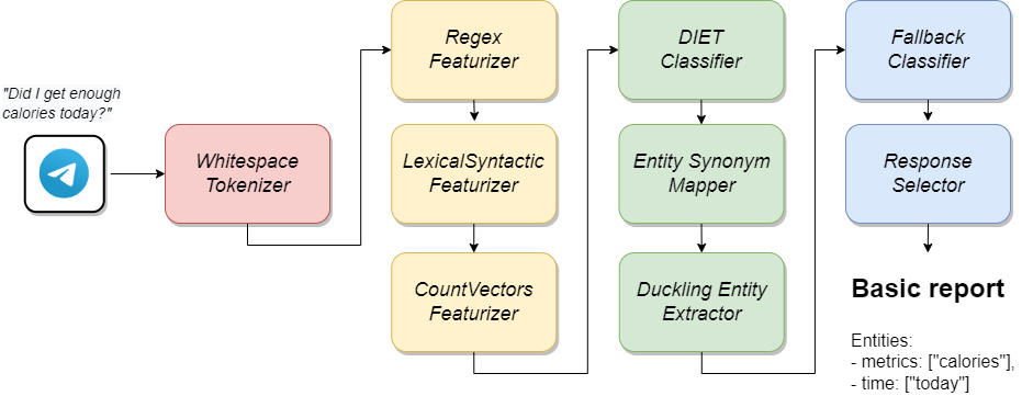
Our chatbot consists of an Input Layer for users’ input understanding; a Data Layer that extracts insights and generates visualisations; a Communication Layer that performs planning and surface realisation (Figure 1). We use RASA Open Source 2.0333https://rasa.com/docs/rasa/ as the main infrastructure for the entire system, and exploit its NLU component (Figure 2) for the Input layer; the Data Layer adopts a custom data analysis logic; the Communication Layer adopts rule-based NLG and variable templates (through Jinja 3.0 444https://jinja.palletsprojects.com/en/3.0.x/).
We adopt a hybrid architecture: we use machine-learning for NLU but restrict text generation to rules. This is mainly for two reasons: 1) diet domain imposes strict accuracy requirements that cannot be met by current E2E NLG Thomson and Reiter (2020); van Miltenburg et al. (2021) and 2) to the best of our knowledge, there is no publicly available diet-coaching corpus which can be used to train or fine-tune generative models. On the other hand, machine-learning offers good generalisation for NLU with the only risk being unexpected inputs or failure in intent classification.
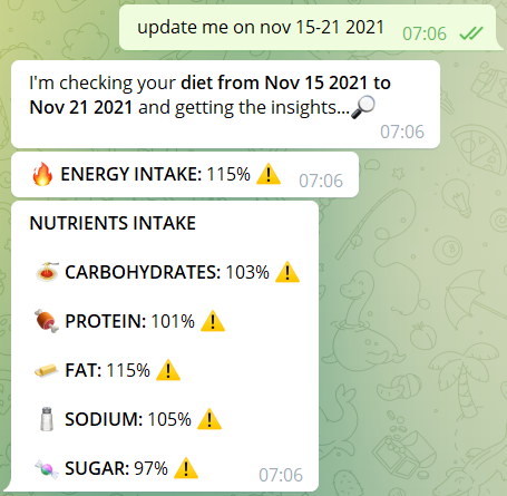
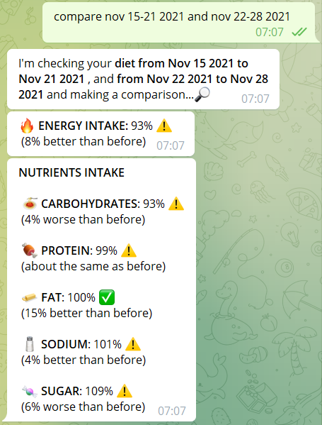
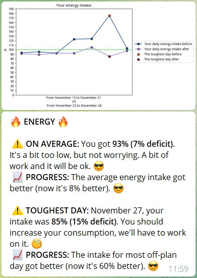
We model two main interactions in the chatbot: basic reports and comparisons (Figure 3). Basic reports show insights about a single time frame, either as brief information on energy and nutrients balance or combinations of charts and text. Comparisons extend basic reports to multiple time frames by informing users about progress (e.g. improved intake; changes in food choices etc..). For each request, users can specify metrics (calories and five nutrients: carbohydrates, protein, fat, sugar and sodium) and time (detected via Duckling Entity extractor555https://duckling.wit.ai/). This approach offers more flexibility than traditional apps, which typically aggregate all the metrics in a single section (e.g. a table) and present pre-defined comparisons (e.g. every month).
3.1 Explanation through text and charts
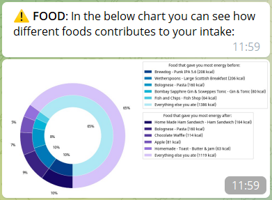
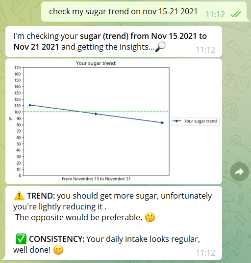
Users can access two typologies of insights: basic and advanced. Basic insights show energy and nutrient intake (see Figure 3) as brief textual messages. This is thought for users that need a quick glance at their data. Advanced insights deliver more information and are presented as a combination of text and charts. Users can obtain the following advanced insights (Figure 4):
-
1.
Intake analysis: reasons and explains intakes with regards to user goals.
-
2.
Trend and consistency: detects if trends match recommended changes in diet (e.g. getting fewer calories to fix an excess) and checks intake consistency (maintaining a stable intake across days).
-
3.
Food analysis: reasons and explains intakes at the food level, by showing which food has the biggest impact.
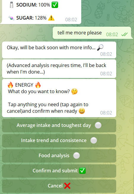
Advanced insights naturally extend to comparisons as well (Figure 4). To let both novice users (that need supervision) and advanced ones access advanced insights, they can be obtained in two ways (Figure 5):
-
1.
Guided navigation: through generic queries (e.g. "tell me more about this" or "anything else?"). Following this trigger, the chatbot presents a button interface for each available advanced insight. Buttons can be checked and unchecked to obtain only those insights that are of interest.
-
2.
Natural language query: by directly asking for specific insights and metrics. This can be done by specifying a particular insight (e.g. "food" or "intake") on a specific period.
For both interactions, users can specify one or more metrics.
3.2 Other features
We implement a number of supplementary best practices Storey et al. (2021) to further improve usability and clarity. The chatbot actively provides feedback for each input (while informing users on the pending task); adopts emojis to make insights more understandable; splits the content into multiple messages and introduces a dynamic delay between them to avoid flooding.
4 Experiment setup
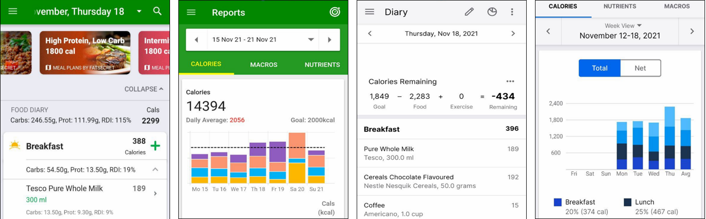
We deploy our chatbot on Telegram Bot API666https://core.telegram.org/bots/api and compare its informativeness with traditional diet apps. We gather our test population (workers) through crowd-sourcing on Amazon Mechanical Turk777https://www.mturk.com/worker/help. Details of recruitment, pay and sanity checks are available in the AppendixA. We choose to compare our chatbot with MyfitnessPal888https://www.myfitnesspal.com/ (MFP) and FatSecret999https://www.fatsecret.com/ (FS). An example of the two apps UI can be seen in Figure 6. We choose these two apps based on their popularity and downloads number on the Apple and Android app stores. We do not compare against any dieting chatbot as none of those present in the literature is publicly available.
4.1 Measuring informativeness
Aiming at communication improvement, we need to find a measure to capture whether one specific tool performs better than others. From communication theory, Webster and Morris (2019) we adopt the concept of "informativeness", defined as "how successfully a person is able to convey an intended message". We extend this definition to diet systems as "how successfully a tool is able to convey an intended message". To capture informativeness we create a ten questions quiz regarding diet analysis (a sample is provided in Appendix C). The quiz consists of 4 macro-tasks:
-
1.
Day analysis: understanding if calories and carbohydrates are balanced on a single day (2pts).
-
2.
Food analysis: understanding what food provided the most calories and fat on a single day, along with quantities (4pts).
-
3.
Week analysis: understanding if calories and carbohydrates are balanced across a week (2pts).
-
4.
Weeks comparison: understanding if, by comparing two weeks, calories and carbohydrates improved or worsened (2pts).
Each question is worth 1 point, for a total of 10 points. We choose to develop a custom quiz because no available questionnaire can be used to evaluate the informativeness of a diet-coaching tool. In creating it, we analyse existing apps and all the information that they deliver; we incorporate experts’ recommendations from previous surveys Vasiloglou et al. (2020); we consider the theoretical constructs of self-regulation Zahry et al. (2016), with a particular focus on the measure of informativeness. We avoid evaluating the "trend and consistency" feature for fairness, as apps don’t offer a way for the user to infer such information without long and tedious calculations.
Workers were randomly assigned to either our chatbot, MFP or FS, each of which was pre-filled with a simulated food diary (none of the data belonged to the users) consisting of 2 weeks of logged meals. We obtained n=27 workers assigned to our chatbot; n=31 workers to MFP; n=29 workers to FS. Besides the tool itself, workers were provided with a PDF guide on how to use it and a glossary explaining the meaning of the terms used in the quiz. Each worker took the quiz and was asked to answer the questions to the best of their knowledge by using the tool. Through the quiz we test the following hypothesis:
Hypothesis 1 (H1):
Chatbot workers scored higher on the informativeness quiz than MFP or FS workers.
| Average score | Score differences | |||||
|---|---|---|---|---|---|---|
| Topic | CB | FS | MFP | CB-FS | CB-MFP | MFP-FS |
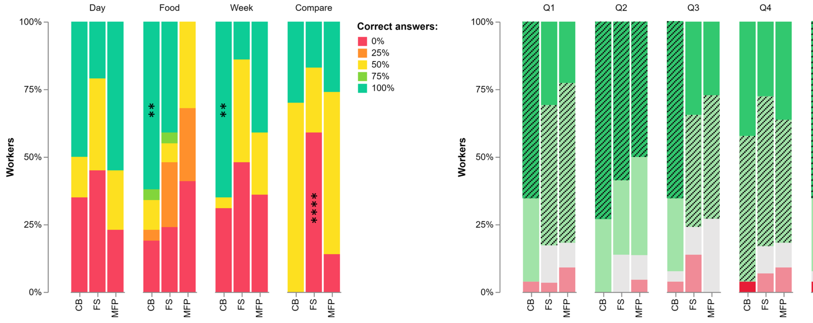
| Overall (10pt) | 6.65 | 4.13 | 5.22 | +2.52** | +1.43 | +1.09 |
| Day analysis (2pt) | 1.15 | 0.76 | 1.32 | +0.40 | -0.16 | +0.56 |
| Food analysis (4pt) | 2.85 | 2.14 | 0.91 | +0.71 | +1.94*** | -1.23* |
| Week analysis (2pt) | 1.35 | 0.66 | 1.05 | +0.70** | +0.30 | +0.39 |
| Weeks comparison (2pt) | 1.31 | 0.59 | 1.14 | +0.72** | +0.17 | +0.55** |
4.2 Measuring nutrition literacy
Previous research highlighted the importance of nutrition literacy in dieting Michie et al. (2011), so we analyse its impact on our experiment. We also analyse if our chatbot communication can reduce the score gap between different literacy levels. Before taking the quiz, each worker completed Pfizer’s Newest-Vital-Sign (NVS) Weiss et al. (2005); Powers et al. (2010), consisting of 6 questions (each one worth 1 point) regarding an ice-cream label. NVS scores are grouped in ranges: 0-1 refers to "high likelihood of limited literacy", 2-3 refers to "possibility of limited literacy"; 4-6 refers to "adequate literacy". We compare NVS scores with quiz scores to test the following hypothesis:
Hypothesis 2 (H2):
There was a positive correlation between NVS score and quiz score in our experiment, but not for chatbot workers.
4.3 Measuring perception of the tool and past experience
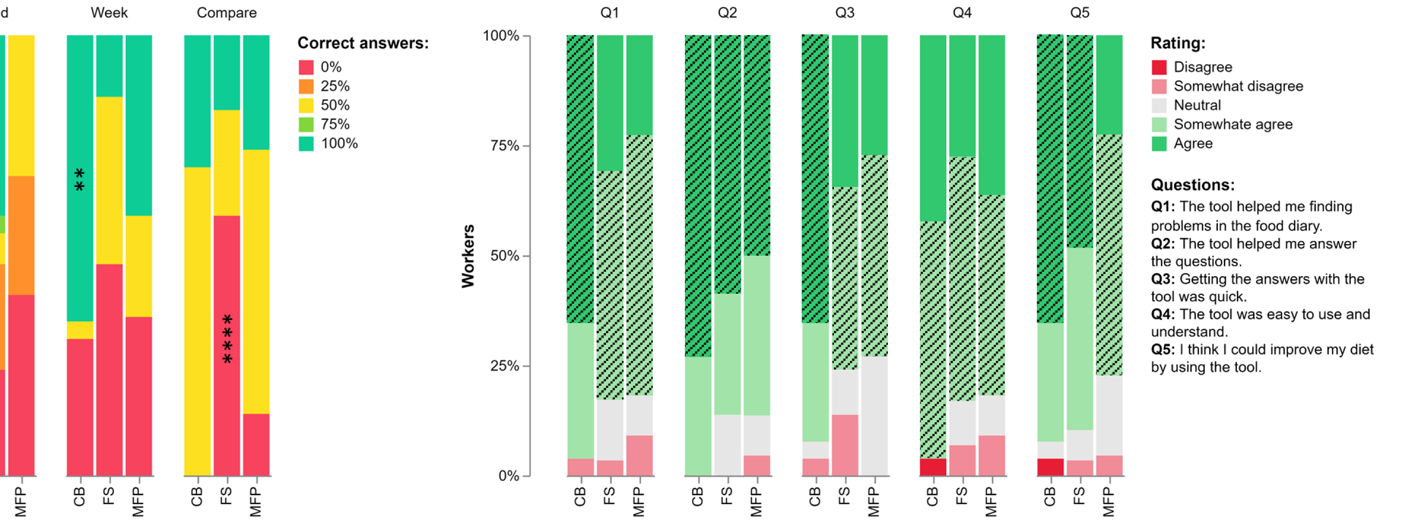
Finally, we inspect workers’ opinions on the tool they used. We ask each worker to rate the tool under different characteristics (see Figure 8) through Likert-5 scale. Through this approach we test the following hypothesis:
Hypothesis 3 (H3):
Our chatbot received higher ratings across the proposed questions.
Finally, we ask workers to specify whether they had past experience with dieting tools (including the one they were assigned) and to specify how often they used them (often; occasionally; rarely; never).
5 Results analysis
For variance analysis, we adopt One-Way ANOVA and Tukey’s post-hoc test (replaced respectively by Kruskal-Wallis test and Dunn’s post-hoc test if ANOVA’s normality requirement is not met). To test variable dependence we adopt Chi-squared test and Bonferroni’s post-hoc test. For the correlation test, we adopt Pearson correlation (substituted by Spearman correlation if Pearson’s normality requirement is not met).
5.1 Preliminary checks
Before analysing results, we verify nutrition literacy uniformity across our population, to ensure that none of the groups contained mostly workers with high/low nutrition literacy. We discover that nutrition literacy distribution is unbalanced among apps, with the majority of workers with low nutrition literacy assigned to MFP sample, none to FS only one to our chatbot (see Table 2). We re-balance the samples by removing all such workers. This limits our inspections of nutrition literacy but keeps the comparison fair. From now on, all results will refer to the re-balanced sample unless otherwise specified. We also check for meaningful differences in workers’ past experience with diet tools, but find none neither in general () and by considering only those workers who had past experience and ().
| Workers per class | |||
|---|---|---|---|
| NVS class | CB | FS | MFP |
| LOW (0-1pt) | 1 | 0 | 9 |
| MID (2-3pt) | 5 | 3 | 5 |
| HIGH (4-6pt) | 21 | 26 | 17 |
5.2 Quiz scores
We first check total and per-task quiz scores (see Table 1). We find that, overall, the highest average score was reached by chatbot workers. The difference was statistically significant when compared to FS workers. Regardless of the group, average scores were low, not going much higher than 6/10. We consider this as a further confirmation of how hard understanding dietary insights is for the average user, especially in our context where data was simulated. By inspecting individual quiz tasks, we see that chatbot workers scored significantly higher in week analysis and comparison than FS workers, and in food analysis than MFP workers. We also find that MFP workers scored significantly higher than FS workers when comparing weeks, while the opposite happened for food analysis. Overall, chatbot workers always scored the highest score in every case, except for the day analysis, where MFP workers’ scores were slightly higher.
Next, we look at the percentage of correct answers to check if any of the tools were associated with reaching specific scores (e.g. maximum points or 0 points). First, we find that our chatbot was positively associated () with an overall score of 9/10 points. This tells us that the chatbot made it easier to reach higher scores in general. We then proceed to analyse individual quiz tasks (Figure 7). Our chatbot was positively associated with the maximum score in food analysis and week analysis. For chatbot workers, it was easier to understand food details and insights based on aggregation in general. It was also negatively associated () with 0 points in weeks comparison. In fact, every chatbot worker managed to answer at least one of the two questions about comparison right. Interestingly, we find the opposite for FS, which was positively associated with scoring 0 points in weeks comparison. This tells us that FS workers struggled considerably in this task. Lastly, using MFP was negatively associated with the maximum score in food analysis: understanding food details was one of the hardest tasks with MFP.
5.3 Nutrition Literacy effect on scores
We check if nutrition literacy influenced quiz scores. Here we discover a discrepancy between the balanced and unbalanced samples. MFP workers show a significant difference () in scores between high and low nutrition literacy. By re-balancing the sample, we lose this significance. We also discover a moderate correlation () between nutrition literacy and quiz score for MFP workers, even after balancing the samples.
5.4 Users’ perception of the tool
Finally, we check workers’ feedback (see Figure 8). We notice a generally positive evaluation for every tool, with the chatbot getting a higher amount of "Agree" ratings across every question. By single-item analysis, our chatbot was positively associated with "Agree" in Q1 (), where it also shows a better mode value than the other tools. Chatbot workers felt it more useful for finding problems in the food diary. We also find a better mode than both apps in Q3, meaning that workers found it to be quicker to use. This result in particular is unexpected considering that there was no significant difference in the quiz execution time (). It could be that using natural language in our chatbot was felt as faster than navigating through different app sections. No app showed better mode than our chatbot in any question. Finally, it is interesting to notice that FS scored higher than MFP in Q5 despite being the tool with the lowest scores across every task except food analysis.
6 Discussion
From quiz results, chatbot workers scored the highest in informativeness across every scenario except for a slight advantage of MFP in day analysis. In multiple contexts, the difference between MFP and FS was statistically significant. We also found that using the chatbot was associated with a higher completion rate in different tasks and very high overall scores like 9/10. With these results we confirm H1. We could not inspect nutrition literacy properly, as the different samples were too unbalanced and introducing low-literate workers would have made the comparison between MFP and our chatbot unfair. We saw a relationship between lower nutrition literacy and quiz scores, but isolated to MFP workers, and could not verify it across the whole population. With these results, we neither confirm nor reject H2 because of the lack of data. Looking at the feedback, we found out that our chatbot received a higher amount of "Agree" ratings across every question. It was also the only tool that showed association with maximum usefulness in finding diet problems. By analysing the mode of each question, we discovered that our chatbot was evaluated as quicker to use than the other apps. We also see that, unlike MFP and FS, it never showed a lower mode than any other tool. With these results we confirm H3.
7 Conclusion and future developments
In this work, we evaluated the combination of charts and textual explanations for diet coaching, in the conversational scenario. We implemented an NLG-chatbot that understands natural language input and returns dietary insights as a combination of textual explanations and visualisations. We compared the chatbot with traditional static diet apps by inspecting informativeness and user feedback. Results show that the combination of visuals and text efficiently delivers information in diet-coaching, and makes it more understandable. Improved informativeness could play a critical role in diet outcomes. Feedback was generally more positive for the chatbot, meaning that it can be a valid tool for diet-coaching, potentially substituting static apps.
For future work, we plan to investigate if our approach can lead to actual learning from the user, for example through spaced repetition Ausubel and Youssef (1965); Tabibian et al. (2019) that can positively affect users’ forgetting curve Ebbinghaus (2013). We also commit to addressing the limits of our setup, to properly inspect the relationship between nutrition literacy and informativeness. We also plan to inspect more personalised approaches to information tailoring, namely by considering users’ stress and emotional state that showed to be promising research directions Balloccu et al. (2020); Balloccu and Reiter (2022). Lastly, we consider this result as a sign of the maturity of our approach and we plan to run a trial to measure its effect on diet-coaching (e.g. weight control).
References
- Ausubel and Youssef (1965) David P Ausubel and Mohamed Youssef. 1965. The effect of spaced repetition on meaningful retention. The Journal of General Psychology, 73(1):147–150.
- Balloccu and Reiter (2022) Simone Balloccu and Ehud Reiter. 2022. Beyond calories: evaluating how tailored communication reduces emotional load in diet-coaching. In Proceedings of the 2nd Workshop on Human Evaluation of NLP Systems (HumEval), pages 42–53, Dublin, Ireland. Association for Computational Linguistics.
- Balloccu et al. (2021) Simone Balloccu, Ehud Reiter, Matteo G. Collu, Federico Sanna, Manuela Sanguinetti, and Maurizio Atzori. 2021. Unaddressed Challenges in Persuasive Dieting Chatbots, page 392–395. Association for Computing Machinery, New York, NY, USA.
- Balloccu et al. (2020) Simone Balloccu, Ehud Reiter, Alexandra Johnstone, and Claire Fyfe. 2020. How are you? introducing stress-based text tailoring. In Proceedings of the Workshop on Intelligent Information Processing and Natural Language Generation, pages 62–70, Santiago de Compostela, Spain. Association for Computational Lingustics.
- Braun et al. (2015) Daniel Braun, Ehud Reiter, and Advaith Siddharthan. 2015. Creating textual driver feedback from telemetric data. In Proceedings of the 15th European Workshop on Natural Language Generation (ENLG), pages 156–165, Brighton, UK. Association for Computational Linguistics.
- Brock et al. (2013) Douglas Brock, Erin Abu-Rish, Chia-Ru Chiu, Dana Hammer, Sharon Wilson, Linda Vorvick, Katherine Blondon, Douglas Schaad, Debra Liner, and Brenda Zierler. 2013. Republished: Interprofessional education in team communication: working together to improve patient safety. Postgraduate medical journal, 89(1057):642–651.
- Casas et al. (2018) Jacky Casas, Elena Mugellini, and Omar Abou Khaled. 2018. Food diary coaching chatbot. In Proceedings of the 2018 ACM International Joint Conference and 2018 International Symposium on Pervasive and Ubiquitous Computing and Wearable Computers, UbiComp ’18, page 1676–1680, New York, NY, USA. Association for Computing Machinery.
- Davis et al. (2020) Courtney R Davis, Karen J Murphy, Rachel G Curtis, and Carol A Maher. 2020. A process evaluation examining the performance, adherence, and acceptability of a physical activity and diet artificial intelligence virtual health assistant. International journal of environmental research and public health, 17(23):9137.
- Ebbinghaus (2013) Hermann Ebbinghaus. 2013. Memory: A contribution to experimental psychology. Annals of neurosciences, 20(4):155.
- Gatt et al. (2009) Albert Gatt, François Portet, Ehud Reiter, Jim Hunter, Saad Mahamood, Wendy Moncur, and Somayajulu Sripada. 2009. From data to text in the neonatal intensive care unit: Using nlg technology for decision support and information management. AI Commun., 22(3):153–186.
- Gkatzia et al. (2017) Dimitra Gkatzia, Oliver Lemon, and Verena Rieser. 2017. Data-to-text generation improves decision-making under uncertainty. IEEE Computational Intelligence Magazine, 12(3):10–17.
- Law et al. (2005) Anna S Law, Yvonne Freer, Jim Hunter, Robert H Logie, Neil McIntosh, and John Quinn. 2005. A comparison of graphical and textual presentations of time series data to support medical decision making in the neonatal intensive care unit. Journal of clinical monitoring and computing, 19(3):183–194.
- Lee and Cho (2017) H Erin Lee and Jaehee Cho. 2017. What motivates users to continue using diet and fitness apps? application of the uses and gratifications approach. Health communication, 32(12):1445–1453.
- Maher et al. (2020) Carol Ann Maher, Courtney Rose Davis, Rachel Grace Curtis, Camille Elizabeth Short, and Karen Joy Murphy. 2020. A physical activity and diet program delivered by artificially intelligent virtual health coach: Proof-of-concept study. JMIR mHealth and uHealth, 8(7):e17558.
- Michie et al. (2011) Susan Michie, Maartje M Van Stralen, and Robert West. 2011. The behaviour change wheel: a new method for characterising and designing behaviour change interventions. Implementation science, 6(1):1–12.
- Molina et al. (2011) Martin Molina, Amanda Stent, and Enrique Parodi. 2011. Generating automated news to explain the meaning of sensor data. In Advances in Intelligent Data Analysis X, pages 282–293, Berlin, Heidelberg. Springer Berlin Heidelberg.
- Mukhtar (2016) Hamid Mukhtar. 2016. Using persuasive recommendations in wellness applications based upon user activities. International Journal of Advanced Computer Science and Applications, 7(8).
- Mulders et al. (2018) Maria D.G.H. Mulders, O. Corneille, and O. Klein. 2018. Label reading, numeracy and food & nutrition involvement. Appetite, 128:214–222.
- Murnane et al. (2015) Elizabeth L. Murnane, David Huffaker, and Gueorgi Kossinets. 2015. Mobile health apps: Adoption, adherence, and abandonment. In Adjunct Proceedings of the 2015 ACM International Joint Conference on Pervasive and Ubiquitous Computing and Proceedings of the 2015 ACM International Symposium on Wearable Computers, UbiComp/ISWC’15 Adjunct, page 261–264, New York, NY, USA. Association for Computing Machinery.
- Pauws et al. (2019) Steffen Pauws, Albert Gatt, Emiel Krahmer, and Ehud Reiter. 2019. Making Effective Use of Healthcare Data Using Data-to-Text Technology, pages 119–145. Springer International Publishing, Cham.
- Powers et al. (2010) Benjamin J Powers, Jane V Trinh, and Hayden B Bosworth. 2010. Can this patient read and understand written health information? Jama, 304(1):76–84.
- Prasetyo et al. (2020) Philips Kokoh Prasetyo, Palakorn Achananuparp, and Ee-Peng Lim. 2020. Foodbot: A Goal-Oriented Just-in-Time Healthy Eating Interventions Chatbot, page 436–439. Association for Computing Machinery, New York, NY, USA.
- Ramos-Soto et al. (2017) Alejandro Ramos-Soto, Borja Vazquez-Barreiros, Alberto Bugarín, Adriana Gewerc, and Senen Barro. 2017. Evaluation of a data-to-text system for verbalizing a learning analytics dashboard. International Journal of Intelligent Systems, 32(2):177–193.
- Savolainen (2010) Reijo Savolainen. 2010. Dietary blogs as sites of informational and emotional support. Information Research, Vol. 15, 15(4).
- Stephens et al. (2019) Taylor N Stephens, Angela Joerin, Michiel Rauws, and Lloyd N Werk. 2019. Feasibility of pediatric obesity and prediabetes treatment support through tess, the ai behavioral coaching chatbot. Translational behavioral medicine, 9(3):440–447.
- Storey et al. (2021) Margaret-Anne Storey, Thomas Zimmermann, Christian Bird, Jacek Czerwonka, Brendan Murphy, and Eirini Kalliamvakou. 2021. Towards a theory of software developer job satisfaction and perceived productivity. IEEE Transactions on Software Engineering, 47(10):2125–2142.
- Tabibian et al. (2019) Behzad Tabibian, Utkarsh Upadhyay, Abir De, Ali Zarezade, Bernhard Schölkopf, and Manuel Gomez-Rodriguez. 2019. Enhancing human learning via spaced repetition optimization. Proceedings of the National Academy of Sciences, 116(10):3988–3993.
- Thomson and Reiter (2020) Craig Thomson and Ehud Reiter. 2020. A gold standard methodology for evaluating accuracy in data-to-text systems. In Proceedings of the 13th International Conference on Natural Language Generation, pages 158–168, Dublin, Ireland. Association for Computational Linguistics.
- van der Meulen et al. (2010) Marian van der Meulen, Robert H. Logie, Yvonne Freer, Cindy Sykes, Neil McIntosh, and Jim Hunter. 2010. When a graph is poorer than 100 words: A comparison of computerised natural language generation, human generated descriptions and graphical displays in neonatal intensive care. Applied Cognitive Psychology, 24(1):77–89.
- Van Dorsten and Lindley (2008) Brent Van Dorsten and Emily M Lindley. 2008. Cognitive and behavioral approaches in the treatment of obesity. Endocrinology and metabolism clinics of North America, 37(4):905–922.
- van Miltenburg et al. (2021) Emiel van Miltenburg, Miruna Clinciu, Ondřej Dušek, Dimitra Gkatzia, Stephanie Inglis, Leo Leppänen, Saad Mahamood, Emma Manning, Stephanie Schoch, Craig Thomson, and Luou Wen. 2021. Underreporting of errors in NLG output, and what to do about it. In Proceedings of the 14th International Conference on Natural Language Generation, pages 140–153, Aberdeen, Scotland, UK. Association for Computational Linguistics.
- Vasiloglou et al. (2020) Maria F. Vasiloglou, Stergios Christodoulidis, Emilie Reber, Thomai Stathopoulou, Ya Lu, Zeno Stanga, and Stavroula Mougiakakou. 2020. What healthcare professionals think of “nutrition & diet” apps: An international survey. Nutrients, 12(8).
- Webster and Morris (2019) Janet Webster and Julie Morris. 2019. Communicative informativeness in aphasia: Investigating the relationship between linguistic and perceptual measures. American Journal of Speech-Language Pathology, 28(3):1115–1126.
- Weiss et al. (2005) Barry D Weiss, Mary Z Mays, William Martz, Kelley Merriam Castro, Darren A DeWalt, Michael P Pignone, Joy Mockbee, and Frank A Hale. 2005. Quick assessment of literacy in primary care: the newest vital sign. The Annals of Family Medicine, 3(6):514–522.
- Zahry et al. (2016) Nagwan R Zahry, Ying Cheng, and Wei Peng. 2016. Content analysis of diet-related mobile apps: A self-regulation perspective. Health Communication, 31(10):1301–1310.
- Zhang et al. (2020) Jingwen Zhang, Yoo Jung Oh, Patrick Lange, Zhou Yu, and Yoshimi Fukuoka. 2020. Artificial intelligence chatbot behavior change model for designing artificial intelligence chatbots to promote physical activity and a healthy diet: Viewpoint. J Med Internet Res, 22(9):e22845.
- Zolnierek and DiMatteo (2009) Kelly B Haskard Zolnierek and M Robin DiMatteo. 2009. Physician communication and patient adherence to treatment: a meta-analysis. Medical care, 47(8):826.
Appendix A Ethics
This section sums up the procedure we adopted to ensure the ethical compliance of our experiment.
A.1 Preliminary review
Before starting the experiment, the procedure and materials were carefully reviewed by the University of Aberdeen’s Ethics Board. Our experiment proposal was accepted without major revisions.
A.2 Platforms
For the quiz, we adopted Microsoft Forms101010https://forms.office.com/ because of its compliance with GDPR policy. For hiring, we used Amazon Mechanical Turk. No recruitment qualification was specified, besides custom ones to prevent the same worker from submitting multiple HITs. Participants were shown a consent form containing all the information regarding the experiment procedure. They were also informed about the requirements that had to be satisfied to obtain the remuneration. All workers had to confirm their acceptance of these conditions (through checkboxes) in order to proceed with the experiment. Workers were given an email contact in case of problems during the experiment.
A.3 Pay and workload
Before launching the experiment, we verified the average completion time with 10 test users. The average result for completing the whole experiment (reading information; downloading and setting up material; taking NVS; taking the quiz; expressing the feedback) was 20 minutes. We gave each worker 45 minutes and paid 15 USD for the HIT. Workers were informed that if they ran out of time on Mturk they could just finish the quiz (on Microsoft Forms web platform) and contact us through the provided email address to still get paid.
A.4 HITs sanity checks
We received a total amount of 250 applications for our task. Most of them were fraudulent, with random answers or unrealistic completion times. In order to recognise legit HITs, we set up multiple sanity-checks, both in general and depending on the tool each worker was assigned.
A.4.1 Global sanity checks
To check the attention of workers during Pfizer’s NVS, a fake price was added to the ice-cream label. Consequently, we added a (non-scored) question to the form, asking "what’s the price of the ice-cream?". Moreover, each worker received a completion code that they had to submit on the Mechanical Turk platform after completing all the tasks.
A.4.2 Sanity check for chatbot worker
The chatbot was programmed to accept some custom queries that led to specific answers. The workers were asked, multiple times, to trigger one of these queries. We manually checked the answers for HITs, in order to verify whether workers actually used the chatbot. In addition, conversations were logged and anonymised, and the provided WorkerID was used to track down specific workers and verify the sanity of interaction.
A.4.3 Sanity check for FS and MFP worker
To verify that workers actually used the diet apps they were asked to provide a description of the app logo, and to check which particular food (among three alternatives) could be seen on a specified day. As these tasks are subjective and could be failed by legit workers who struggled to use the app, each HIT was manually evaluated to avoid unfair treatment.
Appendix B Acknowledgements
This research was funded by the European Union’s Horizon 2020 research and innovation programme under the Marie Skłodowska-Curie grant agreement No 812882.
Appendix C Appendix A: Quiz sample
![[Uncaptioned image]](/html/2206.13435/assets/x3.png)
![[Uncaptioned image]](/html/2206.13435/assets/x4.png)
![[Uncaptioned image]](/html/2206.13435/assets/x5.png)
![[Uncaptioned image]](/html/2206.13435/assets/x6.png)
![[Uncaptioned image]](/html/2206.13435/assets/x7.png)
![[Uncaptioned image]](/html/2206.13435/assets/x8.png)
![[Uncaptioned image]](/html/2206.13435/assets/x9.png)
![[Uncaptioned image]](/html/2206.13435/assets/x10.png)
![[Uncaptioned image]](/html/2206.13435/assets/x11.png)
![[Uncaptioned image]](/html/2206.13435/assets/x12.png)
![[Uncaptioned image]](/html/2206.13435/assets/x13.png)
![[Uncaptioned image]](/html/2206.13435/assets/x14.png)
![[Uncaptioned image]](/html/2206.13435/assets/x15.png)
![[Uncaptioned image]](/html/2206.13435/assets/x16.png)
![[Uncaptioned image]](/html/2206.13435/assets/x17.png)
![[Uncaptioned image]](/html/2206.13435/assets/x18.png)
![[Uncaptioned image]](/html/2206.13435/assets/x19.png)
![[Uncaptioned image]](/html/2206.13435/assets/x20.png)