How Does Automation Shape the Process of Narrative Visualization: A Survey of Tools
Abstract
In recent years, narrative visualization has gained much attention. Researchers have proposed different design spaces for various narrative visualization genres and scenarios to facilitate the creation process. As users’ needs grow and automation technologies advance, increasingly more tools have been designed and developed. In this study, we summarized six genres of narrative visualization (annotated charts, infographics, timelines & storylines, data comics, scrollytelling & slideshow, and data videos) based on previous research and four types of tools (design spaces, authoring tools, ML/AI-supported tools and ML/AI-generator tools) based on the intelligence and automation level of the tools. We surveyed 105 papers and tools to study how automation can progressively engage in visualization design and narrative processes to help users easily create narrative visualizations. This research aims to provide an overview of current research and development in the automation involvement of narrative visualization tools. We discuss key research problems in each category and suggest new opportunities to encourage further research in the related domain.
Index Terms:
Data Visualization; Automatic Visualization; Narrative Visualization; Design Space; Authoring Tools; Survey1 Introduction
Data visualization has been broadly applied to communicate data and information in an effective and expressive manner. Recently, an emerging trend has been to combine narrative and storytelling with visualization [1]. The norms of communicative and exploratory information visualization are used in narrative visualizations in order to tell the desired story [2]. However, creating visualizations with narrative information is a challenging and time-consuming task. Such a creation usually requires data analytic skills and visualization design expertise. Even experts need to spend much time and effort creating an ideal visualization for a specific design scenario. Therefore, by summarizing the experience in practice, researchers specify various design spaces and visualization scenarios for distinct narrative genres, which are used to guide users to create narrative visualizations.
With the emergence of new user requirements and the advancement of automation technology, an increasing number of intelligent tools have been created to assist the visual creative process. Authoring tools offer rich interactions that allow users to adequately control the creation process. However, such tools still require users to decide on each visualization element manually. To further weaken the barriers and reduce the burdens of creation, researchers have developed ML/AI-supported tools and ML/AI-generator tools to support a more automatic process. ML/AI-supported tools usually provide recommendations as part of the narrative visualization creation process. Normally, users need to make their own design choices to achieve the design outcome. However, ML/AI-generator tools do not require user expertise in visualization and can generate a complete set of visualization designs without user intervention.
Over the past few years, related surveys of automated techniques have focused on the automation of traditional statistical charts [3, 4, 5]. Automatic tools that support various genres of narrative visualizations have not been sufficiently investigated. However, systematic reviews on how (and to what extent) automation shapes visual design and visual narrative processes are generally lacking. The narrative process describes the primary responsibilities and actions of data visualization storytellers and the types of artifacts that come from these activities [6]. In addition, most previous studies aim at the creation process from the visual design level. Advances in artificial intelligence and human-computer interaction have brought more opportunities and challenges to this field. Therefore, a state-of-the-art survey is required to provide a better understanding of automation involvement in narrative visualization creation tools.
To fill this gap, we collected 91 design spaces and tools covering the six genres of narrative visualization and classified them into four automation levels, allowing us to describe how automatic techniques could be progressively used in visualization design and visual narrative, further allowing users to create data visualizations. By analyzing the tools of each narrative visualization genre, we compared the focus of the four levels of tools in each narrative genre in order for users to easily choose the appropriate tool to create according to different scenarios. Furthermore, we identified both mature and less-explored research directions for automated visual narrative tools and presented new research problems and future work to assist researchers in advancing their grasp of the subject matter and pursuing their investigations. In addition to the state-of-art survey, we developed an interactive browser to facilitate the exploration and presentation of the collected design spaces and tools at http://autovis.idvxlab.com/.
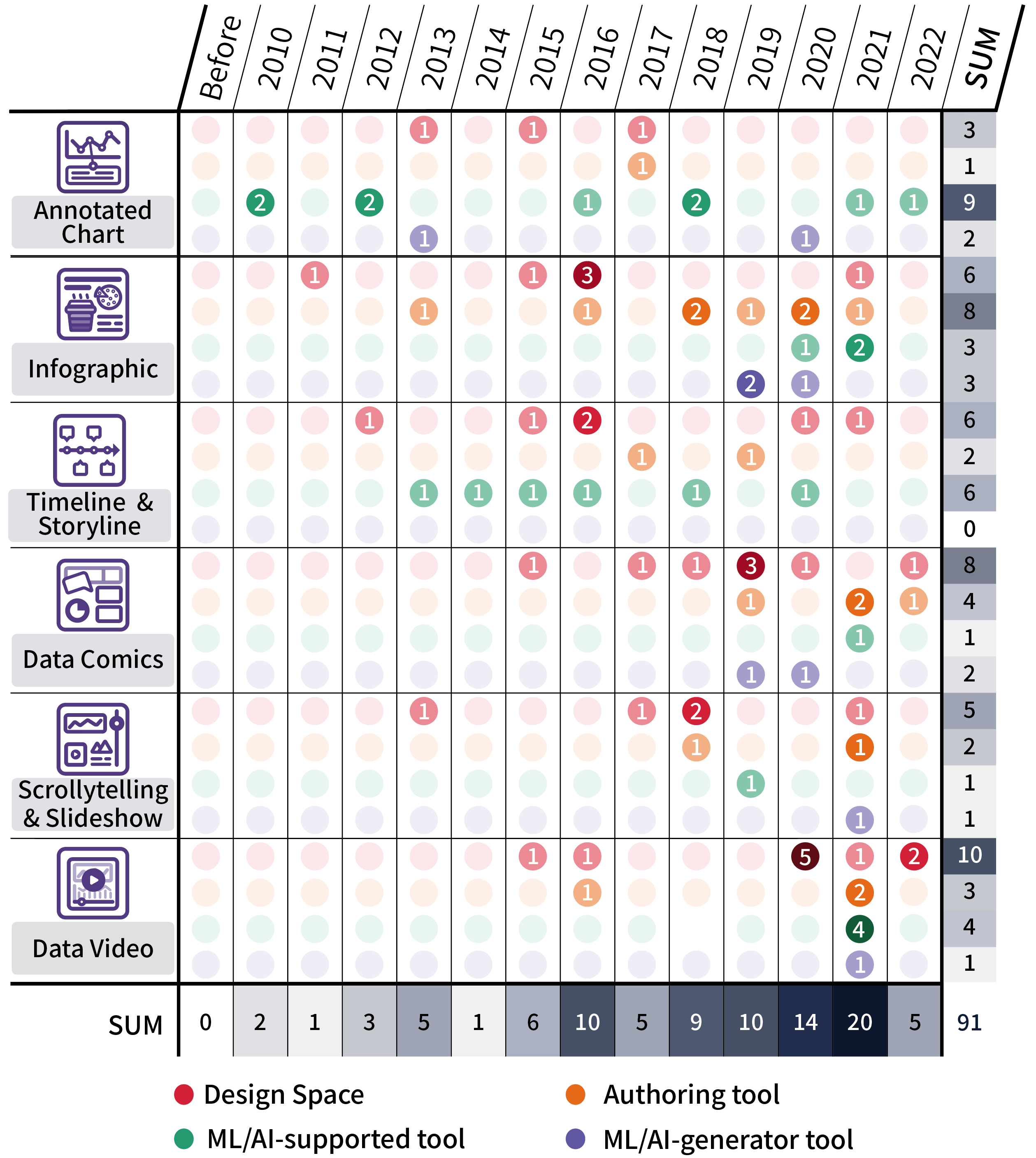
| Design Space | Authoring tool | ML/AI-supported tool | ML/AI-generator tool | SUM | |
| Annotated Chart | [7] [8] [9] | [10] | [11] [12] [13] [14] [15] [16] [17] [18] [19] | [20] [21] | 15 |
| Infographic | [22] [23] [24] [25] [26] [27] | [28] [29] [30] [31] [32] [33] [34] [35] | [36] [37] [38] | [39] [40] [41] | 20 |
| Timeline & Storyline | [42] [43] [44] [45] [46] [47] | [48] [49] | [50] [51] [52] [53] [54] [55] | 14 | |
| Data Comics | [56] [57] [58] [59] [60] [61] [62] [63] | [64] [65] [66] [67] | [68] | [69] [70] | 15 |
| Scrollytelling & Slideshow | [71] [72] [73] [74] [75] | [76] [77] | [78] | [79] | 9 |
| Data Video | [80] [81] [82] [83] [84] [85] [86] [87] [88] [89] | [90] [91] [92] | [93] [94] [95] [96] | [97] | 18 |
| SUM | 38 | 20 | 24 | 9 | 91 |
2 Related Survey and Taxonomy
In this section, we first perform a literature review on narrative visualization. Then, we introduce papers that are most relevant to our work. Then, we present our survey scope and methodology. Finally, we describe the taxonomy of this survey.
2.1 Narrative Visualization and Storytelling Process
Our research is influenced by the emergence of narrative visualization theories and visual storytelling technologies. According to Segel et al. [98], narrative visualization comprises three essential components: narrative genres, narrative structure (methods for organizing plot or information), and visual narrative (visual methods for generating story experiences and transmitting messages).
Hullman et al. [74] provided a summary of how automated sequencing might be included in design systems to assist users in making organized choices when developing narrative visuals. According to Lee et al. [6], aiming to achieve the goal of message delivery, visual data stories must have a collection of narrative segments backed by data and presented in a coherent order. In addition, the process of creating narrative visualizations is not always linear. This approach can be roughly categorized into three steps: investigating the data, making a story, and telling the story. Tong et al. [99] surveyed the literature on storytelling in visualization, covering the logical concepts of who is the subject of the narrative visual (creation tool and audience), how the story is told (narration and transition), and why we can use visual narratives (memory and interpretation). The goal for this research is to provide researchers and practitioners with an overview of the development and research for various narrative visualization tools.
2.2 Related Survey
This section outlines the surveys related to automated visualization techniques and tools. Wang et al. [3] surveyed 88 papers on ML4VIS and explained seven main processes of machine learning techniques applied to visualization: Data Processing4VIS, Data-VIS Mapping, Insight Communication, Style Imitation, VIS Interaction, VIS Reading, and User Profiling. Wu et al. [4] reviewed recent advances in artificial intelligence techniques applied to visual data, examining a number of key research questions related to the development and management of visual data and the support provided by artificial intelligence for these operations. The study by Zhu et al. [5] is the most relevant to us, in which they investigated automated visualization techniques for infographics. However, no previous work has thoroughly analyzed different levels of automation and how those tools help the design and creation process of visual storytelling in different narrative forms. Our effort seeks to give an overview of available design tools that may assist a variety of users in various design situations. Moreover, through the analysis, we identify directions that remain undeveloped for future research.
2.3 Survey Scope and Methodology
Our research focuses on narrative visualization tools. Tong et al. [99] emphasized in their research that narrative visualization focuses more on information visualization than scientific visualization. In addition, studies on narrative scientific visualization have been limited; therefore, scientific visualization was excluded from our study.
To create the corpus of articles, we gathered from visualization journals and conferences by using reference-driven and search-driven methods. We started with a collection of references on the categorization of narrative visualization in this area for the selection of reference-driven, and we then broadened the focus by looking up both citing and cited publications. We completed two rounds of article gathering for the search-based choices. A preliminary search for narrative visualizations, relevant design tools, and best practices was conducted in the first round by using high-impact visualization conferences and publications. In particular, we selected five conferences (ACM CHI, IEEE InfoVis, IEEE VAST, IEEE PacificVis and IV) and five journals (IEEE TVCG, IEEE CGA, and ACM Transactions on Graphics, Computer Graphics Forum, Visual Informatics). We gathered a variety of publications by using two search terms (“visualization” and “design space/design guide,” “visualization” and “authoring tool”) and then evaluated abstracts and full texts to narrow down our sample.
After this round of article selection, 348 papers and tools were obtained. To achieve a more precise review of the literature about narrative visualization, we used narrative visualization genres and tools (e.g., “data comics” and “design space/authoring tool,” “infographics” and “design space/authoring tools,” etc.) to categorize the papers. Furthermore, we removed programming tools and domain-specific application tools, as they are beyond the scope of this research. Finally, 91 narrative visualization papers and tools are summarized in Table 1 and Figure 1. In Table 1 and Figure 1, we excluded 14 commercial software mainly because most of them do not have a definite publication date, and commercial software tends to have frequent updates and additional features, which makes it difficult to fix a specific year.
2.4 Taxonomy
In this section, we will first describe the four levels of automation and then introduce the detailed classification of narrative visualization in our survey.
2.4.1 Tool Classification Method
In this section, we categorize the visualization tools into four groups based on their automation and intelligence[5, 37].
Design space is a conceptual set of possibilities rather than a software tool [100]. Design space stresses the ability to choose from a variety of possibilities and investigate alternatives [101, 102]. The design space is a description of all potential design options throughout the design process. Utilizing basic design principles from current visualization techniques is the most preferred method for building a design space [103]. Moreover, visual design spaces allow us to capture some implicit knowledge of graphic designers [104]. We believe that the visualization design space is an attempt to understand how visualizations are created by designers in a systematic process, that is, to decompose a design work into several design elements and arrange them properly. A straightforward design space makes the design more structured and disciplined, allowing designers to create designs without relying on pure feelings. It is also the basis for computers to understand the design and eventually create tools to facilitate the design process.
Authoring tool encapsulates key software functionalities and features for content creation [105]. It is an application or tool designed for a specific design purpose. Authoring tools allow users to create visualizations freely with interactive features. They usually require designers to design starting from scratch, allowing designers to have major control of the creation process. On the users’ side, authoring tools allow them to understand the creation framework in advance and eventually interact with the system.
ML/AI-supported tools apply intelligent algorithms to facilitate visualization creation. Such tools ease visual generation while ensuring a certain degree of control for user in the creation process. ML/AI-supported tools focus on automatically providing some steps or automatically visualizing some elements, while users need to make decisions on some important steps to create the visualization. A recommended solution is usually provided for a particular part of the visualization. Eventually, users can organize the design content to form the final visualization outcome.
ML/AI-generator tool is even more intelligent, as users no longer need to participate decision making in the authoring process. The ML/AI-generator tool is designed to reduce barriers for amateurs to create visualizations automatically and ease the burdens for experts to search and select without manually specifying all elements [5]. When the user uploads the data, this type of tool automates the process and analysis of the data and can generate a complete set of visual design solutions without user intervention.
2.4.2 Visual Classification Method
Segel et al. [98] presented seven genres of narrative visualization: magazine-style, annotated chart, partitioned poster, flowchart, comic strip, slideshow, film/video/animation. Recently, Roth [75] classified visual storytelling into seven genres: static visual stories, long-form infographics, dynamic slides, narrative animations, multimedia visual experiences, personalized story maps, and compilations (compilations provide a “visual abstract” that typically links to further text) [75]. On the basis of their findings and the presentation outcomes, we reclassified the narrative visualization genres (Table 2). In this research, magazine style, partitioned posters, and static visual stories were jointly studied and then collectively referred to as infographics. Film/video/animation, narrated animations, and multimedia visual experiences are called data videos. Slideshow, compilations, and long-form infographics are collectively called “scrollytelling & slideshow”. In the literature review, we found only a few works about flowcharts. However, many works on timelines & storylines are presented in the form of flowcharts; thus, we jointly utilized flowcharts and timelines. Roth et al.[75] found that personalized story maps are similar to adding annotations to maps; in this study, we classified them as annotated charts. In conclusion, we focused on six genres of narrative visualizations in this survey: annotated charts, infographics, timelines & storylines, data comics, scrollytelling & slideshow, and data videos.
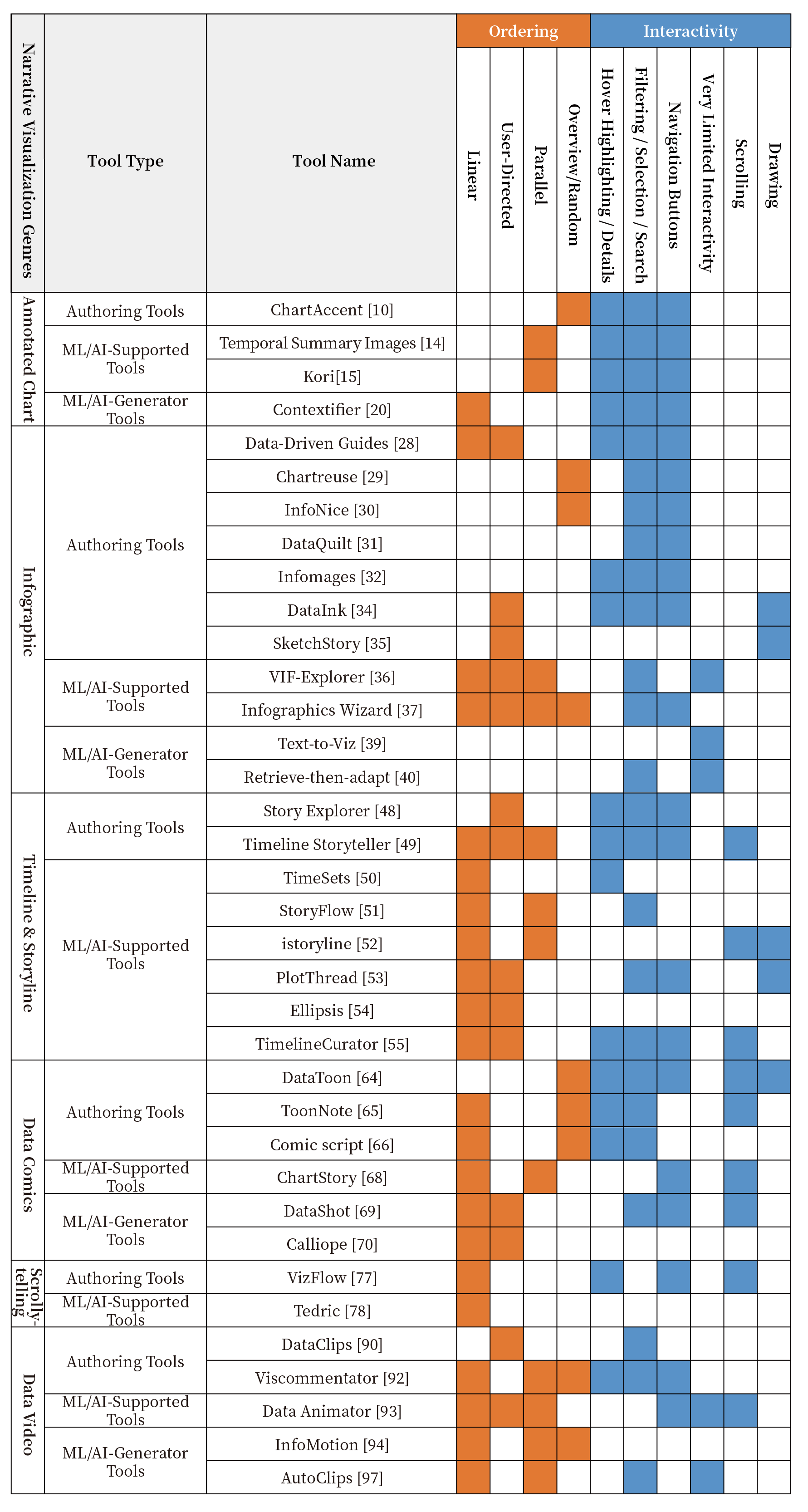
We surveyed the literature [98, 99] to further summarize various tools with different narrative orderings and interactivity. Segel et al.[98] summarized three kinds of ordering for narrative visualization: linear (the author specifies this path), random access (no path is specified), and user-directed (users may choose a route from various available pathways or design their own). Tong et al. [99] added another ordering type called parallel (multiple paths can be displayed simultaneously). Apart from the 38 references listed in the Design Space category in Table 1, some studies proposed techniques or algorithms without developing a fully functional visualization tool with appropriate interfaces. Therefore, we selected the 36 visualization tools that include interactive functions and support the creation of narrative structures for each narrative genre. Their narrative orderings and interactivity are also marked in Figure 2.
| Segel & Heer[98] | Roth et al.[75] | Our work |
|---|---|---|
| magazine style | static visual stories | infographics |
| partitioned poster | ||
| film/video/animation | narrated animations | data videos |
| multimedia visual experiences | ||
| slideshow | dynamic slideshows | scrollytelling & slideshow |
| compilations | ||
| longform infographics | ||
| annotated chart | personalized story maps | annotated chart |
| comic strip | - | data comics |
| flow chart | - | timeline & storyline |
As shown in Figure 2, most tools support linear ordering, and relatively few support random ordering. On average, the tools for annotated charts support the fewest narrative ordering types, while the tools for timelines and data videos support the most narrative ordering types. Segel et al.[98] proposed six types of interactions for narrative structures, of which hover highlighting, filtering/selection/search, and navigation buttons are the three most common interaction types. As we explored the selected tools, we discovered two standard interaction types: scrolling which includes landscape and portrait scrolling, and drawing, which supports “touch+pen” interaction.
3 Annotated Chart
Annotated charts use graphics (arrows or trend lines) or text (data values or commentary) to supplement information, adding contextual information to a visualization to supplement or introduce the meaning of the data. Annotations allow audiences to focus on specific content or critical information while retaining complete details of the contextual data [106, 107].
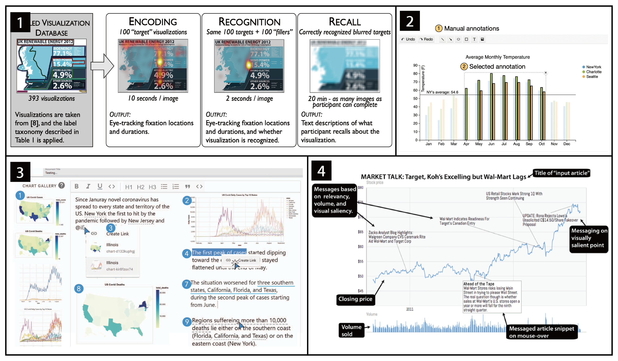
Design space: Adding annotations to visualizations makes the detailed information more accessible to users and improves the memorability of the images [8]. Borkin et al. [8] applied eye movement studies and cognitive experimental techniques to verify that adding captions and annotated text to charts can communicate visual information more effectively. When annotating charts, both the form of the annotation (text, shapes, highlights, and pictures) and the kind of desired annotation (data items, coordinate spaces, structural chart components, and previous annotations) must be considered [10]. In addition, Kong et al. [9] defined annotation as a visual cue. They divided the annotations into two categories: internal cues that modify the existing image by highlighting or downplaying the focus area (i.e., the context) and external cues that add supplementary elements (e.g., outlines, annotations and glyphs) to the existing image to emphasize the focus. They showed that internal cues are often more effective in directing attention than external cues. Internal cues affect the current picture by highlighting the focal region or de-emphasizing the rest of the visualization.
Authoring tool: Researchers have developed a range of visual programming libraries and packages for diagram annotations [108, 109]. These tools require users to have programming skills, while programming tools can only provide asynchronous feedback to designers. To help create chart annotation more easily, researchers have developed authoring tools that have appropriate interfaces and can provide feedback to users, which significantly facilitates the annotating process without requiring specialized programming knowledge. Tableau [110] provides several basic options for annotating charts. For example, the tool allows users to add trend lines to charts. User-created annotations via text can be data-driven but are limited to some standard forms of annotation. ChartAccent [10] is an interactive tool that allows users to generate data annotations manually. It offers many functions, such as highlighting markers, which are more straightforward and flexible than Tableau [110]. Selected markers can be highlighted directly without affecting unselected markers. Although these tools can easily create annotations, they still rely largely on the designer’s expertise to create manually.
ML/AI-supported tool: ML/AI-supported tools of annotated charts reduce manual operations by automatically providing annotated suggestions via user interactions. SmartCues [19], which provides multitouch interaction, is a library that supports details-on-demand via dynamic computational overlays to assist users in building queries and generating data-aware annotations. Touch2Annotate [11] and Click2Annotate [12] are early semi-automatic annotation generators. Touch2Annotate [11] is a tool for adding annotations to multidimensional data visualizations on a multitouch interface. The tool provides annotation templates and allows users to create high-quality chart annotations by simply highlighting the data and selecting the appropriate annotation template according to the annotated content. Click2Annotate [12] allows simple data analysis and generates easy-to-understand annotations. The semantic information encoded in its annotations can be browsed and retrieved. Similarly, Kandogan [13] introduced the idea of just-in-time descriptive analysis. In this scheme, when a user interacts with a diagram, the diagram is automatically annotated in response to that interaction.
Latif et al. [15] developed Kori based on a design space analysis of textual and graphical references and added visualization genres, such as line charts, pie charts, and maps. When users create visualizations with the tool, the system automatically provides annotation suggestions using natural language and enables combining text and graphs via manual interaction. Kong et al. [17] proposed an automated system that overlays user-selected graphics onto existing chart bitmaps and allows users to customize published visualizations by identifying visual markers and attributes of axes of encoded data to better assist users with chart reading tasks. Srinivasan et al. [18] explored the potential applications of interactive data facts for visual data exploration and communication. The researchers also developed the Voder system to demonstrate how users can use interactive data facts to suggest optional visualizations and modifications, which helps users interpret the visualizations and convey their findings. Bryan et al. [14] focused on narrative visualizations for multivariate, time-varying datasets. They proposed a method called Temporal Summary Images (TSI) consisting of temporal layout, data snapshots in the form of comic strips, and textual annotations. Moreover, researchers have noted that line graphs are the most common type of visualization in daily life [111]. However, some line charts are deceptive with exaggeration, understatement, and message reversal. For example, exaggerating or minimizing the effect size via aspect ratio manipulation in line charts leads to deceptive representation [16]. To address this problem, Fan et al. [16] introduced a tool for detecting and annotating line graphs in the wild that reads line graph images and outputs text and visual annotations to assess the truthfulness of line graphs and help readers understand faithful line charts.
Compared with authoring tools, ML/AI-supported tools further simplify the difficulty of creating annotated visual diagrams and reduce manual operations by automatically providing annotation suggestions. Furthermore, ML/AI-supported tools allow users to promptly add annotations to the diagram while interacting with the visualization based on AI assistance.
ML/AI-generator tool: As annotations are essential in visualization design, researchers have explored annotation approaches for different visualization genres. The Contextifier [20] provides an algorithm for selecting annotations that automatically creates a stock timeline graph and matches the appropriate annotation to the line graph by referring to the content in the news article. Liu et al. [21] developed AutoCaption to build a scheme to accomplish the task of diagram title generation by using deep neural networks. One-dimensional residual neural network is used to analyze the relationships between visualization elements, identify essential features of the visualization diagram, and generate a complete description. Both tools create the appropriate information for the diagram without user intervention.
Summary: Annotations are informative additions to visual diagrams and are an essential part of visual design, helping audiences quickly understand diagram information and helping analysts revisit and reuse analysis processes conducted in the past [112]. Researchers have verified the importance of annotation at the visual memory level [7] and at the cognitive level [15], which both indicate that annotations are an integral part of visualization design. Although researchers have studied the layout problem of annotated charts and the distraction caused by repeatedly switching views by using interactive highlighting [113], solutions to occlusion problems, such as annotations blocking the charts, have not yet been addressed. Therefore, more advanced techniques and tools are required to improve the efficiency of the automatic layout. Moreover, for tools to become more intelligent and accurate, the extraction of the existing annotated diagram corpuses and the research related to the identification and correction of incorrect annotations must both be enhanced. Researchers have also developed various tools based on annotated design spaces. Just-in-time annotations and automated annotations provide a new method for users to promptly update and convey visual information [106]. In the future, automated annotations can focus more on internal annotations with the option of rich and aesthetically appealing visual cues [5].
4 Infographic
The term infographics, which stands for informational graphics, refers to a type of visualization that focuses on the use of graphically designed icons, images, colors, and other elements to illustrate data and textual information. Otten et al. [114] defined infographics as “to convey a particular set of information to a specific audience by transforming complex and abstract concepts into visual components.”
Design space: Infographics are frequently utilized in a variety of sectors because they are simple to comprehend and can improve the viewer’s visual working memory [23, 115]. Different categories of infographics, information units, and presentation formats have been studied by researchers. Albers et al.[116] summarized four types of infographics, including bullet list infographics, snapshot infographics, flat information infographics, and information flows. According to the presentation forms, infographics can be divided into static, dynamic, and interactive categories.
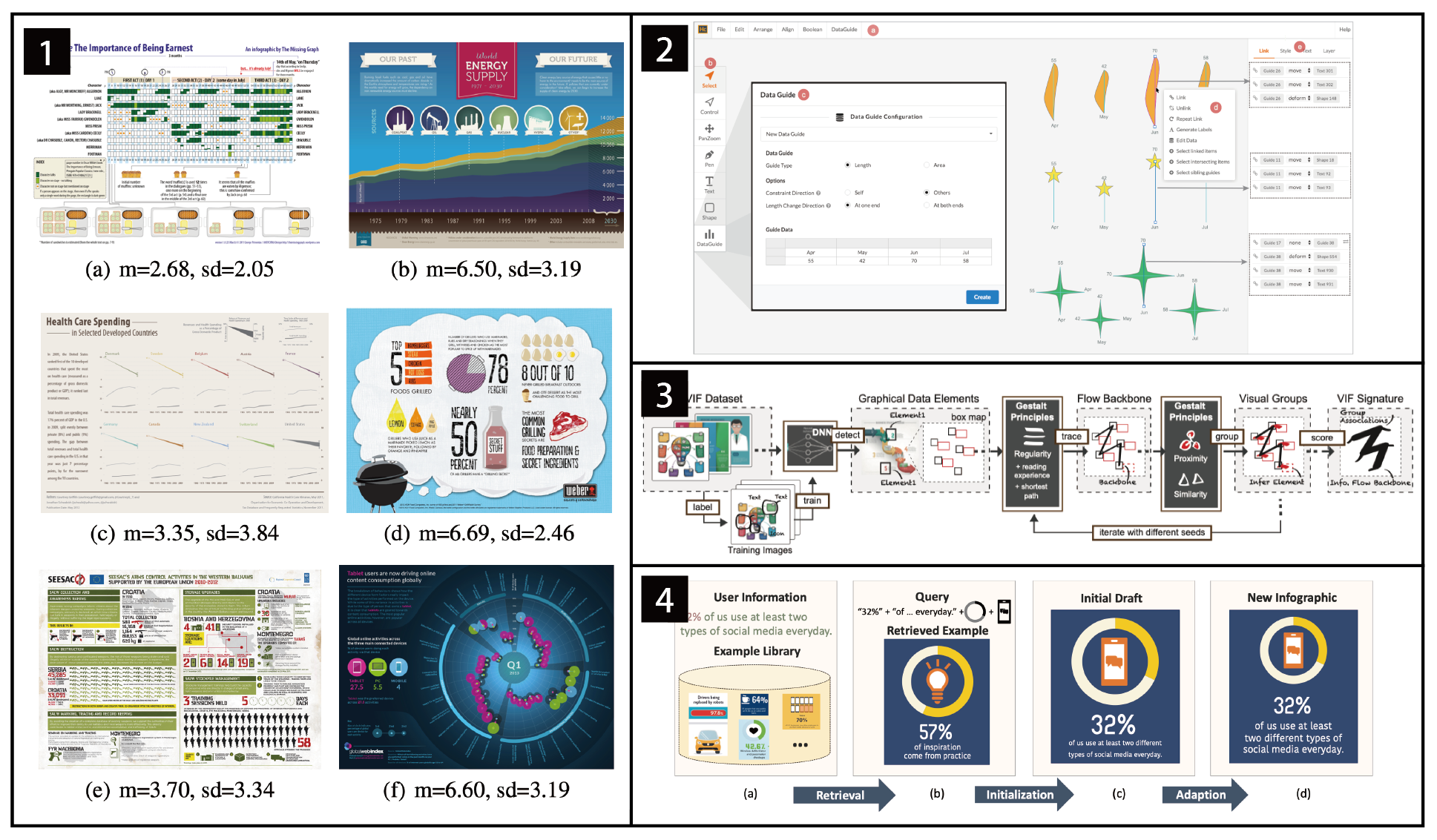
A good infographic should be attractive, easy to understand, and easy to remember[22]. Studies have found that audiences usually form a primary impression of an infographic within the first 500 milliseconds. This impression depends heavily on the color and visual complexity of the page. Therefore, to increase the appeal of infographics, designers should display them by increasing the contrast between colors or selecting a limited number of images with text [23]. However, an infographic is not only a simple combination of graphics and text. Infographics affect how well audiences remember information; when audiences are pleased by infographics, they are more likely to remember it over a longer time period [24]. The studies by Lan et al. [25] showed that adding emotional factors to visual designs can create better infographics. Other researchers point out that embedding games into infographics encourages user interaction and improves their exploration experience [26]. In addition, several specific design guidelines for infographics are proposed. Dunlap & Lowenthal [27] gave design recommendations on four levels: overall design, structure, content, and infographics visuals.
Authoring tool: Infographics have many advantages, but designing infographics can be laborious for amateurs and time-consuming even for experts. Numerous tools can be used to create infographics in the design field, including Adobe Illustrator [117], Sketch [118], and other vector drawing tools. However, these tools do not support associating data with graphics, suggesting the complexity involved in matching data with graphics when used together to create data-driven infographics. Researchers have developed specialized tools to solve this problem by binding data to vector graphics. For example, designers can manually draw graphics and associate data with the created graphics by using Data-Driven Guides (DDG) [28]. This tool relieves the burdens of designers to manually code data into custom graphics. Chartreuse [29] and InfoNice [30] help users create evocative bar graphs with custom markers that convert new bars into infographics with visual elements. Both tools are integrated with Microsoft Office as plug-ins, lowering the barrier to creating infographics. In addition to associating data with vector graphics, DataQuilt [31] and Infomages [32] are tools for binding data to bitmap images. In addition, certain tools are integrated with the sketch functions, allowing users to create designs more freely [33, 34, 35]. DataInk [34] provides “pen+touch” interactions enabling designers to express their creative thinking by drawing on a digital canvas and directly matching their drawings to data. SketchStory [35] integrates real-time free-writing capabilities with interactive data charts, allowing presenters to move and resize data charts by touching the screen, easing and speeding up the creation of personalized and expressive data charts. Although all these tools can help create infographics, most tools can only transform specific data types into specific forms of visual charts, with line charts and bar charts being the majority. Designers still need to reintegrate the design elements and lay them out to form complete infographics.
ML/AI-supported tool: Lu et al. [36] built an infographic visual flow search tool, VIF-Explorer, by analyzing many infographics and extracting the Visual Information Flow (VIF) of these images. However, this software can only analyze simple infographics. Complex or nonstandard infographics with creative elements are challenging to identify and characterize. Infographics Wizard [37] can generate infographics with complex layouts. The tool first recommends VIF layouts based on the given information, then provides recommendations for visual group (VG) designs, and finally generates connections between VGs to complete the infographics. Visme [119], Infogram [120] and Canva [121] are examples of more commercial types of software. These web-based tools allow users to drag and drop various images and graphic elements to create infographics of the highest quality. Additionally, an infographic’s colors have a significant impact on the audience’s first impression [23, 115]. InfoColorizer [38] allows users to employ color palettes to create data-driven infographics.
In short, ML/AI-supported tools for infographics aim to identify existing infographic layouts and color encodings and match them to corresponding infographic recommendations. While it could offer more design options and save efforts for designers, the existing ML/AI-supported tools are not intelligent enough to make creative and unique infographics similar to those created by designers who use authoring tools.
ML/AI-generator tool: Text-to-Viz [39] generates infographics by natural language techniques with predefined schemes in two steps: semantic parsing (identifying how this information is described by casual users) and visual generation (layout, descriptions, graphics, and colors). However, the tool is limited in three aspects: the generability problem, which only supports proportion facts; infographics expressiveness, which is based on predesigned styles; and expression ambiguity, which the current model cannot understand. Qian et al.[40] proposed Retrieve-Then-Adapt to automatically generate infographics by simulating Internet design works so that it can create richer designs. Chen et al. [41] proposed a similar solution in that it helps users turn existing timeline infographics into re-editable templates. In the deconstruction phase, a multitask deep neural network is used to parse the global and local information on the timeline; in the reconstruction phase, the infographic is then extended into an editable template by a channel technique. These approaches identify and visualize accurate information and ensure that the final generated infographic elements are organized harmoniously.
Summary: Different types of tools have different focuses for infographic design. Design spaces of infographics mainly introduce the key components of a good infographics. For authoring tools, the focus is on how to bind images with data. ML/AI-supported tools and ML/AI-generator tools identify the layout of existing infographics and apply or recommend it to new infographics. Creating infographics with authoring tools and ML/AI-supported tools requires users to know what the final infographics look like, which can be challenging for amateurs. ML/AI-generator tools are more friendly to amateur users. These tools help users generate visualizations from data insights and design aesthetics by using an automated approach that reduces the complexity of the creative process and effectively increases productivity.
Although a great deal of research has been conducted, much work is still required in this category. The first direction is to adapt current tools to more visualization genres. Existing tools for converting standard statistical charts into infographics support only simple chart conversions [29, 30]. A more comprehensive visual corpus needs to be built to support a wider variety of visualization genres in future work. The second direction is to offer more advanced extraction and editing functions to existing infographics. Some tools can identify design elements from existing infographics, but only support simple visual charts [39, 40, 41]. Meanwhile, the extraction of artistic effects in infographics is still relatively weak and intelligent algorithms can be applied to tackle this problem. Moreover, editing functions can be added to infographic identification tools directly to reduce the effort of switching between software. The third direction is to enhance research on intelligent algorithms. Many rule-based algorithms are applied in current tools (e.g., color selection [38] and icon selection). The quality of infographics generated by visualization systems can be further improved using more advanced machine learning or deep learning approaches.
5 Timeline & Storyline
Both Timeline and Storyline are used to describe sequences of events [42]. The most typical timeline has events arranged horizontally according to their timestamps and a horizontal axis used to represent time progression from left to right [50]. In a storyline visualization, the narrative unfolds from left to right; each person is represented as a line. When two people interact at the exact moment, their two lines intersect [52, 45]. As their presentations share many resemblances, timelines and storylines are jointly discussed in this section.
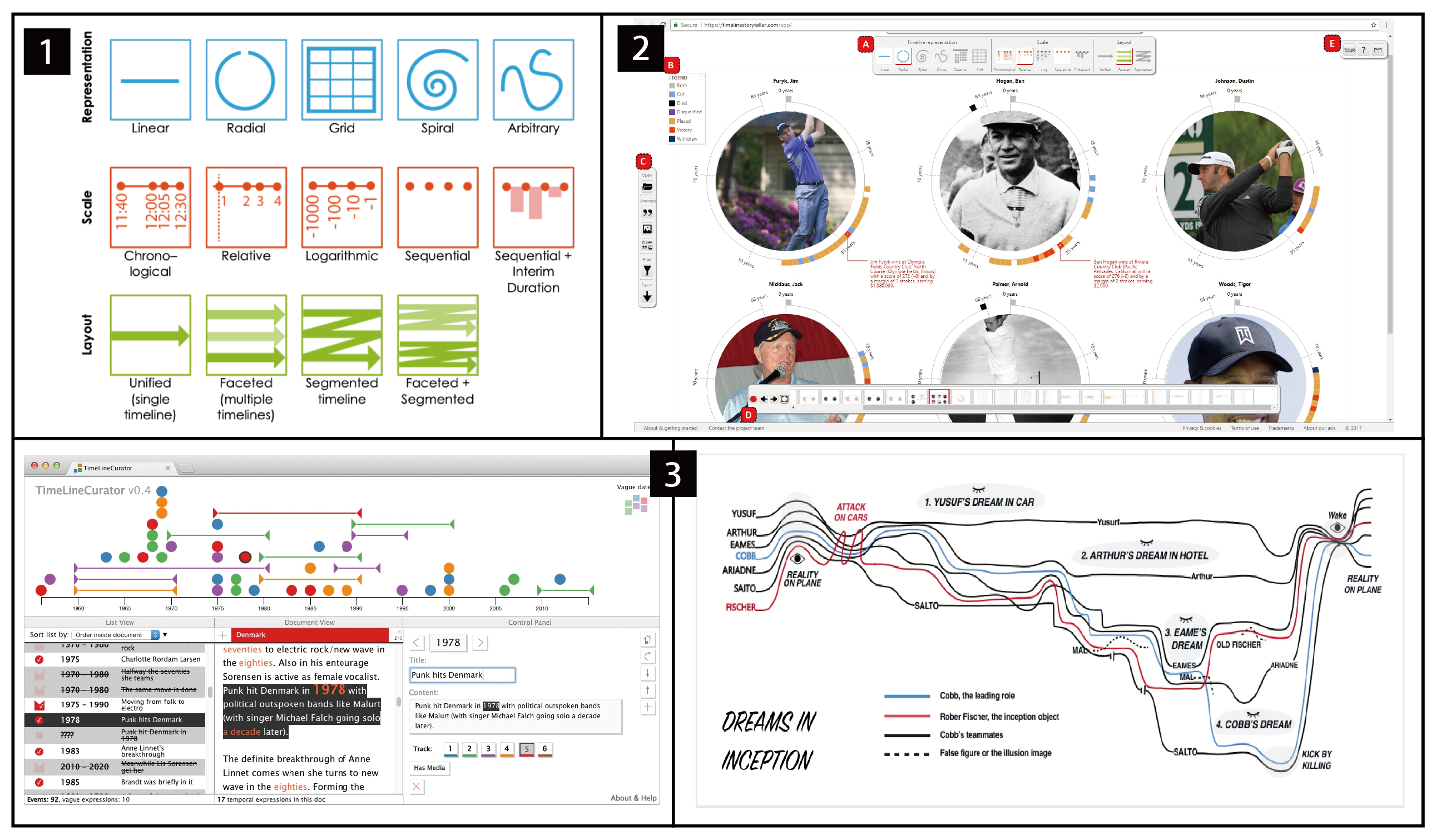
Design space: Brehmer et al. [42] proposed that storytelling with timelines contains three levels of representation (e.g., linear, radial, and grid), scale (e.g., relative and logarithmic), and layout (e.g., unified and faceted). Moreover, by combining these three levels, 20 timeline design options were identified to match the narrative style. Lan et al. [43] identified six narrative sequencing patterns (chronology, trace-back, trailer, recurrence, halfway-back and anchor). The study results showed that nonlinear narratives are more likely to increase user engagement and that nonlinear narratives enable stories to be more expressive without hindering comprehension. Bach et al. [44] proposed the concept of time curves for nonlinear narrative visualization. The aims of their work were to provide a general method for producing straightforward visual summaries for a variety of temporal datasets. The researchers describe the visual patterns that time curves often display (i.e., cluster, transition, cycle, U-turn, outlier, oscillation, and alternation) and how to interpret them. Similarly, Kim et al. [48] suggested the use of story curves to analyze and convey nonlinear narratives in film. Story curves in this style may be used to establish the general ordering of events by comparing the order of events in a film to their actual chronological order.
However, storyline visualization is usually limited in that participants cannot belong to two different groups simultaneously. As a participant is represented as a line, multiple lines bundled together at a time point usually indicate that they belong to the same group at that time. However, when the participant belongs to different groups simultaneously, for example, in co-author relationships, the participant’s line of thinking is difficult to align with that of the co-authors. To solve this problem, Di Giacomo et al. [45] proposed a model that aims to present participants with a tree diagram rather than a line diagram. In addition, several researchers have proposed a series of design guidelines regarding the timelines’ aesthetics and readability, which can be roughly divided into three categories: (1) attempt to keep straight lines to minimize line crossings [46, 47, 52], (2) the same set of lines should appear next to each other, and (3) a certain distance should exist between lines [52]. These design guidelines are proposed to provide a theoretical basis for creating timelines, which can be used to guide users to better create timelines in authoring tools.
Authoring tool: Creating timelines can be a time-consuming task for novices; consequently, researchers have developed several authoring tools for creating timelines [122, 123, 124, 125]. Two of the most commonly used tools are TimelineJS [124] and TimelineSetter [125]. Both tools can automatically generate a visual timeline by filling in dates and titles, describing events in Google spreadsheets, and linking to corresponding images, videos, and other media. The generated timeline can also be demonstrated in the form of slides [124, 125]. Although these tools are increasingly popular, they lack certain capabilities. For instance, they cannot generate timelines for nonlinear storylines or more complicated timeline layouts. On the basis of Genette’s [126] research on the sequence of events in a story, Kim et al. [48] built Story Explorer, a tool that allows users to organize the chronology of scenes in a movie script and to utilize story curves to explore the film’s nonlinear narrative.
However, several of the abovementioned tools can only create linear timelines. Before Timeline Storyteller[49] was developed, designers who wanted to convey expressive stories by using special timeline layouts (matrices, spirals, etc.) usually applied time-consuming manual approaches or programming implementations. However, timelines created in using this method often lacked guidance in balancing the perception and narrative effects, resulting in being difficult to understand [127]. To solve this problem, Brehmer et al. proposed a timeline design space [42] and further developed tools [49] that would easily allow users to create nonlinear forms of timelines.
Although these authoring tools have lowered the threshold for users to create timelines, several challenges at the layout and visual encoding level still need to be addressed. For example, when designers need to finish hundreds or thousands of timelines, it becomes difficult to meet both the aesthetics and readability principles of the timeline design. It is also time-consuming and technically difficult for designers to manually adjust the layout to avoid line crossings and overlaps.
ML/AI-supported tool: Some ML/AI-supported tools in the timeline visualization domain solve the abovementioned problems. TimeSets [50] uses the “gestalt principles” of proximity and uniformity of association to group together the relevant events and the use of backdrop colors to visually link collections’ activities. The tool addresses the visual inconsistency caused by too many lines. StoryFlow [51] uses a new hybrid optimization strategy that combines discrete (sorting and aligning line entities to create the initial layout) and continuous (optimizing the layout based on convex quadratic optimization) optimization methods to quickly create timelines with aesthetic and readable properties. However, this approach is insufficient in effectively supporting advanced design preferences, such as changing the general trend of lines [52]. Tang et al. [52] created iStoryline to create more meaningful storyline visualizations that satisfy the needs of designers. This tool integrates user interactions into an optimization algorithm that allows users to easily create story visualizations by modifying the automatically generated layouts according to their preferences.
While iStoryline’s [52] interactions focus on modifying local areas, customizing the overall layout is time-consuming and the optimization process is unpredictable, which requires repeated trials to optimize the results. To improve the user experience, PlotThread [53] integrates AI agents into the authoring process. The AI agent can decompose a given storyline into a series of segments, allowing the user to understand the state of the intermediate layout and predict the following action. In addition, Ellipsis [54] and TimelineCurator [55] are both timeline authoring tools focused on the field of journalism. Ellipsis[54] blends a domain-specific language for narrative development with a graphical user interface framework. TimelineCurator [55] can process unstructured documents with temporal text by using natural language and subsequently extract the temporal text from them along the way. These tools significantly facilitate the management and processing of documents containing timelines.
Summary: Timelines and storylines are used to depict event progressions. Researchers focus on timeline aesthetics and narrative impact in timeline & storyline design. Users can manually design timelines for particular scenes (i.e., movie narration) or use authoring tools (i.e., matrices and spirals). ML/AI-supported tools leverage intelligent algorithms to assist users in creating narratives by sorting temporal sequences and text information from unstructured raw data. It also enhances the aesthetics and usability of timelines and makes writing tools more efficient. We observed that a significant amount of text information can be easily processed using ML/AI-supported tools, whereas a limited amount of text and a particular type of timeline can be created using authoring tools.
Following the research directions indicated by the existing studies, we believe the following directions may be studied in the future. The first direction is to explore the need for special forms of timelines. Although Brehmer et al. [42, 49] proposed six forms (i.e., linear, radial, spiral, curved, calendar, and grid) of timeline representation, their study mainly focused on two forms, linear and radial. Moreover, the representations of these particular timelines determined by the researchers have not been verified in terms of user acceptance and communication effectiveness. Future work needs to validate these representations via formal experiments and implement more real-world applications of such new forms of timelines. The second direction is that the existing authoring tools often overlap timelines when creating content with multiple temporal texts, and the subjective merging of timelines for aesthetic reasons results in the loss of information. In the future, we also need to strengthen the research in this area, ensuring the integrity of information while achieving the aesthetic goal. In the realm of timelines and storylines, ML/AI generator tools are still in their developmental stages. While current ML/AI-supported tools can assist users in creating timelines, they are primarily utilized for localized adjustments and fall short in terms of fulfilling the demands of the complete content creation process. The future holds immense potential for the research and development of advanced ML/AI generator tools for timelines.
6 Data Comics
Data comics are an emerging form of narrative visualization [98] that focuses on the variation of data information and the visual presentation of data sequences [58]. Different from traditional comics, data comics must contain data-driven content, allowing multiple visualizations to be juxtaposed in a single panel in a comic strip layout, with annotations and visual decorations [56]. Data comics complement the linearity of narratives that are inherently imposed by movies and live presentations while offering the flexibility of two-dimensional spatial arrangements in infographics and annotated charts [60].
Design space: Comics are a static format that is great for ideation and storyboards [57]. Given that the technical barriers are low, comic creation can be shared and distributed in various formats, such as scientific papers, conference posters, slideshows, blogs, etc. The sequential nature of data comics and the tight integration of text and graphical information have great potential to explain complex data and to promote visualization and data literacy [59]. Data comics have the potential to transform the manner we envision and produce infographics and presentations because they can convert storytelling approaches from one medium to another [60]. Furthermore, data comics are incredibly flexible and communicative. They can be used to integrate graphic elements of comic properties with textual explanations and deliver visual content that requires memorization and quick navigation [61, 62].
Although data comics have many advantages, creating good data comics is a complex task. Designers must consider many tradeoffs, such as balancing repetition and highlighting, and the results rely significantly on the expertise of designers. Zhao et al. [62] addressed the issue of data comics view ordering by examining the narrative mechanism of comic strips. The order of the data comic panels must be shown to help recall details in data comics. Wang et al. [61] conducted a user study to compare data comics and infographics in terms of the degree of clarity of reading order and the degree of integration of text and images. The findings demonstrated that complicated spatiotemporal data are difficult to depict using infographics, while it is possible to present with data comics. The participants enjoyed reading data comics in the experiment and regarded them as more entertaining and more effective at retaining their attention.
In another study, Zhao et al. [56] compared data comics with PowerPoint [128]. The results also showed that data comics are more attractive, more space-efficient, and more enjoyable to use than PowerPoint [128]. Moreover, as the narrative style of comics is usually linear, a possible approach is to transform data comics into data videos with appropriate tools. Meanwhile, comics can present specific moments in separate frames, allowing for a more focused presentation of individual data information [62].
To help people comprehend the art of data, visualization, narrative, and the necessity for efficient data-based communication, Bach et al. [60] offered a collection of data comic design patterns. They also constructed six design patterns for data comics according to different associations and layout methods. Some researchers further validated the usefulness of this design space in practical cases. For example, Hasan et al. [63] created an interactive data comic in the form of a card game. Each comic panel becomes an individual card instead of being arranged in a fixed sequence; learners can form different storylines by combining them in different ways. Their research showed that transforming data comics into card games allows learners to grasp information quickly via interaction and encourages collaborative thinking among participants.
Authoring tool: Researchers have developed various tools to create data comics to enhance the potential user experience. DataToon [64] is a tool for creating dynamic web data comics that support “pen+touch” interactions. The tool allows quick exploration of data, rapid generation of visual stories with custom annotations, and interactive filtering of layout templates. However, displaying exploration data and presentation information on the same page can cause visual distractions. Kang et al. [65] solved this problem by proposing ToonNote. ToonNote provides two view modes: notebook view, which adopts the format of a traditional computing notebook to conduct data analysis, and comic layout, which focuses on visual storytelling.
Suh et al.[67] developed CodeToon, a tool that supports the comic creation process by adopting two mechanisms. One is to facilitate the conception of code-related stories via metaphorical recommendations; the other is to generate comics from stories automatically. Both mechanisms allow users to add codes or select code examples provided by the tool, generate a story, and automatically produce comics. The tool allows users to quickly and easily create high-quality coding strips. To enhance the user experience of data comics, Wang et al. [66] proposed a lightweight declarative scripting language, Comic Script, which supports adding interactivity to static comics. Their work allowed them to overcome the original narrative mode, which can only create linear or unchangeable stories, realize nonlinear narratives, offer more personalized layouts, and explore the level of detail and other potential user experiences.
ML/AI-supported tool: ChartStory [68] is a tool that automatically converts a collection of charts into a data comic format. It divides charts into clusters of story segments by identifying narrative segments and then reorganizing the segments to generate a story. Users can further refine the generated data comics via interaction.
ML/AI-generator tool: Fact sheets present multiple data facts via visualization in a juxtaposed format that is highly similar to data comics. In a fact sheet, a data story is constructed from several facts and numerical or statistical findings produced from data [69]. Although some comic elements are missing in fact sheets, we still categorize them in this category because they can be easily extended to data comics by adding some comic-style decorations. Both DataShot [69] and Calliope [70] can automatically generate fact sheets. DataShot [69] transforms tabular data into fact sheets by adopting a three-step process of fact extraction, fact combination, and visual synthesis. This tool can effectively reduce the difficulty of data exploration, create information presentations and enhance the readability of data by means of expressive visual design. This method is extended by Calliope [70] to automatically construct visual data stories from spreadsheets and use the Monte-Carlo-tree search technique to investigate tale fragments and portray them in a logical manner. Calliope can generate coherent visual data stories in which logical connections can be maintained between the preceding and following segments. In this manner, the threshold for creating data stories can be effectively decreased.
Summary: Although in its infancy now, data comics have gained much attention in recent years. According to some preliminary studies [56], data comics perform better than slideshows and infographics in terms of spatial efficiency and reader enjoyment. However, a more detailed evaluation with a larger number of participants needs to be conducted to validate its usage and effectiveness in practice. Moreover, while data comics possess a leisurely and entertaining nature, they are occasionally applied in serious and sensitive contexts. For instance, at Charité in Berlin, comics are utilized on a regular basis to educate patients before heart surgery, showcasing the practical applicability of this medium beyond mere research settings [129].
Almost all the existing tools for creating data comics support basic data exploration and analysis. While authoring tools can reduce the difficulty of creating data comics, they are targeted at users who have a certain level of visualization creation skills, which is not user-friendly to amateurs who want to create data comics from scratch. ML/AI-supported tools and ML/AI-generator tools for creating data comics integrate the ability to analyze data, visualize the analyzed content, and present the information in a narrative format. The difference between the two types of tools is that ML/AI-generator tools can automatically analyze data and arrange the data insights into comic-style narratives directly. By contrast, ML/AI-supported tools require users to select valuable insights or manually layout the panels of data comics.
Reflecting on the collected work presented above, we think that the data comics can be studied in the following aspects in the future. First, the forms of comics vary to a large degree, and current research has ignored how different data types are suitable for which kind of design style and narrative strategy [59] and which style of data comics users prefer under what circumstances. Second, the redundant and non-data related visual elements in data comics can sometimes be confusing and distracting to viewers, imploring the necessity to explore how the number of comics grids, the amount of text, the layout, and the color scheme can be designed to be more acceptable by users. Third, although data comics are a static medium for presenting data, a possible approach is to investigate how to include interactive features to promote user understanding and engagement [62].
7 Scrollytelling & Slideshow
The term “scrollytelling” is a combination of “storytelling” and “scrolling.” It is a scrolling-based visual narrative form that is widely used in data-driven articles [71]. Scrollytelling articles usually start with a full-screen photo or video and scroll by considering the next part of the content [71]. A similar form of visual narrative to scrollytelling is the slideshow [75, 130]. Mckenna et al.[131] noted that many recent websites integrate buttons and sliders, demonstrating that the distinction between the stepper and the scroller depends on whether the user input is clicking the stepper or scrolling the slider. In addition, in terms of story layout, pages often appear as slideshows or hybridsthat combine features of both slideshows and steppers, with different animations and scrolling. They resemble both steppers and scrollers, in which the latter form supports scrollytelling. As the slideshow form and the hybrid form can be interconverted, we jointly studied scrollytelling and slideshow.
Design space: Scrollytelling articles are usually text-centered and use multimedia elements such as images and videos to assist narrative storytelling [72]. Various transition styles between pages can be triggered by scrolling. The choice of transition styles is usually determined by the relationship between facts (e.g., comparative, similar, and sequential). Scrollytelling can be used as visual cues, such as highlighting facts in visualization, to direct attention or to indicate stages to assist browsing [79].
A slideshow is composed of a collection of slides instead of continuous content in scrollytelling. Elias et al. [73] reviewed the elements that comprise a slideshow presentation, identifying six typical elements: slide title, text box, image, embedded content, equations, and tables to ensure accessibility. Hullman et al. [74] analyzed 42 narrative visualizations in the form of slides and investigated how the choice of order affects narrative visualization. For slideshows, the narrative is told by discrete clicking, tapping, keying, or swiping dynamic slideshows, allowing the designer to control the storytelling pace. In addition, users can add or remove pages to the slideshows according to their needs and can exit the presentation page at any time. Slide layouts can show continuous progress between slides or support nonlinear breaks in the narrative [75]. However, when readers have to navigate too many pages, they may eventually suffer from boredom, but too few pages also hinder the user from remembering the story. Therefore, the story’s length in the slides must be accurately established [79].
Authoring tool: Scrollytelling is a challenging task. Idyll [76] provides a “scroller” component for building scrolling narratives, allowing users to control document style, layout, and control pages by clicking or scrolling. Sultanum et al. [77] explored a data-driven approach to article story creation that separates semantic, textual, and graphical links and story layout forms. On this basis, researchers developed VizFlow [77], a tool for creating dynamic data-driven articles. With a text-chart linking strategy, VizFlow allows users to create dynamic layouts for static data-driven articles.
Users have more options or tools to create slideshows compared with scrollytelling. The most popular ones are PowerPoint [128], Keynote [132] and Google Slides [133]. This type of software aims at helping users manually create a set of slideshows that contain text, images, and other multimedia content. Providing abundant design templates allows users to focus on the information they want to present rather than spending plenty of time in the visual layout [134].
ML/AI-supported tool: Users often employ slideshows for presentations or speeches. However, it usually takes considerable time and effort to create slideshows before the presentation, and for impromptu speech, users cannot create slideshows in such a short time. Tedric [78] is a tool to construct a coherent slideshow from a single subject idea. This tool blends a semantic word web with text and picture data sources to produce a slideshow that matches the subject. The user studies conducted by the authors demonstrated that the use of the tool significantly reduces the barriers to impromptu speech and saves users much time.
ML/AI-generator tool: Leake et al.[135] developed a system that converts text into speech by recognizing specific words in each sentence and automatically selects relevant images to transform these texts into audiovisual slides. Lu et al. [79] proposed a method for automatically generating scrollytelling visualizations. The method begins by listing the data facts for a given dataset, scores the facts and arranges them into stories, and then produces visualizations, transitions, and text descriptions for the scrolling display. However, as the existing work in this category is mostly prototypes, the practical usage of ML/AI-generator tools for scrollytelling has not yet been proved.
Summary: Scrollytelling is a scrolling view of content, an interaction that is consistent with our everyday behavior of browsing web pages and articles on mobile devices. A slideshow is another common display that is a step-based display. Although we often encounter the two forms of narratives in daily practice, academic research on slideshow and scrollytelling is generally lacking. First, as mentioned in the timeline chapter, nonlinear narratives are more likely to engage users, and scrollytelling and slideshows can use both linear and nonlinear ways of presenting information. Scrollytelling and slideshows allow the audiences to explore different paths by referring to the content based on their own interests and needs. Instead of following a predetermined linear sequence, the audience can select their own journey by referring to the information by clicking on links, making selections, or following different branches of the narrative. This approach gives the audience more control over the pace and order of information, allowing them to focus on the aspects that are most relevant or meaningful to them. Future work can investigate whether other nonlinear narrative structures are also suitable for scrollytelling or slideshow. Second, existing research has focused on different media combinations, such as images, text, and video, with minimal research on data visualization and intelligent tools. In particular, slideshow creation tools are inexplicitly designed to create narrative visualizations. Therefore, future research can investigate the real needs and design requirements for narrative visualization, thus providing more support to create data-driven scrollytelling and slideshows.
8 Data Video
Data video is a narrative visualization type [98] that combines data visualization with motion graphics and tells data-driven stories. Data videos can present viewers with diverse visual information in a short period, and therefore, they are widely used in disseminating data information [80, 90].
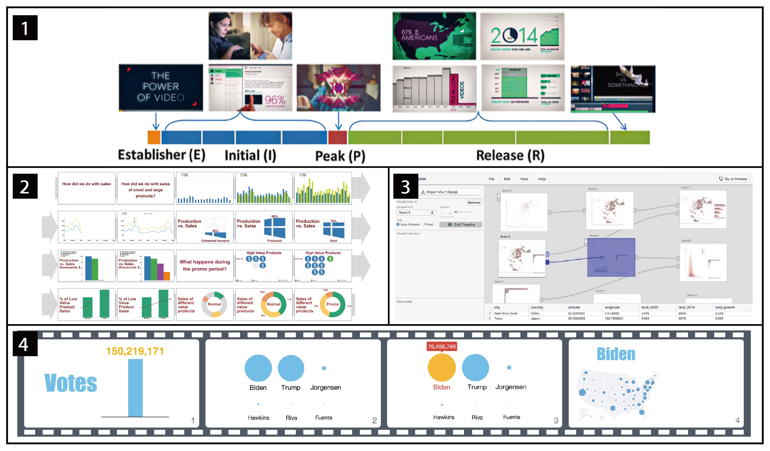
Design space: Researchers have primarily focused on understanding, creating, and disseminating data videos. Amini et al. [80] first proposed a visual narrative structure theory, in which the narrative structure of data video can be divided into four roles: establisher (E), initial (I), peak (P), and release (R). On this basis, Cao et al. [81] presented a more extensive taxonomy of data video, including four narrative structures, five main genres, and six narrative qualities. Users can quickly find specific types of data videos with the help of this classification. These studies provide a solid foundation for designers to create data videos. Xu et al. [82] considered data videos’ opening narrative and visual presentation design. They proposed six cinematic opening styles (symbolism and metaphor, camera eye, big bang, old footage, and ending first styles) and 28 design guidelines for the six styles.
Visual narratives in data videos are usually performed using animation because animation can represent temporal changes and enhance the comprehension and user engagement of data stories [83]. Shi et al. [88] analyzed 43 animation techniques for narrative visualizations and categorized eight narrative strategies (e.g., emphasis, suspense, and comparison) to construct a design space. This design space helps describe how data videos are produced and how various components are integrated with visual narrative strategies. Such design spaces provide users with useful design suggestions; thus, they weaken the barriers to designing and producing expressive data videos. By examining animated data charts, Tang et al. [89] created a design space for data videos with five dimensions: data, motion, layout, duration, and narrative. Moreover, they proposed 20 design guidelines based on these dimensions. In addition, other researchers have conducted studies on how to increase the effectiveness of data video communication. Sallam et al. [84] found that for a problem with no clear solution, a better option is to present it in a data video because the audience may feel high levels of negative emotions. To improve the quality and reduce the complexity of data video, Wang et al. [85] proposed nonlinear time mapping and foreshadowing. The “foreshadowing” technique, as described by researchers, is only applicable to animated stacked images. Li et al. [86] expanded on this by formally defining visual foreshadowing, a technique that addresses the problem of time-consuming videos that ignore the viewer’s attention. Shu et al. [87] examined the Data-GIFs design space and offered recommendations.
Authoring tool: Producing data videos is time-consuming because it requires collaboration between people from different backgrounds (e.g., data analysts to generate data and insights, scripters to write narratives, and motion designers and graphics experts to produce video assets). Each element may depend on one or more particular software tools [90]. DataClips [90] provides a set of data clip libraries that allow amateurs to combine data-driven clips to form longer sequences of data videos. Lan et al. [91] developed Kineticharts, a chart animation scheme for conveying emotions, based on the animations provided in DataClips [90]. Compared with DataClips, Kineticharts [91] can enhance the emotional engagement of users by improving the presentation of the story without hindering users’ understanding of the data. In addition, Chen et al. [92] developed VisCommentator, a tool for analyzing ball sports videos in sports programs, facilitating the creation of enhanced sports analysis videos through data insights and visualization suggestions.
ML/AI-supported tool: Researchers have designed and developed tools to transform static visualizations into dynamic versions. Data Animator [93] utilizes the Data Illustrator [136] framework to match two static visual objects and generate automatic transitions by default. The tool also supports dividing complex animations into segments by layering keyframes, utilizing data characteristics to stagger the start time, and adjusting the pace of animated objects through a timeline view. Similarly, InfoMotion [94] can build data films by extracting the graphical attributes of infographics, understanding its underlying information structure, and adding animation effects to the visual pieces of the infographic in chronological sequence. As InfoMotion [94] is built into PowerPoint [128] as a plug-in, it can automatically link a variety of built-in animation effects to the visual parts of slides, which is excellent for speeding up data video production. This tool [94] is also easier to create data videos than Data Animator [93] because it can only use data in Data Illustrator [136] format. In addition, while Gemini2 [95] and Cast [96] are not dedicated tools for creating data videos, both tools can build keyframes for charts. Gemini2[95] focuses on helping users create animations by referring to keyframe suggestions. Similarly, Cast [96] allows users to manipulate directly to change the parameters of animation effects (e.g., animation type and jogging function) and refine animation specifications (e.g., adjusting keyframes to play across tracks and adjusting delays) by providing a GUI interface. ML/AI-supported tools for creating data videos focus on how to identify existing infographic elements and convert them into dynamic video clips while authoring tools provide a library of existing data clips that users can use directly.
ML/AI-generator tool: While the abovementioned technologies ease the design process, data videos are still difficult to create because users must select which visualizations and animations to utilize and how to assemble a cohesive video. The aforementioned problem was solved by the emergence of AutoClips [97], a tool that automatically makes a data video from a series of data facts. This tool [97] saves users the time of analyzing the data and the obstacles of creating animations by using video motion software, significantly reducing the complexity of creating data videos. However, AutoClips normally only supports tabular data and tends to favor datasets with diverse column types.
Summary: Data video has become popular owing to the growth of social media platforms. Research on data video has also received much attention in recent years. At the design space level, researchers have explored the understanding, creation, and dissemination of data videos to help better understand the components of data videos. These design spaces and guidelines provide the theoretical basis for developing authoring tools, ML/AI-supported tools, and ML/AI-generator tools. Authoring tools simplify the creation of data videos by offering a library of existing data clips that can be replicated. ML/AI-supported tools focus on how to identify existing static visualization elements and convert them into dynamic videos. ML/AI-generator tools can automatically generate data videos directly from input data.
However, certain issues still need further investigation. First, existing automatic tools for creating data videos are still limited to a few visualization genres and input formats. For example, AutoClips [97] only supports tabular data, limiting the visual display possibilities of data video. More tools are needed to handle various data types, such as spatial-temporal data and textual data, which are essential for constructing diverse data narratives. Second, researchers also a need to study how the speed, continuity, and smoothness of animations in data videos, the transitions between charts and graphs, and the embellishment effects added to the videos would affect the understanding and overall experience of readers [91].
9 Discussions and Future Work
In this section, we outline the current limitations and future research opportunities of design spaces and tools at different automation levels for narrative visualization.
Design space aims to describe all the possible design aspects for various narrative genres. The summary of the design space allows us to capture some implicit knowledge of visual designers and practitioners [104]. Most existing studies propose clear design guidelines in specific design scenarios [137, 60, 89]. However, the design space articles on the different narrative genres vary in focus. For example, in annotated charts and infographic genres, the focus is on how to effectively create a correct and aesthetically appealing visualization. For timeline, data comics, scrollytelling, and data video genres, the focus is more on exploring the narrative structure. In particular, data video pays special attention to creating animations, while other genres focus more on static presentations. The major future research directions are listed below.
Simplify and validate the design space. Creators can generally access many existing visualization design guidelines, but choosing the right guidelines is difficult for them. Moreover, design guidelines often fall short in explaining when it is more appropriate to use, and lack proper validation [89]. For example, researchers have proposed visualization design process frameworks [138, 139], but have not explained what scenarios and how to use these frameworks for visualization design. Therefore, a potential research direction is to validate the usage of various design spaces and classify them according to application domains. Amateurs may also be provided with an overview of design spaces to tackle specific design problems. For more experienced designers, we could pay more attention to the subtle design guidelines that can improve the user experience and user perception in the visualization.
Explore new narrative structures. The existing narrative structures are primarily derived from movies or other audio-visual content [80]. Information on the application of narrative structures in novels and plays in narrative visualizations is generally lacking in the extant literature. Due to the different characteristics of various narrative genres, the choice of narrative structure can also be different. For example, a timeline mainly presents content in a linear narrative sequence [50], whereas in data videos, using a nonlinear narrative approach is more likely to engage the audience [43]. Therefore, a potential research direction is to explore different data types and which narrative structure is more suitable for different narrative genres.
Explore other narrative visualization genres. Some traditional visualization genres that focus more on visual analytics are embracing narrative and storytelling concepts. Suprata [137] noted that adding narrative attributes to dashboards allows users to become more aware of their goals and how to take action next. Fernandez Nieto et al. [140] enhanced teachers’ guidance of the content by including narrative attributes in designing learning analytics dashboards. With more attention and practical applications of narrative attributes to traditional dashboards, narrative dashboards can be another future narrative genre. Meanwhile, some new genres of visualizations have emerged, such as immersive visualization [141] and data physicalization [142], which can also be developed with narrative characteristics. Some researchers have demonstrated visualizations such as 3D scatter plots [143], parallel coordinates [144], and networks [145] in immersive environments to help users interpret complex data and facilitate visual data exploration. Others have explored the narrative roles of data physicalization [142], which enabled the participants to develop meaningful narratives in the forms of physical data representations in their study. However, these studies are in their infancy. An emerging trend is the need to study new forms of narrative visualizations. For example, the potential research direction of narrative immersive visualization is a more in-depth exploration of data types, spatial layouts, and user interactions for narrative communication in the virtual environment. The physicalization of data encodes information in a perceptible form, allowing users to explore using all their senses and motor skills [146]. More research on narrative data physicalization is still needed in the future to better understand the design space, the process of producing data, and the benefits compared with flat visualization or virtual presentation [147].
Authoring tools aims to facilitate the visualization creation process with controllable interactions. These tools include stand-alone applications [10, 64], web-based tools [124, 28], and authoring tools that combine with office software [29, 30]. The advantage of these tools is that users have enough control to create customized visualizations, including more complex visualizations that cannot be supported by automated tools. Although these authoring tools significantly improve the efficiency of creating narrative visualizations, most tools are aimed at users with a certain level of expertise. For example, authoring tools for infographics and timelines require users to have visual design skills, while data videos require users to have video editing skills. Future research may invest more efforts in the following directions.
Develop flexible interfaces for authoring tools. Among narrative authoring tools, a few tools can be used to freely draw creative patterns on a screen, including DataSelfies [33], DataInk [34] and SketchStory [35] for infographics and DataToon [64] for data comics. However, other narrative visualization tools are relatively lacking. More flexible interface methods should be provided to help designers achieve more creative ideas and more artistic effects in creating various narrative visualizations.
Develop more interactive visualizations. Among the existing narrative visualization genres, only scrollytelling and slideshow have strong interactive properties, while annotated charts, infographics, data comics, and data videos are mostly static visualizations that lack interactive functionality. However, studies have proven that by providing interactivity[66] and adding interesting [26, 27] and emotional factors [25] to the visualization, users are more likely to memorize the information. Therefore, in future research, a possible approach is to explore more narrative genres of interactive visualizations and to add interesting and emotional elements.
ML/AI-supported tools are designed to assist users in visualization creation by applying intelligent algorithms and techniques. Such tools can provide recommendations or guide the user via the creation process. ML/AI-supported tools for narrative visualizations can serve a wider range of users than authoring tools. For example, designers who lack data analytic skills can easily create data comics with the data analysis capabilities of ML/AI-supported tools; data analysts who lack design skills can use ML/AI-supported tools to create more aesthetically pleasing timelines or data videos.
However, the automatic goals and functions of current ML/AI-supported tools for different narrative visualization types are different. For example, tools for annotated charts, infographics, and data comics have the auxiliary function of identifying and parsing visualizations. Among them, the purpose of annotated chart recognition is to add annotations to facilitate comprehension of the visual story; the purpose of infographic recognition is to create new visualizations based on the original visual styles; and the purpose of data comics recognition is to transform visual content into the comic layout. ML/AI-supported tools for timelines focus on placing timeline text and optimizing visual aesthetic effects, while data videos pay more attention to the creation of animation. By summarizing existing research in ML/AI-supported tools for narrative visualization, the following directions can be studied.
Enhance the research of annotation tools. Although the annotated chart is one specific genre in narrative visualization, annotations are important for any visualization. It can help users understand the visualization and help data analysts review the past analysis process [112]. However, the ability to add annotations to visualizations is lacking in ML/AI-supported tools for different narrative visualizations [93]. Moreover, the annotations generated by most existing tools can only explain the statistical information on a single chart [32, 148]. Studies are generally lacking in terms of applying intelligent techniques to extract context information to build visualizations with narrative structures.
Improve the reusability of existing visualizations. In practice, the majority of charts are saved as bitmap pictures. Although they are simple to spread and use, they are difficult to modify. VisCode [149] and Chartem [150] can store and hide the original data information inside the picture of a chart. However, only rudimentary visual charts are supported by these tools. Therefore, tools to support the recognition and reprocessing of more complex visual charts and more diverse narrative genres must be developed. By improving the reusability of existing narrative visualizations, amateurs are able to create more visual stories efficiently and effectively [93].
Facilitate the adaptability of different software. Some existing tools are integrated with office software. For example, all the features of the DataComicsJS [56] tool can be replicated in presentation tools (e.g., Microsoft PowerPoint [128]) and drawing tools (e.g., Adobe Illustrator [117]). Chartreuse [29] and InfoNice [30] are also both integrated into Microsoft Office software in the form of plug-ins. After incorporating the natural language algorithms of intelligent tools into productivity software, the corresponding functions can work in the background. For example, once a statement is detected that can be enhanced with visualization, a message can pop up to ask the user if he or she wants to use the recommended chart [39]. In this manner, ML/AI-supported tools could reach a wider audience.
ML/AI-generator tools are more intelligent than the previous three types of tools in that they require minimal or no user involvement in the entire creation process. These tools automate the analysis of data and directly generate a complete narrative visualization without user intervention. ML/AI-generator tools mostly target amateurs. The development of such tools has gradually increased in the past decade. As visual communication becomes increasingly important in our daily life, we believe that such tools can play an important role in the creation of narrative visualization. The following directions can be studied in terms of understanding user intent to improve accuracy and efficiency.
Apply natural language techniques to understand and predict user design intent. On the one hand, we can better understand user intent by using natural language interaction in the design process. Once the interaction data and design outcomes are collected, we can use them to train models to predict and recommend potential interaction or design options. On the other hand, recent advances in natural language processing can generate realistic images and artworks directly from textual descriptions [151]. This situation may also drive visualization academics to use cutting-edge approaches to aid in the automation of visual story tools.
Improve data analysis capability to identify user design intent. Among the current six genres of narrative visualizations, ML/AI-generator tools that can be used for timelines are generally lacking. Even though certain intelligent tools can be used to create a timeline, they only modify the local area. Completing the entire creation remains time-consuming. While several ML/AI-generator tools for other genres, such as Autoclips [97], can analyze the data and extract essential parameters from the dataset, the final output is not satisfactory when facing different datasets, different contexts, or more complex data types. Therefore, the ability of ML/AI-generator tools to analyze complex data in the future must be improved. In addition, a possible direction is to study how to input the user’s creative intent into the automation process and at which point in the creation process; in this manner, the user’s intent can be fully grasped to achieve the most satisfying outcome.
Develop narrative recommendation tools to clarify design intent. In statistical charts, researchers have developed many visual recommendation systems such as Voyager [152] and SeeDB [153]. However, research on such tools, specifically for narrative visualization, is lacking. This situation can be explained by recommendation methods being based on data characteristics or design guidelines rather than the user’s design intent. One potential research direction is to develop a narrative visualization recommendation platform, where both the design process and design outcomes of visualizations are stored on the platform. By analyzing the collected information, we could identify the user’s design intent with the help of machine learning algorithms [154]. Such recommendation tools can provide users with abundant design ideas and recommendations in the pre-creation stage of narrative visualizations.
This study outlines four narrative visualization tools at the automation level. Furthermore, although the different tools are divided into different narrative visualization genres in this study, it does not mean that these tools can only create one genre of narrative visualization. The tools present certain compatibility across different genres of narrative visualizations. However, novice users need to undergo a learning curve to varying degrees for either visualization tool type. Moreover, these visualization tools can only tell users how the data have changed, without explaining why it has changed, suggesting that the user will still need to analyze the reasons for the data change results. Moreover, a one-size-fits-all tool to handle all scenarios to address different users and goals does not exist. Therefore, all four levels of automation have their unique values and are worth further investigation, from pure manual design following design theories to the ultimate ML/AI-generated tools that support automation in the whole visualization creation pipeline. Furthermore, with the development of AI technology and the need to create and share data visualization by amateurs, ML/AI-supported tools and ML/AI-generated tools are becoming more popular in both research and various application domains. In particular, with both human participation and machine assistance, ML/AI-supported tools provide a better user experience than authoring tools and support more diverse design opportunities than ML/AI-generator tools. More efforts can be invested in such human-centered ML/AI-supported narrative visualization tools in the future.
10 Conclusion
In this study, we systematically reviewed 105 papers and tools to study how automation can progressively engage in visualization design and narrative processes to help users create narrative visualizations more easily, effectively, and efficiently. We have summarized six genres of narrative visualization (i.e., annotated charts, infographics, timeline & storyline, data comics, scrollytelling & slideshow, and data videos) based on previous research, and four types of tools (i.e., design space, authoring tool, ML/AI-supported tool, ML/AI-generator tool) based on the intelligence and automation level of the tools. This study enables users to comprehend the explicit and implicit design elements of various narrative visualization genres, facilitating the selection of appropriate tools for visual storytelling. However, our survey excluded scientific visualization. In the field of scientific visualization, narrative visualization has been applied in scenarios such as climate or medical condition narratives [155]. We believe that more research and tools in scientific visualization storytelling can be performed and developed in the future. We further discuss new research challenges and outline potential directions for future research and implementation.
Acknowledgments
This work was supported in part by the NSFC 62002267, 62072338, 62061136003, NSF Shanghai 23ZR1464700, and Shanghai Education Development Foundation “Chen-Guang Project” (21CGA75). We would like to thank anonymous reviewers for their constructive feedback.
References
- [1] Robert Kosara and Jock Mackinlay. Storytelling: The next step for visualization. Computer, 46(5):44–50, 2013.
- [2] Jessica Hullman and Nick Diakopoulos. Visualization rhetoric: Framing effects in narrative visualization. IEEE Transactions on Visualization and Computer Graphics, 17(12):2231–2240, 2011.
- [3] Qianwen Wang, Zhutian Chen, Yong Wang, and Huamin Qu. A survey on ml4vis: Applying machine learning advances to data visualization. IEEE Transactions on Visualization and Computer Graphics, 2021.
- [4] Aoyu Wu, Yun Wang, Xinhuan Shu, Dominik Moritz, Weiwei Cui, Haidong Zhang, Dongmei Zhang, and Huamin Qu. Ai4vis: Survey on artificial intelligence approaches for data visualization. IEEE Transactions on Visualization and Computer Graphics, 2021.
- [5] Sujia Zhu, Guodao Sun, Qi Jiang, Meng Zha, and Ronghua Liang. A survey on automatic infographics and visualization recommendations. Visual Informatics, 4(3):24–40, 2020.
- [6] Bongshin Lee, Nathalie Henry Riche, Petra Isenberg, and Sheelagh Carpendale. More than telling a story: Transforming data into visually shared stories. IEEE Computer Graphics and Applications, 35(5):84–90, 2015.
- [7] Michelle A Borkin, Azalea A Vo, Zoya Bylinskii, Phillip Isola, Shashank Sunkavalli, Aude Oliva, and Hanspeter Pfister. What makes a visualization memorable? IEEE Transactions on Visualization and Computer Graphics, 19(12):2306–2315, 2013.
- [8] Michelle A Borkin, Zoya Bylinskii, Nam Wook Kim, Constance May Bainbridge, Chelsea S Yeh, Daniel Borkin, Hanspeter Pfister, and Aude Oliva. Beyond memorability: Visualization recognition and recall. IEEE Transactions on Visualization and Computer Graphics, 22(1):519–528, 2015.
- [9] Ha-Kyung Kong, Zhicheng Liu, and Karrie Karahalios. Internal and external visual cue preferences for visualizations in presentations. Computer Graphics Forum, 36(3):515–525, 2017.
- [10] Donghao Ren, Matthew Brehmer, Bongshin Lee, Tobias Höllerer, and Eun Kyoung Choe. Chartaccent: Annotation for data-driven storytelling. In 2017 IEEE Pacific Visualization Symposium (PacificVis), pages 230–239. IEEE, 2017.
- [11] Yang Chen, Jing Yang, Scott Barlowe, and Dong H Jeong. Touch2annotate: Generating better annotations with less human effort on multi-touch interfaces. CHI’10 Extended Abstracts on Human Factors in Computing Systems, pages 3703–3708, 2010.
- [12] Yang Chen, Scott Barlowe, and Jing Yang. Click2annotate: Automated insight externalization with rich semantics. In 2010 IEEE Symposium on Visual Analytics Science and Technology, pages 155–162. IEEE, 2010.
- [13] Eser Kandogan. Just-in-time annotation of clusters, outliers, and trends in point-based data visualizations. In 2012 IEEE Conference on Visual Analytics Science and Technology (VAST), pages 73–82. IEEE, 2012.
- [14] Chris Bryan, Kwan-Liu Ma, and Jonathan Woodring. Temporal summary images: An approach to narrative visualization via interactive annotation generation and placement. IEEE Transactions on Visualization and Computer Graphics, 23(1):511–520, 2016.
- [15] Shahid Latif, Zheng Zhou, Yoon Kim, Fabian Beck, and Nam Wook Kim. Kori: Interactive synthesis of text and charts in data documents. IEEE Transactions on Visualization and Computer Graphics, 28(1):184–194, 2021.
- [16] Arlen Fan, Yuxin Ma, Michelle Mancenido, and Ross Maciejewski. Annotating line charts for addressing deception. In CHI Conference on Human Factors in Computing Systems, pages 1–12, 2022.
- [17] Nicholas Kong and Maneesh Agrawala. Graphical overlays: Using layered elements to aid chart reading. IEEE Transactions on Visualization and Computer Graphics, 18(12):2631–2638, 2012.
- [18] Arjun Srinivasan, Steven M Drucker, Alex Endert, and John Stasko. Augmenting visualizations with interactive data facts to facilitate interpretation and communication. IEEE Transactions on Visualization and Computer Graphics, 25(1):672–681, 2018.
- [19] Hariharan Subramonyam and Eytan Adar. Smartcues: a multitouch query approach for details-on-demand through dynamically computed overlays. IEEE Transactions on Visualization and Computer Graphics, 25(1):597–607, 2018.
- [20] Jessica Hullman, Nicholas Diakopoulos, and Eytan Adar. Contextifier: automatic generation of annotated stock visualizations. In Proceedings of the SIGCHI Conference on Human Factors in Computing Systems, pages 2707–2716, 2013.
- [21] Can Liu, Liwenhan Xie, Yun Han, Datong Wei, and Xiaoru Yuan. Autocaption: An approach to generate natural language description from visualization automatically. In 2020 IEEE Pacific Visualization Symposium (PacificVis), pages 191–195. IEEE, 2020.
- [22] Camelia Cmeciu, Madalina Manolache, and Alexandra Bardan. Beyond the narrative visualization of infographics on european issues. Studies in Media and Communication, 4(2):54–69, 2016.
- [23] Lane Harrison, Katharina Reinecke, and Remco Chang. Infographic aesthetics: Designing for the first impression. In Proceedings of the 33rd Annual ACM Conference on Human Factors in Computing Systems, pages 1187–1190, 2015.
- [24] Kamila T Lyra, Seiji Isotani, Rachel CD Reis, Leonardo B Marques, Laís Z Pedro, Patrícia A Jaques, and Ig Ibert Bitencourt. Infographics or graphics+ text: Which material is best for robust learning? In 2016 IEEE 16th International Conference on Advanced Learning Technologies (Icalt), pages 366–370. IEEE, 2016.
- [25] Xingyu Lan, Yang Shi, Yueyao Zhang, and Nan Cao. Smile or scowl? looking at infographic design through the affective lens. IEEE Transactions on Visualization and Computer Graphics, 27(6):2796–2807, 2021.
- [26] Nicholas Diakopoulos, Funda Kivran-Swaine, and Mor Naaman. Playable data: characterizing the design space of game-y infographics. In Proceedings of the SIGCHI Conference on Human Factors in Computing Systems, pages 1717–1726, 2011.
- [27] Joanna C Dunlap and Patrick R Lowenthal. Getting graphic about infographics: design lessons learned from popular infographics. Journal of Visual Literacy, 35(1):42–59, 2016.
- [28] Nam Wook Kim, Eston Schweickart, Zhicheng Liu, Mira Dontcheva, Wilmot Li, Jovan Popovic, and Hanspeter Pfister. Data-driven guides: Supporting expressive design for information graphics. IEEE Transactions on Visualization and Computer Graphics, 23(1):491–500, 2016.
- [29] Weiwei Cui, Jinpeng Wang, He Huang, Yun Wang, Chin-Yew Lin, Haidong Zhang, and Dongmei Zhang. A mixed-initiative approach to reusing infographie charts. IEEE Transactions on Visualization and Computer Graphics, 28(1):173–183, 2021.
- [30] Yun Wang, Haidong Zhang, He Huang, Xi Chen, Qiufeng Yin, Zhitao Hou, Dongmei Zhang, Qiong Luo, and Huamin Qu. Infonice: Easy creation of information graphics. In Proceedings of the 2018 CHI Conference on Human Factors in Computing Systems, pages 1–12, 2018.
- [31] Jiayi Eris Zhang, Nicole Sultanum, Anastasia Bezerianos, and Fanny Chevalier. Dataquilt: Extracting visual elements from images to craft pictorial visualizations. In Proceedings of the 2020 CHI Conference on Human Factors in Computing Systems, pages 1–13, 2020.
- [32] Darius Coelho and Klaus Mueller. Infomages: Embedding data into thematic images. Computer Graphics Forum, 39(3):593–606, 2020.
- [33] Nam Wook Kim, Hyejin Im, Nathalie Henry Riche, Alicia Wang, Krzysztof Gajos, and Hanspeter Pfister. Dataselfie: Empowering people to design personalized visuals to represent their data. In Proceedings of the 2019 CHI Conference on Human Factors in Computing Systems, pages 1–12, 2019.
- [34] Haijun Xia, Nathalie Henry Riche, Fanny Chevalier, Bruno De Araujo, and Daniel Wigdor. Dataink: Direct and creative data-oriented drawing. In Proceedings of the 2018 CHI Conference on Human Factors in Computing Systems, pages 1–13, 2018.
- [35] Bongshin Lee, Rubaiat Habib Kazi, and Greg Smith. Sketchstory: Telling more engaging stories with data through freeform sketching. IEEE Transactions on Visualization and Computer Graphics, 19(12):2416–2425, 2013.
- [36] Min Lu, Chufeng Wang, Joel Lanir, Nanxuan Zhao, Hanspeter Pfister, Daniel Cohen-Or, and Hui Huang. Exploring visual information flows in infographics. In Proceedings of the 2020 CHI Conference on Human Factors in Computing Systems, pages 1–12, 2020.
- [37] Anjul Tyagi, Jian Zhao, Pushkar Patel, Swasti Khurana, and Klaus Mueller. User-centric semi-automated infographics authoring and recommendation. arXiv preprint arXiv:2108.11914, 2021.
- [38] Linping Yuan, Ziqi Zhou, Jian Zhao, Yiqiu Guo, Fan Du, and Huamin Qu. Infocolorizer: Interactive recommendation of color palettes for infographics. IEEE Transactions on Visualization and Computer Graphics, pages 1–16, 2021.
- [39] Weiwei Cui, Xiaoyu Zhang, Yun Wang, He Huang, Bei Chen, Lei Fang, Haidong Zhang, Jian-Guan Lou, and Dongmei Zhang. Text-to-viz: Automatic generation of infographics from proportion-related natural language statements. IEEE Transactions on Visualization and Computer Graphics, 26(1):906–916, 2019.
- [40] Chunyao Qian, Shizhao Sun, Weiwei Cui, Jian-Guang Lou, Haidong Zhang, and Dongmei Zhang. Retrieve-then-adapt: Example-based automatic generation for proportion-related infographics. IEEE Transactions on Visualization and Computer Graphics, 27(2):443–452, 2020.
- [41] Zhutian Chen, Yun Wang, Qianwen Wang, Yong Wang, and Huamin Qu. Towards automated infographic design: Deep learning-based auto-extraction of extensible timeline. IEEE Transactions on Visualization and Computer Graphics, 26(1):917–926, 2019.
- [42] Matthew Brehmer, Bongshin Lee, Benjamin Bach, Nathalie Henry Riche, and Tamara Munzner. Timelines revisited: A design space and considerations for expressive storytelling. IEEE Transactions on Visualization and Computer Graphics, 23(9):2151–2164, 2016.
- [43] Xingyu Lan, Xinyue Xu, and Nan Cao. Understanding narrative linearity for telling expressive time-oriented stories. In Proceedings of the 2021 CHI Conference on Human Factors in Computing Systems, pages 1–13, 2021.
- [44] Benjamin Bach, Conglei Shi, Nicolas Heulot, Tara Madhyastha, Tom Grabowski, and Pierre Dragicevic. Time curves: Folding time to visualize patterns of temporal evolution in data. IEEE Transactions on Visualization and Computer Graphics, 22(1):559–568, 2015.
- [45] Emilio Di Giacomo, Walter Didimo, Giuseppe Liotta, Fabrizio Montecchiani, and Alessandra Tappini. Storyline visualizations with ubiquitous actors. In Graph Drawing, pages 324–332, 2020.
- [46] Yuzuru Tanahashi and Kwan-Liu Ma. Design considerations for optimizing storyline visualizations. IEEE Transactions on Visualization and Computer Graphics, 18(12):2679–2688, 2012.
- [47] Martin Gronemann, Michael Jünger, Frauke Liers, and Francesco Mambelli. Crossing minimization in storyline visualization. In International Symposium on Graph Drawing and Network Visualization, pages 367–381. Springer, 2016.
- [48] Nam Wook Kim, Benjamin Bach, Hyejin Im, Sasha Schriber, Markus Gross, and Hanspeter Pfister. Visualizing nonlinear narratives with story curves. IEEE Transactions on Visualization and Computer Graphics, 24(1):595–604, 2017.
- [49] Matthew Brehmer, Bongshin Lee, Nathalie Henry Riche, David Tittsworth, Kate Lytvynets, Darren Edge, and Christopher M. White. Timeline storyteller: The design & deployment of an interactive authoring tool for expressive timeline narratives. In Computation+Journalism Symposium, pages 1–5, February 2019.
- [50] Phong H Nguyen, Kai Xu, Rick Walker, and BL William Wong. Timesets: Timeline visualization with set relations. Information Visualization, 15(3):253–269, 2016.
- [51] Shixia Liu, Yingcai Wu, Enxun Wei, Mengchen Liu, and Yang Liu. Storyflow: Tracking the evolution of stories. IEEE Transactions on Visualization and Computer Graphics, 19(12):2436–2445, 2013.
- [52] Tan Tang, Sadia Rubab, Jiewen Lai, Weiwei Cui, Lingyun Yu, and Yingcai Wu. istoryline: Effective convergence to hand-drawn storylines. IEEE Transactions on Visualization and Computer Graphics, 25(1):769–778, 2018.
- [53] Tan Tang, Renzhong Li, Xinke Wu, Shuhan Liu, Johannes Knittel, Steffen Koch, Lingyun Yu, Peiran Ren, Thomas Ertl, and Yingcai Wu. Plotthread: Creating expressive storyline visualizations using reinforcement learning. IEEE Transactions on Visualization and Computer Graphics, 27(2):294–303, 2020.
- [54] Arvind Satyanarayan and Jeffrey Heer. Authoring narrative visualizations with ellipsis. Computer Graphics Forum, 33(3):361–370, 2014.
- [55] Johanna Fulda, Matthew Brehmer, and Tamara Munzner. Timelinecurator: Interactive authoring of visual timelines from unstructured text. IEEE Transactions on Visualization and Computer Graphics, 22(1):300–309, 2015.
- [56] Zhenpeng Zhao, Rachael Marr, and Niklas Elmqvist. Data comics: Sequential art for data-driven storytelling. Technical Report, Univ. of Maryland, 2015.
- [57] Zezhong Wang, Harvey Dingwall, and Benjamin Bach. Teaching data visualization and storytelling with data comic workshops. In Extended Abstracts of the 2019 CHI Conference on Human Factors in Computing Systems, pages 1–9, 2019.
- [58] Benjamin Bach, Nathalie Henry Riche, Sheelagh Carpendale, and Hanspeter Pfister. The emerging genre of data comics. IEEE Computer Graphics and Applications, 37(3):6–13, 2017.
- [59] Zezhong Wang, Shunming Wang, Matteo Farinella, Dave Murray-Rust, Nathalie Henry Riche, and Benjamin Bach. Comparing effectiveness and engagement of data comics and infographics. In Proceedings of the 2019 CHI Conference on Human Factors in Computing Systems, pages 1–12, 2019.
- [60] Benjamin Bach, Zezhong Wang, Matteo Farinella, Dave Murray-Rust, and Nathalie Henry Riche. Design patterns for data comics. In Proceedings of the 2018 CHI conference on human factors in computing systems, pages 1–12, 2018.
- [61] Zezhong Wang, Jacob Ritchie, Jingtao Zhou, Fanny Chevalier, and Benjamin Bach. Data comics for reporting controlled user studies in human-computer interaction. IEEE Transactions on Visualization and Computer Graphics, 27(2):967–977, 2020.
- [62] Zhenpeng Zhao, Rachael Marr, Jason Shaffer, and Niklas Elmqvist. Understanding partitioning and sequence in data-driven storytelling. In International Conference on Information, pages 327–338. Springer, 2019.
- [63] Md Tanvir Hasan, Annika Wolff, Antti Knutas, Anne Pässilä, and Lasse Kantola. Playing games through interactive data comics to explore water quality in a lake: A case study exploring the use of a data-driven storytelling method in co-design. In CHI Conference on Human Factors in Computing Systems Extended Abstracts, pages 1–7, 2022.
- [64] Nam Wook Kim, Nathalie Henry Riche, Benjamin Bach, Guanpeng Xu, Matthew Brehmer, Ken Hinckley, Michel Pahud, Haijun Xia, Michael J McGuffin, and Hanspeter Pfister. Datatoon: Drawing dynamic network comics with pen+ touch interaction. In Proceedings of the 2019 CHI Conference on Human Factors in Computing Systems, pages 1–12, 2019.
- [65] DaYe Kang, Tony Ho, Nicolai Marquardt, Bilge Mutlu, and Andrea Bianchi. Toonnote: Improving communication in computational notebooks using interactive data comics. In Proceedings of the 2021 CHI Conference on Human Factors in Computing Systems, pages 1–14, 2021.
- [66] Z. Wang, H. Romat, F. Chevalier, N. H. Riche, and B. Bach. Interactive data comics. In VIS 2021, 2021.
- [67] Sangho Suh, Jian Zhao, and Edith Law. Codetoon: Story ideation, auto comic generation, and structure mapping for code-driven storytelling. arXiv preprint arXiv:2208.12981, 2022.
- [68] Jian Zhao, Shenyu Xu, Senthil Chandrasegaran, Chris Bryan, Fan Du, Aditi Mishra, Xin Qian, Yiran Li, and Kwan-Liu Ma. Chartstory: Automated partitioning, layout, and captioning of charts into comic-style narratives. arXiv preprint arXiv:2103.03996, 2021.
- [69] Yun Wang, Zhida Sun, Haidong Zhang, Weiwei Cui, Ke Xu, Xiaojuan Ma, and Dongmei Zhang. Datashot: Automatic generation of fact sheets from tabular data. IEEE Transactions on Visualization and Computer Graphics, 26(1):895–905, 2019.
- [70] Danqing Shi, Xinyue Xu, Fuling Sun, Yang Shi, and Nan Cao. Calliope: Automatic visual data story generation from a spreadsheet. IEEE Transactions on Visualization and Computer Graphics, 27(2):453–463, 2020.
- [71] Doris Seyser and Michael Zeiller. Scrollytelling–an analysis of visual storytelling in online journalism. In 2018 22nd International Conference Information Visualisation (IV), pages 401–406. IEEE, 2018.
- [72] Alexander Godulla and Cornelia Wolf. Digitale Langformen im Journalismus und Corporate Publishing. Springer, 2017.
- [73] Mirette Elias, Abi James, Steffen Lohmann, Sören Auer, and Mike Wald. Towards an open authoring tool for accessible slide presentations. In International Conference on Computers Helping People with Special Needs, pages 172–180. Springer, 2018.
- [74] Jessica Hullman, Steven Drucker, Nathalie Henry Riche, Bongshin Lee, Danyel Fisher, and Eytan Adar. A deeper understanding of sequence in narrative visualization. IEEE Transactions on visualization and computer graphics, 19(12):2406–2415, 2013.
- [75] Robert E Roth. Cartographic design as visual storytelling: Synthesis and review of map-based narratives, genres, and tropes. The Cartographic Journal, 58(1):83–114, 2021.
- [76] Matthew Conlen and Jeffrey Heer. Idyll: A markup language for authoring and publishing interactive articles on the web. In Proceedings of the 31st Annual ACM Symposium on User Interface Software and Technology, pages 977–989, 2018.
- [77] Nicole Sultanum, Fanny Chevalier, Zoya Bylinskii, and Zhicheng Liu. Leveraging text-chart links to support authoring of data-driven articles with vizflow. In Proceedings of the 2021 CHI Conference on Human Factors in Computing Systems, pages 1–17, 2021.
- [78] Thomas Winters and Kory W Mathewson. Automatically generating engaging presentation slide decks. In International Conference on Computational Intelligence in Music, Sound, Art and Design (Part of EvoStar), pages 127–141. Springer, 2019.
- [79] Junhua Lu, Wei Chen, Hui Ye, Jie Wang, Honghui Mei, Yuhui Gu, Yingcai Wu, Xiaolong Luke Zhang, and Kwan-Liu Ma. Automatic generation of unit visualization-based scrollytelling for impromptu data facts delivery. In 2021 IEEE 14th Pacific Visualization Symposium (PacificVis), pages 21–30. IEEE, 2021.
- [80] Fereshteh Amini, Nathalie Henry Riche, Bongshin Lee, Christophe Hurter, and Pourang Irani. Understanding data videos: Looking at narrative visualization through the cinematography lens. In Proceedings of the 33rd Annual ACM Conference on Human Factors in Computing Systems, pages 1459–1468, 2015.
- [81] Ruochen Cao, Subrata Dey, Andrew Cunningham, James Walsh, Ross T Smith, Joanne E Zucco, and Bruce H Thomas. Examining the use of narrative constructs in data videos. Visual Informatics, 4(1):8–22, 2020.
- [82] Xian Xu, Leni Yang, David Yip, Mingming Fan, Zheng Wei, and Huamin Qu. From ‘wow’to ‘why’: Guidelines for creating the opening of a data video with cinematic styles. In CHI Conference on Human Factors in Computing Systems, pages 1–20, 2022.
- [83] John Thompson, Zhicheng Liu, Wilmot Li, and John Stasko. Understanding the design space and authoring paradigms for animated data graphics. Computer Graphics Forum, 39(3):207–218, 2020.
- [84] Samar Sallam, Yumiko Sakamoto, Jason Leboe-McGowan, Celine Latulipe, and Pourang Irani. Towards design guidelines for effective health-related data videos: An empirical investigation of affect, personality, and video content. In CHI Conference on Human Factors in Computing Systems, pages 1–22, 2022.
- [85] Yun Wang, Zhutian Chen, Quan Li, Xiaojuan Ma, Qiong Luo, and Huamin Qu. Animated narrative visualization for video clickstream data. In SIGGRAPH Asia 2016 Symposium on Visualization, pages 1–8. ACM, 2016.
- [86] Wenchao Li, Yun Wang, Haidong Zhang, and Huamin Qu. Improving engagement of animated visualization with visual foreshadowing. In 2020 IEEE Visualization Conference (VIS), pages 141–145. IEEE, 2020.
- [87] Xinhuan Shu, Aoyu Wu, Junxiu Tang, Benjamin Bach, Yingcai Wu, and Huamin Qu. What makes a data-gif understandable? IEEE Transactions on Visualization and Computer Graphics, 27(2):1492–1502, 2020.
- [88] Yang Shi, Xingyu Lan, Jingwen Li, Zhaorui Li, and Nan Cao. Communicating with motion: A design space for animated visual narratives in data videos. In Proceedings of the 2021 CHI Conference on Human Factors in Computing Systems, pages 1–13, 2021.
- [89] Tan Tang, Junxiu Tang, Jiayi Hong, Lingyun Yu, Peiran Ren, and Yingcai Wu. Design guidelines for augmenting short-form videos using animated data visualizations. Journal of Visualization, 23(4):707–720, 2020.
- [90] Fereshteh Amini, Nathalie Henry Riche, Bongshin Lee, Andres Monroy-Hernandez, and Pourang Irani. Authoring data-driven videos with dataclips. IEEE Transactions on Visualization and Computer Graphics, 23(1):501–510, 2016.
- [91] Xingyu Lan, Yang Shi, Yanqiu Wu, Xiaohan Jiao, and Nan Cao. Kineticharts: Augmenting affective expressiveness of charts in data stories with animation design. IEEE Transactions on Visualization and Computer Graphics, 28(1):933–943, 2021.
- [92] Zhutian Chen, Shuainan Ye, Xiangtong Chu, Haijun Xia, Hui Zhang, Huamin Qu, and Yingcai Wu. Augmenting sports videos with viscommentator. IEEE Transactions on Visualization and Computer Graphics, 2021.
- [93] John R Thompson, Zhicheng Liu, and John Stasko. Data animator: Authoring expressive animated data graphics. In Proceedings of the 2021 CHI Conference on Human Factors in Computing Systems, pages 1–18, 2021.
- [94] Yun Wang, Yi Gao, Ray Huang, Weiwei Cui, Haidong Zhang, and Dongmei Zhang. Animated presentation of static infographics with infomotion. In Computer Graphics Forum, volume 40, pages 507–518. Wiley Online Library, 2021.
- [95] Younghoon Kim and Jeffrey Heer. Gemini 2: Generating keyframe-oriented animated transitions between statistical graphics. In 2021 IEEE Visualization Conference (VIS), pages 201–205. IEEE, 2021.
- [96] Tong Ge, Bongshin Lee, and Yunhai Wang. Cast: Authoring data-driven chart animations. In Proceedings of the 2021 CHI Conference on Human Factors in Computing Systems, pages 1–15, 2021.
- [97] Danqing Shi, Fuling Sun, Xinyue Xu, Xingyu Lan, David Gotz, and Nan Cao. Autoclips: An automatic approach to video generation from data facts. Computer Graphics Forum, 40(3):495–505, 2021.
- [98] Edward Segel and Jeffrey Heer. Narrative visualization: Telling stories with data. IEEE Transactions on Visualization and Computer Graphics, 16(6):1139–1148, 2010.
- [99] Chao Tong, Richard Roberts, Rita Borgo, Sean Walton, Robert S Laramee, Kodzo Wegba, Aidong Lu, Yun Wang, Huamin Qu, Qiong Luo, and Ma Xiaojuan. Storytelling and visualization: An extended survey. Information, 9(3):65, 2018.
- [100] Andrea Botero, Kari-Hans Kommonen, and Sanna Marttila. Expanding design space: Design-in-use activities and strategies. In Aalto University publication series Doctoral Dissertations, 2010.
- [101] Gerhard Fischer and Elisa Giaccardi. Meta-design: A framework for the future of end-user development. In End user development, pages 427–457. Springer, 2006.
- [102] Bo Westerlund. Design space conceptual tool–grasping the design process. In Nordes, 2005.
- [103] Hans-Jörg Schulz. Explorative graph visualization. PhD thesis, University of Rostock, 2010.
- [104] Hans-Jorg Schulz, Steffen Hadlak, and Heidrun Schumann. The design space of implicit hierarchy visualization: A survey. IEEE Transactions on Visualization and Computer Graphics, 17(4):393–411, 2010.
- [105] Paul Zikas, George Papagiannakis, Nick Lydatakis, Steve Kateros, Stavroula Ntoa, Ilia Adami, and Constantine Stephanidis. Immersive visual scripting based on vr software design patterns for experiential training. The Visual Computer, 36(10):1965–1977, 2020.
- [106] Richard Brath and Martin Matusiak. Automated annotations. In An IEEE VIS Workshop on Visualization for Communication (VisComm), 2018.
- [107] Catherine C Marshall. Annotation: from paper books to the digital library. In Proceedings of the second ACM International Conference on Digital Libraries, pages 131–140, 1997.
- [108] Virgilio Gómez-Rubio. ggplot2-elegant graphics for data analysis. Journal of Statistical Software, 77:1–3, 2017.
- [109] Michael Bostock, Vadim Ogievetsky, and Jeffrey Heer. D3 data-driven documents. IEEE Transactions on Visualization and Computer Graphics, 17(12):2301–2309, 2011.
- [110] Tableau. https://www.tableau.com/, 2006. Accessed: 2022-02-14.
- [111] Crystal Lee, Tanya Yang, Gabrielle D Inchoco, Graham M Jones, and Arvind Satyanarayan. Viral visualizations: How coronavirus skeptics use orthodox data practices to promote unorthodox science online. In Proceedings of the 2021 CHI conference on human factors in computing systems, pages 1–18, 2021.
- [112] Yedendra B Shrinivasan, David Gotzy, and Jie Lu. Connecting the dots in visual analysis. In 2009 IEEE Symposium on Visual Analytics Science and Technology, pages 123–130. IEEE, 2009.
- [113] Chanwut Kittivorawong, Dominik Moritz, Kanit Wongsuphasawat, and Jeffrey Heer. Fast and flexible overlap detection for chart labeling with occupancy bitmap. In 2020 IEEE Visualization Conference (VIS), pages 101–105. IEEE, 2020.
- [114] Jennifer J Otten, Karen Cheng, and Adam Drewnowski. Infographics and public policy: using data visualization to convey complex information. Health Affairs, 34(11):1901–1907, 2015.
- [115] Husni Naparin and A Binti Saad. Infographics in education: Review on infographics design. The International Journal of Multimedia & Its Applications (IJMA), 9(4):5, 2017.
- [116] Michael J Albers. Infographics: Horrid chartjunk or quality communication. In 2014 IEEE International Professional Communication Conference (IPCC), pages 1–4. IEEE, 2014.
- [117] Adobe Systems Incorporated. Adobe illustrator. https://www.adobe.com/products/illustrator.html, 2023. Online; Accessed: 2023-02-14.
- [118] Bohemian Coding. Sketch - Professional Digital Design for Mac. https://www.sketch.com/, 2010. Online; Accessed: 2023-02-14.
- [119] Visme. https://www.visme.co/make-infographics/, 2013. Accessed: 2022-01-07.
- [120] Infogram. https://infogram.com/, 2012. Accessed: 2022-01-07.
- [121] Canva. https://www.canva.cn/create/, 2018. Accessed: 2022-01-07.
- [122] Webalon. Tiki-toki. http://tiki-toki.com/, 2011. Accessed: 2023-02-14.
- [123] D Dukes and BJ Heinley. Dipity. https://www.timetoast.com/timelines/dipity-online-timeline, 2010. Accessed: 2023-02-14.
- [124] Northwestern University Knight Lab. Timelinejs. http://timeline.knightlab.com/, 2013. Accessed: 2023-02-14.
- [125] Al Shaw, Jeff Larson, and Ben Welsh. Timelinesetter. http://propublica.github.io/timeline-setter/, 2011. Online; Accessed: 2023-02-14.
- [126] Gérard Genette. Narrative discourse: An essay in method, volume 3. Cornell University Press, 1983.
- [127] O Kashan. Timeline of the universe. https://www.informationisbeautifulawards.com/showcase/456-timeline-of-the-universe, 2012. Accessed: 2022-09-12.
- [128] Microsoft. Powerpoint. https://office.live.com/start/powerpoint.aspx, 2016. Accessed: 2022-02-14.
- [129] Anna Brand, Linde Gao, Alexandra Hamann, Claudia Crayen, Hannah Brand, Susan M Squier, Karl Stangl, Friederike Kendel, and Verena Stangl. Medical graphic narratives to improve patient comprehension and periprocedural anxiety before coronary angiography and percutaneous coronary intervention: a randomized trial. Annals of Internal Medicine, 170(8):579–581, 2019.
- [130] Sean McKenna, Dominika Mazur, James Agutter, and Miriah Meyer. Design activity framework for visualization design. IEEE Transactions on Visualization and Computer Graphics, 20(12):2191–2200, 2014.
- [131] Sean McKenna, Nathalie Henry Riche, Bongshin Lee, Jeremy Boy, and Miriah Meyer. Visual narrative flow: Exploring factors shaping data visualization story reading experiences. Computer Graphics Forum, 36(3):377–387, 2017.
- [132] Apple. Keynote. https://www.apple.com/keynote/, 2003. Accessed: 2022-02-14.
- [133] Google. Google slides. https://www.google.com/slides/about/, 2006. Accessed: 2022-02-14.
- [134] Sieben Bocklandt, Gust Verbruggen, and Thomas Winters. Sandslide: Automatic slideshow normalization. In International Conference on Document Analysis and Recognition, pages 445–461. Springer, 2021.
- [135] Mackenzie Leake, Hijung Valentina Shin, Joy O Kim, and Maneesh Agrawala. Generating audio-visual slideshows from text articles using word concreteness. In Proceedings of the 2020 CHI Conference on Human Factors in Computing Systems, pages 1–11, 2020.
- [136] Zhicheng Liu, John Thompson, Alan Wilson, Mira Dontcheva, James Delorey, Sam Grigg, Bernard Kerr, and John Stasko. Data illustrator: Augmenting vector design tools with lazy data binding for expressive visualization authoring. In Proceedings of the 2018 CHI Conference on Human Factors in Computing Systems, pages 1–13, 2018.
- [137] Ferdian Suprata. Data storytelling with dashboard: Accelerating understanding through data visualization in financial technology company case study. Jurnal Metris, 20(01):1–10, 2019.
- [138] Michael Sedlmair, Miriah Meyer, and Tamara Munzner. Design study methodology: Reflections from the trenches and the stacks. IEEE Transactions on Visualization and Computer Graphics, 18(12):2431–2440, 2012.
- [139] Michael Oppermann and Tamara Munzner. Data-first visualization design studies. In 2020 IEEE Workshop on Evaluation and Beyond-Methodological Approaches to Visualization (BELIV), pages 74–80. IEEE, 2020.
- [140] Gloria Milena Fernandez Nieto, Kirsty Kitto, Simon Buckingham Shum, and Roberto Martinez-Maldonado. Beyond the learning analytics dashboard: Alternative ways to communicate student data insights combining visualisation, narrative and storytelling. In LAK22: 12th International Learning Analytics and Knowledge Conference, pages 219–229, 2022.
- [141] Petra Isenberg, Bongshin Lee, Huamin Qu, and Maxime Cordeil. Immersive visual data stories. In Immersive Analytics, pages 165–184. Springer, 2018.
- [142] Maria Karyda, Danielle Wilde, and Mette Gislev Kjærsgaard. Narrative physicalization: supporting interactive engagement with personal data. IEEE Computer Graphics and Applications, 41(1):74–86, 2020.
- [143] Benjamin Bach, Ronell Sicat, Johanna Beyer, Maxime Cordeil, and Hanspeter Pfister. The hologram in my hand: How effective is interactive exploration of 3d visualizations in immersive tangible augmented reality? IEEE Transactions on Visualization and Computer Graphics, 24(1):457–467, 2017.
- [144] Simon Butscher, Sebastian Hubenschmid, Jens Müller, Johannes Fuchs, and Harald Reiterer. Clusters, trends, and outliers: How immersive technologies can facilitate the collaborative analysis of multidimensional data. In Proceedings of the 2018 CHI Conference on Human Factors in Computing Systems, pages 1–12, 2018.
- [145] Maxime Cordeil, Tim Dwyer, Karsten Klein, Bireswar Laha, Kim Marriott, and Bruce H Thomas. Immersive collaborative analysis of network connectivity: Cave-style or head-mounted display? IEEE Transactions on Visualization and Computer Graphics, 23(1):441–450, 2016.
- [146] Trevor Hogan and Eva Hornecker. Towards a design space for multisensory data representation. Interacting with Computers, 29(2):147–167, 2017.
- [147] Pierre Dragicevic, Yvonne Jansen, and Andrew Vande Moere. Data physicalization. Handbook of Human Computer Interaction, pages 1–51, 2020.
- [148] Micheline Elias and Anastasia Bezerianos. Annotating BI visualization dashboards: Needs & challenges. In Proceedings of the SIGCHI Conference on Human Factors in Computing Systems, pages 1641–1650, 2012.
- [149] Peiying Zhang, Chenhui Li, and Changbo Wang. Viscode: Embedding information in visualization images using encoder-decoder network. IEEE Transactions on Visualization and Computer Graphics, 27(2):326–336, 2020.
- [150] Jiayun Fu, Bin Zhu, Weiwei Cui, Song Ge, Yun Wang, Haidong Zhang, He Huang, Yuanyuan Tang, Dongmei Zhang, and Xiaojing Ma. Chartem: Reviving chart images with data embedding. IEEE Transactions on Visualization and Computer Graphics, 27(2):337–346, 2020.
- [151] Victor Dibia and Çağatay Demiralp. Data2vis: Automatic generation of data visualizations using sequence-to-sequence recurrent neural networks. IEEE Computer Graphics and Applications, 39(5):33–46, 2019.
- [152] Jeffrey Heer, Fernanda B Viégas, and Martin Wattenberg. Voyagers and voyeurs: supporting asynchronous collaborative information visualization. In Proceedings of the SIGCHI Conference on Human Factors in Computing Systems, pages 1029–1038, 2007.
- [153] Manasi Vartak, Sajjadur Rahman, Samuel Madden, Aditya G. Parameswaran, and Neoklis Polyzotis. Seedb: Efficient data-driven visualization recommendations to support visual analytics. Proceedings of the VLDB Endowment International Conference on Very Large Data Bases, 8:2182 – 2193, 2015.
- [154] Yuyu Luo, Xuedi Qin, Nan Tang, and Guoliang Li. Deepeye: Towards automatic data visualization. In 2018 IEEE 34th International Conference on Data Engineering (ICDE), pages 101–112. IEEE, 2018.
- [155] Kwan-Liu Ma, Isaac Liao, Jennifer Frazier, Helwig Hauser, and Helen-Nicole Kostis. Scientific storytelling using visualization. IEEE Computer Graphics and Applications, 32(1):12–19, 2011.
![[Uncaptioned image]](/html/2206.12118/assets/photos/qing.jpeg) |
Qing Chen received her B.Eng degree from the Department of Computer Science, Zhejiang University and her Ph.D. degree from the Department of Computer Science and Engineering, Hong Kong University of Science and Technology (HKUST). After receiving her PhD degree, she worked as a postdoc at Inria and Ecole Polytechnique. She is currently an assistant professor at Tongji University. Her research interests include information visualization, visual analytics, human-computer interaction, online education, visual storytelling, intelligent healthcare and design. |
![[Uncaptioned image]](/html/2206.12118/assets/photos/shixiong.jpg) |
Shixiong Cao received his Master’s degree in Design from Sangmyung University in South Korea in 2019, and subsequently obtained a Ph.D. degree from Sungkyunkwan University in South Korea in 2023. Currently, he works as a postdoctoral researcher at Tongji University, and his research interests include information design, narrative visualization design, and user experience design. |
![[Uncaptioned image]](/html/2206.12118/assets/photos/jiazhe.jpeg) |
Jiazhe Wang received his Master’s degree from the Department of Computer Science, University of Oxford. He is currently a data and front-end technologist in Ant Group, a core member of the data visualization team AntV. He is also a tech leader of the augmented analytics team for the internal BI product of Ant Group. His research interests include automated visualization, augmented analytics and narrative visualization. |
![[Uncaptioned image]](/html/2206.12118/assets/photos/nancao.jpg) |
Nan Cao received his Ph.D. degree in Computer Science and Engineering from the Hong Kong University of Science and Technology (HKUST), Hong Kong, China in 2012. He is currently a professor at Tongji University and the Assistant Dean of the Tongji College of Design and Innovation. He also directs the Tongji Intelligent Big Data Visualization Lab (iDVx Lab) and conducts interdisciplinary research across multiple fields, including data visualization, human computer interaction, machine learning, and data mining. He was a research staff member at the IBM T.J. Watson Research Center, New York, NY, USA before joining the Tongji faculty in 2016. |