1021
\vgtccategorySystem or tool
\vgtcinsertpkg\preprinttextTo appear in an IEEE VGTC sponsored conference.
\teaser
![[Uncaptioned image]](/html/2206.08703/assets/x1.png) High-level overview of Plotly-Resampler’s dynamic aggregation functionality (see gif). A front-end graph interaction event (i.e, zoom event) (1) triggers a callback, sending the layout-change (i.e., relayoutData) to the back-end. In the Dash back-end (2), the relayoutData is processed to perform data aggregation for the new regions of interest. Finally, only the to-be-updated data (i.e., updateData) is sent to the front-end, on its end triggering a graph update (3). The presence of an [R] legend prefix indicates that an aggregation of the data is shown. The time suffix in the legend represents an estimate of the aggregation bin size.
High-level overview of Plotly-Resampler’s dynamic aggregation functionality (see gif). A front-end graph interaction event (i.e, zoom event) (1) triggers a callback, sending the layout-change (i.e., relayoutData) to the back-end. In the Dash back-end (2), the relayoutData is processed to perform data aggregation for the new regions of interest. Finally, only the to-be-updated data (i.e., updateData) is sent to the front-end, on its end triggering a graph update (3). The presence of an [R] legend prefix indicates that an aggregation of the data is shown. The time suffix in the legend represents an estimate of the aggregation bin size.
Plotly-Resampler: Effective Visual Analytics for Large Time Series
Abstract
Visual analytics is arguably the most important step in getting acquainted with your data. This is especially the case for time series, as this data type is hard to describe and cannot be fully understood when using for example summary statistics. To realize effective time series visualization, four requirements have to be met; a tool should be (1) interactive, (2) scalable to millions of data points, (3) integrable in conventional data science environments, and (4) highly configurable. We observe that open source Python visualization toolkits empower data scientists in most visual analytics tasks, but lack the combination of scalability and interactivity to realize effective time series visualization. As a means to facilitate these requirements, we created Plotly-Resampler, an open source Python library. Plotly-Resampler is an add-on for Plotly’s Python bindings, enhancing line chart scalability on top of an interactive toolkit by aggregating the underlying data depending on the current graph view. Plotly-Resampler is built to be snappy, as the reactivity of a tool qualitatively affects how analysts visually explore and analyze data. A benchmark task highlights how our toolkit scales better than alternatives in terms of number of samples and time series. Additionally, Plotly-Resampler’s flexible data aggregation functionality paves the path towards researching novel aggregation techniques. Plotly-Resampler’s integrability, together with its configurability, convenience, and high scalability, allows to effectively analyze high-frequency data in your day-to-day Python environment.
Time seriesVisual analyticsPythonDash \CCScatTwelvePlotlyOpen source \nocopyrightspace
1 Introduction
Data wrangling is the process of iterative data exploration and transformation, enabling downstream tasks such as modeling and data analysis. In the data wrangling process, and even in the whole data science pipeline, visual analytics has proven to be a crucial component. For example, visualizations can be utilized to assess the quality of your processing, validate the alignment of your data, obtain insights, and even analyze model predictions. After all, the human eye has frequently been advocated as the ultimate data mining tool [14].
However, effective visualization of time series remains challenging as this data type is less intuitive to grasp compared to for example images or text. Both the temporal and multivariate aspect of time series data should be captured in meaningful visualizations. It has been shown that for most time series analysis tasks, simple visualizations (e.g., line-based charts) are sufficient, compared to more complex or use-case specific approaches [2].
Due to decreasing costs in both storage and sensors, large time series data gets more common. We observe that the current Python visualization landscape struggles to effectively handle such large datasets [32]. More specifically, some tools lack graph interactivity, which is necessary to effectively explore time series, whereas other interactive tools become slow or unresponsive with such large quantities of data. To tackle this problem we created Plotly-Resampler, an add-on for Plotly’s Python bindings, enabling interactive visualizations of large sequences. Plotly-Resampler complies with the visual information seeking mantra: “Overview first, zoom and filter, then details-on-demand” [21]. Correspondingly, Plotly-Resampler is built to be snappy, as the speed of data retrieval qualitatively affects how analysts visually explore and analyze their data [25].
The contribution of this paper is threefold:
-
•
We introduce Plotly-Resampler, an open source Python toolkit that enables interactive and scalable time series visualization. This is achieved by performing under-the-hood data aggregation, depending on the current graph view.
-
•
We demonstrate the practical usefulness of Plotly-Resampler for data wrangling and downstream tasks with a real-world use case and show the minimal code overhead of our package.
-
•
We position and benchmark Plotly-Resampler against alternatives and highlight its strengths and limitations.
2 Related work
According to the Kaggle 2021 survey, (IPython-)notebook-based environments are the go-to tools for data-scientists [11]. Such a notebook-based format drives exploration, which is crucial in every step of the data science process. Their form of interactive computing enables users to execute code, observe, modify, and repeat in an iterative conversation between analyst and data [19].
Based on the observations of Bikakis [5] and Perkel [19], we list four requirements for an effective time series visualization tool;
- 1.
-
2.
Scalable to large datasets: Visualizations should not become slow or unresponsive with large data, where millions of observations from multiple modalities are common.
-
3.
Integrable in conventional data-science environments: The toolkit should be easy to integrate with existing tools and workflows, for example IPython based notebooks running on a remote server.
-
4.
Configurable and convenient: Having a tool that is both easy to use and highly configurable enables broad applicability. For example, an effective tool should conveniently allow visualizing multivariate data on a shared time axis.
In the last two decades, a lot of research has been done on time series visualization techniques [13, 33, 14, 34, 6, 17, 24, 15]. This work focused on describing and comparing time series visualization approaches. However, when we position this research with regard to practical applicability, a common trend is observed; these contributions do not seem to focus on code availability nor integration with either visualization packages or data wrangling environments. This severely limits their applicability, and also makes it hard to reproduce results or to assess other aspects such as scalability and interactivity. Only Stopar et al. [24] and Kincaid et al. [13] provided benchmarking information about their methodology, whereas only Morrow et al. [17] made their code publicly available.
| Bokeh | Plotly | Matplotlib | Holoviews | ||
|---|---|---|---|---|---|
| 1 | Interactivity | + | + | - | + |
| 2 | Scalability | - | - | ||
| 3 | Integrability | + | + | + | + |
| 4 | Configurability | + | + | + | + |
Given the lack of accessible research outcomes on the one hand and the Kaggle survey results on the other hand, we limit our comparison to open source Python toolkits. Table 1 shows that none of those selected toolkits meets all the aforementioned requirements. We observe that there is a consistent trade-off between interactivity and scalability. Matplotlib [10] is somewhat scalable to larger data sizes, but has limited interactivity. Both Bokeh [8] and Plotly [20] provide extensive interactivity by using a JavaScript front-end. However, loading large quantities of data in this front-end hinders responsiveness, thus restricting the scalability of these two libraries. Finally, HoloViews approaches visualization by providing a set of data structures that pair your data with a small amount of metadata [23]. Those data structures are then rendered by a separate plotting system, e.g., Bokeh or Plotly, to visualize data interactively. Just as Plotly-Resampler does, HoloViews provides data aggregation functionality through its Datashader bindings. However, these are not optimized for multivariate line chart aggregation, limiting the convenience and scalability of HoloViews.
As a result, users tend to settle for suboptimal approaches such as downsampling or selecting smaller parts of the data before creating interactive visualizations. On the one hand, static data aggregation (i.e., downsampling) does not show the full data and can induce artifacts such as aliasing [16]. On the other hand, visualizing smaller parts of the data results in a shattered interaction process, as it is substantially harder to associate the overall data with these sporadic local inspections.
It is our first-hand experience with the above shortcomings that sparked the creation of Plotly-Resampler.
3 Plotly-Resampler toolkit
Visualizations are limited by the size of the canvas (i.e., pixel density of the screen). As such, a common issue when visualizing large quantities of data is over-plotting, where multiple data points are rendered on top of each other [3, 33]. Furthermore, front-end rendering and responsiveness slow down significantly when more data points are portrayed. These problems with visualizing large quantities of data can be tackled, to some extent, by either employing series-wise data aggregation (as Plotly-Resampler does) or using density-wise aggregation (as Datashader [9] does).
Datashader was developed to represent large amounts of data for which a shared density color coding is used, making it the most effective when there is a single, large, data modality (e.g., a map, a point cloud). However, when there are multiple distinct modalities in the data, each requires a distinguishable color density coding, resulting in (again) an over-plotting issue. Unfortunately, time series often consists of distinct modalities, rendering this technique unsuitable.
Alternatively, series-wise data aggregation controls over-plotting by reducing the number of rendered data points. This makes multivariate visualizations scalable at the cost of possibly inducing information loss [1]. However, a key insight into visualizing such large amounts of data is that not all data points are equally important. The Largest-Triangle-Three-Buckets (LTTB) aggregation technique exploits this insight to effectively select data points [22].
From these observations, it is clear that series-wise data aggregation is most suitable for effective time series visualization. Next to this, in contrast with a custom plotting language (e.g., HoloViews), we opted to build upon Plotly. By complying with the ”Don’t reimplement the wheel”-mantra, our toolkit leverages all of Plotly’s functionality, i.e., convenience, integrability, interactivity & high configurability, while at the same time resulting in a smaller, more manageable codebase. The realization of Plotly-Resampler’s goal, i.e., scalable data aggregation, is shown in Figure Plotly-Resampler: Effective Visual Analytics for Large Time Series.
3.1 Features
With Plotly-Resampler we aim to contribute a qualitative Python package to the data visualization community for effective time series analysis. For that reason, Plotly-Resampler is listed on PyPi, and can thus be installed via pip install plotly-resampler. Plotly-Resampler’s source code is available on GitHub [30], encouraging input from the community (e.g., contributions via pull requests, issues for discovered bugs, or feature requests). For detailed information, users can consult the documentation along with several code examples demonstrating how to apply Plotly-Resampler for various visualization tasks. To assure Plotly-Resampler’s quality, the functionality is validated with a CI-CD testing pipeline, which tests the toolkit’s functionality as a web-app with Selenium [7] and validates the content of the transferred packets (triggered by graph callbacks) [12].
The scalability of Plotly-Resampler is realized by optimizing several aspects. To perform data-updates, the default Dash graph component requires re-sending all graph data to the front-end, resulting in unnecessary data and computation overhead. This behavior causes an increased callback latency, thus impacting responsiveness. To overcome this problem, we created TraceUpdater [28], a Dash component that minimizes callback latency by only sending to-be-updated trace data to the front-end. Additionally, the back-end data access latency is negligible as the back-end data is stored in memory. Finally, code profiling allowed us to look for bottlenecks and validate that view-based operations (i.e. pass by reference) were applied to the data where possible as such operations do not induce large memory and runtime overheads.
Other features of the Plotly-Resampler toolkit are a direct consequence of its flexibility. For example, Plotly-Resampler is not limited to numeric data types, but also supports categorical and boolean series. Furthermore, there is a high configurability of the functionality, e.g., the data aggregation technique, time series gap detection, or how the web-app should be served. As Plotly-Resampler is built in the Plotly-Dash ecosystem, it also integrates seamlessly with Dash web applications.
3.2 Benchmarks
Given the prevalence of large and high-frequency time series, the scalability capabilities of eligible toolkits were assessed with a line-graph visualization benchmark. The profiling is realized using the VizTracer [26] package with the VizPlugins add-on. The benchmarking code is available on GitHub [30], encouraging reproducibility. We further refer to this README [27] for detailed information regarding the benchmarking procedure.
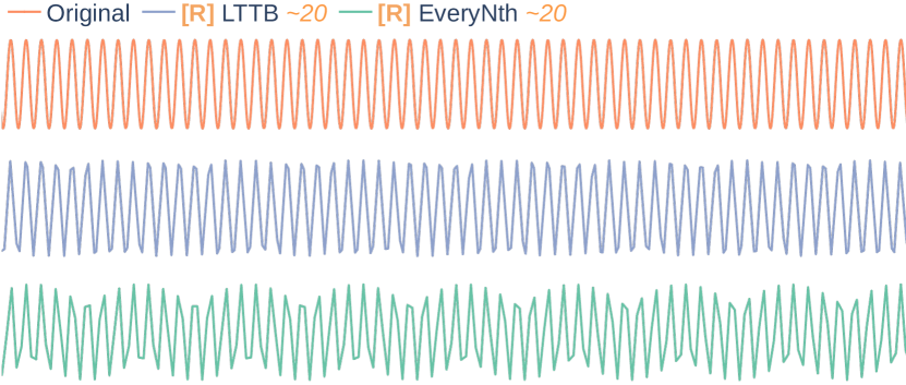
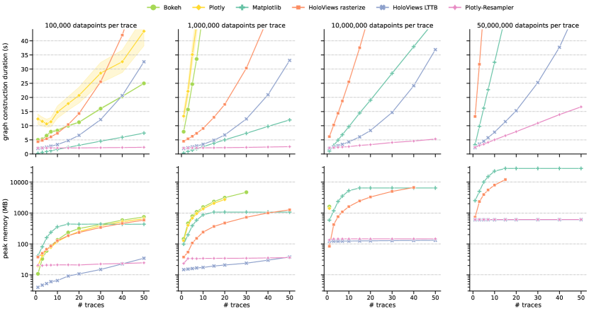
Figure 1 depicts the profiling results. The top charts represent the total time to construct and render the visualization. As expected, the graph construction time increases with the number of data points (i.e., columns) and number of traces (i.e., x-axis), however not all at the same pace. Plotly-Resampler clearly scales better in terms of data points and number of traces. Bokeh and Plotly (without any aggregation functionality) scale the worst, as they are heavily affected by the dataset size. The visualization time of HoloViews-based approaches scales exponentially in terms of the number of visualized traces (i.e., x-axis), rendering them unsuitable for large multivariate visualizations.
The bottom charts indicate the peak memory usage. We observe that both Plotly-Resampler and HoloViews LTTB scale better. These two approaches use less than 700 MB for the largest configuration (right column), whereas Matplotlib and HoloViews rasterize exceed 10 GB.
When dealing with more than 10,000,000 samples per series and more than 10 traces, Plotly-Resampler emerges as the only viable toolkit regarding graph construction time and memory usage.
3.3 Limitations
Data aggregation is a form of resampling, rendering it susceptible to downsampling artifacts, in particular aliasing [16]. Aliasing is more prevalent when a naive aggregation algorithm, such as EveryNth is used (where data points are aggregated by sampling with a fixed interval ). More advanced aggregation methods seem to be less prone to such artifacts. For example, LTTB samples data points in bins with the goal of maximizing the triangular surface of surrounding bins [22]. As an illustration, Figure 2 highlights the influence of the aggregation method on aliasing artifacts. We observe that for the shown region of interest, both methods display artifacts. As expected, EveryNth aggregation (bottom graph) results in a more distorted view than LTTB (middle graph). Plotly-Resampler attempts to minimize the aliasing issue by employing an efficient heuristic of LTTB as default aggregation algorithm and by indicating when data aggregation is performed. This indication is realized by displaying the [R] legend prefix as well as an estimate of the aggregation bin-size as legend suffix.
Plotly-Resampler supports various data types, such as numeric, categorical, and boolean time series data. However, it cannot consider all aspects involved when visualizing time-oriented data, e.g., time-bound text data. Aigner et al. [2] indicated that such different types of time-oriented data can only be visualized with dedicated methods. Hence, we argue that supporting such visualizations is out of scope for this toolkit.
Plotly-Resampler utilizes the pandas.Series [18] data container for storing high-frequency time series. This induces the limitation that all visualized data must fit in memory.
4 Toolkit usage and example use cases
Using Plotly-Resampler requires minimal code overhead. To add aggregation functionality to a Plotly figure, end-users only need to wrap their Plotly figure with the FigureResampler decorator and call show_dash() on that object. A minimal code example as a GitHub gist illustrates this usage [29].
4.1 Use case: sleep staging model analysis
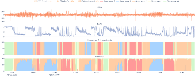
Figure 3 highlights how Plotly-Resampler can be used for sleep (polysomnography) data analysis [4]. Plotly-Resampler allows us to visualize a full night recording of electroencephalography (EEG), and electromyography (EMG) data with a machine learning model its predictions in one graph. From Figure 1 we observe that no other tool is capable of serving the scalability to interactively visualize such large quantities of multivariate data. Plotly-Resampler gives a global overview in which we can see that the model probabilities are well-adjusted. Furthermore, we can obtain insights by zooming in on regions of interest, e.g., mispredictions, sudden changes in the raw data.
5 Conclusion
In this paper, we present Plotly-Resampler, an open source Python package enabling effective time series visualization. An effective visualization toolkit should be (1) interactive, (2) scalable, (3) integrable, and (4) configurable. We observe that no existing Python package meets these four requirements, as there is a consistent trade-off between interactivity and scalability. Plotly-Resampler tackles this trade-off by adding scalability to a toolkit that already meets requirements 1, 3, and 4 (namely Plotly). To achieve this scalability, Plotly-Resampler separates the visualization in a back-end and front-end. The back-end stores all the data, whereas the front-end shows an aggregated view of this data. The interactivity, i.e., dynamic data aggregation, is realized through optimized callbacks between the front-end and back-end.
Benchmarks indicate that Plotly-Resampler significantly outperforms existing alternatives when scaling to large, multivariate datasets. Moreover, we also highlight the applicability and convenience of Plotly-Resampler with a real-world use case.
Plotly-Resampler’s flexible architecture enables it to serve as a platform for researching time series visualization approaches. In particular, it can be used to compare and research data aggregation techniques.
With Plotly-Resampler we aim to contribute a qualitative Python package to the data visualization community. Our goal is to enable effective time series visualization in your day-to-day Python environment.
Acknowledgements.
Jonas Van Der Donckt (1S56322N) and Emiel Deprost (1SA4321N) are funded by a doctoral fellowship of the Research Foundation – Flanders (FWO). Part of this work is done in the scope of the imec.AAA Context-aware health monitoring project. We thank Michael Rademaker for reviewing the manuscript.References
- [1] R. Agrawal, A. Kadadi, X. Dai, and F. Andres. Challenges and opportunities with big data visualization. In Proceedings of the 7th International Conference on Management of computational and collective intElligence in Digital EcoSystems, pages 169–173, Caraguatatuba Brazil, Oct. 2015. ACM.
- [2] W. Aigner, S. Miksch, W. Müller, H. Schumann, and C. Tominski. Visualizing time-oriented data—a systematic view. Computers & Graphics, 31(3):401–409, 2007.
- [3] J. A. Bednar and J. Signell. Common plotting pitfalls that get worse with large data. github.com/holoviz/datashader/examples/user_guide/1_Plotting_Pitfalls.ipynb.
- [4] R. B. Berry, R. Budhiraja, D. J. Gottlieb, D. Gozal, C. Iber, V. K. Kapur, C. L. Marcus, R. Mehra, S. Parthasarathy, S. F. Quan, et al. Rules for scoring respiratory events in sleep: update of the 2007 aasm manual for the scoring of sleep and associated events: deliberations of the sleep apnea definitions task force of the american academy of sleep medicine. Journal of clinical sleep medicine, 8(5):597–619, 2012.
- [5] N. Bikakis. Big Data Visualization Tools, pages 1–6. Springer International Publishing, Cham, 2018.
- [6] M. Cho, B. Kim, H.-J. Bae, and J. Seo. Stroscope: Multi-scale visualization of irregularly measured time-series data. IEEE transactions on visualization and computer graphics, 20(5):808–821, 2014.
- [7] A. Holmes and M. Kellogg. Automating functional tests using selenium. In AGILE 2006 (AGILE’06), pages 6–pp. IEEE, 2006.
- [8] Holoviz-community. Bokeh, interactive data visualization in the browser, from python. https://github.com/bokeh/bokeh.
- [9] Holoviz-community. Datashader, quickly and accurately render even the largest data. https://github.com/holoviz/datashader.
- [10] J. D. Hunter. Matplotlib: A 2d graphics environment. Computing in Science & Engineering, 9(3):90–95, 2007.
- [11] Kaggle-inc. Kaggle’s State of Machine Learning and Data Science 2021.pdf. survey, Oct. 2021.
- [12] W. Keeling. Selenium wire: Extends Selenium’s Python bindings, enabling to inspect requests made by the browser. https://github.com/wkeeling/selenium-wire.
- [13] R. Kincaid. Signallens: Focus+ context applied to electronic time series. IEEE Transactions on Visualization and Computer Graphics, 16(6):900–907, 2010.
- [14] J. Lin, E. Keogh, and S. Lonardi. Visualizing and Discovering Non-Trivial Patterns in Large Time Series Databases. Information Visualization, 4(2):61–82, June 2005. ZSCC: 0000178.
- [15] J. Lin, E. Keogh, S. Lonardi, J. P. Lankford, and D. M. Nystrom. Viztree: a tool for visually mining and monitoring massive time series databases. In Proceedings of the Thirtieth international conference on Very large data bases-Volume 30, pages 1269–1272, 2004.
- [16] M. Mishali and Y. C. Eldar. Sub-nyquist sampling. IEEE Signal Processing Magazine, 28(6):98–124, 2011.
- [17] B. Morrow, T. Manz, A. E. Chung, N. Gehlenborg, and D. Gotz. Periphery plots for contextualizing heterogeneous time-based charts. In 2019 IEEE visualization conference (VIS), pages 1–5. IEEE, 2019.
- [18] T. pandas development team. pandas-dev/pandas: Pandas, Feb. 2020.
- [19] J. M. Perkel. Why jupyter is data scientists’ computational notebook of choice. Nature, 563(7732):145–147, 2018.
- [20] Plotly-community. Plotly, the interactive graphing library for python. https://github.com/plotly/plotly.py.
- [21] B. Shneiderman. The eyes have it: A task by data type taxonomy for information visualizations. In The craft of information visualization, pages 364–371. Elsevier, 2003.
- [22] S. Steinarsson. Downsampling Time Series for Visual Representation. Master’s thesis, University of Iceland, 2013.
- [23] J.-L. R. Stevens, P. Rudiger, and J. A. Bednar. Holoviews: building complex visualizations easily for reproducible science. In Proceedings of the 14th Python in Science Conference, pages 61–69. Citeseer, 2015.
- [24] L. Stopar, P. Skraba, M. Grobelnik, and D. Mladenic. Streamstory: Exploring multivariate time series on multiple scales. IEEE transactions on visualization and computer graphics, 25(4):1788–1802, 2018.
- [25] Sye-Min Chan, Ling Xiao, J. Gerth, and P. Hanrahan. Maintaining interactivity while exploring massive time series. In 2008 IEEE Symposium on Visual Analytics Science and Technology, pages 59–66, Columbus, OH, USA, Oct. 2008. IEEE. ZSCC: 0000087.
- [26] G. Tian. Viztracer: a low-overhead logging, debugging, and profiling tool to trace and visualize Python code execution. https://github.com/wkeeling/selenium-wire, 2020.
- [27] J. Van Der Donckt. Plotly-Resampler benchmark procedure and additional results. https://github.com/predict-idlab/plotly-resampler-benchmarks/tree/6fda4b25f42bb034168f345a97a785562350e2cb/reports.
- [28] J. Van Der Donckt. TraceUpdater: Dash component to update a dcc.Graph its traces via callbacks. https://github.com/predict-idlab/trace-updater.
- [29] J. Van Der Donckt. Plotly-resampler usage example. https://gist.github.com/jonasvdd/828ea56dbfef21e9999392234c38a8af, 2022.
- [30] J. Van Der Donckt and J. Van Der Donckt. Plotly-Resampler benchmark code. https://github.com/predict-idlab/plotly-resampler-benchmarks.
- [31] J. Van Der Donckt, J. Van Der Donckt, E. Deprost, and S. Van Hoecke. tsflex: Flexible time series processing & feature extraction. SoftwareX, 17:100971, 2022.
- [32] J. Veljanoski. Interactive and scalable dashboards with Vaex and Dash, June 2020.
- [33] J. Walker, R. Borgo, and M. W. Jones. Timenotes: a study on effective chart visualization and interaction techniques for time-series data. IEEE transactions on visualization and computer graphics, 22(1):549–558, 2015.
- [34] J. Zhao, F. Chevalier, E. Pietriga, and R. Balakrishnan. Exploratory analysis of time-series with chronolenses. IEEE Transactions on Visualization and Computer Graphics, 17(12):2422–2431, 2011.