longtable
Interactive Exploration of Large Dendrograms with Prototypes
Abstract
Hierarchical clustering is one of the standard methods taught for identifying and exploring the underlying structures that may be present within a data set. Students are shown examples in which the dendrogram, a visual representation of the hierarchical clustering, reveals a clear clustering structure. However, in practice, data analysts today frequently encounter data sets whose large scale undermines the usefulness of the dendrogram as a visualization tool. Densely packed branches obscure structure, and overlapping labels are impossible to read. In this paper we present a new workflow for performing hierarchical clustering via the R package called protoshiny that aims to restore hierarchical clustering to its former role of being an effective and versatile visualization tool. Our proposal leverages interactivity combined with the ability to label internal nodes in a dendrogram with a representative data point (called a prototype). After presenting the workflow, we provide three case studies to demonstrate its utility.
Keywords: hierarchical clustering, interactive graphics, exploratory data analysis, dendrograms, overplotting
1 Introduction
Clustering is one of the principal tools used by data analysts for uncovering the structure present within a data set. Hierarchical clustering is particularly popular since it can reveal multiple scales of groupings at once without forcing the data analyst to commit to a certain number of clusters. Hierarchical clustering has been used successfully in a wide range of application domains, from biology (Ao et al., 2005; Sørlie et al., 2003) to social sciences (Kigerl, 2020; Saint-Arnaud & Bernard, 2003) to document recovery (Zhao et al., 2005; Cutting et al., 2017) and beyond (Studdert-Kennedy & Davenport, 1974).
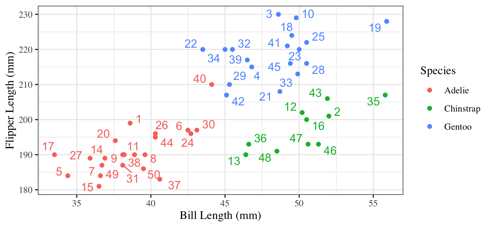
The hierarchical clustering of a data set is represented by a dendrogram, which displays the original observations as leaves of a tree, with interior nodes of the tree corresponding to successive “mergings” of these observations into ever larger clusters. For example, the dendrogram in Figure 1 shows a sample of 50 observations of penguin measurements (Horst et al., 2020). According to the scatterplot showing bill size and flipper size, there appear to be three primary clusters that roughly correspond to the species of penguin. This is supported by the dendrogram presented.
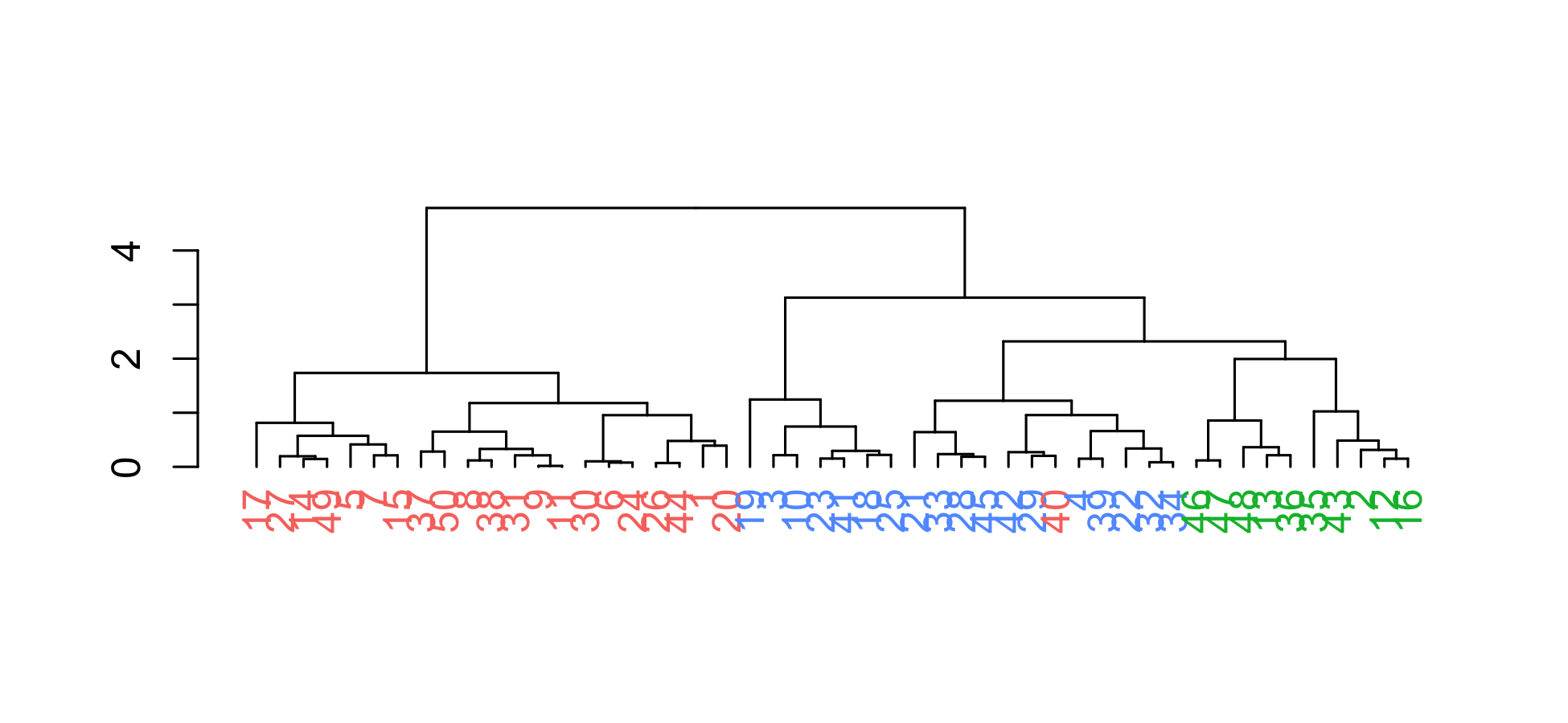
Such is the promise of hierarchical clustering as presented in most statistics classes. Yet, despite the appeal of hierarchical clustering in such examples, its use in real applications can be hampered by practical challenges. First, its usefulness as a visualization tool is severely degraded by increasing data set sizes. The top panel of Figure 2 shows a dendrogram for a hierarchical clustering of about of the most common words from Grolier’s Encyclopedia (Roweis, 2008). In this dendrogram, the branches are more tightly packed, rendering the leaf labels useless due to overlap. This is a known challenge in the visualization literature called overplotting (Swayne et al., 1998), where often the number of elements to be plotted exceeds the number of pixels available to create plots. A number of solutions have been proposed to address this limitation in different plot types, including the introduction of transparency (Cottam et al., 2013), binning, stacking (Dang et al., 2010), and interactivity (Swayne et al., 1998). Second, one must avoid uncritically accepting the structure revealed by a hierarchical clustering since it has been suggested that when no true clustering structure is present in a high-dimensional data set, the dendrogram can still misleadingly indicate structure that is a reflection of the the clustering method rather than the data set (Thrun, 2021). This underscores the importance of being able to inspect dendrograms to understand the reasonableness of the findings based on domain expertise. Both of these practical challenges—the problem of overplotting and the need to carefully probe the recovered structure—can be alleviated by the approach described in this work, which adds interactivity into dendrograms.
While still a developing field, interactive statistical graphics has been a topic of interest since at least the late 1960s (ASA Sections on: Statistical Computing Statistical Graphics, 2018; Friedman & Stuetzle, 2002) and has seen emerging popularity and success in advancing exploratory data analysis (e.g., Tukey et al., 1977; Unwin et al., 1996; Theus & Urbanek, 2008; Young et al., 2011; Su et al., 2017). Recent development of JavaScript frameworks has made it much easier for statisticians to incorporate interactivity into statistical graphics, specifically for the web browser (e.g., Bostock et al., 2011; Sievert, 2018; Chang & Wickham, 2016; Hocking et al., 2017; Satyanarayan et al., 2016). While much of this work has focused on the general interactivity tasks of linking plots, brushing, labeling, and scaling (Swayne & Klinke, 1999), other work has attempted to solve more specific problems through the use of interactive statistical web graphics (e.g., Sievert & Shirley, 2014; Kaplan & Hare, 2019; Kaplan et al., 2017, among others). In this paper we present an example of the latter goal—solving the specific problem of exploring a large dendrogram through the use of interactive statistical web graphics.
The use of interactivity to explore dendrograms has been seen in a limited number of previous works. Seo & Shneiderman (2002) provide a desktop application for exploring dendrograms of gene expression data that allows for interaction with clusters, but does not allow one to explore portions of the dendrogram in isolation, which is necessary to visualize and understand very large dendrograms. Sieger et al. (2017) is a more recent example of an interactive dendrogram available in R that employs the canvas infrastructure to provide interactivity to the user with features and limitations are very similar to Seo & Shneiderman (2002). Conversely, Khan (2018) provides an interactive tree diagram in R that allows for isolating pieces of the tree, but it is not specialized to hierarchical clustering dendrograms and requires the user to manually reformat the clustering object as a tree object. Additionally, this tool does not display the standard dendrogram feature of height, which indicates how far apart two clusters are when they are merged.
Our approach to this problem is built on work by Bien & Tibshirani (2011), who proposed adding the labels of prototypes (i.e., cluster representatives) to the interior nodes of dendrograms and demonstrated through a series of static images how one could in principle use these prototypes to explore a hierarchical clustering in a top-down manner in a process they called “drilling down.” As a demonstration, Figure 6 from their paper (reproduced here as Figure 2) shows several of these static images. The upper panel of the figure shows the full tree from the hierarchical clustering of about of the most common words from Grolier’s Encyclopedia (Roweis, 2008). It is clear that overplotting obfuscates whatever structure might be present in this data. The bottom two portions of the figure show how one can use prototypes to alleviate this problem. On the lower left we see the “upper cut” view of the dendrogram, which is what one gets by only showing the nodes that are above a certain cut height and then replacing any branch that has been cut by a label of the prototype for that branch. Note that without having prototypes assigned to each interior node, there would not be a natural way of removing branches like this. We can “drill down” the tree by examining any of these branches. For example, one of the branches is labeled by the prototype “music,” and on the lower right we see the upper cut of the branch labeled by the “music” label. In this branch, “conductor” is a prototype for two branches that are prototyped by “mahler” and “philharmonic.” When this branch is merged with the branch prototyped by “quartets,” the new prototype becomes “symphony.” Working one’s way down a dendrogram is referred to as “drilling down.” Despite this demonstration and discussion in Bien & Tibshirani (2011), their protoclust package (Bien & Tibshirani, 2017) does not provide the ability to create such images; furthermore, producing a series of static images does not lend itself well to data exploration.
The goal of this present work is to render hierarchical clustering useful again for visualizing and exploring data sets at scales of interest by introducing interaction with the dendrogram into a clustering workflow. Additionally, we provide a tool, which we call protoshiny, that enables this workflow by leveraging three basic ideas beyond the standard hierarchical clustering dendrogram:
-
1)
Use cluster prototypes to summarize branches of a dendrogram.
-
2)
Make dendrograms interactive. Rather than attempting to show an entire dendrogram, allow the data analyst to navigate it interactively through subtrees that can be expanded or contracted.
-
3)
Enable the data analyst to quickly find clusters of interest via search functionality.
The protoshiny R package is a tool for facilitating interactive dendrograms that enable fast finding of interesting clusters with large data sets (2-3) through the use of prototypes (1). While minimax linkage is the most direct way to produce hierarchical clustering with prototypes, protoshiny is designed to more generally accommodate any linkage so long as the user also specifies a choice of prototypes.
In Section 2 we describe protoshiny, an R (R Core Team, 2021) package and interactive dendrogram application. We begin with providing background on hierarchical clustering with prototypes and discuss the particular interactive elements incorporated into protoshiny and comparing the features of protoshiny to three other methods for visualizing a dendrogram. Section 3 presents three case studies of using protoshiny to explore large dendrograms with applications to movie clustering, flow cytometry, and studying patterns of COVID-19 spread across the US. Each case study emphasizes a different strength of protoshiny. We finish with a discussion of the current limitations of the tool, as well as potential directions for expansion in Section 4.
2 Prototypes and Working with Interactivity
2.1 Hierarchical Clustering with Prototypes
Agglomerative hierarchical clustering requires the specification of what is known as a linkage, which describes how one measures the dissimilarity between pairs of clusters. For example, suppose are two disjoint sets of observations and is a measure of dissimilarity between individual observations. One of the most common linkages is complete linkage, which measures the separation between clusters and based on the farthest between-cluster pair of observations:
Minimax linkage (Ao et al., 2005; Bien & Tibshirani, 2011) is a newer linkage that measures cluster separation based on how well the pair of clusters can be summarized by a single observation from one of the two clusters. The key distinguishing property of minimax linkage is that it provides a natural definition of “prototype” for each cluster produced in the hierarchical clustering. A prototype is a representative element of the cluster that is chosen from one of the original observations. Having the prototype be one of the original observations is important for interpretability. For example, in Figure 2, the average of a collection of vectors representing a word is far less useful than a single well-chosen word. In non-hierarchical clustering settings, the k-medoids method is used for this same reason (see, e.g., Hastie et al. (2009)).
To describe minimax linkage, one starts by defining the dissimilarity between an observation and a set:
The minimax radius of a set is then defined as the size of the smallest enclosing “ball” of that is centered at an element of ,
The center of this ball,
is defined as the minimax prototype for the set . Because the minimum is taken specifically over , by definition will always be one of the elements of . If , then all points in are within a dissimilarity of of the prototype . The minimax linkage between and is then defined as
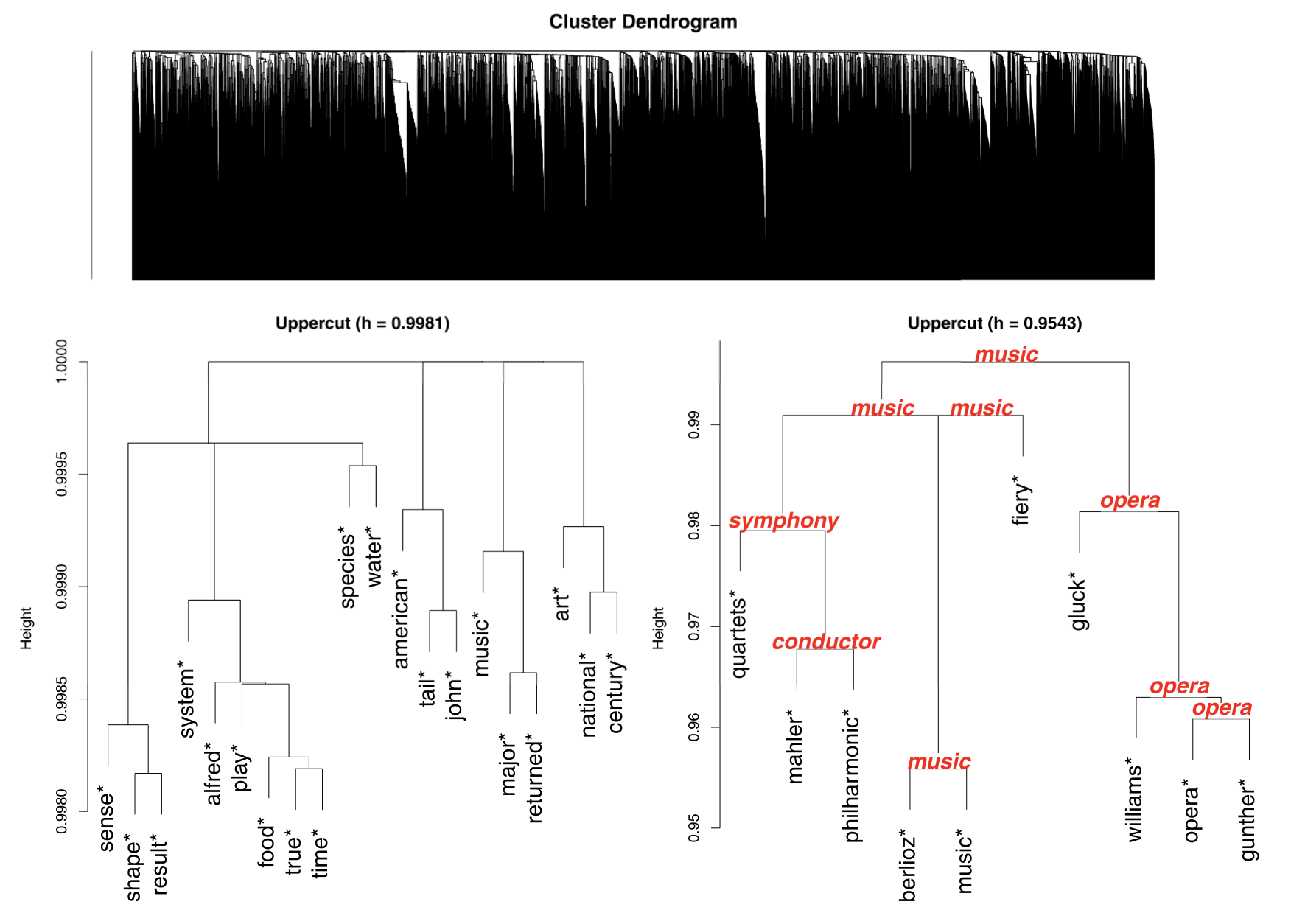
and if clusters and are merged together, the newly formed cluster has prototype . A demonstration of the minimax linkage as used to merge two clusters in the (centered and scaled) Palmer penguins data is given in Figure 3.
Bien & Tibshirani (2011) showed that minimax linkage has a number of desirable properties. For example, suppose one “cuts” a minimax linkage dendrogram at height to produce a set of clusters. In such a case, we are guaranteed that every point in the data set is within a dissimilarity of of its prototype. They also discussed its efficient implementation and described how “ ‘prototype-enhanced’ dendrograms” provide a convenient way of “drilling down” a dendrogram (as we described in the discussion of Figure 2). The key idea is that minimax linkage provides every interior node of a dendrogram with an associated prototype that can be used as a label for summarizing the branch of observations beneath it. This allows one to prune the dendrogram, replacing certain branches of the dendrogram by their prototypes. While Bien & Tibshirani (2011) demonstrated how one might explore a dendrogram in this fashion, a tool for facilitating such a process was not developed.
2.2 Data Exploration with Interactivity
We incorporate three tools of interactivity that allow the data analyst to take full advantage of having a prototype-labeled dendrogram in their analysis of hierarchically clustered data:
-
1)
expansion/contraction (drill down),
-
2)
zooming and panning, and
-
3)
search functionality.
Expansion and contraction of nodes in the dendrogram is key for carrying out the drilling down process described in the discussion of Figure 2. The data analyst can choose which parts of the tree to see in detail and which to hide from view. A potential workflow is as follows. One starts with an upper cut view (analogous to the lower left panel of Figure 2) and uses the visible prototype labels as a high-level summary that suggests where to further explore. The zooming and panning of the dendrogram can be used to focus attention on a particular portion of the dendrogram that may have become crowded due to a large number of expanded elements. In a second potential workflow, the search functionality allows a data analyst to find the first (i.e., highest) instance of a label in the dendrogram. This is useful for quickly locating a cluster with a label that is of interest a priori to the data analyst.
2.3 Additional Details and Usage
The interactive browser-based application protoshiny is built using the Shiny framework (Chang et al., 2017) and the JavaScript library D3 (Bostock et al., 2011). It is an open-source application and available at https://github.com/andeek/protoshiny. In order to use protoshiny, a user can install the R package and launch the application with the following commands:
## install package
install.packages("protoshiny")
## launch application
library(protoshiny)
visualize_hc()
The application is launched in a web browser window, and users can interact with protoshiny by either uploading their own protoclust object (the result of running hierarchical clustering with minimax linkage) or using one of the default test data sets that are pre-loaded. The protoshiny package contains a convenience function (as.protoclust) for converting general clustering objects to protoclust objects with the addition of a user-specified vector of prototypes.
protoshiny is most useful in situations where the labels of clustered objects have interpretable meaning. Here, “label” can be either some text or a thumbnail image. Table 1 provides a comparison of functionality between protoshiny and three other options – two interactive and one static. The inclusion of interactivity, like collapsible nodes, zoom and pan, and search functionality, in combination with labelled branches contribute to the utility of protoshiny when compared to other options. Furthermore, the web-based framework allows for a hosted version to remove any need for a user to install software. Khan (2018) also provide a web-based interactive tree, however this package does not display the tree structure as a dendrogram, thus losing the visual representation of similarity between elements through height of branches. Sieger et al. (2017) provides improvements over a static dendrogram in situations where a heatmap is useful whereas protoshiny is most useful when observation labels are informative (e.g., clustering words, movies, images, counties). In some cases, a dissimilarity is all that can be computed (without observations being points in a space) and in such a situation a heatmap is not even available.
| Functionality | protoshiny | Static Dendrogram | idendr0 (Sieger et al. 2017) | collapsibleTree (Khan 2018) |
| Interactivity | ||||
| Zoom and Pan | ||||
| Tree as Dendrogram | ||||
| Cluster Export | ||||
| Large Data | ||||
| Web-based | ||||
| Labelled Branches | ||||
| Collapsible Nodes | ||||
| Thumbnail Images | ||||
| Search | ||||
| Heatmap | ||||
| Linked Brushing |
3 Case Studies
We now demonstrate the workflow through three case studies. These examples highlight various features of the protoshiny tool and convey how they can lead to greater insight into a data set.
3.1 Movies
In this section, we explore a hierarchical clustering of 13,816 movies. We use the MovieLens 25M Data set (Harper & Konstan, 2015), which is based on users’ ratings and taggings of movies. Vig et al. (2012) show how movies can be embedded in a vector space in which each dimension gives the relevance score of this movie to a particular tag. In the data we use, there are 1,128 such tags. Each movie is represented by a 1,128-dimensional vector of relevance scores. For example, the five tags with the highest relevance scores for the 1993 movie Groundhog Day are time loop, comedy, original, imdb top 250, and small town.
Given this embedding, we perform hierarchical clustering with minimax linkage and dissimilarities given by one minus the correlation between the movies’ relevance score vectors. An example of creating and saving a protoclust object for this clustering is provided below. In the following code snippet, D represents a matrix of the dissimilarities between movie vector embeddings. After the cluster object is created, the protoshiny application can be launched to visually explore the results.
library(protoclust) # clustering with minimax linkage
## perform clustering on a distance matrix D
hc <- protoclust(D)
## save object in known location
save(hc, file = "directory/hc.Rdata")
Once the data is loaded into the application via the interface, the user can choose for prototype labels to be either text (in which case labels come from the row names of D) or thumbnail images. A screen capture of the option specification tab of the application is shown in Figure 4. For the movie example, we will select text labels. There are also two choices for the initial state of the dendrogram. The default is to show the top 10 nodes. A second option, called “Dynamic Cut” is also included. In traditional usage, hierarchical clustering yields a choice of different clusterings, one clustering for each step of the algorithm. Each interior node of a dendrogram represents the merging of a pair of clusters, and the height of that node has meaning—-the height of the interior node corresponding to the merging of clusters and is given by , where is the particular linkage being used. Traditionally, to get a particular clustering, one “cuts” the dendrogram at a chosen height , returning the clustering given by the branches resulting from the cut.
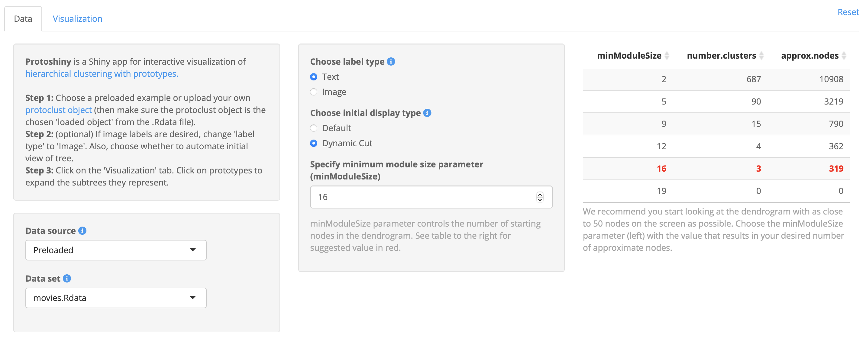
Langfelder et al. (2007) introduce an alternative to the fixed height cutting method for dendrograms that is intended to have improved performance on complex dendrograms, called “Dynamic Cut.” The proposed dynamic method is an adaptive approach that starts with a fixed height cut and then iteratively splits and combines clusters until the number of clusters becomes stable. The joining heights of the initial clusters are used to detect sub-cluster structure via a run-based calibration procedure. If sub-cluster structure is detected, this cluster is split. Clusters are merged when their membership becomes too small. The idea being that dynamic tree cutting may produce a more suitable starting view of the dendrogram in an automated fashion. We have incorporated the dynamic tree cutting methods in protoshiny by using the R package dynamicTreeCut (Langfelder et al., 2016). In protoshiny, the user has the ability to specify the minimum size of the final clusters resulting from dynamicTreeCut, which directly affects the number of nodes seen in the initial view of the dendrogram. For visualization, we recommend choosing a minimum size parameter that results in approximately 50 nodes to be displayed, however this choice can be manually adjusted by the user.
Once all options have been set, the data analyst can view and interact with the dendrogram by clicking the “Visualization” tab in the application. At this point an initial dendrogram will be displayed and the data analyst can interact with the dendrogram in the three ways described in Section 2.2: by clicking on nodes to expand/contract them; by zooming and panning to particular portions of the dendrogram using the scroll or click and drag functionality of the analyst’s mouse; and lastly, by use of the search bar to reveal the first instance of a particular prototype label. Prototype labels will be shown on each branch of the dendrogram only when they differ from the parent branch prototype.
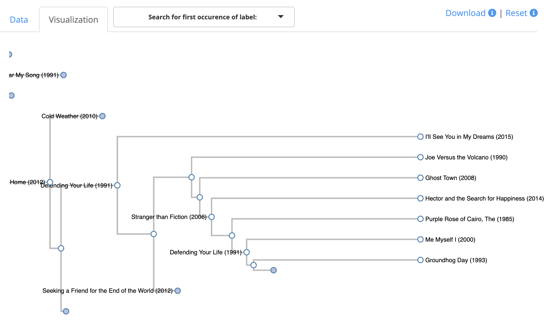
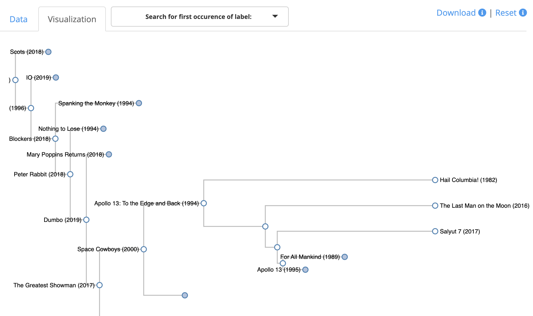
The left side of Figure 5 shows the result of using the search feature to find Groundhog Day in the dendrogram. We see that its lowest prototypes in the tree are Defending Your Life and Stranger than Fiction. These movies are natural choices as prototypes for Groundhog Day since they all are a combination of comedy, drama, and fantasy. The search feature finds the highest occurrence in the dendrogram of a movie. In the case of Groundhog Day, it is not a prototype for any movie and therefore the search revealed the movie as a leaf in the dendrogram, which is the highest occurrence of this movie in the dendrogram. However, the right side of Figure 5 shows that when we search for the 1995 movie Apollo 13, this movie is a prototype for a branch of the tree, hence it shows up higher in the dendrogram. Expanding this branch of the tree reveals that it is a prototype for four historical space-related movies. The search feature returns only the highest occurrence of a label in the dendrogram. For example, if the branch shown for Apollo 13 contained a child branch for which Apollo 13 was also a prototype, it would not be displayed initially.
3.2 Flow Cytometry in the Ocean
To study the time-changing biogeography of phytoplankton, oceanographers have developed the ability to perform continuous-time flow cytometry measurements on a ship as it travels through the ocean (Swalwell et al., 2011). The output is a sequence of three-dimensional scatterplots, in which points represent individual cells and a point’s location in the scatterplot describes three optical properties of that cell. In this section, we use protoshiny to explore the data collected from a cruise in the North Pacific over a two-week period in Spring 2016 (Ribalet et al., 2019). The data set includes 6,336 scatterplots (referred to as cytograms), each representing the cells measured during a three-minute time interval. We note that clustering is commonly used to distinguish different cell types within a cytogram; however, in this oceanographic setting, the goal is to understand the variability in cytograms across different time points. Thus, we take as input in this example a 6,336-by-6,336 dissimilarity matrix that was computed by Cape et al. (2020) based on the earth mover’s distance (Rubner et al. (2000)) between cytograms, using an approach similar to what was proposed in Orlova et al. (2016). Earth mover’s distance, which is also known as Wasserstein’s distance, is a common approach to measuring the distance between two distributions. It imagines these distributions as physical mounds of dirt and measures the distance between these in terms of the minimum amount of dirt-moving needed to transform one into the other. In this example, histogram-approximations of the scatterplots are taken as the distributions on which earth mover’s distance is computed.
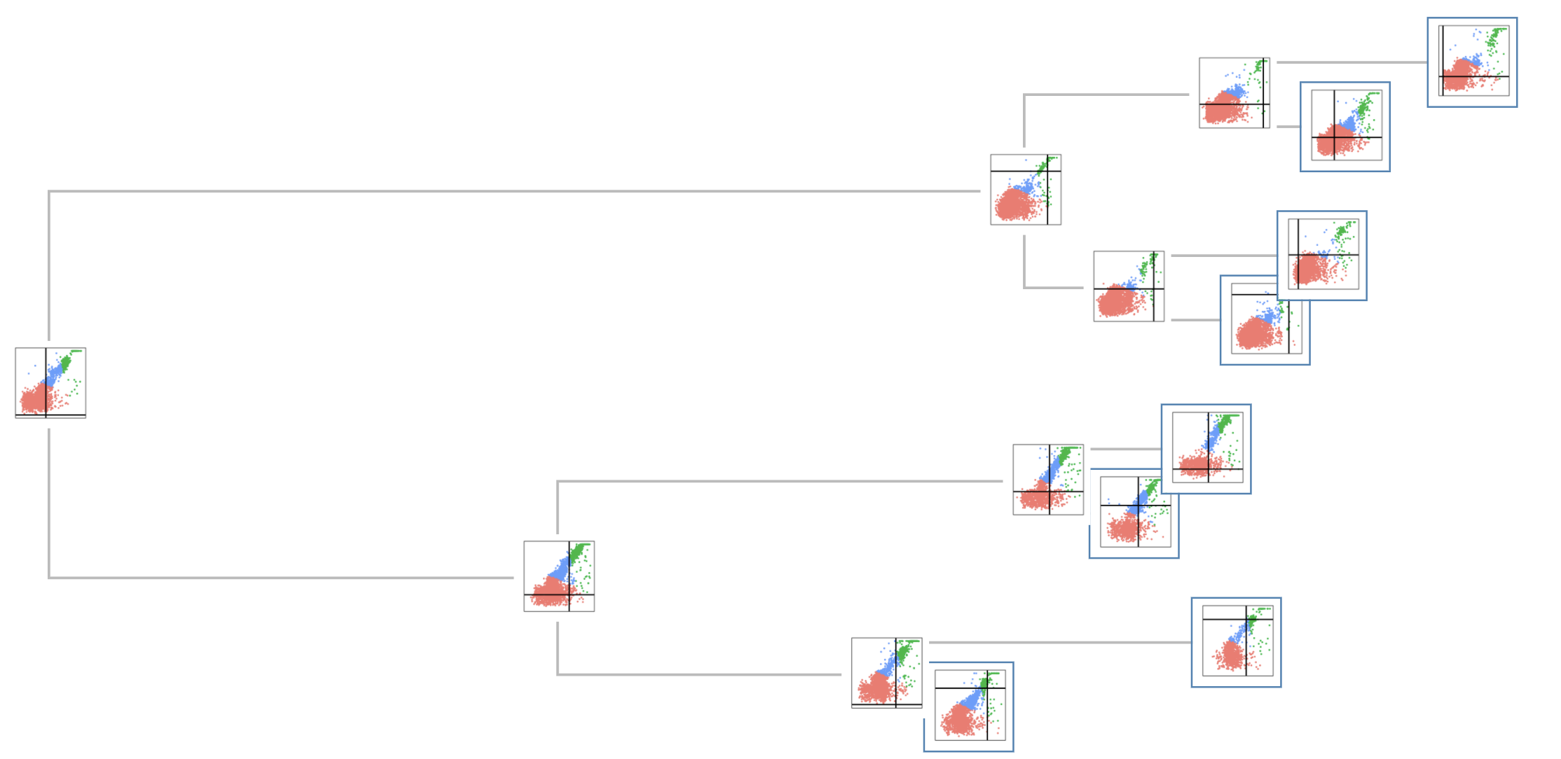
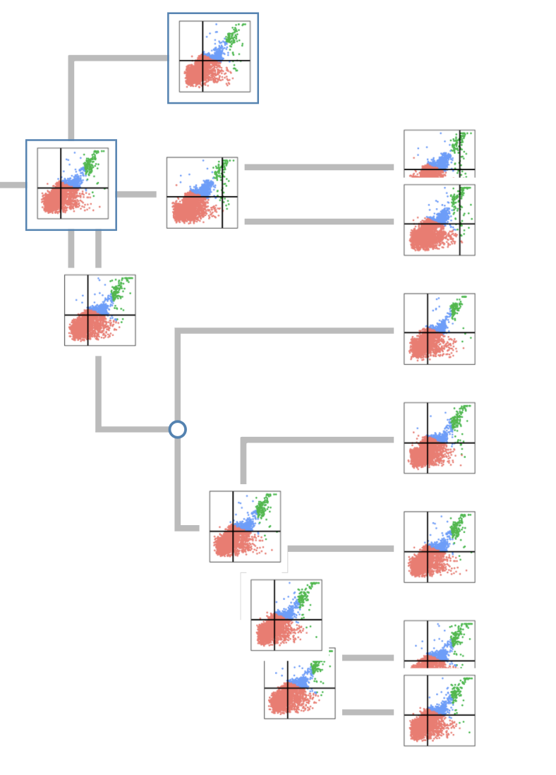
Figure 6 shows two screenshots of using protoshiny to explore the dendrogram. In this example, every cytogram is visually labeled by a thumbnail image (showing a two-dimensional projection of the cytogram), and a text label giving the timestamp of the sample shows up on mouseover as a tooltip (not shown in figure). The color of the points corresponds to a crude division (or “gating”) of the cells into three broad classes of cells. The position of the vertical line represents the date of the measurement (from 2016-04-20 on the far left to 2016-05-04 on the far right), and the position of the horizontal line represents the time of day (from midnight on the bottom to 11:59pm on the top). In the left panel of Figure 6, one can discern in the three main branches of the dendrogram subtle differences in the point cloud structure, providing a convenient, uncluttered high-level summary of over 6,000 cytograms. Unsurprisingly, exploration of the dendrogram reveals that cytograms whose date-timestamps are close together tend to be clustered together. However, the right panel of Figure 6 shows an exception. From comparing vertical bars in this branch, we observe two cytograms from late in the cruise (2016-05-01) within a branch that otherwise contains cytograms from a single day earlier in the cruise (2016-04-24). Interestingly, the horizontal bar reveals that all cytograms from this branch (across both days) are from the same time of day (10am–11am). Further investigation reveals that the ship was in a very similar latitude at these two dates. The cruise spanned over 16∘ of latitude in total while the cytograms in this branch were all within 1.5∘ of each other.
The protoshiny package has now been integrated into the SeaFlow data curation pipeline (Ribalet & Hynes, 2020). In particular, it is used to rapidly check the consistency and correctness of the cell population gating for cytograms by expanding prototype nodes to examine clusters of similar cytograms.
3.3 COVID-19
As of April 15, 2022, there have been 503,025,210 confirmed COVID-19 cases and 6,194,288 related deaths recorded worldwide, with 80,576,205 confirmed cases and 988,161 deaths being attributed to the United States (Johns Hopkins University & Medicine, 2022). A positive relationship between human mobility and the spread of the COVID-19 virus has been observed by multiple authors (Kraemer et al., 2020; Badr et al., 2020; Engle et al., 2020). Additionally, there is evidence that COVID-19 has been spread through the air conditioning systems in restaurants (Lu et al., 2020). We are interested in investigating the mobility patterns in counties in the US, with an additional focus of how this relates to the spread of COVID-19 through the use of hierarchical clustering. We will consider the following three questions:
-
1)
Can we cluster US counties by residents’ behaviors—i.e., home mobility and restaurant mobility?
-
2)
Are there any interesting patterns that emerge from a clustering of US counties by residents’ behaviors?
-
3)
Do those clustered US counties have similar trajectories of COVID cases?
To address these three questions, we use minimax linkage (as detailed in Section 2.1) to obtain a dendrogram with prototypes and then use protoshiny to inspect the clusters for interesting patterns. We use protoshiny’s image labels to address the second question, and the application’s ability to quickly change image labels to address the third question within a single session of protoshiny.
We use two data sources to perform this analysis—mobility data and case numbers. The mobility data come from SafeGraph (2021) via the covidcast R package (Bien et al., 2021). We pull two mobility metrics from this data source—the fraction of mobile devices that did not leave the immediate area of their home in each day per 100,000 population (home mobility) and the number of daily visits made by those with SafeGraph’s apps to restaurants in a certain region per 100,000 population (restaurant mobility). These two mobility metrics are aggregated by county in the US by the CMU Delphi research group as described in their documentation (CMU Delphi Research Group, 2020), and we have pulled data from August 1, 2020 to Jan 15, 2021. The top of Figure 7 shows the mobility data for one such county—Larimer County, CO—for the time period discussed. While the home mobility measure has a slight increase over the winter months, there is a clear drop in the restaurant mobility over the same time period. This can be explained by three potential factors: (1) an increase in restrictions on restaurants limiting indoor dining in the county that began on November 24, 2020 (O’Donnell, 2020), (2) lower temperatures making outdoor dining less pleasant, and (3) the suspension of on-campus learning at Colorado State University on November 30, 2020 (Colorado State University, 2020). It is of note that indoor dining had an increase in Larimer County in late December, which preceded the loosening of restrictions to allow for indoor dining on January 4, 2021 (Larimer County, 2021) and may correspond to the return of students to the county.
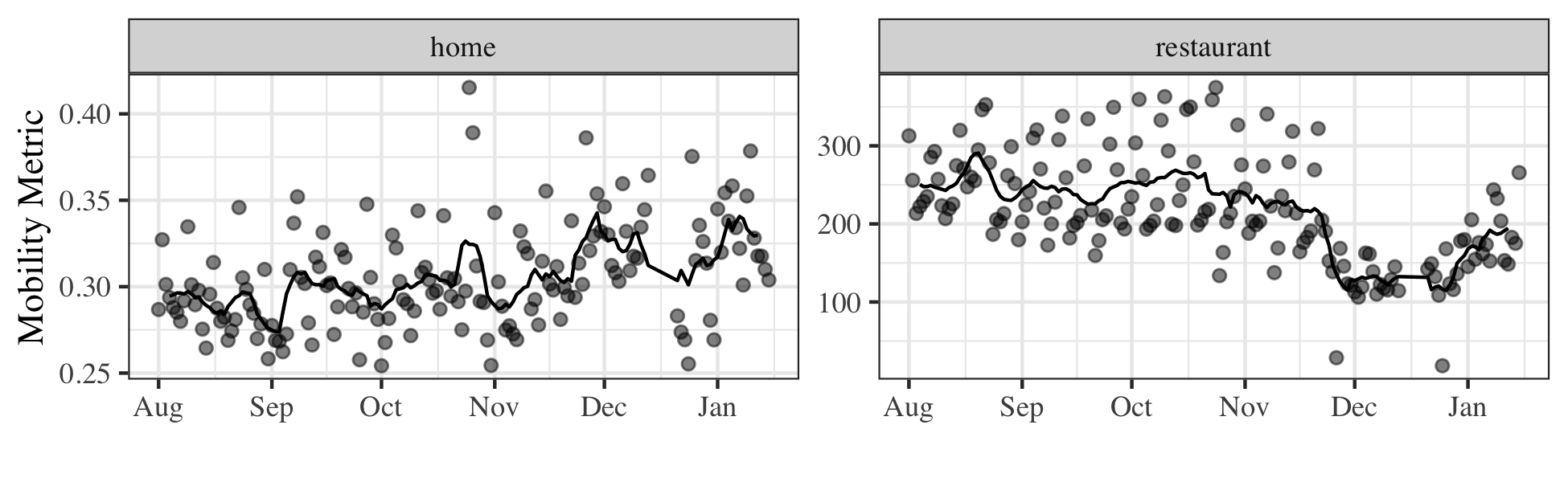
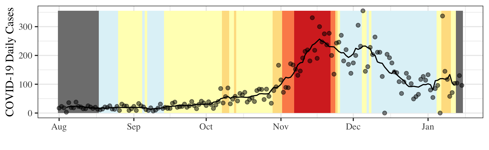
In addition to clustering counties by mobility, we will also look at the COVID-19 case numbers over time in each county. By looking at case numbers clustered by mobility trends, we can hope to gain some insight into the relationship between them and address our third question. The case numbers data is pulled from The New York Times, based on reports from state and local health agencies (The New York Times, 2021). The bottom of Figure 7 shows the case numbers for Larimer County, CO for the same date range (August 1, 2020 to Jan 15, 2021). There is a large spike in cases during the month of November, corresponding to the weeks prior to the stricter county regulations.
In order to cluster the US counties by mobility, we create a dissimilarity matrix consisting of one minus the correlation of the vectorized mobility data between counties after centering and scaling the individual features, where the “vectorized” mobility data refers to stacking the two sets of metrics on top of one another to create a vector of points. To avoid issues with missing data values, we have removed counties that do not have complete mobility data. This results in 2,428 counties to be clustered. Figure 8 shows the initial overview of this clustering as seen within protoshiny. The thumbnails are scatterplots of the two mobility metrics colored by region as defined by the 2010 U.S. Census (U.S. Census Bureau, 2010) with the increasing intensity of color to indicate time. Of the thumbnails displayed in the initial screenshot of Figure 8, gray indicates U.S. territories, pink indicates counties in the Midwest region, orange indicates counties in the South region, purple indicates counties in the Northeast region, and teal indicates counties in the West region.
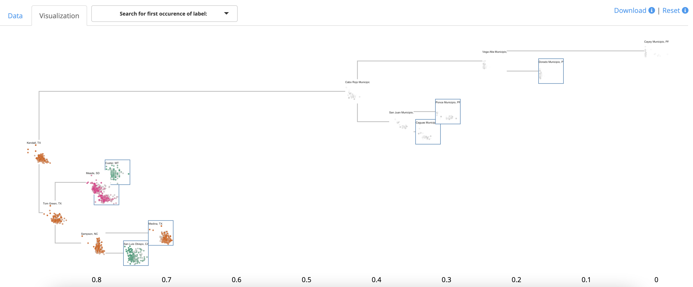
It is straightforward to drill down to the first instance of Larimer County, CO, as seen in the top of Figure 9 by using the search functionality. Interestingly, Larimer County is a prototype for the neighboring Weld County, CO. From this detailed view in protoshiny, we are able to see clear geographic clusters have occurred even though geography was not included in the dissimilarity matrix. Specifically, all of the counties colored in green are in the west region of the US, and, further, they are all Colorado counties. This indicates there are geographic patterns in mobility and distancing behavior, specifically with regards to staying home and going to restaurants. This is not unexpected due to the state-wide policies that have or have not been put in place in each state at different times.
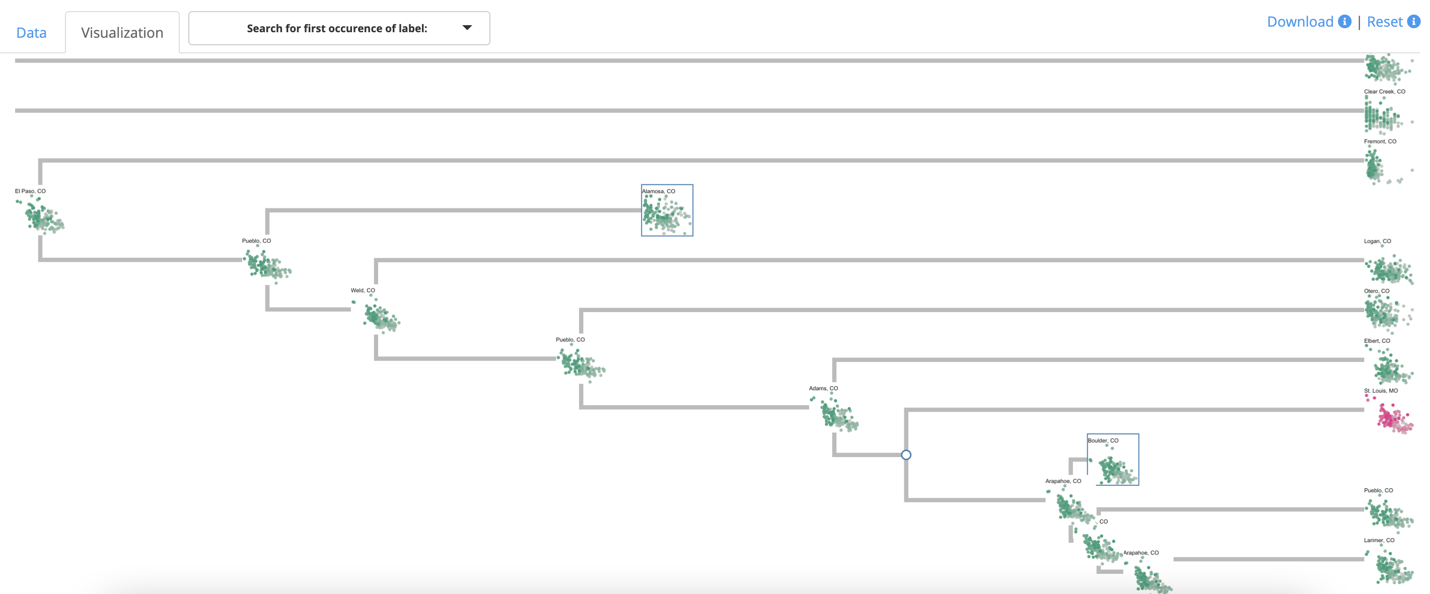
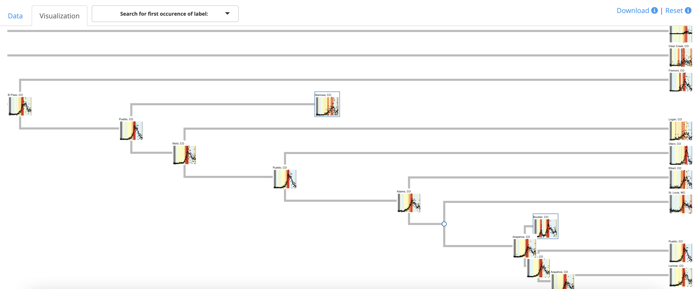
By changing the labels in protoshiny to scatterplots of COVID-19 cases per day without altering the dissimilarity matrix used for clustering (see bottom of Figure 9), we can explore possible connections between mobility and the COVID-19 case numbers in these counties. In this instance, we have updated the image labels for each prototype without changing the underlying clustering. From this view, the clustered Colorado counties appear to all have a similar pattern, with a large spike in November. The exception to this is Boulder County, which is shown as a prototype for a different cluster than Larimer County containing Boulder and Denver counties. This suggests that the mobility and distancing behavior in Boulder is slightly different than Larimer, which is captured by the clustering based on mobility and distancing, and might explain a portion of the difference in case numbers. This illustrates that a data analyst can change the thumbnails in protoshiny without having to reload the dendrogram, which allows this change to be quickly accomplished for the same clustering object and can lead to further insights into the data.
4 Discussion
In this paper, we have presented a workflow and accompanying tool that renders dendrograms from hierarchical clustering useful for exploring data sets at scales of interest. The approach combines interactivity with the idea of using prototypes to summarize branches of a dendrogram. The result is a novel way to gain insight from hierarchical clustering on more realistically sized data sets. We have also presented three case studies to highlight the multiple strengths of the approach in diverse domains.
In addition to the functionality presented in this paper, protoshiny also features the ability to save and download the resulting clusters that result from a session. It is also possible to load a clustering resulting from a previously saved session in protoshiny back into the tool and display the dendrogram with expanded and contracted branches exactly as before. This is a step towards more reproducible analyses resulting from an interactive online application. The ability to export the current clusters allows for more natural integration of protoshiny into users’ current analysis workflows. A related direction for future work will be to add more features to the R API for fast loading of clustering objects and labels into the browser tool.
While protoshiny does expand on the utility of dendrograms for larger data sets, a current limitation of the tool is extreme scalability. One can imagine a massive dendrogram that would not even be loadable into the tool due to the framework in place. Currently, the entire tree is loaded from the server side into the client side of the application at one time and different branches are hidden or shown to the user in their browser via clicks. In the case of a massive tree, it may make sense to only load relevant parts of the tree as a user clicks through and expands branches. While it is entirely possible to shift the framework of protoshiny, a limitation remains in that the clustering must first be calculated on the entire data set. Currently the authors have loaded data sets of size about observations with no issue. Nonetheless, even in its current form protoshiny provides new capabilities for practitioners to explore their data sets in a way that previously was not possible.
Acknowledgments
This work was supported by grants by the Simons Collaboration on Computational Biogeochemical Modeling of Marine Ecosystems/CBIOMES (Grant ID: 549939 to JB) and NSF CAREER Award DMS-1653017. The authors would like to thank Mattias Rolf Cape and François Ribalet for providing the flow cytometry dissimilarity matrix, as well as Annette Hynes and François Ribalet for information on how protoshiny has been used in the SeaFlow data curation process.
Supplementary Material
The supplementary material contains comparisons to other tools for producing static and interactive dendrograms. Additionally, images used as labels for all examples in the paper and code for producing the clusters are available at https://github.com/andeek/protoshiny-code. All R data objects used for exploration within protoshiny are available within the package, which is available on CRAN.
Disclosure Statement
The authors report there are no competing interests to declare.
References
- (1)
- Ao et al. (2005) Ao, S. I., Yip, K., Ng, M., Cheung, D., Fong, P.-Y., Melhado, I. & Sham, P. C. (2005), ‘Clustag: hierarchical clustering and graph methods for selecting tag snps’, Bioinformatics 21(8), 1735–1736.
- ASA Sections on: Statistical Computing Statistical Graphics (2018) ASA Sections on: Statistical Computing Statistical Graphics (2018), ‘ASA Sections on: Statistical Computing Statistical Graphics Video Library’, http://stat-graphics.org/movies/. Accessed: 2018-09-26.
- Badr et al. (2020) Badr, H. S., Du, H., Marshall, M., Dong, E., Squire, M. M. & Gardner, L. M. (2020), ‘Association between mobility patterns and covid-19 transmission in the usa: a mathematical modelling study’, The Lancet Infectious Diseases 20(11), 1247–1254.
- Bien et al. (2021) Bien, J., Brooks, L., Farrow, D., Reinhart, A. & Tibshirani, R. (2021), covidcast: Client for Delphi’s COVIDcast API. https://cmu-delphi.github.io/covidcast/covidcastR/, https://github.com/cmu-delphi/covidcast.
- Bien & Tibshirani (2011) Bien, J. & Tibshirani, R. (2011), ‘Hierarchical clustering with prototypes via minimax linkage’, Journal of the American Statistical Association 106(495), 1075–1084.
- Bien & Tibshirani (2017) Bien, J. & Tibshirani, R. (2017), protoclust: Hierarchical Clustering with Prototypes. R package version 1.6.1.
-
Bostock et al. (2011)
Bostock, M., Ogievetsky, V. & Heer, J. (2011), ‘D3 data-driven documents’, IEEE Transactions on
Visualization and Computer Graphics 17(12), 2301–2309.
http://dx.doi.org/10.1109/TVCG.2011.185 -
Cape et al. (2020)
Cape, M. R., Ribalet, F., Bien, J., Hyun, S. & Armbrust, E. V.
(2020), Ob14f-0437 - determining ecological
provinces from optical cytometric data in the north pacific ocean, in
‘Ocean Sciences Meeting’, San Diego, CA.
https://agu.confex.com/agu/osm20/meetingapp.cgi/Paper/657891 -
Chang et al. (2017)
Chang, W., Cheng, J., Allaire, J., Xie, Y. & McPherson, J.
(2017), shiny: Web Application
Framework for R.
R package version 1.0.5.
https://CRAN.R-project.org/package=shiny -
Chang & Wickham (2016)
Chang, W. & Wickham, H. (2016),
ggvis: Interactive Grammar of Graphics.
R package version 0.4.3.
https://CRAN.R-project.org/package=ggvis - CMU Delphi Research Group (2020) CMU Delphi Research Group (2020), ‘Delphi Epidata API SafeGraph’, https://cmu-delphi.github.io/delphi-epidata/api/covidcast-signals/safegraph.html. Accessed: 2021-04-13.
- Colorado State University (2020) Colorado State University (2020), ‘Fall 2020 Framework’, https://covid.colostate.edu/kb/fall-2020-framework/. Accessed: 2021-03-02.
- Cottam et al. (2013) Cottam, J., Lumsdaine, A. & Wang, P. (2013), Overplotting: Unified solutions under abstract rendering, in ‘2013 IEEE International Conference on Big Data’, IEEE, pp. 9–16.
- Cutting et al. (2017) Cutting, D. R., Karger, D. R., Pedersen, J. O. & Tukey, J. W. (2017), Scatter/gather: A cluster-based approach to browsing large document collections, in ‘ACM SIGIR Forum’, Vol. 51, ACM New York, NY, USA, pp. 148–159.
- Dang et al. (2010) Dang, T. N., Wilkinson, L. & Anand, A. (2010), ‘Stacking graphic elements to avoid over-plotting’, IEEE Transactions on Visualization and Computer Graphics 16(6), 1044–1052.
- Engle et al. (2020) Engle, S., Stromme, J. & Zhou, A. (2020), ‘Staying at home: mobility effects of covid-19’, Available at SSRN .
- Friedman & Stuetzle (2002) Friedman, J. H. & Stuetzle, W. (2002), ‘John w. tukey’s work on interactive graphics’, The Annals of Statistics 30(6), 1629–1639.
- Harper & Konstan (2015) Harper, F. M. & Konstan, J. A. (2015), ‘The movielens datasets: History and context’, Acm transactions on interactive intelligent systems (tiis) 5(4), 1–19.
- Hastie et al. (2009) Hastie, T., Tibshirani, R., Friedman, J. H. & Friedman, J. H. (2009), The elements of statistical learning: data mining, inference, and prediction, Vol. 2, Springer.
-
Hocking et al. (2017)
Hocking, T. D., VanderPlas, S., Sievert, C., Ferris, K., Tsai, T. & Khan, F. (2017), animint: Interactive
animations.
R package version 2017.01.04.
https://github.com/tdhock/animint -
Horst et al. (2020)
Horst, A. M., Hill, A. P. & Gorman, K. B. (2020), palmerpenguins: Palmer Archipelago (Antarctica)
penguin data.
R package version 0.1.0.
https://allisonhorst.github.io/palmerpenguins/ - Johns Hopkins University & Medicine (2022) Johns Hopkins University & Medicine (2022), ‘Coronavirus Resource Center’, https://coronavirus.jhu.edu. Accessed: 2022-04-15.
- Kaplan et al. (2017) Kaplan, A., Hofmann, H. & Nordman, D. (2017), ‘An interactive graphical method for community detection in network data’, Computational Statistics 32(2), 535–557.
- Kaplan & Hare (2019) Kaplan, A. J. & Hare, E. R. (2019), ‘Putting down roots: a graphical exploration of community attachment’, Computational Statistics 34(4), 1449–1464.
-
Khan (2018)
Khan, A. (2018), collapsibleTree:
Interactive Collapsible Tree Diagrams using ‘D3.js’.
R package version 0.1.7.
https://CRAN.R-project.org/package=collapsibleTree - Kigerl (2020) Kigerl, A. (2020), ‘Behind the scenes of the underworld: hierarchical clustering of two leaked carding forum databases’, Social Science Computer Review p. 0894439320924735.
- Kraemer et al. (2020) Kraemer, M. U., Yang, C.-H., Gutierrez, B., Wu, C.-H., Klein, B., Pigott, D. M., Du Plessis, L., Faria, N. R., Li, R., Hanage, W. P. et al. (2020), ‘The effect of human mobility and control measures on the covid-19 epidemic in china’, Science 368(6490), 493–497.
- Langfelder et al. (2007) Langfelder, P., Zhang, B. & Horvath, S. (2007), ‘Defining clusters from a hierarchical cluster tree: the Dynamic Tree Cut package for R’, Bioinformatics 24(5), 719–720.
-
Langfelder et al. (2016)
Langfelder, P., Zhang, B. & Horvath, S. (2016), dynamicTreeCut: Methods for Detection of
Clusters in Hierarchical Clustering Dendrograms.
R package version 1.63-1.
https://CRAN.R-project.org/package=dynamicTreeCut - Larimer County (2021) Larimer County (2021), ‘Safer at Home Level Orange’, https://www.larimer.org/health/communicable-disease/coronavirus-covid-19/safer-at-home. Accessed: 2021-02-08.
- Lu et al. (2020) Lu, J., Gu, J., Li, K., Xu, C., Su, W., Lai, Z., Zhou, D., Yu, C., Xu, B. & Yang, Z. (2020), ‘Covid-19 outbreak associated with air conditioning in restaurant, guangzhou, china, 2020’, Emerging infectious diseases 26(7), 1628.
- O’Donnell (2020) O’Donnell, K. (2020), ‘Larimer County to Move to Safer at Home Level Red of Colorado’s Dial’, https://www.larimer.org/spotlights/2020/11/20/larimer-county-move-safer-home-level-red-colorado-s-dial. Accessed: 2021-01-25.
- Orlova et al. (2016) Orlova, D. Y., Zimmerman, N., Meehan, S., Meehan, C., Waters, J., Ghosn, E. E., Filatenkov, A., Kolyagin, G. A., Gernez, Y., Tsuda, S., Moore, W., Moss, R. B., Herzenberg, L. A. & Walther, G. (2016), ‘Earth mover’s distance (emd): a true metric for comparing biomarker expression levels in cell populations’, PloS one 11(3), e0151859.
-
R Core Team (2021)
R Core Team (2021), R: A Language and
Environment for Statistical Computing, R Foundation for Statistical
Computing, Vienna, Austria.
https://www.R-project.org/ - Ribalet et al. (2019) Ribalet, F., Berthiaume, C., Hynes, A., Swalwell, J., Carlson, M., Clayton, S., Hennon, G., Poirier, C., Shimabukuro, E., White, A. & Armbrust, E. V. (2019), ‘Seaflow data v1, high-resolution abundance, size and biomass of small phytoplankton in the north pacific’, Scientific data 6(1), 1–8.
- Ribalet & Hynes (2020) Ribalet, F. & Hynes, A. (2020), Personal Communication. Received: August 12, 2020.
- Roweis (2008) Roweis, S. (2008), ‘Data for MATLAB Hackers’, https://cs.nyu.edu/~roweis/data.html. Accessed: 2021-02-16.
- Rubner et al. (2000) Rubner, Y., Tomasi, C. & Guibas, L. J. (2000), ‘The earth mover’s distance as a metric for image retrieval’, International journal of computer vision 40(2), 99–121.
- SafeGraph (2021) SafeGraph (2021), https://www.safegraph.com. Accessed: 2021-01-25.
- Saint-Arnaud & Bernard (2003) Saint-Arnaud, S. & Bernard, P. (2003), ‘Convergence or resilience? a hierarchical cluster analysis of the welfare regimes in advanced countries’, Current sociology 51(5), 499–527.
- Satyanarayan et al. (2016) Satyanarayan, A., Moritz, D., Wongsuphasawat, K. & Heer, J. (2016), ‘Vega-lite: A grammar of interactive graphics’, IEEE transactions on visualization and computer graphics 23(1), 341–350.
- Seo & Shneiderman (2002) Seo, J. & Shneiderman, B. (2002), ‘Interactively exploring hierarchical clustering results [gene identification]’, Computer 35(7), 80–86.
- Sieger et al. (2017) Sieger, T., Hurley, C. B., Fišer, K. & Beleites, C. (2017), ‘Interactive dendrograms: The r packages idendro and idendr0’, Journal of Statistical Software, Articles 76(10), 1–22.
-
Sievert (2018)
Sievert, C. (2018), plotly for R.
https://plotly-book.cpsievert.me - Sievert & Shirley (2014) Sievert, C. & Shirley, K. (2014), Ldavis: A method for visualizing and interpreting topics, in ‘Proceedings of the workshop on interactive language learning, visualization, and interfaces’, pp. 63–70.
- Sørlie et al. (2003) Sørlie, T., Tibshirani, R., Parker, J., Hastie, T., Marron, J. S., Nobel, A., Deng, S., Johnsen, H., Pesich, R., Geisler, S. et al. (2003), ‘Repeated observation of breast tumor subtypes in independent gene expression data sets’, Proceedings of the national academy of sciences 100(14), 8418–8423.
- Studdert-Kennedy & Davenport (1974) Studdert-Kennedy, W. G. & Davenport, M. (1974), ‘The balance of roger de piles: a statistical analysis’, The Journal of Aesthetics and Art Criticism 32(4), 493–502.
- Su et al. (2017) Su, S., Law, C. W., Ah-Cann, C., Asselin-Labat, M.-L., Blewitt, M. E. & Ritchie, M. E. (2017), ‘Glimma: interactive graphics for gene expression analysis’, Bioinformatics 33(13), 2050–2052.
- Swalwell et al. (2011) Swalwell, J. E., Ribalet, F. & Armbrust, E. V. (2011), ‘Seaflow: A novel underway flow-cytometer for continuous observations of phytoplankton in the ocean’, Limnology and Oceanography: Methods 9(10), 466–477.
- Swayne et al. (1998) Swayne, D. F., Cook, D. & Buja, A. (1998), ‘Xgobi: Interactive dynamic data visualization in the x window system’, Journal of computational and Graphical Statistics 7(1), 113–130.
- Swayne & Klinke (1999) Swayne, D. F. & Klinke, S. (1999), ‘Introduction to the special issue on interactive graphical data analysis: What is interaction?’, Computational Statistics 14(1), 1–6.
- The New York Times (2021) The New York Times (2021), ‘Coronavirus (Covid-19) Data in the United States’, https://github.com/nytimes/covid-19-data. Accessed: 2021-01-15.
- Theus & Urbanek (2008) Theus, M. & Urbanek, S. (2008), Interactive graphics for data analysis: principles and examples, CRC Press.
- Thrun (2021) Thrun, M. C. (2021), ‘Distance-based clustering challenges for unbiased benchmarking studies’, Scientific reports 11(1), 1–12.
- Tukey et al. (1977) Tukey, J. W. et al. (1977), Exploratory data analysis, Vol. 2, Reading, MA.
- Unwin et al. (1996) Unwin, A., Hawkins, G., Hofmann, H. & Siegl, B. (1996), ‘Interactive graphics for data sets with missing values—manet’, Journal of Computational and Graphical Statistics 5(2), 113–122.
- U.S. Census Bureau (2010) U.S. Census Bureau (2010), ‘2010 Census Regions and Divisions of the United States’, https://www2.census.gov/geo/pdfs/maps-data/maps/reference/us_regdiv.pdf. Accessed: 2021-04-13.
- Vig et al. (2012) Vig, J., Sen, S. & Riedl, J. (2012), ‘The tag genome: Encoding community knowledge to support novel interaction’, ACM Transactions on Interactive Intelligent Systems (TiiS) 2(3), 1–44.
-
Wickham et al. (2020)
Wickham, H., Hester, J. & Chang, W. (2020), devtools: Tools to Make Developing R Packages
Easier.
R package version 2.3.2.
https://CRAN.R-project.org/package=devtools - Young et al. (2011) Young, F. W., Valero-Mora, P. M. & Friendly, M. (2011), Visual statistics: seeing data with dynamic interactive graphics, John Wiley & Sons.
- Zhao et al. (2005) Zhao, Y., Karypis, G. & Fayyad, U. (2005), ‘Hierarchical clustering algorithms for document datasets’, Data mining and knowledge discovery 10(2), 141–168.