1317
\vgtccategoryResearch
\vgtcinsertpkg\preprinttextSubmitted to IEEE VIS 2022.
\teaser
![[Uncaptioned image]](/html/2205.04557/assets/figs/cct_paper_header.png) A demonstration of the overall hybrid visualization-scripting workflow in a Jupyter notebook. Our design supports rapid investigation of open-ended problems in performance analysis by embedding visualizations directly in a notebook environment. Users can pass data being manipulated by their scripts directly into the visualization and retrieve transformations made from point-and-click interactions. This workflow design results in a leaner visual design that leverages the expressiveness of scripts without sacrificing the comprehensibility afforded by visualizations.
A demonstration of the overall hybrid visualization-scripting workflow in a Jupyter notebook. Our design supports rapid investigation of open-ended problems in performance analysis by embedding visualizations directly in a notebook environment. Users can pass data being manipulated by their scripts directly into the visualization and retrieve transformations made from point-and-click interactions. This workflow design results in a leaner visual design that leverages the expressiveness of scripts without sacrificing the comprehensibility afforded by visualizations.
Designing an Interactive, Notebook-Embedded, Tree Visualization to Support Exploratory Performance Analysis
Abstract
Interactive visualization via direct manipulation has inherent design trade-offs in flexibility, discoverability, and ease-of-use. Scripting languages can support a vast range of user queries and tasks, but may be more cumbersome for free-form exploration. Embedding interactive visualization in a scripting environment, such as a computational notebook, provides an opportunity for leveraging the strengths of both direct manipulation and scripting. We conduct a design study investigating this opportunity in the context of calling context trees as used for performance analysis of parallel software. Our collaborators make new performance analysis functionality available to users via Jupyter notebook examples, making the project setting conducive to such an investigation. Through a series of semi-structured interviews and regular meetings with project stakeholders, we produce a formal task analysis grounded in the expectation that tasks may be supported by scripting, interactive visualization, or both paradigms. We then design an interactive bivariate calling context tree visualization for embedding in Jupyter notebooks with features to pass data and state between the scripting and visualization contexts. We evaluated our embedded design with seven high performance computing experts. The experts were able to complete tasks and provided further feedback on the visualization and the notebook-embedded interactive visualization paradigm. We reflect upon the project and discuss factors in both the process and the design of the embedded visualization.
K.6.1Management of Computing and Information SystemsProject and People ManagementLife Cycle; \CCScatK.7.mThe Computing ProfessionMiscellaneousEthics
1 Introduction
Interactive visualizations offer powerful support for deriving novel insights from large and complex data. However, these same visualizations are often entirely GUI-based, limiting the queries and data manipulations to what the tool developers had already foreseen. Scripting offers enormous flexibility in specifying queries, but its output often lacks context or is unintuitive. To remedy this tension, we investigate a closed-loop visualization-scripting workflow through a design study supporting performance analysis in high performance computing.
Performance analysis is an intrinsically exploratory activity. There are some agreed upon strategies and commonly-used software but the concept of “poor” performance is ill-defined and the space of potential problems is vast. Accordingly, performance analysis remains a creative endeavor. Often a performance problem can be hard to articulate or identify without iterating through a loop of collecting, transforming, and visualizing profiling data. If initial expectations are not verified, analysts need to re-examine their datasets, poke and prod at previously ignored facets, and derive new metrics which add fresh perspectives to stubborn data. As computing experts, performance analysts have strong scripting capabilities which are typically not leveraged by GUI-only performance visualization tools.
Following visualization design study methodology [44], we investigate a visualization-scripting workflow for analyzing calling context trees, a common type of data in performance analysis. We conduct interviews with front-line performance analysts and gather task-related data through weekly meetings with collaborators. From these interactions we produce a formal task analysis that characterizes performance analysis tasks as supported primarily by scripting, visualization, or both.
Using this task analysis, we design a notebook-embedded interactive calling context tree (CCT) visualization that espouses the hybrid workflow and proposed task organization. We designed the visualization to fit in this workflow rather than standing alone, prioritizing intuitiveness of use for lightweight exploration. Furthermore, while visualizations generated in notebooks are typically an endpoint in notebook-based analysis, our CCT visualization supports the transfer of data and state between Python scripting cells and the interactive visualization context. This means that the data in the notebook can reflect changes made to the data in the visualization and vice-versa.
We evaluate our design with seven performance analysis experts. We find that participants completed our evaluation tasks successfully and derived insights about program performance. Through our evaluation we also gathered feedback about the notebook-embedded nature of our tool and its visualization-scripting paradigm. Though overall our design fulfilled its goals and was well-received, we note yet unresolved design concerns regarding managing state synchronization between scripting cells and the interactive visualization. We suggest further examination of these design choices.
The primary contributions of this work are:
-
•
A notebook-embedded-aware task analysis for performance analysis with calling context trees (subsection 4.2)
-
•
A validated design for a scalable, notebook-embedded calling context tree visualization (section 5), and
-
•
Reflections and guidance regarding designing notebook-embedded hybrid scripting/visualization workflows. (section 7)
2 Related Work
We discuss related work on the topics of integrating scripting with interactive visualization, calling context tree visualizations, and general multivariate hierarchical approaches.
2.1 Integrating Scripting and Graphical Interfaces
Previous works [21, 11, 22] have sought to balance the trade off between the flexibility of scripting and the ease-of-use of graphical user interfaces. Hanpuku [11] enables visualization authoring through an iterative edit loop between D3 [13] and Adobe Illustrator. Sketch-N-Sketch [22] supports SVG authoring through both direct manipulation and Javascript code, concurrently updating both the graphical output and and source code in an integrated system.
Computational notebooks such as Jupyter [28], R-Markdown [7, 51, 52], and Observable [40] provide a literate [29] environment combining executable code, the output of that code including visualizations, and formatted narrative text and documentation. Notebooks can package code and results with explanation, making them amenable to sharing as well as a convenient starting points for further iterative analysis.
In Jupyter in particular, code is input into individually executable cells, which when run may produce output, including visualizations. While these visualizations may be used in a user’s analysis process, there is often a manual step in which users express their findings again in code due to the separation between the visualization and code cells. Several libraries [42, 49, 26] have sought to better integrate scripting and graphical interfaces in Jupyter. B2 [49] tracks data queries from both code and visualization to integrate scripted data queries and visual data queries. The mage [26] library allows creation of interactive widgets linked with code to support both graphical and scripting interfaces.
These prior works have focused on design and implementation of paradigms that permit users to benefit from both scripting and graphical interfaces. Our work focuses on designing interactive visualizations assuming this general paradigm in a complex data exploration scenario.
2.2 Visualizing Calling Context Trees
Calling Context Trees (CCTS) are frequently visualized use node-link diagrams [18, 47, 16, 6, 32, 37], indented trees [19, 5, 8], or icicle plots (“flame graphs”) and sunbursts [4, 35, 3]. Across all these idioms, node coloring is frequently used to encode an attribute. Icicle plots and sunbursts permit length and arc length respectively to encode attributes. Indented tree have been associated with a table (i.e., tree+table idiom) [5] to show several attributes. DeRose et al. [16] used node height, width, and embedded bar charts to show a collection of attributes in a node-link approach. To leverage familiarity, we chose the prevalent node-link approach, albeit with a different bivariate encoding to support our constraints and common tasks. We discuss our design in section 5.
Some performance analysis tasks [9] require analyzing large collections of similar CCTs, e.g., when they are represented per parallel CPU, resulting in aggregative approaches. VIPACT [37] shows distributions of per-CPU data as gradient halos on nodes. Xie et al. [50] prioritizes locating anomalous CCTs in execution traces through an embedding approach. CallFlow [36, 27] prioritizes showing the distribution of attributes and aggregates call sites by their module, using a Sankey diagram with embedded histograms and other distribution indicators as well as linked statistical charts to represent the resulting structure and encode performance metrics. Comparison across per-CPU trees was not a goal discussed in our interviews with target users, and thus we focus on tasks with pre-aggregated per-program trees.
2.3 Multivariate Encodings of Other Hierarchical Data
Tree+table [38] and glyph-based node-link diagrams [17, 15] have been used in other contexts. Like with CCTs, as node-link diagrams grow in size, the area available on each node shrinks, making even one node-based variable difficult to convey. Other approaches to multivariate encoding for hierarchical data eschew node-link visual representations [53, 24, 48, 54, 45, 2] due to scalability concerns. Please see the surveys by Schulz [41] and Nobre et al. [39] for further discussion. We prioritized familiarity with node-link approaches in our visualization, dealing with space constraints through interactivity elision and pruning.
3 Background
There are three key concepts that support the contributions of this paper: performance analysis, calling context profiles, and a performance tool using such profiles (i.e., Hatchet). In this section we provide an overview of the three concepts.
3.1 Performance Analysis
Performance describes how well an application executes on computing resources, typically in terms of metrics such as time-to-completion or efficiency of resource use. For critical applications run on High Performance Computing (HPC) resources, also known as supercomputers, poor performance limits the problem size or level of detail that can feasibly be computed by an application.
Performance analysis is a key step in optimizing an application’s performance. Developers collect performance data to support their analysis. The most simple performance metric is the total execution time of a given application. More detailed metrics can be used to capture performance of specific regions in the application code (e.g., functions).
3.2 Calling Context Profiles
A common form of performance data is a profile. A profile accumulates metrics associated with regions. Different kinds of profiles aggregate or disambiguate regions. For example, a flat profile will accumulate metrics for each function. A more detailed profile may accumulate metrics for each call site—a particular function call at a line of code—or at a calling context—the chain of calls leading to a particular function call. The calling context is also referred to as a call path.
Calling contexts can be structured into a calling context tree (CCT), which is a prefix tree of all calling contexts. Each node in the CCT represents an invocation of a particular code region with a unique calling context. Each calling context is represented as a path from the root of the tree to a given node. CCTs are a popular structure for collecting profile data because they allow performance analysts to examine how the behavior of a code region changes based on how that region is invoked.
Two common metrics in CCTs are inclusive time and exclusive time. Inclusive time refers to the total time required to complete a function call—including the time for all the functions the original invokes. In other terms, it is the total time of the entire calling context subtree. Exclusive time is the time for the function without its subtree.
3.3 Hatchet
Hatchet [10] is an open-source library for CCT analysis. It provides a canonical data model that can be used to read, represent, and index data produced by several HPC profilers. In Hatchet, the CCT is stored as a GraphFrame object, which build on pandas [46], thereby allowing performance analysts to leverage modern data analysis ecosystems.
Hatchet provides numerous operators for GraphFrame data. For tree comparisons, Hatchet supports creating new GraphFrames representing the intersection or union of multiple trees. These operations can create derived metrics calculated by arbitrary functions of the metrics from the original trees, such as speedup (i.e., the ratio of timing data between two GraphFrames for each node) and imbalance (i.e., the variance across trees).
Hatchet also features a call path query language [14] that enable users to study GraphFrame data, including CCTs, through the creation and deployment of complex filters. Patterns of call paths, also called query paths, comprise of a list of abstract graph nodes and are fed into the filters to extract knowledge on performance.
4 Design Process
We followed the iterative design study methodology of Sedlmair et al. [44], informed by the criteria for rigor proposed by Meyer and Dykes [34]. We describe our process in these frameworks, our resulting data and task analyses, and our processes for rigor.
Our core research team includes two visualization experts and a Hatchet project manager who met weekly regarding the project. We also met at least monthly with the larger Hatchet development team. The visualization team interviewed two regular Hatchet users, identified as frontline analysts during the design phase. The Hatchet project manager, who met more frequently with the frontline analysts as they were in the same organization, communicated needs and requests from them and also gathered example use cases and notebooks.
4.1 Data
Our data is a calling context tree as represented by a Hatchet GraphFrame object. Thus, we have a tree network structure where each node has associated quantitative attributes. The set of attributes is fixed across the entire tree. There may be any number of attributes. Typically, both inclusive and exclusive time will be part of the attribute list.
The size of the tree depends on the profiling tool which originally collected the data. The examples we use here were collected in one of two schemes. Caliper [12] collects data on functions that are manually marked, typically resulting in small trees focused on a narrow region an analyst sought to explore. HPCToolkit [5] collects data without human annotation and thus covers a much more complete portion of the code, resulting in a large and detailed tree. Although specific tree sizes vary depending on the program being analyzed, they do scale up with application parallelization. As an example, the Kripke datasets we used for our evaluation were approximately 1500 nodes and 2700 nodes, respectively. For massively parallel runs these can scale up to tens of thousands of nodes.
Though both tools collect CCTs per parallel process, our interviews with frontline analysts did not discuss viewing the distribution across those processes. Rather, they started their Hatchet analyses with an aggregated per-run tree. We thus focused on that aggregated data.
4.2 Task Analysis
Our task analysis is informed by semi-structured interviews with two active Hatchet users, artifacts collected from them, feature requests communicated through the Hatchet project manager, and ongoing meetings with the Hatchet team. The supplemental materials include quotes and memos supporting each task.
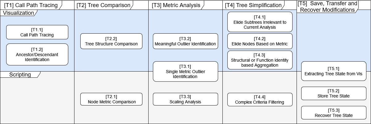
We were aware from project inception that the target delivery mechanism for the visualization was Jupyter notebooks. Development teams at our collaborators’ organization are made aware of new features through sample notebooks available through a common web portal. Thus, when analyzing tasks, we considered whether the visualization or scripting capabilities should support them. Figure 1 shows an overview of tasks and their contexts.
[T1] Call Path Tracing. Users wanted to follow the chain of function calls leading to or from nodes of interest. This provides context to a node of interest, orienting users with respect to code, and allows them to analyze the call stack.
Subtasks
-
1.
Trace the path from a node towards the root. Often use for orientation. (Visual)
-
2.
Identify ancestors and descendants of nodes. Used for analysis. (Visual)
[T2] Tree Comparison. Performance is often analyzed by comparison between two executions of the same program run with different resources, underlying libraries, or versions. Users want to see how node attributes differed between runs and how the structure of the tree changed between software updates.
Subtasks
-
1.
Compare node metrics between scaling runs (Script)
-
2.
Compare tree structures across different implementations (Visual)
[T3] Metric Analysis. Users want to know the distribution of attributes across nodes and which nodes have extreme or abnormal attributes. For example, if the speedup metric for a node is unexpectedly small, users may want to investigate it further. Our discussions with stakeholders underscored a common need for bivariate analysis: users wanted to know individual metrics like speedup in the context of how long a node executed. A node with poor speedup might not matter much if the node’s execution time is already short.
Subtasks
-
1.
Find nodes with extreme single metric values (Script, Visual)
-
2.
Find meaningful outliers through bivariate analysis (Visual)
-
3.
Analyze how individual functions scale with more processing units (Script)
[T4] Tree Simplification. Users want to simplify the tree to focus on subtrees of interest for a particular analysis or to elide nodes that represent code they cannot change. In some cases, these nodes represent details that do not match their level of abstraction in thinking about the code. Users would like to aggregate these to maintain context without details. The concept of “interest” changes depending on the particular analysis. Users can describe a wide variety of queries and filters to retrieve or remove nodes.
Subtasks
-
1.
Elide subtrees not relevant to current analysis (Visual)
-
2.
Elide nodes based on a metric (Visual)
-
3.
Aggregate subtrees or internal paths based on structure and function identity (Visual)
-
4.
Filter based on some other complex criteria. For example, “Remove all nodes in a specific library” (Scripting)
[T5] Save, Transfer, & Recover Modifications. Users wish to reproduce the modifications they made to the tree, for use across different analysis sessions or when sharing with others. They may make changes either visually or through scripting and then transfer those changes between the two contexts.
Subtasks
-
1.
Extracting the tree state from the visualization (Visual, Scripting)
-
2.
Store the tree state for future use (Scripting)
-
3.
Recover the tree state (Scripting)
4.3 Addressing Rigor
Meyer and Dykes’ describe six criteria for rigor in a design study. We describe how we have structured our study to fulfill these criteria.
The Informed criterion addresses the preparedness for the research. Our team has significant experience in both visualization and performance analysis, studied related work in CCTs and design methodologies, and collected diverse use examples through our collaborators.
The Reflexive criterion urges researchers to reflect upon their biases and actions. We generated abundant notes and pages of discussions around design and implementation. We had weekly contact with collaborators regarding the project. We also shared a preliminary version of the work [43] with the HPC community and gathered feedback that informed the design.
The Abundant criterion suggests numerous artifacts and perspectives, long-term collaborations, and rapid prototyping. Our long-term collaboration starts in Fall 2019, with regular meetings starting in Summer 2020, though the CCT visualization was not a focus until Summer 2021. We generated 19 pages of meeting records, five pages of pen-and-paper-designs, five pages of task analysis, five pages of evaluation design, transcripts of two hour-long interviews, two slide presentations, and a research poster. In support of the Transparent criterion, we have made many of these available in supplemental material or open-source repositories. We also aim to highlight limitations where they apply throughout this document.
We cannot claim to meet the Plausibility and Resonance criteria, as those require community validation. We however support Plausiblity through evidence of our Abundant and Reflexive methods. We discuss transferability in section 7.
5 Interactive, Embedded CCT Visualization Design
We designed the visualization through an iterative process with weekly meetings sharing design documents and prototypes. Our design was informed through our interviews with frontline analysts, feedback from the Hatchet project manager and team, and our resulting task analysis. In addition to these design inputs, there were two other constraints we sought to fulfill. First, [C1]—the visualization would be embedded in Jupyter notebooks as this is an intended environment by the Hatchet team and on in which they distribute examples of their new features. Second, [C2]—the visualization needed to be intuitive as the Hatchet project manager had observed target users would not take time to learn an unfamiliar visualization.
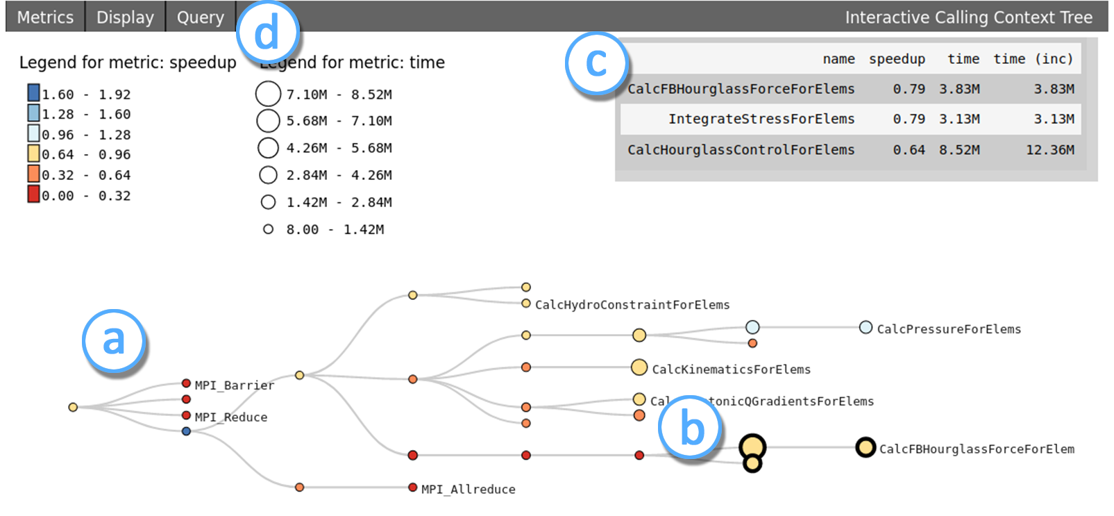
We explain the key elements of our interactive, embedded calling context tree visualization. Figure 2 shows an overview of the tool.
5.1 Tree View and Bivariate Encoding
We chose a node-link depiction as the main representation for its support of our tasks and for our users’ familiarity. Multiple subtasks were identified that involved path or structure, such as [T1] - call path tracing, [T2.2] - tree structure comparison, and [T4.1, T4.3] - aggregating or eliding tree substructures. Node-link diagrams have been shown to be a good idiom for these network tasks [20, 31, 25]. We knew the target audience would be familiar with node-link diagrams as they were prevalent in the related work and used in the original Hatchet publication. Thus, we expected a node-link diagram would require little training to understand, supporting our intuitive constraint [C2].
We chose to orient the node-link diagram with the root on the left and expanding rightwards to make use of Jupyter cell aspect ratios. Users can interactively pan and zoom the tree with mouse/trackpad interactions. If the input data contains multiple trees, they are shown stacked vertically.
To support the metric analysis tasks [T4], we encode two metrics, a primary metric with node color and a secondary metric with node size. Users can change the metrics as well as switch between a diverging color map and a single hue ramp, both which can be inverted, through the menus. Legends for both encodings appear under the menu bar.
Bivariate support was a priority feature during the design as often other metrics are evaluated in the context of execution time. Early designs used color for a single metric, due to its distinguishability and preattentive nature to support outlier detection. Color is often used in other HPC visualization [5, 33], so we expected familiarity from our users as well. We considered a bivariate colormap to put metrics on equal footing, but ultimately chose size as the second channel so metrics could be decoded individually, stand out individually, and intersections would still be salient.
5.2 Node Details, Selection, and Labeling
While only two metrics are directly encoded on the nodes, users can access more attributes through node selection. Details of selected nodes are shown in a floating table, designed to look similar to the pandas output. Nodes may be selected individually on click or mass selected using a brush.
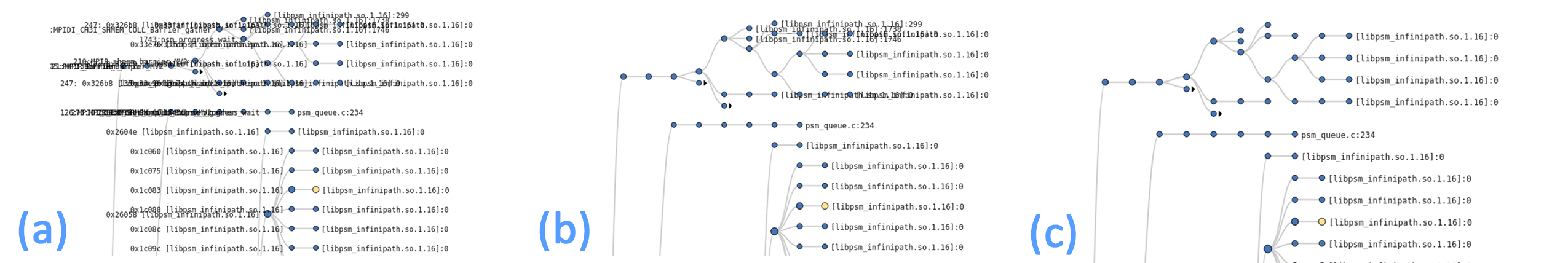
Directly labeling all nodes leads to a lot of occlusion, especially in larger datasets. To mitigate this problem, we omit labels on internal nodes and use a heuristic strategy to remove overlapping labels. Node names are still available via hover tooltip.
Our overlap removal is a sliding algorithm that first holds text positions in a y-coordinate ordered array. We then check collisions against all text-boxes within the distance of the box’s height. When a collision is detected, we remove the label of the node closer to the root. If the labels are at the same level, we remove the one with the smaller primary metric. The number of nearby text-boxes to check for collisions is typically under 30, even for deep trees with tightly laid out leaves, so the runtime of this approach is near linear.
5.3 Tree Simplification (Pruning)
Calling context trees can contain thousands of nodes, not all of which are of interest to a given analysis. However, analysts want access to all of them should their analysts require them and also for initial overviews. Thus, supporting the tree simplification tasks ([T4]), we added several interactive features for reducing the size of the tree shown.
We note these tree elision functionalities are pruning operations and not filtering because they only elide nodes from the leaves towards the root (i.e., subtrees) to maintain the tree structure and therefore the context of the shown nodes.
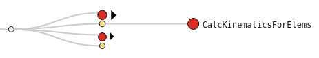
We have a manual prune in support of T4.1 (subtree elision) and a mass prune in support of T4.2 (elision based on metrics). Elided subtrees are signified with a circle with a black arrow, indicating that they can be expanded (Figure 3). Their metrics are the average of their subtree.
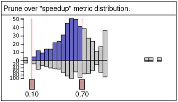
With Manual Pruning, double-clicking on a node will collapse (or uncollapse) its subtree. The Mass Prune feature elides subtrees based on a metric value range, set through a floating interface shown in Figure 5 which is available through the menus. The interface shows the distribution of the primary metric as a butterfly histogram. The top histogram shows the distribution of prunable nodes. The bottom shows the distribution of nodes that are internal, i.e., they will not be pruned because doing so would disconnect the tree.
The two pink handles can be adjusted to set the range that should be shown. The tree updates interactively when the user releases a handle. By default, the tree is shown with the mass prune functionality set to elide prunable nodes with 0.0 as their primary metric value.
We deprioritized design for T4.3 (aggregation along internal paths and across subtrees) due to lack of specific motivating data. We included a prototype of the feature in the most simple case (aggregation along an internal path) in our early evaluations, but stopped including it due to time after gathering initial data for future design.
5.4 Notebook Embedded Features
To move scripting results to the visualization, users need only to pass the GraphFrame they want visualized through the visualization’s Jupyter magic function described in subsection 5.5. Users can flexibly derive new data via Hatchet or general Python scripting in the regular Jupyter cells which is how we expected them to implement more complex and hard to predict filtering tasks ([T4.4]) and precise metric comparisons and searches ([T2.1, T3.1, T3.3]).
We pass state information from the visualization back to the scripting cells by exporting a query in the Hatchet query language. This supports multiple goals of [T5]. First, users can save and later apply the output query to the same GraphFrame to retrieve the pruned tree of interest. They can also apply it to a GraphFrame of a different execution of the same program to similarly prune the tree. Second, the visualization can act as a graphical interface for creating Hatchet queries, helping users learn the query language.
We designed the query export to be on-request, rather than automatically available at all times, at the request of the Hatchet project manager. They were concerned an automatic approach would be confusing. (See our reflections in section 7 for further discussion on deliberate versus automatic workflow behavior.) Once exported through the visualization menus, the query can be placed in any Python variable and then either applied or saved to disk.
5.5 Implementation
The calling context tree visualization was implemented in JavaScript using D3 [13]. Javascript code was built and combined with HTML and CSS files using webpack. The loading of the visualization into Jupyter cells and the data transfer between Python and Javascript and vice versa code was done through our Roundtrip [43, 42] library.
To best support the transition from scripting to visual analysis, we wanted our API for creating a visualization to be as lightweight and simple as possible. We also wished to convey to users that the functionality is Jupyter specific, so we provide users with an Jupyter magic interface by defining our call as %cct. Jupyter magic functions are denoted with the “%” character and often modify the behavior of a notebook. This magic function takes one argument, a Hatchet GraphFrame.
6 Evaluation
We conducted formal evaluation sessions with seven HPC experts to evaluate the efficacy of the visualization design and the scripting-visualization workflow.
6.1 Evaluation Design
The evaluation sessions were 60 minutes long and conducted over video-conferencing software. Each session consisted of an initial briefing, overview of visualization features (25 minutes), three tasks for the users to complete (15-20 minutes), semi-structured interview questions (10-15 minutes), and a debriefing. During the overview, a facilitator shared their screen and introduced a tutorial notebook for the project and then demonstrated the features on a small example dataset. Participants had access to these notebooks and were encouraged to follow along, a choice which we found to be effective for explaining the visualization functionality, catching gaps in understanding quickly, and eliciting feedback during the tutorial phase. After the tutorial, the participant shared their screen and performed tasks on the evaluation dataset.
The evaluation design document and evaluation script are available in the supplemental materials. We piloted the evaluation with two HPC experts, a PhD student and a research professional.
6.1.1 Evaluation Datasets
For the tutorial, we used a small Caliper-generated dataset collected during an execution of Lulesh [1]. For the evaluation tasks, we used HPCToolkit-generated datasets collected from two Kripke [30] executions, run on 64 and 128 cores respectively, resulting in trees of 1500 and 2700 nodes. Krikpe is a particle transport simulation code. Although most of the participants were more familiar with targeted Caliper-generated datasets, we chose HPCToolkit-generated examples to evaluate the visualization with larger CCTs.
6.1.2 Participants
We recruited seven participants (Table 1). P1 and P2 were Hatchet users that we previously interviewed early in the design study. P3, P4, and P5 were all professionals at the same organization spread across three different software teams. P6 and P7 were PhD students focusing on HPC. Of the participants, only P4 said they were familiar with Kripke. P1 stated they were not familiar, though they were aware of it.
Of the participants, P1, P2, and P5 are active Hatchet users, P3, P4, and P6 have some familiarity, and P7 had not used Hatchet before. P5 is an active Jupyter user. P1, P2, P4, and P6 used Jupyter regularly but in a limited enough fashion to need reminders of how to expand and run cells. P3 and P7 had only cursory knowledge of Jupyter.
| P1 | P2 | P3 | P4 | P5 | P6 | P7 | |
|---|---|---|---|---|---|---|---|
| Hatchet | High | High | Some | Some | High | Some | None |
| Jupyter | Some | Some | Little | Some | High | Some | Little |
6.1.3 Evaluation Tasks
Participants were asked to perform three tasks, the third only being asked if time permitted. The first task asked participants to familiarize themselves with the dataset and was intended to allow us to observe insights generated in open exploration. The second task guided the participants to load the second dataset, calculate a speedup metric between the datasets, and then identify targets for optimization. The final task asked participants to export the Hatchet query described by the visualization, apply it using Python, and then visualize the results. It was designed to introduce participants to the visualization-to-scripting workflow. We list these tasks and their corresponding task analysis items below:
-
E1.
Open Ended Exploration [T1.1, T1.2, T3.1, T4.2, T4.3]
-
E2.
Identify A Candidate for Optimization [T2.1, T3.1, T3.2]
-
E3.
Export and Apply Query [T5.1, T5.3]
We designed these tasks through iterative documentation and discussion between primary investigators with the goal of evaluating how well the embedded visualization supported the operations identified in the task analysis, including ones designed for the notebook-embedded workflow.
6.1.4 Semi-structured interview
After the tasks, to elicit feedback regarding the visualization and notebook-embedded workflow, we prompted participants with the following questions:
-
Q1.
What if any changes do you suggest should be made?
-
Q2.
What if any features/facets do you suggest should be kept?
-
Q3.
Have you used other CCT visualizers before? What are your thoughts of this visualization in comparison to those?
6.2 Evaluation Task Results
We summarize our observations during the evaluation tasks.
6.2.1 E1: Open-ended Exploration
Participants were asked to explore the dataset provided using any and all tools available to them in the notebook. During this task, participants were asked to think aloud, explain their analysis process, describe the dataset, and highlight any interesting data points or portions of the CCT they came across.
All participants used the tree visualization as the primary or sole method of data exploration. Almost all participants began this task by hovering over nodes to view the names associated with nodes until they found something meaningful to them.
Most participants (P1-P5, P7) noted large subtrees with functions related to the MPI or Libsim, two parallel libraries, or the C++ method memset. They noted they preferred to see core Kripke functions rather than library functions and began removing them from the view. There were a variety of strategies used. P1, P3, P5, P6, and P7 used the Mass Prune feature liberally. P1, P3, and P7 then further adjusted the view by either manually collapsing or re-expanding subtrees. P2 and P4 relied more heavily on manually collapsing subtrees. After tree simplification, all participants identified key functions used in the core processing loop of the Kripke program.
In addition to tree transformations, participants explored other visualization functionality during this time. Participants P2-P6 changed the encodings from the defaults. P5 noted they were only interested in inclusive time and mapped both channels to that metric. The other participants swapped the encodings. P3, P4, P6, and P7 explicitly sought out nodes based on the intensity of their encoding.
6.2.2 E2: Speedup and Targets for Optimization
Participants were asked to load a second Kripke profile into a Hatchet GraphFrame using Python. We guided them to apply a function to calculate a new GraphFrame with a speedup metric comparing the two datasets. With the new speedup GraphFrame, we asked them to identify a function that would be a good candidate for optimization. This task roughly approximates an analysis common in HPC: evaluating performance scaling when allocated more resources.
Many participants (P1, P3, P5-P7) repeated their approach of mass pruning as a first step but found the results were different compared to what they saw in the initial evaluation task. Because “speedup” was now the primary metric, participants were pruning over a different distribution. Due to the heavy skew of this distribution, mass pruning was not as effective as in E1.
P6 and P7 changed the primary encoding to exclusive time to prune to the nodes that take more time and then changed color back to speedup to continue their analysis. P1-P4 manually collapsed subtrees belonging to external libraries to focus on the core Kripke calls, with P2 and P3 then changing encodings so small speedups were shown in red.
Noting that there were a few outliers skewing the mass prune distribution, P5 returned to the Python cells to remove the few extreme values from the GraphFrame programmatically. They then returned to the visualization and used the mass prune on the filtered set.
All but P5 offered a suitable candidate for optimization. P5 vocalized several insights regarding which parts of the program showed poor scaling and why they might do so, but said they would require more time to give a better answer. P2, P3, P4, P6, P7 suggested multiple core Kripke functions which had high exclusive times and low speedup. P2 and P6 cited encoding-based reasons for their conclusion, stating that these nodes stood out as “big and red” after they changed encodings.
6.2.3 E3: Saving and Retrieving Queries
Participants were asked to save the transformations they made to the tree in the previous two tasks by exporting a query back to the notebook from the visualization. They were then asked to filter their most recently visualized graph frame and visualize the filtered frame. This task was designed to exercise the integrated workflow aspect of the visualization so participants could give informed feedback.
All five participants who we asked to perform this task (P1, P3, P5-P7) did so successfully. P2 and P4 were not asked as their sessions were shorter than anticipated due to issues outside the evaluation design.
6.3 Analysis
Two authors who attended the evaluation sessions coded the transcripts and evaluation notes. They then met to discuss, combine, and organize codes, producing a final document of hierarchically organized themes (see supplemental material). We discuss the emergent themes regarding tasks and insights, analysis strategies, feature utility and intuitiveness, issues and suggestions for improvement, and observations regarding the notebook-embedded workflow.
6.3.1 Evaluation Task Success and Insight Discovery
Participants successfully completed every task they were asked, except for P5 on E2 who made several insights regarding various nodes with poor performance, some of which others gave as their answers, but said they would need more time to come up with a better answer.
In addition to the well-defined task, we observed participants vocalize several other insights during both the familiarity task (E1) and the speedup task (E2). We discuss a sample here. In E1, several identified particular hot spots (P1, P5, P6) or hot paths (P3, P7). P1 and P4 identified that the version of Kripke used a parallel library called RAJA [23]. The RAJA nodes were not clearly marked as such due to limitations in data collection, but the participants were able to recognize it from the structure. P5 hypothesized that this implementation of Kripke likely overused the memset function call, suggesting an alternative that could be more performant.
In E2, P1 inferred from the function names where poor performance might be due to load balancing. P2 discussed the range of speedups and P4 identified some speedups as satisfactory. P5 suggested an observed slowdown in MPI_Barrier was consistent when more parallel processes need to synchronize.
The task successes and additional insights demonstrate that participants were able to parse large, cluttered trees, build mental models of the underlying structure of the code, and identify likely problem areas. This suggests our target audience is able to perform the analysis tasks we aimed for in our visualization design on realistically-sized datasets.
6.3.2 Variety of Strategies
Participants demonstrated a variety of strategies in analyzing the CCT. P1, P3, P5, and P6 used the mass prune feature heavily to find focus areas of the tree and then would tweak the results with the manual collapsing and uncollapsing of subtrees. In contrast, P2 and P7 preferred panning, zooming, and manual collapsing. These two participants had more experience with commercial indented tree+table visualizations, which may have influenced their strategies.
We also observed a variety off strategies for node selection. While most used the single and multi-click features, P5 used the brush to select multiple nodes at the same tree level.
6.3.3 Utility and Intuitive Design
We asked participants which features should be kept. Additionally, participants stated positive sentiments towards features unprompted. Each feature was mentioned at least once with the exception of node composition. We sample prevalent mentions.
P1, P5, and P6 said the visualization had everything they needed. P1, P3, and P5 found the mass prune functionality especially useful. P2 and P4 appreciated the bivariate encoding, with P4 saying that size made it easy to see where the most time was spent. P3 and P4 also liked the ability to compare trees.
P1, P2, P3, P6, and P7 expressed that they found the interactions with the visualization intuitive. P2 stated, “I knew how to use it for the most part before you even explained it. . .”
Three participants (P2, P3, P5) expressed a desire to work with this visualization further with P2 and P5 were especially interested in seeing how it would work with their own data.
6.3.4 Issues and Suggestions for Improvement
We asked participants what should be changed. Participant also made feature requests and reported issues unprompted. The most common requests included undo features (P1-P4, P6), the ability to add annotations (P4, P7), and the ability to prune by brushing (P4, P7). There were several one-off quality of life issues, such as increasing the tooltip font size and having the menus close when clicked off of. There were also a variety of requests for other metrics or to mass prune by other criteria. We discuss these in subsubsection 6.3.5.
In terms of negative sentiments, P3 and P5 expressed frustration with the skewed histogram, wishing to dynamically change the range. P2 found the mass prune handles to be “unintuitive.” P1 and P3 expressed some discomfort with the notebook-embedded workflow, which we also discuss in subsubsection 6.3.5.
6.3.5 Notebook-Embedded Workflow
We observed that most participants worked through the tasks which required scripting or switching between the context of code and visualization without significant frustration or friction, though we note these opportunities were limited by the length of the evaluation. In particular, while all participants suggested a complex query that we made the conscious choice should be handled by scripting, only one (P5) was prepared to implement it.
It is important to note that the complex queries suggested by the participants were not all the same. The most prevalent was to filter out MPI or LibSim libraries (P2, P3, P4, P5). Individual suggestions were pruning RAJA-related calls, pruning system calls, pruning libraries, pruning libraries qualified on metrics, pruning based on “what we control,” pruning by regular expression, pruning based on depth, and pruning leaves. Even in the most prevalent case, pruning MPI calls, is not as simple as a name match and may not be necessary for other datasets. This wide variety of desired, complicated queries suggests the need for the flexibility inherent to scripting. This observation is consistent with the wide variety of strategies observed across individuals when doing performance analysis.
We probed users further about whether their query should be a feature of scripting or visualization. P2 said that pruning a tree through scripting “would work with me.” P5 emphatically preferred scripting, explaining that debugging regular expressions would be easier. P4 expressed an interest in both, but prioritized scripting support before interactive visualization.
In addition to queries, three participants (P3, P5, P6) inquired about the possibility of adding metrics while working on the speedup task. P5 suggested “percentage of time,” which is something Hatchet can do in a few lines of code. Adding metrics is another task supported by the integrated scripting environment.
Not all participants were comfortable with our embedded approach. P3 described the workflow as “not helpful.” P1 said the combination of scripting and visualization, two things they think of as separate, was “unintuitive.” However, P1 qualified their comment, noting the workflow has a need, but they were unsure how to implement it. They suggested improved messaging for the query save feature. Most participants did not comment on the speedup calculation or the query save workflow, suggesting the interface was not particularly notable to them.
P1, P4, and P5 liked the capability of retrieving a query from the visualization both for saving and retrieving the subset, but for other reasons as well. P1 was interested in retrieving the subselection as a table for further analysis. P5 said they did not have a personal use, but “could see [their] colleagues using this to build queries.”
6.3.6 Comparisons to Alternative Visualizations
Several participants (P2, P4-P7) acknowledged experience with alternative calling context tree visualizations when asked, though some had to be prompted by the facilitators regarding their indented tree experience, as they did consider them a visualization on their own. P2 and P7 had used commercial products with indented trees. P4 uses a commercially-backed Graphviz [18] call graph visualization. P4-P7 had used Hatchet’s console-based ASCII indented tree. P5 also used a web-based flamegraph.
P4 noted the commerically-backed tool has “more power” with “more resources put into them,” but noted our visualization could show more nodes at once and was more interactive. P6 also mentioned interactivity and said our visualization was “more effective” than the console-based indented tree. While P2 declined to compare because theirs was in a commercial debugger used for different tasks, they also noted the interactivity was intuitive.
P4 further stated they liked that our tool supported comparing multiple datasets, with P4 noting it was something the other tools did not. This interest in comparison was echoed by P5.
P7 found our node-link tree more natural than the file system-like indented tree they had experienced and noted it was easier to track hot paths with our encodings.
6.4 Limitations and Threats to Validity
The generalizability of our evaluation is limited by the modest number of participants. We sought participants who would be representative users—those who had expertise in HPC performance analysis and familiarity with Hatchet. This limited our participant pool. Furthermore, all of the participants knew at least one of the authors, which may have biased their comments and interview responses towards expressing positive sentiments, e.g., P2 declining to compare our visualization to a commercial tool.
Though Jupyter is a delivery mechanism for Hatchet and other tools in our collaborator’s organization, familiarity with Jupyter varied in our participant pool, with only one participant being a frequent user. The lack of familiarity may have affected user feedback. Also, some users may not have focused solely on the visualization over the entire notebook during the evaluation. Deployment over time is needed to determine if the integrated visualization is adopted.
We designed evaluation sessions to last an hour as this is a typical schedule slot duration for our professional users. This limited the kinds of tasks we could include. Even though most participants had some familiarity with Hatchet, they were not so familiar with the API that we would expect them to write Hatchet queries in open-ended analysis on the fly, though one, P5, did. The time constraints limited our ability to further explore the scripting and visualization workflow.
7 Reflections
We reflect upon our design study and what we learned regarding designing in a notebook embedded context and CCT visualization design.
7.1 Notebook-Embedded Visualization
The embedding of our visualization within the exploratory scripting workflow was an intentional and informed decision, based on both the constraints of our collaborators—using notebooks as a delivery mechanism—and our observations that exploratory performance analysis benefits from the flexibility of scripting. Based on our understanding of performance analysis as an inherently exploratory process, we designed the visualization assuming the exploratory workflow of modifying the dataset with Hatchet scripts, doing visual tasks, and then either modifying the dataset again or exporting a subset of the data found during visual exploration. We discuss our lessons learned regarding our notebook-embedded design process and evaluation.
Identifying visual or scripting strengths in our task analysis helped us focus and prioritize our design. Our early interviews with frontline analysts sought to understand the entire performance analysis process, without focusing on CCT visualization in particular. By embedding ourselves with the Hatchet team, we were further able to hear feedback regarding not just the visual needs, but how Hatchet scripting is used in workflows and what requests there were of the library as a whole. From this, we developed our task analysis with both scripting and visual tasks. We further reflected upon which mode of exploration, scripting or interactive visualization, served the task best.
By referring to our task analysis, we also avoided adding complex features for a single user, as those were better served under a class of scripting operations. This is especially important as our access to frontline analysts was limited in both time and number of people. It can be tempting to add features for one person, but as our evaluation showed, the query features were quite diverse among participants. We plan to further analysis these queries to determine if more abstract query features, like our metric mass prune, will be helpful, while leaving the specific ones to scripting.
Feedback from participants during our evaluation largely validated our task assignment choices, though we found evidence for more tasks that spanned both visualization and scripting. Even in these cases, participants’ prioritizations followed our task analysis.
There were benefits and drawbacks to using Jupyter as a platform for our HPC audience. It is unclear how visualizations should be delivered in this domain. Jupyter notebooks are a delivery mechanism for the Hatchet team within their organization. The notebooks with new Hatchet feature examples are uploaded to a performance analysis portal where developers discover them and if helpful to their analysis, use them. The online portal also has web-based visualizations supporting other analysis tasks. During our evaluation, one participant (P4) noted the importance of this online availability, because notebooks sent other ways would be more easily lost.
However, as demonstrated in our evaluation, most of our intended audience do not use Jupyter regularly. Only one participant (P5) knew the common hotkeys. Thus, while the Jupyter delivery mechanism of scripting and visualization fits within the organization, it is still unclear whether the mechanism best supports the users. Some had used file system style visualizations embedded in desktop debugger applications or printed in ASCII to a terminal, but noted the limits in interactivity and the less natural idiom. Some had used the web-based visualizations in the portal, but these do not support scripting.
We heard mixed feedback regarding how automatic or deliberate synchronization between scripting state and visualization state should be. There are two key datasets that can be transferred between the scripting cells and the visualization, the GraphFrame input to the visualization, and the Hatchet query describing the subset being shown by the visualization. Automatic synchronization ensures these two datasets are always the same between the scripting cells and visualization. Deliberate synchronization only pushes data between scripting and visualization when the user takes a deliberate action, such as (re-)running a code cell or performing a particular action in the visualization. Our visualization can be run in either mode.
We expected that automatic synchronization would be preferred due to its fluidity and decreased number of manual operations. However, the Hatchet project manager, who is also an experienced HPC performance analyst, was concerned that users would find the automatic approach mysterious and that state they wanted to save could be overwritten. The project manager argued it would only be one more quick operation when switching contexts, followed by several more similar ones for the interaction, anyway.
We conducted our evaluation in deliberate mode. While Participant P1 expressed discomfort at the combination of scripting and visualization as a whole, he noted improvements to the interface could help. P6 inquired about the workflow of adjusting the source data for a visualization. When we informed him that functionality for automatically updating the visualization existed, but was not supported in the evaluation, he expressed mild enthusiasm for the functionality.
These tensions suggest further study regarding the deliberate or automatic design choice and further study regarding how to signify synchronization (or lack there of) between contexts.
7.2 CCT Visualization Design
We reflect upon the visual design of our calling context tree, including encoding choices, and transferrability.
We were able to leverage both visualization knowledge and prior work on CCTs, but there were still hurdles that may limit adoption of the design in HPC tools. We made a conscious decision to aim for simple, intuitive visualization, building on our experience with difficulties in adoption of more unique approaches and allowing us to focus on the design concerns of the notebook-embeddded workflow. Though we were able to use existing software (e.g., a modification of d3js’s Reingold-Tilford [reingold] layout) and visualization principles (e.g., saliency and separability of color and size), we found we still needed significant effort to support the multiple forms of tree navigation and simplification as well as labeling concerns. We suspect tree navigation and labeling implementation needs may be why the file-system-style indented tree remains used in HPC tools for more than file navigation.
This choice for an simple visualization was further informed by Seidlmair, Meyer and Munzner’s assertion that “The goal of the design cycle is satisfying rather than optimizing” [44]. In the context of a visualization embedded in a scripting workflow, we found that efficiently filling in the gaps not met by scripting alone in a usable way satisfied much better than attempting to design something complex which could not meet all contingencies and may not get used.
Many participants changed encodings in common ways, swapping two variables or inverting, suggesting derivable cultural norms. During the design of our software we acknowledged that a naïve bivariate encoding of any metric may not be enough for effective analysis. Although it would take a more thorough investigation we posited that hard-coded “intelligent defaults” for metric encodings may be helpful, for example, making speedup use inverted color by default or always mapping time to node size.
We did not formally investigate these special encodings, but in our evaluations we observed that between the two default GraphFrame metrics (time (exclusive) and inclusive time), inclusive time appeared more salient when encoded by color than size. When shown with color, it highlighted a more visually literal “hotpath” of the most active nodes, starting with red nodes at the root fading off into yellow and light blue. We also noted that the intersection of “color” for “speedup” and “size” for “time” highlighted potential optimization candidates in a highly visceral way, where the most problematic nodes were “big and red.”
There are hundreds of performance metrics which can be affixed to a calling context tree, so our observations here are very limited. It does however provoke a line of inquiry into what makes for a good mapping between performance metrics and encodings and whether we can define or prioritize common performance metrics such that our tool and others can apply them to performance visualizations generally.
We observed broader domain interest in our bivariate tree design, suggesting transferrability. Although not especially novel to the visualization community, we found there was significant domain interest in bivariate encodings for tree visualization within the HPC and related communities. While presenting preliminary results in poster form at a domain conference [43], the lead author was approached by an HPC professional, a professional working in data provenance, and a machine learning professional. In these encounters, the professionals noted they were not analyzing calling context trees, but were interested because our visualization showed two metrics in tandem. These encounters extended into larger conversations about how this visual design for hierarchical data could work for their specific needs. Although not definitive, we believe that this indicates that this particular design is transferable across multiple computing domains working with hierarchical data.
8 Conclusion
We conducted a design study investigating a hybrid visualization-scripting workflow in the context of performance analysis of calling context trees. Following design study methodology and criteria for rigor, we carefully considered the division of visualization and scripting tasks and used that analysis to design a notebook-embedded interactive visualization. We evaluated the resulting notebook-embedded visualization with seven performance analysts, validating the design for our identified tasks and demonstrating interest in further use of the overall tool and workflow. The variety of queries expressed by our participants and their interest retrieving queries from the visualization further support the benefits of this workflow.
We reflect on the ramifications of the notebook-embedded visualization-scripting workflow, comment on the merits and limitations of the visualization we developed, and provide guidance for future visualization-scripting designs and design projects. Our work suggests the visualization-scripting workflow embodied by the notebook-embedded visualization shows promise and reveals the need for further design work regarding how users will perceive and convey transitions between both visualization and scripting states.
Acknowledgements.
This work was performed under the auspices of the U.S. Department of Energy by Lawrence Livermore National Laboratory under contract DE-AC52-07NA27344. Lawrence Livermore National Security, LLC. as well as the United State Department of Defense through DTIC Contract FA8075-14-D-002-007, the National Science Foundation under NSF IIS-1844573, and the Department of Energy under DE-SC0022044. LLNL-CONF-833190.References
- [1] Hydrodynamics Challenge Problem, Lawrence Livermore National Laboratory. Technical Report LLNL-TR-490254, Lawrence Livermore National Laboratory.
- [2] Website: A Closer Look at Labor. URL: https://nbremer.github.io/occupationscanvas/. (Accessed on Mar 3, 2022).
- [3] Understanding software performance regressions using differential flame graphs. In IEEE 22nd International Conference on Software Analysis, Evolution, and Reengineering, SANER, pp. 535–539, mar, 2015. doi: 10 . 1109/SANER . 2015 . 7081872
- [4] A. Adamoli and M. Hauswirth. Trevis: A context tree visualization & analysis framework and its use for classifying performance failure reports. In Proceedings of the 5th International Symposium on Software Visualization, SoftVis, pp. 73–82. ACM, New York, NY, USA, 2010. doi: 10 . 1145/1879211 . 1879224
- [5] L. Adhianto, S. Banerjee, M. Fagan, M. Krentel, G. Marin, J. Mellor-Crummey, and N. R. Tallent. Hpctoolkit: Tools for performance analysis of optimized parallel programs. Concurrency and Computation: Practice and Experience, 22(6):685–701, 2010.
- [6] D. H. Ahn, B. R. de Supinski, I. Laguna, G. L. Lee, B. Liblit, B. P. Miller, and M. Schulz. Scalable temporal order analysis for large scale debugging. In Proceedings of the Conference on High Performance Computing Networking, Storage and Analysis, SC, pp. 44:1–44:11. ACM, New York, NY, USA, 2009. doi: 10 . 1145/1654059 . 1654104
- [7] J. Allaire, Y. Xie, J. McPherson, J. Luraschi, K. Ushey, A. Atkins, H. Wickham, J. Cheng, W. Chang, and R. Iannone. rmarkdown: Dynamic Documents for R, 2020. R package version 2.5.
- [8] R. Bell, A. D. Malony, and S. Shende. Paraprof: A portable, extensible, and scalable tool for parallel performance profile analysis. In European Conference on Parallel Processing, pp. 17–26. Springer, 2003.
- [9] A. Bergel, A. Bhatele, D. Boehme, P. Gralka, K. Griffin, M.-A. Hermanns, D. Okanović, O. Pearce, and T. Vierjahn. Visual analytics challenges in analyzing calling context trees. In Programming and Performance Visualization Tools, pp. 233–249. Springer, 2017.
- [10] A. Bhatele, S. Brink, and T. Gamblin. Hatchet: Pruning the overgrowth in parallel profiles. In Proceedings of the International Conference for High Performance Computing, Networking, Storage and Analysis, pp. 1–21, 2019.
- [11] A. Bigelow, S. Drucker, D. Fisher, and M. Meyer. Iterating between tools to create and edit visualizations. IEEE Transactions on Visualization and Computer Graphics, 23(1):481–490, 2016.
- [12] D. Boehme, T. Gamblin, D. Beckingsale, P.-T. Bremer, A. Gimenez, M. LeGendre, O. Pearce, and M. Schulz. Caliper: performance introspection for hpc software stacks. In SC’16: Proceedings of the International Conference for High Performance Computing, Networking, Storage and Analysis, pp. 550–560. IEEE, 2016.
- [13] M. Bostock, V. Ogievetsky, and J. Heer. D3: Data-driven documents. IEEE Trans. Visualization and Comp. Graphics (Proc. InfoVis), 2011.
- [14] S. Brink, I. Lumsden, C. Scully-Allison, K. Williams, O. Pearce, T. Gamblin, M. Taufer, K. E. Isaacs, and A. Bhatele. Usability and Performance Improvements in Hatchet. p. 10.
- [15] Y. Darzi, Y. Yamate, and T. Yamada. FuncTree2: an interactive radial tree for functional hierarchies and omics data visualization. Bioinformatics (Oxford, England), 35(21):4519–4521, Nov. 2019. doi: 10 . 1093/bioinformatics/btz245
- [16] L. DeRose, B. Homer, and D. Johnson. Detecting application load imbalance on high end massively parallel systems. In A.-M. Kermarrec, L. Bougé, and T. Priol, eds., Euro-Par, vol. 4641, of Lecture Notes in Computer Science, pp. 150–159. Springer, 2007,. doi: 10 . 1007/978-3-540-74466-5_17
- [17] Y. Dong, A. Fauth, M. Huang, Y. Chen, and J. Liang. PansyTree: Merging Multiple Hierarchies. In 2020 IEEE Pacific Visualization Symposium (PacificVis), pp. 131–135, June 2020. ISSN: 2165-8773. doi: 10 . 1109/PacificVis48177 . 2020 . 1007
- [18] J. Ellson, E. R. Gansner, E. Koutsofios, S. C. North, and G. Woodhull. Graphviz and dynagraph – static and dynamic graph drawing tools. In GRAPH DRAWING SOFTWARE, pp. 127–148. Springer-Verlag, 2003.
- [19] M. Geimer, P. Saviankou, A. Strube, Z. Szebenyi, F. Wolf, and B. J. Wylie. Further improving the scalability of the scalasca toolset. In International Workshop on Applied Parallel Computing, pp. 463–473. Springer, 2010.
- [20] M. Ghoniem, J. . Fekete, and P. Castagliola. A comparison of the readability of graphs using node-link and matrix-based representations. In IEEE Symposium on Information Visualization, pp. 17–24, 2004.
- [21] B. Hartmann, L. Yu, A. Allison, Y. Yang, and S. R. Klemmer. Design as exploration: creating interface alternatives through parallel authoring and runtime tuning. In Proceedings of the 21st annual ACM symposium on User interface software and technology, pp. 91–100, 2008.
- [22] B. Hempel, J. Lubin, and R. Chugh. Sketch-n-sketch: Output-directed programming for svg. In Proceedings of the 32nd Annual ACM Symposium on User Interface Software and Technology, pp. 281–292, 2019.
- [23] R. Hornung and J. Keasler. Raja performance portability layer c++. https://github.com/LLNL/RAJA. Accessed: 2020-04-26.
- [24] D. A. Keim. Visual Techniques for Exploring Databases. p. 61.
- [25] R. Keller, C. Eckert, and P. Clarkson. Matrices or node-link diagrams: Which visual representation is better for visualising connectivity models? Information Visualization, 5:62–76, 04 2006. doi: 10 . 1057/palgrave . ivs . 9500116
- [26] M. B. Kery, D. Ren, F. Hohman, D. Moritz, K. Wongsuphasawat, and K. Patel. mage: Fluid moves between code and graphical work in computational notebooks. In Proceedings of the 33rd Annual ACM Symposium on User Interface Software and Technology, pp. 140–151, 2020.
- [27] S. Kesavan, H. Bhatia, A. Bhatele, S. Brink, O. Pearce, T. Gamblin, P.-T. Bremer, and K.-L. Ma. Scalable comparative visualization of ensembles of call graphs. IEEE Transactions on Visualization and Computer Graphics, 2021.
- [28] T. Kluyver, B. Ragan-Kelley, F. Pérrez, B. Granger, B. Matthias, K. Frederic, Jonathan adn Kelley, J. Hamrick, J. Grout, S. Corlay, P. Ivanov, S. Avila, Damiánn adn Abdalla, C. Willing, and J. D. Team. Jupyter Notebooks –- a publishing format for reproducible computational workflows, pp. 87–90. 2016. doi: 10 . 3233/978-1-61499-649-1-87
- [29] D. E. Knuth. Literate Programming. The Computer Journal, 27(2):97–111, 01 1984. doi: 10 . 1093/comjnl/27 . 2 . 97
- [30] A. J. Kunen, T. S. Bailey, and P. N. Brown. Kripke–a massively parallel transport mini-app. Technical report, Lawrence Livermore National Lab.(LLNL), Livermore, CA (United States), 2015.
- [31] B. Lee, C. Plaisant, C. S. Parr, J.-D. Fekete, and N. Hen ¿ ry. Task taxonomy for graph visualization. In Proceedings of the 2006 AVI BELIV Workshop, BELIV ’06, pp. 1–5. ACM, 2006. doi: 10 . 1145/1168149 . 1168168
- [32] S. Lin, F. Taïani, T. C. Ormerod, and L. J. Ball. Towards anomaly comprehension: Using structural compression to navigate profiling call-trees. In Proceedings of the 5th International Symposium on Software Visualization, SOFTVIS, pp. 103–112. ACM, New York, NY, USA, 2010. doi: 10 . 1145/1879211 . 1879228
- [33] A. D. Malony and F. G. Wolf. Performance refactoring of instrumentation, measurement, and analysis technologies for petascale computing. the prima project. Technical report, Univ. of Oregon, Eugene, OR (United States), 2014.
- [34] M. Meyer and J. Dykes. Criteria for rigor in visualization design study. IEEE transactions on visualization and computer graphics, 26(1):87–97, 2019.
- [35] P. Moret, W. Binder, A. Villazón, and D. Ansaloni. Exploring large profiles with calling context ring charts. In Proceedings of the first joint WOSP/SIPEW international conference on Performance engineering, pp. 63–68, 2010.
- [36] H. T. Nguyen, A. Bhatele, N. Jain, S. P. Kesavan, H. Bhatia, T. Gamblin, K.-L. Ma, and P.-T. Bremer. Visualizing hierarchical performance profiles of parallel codes using callflow. IEEE transactions on visualization and computer graphics, 27(4):2455–2468, 2019.
- [37] H. T. Nguyen, L. Wei, A. Bhatele, T. Gamblin, D. Boehme, M. Schulz, K.-L. Ma, and P.-T. Bremer. Vipact: a visualization interface for analyzing calling context trees. In 2016 Third Workshop on Visual Performance Analysis (VPA), pp. 25–28. IEEE, 2016.
- [38] C. Nobre, S. Marc, and L. Alexander. Juniper: A Tree+Table Approach to Multivariate Graph Visualization. IEEE transactions on visualization and computer graphics, p. 10.1109/TVCG.2018.2865149, Sept. 2018. doi: 10 . 1109/TVCG . 2018 . 2865149
- [39] C. Nobre, M. Streit, M. Meyer, and A. Lex. The state of the art in visualizing multivariate networks. Computer Graphics Forum (EuroVis), 38:807–832, 2019. doi: 10 . 1111/cgf . 13728
- [40] Observable, Inc. Observable. https://observablehq.com/, Last Accessed March 2022.
- [41] H.-J. Schulz. Treevis.net: A tree visualization reference. IEEE Computer Graphics and Applications, 31(6):11–15, 2011. doi: 10 . 1109/MCG . 2011 . 103
- [42] C. Scully-Allison and J. Bartels. Roundtrip. https://github.com/hdc-arizona/roundtrip, 2019.
- [43] C. Scully-Allison, O. Pearce, and K. Isaacs. Poster: Missing the trees for the branches: Graphical-scripting interaction with large-scale calling context trees. In The International Conference For High Performance Computing, Networking, Storage, and Analysis (SC), November 2021.
- [44] M. Sedlmair, M. Meyer, and T. Munzner. Design study methodology: Reflections from the trenches and the stacks. IEEE transactions on visualization and computer graphics, 18(12):2431–2440, 2012.
- [45] T. Tekusova and T. Schreck. Visualizing Time-Dependent Data in Multivariate Hierarchic Plots - Design and Evaluation of an Economic Application. In 2008 12th International Conference Information Visualisation, pp. 143–150, July 2008. ISSN: 2375-0138. doi: 10 . 1109/IV . 2008 . 51
- [46] The pandas development team. pandas-dev/pandas: Pandas, Feb. 2020. doi: 10 . 5281/zenodo . 3509134
- [47] J. Weidendorfer, M. Kowarschik, and C. Trinitis. A tool suite for simulation based analysis of memory access behavior. In International Conference on Computational Science, pp. 440–447. Springer, 2004.
- [48] K. Wittenburg and T.-Y. Lee. Equal-height treemaps for multivariate data. In Proceedings of the 2018 International Conference on Advanced Visual Interfaces, AVI ’18, pp. 1–3. Association for Computing Machinery, New York, NY, USA, May 2018. doi: 10 . 1145/3206505 . 3206591
- [49] Y. Wu, J. M. Hellerstein, and A. Satyanarayan. B2: Bridging code and interactive visualization in computational notebooks. In Proceedings of the 33rd Annual ACM Symposium on User Interface Software and Technology, pp. 152–165, 2020.
- [50] C. Xie, W. Xu, and K. Mueller. A visual analytics framework for the detection of anomalous call stack trees in high performance computing applications. IEEE transactions on visualization and computer graphics, 25(1):215–224, 2018.
- [51] Y. Xie, J. Allaire, and G. Grolemund. R Markdown: The Definitive Guide. Chapman and Hall/CRC, Boca Raton, Florida, 2018. ISBN 9781138359338.
- [52] Y. Xie, C. Dervieux, and E. Riederer. R Markdown Cookbook. Chapman and Hall/CRC, Boca Raton, Florida, 2020. ISBN 9780367563837.
- [53] B. Zheng and F. Sadlo. On the Visualization of Hierarchical Multivariate Data. Apr. 2021. doi: 10 . 1109/PacificVis52677 . 2021 . 00026
- [54] M. Zhou, W. Hu, and T. Ai. Multi-level thematic map visualization using the Treemap hierarchical representation model. Journal of Geovisualization and Spatial Analysis, 4(1):12, May 2020. doi: 10 . 1007/s41651-020-00053-8