Doctor XAvIer: Explainable Diagnosis on Physician-Patient Dialogues and XAI Evaluation
Abstract
We introduce Doctor XAvIer —a BERT-based diagnostic system that extracts relevant clinical data from transcribed patient-doctor dialogues and explains predictions using feature attribution methods. We present a novel performance plot and evaluation metric for feature attribution methods —Feature Attribution Dropping (FAD) curve and its Normalized Area Under the Curve (N-AUC). FAD curve analysis shows that integrated gradients outperforms Shapley values in explaining diagnosis classification. Doctor XAvIer outperforms the baseline with 0.97 F1-score in named entity recognition and symptom pertinence classification and 0.91 F1-score in diagnosis classification.
1 Introduction
Previous studies have shown that electronic medical record (EMR) data are difficult to use in machine learning systems due to the lack of regulation in data quality —EMR data are often incomplete and inconsistent (Weiskopf and Weng, 2013; Roth et al., 2009). Recently, there have been attempts to improve automated clinical note-taking by extracting relevant information directly from physician-patient dialogues (Khattak et al., 2019; Kazi and Kahanda, 2019; Du et al., 2019). This can alleviate physicians of tedious data entry and ensures more consistent data quality (Collier, 2017).
Due to the potential in reducing costs associated with collecting patient information and diagnostic errors, there is increasing interest in using information extraction techniques in automatic diagnostic systems (Xu et al., 2019; Wei et al., 2018). Jeblee et al. (2019) introduced a system that extracts pertinent medical information from clinical conversations for automatic note taking and diagnosis. However, their methodology did not explore state-of-the-art natural language processing (NLP) techniques —entity extraction was done by searching the transcript for entities from medical lexicons and tf-idf was used for text classification. Although there is existing work that employs more sophisticated NLP techniques to patient-physician dialogues (Krishna et al., 2020; Selvaraj and Konam, 2019), there is a lack of end-to-end diagnostic systems that employ such techniques. Furthermore, all of the previous works mentioned fail to address the black-box nature of deep learning in the medical industry. Most physicians are reluctant to rely on opaque, AI-based medical technology —especially in high-risk decision-making involving patient well-being (Gerke et al., 2020).
| Speaker | Utterance |
|---|---|
| DR | So how are you feeling [PATIENT NAME]? |
| O O O O O O | |
| PT | Not good. I’m having back and neck pain. |
| O O O O B-symptom O B-symptom I-symptom | |
| DR | And when did this start? |
| O B-time-expr O O B-time-expr | |
| PT | Around three days ago. |
| O B-time-expr I-time-expr I-time-expr | |
| DR | I see. Do you take any pain killers? |
| O O O O O O B-medication I-medication | |
| PT | Yes, acetaminophen and ibuprofen. |
| O B-medication O B-medication |
In this work, we present Doctor XAvIer —a BERT-based diagnostic system that extracts relevant clinical data from transcribed patient-doctor dialogues and explains predictions using feature attribution methods. Feature attribution methods are explainable AI (XAI) methods that compute an attribution score for each input feature to represent its contribution to the model’s prediction. We report feature attribution scores using integrated gradients (IG) (Sundararajan et al., 2017) and Shapley values (Lundberg and Lee, 2017) to provide insight as to which features are important in diagnosis classification. Descriptions of integrated gradients and Shapley values are provided in Appendix A. Feature attribution scores could potentially help physicians build confidence in the model’s prediction or give additional insight about the relationships between different diseases and relevant patient information (Markus et al., 2021). Finally, we present a novel performance plot and evaluation metric for feature attribution methods —the Feature Attribution Dropping (FAD) curve and its Normalized Area Under the Curve (N-AUC).
2 FAD Curve Analysis
We introduce Feature Attribution Dropping (FAD) curve analysis for evaluating feature attribution methods. FAD curve analysis requires no modifications to the original machine learning model and is simple to implement.
2.1 FAD Curve
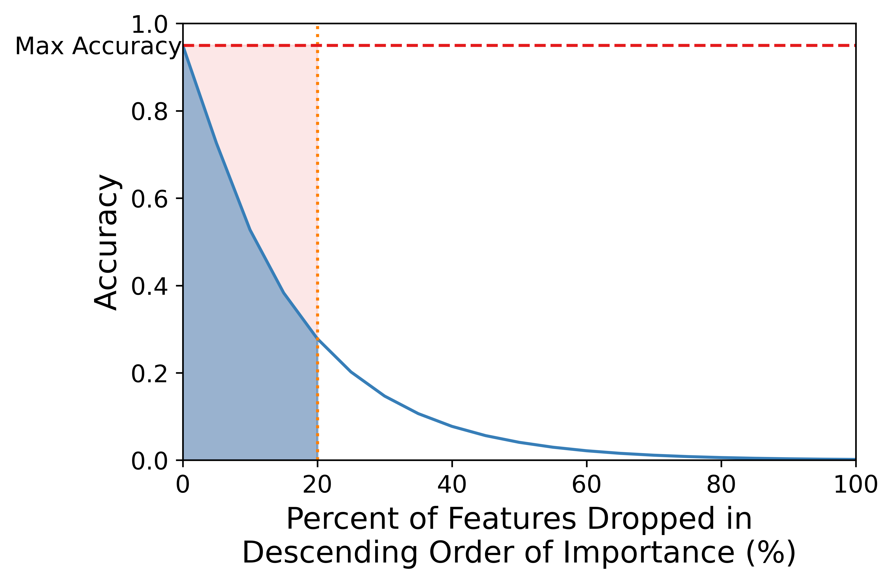
The FAD curve illustrates the explainability of a feature attribution method by plotting the performance metric (e.g., accuracy) against the percentage of features dropped in descending order of importance ranked by the feature attribution method (see Fig. 1). We define the feature importance as the absolute value of the feature attribution score to represent the magnitude of the contribution of each feature to the model’s prediction. Features are dropped by modeling the absence of such features in the input. For standard machine learning inputs, continuous features can sometimes be set to their means or image pixels can sometimes be set to black (Sundararajan et al., 2017). A careful consideration of the nature of the data is, of course, required beforehand.
The intuition behind FAD curves is inspired by counterfactual explanations —which describes how the prediction of a model changes when the input is perturbed (Wachter et al., 2018) —and the Pareto principle —which states that for many situations, approximately 80% of the outcome is due to 20% of causes (the "vital few") (Pareto, 1964; Roccetti et al., 2021). If a feature attribution method accurately ranks the most important features for a certain prediction and the Pareto principle holds true, then cumulatively dropping the most important features in descending order should yield a smaller and smaller decrease in model performance for that prediction. In other words, the model’s ability to make correct predictions is mostly attributed to a small subset of important features. This entails that the steeper the FAD curve is early on, the better the feature attribution method.
2.2 N-AUC
We present the FAD curve Normalized Area Under the Curve (N-AUC) as a performance metric for feature attribution methods. An intuitive way to quantify how much the FAD curve decreases early on is to calculate the Area Under the Curve (AUC) bounded from 0% to % of features dropped in descending order of importance. We choose =20 using the Pareto principle, but this number is just an estimate.
Since steeper FAD curves have smaller AUCs, FAD curves with smaller AUCs indicate a better feature attribution method than FAD curves with larger AUCs. The area under the curve is approximated using the trapezoidal rule (Tai, 1994), as described in Appendix B. Although any performance metric can be used for FAD Curve analysis, we will use accuracy in our explanation for the sake of simplicity. The range of the FAD curve AUC is where is the maximum FAD curve accuracy of all the feature attribution methods for a model’s prediction and is the x-axis upper bound. Note that the minimum FAD curve AUC can only equal zero if the model performance is zero in the bounded range. This case is excluded from FAD curve analysis since this scenario is rare and uninformative. In order to easily compare feature attribution methods, we normalize the FAD curve AUC:
| (1) |
Thus, the range of the FAD curve N-AUC is .
3 Methods and Experiments
We introduce Doctor XAvIer —a medical diagnostic system composed of joint Named Entity Recognition (NER) and intent (i.e. symptom pertinence) classification, primary diagnosis classification, and FAD curve analysis. In this section we discuss each component in detail and evaluate each component.
3.1 Dataset
The Verilogue dataset (Jeblee et al., 2019) is a collection of 800 physician-patient dialogues as audio files and their corresponding human-generated transcripts with speaker labels. Each dialogue includes the patient’s information as well as the primary diagnosis. The distribution of the primary diagnoses in the dataset is shown in Appendix C. The patient’s information consists of the patient’s age, gender, height, weight, blood pressure, smoking status, employment status, and ongoing treatments. Entities —including symptoms, medications, anatomical locations, time expressions, and therapies —are annotated by physicians in each transcript. Additional details about the dataset can be found in Jeblee et al. (2019).
3.2 Joint NER and Intent Classification
A diagnosis requires relevant clinical entities and a measure of pertinence of such entities. For example, a patient might mention a relevant symptom that was experienced by someone else and therefore not pertinent to diagnosis. For each sequence in the physician-patient dialogue, we extract clinical entities with NER and classify the intent of the speaker. We identify the clinical entities identified in Table 2. We label each word in each sequence in the dataset using the Inside-Outside-Beginning (IOB) format (Ramshaw and Marcus, 1995). In this paper, we focus on identifying the pertinence of symptoms. We define the intents of the patient as: confirm/deny/unsure of symptom and the intent of both the patient and physician as: closing (i.e., ending the conversation). Of the 407 annotated dialogues we randomly select 40 to use as a test set for NER and intent classification.
We fine-tune Bio+Clinical BERT (Alsentzer et al., 2019) jointly on these two classification tasks. This model was initialized from BioBERT (Lee et al., 2019) and trained on all notes from MIMIC-III (Johnson et al., 2016) —a database containing electronic health records from ICU patients. Language models pre-trained on domain-specific text yield improvements on clinical NLP tasks as compared to language models pre-trained on a general corpus (Grouchy et al., 2020). Since a majority of interactions between the physician and patient in the dataset are in question-and-answer format, it is beneficial to concatenate the previous sequence with the current sequence, including the respective speaker codes, to give more context to the model. This is done for each sequence before tokenization and improves NER accuracy from 89% to 96%.
For NER, we concatenate the last four hidden layers of Bio+Clinical BERT and feed this representation into an output layer for token-level classification. For intent classification, we feed the [CLS] representation of Bio+Clinical BERT into an output layer for sequence classification. We train with a batch size of 16 sequences and a maximum sequence length of 128 tokens for 5 epochs and select the model with the lowest validation loss. We use AdamW with learning rate of 2e-5, = 0.9, = 0.999, L2 weight decay of 0.01, and linear decay of the learning rate (Loshchilov and Hutter, 2017). We use a dropout probability of 0.1 on all layers except the output layers.
For the loss function, we propose a linear interpolation between the intent classification Cross-Entropy (CE) loss and the average NER Negative Log Likelihood (NLL) loss with . The intent classification CE loss is defined as:
| (2) |
where is the ith element of the softmax output of the intent classes, is the ith element of the one-hot-encoded intent label, is the number of intent classes, is the input, and is the set of model parameters. The average NER NLL loss is defined as:
| (3) |
where is the softmax output of the entity classes —for each token in the sequence —at the target class , is the set of entity labels, and is the number tokens in the sequence. The full loss function is defined in Appendix D.1. [PAD] tokens are excluded from the loss function using masking.
As seen in Table 2 and Table 3, the model yields approximately 0.97 weighted precision, recall, and F1-score on both tasks, outperforming Jeblee et al. (2019)’s models. However, the exact results are difficult to compare since Jeblee et al. (2019) tested their model on a smaller subset of the dataset.
| Entity | Instances | P | R | F1 |
|---|---|---|---|---|
| Other | 158,018 | 0.98 | 0.98 | 0.98 |
| Anatomical Location | 598 | 0.73 | 0.65 | 0.69 |
| Bodily Function | 6 | 0.00 | 0.00 | 0.00 |
| Diagnosis | 1,345 | 0.79 | 0.75 | 0.77 |
| Therapy | 1420 | 0.62 | 0.69 | 0.65 |
| Medication | 3,324 | 0.90 | 0.81 | 0.85 |
| Referral | 256 | 0.71 | 0.79 | 0.74 |
| Symptom | 3,574 | 0.57 | 0.66 | 0.61 |
| Substance Use | 68 | 0.00 | 0.00 | 0.00 |
| Time Expression | 4,062 | 0.90 | 0.84 | 0.87 |
| Weighted Avg | 172,671 | 0.97 | 0.96 | 0.97 |
| Intent | Instances | P | R | F1 |
|---|---|---|---|---|
| Confirm Symptom | 228 | 0.70 | 0.69 | 0.70 |
| Deny Symptom | 52 | 0.73 | 0.69 | 0.71 |
| Unsure of Symptom | 73 | 0.34 | 0.65 | 0.62 |
| Closing | 28 | 0.29 | 0.47 | 0.36 |
| Other | 6,425 | 0.99 | 0.99 | 0.99 |
| Weighted Avg | 6,806 | 0.97 | 0.97 | 0.97 |
3.3 Primary Diagnosis Classification
We classify the primary diagnosis for each physician-patient dialogue using the the patient’s information —such as the patient’s age, weight, blood pressure, and smoking status —and the extracted symptoms from the conversation. Since the same symptom can be said in various different ways, we compile a set of symptoms of all the diseases in the dataset according to WedMD and assign each extracted symptom to one of the pre-defined symptoms. We use a pre-trained SentenceBERT (SBERT) model (Reimers and Gurevych, 2019) to embed each extracted symptom and all the pre-defined symptoms. Each extracted symptom is assigned to its most similar pre-defined symptom measured by the cosine similarity between the SBERT embeddings (Ngai et al., 2021). The most similar pre-defined symptom is defined as:
| (4) |
where is the set of symptoms of all diseases in the dataset, is the ith symptom in , is the jth extracted symptom, is the SBERT embedding of text , and is the cosine similarity between embeddings and . The assigned pre-defined symptom is:
|
|
(5) |
where is a constant and represents that we do not use the extracted symptom for classification. We chose since it minimized incorrect assignments of extracted symptoms in the dataset while filtering out less than 10% of extracted symptoms.
The diagnosis classification model is a neural network composed of 549 input features and three hidden layers with 182K total parameters. The input features consists of patient information and the pertinence of extracted symptoms from the conversation. The model is evaluated using stratified -fold cross-validation. We train with a batch size of 32 for 100 epochs and select the model with the lowest validation loss. We use Adam (Kingma and Ba, 2017) with learning rate of 1e-3, = 0.9, = 0.999, and = 1e-08. We use a GELU activation (Hendrycks and Gimpel, 2016) on all hidden layers. The training loss is the standard CE loss.
As seen in Table 4, Doctor XAvIer yields a significant improvement in weighted precision, recall, and F1-score for diagnosis classification compared to the baseline Jeblee et al. (2019).
| Diagnosis | Model | P | R | F1 |
|---|---|---|---|---|
| ADHD | Doctor XAvIer | 0.95 | 0.97 | 0.96 |
| (Jeblee et al., 2019) | 0.84 | 0.84 | 0.83 | |
| Depression | Doctor XAvIer | 0.92 | 0.93 | 0.92 |
| (Jeblee et al., 2019) | 0.80 | 0.64 | 0.71 | |
| Osteoporosis | Doctor XAvIer | 0.85 | 0.69 | 0.75 |
| (Jeblee et al., 2019) | 0.81 | 0.78 | 0.78 | |
| Influenza | Doctor XAvIer | 1.00 | 0.99 | 0.99 |
| (Jeblee et al., 2019) | 0.91 | 0.95 | 0.93 | |
| COPD | Doctor XAvIer | 0.93 | 0.93 | 0.93 |
| (Jeblee et al., 2019) | 0.75 | 0.65 | 0.68 | |
| Type II Diabetes | Doctor XAvIer | 0.52 | 0.47 | 0.48 |
| (Jeblee et al., 2019) | 0.81 | 0.75 | 0.76 | |
| Other | Doctor XAvIer | 0.73 | 0.80 | 0.76 |
| (Jeblee et al., 2019) | 0.71 | 0.82 | 0.76 | |
| Weighted Avg | Doctor XAvIer | 0.91 | 0.91 | 0.91 |
| (Jeblee et al., 2019) | 0.82 | 0.80 | 0.80 |
3.4 Evaluation of Explainability Methods
For each test fold and model trained on the train fold in the stratified -fold cross-validation of the diagnosis classification model, we evaluate each feature attribution method using FAD curve analysis. We choose accuracy as the performance metric for FAD curve analysis.
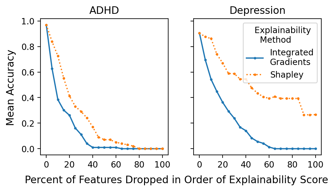
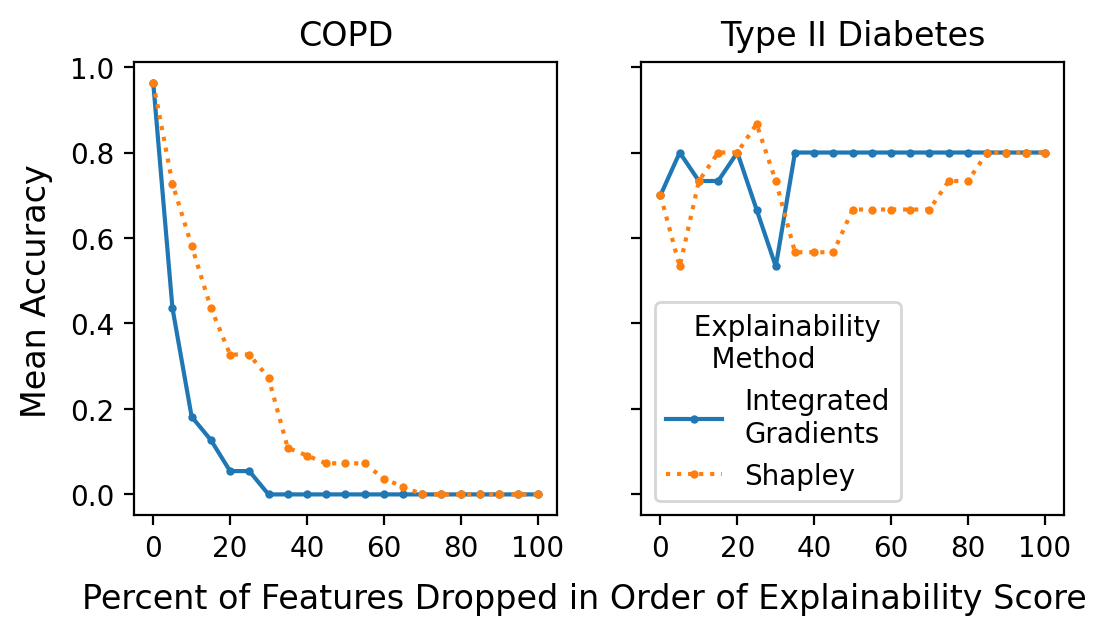
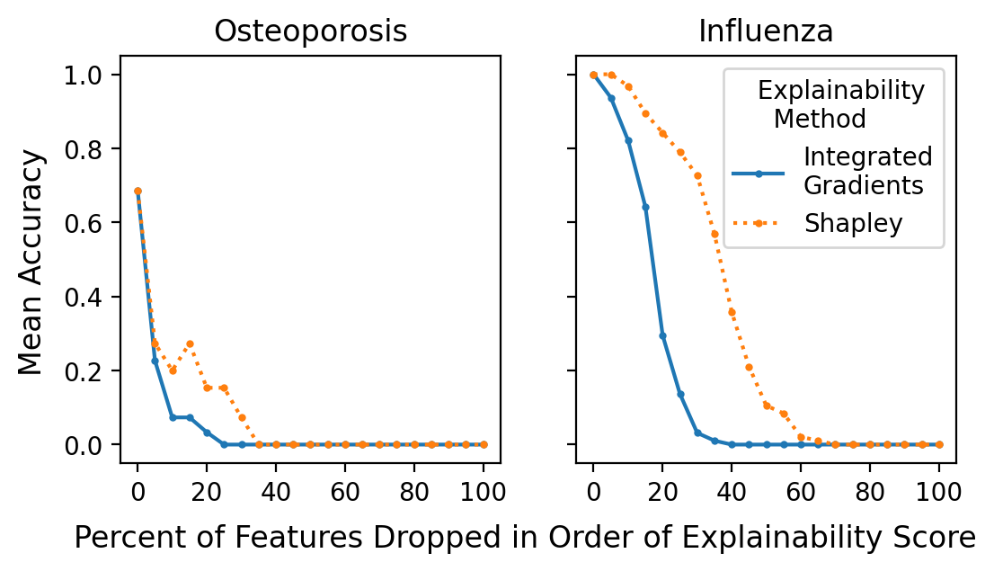
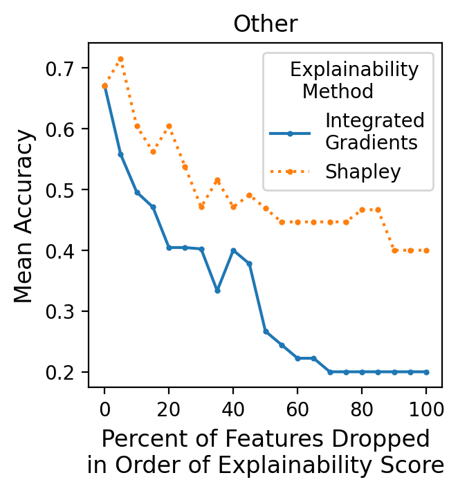
As seen in Table 5, integrated gradients outperforms Shapley values according to FAD curve analysis —achieving smaller N-AUCs for all diagnoses. As seen in Figures 2, 3, and 4 and Appendix F.2, integrated gradients yields noticeably steeper FAD curves than Shapley values for all of the diagnoses except Type II Diabetes. The sporadic shapes of the Type II Diabetes FAD curves can potentially be explained by the lack of dialogues with Type II Diabetes as their primary diagnosis —there are only 3 instances. This suggests that we could potentially improve performance by collecting more instances of the infrequent classes or performing regularization.
It is important to note that some features in the dataset may be correlated. Therefore, dropping features that are correlated with other features may lead to an increase —instead of a decrease —in the performance metric despite dropping features in descending order of importance. We could potentially mitigate this by using feature selection methods before performing FAD curve analysis.
| Diagnosis | Instances | IG | Shapley |
|---|---|---|---|
| ADHD | 20 | 0.48 | 0.77 |
| Depression | 14 | 0.63 | 0.85 |
| Osteoporosis | 5 | 0.24 | 0.36 |
| Influenza | 19 | 0.72 | 0.95 |
| COPD | 11 | 0.33 | 0.59 |
| Type II Diabetes | 3 | 0.59 | 0.73 |
| Other | 9 | 0.71 | 0.95 |
4 Conclusion
Doctor XAvIer yields significant improvements in NER, symptom pertinence classification, and diagnosis classification compared to previous work (Jeblee et al., 2019), while also explaining why the model made each diagnosis. We also present a novel performance plot and evaluation metric for feature attribution methods —FAD curve analysis and its N-AUC. FAD curve analysis shows that integrated gradients outperforms Shapley values in explaining diagnosis classification in the Verilogue dataset. In our future work, we will calculate in a data-driven manner to standardize FAD curve analysis for a given dataset. We will also apply FAD curve analysis to other feature attribution methods, AI domains, and datasets to evaluate its generalizability.
References
- Alsentzer et al. (2019) Emily Alsentzer, John R. Murphy, Willie Boag, Wei-Hung Weng, Di Jin, Tristan Naumann, and Matthew B. A. McDermott. 2019. Publicly available clinical BERT embeddings. CoRR, abs/1904.03323.
- Collier (2017) Roger Collier. 2017. Electronic health records contributing to physician burnout. CMAJ, 189(45):E1405–E1406.
- Du et al. (2019) Nan Du, Kai Chen, Anjuli Kannan, Linh Tran, Yuhui Chen, and Izhak Shafran. 2019. Extracting symptoms and their status from clinical conversations. In Proceedings of the 57th Annual Meeting of the Association for Computational Linguistics, pages 915–925, Florence, Italy. Association for Computational Linguistics.
- Gerke et al. (2020) Sara Gerke, Timo Minssen, and Glenn Cohen. 2020. Ethical and legal challenges of artificial intelligence-driven healthcare. National Center for Biotechnology Information, pages 295–336.
- Grouchy et al. (2020) Paul Grouchy, Shobhit Jain, Michael Liu, Kuhan Wang, Max Tian, Nidhi Arora, Hillary Ngai, Faiza Khan Khattak, Elham Dolatabadi, and Sedef Akinli Koçak. 2020. An experimental evaluation of transformer-based language models in the biomedical domain. CoRR, abs/2012.15419.
- Hendrycks and Gimpel (2016) Dan Hendrycks and Kevin Gimpel. 2016. Bridging nonlinearities and stochastic regularizers with gaussian error linear units. CoRR, abs/1606.08415.
- Jeblee et al. (2019) Serena Jeblee, Faiza Khan Khattak, Noah Crampton, Muhammad Mamdani, and Frank Rudzicz. 2019. Extracting relevant information from physician-patient dialogues for automated clinical note taking. In Proceedings of the Tenth International Workshop on Health Text Mining and Information Analysis (LOUHI 2019), pages 65–74, Hong Kong. Association for Computational Linguistics.
- Johnson et al. (2016) Alistair EW Johnson, Tom J Pollard, Lu Shen, Li-wei H Lehman, Mengling Feng, Mohammad Ghassemi, Benjamin Moody, Peter Szolovits, Leo Anthony Celi, and Roger G Mark. 2016. MIMIC-III, a freely accessible critical care database. Scientific data, 3(1):1–9.
- Kazi and Kahanda (2019) Nazmul Kazi and Indika Kahanda. 2019. Automatically generating psychiatric case notes from digital transcripts of doctor-patient conversations. In Proceedings of the 2nd Clinical Natural Language Processing Workshop, pages 140–148, Minneapolis, Minnesota, USA. Association for Computational Linguistics.
- Khattak et al. (2019) Faiza Khattak, Serena Jeblee, Noah Crampton, Muhammad Mamdani, and Frank Rudzicz. 2019. Autoscribe: Extracting clinically pertinent information from patient-clinician dialogues. Studies in health technology and informatics, 264:1512–1513.
- Kingma and Ba (2017) Diederik P. Kingma and Jimmy Ba. 2017. Adam: A method for stochastic optimization. International Conference on Learning Representations.
- Krishna et al. (2020) Kundan Krishna, Amy Pavel, Benjamin Schloss, Jeffrey P. Bigham, and Zachary C. Lipton. 2020. Extracting structured data from physician-patient conversations by predicting noteworthy utterances. CoRR, abs/2007.07151.
- Lee et al. (2019) Jinhyuk Lee, Wonjin Yoon, Sungdong Kim, Donghyeon Kim, Sunkyu Kim, Chan Ho So, and Jaewoo Kang. 2019. BioBERT: a pre-trained biomedical language representation model for biomedical text mining. CoRR, abs/1901.08746.
- Loshchilov and Hutter (2017) Ilya Loshchilov and Frank Hutter. 2017. Fixing weight decay regularization in Adam. CoRR, abs/1711.05101.
- Lundberg and Lee (2017) Scott M. Lundberg and Su-In Lee. 2017. A unified approach to interpreting model predictions. CoRR, abs/1705.07874.
- Markus et al. (2021) Aniek F. Markus, Jan A. Kors, and Peter R. Rijnbeek. 2021. The role of explainability in creating trustworthy artificial intelligence for health care: A comprehensive survey of the terminology, design choices, and evaluation strategies. Journal of Biomedical Informatics, 113:103655.
- Ngai et al. (2021) Hillary Ngai, Yoona Park, John Chen, and Mahboobeh Parsapoor. 2021. Transformer-based models for question answering on COVID19. CoRR, abs/2101.11432.
- Pareto (1964) Vilfredo Pareto. 1964. Cours d’économie politique, volume 1. Librairie Droz.
- Ramshaw and Marcus (1995) Lance Ramshaw and Mitch Marcus. 1995. Text chunking using transformation-based learning. In Third Workshop on Very Large Corpora.
- Reimers and Gurevych (2019) Nils Reimers and Iryna Gurevych. 2019. Sentence-BERT: Sentence embeddings using siamese bert-networks. CoRR, abs/1908.10084.
- Roccetti et al. (2021) Marco Roccetti, Giovanni Delnevo, Luca Casini, and Silvia Mirri. 2021. An alternative approach to dimension reduction for pareto distributed data: a case study. Journal of Big Data.
- Roth et al. (2009) Carol P. Roth, Yee-Wei Lim, Joshua M. Pevnick, Steven M. Asch, and Elizabeth A. McGlynn. 2009. The challenge of measuring quality of care from the electronic health record. American Journal of Medical Quality, 24(5):385–394. PMID: 19482968.
- Selvaraj and Konam (2019) Sai P. Selvaraj and Sandeep Konam. 2019. Medication regimen extraction from clinical conversations. CoRR, abs/1912.04961.
- Sundararajan and Najmi (2019) Mukund Sundararajan and Amir Najmi. 2019. The many shapley values for model explanation. CoRR, abs/1908.08474.
- Sundararajan et al. (2017) Mukund Sundararajan, Ankur Taly, and Qiqi Yan. 2017. Axiomatic attribution for deep networks.
- Tai (1994) Mary M Tai. 1994. A mathematical model for the determination of total area under glucose tolerance and other metabolic curves. Diabetes care, 17(2):152–154.
- Wachter et al. (2018) Sandra Wachter, Brent Mittelstadt, and Chris Russell. 2018. Counterfactual explanations without opening the black box: Automated decisions and the GDPR.
- Wei et al. (2018) Zhongyu Wei, Qianlong Liu, Baolin Peng, Huaixiao Tou, Ting Chen, Xuanjing Huang, Kam-fai Wong, and Xiangying Dai. 2018. Task-oriented dialogue system for automatic diagnosis. In Proceedings of the 56th Annual Meeting of the Association for Computational Linguistics (Volume 2: Short Papers), pages 201–207, Melbourne, Australia. Association for Computational Linguistics.
- Weiskopf and Weng (2013) Nicole Gray Weiskopf and Chunhua Weng. 2013. Methods and dimensions of electronic health record data quality assessment: enabling reuse for clinical research. Journal of the American Medical Informatics Association, 20(1):144–151.
- Xu et al. (2019) Lin Xu, Qixian Zhou, Ke Gong, Xiaodan Liang, Jianheng Tang, and Liang Lin. 2019. End-to-end knowledge-routed relational dialogue system for automatic diagnosis. CoRR, abs/1901.10623.
Appendix
Appendix A Feature Attribution Methods
A.1 Shapley Values
The Shapley value (Lundberg and Lee, 2017) —a method from cooperative game theory —assigns payouts to players depending on their contribution to the total payout in a cooperative game. Players cooperate in a coalition and receive a certain profit from this cooperation. In explainable AI, the game is the prediction task for a single instance in the dataset, the players are the feature values of a single instance that collaborate to make a prediction, and the gain is the prediction for an instance minus the average prediction for all instances (Sundararajan and Najmi, 2019). In other words, the Shapley value measures the contribution of each input feature to a model’s prediction for a single instance.
A.2 Integrated Gradients
Integrated gradients (Sundararajan et al., 2017) is an XAI technique which attributes the prediction of a deep neural network to its input features. Integrated gradients attributes blame to an input feature by using the absence of the input feature as a baseline for comparing outcomes. For most deep networks, there exists a baseline in the input space where the prediction is neutral. For example, the baseline for an object recognition network can be a black image. Mathematically, integrated gradients is defined as the path integral of the gradients along the straightline path from the baseline to the input .
Appendix B Area Under the Curve Approximation
Appendix C Additional Dataset Details
Table 6 shows the distribution of diagnoses in the Verilogue dataset.
| Primary Diagnosis | Dialogues |
|---|---|
| ADHD | 99 |
| Depression | 72 |
| Osteoporosis | 26 |
| Influenza | 95 |
| COPD | 55 |
| Type II Diabetes | 14 |
| Other | 46 |
Appendix D Additional Details for Joint NER and Intent Classification
D.1 Loss Function Equations
D.2 Training Hardware
Training of the joint NER intent classiciation model was performed on a NVIDIA Quadro RTX 6000 GPU and took approximately two hours to finish training.
| Feature | Attribution % |
|---|---|
| Age | 0.015 |
| Trouble making decisions and remembering things | 0.013 |
| Taking Adderall | 0.009 |
| Trouble focusing on a task | 0.007 |
| Easily distracted | 0.004 |
| Restlessness | 0.003 |
| Feature | Attribution % |
|---|---|
| Weight | 0.003 |
| Age | 0.002 |
| Trouble focusing on a task | 0.002 |
| Trouble making decisions and remembering things | 0.002 |
| Easily distracted | 0.002 |
| Systolic Blood Pressure | 0.002 |
Appendix E Additional Details for Primary Diagnosis Classification
E.1 Training Hardware
Training of the primary diagnosis classification model was performed on a NVIDIA Tesla K80 GPU and took approximately an hour to finish training and evaluating all five models.
Appendix F Additional Details for FAD Curve Analysis
F.1 Feature Attribution Examples
F.2 Additional FAD Curves for Diagnosis Classification
The FAD curve for the diagnosis Other is seen in Figure 5.
Appendix G Code
The code is available at: https://github.com/hillary-ngai/doctor_XAvIer.