ZeroIn: Characterizing the Data Distributions of Commits in Software Repositories
Abstract
Modern software development is based on a series of rapid incremental changes collaboratively made to large source code repositories by developers with varying experience and expertise levels. The ZeroIn project is aimed at analyzing the metadata of these dynamic phenomena, including the data on repositories, commits, and developers, to rapidly and accurately mark the quality of commits as they arrive at the repositories. In this context, the present article presents a characterization of the software development metadata in terms of distributions of data that best captures the trends in the datasets. Multiple datasets are analyzed for this purpose, including Stack Overflow on developers’ features and GitHub data on over 452 million repositories with 16 million commits. This characterization is intended to make it possible to generate multiple synthetic datasets that can be used in training and testing novel machine learning-based solutions to improve the reliability of software even as it evolves. It is also aimed at serving the development process to exploit the latent correlations among many key feature vectors across the aggregate space of repositories and developers. The data characterization of this article is designed to feed into the machine learning components of ZeroIn, including the application of binary classifiers for early flagging of buggy software commits and the development of graph-based learning methods to exploit sparse connectivity among the sets of repositories, commits, and developers.
1 Introduction
The ZeroIn project is aimed at building a novel computational framework to enable the characterization and classification of buggy or vulnerable code changes at the very origin of source code, as early as the time at which they are committed to software repositories. We achieve this by novel use of machine learning for analyzing, classifying, visualizing, and modeling massive logs of version control in combination with key characterization of developers’ historical traits. The intrinsically temporal nature of software coder and repository interactions creates transitive and complex dependencies that could potentially reveal insights into the vulnerabilities [8]. The research in this project is aimed at tapping the potential to broadly benefit modern software development platforms and increase software security globally.
In order to apply modern machine learning techniques to this difficult problem, large datasets are necessary for training, testing, and validating the techniques. Most importantly, ground truth data at scale is needed not only to meet the accuracy measures but also to be relevant to the large sizes of modern software repositories and global developer team sizes [1].
Here, we present the data gathering and characterization of software development spanning institutions (coder team strengths, etc.), coder features (experience, expertise, etc.), software repository characteristics (commit volumes, frequencies, bugs, etc.).
To our knowledge, this is one of the first attempts at characterizing the metadata about modern software repositories at a large scale and across multiple dimensions including the software bases, commits, and coder features.
1.1 Closed-form Distributions from Datasets
The large sizes of the datasets are distilled into closed form distributions defined by probability density functions by applying multiple candidate distributions and sorting the distributions and their parameters by their goodness of fit and selecting the top candidates that provides the best fit. The cumulative distribution functions of these probability density functions are necessary to derive the inverse cumulative distribution functions, which are in turn necessary for accurately sampling the distributions in the generation of synthetic ground truth driven by the real data. To illustrate, the probability density function of the Log-Normal distribution is given by
where is the shift parameter, and and are such that follows the Normal distribution with a mean and standard deviation .
The cumulative density function of is given by
where, the error function is defined as:
The inverse, , of the cumulative distribution function is given by
where, , and is defined by the pair of relations and .
For the other distributions used in later sections (such as Exponential and Negative Binomial), a similar set of derivations provide the inverse CDF equations from their corresponding PDF equations.
The inverse CDF is directly useful in regenerating any probability density function using random sampling techniques (see, for example, chapter 12 on reversible distribution sampling [6]). We exploit this key feature of the relation between empirically-determined fit for (and, by implication, ) and its inverse CDF to develop concise representations of all large datasets used in our study.
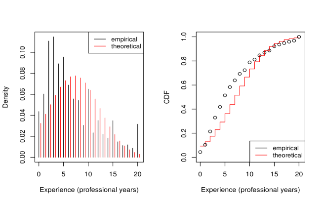
1.2 Machine Learning Model
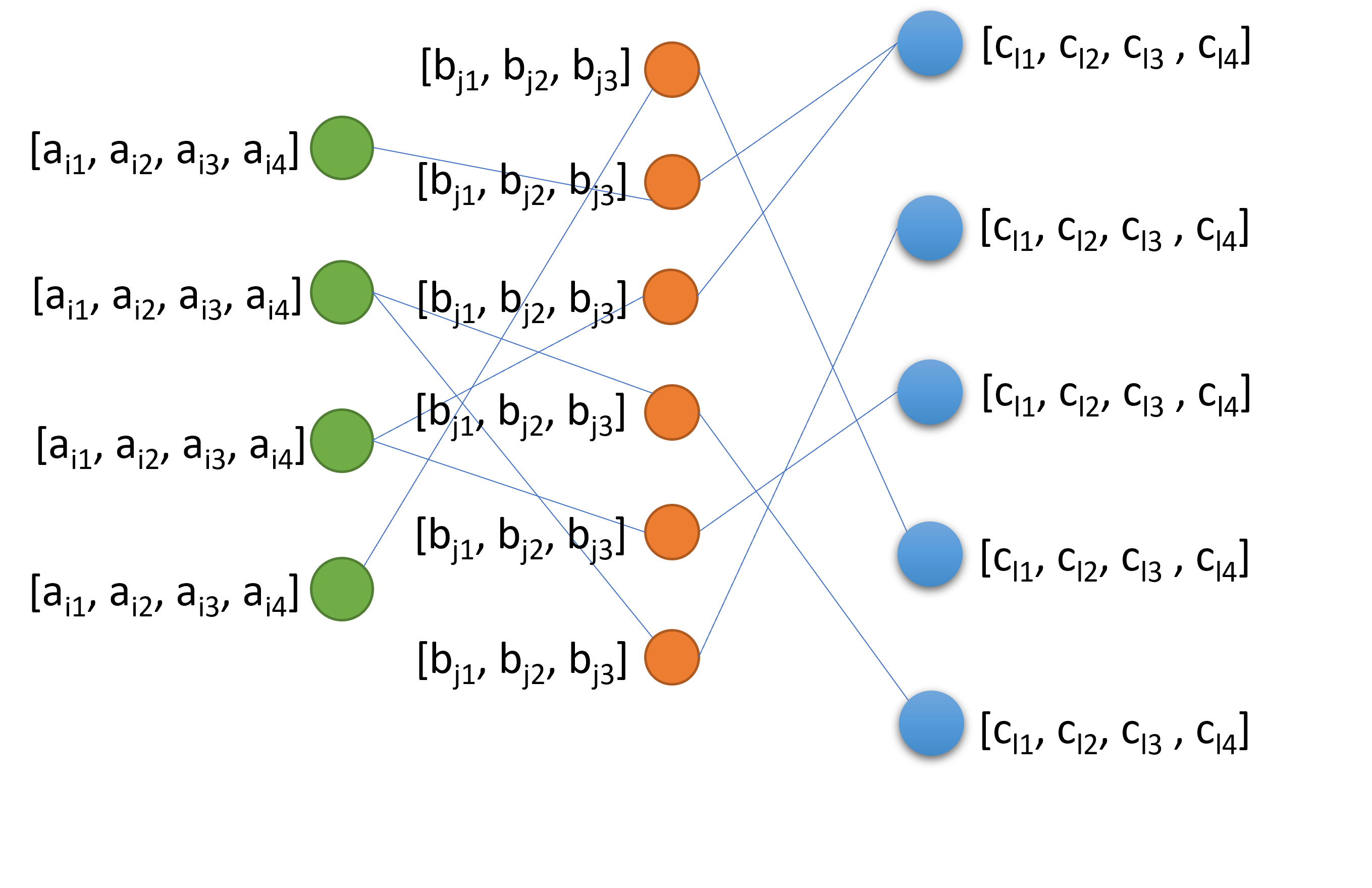
Figure 1 depicts our graph model for modelling the software development process. The first column of nodes denotes coders, each with its own feature vector. The second column of nodes (along with their own feature vectors) represents the commits performed by the coders, and the last column of nodes (with their feature vectors) represents the repositories to which the commits are made. The datasets are used to ultimately generate the distributions needed to populate this tripartite graph and their feature vectors for use in training, testing, and validating our machine learning algorithms. In the later inferencing stage, the same graph model will be used to represent the production data on which the learner will be exercised to watch every commit and signal the prognoses of vulnerabilities [3].
2 GitHub Dataset with 452 Million Commits
To capture and characterize the volumes of commits to software repositories, we undertook a search for publicly available metadata on large software repository storehouses. We found the data.world repository on 452 million commits to the popular GitHub software storehouse as a suitable dataset.
The dataset is described at the following website: https://data.world/vmarkovtsev/452-m-commits-on-github. The direct URL to the statistics file containing the metadata in comma-separated value (CSV) format is https://query.data.world/s/7euzfiycvbfxikevuc2cg2p4pbuish. This dataset contains metadata from 16 million repositories on GitHub. The primary data in this dataset is organized into four main columns: repository name, number of commits, number of contributors and average length of the commit.
Using Python’s Scipy Library, we performed regression using multiple candidate distributions. Among the different distributions evaluated, the Exponential and Log-Normal distributions fared the best in terms of goodness of fit. The best fitting distributions are shown in Table 1. The distribution provides loc and scale parameters: the loc parameter shifts the distribution by the appropriate amount and the scale parameter stretches the distribution as required. These values are indicated in the table as (loc, shape) values against the distribution. Similar parameters are used to define the other distributions as well.
| Commits | Repositories | Best Fit | Second-Best Fit |
|---|---|---|---|
| <20 | 13,156,036 | Exponential (-0.83,0.83) | Log-Normal (5.67,-0.832,0) |
| 20 - 100 | 2,235,831 | Exponential (-1.07,1.07) | Log-Normal (1.01,-1.17,0.76) |
| 100 - 1000 | 554,079 | Log-Normal (1.30,-0.83,0.41) | Weibull Min (0.81,-0.81,0.71) |
| 1000 - 4000 | 28,549 | Exponential (-1.07,1.07) | Weibull Min (0.93,-1.07,1.11) |
| 4000 - 10,000 | 4,766 | Exponential (-1.26,1.26) | Gamma (1.17,-1.26,1.07) |
| 10,000 - 100,000 | 2,221 | Log-Normal (1.30,-0.81,0.40) | Inv. Gaussian (2.13,-0.851,0.40) |
| >100,000 | 128 | Exponential (-0.94,0.94) | Log-Normal (1.33,-0.96,0.48) |
Table 1 gives the parameters of the best fitting and second best fitting distributions over the different range of number of commits.
2.1 Distributions of Commits to Repositories
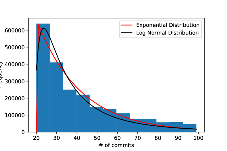
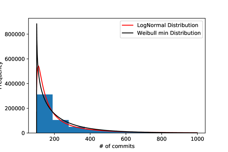
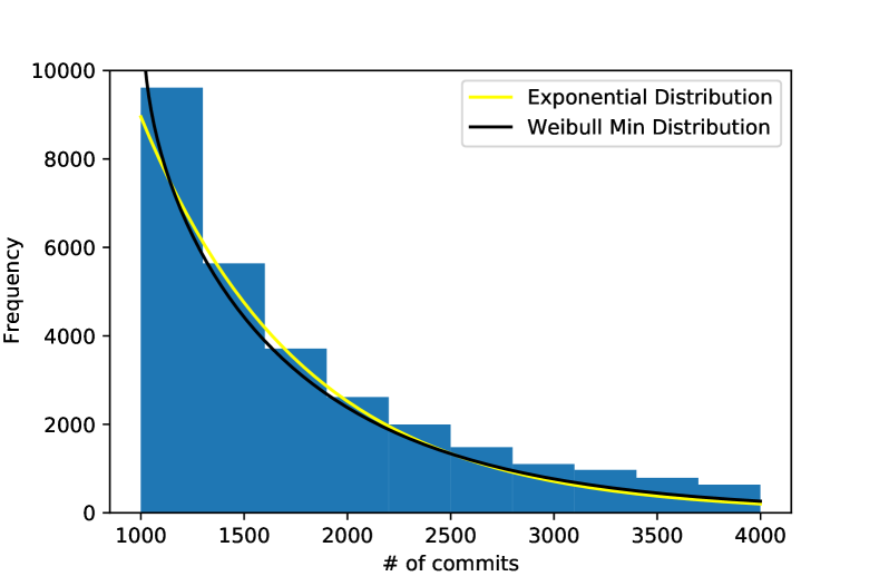
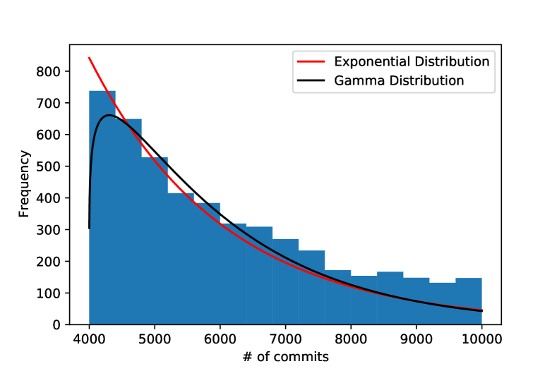
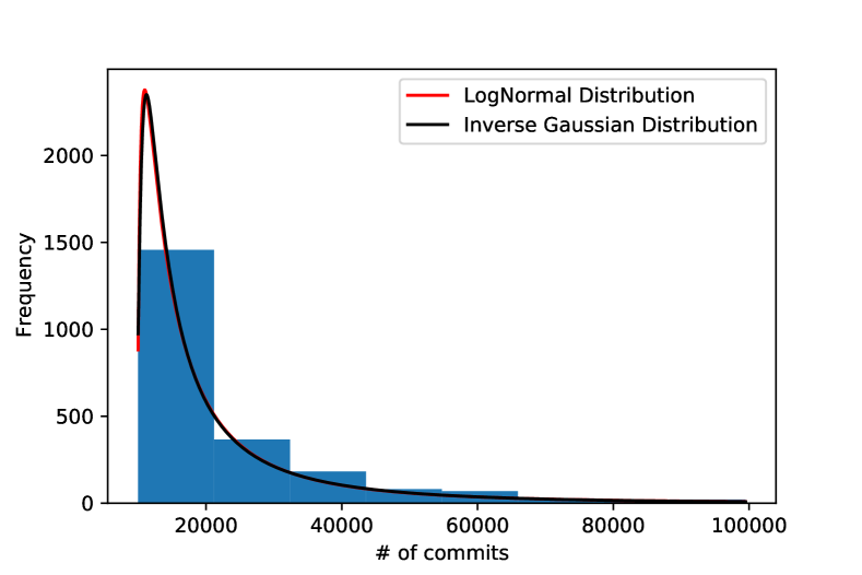
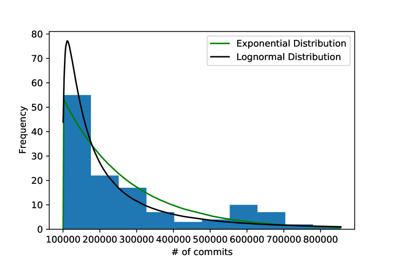
Figure 2 shows the histogram of number of commits between 20 and 100 (very low activity repositories). In this figure (and all other related figures), we overlay the Probability Density Functions (PDFs) of the best fitting distributions on the histogram. Figure 3 shows the histogram of number of commits between 100 and 1000 (low activity repositories). Figure 4 shows the histogram of number of commits between 1000 and 4000 (medium activity repositories). Figure 5 shows the histogram of number of commits between 4000 and 10000 (medium activity repositories). Figure 6 shows the histogram of number of commits between 10000 and 100K (high activity repositories). Figure 7 shows the histogram of number of commits greater than 100K (very high activity repositories).
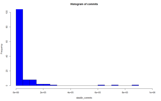
Figure 8 shows the histogram of all the commits.
2.2 Distributions of Contributors to Repositories
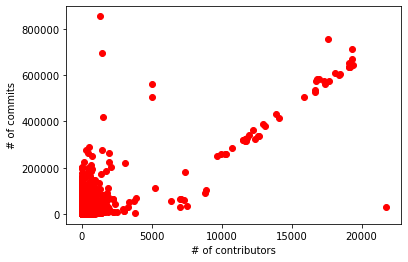
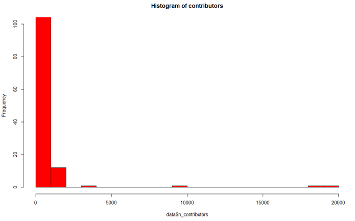
Figure 9 shows the relationship between number of commits and number of contributors across all the repositories. Figure 10 shows the histogram of all the contributors.
3 StackOverFlow Developer Dataset
Stack Overflow conducts an annual survey of developers across the globe every year. We used the 2019, 2020 and 2021 datasets to find the best fit distributions to the professional years of experience of coders. The datasets can be found through this link: StackOverflow Dataset
3.1 Overview and Preprocessing of the Data
3.1.1 Preprocessing 2021 Dataset
In the preprocessing stage, we dropped all rows that contain N/A values or coders with less than 1 year of experience or more than 50 years of experience. And to categorize the professionals from all coders, we used the column named ‘Main Branch’ and restricted the analysis to those participants who marked ‘I am a developer by profession’.
3.1.2 Preprocessing 2020 Dataset
We started our preprocessing of the data by converting “Less than 1 year” values to 0, “More than 50 years” to 51 and dropping “NA” values from the column “YearsCodePro”. We also considered only “Employed full-time” entries for “Employment” column. Further, values in the range of 30-90 were considered for the column “WorkWeekHrs”.
3.1.3 Preprocessing for Comparison of Datasets
In order to be able to make comparison across the three years, we normalize the comparison by using the same preprocessing method as used for the 2021 dataset. In other words, the preprocessing steps described earlier for the 2021 dataset are applied to the 2019 and 2020 datasets also, and the resulting data is used for direct comparison across the years.
3.2 Professional Coder Distributions in 2021
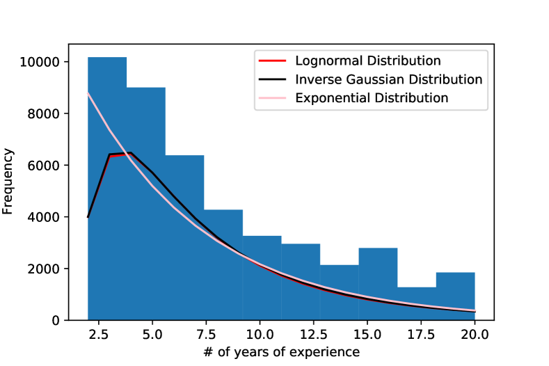
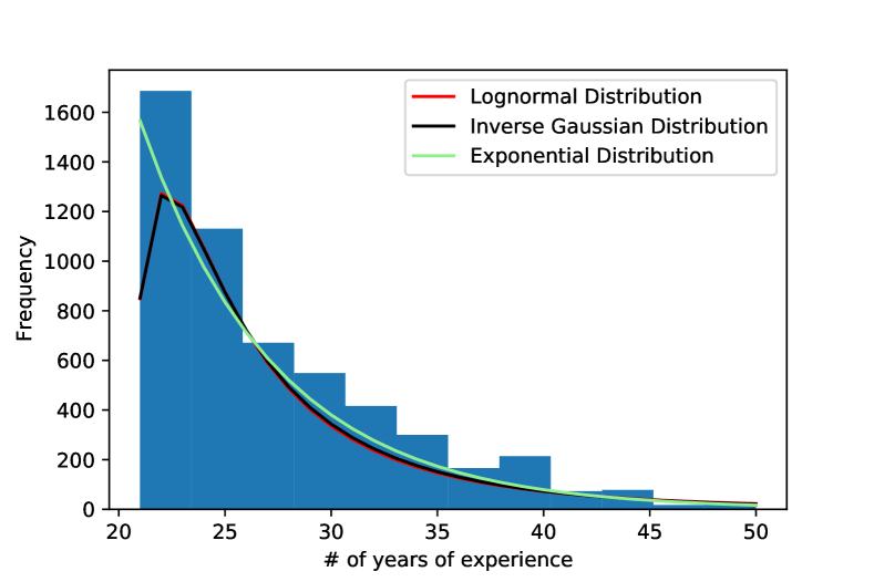
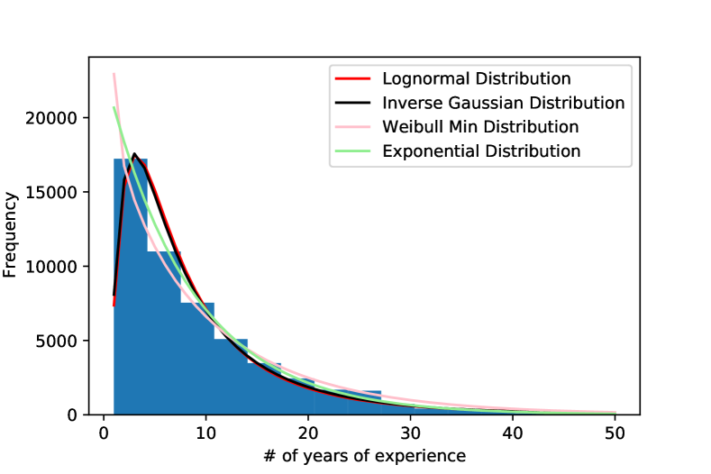
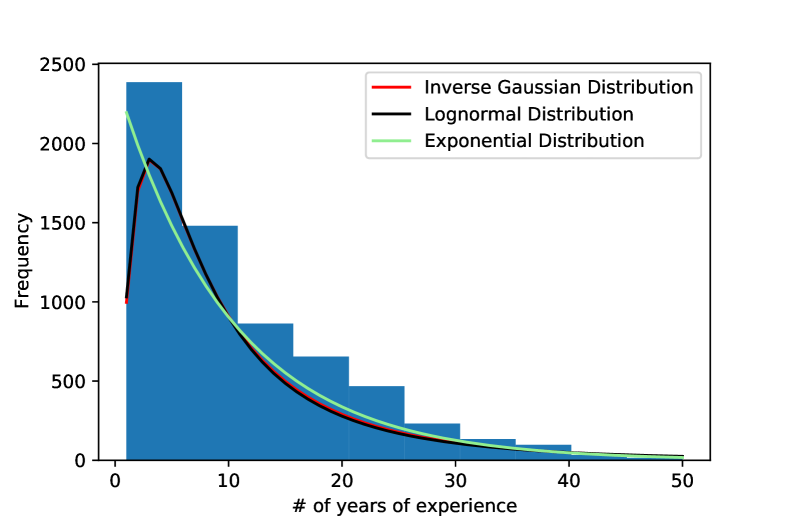
Figure 11 shows the histogram of professional coders with years of experience between 2 and 20 years. Figure 12 shows the histogram of professional coders with more than 20 years of experience. Figure 13 shows the histogram of all the Professional coders with more than 1 year of experience. Figure 14 shows the histogram of all the Professional coders with more than 1 year of experience. Table 2 captures all the distributions from these figures into best-fit and second-best-fit distributions for all the groups.
| Group | Best fit | Second best fit |
|---|---|---|
| Professional coders bw 2 and 20 | Log-Normal (0.89, -1.29, 0.92) | Inverse Gaussian (0.77, -1.39, 1.8) |
| Professional coders more than 20 | Inverse Gaussian (0.71, -1.42, 2.00) | Log-Normal (0.84, -1.32, 0.97) |
| All professional coders | Log-Normal (0.91, -1.13, 0.78) | Inverse Gaussian (0.89, -1.20, 1.36) |
| Non- professional coders | Exponential (-1.04,1.04) | Beta: Visually looks weird so dropped |
3.3 Professional Coder Distributions in 2020
Here, we start with determining the frequency histograms of the coders which provides the visual indication of the potential distributions to attempt in fitting the data. This is described in Section 3.3.1.
For the rest of the analyses in this section, the fitdistrplus package in the R statistical analysis software is used.
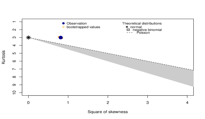
We compute the skewness-kurtosis measures in order to uncover specific candidate distributions to further narrow down the potential distributions. This is achieved using the descdist function of the R package. The results from this step are described in Section 3.3.2.
The dataset is then tested against fitted distributions (i.e., Normal, Poisson and Negative Binomial) using the fitdist function, which provides the Log-likelihood, Akaike information criterion (AIC), and Bayesian information criterion (BIC) values. This step is described in Section 3.3.3.
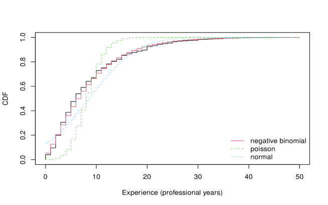
Following this, we generated the P-P plots for theoretical probabilities against the distribution of the empirical data (this is achieved using the ppcomp function). The CDF plots for empirical cumulative distribution are generated and plotted against fitted distribution functions (this is achieved using the cdfcomp function). These plots are presented in Section 3.3.4.
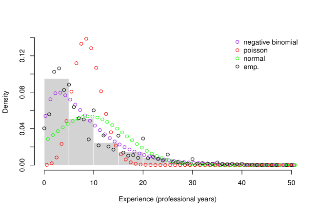
The density plots for the histogram are fitted against density functions (this is performed using denscomp function). This is described in Section 3.3.5.
Finally, considering all the statistical analyses, we select the best fitting distribution for each professional coding year range. This is described in Section 3.3.6.
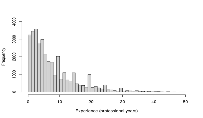
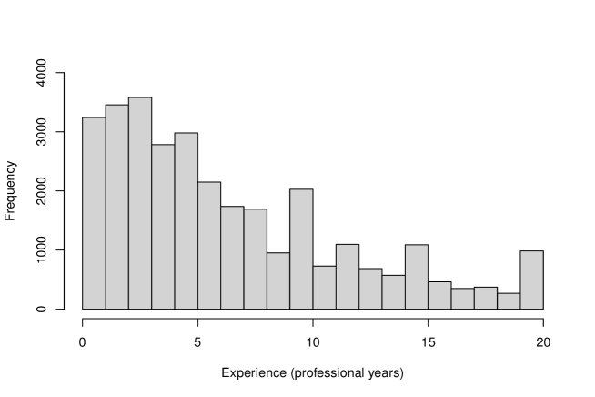
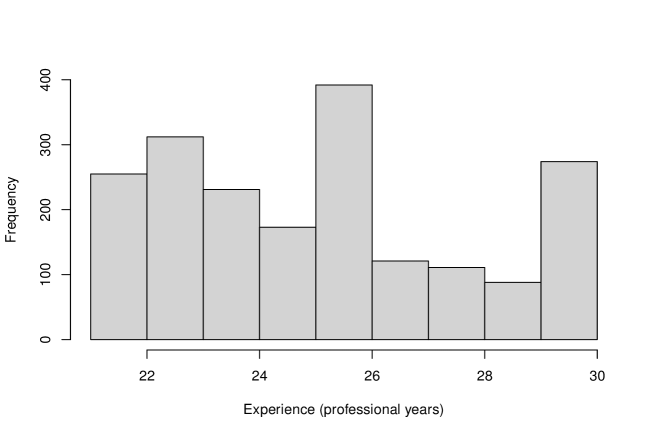
3.3.1 Frequency Histograms of Professional Coders
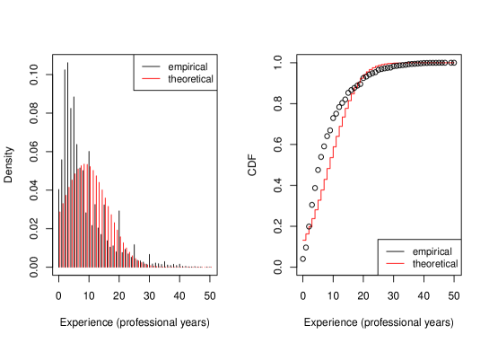
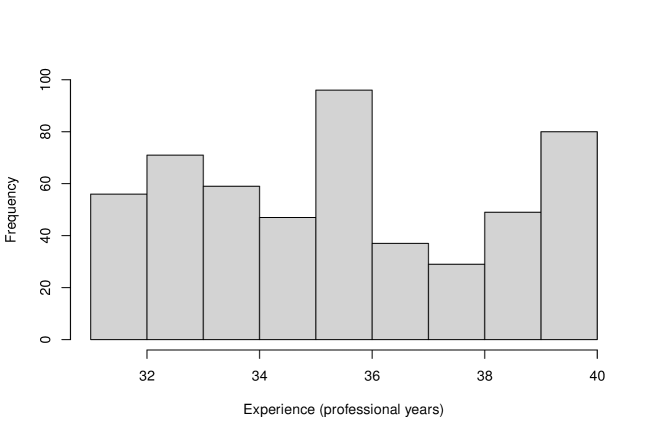
Figure 23, Figure 31, and Figure 39 show the frequency histogram of professional coders with 0-20, 21-30, and 31-40 years of working experience, respectively. Figure 15 captures the same for the broader range of 0-50 years working experience.
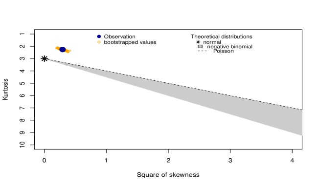
3.3.2 Determining the Potential Matching Distributions
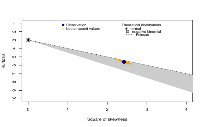
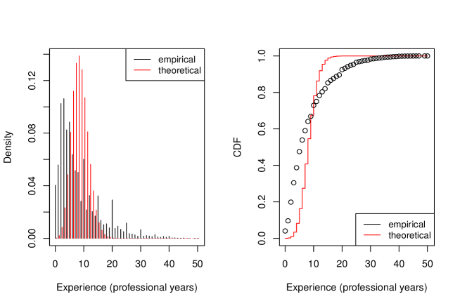
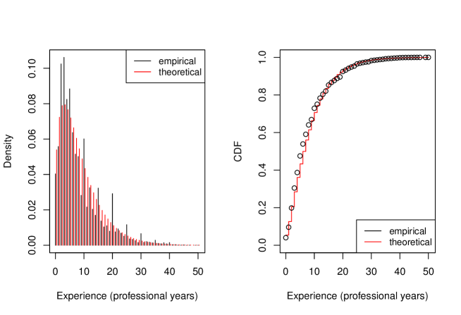
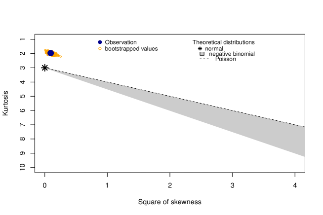
For every group representing the coding experience range of the coders, the skewness-kurtosis plot of professional coders in that experience range is computed. This plot helps to visually determine which discrete distribution the data set follows more closely. Figure 24, Figure 32, and Figure 40 show the skewness-kurtosis plots of professional coders with 0-20, 21-30, and 31-40 years of working experience, respectively. Figure 16 captures the same for the broader range from 0 to 50 years of experience.
Table 3 shows the frequency of coders and the best distribution for each professional coding year range along with parameters.
| Coding Year Range | Count of Coders | Best Fit |
|---|---|---|
| 0–50 | 33,734 | Neg. Binomial (1.59,8.33) |
| 0–20 | 31,202 | Neg. Binomial (2.2,6.8) |
| 21–30 | 1,957 | Normal (24.66,2.81) |
| 31–40 | 524 | Normal (35.02,2.82) |
3.3.3 Fit of Distributions
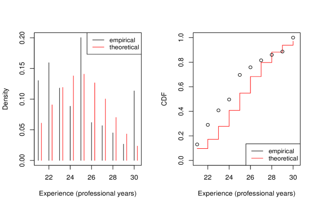
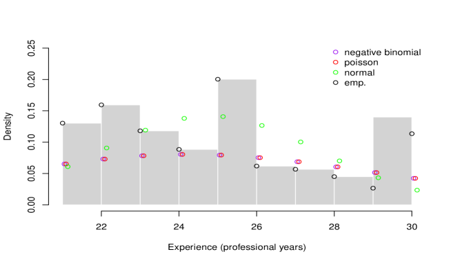
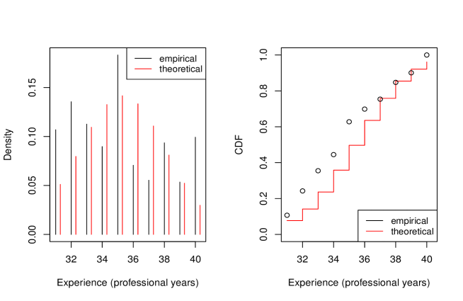
Figure 25 (left), Figure 33 (left), and Figure 41 (left) represent density plots that compare between empirical (data set) and Normal distribution of professional coders with 0-20, 21-30, and 31-40 years of working experience, respectively. Figure 17 (left) captures the same for the broader range of 0-50 years working experience.
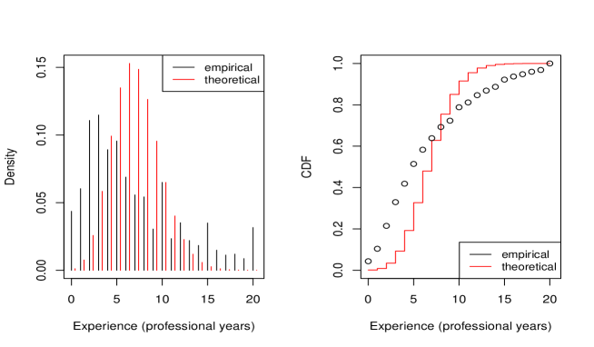
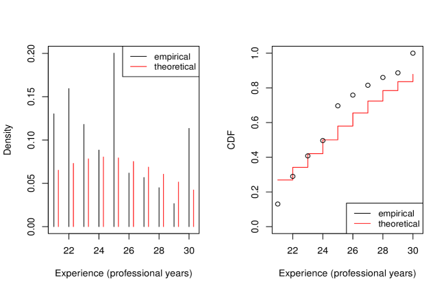
Figure 26 (left), Figure 34 (left), and Figure 42 (left) represent density plots that compare between empirical (data set) and Poisson distribution of professional coders with 0-20, 21-30, and 31-40 years of working experience, respectively. Figure 18 (left) captures the same for the broader range of 0-50 years working experience.
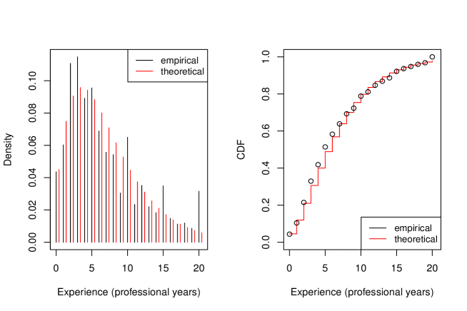
Figure 27 (left), Figure 35 (left), and Figure 43 (left) represent density plots that compare between empirical (data set) and Negative Binomial distribution of professional coders with 0-20, 21-30, and 31-40 years of working experience, respectively. Figure 19 (left) captures the same for the broader range of 0-50 years working experience.
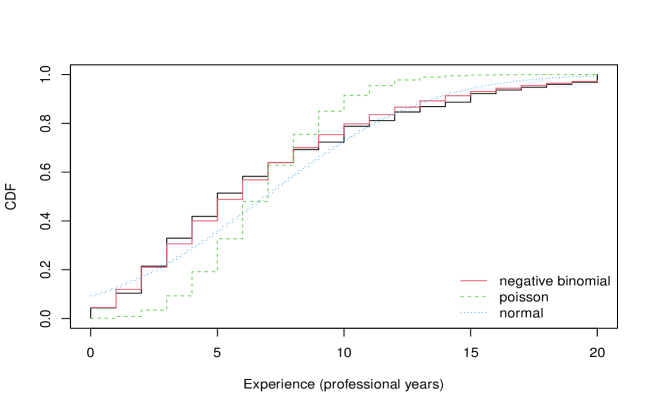
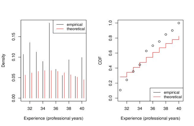
Figure 25 (right), Figure 33 (right), and Figure 41 (right) represent CDF plots that compare between empirical (data set) and Normal distribution of professional coders with 0-20, 21-30, and 31-40 years of working experience, respectively. Figure 17 (right) captures the same for the broader range of 0-50 years working experience.
Figure 26 (right), Figure 34 (right), and Figure 42 (right) represent CDF plots that compare between empirical (data set) and Poisson distribution of professional coders with 0-20, 21-30, and 31-40 years of working experience, respectively. Figure 18 (right) captures the same for the broader range of 0-50 years working experience.
Figure 27 (right), Figure 35 (right), and Figure 43 (right) represent CDF plots that compare between empirical (data set) and Negative Binomial distribution of professional coders with 0-20, 21-30, and 31-40 years of working experience, respectively. Figure 19 (right) captures the same for the broader range of 0-50 years working experience.
3.3.4 Closeness of Fit of Cumulative Distribution Functions
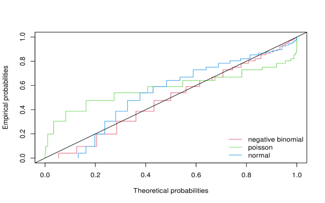
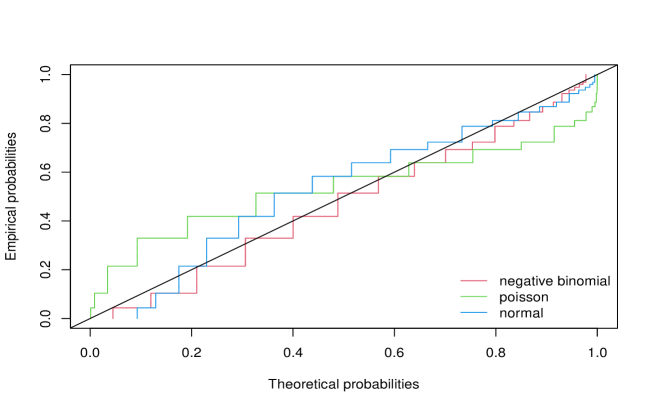
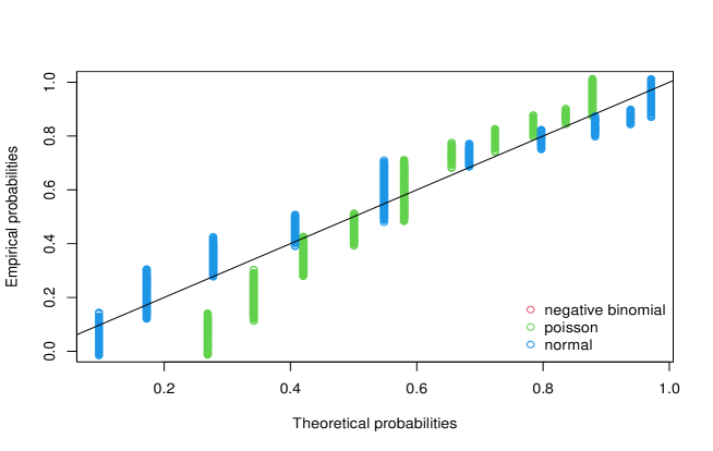
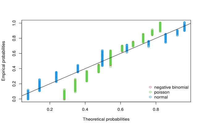
The fit of each distribution can be evaluated by comparing their cumulative distribution function curves against the the perfect linear match representing the actual data on a plot of distribution probability versus empirical probability (P-P plot).
Figure 28, Figure 36, and Figure 44 show the P-P plots for the Normal, Poisson and Negative Binomial distribution with respect to empirical distribution (data set) of professional coders with 0-20, 21-30, and 31-40 years of working experience, respectively. Figure 20 captures the same for the broader range of 0-50 years working experience.
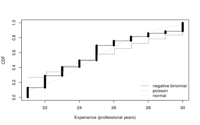
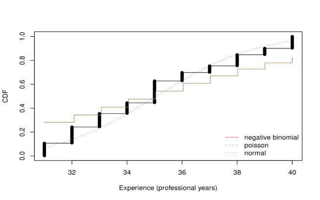
Figure 29, Figure 37, and Figure 45 show the CDF plots for the Normal, Poisson and Negative Binomial distribution with respect to empirical distribution (data set) of professional coders with 0-20, 21-30, and 31-40 years of working experience respectively. Figure 21 captures the same for the broader range of 0-50 years working experience.
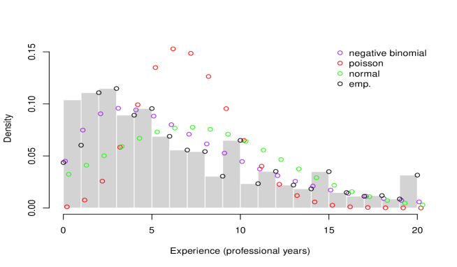
3.3.5 Density Overlay for Different Distributions
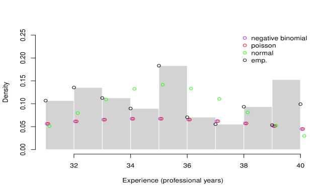
Figure 30, Figure 38, and Figure 46 show the histogram (default bin size) against fitted Normal, Poisson and Negative Binomial density functions of professional coders with 0-20, 21-30, and 31-40 years of working experience respectively. Figure 22 captures the same for the broader range of 0-50 years working experience, respectively.
3.3.6 Best Fit Distributions
Table 5, Table 6, and Table 7 exhibits summary of fitting different distributions considering parameters, log-likelihood, Akaike’s Information Criteria (AIC) and Bayesian Information Criteria (BIC) for professional coders with 0-20, 21-30, and 31-40 years of working experience respectively. Table 4 exhibits the same for the broader range of 0-50 years working experience.
| Distribution | Log-likelihood | AIC | BIC | Best Fit | |
|---|---|---|---|---|---|
| Normal |
mean = 8.33
sd = 7.45 |
-115,628 | 231,260 | 231,277 | |
| Poisson |
lambda=
8.33 |
-159,718 | 319,438 | 319,447 | |
| N. Binomial |
size = 1.59
mu = 8.33 |
-105,885 | 211,774 | 211,790 | \checkmark |
| Distribution | Log-likelihood | AIC | BIC | Best Fit | |
|---|---|---|---|---|---|
| Normal |
mean = 6.80
sd = 5.13 |
-95,336 | 190,676 | 190,693 | |
| Poisson |
lambda=
6.80 |
-113,532 | 227,066 | 227,074 | |
| N. Binomial |
size = 2.20
mu = 6.80 |
-90,475 | 180,955 | 180,972 | \checkmark |
| Distribution | Log-likelihood | AIC | BIC | Best Fit | |
|---|---|---|---|---|---|
| Normal |
mean = 24.66
sd = 2.81 |
-4,801 | 9,607 | 9,618 | \checkmark |
| Poisson |
lambda=
24.66 |
-5,244 | 10,490 | 10,496 | |
| N. Binomial |
size = 1.08e+08
mu = 24.66 |
-5,244 | 10,492 | 10,503 | |
| Distribution | Log-likelihood | AIC | BIC | Best Fit | |
|---|---|---|---|---|---|
| Normal |
mean = 35.02
sd = 2.82 |
-1,286 | 2,576 | 2,585 | \checkmark |
| Poisson |
lambda=
35.02 |
-1,472 | 2,947 | 2,951 | |
| N. Binomial |
size = 1.39e+08
mu = 35.02 |
-1,472 | 2,949 | 2,957 | |


3.4 Comparison of Changes across Years
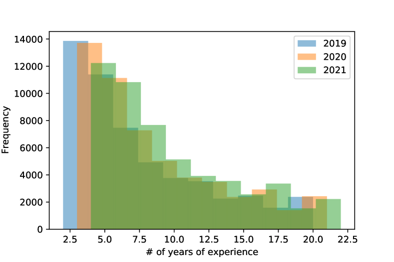
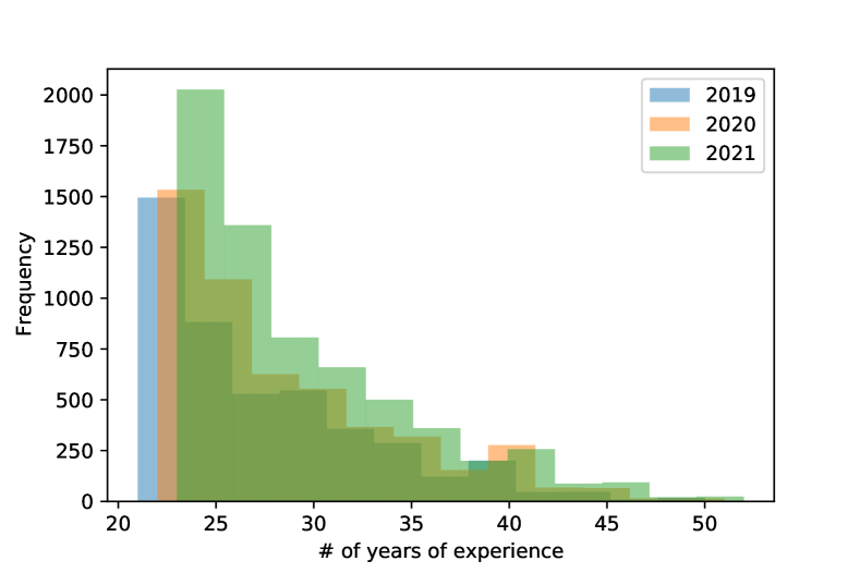
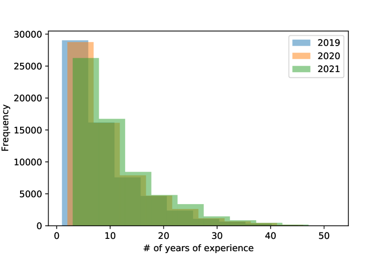
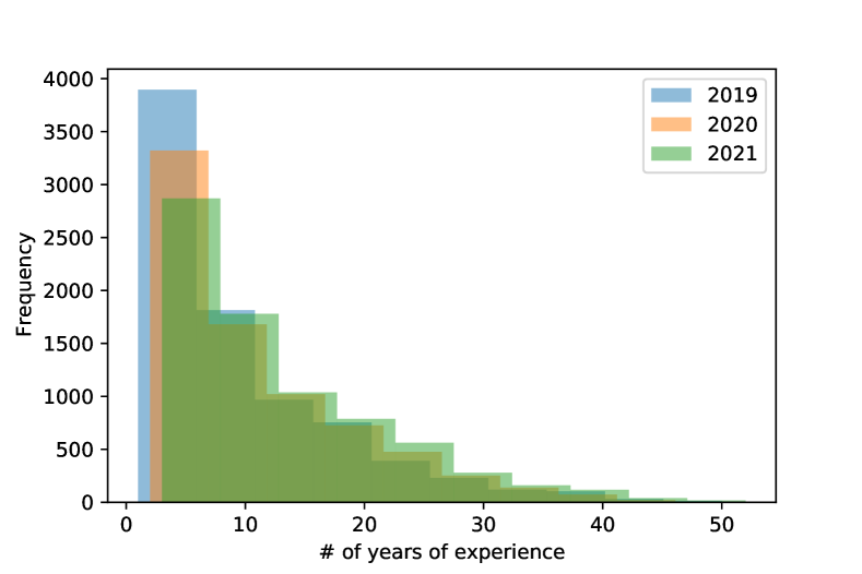
Figure 47 shows histogram of professional coders in 2019, 2020 and 2021 with 2 to 20 years of experience. Figure 48 shows histogram of professional coders in 2019, 2020 and 2021 with 20 to 50 years of experience. Figure 49 shows histogram of all professional coders in 2019, 2020 and 2021 with more than 1 year of experience. Figure 50 shows histogram of all non-professional coders in 2019, 2020 and 2021.
4 TravisTorrent Dataset
4.1 Dataset Overview
The TravisTorrent dataset contains metadata from git repositories for 1283 Java and Ruby projects hosted at Github up to January 27, 2017. It consists of an SQLite table containing following columns:
-
•
project: project name on Github, in the form ’owner/project’
-
•
sha: the commit id
-
•
message: the commit message
-
•
date: the commit date
-
•
author name: name of the commit author
-
•
author email: email of the commit author
After some minor preprocessing, the dataset contains 2,249,243 rows.
This dataset has been analyzed to provide insights on commit volumes on repository-basis and developer-basis. This dataset also provides unique information on temporal nature of the commits, which enables us to analyze measures such as commit rates for various time intervals.
4.2 Project-Level Metadata Information
4.2.1 Commit Counts of Projects
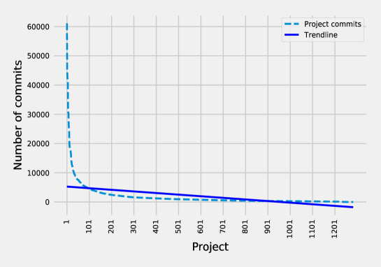
Figure 51 shows project-level commits (high to low) with a trend-line. The slope and intercept of the trend-line are -5.49 and 5278.26.
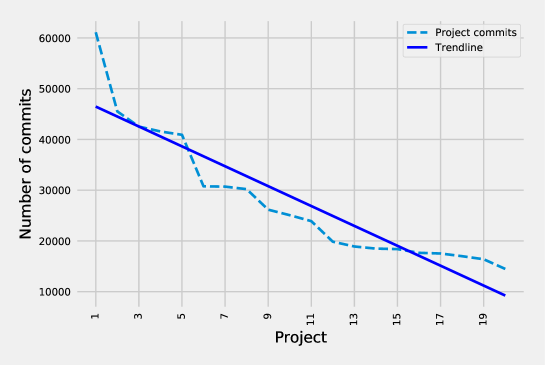
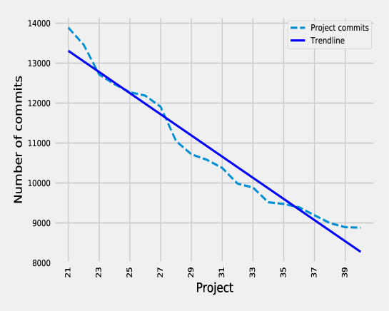
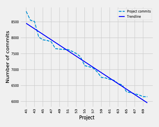
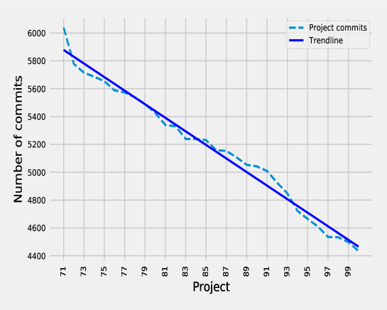
4.2.2 Granular View of Commits for Top 100 Projects
Figure 52, Figure 53, Figure 54, and Figure 55 provides granular view of commits for 1-20, 21-40, 41-70 and 71-100 projects with trend-line. The slopes of the trendline are -1958.95, -264.86, -86.11, and -48.71 respectively. The intercepts of the trend-line are 48426.97, 18869.19, 11984.57, and 9336.82 respectively.
4.3 Project-Level Commit Rates
Figure 56 shows project-level commit rate for 1281 projects. Although total number of project is 1283, two of the projects had commits on a particular date only. While calculating commit rate, those projects were excluded.
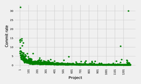
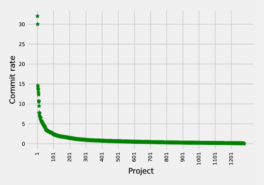
Figure 57 shows the rearranged (high-low) project-level commit rate for 1281 projects. As we can see from figure 57, most of the projects had very low (¡=2) commit rate.
4.4 Author-Level Commit Metadata Information
4.4.1 Commit Counts of Authors
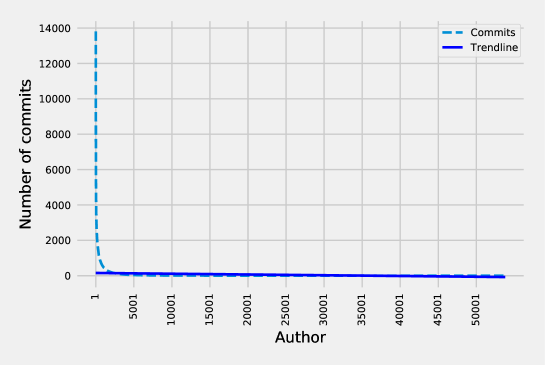
Figure 58 shows author-level commits (high-low) with trend-line. The slope and intercept of the trend-line are -0.00427 and 156.67.
4.4.2 Granular View of Commits for Top 100 Authors
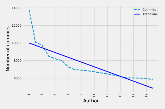
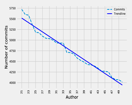
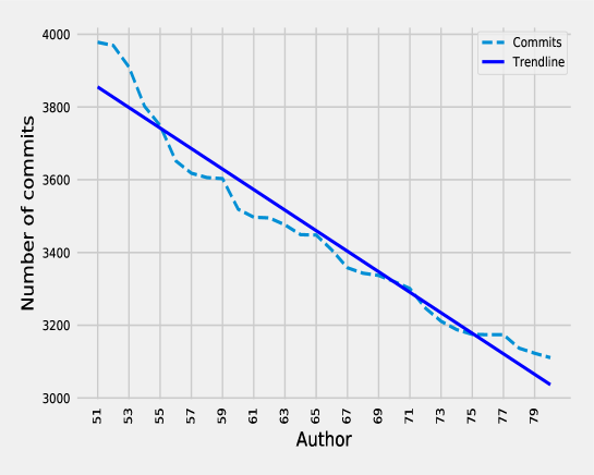
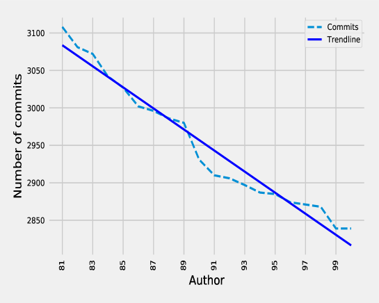
Figure 59, Figure 60, Figure 61, and Figure 62 provides granular view of commits for 1-20, 21-50, 51-80 and 81-100 authors with trend-line. The slopes of the trendline are -271.74, -54.21, -28.22, and -14.06 respectively. The intercepts of the trend-line are 10278.89, 6655.92, 5294.05, and 4222.15 respectively.
4.5 Author-Level Commit Rates
Figure 63 shows author-level commit rate for over 28k authors. About 50 percent of the authors were excluded because either they committed only once or on a particular date only.
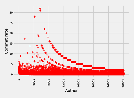
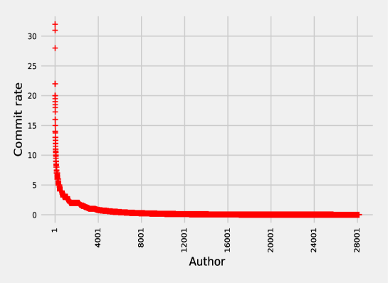
Figure 64 shows the rearranged (high-low) author-level commit rate for over 28k authors. As we can see from Figure 64, most of the authors had very low (¡=2) commit rate.
4.6 Weekly Commit Trends
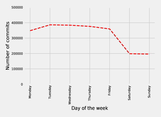
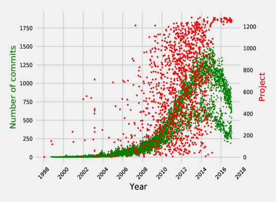
Figure 65 shows day-wise commit counts in a typical week for the entire time period (1998-2017) of the data set.
4.7 Overall Commit Timelines
Figure 66 shows time series of the commit counts for the entire time frame (1998-2017) of the data set.
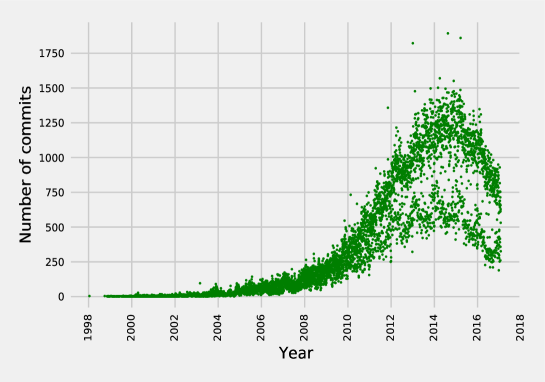
Figure 67 shows the overlay of project start date on the time series of the commit counts for the entire time frame (1998-2017) of the data set. As we can see from the figure 67, most of the projects started just before the year 2014 causing the peak of commit counts in the year 2014.
5 Additional Datasets
5.1 Bug Datasets
This is a collection of datasets used in the literature [7, 5, 4, 9, 10] and portions of it are available on GitHub (https://github.com/logpai/bugrepo) for analyzing software bugs. Table 8 shows the names of the datasets and their number of metadata fields and the number of projects covered in each bug data set. This collection of datasets is potentially useful in our project to serve as training data for bug patterns in our machine learning methods.
| Dataset | Metadata Fields | Projects Covered |
|---|---|---|
| Bug triage | 8 | 3 |
| Bugrepo | 11 | 5 |
| SEOSS | 17 | 33 |
| Rediscovery | 14 | 3 |
| 10 years bug fixing activity | 53 | 55 |
| Generating duplicate bug | 13 | 4 |
5.2 Android Application Development Dataset
The “Dataset of Commit History of Real-World Android Applications”, also named AndroidTimeMachine, is the first, self-contained, publicly available dataset weaving spread-out data sources about a large number of Android apps [2]. Covering over 8,431 real-world, open-source Android applications, this dataset contains:
-
1.
metadata about the apps’ git projects, with their full commit history, and
-
2.
metadata from the Google Play store, with app ratings and permissions.
The following is the characterization of file distribution from this dataset available at this link.
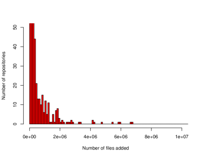
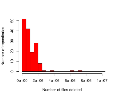
Figure 68 shows the histogram of the number of files added to and deleted from in different repositories.
Although our initial analyses were based on the more readily accessible Excel spreadsheet-formatted information from this dataset, this dataset also includes a greater amount of data included inside a container image. Examining this additional data can potentially provide more training data that can be useful in our machine learning approaches.
References
- [1] Abdulkareem Alali, Huzefa Kagdi, and Jonathan I Maletic. What’s a typical commit? a characterization of open source software repositories. In 16th IEEE international conference on program comprehension, pages 182–191, 2008.
- [2] Franz-Xaver Geiger, Ivano Malavolta, Luca Pascarella, Fabio Palomba, Dario Di Nucci, and Alberto Bacchelli. A graph-based dataset of commit history of real-world android apps. In Proceedings of the 15th International Conference on Mining Software Repositories, pages 30–33, 2018.
- [3] Weihua Hu, Matthias Fey, Marinka Zitnik, Yuxiao Dong, Hongyu Ren, Bowen Liu, Michele Catasta, and Jure Leskovec. Open graph benchmark: Datasets for machine learning on graphs. arXiv preprint arXiv:2005.00687, 2020.
- [4] Alina Lazar, Sarah Ritchey, and Bonita Sharif. Generating duplicate bug datasets. In Proceedings of the 11th Working Conference on Mining Software Repositories, page 392–395, 2014.
- [5] Senthil Mani, Anush Sankaran, and Rahul Aralikatte. Deeptriage: Exploring the effectiveness of deep learning for bug triaging. In 6th ACM IKDD CoDS and 24th COMAD (CoDS-COMAD ’19), pages 171–179, 2019.
- [6] Kalyan S. Perumalla. Introduction to Reversible Computing. CRC Press, 2013.
- [7] Michael Ratha and Patrick Maderb. The seoss 33 datasetd-requirements, bug reports, code history, and trace links for entire projects. Data in Brief, 2019.
- [8] Eric S. Raymond and Tim O’Reilly. The Cathedral and the Bazaar. O’Reilly and Associates, Inc., USA, 1st edition, 1999.
- [9] Mefta Sadat, Ayse Basar Bener, and Andriy Miranskyy. Rediscovery datasets: Connecting duplicate reports. In 2017 IEEE/ACM 14th International Conference on Mining Software Repositories (MSR), pages 527–530, 2017.
- [10] Renan Vieira, Antônio da Silva, Lincoln Rocha, and João Paulo Gomes. From reports to bug-fix commits: A 10 years dataset of bug-fixing activity from 55 apache’s open source projects. In Proceedings of the Fifteenth International Conference on Predictive Models and Data Analytics in Software Engineering, page 80–89, 2019.