An Adaptive Benchmark for Modeling User Exploration of Large Datasets
Abstract.
Despite the pivotal role that data exploration plays in data science, relatively few benchmarks exist to measure the performance of interactive systems for big data exploration. In this paper, we contribute a new benchmark that can simulate realistic exploration with a developer-specified dashboard design. The distinguishing feature of our SImulation-BAsed (or SIMBA) benchmark is its joint representation for tracking a simulated user’s analysis state, which is recorded as: (1) a position within a user interaction graph, inferred from the developer’s specification; and (2) a set of SQL queries representing the information extracted from the dashboard thus far. Using this joint representation, the SIMBA benchmark can model user analysis goals as a set of queries to be generated through a valid sequence of user interactions, as well as measure the completion of analysis goals by testing for equivalence between the user’s previous queries and their goal queries. In this way, we can simulate how an analyst opportunistically searches for interesting insights at the beginning of an exploration session and eventually hones in on specific goals towards the end. To demonstrate the versatility of the SIMBA benchmark, we use it to test the performance of four DBMSs with six different dashboard specifications and compare our results with IDEBench. Our results show that Markov model approaches (e.g., IDEBench) are unable to capture key elements of analysts’ exploration behavior and fail to surface critical differences in DBMS performance under different data exploration scenarios.
1. Introduction
Dashboards are arguably the most pervasive use case for data exploration systems today (Sarikaya et al., 2019; Bach et al., 2022), exemplified by the massive investments made by top analytics companies in helping analysts create and maintain interactive dashboards, e.g., Tableau (Tableau Software, 2022), Salesforce (Salesforce, 2022), Adobe (Adobe, 2022), and Microsoft (Microsoft, 2022). Dashboards provide an intuitive collection of visualizations and interaction widgets to help a broad audience of analysts investigate their own questions about a complex dataset (Sarikaya et al., 2019). To highlight the value of dashboards, we walk through a motivating example, illustrated in Figure 1.
Example 1.1.
The dashboard in Figure 1 is a real-world example from Tableau Public111https://public.tableau.com/app/profile/steve.mostello/viz/CustomerServiceDashboard_0/DailyDashboard. It tracks the performance of customer service representatives working in a call center. The total calls per hour and representative are tracked as well as the rate at which calls are abandoned or dropped. A manager might interact with this dashboard to identify top performing employees or diagnose an issue that is causing calls to be dropped. All of the visualizations in the dashboard are linked; for example, if the manager clicks on a bar or pie chart, any visualizations linked to the selected chart must be re-rendered to show the highlighted data, triggering re-execution of the underlying database queries. If the underlying data processing engine is not designed to support this level of interactivity, the manager’s analysis flow may be disrupted or even abandoned out of frustration (Zhicheng Liu and Jeffrey Heer, 2014; Battle et al., 2020).
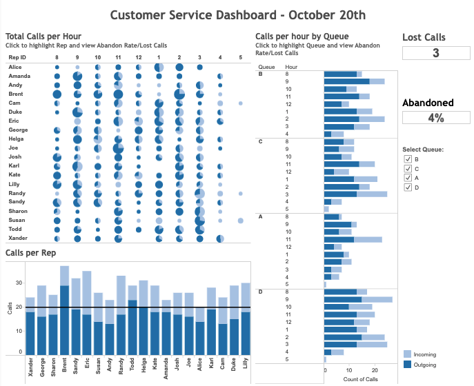
While interactive dashboards are generally efficient, there are common performance problems that can hinder a user’s exploration experience. One critical problem arises when a DBMS is overwhelmed with requests triggered by interactions. Instead of a near-instantaneous update to the visualizations, the interface lags, disrupting the user’s thought process. Latency as small as 500ms has been shown to decrease user performance, although analysts might be more sensitive to certain interaction types over others (Zhicheng Liu and Jeffrey Heer, 2014). Recent work shows how even modest datasets with 10-100 million rows induce performance degradation within dashboards (Battle et al., 2020).
Despite the pervasiveness of dashboards in data exploration and their sensitivity to performance degradation, existing benchmarks still overlook these interactive use cases (Vogelsgesang et al., 2018). For example, standard analytics benchmarks such as TPC-H (TPC-H, 2022) and TPC-DS (TPC-DS, 2022) fail to capture the cadence and ad-hoc nature of SQL queries generated by dashboards, leading to performance results that are inaccurate at best and misleading at worst (Battle et al., 2020). More dashboard-focused benchmarks support a static set of queries over a fixed set of dashboards (e.g., only bar charts (Battle et al., 2020), or only a subset of Tableau queries (Ghita et al., 2020)), or propose oversimplified models of dashboard interaction behaviors (e.g., simple Markov chains (Eichmann et al., 2020)). As a result, DBMS designers have few options for testing the efficacy of their systems under interactive data exploration scenarios.
In this paper, we contribute a SImulation-BAsed (or SIMBA) benchmark for testing the performance of a DBMS with any dashboard composed of standard visualizations and interaction widgets. Given a developer-specified dashboard design in a JSON format, the SIMBA benchmark simulates how an analyst might interact with the specified dashboard to achieve a pre-defined exploration goal. To the best of our knowledge, this paper is the first to consider how to generate plausible sequences of user interactions to achieve well-known interactive data exploration goals from the literature. To achieve this, the SIMBA benchmark addresses three core challenges in designing benchmarks for interactive data exploration scenarios: (1) expressing user exploration goals such that existing algorithms, e.g., path planning and/or graph search algorithms, can reason about them; (2) translating user interactions into allowable actions that an algorithm can take towards a specified goal; and (3) tracking the algorithm’s progress towards achieving a given analysis goal to provide actionable rewards and feedback.
Specifying User Goals. To address the first challenge, we need a way to specify a user’s exploration goals, as well as the allowable actions an algorithm can take to make progress towards these goals. We achieve this through a two-phase process. First, we synthesize a core set of customizable templates representing common user exploration goals from the visualization and HCI literature. Second, we translate these templates to equivalent SQL templates that would provide useful answers to the goal templates. In this way, we can represent user goals as a precise result that can be calculated on the underlying dataset using the corresponding SQL templates.
Specifying Allowable Actions to Reach a Goal. Inspired by previous work (Eichmann et al., 2020; Satyanarayan et al., 2017), we adopt a JSON-based specification language to specify a dashboard design. We use written specifications to infer an interaction graph, i.e., a graph representing what interactions a simulated user can perform and the SQL queries generated by these interactions. Using our interaction graph, we can translate any possible interaction within a given dashboard specification into its corresponding SQL queries over the underlying dataset.
Measuring Goal Completion. Given a navigable space of exploration states, we can apply existing AI algorithms, e.g., path planning and/or graph search algorithms, to identify viable interaction paths towards specified goal states. However, we still need a way to determine whether the algorithm has reached the goal state. To achieve this, we incorporate a suite of SQL query equivalence functions for testing whether a generated SQL query matches the specified goal state queries from our templates.
Integrating the Three Components to Simulate Goal Directed Exploration. With these three components, we can generate valid sequences of interactions and test whether these interactions will emit the target goal queries. However, analysts rarely march directly towards a pre-specified goal. Instead, they opportunistically search their data for interesting paths to pursue, and eventually identify specific goals they seek to achieve (Leilani Battle and Jeffrey Heer, 2019). We simulate this shift from open-ended to more focused exploration by alternating between Markov models of user exploration behavior and our goal-directed model; we assign probabilities to choosing the actions of either model, and update the probabilities as a simulated user progresses through an exploration session.
Evaluation. To demonstrate the value of our benchmark, we test it with four different database management systems (DBMSs) and six dashboard specifications derived from the literature. We compare the performance of these DBMSs using our benchmark and a competing benchmark IDEBench. Our results show that even when pursuing the same analysis goal, DBMS performance varies across different dashboards due to differences in supported dashboard queries and available data attributes. Similarly, differences in exploration goals can also lead to differences in performance outcomes, even when using the same dashboard. Finally, we show that although randomization is useful for simulation-based benchmarking, unconstrained variance can lead to the generation of unrealistic interaction sequences with no clear purpose or analogues in the real world, which the SIMBA benchmark design successfully avoids.
To summarize, this paper makes the following contributions:
-
•
We introduce a method for translating theoretical goals from the visualization and HCI literature into concrete goal queries tailored to a specified dashboard design (section 2).
- •
-
•
We present the results of running the SIMBA benchmark with six specifications from real-world dashboards and five DBMSs, and compare our results with IDEBench. (section 5).
2. Specifying User Goals
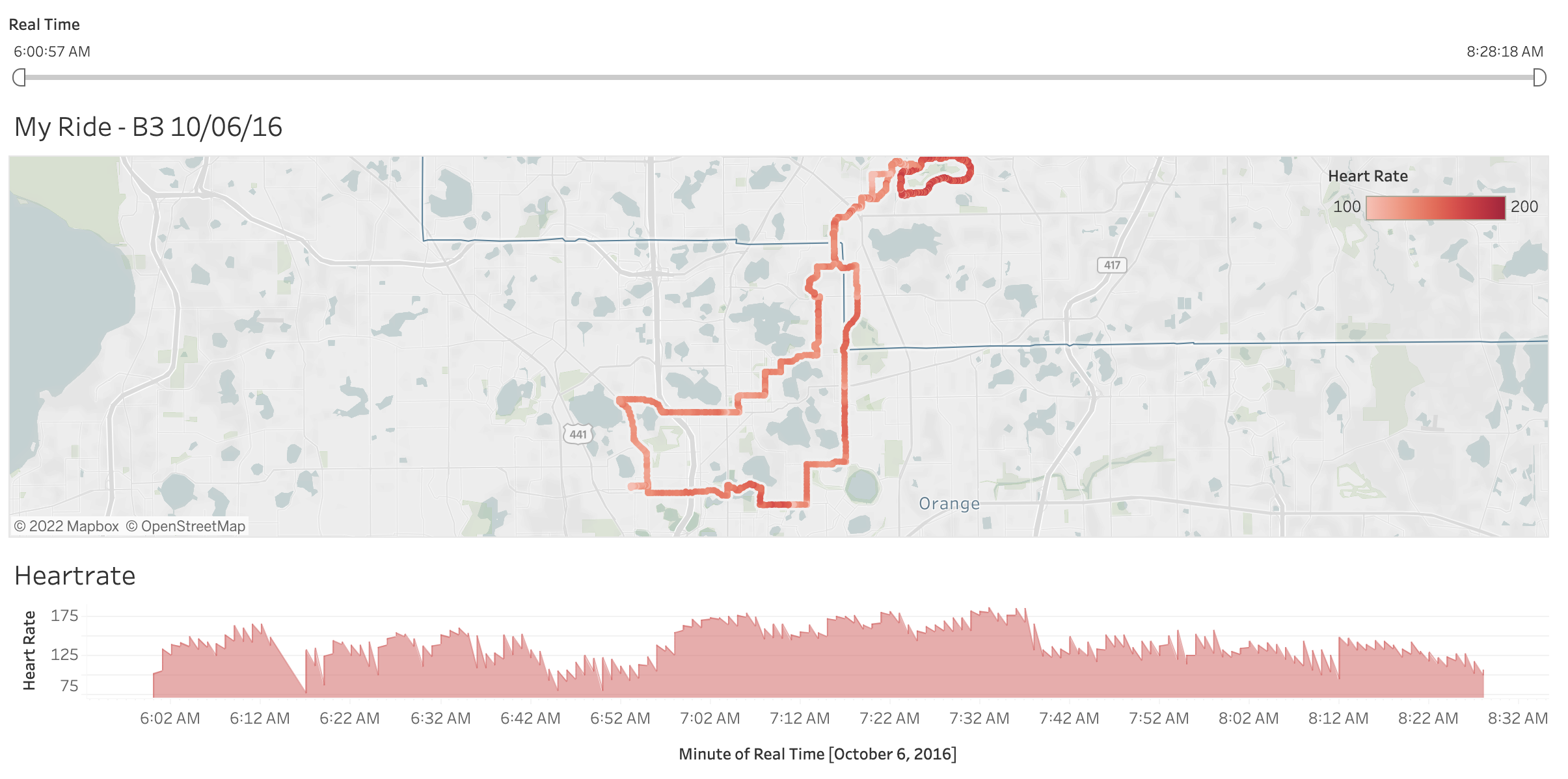
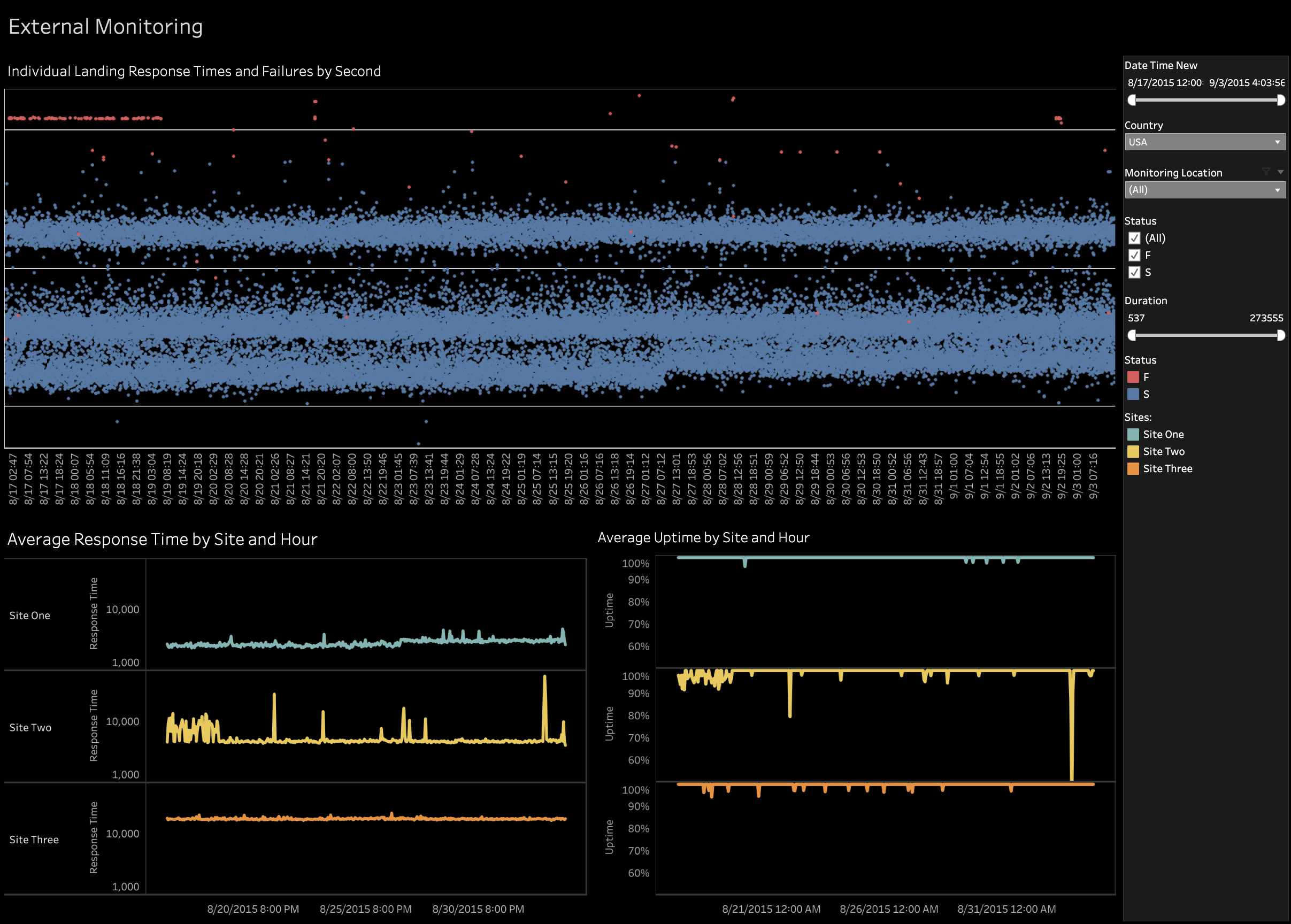

A major challenge in simulating data exploration is crafting meaningful sequences of user interactions, such as filtering data to omit irrelevant records (Crotty et al., 2015; Moritz et al., 2019), then zooming in to investigate an observed outlier, pattern, or trend (Battle et al., 2016; Liu et al., 2013). One approach to producing interaction sequences is to consider what kinds of interactions people tend to perform and the frequency with which these interactions occur. For example, given a distribution of probabilities for different interaction types, Eichmann et al. generate random sequences of interactions based on these probabilities (Eichmann et al., 2020).
However, analysts do not always behave randomly. They often have a goal in mind as they explore which may not be well-formed at the beginning of the exploration session (Leilani Battle and Jeffrey Heer, 2019; Lam et al., 2018; Yan et al., 2021; Zgraggen et al., 2018; Alspaugh et al., 2019). These goals often shift over time as analysts uncover more insights from their data (Battle et al., 2016; Leilani Battle and Jeffrey Heer, 2019). Thus an alternative approach is to generate goal-directed simulations. In this section, we explain how we derive these data analysis and exploration goals from the literature, which we use to generate user interaction sequences for our simulations.
2.1. Extracting Goals From Academic Papers
Analysts’ usage of dashboards are shaped by their analysis question, the dataset visualized, and the design of the dashboard that they are interacting with (Bach et al., 2022; Sarikaya et al., 2019). With this in mind, we reviewed several established survey papers summarizing well-known goals, tasks, and sub-tasks during data analysis (Lam et al., 2018; Matthew Brehmer and Tamara Munzner, 2013), data exploration (Leilani Battle and Jeffrey Heer, 2019), and use of dashboards (Sarikaya et al., 2019). We leverage two key insights from this review that guide our goal extraction process.
First, analysts’ data exploration goals tend to fall into well-known categories, but which goals are relevant depends on the dashboard and data being explored. We derive our templates from common goal/task categories from the literature (Leilani Battle and Jeffrey Heer, 2019):
- :
-
Understanding Data Correctness and Semantics. Learning the data schema and checking for data errors, missing fields or otherwise surprising values.
- :
-
Characterizing Data Distributions and Relationships. Understanding the overall shape of the data and identifying potential correlations or outliers for further investigation.
- :
-
Analyzing Causal Relationships. Investigating which attributes may drive observed correlations or patterns within the data or may have caused observed outliers.
- :
-
Hypothesis Formulation and Verification. Using observed data correlations, outliers, and causal relationships to formulate hypotheses about higher-level phenomena and/or synthesizing takeaways that can aid in later decision making.
Second, since dashboards are generally designed with specific data and analysis goals in mind (Sarikaya et al., 2019), the dashboard interface structure itself can be analyzed to infer relevant analysis goals. Sarikaya et al. surveyed the academic literature and current industry tools to understand the major categories of dashboards that people tend to create, which they group into six major types. However, only three of these dashboard types support interactions and are therefore suitable for data exploration tasks, which we focus on here:
- :
-
Operational Decision-Making. Visualizes performance metrics (e.g., sales data) for daily decision making.
- :
-
Strategic Decision-Making. Visualizes performance metrics for longer term decision making.
- :
-
Quantified Self. Operational decision making for personal contexts, such as finance and dieting.
As an example, the dashboard in Figure 1 would be considered an Operational Decision-Making dashboard by Sarikaya et al.. These categories provide useful hints regarding which types of data exploration goals are relevant to certain dashboard types. This step yielded valid pairings of exploration task types and dashboard types to guide the next step of our goal template generation process.
2.2. Applying Goals to Dashboards
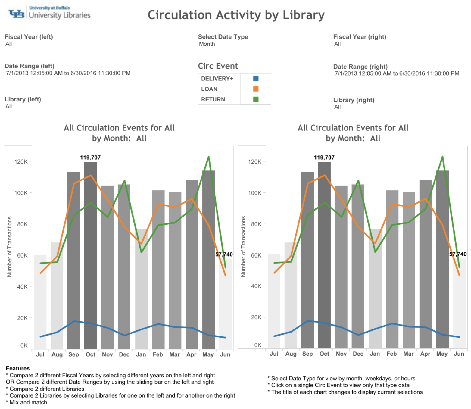
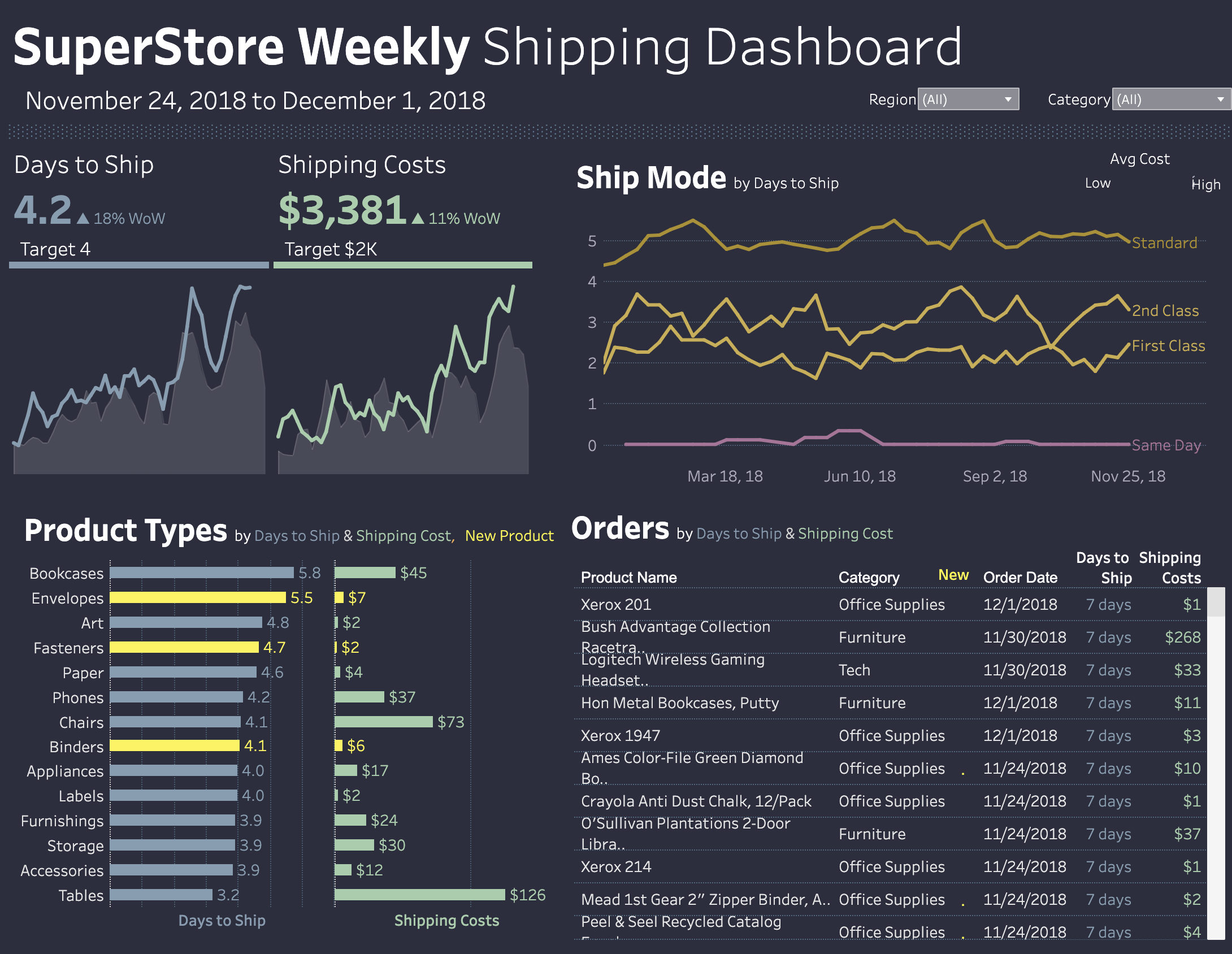
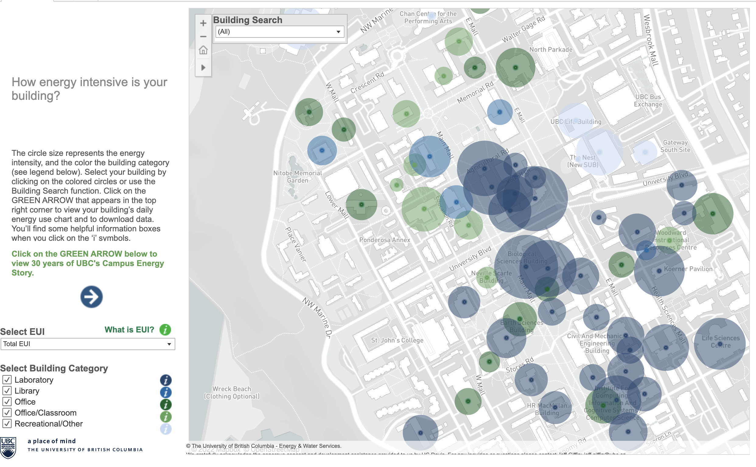
The next step is to validate theorized goals against a wide range of example dashboards in the real world. Using our task-dashboard pairings, we identified six examples of dashboards matching the relevant dashboard types observed by Sarikaya et al. (Sarikaya et al., 2019), shown in Figure 2. We selected two examples per dashboard type, found via a search on Tableau Public. Note that only active dashboards with publicly available data were selected for our analysis. Links to all of the dashboards are provided in our supplemental materials 222https://osf.io/vbm8z/?view_only=2e06892f0c104a9e911e8e7599deb2ab. We briefly describe each dashboard below:
- :
-
Circulation Activity by Library (Strategic decision making) System wide and branch-specific circulation events are compared and can be filtered by date range and branch.
- :
-
Supply Chain (Strategic decision making) Orders are explored by products purchased, shipping time/mode, and associated shipping costs and can be filtered by region and category.
- :
-
Campus Energy Map (Strategic decision making) Summarizes energy consumption for each building on the UBC campus. When a building is selected, additional details regarding energy type and building use are displayed.
- :
-
MyRide (Quantified Self) Renders heart rate fluctuations during a bicycle ride in Orlando, FL.
- :
-
IT Monitor (Operational decision making) Displays system telemetry to be monitored by information technology workers; it supports drill down interactions to investigate outlier events.
- :
-
Customer Service (Operational Decision-Making) Summarizes call center performance by representative and call queue. Individual representatives can be selected to highlight their performance and visualizations can be filtered by call queue.
Three of the paper authors analyzed the interface structure of the dashboards, the data being visualized by the dashboards, and any relevant metadata surrounding the dashboards, such as title headers, supplemental text, or instructions for how to use the dashboard. For each dashboard, one author brainstormed analysis questions that could be answered through visual exploration of the dashboard according to the task types categorized by Battle and Heer (Leilani Battle and Jeffrey Heer, 2019). Then, another author independently attempted to answer the question. The steps that the second author took to reach an answer were logged as well as the configuration of the dashboard at the start and end of their session and the answer they reached.
Example 2.1.
To demonstrate our approach, consider our running example in Example 1.1 with the customer service dashboard (see Figure 1). One of the analysis tasks generated for this dashboard was to determine: Is there a correlation between call volume and call abandonment? Using Battle and Heer’s categorization, this question is an example of characterizing a data relationship. We observed that a user could answer this question by clicking/highlighting hours that had a higher call volume and then using the ’Total Calls by Hour’ and ’Calls per Rep’ visualizations to determine the percent abandoned and if this correlated more closely with the time of day or representative.
This step yielded a set of valid data analysis questions for each of our six dashboards, where each question matches at least one of our established analysis task and dashboard type pairings.
2.3. Generalizing Goals as Query Templates
| Goal | Generalization | Categorical | Quantitative | Temporal | ||||
|---|---|---|---|---|---|---|---|---|
| Analyzing Spread |
|
1 | 1 | |||||
| Filtering |
|
1+ | 1 | |||||
| Finding Correlations |
|
2 | ||||||
| Identification |
|
1 | 1+ | |||||
|
|
1 | 1 | |||||
|
|
1 | 1 |
After confirming that each analysis question was answerable on the corresponding dashboard, we generalized each question to be applicable to all of the other dashboards. Specifically, we considered how the interactions required to answer the question translate to manipulations of the underlying dataset, and which data variables need to be manipulated and their data types. These manipulations would suggest the types of SQL queries a user would need to answer the target question, allowing us to frame each question as a parameterized SQL query to be executed. With this method, we derived six templates that cover a diverse set of analysis goals, shown in Table 1. Our templates cover both the exploration tasks categorized by Battle and Heer (Leilani Battle and Jeffrey Heer, 2019) (subsection 2.1) and dashboard types categorized by Sarikaya et al. (Sarikaya et al., 2019) (subsection 2.2). For example, the question in Example 2.1 corresponds to row four of Table 1 (Finding Correlations). We illustrate our approach with an example:
Example 2.2.
Consider the analysis question presented in Example 2.1. This question asks about a relationship between two numerical variables: total calls (COUNT(*)) and total abandoned calls (SUM(abandoned)). Thus, this question can be generalized as: “Is there a strong correlation between numerical attribute 1 and numerical attribute 2?” Given the question is parameterized by data type, and assuming we have access to the underlying dataset schemas for the dashboards, this question can be applied to any dashboard that contain at least two numerical fields (or in this case, aggregates that produce numerical values). Going one step further, this question template can be captured through the following SQL template:
SELECT [numerical attribute 1], [numerical attribute 2] FROM [table]
To account for the volume of calls over time, we can include a modulating variable, for example calculating calls per hour rather than simply total calls, as a grouping variable:
SELECT [modulator], [numerical attribute 1],
[numerical attribute 2]
FROM [table] GROUP BY [modulator]
When we populate the template for our call volume example, we get the following SQL query representing our target goal query:
SELECT hour, COUNT(*) as call_volume,
sum(abandoned) as call_abandonment
FROM customer_service GROUP BY hour
In the next section, we describe how our simulation algorithm can leverage these templates by incorporating knowledge from the user interface design and underlying dataset schemas.
To verify the applicability of our templates, we asked visualization and HCI researchers at our home institution to review the synthesized templates. Our colleagues confirmed the utility of the templates and provided feedback for further refinement, for example alternative methods for modeling correlations. We augmented the templates accordingly. Note that all of the original dashboards, analysis questions, abstracted question templates, and SQL templates are shared in our supplemental materials.
Although our templates are designed to cover most benchmark users’ needs, they are not exhaustive. For example, most of our selected dashboards apply binned aggregation to temporal rather than quantitative attributes. However, these templates can easily be extended to support alternative scenarios by swapping out or adding the desired data attributes, e.g., swapping temporal for quantitative or categorical attributes to calculate bins.
3. Specifying Allowable Actions
Given a specified user goal, the next step is to detect what the allowable actions are for working towards this goal. Currently, we lack consistent data structures for inferring what interactions a user is allowed to perform in a given dashboard, and how these interactions may translate to queries on an underlying dataset. To address this problem, we propose a specification language, which allows dashboard developers to specify any dashboard design consisting of common visualization and interaction components.
What is novel about our approach is not the language itself, but how we use it to generate a graph layer of the desired dashboard. With this graph data structure, we can infer relationships between the visualizations in the dashboard, the interaction widgets an analyst might use to manipulate these visualizations, and their corresponding SQL queries. In other words, we can reason about any possible interaction a user might perform on this dashboard by maintaining a joint representation of the dashboard state:
-
•
interaction layer: tracks dashboard state as positions within and updates to the graph representation; and
-
•
data layer: translates the user’s graph manipulations to their corresponding SQL queries on a back-end DBMS.
In this section, we briefly summarize our specification language, explain how we translate dashboard specifications into our graph representation, and discuss how we map user interactions (i.e., manipulations on the graph) to their corresponding SQL queries.
3.1. Specification Language
Our specification language enables a benchmark user to specify a desired dashboard design that queries a target dataset file. It merges language structure from Vega-Lite (Satyanarayan et al., 2017) (for UI specification) and IDEBench (Eichmann et al., 2020) (for query specification). Our specification language is not necessarily a novel contribution in itself. However, to understand the SIMBA benchmark, the reader needs to know how this language works. Hence we provide a brief summary here. Our specification has three parts: a database specification to describe the input dataset, an interface specification to describe the visualizations and interactions in the dashboard, and finally an (optional) interaction specification that allows the benchmark to replay an existing file containing pre-recorded system interaction logs.
3.1.1. Database Specification
The database specification is a JSON representation of the datasets that support the visualizations, similar to prior work (Eichmann et al., 2020). Each table is specified in a de-normalized, star schema form using key-value pairs for each column name and datatype (categorical, numerical, datetime). However, unlike previous benchmarks, the SIMBA benchmark also supports the specification of calculated fields, which are common in dashboard development. Calculated fields are specified using key-value pairs, with the key being the alias for the calculated field and the value being the SQL query performing the calculation.
3.1.2. Interface Specification
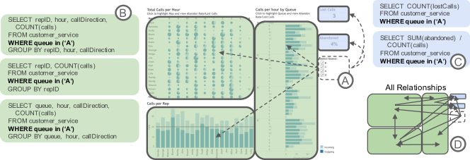
The interface specification essentially extends Vega-Lite to makes it easier to specify complete dashboards rather than just a single visualization. It captures three sets of components: visualizations (e.g., tables, bar charts, line charts, etc.), widgets (check boxes, sliders, dropdown menus, etc.), and relationships between the two (see Figure 4 for examples). Note that visualizations themselves can also be interactive widgets, such as in brushing and linking. (Battle et al., 2020). Relationships map dependencies between widgets and visualizations into queries, for example how a slider widget modifies or extends corresponding SQL filter predicates.
The SIMBA benchmark can also simulate manipulation of the interface itself, for example to swap out an attribute on the x- or y- axis of a visualization or even to add/remove entire visualizations. These capabilities are expressed through wildcards, which are placeholders that tell the benchmark which visualization parameters are permutable, e.g., that the x- and y-axes could be changed through interface manipulations. We discuss this further in subsection 3.2.
3.1.3. (Optional) Interaction Specification
The interaction specification is an array of timestamped interaction logs defined with respect to the interface specification, based on the IDEBench logging structure (Eichmann et al., 2020). Each log record represents either a data manipulation executing a relationship defined in the interface specification, or an interface manipulation redefining a piece of the interface specification. Each interaction log record must contain a timestamp, the triggered relationship and the new values for the data attributes activated by the specified interaction, i.e., the query results. When many relationships are defined, a single interaction might trigger a chain of updates across the dashboard. However, only the relationships directly triggered by the logged interaction, i.e., the first interaction within a chain, are defined as “user” interactions. Subsequent dashboard updates, i.e., the rest of the chain, are propagated automatically by the benchmark using the interface specification and are assumed to occur simultaneously.
3.2. Generating the Graph Layer
3.2.1. Initial Graph Generation
Given an interface specification, the SIMBA benchmark generates a graph layer for reason about which interactions to simulate within a given dashboard. Each node in the resulting graph is a widget or visualization and each directed edge is a relationship connecting source widgets with target nodes. Properties such as data attributes, aggregation operators and filters are stored as node properties. Attribute information are retrieved from the database specification as needed.
3.2.2. Updating the Graph Layer During Simulations
Previous benchmarks either focus on bar charts (e.g., IDEBench (Eichmann et al., 2020)) or assume that dashboard structure is immutable (e.g., Crossfilter (Battle et al., 2020)). Beyond static dashboards, users may also leverage wildcards to express a wide range of adaptable dashboard designs using the SIMBA benchmark. The SIMBA benchmark can even simulate “blank slate” sessions where the user builds a dashboard from scratch, as well as dashboards that allow users limited design capabilities such as changing the variable encoded on the x- or y-axis or removing a visualization from the dashboard.
Graph Updates From Data Manipulations
Simulating a user interaction with a widget (e.g., moving a slider, checking a check box) induces a data manipulation in the graph layer. For data manipulations, the graph structure remains fixed, but node and edge properties are updated to reflect the current state of the dashboard. When a data manipulation is triggered, we update the widget node properties in the graph to the new values. Then, we traverse the graph to identify dependent nodes that would be triggered by this manipulation. Properties in these nodes are likewise updated.
Graph Updates From Interface Manipulations
If the interface specification contains wildcards, then interface manipulations could alter the interface graph. For example, wildcards might add/alter an encoding in a visualization (e.g., add a color scale, change the x- or y-axis, etc.) or remove a visualization from the interface. When an interface manipulation is triggered, we first check that the manipulation is valid as per the interface specification. Then, the graph layer is updated to reflect the new state accordingly.
3.3. From Interactions to SQL Queries
The SIMBA benchmark uses the graph layer to facilitate bi-directional mapping between interaction records (interaction layer) and SQL queries (data layer). Since the graph nodes contain relevant attribute information, we can easily map node properties to corresponding entries within the database specification. As an example, Figure 4 demonstrates the three layers of the Customer Service dashboard and how they are leveraged to represent a user interaction. In the graph layer, each node is defined by the combination of data attributes used to build the visualization. The current state of the node is defined via filters that are applied by active relationship edges. When we step further down into the data layer, the node properties are compiled into SQL statements. As the state of the dashboard changes, node properties change and the SQL layer of each node is updated. The sequence of SQL queries generated in the data layer form the workload for the SIMBA benchmark. For example, when queue A is selected in the Customer Service Dashboard in fig 4, the filter property queue = ’A’ is added to each of the three visualization nodes. This change triggers an update in the data layer to compile new SQL statements for each node, adding the predicate queue = ’A’ to the WHERE clause.
4. Generating Exploration Sessions
With the ability to specify user exploration goals, as well as valid actions in pursuit of these goals, it is possible to generate sequences of interactions to achieve a specified goal. In this section, we explain how sequences of goal-directed data exploration interactions are generated. However, analysts rarely know exactly how to reach a goal directly, and may even shift their goals over time. Therefore, we also explain how we augment our goal-directed interaction sequences to reflect more realistic exploration scenarios.
4.1. Simulating Targeted Exploration
Targeted exploration describes cases in which the user has a well-formed analysis goal in mind. For example, a call center manager might want to use the Customer Service dashboard to determine which call center representatives are the highest performers, as determined by the number of calls they respond to. In addition to determining which reps had the most calls overall, the manager might look at the overall calls per hour to see if someone was a high performer on a particular shift or if there are outlier performers that might need further investigation.
4.1.1. Overview: The Structure of a Simulation
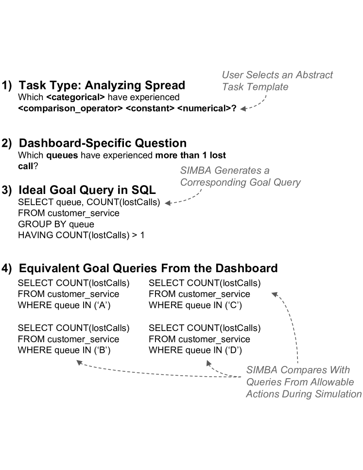
Targeted exploration is simulated with a series of parameterized goal templates where each template represents a related analysis question within a central theme, such as, ”Which reps are high performers?” These templates are translated into a dashboard simulation that outputs a workflow of queries that can be executed against a DBMS for benchmarking.
To execute a targeted simulation, users need a set of templates (expressed as the interaction specification and associated configuration) and specification documents for the dataset and dashboard. First, the dashboard is initialized as a graph from the set of specification documents. Next, a template is taken from the workflow and is decomposed into goal queries. A search is conducted across the graph to identify a set of dashboard states that achieves all of the goal queries, with preference given to states that achieve more than one goal simultaneously. Finally, the steps needed to permute the dashboard to achieve the desired goal states are recorded, and as they are executed against the graph, the queries generated from each step form the query workflow.
Simulations are executed recursively on the dashboard graph and array of goal templates until either no goal templates remain or a single template is deemed unsolvable. More complex workloads can also be composed by forming ordered lists of goal query sets. We present three example compositions from the literature in section 5.
4.1.2. Generating Immediate Next Steps
Given the current state of the dashboard, the simulator must decide the next step to accomplish the current goal template. The simulator leverages the joint representation by searching over manipulations in the graph layer, and checking the SQL layer to determine if analysis goals have been met. For example, in Figure 5 an Analyzing Spread template is executed against the Customer Service dashboard. To generate the next interaction step, we search the graph layer to find all possible manipulations, then test to see which steps achieve at least one of the four goal queries using the SQL layer. We then choose a step that maximizes the goal queries achieved and the goal queries that would be achieved with one additional graph interaction.
4.1.3. Measuring Goal Completion
A key challenge in generating goal-directed simulations is measuring progress towards the specified goal. How does the simulator know when the goal has been achieved? To measure progress towards a given goal, i.e., a populated goal template from section 2, we track the SQL queries generated by the dashboard with each simulated interaction, and compare the simulated SQL queries with the specified goal queries.
Determining Goal Completion.
At a high level, we consider a target goal query solved if the result set of this query is “covered” by the result sets of all simulated SQL queries thus far. In other words, if at some point in the simulation the user saw the desired records specified by the goal query, then this goal has been achieved. This is essentially a comparison of two sets. The first set represents the anticipated query results from the specified goal query, which we denote as . If there are two goals to achieve and , we can represent this as a union of the result sets across the corresponding goal queries: , which also extends easily beyond two goals. The second set is the set of observed query results for each simulated interaction thus far. For example, if only one interaction has been simulated , then there is only one result set to compare, denoted as . If two interactions have been simulated and , we denote this as . Given the set of all goals and the set of all simulated interactions , we consider all target goal queries solved if:
We can determine the equivalence of query result sets in three ways: (1) syntactical equivalence, or seeing if the text of the queries is essentially the same, (2) semantic equivalence, or reasoning about what the queries represent to see if the results should be the same, or (3) result equivalence, or executing the queries and inspecting the results to test if they overlap. We can use similar techniques to test for query subsumption, for example if one query is essentially the prefix of another query in terms of text, or if semantically one query should subsume the other. We describe how we implemented each of these equivalence/subsumption methods below.
Syntactical Equivalence.
A query is syntactically equivalent to the goal query if the query’s text covers at least the same columns and rows as the goal query’s text. Consider the following example:
Example 4.1.
Revisiting the target goal query in Example 2.1, we consider the following query to subsume this goal query, since it is syntactically the same minus an added group by attribute (queue):
SELECT hour, queue, COUNT(*) as call_volume,
sum(abandoned) as call_abandonment
FROM customer_service GROUP BY hour, queue
To get equivalent results to our original goal query (i.e., only group by hour), we aggregate the results further to remove the queue attribute.
Semantic Equivalence.
We use SPES to determine semantic equivalence between goal queries and dashboard interaction queries. SPES is a SQL solver for inferring semantic equivalence between SQL queries (Zhou
et al., 2020). Two queries are equivalent if they produce the same results given any valid input relations, which SPES infers by compiling SQL queries into denotational semantics and using mathematical principles to reason about them.
However, there are some SQL features that SPES does not support such as expressions in GROUP BY clauses, aggregate functions such as MAX() and MIN(), and functions that extract values from existing data such as YEAR() and MONTH() from a date. For this reason, we augment SPES with two additional methods for equivalence testing: result set overlap and string matching.
For example, we infer equivalence if SPES returns a match or if string matching indicates ¿95% similarity after processing to remove additional whitespace.
Result Equivalence.
Query results are considered equal when the goal query result is subsumed by the query results represented in the current dashboard state. Specifically, every column and row in the goal result set must also be present in the dashboard result set, but the dashboard may contain additional rows or columns beyond what is stipulated in the goal query. For example, if the goal result is a subset of the query results rendered within a specific visualization component, then result equivalence can be detected within the dashboard.
Measuring Progress.
Given the ability to determine SQL equivalence or subsumption, goal completion becomes straightforward to detect. However, making progress towards a goal is not the same as completing it. We measure progress toward a specified goal as overlap between result sets rather than subsumption or equivalence. The more results are “covered” by a potential interaction (i.e., the more results overlap with the anticipated result set), the closer it brings the simulation to reaching the target goal state. In this way, the Oracle model can compare the utility of potential next steps by comparing overlaps produced by their corresponding query result sets (i.e., maximizing ).
4.2. Simulating Open-Ended Exploration
Unlike targeted exploration, which involves an experienced user with an explicit goal in mind, open-ended exploration is often characterized by a lack of clear analysis goals and seemingly random sequences of interactions. It may even include revisiting information the user has already seen, i.e., interaction cycles (Leilani Battle and Jeffrey Heer, 2019). To simulate this behavior, we build on established strategies for modeling open-ended exploration. Specifically, we extend the approach of Eichmann et al. (Eichmann et al., 2020), where possible interactions are assigned prediction probabilities, and interactions are simulated by sampling from the resulting distribution.

Predicting Interactions.
Similar to the work of Eichmann et al. (Eichmann et al., 2020), the probability of performing each interaction is defined in advance through a transition matrix, which represents the probability of going from one interaction to another, e.g., the probability of filtering given a zoom just occurred, or the probability of filtering given the user just performed a filtering interaction. This transition matrix represents a Markov chain that we can use to simulate interactions. To do this, we identify the simulation’s current state in the transition matrix, i.e., the simulation’s last interaction, or the starting state for the beginning of the simulation. Then, we randomly select one of the outgoing transitions from this state according to their probabilities.
To simulate open-ended exploration in a range of scenarios, we provide a library of pre-set transition matrices, including probability distributions originally proposed by Eichmann et al. for IDEBench (Eichmann et al., 2020). Users can also specify their own custom transition matrix as input to the benchmark. Note that a specified dashboard may only include a subset of interaction types supported by the benchmark. Furthermore, some interactions may become inapplicable as a session progresses. For example, once a user has fully zoomed out of a visualization, they cannot continue to zoom out. To account for this, probability distributions are adjusted at runtime to omit inapplicable interactions, which we infer from the current dashboard state, i.e., the state of the current dashboard graph.
Predicting Interaction Parameters.
Once an interaction has been predicted, the next step is to apply the effects of this interaction to the dashboard state. For example, the Customer Service dashboard contains a checkbox selection interaction over four call center queues (i.e., four chechboxes), where checking or unchecking any one of these boxes represents a selection interaction. Once the selection interaction has been predicted, the simulator must decide which box to check or uncheck. We use a uniform random model to choose these parameters with equal probability. For example, choosing randomly which of the four checkboxes to check/uncheck. This approach also extends easily to other interaction types, such as randomly selecting the starting and ending points for dragging a slider. Note that we simulate serial manipulation of interaction parameters because users can only manipulate the interface one click at a time. For example, a user cannot physically click on two checkboxes simultaneously, since they are limited by what they can do with a standard mouse or track pad.
Simulating Open-Ended Exploration Sessions.
To simulate an open-ended exploration session, we set the Markov chain to its initial state, randomly select an initial interaction, and then apply it to the dashboard graph. The model is then used to select subsequent, applicable interactions until all of the goal queries have been achieved. Similar to targeted exploration, goal attainment is determined by testing for syntatic, semantic and result equivalence.
4.3. Interweaving Targeted and Open-Ended Exploration
During exploratory visual analysis, users often alternate between targeted exploration, where they focus on completing specific analysis goals, and open-ended exploration, where they browse the data in an unstructured way, looking for something “interesting” (Wongsuphasawat et al., 2017; Leilani Battle and Jeffrey Heer, 2019). In the beginning, the user may not have any concrete goals (Alspaugh et al., 2019; Zhicheng Liu and Jeffrey Heer, 2014), making unstructured interactions more likely. However, as the user learns more about their dataset, they may become more focused on answering specific questions (Zgraggen et al., 2018). In this section, we describe how we simulate this alternating between targeted and open-ended interaction sequences, as well as shift the distribution of interactions between the two over time.
Modeling Shifts in Exploration Strategy.
To model targeted exploration, we introduce a new Oracle model that can simulate interactions to achieve user-specified goal queries (see subsection 4.1 for details). To model open-ended exploration, we use a Markov model inspired by the work of Eichmann et al. (Eichmann et al., 2020) (see subsection 4.2 for details). We represent alternating between targeted and open-ended exploration as switching from using one model to another to simulate the user’s next interactions. In this way, we can control when and for how many interactions a certain exploration strategy is adopted by the simulation, which we achieve by assigning probability distributions to the models. For example, a distribution of 0.5 means it is equally likely for the simulation to choose between the two models. A distribution of 0 or 1 means that only one model will ever be selected. This control flow is depicted in Figure 6.
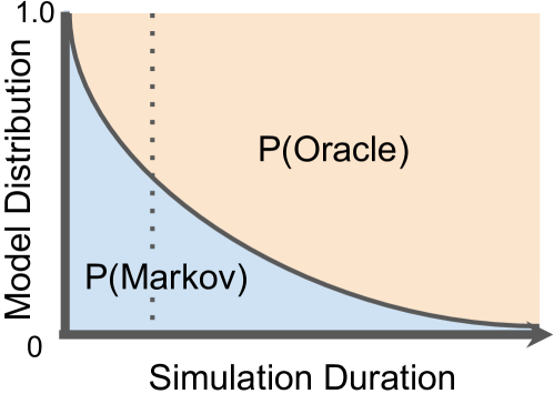
Given the lack of user goals at the start, each exploration session is initiated as an open-ended exploration session dominated by the Markov model (e.g., with a probability distribution over the relationships defined in the interface specification). However, as the simulation progresses, the “user” learns more about their data and becomes more focused, decreasing the probability of selecting the Markov model. We implemented this behavior as a decision function that applies exponential decay to the likelihood of selecting the Markov model. We tune our decision function with default parameters that yield interaction session durations consistent with those observed in prior studies (Eichmann et al., 2020). These parameters may also be used to simulate the experience of the user or their familiarity with the dashboard or data. For example, experienced users know what they are looking for and thus may quickly default to following the shortest path (i.e., a lower initial probability assigned to the Markov model and faster decay). However, novice users are better modeled with a lower decay rate, resulting in spending more time in the open-exploration phase.
Modeling Shifts in Exploration Goals.
Analysts often have more than a single goal they seek to achieve when exploring a dataset. This behavior can be represented in our simulations by providing multiple goal queries as input. Specifically, benchmark users can provide a list of goal queries for the simulation to use as input. In this case, the simulation will run using the first goal query and the default dashboard state as its initial input. When the first goal query is achieved, the simulation will repeat the same process but use the current dashboard state and the second goal query as input. Then, this process is repeated until all goal queries have been achieved. In this way, we can model a progression of exploration through goal query transitions.
That being said, the current benchmark requires users to specify the list of goal queries manually. To streamline the process, we have provided three sets of default goal sequences, each representing well known goal progressions from the literature (Leilani Battle and Jeffrey Heer, 2019; Shneiderman, [n.d.]; Battle et al., 2020). These defaults can easily be copied and augmented to generate similar progressions for different input datasets and dashboard specifications (please see our supplemental materials for examples). In the future, we plan to extend the benchmark to dynamically generate its own progression of goals based on the current model and dashboard states, which we discuss in LABEL:sec:discussion.
5. Evaluation
For a new data exploration benchmark to be useful to the database community, it must provide either new workloads or new exploration contexts (i.e., dashboard designs and/or input datasets) that DBMSs have yet to be tested against. In this section, we demonstrate the value of our proposed benchmark by comparing its results against the results of an existing data exploration benchmark, IDEBench (Eichmann et al., 2020). We specify how to utilize our system for benchmarking. Then, we present experimental results carried out on all six of the demonstration dashboards summarized in subsection 2.2 (see Figure 2).
| Dataset Size | Goal Sequence | Dashboard |
|---|---|---|
| 100K | Shneiderman (Shneiderman, [n.d.]) | Circulation Activity |
| 1M Rows | Battle & Heer (Leilani Battle and Jeffrey Heer, 2019) | Supply Chain |
| 10M Rows | Battle et al. (Battle et al., 2020) | Campus Energy Map |
| 100M Rows | MyRide | |
| IT Monitor | ||
| Customer Service |
5.1. Experiment Setup
In this section, we explain how we setup our experiments to run our benchmark and compare it with IDEBench (Eichmann et al., 2020). Note that since the Crossfilter benchmark (Battle et al., 2020) is unable to generate simulations with new datasets, we do not include it in our experiments.
5.1.1. Environment Setup
Each experiment was conducted on a single server (Red Hat 7 operating system), with 20 GB of memory, 12 cores (Intel(R) Xeon(R) Silver 4116 CPU @ 2.10GHz), and over 30 TB of disk space.
5.1.2. DBMSs and Drivers
Consistent with prior work (Eichmann et al., 2020; Battle et al., 2020), we use our benchmark to test multiple data processing back-ends (using the default settings for each). We implemented DBMS wrappers for four systems: PostgreSQL, DuckDB, SQLite, and MonetDB. These DBMSs were selected for their support for analytics, usage in interactive applications, and popularity.
5.1.3. Benchmark Parameters
We permute three parameters in our experiments (see Table 2): dataset size, goal template sequences, and dashboards. We test six different dashboards as described earlier in subsection 2.2. Each dashboard visualizes a different dataset, leading to six different datasets tested using our benchmark:
-
•
Circulation Activity by Library: 2 quantitative and 2 categorical fields
-
•
Supply Chain Dashboard: 5 quantitative and 18 categorical fields
-
•
Campus Energy Map: 22 quantitative and 4 categorical fields
-
•
MyRide: 10 quantitative and 3 categorical fields
-
•
IT Monitor: 3 quantitative and 5 categorical fields
-
•
Customer Service Dashboard: 10 quantitative and 6 categorical fields
To see how performance changes as dataset size increases, we test three different dataset sizes (adopting dataset generation techniques from prior work (Battle et al., 2020; Eichmann et al., 2020)): 100K, 1M, 10M and 100M rows.
We provide three different sequences of goal templates to guide the benchmark simulations (see subsection 4.1 for details). These sequences are derived directly from the data exploration tasks proposed by Shneiderman (Shneiderman, [n.d.]), Battle & Heer (Leilani Battle and Jeffrey Heer, 2019), and the developers of the Crossfilter benchmark (Battle et al., 2020). These sequences enable our benchmark to re-create established data exploration scenarios with new datasets and dashboards.
IDEBench does not support simulation of goal-driven exploration. Thus, only two of these three parameters apply for IDEBench (dataset size, dashboards). We used a mixed workflow, and the default probabilities for generating actions.
5.1.4. Evaluation Metrics
We adopt two established metrics from existing benchmarks and evaluation methods for data exploration scenarios (see (Leilani Battle and Jeffrey Heer, 2019; Battle et al., 2020) for a detailed summary of existing metrics):
-
•
Query Duration: The average latency of all queries issued.
-
•
Response Rate: The fraction of queries successfully completed within a given threshold, out of all queries issued. Based on existing latency thresholds from the literature, we use a threshold of 100ms for queries generated by brush and slider interactions (Battle et al., 2020), and a threshold of 500ms for all other interaction types (Zhicheng Liu and Jeffrey Heer, 2014).
5.2. Experiment 1: Overall Results
In our initial experiment we study how the four DBMS systems behave with respect to dashboard design, goal sequence, and dataset size. For each goal sequence and dashboard, we generate a workflow using default parameters. These workflows are then executed against various dataset sizes in each DBMS.
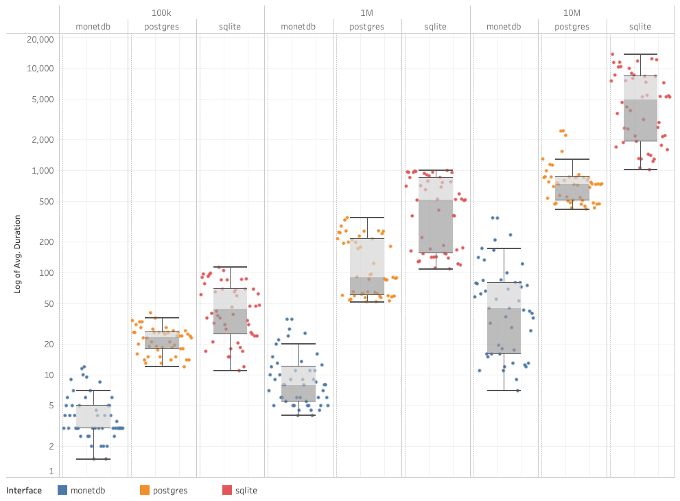
Across all dashboards, MonetDB and DuckDB consistently obtained the best performance, in line with previous results (Eichmann et al., 2020; Battle et al., 2020). Query duration is positively correlated with the size of the dataset for each DBMS, but the average duration seen on MonetDB on the 10M dataset (76ms) is comparable to the results obtained using the 100k dataset on sqlite (49ms). On the 10M dataset, the maximum query duration observed on MonetDB (343ms) was less than every the minimum query duration for all other DBMSs.
Dense dashboards that contained many interactive, dependent components tended to yield shorter interaction sessions due to the goal queries being achieved fairly quickly. However, these dashboards still yielded workflows with similar volume of queries due to the inter-connectivity of the dashboard elements. There was no strong trend in query duration across the dashboard designs.
5.3. Experiment 2: Comparison to IDEBench
In our second experiment we compare the workflows generated from SIMBA to IDEBench and the resultant DBMS performance. Comparison workflows were generated in IDEBench for each dashboard using a mixed template with default configurations for interaction generation. IDEBench does not support exploration across preset dashboard designs, but we did constrain the exploration space by assigning a probability of 0 to all fields that were not used in the original dashboard design. Remaining field probabilities were determined by their usage in the original dashboard. Experiments were conducted across the four DBMSs across the six dashboards for each dataset size.
Workflow Evaluation
When generating modeled workflows we expect to see some variability across runs, but we would also expect to see variability reasonably constrained across workflows, otherwise the DBMS benchmark would be useless for temporal comparisons. We generated 200 workflows each for the My Ride and Customer Service dashboards to assess the variability in dashboard designs produced by the Markov model workflow generator component of IDEBench. We assessed the dashboard designs to see how closely they matched the original dashboard, the variability across the 200 runs, and the similarity of the queries generated to SIMBA.
This effect is magnified for dashboards that have a larger input dataset since there is a larger potential design space. For example, the MyRide and Circulation dashboards have a relatively small design space and we observe low levels of variability.
Performance Evaluation
Similar to the SIMBA benchmark, query durations increased with dataset size, and DuckDB and MonetDB yielded the lowest query durations.
5.4. Experiment 3: Varying Exploration Mode
For our last experiment we investigate the relationship between exploration mode and DBMS performance. Using the Shneiderman (Shneiderman, [n.d.]) workflow as a base, we vary the tradeoff parameter between the oracle and the model to imitate three modes of exploration: targeted, open-ended and interwoven. We alternate between oracle-only workflow generation, representative of targeted exploration, an open ended model driven exploration. While both methods leverage the same set of sequential goal templates, the oracle-only method prefers a shortest path solution while the model driven exploration employs a broader, meandering search pattern to achieve each template goal.
For this reason, the model driven workflows are longer and characterized by many similar queries generated from the same set of visualizations. For instance, the model spends more time exploring different filter conditions of a given visualization, while targeted exploration focuses on only the fields and values of interest expressed in the goal template.
-
•
Further workflow customization is possible by toggling the exploration parameter to control targeted versus open exploration.
-
•
Targeted exploration yielded workflows significantly shorter than the baseline due to the Oracle preference for a shortest path solution to each template. The opposite was observed for open exploration.
-
•
While open exploration workflows tend to be longer, they don’t necessarily yield worse DBMS performance. Performance is largely predicated on the dashboard complexity.
6. Related Work
Here, we summarize relevant research for benchmarking system performance in exploratory visual analysis (or EVA (Leilani Battle and Jeffrey Heer, 2019)) scenarios.
Mapping Visualizations and Interactions to SQL
The SIMBA benchmark extends prior work in mapping visualization interfaces to SQL (Siddiqui et al., 2016; Stolte et al., 2002; Yan et al., 2021; Zhang et al., 2019). For example, Stolte et al. propose a SQL-based table algebra for specifying complex, grouped aggregation visualizations (Stolte et al., 2002), enabling Polaris (later Tableau) to map visualizations to SQL queries for efficient processing. However, the SIMBA benchmark supports a wider range of visualization interface designs compared to these approaches. Chen and Wu use a similar idea to generate dashboard designs from a set of target queries (Chen and Wu, 2022) but do not simulate how users might interact with these dashboards. The SIMBA benchmark is the first DBMS benchmark to apply this approach to simulate realistic exploration behaviors.
Measuring EVA Performance
Many metrics have been proposed in the literature to gauge exploration performance. In this paper, we focus on metrics that can be calculated directly from user interaction logs. Some metrics assess the pacing and flow of interactions over time, including interaction rates (Zhicheng Liu and Jeffrey Heer, 2014; Feng et al., 2019; Zgraggen et al., 2016). A related measure frequently used is system response time (Zhicheng Liu and Jeffrey Heer, 2014; Zgraggen et al., 2016; Idreos et al., 2015; Jiang et al., 2018). Average or worst case latency per interaction is also considered (Battle et al., 2016; Chan et al., 2008; Crotty et al., 2016; Kamat et al., 2014; Rahman et al., 2017). Some also consider summative measures such as total exploration time (Dimitriadou et al., 2014; Feng et al., 2019), total interactions performed (Dabek and Caban, 2017; Dimitriadou et al., 2014; Feng et al., 2019; Gotz and Wen, 2009), or attributes explored (Wongsuphasawat et al., 2017). The SIMBA benchmark easily supports computing all of these measures, as well as new measures, such as the measures of interaction variance we discuss in section 5.
Benchmarking EVA Tools
Many benchmarks have been developed in the database and visualization communities. However, the vast majority fail to fully capture the key characteristics and concerns of data exploration (Battle et al., 2017; Battle et al., 2020). For example, DBMS benchmarks such as TPC-H, TPC-DS, and SSB simulate how well a DBMS supports a range of routine business intelligence operations (Barata et al., 2015; O’Neil et al., 2009); however, analysts often query their data opportunistically based on statistical patterns or anomalies seen as they explore, resulting in spontaneous queries that these benchmarks fail to capture (Battle et al., 2020). Visualization benchmarks such as the Visual Analytics Benchmark Repository (Plaisant et al., 2008) record realistic exploration use cases, but act more as unstructured data archives than true benchmarks (Battle et al., 2017). A few benchmarks exist for interactive scenarios (Eichmann et al., 2020; Rahman et al., 2020; Battle et al., 2020), however they focus on only one or two basic use cases, e.g., only bar chart exploration (Battle et al., 2020; Eichmann et al., 2020). Little has been done to make these benchmarks more robust, relevant, and easy to adopt across multiple communities. Our SIMBA benchmark approach addresses these problems.
7. Conclusion
In this paper, we presented a SIMulation-BAsed (SIMBA) benchmark for evaluating database management systems connected to any standard data exploration dashbaord. The joint representation at the heart of SIMBA models user analysis goals as a query set generated through a sequence of user interactions. We compared the flexibility of SIMBA against IDEBench using four DBMSs connected to six unique dashboards. We found that differences in dashboard designs induced measurable differences in exploration patterns and ultimately DBMS performance, even when the user goals were the same. Similarly, differences in goals also lead to differences in DBMS performance, even when using the same dashboard. SIMBA successfully simulated all of these performance variations whereas IDEBench only supported a subset of them.
References
- (1)
- Adobe (2022) Adobe. 2022. Panels Overview — Adobe Analytics. https://experienceleague.adobe.com/docs/analytics/analyze/analysis-workspace/panels/panels.html?lang=en.
- Alspaugh et al. (2019) Sara Alspaugh, Nava Zokaei, Andrea Liu, Cindy Jin, and Marti A. Hearst. 2019. Futzing and Moseying: Interviews with Professional Data Analysts on Exploration Practices. IEEE Transactions on Visualization and Computer Graphics 25, 1 (2019), 22–31. https://doi.org/10.1109/TVCG.2018.2865040
- Bach et al. (2022) Benjamin Bach, Euan Freeman, Alfie Abdul-Rahman, Cagatay Turkay, Saiful Khan, Yulei Fan, and Min Chen. 2022. Dashboard Design Patterns. IEEE Transactions on Visualization and Computer Graphics (2022), 1–11. https://doi.org/10.1109/TVCG.2022.3209448
- Barata et al. (2015) Melyssa Barata, Jorge Bernardino, and Pedro Furtado. 2015. An overview of decision support benchmarks: TPC-DS, TPC-H and SSB. In New Contributions in Information Systems and Technologies. Springer, 619–628.
- Battle et al. (2017) L. Battle, R. Chang, J. Heer, and M. Stonebraker. 2017. Position statement: The case for a visualization performance benchmark. In 2017 IEEE Workshop on Data Systems for Interactive Analysis (DSIA). 1–5. https://doi.org/10.1109/DSIA.2017.8339089
- Battle et al. (2016) Leilani Battle, Remco Chang, and Michael Stonebraker. 2016. Dynamic prefetching of data tiles for interactive visualization. In Proceedings of the 2016 International Conference on Management of Data. 1363–1375.
- Battle et al. (2020) Leilani Battle, Philipp Eichmann, Marco Angelini, Tiziana Catarci, Giuseppe Santucci, Yukun Zheng, Carsten Binnig, Jean-Daniel Fekete, and Dominik Moritz. 2020. Database Benchmarking for Supporting Real-Time Interactive Querying of Large Data. In Proceedings of the 2020 ACM SIGMOD International Conference on Management of Data (Portland, OR, USA) (SIGMOD ’20). Association for Computing Machinery, New York, NY, USA, 1571–1587. https://doi.org/10.1145/3318464.3389732
- Chan et al. (2008) Sye-Min Chan, Ling Xiao, John Gerth, and Pat Hanrahan. 2008. Maintaining interactivity while exploring massive time series. In 2008 IEEE Symposium on Visual Analytics Science and Technology. 59–66. https://doi.org/10.1109/VAST.2008.4677357
- Chen and Wu (2022) Yiru Chen and Eugene Wu. 2022. PI2: End-to-End Interactive Visualization Interface Generation from Queries. In Proceedings of the 2022 International Conference on Management of Data (Philadelphia, PA, USA) (SIGMOD ’22). Association for Computing Machinery, New York, NY, USA, 1711–1725. https://doi.org/10.1145/3514221.3526166
- Crotty et al. (2015) Andrew Crotty, Alex Galakatos, Emanuel Zgraggen, Carsten Binnig, and Tim Kraska. 2015. Vizdom: interactive analytics through pen and touch. Proceedings of the VLDB Endowment 8, 12 (2015), 2024–2027.
- Crotty et al. (2016) Andrew Crotty, Alex Galakatos, Emanuel Zgraggen, Carsten Binnig, and Tim Kraska. 2016. The case for interactive data exploration accelerators (IDEAs). In Proceedings of the Workshop on Human-In-the-Loop Data Analytics. 1–6.
- Dabek and Caban (2017) Filip Dabek and Jesus J Caban. 2017. A Grammar-based Approach for Modeling User Interactions and Generating Suggestions During the Data Exploration Process. IEEE Transactions on Visualization and Computer Graphics 23, 1 (2017), 41–50. https://doi.org/10.1109/TVCG.2016.2598471
- Dimitriadou et al. (2014) Kyriaki Dimitriadou, Olga Papaemmanouil, and Yanlei Diao. 2014. Explore-by-example: An Automatic Query Steering Framework for Interactive Data Exploration. In Proceedings of the 2014 ACM SIGMOD International Conference on Management of Data (Snowbird, Utah, USA) (SIGMOD ’14). ACM, New York, NY, USA, 517–528. https://doi.org/10.1145/2588555.2610523
- Eichmann et al. (2020) Philipp Eichmann, Emanuel Zgraggen, Carsten Binnig, and Tim Kraska. 2020. IDEBench: A Benchmark for Interactive Data Exploration. In Proceedings of the 2020 ACM SIGMOD International Conference on Management of Data (Portland, OR, USA) (SIGMOD ’20). Association for Computing Machinery, New York, NY, USA, 1555–1569. https://doi.org/10.1145/3318464.3380574
- Feng et al. (2019) M. Feng, E. Peck, and L. Harrison. 2019. Patterns and Pace: Quantifying Diverse Exploration Behavior with Visualizations on the Web. IEEE Transactions on Visualization and Computer Graphics 25, 1 (Jan 2019), 501–511. https://doi.org/10.1109/TVCG.2018.2865117
- Ghita et al. (2020) Bogdan Ghita, Diego G Tomé, and Peter A Boncz. 2020. White-box Compression: Learning and Exploiting Compact Table Representations.. In CIDR.
- Gotz and Wen (2009) David Gotz and Zhen Wen. 2009. Behavior-Driven Visualization Recommendation. In Proceedings of the 14th International Conference on Intelligent User Interfaces (Sanibel Island, Florida, USA) (IUI ’09). Association for Computing Machinery, New York, NY, USA, 315–324. https://doi.org/10.1145/1502650.1502695
- Idreos et al. (2015) Stratos Idreos, Olga Papaemmanouil, and Surajit Chaudhuri. 2015. Overview of data exploration techniques. In Proceedings of the 2015 ACM SIGMOD International Conference on Management of Data. ACM, 277–281.
- Jiang et al. (2018) Lilong Jiang, Protiva Rahman, and Arnab Nandi. 2018. Evaluating interactive data systems: Workloads, metrics, and guidelines. In Proceedings of the 2018 International Conference on Management of Data. ACM, 1637–1644.
- Kamat et al. (2014) Niranjan Kamat, Prasanth Jayachandran, Karthik Tunga, and Arnab Nandi. 2014. Distributed and interactive cube exploration. In 2014 IEEE 30th International Conference on Data Engineering. 472–483. https://doi.org/10.1109/ICDE.2014.6816674
- Lam et al. (2018) Heidi Lam, Melanie Tory, and Tamara Munzner. 2018. Bridging from Goals to Tasks with Design Study Analysis Reports. IEEE Transactions on Visualization and Computer Graphics 24, 1 (2018), 435–445. https://doi.org/10.1109/TVCG.2017.2744319
- Leilani Battle and Jeffrey Heer (2019) Leilani Battle and Jeffrey Heer. 2019. Characterizing Exploratory Visual Analysis: A Literature Review and Evaluation of Analytic Provenance in Tableau. Computer Graphics Forum 38 (06 2019), 145–159. https://doi.org/10.1111/cgf.13678
- Liu et al. (2013) Zhicheng Liu, Biye Jiang, and Jeffrey Heer. 2013. imMens: Real-time visual querying of big data. In Computer Graphics Forum, Vol. 32. Wiley Online Library, 421–430.
- Matthew Brehmer and Tamara Munzner (2013) Matthew Brehmer and Tamara Munzner. 2013. A Multi-Level Typology of Abstract Visualization Tasks. IEEE Transactions on Visualization and Computer Graphics 19, 12 (2013), 2376–2385.
- Microsoft (2022) Microsoft. 2022. Data Visualization — Microsoft Power BI. https://powerbi.microsoft.com/en-us/.
- Moritz et al. (2019) Dominik Moritz, Bill Howe, and Jeffrey Heer. 2019. Falcon: Balancing interactive latency and resolution sensitivity for scalable linked visualizations. In Proceedings of the 2019 CHI Conference on Human Factors in Computing Systems. 1–11.
- O’Neil et al. (2009) Patrick O’Neil, Elizabeth O’Neil, Xuedong Chen, and Stephen Revilak. 2009. The Star Schema Benchmark and Augmented Fact Table Indexing. In Performance Evaluation and Benchmarking, Raghunath Nambiar and Meikel Poess (Eds.). Springer Berlin Heidelberg, Berlin, Heidelberg, 237–252.
- Plaisant et al. (2008) Catherine Plaisant, Jean-Daniel Fekete, and Georges Grinstein. 2008. Promoting Insight-Based Evaluation of Visualizations: From Contest to Benchmark Repository. IEEE Transactions on Visualization and Computer Graphics 14, 1 (2008), 120–134. https://doi.org/10.1109/TVCG.2007.70412
- Rahman et al. (2017) Sajjadur Rahman, Maryam Aliakbarpour, Ha Kyung Kong, Eric Blais, Karrie Karahalios, Aditya Parameswaran, and Ronitt Rubinfield. 2017. I’ve Seen ”Enough”: Incrementally Improving Visualizations to Support Rapid Decision Making. Proc. VLDB Endow. 10, 11 (aug 2017), 1262–1273. https://doi.org/10.14778/3137628.3137637
- Rahman et al. (2020) Sajjadur Rahman, Kelly Mack, Mangesh Bendre, Ruilin Zhang, Karrie Karahalios, and Aditya Parameswaran. 2020. Benchmarking Spreadsheet Systems. In Proceedings of the 2020 ACM SIGMOD International Conference on Management of Data (Portland, OR, USA) (SIGMOD ’20). Association for Computing Machinery, New York, NY, USA, 1589–1599. https://doi.org/10.1145/3318464.3389782
- Salesforce (2022) Salesforce. 2022. Visualize Your Data With Dashboards and Charts. https://trailhead.salesforce.com/content/learn/modules/reports_dashboards/reports_dashboards_visualizing_data.
- Sarikaya et al. (2019) A. Sarikaya, M. Correll, L. Bartram, M. Tory, and D. Fisher. 2019. What Do We Talk About When We Talk About Dashboards? IEEE Transactions on Visualization and Computer Graphics 25, 1 (2019), 682–692. https://doi.org/10.1109/TVCG.2018.2864903
- Satyanarayan et al. (2017) Arvind Satyanarayan, Dominik Moritz, Kanit Wongsuphasawat, and Jeffrey Heer. 2017. Vega-Lite: A Grammar of Interactive Graphics. IEEE Trans. Visualization & Comp. Graphics (Proc. InfoVis) (2017). http://idl.cs.washington.edu/papers/vega-lite
- Shneiderman ([n.d.]) Ben Shneiderman. [n.d.]. The Eyes Have It: A Task by Data Type Taxonomy for. In Proceedings of IEEE Symposium on Visual Languages, Vol. 96.
- Siddiqui et al. (2016) Tarique Siddiqui, Albert Kim, John Lee, Karrie Karahalios, and Aditya Parameswaran. 2016. Effortless Data Exploration with zenvisage: An Expressive and Interactive Visual Analytics System. Proceedings of the VLDB Endowment 10, 4 (2016).
- Stolte et al. (2002) Chris Stolte, Diane Tang, and Pat Hanrahan. 2002. Polaris: A system for query, analysis, and visualization of multidimensional relational databases. IEEE Transactions on Visualization and Computer Graphics 8, 1 (2002), 52–65.
- Tableau Software (2022) Tableau Software. 2022. Tableau Desktop — Connect, analyze, and visualize any data. https://www.tableau.com/products/desktop.
- TPC-DS (2022) TPC-DS 2022. TPC-DS. https://www.tpc.org/tpcds/. Accessed: 2022-10-05.
- TPC-H (2022) TPC-H 2022. TPC-H. http://www.tpc.org/tpch/. Accessed: 2022-10-05.
- Vogelsgesang et al. (2018) Adrian Vogelsgesang, Michael Haubenschild, Jan Finis, Alfons Kemper, Viktor Leis, Tobias Muehlbauer, Thomas Neumann, and Manuel Then. 2018. Get Real: How Benchmarks Fail to Represent the Real World. In Proceedings of the Workshop on Testing Database Systems (Houston, TX, USA) (DBTest’18). Association for Computing Machinery, New York, NY, USA, Article 1, 6 pages. https://doi.org/10.1145/3209950.3209952
- Wongsuphasawat et al. (2017) Kanit Wongsuphasawat, Zening Qu, Dominik Moritz, Riley Chang, Felix Ouk, Anushka Anand, Jock Mackinlay, Bill Howe, and Jeffrey Heer. 2017. Voyager 2: Augmenting visual analysis with partial view specifications. In Proceedings of the 2017 CHI Conference on Human Factors in Computing Systems. 2648–2659.
- Yan et al. (2021) Jing Nathan Yan, Ziwei Gu, and Jeffrey M Rzeszotarski. 2021. Tessera: Discretizing Data Analysis Workflows on a Task Level. In Proceedings of the 2021 CHI Conference on Human Factors in Computing Systems (Yokohama, Japan) (CHI ’21). Association for Computing Machinery, New York, NY, USA, Article 20, 15 pages. https://doi.org/10.1145/3411764.3445728
- Zgraggen et al. (2016) Emanuel Zgraggen, Alex Galakatos, Andrew Crotty, Jean-Daniel Fekete, and Tim Kraska. 2016. How Progressive Visualizations Affect Exploratory Analysis. IEEE Transactions on Visualization and Computer Graphics (2016).
- Zgraggen et al. (2018) Emanuel Zgraggen, Zheguang Zhao, Robert Zeleznik, and Tim Kraska. 2018. Investigating the effect of the multiple comparisons problem in visual analysis. In Proceedings of the 2018 chi conference on human factors in computing systems. 1–12.
- Zhang et al. (2019) Qianrui Zhang, Haoci Zhang, Thibault Sellam, and Eugene Wu. 2019. Mining Precision Interfaces From Query Logs. In Proceedings of the 2019 International Conference on Management of Data (Amsterdam, Netherlands) (SIGMOD ’19). Association for Computing Machinery, New York, NY, USA, 988–1005. https://doi.org/10.1145/3299869.3319872
- Zhicheng Liu and Jeffrey Heer (2014) Zhicheng Liu and Jeffrey Heer. 2014. The Effects of Interactive Latency on Exploratory Visual Analysis. IEEE Transactions on Visualization and Computer Graphics 20, 12 (2014), 2122–2131.
- Zhou et al. (2020) Qi Zhou, Joy Arulraj, Shamkant Navathe, William Harris, and Jinpeng Wu. 2020. SPES: A Two-Stage Query Equivalence Verifier. (2020).