Discovering Concepts in Learned Representations using Statistical Inference and Interactive Visualization
Abstract.
Concept discovery is one of the open problems in the interpretability literature that is important for bridging the gap between non-deep learning experts and model end-users. Among current formulations, concepts defines them by as a direction in a learned representation space. This definition makes it possible to evaluate whether a particular concept significantly influences classification decisions for classes of interest. However, finding relevant concepts is tedious, as representation spaces are high-dimensional and hard to navigate. Current approaches include hand-crafting concept datasets and then converting them to latent space directions; alternatively, the process can be automated by clustering the latent space. In this study, we offer another two approaches to guide user discovery of meaningful concepts, one based on multiple hypothesis testing, and another on interactive visualization. We explore the potential value and limitations of these approaches through simulation experiments and an demo visual interface to real data. Overall, we find that these techniques offer a promising strategy for discovering relevant concepts in settings where users do not have predefined descriptions of them, but without completely automating the process.
1. Introduction
Automatic representation learning can be both a blessing and a curse. On the one hand, it allows practitioners to achieve state-of-the-art performance on a variety of prediction tasks using a generic workflow, without having to hand-engineer features from unstructured input, and it lies at the core of almost all modern AI systems (Bengio et al., 2012). On the other, the resulting features can be difficult to characterize, either intrinsically, or through their influence on downstream predictions. Mitigating the risk that comes from deploying inscrutable systems in socially relevant settings has emerged as a research priority in the machine learning community (Doshi-Velez et al., 2017; Samek et al., 2017).
Kim et al. (2017) have proposed one way forwards, formally defining activation scores for user-defined concepts. Their method, Testing with Concept Activation Vectors (TCAV), gives a score for how concepts – practically, a collection of related images – influence predictions. For example, a user trying to understand a model for zebra classification can provide a ”stripes” concept by collecting many images of stripes, and TCAV will generate a score describing the relevance of that concept. This offers a degree of agency in model inspection not available in more traditional interpretability techniques. The approach takes as its starting point an active and curious user, willing to dedicate time to model inspection.
Our work takes this perspective one step further – helping users become data detectives – in order to address one of TCAV’s limitations, the need to collect images from which concepts can be defined. Anything that can facilitate users’ interrogation of concepts has the potential to make the method more widely applicable. In its focus on weakening the requirement for preset concepts, our work is similar to (Ghorbani et al., 2019). However, rather than automating concept discovery, we aim instead to streamline it from the user’s perspective, borrowing techniques from statistical inference and interactive visualization (Efron, 2010; Wickham et al., 2015). We have two main ideas,
-
•
Multiple hypothesis testing: Rather than testing one well-defined concept-related hypothesis at a time, we can sift through many (usually uninteresting) candidates in search of a few promising ones, controlling for the risk that indiscriminate searches produce false positives.
-
•
Interactive visualization: A visual interface can help users rapidly cycle through many concepts, offering feedback about queries on the fly, and shaping intuition about relevant concepts in the process.
Both approaches suggest potential concepts in reference to existing samples, rather than those collected explicitly for the purpose of concept evaluation. The distinction is analogous to the one between exploratory and confirmatory data analysis: the strategy outlined in this work allows weak identification across a range of potential concepts, but not explicit verification of one defined in advance.
Our main contributions area
Further, our study takes a geometric perspective of concept activation vectors; clarifying this interpretation is one of the implicit goals of this work.
2. Methodology
Before detailing our proposals, we summarize the approach of Kim et al. (2017). Say that there are samples , each with corresponding label . We have a classifier , mapping samples to predicted classes. can be an arbitrary black box, with the exceptions that (1) we must be able to extract automatically learned features corresponding to any input, and (2) it must produce predicted probabilities for each class .
TCAV looks at how perturbations in the learned features – call them – affect downstream predictions. The perturbation itself is derived from a user-specified collection of images, , which capture some concept . Specifically, each is featurized as , and a classifier is trained to linearly separate the from random . The direction orthogonal to the separating hyperplane is used to summarize the concept . By changing to for some small , we imagine we are perturbing sample slightly “towards” the concept .
To measure the relevance of a concept with respect to the classes of the response, we can calculate , where is the dimensional Jacobian, whose entry, describes the sensitivity of the class’s probability with respect to the learned feature, evaluated at the point . This is a directional derivative of the class probabilities in the direction . TCAV quantifies the significance of the concept encoded by with respect to the class by seeing whether the fraction of from that class with positive directional derivative is larger than would be expected when defining random concepts, where a random concept is one defined by a random subset of the . Formally, the relevance of concept for class is given by the score
| (1) |
where is the number of samples in class and is the coordinate of .
2.1. Multiple Hypothesis Testing
Multiple hypothesis testing is widely used in genetics, and we motivate its application to the problem of concept discovery by drawing parallels to that field. In genetics, when researchers want to know which genes are associated with a particular disease, they perform a hypothesis tests for each of possibly thousands of candidates, with the expectation that almost all will be irrelevant. However, a few may emerge as potential signal within the noise, and using an appropriate statistical correction, it is possible to guarantee that the proportion of false discoveries among these selected candidates lies below some fraction (Efron, 2010).
In the concept discovery setting, we screen for concept vectors in the way that a scientist screens for disease causing genes. To implement the idea, we need to specify two things,
-
•
A way of proposing concept directions to screen over.
-
•
A way of evaluating the significance of candidate concepts.
To propose concept directions, we simply draw random directions on the unit sphere in the learned feature space. This has the disadvantage of undersampling directions with high densities of , but appears sufficient in our preliminary experiments.
Given this collection of directions, we could evaluate their individual significance using a randomization test, as in (Kim et al., 2017). Rather than selecting random sets and fitting separating hyperplanes, we pick random directions as above. This has the benefit of not having to fit a separate hyperplane for each draw from the randomization null, but again undersamples dense regions.
Given these reference , a -value can be obtained as111For clarity, we omit the class from our notation, but all these calculations must be done with respect to some set class. , the tail area in the null reference distribution of TCAV scores above the observed score for the candidate concept of interest. These -values need to be adjusted in order to guarantee proper statistical inference. To see why, note that in the completely null case, where the -values are uniformly distributed, an significance threshold for individual hypotheses will lead to a fraction of the ’s being declared interesting, when really none of them are: 100% of the discoveries are false discoveries. The usual terminology is that the false discovery rate (FDR, the proportion of rejected hypotheses that were in fact null) is 1.
To address this, we can use the Benjamini-Hochberg procedure: apply more stringent thresholds, depending on strength of the signal (Efron, 2010). Specifically, sort the -values, so that is the smallest of the original . Instead of comparing , compare . Reject the hypotheses corresponding to , where is last time the inequality holds. This is guaranteed to keep the proportion of “false discovery” directions below .
This approach is the most natural one, but it suffers two limitations. First, it requires a randomization test for each candidate. This is computationally expensive, since samples cannot be reused – this would violate the independence assumption required to guarantee FDR control. Second, we observe that the randomization -values using the statistic 1 can be degenerate. For some directions, all are positive across all samples in class , so that the corresponding -value must be zero.
We can address the first issue by using local FDR (lFDR) methods (Efron, 2010). Rather than starting with -values, these methods operate directly on test statistics. By assuming that most hypotheses are null, it is able to estimate a reference null distribution. By comparing this reference with the original test statistics, a local FDR can be approximated for any value of the test statistic. Those in the bulk of the reference null have a high lFDR – rejecting these would lead to a high fraction of false discoveries – while those in the tails have a low lFDR. Rejecting all points with lFDR is guaranteed to control the FDR below .
To deal with the second issue, were consider test statistics that account for the size of the score , not simply the sign. This possibility is noted by (Kim et al., 2017), but not pursued there. In our experiments, we find that , the empirical standard deviation of concept activations, has a distribution more amenable to lFDR estimation.
Aside from the main thread of concept discovery, we note that it is possible to adapt the multiple testing view to the related problem of screening for subregions of the feature space for which a prespecified concept direction is relevant. We can cluster samples, evaluate concept activation scores within each, and compare to reference distributions. This can be used to identify samples along decision boundaries, where class probabilities are changing rapidly.
2.2. Interactive Exploration
Concepts are directions in the learned features space. By making it possible for users to interact with this space, we can facilitate concept discovery. There are two challenges in implementing this idea. First, the dimensionality of the learned space is typically very large. Second, users may become annoyed with the number of interactions necessary to find and understand interesting, tangible concepts. To address these issues, we appeal to techniques from the interactive data visualization literature: dimensionality reduction and linking (Buja et al., 1996).
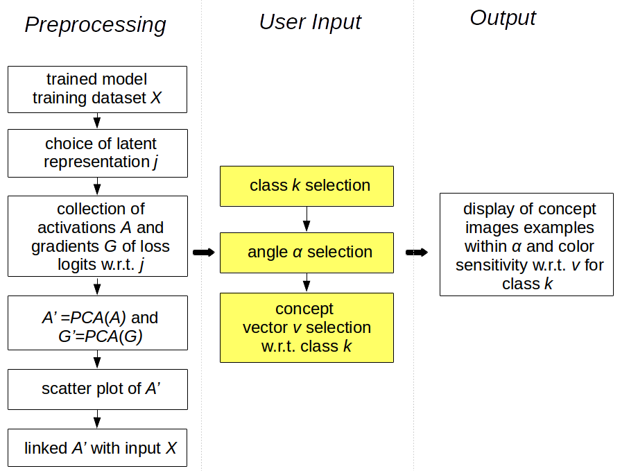
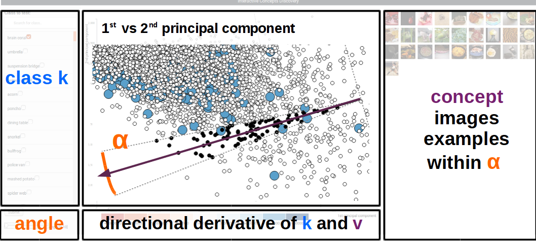
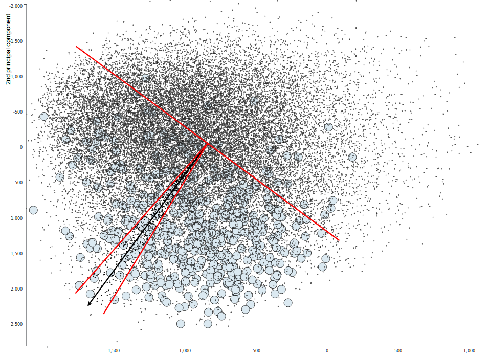
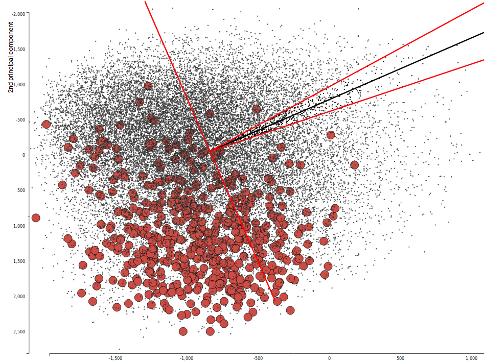
We propose the view in Figure 1, with functionality outlined in Figure 3. Each point in the scatterplot corresponds to one sample in the original data. Their positions are obtained by plotting with respect to the directions derived from a Principal Components Analysis (PCA) on the learned features. This reduction is how we manage the high-dimensionality of the ; alternative reductions could be used. The central black arrow represents a user-defined concept direction , and points of the currently selected class are enlarged and colored according to the class’ score, . This immediate visual feedback on the relevance of a concept direction is how we make it easier to discover interesting concepts. To provide context about the relevant directions, we display representative images along the concept direction, between the dashed helper lines defined by a user-chosen angle in the bottom left corner. The left panel lets users switch between classes. The overall procedure is summarized in Figure 2 – the elements requiring user interaction are highlighted in yellow.
Working in lower dimensions has its cost, it is an approximation. To calculate the TCAV score, we need to obtain a directional derivative between the concept vector and the gradient of logit function with respect learned features. For the type of high-dimensional learned by modern deep learning models, performing this computation with the full high-dimensional gradient for each point breaks the system’s responsiveness. Instead, we again apply dimensionality reduction, this time to the gradients. This trick allows us to store only projection of the gradients, dramatically decreasing the computational load.
The score obtained from the directional derivative is plotted in color space on samples from the selected class. In this way, users can quickly assess which directions are worth exploring further. Instead of staying in the projected space we could perform the reverse operation to obtain an approximation of the vector in the original feature space. In the case of PCA, we use the following procedure: let be the original input matrix, be the mean vector of and let be the matrix of eigenvectors with highest eigenvalues used to obtain the PCA scores . Then, the reconstruction in the original space is . While this is possible, we find that it is still too slow for interactive visualization.
To further streamline the search, we can imagine a few modifications. To suggest directions worth exploring, we could precompute activation summary statistics across directions, and provide reference to them on the plot. We could show the loss evaluated on the projected space as a heatmap, highlighting ridges at which class predictions change. We could also sort classes so that those with similar active concept vectors are placed nearer to one another.
3. Experiments
We now present experiments to evaluate our proposed approaches, with the goal of discovering strengths and clarifying weaknesses.
3.1. Multiple Testing Illustration
We first study the behavior of the multiple testing proposal in a transparent simulation setting. The data are generated as follows. Draw 2000 points uniformly in the square . Define three classes (see the background in Figure 5),
-
•
Class 0 are points in .
-
•
Class 1 are points in .
-
•
Class 2 are points in .
The interesting characteristic of this dataset is that a large portion of the decision boundaries for classes 0 and 2 is linear, while for class 1, the boundary is a circle. Intuitively, the vertical direction is more important for defining classes 0 and 2 than it is for class 1.
Our “black box” classifier is in fact a simple 1-layer MLP. That is, the probability that belongs to class is approximated by
where is the -dimensional softmax and ReLU denotes the function . We use only 20 hidden units – this is enough to reach essentially 0 training loss. This model is convenient for our study of interpreting automatically learned features because its learned mapping has a simple description: each coordinate activates when lands in the half-space orthogonal to , with larger activations further in. By mixing these activating hyperplanes, the MLP can trace out the curve defining the true boundary. See Supplementary Figure 12.
Given this setup, we can now ask,
-
•
What concepts are discovered by the multiple testing procedure?
-
•
For any specific direction, which clusters of points are most strongly activated?
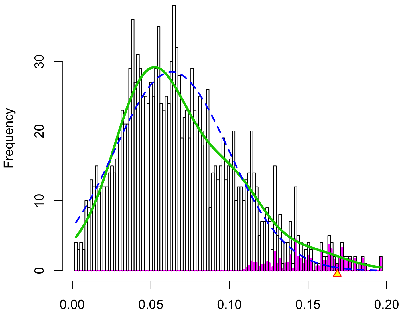
Considering the variants of the multiple hypothesis testing approach presented in Section 2.1, we first describe our specific implementation222All code for this study are available at https://github.com/adrijanik/concepts-exploration, see Appendix A for more on reproducing experiments. We draw 500 candidate concepts on the 20-dimensional unit sphere in the learned feature space. For fixed and class , we evaluate over all 2000 .
As a measure of interestingness, we compute the standard deviation of the collection . We use the local FDR procedure applied to these to assign an lFDR scores to every candidate concept. The reference null and declared discoveries are displayed in Figure 4.
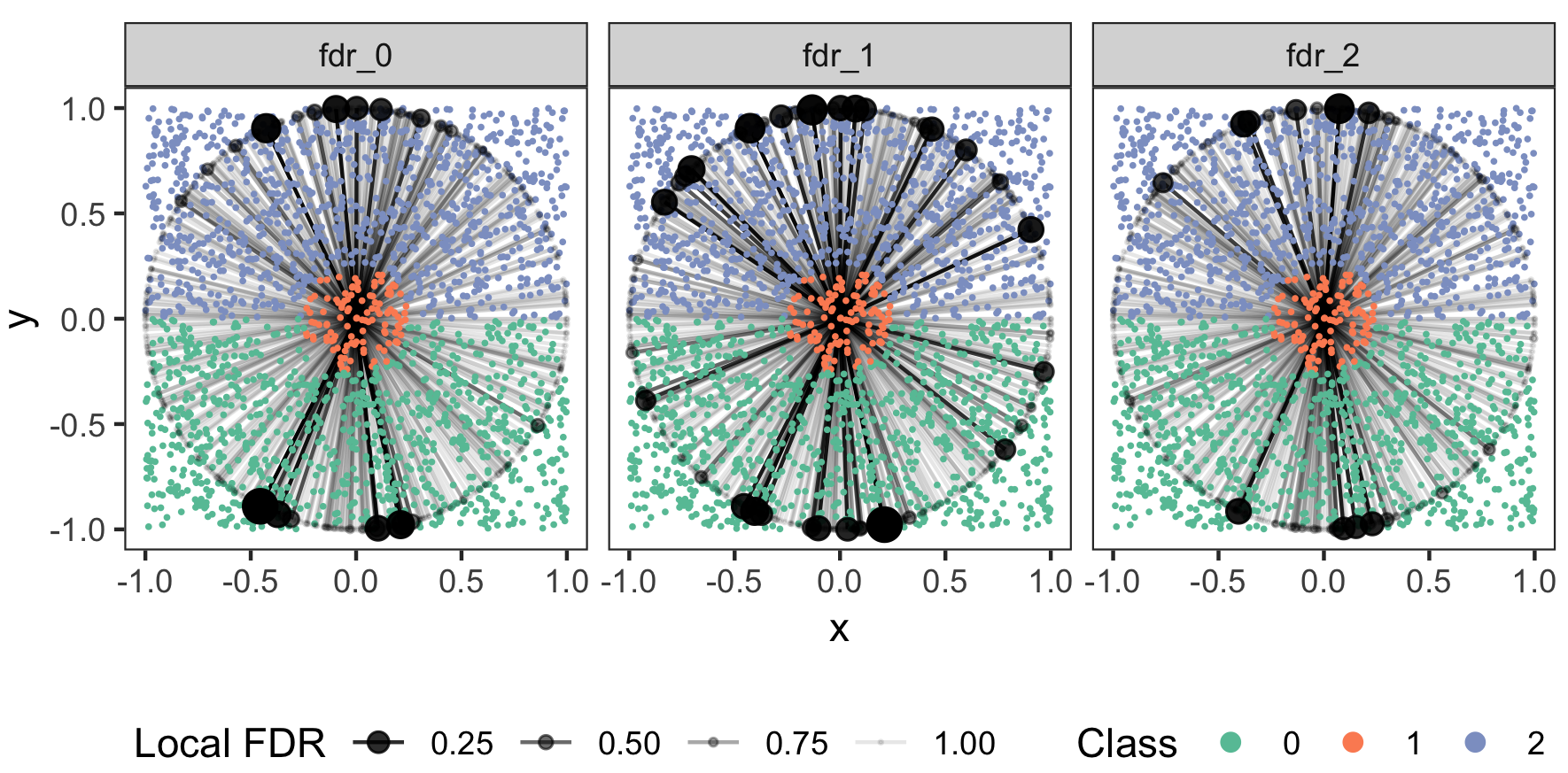
Since our simulation data are low-dimensional, we can visualize the discovered concepts, though only indirectly. To do so, recall that the learned feature corresponds to an activation in the direction orthogonal to . Identify this direction with the standard basis vectors, , in the learned feature space. Formally, the duality comes from ; informally, moving all points in the direction in the -space increases the activation of the learned features.
In this light, it is natural to associated the direction in the -space with the candidate concept . These directions, normalized to length 1, are displayed in Figure 5, shaded in according to the lFDR of the associated direction, and overlaid on the original simulation data. Evidently, the relevant directions for classes 0 and 2 generally lie orthogonal to the -axis. On the other hand, class 1 has low lFDR concept directions that make relatively small angles with the -axis. The fact that the discovered directions correspond to those defining the decision boundaries relevant to each class provides qualitative validation of our approach, though our setting is admittedly a simple one.
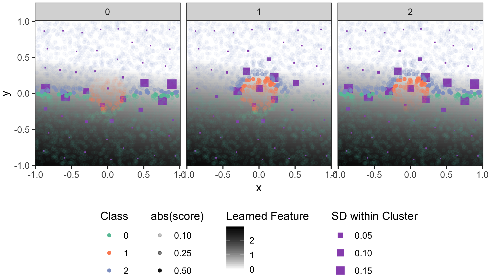
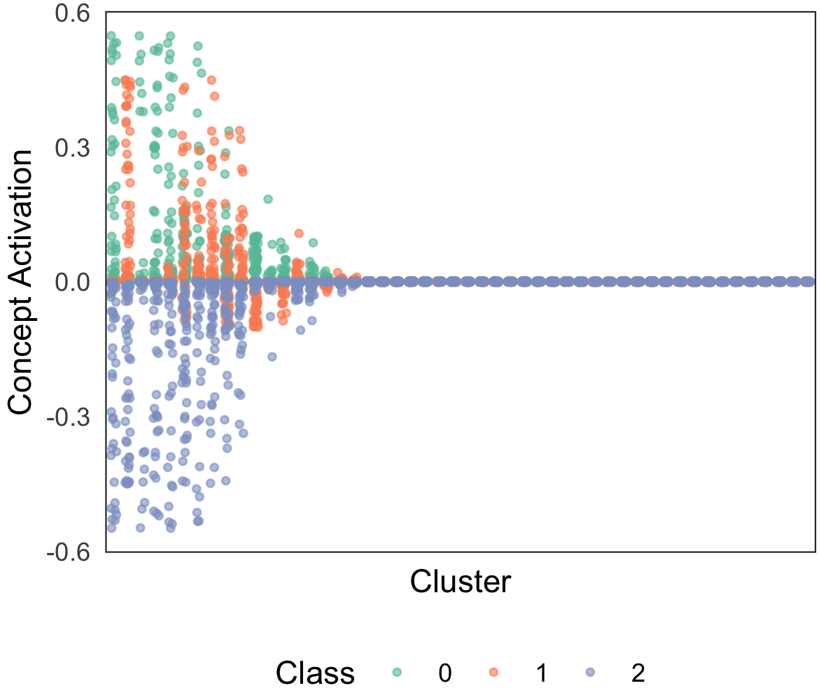
We next consider the distribution of when a specific direction is chosen, with the goal of identifying strongly activated subsets of points. In a real application, this might provide a more granular view into concept activations than the class-level summary statistic in equation 1. To this end, we set the concept to , corresponding to the first learned feature dimension. We cluster all samples in the original -space using k-means and compute the standard deviation of activation scores within each cluster. The result is displayed in Figure 6.
Each purple square corresponds to one cluster centroid. Their sizes reflects the standard deviation of activations within that cluster, where activations are computed with respect to the class indicated by the subpanel titles. The absolute value of the original per-point activation scores is indicated by the transparency of the points. The value of the learned feature is displayed as the grey plane in the background.
Clusters with the largest variation in concept activation for this direction tend to appear near the decision boundaries for the corresopnding classes. Note further that parts of the boundary that are far from the learned feature’s defining hyperplane tend to have smaller variation – this is visible in the U-shaped part of the boundaries for the first and second classes, for example. In Supplementary Figure 11, we further find that activations are generally positive for classes 0 and 1 and negative for class 2. This is consistent with the downward orientation of the feature under study.
If this pattern generalizes outside of this simulation experiment, then this approach to summarizing clusters by concept activation can be used to sample points near decision boundaries where specific concepts – user-defined or statistically discovered – are informative.
3.2. Interactive Visualization
For visualization, we experiment with a real-world image classification task. We inspect a GoogleNet network trained on ImageNet images. For the purpose of visualization we chose the 50 first classes from the 200 classes in tiny ImageNet. For the selected classes we obtain feature activations and gradients at the mixed4d layer. Our setup mirrors that in the experiments of Kim et al. (2017). For each class we have 500 images; in total, our dataset has 25000 images.
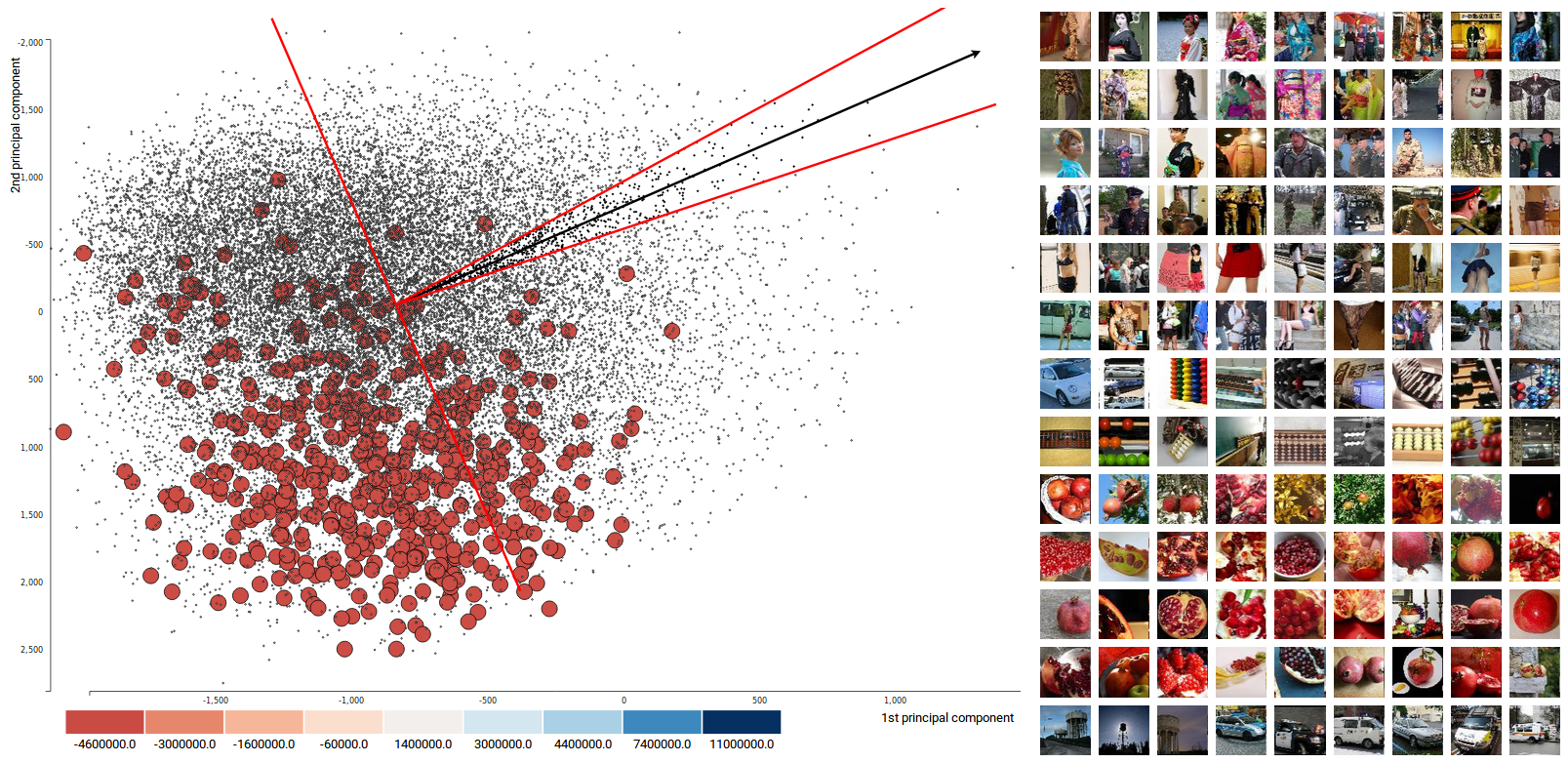
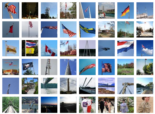
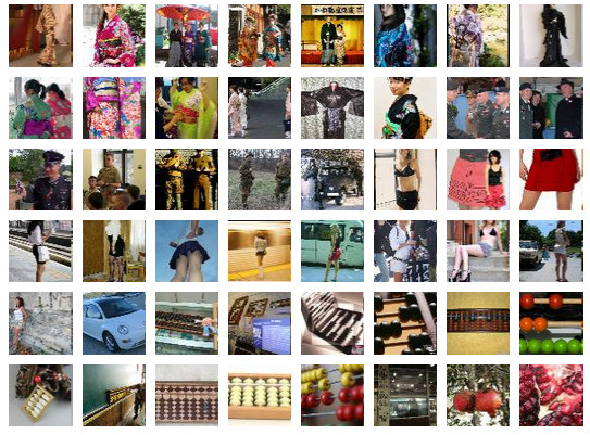
In Figure 7, we see an example of a user chosen concept vector pointing towards samples from the selected class “flagpole.” This is manifested by changes in the colors of points from that class – points become dark blue when the user’s concept vector leads to positive activation scores. In contrast, we can identify a direction that triggers negative scores, marked as red and presented in Figure 8. Example concepts images can be found in Figure 9.
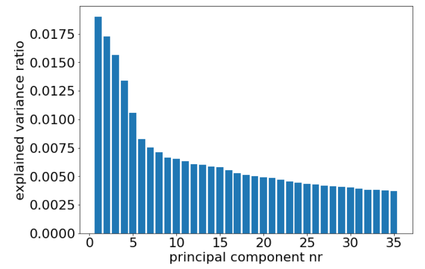
It is worth questioning whether the dimensionality-reduced view is a reliable representation of original space. For this purpose, we look at the variance ratio explained by selected components. With a complex network such as GoogleNet, the activation space has dimension of for each analyzed image. After flattening, this gives an activation vector of size , and when we reduce this dimension with PCA, variance is distributed across many components (see Figure 10) with first one having around 2% of variance explained.
for ”flagpole” class.
for ”flagpole” class.
Visualizing CAVs in the lower dimension is an approximate approach but it may be useful. Navigating through latent space with hundred of thousands dimension is not an easy task and this initial experiments showed us that we may need to visualize more principal components in coordinated views or try our method with a smaller networks, especially promising may be networks with encoder-decoder structure due to their architecture and clear bottleneck layer.
We have potential ideas for future experiments we especially find promising plotting pairs of principal components in coordinated views to see how concept directions affect other sources of variance and also trying different methods of dimensionality reduction especially non-linear ones.
4. Discussion
Concept discovery can be guided by geometry, statistical inference, and visualization. Inspired by (Kim et al., 2017), we have developed strategies that let practitioners interrogate the decision surfaces of deep learning models and the way they relate to automatically learned features. We intend for this approach to be a compromise between the manual concept definition of (Kim et al., 2017) and the full automation of (Ghorbani et al., 2019).
There are important challenges that must be overcome before either inferential or interactive concept exploration can become commonplace. The first challenge we highlight is that there are likely more efficient strategies for sampling candidate concepts in the learned feature space. It seems natural to place more mass on directions containing more observations. Second, there is the challenge of choosing an measure of concept interestingness which is amenable to local FDR methodology, and a systematic study of potential test statistics beyond those described here would be valuable. Third, our interactive visualization approach is limited by difficulties of visualization high-dimensional functions. Further experiments – perhaps using parallel coordinates or linked views (Buja et al., 1996) – may yield improvements.
Nonetheless, our experiments point to the value of model interpretability workflows that equip users with all the tools of modern statistics and visualization. We have provided experiments that demonstrate how multiple hypothesis testing can highlight relevant concepts to follow-up on even when none are provided upfront. Further, we have highlighted how interactive views that link concrete image displays with abstract class summaries can engage users in the process of concept discovery. We hope that these techniques play a role in advancing model interpretability as a scientific enterprise, providing powerful tools to users curious about the inner workings of complex models.
References
- (1)
- Bengio et al. (2012) Yoshua Bengio, Aaron C Courville, and Pascal Vincent. 2012. Unsupervised feature learning and deep learning: A review and new perspectives. CoRR, abs/1206.5538 1 (2012), 2012.
- Buja et al. (1996) Andreas Buja, Dianne Cook, and Deborah F. Swayne Research Scientist. 1996. Interactive High-Dimensional Data Visualization. Journal of Computational and Graphical Statistics 5, 1 (1996), 78–99. https://doi.org/10.1080/10618600.1996.10474696 arXiv:https://www.tandfonline.com/doi/pdf/10.1080/10618600.1996.10474696
- Doshi-Velez et al. (2017) Finale Doshi-Velez, Mason Kortz, Ryan Budish, Chris Bavitz, Sam Gershman, David O’Brien, Stuart Schieber, James Waldo, David Weinberger, and Alexandra Wood. 2017. Accountability of AI under the law: The role of explanation. arXiv preprint arXiv:1711.01134 (2017).
- Efron (2010) Bradley Efron. 2010. Large-Scale Inference: Empirical Bayes Methods for Estimation, Testing, and Prediction. Cambridge University Press. https://doi.org/10.1017/CBO9780511761362
- Ghorbani et al. (2019) Amirata Ghorbani, James Wexler, and Been Kim. 2019. Automating Interpretability: Discovering and Testing Visual Concepts Learned by Neural Networks. (2019). arXiv:1902.03129 http://arxiv.org/abs/1902.03129
- Kim et al. (2017) Been Kim, Martin Wattenberg, Justin Gilmer, Carrie Cai, James Wexler, Fernanda Viegas, and Rory Sayres. 2017. Interpretability Beyond Feature Attribution: Quantitative Testing with Concept Activation Vectors (TCAV). arXiv:1711.11279 [stat] (Nov. 2017). http://arxiv.org/abs/1711.11279 arXiv: 1711.11279.
- Samek et al. (2017) Wojciech Samek, Thomas Wiegand, and Klaus-Robert Müller. 2017. Explainable artificial intelligence: Understanding, visualizing and interpreting deep learning models. arXiv preprint arXiv:1708.08296 (2017).
- Wickham et al. (2015) Hadley Wickham, Dianne Cook, and Heike Hofmann. 2015. Visualizing statistical models: Removing the blindfold. Statistical Analysis and Data Mining: The ASA Data Science Journal 8, 4 (2015), 203–225.
Appendix A Reproducibility
Demo was developed in JavaScript with the usage of d3.js visualization library. Demo is available online under following link: https://adrijanik.github.io/concepts-vis/. Network that was been used is GoogleNet that was trained on ImageNet and used in the TCAV implementation tutorial by tensorflow. As the original training set is huge, we limited this study to a smaller dataset tiny-ImageNet-200 https://tiny-imagenet.herokuapp.com/ with 200 classes from original set.
Pre-processing part of data was done using Python 3.6 with implementation of PCA from scikit-learn package. PCA was trained on 600 samples that contained 3 samples from each class drawn randomly from the dataset.
The source code can be found in the following GitHub repository: https://github.com/adrijanik/concepts-exploration.
Appendix B Supplementary Figures