1169 \vgtccategoryResearch \vgtcpapertypeapplication/design study \authorfooter Yamei Tu, Han-Wei Shen, Spyros Blanas, J.Craig Jenkins are with The Ohio State University. E-mail: tu.253, shen.94, blanas.2, jenkins.12 @osu.edu. Junpeng Wang is with Visa Research. E-mail: junpeng@vt.edu. Olga Li, Przemek Powalko, Irina Tomescu-Dubrow, Kazimierz M. Slomczynski are with Institute of Philosophy and Sociology. Email: li.olya.en@gmail.com, powal@yahoo.com, dubrow.4, slomczynski.1 @osu.edu \shortauthortitleBiv et al.: Global Illumination for Fun and Profit
SDRQuerier: A Visual Querying Framework for
Cross-National Survey Data Recycling
Abstract
Public opinion surveys constitute a widespread, powerful tool to study peoples’ attitudes and behaviors in comparative perspectives. However, even world-wide surveys provide only partial geographic and time coverage, which hinders a comprehensive knowledge production. To broaden the scope of comparison, social scientists turn to ex-post harmonization of variables from datasets that cover similar topics but in different populations and/or years. The resulting new datasets can be analyzed as a single source, which can be flexibly accessed through many data portals for scientists. However, such portals offer little guidance to explore the data in-depth or query data with user customized needs. As a result, it is still challenging for social scientists to efficiently identify related data for their studies and evaluate their theoretical models based on the sliced data. To overcome these limitations, in the Survey Data Recycling (SDR) international cooperation research project, we propose SDRQuerier and apply it to the harmonized SDR database, which features over two million respondents interviewed in a total of 1,721 national surveys that are part of 22 well-known international projects spanning the period 1966-2012 and 142 countries/territories. Using the SDR database as a prototype, we design the SDRQuerier to solve three practical challenges that social scientists routinely face. First, a BERT-based model provides customized data queries through research questions or keywords (Query-by-Question). Second, we propose a new visual design to showcase the availability of the harmonized data at different levels, thus helping users decide if empirical data exist to address a given research question (Query-by-Condition). Lastly, SDRQuerier discloses the underlying relational patterns among substantive and methodological variables in the database (Query-by-Relation), to help social scientists rigorously evaluate or even improve their regression models. Through case studies with multiple social scientists in solving their daily challenges, we demonstrated the novelty, usefulness and effectiveness of SDRQuerier.
keywords:
Survey data recycling, data harmonization, visual data query, social science, visual analytics.K.6.1Management of Computing and Information SystemsProject and People ManagementLife Cycle;
\CCScatK.7.mThe Computing ProfessionMiscellaneousEthics
\teaser
![[Uncaptioned image]](/html/2201.11125/assets/x1.png) (a1-a4) Query-by-Question recommends target variables based on user input and allows further visual explorations; (b1-b3) Query-by-Condition includes the new design, Temporal Availability Profiler, revealing the multi-faceted information of available data given user’s conditions; (c1-c2) Query-by-Relation presents the relational patterns from the available data to assist social research.
\vgtcinsertpkg
(a1-a4) Query-by-Question recommends target variables based on user input and allows further visual explorations; (b1-b3) Query-by-Condition includes the new design, Temporal Availability Profiler, revealing the multi-faceted information of available data given user’s conditions; (c1-c2) Query-by-Relation presents the relational patterns from the available data to assist social research.
\vgtcinsertpkg
1 Introduction
Comparative surveys are a powerful tool that researchers in many fields, such as sociology, political science, economics, demography, etc., employ to study how the individual-level conditions (e.g., age, gender) combine with contextual factors (e.g., democracy, economics) to shape social phenomena across cultures and time [19, 31]. While a treasure of free, publicly accessible international survey projects exists, users encounter drawbacks in doing comparative analyses, mainly because single survey projects cover only a fraction of the world’s nations and selected time periods. To broaden the scope of comparison, social scientists increasingly harmonize information from existing cross-national datasets that measure the same concepts for different populations and/or years into a new integrated database [29, 8]. Survey Data Recycling (SDR) is such an active research project that develops ex-post harmonization methods [9, 33] to recode, rescale, or transform variables from 22 international surveys into one integrated dataset with consistent scales [18, 25, 40]. The SDR harmonized database is available online through the SDR data portal, such that the scientists can flexibly access the data to conduct further analysis. The large-scale harmonized databases that entail the potential for innovative comparative research are also likely to raise substantial difficulties in understanding and exploring the dataset, as well as evaluating their theoretical models built on top of the sliced data. Given the organization of the current online data portal, scholars generally do not have access to effective means for understanding the complex structure and various types of variables, causing difficulties in choosing an appropriate set of variables from the data for their analyses. It is also difficult for researchers to explore data availability taking into account source data quality or harmonization features for their analysis, even with a set of accurate filtering conditions. Lastly, survey data are used to evaluate regression models proposed by scientists. Nevertheless, retrieving the useful information from the available high-quality data to evaluate the fit of statistical models against the empirical data is a non-trivial task.
With the success of visualization in analyzing multi-variate and multi-faceted data, we believe it is key to solving the above challenges from three aspects. First, as SDR data are harmonized from a set of meta-data, i.e. survey questionnaires, codebooks, and data dictionaries, illustrating structures of the harmonized data and relating the unstructured texts with the harmonized variables can significantly improve the effectiveness of data query. Second, as both the meta-data and harmonized data suffer from severe data quality issues, demonstrating data availability is in strong need, which avoids spending time on less-verifiable problems but initiate promising research topics with solid data support. Third, visualizations with convenient user interactions can greatly assist in the exploration of the hidden relationships between the meta-data and harmonized data in the dataset. Apart from these potential benefits, however, we found the power of visualizations has not been sufficiently leveraged in social science applications. For example, bar charts are adopted frequently to show the temporal coverage of surveys, but they fall short in revealing the surveys’ spatial coverage simultaneously. Scatterplots are commonly used to qualitatively present the correlation between target variables, but they fail to reflect the quality of the underlying data and may present biased results [12].
To overcome these limitations, we collaborate with social scientists and use the SDR database as a pilot case for developing a new visual analytical system, the SDRQuerier. The system is equipped with three-level of information queries through visualization and interactions. To facilitate understanding, we propose a question-driven variable recommendation for efficient data exploration. Users can query relevant variables by inputting their research questions. Based on the related variables, users can perform accurate queries to check available data. For exploring data availability, SDRQuerier is equipped with a new design, Temporal Availability Profiler, which exhibits multi-faceted information dynamically. Furthermore, our system performs model evaluation and suggests methodological variable improvements by answering the following questions: What are the relationships between variables selected for the regression model? and What other variables are necessary to include in the model? We also perform extensive case studies and host thorough discussions with domain experts. To sum up, the main contributions of our work are as follows:
-
•
We abstract the challenges in analyzing harmonization survey data and propose a visual analytics system, SDRQuerier, to solve them. It is equipped with three visual components assisting in different stages: understanding, exploring, and analyzing.
-
•
We propose a new question-driven variable recommendation for data understanding, which facilitates users to identify variables of interest in an efficient way.
-
•
We design Temporal Availability Profiler to visualize available survey projects from different levels and perspectives. We prove the novelty and usefulness of this design with thorough case studies.
2 Related Work
2.1 Survey Data Visualization
To present information succinctly, social scientists frequently use basic visualizations to generate static reports [12]. For example, for discrete categorical data, bar charts or pie charts are commonly utilized to display proportions or distributions of different categories [16]. For quantitative data, bar charts, such as boxplots and error bars, are designed to incorporate statistical measurements [16, 30]. These static visualizations can only convey information formed and filtered by the creators of visualization. To allow human-in-the-loop of the information seeking process, there are some visualization tools that allow users to flexibly explore survey data with their own questions, e.g., NESSTAR [2], SDA [32]. Jones et al. developed an interactive system for presenting quantitative social environmental survey data to help explore and understand [16]. All the works mentioned above aim to understand the content of survey data through visualization. To our knowledge, SDRQuerier is the first interactive system that allows users to explore large, complex and high-dimensional harmonized dataset through visualization and multi-faceted queries.
2.2 Time-Varying Multivariate Data Visualization
Time varying multivariate data depict how various features evolve over time, and these evolution patterns often provide valuable insights into the data generated by different domains [1, 39]. Based on the fact that time can be considered either linear or cyclic, visualizations can be categorized into two groups: time series plots [20, 21] vs. spiral graphs [13, 3, 38]. The Spiral Graph is more efficient to discern periodic patterns. For sequential visualization, the Theme River [11], is one of the most popular visualization that maps the frequencies of multiple topics at each time step to the widths of colored currents in the river, depicting the thematic evolution of documents based on a river metaphor. In our Temporal Availability Profiler, the sub component, Separate Availability uses the same metaphor as the Theme River, presenting the data availability as a flow. However, we allow the information presented from multiple perspectives, where Theme River and other methods are not applicable [10, 13]. There are many visualization tools designed for capturing multi-level information of time-varying data in the literature [7]. Dasgupta et al. developed coordinated views to illustrates the evolution of chemical species for geologists to observe interactions, including parallel coordinates and matrix views [4]. Wang et al. designed a spiral graph for analyzing sentiment of time-varying twitter data [37]. Pena et al. compared three visualizations of geo-temporal multivariate data, which is considered as the most related work [26] to this paper. However, the difference is that geological and temporal information fall into two levels of our analysis in social research. The purpose of Temporal Availability Profiler is to illustrate the temporal availability and high-level spatial availability first, and the detailed geological information is presented later to scientists.
2.3 BERT for Information Retrieval
Information Retrieval has advanced rapidly in the recent years due to the development of natural language processing (NLP) technology. Given the state-of-the-art performance in many downstream tasks in NLP, the most related ones to our automatic recommendation model are search-related, such as document retrieval and question answering [6, 24, 41]. Some works applied BERT to ad-hoc document retrieval by ranking the documents based on inference scores computed for each document given a specific query [42, 22, 43]. However, they differ in the way of computing the inference score. Yang el al. tackled the challenge of long documents by inferring individual sentence first and then computing document score based on the sentences [42], while Jiang et al. handled cross-lingual document retrieval between English queries and foreign-language documents [15]. The aforementioned works aim to improve the performance or solve the difficulties when apply BERT to information retrieval, while for SDRQuerier, we propose to use BERT for variable recommendation from two perspectives. Also, we identify the different scenarios to apply this model.
3 Background
In this section, we introduce the different types of variables in the harmonized data, meanwhile explaining where the data complexity comes from. We also provide a brief introduction of the BERT model and its inner structure, used in SDRQuerier.
3.1 Variables Types in Harmonized SDR Dataset
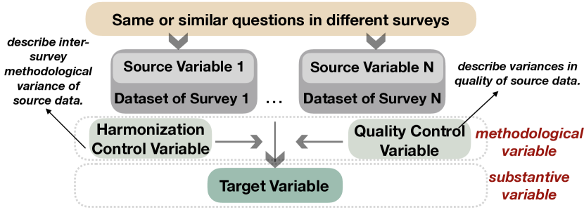
During ex-post survey data harmonization, information from international survey projects and other sources is combined into the integrated SDR dataset. Given one survey, each question in the questionnaire is related to one dimension (column) in the dataset. For example, a survey may ask the respondents questions about their attitudes and behaviors and record all responses into a table. In the resulting tabular dataset, each column corresponds to a specific question, and each row indicates one respondent’s answers to the questions in the survey questionnaire. Each dimension refers to one variable. Original variables, taken from different surveys for harmonization, are called source variables. The indicator in the harmonized dataset, produced from a series of source variables measuring the same concept in different surveys, is called a target variable. Combining the information from different source variables into a target variable requires ex-post harmonization procedures, since the characteristics (e.g. wording, answer options) of source questions related to one concept frequently vary between surveys.
During the process of transforming source variables into target variables, the SDR team creates harmonization controls. These are target variable specific measures that capture primarily inter-survey methodological variability in formulation of the source questions that can influence the validity and reliability of the constructed target variable.
The SDR database provides another set of methodological indicators, source data quality controls. These variables capture biases and errors that stem from differences in the quality of the source survey data, where quality is operationalized along three dimensions: the source documentation (questionnaires, codebooks, study descriptions, technical reports), data records in individual source datasets, and the consistency between these documentation and data records. Source data quality controls also can affect the relationship between substantive target variables. Researchers should assess if and to what extent they do so. Overall, ex-post survey data harmonization in the SDR project yields the following types of variables:
-
•
Source: raw variables from the surveys taken for harmonization.
-
•
Target: substantive variables in the integrated dataset, constructed out of source variables as the product of ex-post harmonization.
-
•
Harmonization Control: methodological variables that accompany target variables to record properties of the source variables that can affect the reliability and validity of the target variable, and that could be lost in the process of transforming source into target variables.
-
•
Quality Control: methodological variables that address inter-survey variations and the quality of the source survey data.
3.2 BERT
In this section, we first introduce the BERT model, then move on to describe the basic component inside the model, namely, Encoder.
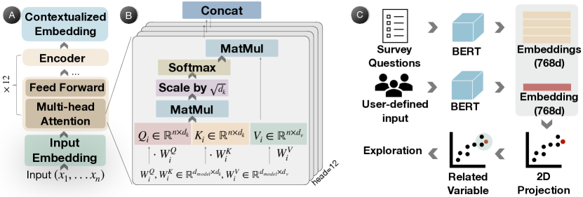
BERT Model: Bidirectional Encoder Representations from Transformers (BERT) is a Transformer-based language representation model that can be fine-tuned to achieve state-of-the-art performance on many natural language processing tasks [5]. It origins from pre-training contextual representations, e.g. ELMo [27], ULM-FiT [14], OpenAI [28], etc. The BERT coverts an input sequence to a sequence of vector representations [35]. The BERT outperforms previous work by considering the context for each occurrence of one word, which means BERT generates different embeddings for the same words in different contexts. As shown in Figure 3(A), BERT is composed of a stack of identical Transformer Encoders. There are two model sizes: (Encoder12) and (Encoder24). We use in the automatic recommendation model.
Transformer Encoder. The encoder of BERT is based on the original implementation of Transformer [35]. As shown in Figure 3(B), it has two sub-layers: the multi-head attention layer and the feed-forward network. In the first layer, for head i, it first multiplies the input embedding matrix with three learnable parameter matrices , , into Q, K, V and generates the output matrix as:
| (1) |
In , there are 12 heads, which means 12 sets of attending on different information. So the output of the multi-head attention layer is then calculated as:
| (2) |
where . The second layer consists of two linear transformations with a ReLU activation in between:
| (3) |
4 Requirement Analysis and Approach Overview
4.1 Design Requirements
The SDR portal enables scientists to download harmonized survey data that can be used for comparative empirical research. The challenge is how to help them identify what the related data are and how to use them. We have collaborated with four domain experts for more than one year to identify the requirements, summarized as follows:
-
•
R1: Identifying related variables to the user’s research topic. Given the large dimensionality of the harmonized dataset, identifying the related columns is important and necessary to acquire meaningful data from the portal. In order to provide enough guidance for experts, SDRQuerier is required to:
-
–
R1.1: Give the variable recommendation based on users’ needs. Automatic variable recommendation can help scientists avoid unnecessary exploration and focus on more important variables.
-
–
R1.2: Exhibit data provenance of harmonized target variables. Showing what source variables each target variable links to helps scientists understand the logic and meaning of each target variable. Simultaneously, this background information fosters researchers’ trust in the harmonized data, as it speaks to the transparency of the harmonization process.
-
–
R1.3: Present an overview of the harmonized dataset. Due to the complexity of the harmonized data, plenty of information need to be presented (e.g., types of variables, relations between variables) for understanding these data.
-
–
-
•
R2: Revealing data availability for decision support. Typically, scholars who conduct quantitative comparative survey research seek data that meet specific conditions. Retrieving valid records by specific conditions is an easy task, but deciding whether they are sufficient to evaluate a scientific model should take many other factors into consideration.
-
–
R2.1: Facilitating target variables selection. While several target variables may fit to a given research problem, their availability varies a lot. In order to decide which one to choose, scientists need to know their individual and joint availability.
-
–
R2.2: Assisting with decision making. Once available data are identified, it is important to assist researchers in deciding whether these data meet the formal requirements for regression analysis. This can be done by providing multi-faceted information, e.g., which data have quality issues?
-
–
-
•
R3: Retrieving underlying patterns for hypothesis testing. Social scientists use survey data to examine if and to what extent there is empirical support hypotheses between various variables, which can be assisted by the hidden patterns from the data.
-
–
R3.1 Validating the selected target variables. Hypotheses propose some associations or causal relationships between variables of interest. Revealing relational patterns from target data is a good way to preliminarily evaluate the hypotheses.
-
–
R3.2 Describing the potentially related variables to improve the regression model. Relations between target variables should also consider the potential role of methodological variables. Scientists should take them into consideration when building theoretical models to test hypotheses.
-
–
4.2 Approach Overview
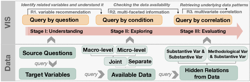
Figure 2 displays an overview of our framework. We summarize the domain requirements into three challenges in different stages of the social research pipeline: understanding, exploring and evaluating. To solve the challenges, we propose a framework that contains three corresponding modules. First, inspired by conversational Artificial Intelligence, we train a BERT-based model to generate variable recommendations based on user’s input text, either keywords or sentences describing their information of interest. This process is defined as Query-by-Question. Later, the recommendation is combined with visualization and interactions to facilitate harmonized data understanding. Second, in the Query-by-Condition module, we perform information retrieval based on specific filtering conditions. In order to show the multi-faceted information from the retrieved data, we design a new visualization, Temporal Availability Profiler, to assist scientists in deciding whether data are sufficient to use considering data diversity, coverage, and quality issues. Lastly, computing the relational patterns from available data samples can verify whether the expected patterns exist or not, which in turn helps scientists to test their hypotheses and choose the variables for their theoretical models, defined as Query-by-Relation.
5 Visual Analytics System: SDRQuerier
Motivated by the requirements in section 4, we design and implement SDRQuerier with three coordinated visual components, enabling multi-granularity queries of the harmonized survey data for social scientists.
5.1 Query-by-Question (QBQ)
Although target variables names in the harmonized data have been carefully chosen, it can be difficult to quickly identify the theoretical concept from the abbreviated names. As explained in section 3, each target variable is summarized from a set of survey questions in the questionnaires. Therefore, the survey questions provide good contexts, accurately reflecting the meaning of target variables. For example, T_DEMONST (a target variable) can be characterized as authorized demonstrations in democratic countries or unauthorized activities in non-democratic countries given different political backgrounds.
Inspired by conversational AI, we train a BERT-based classification model on survey questions to predict the target variables. With such a model, we can infer the target variable from a wide variety of text inputs, e.g., research questions, descriptions, or a set of keywords for a sociological concept. For example, when a researcher studies if life conditions can influence political participation, he/she might type in the sociological concept, i.e.\saypolitical participation, or the descriptions of life condition indicators, i.e.\sayhow much are you satisfied with your life? or \sayare you living in metropolitan or not? to retrieve the related target variables. Based on the model, we can recommend a target variable in two ways (R1.1): (1) the hard recommendation, which outputs the target variable with the highest probability from the classification model; (2) the soft recommendation, which converts one-to-one prediction problem to a one-to-many clustering issue by allowing users to flexibly explore the semantic similarity between their inputs and survey questions.
5.1.1 BERT-Based Model for Target Variable Prediction
To automate the QBQ process, we train a BERT-based model to relate the survey questions with target variables. The model (1) takes a survey question as input, (2) embeds it into a [cls] token, which represents the entire text sequence and is then used for sequence classification tasks, and (3) converts the [cls] token to a target variable. A pre-trained BERT model is employed to perform (1)(2), and a classification layer is appended to the model to conduct (2)(3). A set of question and target variable pairs, labeled by our social scientists, are used to train the classification layer with a cross-entropy loss.
5.1.2 BERT-Based Model for Soft Recommendation
The soft recommendation qualitatively measures the semantic similarity between user-defined text input and the survey questions. We extract the hidden states, i.e. embeddings from the trained model, which is promised to capture the semantic information. As shown in Figure 3(C), the embeddings of users’ input and survey questions are extracted and jointly projected to 2D for visual exploration. tSNE [34] is employed here to interactively update the projection result, given its superior performance over UMAP for non-linear projections. We perform the embedding updates in an iterative manner following algorithm 1, aiming to reduce the running time and acquire stable results.
5.1.3 Visual Design for Understanding Harmonized data
There are three coordinated views to assist the identification of related data in the harmonized database (R1): the Scatterplot in SDRQuerier: A Visual Querying Framework for Cross-National Survey Data Recycling-, the Information Table in SDRQuerier: A Visual Querying Framework for Cross-National Survey Data Recycling-, and the Circular Graph in SDRQuerier: A Visual Querying Framework for Cross-National Survey Data Recycling -.
The Scatterplot demonstrates the embedding projection result, revealing semantic similarity among survey questions and the user-defined input. Each dot represents one question, relating to one target variable, so we use the target variable to color the questions in the projection space. As shown in SDRQuerier: A Visual Querying Framework for Cross-National Survey Data Recycling(a1), questions of the same color are grouped together, verifying that our BERT model captures their semantic similarity. It also presents the variance in the same source variables. From the projection, users can also brush the dots of interest, which will update the Information Table automatically.
The Information Table connects source information and target information together, aiming to help scientists identify the data columns to query from the the SDR portal. The columns of the tabular data are year, survey wave, source question, target variable, label of target variable. As confirmed by domain experts, individual source question varies across surveys, and hence it is helpful to present this variation to scientists in order to help them better understand the data pre-processing process and improve the credibility of the harmonized data (R1.2).
The Circular Graph is proposed to handle the complexity and dimensionality of the harmonized data, which targets to: (1) indicate diverse types of variables, such as source-, target-, harmonization control- or quality-variables; (2) illustrate the relationships of different variables (R1.3). As shown in SDRQuerier: A Visual Querying Framework for Cross-National Survey Data Recycling(a3), the circular bar chart represents the target variables. The length of the bar implies the overall availability of each target variable, i.e., how frequently the corresponding target variable is measured in international surveys. The color indicates the topic of the target variables, which is consistent with the color schema used in the Scatterplot. Once the user triggers the query from scatterplot, only the predicted bar will be highlighted in orange while others fade out. Several target variables can describe the same topic from different perspectives. For example, T_HAPPY_11 and T_HAPPY_DISTRIB both measure respondents’ self-reported happiness, but using different specifications. As described in section 3, target variables capturing the same theoretical concept can share one or several harmonization control variables, which record the variance in source variable properties. These controls are visualized in the orange arcs ( ) , the number of arcs in the same radial position reflects the number of harmonization control variables in the group. When clicking an arc, the right panel will pop up to show the value distribution and value label of the harmonization control variable(SDRQuerier: A Visual Querying Framework for Cross-National Survey Data Recycling-). As proved by experts, knowing the meaning and distribution of harmonization control variables is extremely helpful when querying data from the SDR portal. The inner circle ( ) conveys that all the target variables are related to the quality control variables. The most inner network represents the information and demographics of the respondents. The demographics include respondents’ age, birth year, sex of the respondents; their color is also consistent with the Scatterplot. For example, for age, survey can ask about age in many ways as reflected by the numerous red points ( ) in the Scatterplot.
5.2 Query-by-Condition (QBC)
Core to social science quantitative comparative research is to assess the extent to which empirical data provide support to their hypotheses. While these postulated hypotheses often refer to specific countries and certain year-range, it is a common practice among social scientists to blindly download the full harmonized data without any filtering conditions (from data portals), and then check if downloaded data fit their research needs, e.g., in terms of country and time coverage. However, the process is inefficient and can be greatly improved if data availability can be effectively and user-friendly checked from multiple perspectives before downloading (R2).
5.2.1 Temporal Availability Profiler
We propose a new design, Temporal Availability Profiler to reveal the availability of the harmonized data at multiple levels. The design is composed of two sub-components (Separate Availability and Join Availability), sharing the same -axis to reveal data samples density evolution across time (i.e., temporal availability).
The Separate Availability view (SDRQuerier: A Visual Querying Framework for Cross-National Survey Data Recycling-) illustrates the amount of valid samples for each target variable over time, which helps user decide among multiple alternative variables (R2.1). The Joint Availability view (SDRQuerier: A Visual Querying Framework for Cross-National Survey Data Recycling-) exhibits the available samples for all the selected target variables, indicating the precise pool of valid samples that one can rely on to evaluation the multi-variate relations (R2.2).
Before we construct the view, we have condition sets and selected target variable sets . Condition sets are used to filter rows in the harmonized dataset. For example, a scientist wants to study political protests in Russia under Putin’s regime. The condition sets = (”country=Russia”, ”year2020”, ”year2000”). For Joint Availability view, the available samples should satisfy all condition sets, and also contain data at all target columns. While in the Separate Availability, each row indicates one corresponding target variable . The samples in each row should be valid for both condition sets and corresponding column.
Given one specific year, the connection between the two sub components can be summarized in the following situations:
-
1.
case1: Each target variable has data , and there are also jointly available samples, i.e., . This is the ideal case where there exist data of high-quality to use.
-
2.
case2: At least one target variable does not have data, resulting in the lack of jointly available data, i.e., . In other words, the lack of available data to use comes from specific variables, helping scientists to decide whether to omit the unavailable variable or impute the missing data.
-
3.
case3: Each target variable has data , but there is no overlap among them, i.e., . This scenario indicates we have low-quality data since they do not contain all the variables of interest.
5.2.2 Visual Design of Temporal Availability Profiler
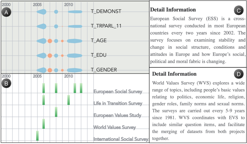
As visualized in SDRQuerier: A Visual Querying Framework for Cross-National Survey Data Recycling-, Separate Availability presents the available data for each variable over time. The color summarizes aforementioned connections with Joint Availability, including blue (case1) and orange (case2 & case3). For each variable, the width of flow illustrates how many samples are covered each year. In the Joint Availability, each row represents one valid survey project, which may cover a period of years. A user may click the survey project name to show the background information of each survey, incorporating survey documentation into SDRQuerier is highly recommended by domain experts (Figure 7C-D). Given one survey, there is multi-faceted information to be presented properly. Through the discussion with domain experts, they prefer simple but efficient visualization to delicate glyph-design for multi-faceted information. To do this, we propose some interactions with a responsive bar chart to show information from multiple perspectives.
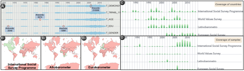
Responsive Bar Chart The meaning of bar can be embedded as either macro-level or micro-level by users, defined as the responsive bar chart. Scientists can select to see how many respondents are available (micro-level) or how many countries are available (macro-level) through the drop down selector \faChevronDown in the top of this module. To present the country coverage, we further allow users to click the bar for the detailed information in a map, where green means covered country (SDRQuerier: A Visual Querying Framework for Cross-National Survey Data Recycling-). Also, we allow two different sorting methods of rows: availability-based and quality-based. For the availability-based method, if a project covers more distinct years, it will have higher availability. For quality-based sorting, we compute a quality indicator for each survey project (each row) as follows:
| (4) |
Suppose one survey set is composed of many waves conducted in different years. In each wave, there are some samples that do not have quality issues, which are recorded as quality variables in the harmonized dataset. The quality indicator is the faction of the samples without quality issues to the total samples given survey.
5.3 Query-by-Relation (QBR)
Social scientists propose hypotheses derived from the literature review, which are then tested through statistic models using appropriate data. However, building these models often requires a long time to process the survey data and identify the related variables. Effective and accurate variable selections becomes crucial.
To accommodate this, we propose a third module, Query-by-Relation (QBR), to query the hidden patterns from data for model verification and improvements. QBR is performed by answering two questions: (1) what are the relationships between the selected target variables? Whether the variables are correlated can help scientists to preliminary test their hypotheses. For example, a researcher wants to test whether respondent’s resources have a negative effect on individual’s trust in political institutions. Checking the correlation strength among these variables can help scientists to determine whether the selected variables are appropriate for hypotheses testing. (2) what are the potentially related variables? In the SDR harmonized dataset, both types of methodological variables can affect the relationship between substantive variables, so they should be included in the regression analysis when constructing regression models. Understanding the correlation between them is important for scientists to include appropriate additional methodological variables into their models. To the end, we designed two subviews in QBR to answer the above two questions.
Correlation Matrix. Driven by R3.1, our first subview presents the pairwise correlations for user-selected target variables, allowing scientists to check if these variables are correlated with each other and to further determine what to keep for their regression analysis. We compute several necessary and common statistics for pairwise relations: (1) Pearson correlation coefficient, (2) p-value, (3) levels of the p-value (thresholds are suggested by experts), (4) standard errors. To flatten the learning curve of visual encoding, as suggested by our domain experts, we show the computed information with texts and only incorporate two visual channels in the matrix, i.e., position for pairwise relation and responsive color. Users are allowed to select one of the computed information and map it to the color interactively. After several key design iterations with the domain experts, we determined to show one-half of the symmetric matrix to reduce redundant information and avoid unnecessary interpretation of the position.
Network Visualization. Variable selection is extremely important when building regression models to test research hypotheses. Due to the dissimilar structure of harmonized data to typical survey data, users may not know what methodological variables should be considered together with substantive variables for a robust model analysis. Thus QBR facilitates to query the complex relations given one pair of target variables (R3.2). As shown in SDRQuerier: A Visual Querying Framework for Cross-National Survey Data Recycling-, we apply the same color scheme to the type of nodes as QBQ: harmonization control ( ), quality control ( ), target ( ). We label the significance level for each edge in the network, which is defined by domain experts. If correlation coefficient is not defined for an edge, we highlight it with red.
6 Evaluation
This section first evaluates the efficiency and usefulness of the backend algorithms employed in SDRQuerier. Then, we worked with the domain experts on the case studies to demonstrate how SDRQuerier can help them in the process of understanding and exploring harmonized data, as well as evaluating social science models via effectively visual-queries and friendly user-interactions.
6.1 Evaluation of the BERT-based Model
We fine-tune a pre-trained BERT model to classify each survey question to the most related target variable, aiming to recommend variables given multiple types of user-defined inputs. To achieve this, both the final prediction and intermediate result, i.e. embeddings are extracted from the tuned model for hard and soft recommendation respectively. To perform a comprehensive evaluation, we demonstrate the effectiveness of two recommendations through qualitative and quantitative measures.
6.1.1 Quantitative Evaluation
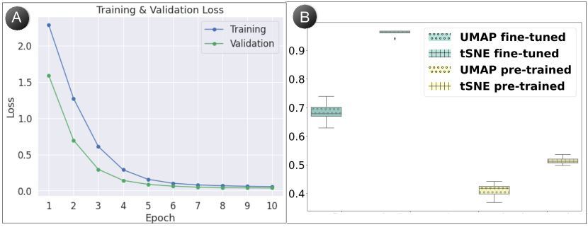
The performance of hard recommendation can be revealed from the successful loss converging pattern and high prediction accuracy. To train the model, we utilize a dataset consisting of 1591 survey questions with target variables as labels, which is manually labeled by the domain experts during the pre-processing of harmonization. The dataset is split into 90% training and 10% validation. The training hyper-parameters are set as follows: batch-size=32, number-of-epochs=10, learning-rate=2e-5. The model converging process is depicted by the loss shown in Figure 4A. The validation accuracy reaches 99% in the final epoch, which promises good performance on the classification task.
Even with the high performance of hard recommendation, some user-defined text is likely related to multiple target variables where soft recommendation is more applicable. Soft commendation promises to capture the semantic similarity in the embedding projection space so that users are able to identify multiple related survey questions. Therefore, the clusters formed in the embedding space should be verified to capture the semantic information. We decided to compute the similarity between the clustering of survey question embeddings and the groups of ground truth, expecting those questions with the same labels will be grouped into the same cluster in the projection space. To demonstrate the good performance of the embedding clustering results, we compare the embeddings generated from our fine-tuned model with the pre-trained model. Besides the embedding representation, the performance also relies on projection methods. Thus, we also take two projection methods into consideration, i.e. tSNE [34] and UMAP [23].
We choose Adjusted Mutual Information (AMI) to quantitatively compare the clusters from embedding and ground truth labels. AMI is a widely used method to compare different partition/clustering results of the same dataset [36]. When comparing two clustering results, since the mutual information (MI) for the result with a larger number of clusters is generally higher, AMI takes this into account and adjusts MI through the following equation:
| (5) |
where U, V are the results of two clustering methods. The value of AMI is in the range of [0,1], where 1 means U and V are identical.
As shown in Figure 4B, color is used to differentiate fine-tuned ( ) and pre-trained model ( ). Within each group, the projection method is encoded in textures of the boxplot. It is clear to see that fine-tuned model improves the results a lot for both tSNE and UMAP because the results of embedding clustering from the fine-tuned model much better match the ground truth. Also, we can observe that tSNE outperforms UMAP in both models. We can conclude that the fine-tuning improves the soft recommendation regardless of the projection methods.
6.1.2 Qualitative Evaluation
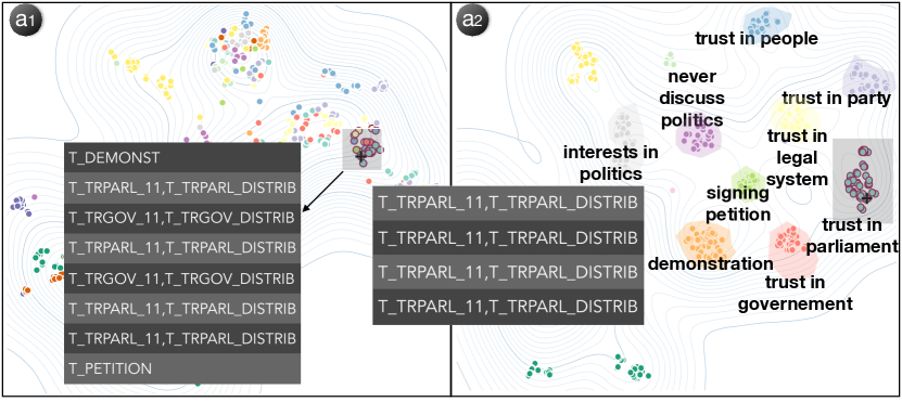
To demonstrate the qualitative improvements of the fine-tuned model, Scatterplots with the two clustering results from different models are shown in Figure 5. The figure discloses several advantages of our fine-tuned model () compared with the pre-trained BERT (). First, there is a clear boundary between different clusters in Figure 5-. While in the pre-trained model, several groups interfere with each other, and it is hard to differentiate them without coloring. Second, related groups are also closer to each other in Figure 5-, which corresponds to high-level sociology concepts. As pointed by the experts, \saytrust in people, \saytrust in party, \saytrust in government, and \saytrust in legal system form the concept of \saytrust in political institutions. \sayinterest in politics is close to \saynever discuss politics, both of them depict the attitude of respondents in politics. \saydemonstration and \saysigning petition comprise the concept of \saypolitical behaviors.
We would also like to give an example to compare the quality of soft recommendation. As shown in Figure 5, \faPlus indicates the projected embedding of a user’s input, i.e. \saytrust in parliament. From the result of pre-trained model (Figure 5-), it is clear that the queried topic is isolated from multiple topics in the projection. After brushing the surrounding circles, the table presents some non-related target variables. However, in our fine-tuned BERT model (Figure 5-), the queried topic falls into a small cluster of circles. The cluster (i.e., trust in parliament) presents related target variables (T_TRPARL_11, T_TRPARL_DISTRIB) for the queried topic. We can conclude that the training not only teaches the model to better predict target variables but also significantly improves the performance of soft recommendation.
| Concept | Name | Label | |||
| political attitudes | trust in political institutions | T_TRPARL_DISTRIB | trust in the parliament | ||
| T_TRLEG_DISTRIB | trust in the legal system | ||||
| T_TRPARTY_DISTRIB | trust in political parties | ||||
| T_TRGOV_DISTRIB | trust in the government | ||||
| interests | T_INTPOL_DISTRIB | interest in politics | |||
| political behavior | T_DEMONST |
|
|||
| T_PENTITION | signing petitions | ||||
| Socio-demographics | T_AGE | age | |||
| T_GENDER | gender | ||||
| T_METRO | living in metropolitan | ||||
| T_EDU | education | ||||
6.2 Evaluation of Embedding Iterative Updating Algorithm
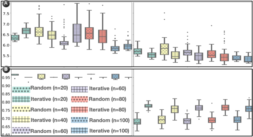
This section measures to what extent our Embedding Iterative Updating Algorithm can stabilize the projection results, and how much it can improve the projection efficiency. The study was conducted by running the algorithm with different iterations (i.e., 20, 40, 60, 80, and 100). To show the effectiveness of our algorithm, a baseline of updating the embedding projections with random initialization was also conducted.
We compute both the running time (Figure 6A) and AMI score (Figure 6B) of tSNE (left) and UMAP (right) with different parameter settings. The -axis indicates the increasing number of iterations utilized in our iterative updating algorithm. The random initialization and iterative updating are encoded in the texture. Comparing to UMAP (right), tSNE (left) takes longer time, but generates better clustering results. When it comes to the efficiency between random initialization and iterative updating, tSNE cannot guarantee iterative updating will help the algorithm converge faster (upper left). But it is clear to see that iterative updating decreases the running time for UMAP (upper right). For the AMI score, with tSNE projection, iterative updating does not improve accuracy given the fact that random initialization already reaches a high-level (bottom left). But we can also infer from the figure that iterative updating makes the iteration stable by decreasing the variance of running time. For UMAP, iterative updating can improve the clustering results regardless of the running iterations (bottom right).
6.3 Data Availability Checking
We illustrate how the Temporal Availability Profiler can be utilized in different scenarios with two case studies: one emphasizes how it can help the SDR research group to summarize the possible directions for social science research; the other describes how it can help scientists to decide whether data are sufficient or not for comparative analysis. All the names used in the case studies are pseudonyms for privacy issues.
6.3.1 Case1: Political engagement: attitudes and behaviors
We invite an expert, Arya, who works on the SDR project and has a deep understanding of the harmonization process of SDR. Arya wants to propose future research directions/topics according to available data of the SDR regarding political engagement.
Since Arya knows the variables very well, she jumps to the QBC directly to check the data availability. First, Arya selected some target variables to form the high-level theoretical concepts, summarized in Table 1. Without adding filtering conditions, Arya clicked the \faSearch button, the availability of selected variables is displayed in SDRQuerier: A Visual Querying Framework for Cross-National Survey Data Recycling ()
| Survey | Background | Insights | ||||||||||||
|
|
|
||||||||||||
|
|
|
||||||||||||
|
|
|
||||||||||||
|
|
|
From the color ( ) in SDRQuerier: A Visual Querying Framework for Cross-National Survey Data Recycling-, the joint available data for all the selected variables are available for years 1990, 1995-1998, 2004-2011. Arya checked each concept separately. In the concept of socio-demographics, the data for \sayage and \saygender are pretty complete. However, there are no sufficient data for \sayliving in metropolitan in the 70s and in the beginning of the 80s. Also, \sayeducation has a deficiency gap during 1982-1984. Given the incomplete socio-demographics of respondents, Arya concluded that those years with data deficiency should be imputed or excluded by researchers. For concept of political attitudes, \sayinterest in politics has the greatest data coverage. Based on the observation that \saytrust in the parliament and \saytrust in the legal system share the same temporal coverage, Arya confirmed that it allows researchers to conduct a study about trust in political institutions from the 80s, even with the gap from 1985-1988. Compared to the \saypolitical attitudes, \saypolitical behaviors can be analyzed more comprehensively from the 60s given the higher temporal coverage.
Drilling down to the country coverage, Arya clicked several available surveys in the Joint Availability to check it. The result is presented in SDRQuerier: A Visual Querying Framework for Cross-National Survey Data Recycling-b3, it is clear to see that the available data ( ) cover Latin America (Latinobarometro), Europe (World Values Study), and Asia (Asia Europe Survey). She concluded that researchers can conduct various analyses on political attitudes and behaviors controlling for socio-demographic characteristics for a period of over 40 years in different regions. She also pointed out that even in the same survey project conducted in different years, the covered region can fluctuate. The beauty of the SDR harmonized data is that different surveys can complement each other not only temporally but also spatially. For example, when Arya hovered over the bar chart, it showed that World Values Survey (WVS) covers 23 countries in 2006. From the detailed coverage map visualized in SDRQuerier: A Visual Querying Framework for Cross-National Survey Data Recycling-, it is obvious to see the covered area includes Latin America. However, it only covers 9 countries in 2007 without Latin America, which can be supplemented by another survey project in 2007, i.e., Latinobarometro. Finally, Arya summarized that regarding political engagement, the available survey projects offer a substantive set of variables for comparative cross-national research.
6.3.2 Case2: Protest participation in Russia
Given the possible research directions of the SDR harmonized dataset, Jimmy wants to study protest participation in autocratic states by analyzing contemporary Russia. He needs data that cover Russia in the 2000s2010s, the period of the tightening autocratic measures in the country. Based on the literature review, Jimmy proposes that several determinants, such as trust in political institutions, satisfaction with the democratic performance in the country, and economic hardship, can influence protest participation in autocracies in different ways.
After exploring the system with QBQ, he decided to use T_DEMONST as a protest indicator and T_TRPARL as an indicator for trust in political institutions. He also identified a set of necessary socio-demographic variables for his study. However, the SDR data lack two variables that measure potential protest determinants, theorized by Jimmy based on the literature review, namely, the subjective perception of democracy and individual’s economic situation. After detecting variables in the SDR data, Jimmy applied two filtering conditions to check the data availability via QBC: (country==\sayRussian, year[2000, 2019]).
While examining the joint availability displayed on Figure 7A, Jimmy identified that the unavailability gaps in 2007 and 2009 come from the lack of T_TRPARL_11 and T_DEMONST. He concluded that the sufficient for his study data on Russia are available only from 2005 to 2012 with gaps in \saydemonstration and in “trust in parliament”. Therefore, he needs to make the decision whether to use biannual data (i.e., data from year 2006, 2008, 2010, 2012), impute the missing data from 2007 to 2009 or search for another dataset because of the missing data. Also, it is clear to see that the size of available samples fluctuates over time, which might be a concern regarding how to use the data properly, as pointed out by Jimmy. The information derived from our visualization helps Jimmy to structure his research, and the prior-knowledge on the data availability leads to more reasonable expectations on the final outcome. Drilling down to the Joint Availability in Figure 7B, several findings and derived insights are summarized in Table 2.
Based on these observations and conclusions, Jimmy agreed that the combination of these surveys ensures sufficient high-quality samples. However, Jimmy’s main concern is the lack of key variables, i.e. two potential determinants of protest participation. He concluded that using only SDR data is not sufficient for his research due to the time and variable coverage limitations. He probably can try to harmonize the data for missing variables by himself from other sources.
6.4 Participation in Demonstrations worldwide
We invite expert Kiara to demonstrate how SDRQuerier can assist scientists in the social research process following one previous study [17]. It is focused on participation in demonstrations worldwide, which requires samples with a high regional diversity for comparison. Kiara hypothesized that resources and political attitudes have different effects on the levels of participation in demonstrations in democratic and non-democratic countries. Kiara was curious if she could rely on the SDR data. Before downloading the dataset to conduct further analysis, she used our SDRQuerier to check the data.
To begin with, Kiara utilized QBQ to explore the variables that she could use. Kiara first typed in the most important concept of her research, \sayparticipation in demonstration. The prediction from \sayhard recommendation is \sayT_DEMONST in SDRQuerier: A Visual Querying Framework for Cross-National Survey Data Recycling-, which conforms to her domain knowledge. Kiara knew that the meaning of demonstration can vary a lot depending on political backgrounds, thus, she was wondering what is the definition of \sayT_DEMONST in the SDR. From SDRQuerier: A Visual Querying Framework for Cross-National Survey Data Recycling-, it is clear that \faPlus falls into one cluster, from which Kiara brushed circles ( ) to check the detailed information. The table in SDRQuerier: A Visual Querying Framework for Cross-National Survey Data Recycling- showed that the source variables for \sayT_DEMONST include not only demonstrations, but also protests and marches. It also varied between participation in a public, authorized, or unauthorized demonstrations, as well as very specific protests (e.g., against the former president). The source questions also varied in terms of the time length. Generally, respondents were asked in the format of \sayHave you performed [action type] in the last [time period]?, where [time period] varied across \saytwelve months, 1, 2, 3, 4, 5, 8, 10 years or ever in different surveys.
Kiara intended to learn the structure of harmonized data via circular graph. From there, many visual investigations can be done through interactive exploration. With a brief overview, Kiara found that a four-level hierarchical structure correspond to the type of variables: socio-demographics, quality control variables, target variables, harmonization control variables, which differs from the common one-survey data structure. She hovered the highlighted bar to see the predicted variable’s name, i.e. \sayT_DEMONST. It faces four arcs, which indicates that variations in source questions were captured with four harmonization control variables. She was inquisitive about the meaning of control variables, so she clicked one of them, i.e., C_PR_DEMONST_YEARS. The labels and distributions are shown in SDRQuerier: A Visual Querying Framework for Cross-National Survey Data Recycling-, she discovered the variance of the time range is captured well and the most frequent asked year range is \sayever. After the in-depth exploration, Kiara confirmed that the information contained in control variables revealed the high quality of the harmonized data and allowed her to conceptualize participation in demonstrations for her study.
After the preliminary examination of the available variables, Kiara decided to choose T_DEMONST as the indicator for participation in demonstrations. When deciding on the measurement for political attitudes, she found a variety of options. During our tutorial session, Kiara learned that the length of each target variable bar indicates its popularity in different surveys and countries. Thus, she selected T_TRPARL (trust in parliament) to measure political attitudes based on the distributions for all the political attitude variables. To measure resources, she picked T_EDU (education). She selected T_GENDER and T_AGE to control for the socio-demographic characteristics of the respondents from the sample. Kiara proceeded further with this set of variables.
From the Separate Availability in Figure 8A, Kiara easily identified the possible time-period of her study, as SDR provides sufficient data from 1989 to 2013 without any gap. The gap in 1982 can be explained by the deficiency of T_EDU. From the responsive bar charts, there are 22 available surveys in total, which convinced Kiara that the increase in data coverage is one of the primary advantages of the harmonized data. We displayed the top-3 surveys with highest availability in Figure 8C (macro-level) and Figure 8D (micro-level). The pattern indicates some surveys have stable country coverage, e.g., Latinbarometro. While other surveys fluctuate a lot, e.g., International Social Survey Programme. Kiara found that the available data also cover diverse regions and countries in Figure 8 (B1-B3), which allows her to compare democratic and non-democratic countries from different parts of the world.
Next, Kiara wanted to query the data patterns to verify if selected variables are correlated with each other, as this was an important condition for including variables in her regression analysis. In the correlation matrix(SDRQuerier: A Visual Querying Framework for Cross-National Survey Data Recycling-), the intense color of all cells indicated that the correlations between all the variables were significant. Based on this observation, Kiara concluded that the variables selected in her model were accurate and can be used in her model. Finally, Kiara clicked the cell in the correlation matrix to look deeper into the relationship between T_DEMONST and T_EDU. She then found out that these two target variables are correlated not only with each other but also with their respected harmonization control variables and with quality control variables (SDRQuerier: A Visual Querying Framework for Cross-National Survey Data Recycling-). Furthermore, based on the significance level labeled on each edge, she also identified that the T_EDU has weaker relationships with quality control variables compared to T_DEMONST, indicating T_EDU has better quality than T_DEMONST. In conclusion, Kiara verified that she would include those methodological variables (i.e., quality- and harmonization control variables) in her regression analyses as well.
After such detailed exploration, Kiara concluded that the ex-post harmonized survey data are sufficient for her research. The country and time coverage allowed her to study the effect of education and trust in parliament on the probability of individuals to participate in demonstrations in democratic and non-democratic countries. She also pointed out that SDR lack macro-level data with democracy indicators, which she needs to add from the other dataset. At the micro-level, SDR data contain all the items she needs. Besides, the interface demonstrates the high quality of the SDR data and the importance of including methodological variables while using a harmonized dataset, such as SDR. She agreed that SDRQuerier provides accurate guidance for variables identification, supplies efficient decision-making support for relying on the harmonization data or not via visual exploration and contributes a lot for variable selection in regression models.
7 Expert Feedback
We conducted in-depth interviews with the same group of experts to gather their qualitative feedbacks on the usefulness and usability of SDRQuerier (E1E4). E1 and E2 are social scientists with more than 45 years of experience studying social movements and contentious politics. E3 has 10+ years of experience in survey data harmonization and E4 has 5+ years of experience in both survey data transformation and data management. We started the interviews with an introduction of the SDRQuerier pipeline and the functions of individual visual components. The interviews were in an interactive way to discuss the pros and cons, suggestions, and agreements on SDRQuerier.
Overall, all experts agreed that the tool \say is very helpful in learning the structure and capacity of the harmonized survey data, and \say also contributes to data methodology literature, for proposing new ways to work with the harmonized dataset. As to the goal of SDRQuerier, E1 commented that \saygiven the ambitious goal, it can bring a big contribution to social science as a pioneer research. E2 added that \saySDRQuerier will increase the popularity of the SDR given the novel visualizations, making it available to researches from other fields using survey data for analysis, such as economy or psychology. In terms of the usability, they agreed that it is easy to understand the system without knowledge in computer science and visualization. Regarding the assistance for scientists to identify desired data, they believed \saythe availability checking is extremely needed given the complexity of the SDR data and \saythe visual interactions are indeed useful to explore the complex data.
All experts expressed their interest in the QBQ component, E4 mentioned that \saythe role of the module will be even bigger when the number of variables increases as the harmonized data become mature in the future. E4 also pointed out that \saybesides the ex-post harmonization analysis, the trained model is also useful for social scientists to retrieve questions during the harmonization process. E3 agreed and summarized that \sayQBQ can be used in three different levels. Besides ex-post analysis and pre-processing during harmonization, it can be extremely useful for international surveys as they contain hundreds of variables. Although social scientists do not quite understand the inner structures of the trained model, it is efficient to identify related variables and easy to use. E2 evaluated QBR highly, as harmonized data users should consider methodological variables to include in their models, and added that \sayit is very useful to present the network to scientists given the complex relationships among the variables. E1 highlighted the importance of the visualising some weak relations between target variables and quality control variables, as it indicates good quality of the samples.
Additionally, the experts suggested some improvements for SDRQuerier. E1 expressed a concern that users might overthink the meaning of each element after learning visual mappings introduced in SDRQuerier. Take the network in QBR as an example, after noticing the color of edge indicating the coefficient is valid or not, they may wonder whether the edge length also encodes other information. Both E3 and E2 were first confused about the coloring schema of the Temporal Availability Profiler, though they understood it after detailed explanations. They worried that the learning curve of the coloring algorithm might be high for social scientists without visualization and database training. These comments will be considered in the future when deploying SDRQuerier into the SDR portal.
8 Conclusion
In this work, we present SDRQuerier, a visual query system that facilitates scientists to locate target data and evaluate their theoretical models. To achieve this, the system provides visual guidance and queries with three modules: Query-by-Question, Query-by-Condition, Query-by-Relation. From the solid evaluation and thorough studies, we have identified several applications for QBQ and exemplified how QBC and QBR help scientists to understand, explore, and utilize harmonized survey data in their research. Insightful findings and positive feedback from domain experts demonstrated the novelty, usefulness and effectiveness of SDRQuerier.
References
- [1] W. Aigner, S. Miksch, W. Müller, H. Schumann, and C. Tominski. Visualizing time-oriented data—a systematic view. Computers & Graphics, 31(3):401–409, 2007.
- [2] P. Assini. Nesstar: A semantic web application for statistical data and metadata. In in Eleventh International World Wide Web Conference: Workshop on Real World Applications of RDF and the Semantic. Citeseer, 2002.
- [3] J. V. Carlis and J. A. Konstan. Interactive visualization of serial periodic data. In Proceedings of the 11th annual ACM symposium on User interface software and technology, pp. 29–38, 1998.
- [4] A. Dasgupta, R. Kosara, and L. Gosink. Vimtex: A visualization interface for multivariate, time-varying, geological data exploration. In Computer Graphics Forum, vol. 34, pp. 341–350. Wiley Online Library, 2015.
- [5] J. Devlin, M.-W. Chang, K. Lee, and K. Toutanova. Bert: Pre-training of deep bidirectional transformers for language understanding. arXiv preprint arXiv:1810.04805, 2018.
- [6] V. Dibia. Neuralqa: A usable library for question answering (contextual query expansion+ bert) on large datasets. arXiv preprint arXiv:2007.15211, 2020.
- [7] J. A. Fails, A. Karlson, L. Shahamat, and B. Shneiderman. A visual interface for multivariate temporal data: Finding patterns of events across multiple histories. In 2006 IEEE Symposium On Visual Analytics Science And Technology, pp. 167–174. IEEE, 2006.
- [8] J. R. Frick, S. P. Jenkings, D. R. Lillard, O. Lipps, M. Wooden, et al. The cross-national equivalent file (cnef) and its member country household panel studies. Schmollers Jahrbuch: Zeitschrift für Wirtschafts-und Sozialwissenschaften, 127(4):627–654, 2007.
- [9] P. Granda, C. Wolf, and R. Hadorn. Harmonizing survey data. Survey methods in multinational, multiregional, and multicultural contexts, pp. 315–332, 2010.
- [10] R. L. Harris. Information graphics: A comprehensive illustrated reference. Oxford University Press, USA, 1999.
- [11] S. Havre, B. Hetzler, and L. Nowell. Themeriver: Visualizing theme changes over time. In IEEE Symposium on Information Visualization 2000. INFOVIS 2000. Proceedings, pp. 115–123. IEEE, 2000.
- [12] K. Healy and J. Moody. Data visualization in sociology. Annual review of sociology, 40:105–128, 2014.
- [13] K. P. Hewagamage, M. Hirakawa, and T. Ichikawa. Interactive visualization of spatiotemporal patterns using spirals on a geographical map. In Proceedings 1999 IEEE Symposium on Visual Languages, pp. 296–303. IEEE, 1999.
- [14] J. Howard and S. Ruder. Universal language model fine-tuning for text classification. arXiv preprint arXiv:1801.06146, 2018.
- [15] Z. Jiang, A. El-Jaroudi, W. Hartmann, D. Karakos, and L. Zhao. Cross-lingual information retrieval with bert. arXiv preprint arXiv:2004.13005, 2020.
- [16] A. S. Jones, J. S. Horsburgh, D. Jackson-Smith, M. Ramírez, C. G. Flint, and J. Caraballo. A web-based, interactive visualization tool for social environmental survey data. Environmental modelling & software, 84:412–426, 2016.
- [17] M. Kołczyńska. Micro-and macro-level determinants of participation in demonstrations: An analysis of cross-national survey data harmonized ex-post. methods, data, analyses, 14(1):36, 2020.
- [18] M. Kołczyńska and K. M. Slomczynski. Item metadata as controls for ex post harmonization of international survey projects. Advances in comparative survey methods: Multinational, multiregional, and multicultural contexts (3MC), pp. 1011–1033, 2018.
- [19] J. A. Krosnick. Survey research. Annual review of psychology, 50(1):537–567, 1999.
- [20] S. Liu, M. X. Zhou, S. Pan, Y. Song, W. Qian, W. Cai, and X. Lian. Tiara: Interactive, topic-based visual text summarization and analysis. ACM Transactions on Intelligent Systems and Technology (TIST), 3(2):1–28, 2012.
- [21] D. Luo, J. Yang, M. Krstajic, W. Ribarsky, and D. Keim. Eventriver: Visually exploring text collections with temporal references. IEEE transactions on visualization and computer graphics, 18(1):93–105, 2010.
- [22] S. MacAvaney, A. Yates, A. Cohan, and N. Goharian. Cedr: Contextualized embeddings for document ranking. In Proceedings of the 42nd International ACM SIGIR Conference on Research and Development in Information Retrieval, pp. 1101–1104, 2019.
- [23] L. McInnes, J. Healy, and J. Melville. Umap: Uniform manifold approximation and projection for dimension reduction. arXiv preprint arXiv:1802.03426, 2018.
- [24] R. Nogueira and K. Cho. Passage re-ranking with bert. arXiv preprint arXiv:1901.04085, 2019.
- [25] O. Oleksiyenko, I. Wysmulek, and A. Vangeli. Identification of processing errors in cross-national surveys. Advances in comparative survey methods: Multinational, multiregional, and multicultural contexts (3MC), pp. 985–1010, 2018.
- [26] V. Peña-Araya, E. Pietriga, and A. Bezerianos. A comparison of visualizations for identifying correlation over space and time. IEEE transactions on visualization and computer graphics, 26(1):375–385, 2019.
- [27] M. E. Peters, M. Neumann, M. Iyyer, M. Gardner, C. Clark, K. Lee, and L. Zettlemoyer. Deep contextualized word representations. arXiv preprint arXiv:1802.05365, 2018.
- [28] A. Radford, K. Narasimhan, T. Salimans, and I. Sutskever. Improving language understanding by generative pre-training. 2018.
- [29] S. Ruggles, M. L. King, D. Levison, R. McCaa, and M. Sobek. Ipums-international. Historical Methods: A Journal of Quantitative and Interdisciplinary History, 36(2):60–65, 2003.
- [30] J. Ryssevik and S. Musgrave. The social science dream machine: Resource discovery, analysis, and delivery on the web. Social Science Computer Review, 19(2):163–174, 2001.
- [31] R. Singleton Jr, B. Straits, and M. Straits. Approaches to social research. 2nd and 5th ed, 2009.
- [32] C. Thomas. Sda: Survey documentation and analysis. Berkeley: University of California, Berkeley, 2011.
- [33] I. Tomescu-Dubrow, K. M. Slomczynski, and J. C. Jenkins. Democratic values and protest behavior in cross-national perspective. harmonization of data from international survey projects. 2016.
- [34] L. Van der Maaten and G. Hinton. Visualizing data using t-sne. Journal of machine learning research, 9(11), 2008.
- [35] A. Vaswani, N. Shazeer, N. Parmar, J. Uszkoreit, L. Jones, A. N. Gomez, Ł. Kaiser, and I. Polosukhin. Attention is all you need. In Advances in neural information processing systems, pp. 5998–6008, 2017.
- [36] N. X. Vinh, J. Epps, and J. Bailey. Information theoretic measures for clusterings comparison: Variants, properties, normalization and correction for chance. The Journal of Machine Learning Research, 2010.
- [37] F. Y. Wang, A. Sallaberry, K. Klein, M. Takatsuka, and M. Roche. Senticompass: Interactive visualization for exploring and comparing the sentiments of time-varying twitter data. In 2015 IEEE Pacific Visualization Symposium (PacificVis), pp. 129–133. IEEE, 2015.
- [38] M. Weber, M. Alexa, and W. Müller. Visualizing time-series on spirals. In Infovis, vol. 1, pp. 7–14, 2001.
- [39] K. Wongsuphasawat, J. A. Guerra Gómez, C. Plaisant, T. D. Wang, M. Taieb-Maimon, and B. Shneiderman. Lifeflow: visualizing an overview of event sequences. In Proceedings of the SIGCHI conference on human factors in computing systems, pp. 1747–1756, 2011.
- [40] I. Wysmulek, K. M. Slomczynski, and I. Tomescu-Dubrow. Survey data quality in analyzing harmonized indicators of protest behavior: A survey data recycling approach. American Behavioral Scientist, 2021.
- [41] W. Yang, Y. Xie, A. Lin, X. Li, L. Tan, K. Xiong, M. Li, and J. Lin. End-to-end open-domain question answering with bertserini. arXiv preprint arXiv:1902.01718, 2019.
- [42] W. Yang, H. Zhang, and J. Lin. Simple applications of bert for ad hoc document retrieval. arXiv preprint arXiv:1903.10972, 2019.
- [43] Z. A. Yilmaz, S. Wang, W. Yang, H. Zhang, and J. Lin. Applying bert to document retrieval with birch. In Proceedings of the 2019 Conference on Empirical Methods in Natural Language Processing and the 9th International Joint Conference on Natural Language Processing (EMNLP-IJCNLP): System Demonstrations, pp. 19–24, 2019.