Interactive Visualization of Spatial Omics Neighborhoods
Abstract
Dimensionality reduction of spatial omic data can reveal shared, spatially structured patterns of expression across a collection of genomic features. We study strategies for discovering and interactively visualizing low-dimensional structure in spatial omic data based on the construction of neighborhood features. We design quantile and network-based spatial features that result in spatially consistent embeddings. A simulation compares embeddings made with and without neighborhood-based featurization, and a re-analysis of (Keren et al., 2019) illustrates the overall workflow. We provide an R package, NBFvis, to support computation and interactive visualization for the proposed dimensionality reduction approach. Code and data for reproducing experiments and analysis is available at https://github.com/XTH1114/NBFvis.
Spatially resolved omic technologies provide a view into the landscape of complex biological processes (Burgess, 2019; Nawy, 2018). For example, they have revealed novel aspects of tissue differentiation and the structure of certain cancers (Rao et al., 2021; Yoosuf et al., 2020). A spatial transcriptomic or proteomic dataset can be viewed as a spatially indexed collection of high-dimensional vectors (Dries et al., 2021a). The coordinates of each vector correspond to different genomic features (genes expression and protein measurements for spatial transcriptomics and proteomics, respectively) while the spatial index locates each measurement at some location in a tissue or cell.
Two challenges in the analysis of spatial omic data are,
-
•
Microenvironment dimensionality reduction: Considering the large number of simultaneously measured genomic features, some form of dimensionality reduction is essential for effective exploratory analysis. However, for spatially resolved data, a dimensionality reduction should describe microenvironments and their relationships with one another. It is more useful to embed the genomic signature of a cell’s local neighborhood than simply the cell in isolation.
-
•
Streamlined navigation: Low-dimensional representations of microenvironments may not be interpretable on their own. To this end, it is helpful to relate the representations the to their original spatial and genomic contexts. Ensuring that these correspondences can be explored efficiently is a challenge in itself.
This paper discusses methods to address these challenges and releases a new R package that implements them. For first challenge, our approach is to featurize spatial neighborhoods and pass this representation to downstream dimensionality reduction techniques. We explore in depth features based on (1) histograms of expression levels and (2) local cell network properties. For the second challenge, we design an interactive visualization that links learned representations with contextual descriptors.
We evaluate these methods using simulation and a qualitative data analysis. The simulation clarifies the difference between learning representations on individual cells and local cellular neighborhoods. The data analysis recapitulates the findings of (Chen et al., 2020; Keren et al., 2019). We believe that the main advantages of the proposed approach are,
-
•
Modularity: The approach can be make use of existing dimensionality-reduction methods while ensuring that results reflect meaningful spatial structure.
-
•
Flexibility: Spatial featurizations can be tailored to specific problem contexts with little changes to the overall workflow.
Our methods are implemented in the R package NBFvis, available at https://github.com/XTH1114/NBFvis.
The remainder of the paper is organized as follows. Section 1 reviews relevant literature on analysis of spatial omic data. Section 3 describes the proposed method. Section 4 introduces what kinds of visualization and interactivity are provided in our package. Sections 2 and 5 illustrate the method in simulation and real data analysis. Section 6 gives an overview of NBFVis’s functionality. We conclude with a summary and directions for future work in Section 7.
1 Background
The proliferation of spatial omic data has attracted attention from the modeling and visualization communities. Important themes that have emerged include the selection of spatially varying genes, derivation of spatial summary measures, and discovery of spatially consistent microenvironments. The resulting software packages allow analysts to generate overviews of spatial variation as well as focus on specific genomic features of interest.
Several studies propose feature-level models of spatial variation to select those with notable spatial expression patterns. SPARK fits a collection of random effects models with diverse set of kernels to capture variation at several spatial scales Sun et al. (2020). Alternatively, (Zhu and Sabatti, 2020) computes a measure of spatial variation based on a spatially induced graph laplacian; genes exhibiting similar patterns of spatial expression are then clustered. Alternatively, (Hsu and Culhane, 2020) proposes an adaptation of Moran’s -statistic to measure the extent of spatial clustering across cell types, highlighting the potential for the classical spatial statistics methods to support modern spatial omics analysis. Like NBFVis, these methods compute spatial statistics to summarize spatial omic datasets. However, they tend not to provide localized measures of spatial structure, focusing instead on tissue-level properties.
The Giotto package includes approaches to dimensionality reduction and interactive visualization of spatial omics data Dries et al. (2021b). Of particular interest, the package supports interactive visualization that dynamically links embeddings of expression measurements with corresponding cell locations. Note however that these embeddings are derived without reference to spatial features.
Similar to our approach, Spatial-LDA proposes a variation of the topic models that learns spatially consistent patterns of cell type mixing (Chen et al., 2020). This is achieved by tying together mixed memberships of neighboring cells in a structured prior, and the model is fit using a custom optimization scheme. Regions with similar topic memberships can be interpreted as microenvironments. Our proposal has a similar data analytic goal; however, we aim to support more generic spatial features while preserving simplicity in implementation.
2 Simulation
We provide a toy simulation to clarify the differences in embeddings when neighborhood information is and is not used. We find that if only cell-level information is considered, the embeddings will be dominated by cell types and fail to reflect microenvironment structure.
2.1 Dataset construction
Assume that there is one tissue section with three cell types. For each cell, five proteins are measured. Different cell types have different protein profiles, which means the average measurements of proteins differs according to cell type. We assume that cell types are clustered spatially, but that these clusters are close enough so that some areas overlap. These overlapping areas can be considered different microenvironments, since the local mixture of protein profiles is different from regions of pure cell types.
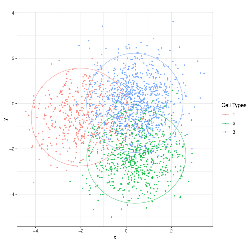
Figure 1 is the spatial plot for the simulated dataset. Two thousand “cells” are generated and divided into three different cell types according to a multinomial distribution with the probability for Cell Type 1, 2, and 3,
where is the cell type of the cell.
For this demonstration, we imagine that protein abundances are drawn from a mixture of multivariate normals. The average of each mixture component represents the typical cell profile for each cell type. That is, for each cell, the measurements for each of the five proteins has the form,
where is the average protein profile for the cell type and is 5-dimensional measurement for the cell.
Next, we simulate cell locations to get mixed spatial patterns. We use a different mixture of (now two-dimensional) multivariate normals. As before, component means and are drawn from a multivariate normal. Denoting the coordinates of cell by and the spatial mean of cell type by , we draw,
After simulation, we obtain a expression matrix, each row of which corresponds the simulated observation of one cell. We call this matrix the “single cell matrix.”
To extract neighborhood information for each cell, we first find neighborhoods with a given radius (here we use 0.2 units in length). We then calculate statistics within each neighborhood. We choose quantiles of protein content as neighborhood-based statistics, which are simple but effective. For every cell and protein, we derive 21 quantiles in the neighborhood. After calculation, an extended matrix is obtained. We call this the “neighborhood matrix.”
2.2 Comparison
We next apply dimensionality reduction methods to both the single cell and the neighborhood matrices, in order to clarify the difference in the resulting embeddings.
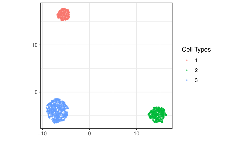
First, we apply Uniform Manifold Approximation and Projection (UMAP) McInnes et al. (2018) to the single cell matrix, whose low-dimensional embeddings are shown in Figure 2. Only three separate clusters are visible in the embedding plot, each corresponding to a cell type. These UMAP embeddings ignore the microenvironments of mixed cell types along cluster borders in the spatial plot. This result indicates that, when spatial information is not directly incorporated, the low-dimensional embeddings are dominated by cell types and fail to distinguish microenvironments.
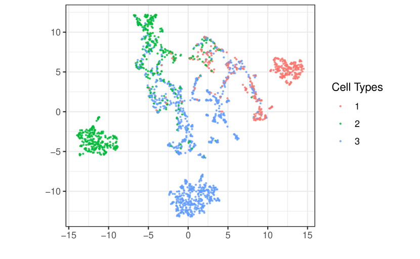
In contrast, the embedding plot of the neighborhood matrix detects microenvironment structure; see Figure 3. We notice that there are still three clusters consisting of pure cell types. However, there are additional clusters of mixed cell types. Between the three pure clusters is a region corresponding to microenvironments with mixed cell types in the spatial plot. Furthermore, we notice that this region can be further divided into spatially consistent “subcluters.” For instance, one region with only blue and green cells is related to the blue-green spatial boundary. This can be treated as a unique microenvironment. Similar red-blue and red-green regions are also visible.
In summary, UMAP embeddings using the single cell matrix are dominated by cell types and fail to detect microenvironments with mixed cell types. However, by simply applying UMAP to the neighborhood matrix, we are able to detect these spatially meaningful microenvironments.
3 Methods
First we establish notation and overview the general approach. Let contain expression measurements for gene or protein expression features across cells. We call the expression matrix. Let contain the spatial locations of the cells. We first apply a preliminary dimensionality reduction, like Principal Component Analysis (PCA), to the expression matrix before the following neighborhood-based featurization. Call the reduced matrix , where is the number of dimensions after dimensionality reduction.
Before we can embed properties of cell neighborhoods, we need to define and derive features for each neighborhood. For each cell , we define its neighborhood using distances induced by , either containing all cells within a certain radius or simply the -nearest neighbors. Denote the neighborhood for cell by , where where is the number of neighbors surrounding . We featurize the neighborhoods using neighborhood-based featurizaton functions ,. We then rescale all the derived featurization matrices and concatenate them to obtain an extended neighborhood-based featurization . The neighborhood matrix from Section 2 is a special case of using quantile features.
In more detail, let be a set of featurization functions. By applying every to each neighborhood , we can construct . The matrix can be rescaled and then combined into a widened neighborhood matrix . This neighborhood matrix is input to a dimensionality reduction method to recover a set of embeddings. Our final set of microenvironments is found by clustering these embeddings. Below, we apply -means to the set of neighborhood-level embeddings.
3.1 Example
We next discuss a specific instantiation of this general procedure, describing the neighborhood and featurization choices used in Section 5 and implemented in NBFvis. There, gives the number of cells in one tissue section, is the number of proteins measured, and are the centers of the segmented cells. We apply PCA to the expression matrix and then derive the reduced expression matrix . Neighborhoods are constructed by keeping the nearest neighbors that are also within a given radius.
We use two types featurization functions – quantile features and network features. For the cell’s neighborhood, quantiles are calculated for the protein, where . For the neighborhood of the cell, we derive a -dimensional vector . Thus, . After featurization, we obtain an matrix, which we call the “quantile matrix.” Next, consider construction of a network features. Let denote the geometric graph associated with , using the metric induced by . Based on , we can calculate a variety of node or edge features. The associated network featurization here is , where is the number of network statistics. For example, in the experiments below, we use the number of edges and a variety of centrality measures. We use an ensemble of 29 network-based statistics in our example, detailed in the appendix.
The final featurization combines both quantile and network features,
is a neighborhood matrix. Rescaling is applied to this neighborhood matrix so that every column is on a similar scale. This rescaled neighborhood matrix is passed to UMAP to obtain low-dimensional embeddings. These embeddings can then be clustered to identify distinct microenvironments.
3.2 Implementation details
Several subtle but important details are worth noting. Before we calculate a featurization matrix, a preliminary dimensionality reduction method is needed. First, applying dimensionality reduction decreases the computational burden of downstream analysis. Computing quantiles for each feature in a high-dimensional dataset will further increase the dimensionality. For example, computing 10 quantiles for each of 100 variables results in 1000 columns. This significantly increases the computational burden of embedding. Second, a statistical reason for dimensionality reduction is to reduce the noise in the original high-dimensional dataset. If the original data are effectively low rank, then dimensionality reduction method will reduce unnecessary noise while preserving most statistical information, which is beneficial for the following embedding.
Another detail is the rescaling of the neighborhood matrix. Although the neighborhood matrix could have hundreds or even thousands of columns, there is no need to apply a preliminary dimensionality reduction to it, since all values are approximately comparable. However, it is necessary to rescale the neighborhood matrix because the ranges of different statistics vary dramatically, causing one or two variables with large variance to dominate the whole UMAP embedding. For instance, the entries in the quantile matrix are between -1.5 and 1.5 in the TNBC dataset, but for the network matrix, it is common to have some network statistics larger than 10. These network statistics would dominate the UMAP embedding if no rescaling is applied.
4 Visualization Design
We devise an interactive Shiny app (Chang et al., 2015) to analyze outputs from the neighborhood-based analysis, supporting visualization of microenvironment differences. In this section, we discuss the design and visual queries supported by the interface.
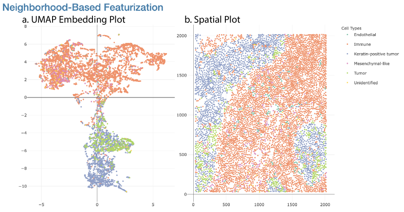
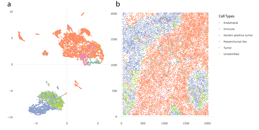
Figure 4 shows the first component of the Shiny app, the UMAP embedding and linked spatial plot. This is used to relate the low-dimensional embeddings of each cell’s neighborhood features to its overall spatial context. Figure 4a is the two-dimensional UMAP embedding plot derived from the neighborhood matrix. Each point corresponds to one cell. The closer these points are, the more similar their neighborhood featurizations. To clearly visualize the distribution of cell types, the points in Figure 4a are colored according to cell types.
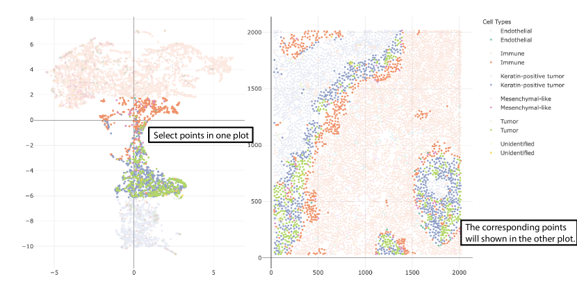
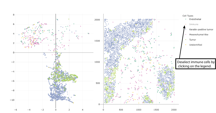
Figure 4b is the spatial plot. Each point here represents a cell center, derived from the original cell polygon in the tissue section. As before, different cell types are distinguished by colors. Furthermore, the two panels in Figure 4 are dynamically linked. When points are selected in one plot through a mouse brush, the corresponding points will also be highlighted in the other plot. Figure 5 shows the highlighted points in these two plots after one such selection. We can click on the legend on the sidebar to deselect the these cell types so that they do not appear. Figure 6 shows the embedding plot and scatterplot after deselecting the immune cells.
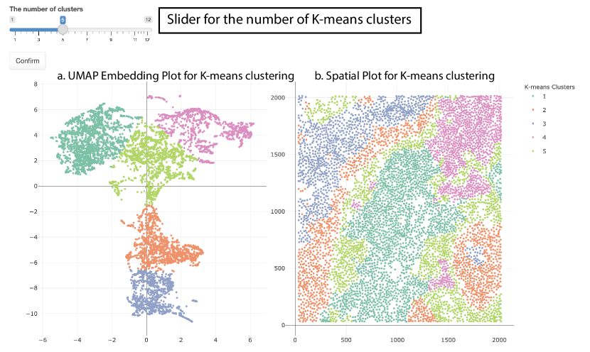
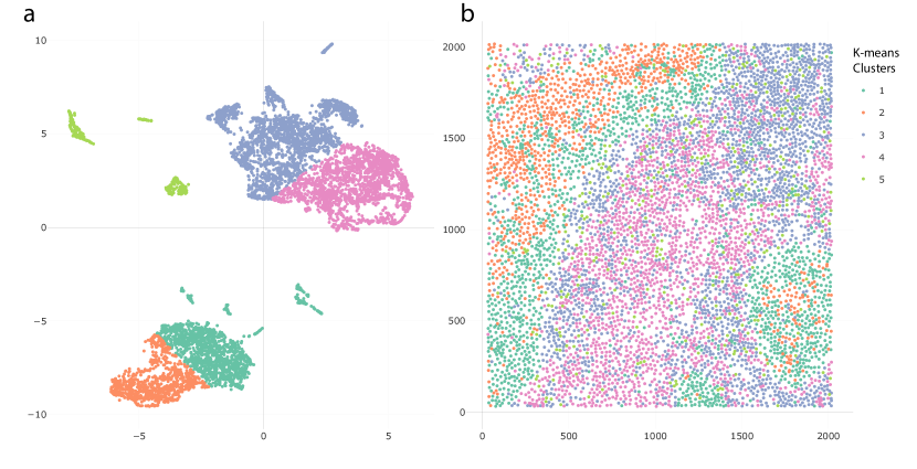
The second component of the Shiny app shows the same embeddings, but colored by -means cluster rather than cell type. For example, in Figure 7, the positions of points are still the same as in Figure 4, but they are clustered into five -means clusters. A slider is provided at the top of the second component in Figure 7, which is used for changing the value of in the -means clustering.
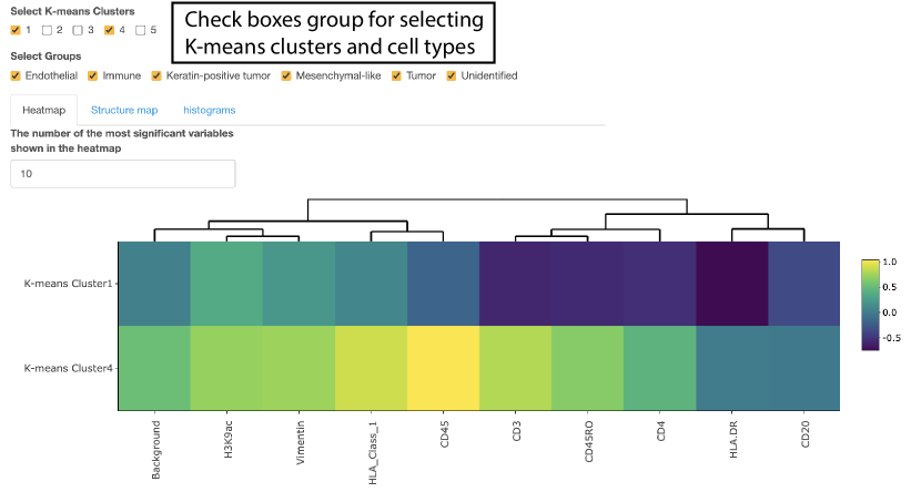
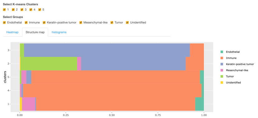
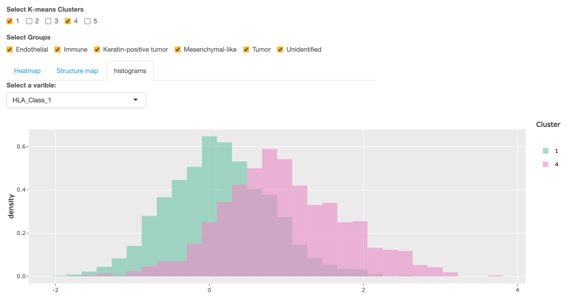
The third component of this Shiny app supports the comparison of expression levels across -means clusters using a heatmap, structure plot, and histogram; see Figure 8. There are three tab panels with which we can switch between these three plots. Before making further comparison, we can filter to cells of interest using the check boxes at the top of Figure 8. Two groups of check boxes are offered to select the cell types and -means clusters to focus on. Based on the filtered cells, a expression heatmap of -means clusters is provided in Figure 8. By default, it shows the top 10 most differentially expressed features across the selected clusters, based on the median of expression value in each cluster. A numeric input is offered above the heatmap – this controls the number of features appearing in the heatmap. The structure plot of the selected -means clusters is provided in Figure 9, with which we can see the proportion of each cell type across every cluster. The histogram of expression is available to compare the selected feature’s expression across clusters. For example, Figure 10 is the histogram of the HLA Class 1 content in Cluster 1 and 4. Note that a selection input box is offered above the histogram to change the selected feature easily.
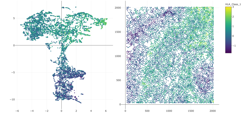
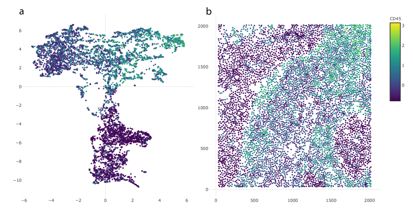
To show the spatial distribution of a specific feature’s expression, another combination of the embedding and spatial plot is provided in Figure 11. The colors of the points in Figure 11 are reflect HLA Class 1 content. This expression plot highlights spatial characteristics of the expression content. In this case, expression is elevated in immune cells, especially those closest to the tumor-immune boundary.
5 Data analysis
To illustrate our approach and package, we re-analyze the Triple Negative Breast Cancer (TNBC) dataset of Keren et al. (2019). To study this data, Chen et al. (2020) proposed Spatial-LDA, which was found to reveal novel microenvironments. Spatial-LDA models the distribution of cell types within neighborhoods but does not model protein expression directly. In contrast, our proposal considers quantitative protein measurements and network statistics within spatial neighborhoods. Here, we choose the tissue section of Patient 4, which has 6643 cells consist of six cell types, immune cells (62.6%), keratin-positive tumor cells (25.2%), tumor cells (6.4%), mesenchymal-like cells (3.2%), endothelial cells (1.9%), and unidentified cells (0.5%). We use 41 expression variables, two-dimensional coordinates of cell centers, and cell types for further analysis.
The first step is to construct the neighborhood quantile matrix. We apply PCA to reduce the dimension of the expression matrix. We keep 19 principal components, which is the smallest number of components required to explain 90% of the variance. These components are labelled as . Next, neighborhoods are defined using a radius of 60 pixels. We only include the cells among the top 40 nearest neighbors to the center cell of the neighborhood. Quantiles for each principal component are calculated based on neighborhoods. To avoid the influence of extreme values, only quantiles are included. Hence, we derive a quantile matrix of neighborhoods after featurization. The second step is to obtain the network matrix of the neighborhoods. We again use a radius of 60 pixels to define neighborhoods and keep only the 40 closest cells. Networks are constructed based on these neighborhoods. We link cells whose centers are within 30 pixels of one another. Then, 29 network statistics are calculated according the neighborhood networks; most of these network statistics are different kinds of network centralities. This results in a neighborhood network matrix.
The third step is to combine the quantile and network matrices together into an extended neighborhood matrix. The network matrix is rescaled in this step. The result is a neighborhood matrix. The final step applies dimensionality reduction and clustering to the neighborhood matrix. We apply UMAP to the neighborhood matrix to generate 2-dimensional embeddings of each cell. -means is applied to the UMAP embeddings to find potential clusters. These can be interpreted as microenvironments.
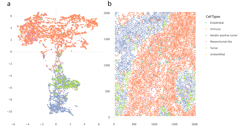
We use a Shiny app implemented in NBFvis to explore the resulting of UMAP embeddings and -means clusters. Figure 12 shows the UMAP embeddings and spatial plot of the neighborhood matrix. Figure 12a gives the embeddings based on the reduction of the neighborhood matrix. The points in the embedding plot are colored according to their cell types. There are two main clusters in the embedding plot, composed primarily of immune and tumor cells, respectively. These two clusters are connected by a transition zone of a mixture of tumor and immune cells. Figure 12b is the spatial plot of the cells in the tissue section. By selecting the transition zone in the embedding plot, we find that the cells in this area are located on the boundary of immune cells, tumor cells, and keratin-positive tumor cells. This is shown in Figure 13.
-means clustering applied to the UMAP embeddings suggests potential microenvironments. Figure 14 shows clustering results with . The clusters are distinguished by their colors. In the embedding plot Figure 14a, the embeddings are divided into 5 clusters, and in the spatial plot Figure 14b, the corresponding locations of these clusters are shown. One finding is that the clusters in the embedding space are spatially consistent.
In the Figure 14b, two microenvironments are founded among the tumor cells and keratin-positive tumor cells, Cluster 3 in the inner part of the tumor cell groups and Cluster 4 close to the boundary of immune cells. This mirrors the findings of Chen et al. (2020). Another finding is that there is a special immune cell microenvironment, Cluster 2, lying on the boundary of immune cells, tumor cells, and keratin-positive tumor cells. This microenvironment is distinguished from the immune microenvironment in the inner part of immune cell groups, which is Cluster 5 in Figure 14b. Notice that Clusters 4 and 5, which are the microenvironments close to the tumor-immune boundary, are in the transition zone in the UMAP embedding plot in Figure 13. Moreover, another microenvironment, Cluster 3, is found in the top-left corner of Figure.14b, separate from the previous two immune microenvironments, Clusters 2 and 5.
Next, we explore the differences between these microenvironments by studying their expression patterns. Figure 15 is the heatmap of the inner and boundary immune microenvironments, which are Clusters 2 and 5 in the Figure 14b, respectively. The heatmap shows the top 10 most differentially expressed proteins between these two clusters, determined by the differences between medians of expressions in each group. We choose the two most differentially expressed proteins, CD45 and CD45RO, for further exploration. The histograms in Figure 16 show the contents of CD45 across these two microenvironments. The inner immune microenvironment has a right-skewed distribution of CD45, indicating that many cells in this microenvironment have low content of CD45. In contrast, the distribution of CD45 in the boundary immune microenvironment is significantly higher than that in the inner immune microenvironment. Figure 17 is the expression plot of CD45, this confirms that cells along the tumor-immune boundary have elevated CD45.
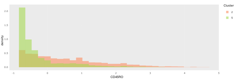
Checking the histogram and spatial expression of CD45RO in the inner and boundary immune microenvironments, we arrive at similar conclusions. Figure 18 is the histogram of these two microenvironments. The histogram for the inner immune microenvironments has a peak near the minimal value, which does not appear on the histogram of the boundary immune microenvironments. It shows that there are lower contents of CD45RO in the inner immune microenvironment but higher contents of CD45R0. Figure19 also shows that there is a lighter boundary on the tumor-immune cells, highlighting this microenvironment.

5.1 Cell-level approach
We also use the visualization tool to show the UMAP embedding and clustering results when directly applied to the original cell-level protein expression matrix. We use the same preprocessing as Keren et al. (2019). This serves as a reference point against which to compare the proposed neighborhood-based featurization.
Figure 20 gives the UMAP embedding and spatial plot by the cell-level approach. We find two clusters in the Figure 20a, one mainly made up of immune and tumor cells, respectively. The result is similar to the simulation, where UMAP embeddings are dominated by the differences between cell types and microenvironments are hardly distinguished.
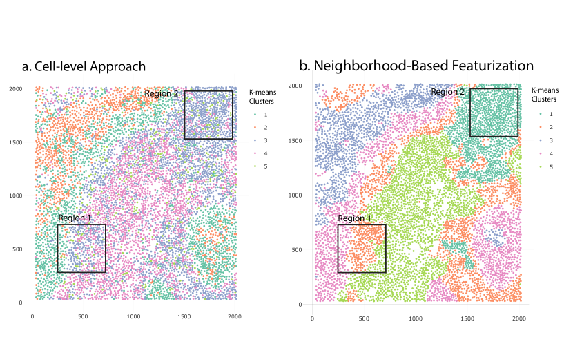
Figure 21 shows the clustering results after -means clustering with . The clustered microenvironments are mixed with each other; in particular, it is difficult to distinguish a tumor-immune boundary microenvironment. Figure 22 compares the clustered spatial plots based on the cell-level and neighborhood-based approaches. In Figure 22a, the cells in Region 1 are a mixture of three microenvironments derived from the cell-level approach. It is difficult to identify which microenvironment this region belongs to. Although Region 2 of Figure 22a is mainly composed of Cluster 3, there are cells from Clusters 4 and 5 distributed throughout. Though in principle it is possible to distinguish microenvironments based on particular mixture patterns across cell types, doing so requires much more effort than examining the neighborhood-based representation.
Compared with the cell-level approach, the neighborhood-based featurization has a noticeably clearer clustering result. In Region 1 of Figure 22b, the cells in the boundary of tumor cells are spatially consistent according to their own cell types. Further, in Region 2 of Figure 22b, we observe a dominant microenvironment without needing to parse mixed patterns of cell types.
Overall, the neighborhood-based featurization provides representations with better spatial consistency, simplifying the discovery of microenvironments.
6 Package
We next summarize how to use NBFvis to implement the proposed workflow. We first load the packages and dataset we need. The dataset patient4 is a data frame of all cells in the tissue section of Patient 4 in the TNBC data (Keren et al., 2019). We have added two columns named x_center and y_center, which are the coordinates of the calculated cell centers from the spatial raster data.
    library(NBFvis)
    library(dplyr)
    data(patient4)
We select 41 variables from dsDNA to HLA Class 1, most of which are proteins and cell type markers. The quantile_matrix function generates the quantile matrix from each cell’s neighborhood.
    Quantiles_patient4 <- quantiles_matrix(
        data = patient4 %>% select(dsDNA:HLA_Class_1),
        coordinate = patient4 %>% select(x_center,y_center),
        index = patient4$index,
        NN = 40,
        distance = 60,
        min_percentile = 0.1,
        max_percentile = 0.9,
        quantile_number = 17,
        method = pca_)
The function network_matrix first builds the network inside the neighborhood and then calculates the corresponding network statistics using the argument given by fun. In this example, we use the function centralities, also exported by our package.
    centrality_patient4 <- network_matrix(
        coordinate = patient4 %>% select(ends_with("_center")),
        index = patient4$index,
        radius = 60,
        NN = 40,
        edge = 30,
        fun = centralities,
        length_output = 29,
        name_output = NULL)
The scales of these two matrix are not the same, which means rescaling is needed. Here we remove Column, index and n_neighborhood in the quantile matrix so that all the columns left are quantile and network variables. Normalization and centering are applied to the centralities matrix so that they have a similar scale to the quantile matrix. We then combine the quantile matrix and the rescaled network matrix to construct an extended featurization matrix, which we called the neighborhood matrix earlier.
    neighborhood_info_patient4 <- cbind(
        Quantiles_patient4 %>% select(-index, -n_neighbor),
        scale(centrality_patient4 %>% select(-index)))
The final step is to input the neighborhood matrix, the cell dataset patient4, and the names of the variable of interest in the function NBFvis. This returns an interactive Shiny app that was the source of figures in Section 5,
    NBF_vis(
        matrix = neighborhood_info_patient4,
        origin_data = patient4,
        var_names = colnames(patient4)[17:57])
7 Discussion
We have presented a method for visualizing spatial omics datasets that integrates dimensionality reduction methods like UMAP with neighborhood-based featurization based on quantiles and network properties. According to the results of our simulation, dimensionality reduction based on genomic features alone has difficulty identifying microenvironments because the associated embeddings are dominated by differences in expression patterns across cell types. Also, -means clustering on the UMAP embeddings from this approach results in spatially inconsistent clusters, making it difficult to identify potential microenvironments. In contrast, our approach, though simple to implement, is able to avoid these problems by leveraging neighborhood information of cells. After combining neighborhood-based statistics like quantiles and centralities, we can detect microenvironments with mixed cell types, paralleling our simulation results. Furthermore, spatially consistent -means clusters can be derived, supporting discovery of microenvironments.
We apply our methodology to the spatial omics dataset of (Keren et al., 2019) and find five spatially continuous microenvironments in the cells’ spatial plot. We compared this result with the analogous approach based on cell-level data and found that it is more difficult to identify meaningful microenviornments without an initial featurization step.
One advantage of our methodology is that the choice of neighborhood-based featurization is flexible. In our example, we use neighborhood quantiles of principal components and network statistics to build the neighborhood matrix for UMAP. These statistics could be replaced by other neighborhood-based statistics like cell-type diversity or local modularity. Also, the embedding and clustering methods are not fixed. We could use alternative dimensionality reduction methods like -distributed stochastic neighbor embedding (-SNE) and PCA or clustering methods like spectral clustering depending on the problem structure.
There are several avenues to develop this work. First, we treat the vertices in the neighborhood networks identically, ignoring their cell types. This is convenient for the computation of network statistics, but information is nonetheless lost. To address this, it may be possible to build neighborhood networks with different vertex types and compute corresponding network statistics. A second question is how to combine matrices. Our featurization is based on matrices from two groups of statistics (quantiles and network statistics), and their variances and interpretation could be quite different according to their groups. Is there a more principled approach to scaling and combining these measures into a single featurization? One possible solution could be Multiple Factor Analysis, which distinguishes between groups of statistics (Pagès, 2014). Thirdly, we use -means clustering in our methodology, which is a common choice but far from the best clustering algorithm for low-dimensional embeddings. -means clustering is sensitive to outliers in the embedding plot and assumes spherical clusters, making it potentially unreliable. Spectral clustering could be a potential improvement, because it is more sensitive to the gradient structures in the UMAP embeddings.
Acknowledgements
We would like to express our gratitude to all the members in our group, who provided us with precious suggestions for the modification of our methodology and Shiny app. In particular, we thank MinXing Zheng for suggestions on the choices of network statistics and Xinran Miao and Hanying Jiang for help improving the user interface to our Shiny app.
References
- Keren et al. [2019] Leeat Keren, Marc Bosse, Steve Thompson, Tyler Risom, Kausalia Vijayaragavan, Erin McCaffrey, Diana Marquez, Roshan Angoshtari, Noah F Greenwald, Harris Fienberg, et al. Mibi-tof: A multiplexed imaging platform relates cellular phenotypes and tissue structure. Science advances, 5(10):eaax5851, 2019.
- Burgess [2019] Darren J Burgess. Spatial transcriptomics coming of age. Nature Reviews Genetics, 20(6):317–317, 2019.
- Nawy [2018] Tal Nawy. Spatial transcriptomics. Nature Methods, 15(1):30–30, 2018.
- Rao et al. [2021] Anjali Rao, Dalia Barkley, Gustavo S França, and Itai Yanai. Exploring tissue architecture using spatial transcriptomics. Nature, 596(7871):211–220, 2021.
- Yoosuf et al. [2020] Niyaz Yoosuf, José Fernández Navarro, Fredrik Salmén, Patrik L Ståhl, and Carsten O Daub. Identification and transfer of spatial transcriptomics signatures for cancer diagnosis. Breast Cancer Research, 22(1):1–10, 2020.
- Dries et al. [2021a] Ruben Dries, Jiaji Chen, Natalie Del Rossi, Mohammed Muzamil Khan, Adriana Sistig, and Guo-Cheng Yuan. Advances in spatial transcriptomic data analysis. Genome Research, 31(10):1706–1718, 2021a.
- Chen et al. [2020] Zhenghao Chen, Ilya Soifer, Hugo Hilton, Leeat Keren, and Vladimir Jojic. Modeling multiplexed images with spatial-lda reveals novel tissue microenvironments. Journal of Computational Biology, 27(8):1204–1218, 2020.
- Sun et al. [2020] Shiquan Sun, Jiaqiang Zhu, and Xiang Zhou. Statistical analysis of spatial expression patterns for spatially resolved transcriptomic studies. Nature methods, 17(2):193–200, 2020.
- Zhu and Sabatti [2020] Junjie Zhu and Chiara Sabatti. Integrative spatial single-cell analysis with graph-based feature learning. bioRxiv, 2020.
- Hsu and Culhane [2020] Lauren Hsu and Aedin Culhane. Tumor spatial autocorrelation and clinical prognosis. https://laurenhsu1.github.io/BIRSBIO2020.scProteomics.exploratory/articles/moran_clinical.html, 2020.
- Dries et al. [2021b] Ruben Dries, Qian Zhu, Rui Dong, Chee-Huat Linus Eng, Huipeng Li, Kan Liu, Yuntian Fu, Tianxiao Zhao, Arpan Sarkar, Feng Bao, et al. Giotto: a toolbox for integrative analysis and visualization of spatial expression data. Genome biology, 22(1):1–31, 2021b.
- McInnes et al. [2018] Leland McInnes, John Healy, and James Melville. Umap: Uniform manifold approximation and projection for dimension reduction. arXiv preprint arXiv:1802.03426, 2018.
- Chang et al. [2015] Winston Chang, Joe Cheng, JJ Allaire, Yihui Xie, and Jonathan McPherson. Package ‘shiny’. See http://citeseerx. ist. psu. edu/viewdoc/download, 2015.
- Pagès [2014] Jérôme Pagès. Multiple factor analysis by example using R. CRC Press, 2014.
Appendix
Network statistics implemented in NBFvis.
-
1.
Degree
-
2.
Number of Nodes
-
3.
Betweenness Centrality
-
4.
Closeness Centrality
-
5.
Eigenvector Centrality Scores
-
6.
Eccentricity Scores
-
7.
Subgraph Centrality Scores
-
8.
Load Centrality Scores
-
9.
Gil-Schmidt Power Index
-
10.
Information Centrality Scores
-
11.
Stress Centrality Scores
-
12.
Average Distance
-
13.
Barycenter Centrality Score
-
14.
Latora Closeness Centrality
-
15.
Residual Closeness Centrality
-
16.
Communicability Betweenness Centrality
-
17.
Cross-clique Connectivity Centrality
-
18.
Decay Centrality
-
19.
Diffusion Degree
-
20.
Radiality Centrality
-
21.
Geodesic k-path Centrality
-
22.
Laplacian Centrality
-
23.
Leverage Centrality
-
24.
Lin Centrality
-
25.
Lobby Centrality
-
26.
Markov Centrality Score
-
27.
Maximum Neighborhood Component
-
28.
Semi Local Centrality
-
29.
Topological Coefficient