The Parallel Coordinates Plot Revisited: Visual Extensions from Hive Plots, Heterogeneous Correlations, and an Exploration of Covid-19 Data in the United States
Abstract
This paper extends an existing visualization, the Parallel Coordinates Plot (PCP), specifically its polar coordinate representation, the Polar Parallel Coordinates Plot (P2CP). With the additional incorporation of techniques borrowed from Hive Plot network visualizations, we demonstrate improved capabilities to explore multidimensional data in flatland, with a particular emphasis on the unique ability to represent 3-dimensional data. To demonstrate these techniques on P2CPs, we consider toy data, the Iris dataset, and socioeconomic data for counties in the United States. We conclude with an exploration of Covid-19 data from counties in the contiguous United States.
1 Introduction
“Reasoning about evidence should not be stuck in 2 dimensions, for the world we seek to understand is profoundly multivariate” — Edward Tufte [1].
Multidimensional data visualization is routinely stuck between two conflicting truths—humans are very good at finding patterns in data that can be visualized in two dimensions, but plotting high-dimensional data in 2d requires representational tricks that can come with an interpretability trade-off.
Plenty of clever techniques have been applied to comprehensibly reduce multidimensional data into flatland. Perhaps the simplest technique used is to look at all of the pairs of bivariate Scatterplots in a Scatterplot Matrix. Another commonly-used technique is to plot a dataset as a standard bivariate Scatterplot using two of the available dimensions, but modify the appearance of each plotted point according to additional dimensions of data. For example, the color and size of each point can represent extra dimensions, with techniques like Chernoff faces [2] extending this concept to higher dimensions. Others prefer to use embedding techniques such as Principal Components Analysis to explicitly collapse the information content of multidimensional data into flatland. Finally, assigning dimensions to axes in flatland, a technique most notably used with the Parallel Coordinates Plot (PCP), allows one to represent a multidimensional point as a polyline while preserving univariate relationships as well as a subset of bivariate relationships.
Just as PCPs visualize relationships between orthogonal dimensions of multivariate data, a Hive Plot (HP) visualizes relationships between orthogonal sets of nodes in network data. In this paper, we delve into the overlap between these two visualization techniques, applying concepts from HPs to PCPs in order to improve the analytical capabilities of PCPs. We demonstrate the resulting visualization, the Polar Parallel Coordinates Plot (P2CP), on toy data as well as the Iris dataset, county-level socioeconomic data for the United States, and county-level Covid-19 data from the contiguous United States.
1.1 Outline
We first discuss the history of Parallel Coordinates Plots and Radar Charts in Section 2. We then apply techniques from the Hive Plot literature on several example datasets in Section 3. Next, we visualize correlations in Polar Parallel Coordinates Plots in Section 4. As an application of Hive Plot techniques and exploration of heterogeneous correlations, we look at county-level Covid-19 data for the contiguous United States in Section 5, and we conclude in Section 6.
2 Parallel Coordinates Plots and Polar Doppelgangers
The Parallel Coordinates Plot (PCP) extends as far back as the 1880s. Philbert Maurice d’Ocagne in 1885 is frequently credited with laying out the means of coordinate transformation needed for PCPs [3], but Henry Gannett preceded d’Ocagne with the first plots a few years earlier [4]. PCPs were popularized in 1980s by Alfred Inselberg [5]. Heinrich and Weiskopf [6] nicely summarize many of the recent innovations in PCPs.
The polar coordinate equivalent of PCPs, the Polar Parallel Coordinates Plot (P2CP), which radiates axes out from the origin, is essentially an applied use of the Radar Chart (RC), also known as the Spider Plot or Star Plot. RCs actually precede PCPs by several years, with Georg von Mayr publishing the first RC in 1877 [7].
Although some researchers worry that PCPs can be hard to interpret, there is evidence that even the unfamiliar can in fact understand PCPs [8]. Furthermore, Lazenberger et al. [9] found evidence suggesting that although PCPs were more interpretable at first glance, P2CPs were better for hypothesis generation as well as the visualization of important insights.
Unfortunately, although RCs are a well-established visualization technique, there is minimal exploration in the literature of their use as P2CPs, with only some discussion in the context of Circular Parallel Coordinates Plots [10] and Stardinates [11]. Instead, RCs, both in the literature and in practice, focus on shape comparisons between only a few multidimensional points rather than considering a far larger number of data points as one usually shows with a PCP. This limited use of RCs has many flaws. For example, many RC tools fill in the area inside the completed loop representation of a multidimensional data point, which leads to a visually disingenuous quadratic increase in area with respect to a linear increase along one dimension. Furthermore, there are far more interpretable visualizations than RCs for comparing so few multidimensional points. For a more thorough discussion critiquing RCs, see [12].
By borrowing a few concepts from Hive Plots—a technique from network visualization—this paper extends the visualization capabilities of P2CPs to larger datasets. In particular, we focus on curved edges, the unique visualization power of a 3-axis P2CP, and small multiples.
3 Visualization Techniques from Hive Plots
HPs [13] serve as an interpretable means of network visualization. Due to the abstract nature of most networks, there usually is not a “correct” way to place nodes in Euclidean space. Whereas many network visualizations rely on an algorithmic placement of nodes that can be difficult to interpret, HPs allow one to more explicitly position nodes. First, one chooses a partitioning of the nodes, which consequently dictates a set of distinct axes on which to place each set of nodes. The user then selects a scalar ordering variable for each axis. A node is thus precisely and interpretably placed on its specified axis in two-space based on its corresponding scalar value. After drawing edges between nodes in their final placement, the resulting structure offers a strong visual interpretability, suggesting anecdotal patterns between nodes with respect to the sorting variables chosen by the user.
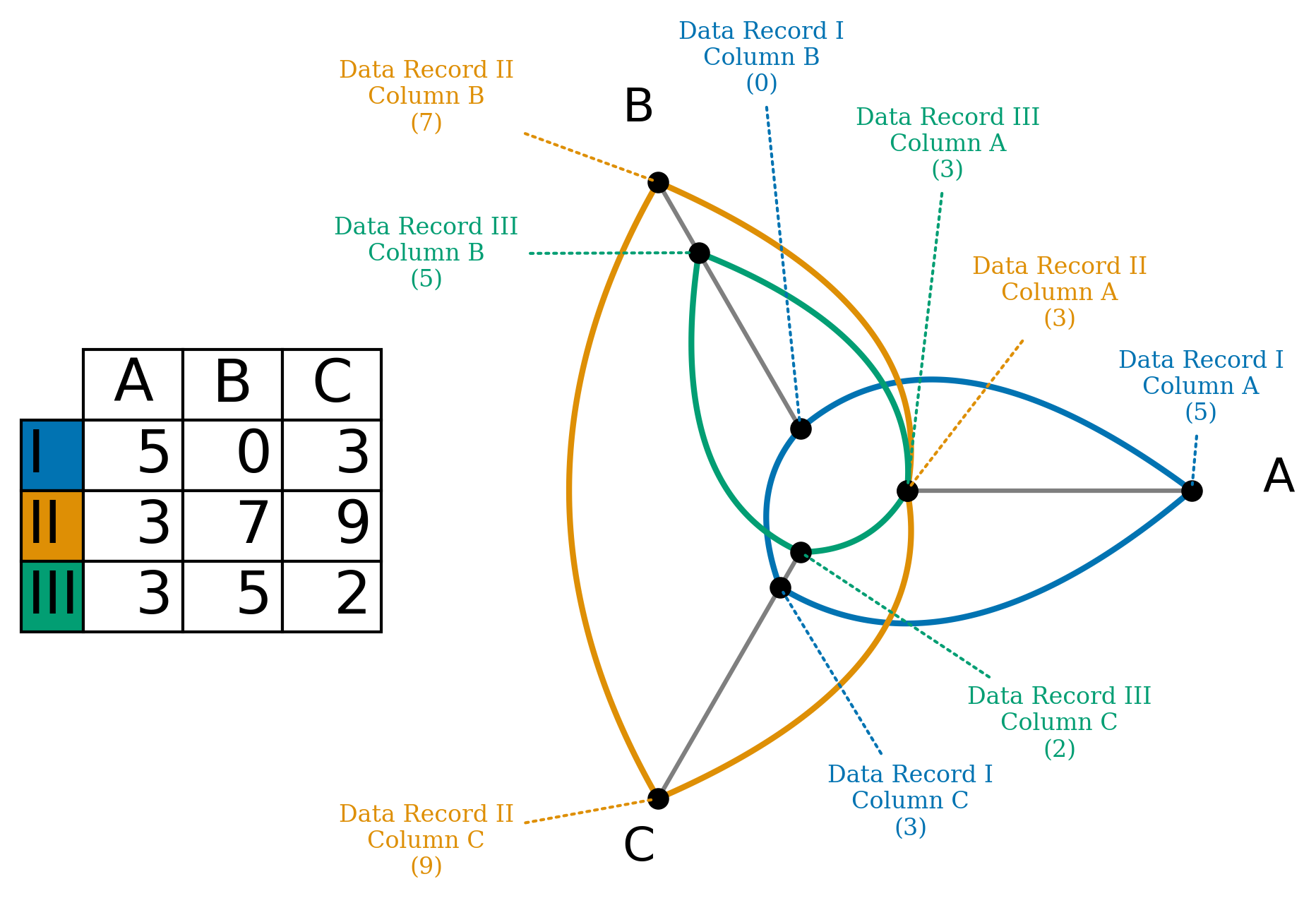
To connect P2CPs to HP visualization techniques, we must first clarify how we will think of standard multidimensional data as “network data” of a sort. Rather than thinking of choosing our axes to be some partition of the nodes in a network, we will let our axes be dimensions of the dataset. We will thus think of a “node” on an axis as being a specific dimension value in a record of data. Assuming we do not have missing values in our data, one multidimensional data point will thus consist of one closed loop in a HP. A simple example of three points in three dimensions is shown in Figure 1.
We borrow several concepts from HP visualizations to extend the capabilities of P2CPs with many data points.
3.1 Curvature of Edges
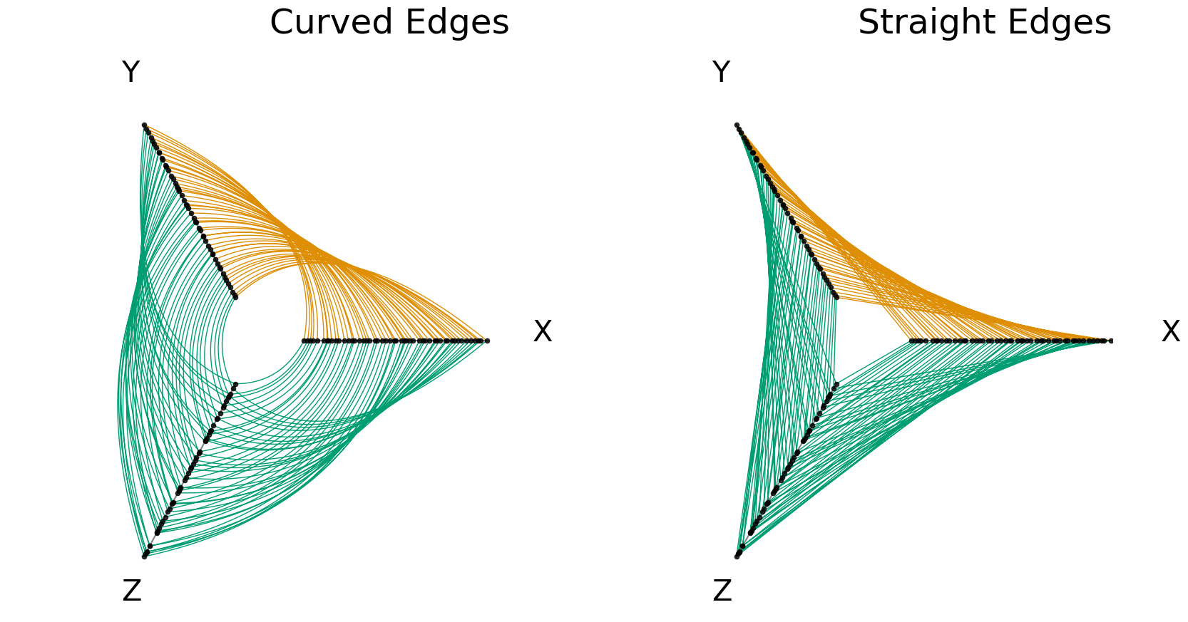
RCs and P2CPs almost always follow the PCP convention of straight line connections between axes,111There are some exceptions of PCPs contemplating curved edges, for example [14]. thus under-utilizing the available space in polar coordinates. HPs on the other hand draw Bézier curves that arc through the space.222One notable Radar Chart tool with curved edges is available through Google Docs, which draws line arcs quite similarly to the authors’ preferred Bézier curve structure. Examples can be found at https://support.google.com/docs/answer/9146868 The curved edges not only make better use of the space in a plot in polar coordinates, but also avoid visual artifacts of concavity that can appear in figures with a more dense number of edges, exemplified in Figure 2.
3.2 3 Dimensions Preserved in Flatland
Static visualizations of 3-dimensional data can be highly misleading. As an example, consider the following toy dataset—four Gaussian blobs centered at four different corners of a cube (Figure 3).
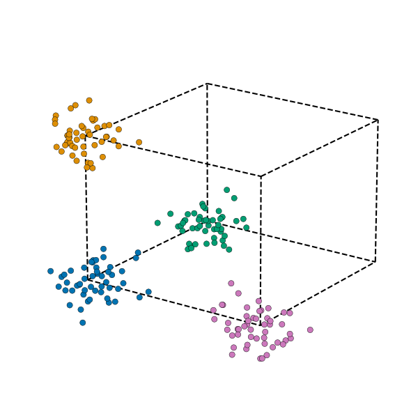
With the strategic choice of angle and azimuth in Figure 3, the four clusters are clearly distinguished, but if we look at the wrong angle, the separability becomes far less visually apparent (Figure 4).
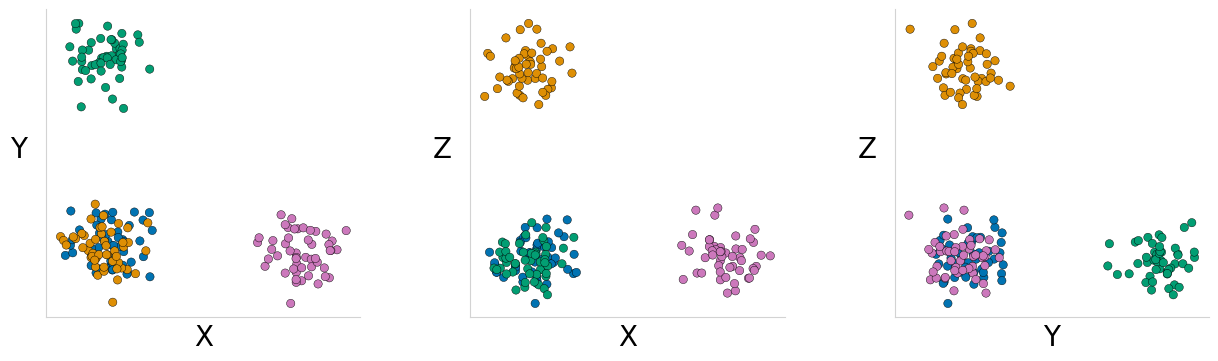
If we instead place our , , and axes in flatland with a 3-axis P2CP (Figure 5), we can see the unambiguous trivariate separability, as exhibited by the appearance of four loops of distinct shape and color . Though 3-axis P2CPs can of course nicely demonstrate trivariate relationships, the use of three axes has a particular motivation for HPs.
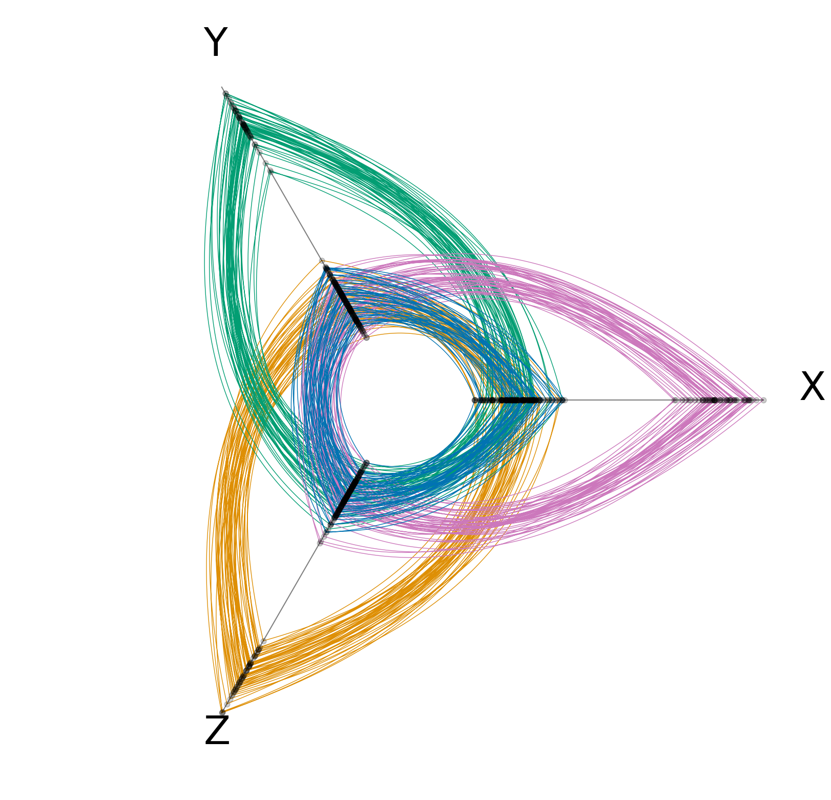
HPs typically have three axes because each axis is adjacent to every other axis, and thus one would never need to draw an edge between nodes that crosses over an axis. Given one might have any arbitrary partitioning of nodes into groups, this enables cleanly visualizing any of the possible bivariate relationships in the resulting figure.
When translating this property to P2CPs, a 3-axis P2CP results in every bivariate relationship being visually represented in a single two-dimensional figure.333P2CPs also preserve univariate relationships on each axis. Therefore, despite projecting onto flatland, 3-dimensional P2CPs do not collapse any variable interactions in the resulting figure.
As the number of dimensions increases beyond 3, PCPs and P2CPs are still perfectly valid visualization schemes, but it should be noted that new issues arise that can affect interpretability. In particular, both the ordering of axes [15] and strategic placement of repeat axes [16] are research questions in their own right.
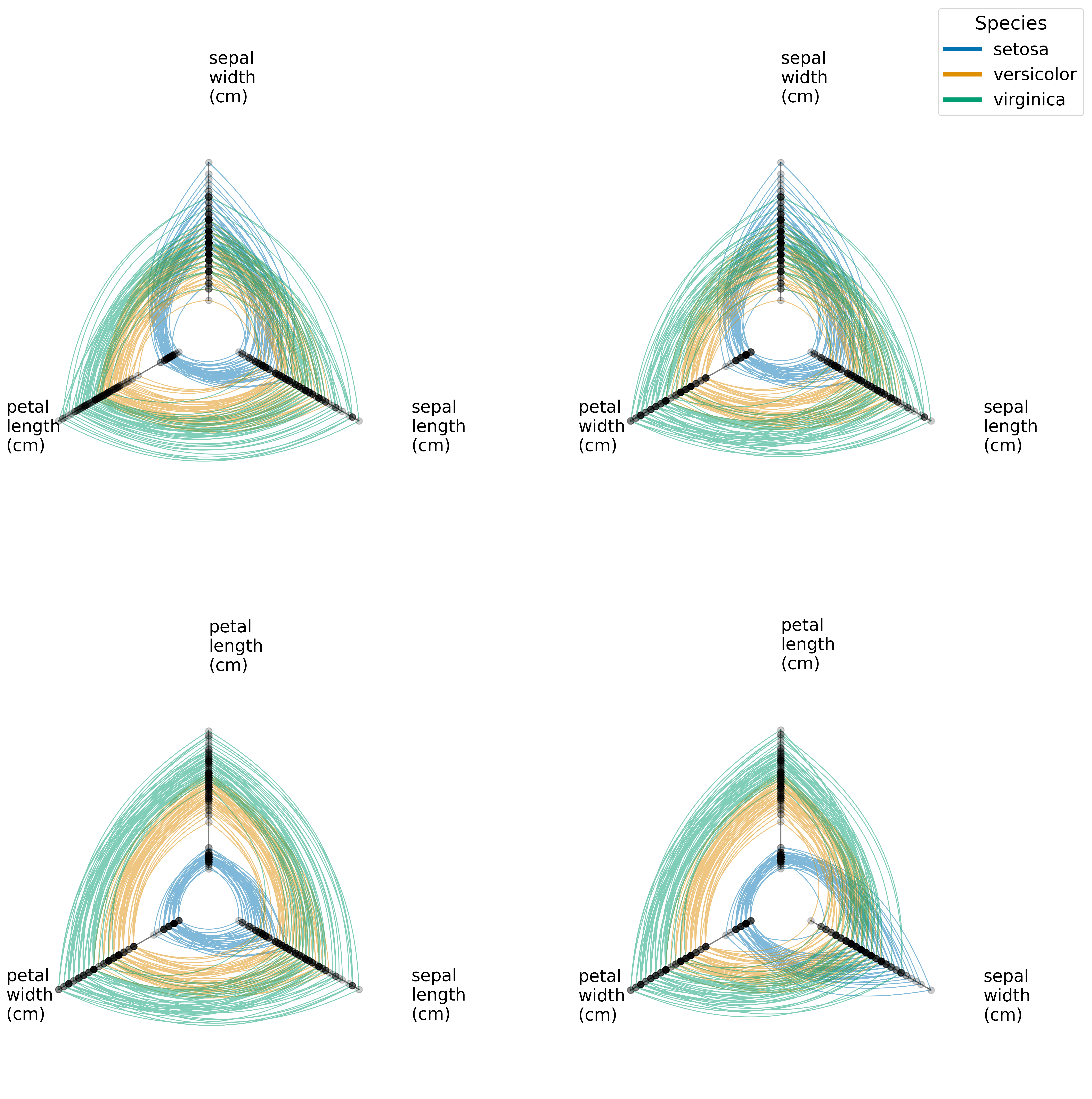
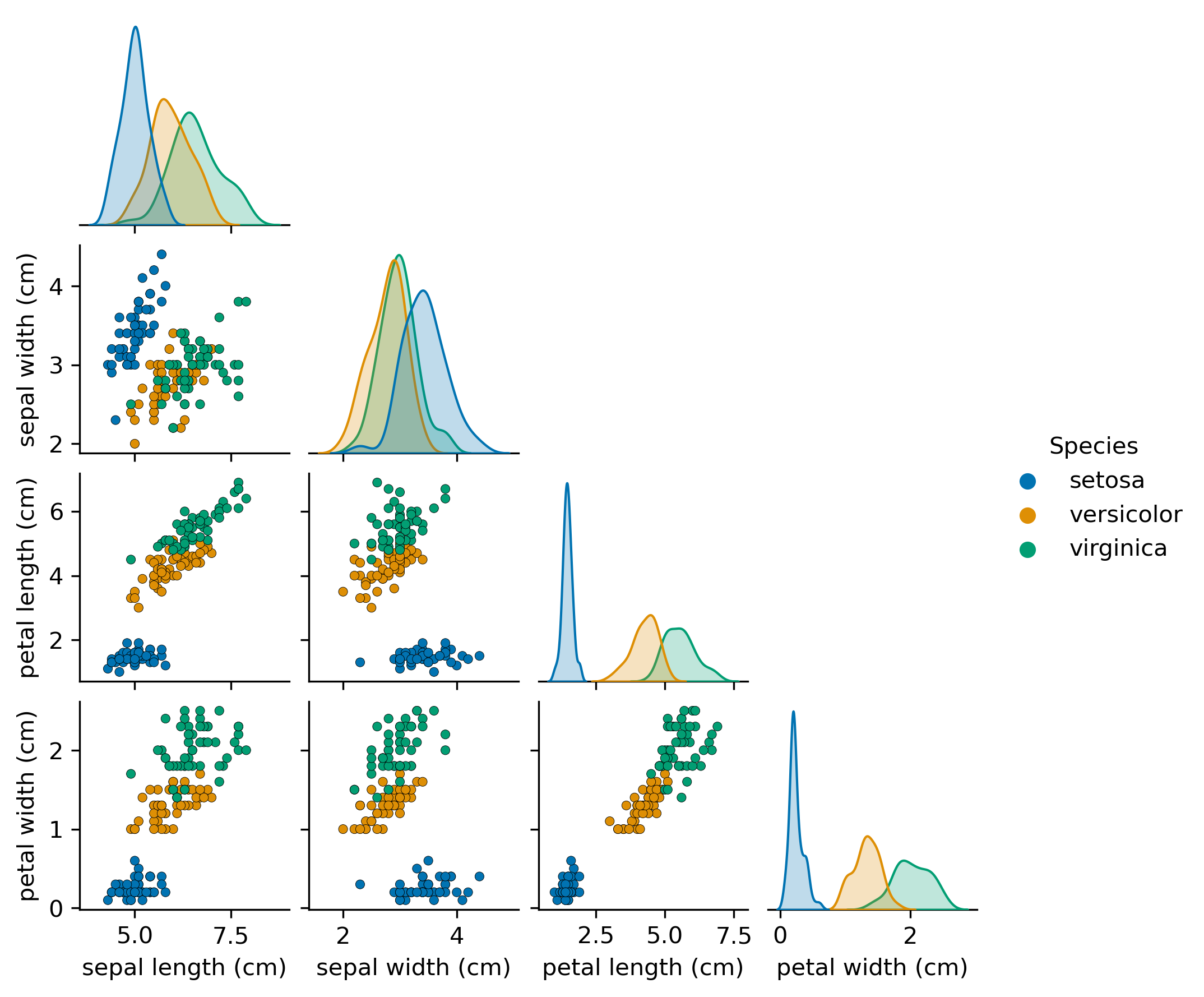
If forced to look at a single, static visualization, a 3-axis P2CP is in fact more informative than a 3-dimensional Scatterplot. Consider the Iris Dataset [17] [18], which consists of three types of flowers represented by four dimensions of data. The labels separate quite well on both petal length and petal width, as demonstrated by a standard Scatterplot Matrix shown in Figure 6.444As a digression of examples using P2CPs, the Scatterplot Matrix in Figure 6 could instead be represented as four instances of 3-axis P2CPs showing the four possible trivariate relationships. The resulting figure can be found in the Appendix (Figure 15).
Suppose we simply want to explore the separability of the different labels via Principal Components Analysis (PCA). Looking at the first three Principal Components (PCs) in three dimensions (the left plot in Figure 7), we can only draw one conclusion—the first PC performs quite a bit of separation on its own—but we are unable to conclude anything further. In fact, there is no single 3d Scatterplot of the PCA dataset that can unambiguously show us the collective separability possible using these three PCs.
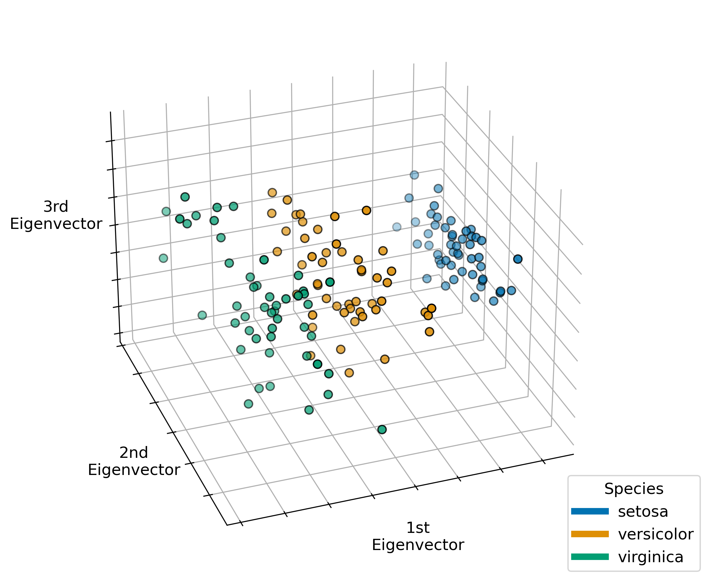
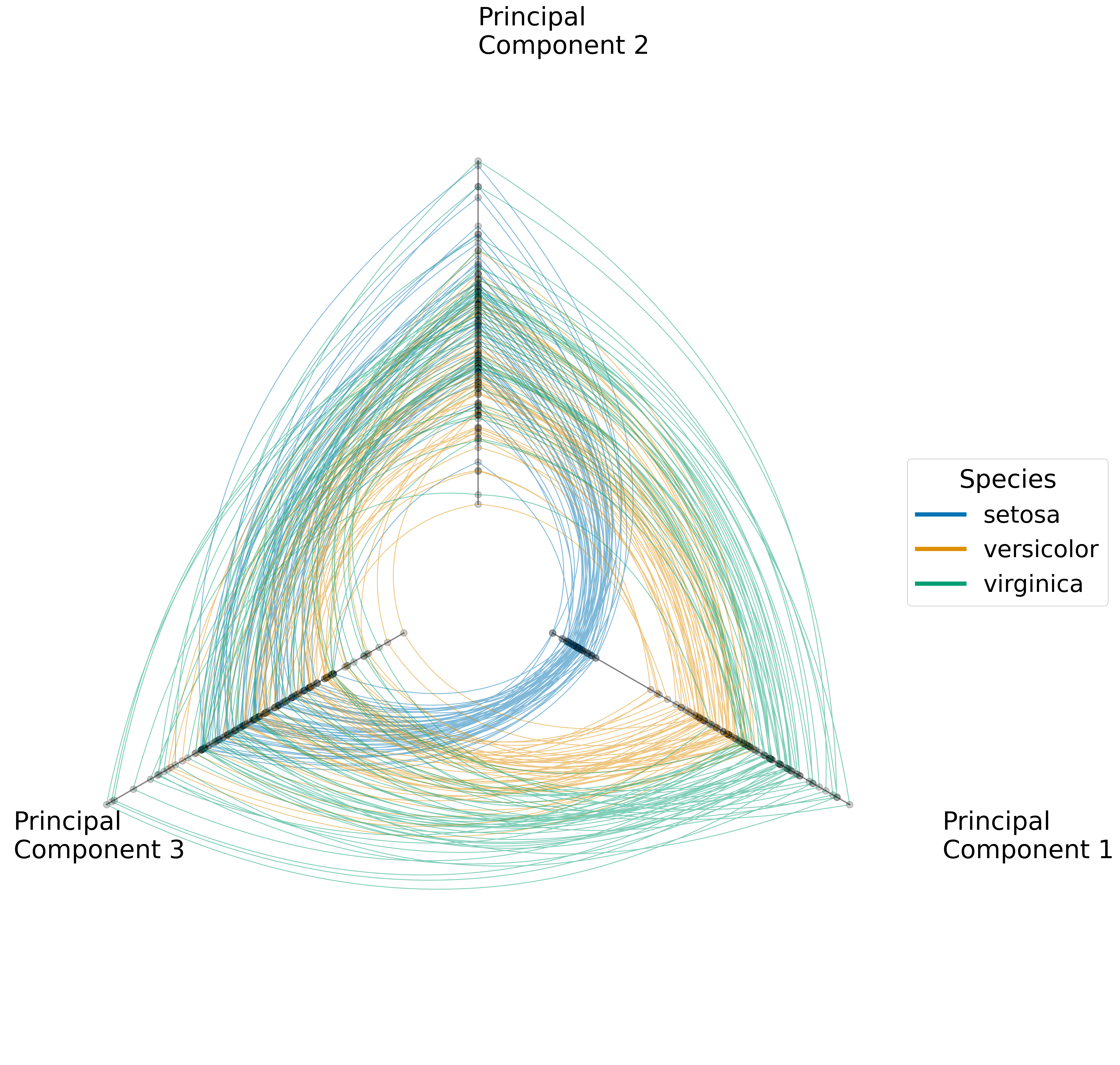
A 3-axis P2CP visualization of the same dataset (the right plot in Figure 7), on the other hand, not only demonstrates the standalone, univariate separability resulting from PC1, but also shows us that the second and third PCs have no univariate separability. Furthermore, this visualization illustrates that no bivariate relationship or even the one trivariate relationship can improve on the separability achieved by PC1 alone.
3.3 Small Multiples with Hive Panels
The compact nature of HPs allows one to look at small multiples of plots in succession with each other, referred to in the HP literature as a Hive Panel [13]. Although small multiples have frequently been used with RCs, they have not been used in the PCP literature. One use case for small multiples with parallel coordinates would be to visualize multiple combinations of dimensions from a high-dimensional dataset—for example, instead of making a single, long PCP with axes, one could make P2CPs, each with three axes.
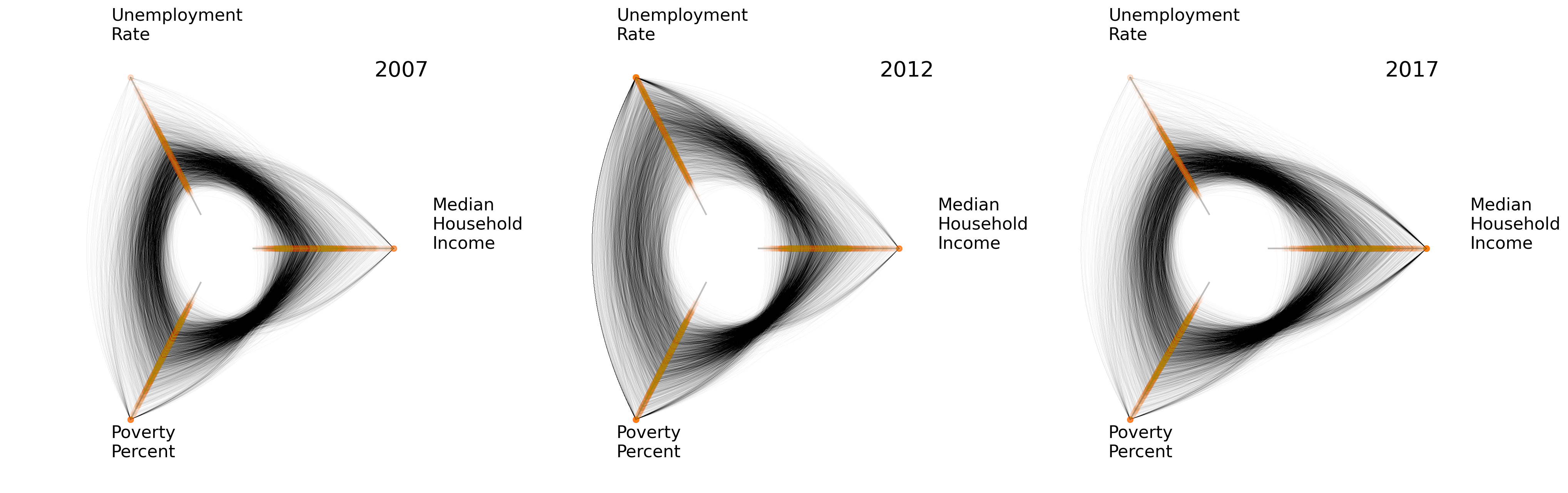
A second natural use case arises with multidimensional time series data, for which one might be interested in visualizing the changing multivariate relationship over time. Current methodologies in the literature for showing changes over time with PCPs include adding axes for discrete times [19], using color and alpha channels to continuously correspond with time [20], and animation tools over the same set of axes [21] [22]. With P2CPs, we can instead partition the data over discretized windows of time and look at the resulting P2CPs side-by-side. As an example, in Figure 8, we generated a series of P2CPs with three socioeconomic variables using data from the Bureau of Labor Statistics [23] and the United States Census Bureau [24]—unemployment rate, poverty percentage, and median household income—for United States counties in 2007, 2012, and 2017. This figure shows some consistent relationships over time, most notably a stable negative correlation between poverty and income, but also demonstrates an intriguing heterogeneity over time between unemployment and income.
4 Visualizing Multivariate, Heterogeneous Correlations with Polar Parallel Coordinates Plots
A large part of Exploratory Data Analysis involves looking for patterns, with a particularly important pattern between two variables being their correlation. In this section, we look at basic bivariate correlations in P2CPs and then turn our attention to multivariate correlations. We demonstrate with a simple example how in a circumstance of heterogeneous correlations, the multivariate visualization scheme of P2CPs lends itself well to finding localized, multivariate patterns in the data, a strategy we will make use of in practice in Section 5.
Before discussing the visualization of correlations with P2CPs further, it’s important to note that when visually exploring bivariate correlations, there are known interpretability trade-offs when using PCPs as opposed to Scatterplots, discussed further in [25], [26], and [27]. These trade-offs, however, extend only to the simpler task of identifying the magnitude of positive and negative correlations as noise increases. For the majority of this section, we will focus on heterogeneous correlations and the particular capability with P2CPs to discern localized, multivariate patterns, a task that we consider outside the scope of the above-cited papers.
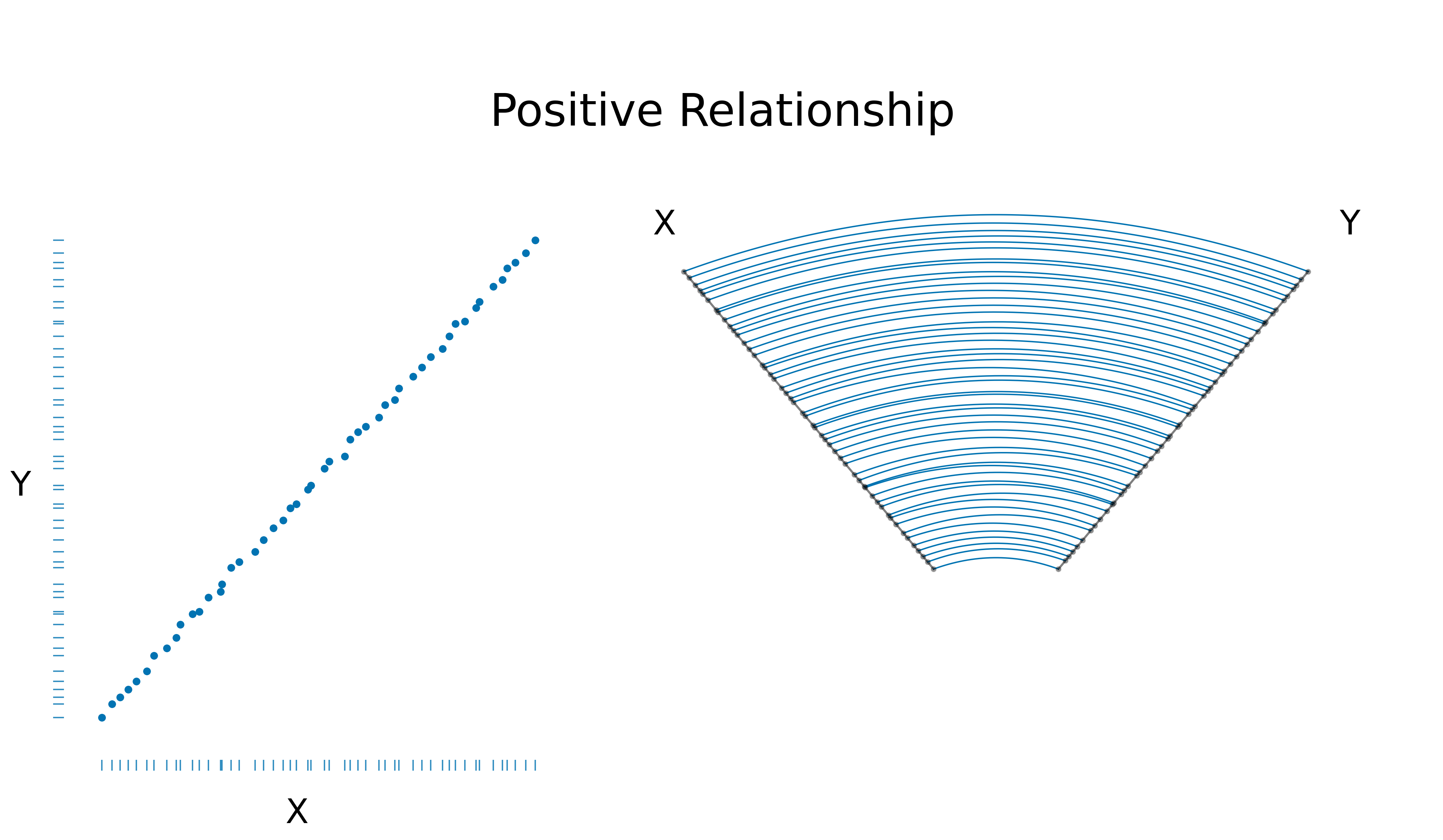
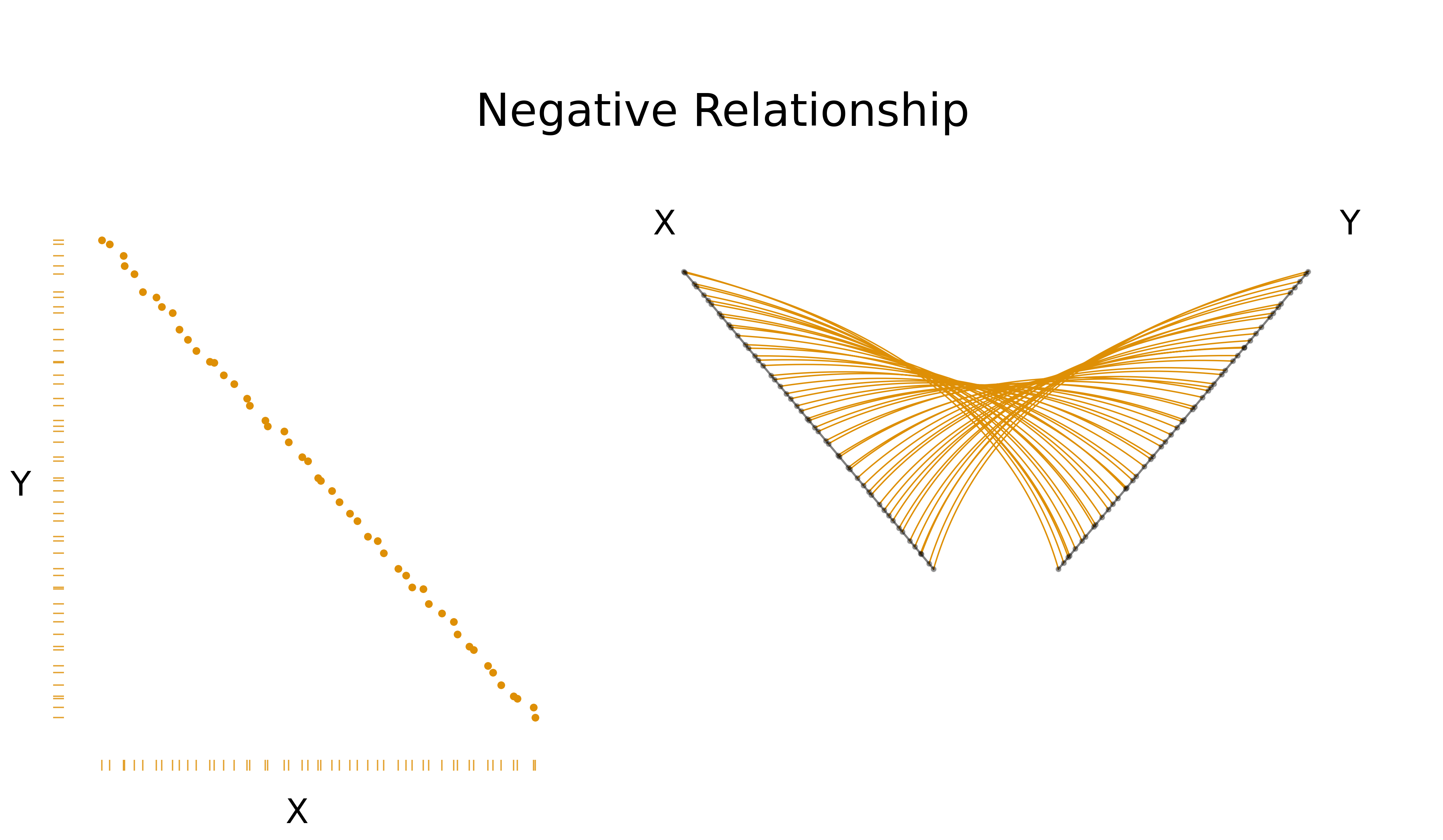
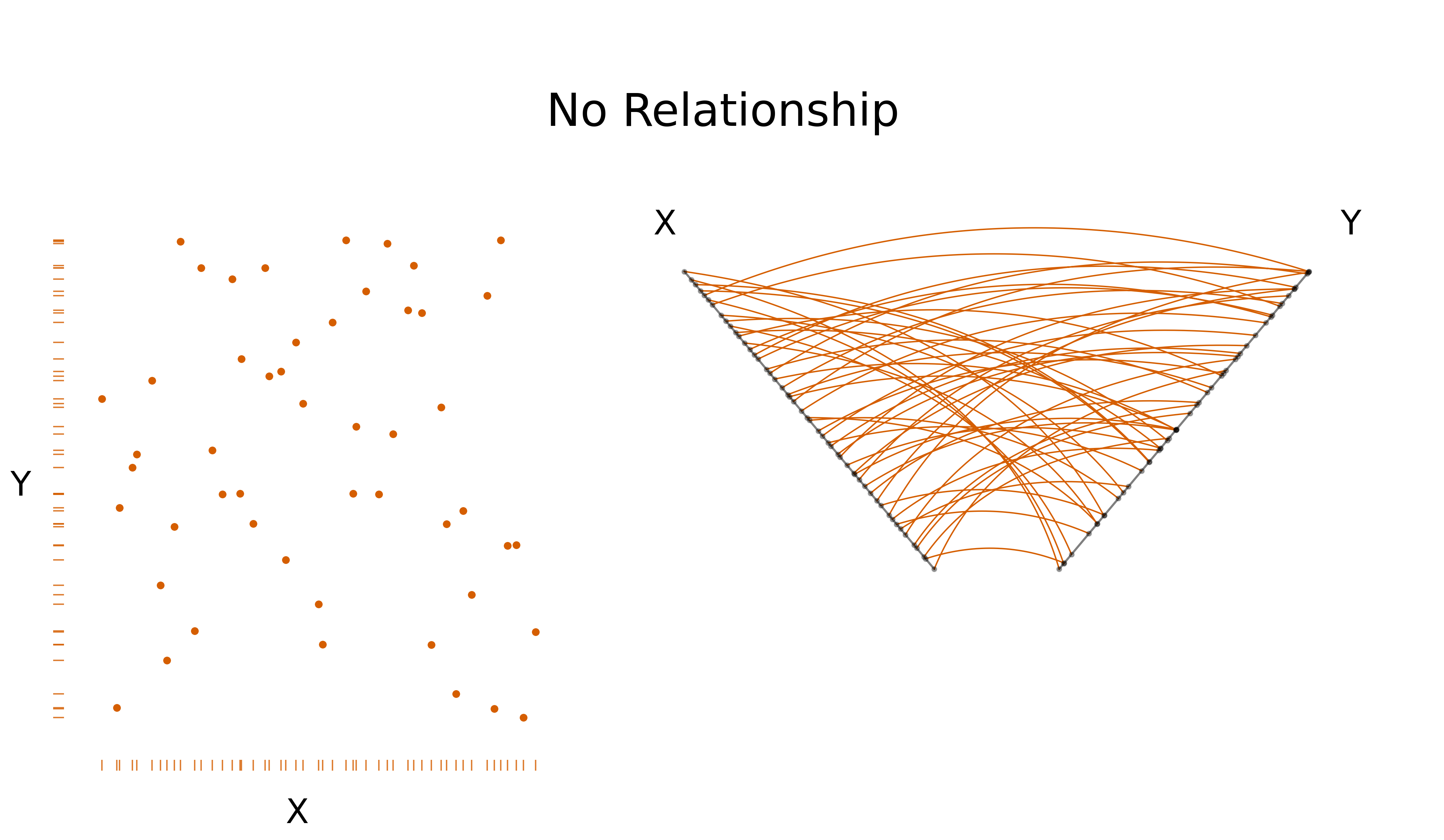
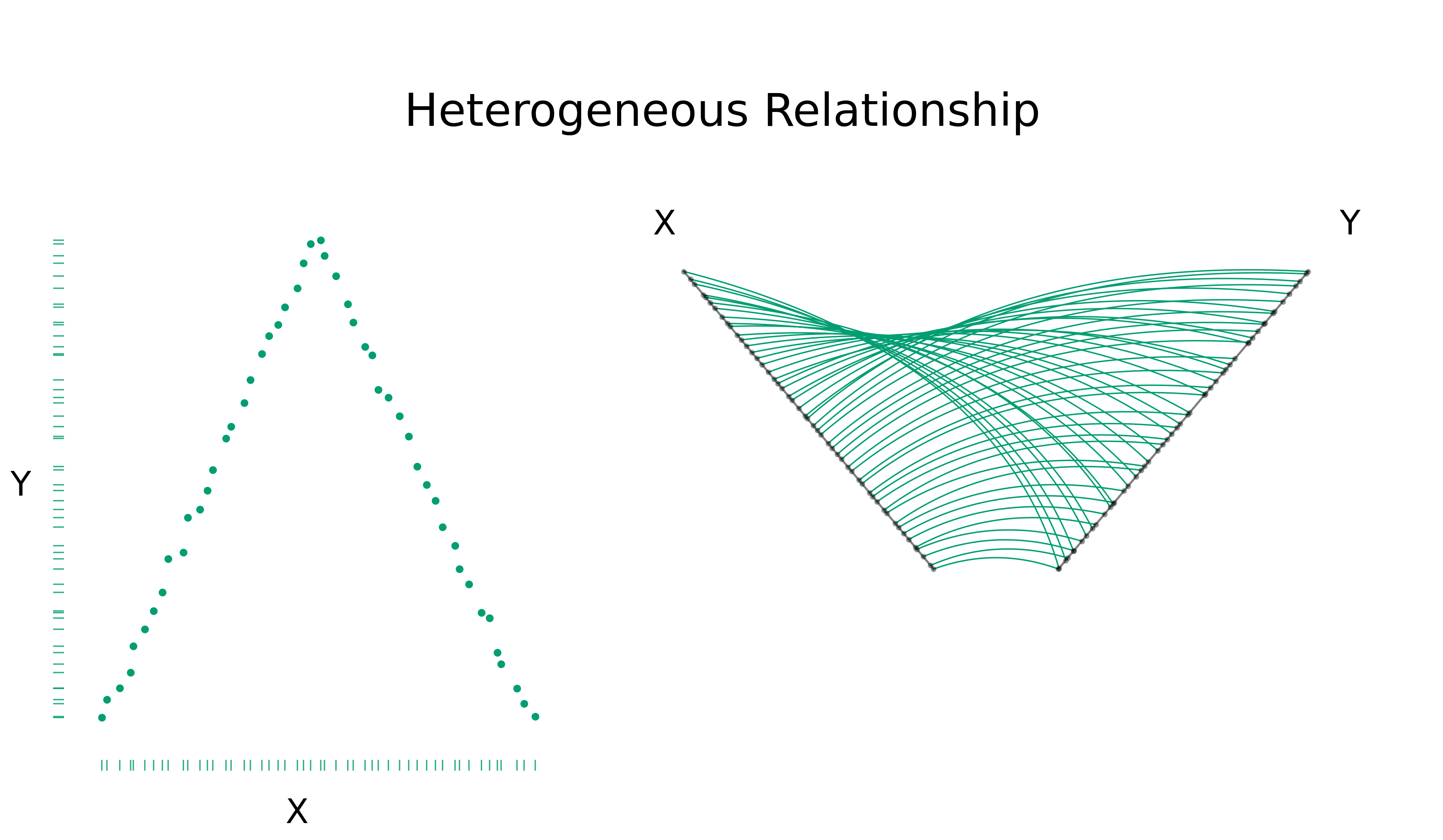
To demonstrate basic correlation patterns with P2CPs, we first consider four simple, low-noise examples in Figure 9. Dot-Dash Plots [28] were used for the bivariate Scatterplots to create a more comparable visualization to the P2CP, as P2CPs also display univariate density on their axes. For P2CPs, positive relationships result in concentric arcs, negative relationships result in a “butterfly” pattern, and no relationship conveniently looks like no relationship.
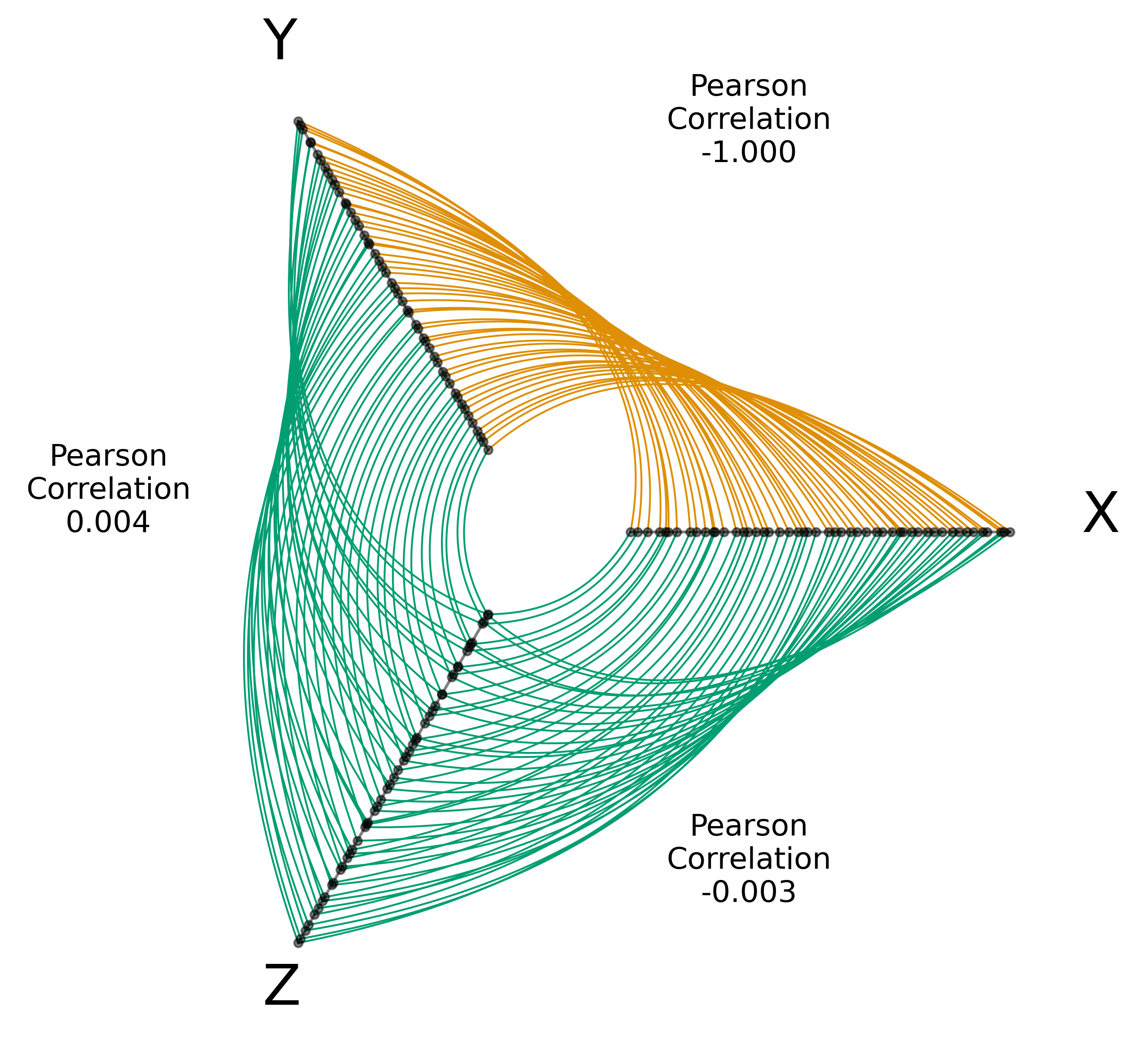
Heterogeneous correlations can of course vary drastically from our simple example in Figure 9, but regardless of the particular heterogeneous structure, one can likely discern local patterns in that bivariate relationship with a standard Scatterplot as well as with a P2CP representation. With P2CPs though, one can additionally explore those local patterns in a multivariate context. As a simple toy example, consider a 3-variable toy dataset in Figure 10 composed of two heterogeneous relationships and one negative relationship, borrowing correlation structures from Figure 9. With this visualization, we can quickly discern multivariate patterns; for example, a high value for any one variable relates to a lower value for the other two variables.
5 Polar Parallel Coordinates Plots with Covid-19 Data in the United States
Applying the techniques from Section 3, we visually explored the trivariate relationship between vaccination rates, Covid-19 cases, and Covid-19 deaths for counties in the contiguous United States from March, 2021 through August, 2021. Specifically, we focused on the relative outcomes of the most-vaccinated and least-vaccinated counties. Vaccination data came from the Centers for Disease Control [29], and Covid-19 cases and deaths data came from Johns Hopkins University [30].
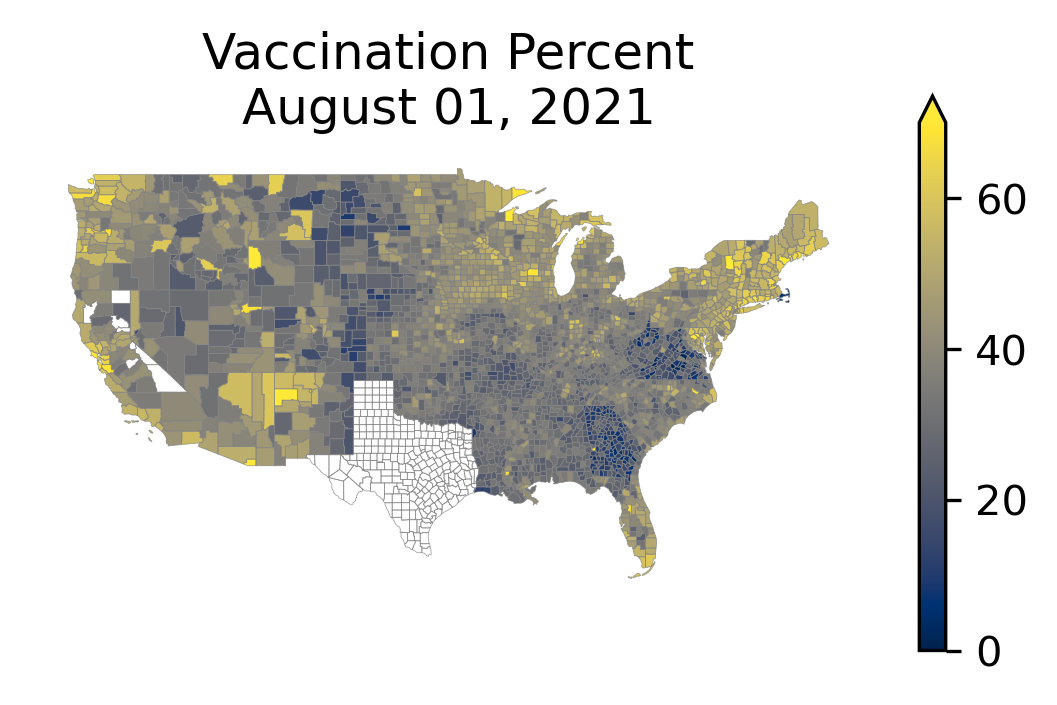
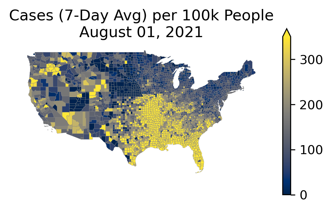
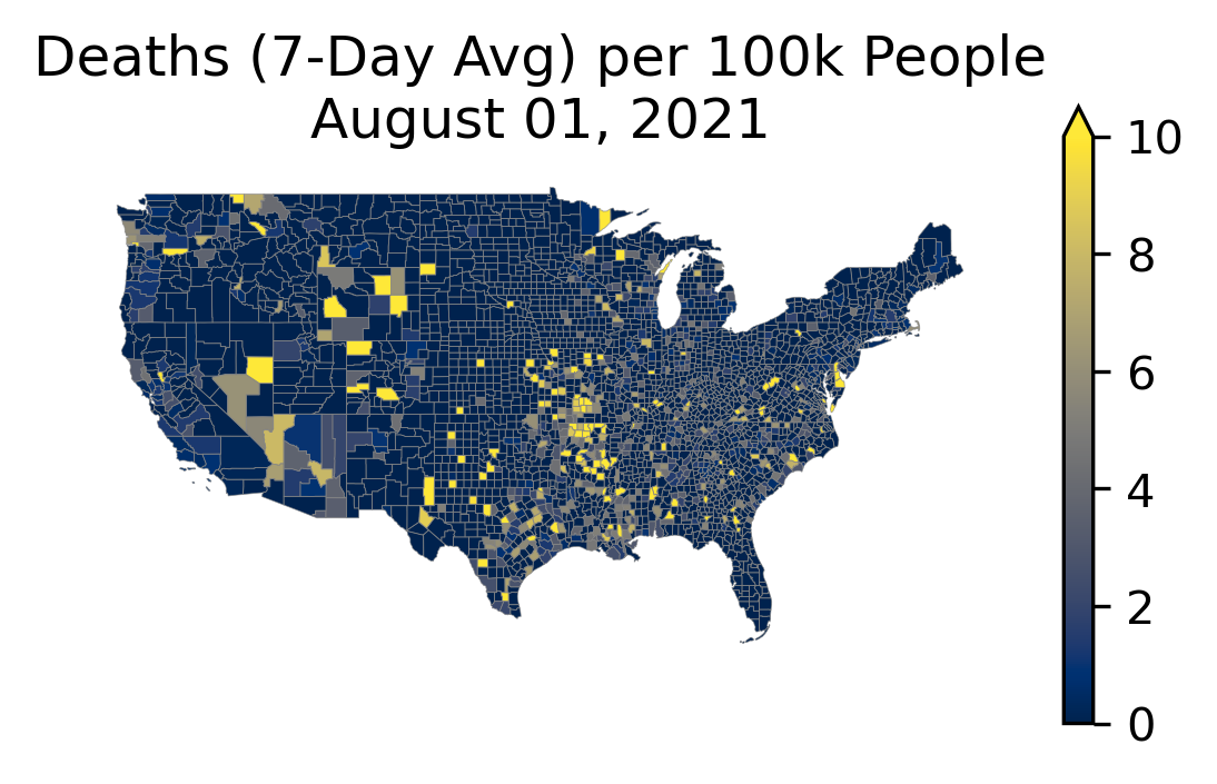
First, we considered these three variables in their geographic context for a single day of data—August 1st, 2021—in Figure 11. There are certainly geospatial patterns here within each map, but these maps don’t lend themselves well to considering the multivariate relationship between the variables.
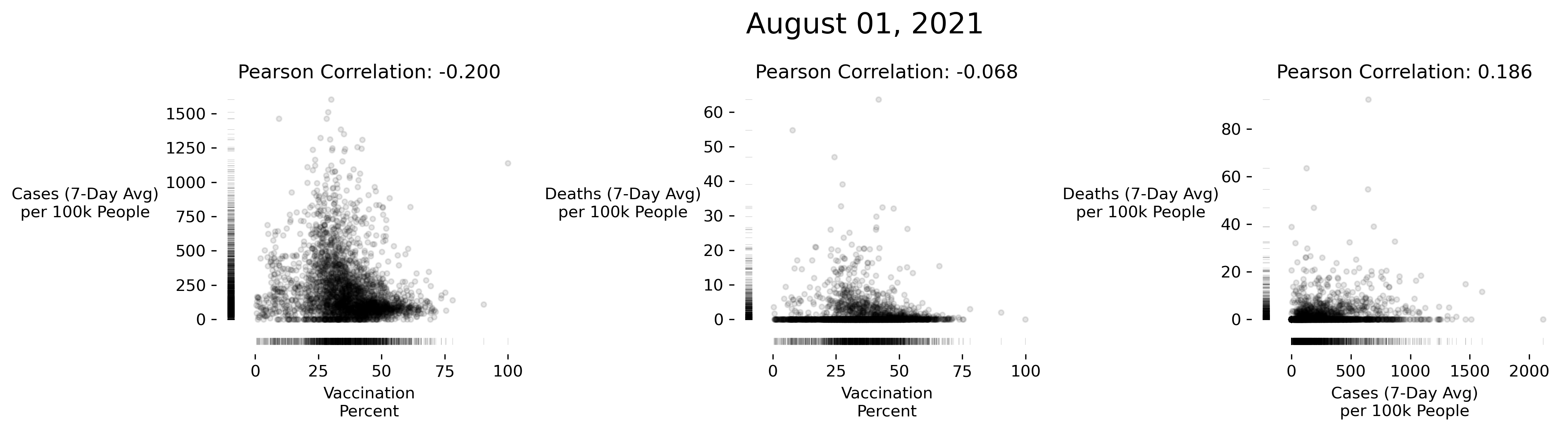
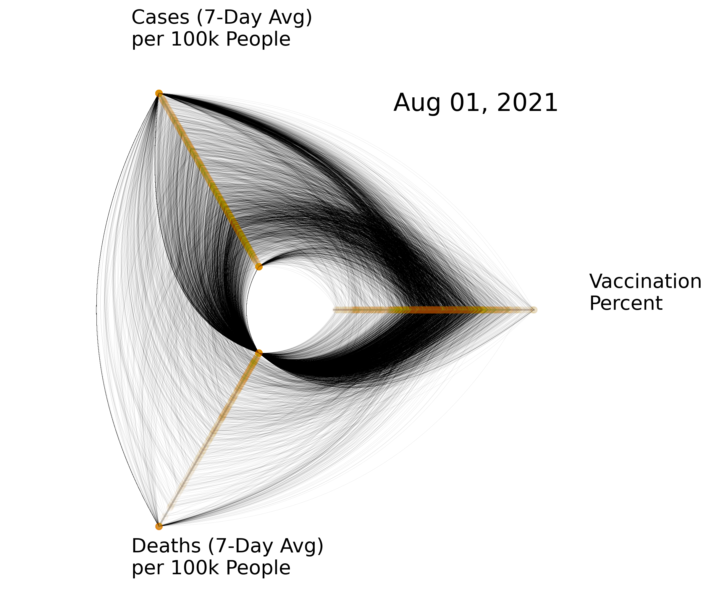
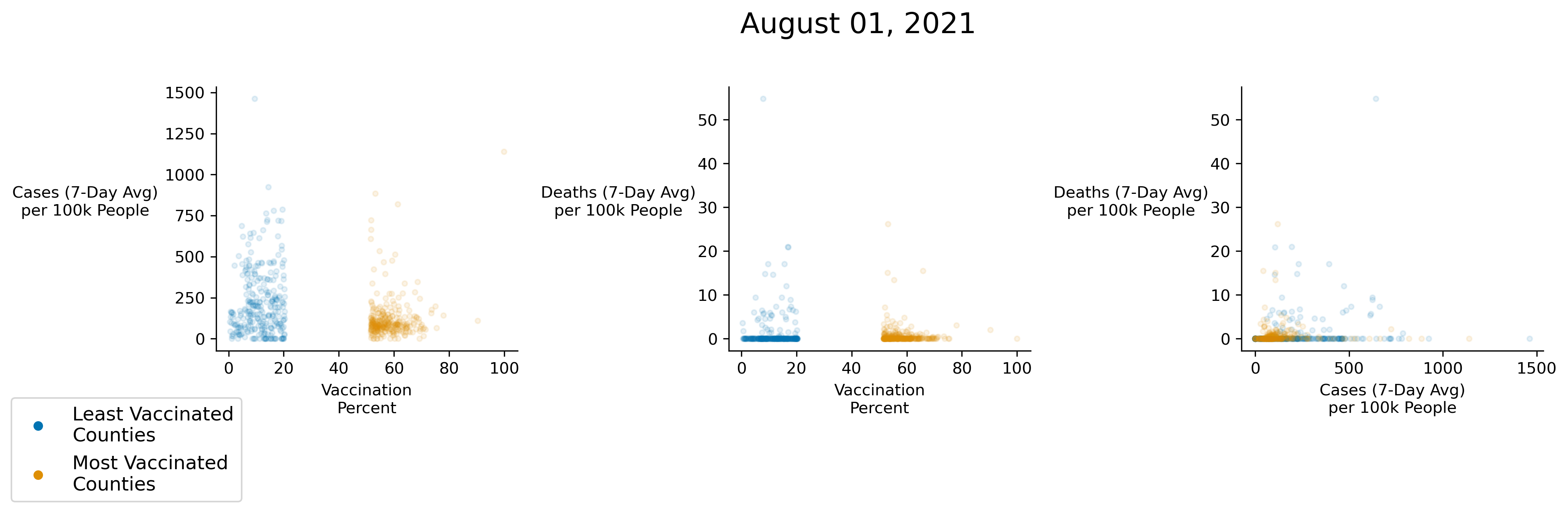
Next, we considered two different forms of comparison of the same data—bivariate Dot-Dash Plots and a P2CP—in Figure 12. Perhaps the greatest surprise from the Scatterplots upon first glance is the lack of any apparent strong relationship between deaths and vaccination rates, and unfortunately, the Scatterplots offer little suggestion of the next step in a visual exploration of these data. The P2CP, on the other hand, shows an intriguing heterogeneous relationship between deaths and vaccination rates reminiscent of the heterogeneous relationships considered in Figure 10, where one could see visually distinctive behavior within a subset of the data despite minimal overall correlation.
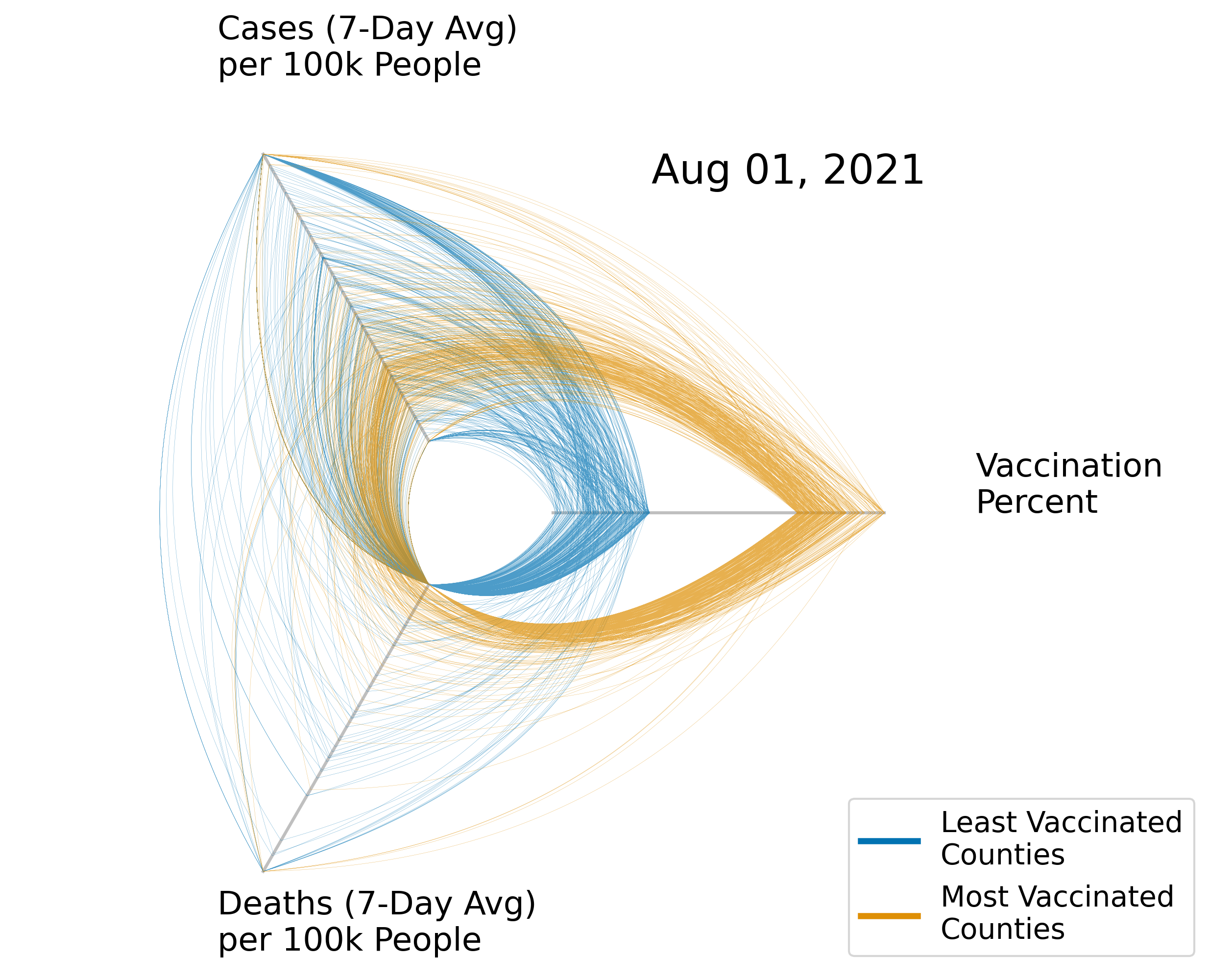
A natural starting point with heterogeneous behavior is to focus on just the extremes of a variable; to start, we will focus on the lowest and highest quantiles of vaccination percentage. In Figure 13, we replicate Figure 12, but we keep and color only the highest and lowest 10% of counties by vaccination percentage. Several interesting patterns can be seen in this figure. First, there is a clear divergence in common behavior between the groups in terms of case rates, with less-vaccinated counties seeing more cases in general, though it should be noted that highly-vaccinated counties also have counties with high case rates. Second, both groups have relatively low death rates, but the less-vaccinated counties have noticeably more outlier counties with high death rates. Finally, we can see a fairly heterogeneous relationship between cases and deaths among the less-vaccinated group of counties. Namely, there appear to be two relationships—many of the less-vaccinated counties seem to observe a fairly standard positive correlation between cases and deaths, whereas another subset are following the trend of the more-vaccinated counties, that is, maintaining a low death rate regardless of case rate. This might be indicative of an omitted variable dividing outcomes in the less-vaccinated group of counties.555Variable behavior could be the result of anything from heterogeneous spread of more-infectious variants to demographic conditions (e.g. average age, obesity rates, etc. in counties). Once again, though, our P2CP visualization suggests hypotheses worthy of further exploration that are not visually suggested by comparable Scatterplots.
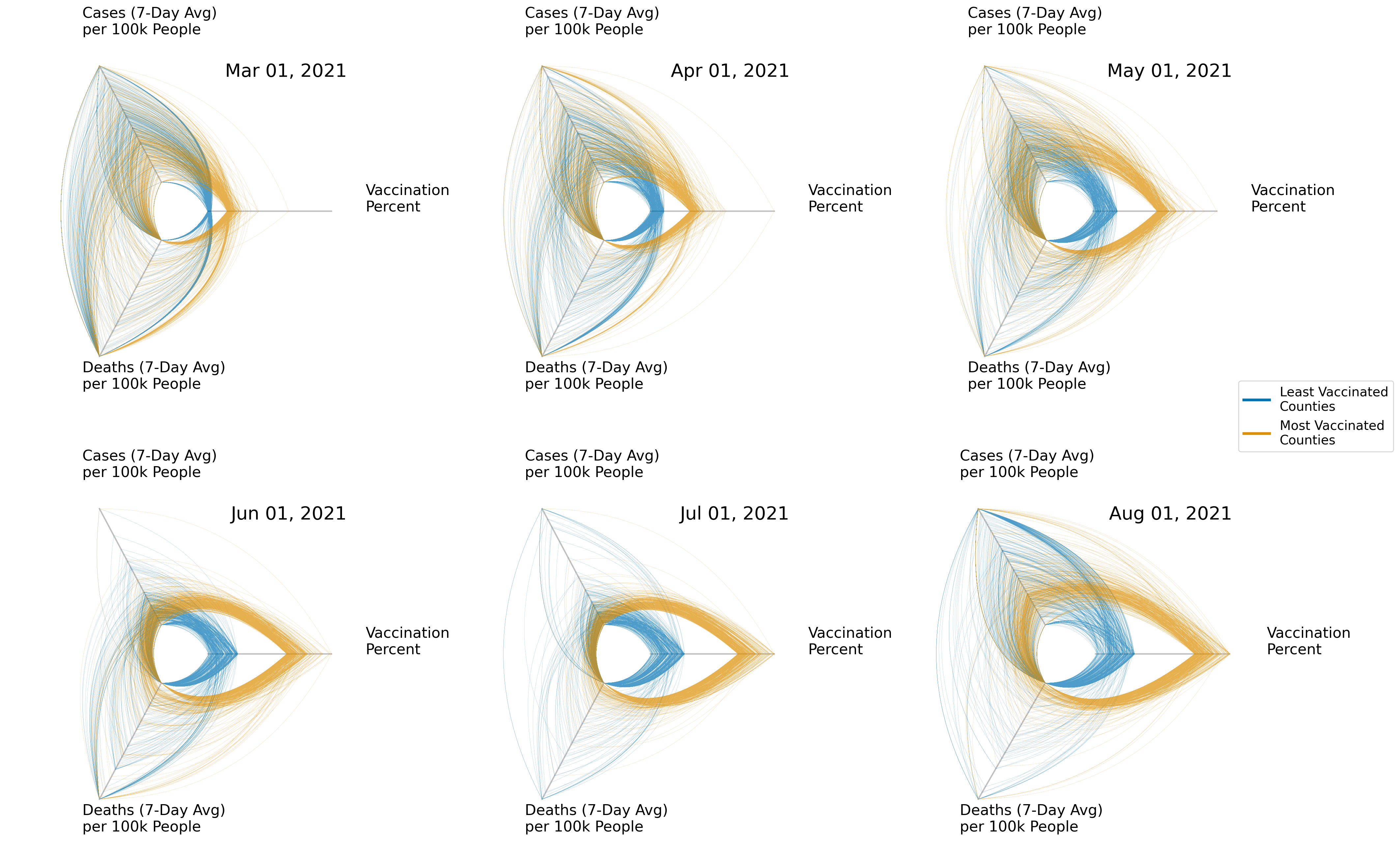
Taking advantage of the small multiples capability of P2CPs, we can look for trends in these observed behaviors over time. In Figure 14, we find that the trends and separations discussed in Figure 13 are steadily converged on over time. Furthermore, we are able to explore these trends looking at only six plots as opposed to the eighteen that would be required were we instead to look at bivariate Scatterplots.
6 Conclusion
When augmented with techniques from HP network visualizations, P2CPs offer a compact, interpretable means for multidimensional visualization in flatland that lends itself well to plotting with small multiples. By taking advantage of the unique properties of 3-axis P2CPs in particular, we can collapse 3-dimensional data into two dimensions without sacrificing the visualization of any variable interactions. P2CPs offer a particularly good means for the exploration of multivariate, heterogeneous correlations, which makes this visualization technique a strong tool when working with socioeconomic data. Finally, P2CPs encourage hypothesis generation, making them an excellent starting point when beginning to analyze a dataset.
Acknowledgments
This material is based upon work supported by the National Science Foundation under Grant No. 2029153. We are grateful to Tessa Johnson and Sam Voisin for technical discussion.
References
- [1] E. R. Tufte, Beautiful evidence, vol. 1. Graphics Press Cheshire, CT, 2006.
- [2] H. Chernoff, “The use of faces to represent points in k-dimensional space graphically,” Journal of the American statistical Association, vol. 68, no. 342, pp. 361–368, 1973.
- [3] M. d’Ocagne, Coordonnées parallèles et axiales: Méthode de transformation géométrique et procédé nouveau de calcul graphique déduits de la considération des coordonnées parallèles. Gauthier-Villars, 1885.
- [4] F. W. Hewes, H. Gannett, et al., “Scribner’s statistical atlas of the united states,” 1883.
- [5] A. Inselberg, “The plane with parallel coordinates,” The visual computer, vol. 1, no. 2, pp. 69–91, 1985.
- [6] J. Heinrich and D. Weiskopf, “State of the art of parallel coordinates.,” in Eurographics (State of the Art Reports), pp. 95–116, 2013.
- [7] G. Von Mayr, Die gesetzmässigkeit im gesellschaftsleben, vol. 23. De Gruyter Oldenbourg, 1877.
- [8] H. Siirtola, T. Laivo, T. Heimonen, and K.-J. Räihä, “Visual perception of parallel coordinate visualizations,” in 2009 13th International Conference Information Visualisation, pp. 3–9, IEEE, 2009.
- [9] M. Lanzenberger, S. Miksch, and M. Pohl, “Exploring highly structured data: a comparative study of stardinates and parallel coordinates,” in Ninth International Conference on Information Visualisation (IV’05), pp. 312–320, IEEE, 2005.
- [10] P. E. Hoffman, Table visualizations: a formal model and its applications. University of Massachusetts Lowell, 2000.
- [11] M. Lanzenberger, The interactive stardinates: an information visualization technique applied in a multiple view system. PhD thesis, 2003.
- [12] From Data to Viz, “The radar chart and it’s caveats.” https://www.data-to-viz.com/caveat/spider.html. Accessed: 2021-08-03.
- [13] M. Krzywinski, I. Birol, S. J. Jones, and M. A. Marra, “Hive plots—rational approach to visualizing networks,” Briefings in bioinformatics, vol. 13, no. 5, pp. 627–644, 2012.
- [14] J. Heinrich, Y. Luo, A. E. Kirkpatrick, H. Zhang, and D. Weiskopf, “Evaluation of a bundling technique for parallel coordinates,” arXiv preprint arXiv:1109.6073, 2011.
- [15] Z. Zhang, K. T. McDonnell, and K. Mueller, “A network-based interface for the exploration of high-dimensional data spaces,” in 2012 IEEE Pacific Visualization Symposium, pp. 17–24, IEEE, 2012.
- [16] C. B. Hurley and R. Oldford, “Pairwise display of high-dimensional information via eulerian tours and hamiltonian decompositions,” Journal of Computational and Graphical Statistics, vol. 19, no. 4, pp. 861–886, 2010.
- [17] E. Anderson, “The species problem in iris,” Annals of the Missouri Botanical Garden, vol. 23, no. 3, pp. 457–509, 1936.
- [18] R. A. Fisher, “The use of multiple measurements in taxonomic problems,” Annals of eugenics, vol. 7, no. 2, pp. 179–188, 1936.
- [19] J. Dietzsch, J. Heinrich, K. Nieselt, and D. Bartz, “Spray: A visual analytics approach for gene expression data,” in 2009 IEEE Symposium on Visual Analytics Science and Technology, pp. 179–186, IEEE, 2009.
- [20] J. Johansson, P. Ljung, and M. Cooper, “Depth cues and density in temporal parallel coordinates.,” in EuroVis, vol. 7, pp. 35–42, Citeseer, 2007.
- [21] N. Barlow and L. J. Stuart, “Animator: A tool for the animation of parallel coordinates,” in Proceedings. Eighth International Conference on Information Visualisation, 2004. IV 2004., pp. 725–730, IEEE, 2004.
- [22] R. Theron, “Visual analytics of paleoceanographic conditions.,” in IEEE VAST, pp. 19–26, Citeseer, 2006.
- [23] United States Bureau of Labor Statistics, “Labor force data by county, annual averages.” https://www.bls.gov/lau/#cntyaa. Accessed: 2021-08-25.
- [24] United States Census Bureau, “Saipe state and county estimates.” https://www.census.gov/programs-surveys/saipe.html. Accessed: 2021-08-25.
- [25] J. Li, J.-B. Martens, and J. J. Van Wijk, “Judging correlation from scatterplots and parallel coordinate plots,” Information Visualization, vol. 9, no. 1, pp. 13–30, 2010.
- [26] J. Johansson, C. Forsell, M. Lind, and M. Cooper, “Perceiving patterns in parallel coordinates: determining thresholds for identification of relationships,” Information Visualization, vol. 7, no. 2, pp. 152–162, 2008.
- [27] X. Kuang, H. Zhang, S. Zhao, and M. J. McGuffin, “Tracing tuples across dimensions: A comparison of scatterplots and parallel coordinate plots,” in Computer Graphics Forum, vol. 31, pp. 1365–1374, Wiley Online Library, 2012.
- [28] E. Tufte, “The visual display of quantitative information,” 2001.
- [29] Centers for Disease Control, “Covid-19 vaccinations in the united states, county.” https://data.cdc.gov. Accessed: 2021-08-08.
- [30] J. M. Clarke, A. Majeed, and T. Beaney, “Measuring the impact of covid-19,” 2021.
Appendix