1199 \vgtccategoryResearch \vgtcpapertypetheory/model \authorfooter Zehua Zeng is with University of Maryland. E-mail: zhzeng@umd.edu. Phoebe Moh is with University of Maryland. E-mail: pmoh@umd.edu. Fan Du is with Adobe Research. Email: fdu@adobe.com. Jane Hoffswell is with Adobe Research. Email: jhoffs@adobe.com. Tak Yeon Lee is with KAIST, work performed while at Adobe Research. Email: takyeonlee@kaist.ac.kr. Sana Malik is with Adobe Research. Email: sanmalik@adobe.com. Eunyee Koh is with Adobe Research. Email: eunyee@adobe.com. Leilani Battle is with University of Washington, work performed while at University of Maryland. E-mail: leibatt@uw.edu. \shortauthortitleBiv et al.: Global Illumination for Fun and Profit
An Evaluation-Focused Framework for Visualization Recommendation Algorithms
Abstract
Although we have seen a proliferation of algorithms for recommending visualizations, these algorithms are rarely compared with one another, making it difficult to ascertain which algorithm is best for a given visual analysis scenario. Though several formal frameworks have been proposed in response, we believe this issue persists because visualization recommendation algorithms are inadequately specified from an evaluation perspective. In this paper, we propose an evaluation-focused framework to contextualize and compare a broad range of visualization recommendation algorithms. We present the structure of our framework, where algorithms are specified using three components: (1) a graph representing the full space of possible visualization designs, (2) the method used to traverse the graph for potential candidates for recommendation, and (3) an oracle used to rank candidate designs. To demonstrate how our framework guides the formal comparison of algorithmic performance, we not only theoretically compare five existing representative recommendation algorithms, but also empirically compare four new algorithms generated based on our findings from the theoretical comparison. Our results show that these algorithms behave similarly in terms of user performance, highlighting the need for more rigorous formal comparisons of recommendation algorithms to further clarify their benefits in various analysis scenarios.
keywords:
Visualization Tools, Visualization Recommendation AlgorithmsIntroduction
The visualization community has developed a wide variety of systems for recommending how to visualize data [38]. The algorithms behind these systems aim to help users uncover meaningful insights in their data by automatically generating visualizations for analysts to explore. For example, Voyager [36, 37] encourages broad data exploration by recommending effective charts based on Mackinlay’s [24] design principles. VizDeck [17] and Foresight [7] recommend visualizations based on standard statistical characteristics of the dataset. SeeDB [30] recommends visualizations based on a self-defined criterion of statistical “interestingness”, or divergence of a sub-population from the whole.
While this panoply of recommendation algorithms provides many viable alternatives, it is unclear which algorithm should be prioritized for any given visualization scenario. In a review of existing evaluation practices, we find that many recommendation systems evaluate their recommendation algorithms in isolation [22], or construct benchmarks that their systems are already optimized for [24, 30, 36, 37]. Even evaluations that do compare different algorithms do not measure user performance [13, 21, 26]. In other words, our community tends to generate new visualization recommendation algorithms without giving commensurate thought on how to evaluate them. As a result, the visualization community lacks rigorous theoretical and empirical guidance for how and when to apply each of these algorithms effectively.
One way to address this is to develop a standardized framework for comparing different visualization recommendation algorithms. Given that the purpose of these algorithms is to help analysts visually explore their data, a standardized framework should enable us to directly compare algorithms based on how they impact a user’s performance for a variety of visual analysis tasks. The framework should also facilitate comparison of the algorithmic performance of the proposed approaches; for example, the framework should enable us to compare how each algorithm enumerates and traverses the design space of candidate visualizations in search of an optimal recommendation.
In this paper, we propose an evaluation-focused framework to enable more effective theoretical and empirical comparisons of visualization recommendation algorithms. Our framework is based on the central process connecting most if not all of these algorithms: to generate the “best” recommendations, an algorithm must be able to enumerate the space of possible visualization designs and rank this design space, often by approximating and comparing the utility of candidate visualizations. Our evaluation framework is defined through three major components: (1) a network representing the space of all possible visualization designs for a given dataset, where nodes are visualization designs and edges connect designs that differ by a single encoding or data transformation; (2) the method a recommendation algorithm uses to traverse the design space to enumerate candidate visualization designs; and (3) an oracle used to approximate and rank the value of candidate visualizations that are enumerated.
Existing frameworks such as CompassQL [35], ZQL [29], and Draco [26], focus on generating new visualization recommendation algorithms, rather than comparing algorithms. As a result, behavioral differences are not intuitively captured through these frameworks, making it difficult to reason about the differences in algorithmic performance. For example, it is not clear how one might cluster different recommendation algorithms based on their behavioral similarity. With our framework, these behavioral differences become obvious. For example, Voyager [36, 37] by default recommends visualizations which are one design or data transformation away from the current visualization, representing a narrow but efficient traversal of the visualization design space. In contrast, machine-learning-based algorithms enumerate and rank massive sub-spaces of visualization designs represented by the model’s input features [13, 22].
We demonstrate the generality and coverage provided by our framework by comparing the behavior of five visualization recommendation systems: Voyager [36, 37], DeepEye [22], Foresight [7], Show Me [25] and Dziban [21]. We also show how our framework clarifies gaps in the literature where new algorithms can be formed, simply by varying traversal method and oracle combinations. Using two common graph traversal methods, breadth-first search (BFS) and depth-first search (DFS), and the oracles for Voyager [36] and Dziban [21], we construct four recommendation algorithms: CompassQL+BFS (i.e., Voyager), CompassQL+DFS, Dziban+BFS, and Dziban+DFS. We then use our framework to design a user study to guide the empirical evaluation of these four visualization recommendation algorithms. Our results show that subjects did not perform significantly better with Dziban compared to CompassQL in focused-oriented tasks, however subjects did find Dziban’s recommendations to be more intuitive in post-task survey ratings. These findings reinforce our argument that we need more evaluation-focused frameworks to elucidate the benefits of existing recommendation algorithms in real-world visual analysis scenarios. All of our data and code are available online on OSF: https://osf.io/txqsu/.
1 Related Work
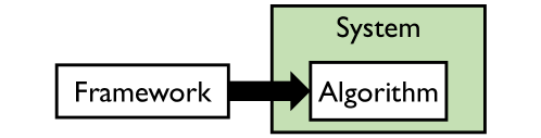
As illustrated in Fig. 1, users can only interact with visualization recommendation algorithms when provided with an interface, and often a full system through which to interact. Furthermore, several algorithms are specified using existing visualization recommendation frameworks, which often take the form of specialized languages. In this section, we discuss the relevant literature in specifying visualization recommendation algorithms, and evaluating both algorithms and systems.
1.1 Visualization Recommendation Algorithms
Existing recommendation algorithms can be separated into two main categories based on how the ranking engine (oracle) is implemented: rule-based or machine learning-based. Rule-based algorithms enumerate and then rank visualizations using heuristics based on theory or experimental findings in visual perception [36, 37, 25, 17, 7, 28, 9]. For example, theory work from Bertin [4] and Mackinlay [24] has been incorporated within rule-based algorithms behind a wide range of recommendation systems, including Voyager [36, 37] and Show Me [25]. Other recommendation systems, such as VizDeck [17] and Foresight [7] rank visualizations using manually-selected statistical rules.
Instead of ranking visualizations with manually-derived rules, other algorithms train machine learning models to generate recommendations [13, 22, 8, 26, 5, 32]. For example, Hu et al. [13] trained a deep learning model to learn the most common visualization designs from a large corpus of data sets and their associated Plotly visualizations. One of the Draco applications developed by Moritz et al. [26], Draco-Learn, was implemented by training models to learn effectiveness criteria from previous experimental findings. Luo et al. [22] strive to balance the best of both strategies by combining deep learning with hand-written rules to generate recommendations.
Our framework provides a means of comparing these different ranking strategies, or oracles, in a systematic and repeatable manner.
1.2 Visualization Recommendation Frameworks
Several frameworks have been proposed to make it easier to create new visualization recommendation algorithms. CompassQL [35] is a query language created by Wongsuphasawat et al., which can produce different types of recommendation algorithms by varying phases of the recommendation process, such as enumerating, choosing, and ranking. For example, the visualization recommendation algorithm in Voyager [36, 37] is implemented with CompassQL. ZQL [29] is another query language that serves a similar purpose for visualization recommendation in the Zenvisage system. Draco [26] is an alternative framework for specifying visualization recommendation algorithms based on answer set programming. Using Draco, one can specify new algorithms using a combination of encoding constraints and weights for these constraints. In this way, Draco enables the creation of new recommendation algorithms, without the creator having to worry about how to enumerate the underlying visualization design space.
To evaluate recommendation algorithms, we need to know not only the constraints imposed by the algorithms (the focus of current frameworks), but also the strategies employed to apply these constraints. Furthermore, we need to know what the differences are between strategies in order to reason about how they impact the performance of the system running algorithm and the decisions of users who view the recommendations. In contrast, our framework gives a clear definition of the visualization design space and considers an algorithm’s traversal method through enumeration, which makes the enumeration process comparable.
1.3 Evaluating Visualization Recommendation Algorithms
Evaluation is crucial since it actually helps users explore their data more effectively. However, not all algorithms are evaluated in terms of how they improve user exploration performance. For example, Foresight [7] only provides some usage scenarios to demonstrate its efficacy. On the other hand, although some existing systems do empirically evaluate user performance, the proposed algorithms are evaluated in isolation. For instance, Voyager [36, 37] and SeeDB [30] were compared to a baseline with no recommendations provided. VizDeck [17] claimed that tasks with higher accuracy and less time compared to IBM ManyEyes [31], Google Fusion Tables [10], and Tableau [33]. However, none of the compared systems provide recommendations.
Even when multiple algorithms are compared in the literature, is still not the focus. Dziban [21] was evaluated by calculating the ranking of its recommended visualizations in both Draco [26] and GraphScape [19] algorithms to check whether it provides a favorable tradeoff in terms of effectiveness and similarity. On the other hand, DeepEye [22] was tested by ground-truth data, which was derived by having students to label whether a visualization is good or bad. Similarly, VizML [13] was compared with CompassQL [35], DeepEye [22], ShowMe [25] and Data2Vis [8] using an effectiveness score which was calculated based on human-labeled data. However, human-perceptually “good” visualizations do not necessarily help the actual analysis process. Since tasks are not taken into account in the labelling process, there exists no evidence of whether these benchmark results can carry over into the actual human performance with higher level analysis tasks.
2 Evaluation Framework
In this section, we describe our framework, which is based on the general recommendation process followed by the majority of visualization recommendation algorithms: enumerate, search, and rank. To demonstrate how our framework can be applied, we compare five existing representative visualization recommendation systems: Voyager [36, 37], DeepEye [22], Foresight [7], Show Me [25] and Dziban [21].
2.1 Defining the Core Components of the Framework
Visualization recommendation algorithms are a form of search algorithm, which generally follow two basic steps: traverse candidates within the larger search space, and evaluate these candidates against specific search criteria. In the case of visualization recommendation, the traversal step involves enumerating the visualization design space, and the evaluation step requires ranking the candidate visualizations for the subsequent recommendation. However, before an algorithm can enumerate candidate visualizations, the visualization design space must first be clearly defined. In this section, we define the visualization design space, as well as the enumeration and ranking steps.
2.1.1 Defining the Visualization Design Space
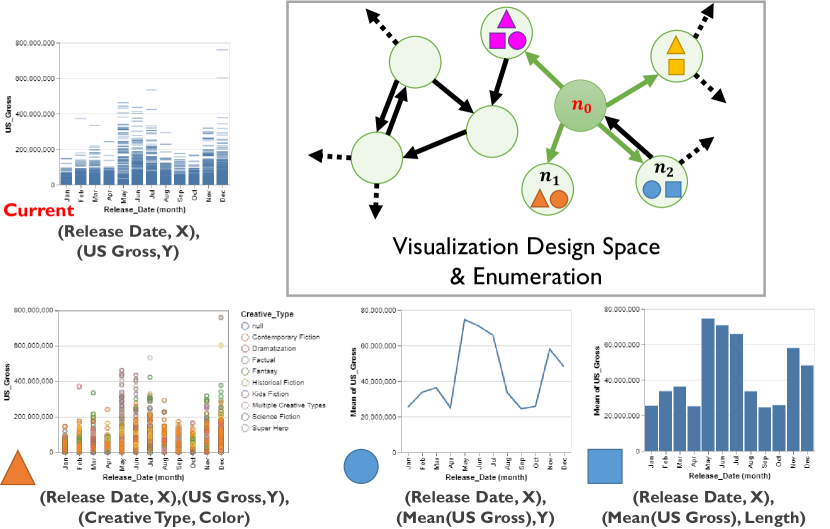
To facilitate comparison, we must first establish a consistent definition of the visualization design space that can be applied to a wide range of algorithms. which is defined as the combination of data attributes, encoding channels, and data transformations that can be applied to a given dataset. By leveraging this full design space, individual algorithms can be compared in terms of the particular subspaces they traverse.
Tracking Visualization Designs Within the Design Space Graph.
Suppose we are generating recommendations for a movies dataset , containing attributes , such as movie title, creative type, gross, release date, etc. There are possible transformations ; each transformation has a set of parameters to determine how it can be applied to the data. For example, one possible data transformation is calculating the average of movie gross: AVG(), which is parameterized by only one attribute. On the other hand, there also exist possible encoding channels which are used to visualize the combination of attribute and data transformation, such as, the 13 encoding channels proposed by Mackinlay [24]. We represent the visualization design space for this dataset as a network graph . Each node of the graph contains visualizations which are defined by a set of data attributes (, , etc.), data transformations (, , etc.), and encoding channels (, , etc.):
| (1) |
Here, , etc. are attributes from , and , etc. are data transformations operated on attributes , etc., while , etc. are encoding channels used to visualize the combination of , etc. is a visualization defined by the attribute set and its corresponding data transformations and encoding channels . Edges between each pair of nodes represent operations that transform one node to another, such as adding one attribute, or changing the data transformation or encoding channel of an attribute.
2.1.2 Defining Sub-spaces for Different Types of Algorithms
To more efficiently navigate the visualization design space, recommendation algorithms can merge multiple visualizations into one node, or even ignore nodes, reducing the total edges that needed to be traversed. We discuss how different algorithms manipulate the visualization design space, based on the three types of recommendation algorithms proposed by Wongsuphasawat et al. [35]: algorithms suggesting what attributes and/or transformations to visualize (data query recommendations), what encoding channels to apply to selected data (visual encoding recommendations), or both (hybrid recommendations).
Visual Encoding Recommendations.
These algorithms focus on enumerating and ranking variations in encoding choices (e.g., Show Me [25]), requiring access to attribute, transformation, and encoding information. However, to reduce the cost of enumerating the visualization design space, these algorithms often require the user to select what attributes and transformations to visualize in advance. In this way, all nodes that include attributes can be ignored. We can represent this subspace in the following way:
| (2) |
Data Query Recommendations.
These algorithms tend to focus on recommending attributes and/or transformations, and ignore encoding channels (e.g., Foresight [7] and SeeDB [30]). To ignore design variation, we can merge all visualizations that vary only by encodings into one node (i.e., remove all encoding channel specifiers ):
| (3) |
Hybrid Recommendations.
These algorithms consider variations in attributes, transformations, and encoding channels (e.g., Voyager [36, 37]). As a result, the full expressiveness of the visualization design space graph is required. However, enumerating all possible combinations of attributes, transformations, and encoding channels can be prohibitively expensive. In the next section, we discuss how algorithms efficiently enumerate candidate visualizations within this space of possible visualization designs.
2.1.3 Defining the Enumeration Step
Given a formal definition of the visualization search space , search algorithms must then traverse this space to identify qualified candidate results. The result of the enumeration step is a list of candidates that match the input requirements, which are then passed to the ranking step. However, the full visualization design space is an exponential function of attributes , transformations , and encoding channels , making it prohibitively large to search in its entirety. As a result, visualization recommendation algorithms must address a trade-off between recommendation breadth and execution cost, where higher quality results can be achieved by enumerating and ranking more of the visualization design space, but performing this additional work increases the algorithm’s execution time.
Input Nodes to the Enumeration Step.
In response to this tradeoff, recommendation algorithms generally enumerate visualizations based on one or more reference nodes, often the nodes that contain the user’s current selected attributes or visualization, or auto-generated reference nodes derived from simple heuristics. For example, Voyager [36, 37] uses the node that contains the user’s current visualization as a reference (denoted as ), otherwise Voyager generates univariate visualizations by default.
Applying Constraints to Bound the Number of Candidate Nodes.
by imposing strict manual constraints on what parts of the space can be traversed. The most common constraints limit either the maximum path length that can be explored from some reference node , or the maximum number of inputs within a candidate node. Using our design space notation from 2.1, we can represent all nodes with a maximum path length of 2 from as:
| (4) |
and nodes comprised of visualizations () with at most two inputs as:
| (5) |
For example, Voyager [36, 37] only considers nodes that differ from the user’s current visualization by at most one attribute or data transformation, i.e., by setting the path length threshold to one for Eq. 4. This example is illustrated in Fig. 2. DeepEye [22] only outputs two-attribute visualizations, i.e., by setting in Eq. 5. DeepEye also limits data transformation choices to three types (aggregating, binning and sorting), and encoding choices to one of four basic visualization types (bar, pie, line, scatterplot), i.e., by setting and .
Navigating the Bounded Design Space to Enumerate Candidates.
Once the constraints of the traversal are established, then algorithms must select a method for enumerating specific designs within this bounded space. Given one or more reference nodes, there are three basic approaches to the enumeration process:
-
•
a random traversal, such as by listing random combinations of valid attributes, transformations, and/or encoding channels;
-
•
a tree-oriented traversal, such as breadth-first or depth-first search along , originating at ;
-
•
a cluster-oriented traversal, where nodes are clustered by pre-defined criteria, and clusters closest to are prioritized.
We see that these traversal strategies lead to varying degrees of depth and breadth in the coverage of the design space. For example, random and cluster-oriented traversals can cover a broader range of , but at the risk of having few nodes explored close to the user’s current visualization . In contrast, tree-oriented traversals will have dense coverage near , but may have little or no coverage elsewhere in .
Note also that this traversal process need not take place all at once. For example, in the case of algorithms that rely on machine learning models, enumeration may happen both in the training phase (random traversal of training inputs) as well as in the prediction phase (cluster-oriented traversal within the model structure).
2.1.4 Defining the Ranking Step
Given the candidates generated by the enumeration step, the purpose of the ranking step is to order these candidates in terms of how closely they match a set of pre-defined search criteria. In the case of visualization recommendation algorithms, the search criteria represent the quality and relevance of the candidate visualization. We use “oracle” to refer to the part of the algorithm that assesses candidate quality and relevance.
Oracle Inputs & Structure.
Oracles often take as input the user’s recent history of visualizations created and interactions performed, as well as statistics about the current dataset. Using these inputs, oracles typically compute one or more scoring features and rank enumerated candidates using a weighted function of these features, or a model. Feature weights for the model can be represented mathematically, such as by assigning numerical weights to calculated heuristics to produce a single score [21, 36, 37], as well as procedurally, such as through ordered pruning rules to eliminate low-quality candidates [22]. There are three types of models that oracles often use to rank candidates: behavioral models, statistical models, and machine learning models.
Behavioral models.
These models are generally represented as manual heuristics derived from user studies and/or field observations. For example, APT [24], Draco-APT [26], Show Me [25], and Voyager [36, 37] are based in part on manually-derived best practices, particularly for enhancing visual perception. In another example, the BDVR algorithm [11] compares the user’s most recent interactions to the four most common interaction patterns observed with the HARVEST system. The BDVR algorithm then ranks visualizations based on whether they would be produced by the closest matching patterns.
Statistical models.
These models often use a pre-defined set of aggregate statistics to compare candidates [7, 17, 30]. For example, Foresight [7] analyzes the dataset to be visualized for statistical properties selected by the user, such as skew, outliers, and linear relationships, and scores candidate visualizations according to these features.
Machine Learning models.
These models take large corpora of existing user data as input to an offline training phase [26]. During the training phase, these models generally cluster similar visualization designs, and develop hierarchical data structures to efficiently index into these clusters. Recent approaches use deep learning models to avoid the need for feature engineering prior to training [22, 13, 8].
Hybrid models.
2.2 Comparing Existing Algorithms Using the Framework


Using the three main components of our framework, we can evaluate a wide range of visualization recommendation algorithms. We demonstrate the flexibility of our framework by analyzing algorithms from five existing works: Voyager [36, 37], DeepEye [22], Foresight [7], Show Me [25] and Dziban [21]. We compare the high-level intuition behind the enumeration strategies in Fig. 3, and the enumeration constraints in Table 1. We selected these five algorithms because they cover all three types of recommendation algorithms proposed by Wongsuphasawat et al. [35], and their results can be generalized to many other systems. For instance, Show Me [25] uses a visual encoding recommendation algorithm. Foresight uses a query recommendation algorithm that is similar to other query recommendation algorithms (e.g., VizDeck [17]). DeepEye uses a hybrid algorithm that is machine learning based [22]. Other machine learning approaches are similar to DeepEye, differing primarily by model type or input data used for training [13, 26].
| Algorithms | # of Attributes | Transformations | Encodings |
| Voyager, Dziban, | |||
| Show Me | N/A | aggregation, binning, sorting | position, length, area, shape, color |
| \rowcolor [HTML]ededed Foresight | N/A | position, length | |
| DeepEye | aggregation, binning, sorting | position, length, area |
Show Me [25].
As discussed in subsubsection 2.1.2, Show Me recommends visual encodings based on user-specified attributes and data transformations. By assuming the attributes and transformations are fixed, Show Me can enumerate and rank all relevant nodes that vary only by visual encodings (see Eq. 2).
Voyager [36, 37].
Voyager applies tree-oriented enumeration with an aggressively bounded search space in terms of attributes. As mentioned in 2.1.3, Voyager uses the user’s current visualization to generate relevant charts with a maximum path length constraint of one (see 3(a)). Constraining the attribute space allows Voyager to enumerate more encoding channels than other algorithms, as shown in Table 1. The Voyager oracle applies Mackinlay’s effectiveness rules [24].
Dziban [21].
Dziban is a visualization recommendation API that uses Draco [26] as the implementation base. Dziban contains a hybrid visualization recommendation algorithm that builds on the GraphScape [19] and Voyager [36, 37] oracles. Given a user’s prior query, Dziban can recommend new transformations and encoding channels, however, it does not recommend new attributes to visualize. Dziban prioritizes perceptually similar visualizations in its ranking step.
Foresight [7].
The Foresight system ranks visualizations based on “insight” scores derived from user-selected statistical features or data attributes. Foresight enumerates all possible pairings of data attributes, as well as all individual attributes, but restricts the final visualizations to either a bar chart, a box plot, or a scatterplot. Thus, Foresight performs a full attribute enumeration within a bounded search space.
DeepEye [22].
Although DeepEye can be extended to support different numbers of attributes, the paper focuses on enumerating visualizations with two attributes and at most three data transformations (see Table 1). DeepEye supports four visualization types: bar, pie, line, and scatter. Though the DeepEye authors describe their enumeration method in terms of trees, when compared using our evaluation framework, DeepEye actually performs cluster-oriented enumeration. The oracle ranks visualization candidates using both hand-written rules from visualization experts, and a suite of binary classifiers trained using visualization preference data collected from user studies. Note that the hand-written rules are used as heuristics to prune the search space, interleaving the enumeration and ranking steps.
Comparing Algorithms in Terms of Enumeration Trade-Offs.
We see wide variation in the depth and breadth of design space coverage in Fig. 3, and also in the enumeration constraints in Table 1. For example, near the user’s current visualization, represented in black in 3(a), but Voyager leaves much of the visualization design space unexplored. However, Voyager enumerates more encoding channels compared to other algorithms, as shown in Table 1. Dziban does not enumerate attributes, limiting its search space to transformations and encoding channel variations only; in return, Dziban can also enumerate a larger range of encoding channels. Show Me takes this restriction one step further by only enumerating and ranking variations in encoding channels, enabling broad and deep coverage of the encoding space, but virtually no coverage of the attribute and transformation space.
In comparison, we see in 3(b) that Foresight enumerates all attribute combinations within its bounded search space, providing both broader and deeper coverage of attributes. However as a trade-off, we see in Table 1 that Foresight severely limits the space of encoding channels that may be enumerated. We see that DeepEye makes a similar tradeoff to Foresight. In 3(c), we see that DeepEye’s cluster-oriented enumeration approach provides greater enumeration depth than both Voyager and Foresight, but it also lacks thorough coverage of attributes (and transformations) across the bounded search space. However, the cost of this increased attribute/transformation enumeration depth is reduced encoding channel coverage, as shown in Table 1.
Comparing Algorithms in Terms of Ranking Trade-Offs.
Three of the four algorithms we compare utilize behavioral ranking models (Voyager, Dziban, DeepEye). These behavior-based heuristics are fast to apply to visualization candidates, but can take significant effort to derive on account of having to conduct user studies and/or field studies beforehand to collect the data [27]. Even when the data is collected, significant manual effort may also be required to hand-tune the resulting models [36, 37, 21]. This issue of effort is also observed for machine-learning models, such as in the case of DeepEye, which required extensive data collection to train its machine-learning oracle. In the case of Voyager and Dziban, existing heuristics, algorithms, and user study data were used to develop the oracles, which can help reduce the burden of training and tuning new models. Foresight’s oracle requires no training since it relies on a pre-defined set of statistics. However, Foresight must calculate these statistics for all enumerated attribute combinations, making its execution more expensive. Foresight uses statistical sketches to reduce the processing time.
Once these algorithms are finally trained and tuned, a natural question is: which algorithm provides the best recommendations for a given visualization task? Though this question could be evaluated theoretically, existing approaches often use a somewhat reductive approach of approximating users’ analytic performance through low-level perceptual heuristics (e.g., [22, 21]). Perception is only one component of a user’s analytic performance and is a poor approximation of user performance in higher-level visual analysis tasks, such as prediction or exploration [3]. Instead, we argue for an empirical evaluation approach that is more task-sensitive. To compare the quality of generated recommendations, we provide a demonstration of using our framework to empirically evaluate different algorithms in the following sections.
3 Benchmarking Recommendation Algorithms
We show that our framework could compare a wide range of existing visualization recommendation algorithms theoretically in the previous section. Whereas in this section, we show how our framework could guide the empirical comparison of various recommendation algorithms.
3.1 Algorithms for Standardized Evaluation
Existing recommendation algorithms either have no interface presented [13, 21, 26] or the systems built on the top of them utilize different interface designs [7, 17, 22, 30, 36, 37, 14], which makes it hard to conduct a standardized evaluation. Moreover, various systems allow different kinds of user input, which brings even more difficulties to the evaluation and comparison. For instance, the majority of systems allow selected data fields as input [7, 17, 22, 36, 37, 14], while some also allow inputting statistical features [7], or visualization types [17].
Thus, to standardize the benchmark of different recommendation algorithms, we implement an interface to wrap around algorithms that are generated by applying the enumeration approach and oracle behind existing recommendations. In this paper, by varying the traversal method and the oracle, we come up with four new visualization recommendation algorithms to evaluate. The graph traversal method would be either BFS or DFS, and the oracles are CompassQL [35] and Dziban [21]. Both BFS and DFS are tree-oriented traversal methods. While BFS enumerates with a maximum path length of one, DFS enumerates along the path until the current node or the space boundary is reached. The CompassQL version that we use is the same as the one behind the Voyager [36, 37] systems, which ranks visualizations by effectiveness. On the other hand, Dziban is built on the top of Draco [26] and GraphScape [19], which takes both effectiveness and perceptual distance into consideration while ranking visualizations.
algorithms is not publicly accessible [7, 17, 22, 13]. Moreover, by adding the ranking strategy of GraphScape [19] to optimize the perceptual distance, Dziban [21] claims to provide a considerable benefit Draco-CQL [26], which is a re-implementation version of CompassQL [35]. benchmark these two ranking engines to see whether there exists a significant improvement user performance. The visualization design space is the same for all algorithms, where each node contains visualizations with the same , and each edge represents or removing one data attribute. We only consider visualizations with 3 data attributes or less, thus no attribute can be removed from a univariate chart, and no attribute can be added to a three-attribute chart. Oracles would need to make other data variation decisions, like whether to add data transformations (binning or aggregating), as well as design variation decisions, like applying which visual encoding for each attribute.
3.2 Interface Design
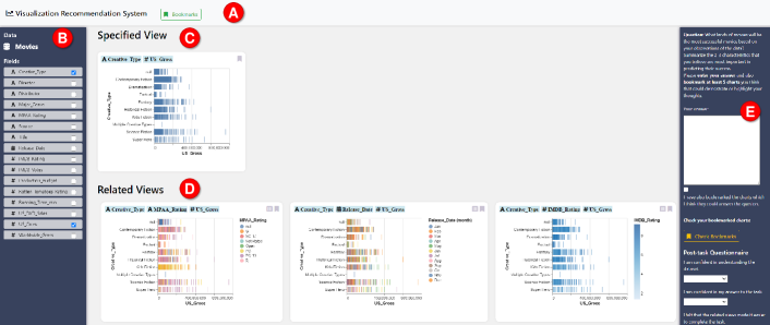
Fig. 4 shows the interface for evaluating the set of new visualization recommendation algorithms, which consists of a top panel, a data panel (left), a visualization gallery (middle), and a task panel (right). Our interface design is inspired by the Voyager systems [36, 37]. Since we focus on evaluating the recommendation quality of each algorithm, limited interactions are allowed in the interface, such as selecting attributes, bookmarking or specifying a chart, and also hovering over a chart to check the value of a particular data point.
The Top Panel (A).
By clicking the button in the top panel, a bookmark gallery of visualizations saved by the user pops up. Participants are encouraged to bookmark charts that could answer the question during the user study.
The Data Panel (B).
It shows the name of the current dataset and presents a list of all data fields within the dataset. The list is grouped by the data type and then ordered by the variable name alphabetically. For each variable, it shows the data type icon, the variable name and then a checkbox representing whether the variable is included in the specified view. Users can click on the checkbox to include or exclude an attribute from the specified view (C). The related views (D) will provide different recommendations based on the current specification.
The Visualization Gallery (C & D).
It consists of two views: the specified view (C) and the related views (D). Each chart contains a label on the top-left corner showing which data attributes are visualized in the chart, and a bookmark button (\faBookmarkO) on the top-right corner, which triggers whether the bookmark gallery includes or excludes the chart.
The specified view (C) is the best chart recommendation for the currently selected variables. The related views show recommended charts by the current recommendation algorithm based on the specified view. When no data field is selected, the related views show univariate visualizations. By default, the related views display the top five recommended charts based on the specified view, if users want to explore more, they can click on the Load More button (\faSpinner Load More) to view additional recommendations. The list button (\faListAlt) on each chart in the related views allows users to update the specified view and display new recommendations from this starting point ().
The Task Panel (E).
It consists of (1) the current task description, (2) an input area for users to answer the question, (3) a checkbox for users to self-check if they bookmarked charts that could help answer the question, (4) a button to revisit the bookmark gallery, (5) the post-task questionnaire, and (6) a submit button to navigate to the next step. When participants click on the submit button, the answer of the task, the specifications of the bookmarked charts, the response of the post-task questionnaire, and also the interaction log will be sent to the server.
3.3 Study Design
The study followed a 4 (recommendation algorithms) 2 (dataset) mixed design, thus in total there are 8 designs. We utilized a between-subjects study design; each participant only conducted one analysis session, with a random combination of recommendation algorithm and dataset. All participants completed the study remotely.
Visualization Tools.
The different visualizations in the specified and related views.
Datasets.
We utilized two Voyager [36] datasets for the evaluation: movies and birdstrikes. The movies111https://github.com/vega/vega-datasets/blob/master/data/movies.json dataset contains 3,201 records and 15 attributes (7 nominal, 1 temporal, 8 quantitative). The birdstrikes222https://github.com/vega/vega-datasets/blob/master/data/birdstrikes.csv dataset is a redacted version of FAA wildlife airplane strike records with 10,000 records and 14 attributes (9 nominal, 1 temporal, 4 quantitative).
Participants.
We recruited nine subjects for each condition, for a total of 72 participants (23 female, 49 male), all of whom successfully completed the study and were included in our . All participants claimed to have proficient computer skills and prior experience using at least one of the following or similar tools/programming languages: Excel, Tableau, Voyager, Python/matplotlib, R/ggplot, D3. We recruited participants from both academia and industry. Of the 72 participants, 40 were students while 32 were professional participants from the industry. We compensated participants with a $10 Amazon gift certificate.
Study Protocol.
Each participant completed a 60-minute online session, consisting of: (1) study overview and consent form; (2) a demographic survey; (3) 10-min tutorial and demo with a dataset distinct from those used for the actual analysis sections; (4) 40-minute analysis block with one study design; and (5) the exit-survey. During the study session, participants were asked to complete four analysis tasks, two focused and two open-ended (see Table 2). After each task, participants were asked to reflect on their experience using the recommendation tool to complete the task in a short post-task questionnaire with a symmetric 5-point scale, from strongly disagree (-2) to strongly agree (+2):
-
•
Confidence in Understanding Data: I am confident in understanding the dataset.
-
•
Confidence in Answer: I am confident in my answer to the task.
-
•
Efficiency: related views made it easier to explore the .
-
•
Ease of Use: related views were easy to understand.
-
•
Utility: related views were useful for completing the task.
-
•
Overall: I would use this for similar tasks in the future.
a survey to the recommender. The following questions were :
-
•
What are the advantages and disadvantages of the tool?
-
•
Do you have any other comments on the recommendation system?
| Task ID | Task Prompt |
| T1 (Find Extremum) | Which creative type has the maximum number of movies based on Book/Short Story (Source)? |
| \rowcolor[HTML]ededed T2 (Retrieve Value) | Among Disney Ride (Source) movies, what is the running time (mins) of the highest Worldwide grossing movie? |
| T3 (Prediction) | What kinds of movies will be the most successful movies based on your observations of the data? Summarize the 2-3 characteristics that you believe are most important in predicting their success. |
| \rowcolor[HTML]ededed T4 (Exploration) | Feel free to explore any and all aspects of the data for up to [15 mins]. Use the bookmark features to save any interesting patterns, trends or other insights worth sharing with colleagues. |
Tasks.
We designed four visual analytics tasks (see Table 2) for each dataset based on prior studies of data analysis [2, 3, 36, 37]. These four tasks cover all three analysis task classes discussed by Battle et al. [2]: quantitative, qualitative, and exploratory. T1 and T2 are focused tasks; T1 involves two data attributes, while T2 involves three data attributes. T1 asks participants to find the extremum, which is a qualitative task, while T2 asks participants to retrieve a specific value from a subset of the data, which is a quantitative task. Both T3 and T4 are exploratory tasks. T3 provides a particular direction for the data exploration, while T4 asks participants to freely explore the dataset.
Collected Data.
Since the user study was conducted remotely, for each task, we collected participants’ (1) answers, (2) bookmarked charts, (3) interaction logs, and (4) responses of post-task questionnaires. We also obtained comments from the exit-study survey.
Pre-registration.
We pre-registered the conditions, measurements, analysis (using Bayesian regression models to test if there is a significant difference in the stated measurements), and data collection criteria on the website AsPredicted333https://aspredicted.org/blind.php?x=2vi5tq before collecting any data.
4 Benchmark Results
We obtained 72 valid study results which passed the exclusion criteria in our pre-registration. We also had a pilot study with five , where we derived the informative priors for our quantitative analysis.
We now present the analysis of study results, focusing on the accuracy and completion time of focused-tasks, user interaction activities during open-ended tasks, post-task questionnaire responses, and qualitative feedback. For quantitative analyses, we adopted Bayesian models to estimate the 95% credible interval (CI) for each parameter. Since the data type of our collected data varies, we had to apply various Bayesian regression models. We used the logistic regression for analyzing the accuracy, the linear regression for the completion time and interaction logs, and the ordinal regression for post-task questionnaire responses. We chose Bayesian models because they allow us to draw more reasonable conclusions about the true values of our parameters from small-n studies than the null hypothesis significant testing (NHST). The Bayesian 95% credible interval represents the interval that we are 95% sure contains the true value, which is different from the NHST confidence interval. We provide our experiment code, data collected for both experiments, and analysis scripts as supplemental materials in the OSF repository.
4.1 Focused Tasks
We use accuracy and completion time as the two metrics to evaluate and compare the empirical utility of the four recommendation algorithms in supporting focus-oriented analysis.
4.1.1 Accuracy
To analyze task accuracy, we trained a Bayesian logistic regression model for the two focused tasks to model the probability of a correct answer given an oracle and graph traversal combination.
that CompassQL+DFS and Dziban+BFS higher accuracy than Dziban+DFS, while CompassQL+BFS to have the lowest accuracy rate. However, since all of the 95% CIs overlap, we cannot make a formal conclusion about which algorithm significantly better in the accuracy of focused tasks.
4.1.2 Completion Time
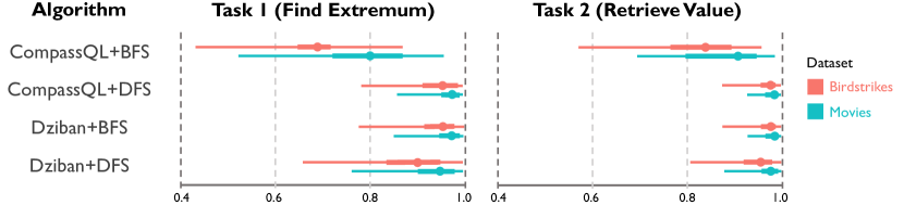
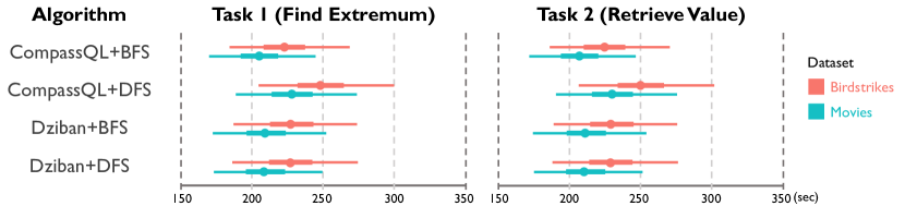
We derived a weakly informative prior on completion times in seconds from the pilot study: N(). As shown in Fig. 6, all 95% CIs overlap with each other, thus we cannot conclude which recommendation algorithm a significant effect on the completion time of focused tasks. However, it is interesting to see that while participants spent the most time with CompassQL+DFS, the accuracy with CompassQL+DFS was the highest. This relationship could imply that the longer time that participants spent in the task led to a higher accuracy. Although not , it generally takes less time for participants to complete tasks with the Movies dataset than the Birdstrikes one. On the other hand, the accuracy with the Movies dataset is also slightly higher. This finding is reasonable, since people are more familiar with Movies data than Birdstrikes data in real life.
In summary, since all 95% CIs overlap in both the accuracy and the completion time analysis, we conclude for preciseness and decisiveness that the four new recommendation algorithms have no significant impact on the performance of participants in focused tasks.
4.2 Open-ended Tasks
To evaluate the utility of different algorithms for supporting open-ended tasks, we analyze the interaction logs from the user study. Since the user study was conducted remotely, we lack eye-tracking data to show which visualizations users were attending to. Taking inspiration from Voyager [36, 37], we analyze the number of unique variable sets shown on screen to assess which recommendation algorithm provides broader data exploration during the open-ended tasks. Moreover, we extend the analysis to the number of unique visual designs. Unlike the variable set which only considers the combination of data fields, the visual design takes data transformations and visual encodings into account. Since each edge in the visualization design space only represents the attribute modification, and oracles need to make choices for data transformations and encoding channels, it would be interesting to see whether the oracle would provide different visualization designs from the same node while the reference node () is different.
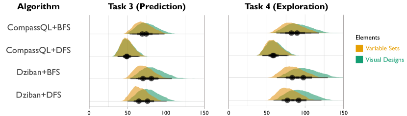
4.2.1 Exposed Variable Sets & Visual Designs
On the other hand, we also see that Dziban exposed more numbers of visual designs than variable sets, so did BFS, which means Dziban and BFS recommended more design variants with the same variable sets, while CompassQL+DFS seemed to only recommend roughly one visual design for each variable set. We also find that participants exposed to slightly more unique variable sets and visual designs in the exploration task than in the prediction task, which is reasonable since the exploration task encourages participants to explore the dataset freely while the prediction task restrains a direction for the data exploration.
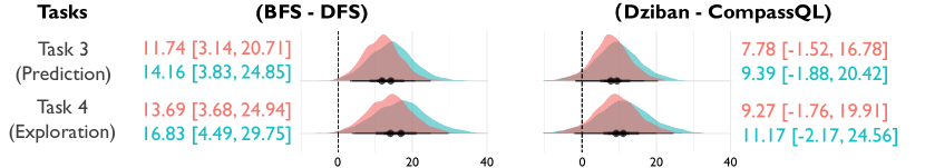
To check the significance, we also run a Bayesian linear regression model on the exposure difference between BFS and DFS, as well as the difference between Dziban and CompassQL, as shown in Fig. 8.
From 8(a) we can see that there is a significant difference in the average number of exposed variable sets between the two traversal methods, BFS and DFS. In the prediction task, BFS exposed significantly more variable sets with both the Birdstrikes dataset () and the Movies dataset (). We also find a similar pattern of the exposure difference in the exploration task that BFS exposed significantly more variable sets than DFS. However, since the 95% CIs overlap with the auxiliary line at 0, we cannot conclude that Dziban exposed significantly more unique variable sets than CompassQL.
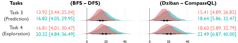
On the other hand, in terms of the number of visual designs, we find a significant difference between both traversal methods and between both oracles (8(b)). BFS exposed significantly more visual designs with both the Birdstrikes dataset () and the Movies dataset () in the prediction task, while in the exploration task, BFS exposed () more with the Birdstrikes dataset and () more visualizations with the Movies dataset. A similar pattern of the exposure difference is also found between the two oracles. Dziban exposed significantly more visual designs than CompassQL with both the Movies and the Birdstrikes dataset in both tasks. It is interesting to see that although Dziban did not expose significantly more unique variable sets, it exposed significantly more unique visual designs than CompassQL, which means Dziban tends to recommend more design variants than data variants (as shown in Fig. 7).
4.2.2 Interacted Variable Sets & Visual Designs
We also analyze the number of unique variable sets and visual designs that participants interacted with during the open-ended tasks. We include interactions like specifying (\faListAlt), bookmarking (\faBookmarkO), and mouse-hovering for more than half a second. From Fig. 9 we do not see much difference in the number of interacted variable sets and visual designs among different recommendation algorithms. It seems that participants interacted with more visual designs than variable sets with BFS, which means that BFS provides more interesting design variants that participants would like to interact with. On the other hand, the number of unique variable sets and visual designs are about the same with DFS. In other words, DFS did not expose as many interesting design variants as BFS (Fig. 7).
4.3 Post-task Questionnaires
We used the Bayesian ordinal regression model to analyze the user responses from the post-task questionnaires. Since we used a symmetric 5-point scale (-2 strongly disagree, +2 strongly agree) in the post-task questionnaire, our prior on user score of (range ) is expressed as a normal distribution .
4.3.1 Confidence Rating
In the post-task questionnaire, we asked participants to rate their confidence in understanding data, and also in their answers.
Confidence in Understanding data.
As shown in Fig. 10, BFS performed slightly better than DFS on users’ confidence in understanding data. also had a higher confidence rating than CompassQL.
Confidence in Answer.
On the other hand, BFS performed slightly worse than DFS on users’ confidence in their answers. However, the Dziban oracle still had a slightly higher rating than CompassQL.
In summary, we don’t see much difference in users’ confidence ratings between the two traversal methods, BFS and DFS.
4.3.2 Recommendation Algorithm Preference
We also asked participants to rate the related views in different aspects: efficiency, ease of use, utility, and overall (Fig. 11).
Efficiency.
In terms of the efficiency rating, BFS received a significantly higher rating than DFS. However, although Dziban received a slightly better rating than CompassQL, we cannot conclude that a significant difference exists between the two oracles in the efficiency experience since the 95% CIs overlap with the line at 0.
Ease of Use.
Similar to the efficiency rating, BFS performed significantly better than DFS with respect to the ease of use. However, there is no evidence supporting that Dziban performed significantly better than CompassQL in terms of the ease of use.
Utility.
Both 95% CIs overlap with the auxiliary line at 0, thus we cannot conclude which traversal method or oracle is significantly better than the other one, although we can see that BFS and Dziban have slightly higher utility ratings than DFS and CompassQL respectively.
Overall.
Similar to the utility, since both 95% CIs overlap with the line at 0, users did not significantly prefer one traversal method or oracle over the other one.
In summary, we see some significant differences in the user preference between the two traversal methods. In particular, participants significantly preferred BFS in the efficiency and ease of use experience. Although not significantly, we still can see that Dziban received a slightly higher rating in each experience compared to CompassQL.
4.4 Participant Feedback
DFS is not preferred for focused tasks.
Participants dislike DFS for focused tasks since the recommended charts could have more fields added compared to the current specified chart. One participant found that “The recommendations were useful but most of the time distractive and too many for answering specific questions.” Another said that “When I checked one attribute, the recommendation charts always include three attributes. I would prefer if it was only two factors for the first two [focused] tasks.” However, when it comes to open-ended tasks, participants had a different point of view in terms of the DFS traversal method; one participant mentioned that “This tool is good for exploring the data, especially it is the first time seeing (the data).”
Dziban is preferred as an oracle.
Since Dziban takes the perceptual distance from the current chart into account, the behavior makes more sense to participants when they explore the related views. One participant commented on CompassQL that “(I am) unsure if there is any logic on the recommended charts, sometimes they are completely useless and just layer on another random metric or dimension”. Another participant also pointed out that “The recommendations (from CompassQL) were often ineffective and created out of unrelated fields”. When it came to the recommendations from Dziban, participants provided more positive feedback. One said that “The tool helps explore datasets and provides useful recommendations in terms of related measures and dimensions to enable getting useful insights.” Another participant also commented that “For the most part, the tool added fields that made sense to include in addition to the original choices.”
Both oracles need to be improved.
Overall, we got positive feedback about the recommended charts, however, we also found some comments about the disadvantages of both oracles. The most common issue for CompassQL is it recommends scatterplots a lot since it only emphasizes effectiveness and when it comes to three attributes, it picks area or color as the third encodings, which sometimes confuses participants. One commented that “I didn’t understand the shaded circle. I guess it could be there are various different values that are big and small.” In terms of color encoding, one participant commented that “(It seems to be) often picking categories to represent color where there were so many colors as to make them all meaningless”, and another pointed out that “Colors did not seem related to essential data.” On the other hand, Dziban also considers the perceptual distance thus it tends to recommend charts that look similar to the original one but does not consider the effectiveness enough, like using text as a mark type in a scatterplot. A participant commented on Dziban that “Don’t recommend views where a text value would dominate the visualization.” to address these problems would be including more hand-tuned constraints, such as not using to visualize more than a certain number of categories, not using area encoding when the overlapping exists, and not using text as a mark type to visualize long content.
5 Discussion & Future Work
In this paper, we presented an evaluation-focused framework that can describe many existing visualization recommendation algorithms, and showed how our framework could guide the theoretical and empirical comparison of such algorithms. We conclude this paper with a discussion of guidelines for new recommendation algorithms, key benchmarking takeaways, limitations, and opportunities for future work.
5.1 The Framework As Guidelines
We now discuss how our framework could serve as a guideline not only for the future construction of recommendation algorithms but also for benchmarking a larger range of existing recommendation systems.
5.1.1 For Future Recommendation Algorithms
Our framework consists of three major components: (1) the visualization design space, (2) the traversal method, and (3) the oracle. While constructing new recommendation algorithms, one should think about whether any of the components in the algorithm is new to the community. For example, does my visualization design space contain more (meaningful) visual designs than other existing automated systems? Is my algorithm using a new way to traverse the visualization space which could help the actual analysis? Is there a new creative ranking strategy that has not been covered by the existing literature? On the other hand, thinking about different combinations of the three components is another creative opportunity for constructing new recommendation algorithms. Among the new algorithms evaluated in this work, CompassQL+DFS, Dziban+BFS and Dziban+DFS have not previously been proposed to the community, although the ranking engines (CompassQL and Dziban) have been researched as key contributions in this space.
5.1.2 For Benchmarking Various Automated Systems
Although we did not benchmark existing automated systems since they leverage different interfaces and have limited code availability, our user study design still provides an at-a-glance overview of how our framework could be used to guide the evaluation and comparison of various automated systems. Without a standardized interface design and style of user inputs, it is difficult to compare multiple recommendation algorithms. By leveraging our framework, one could compartmentalize the three main components of the algorithm and test them within our standardized interface. For instance, one of our proposed algorithms, CompassQL+BFS utilizes the same idea of the graph traversal method and the ranking engine behind the Voyager systems. In such a way, our framework could not only evaluate the recommendation algorithm as a whole but also compare different components. As shown in the previous section (Sect. 4), our results not only show which algorithm performed better but also which traversal method or oracle was preferred.
5.2 Takeaways from Benchmarking
From Sect. 4, we can see that there is actually no significant difference between recommendation algorithms in the participants’ performance with focused tasks. On the other hand, for open-ended tasks, we find that BFS exposed significantly more unique variable sets and visual designs than DFS, while Dziban exposed significantly more unique visual designs than CompassQL, but not variable sets. However, when it comes to interacted variable sets and visual designs, we do not see any significant difference between BFS and DFS traversal methods and between Dziban and CompassQL oracles. This finding raises an important point: significantly more exposure does not necessarily lead to significantly more interactions. When designing a new visualization recommendation algorithm, exposing more data variants and design variants is a good trend. However, if more exposure does not lead to more interactions, the resulting recommendations may lack the right level of “interestingness” for a worthwhile data exploration experience.
On the other hand, in terms of participants’ preferences, we do find that participants significantly prefer BFS over DFS in the utility and ease of use ratings. Participants also prefer Dziban rather than CompassQL in all metrics (efficiency, utility, ease of use, and overall), although the rating difference is not significant. Participants’ post-study feedback also reveals their preference for Dziban as an oracle. Since Dziban takes the perceptual distance into account, participants could better understand why such visualizations are recommended.
As we mentioned before, Dziban is an improved version of Draco-CQL (a re-implementation of CompassQL), which takes the perceptual distance into account. However, we do not find a significant difference in the user performance between Dziban and CompassQL in focused-tasks, and the only significant improvement in open-ended tasks is that more visual designs are exposed (but not necessarily interacted with) While the Dziban paper did present a comparison with Draco-CQL and GraphScape, it did not consider the user performance. Based on their benchmark results, they claimed that Dziban provides a considerable benefit by suggesting charts that are effective, but also perceptually closed to the current one. Nevertheless, without a framework to evaluate and compare the user performance between algorithms, we do not know whether the benefit would carry over into the actual analysis process.
From another perspective, we also find that users’ preferences change with different analysis tasks, which implies that it is hard for a single algorithm to perform well across all tasks. When designing a new recommendation algorithm, one should think about which type of task to prioritize based on the expected goals of the intended users. Alternatively, the recommendation system could switch to different algorithms depending on the particular task that users want to accomplish.
5.3 Limitations & Future Work
Given the necessary level of visualization and analysis expertise for our participants, our recruitment protocol could not leverage standard crowdsourcing platforms, which limited the number of participants that we could feasibly recruit. As a result, we limited our evaluation to two traversal methods and two existing ranking engines, CompassQL and Dziban. However, it would be exciting to involve other promising traversal methods and oracles in future evaluations.
Given the current COVID-19 restrictions, the entire study was conducted remotely, which made it difficult to fairly perform a longer study session (like the 2-hour session in Voyager’s evaluation [36, 37]). Therefore, we took a step back and chose the between-subjects study design, where each participant was exposed to only one recommendation algorithm. However, the result would be more accurate and comparable if we could have conducted a within-subjects study.
As the study session length is limited, we could only pick a small number of visual analytics tasks to evaluate the user performance, while there exists a larger group of analysis activities in real-life practice [16, 1]. Moreover, our benchmark results imply that analysts prefer different algorithms for different analysis tasks. Thus, one of the promising future work directions would be to include more analysis tasks into the benchmarking to better understand how different algorithms affect the user performance in various analysis tasks.
In this work, we focused on researching how different recommendation algorithms would affect the performance, behavior, and preference of participants, thus we only included limited interactions in our interface design. However, from the post-study interviews, we find that participants would like to see the interface include more robust functionality, like filtering or supporting user-specified aggregations. It would be interesting to see how the participant performance, particularly when interacting with charts, changes with those extra features, and whether such features would significantly affect the overall study results. Since the source code for our empirical evaluation is publicly accessible, it would be easier to accomplish the aforesaid incremental evaluations.
Acknowledgements.
The authors wish to thank the HCIL, the BAD Lab, and our paper reviewers for their thoughtful feedback. This work was supported in part by NSF award IIS-1850115 and an Adobe Research Award.References
- [1] R. Amar, J. Eagan, and J. Stasko. Low-level components of analytic activity in information visualization. In Proceedings of the Proceedings of the 2005 IEEE Symposium on Information Visualization, INFOVIS ’05, p. 15. IEEE Computer Society, USA, 2005. doi: 10 . 1109/INFOVIS . 2005 . 24
- [2] L. Battle, P. Eichmann, M. Angelini, T. Catarci, G. Santucci, Y. Zheng, C. Binnig, J.-D. Fekete, and D. Moritz. Database benchmarking for supporting real-time interactive querying of large data. pp. 1571–1587, 06 2020. doi: 10 . 1145/3318464 . 3389732
- [3] L. Battle and J. Heer. Characterizing exploratory visual analysis: A literature review and evaluation of analytic provenance in Tableau. In Computer Graphics Forum, vol. 38, pp. 145–159. Wiley Online Library, 2019.
- [4] J. Bertin. Semiology of Graphics. University of Wisconsin Press, 1983.
- [5] Y.-R. Cao, J.-Y. Pan, and W.-C. Lin. User-Oriented Generation of Contextual Visualization Sequences, p. 1–8. Association for Computing Machinery, New York, NY, USA, 2020.
- [6] A. D. de Groot. The meaning of “significance” for different types of research [translated and annotated by eric-jan wagenmakers, denny borsboom, josine verfhagen, rogier kievit, marjan bakker, angelique cramer, dora matzke, don mellenbergh, and han lj van der maas]. Acta Psychologica, 148:188–194, 2014. doi: 10 . 1016/j . actpsy . 2014 . 02 . 001
- [7] Ç. Demiralp, P. J. Haas, S. Parthasarathy, and T. Pedapati. Foresight: Recommending visual insights. Proc. VLDB Endow., 10(12):1937–1940, Aug. 2017. doi: 10 . 14778/3137765 . 3137813
- [8] V. Dibia and Ç. Demiralp. Data2vis: Automatic generation of data visualizations using sequence-to-sequence recurrent neural networks. IEEE Comput. Graph. Appl., 39(5):33–46, Sept. 2019. doi: 10 . 1109/MCG . 2019 . 2924636
- [9] H. Ehsan, M. A. Sharaf, and P. K. Chrysanthis. MuVE: Efficient multi-objective view recommendation for visual data exploration. In 32nd IEEE International Conference on Data Engineering, ICDE 2016, Helsinki, Finland, May 16-20, 2016, pp. 731–742. IEEE Computer Society, 2016. doi: 10 . 1109/ICDE . 2016 . 7498285
- [10] H. Gonzalez, A. Halevy, C. S. Jensen, A. Langen, J. Madhavan, R. Shapley, and W. Shen. Google fusion tables: Data management, integration and collaboration in the cloud. In Proceedings of the 1st ACM Symposium on Cloud Computing, SoCC ’10, p. 175–180. Association for Computing Machinery, New York, NY, USA, 2010. doi: 10 . 1145/1807128 . 1807158
- [11] D. Gotz and Z. Wen. Behavior-driven visualization recommendation. In Proceedings of the 14th International Conference on Intelligent User Interfaces, IUI ’09, p. 315–324. Association for Computing Machinery, New York, NY, USA, 2009. doi: 10 . 1145/1502650 . 1502695
- [12] J. Heer, J. Mackinlay, C. Stolte, and M. Agrawala. Graphical histories for visualization: Supporting analysis, communication, and evaluation. IEEE Transactions on Visualization and Computer Graphics, 14(6):1189–1196, 2008.
- [13] K. Hu, M. Bakker, S. Li, T. Kraska, and C. Hidalgo. VizML: A machine learning approach to visualization recommendation. In Proceedings of the 2019 CHI Conference on Human Factors in Computing Systems, pp. 1–12, 2019.
- [14] K. Hu, D. Orghian, and C. Hidalgo. DIVE: A mixed-initiative system supporting integrated data exploration workflows. In Proceedings of the Workshop on Human-In-the-Loop Data Analytics, HILDA’18. Association for Computing Machinery, New York, NY, USA, 2018. doi: 10 . 1145/3209900 . 3209910
- [15] T. j. Jankun-Kelly, K. Ma, and M. Gertz. A model and framework for visualization exploration. IEEE Transactions on Visualization and Computer Graphics, 13(2):357–369, 2007.
- [16] S. Kandel, A. Paepcke, J. M. Hellerstein, and J. Heer. Enterprise data analysis and visualization: An interview study. IEEE Transactions on Visualization and Computer Graphics, 18(12):2917–2926, 2012. doi: 10 . 1109/TVCG . 2012 . 219
- [17] A. Key, B. Howe, D. Perry, and C. Aragon. VizDeck: Self-organizing dashboards for visual analytics. In Proceedings of the 2012 ACM SIGMOD International Conference on Management of Data, SIGMOD ’12, p. 681–684. Association for Computing Machinery, New York, NY, USA, 2012. doi: 10 . 1145/2213836 . 2213931
- [18] Y. Kim and J. Heer. Assessing effects of task and data distribution on the effectiveness of visual encodings. In Computer Graphics Forum, vol. 37, pp. 157–167. Wiley Online Library, 2018.
- [19] Y. Kim, K. Wongsuphasawat, J. Hullman, and J. Heer. GraphScape: A model for automated reasoning about visualization similarity and sequencing. In Proceedings of the 2017 CHI Conference on Human Factors in Computing Systems, CHI ’17, p. 2628–2638. Association for Computing Machinery, New York, NY, USA, 2017. doi: 10 . 1145/3025453 . 3025866
- [20] D. Lakens. The value of preregistration for psychological science: A conceptual analysis. Japanese Psychological Review, 62(3):221–230, 2019.
- [21] H. Lin, D. Moritz, and J. Heer. Dziban: Balancing agency & automation in visualization design via anchored recommendations. In Proceedings of the 2020 CHI Conference on Human Factors in Computing Systems, CHI ’20, p. 1–12. Association for Computing Machinery, New York, NY, USA, 2020. doi: 10 . 1145/3313831 . 3376880
- [22] Y. Luo, X. Qin, N. Tang, and G. Li. DeepEye: Towards automatic data visualization. In 2018 IEEE 34th International Conference on Data Engineering (ICDE), pp. 101–112, April 2018. doi: 10 . 1109/ICDE . 2018 . 00019
- [23] K.-L. Ma. Image graphs - a novel approach to visual data exploration. In Proceedings of the 10th IEEE Visualization 1999 Conference (VIS ’99), VISUALIZATION ’99. IEEE Computer Society, USA, 1999.
- [24] J. Mackinlay. Automating the design of graphical presentations of relational information. ACM Trans. Graph., 5(2):110–141, Apr. 1986. doi: 10 . 1145/22949 . 22950
- [25] J. Mackinlay, P. Hanrahan, and C. Stolte. Show Me: Automatic presentation for visual analysis. IEEE Transactions on Visualization and Computer Graphics, 13(6):1137–1144, Nov. 2007. doi: 10 . 1109/TVCG . 2007 . 70594
- [26] D. Moritz, C. Wang, G. L. Nelson, H. Lin, A. M. Smith, B. Howe, and J. Heer. Formalizing visualization design knowledge as constraints: Actionable and extensible models in Draco. IEEE Transactions on Visualization and Computer Graphics, 25(1):438–448, Jan. 2019. doi: 10 . 1109/TVCG . 2018 . 2865240
- [27] B. Saket, D. Moritz, H. Lin, V. Dibia, Ç. Demiralp, and J. Heer. Beyond heuristics: Learning visualization design. CoRR, abs/1807.06641, 2018.
- [28] J. Seo and B. Shneiderman. A rank-by-feature framework for interactive exploration of multidimensional data. Information Visualization, 4:96–113, 05 2005. doi: 10 . 1057/palgrave . ivs . 9500091
- [29] T. Siddiqui, J. Lee, A. Kim, E. Xue, X. Yu, S. Zou, L. Guo, C. Liu, C. Wang, K. Karahalios, and A. G. Parameswaran. Fast-forwarding to desired visualizations with zenvisage. In CIDR, 2017.
- [30] M. Vartak, S. Rahman, S. Madden, A. Parameswaran, and N. Polyzotis. SeeDB: Efficient data-driven visualization recommendations to support visual analytics. Proc. VLDB Endow., 8(13):2182–2193, Sept. 2015. doi: 10 . 14778/2831360 . 2831371
- [31] F. B. Viegas, M. Wattenberg, F. van Ham, J. Kriss, and M. McKeon. ManyEyes: A site for visualization at internet scale. IEEE Transactions on Visualization and Computer Graphics, 13(6):1121–1128, Nov. 2007. doi: 10 . 1109/TVCG . 2007 . 70577
- [32] Y. Wang, Z. Sun, H. Zhang, W. Cui, K. Xu, X. Ma, and D. Zhang. DataShot: Automatic generation of fact sheets from tabular data. IEEE Transactions on Visualization and Computer Graphics, 26:895–905, 2020.
- [33] R. Wesley, M. Eldridge, and P. T. Terlecki. An analytic data engine for visualization in tableau. In Proceedings of the 2011 ACM SIGMOD International Conference on Management of Data, SIGMOD ’11, p. 1185–1194. Association for Computing Machinery, New York, NY, USA, 2011. doi: 10 . 1145/1989323 . 1989449
- [34] J. M. Wicherts, C. L. Veldkamp, H. E. Augusteijn, M. Bakker, R. Van Aert, and M. A. Van Assen. Degrees of freedom in planning, running, analyzing, and reporting psychological studies: A checklist to avoid p-hacking. Frontiers in Psychology, 7:1832, 2016. doi: 10 . 3389/fpsyg . 2016 . 01832
- [35] K. Wongsuphasawat, D. Moritz, A. Anand, J. Mackinlay, B. Howe, and J. Heer. Towards a general-purpose query language for visualization recommendation. In Proceedings of the Workshop on Human-In-the-Loop Data Analytics, HILDA ’16, pp. 4:1–4:6. ACM, New York, NY, USA, 2016. doi: 10 . 1145/2939502 . 2939506
- [36] K. Wongsuphasawat, D. Moritz, A. Anand, J. Mackinlay, B. Howe, and J. Heer. Voyager: Exploratory analysis via faceted browsing of visualization recommendations. IEEE Transactions on Visualization and Computer Graphics, 22(1):649–658, Jan 2016. doi: 10 . 1109/TVCG . 2015 . 2467191
- [37] K. Wongsuphasawat, Z. Qu, D. Moritz, R. Chang, F. Ouk, A. Anand, J. Mackinlay, B. Howe, and J. Heer. Voyager 2: Augmenting visual analysis with partial view specifications. In Proceedings of the 2017 CHI Conference on Human Factors in Computing Systems, CHI ’17, p. 2648–2659. Association for Computing Machinery, New York, NY, USA, 2017. doi: 10 . 1145/3025453 . 3025768
- [38] S. Zhu, G. Sun, Q. Jiang, M. Zha, and R. Liang. A survey on automatic infographics and visualization recommendations. Visual Informatics, 4, 08 2020. doi: 10 . 1016/j . visinf . 2020 . 07 . 002