A Review and Collation of Graphical Perception Knowledge for Visualization Recommendation
Abstract.
Selecting appropriate visual encodings is critical to designing effective visualization recommendation systems, yet few findings from graphical perception are typically applied within these systems. We observe two significant limitations in translating graphical perception knowledge into actionable visualization recommendation rules/constraints: inconsistent reporting of findings and a lack of shared data across studies. How can we translate the graphical perception literature into a knowledge base for visualization recommendation? We present a review of 59 papers that study user perception and performance across ten visual analysis tasks. Through this study, we contribute a JSON dataset that collates existing theoretical and experimental knowledge and summarizes key study outcomes in graphical perception. We illustrate how this dataset can inform automated encoding decisions with three representative visualization recommendation systems. Based on our findings, we highlight open challenges and opportunities for the community in collating graphical perception knowledge for a range of visualization recommendation scenarios.
1. Introduction
Certain graphical perception results have had a tremendous influence on the design of visualization recommendation systems. For example, Wongsuphasawat et al. (Wongsuphasawat et al., 2016, 2017) leverage theoretical breakthroughs from Bertin (Bertin, 1983) and Mackinlay (Mackinlay, 1986) in the development of the Voyager system. Similarly, Moritz et al. (Moritz et al., 2019) leverage empirical findings from Cleveland and McGill (Cleveland and McGill, 1984) and Kim and Heer (Kim and Heer, 2018) in the development of the Draco recommendation framework. However, we observe many more graphical perception studies that are never considered in the design of visualization recommendation systems. For example, none of the visualization recommendation systems we observe (e.g., as summarized in current surveys (Zhu et al., 2020; Shen et al., 5555; Zeng et al., 2022; Wang et al., 2022; Wu et al., 2022)) use guidelines from more than three graphical perception studies to guide their encoding decisions. Some visualization recommendation systems do not reference any graphical perception studies at all to inform their designs (e.g., (Demiralp et al., 2017; Key et al., 2012; Vartak et al., 2015)). We posit that visualization recommendation algorithms could be further enhanced if they could leverage more findings from the graphical perception literature.
Furthermore, we observe significant changes and contradictions in encoding guidelines as knowledge in graphical perception continues to evolve (Kosara, 2016). For example, Cleveland and McGill treated pie charts as primarily angle encodings (Cleveland and McGill, 1984); however, more recent work suggests that pie charts are perceived more as area encodings (Kosara, 2019a). Thus, if a visualization recommendation system only uses a few graphical perception papers to guide its selection of perceptually effective visualizations, it runs the risk of making outdated decisions, which could lead users to misinterpret the data. As a result, we argue that graphical perception is a necessary component of designing effective visualization recommendation algorithms.
Despite the importance of graphical perception in visualization recommendation, we observe that no current work establishes a pipeline for integrating graphical perception studies into the design of visualization recommendation algorithms. For example, we fail to find any papers that translate a large body of graphical perception literature into actionable design guidelines for visualization recommendation algorithms (Quadri and Rosen, 2022). Existing surveys either summarize existing graphical perception papers (Ware, 2012) or summarize the behavior of existing visualization recommendation systems (Zhu et al., 2020; Shen et al., 5555; Zeng et al., 2022) and ignore how one influences the other. Although existing visualization recommendation frameworks (Moritz et al., 2019; Wongsuphasawat et al., 2016; Siddiqui et al., 2016) enable modeling visualization design knowledge into developing new recommendation algorithms, users still need to translate existing graphical perception guidelines into rules/constraints that these algorithms can understand.
We observe two major barriers to translating graphical perception knowledge into actionable visualization design rules and constraints: inconsistent reporting of findings and a lack of shared data across graphical perception studies. To address this problem, one should ideally review the literature in graphical perception, identify which graphical perception studies are actually relevant to visualization recommendation algorithms, and finally synthesize findings from the relevant graphical perception studies in a format that can be integrated into visualization recommendation code.
In this paper, we survey existing graphical perception studies that compare and rank visualization designs by perceptual effectiveness under ten analysis tasks. We systematically document the visualization designs studied in each study and other factors influencing how visualization designs are compared, such as input data characteristics. Then, we summarize study outcomes at three levels—between encodings, within chart types, and between chart types—to synthesize concrete perception-driven design rules for generating effective visualization designs for specific data characteristics and analysis tasks. We illustrate how our results can be used to improve existing visualization recommendation systems with three representative systems as case studies: Foresight (Demiralp et al., 2017), Voyager (Wongsuphasawat et al., 2016, 2017) and Draco (Moritz et al., 2019). Furthermore, we share code to automatically translate graphical perception results into their corresponding Draco constraints. Finally, we discuss open challenges towards building a knowledge base in graphical perception for visualization recommendation, such as contradictory results and missing visualization design pairings in the literature.
In summary, we make the following contributions in this paper:
-
•
We review a broad range of the literature (59 papers) on visualization comparison and develop a schema to record the theoretical and experimental results of the comparisons made. The resulting dataset can be ingested into visualization recommendation algorithms to guide the recommendation process.
-
•
We summarize the major takeaways from graphical perception papers as concrete design guidelines to help visualization recommendation algorithms and even data analysts select optimal visualization designs.
-
•
We illustrate how our guidelines could be used to improve existing visualization recommendation systems and share code to translate findings from 30 graphical perception papers into their corresponding Draco (Moritz et al., 2019) constraints.
-
•
Finally, we suggest potential paths for future research to address observed challenges in graphical perception and visualization comparison.
All of our data are available online: https://github.com/Zehua-Zeng/graphical-perception-knowledge.
2. Related Work
In this section, we discuss existing works in graphical perception and visualization recommendation systems.
2.1. Graphical Perception Work
Many works investigate how to design effective visualizations. Theory works such as Bertin’s visual encoding principles (Bertin, 1983) and Mackinlay’s APT work (Mackinlay, 1986) have been highly influential in information visualization research. Cleveland & McGill (Cleveland and McGill, 1984) organized the encoding channels put forth by Bertin from least to most effective in terms of quantitative data and validated this ranking in part through graphical perception studies. Mackinlay (Mackinlay, 1986) later extended the ranking to include ordinal and nominal data in the APT system. Shneiderman (Shneiderman, 1996)’s task taxonomy then broadened Mackinlay’s work by including data types that were not covered in APT, such as multidimensional data, trees, and networks. The design principles proposed by Bertin, Cleveland & McGill, Mackinlay, and Shneiderman inform the structure of our framework, which focuses on organizing comparison among not only different visual encodings but also various visualization types.
Numerous later experiments build on these foundational theoretical works. For example, the experimental results of Cleveland & McGill were replicated and validated by Heer & Bostock (Heer and Bostock, 2010) through crowdsourcing of graphical perception experiments. Talbot et al. (Talbot et al., 2014) also designed four follow-up experiments on the perception of bar charts to further explore and explain Cleveland & McGill’s results. Their main goal was to understand how different bar chart designs impact analysis task performance. Kim et al. (Kim and Heer, 2018) discuss ways to evaluate the effectiveness of twelve 3-encoding visualization designs for different low-level tasks and dataset characteristics. Kosara (Kosara, 2019a) finds that pie charts may be perceived differently than initially hypothesized by Cleveland and McGill. Saket et al. (Saket et al., 2019) evaluate the effectiveness of basic visualization types for a specific set of analysis tasks.
2.2. Visualization Recommendation Systems
We provide a summary of visualization recommendation systems here and defer to existing surveys for more details (Zeng et al., 2022; Zhu et al., 2020; Wang et al., 2022; Wu et al., 2022). Existing visualization recommendation systems can be divided into two main categories according to their strategies to rank visualization designs: rule-based or machine learning-based (Hu et al., 2019; Zeng et al., 2022). Rule-based systems utilize either existing theoretical principles in graphical perception (e.g., (Wongsuphasawat et al., 2016, 2017)) or propose new metrics to rank visualization designs (e.g., (Demiralp et al., 2017; Vartak et al., 2015; Key et al., 2012)). For example, Wongsuphasawat et al. (Wongsuphasawat et al., 2016, 2017) use Mackinlay’s principles (Mackinlay, 1986) to make recommendations, prioritizing recommendations based on the breadth of data covered within the visualizations. Vartak et al. (Vartak et al., 2015) use an “interestingness” metric based on deviation in the data to identify visualizations of potential interest. Both Key et al. (Key et al., 2012) and Demiralp et al. (Demiralp et al., 2017) apply statistical features of the dataset into their systems for guiding exploratory analysis.
Machine learning-based systems (Hu et al., 2019; Luo et al., 2018; Moritz et al., 2019; Li et al., 2022, 2023) design and train models based on (often large) visualization design corpora. For example, Hu et al. (Hu et al., 2019) trained a deep learning model using millions of Plotly visualizations and recommended visualization designs for new datasets using the trained model. In a similar spirit, Luo et al. (Luo et al., 2018) implemented a visualization recommendation system by combining deep learning techniques with hand-written rules. Moritz et al. (Moritz et al., 2019) introduced the Draco system, which enables users to generate relevant visualizations by formulating design requirements as rules passed to a constraint solver. One of the Draco applications, Draco-Learn, was implemented with a training model which learns effectiveness criteria from two prior empirical studies (Kim and Heer, 2018; Saket et al., 2019). A more recent work by Li et al. (Li et al., 2022) proposed a visualization recommendation algorithm based on a knowledge graph employed to model visualization rules, leveraging the advantages of rule-based and machine-learning-based methods.
2.3. Limitations of Current Work
All these graphical perception works can (and probably should) inform the design of visualization recommendation systems, yet their influence is still limited (Saket et al., 2018). Existing visualization recommendation systems only utilize a limited amount of research work as the design guidelines, which introduces the risk of suggesting ineffective visual encodings. Rather than assessing graphical perception from a structural and implementation perspective, existing surveys primarily summarize graphical perception research to educate non-specialists (Ware, 2012, 2008). We believe this paper is the first to systematically synthesize the graphical perception literature into actionable data and guidelines for visualization recommendation systems. Furthermore, our work demonstrates how graphical perception work that has generally been overlooked in visualization recommendation systems can be used to improve their performance.
3. Methodology
Our goal is to enhance the ability of visualization recommendation systems to reason intelligently about the effectiveness (Mackinlay, 1986) of various visualization designs across analysis tasks and datasets. To achieve this, we first need to understand the space of visualization designs and visual comparisons that are most relevant to visualization recommendation systems. In this section, we formally define the visualization design space that we focus on in this paper. Then, we describe our method and rationale for collecting and filtering relevant theory and experiment papers in graphical perception.
3.1. Which Visualization Designs Should Be Compared?
First, we need to define the visualization design space in which a single recommendation system (or algorithm) can be effective. On the one hand, it is impractical to derive a single visualization recommendation system to cover all possible visualizations. On the other hand, it is equally impractical to expect visualization users to learn a completely different system for every conceivable visualization use case. We establish the boundaries of the visualization design space, which effectively covers the search space for most visualization recommendation algorithms (e.g., Voyager (Wongsuphasawat et al., 2016, 2017), Foresight (Demiralp et al., 2017), DeepEye (Luo et al., 2018), Draco (Moritz et al., 2019) etc.). Then, we explain how we specify individual visualization designs within this space, informed by the literature on visualization specification and visualization languages (Satyanarayan et al., 2017; Wickham, 2010).
3.1.1. Establishing Design Space Boundaries
Our boundaries are informed by existing literature on (1) visualization design spaces (Wongsuphasawat et al., 2016; Moritz et al., 2019; Mackinlay et al., 2007), which formally define the range of visualization designs that could be recommended; and (2) graphical perception studies (Tory et al., 2006; Selow and Wijk, 1999; Lee et al., 2006; Heer and Robertson, 2007; Satyanarayan et al., 2017), which can be used to identify a subset of designs that can be fairly compared in terms of user performance. We summarize our findings as the following constraints on the visualization design space.
B1. Exclude 3D visualizations.
As found in previous work, users often have difficulty in perceiving information from 3D visualizations (Tory et al., 2006). Most recommendation algorithms do not include them (Zeng et al., 2022). Moreover, in many cases, multiple linked 2D views prove to be more effective than a single 3D visualization of the same data (Selow and Wijk, 1999). Thus, we exclude 3D visualizations from our design space.
B2. Exclude network graph visualizations.
As discussed in previous work (Lee et al., 2006), graph analysis tasks are generally considered separate from tabular data in visualization research and should likely be studied separately. Moreover, existing visualization recommendation systems mainly focus on generating visualizations for tabular data and generally do not include network graph visualizations (e.g., (Wongsuphasawat et al., 2016, 2017; Moritz et al., 2019; Demiralp et al., 2017; Key et al., 2012).) Thus, we exclude graph visualizations, like trees, treemaps, networks, radar charts, chord diagrams, etc.
B3. Focus on static visualization designs.
Although animations and transitions can improve a user’s perception of an underlying dataset (Heer and Robertson, 2007), many if not most visualizations are still designed without any animations or transitions. Given a lack of data in the literature evaluating the animation and transition design spaces, we do not include these design elements within our visualization design space. Similarly, the design space of interactions is still an under-explored area in visualization, and enumeration of this space has only recently become viable (Satyanarayan et al., 2017). In this case, the lack of data and theoretical principles is already evident and does not require an in-depth literature review. As a result, we exclude animations and interactions from our analysis. We plan to revisit this gap in our future work as more data becomes available.
3.1.2. Specifying Visualization Designs
After establishing the design space boundaries, we then discuss how to specify individual visualization designs to be compared. The visualization effectiveness could be impacted by many factors, such as the encoding channels, mark types, and scales used in the visualization, but also the data characteristics of the input dataset, like the cardinality and entropy of each attribute. Inspired by one of the most popular visualization grammars, Vega-Lite (Satyanarayan et al., 2017), we use data types, data transformations, encoding channels, mark types, and scales to specify each observed visualization design. However, Vega-Lite does not support data characteristics specification. To address this limitation, we extend Vega-Lite by integrating a new “data characteristics” component to support describing the target dataset; the specification structure is based on how dataset characteristics are specified in Draco (Moritz et al., 2019). Examples of how to use our specification language are provided in 1 and our supplemental materials.
Data Types: quantitative, nominal, or ordinal.
Data Characteristics: cardinality and entropy.
Data Transformations: aggregation or bin.
Encoding Channels: position (X/latitude, Y/longitude), length, angle, area, texture, shape, color saturation, color hue, orientation, column, row.
Mark Types: point, line, area-circle, area-rect, area-arc, area-other, text, geoshape, box-plot.
Scales: linear, log, nominal, or ordinal.
We utilize data types, characteristics, and transformations to describe the data while encoding channels, mark types, and scales to specify the visualization design itself. There exist more measurements for data characteristics like scagnostics (Wilkinson et al., 2005). However, scagnostics are mainly used for one chart type–scatterplot, which is already covered by a recent survey (Sarikaya and Gleicher, 2017). In this paper, we focus on comparing different visualization designs instead of emphasizing one or two specific chart types; thus, we select the three most commonly used measurements for data characteristics–cardinality, entropy, and correlation.
When selecting encoding channels for our analysis, we start with the encoding channels discussed in the ranking of perceptual tasks proposed by Cleveland & McGill (Cleveland and McGill, 1984) and later extended by Mackinlay (Mackinlay, 1986). We remove the connection and containment channels because they are mainly used for graph visualizations which we exclude from the analysis (Section 3.1.1). We also find that orientation has been discussed frequently in the literature (e.g., (Chung et al., 2016; Waldner et al., 2019)) and is similar to the direction channel proposed by Cleveland & McGill (Cleveland and McGill, 1984) and the slope channel mentioned by Mackinlay (Mackinlay, 1986); thus we combine them into orientation channel. We split the position channel into positionX and positionY since there are 2 directions of position in the 2D Cartesian plane, which could impact a user’s perception of these values. We also add column and row encodings for faceting charts, bringing the number of encoding channels to 12 (see Figure 1). To save space, we use an abbreviation to represent each channel. PX is positionX, PY is positionY, L is length, An is angle, O is orientation, Ar is area, C is column, R is row, CS is color saturation, CH is color hue, T is texture and S is shape, shown in Figure 1.
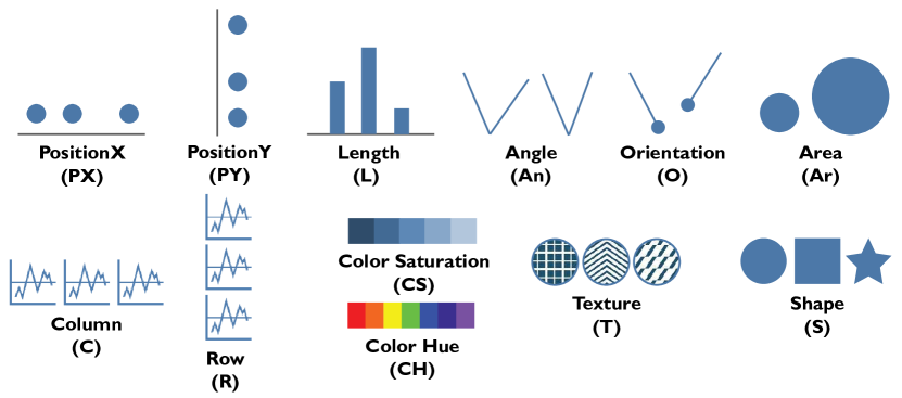
Figure 1 shows all encodings used in our design space, including 12 encodings: PositionX, PositionY, Length, Angle, Orientation, Area, Column, Row, Color Saturation, Color Hue, Texture, and Shape.
3.2. Which Papers Should be Included in the Survey?
To initially find relevant papers for our literature review, we checked all papers in well-known visualization-related conferences and journals (specifically: IEEE TVCG, ACM SIGCHI, EuroVIS) in the last ten years, in which we searched for the keywords “encoding”, “perception”, “effectiveness”, “evaluate” in the titles, abstracts, and keywords. We also reviewed the references for each paper found through colleagues or online searches; any relevant papers were also included in our review. In total, we found 132 candidate papers for our literature review.
We then excluded papers that fall outside the boundaries of the visualization design space described in Section 3.1.1. For example, we excluded papers that only evaluate 3D visualizations, graph visualizations, or animated visualizations. Given our focus on providing guidelines for visualization recommendation systems, we use the following filters to guide our paper selection process:
F1. Focus on human perception and task performance.
An essential facet of visualization recommendation systems is encoding selection, which directly impacts a user’s ability to perceive the underlying information (Kim et al., 2017; Zeng et al., 2022). Even if a visualization system suggests certain data attributes to explore, these findings will be inaccessible to the user if the data is presented incorrectly. Thus, we focus on results that speak to a user’s ability to perceive different visual encodings and differences in user performance across tasks and visualization designs.
F2. Focus on evaluation with standard displays.
Although some existing work has researched the effect of display size on graphical perception or task performance (Heer and Bostock, 2010; Andrews et al., 2010; Dasgupta and Kosara, 2010), and some are building new systems to better support different display sizes (Brehmer et al., 2019; Horak et al., 2018; Badam et al., 2016; Hoffswell et al., 2020), the vast majority of existing visualization evaluations are still conducted in regular displays (e.g., computer screens). Thus, we focus on reviewing the literature in visualization evaluation and comparison with standard desktop and laptop displays.
F3. Focus on evaluation with visualizations that can be generated by automatic processes.
Recent work (Cui et al., 2019) combines natural language analysis techniques with visualization synthesis to automatically generate infographics; however, it remains challenging for recommendation systems to understand the semantic meaning of most datasets and then select corresponding encodings or visualizations. Thus, we exclude papers only evaluating visualizations that usually require a certain amount of manual generation, like visual embellishments (Skau et al., 2015; Borgo et al., 2012; Haroz et al., 2015; Skau and Kosara, 2017), and semantically color assignments (Lin et al., 2013; Setlur and Stone, 2016), etc.
F4. Compare different visualization designs.
In order for algorithms to select the most relevant visualization design for a given dataset, they must be able to compare and ultimately rank the effectiveness of different designs (Zeng et al., 2022). To determine which designs should be preferred by these algorithms, we need experimental results that compare different visualization designs or theoretical rules and guidelines to prune irrelevant designs. To this end, we include any paper in our review that compares the user’s ability to effectively perceive and reason about information encoded using different visualization designs (at least one of the six components from Section 3.1.2 are different).
This filtering step excluded 73 of the 132 candidate papers, leaving 59 papers for our analysis.
4. Systematically Recording Perceptual Results
In this section, we present a schema to record extracted visualization rankings. We use this schema to generate a data record for each of the 59 papers in our literature review, contributing a JSON dataset of graphical perception results that can be imported into visualization recommendation systems. Our schema also enables a fine-grained analysis of how many graphical perception works exists to inform encoding choices within these systems. Our schema has four components:
Category: either theory, experiment, or hybrid. Experiment papers focus on experiments that provide concrete performance measures for various graphical perception scenarios. Theory papers present theoretical principles to generalize the findings of empirical work or formal models that can be tested in subsequent work. Hybrid papers present a pairing of theoretical hypotheses and experiments conducted to test (at least some of) the proposed hypotheses.
Designs: a list of all the visualization designs tested by each paper in our review, each specified using our visualization space design parameters from Section 3.1.2.
Tasks: a set of visual analysis tasks used in the existing literature for guiding the evaluation of visualization designs. Previous research has indicated that the effectiveness of visualization depends on the data attributes to be visualized (Santos, 2008) and the task to be performed (Amar et al., 2005); thus, we also include tasks in our schema. We use prior work (Amar et al., 2005; Kim and Heer, 2018) as guidelines and develop a hierarchical task taxonomy.
Results: ordered lists representing the rankings and significant differences reported in the literature for the proposed or tested visualization designs. Results are separated into theoretical rankings and experimental results.
4.1. Visualization Designs
Visualization designs are specified by six components as discussed in Section 3.1.2. We incorporate layers in our schema (Wickham, 2010) since many designs are only feasible by overlaying multiple visualizations on top of each other. Each layer is a single visualization design, defined by an encoding set and the mark type. Each encoding set consists of the data information of the data column visualized by the current encoding and its assigned encoding channel and scale. 1 shows an example of a composite graph, a bar chart (line 11-18) overlaid on a line chart (line 3-10), mentioned in Albers et al. (Albers et al., 2014) (as shown in Figure 2). We assign an ID for each recorded visualization design, where “E” means the design is empirically evaluated, and “T” means it is theoretically discussed. For example, the ID “E-4” (line 1 in 1) means this visualization design is the fourth empirically tested design in the paper (Albers et al., 2014).
When determining the encoding set for a visualization design, we consider all encodings a user or participant perceives within the design rather than the subset of encodings highlighted by a particular experiment or design rule. For example, when participants are asked to judge whether test marks are using the same or different colors in scatterplots (Szafir, 2018), they perceive three encodings (PX, PY, CH), even if only one encoding (CH) is permuted.
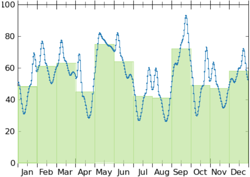
In Listing 1, we use a visualization to demonstrate how our data schema specifies visualization designs. Figure 2 shows the corresponding visualization.
4.2. Tasks
| Tasks | Descriptions | Relevant Work | |
|---|---|---|---|
| Retrieve Value | Identify values of the specified attributes | (Correll et al., 2020; Ceja et al., 2020; Kanjanabose et al., 2015; Kim and Heer, 2018; Liu and Heer, 2018; McColeman et al., 2021; Reda et al., 2018; Saket et al., 2019; Waldner et al., 2019; Sarikaya and Gleicher, 2017; Albers Szafir et al., 2016) | |
| Filter | Find data points satisfying the specified conditions | (Sarikaya and Gleicher, 2017; Golebiowska and Coltekin, 2022; Nothelfer and Franconeri, 2019; Nusrat et al., 2015; Saket et al., 2019; Srinivasan et al., 2018; Waldner et al., 2019) | |
| Sort | Compare a set of data points by the specified ordinal metric | (Correll et al., 2020; Lu et al., 2021; Sarikaya and Gleicher, 2017; Smart and Szafir, 2019; Talbot et al., 2014; Burlinson et al., 2018; Cleveland and McGill, 1984; Heer and Bostock, 2010; Kim and Heer, 2018; Kosara, 2019b; Mylavarapu et al., 2019; Nothelfer and Franconeri, 2019; Nusrat et al., 2015; Saket et al., 2019; Waldner et al., 2019; Zhao et al., 2019) | |
| Cluster | Detect clusters of similar attribute values | (Demiralp et al., 2014; Sarikaya and Gleicher, 2017; Albers Szafir et al., 2016; Szafir, 2018; Wang et al., 2019; Gogolou et al., 2019; Kanjanabose et al., 2015; Micallef et al., 2017; Araya et al., 2020; Saket et al., 2019) | |
| Value | Correlate | Determine/estimate the correlation within the specified attributes | (Sarikaya and Gleicher, 2017; Albers Szafir et al., 2016; Aigner et al., 2011; Burlinson et al., 2018; Chung et al., 2016; Correll and Heer, 2017; Harrison et al., 2014; Javed et al., 2010; Kanjanabose et al., 2015; Kay and Heer, 2015; Li et al., 2010; Micallef et al., 2017; Nusrat et al., 2015; Ondov et al., 2019; Peña-Araya et al., 2019; Reda et al., 2018; Saket et al., 2019; Liu et al., 2021; Correll et al., 2020) |
| Aggregate | Compute/compare the aggregate value of the specified attributes | (Gramazio et al., 2016; Sarikaya and Gleicher, 2017; Albers Szafir et al., 2016; Aigner et al., 2011; Albers et al., 2014; Burlinson et al., 2018; Correll et al., 2012; Gleicher et al., 2013; Godau et al., 2016; Hong et al., 2021; Jardine et al., 2020; Javed et al., 2010; Kim and Heer, 2018; Mylavarapu et al., 2019; Nothelfer and Franconeri, 2019; Nusrat et al., 2015; Ondov et al., 2019; Perin et al., 2018; Reda et al., 2018; Reda and Papka, 2019; Saket et al., 2019; Schloss et al., 2019; Srinivasan et al., 2018; Xiong et al., 2019) | |
| Find Extremum | Find data points with an extreme value of the specified attribute | (Albers Szafir et al., 2016; Albers et al., 2014; Chung et al., 2016; Golebiowska and Coltekin, 2022; Javed et al., 2010; Karduni et al., 2020; Kim and Heer, 2018; Araya et al., 2020; Perin et al., 2018; Saket et al., 2019; Srinivasan et al., 2018; Waldner et al., 2019) | |
| Determine Range | Find the span of values of the specified attributes | (Albers et al., 2014; Golebiowska and Coltekin, 2022; Jardine et al., 2020; Araya et al., 2020; Saket et al., 2019; Srinivasan et al., 2018) | |
| Characterize Distribution | Identify the distribution of given attributes | (Sarikaya and Gleicher, 2017; Albers Szafir et al., 2016; Albers et al., 2014; Kim and Heer, 2018; Kosara, 2019b; Araya et al., 2020; Redmond, 2019; Saket et al., 2019) | |
| Summary | Find Anomalies | Identify anomalies within the dataset | (Sarikaya and Gleicher, 2017; Albers Szafir et al., 2016; Albers et al., 2014; Burlinson et al., 2018; Gramazio et al., 2014; Kanjanabose et al., 2015; Micallef et al., 2017; Saket et al., 2019) |
Generally, visualizations are designed to facilitate specific visualization tasks or user objectives (Munzner, 2009; Saket et al., 2019; Rind et al., 2016), including in visualization recommendation contexts (Zeng et al., 2022). As a result, graphical perception experiments gauge performance under a specific subset of tasks. Furthermore, we and others (Rind et al., 2016) observe that the literature is not always consistent in how visual analysis tasks are defined. Thus, we developed a standardized taxonomy to categorize the tasks observed across our selected papers. We use the low-level analysis tasks proposed by Amar et al. (Amar et al., 2005) as an initial starting point for the taxonomy. We use the categorization of Kim & Heer to divide these low-level tasks into two groups (Kim and Heer, 2018): value and summary tasks. Value tasks require reading or comparing individual values while summary tasks require identification or comparison of the aggregate properties. Then, we adjusted the task descriptions in response to observed discrepancies from our literature review. For example, we extended “Compute Derived Value” in Amar et al.’s taxonomy into “Aggregate” which includes computing and comparing the aggregate values of the specified attributes. Table 1 shows all of the visual analytics tasks we observed in our literature review, as well as their descriptions and the relevant works that mention them.
4.3. Results
Results represent a summary of the reported outcomes of a given graphical perception experiment or theory paper that can be used to inform visual encoding recommendations. When documenting graphical perception results, we distinguish between experimental and theoretical rankings. They are grouped by the metric that the graphical perception paper uses to rank the visualization designs. We include all and only the metrics that we observed directly from the graphical perception literature. In total, we observed six different metrics used in the existing literature to compare visualizations: accuracy, bias, JND (just noticeable difference), time and user-preference for experimental results and effectiveness for theoretical rules. Under each metric, we refer to the graphical perception paper or its available supplemental materials to record how visualization designs are ranked based on their task performance (from the best to the worst). For visualizations that perform about the same, we group them into a sub-set. While the rank list only reflects the ranking among visualization designs, it does not show whether there is a significant difference between the two visualization designs in terms of each metric. Thus, we also record the significance results which store a list of visualization pairs where the first entry performs significantly better than the second one. For experimental results, we also record the statistical test results (if reported in the literature), including the statistical method, threshold, and effect size.
We use a hybrid paper (Cleveland and McGill, 1984) as an example (shown in 2). If a task is conducted multiple times, we add an index after the task name to differentiate different task rounds. From 2, we can see that two sort tasks were conducted (line 4, 14). In the first experiment (line 4-13), the rank list (line 5) shows that visualization “E-1” performed the best among five designs. Moreover, the significance result (line 6-13) reveals that bootstrapping method was used to determine whether there is a significant difference between two visualizations, and the threshold was set at 95%. The pairs list reveals that there was a significant performance difference between “E-1” and some other visualization designs (“E-3”, “E-4”, and “E-5”) (line 7-9). However, the effect size was not reported in the experiments from this paper (line 12-13).
5. Integrating Current Rankings & Guidelines
In this section, we review existing graphical perception theories and experiments that could be used to guide visualization recommendation systems. We synthesize existing performance rankings across different visualization designs and summarize the impact of data characteristics and tasks on these rankings. We generate tables summarizing our findings, which system designers can use to specify encoding rules for visualization recommendation systems, e.g., as queries (Wongsuphasawat et al., 2016) or constraints (Moritz et al., 2019). We have three research goals for this work: (1) summarize how to rank individual encodings according to their expressiveness and effectiveness; (2) summarize how to rank variations on a single chart type to enhance its design; and (3) summarize rankings for comparing different chart types, to identify the best performing visualization designs for specific data characteristics or task types.
5.1. Encoding Channels
| Relevant Work | |
|---|---|
| PX | (Aigner et al., 2011; Chung et al., 2016; Albers et al., 2014; Correll et al., 2012; Correll and Heer, 2017; Gleicher et al., 2013; Godau et al., 2016; Gogolou et al., 2019; Gramazio et al., 2014; Harrison et al., 2014; Heer and Bostock, 2010; Javed et al., 2010; Kanjanabose et al., 2015; Kay and Heer, 2015; Kim and Heer, 2018; Liu and Heer, 2018; Nusrat et al., 2015; Ondov et al., 2019; Reda et al., 2018; Saket et al., 2019; Correll et al., 2020; Lu et al., 2021; Smart and Szafir, 2019; Szafir, 2018; Talbot et al., 2014; Burlinson et al., 2018; Golebiowska and Coltekin, 2022; Hong et al., 2021; Karduni et al., 2020; Li et al., 2010; Liu et al., 2021; McColeman et al., 2021; Mylavarapu et al., 2019; Nothelfer and Franconeri, 2019; Peña-Araya et al., 2019; Araya et al., 2020; Reda and Papka, 2019; Schloss et al., 2019; Srinivasan et al., 2018; Waldner et al., 2019; Xiong et al., 2019; Zhao et al., 2019), (Mackinlay, 1986; Sarikaya and Gleicher, 2017; Albers Szafir et al., 2016), (Cleveland and McGill, 1984; Wang et al., 2019; Micallef et al., 2017) |
| PY | (Srinivasan et al., 2018; Aigner et al., 2011; Albers et al., 2014; Correll et al., 2012; Correll and Heer, 2017; Gleicher et al., 2013; Godau et al., 2016; Gogolou et al., 2019; Gramazio et al., 2014; Harrison et al., 2014; Heer and Bostock, 2010; Javed et al., 2010; Kanjanabose et al., 2015; Kay and Heer, 2015; Kim and Heer, 2018; Nusrat et al., 2015; Ondov et al., 2019; Reda et al., 2018; Saket et al., 2019; Correll et al., 2020; Lu et al., 2021; Smart and Szafir, 2019; Szafir, 2018; Burlinson et al., 2018; Golebiowska and Coltekin, 2022; Hong et al., 2021; Li et al., 2010; Liu et al., 2021; McColeman et al., 2021; Mylavarapu et al., 2019; Nothelfer and Franconeri, 2019; Peña-Araya et al., 2019; Araya et al., 2020; Schloss et al., 2019; Xiong et al., 2019), (Mackinlay, 1986; Sarikaya and Gleicher, 2017; Albers Szafir et al., 2016), (Cleveland and McGill, 1984; Wang et al., 2019; Jardine et al., 2020; Micallef et al., 2017) |
| L | (Srinivasan et al., 2018; Albers et al., 2014; Godau et al., 2016; Harrison et al., 2014; Heer and Bostock, 2010; Kay and Heer, 2015; Perin et al., 2018; Saket et al., 2019; Skau and Kosara, 2016; Correll et al., 2020; Lu et al., 2021; Szafir, 2018; Talbot et al., 2014; Ceja et al., 2020; Karduni et al., 2020; Kosara, 2019b; McColeman et al., 2021; Mylavarapu et al., 2019; Nothelfer and Franconeri, 2019; Peña-Araya et al., 2019; Redmond, 2019; Waldner et al., 2019; Xiong et al., 2019; Zhao et al., 2019), (Mackinlay, 1986; Albers Szafir et al., 2016), (Cleveland and McGill, 1984; Jardine et al., 2020), |
| An | (Harrison et al., 2014; Heer and Bostock, 2010; Kay and Heer, 2015; Skau and Kosara, 2016; Lu et al., 2021; Kosara, 2019b; Ondov et al., 2019; Redmond, 2019; Saket et al., 2019), (Mackinlay, 1986), (Cleveland and McGill, 1984) |
| Ar | (Chung et al., 2016; Correll and Heer, 2017; Gogolou et al., 2019; Harrison et al., 2014; Heer and Bostock, 2010; Kay and Heer, 2015; Kim and Heer, 2018; Nusrat et al., 2015; Ondov et al., 2019; Perin et al., 2018; Saket et al., 2019; Skau and Kosara, 2016; Demiralp et al., 2014; Hong et al., 2021; Javed et al., 2010; Kosara, 2019b; McColeman et al., 2021; Mylavarapu et al., 2019; Peña-Araya et al., 2019; Waldner et al., 2019), (Mackinlay, 1986; Albers Szafir et al., 2016), (Cleveland and McGill, 1984) |
| O | (Mackinlay, 1986; Albers Szafir et al., 2016), (Cleveland and McGill, 1984), (Chung et al., 2016; Harrison et al., 2014; Heer and Bostock, 2010; Kay and Heer, 2015; Ondov et al., 2019; Skau and Kosara, 2016; McColeman et al., 2021; Waldner et al., 2019) |
| CH | (Srinivasan et al., 2018; Aigner et al., 2011; Chung et al., 2016; Correll et al., 2012; Gleicher et al., 2013; Gogolou et al., 2019; Gramazio et al., 2014; Harrison et al., 2014; Javed et al., 2010; Kim and Heer, 2018; Liu and Heer, 2018; Reda et al., 2018; Saket et al., 2019; Skau and Kosara, 2016; Bujack et al., 2018, 2018; Demiralp et al., 2014; Lu et al., 2021; Smart and Szafir, 2019; Szafir, 2018; Golebiowska and Coltekin, 2022; Kay and Heer, 2015; Kosara, 2019b; Reda and Papka, 2019), (Mackinlay, 1986; Albers Szafir et al., 2016), (Wang et al., 2019; Fang et al., 2017; Gramazio et al., 2016) |
| CS | (Chung et al., 2016; Albers et al., 2014; Gleicher et al., 2013; Javed et al., 2010; Kim and Heer, 2018; Liu and Heer, 2018; Ondov et al., 2019; Perin et al., 2018; Reda et al., 2018; Bujack et al., 2018, 2018; Golebiowska and Coltekin, 2022; Hong et al., 2021; McColeman et al., 2021; Peña-Araya et al., 2019; Araya et al., 2020; Reda and Papka, 2019; Redmond, 2019; Schloss et al., 2019), (Mackinlay, 1986; Albers Szafir et al., 2016), (Jardine et al., 2020; Cleveland and McGill, 1984) |
| T | (Chung et al., 2016), (Mackinlay, 1986) |
| S | (Chung et al., 2016; Gleicher et al., 2013; Kanjanabose et al., 2015; Demiralp et al., 2014; Smart and Szafir, 2019; Burlinson et al., 2018), (Mackinlay, 1986) |
| C | (Ondov et al., 2019; Peña-Araya et al., 2019; Araya et al., 2020; Waldner et al., 2019), (Albers Szafir et al., 2016), (Jardine et al., 2020) |
| R | (Aigner et al., 2011; Javed et al., 2010; Ondov et al., 2019; Kim and Heer, 2018; Peña-Araya et al., 2019; Araya et al., 2020; Waldner et al., 2019), (Albers Szafir et al., 2016), (Jardine et al., 2020) |
In this section, we cluster research papers by the encoding channels they cover. We first discuss how well existing literature covers each encoding channel, then summarize the study outcomes showing how effective each encoding channel is in visualizing different data types.
5.1.1. Literature Coverage
As shown in Table 2, all twelve encoding channels are covered by existing literature. To analyze encoding coverage, we break down visualization designs into encoding sets. For example, a paper studying scatterplots covers both the PX and PY encodings. As another example, a paper that studies grouped bar charts covers three encodings: PX, PY, and CH. We can see that (PX, PY) (49/59, 83.05), CH (29/59, 49.15), L (28/59, 47.46), and Ar (23/59, 38.98) are the most discussed encodings, while other encodings such as R (9/59, 15.25), S (7/59, 11.86), C (6/59, 10.17) and T (2/59, 3.39) are less mentioned.
5.1.2. Study Outcomes
In Table 3, we summarize findings of encoding perception organized by Mackinlay’s principles of expressiveness and effectiveness (Mackinlay, 1986). A visualization design is considered expressive if it shows all and only the data the user wants to see and effective if a user can accurately interpret the graphical representation. We cluster research papers regarding data types to learn which encoding works better for a specific data type.
| Expressiveness | ||
| Q | Ar (\faCheck), CS (\faCheck), CH (\faAsterisk), S (\faClose), T (\faClose) | |
| N | CH (\faCheck), T (\faCheck), O (\faCheck), S (\faCheck), Ar (\faClose), CS (\faClose) | |
| O | Ar (\faCheck), CS (\faCheck), T (\faCheck), CH (\faAsterisk), S (\faClose) | (Mackinlay, 1986; Bujack et al., 2018, 2018) |
| Effectiveness | ||
| Q | PXPYLAnOArCS | (Cleveland and McGill, 1984) |
| Q | PXPYLAnOArCSCH | |
| N | PXPYCHTCSSLAnOAr | |
| O | PXPYCSCHTLAnOAr | (Mackinlay, 1986) |
Quantitative.
As shown in Table 3, we can see that existing theoretical principles (Mackinlay, 1986) do not recommend using S and T for quantitative data since they usually cannot be perceived to be ordered. However, empirical results from Chung et al. (Chung et al., 2016) show that S and T can be orderable; in particular, marks with countable differences (e.g., the number of spikes or lines) can be perceived as ordered (see Figure 3).
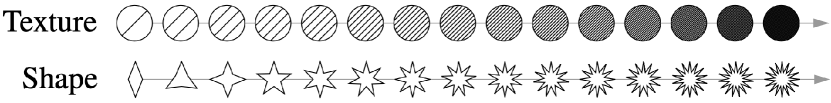
Figure 3 shows the Texture and Shape encodings used in Chung et al.’s experiments.
In terms of effectiveness, Cleveland & McGill (Cleveland and McGill, 1984) propose a ranking for encodings representing quantitative data, and Mackinlay (Mackinlay, 1986) extends this ranking to include nominal and ordinal data (see Table 3). Cleveland & McGill test part of the ranking with follow-up experiments. Their results show that PY encoding outperforms L and An encodings on sort tasks. Heer and Bostock (Heer and Bostock, 2010) replicate these experiments but also add Ar encoding in the test and adjust the experiments to make results among tested encodings comparable. Their results are similar to Cleveland & McGill’s. McColeman et al. (McColeman et al., 2021) re-examine these encoding rankings with a different task and find they do not hold. Furthermore, they find that other factors—such as cardinality—have more influence on task performance than the encoding choice (see Table 4).
On the one hand, theoretical works (Mackinlay, 1986; Bujack et al., 2018, 2018) suggest that the full-color spectrum is not ordered, but part of CH still can be used for quantitative data.
CS, in comparison, is preferable to represent quantitative data.
On the other hand, experiments are conducted to evaluate the human performance of perceiving CS and CH conveying quantitative data with various visual analysis tasks (see Table 5).
Although Liu & Heer (Liu and Heer, 2018) and Reda et al. (Reda et al., 2018; Reda and Papka, 2019) arrive at a similar finding which is that participants can discriminate more minor gradient variations with multi-hue colormaps (CH + CS) than with single-hue ones (CS only), they draw different conclusions for the rainbow colormap (\scalerel*![[Uncaptioned image]](/html/2109.01271/assets/x4.png) B).
Liu & Heer (Liu and Heer, 2018) suggest that the rainbow colormap is not intuitive and performs the worst for ordering colors and should be jettisoned; however, Reda et al. do not discard the rainbow colormap. They recommend using rainbow or other multi-hue colormaps for value tasks at high spatial frequency.
Schloss et al. (Schloss et al., 2019), on the other hand, investigate how the different colormaps would be affected by background color.
They find that when colormaps vary less in opacity, human perception is unaffected by the background; however, the role of the background increases when apparent variation in opacity increases.
B).
Liu & Heer (Liu and Heer, 2018) suggest that the rainbow colormap is not intuitive and performs the worst for ordering colors and should be jettisoned; however, Reda et al. do not discard the rainbow colormap. They recommend using rainbow or other multi-hue colormaps for value tasks at high spatial frequency.
Schloss et al. (Schloss et al., 2019), on the other hand, investigate how the different colormaps would be affected by background color.
They find that when colormaps vary less in opacity, human perception is unaffected by the background; however, the role of the background increases when apparent variation in opacity increases.
| Task | Metric | Rank | Ref. |
|---|---|---|---|
| PY (bar)L, PY (bar)An | (Cleveland and McGill, 1984) | ||
| sort | accuracy | PY (bar)LAnAr | (Heer and Bostock, 2010) |
| retrieve value | accuracy | OArCSLPY (bar)PY (line) | |
| (2 marks) | bias | OLPY (bar)CSArPY (line) | |
| retrieve value | accuracy | ArOCSPY (bar)LPY (line) | |
| (4 marks) | bias | LPY (bar)OCSArPY (line) | (McColeman et al., 2021) |
| Task | Metric | Rank | Ref. |
| accuracy |
|
||
| sort | time |
|
(Liu and Heer, 2018) |
| aggregate | JND |
|
(Reda and Papka, 2019) |
| filter |
|
||
| correlate |
|
||
| cluster | accuracy |
|
(Reda et al., 2018) |
Nominal.
Mackinlay’s expressiveness rules—the only relevant theory work observed—do not recommend using Ar and CS for nominal data since they would probably be perceived to be ordered. Empirically-focused papers (Demiralp et al., 2014; Smart and Szafir, 2019) aim to learn how discriminable different encoding channels are for nominal data. Demiralp et al. (Demiralp et al., 2014) examine the perceptual distance for CH, S, Ar and their combinations. Based on the experiment results, they propose palettes that can maximize perceptual discriminability for each examined encoding (see Figure 4). Smart & Szafir (Smart and Szafir, 2019) measure how using CH, S, and Ar for marks influences data interpretation in multiclass scatterplots. They find that (1) S affects CH and Ar difference perception more strongly than CH or Ar affects S perception; (2) CH are generally more discriminable with filled shapes than with unfilled ones, and filled shapes (e.g. \faCircle, \faSquare ) are perceived as larger than their unfilled counterparts (e.g. \faCircleThin, \faSquareO ); and (3) shapes with top or bottom edges (e.g. \faSquare, \faSquareO ) are perceived larger than others (e.g. \faPlus, \faStarO ).

Figure 4 shows the shape, color hue, and area palettes proposed by Demiralp et al.
Ordinal.
As for expressiveness, existing theory work does not recommend CH to represent ordinal data and recommends CS instead (Mackinlay, 1986).
We find one empirical work evaluating CS and CH for conveying ordinal data (Golebiowska and Coltekin, 2022). They confirm that CS (\scalerel*![]() B)
performs better than CH (\scalerel*
B)
performs better than CH (\scalerel*![]() B) in both accuracy and time for summary tasks.
B) in both accuracy and time for summary tasks.
Takeaways: Design Guidelines.
Theoretical work provides concrete rules that allow visualization recommendation algorithms to immediately detect bad encoding choices for a specific data type. In this way, theoretical rules can help visualization recommendation algorithms automatically prune the space of recommendation candidates. Meanwhile, experimental work examines some hypotheses on how visual encodings perform in practical scenarios. The resulting rankings can inform heuristics-driven visualization recommendation algorithms like Voyager (Wongsuphasawat et al., 2016, 2017) (see Section 6.1.2). We observe the following takeaways that could inform both human and algorithmic design decisions:
-
•
In general, position encodings (PX, PY) are the top choices for representing all data types (quantitative, nominal, ordinal).
-
•
Ar and CS encodings are also top choices for visualizing quantitative data.
-
•
CH, S, and Ar encodings are effective for visualizing nominal data. However, different combinations have different perceptual discrminabilities. For example, CH is generally more discriminable with filled shapes than with unfilled ones.
-
•
CH is not expressive for representing ordinal data, and CS performs better than CH.
5.2. Chart Types
Although research findings at the individual encoding level can help systems avoid obvious pitfalls (e.g., choosing a poor color scheme), they fail to clarify interference effects (Kim and Heer, 2018) between encodings. For example, the optimal encoding for a single quantitative attribute may not apply when this attribute is also rendered alongside two nominal attributes. To address the complexities of combining encodings into full visualization designs, we re-cluster research papers by the chart types they cover. We discuss how well existing literature covers different chart types, then summarize observed coverage and study outcomes from the literature towards achieving our two remaining goals: (1) comparing different variants of a single chart type, and (2) comparing different chart types to identify better visualization designs.
| Relevant Work | |
|---|---|
| Scatterplot | (Heer and Bostock, 2010; Li et al., 2010; Gleicher et al., 2013; Albers et al., 2014; Gramazio et al., 2014; Kanjanabose et al., 2015; Correll and Heer, 2017; Smart and Szafir, 2019; Liu et al., 2021; Lu et al., 2021; Hong et al., 2021; Harrison et al., 2014; Kay and Heer, 2015; Szafir, 2018; Burlinson et al., 2018; Kim and Heer, 2018; Saket et al., 2019; McColeman et al., 2021; Godau et al., 2016; Mylavarapu et al., 2019), (Albers Szafir et al., 2016; Sarikaya and Gleicher, 2017), (Micallef et al., 2017; Wang et al., 2019) |
| Bar Chart | (Heer and Bostock, 2010; Talbot et al., 2014; Albers et al., 2014; Godau et al., 2016; Ondov et al., 2019; Srinivasan et al., 2018; Xiong et al., 2019; Waldner et al., 2019; Nothelfer and Franconeri, 2019; Mylavarapu et al., 2019; Karduni et al., 2020; Ceja et al., 2020; Lu et al., 2021; Cleveland and McGill, 1984; Harrison et al., 2014; Kay and Heer, 2015; Szafir, 2018; Saket et al., 2019; Kosara, 2019b; Redmond, 2019; Correll et al., 2020; Araya et al., 2020; McColeman et al., 2021; Zhao et al., 2019), (Albers Szafir et al., 2016),(Jardine et al., 2020) |
| Line Chart | (Gogolou et al., 2019; Ondov et al., 2019; Xiong et al., 2019; Correll et al., 2020; Javed et al., 2010; Aigner et al., 2011; Correll et al., 2012; Harrison et al., 2014; Kay and Heer, 2015; Albers et al., 2014; Szafir, 2018; Correll and Heer, 2017; Saket et al., 2019; McColeman et al., 2021),(Albers Szafir et al., 2016) |
| Area Chart | (Javed et al., 2010; Correll and Heer, 2017; Gogolou et al., 2019; Harrison et al., 2014; Kay and Heer, 2015) |
| Pie/Donut Chart | (Heer and Bostock, 2010; Skau and Kosara, 2016; Waldner et al., 2019; Lu et al., 2021; Harrison et al., 2014; Kay and Heer, 2015; Ondov et al., 2019; Saket et al., 2019; Kosara, 2019b; Redmond, 2019) |
| Heatmap | (Gogolou et al., 2019; Correll et al., 2012; Albers et al., 2014; Schloss et al., 2019) |
| Parallel Coordinates | (Li et al., 2010; Kanjanabose et al., 2015; Harrison et al., 2014; Kay and Heer, 2015) |
| Geomap/Cartogram | (Peña-Araya et al., 2019; Araya et al., 2020; Gramazio et al., 2014; Nusrat et al., 2015; Reda et al., 2018; Reda and Papka, 2019; Golebiowska and Coltekin, 2022), (Albers Szafir et al., 2016), (Gramazio et al., 2016) |
5.2.1. Literature Coverage
We summarize the chart type coverage by existing literature in Table 6. Here we use higher-level visualization types to cluster papers. For example, we lump bubble charts into scatterplots and any variants of area charts like stream graphs into area charts. We group pie charts and donut charts into one category, as well as geomaps and cartograms. We can see that bar charts (26/59, ), scatterplots (24/59, ), and line charts (15/59, ) are the top 3 studied chart types, while only a few research papers cover other chart types like area charts (5/59, ), heatmaps (4/59, ), parallel coordinates (4/59, ). This result is pretty consistent with Beagle (Battle et al., 2018), based on which bar charts and line charts are the most popular visualization types among all SVG-based visualizations mined from webs. On the other hand, we also observe the dearth of theoretical work in the space (see Table 6); thus, we focus on summarizing the study outcomes from empirical work in Section 5.2.2 and Section 5.2.3.
5.2.2. Within Chart Type Comparison
Scatterplots.
Besides the evaluation of the class separability perception (Smart and Szafir, 2019; Wang et al., 2019) (mentioned in Section 5.1.2), scatterplots are also examined with different data characteristics (Kim and Heer, 2018; Gramazio et al., 2014; Gleicher et al., 2013), and marks (Kim and Heer, 2018; Liu et al., 2021; Gleicher et al., 2013; Hong et al., 2021). We summarize the findings from these research papers in Table 7. Kim & Heer (Kim and Heer, 2018) suggest that in general using Ar performs better in summary tasks and CS performs better in aggregate tasks when representing quantitative data; however, the performance exhibits significant variance across different data characteristics (entropy and cardinality). Gleicher et al. (Gleicher et al., 2013) find that higher cardinality (more numbers of points) leads to marginally better performance in aggregate tasks; on the other hand, using redundant encodings (like using the combination of CH and S for a same nominal attribute) would not influence the task performance significantly. Gramazio et al. (Gramazio et al., 2014) suggest that using larger marks can reduce participants’ response time; however, Hong et al. (Hong et al., 2021) find that larger and darker marks lead to more bias. Liu et al. (Liu et al., 2021) study if the mark orientation would affect task performance and find that the mark orientation that is consistent with the trend of the scatterplots can reduce errors in estimate trend tasks.
| Designs | Tasks | Metrics | Ref. |
|
|
summary | time, accuracy | |
|
|
aggregate | accuracy | (Kim and Heer, 2018) |
|
|
summary, value | time, accuracy | |
|
|
summary | time | (Gramazio et al., 2014) |
|
|
aggregate | bias | (Hong et al., 2021) |
|
|
correlate | accuracy | (Liu et al., 2021) |
|
|
|||
|
|
aggregate | accuracy | (Gleicher et al., 2013) |
Bar Charts.
Unlike scatterplots, bar charts are often studied with different variants (Ceja et al., 2020; Karduni et al., 2020; Srinivasan et al., 2018; Nothelfer and Franconeri, 2019; Talbot et al., 2014) and arrangements (Talbot et al., 2014; Zhao et al., 2019). Srinivasan et al. (Srinivasan et al., 2018) and Nothlfer & Franconeri (Nothelfer and Franconeri, 2019) evaluate different bar chart variants for comparing changing data. They both find that visualizing data differences yields better performance and suggest using charts with difference overlays since only visualizing deltas would lose the context of base values. For visualizing disproportionate values, Karduni et al. (Karduni et al., 2020) propose using Du Bios wrapped bar charts. They find that wrapped bar charts lead to higher accuracy but sometimes at the cost of more time needed than basic bar charts. Other experiments focus more on the perception of bar charts. Talbot et al. (Talbot et al., 2014) explore variations of bar charts originally studied by Cleveland & McGill (Cleveland and McGill, 1984) and find that shorter bars are more difficult for sort tasks. Zhao et al. (Zhao et al., 2019), on the other hand, investigate whether neighborhood would influence the perception of bars with sort tasks. The results show that neighborhood does have an effect, but the effect size is small; other factors like data characteristics have dominated effects. Godau et al. (Godau et al., 2016) find consistent underestimations with bar charts, which are not affected by the height of bars; moreover, the bias persists even adding a numerical scale or outliers. Ceja et al. (Ceja et al., 2020) recently find that bars with wide aspect ratios are overestimated, bars with tall ratios are underestimated, and bars with square ratios show no systematic bias.
Line Charts.
We only find one paper that studies line charts solely. Aigner et al. (Aigner et al., 2011) evaluate three types of line charts (juxtaposition on linear scale, superimposition on log scale, and indexing) with various tasks. They find that using indexing generally yields higher accuracy and user preference than the two other types; the advantages with completion time are less clear, although some benefits are shown.
Small Multiples.
Both Ondov et al. (Ondov et al., 2019), and Jardine et al. (Jardine et al., 2020) study how different arrangements of small multiples would affect the task performance. In their experiments, five arrangements (stacked, adjacent, mirrored, overlaid, animated) are tested with three chart types—bar charts (with find extremum, correlate, determine range, aggregate tasks), line and donut charts (with find extremum task only). The results suggest that it is unlikely to discover an easy guideline that specifies the best arrangement or encoding for a given task.
Takeaways: Research Challenges.
Our summary tables provide not only an overview of the current literature studying different chart types but also design guidelines that can be applied by visualization designers and visualization recommendation systems to generate effective visualizations. For example, using CS rather than Ar to represent quantitative data might improve the performance of scatterplots in aggregate tasks, and using redundant encodings might not provide any additional benefit (in Table 7). However, we also find some limitations in the existing literature:
-
•
The literature tends to focus more on studying variants of scatterplots and bar charts than other chart types. We suggest the community study more variants of the underexplored chart types to better understand the interference effects between different encoding channels.
-
•
Although the line chart is one of the most popular chart types used on the web (Battle et al., 2018), not many evaluations of variants exist; thus, we urge more experiments examining different variations of line charts.
-
•
We also find that existing study results differ based on individual factors like data characteristics, tasks, experiment setups, and participants. We suggest more experiments and theories for concluding which visualization design to pick under different analysis scenarios.
5.2.3. Between Chart Type Comparison
Time Series Data.
We observe that visualizing time series data is often discussed in existing literature (Javed et al., 2010; Correll et al., 2012; Albers et al., 2014; Gogolou et al., 2019; Peña-Araya et al., 2019; Araya et al., 2020). Correll et al. (Correll et al., 2012) perform an empirical experiment of a aggregate task for time series data; four display conditions were tested: ordered/permuted line chart and ordered/permuted colorfield chart. The results suggest that colorfield charts outperform in accuracy across all difficulty levels. Albers et al. (Albers et al., 2014) extend the work of Correll et al. in a follow-on experiment by testing more visualization designs with more tasks. The results confirm that different designs support different tasks; position-based charts outperform in some tasks (find extremum, determine range) while color-based charts perform better in others (aggregate, find anomalies). Instead of testing encoding performance (position vs. color), Javed et al. (Javed et al., 2010) explore user performance for find extremum, determine range, sort tasks for different line graph techniques (shared-space vs. split-space). They find no significant difference between these two techniques in terms of accuracy; however, shared-space techniques are faster in find extremum while split-space ones are faster in sort tasks.
| Underestimate | Overestimate | Perception Pull | No Bias | Ref. |
|---|---|---|---|---|
|
|
|
(Godau et al., 2016) | ||
|
|
|
|
(Xiong et al., 2019) | |
|
|
|
|
(Ceja et al., 2020) |
Systematic Bias.
Bias evaluation has attracted more attention recently (Xiong et al., 2019; Godau et al., 2016; Ceja et al., 2020; Correll et al., 2020). Godau et al. (Godau et al., 2016) test whether there is a bias in the central tendency perceived in bar charts, and they find that the mean value is systematically underestimated in bar charts (but not in scatterplots). Their other experiments also confirm that the underestimation of the average persists with varying bar heights or adding outliers. However, Xiong et al. (Xiong et al., 2019) reach a completely different conclusion. They conducted three empirical studies to investigate position perception bias with visualizations containing a single bar/line, multiple bars/lines, and one line with one set of bars. In contrast to the results of Godau et al., they found that the perceived average position was significantly biased in both single line charts and single bar charts. Line positions are consistently underestimated, while bar positions are overestimated. In the experiments involving multiple data series (multiple lines and/or bars), they also observe an effect of “perceptual pull”, where the average position estimate for each series was “pulled” toward the other. Aiming to explain this contradiction, recent research by Ceja et al. (Ceja et al., 2020) finds that the systematic bias in bars is related to the aspect ratio of bars. No systematic bias is shown with square bars, while wide bars are overestimated, and tall bars are underestimated. We summarize the study outcomes in Table 8.
Scatterplots vs. Parallel Coordinates.
Several current works focus on comparing scatterplots with parallel coordinates (Li et al., 2010; Kanjanabose et al., 2015; Harrison et al., 2014; Kay and Heer, 2015). Li et al. (Li et al., 2010) focus on studying correlate task performance between scatterplots and parallel coordinates and find that the degree of correlation between attributes is underestimated in parallel coordinates, suggesting that scatterplots are better options for correlate tasks. Kanjanabose et al. (Kanjanabose et al., 2015) also perform experiments comparing scatterplots and parallel coordinates but focus on other visual analysis tasks, including retrieve value, cluster, find anomalies and determine range. The results suggest that parallel coordinates outperform in accuracy across cluster, find anomalies and determine range tasks, and in completion time with retrieve value and determine range tasks.
Bar Charts vs. Pie Charts.
We find five papers (Cleveland and McGill, 1984; Heer and Bostock, 2010; Waldner et al., 2019; Kosara, 2019b; Redmond, 2019) comparing bar charts and pie charts. Cleveland & McGill (Cleveland and McGill, 1984) propose an order of encoding channels based on graphical perception but also test parts of this theory through experiments. They use bar charts to assess position and length encodings and pie charts for angle encoding. Heer & Bostock (Heer and Bostock, 2010) replicate these experiments but also adjust the experiments to make results between length and angle encodings comparable. They conduct the experiments with sort tasks, and both of the results suggest that bar charts perform better than pie charts in terms of the accuracy metric. Later on, Waldner et al. (Waldner et al., 2019) also report that radial charts perform less accurately, efficiently, and preferably than bar charts in many analytical tasks. Kosara (Kosara, 2019b) also has similar findings (bar pie) with find extremum tasks. However, by comparing the performance of pie charts and bar charts with multiple variants, Redmond (Redmond, 2019) finds that pie charts perform more accurately with retrieve value tasks.
Multi-Chart Comparisons.
Some experiments involve a large range of chart types (Saket et al., 2019; Harrison et al., 2014; Saket et al., 2018; Mylavarapu et al., 2019; Correll and Heer, 2017; Skau and Kosara, 2016). Saket et al. (Saket et al., 2019) conduct an experiment to evaluate the effectiveness of five 2-encoding visualization designs across all ten analysis tasks (mentioned in Table 1): line chart, bar chart, scatterplot, pie chart, and table. They confirm that no specific visualization outperforms in every task, and suggest using bar charts for clustering, line charts for correlation, and scatterplots for finding anomalies. Harrison et al. (Harrison et al., 2014) conduct a crowdsourced experiment to evaluate the human perception of correlation among nine commonly used visualization types, like scatterplots, area charts, line charts, bar charts, pie charts, parallel coordinates, etc. The results reveal significant differences in the correlation perception across visualizations, and the results also vary significantly across different data characteristics (different correlation coefficients ). Skau & Kosara (Skau and Kosara, 2016), on the other hand, compare the effectiveness of pie charts, donut charts, arc charts, and area charts with retrieve value tasks. The results show no significant difference between pie charts and donut charts in accuracy, and both perform better than arc and area charts.
| Tasks | Designs |
|---|---|
| Retrieve Value |
|
| Filter |
|
| Sort |
|
| Cluster |
|
| Correlate |
|
| Aggregate |
|
| Find Extremum |
|
| Determine Range |
|
| Characterize Distribution |
|
| Find Anomalies |
|
Takeaways: Design Guidelines.
Although we observe gaps in the literature for specific analysis tasks and performance metrics, current studies do provide some guidance on which visualization types work best for common analysis tasks. In Table 9, we synthesize these results into concrete design guidelines for ten different tasks:
-
•
Existing literature suggests using bar charts for the majority of the tasks (six out of ten tasks: cluster, filter, sort, distribution, find extremum, and aggregation). However, some literature (Xiong et al., 2019; Godau et al., 2016; Ceja et al., 2020) also found that there exist systematic bias in bars.
-
•
Parallel Coordinates are also top choices for four tasks: cluster, retrieve value, find anomalies, determine range.
-
•
Currently, no systematic bias is found with point marks (Godau et al., 2016). Scatterplots are also top choices for correlate and find anomalies tasks.
6. Discussion: Applications & Research Challenges
In this paper, we present a literature review to investigate how visualization designs are compared and ranked in existing theory and experimental work, but also contribute a dataset and synthesize guidelines to facilitate the generation of encoding rules for visualization recommendation systems. In this section, we show how our contributions could be used directly within these systems. We also outline the challenges we observed in the literature and suggest research directions in developing new theories and experiments to further encapsulate, enrich and evaluate our understanding of graphical perception.
6.1. Examples of Using Graphical Perception Data to Augment Visualization Recommendations
Although current literature does not cover the entire visualization design space, we can still apply existing graphical perception guidelines to visualization recommendation systems. Here we use three representative visualization recommendation systems as examples to demonstrate how our survey data can inform encoding decisions.
6.1.1. Draco (Moritz et al., 2019)
The Draco system models visualization design guidelines as hard or soft constraints. Draco first excludes the visualizations that violate the hard constraints and then searches for the most preferred visualizations using soft constraints. Although Draco already applies some of the existing visualization design knowledge in its applications (Draco-APT (Mackinlay, 1986), Draco-CQL (Mackinlay, 1986; Mackinlay et al., 2007), and Draco-Learn (Kim and Heer, 2018; Saket et al., 2019)), the number of utilized research papers is limited. In this paper, we collect graphical perceptual results from 59 existing literature works. First, our synthesized guidelines in Section 5 could be translated into hard or soft constraints to further enhance Draco’s recommendations. For example, we translate two visualization design rules from Section 5.2.2 (e.g., preferring color encodings for the aggregate task) into Draco soft constraints in 3.
Second, our synthesized dataset of perceptual results (in Section 4) can be used as an input corpus for Draco-Learn. We provide scripts in the supplemental material to automatically translate our datasets into pairs of ranked visualizations as the training dataset for Draco-Learn. By learning visualization rankings from a large number of research papers (instead of two papers), Draco-Learn could potentially support more chart types and produce more effective recommendations for observed data characteristics and task types.
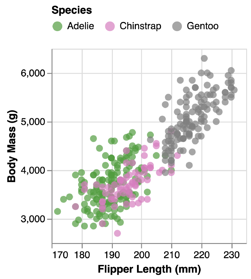
Figure 5 shows an example of how to improve the visualizations recommended by Voyager systems using our synthesized guidelines.
6.1.2. Voyager (Wongsuphasawat et al., 2016, 2017)
The Voyager system suggests both data attributes and visual encodings.
Voyager uses CompassQL (Wongsuphasawat et al., 2016) as the recommendation engine and Vega-lite (Satyanarayan et al., 2017) as the visualization renderer.
5(a) shows one of the visualizations recommended by Voyager, which is a colored scatterplot using a Vega-lite color palette (\scalerel*![[Uncaptioned image]](/html/2109.01271/assets/x67.png) B) for nominal data.
We re-generate the recommended chart (as shown in 5(b)) using the design guidelines from Section 5.1.2: (1) the re-ordered color palette (\scalerel*
B) for nominal data.
We re-generate the recommended chart (as shown in 5(b)) using the design guidelines from Section 5.1.2: (1) the re-ordered color palette (\scalerel*![[Uncaptioned image]](/html/2109.01271/assets/x68.png) B) can maximize perceptual distance (Demiralp et al., 2014); and (2) colors are more discriminable with filled shapes (Smart and Szafir, 2019).
We can see that each category (species) is more distinguishable from the other in the improved recommendation compared to the Voyager original recommendation (Figure 5).
In the same spirit, we can use suggested palettes for shape, color hue, and area from existing literature (Demiralp et al., 2014; Gramazio et al., 2016; Fang et al., 2017; Wang et al., 2019) to improve the effectiveness of Voyager’s recommended visualizations.
We provide the Vega-Lite (Satyanarayan et al., 2017) specifications for suggested color palettes in the supplemental material. They can be ingested by visualization recommendation systems that use Vega-Lite as a visualization renderer, similar to existing work (e.g., (Wongsuphasawat et al., 2016, 2017; Lin et al., 2020; Moritz et al., 2019; Kim et al., 2017)).
B) can maximize perceptual distance (Demiralp et al., 2014); and (2) colors are more discriminable with filled shapes (Smart and Szafir, 2019).
We can see that each category (species) is more distinguishable from the other in the improved recommendation compared to the Voyager original recommendation (Figure 5).
In the same spirit, we can use suggested palettes for shape, color hue, and area from existing literature (Demiralp et al., 2014; Gramazio et al., 2016; Fang et al., 2017; Wang et al., 2019) to improve the effectiveness of Voyager’s recommended visualizations.
We provide the Vega-Lite (Satyanarayan et al., 2017) specifications for suggested color palettes in the supplemental material. They can be ingested by visualization recommendation systems that use Vega-Lite as a visualization renderer, similar to existing work (e.g., (Wongsuphasawat et al., 2016, 2017; Lin et al., 2020; Moritz et al., 2019; Kim et al., 2017)).

Figure 6 shows a screenshot of the Foresight system. They suggest different visualizations according to different data characteristics.
6.1.3. Foresight (Demiralp et al., 2017)
The Foresight system suggests data attributes based on their “insight” scores and presents the recommendation with either a bar chart, a box plot, or a scatterplot. As we can see from Figure 6, Foresight uses different chart types to visualize different “insight classes”. Bar charts are used for distributions (heavy tails), while box plots are used for outliers and scatterplots for correlations. However, the results from experiments by Saket et al. (Saket et al., 2019) suggest that scatterplots perform the best for finding anomalies, while line charts for correlation, and bar charts for distribution tasks. Thus, replacing existing chart types with the best ones (see Table 9) based on empirical results for corresponding tasks might help users gain more insights more effectively with Foresight.
6.2. Challenges & Open Research Areas
Here we synthesize our takeaways from Section 5 into open research challenges toward a comprehensive ranking of visualization designs and discuss directions for future research based on our analysis.
6.2.1. Gaps in Visualization Comparison Coverage
Gaps in theoretical work.
As mentioned in Section 4, theory work is critical to generalizing the findings of specific experiments as the takeaways can be applied broadly in visualization. Although all twelve encodings are ranked (or pruned) according to theoretical hypotheses (see Table 2, Table 3), only a few visualization types (scatterplot, bar chart, line chart, and cartogram) are discussed in theory work (see Table 6). Other chart types, such as area charts, pie charts, and heatmaps, are never ranked theoretically. In other words, interference effects among visual encodings are rarely theoretically studied. Solutions: An impactful area would be deriving theoretical principles from existing experiment results for multi-encoding designs to infer how well different encodings will work together and whether the performance of encoding combinations still follow the same rankings. New theories can also help to prune the design space to identify gaps that truly warrant new experiments.
Gaps in experimental work.
On the one hand, we observe much fewer experiments evaluating how effectively each encoding could convey ordinal data (only CH and CS are tested). Solutions: We urge more empirical work to conclude which encoding to pick under different task scenarios.
On the other hand, existing evaluations mainly focus on specific encodings (PX, PY, L, Ar, CS, CH) or charts (scatterplots and bar charts), while other chart types are either only compared with one or two other charts, or never studied with different variants (see Section 5.2). Solutions: Evaluating the performance of previously ignored encodings (e.g., T, S) and chart types (e.g., area charts, heatmap) under different analysis tasks would contribute more “ground truth” evidence to further validate our approaches to automating the visualization design process.
6.2.2. Inconsistencies and Conflicts in the Literature
Between theories and experiments.
We observe that theoretical hypotheses might not necessarily be “correct” in a practical sense. For example, as previously mentioned, five attribute-encoding pairs ((Q, T/S), (O, S), (N, Ar/CS) are considered inexpressive based on Mackinlay’s work (Mackinlay, 1986) (see Table 3); however, a more recent evaluation (Chung et al., 2016) shows different results. Mackinlay suggests that T and S are not relevant to quantitative data, but according to the results from Chung et al.’s experiments, both T and S encodings perform better in accuracy than O conveying quantitative data with estimate trend and find extremum tasks. Solutions: Refining core theory work in light of recent experimental results could further enhance the performance of visualization recommendation systems.
Between different experiments.
Even when experiments were similar, we may find contradictory results. Even though Godau et al. (Godau et al., 2016) and Xiong et al. (Xiong et al., 2019) both conducted experiments to test human bias in perceiving average position for length (bar charts) and position encodings (scatterplot or line charts), they have completely different results (as shown in Table 8). Godau et al. only find underestimation in bar charts but no bias for point positions (scatterplots). However, Xiong et al. find significant bias in both bar charts and line charts, where line positions are underestimated while bar positions are overestimated. In another example, Harrison et al. (Harrison et al., 2014) find Weber’s law to be a convincing model for how people perceive data correlations; however, in a re-analysis of the same data, Kay and Heer (Kay and Heer, 2015) find Weber’s Law not to be a good fit. It is natural in science to improve upon existing results and theories; however, there is currently no easy way to identify and track these discrepancies within the literature and translate them into concrete improvements to visualization recommendation systems. Solutions: Redesigning experiments to test visualizations with controversial results, conducting more comprehensive comparisons between more nuanced design decisions, and involving more metrics could lead to more precise visualization design rankings for recommendation systems.
Summary.
Given the (multiple) discrepancies we have observed, we argue that the findings of both visualization theory and experimental research should be treated as hypotheses until subsequent experiments converge on a consistent set of results. Furthermore, we argue that replication experiments should be held in high regard within the visualization community regardless of whether their findings reinforce or challenge our current assumptions, since either way, they are the only way to validate our understanding of how people perceive and use visualizations. We need them to ensure that visualization recommendation algorithms are built upon a solid foundation of theoretical and empirical findings; we should reward them accordingly.
6.3. Limitations & Future Work
Our literature review contributes a detailed record of how different visualization designs are compared and ranked in 59 different theoretical and experimental papers. This record not only specifies all researched visualization designs but also keeps track of the ranking of their performance (accuracy, bias, JND, time, user-preference) under different task scenarios. A next step to extend this work could be to apply the findings to develop better encoding strategies within visualization recommendation systems, such as adapting the recommendation strategy based on the user’s current analysis task.
Given our initial goal is to understand how different visualization designs (especially different encodings) are ranked in the current theoretical and experimental work, our schema only records {data types, data characteristics, data transformations, encoding channels, mark types, scales} for each covered design (details in 1). For more granular design decisions, we add notes to specify them. For example, to record Talbot et al.’s experiments testing bar charts (Talbot et al., 2014), we add notes to specify each variant of the bar chart tested, such as whether two bars are aligned or separated, whether distractors are added, the indicator location, etc. However, it is hard to parse these notes automatically. We see our schema as a starting point for collating existing encoding design knowledge and encourage the visualization community to extend this schema to support more nuanced visualization designs.
Informed by existing work on visualization design spaces and graphical perception studies, we excluded (1) 3D visualizations, (2) graph visualizations, and (3) visualizations with animations or interactions from our defined visualization space. When more theoretical and experimental findings become available in the literature, expanding our work to include these excluded designs would be interesting.
We also note that by focusing on graphical perception, we are unable to account for other factors that may influence the overall effectiveness of a visualization design, such as visual aesthetics (Tufte, 2001), intuition, and metaphors (Ziemkiewicz and Kosara, 2008), as well as user background and preferences (Ziemkiewicz et al., 2012). Developing a broader framework encompassing both graphical perception and these other factors would be exciting future work.
Acknowledgements.
The authors wish to thank colleagues in the UMD HCIL and the BAD Lab, as well as Niklas Elmqvist, Michael Correll, Steve Franconeri and our paper reviewers for their thoughtful feedback. This work was supported in part by NSF award IIS-1850115 and a VMWare Early Career Faculty Grant.References
- (1)
- Aigner et al. (2011) Wolfgang Aigner, Christian Kainz, Rui Ma, and Silvia Miksch. 2011. Bertin was Right: An Empirical Evaluation of Indexing to Compare Multivariate Time-Series Data Using Line Plots. Computer Graphics Forum 30 (03 2011), 215–228. https://doi.org/10.1111/j.1467-8659.2010.01845.x
- Albers et al. (2014) Danielle Albers, Michael Correll, and Michael Gleicher. 2014. Task-Driven Evaluation of Aggregation in Time Series Visualization. In Proceedings of the SIGCHI Conference on Human Factors in Computing Systems (Toronto, Ontario, Canada) (CHI ’14). Association for Computing Machinery, New York, NY, USA, 551–560. https://doi.org/10.1145/2556288.2557200
- Albers Szafir et al. (2016) Danielle Albers Szafir, Steve Haroz, Michael Gleicher, and Steven Franconeri. 2016. Four types of ensemble coding in data visualizations. Journal of Vision 16 (03 2016), 11. https://doi.org/10.1167/16.5.11
- Amar et al. (2005) R. Amar, J. Eagan, and J. Stasko. 2005. Low-level components of analytic activity in information visualization. IEEE Symposium on Information Visualization, 2005. INFOVIS 2005. 15 (2005), 111–117. https://doi.org/10.1109/INFVIS.2005.1532136
- Andrews et al. (2010) Christopher Andrews, Alex Endert, and Chris North. 2010. Space to Think: Large High-Resolution Displays for Sensemaking. Association for Computing Machinery, New York, NY, USA, 55–64. https://doi.org/10.1145/1753326.1753336
- Araya et al. (2020) Vanessa Peña Araya, Anastasia Bezerianos, and Emmanuel Pietriga. 2020. A Comparison of Geographical Propagation Visualizations. In CHI ’20: CHI Conference on Human Factors in Computing Systems, Regina Bernhaupt, Florian ’Floyd’ Mueller, David Verweij, Josh Andres, Joanna McGrenere, Andy Cockburn, Ignacio Avellino, Alix Goguey, Pernille Bjøn, Shengdong Zhao, Briane Paul Samson, and Rafal Kocielnik (Eds.). ACM, Honolulu, HI, USA, 1–14. https://doi.org/10.1145/3313831.3376350
- Badam et al. (2016) S. Badam, F. Amini, N. Elmqvist, and P. Irani. 2016. Supporting visual exploration for multiple users in large display environments. In 2016 IEEE Conference on Visual Analytics Science and Technology (VAST). IEEE Computer Society, Los Alamitos, CA, USA, 1–10. https://doi.org/10.1109/VAST.2016.7883506
- Battle et al. (2018) Leilani Battle, Peitong Duan, Zachery Miranda, Dana Mukusheva, Remco Chang, and Michael Stonebraker. 2018. Beagle: Automated Extraction and Interpretation of Visualizations from the Web. Association for Computing Machinery, New York, NY, USA, 1–8. https://doi.org/10.1145/3173574.3174168
- Bertin (1983) Jacques Bertin. 1983. Semiology of Graphics. University of Wisconsin Press, Madison, Wisconsin, USA.
- Borgo et al. (2012) R. Borgo, A. Abdul-Rahman, F. Mohamed, P. W. Grant, I. Reppa, L. Floridi, and M. Chen. 2012. An Empirical Study on Using Visual Embellishments in Visualization. IEEE Transactions on Visualization and Computer Graphics 18, 12 (Dec 2012), 2759–2768. https://doi.org/10.1109/TVCG.2012.197
- Brehmer et al. (2019) Matthew Brehmer, Bongshin Lee, Petra Isenberg, and Eun Kyoung Choe. 2019. Visualizing Ranges over Time on Mobile Phones: A Task-Based Crowdsourced Evaluation. IEEE Transactions on Visualization and Computer Graphics 25, 1 (2019), 619–629. https://doi.org/10.1109/TVCG.2018.2865234
- Bujack et al. (2018) R. Bujack, T. L. Turton, D. H. Rogers, and J. P. Ahrens. 2018. Ordering Perceptions about Perceptual Order. In 2018 IEEE Scientific Visualization Conference (SciVis). IEEE Computer Society, Los Alamitos, CA, USA, 32–36. https://doi.org/10.1109/SciVis.2018.8823772
- Bujack et al. (2018) R. Bujack, T. L. Turton, F. Samsel, C. Ware, D. H. Rogers, and J. Ahrens. 2018. The Good, the Bad, and the Ugly: A Theoretical Framework for the Assessment of Continuous Colormaps. IEEE Transactions on Visualization and Computer Graphics 24, 1 (2018), 923–933.
- Burlinson et al. (2018) David Burlinson, Kalpathi Subramanian, and Paula Goolkasian. 2018. Open vs. Closed Shapes: New Perceptual Categories? IEEE Transactions on Visualization and Computer Graphics 24, 1 (2018), 574–583. https://doi.org/10.1109/TVCG.2017.2745086
- Ceja et al. (2020) Cristina R Ceja, Caitlyn M McColeman, Cindy Xiong, and Steven L Franconeri. 2020. Truth or square: Aspect ratio biases recall of position encodings. IEEE Transactions on Visualization and Computer Graphics 27, 2 (2020), 1054–1062.
- Chung et al. (2016) David Chung, Daniel Archambault, Rita Borgo, Darren Edwards, Robert Laramee, and Min Chen. 2016. How Ordered Is It? On the Perceptual Orderability of Visual Channels. Computer Graphics Forum 35 (06 2016), 131–140. https://doi.org/10.1111/cgf.12889
- Cleveland and McGill (1984) William S Cleveland and Robert McGill. 1984. Graphical perception: Theory, experimentation, and application to the development of graphical methods. J. Amer. Statist. Assoc. 79, 387 (1984), 531–554.
- Correll et al. (2012) Michael Correll, Danielle Albers, Steven Franconeri, and Michael Gleicher. 2012. Comparing Averages in Time Series Data. In Proceedings of the SIGCHI Conference on Human Factors in Computing Systems (Austin, Texas, USA) (CHI ’12). Association for Computing Machinery, New York, NY, USA, 1095–1104. https://doi.org/10.1145/2207676.2208556
- Correll et al. (2020) Michael Correll, Enrico Bertini, and Steven Franconeri. 2020. Truncating the Y-Axis: Threat or Menace?. In CHI ’20: CHI Conference on Human Factors in Computing Systems, Regina Bernhaupt, Florian ’Floyd’ Mueller, David Verweij, Josh Andres, Joanna McGrenere, Andy Cockburn, Ignacio Avellino, Alix Goguey, Pernille Bjøn, Shengdong Zhao, Briane Paul Samson, and Rafal Kocielnik (Eds.). ACM, Honolulu, HI, USA, 1–12. https://doi.org/10.1145/3313831.3376222
- Correll and Heer (2017) Michael Correll and Jeffrey Heer. 2017. Regression by Eye: Estimating Trends in Bivariate Visualizations. In Proceedings of the 2017 CHI Conference on Human Factors in Computing Systems (Denver, Colorado, USA) (CHI ’17). Association for Computing Machinery, New York, NY, USA, 1387–1396. https://doi.org/10.1145/3025453.3025922
- Cui et al. (2019) Weiwei Cui, Xiaoyu Zhang, Yun Wang, He Huang, Bei Chen, Lei Fang, Haidong Zhang, Jian-Guan Lou, and Dongmei Zhang. 2019. Text-to-viz: Automatic generation of infographics from proportion-related natural language statements. IEEE transactions on visualization and computer graphics 26, 1 (2019), 906–916.
- Dasgupta and Kosara (2010) Aritra Dasgupta and Robert Kosara. 2010. Pargnostics: Screen-Space Metrics for Parallel Coordinates. IEEE Transactions on Visualization and Computer Graphics 16, 6 (2010), 1017–1026. https://doi.org/10.1109/TVCG.2010.184
- Demiralp et al. (2014) Ç. Demiralp, M. S. Bernstein, and J. Heer. 2014. Learning Perceptual Kernels for Visualization Design. IEEE Transactions on Visualization and Computer Graphics 20, 12 (Dec 2014), 1933–1942. https://doi.org/10.1109/TVCG.2014.2346978
- Demiralp et al. (2017) Çagatay Demiralp, Peter J. Haas, Srinivasan Parthasarathy, and Tejaswini Pedapati. 2017. Foresight: Recommending Visual Insights. Proc. VLDB Endow. 10, 12 (2017), 1937–1940. https://doi.org/10.14778/3137765.3137813
- Fang et al. (2017) H. Fang, S. Walton, E. Delahaye, J. Harris, D. A. Storchak, and M. Chen. 2017. Categorical Colormap Optimization with Visualization Case Studies. IEEE Transactions on Visualization and Computer Graphics 23, 1 (Jan 2017), 871–880. https://doi.org/10.1109/TVCG.2016.2599214
- Gleicher et al. (2013) Michael Gleicher, Michael Correll, Christine Nothelfer, and Steven Franconeri. 2013. Perception of average value in multiclass scatterplots. IEEE Transactions on Visualization and Computer Graphics 19, 12 (31 10 2013), 2316–2325. https://doi.org/10.1109/TVCG.2013.183
- Godau et al. (2016) Claudia Godau, Tom Vogelgesang, and Robert Gaschler. 2016. Perception of Bar Graphs - A Biased Impression? Comput. Hum. Behav. 59, C (June 2016), 67–73. https://doi.org/10.1016/j.chb.2016.01.036
- Gogolou et al. (2019) A. Gogolou, T. Tsandilas, T. Palpanas, and A. Bezerianos. 2019. Comparing Similarity Perception in Time Series Visualizations. IEEE Transactions on Visualization and Computer Graphics 25, 1 (Jan 2019), 523–533. https://doi.org/10.1109/TVCG.2018.2865077
- Golebiowska and Coltekin (2022) I. M. Golebiowska and A. Coltekin. 2022. Rainbow Dash: Intuitiveness, Interpretability and Memorability of the Rainbow Color Scheme in Visualization. IEEE Transactions on Visualization and Computer Graphics 28, 07 (Jul 2022), 2722–2733. https://doi.org/10.1109/TVCG.2020.3035823
- Gramazio et al. (2016) Connor C Gramazio, David H Laidlaw, and Karen B Schloss. 2016. Colorgorical: Creating discriminable and preferable color palettes for information visualization. IEEE transactions on visualization and computer graphics 23, 1 (2016), 521–530.
- Gramazio et al. (2014) Connor C. Gramazio, Karen B. Schloss, and David H. Laidlaw. 2014. The relation between visualization size, grouping, and user performance. IEEE Transactions on Visualization and Computer Graphics 20, 12 (2014), 1953–1962. https://doi.org/10.1109/TVCG.2014.2346983
- Haroz et al. (2015) Steve Haroz, Robert Kosara, and Steven L. Franconeri. 2015. ISOTYPE Visualization: Working Memory, Performance, and Engagement with Pictographs. In Proceedings of the 33rd Annual ACM Conference on Human Factors in Computing Systems (Seoul, Republic of Korea) (CHI ’15). Association for Computing Machinery, New York, NY, USA, 1191–1200. https://doi.org/10.1145/2702123.2702275
- Harrison et al. (2014) L. Harrison, F. Yang, S. Franconeri, and R. Chang. 2014. Ranking Visualizations of Correlation Using Weber’s Law. IEEE Transactions on Visualization and Computer Graphics 20, 12 (Dec 2014), 1943–1952. https://doi.org/10.1109/TVCG.2014.2346979
- Heer and Bostock (2010) Jeffrey Heer and Michael Bostock. 2010. Crowdsourcing Graphical Perception: Using Mechanical Turk to Assess Visualization Design. In Proceedings of the SIGCHI Conference on Human Factors in Computing Systems (Atlanta, Georgia, USA) (CHI ’10). Association for Computing Machinery, New York, NY, USA, 203–212. https://doi.org/10.1145/1753326.1753357
- Heer and Robertson (2007) Jeffrey Heer and George Robertson. 2007. Animated Transitions in Statistical Data Graphics. IEEE Transactions on Visualization and Computer Graphics 13, 6 (Nov 2007), 1240–1247. https://doi.org/10.1109/TVCG.2007.70539
- Hoffswell et al. (2020) Jane Hoffswell, Wilmot Li, and Zhicheng Liu. 2020. Techniques for Flexible Responsive Visualization Design. In CHI ’20: CHI Conference on Human Factors in Computing Systems, Regina Bernhaupt, Florian ’Floyd’ Mueller, David Verweij, Josh Andres, Joanna McGrenere, Andy Cockburn, Ignacio Avellino, Alix Goguey, Pernille Bjøn, Shengdong Zhao, Briane Paul Samson, and Rafal Kocielnik (Eds.). ACM, Honolulu, HI, USA, 1–13. https://doi.org/10.1145/3313831.3376777
- Hong et al. (2021) Matt-Heun Hong, Jessica K Witt, and Danielle Albers Szafir. 2021. The Weighted Average Illusion: Biases in Perceived Mean Position in Scatterplots. IEEE Transactions on Visualization and Computer Graphics 28, 1 (2021), 987–997.
- Horak et al. (2018) Tom Horak, Sriram Karthik Badam, Niklas Elmqvist, and Raimund Dachselt. 2018. When David Meets Goliath: Combining Smartwatches with a Large Vertical Display for Visual Data Exploration. Association for Computing Machinery, New York, NY, USA, 1–13. https://doi.org/10.1145/3173574.3173593
- Hu et al. (2019) Kevin Zeng Hu, Michiel A. Bakker, Stephen Li, Tim Kraska, and César A. Hidalgo. 2019. VizML: A Machine Learning Approach to Visualization Recommendation. In Proceedings of the 2019 CHI Conference on Human Factors in Computing Systems, Stephen A. Brewster, Geraldine Fitzpatrick, Anna L. Cox, and Vassilis Kostakos (Eds.). ACM, Glasgow, Scotland, UK, 128. https://doi.org/10.1145/3290605.3300358
- Jardine et al. (2020) N. Jardine, B. D. Ondov, N. Elmqvist, and S. Franconeri. 2020. The Perceptual Proxies of Visual Comparison. IEEE Transactions on Visualization and Computer Graphics 26, 01 (Jan 2020), 1012–1021. https://doi.org/10.1109/TVCG.2019.2934786
- Javed et al. (2010) Waqas Javed, Bryan McDonnel, and Niklas Elmqvist. 2010. Graphical perception of multiple time series. IEEE transactions on visualization and computer graphics 16, 6 (2010), 927–934.
- Kanjanabose et al. (2015) Rassadarie Kanjanabose, Alfie Abdul-Rahman, and Min Chen. 2015. A Multi-Task Comparative Study on Scatter Plots and Parallel Coordinates Plots. Comput. Graph. Forum 34, 3 (jun 2015), 261–270.
- Karduni et al. (2020) Alireza Karduni, Ryan Wesslen, Isaac Cho, and Wenwen Dou. 2020. Du Bois Wrapped Bar Chart: Visualizing Categorical Data with Disproportionate Values. In Proceedings of the 2020 CHI Conference on Human Factors in Computing Systems (Honolulu, HI, USA) (CHI ’20). Association for Computing Machinery, New York, NY, USA, 1–12. https://doi.org/10.1145/3313831.3376365
- Kay and Heer (2015) Matthew Kay and Jeffrey Heer. 2015. Beyond weber’s law: A second look at ranking visualizations of correlation. IEEE Transactions on Visualization and Computer Graphics 22, 1 (2015), 469–478.
- Key et al. (2012) Alicia Key, Bill Howe, Daniel Perry, and Cecilia Aragon. 2012. VizDeck: Self-Organizing Dashboards for Visual Analytics. In Proceedings of the 2012 ACM SIGMOD International Conference on Management of Data (Scottsdale, Arizona, USA) (SIGMOD ’12). Association for Computing Machinery, New York, NY, USA, 681–684. https://doi.org/10.1145/2213836.2213931
- Kim and Heer (2018) Younghoon Kim and Jeffrey Heer. 2018. Assessing Effects of Task and Data Distribution on the Effectiveness of Visual Encodings. Comput. Graph. Forum 37, 3 (2018), 157–167. https://doi.org/10.1111/cgf.13409
- Kim et al. (2017) Younghoon Kim, Kanit Wongsuphasawat, Jessica Hullman, and Jeffrey Heer. 2017. GraphScape: A Model for Automated Reasoning about Visualization Similarity and Sequencing. Association for Computing Machinery, New York, NY, USA, 2628–2638. https://doi.org/10.1145/3025453.3025866
- Kosara (2016) Robert Kosara. 2016. An Empire Built On Sand: Reexamining What We Think We Know About Visualization. In Proceedings of the Sixth Workshop on Beyond Time and Errors on Novel Evaluation Methods for Visualization (Baltimore, MD, USA) (BELIV ’16). Association for Computing Machinery, New York, NY, USA, 162–168. https://doi.org/10.1145/2993901.2993909
- Kosara (2019a) R. Kosara. 2019a. Evidence for Area as the Primary Visual Cue in Pie Charts. In 2019 IEEE Visualization Conference (VIS). IEEE Computer Society, Los Alamitos, CA, USA, 101–105. https://doi.org/10.1109/VISUAL.2019.8933547
- Kosara (2019b) Robert Kosara. 2019b. The Impact of Distribution and Chart Type on Part-to-Whole Comparisons. In 21st Eurographics Conference on Visualization, EuroVis 2019 - Short Papers, Jimmy Johansson, Filip Sadlo, and G. Elisabeta Marai (Eds.). Eurographics Association, Porto, Portugal, 7–11. https://doi.org/10.2312/evs.20191162
- Lee et al. (2006) Bongshin Lee, Catherine Plaisant, Cynthia Sims Parr, Jean-Daniel Fekete, and Nathalie Henry. 2006. Task Taxonomy for Graph Visualization. In Proceedings of the 2006 AVI Workshop on BEyond Time and Errors: Novel Evaluation Methods for Information Visualization (Venice, Italy) (BELIV ’06). Association for Computing Machinery, New York, NY, USA, 1–5. https://doi.org/10.1145/1168149.1168168
- Li et al. (2022) H. Li, Y. Wang, S. Zhang, Y. Song, and H. Qu. 2022. KG4Vis: A Knowledge Graph-Based Approach for Visualization Recommendation. IEEE Transactions on Visualization and Computer Graphics 28, 01 (jan 2022), 195–205. https://doi.org/10.1109/TVCG.2021.3114863
- Li et al. (2010) Jing Li, Jean-Bernard Martens, and Jarke J. van Wijk. 2010. Judging Correlation from Scatterplots and Parallel Coordinate Plots. Information Visualization 9, 1 (March 2010), 13–30. https://doi.org/10.1057/ivs.2008.13
- Li et al. (2023) Y. Li, Y. Qi, Y. Shi, Q. Chen, N. Cao, and S. Chen. 2023. Diverse Interaction Recommendation for Public Users Exploring Multi-view Visualization using Deep Learning. IEEE Transactions on Visualization and Computer Graphics 29, 01 (Jan 2023), 95–105. https://doi.org/10.1109/TVCG.2022.3209461
- Lin et al. (2020) Halden Lin, Dominik Moritz, and Jeffrey Heer. 2020. Dziban: Balancing Agency & Automation in Visualization Design via Anchored Recommendations. In Proceedings of the 2020 CHI Conference on Human Factors in Computing Systems (Honolulu, HI, USA) (CHI ’20). Association for Computing Machinery, New York, NY, USA, 1–12. https://doi.org/10.1145/3313831.3376880
- Lin et al. (2013) Sharon Lin, Julie Fortuna, Chinmay Kulkarni, Maureen Stone, and Jeffrey Heer. 2013. Selecting Semantically-Resonant Colors for Data Visualization. In Proceedings of the 15th Eurographics Conference on Visualization (Leipzig, Germany) (EuroVis ’13). The Eurographs Association John Wiley Sons, Ltd., Chichester, GBR, 401–410.
- Liu et al. (2021) Tingting Liu, Xiaotong Li, Chen Bao, Michael Correll, Changehe Tu, Oliver Deussen, and Yunhai Wang. 2021. Data-Driven Mark Orientation for Trend Estimation in Scatterplots. In Proceedings of the 2021 CHI Conference on Human Factors in Computing Systems (Yokohama, Japan) (CHI ’21). Association for Computing Machinery, New York, NY, USA, Article 473, 16 pages. https://doi.org/10.1145/3411764.3445751
- Liu and Heer (2018) Yang Liu and Jeffrey Heer. 2018. Somewhere Over the Rainbow: An Empirical Assessment of Quantitative Colormaps. Association for Computing Machinery, New York, NY, USA, 1–12. https://doi.org/10.1145/3173574.3174172
- Lu et al. (2021) Min Lu, Joel Lanir, Chufeng Wang, Yucong Yao, Wen Zhang, Oliver Deussen, and Hui Huang. 2021. Modeling Just Noticeable Differences in Charts. IEEE Transactions on Visualization and Computer Graphics 28, 1 (2021), 718–726.
- Luo et al. (2018) Yuyu Luo, Xuedi Qin, Nan Tang, and Guoliang Li. 2018. DeepEye: Towards Automatic Data Visualization. In 34th IEEE International Conference on Data Engineering. IEEE Computer Society, Paris, France, 101–112. https://doi.org/10.1109/ICDE.2018.00019
- Mackinlay (1986) Jock Mackinlay. 1986. Automating the Design of Graphical Presentations of Relational Information. ACM Trans. Graph. 5, 2 (April 1986), 110–141. https://doi.org/10.1145/22949.22950
- Mackinlay et al. (2007) J. Mackinlay, P. Hanrahan, and C. Stolte. 2007. Show Me: Automatic Presentation for Visual Analysis. IEEE Transactions on Visualization and Computer Graphics 13, 6 (Nov 2007), 1137–1144. https://doi.org/10.1109/TVCG.2007.70594
- McColeman et al. (2021) Caitlyn M McColeman, Fumeng Yang, Timothy F Brady, and Steven Franconeri. 2021. Rethinking the ranks of visual channels. IEEE Transactions on Visualization and Computer Graphics 28, 1 (2021), 707–717.
- Micallef et al. (2017) L. Micallef, G. Palmas, A. Oulasvirta, and T. Weinkauf. 2017. Towards Perceptual Optimization of the Visual Design of Scatterplots. IEEE Transactions on Visualization and Computer Graphics 23, 06 (Jun 2017), 1588–1599. https://doi.org/10.1109/TVCG.2017.2674978
- Moritz et al. (2019) D. Moritz, C. Wang, G. L. Nelson, H. Lin, A. M. Smith, B. Howe, and J. Heer. 2019. Formalizing Visualization Design Knowledge as Constraints: Actionable and Extensible Models in Draco. IEEE Transactions on Visualization and Computer Graphics 25, 1 (Jan 2019), 438–448. https://doi.org/10.1109/TVCG.2018.2865240
- Munzner (2009) Tamara Munzner. 2009. A Nested Model for Visualization Design and Validation. IEEE Transactions on Visualization and Computer Graphics 15, 6 (2009), 921–928. https://doi.org/10.1109/TVCG.2009.111
- Mylavarapu et al. (2019) Pranathi Mylavarapu, Adil Yalcin, Xan Gregg, and Niklas Elmqvist. 2019. Ranked-List Visualization: A Graphical Perception Study. In Proceedings of the 2019 CHI Conference on Human Factors in Computing Systems (Glasgow, Scotland Uk) (CHI ’19). Association for Computing Machinery, New York, NY, USA, Article 192, 12 pages. https://doi.org/10.1145/3290605.3300422
- Nothelfer and Franconeri (2019) Christine Nothelfer and Steven Franconeri. 2019. Measures of the benefit of direct encoding of data deltas for data pair relation perception. IEEE transactions on visualization and computer graphics 26, 1 (2019), 311–320.
- Nusrat et al. (2015) Sabrina Nusrat, Md Alam, and Stephen Kobourov. 2015. Evaluating Cartogram Effectiveness. IEEE Transactions on Visualization and Computer Graphics PP (04 2015). https://doi.org/10.1109/TVCG.2016.2642109
- Ondov et al. (2019) B. Ondov, N. Jardine, N. Elmqvist, and S. Franconeri. 2019. Face to Face: Evaluating Visual Comparison. IEEE Transactions on Visualization and Computer Graphics 25, 01 (Jan 2019), 861–871. https://doi.org/10.1109/TVCG.2018.2864884
- Peña-Araya et al. (2019) Vanessa Peña-Araya, Emmanuel Pietriga, and Anastasia Bezerianos. 2019. A comparison of visualizations for identifying correlation over space and time. IEEE transactions on visualization and computer graphics 26, 1 (2019), 375–385.
- Perin et al. (2018) C. Perin, T. Wun, R. Pusch, and S. Carpendale. 2018. Assessing the Graphical Perception of Time and Speed on 2D+Time Trajectories. IEEE Transactions on Visualization and Computer Graphics 24, 1 (Jan 2018), 698–708. https://doi.org/10.1109/TVCG.2017.2743918
- Quadri and Rosen (2022) Ghulam Jilani Quadri and Paul Rosen. 2022. A Survey of Perception-Based Visualization Studies by Task. IEEE Transactions on Visualization and Computer Graphics 28, 12 (2022), 5026–5048. https://doi.org/10.1109/TVCG.2021.3098240
- Reda et al. (2018) Khairi Reda, Pratik Nalawade, and Kate Ansah-Koi. 2018. Graphical Perception of Continuous Quantitative Maps: The Effects of Spatial Frequency and Colormap Design. In Proceedings of the 2018 CHI Conference on Human Factors in Computing Systems (Montreal QC, Canada) (CHI ’18). Association for Computing Machinery, New York, NY, USA, Article 272, 12 pages. https://doi.org/10.1145/3173574.3173846
- Reda and Papka (2019) K. Reda and M. E. Papka. 2019. Evaluating Gradient Perception in Color-Coded Scalar Fields. In 2019 IEEE Visualization Conference (VIS). IEEE Computer Society, Los Alamitos, CA, USA, 271–275. https://doi.org/10.1109/VISUAL.2019.8933760
- Redmond (2019) S. Redmond. 2019. Visual Cues in Estimation of Part-To-Whole Comparisons. In 2019 IEEE Visualization Conference (VIS). IEEE Computer Society, Los Alamitos, CA, USA, 1–5. https://doi.org/10.1109/VISUAL.2019.8933718
- Rind et al. (2016) Alexander Rind, Wolfgang Aigner, Markus Wagner, Silvia Miksch, and Tim Lammarsch. 2016. Task cube: A three-dimensional conceptual space of user tasks in visualization design and evaluation. Information Visualization 15, 4 (2016), 288–300.
- Saket et al. (2019) B. Saket, A. Endert, and Ç. Demiralp. 2019. Task-WBased Effectiveness of Basic Visualizations. IEEE Transactions on Visualization and Computer Graphics 25, 7 (July 2019), 2505–2512. https://doi.org/10.1109/TVCG.2018.2829750
- Saket et al. (2018) Bahador Saket, Dominik Moritz, Halden Lin, Victor Dibia, Cagatay Demiralp, and Jeffrey Heer. 2018. Beyond Heuristics: Learning Visualization Design. https://doi.org/10.48550/ARXIV.1807.06641
- Santos (2008) Beatriz Sousa Santos. 2008. Evaluating visualization techniques and tools: What are the main issues.
- Sarikaya and Gleicher (2017) Alper Sarikaya and Michael Gleicher. 2017. Scatterplots: Tasks, Data, and Designs. IEEE Transactions on Visualization and Computer Graphics PP (08 2017), 1–1. https://doi.org/10.1109/TVCG.2017.2744184
- Satyanarayan et al. (2017) A. Satyanarayan, D. Moritz, K. Wongsuphasawat, and J. Heer. 2017. Vega-Lite: A Grammar of Interactive Graphics. IEEE Transactions on Visualization and Computer Graphics 23, 1 (Jan 2017), 341–350. https://doi.org/10.1109/TVCG.2016.2599030
- Schloss et al. (2019) Karen B. Schloss, Connor Gramazio, Allison T. Silverman, Madeline L. Parker, and Audrey S. Wang. 2019. Mapping Color to Meaning in Colormap Data Visualizations. IEEE Transactions on Visualization and Computer Graphics 25 (2019), 810–819.
- Selow and Wijk (1999) E. R. Van Selow and J. J. Van Wijk. 1999. Cluster and Calendar Based Visualization of Time Series Data. In Information Visualization, IEEE Symposium on. IEEE Computer Society, Los Alamitos, CA, USA, 4. https://doi.org/10.1109/INFVIS.1999.801851
- Setlur and Stone (2016) Vidya Setlur and Maureen C. Stone. 2016. A Linguistic Approach to Categorical Color Assignment for Data Visualization. IEEE Transactions on Visualization and Computer Graphics 22, 1 (2016), 698–707. https://doi.org/10.1109/TVCG.2015.2467471
- Shen et al. (5555) L. Shen, E. Shen, Y. Luo, X. Yang, X. Hu, X. Zhang, Z. Tai, and J. Wang. 5555. Towards Natural Language Interfaces for Data Visualization: A Survey. IEEE Transactions on Visualization and Computer Graphics 01 (Jan 5555), 1–1. https://doi.org/10.1109/TVCG.2022.3148007
- Shneiderman (1996) B. Shneiderman. 1996. The Eyes Have It: A Task by Data Type Taxonomy for Information Visualizations. In Visual Languages, IEEE Symposium on. IEEE Computer Society, Los Alamitos, CA, USA, 336. https://doi.org/10.1109/VL.1996.545307
- Siddiqui et al. (2016) Tarique Siddiqui, Albert Kim, John Lee, Karrie Karahalios, and Aditya G. Parameswaran. 2016. Effortless Data Exploration with zenvisage: An Expressive and Interactive Visual Analytics System. Proc. VLDB Endow. 10, 4 (2016), 457–468. https://doi.org/10.14778/3025111.3025126
- Skau et al. (2015) Drew Skau, Lane Harrison, and Robert Kosara. 2015. An Evaluation of the Impact of Visual Embellishments in Bar Charts. Computer Graphics Forum 34 (06 2015). https://doi.org/10.1111/cgf.12634
- Skau and Kosara (2016) Drew Skau and Robert Kosara. 2016. Arcs, Angles, or Areas: Individual Data Encodings in Pie and Donut Charts. Comput. Graph. Forum 35, 3 (2016), 121–130. https://doi.org/10.1111/cgf.12888
- Skau and Kosara (2017) Drew Skau and Robert Kosara. 2017. Readability and Precision in Pictorial Bar Charts. In 19th Eurographics Conference on Visualization, EuroVis 2017 - Short Papers, Barbora Kozlíková, Tobias Schreck, and Thomas Wischgoll (Eds.). Eurographics Association, Barcelona, Spain, 91–95. https://doi.org/10.2312/eurovisshort.20171139
- Smart and Szafir (2019) Stephen Smart and Danielle Albers Szafir. 2019. Measuring the Separability of Shape, Size, and Color in Scatterplots. In Proceedings of the 2019 CHI Conference on Human Factors in Computing Systems (Glasgow, Scotland Uk) (CHI ’19). Association for Computing Machinery, New York, NY, USA, Article 669, 14 pages. https://doi.org/10.1145/3290605.3300899
- Srinivasan et al. (2018) Arjun Srinivasan, Matthew Brehmer, Bongshin Lee, and Steven M. Drucker. 2018. What’s the Difference? Evaluating Variations of Multi-Series Bar Charts for Visual Comparison Tasks. Association for Computing Machinery, New York, NY, USA, 1–12. https://doi.org/10.1145/3173574.3173878
- Szafir (2018) D. A. Szafir. 2018. Modeling Color Difference for Visualization Design. IEEE Transactions on Visualization and Computer Graphics 24, 1 (Jan 2018), 392–401. https://doi.org/10.1109/TVCG.2017.2744359
- Talbot et al. (2014) J. Talbot, V. Setlur, and A. Anand. 2014. Four Experiments on the Perception of Bar Charts. IEEE Transactions on Visualization and Computer Graphics 20, 12 (Dec 2014), 2152–2160. https://doi.org/10.1109/TVCG.2014.2346320
- Tory et al. (2006) Melanie Tory, Arthur E. Kirkpatrick, M. Stella Atkins, and Torsten Moller. 2006. Visualization Task Performance with 2D, 3D, and Combination Displays. IEEE Transactions on Visualization and Computer Graphics 12, 1 (Jan. 2006), 2–13. https://doi.org/10.1109/TVCG.2006.17
- Tufte (2001) E. R. Tufte. 2001. The Visual Display of Quantitative Information. Graphics Press, Cheshire, Connecticut.
- Vartak et al. (2015) Manasi Vartak, Sajjadur Rahman, Samuel Madden, Aditya Parameswaran, and Neoklis Polyzotis. 2015. SeeDB: Efficient Data-Driven Visualization Recommendations to Support Visual Analytics. Proc. VLDB Endow. 8, 13 (Sept. 2015), 2182–2193. https://doi.org/10.14778/2831360.2831371
- Waldner et al. (2019) Manuela Waldner, Alexandra Diehl, Denis Gracanin, Rainer Splechtna, Claudio Delrieux, and Kresimir Matkovic. 2019. A Comparison of Radial and Linear Charts for Visualizing Daily Patterns. IEEE Transactions on Visualization and Computer Graphics 26 (2019), 1033–1042.
- Wang et al. (2022) Qianwen Wang, Zhutian Chen, Yong Wang, and Huamin Qu. 2022. A Survey on ML4VIS: Applying Machine Learning Advances to Data Visualization. IEEE Transactions on Visualization and Computer Graphics 28 (2022), 5134–5153.
- Wang et al. (2019) Y. Wang, X. Chen, T. Ge, C. Bao, M. Sedlmair, C. Fu, O. Deussen, and B. Chen. 2019. Optimizing Color Assignment for Perception of Class Separability in Multiclass Scatterplots. IEEE Transactions on Visualization and Computer Graphics 25, 1 (Jan 2019), 820–829. https://doi.org/10.1109/TVCG.2018.2864912
- Ware (2008) Colin Ware. 2008. Visual Thinking: For Design. Morgan Kaufmann, Amsterdam. http://www.sciencedirect.com/science/book/9780123708960
- Ware (2012) Colin Ware. 2012. Information Visualization: Perception for Design (3 ed.). Morgan Kaufmann Publishers Inc., San Francisco, CA, USA.
- Wickham (2010) Hadley Wickham. 2010. A layered grammar of graphics. Journal of Computational and Graphical Statistics 19, 1 (2010), 3–28. https://doi.org/10.1198/jcgs.2009.07098
- Wilkinson et al. (2005) L. Wilkinson, A. Anand, and R. Grossman. 2005. Graph-theoretic scagnostics. In Information Visualization, IEEE Symposium on. IEEE Computer Society, Los Alamitos, CA, USA, 157,158,159,160,161,162,163,164. https://doi.org/10.1109/INFVIS.2005.1532142
- Wongsuphasawat et al. (2016) Kanit Wongsuphasawat, Dominik Moritz, Anushka Anand, Jock Mackinlay, Bill Howe, and Jeffrey Heer. 2016. Towards a General-purpose Query Language for Visualization Recommendation. In Proceedings of the Workshop on Human-In-the-Loop Data Analytics (San Francisco, California) (HILDA ’16). ACM, New York, NY, USA, Article 4, 6 pages. https://doi.org/10.1145/2939502.2939506
- Wongsuphasawat et al. (2016) K. Wongsuphasawat, D. Moritz, A. Anand, J. Mackinlay, B. Howe, and J. Heer. 2016. Voyager: Exploratory Analysis via Faceted Browsing of Visualization Recommendations. IEEE Transactions on Visualization and Computer Graphics 22, 1 (Jan 2016), 649–658. https://doi.org/10.1109/TVCG.2015.2467191
- Wongsuphasawat et al. (2017) Kanit Wongsuphasawat, Zening Qu, Dominik Moritz, Riley Chang, Felix Ouk, Anushka Anand, Jock Mackinlay, Bill Howe, and Jeffrey Heer. 2017. Voyager 2: Augmenting Visual Analysis with Partial View Specifications. Association for Computing Machinery, New York, NY, USA, 2648–2659. https://doi.org/10.1145/3025453.3025768
- Wu et al. (2022) A. Wu, Y. Wang, X. Shu, D. Moritz, W. Cui, H. Zhang, D. Zhang, and H. Qu. 2022. AI4VIS: Survey on Artificial Intelligence Approaches for Data Visualization. IEEE Transactions on Visualization and Computer Graphics 28, 12 (dec 2022), 5049–5070. https://doi.org/10.1109/TVCG.2021.3099002
- Xiong et al. (2019) Cindy Xiong, Cristina Ceja, Casimir Ludwig, and Steven Franconeri. 2019. Biased Average Position Estimates in Line and Bar Graphs: Underestimation, Overestimation, and Perceptual Pull. IEEE Transactions on Visualization and Computer Graphics 26 (08 2019). https://doi.org/10.1109/TVCG.2019.2934400
- Zeng et al. (2022) Zehua Zeng, Phoebe Moh, Fan Du, Jane Hoffswell, Tak Yeon Lee, Sana Malik, Eunyee Koh, and Leilani Battle. 2022. An Evaluation-Focused Framework for Visualization Recommendation Algorithms. IEEE Transactions on Visualization and Computer Graphics 28, 1 (2022), 346–356. https://doi.org/10.1109/TVCG.2021.3114814
- Zhao et al. (2019) Mingqian Zhao, Huamin Qu, and Michael Sedlmair. 2019. Neighborhood Perception in Bar Charts. In Proceedings of the 2019 CHI Conference on Human Factors in Computing Systems (Glasgow, Scotland Uk) (CHI ’19). Association for Computing Machinery, New York, NY, USA, Article 232, 12 pages. https://doi.org/10.1145/3290605.3300462
- Zhu et al. (2020) Sujia Zhu, Guodao Sun, Qi Jiang, Meng Zha, and Ronghua Liang. 2020. A survey on automatic infographics and visualization recommendations. Visual Informatics 4, 3 (2020), 24–40.
- Ziemkiewicz and Kosara (2008) Caroline Ziemkiewicz and Robert Kosara. 2008. The shaping of information by visual metaphors. IEEE Transactions on Visualization and Computer Graphics 14, 6 (2008), 1269–1276.
- Ziemkiewicz et al. (2012) Caroline Ziemkiewicz, Alvitta Ottley, R. Crouser, Krysta Chauncey, Sara Su, and Remco Chang. 2012. Understanding Visualization by Understanding Individual Users. Computer Graphics and Applications, IEEE 32 (11 2012). https://doi.org/10.1109/MCG.2012.120