1440 \vgtccategoryResearch \vgtcpapertypealgorithm/technique \authorfooter J.-T. Sohns, M. Schmitt and H. Leitte are with the Visual Information Analysis group at TU Kaiserslautern. E-mail: leitte@cs.uni-kl.de. F. Jirasek and H. Hasse are with Laboratory of Engineering Thermodynamics (LTD) at TU Kaiserslautern. E-mail: hans.hasse@mv.uni-kl.de. \shortauthortitleJ.-T. Sohns et al.: Attribute-based Explanation of Non-Linear Embeddings of High-Dimensional Data
Attribute-based Explanation of Non-Linear Embeddings of High-Dimensional Data
Abstract
Embeddings of high-dimensional data are widely used to explore data, to verify analysis results, and to communicate information. Their explanation, in particular with respect to the input attributes, is often difficult. With linear projects like PCA the axes can still be annotated meaningfully. With non-linear projections this is no longer possible and alternative strategies such as attribute-based color coding are required. In this paper, we review existing augmentation techniques and discuss their limitations. We present the Non-Linear Embeddings Surveyor (NoLiES) that combines a novel augmentation strategy for projected data (rangesets) with interactive analysis in a small multiples setting. Rangesets use a set-based visualization approach for binned attribute values that enable the user to quickly observe structure and detect outliers. We detail the link between algebraic topology and rangesets and demonstrate the utility of NoLiES in case studies with various challenges (complex attribute value distribution, many attributes, many data points) and a real-world application to understand latent features of matrix completion in thermodynamics.
keywords:
Dimensionality reduction, embedding, augmented projections, point set contours, explainable artificial intelligence.K.6.1Management of Computing and Information SystemsProject and People ManagementLife Cycle;
\CCScatK.7.mThe Computing ProfessionMiscellaneousEthics
\teaser
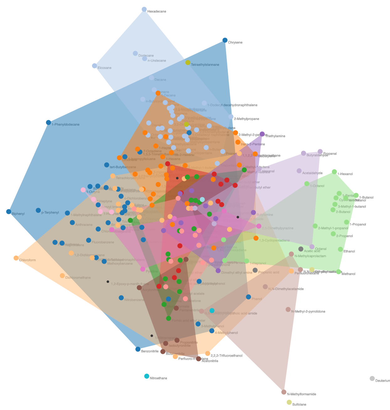
![[Uncaptioned image]](/html/2108.08706/assets/figures/nolies2-6.jpg) Explaining machine learning: The embedding (MDS, top right) shows a non-linear projection of the 4D latent feature space as computed by machine learning for 240 chemical compounds [26]. Color-based augmentation helps relate structures in the embedded point cloud to input attributes (bottom, continuous variables) and domain knowledge (top, categorical variables). Our new approach enabled domain scientists detect previously unrecognizable patterns and outliers in their data.
Explaining machine learning: The embedding (MDS, top right) shows a non-linear projection of the 4D latent feature space as computed by machine learning for 240 chemical compounds [26]. Color-based augmentation helps relate structures in the embedded point cloud to input attributes (bottom, continuous variables) and domain knowledge (top, categorical variables). Our new approach enabled domain scientists detect previously unrecognizable patterns and outliers in their data.
Introduction
High-dimensional data is omnipresent in the form of tabular data. It occurs in economy, biology, chemistry, political science, astronomy, and physics to only name a few [34, 41]. For such data a large variety of analysis techniques is offered in modern data analysis libraries ranging from cluster analysis, to regression, to outlier detection, and dimensionality reduction [44]. The exploratory data analysis principles requests for such techniques to show for each drawn conclusion a raw data plot that convincingly shows such [56]. In many applications this raw data plot is an embedding of the high-dimensional data using methods like linear projections (e.g. PCA) or non-linear techniques like multi-dimensional scaling (MDS) or t-distributed stochastic neighbor embedding (t-SNE). Linear techniques have the advantage that the resulting axes still have meaning, but often they cannot uncover complex structures in high-dimensional space. Non-linear projections often nicely reveal complex structure in high-dimensional space, but no longer offer direct annotation of the projected space. Hence, it is paramount to equip these widely used techniques with mechanisms that help users properly read the projected data and relate original data attributes to the computed features.
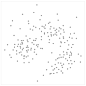
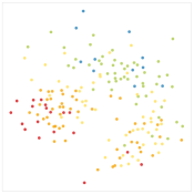
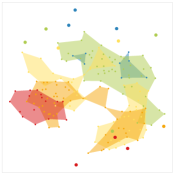
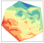
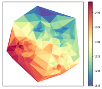
Going through examples in high-dimensional data analysis libraries [44] and recent papers [34], we observed that the gold standard for this task is still color-coding glyphs and 2D interpolation-based scalarfield reconstruction [31] as is also confirmed by the survey by Nonato et al. [41]. Fig. 1 compares these standard techniques for an MDS embedding of the wine dataset [1, 20] augmented with the alcohol levels of each sample point. Color-coding assigns each projected data point a color using one of the original attributes (Fig. 1(b)). This technique is easy to implement and to comprehend, but suffers from occlusion and visual clutter and makes outlier detection difficult [37]. Scalarfield reconstruction techniques [31] reconstruct a 2D scalar function for a given attribute, which serves as input to a spatial color-coding (Fig. 1(d) + 1(e)). This results in readily visible spatial patterns, but cannot account for the fact that data points with different attribute values are projected onto the same position in 2D space. In our new technique, we combine the strengths of these two directions. Our goals are to design a technique and system that are easy to use and comprehend, that are applicable to all types of embedding techniques, that can be directly integrated into existing analysis pipelines, and that enable the user to quickly and correctly understand attribute value distributions in the embedded data. We also remark that the goal of this paper is not to explain the projection, i.e., the precise nature of the data transformation from high-dimensional to 2D space, as is done for example in [16, 57] who visually encode least-varying dimensions, but only the final outcome, i.e., the embedding of the data points in the plane.
In this paper, we present NoLiES, an interactive system that enables the user to explore linear and non-linear embeddings with respect to the original attributes. The code is open source111https://github.com/leitte/NoLiES and a live demo is provided via MyBinder222https://bndr.it/2m8ns. NoLiES inherently relies on a novel augmentation technique for multidimensional projections, which we call rangesets. Rangesets, as presented in Fig. 1(c), visually group datapoints with similar attribute values into non-convex -hulls. The method allows for outlier filtering and user defined adjustments which is explained in detail in Sect. 3. To answer questions relating to multiple attributes, an interactive analytics system is required, which will be presented in Sect. 4. Several use cases, a real-world application problem of machine learning (ML) in thermodynamics (Sect. 5), and feedback from an informal expert user study (Sect. 6) are provided to demonstrate the capabilities of the novel technique.
In summary, our contributions are as follows:
-
•
We review the state-of-the-art of direct augmentation techniques for multivariate projections and highlight strengths and interpretation challenges with these techniques.
-
•
We detail a novel visualization technique (rangesets) to augment embeddings.
-
•
We detail the connection of rangesets to algebraic topology and provide first steps on how this theory can be used to further improve augmentations of embeddings.
-
•
We present an interactive analysis system and detail the analysis workflow to interpret linear and non-linear embeddings, along with several case studies using examples from ML data bases and real world applications.
1 Related Work
NoLiES builds upon concepts for augmented multidimensional projections, improved scatterplots, and topological analysis of high-dimensional data, which we will review in the following.
1.1 Augmentation of Multidimensional Projections
Non-linear dimensionality reduction techniques are widely used for data exploration [41]. Much of the work centers around finding better projections, controlling and communicating error, and automatic detection and visualization of features. A critical aspect that receives far less support is the interpretation of projected data. Common techniques are (i) direct enrichment, (ii) cluster-based enrichment, and (iii) spatially-structured enrichment [41]. Direct techniques augment the embedding for example with attribute-based color and text labels to provide additional information [34]. A variety of techniques is presented by Aupetit [3] using color-coding on the glyphs [33, 19, 52, 32], (hex)bin visualizations for local densities and values [43], and multivariate glyph-based approaches. All these techniques have in common that they can represent per pixel only attribute values of a single data point. However, most multidimensional projections (linear and non-linear alike) suffer from projection ambiguity, i.e., data points with different attribute values are projected onto the same 2D coordinate, which needs to be communicated. The methods closest to our approach are classified as spatially-structured enrichment, which first partition the space using techniques such as Voronoi diagrams or treemaps and afterwards enrich these regions [8, 51]. Most of these applications, however, aim at a non-overlapping partitioning, which we specifically want to integrate to correctly reflect the nature of the data.
Several techniques aim at the reconstruction of a continuous scalarfield that can be directly visualized using field visualization techniques, e.g., ProbingProjection [52] or DataContextMap [13]. These spatial techniques directly avoid overplotting and group coherent regions [37], but need special strategies to cope with projection ambiguity as will be discussed in more detail in Sect. 3.1.
The third line of research that also follows the concept of a continuous field tries to recover the non-linear axes or illustrate regions of maximal attribute values. The DataContextMap [14] enriches the embedding with additional data points that locate regions of high attribute values and augment the visualization with additional attribute-based contours on the reconstructed scalar field [13]. DimReader [23] augments the embedding with non-linear grid lines and prolines [11] display the non-linear axes. The t-viSNE system [12] presents an analytics tool to explore t-SNE projections [59] using for enrichment color-coded glyphs augmented with interactive exploration. An excellent overview of interaction with dimensionality reduction is given by Sacha et al. [47]. The techniques in this third category are complimentary to our approach and can be combined with the here proposed rangesets.
1.2 Improving Scatterplots
Scatterplot visualization and the treatment of its challenges like overplotting and clutter have been researched in their own right [4]. Micallef et al. [39] present techniques to optimize parameter settings for scatterplots like size and opacity to automatically improve the visual results. Contours have been applied in a variety of approaches to represent set relationships in scatterplots to improve perception and to lower cognitive load [15, 50, 13, 37]. Bubble Sets [15] employ density estimates and contour lines to determine outlines for a set. Butterfly Plots [48] use convex hulls and refined convex hulls to enclose data points of the same class. Alpha Shapes, as used in our technique, were previously used by Joia et al. [28] to highlight 2D clusters. Simonetto et al. [50] start with a planar graph connecting the points of a set for which a geometric hull is computed. From a theoretical perspective, this approach is similar to ours, though we assume more data points per set, which allows us to go for geometry directly generated through a triangulation. Mayorga and Gleicher [37] present Splatterplots that combine density plots with contours to solve the overplotting problem for large numbers of points and at the same time be agnostic to outliers. This approach is conceptually very similar to ours and inspired the presented rangesets. Challenges that we wanted to further improve are locally non-uniform density and cognitive load. A more detailed discussion is given in Sect. 3.1.
1.3 Topological Methods for High-dimensional Data
The filtration of the Delaunay triangulation, which is a simplicial complex, allows us to draw from the well researched theory of algebraic topology [21, 36]. A brief summary of the theory and how it relates to our approach are given in Sect. 3.2.2. Topological methods have a long history in high-dimensional data analysis [34]. Commonly, they are applied on the high-dimensional data in a preprocessing step to extract relevant structures, e.g. the contour tree [35] or features [49, 52, 45, 46], that help simplify the data and create abstractions that are easier to represent. Topological methods have also been used to control and evaluate the projection process [45, 3, 18] integrating Voronoi cells for quality control [3]. With this paper, we hope to initiate a connection from the embedding side, so that high-dimensional and two-dimensional topology can mutually augment each other for more insightful data analysis.
2 Problem Definition and Workflow
NoLiES supports the visual interpretation of dimensionality reduction schemes. Fig. 2 illustrates the three steps of the workflow including screenshots of the two GUI elements. NoLiES is implemented in a Jupyter Notebook [29] that, when combined with the python panel package [54], comes in two flavors: (Step 1) Scripting and static charts in the Jupyter Notebook and (Step 2) an interactive web-application that supports user interactions. When talking about NoLiES, we primarily refer to the interactive GUI that is used for the data analytics part.
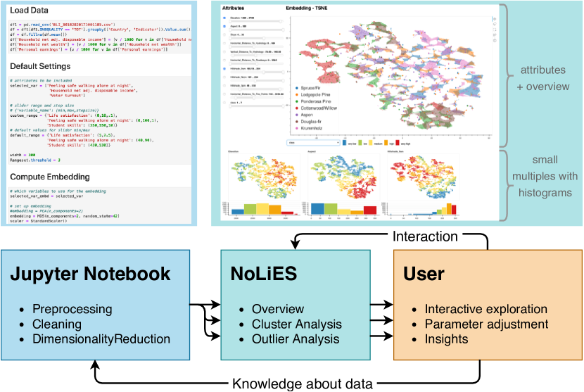
Step 1 – Jupyter Notebook comprises data preprocessing and knowledge storage (Fig. 2 (left)): In the notebook, the user specifies data loading and cleaning routines. Additionally, they can provide custom parameter values and selections like considered data attributes, slider ranges, filter threshold, or colormaps. In the multi-dimensional projection section, the user can choose their preferred dimensionality reduction method and couple it with appropriate control mechanisms like data scaling and correlation checks.
Step 2 – NoLiES for interactive exploration in the GUI (Fig. 2 (right)): Once the user is happy with the data preprocessing, they change to the interactive GUI view in the browser. In this view, only the chart elements from the notebook are visible and are now linked interactively. The GUI shows the embedded data in a scatterplot and provides overview over included data attributes and attribute value distributions.
The survey by Nonato and Aupetit [41] gives an excellent overview over analytical tasks performed using multi-dimensional projections. NoLiES supports tasks relating to the two main categories Explore Dimensions (Axes) and Explore Items in Enriched Layout, i.e., it helps understand the mapped data and explore structures in the projected data respectively. In particular, we support the following fine grained tasks (names in italic are tasks as defined by Nonato and Aupetit): (i) Explore dimensions (Map Synthesized Dimension to Original Dimension, Discover Relation btw. Visual Pattern & Original Dim.): We provide a visual link between the position in 2D space and the original data attributes, which explains the attribute value distribution in the projected data. (ii) Cluster-based analysis (Name Cluster, Discover Clusters in Map, Match Clusters and Classes in Map, Brush in Data Space): The user observes regions in the embedding that are denser than their surroundings, i.e., clusters. They now want to understand what discriminates the cluster from the surrounding data and what are characteristics that points in the cluster have in common. Small multiples and interactive selections that are shared between all plots support these tasks. (iii) Outlier analysis (Discover an Outlier in Map, Discover Class-Outlier in Map): Outliers are points that are unusually far away from other points compared to average point distance. Here, the user would like to understand what sets this point apart from the surrounding points. We support this task by outlier highlighting and the cluster strategies as above.
Step 3 – User in the loop Commonly, the user will need to make adjustments to the default settings during analysis. Hence, the analysis runs in cycles. Additionally, the user can augment the notebook with obtained knowledge to use it in the next run and preserve it for future analysis.
3 Method
The centerpiece of NoLiES are the proposed rangesets (Fig. 1 (center)), which we introduce in this section. We start with a detailed review of existing augmentation strategies, continue with the description of the contour extraction algorithm including references to levelset computation from algebraic topology, and close with the visual encoding.
3.1 Discussion of Existing Approaches
In the presented rangeset approach, we wanted to overcome challenges we faced when using state-of-the-art techniques to explore non-linear projections. Starting point was the data displayed in Fig. Attribute-based Explanation of Non-Linear Embeddings of High-Dimensional Data, which consists of 240 points in 4D. Using standard approaches it was not possible to relate the structure in the point cloud to the input variables or domain knowledge. In this section, we review the three most widely-used concepts for scatterplot augmentation: Glyph-based colorcoding, scalarfield reconstruction, and set-based visualization. For illustration purposes, we use the UCI wine dataset [1, 20], which features the same challenges, but is more widely known and accessible (Fig. 1).
Glyph-based colorcoding (Fig. 1(b)) is easy to implement and gives an intuitive sense of value locations, but suffers from occlusion and overplotting as detailed before [37]. Assessing the amount of group/color overlap and rapid detection of outliers, however, are difficult.
Fig. 1(d) + 1(e) represent scalar fields as reconstructed from the point data. Two popular approaches are nested filled isocontours and triangulation-based [17] renderings. Both methods are implemented in matplotlib. While both techniques give a good sense of attribute value distributions, they have difficulties in representing regions that suffer from projection ambiguity, i.e., where points with different attribute values are projected onto each other or close to each other. Here, field-based approaches have to either work with local averages (isocontouring) or create many small color patches (triangulations).
A third concept that is used particularly for categorical attributes on scatterplots are set-based visualizations [41]. The two primary directions in which the outlines of sets can be obtained are geometric/algebraic approaches and statistical approaches. The geometric approaches operate on a simplicial complex (graph or triangulation) and derives the boundary from this construct through filtering or additional geometric operations like dilation. The convex hull of a set of points is an example of a geometrically created boundary. The statistical approach relies on a density estimate for which an isocontour is drawn. Both approaches, statistical and geometric, rely on parameters that control the outlier filtering. In the statistical case, this is achieved through the isovalue of the boundary contour. A known problem is the challenge in handling point clouds with locally varying density, which are treated, for example, with adaptive-KDE-methods [58], which, however, are hardly implemented in data analysis software packages. Geometric approaches, on the other hand, are commonly controlled by geometric criteria like maximal distance to identify outliers.
In conclusion, we want to state that all methods have use cases where they are best suited. Glyph coloring is easy to implement and works very well with a limited number of data points. Statistical approaches carry the interesting notion of probability that points may be located in a certain area of the plot and scalar-field techniques can handle an arbitrary number of color-levels if this is requested. For the rangesets presented in this paper, we chose the geometric set-based approach as it uses the strengths of spatial augmentations, can handle projection ambiguity, and is intuitive to control by a single distance parameter with good default value heuristics.
3.2 Computation of Contours
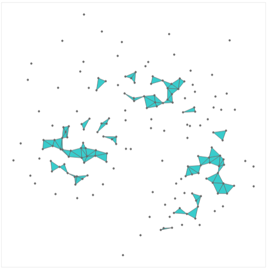
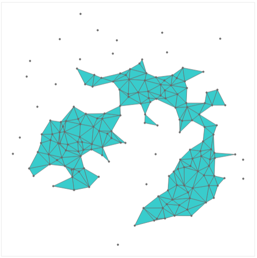
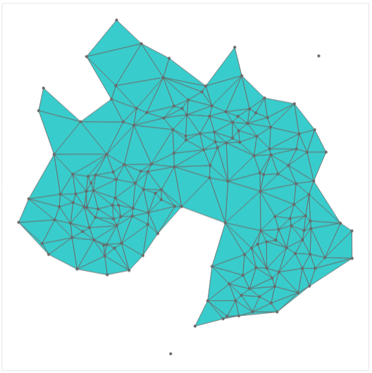
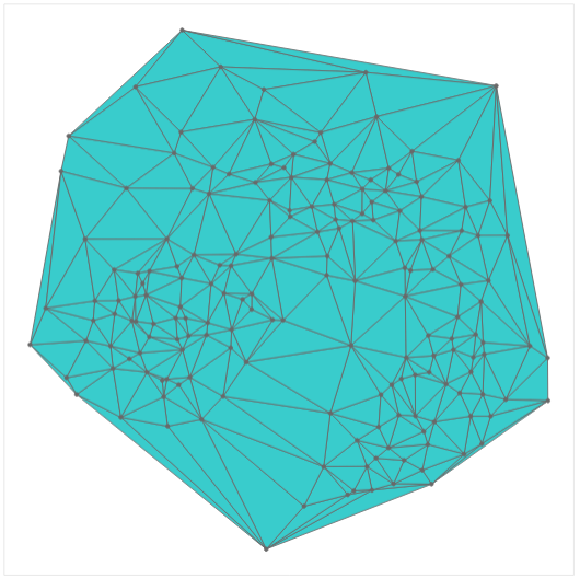
Rangesets use geometric contours to visually group data points with similar values. For categorical attributes a contour is drawn per category (see Fig. 5). For continuous variables, we first discretize the value range of the attribute and then draw a contour per bin, i.e., for a range of attribute values (see Fig. 8). In the following, we detail the algorithms used to compute the contour(s) per value bin and to filter outliers. The final algorithm then consists of the following five steps as illustrated in Fig. 4: (i) select an attribute bin, (ii) filter data points in the respective range, (iii) compute Delaunay triangulation of the filtered points, (iv) remove triangles with unwanted properties, (v) compute the boundary of the triangulation and find all points in the current range that do not belong to the contour for highlighting.

3.2.1 Non-Convex Hulls
Given a set of points in the plane ( being a positive integer), we are looking for a hull that tightly encloses the points of and allows for filtering of outliers. Non-convex or minimum area hulls [2] feature these properties. Following the discussion for the choice of a non-convex hull for scagnostics [62], we use -hulls as they can be computed efficiently and allow for filtering of outliers. The -hull of is the intersection of all closed complements of discs with radius that contain all the points of for arbitrary negative reals . As shown in [21], -hulls can be computed efficiently from the Delaunay triangulation [17] of the point set by excluding triangles that contain an edge whose length exceeds a given threshold . For the distance computation we use the Euclidean distance . The filtered Delaunay graph now has the vertex set and an edge set of , i.e., two vertices and are connected if and only if their distance is less than or equal to the selected distance threshold . The parameter controls the “tightness” of the computed contour. Large values include all edges of the Delaunay triangulation resulting in the convex hull [17] of the point set. Very small values will result in a strong fragmentation.
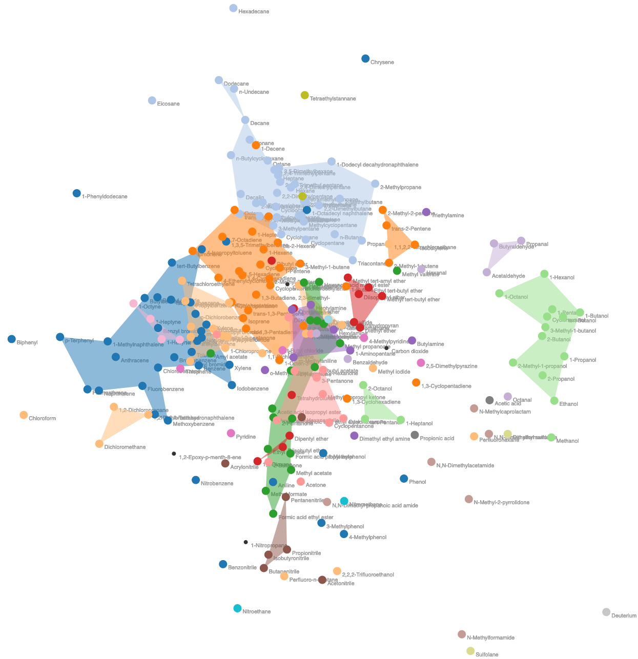
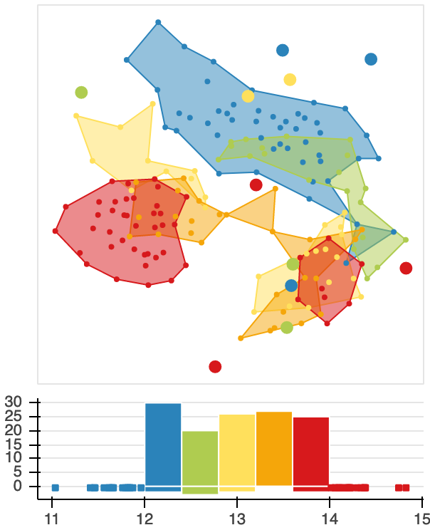
An example that illustrates the progression of the contours with increasing -values is shown in Fig. 3. Here, all points of the wine dataset are included in the contouring process and the resulting contours are shown for increasing -thresholds. Note how the set of contours changes from small fragments, over a smooth tight boundary, to the full convex hull. The choice of the ”tightness” of the boundary has strong effects on the final augmentation for the embedding where multiple contours are drawn. An additional complex example is given in Fig. 5 for the thermodynamics dataset where 20 categorical classes are used to explain the embedding. For small -values, the contours for each class focus on dense core regions (left, ). For large values, the contours overlap strongly and are no longer helpful (right). Finding a good -value is an important aspect of the algorithm and will be discussed in the next section.
3.2.2 Topological Filtration to Control
To better understand the progression of the size of the contour, we now look into algebraic topology. The above outlined algorithm induces a filtration of the simplicial complex, i.e., the subcomplexes and form a nesting hierarchy with being a subset of if and only if . On the operational level, this results in the nice property that increasing the threshold can only add triangles to the non-convex hull, but never remove them. For no contour is created and each data point is an outlier and for , where is the longest edge in the Delaunay graph, we obtain the convex hull of the set of points in the plane. For -values within this range, the number of outliers will decrease and the number of contours will vary. Algebraic topology is a research field that studies topological properties and changes of the simplicial complex under filtrations. For our analysis, we currently consider the zero Betti-number , which captures the number of connected components. Another helpful characteristic is the first Betti-number, which counts the number of holes in polygons.
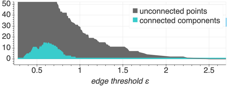
To obtain a better understanding of the effects of , we additionally provide a topological summary. In simply connected domains like ours, this information is often presented as a contour tree [10], which depicts the merging of the contours as changes. As the more critical information for our application is the number of outliers and connected components for any , we provide this information in an area chart. You can think of this chart as a marginal of the merge tree differentiating between connected components containing exactly one and those containing multiple vertices.
An example of the topology chart is given in Fig. 3. Connected components with more than one vertex are depicted in blue and outliers in gray. The plot is truncated at the top as in the beginning most data points are outliers. Alternatively, the user can switch to a logarithmic y-axis. The graph presented here is typical for all datasets that we investigated. In the beginning, with , all datapoints are outliers. With increasing -values many small contours form (), which eventually merge to larger more stable contours. Starting from , we only have one contour and the threshold parameter only controls the number of outliers. Note that the presented -values are not universal as they refer to edge length as computed by the embedding. Scaling the embedding can help, but one still has to account for varying aspect ratios and point densities due to number of points.
Wilkinson et al. [62] propose a default value for based on edge lengths in the minimal spanning tree (MST):
where is the 75th percentile of the MST edge lengths and the expression in the parentheses is the interquartile range of the edge lengths. It is important to note that the minimum spanning tree of a set P of point sites (in any dimension) is a subgraph of the Delaunay triangulation. Hence, we use this criterion to provide a default value for the filter threshold . In most practical applications we found this value too restrictive and manually raised the threshold to obtain smoother contours. An example is given in Fig. 3 where the suggested is 0.96 (similar to Fig. 3(c)), but was overwritten with for the analysis.
3.2.3 Discussion of Triangle Filter Criteria
The above described algorithm demonstrates how topological analysis can be used to control the contours and we used maximal edge length for the distance function. Alternative choices, however, are possible. The three widely used local criteria when controlling triangulation quality are edge length, triangle area, and inner angles. Optimizing inner angles is already ensured through the Delaunay triangulation, which creates an angle optimal triangulation, i.e., from all possible triangulations the one with largest smallest angle is chosen [17]. This ensures that long spiky triangles are avoided as much as possible.
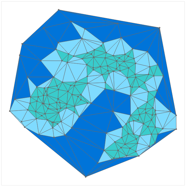
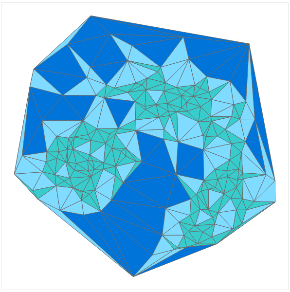
In the above algorithm, we used edge length for the filtration. An alternative choice of distance metric for the filtration that we explored during the development of NoLiES is the area of triangles, i.e., triangles and their bounding edges are included in if they do not exceed the threshold size . The goal was to exclude large triangles that cover space without additional points inside the triangle. A comparison of the two distance metrics can be seen in Fig. 6. This choice of metric, however, proved to be much harder to control and resulted in unexpected holes in the hull and long spiky triangles not being removed.
| n points | 1k | 2.5k | 5k | 10k | 15k | 20k | 50k |
|---|---|---|---|---|---|---|---|
| UMAP | 4.6 | 5.0 | 3.8 | 6.1 | 4.9 | 6.2 | 14.4 |
| MST | 0.2 | 1.3 | 6.0 | 28.7 | 75.9 | 178.4 | — |
| Rangeset | 0.6 | 3.3 | 7.3 | 11.3 | 20.5 | 35.5 | 57.7 |
3.2.4 Scalability and Stability
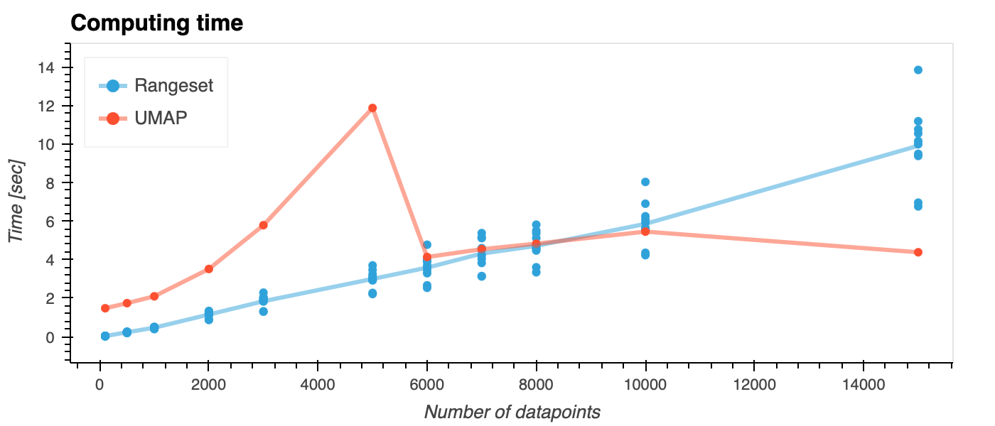
Algorithms from algebraic topology have great analytical power, but are known to be computationally expensive [5]. In our practical examples, we found the system to be interactive for datasets with up to 1,000 data points. Up to 5,000 data points required acceptable waiting times of a few seconds. We conducted a systematic study to assess running times for larger datasets. For the analysis we sampled the covertype dataset [6] which consists of 500k data points. For the embedding we used the UMAP algorithm [38] which was able to project the data within a couple of second for various sample sizes (Table 1). Assessing projection quality requires the computation of the minimal spanning tree (MST - second row) [40] which in our test cases commonly took longest and was prohibitive beyond 20k data points. We tested implementations based on the python packages scikit-learn and scipy for this task and found the distance computation in scikit-learn to be faster. Rangesets were computed for five bins and averaged across variables. Fig. 7 illustrates the range of timings for the ten variables. Depending of the distribution of points and the discretization, we observe variations of 30% of the mean value. Overall the plot shows that rangesets scale linear with the number of data points. Up to 5k data points we found a live computation of the rangesets acceptable (about 7sec waiting time). With more data points we recommend to downsample the dataset or precompute the rangesets.
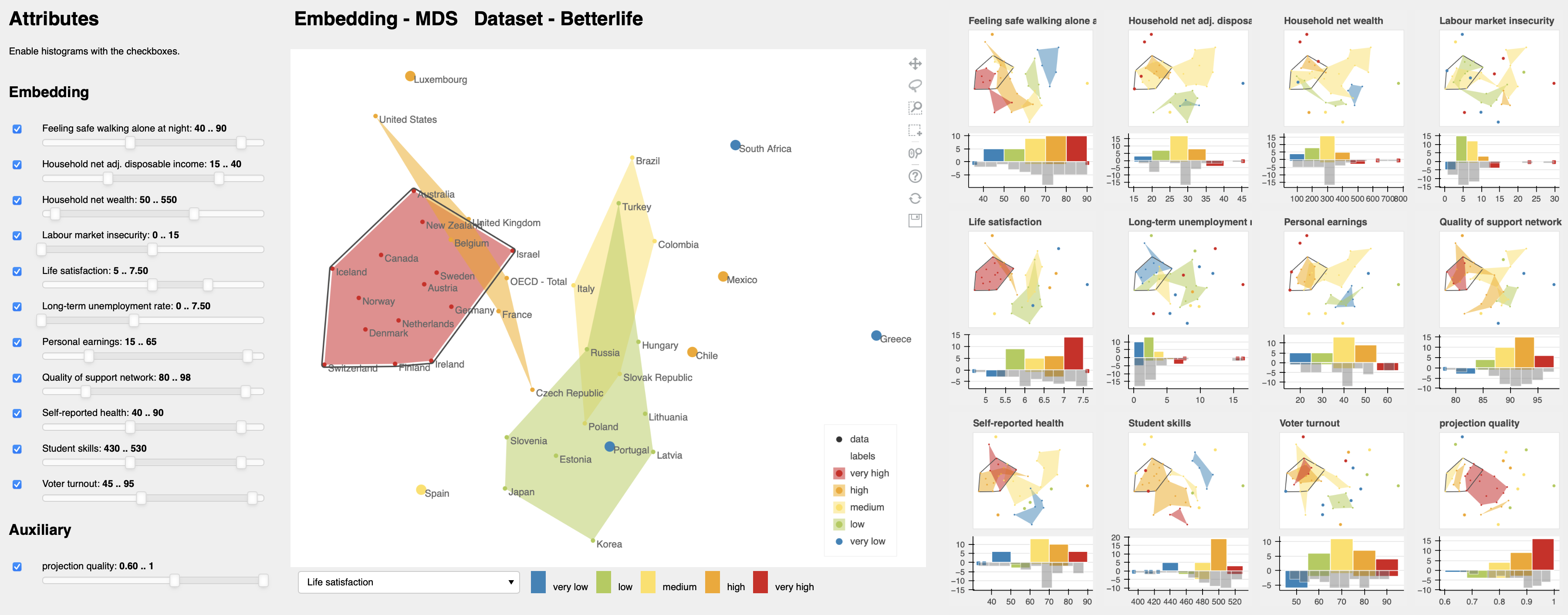
Regarding the numbers of attributes, we were able to successfully use NoLiES for up to 16 attributes. Fig. 9 shows the GUI for a dataset with 11 attributes. To help users comprehend the connection between many attributes interactive selections are shared between all plots. To not obscure the underlying information, the outline curve is offset by edge width [22]. In Fig. 9 the gray outline was manually drawn, optimized with the rangeset algorithm, and shared between all plots. In this way, the user can now go through all attributes, directly find the region of interest, and deselect irrelevant plots to focus on fewer attributes.
To help the user assess truthfulness of the projection we automatically include projection quality [40] as auxiliary attribute in the GUI.
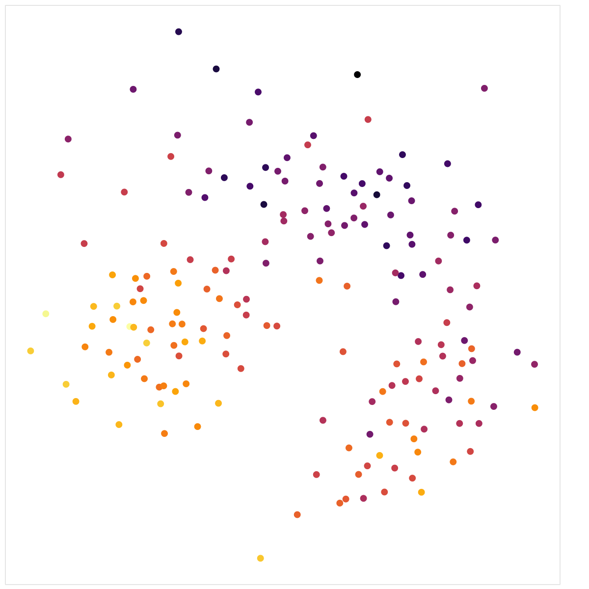

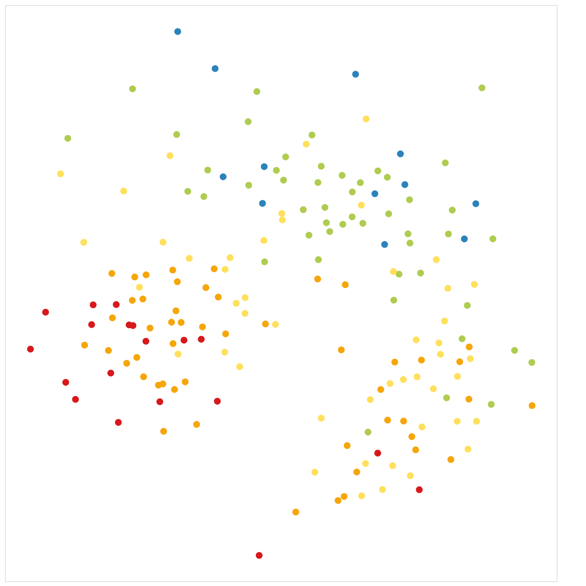

(a) Comparison of continuous (left) and discrete (right) colormap.
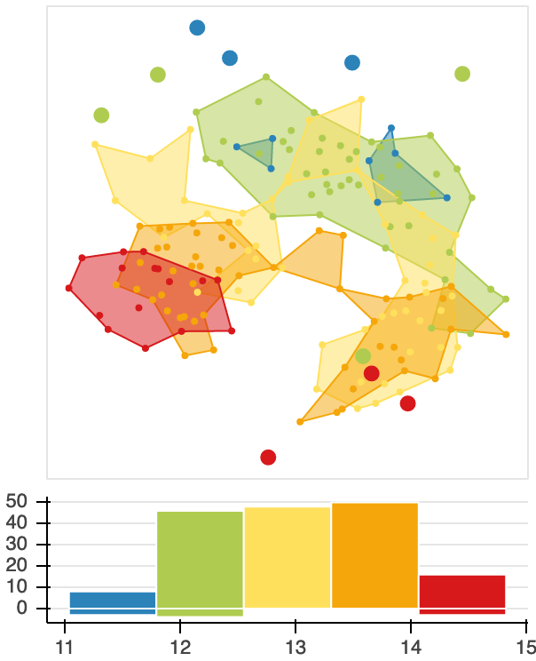
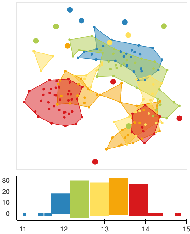
(b) Effects of changing range boundaries.
3.3 Attribute Range Discretization
The contour algorithm described so far computes the contour for a single bin of the attribute histogram and, hence, data binning plays an important role for the rangesets. Histogram computation has been intensively studied in the statistics community and we can draw from excellent prior research [24]. We use the numpy histogram function with settings for the following parameters: min-max-range of the attribute that is considered, number of bins for the discretization, step size of the discretization (uniform vs. non-uniform), and handling of values outside the selected range. We provide default values for all attributes following the reasoning below that can be overwritten by the user in the Jupyter Notebook. A screenshot of the entire system including small-multiples with histograms is given in Fig. 9.
Initially, min-max-ranges for each attribute are defined by the extremal values in the data. Adjustments may be necessary to obtain bins with easy to read values or to account for the range of possible values (e.g. 0-100% when values only range from 37-82%). In NoLiES, this can be done interactively via the range-sliders below each attribute in the attribute panel (see Fig. 9 (left) for an example). Upon dragging the slider, the contours update automatically giving instant feedback on the effects of the changes. Three samples of this interaction process on the wine dataset (attribute alcohol) are depicted in Fig. 8b. Like in this example, we experienced in general that the contours were fairly stable and the exact choice of the absolute range was not too critical. Customized ranges can be stored in the notebook and are automatically used in the next iteration. Automatic outlier detection [61] and choosing thresholds with human-interpretable values [53] may be used to further automize the process.
We discretize the selected range in the default case into five bins with equidistant boundaries. In our examples we found five bins sufficient to model any underlying distribution. Fig. 9 depicts the histograms for five bins in color and the version as computed by numpy.histogram below in gray. Using more contours resulted in hard to read images which aligns with the findings by Kraus et al. [30], who report for continuous scalar fields difficulties in precise readings of continuous maps on scatterplots, which aligns with findings by Tory et al. [55]. A comparison of a perceptually uniform continuous colormap and our discrete one are given in Fig. 8a. We are aware that ”rainbow”-colormaps are not a popular choice. However, the colors in this colormap are easy to name and highly distinct, which makes comparison in a small-multiples setting (like ours) easy and allows for easy and unambiguous communication. Hence, we assign each of the five bins a fixed color [blue, green, yellow, orange, red] and a label [very low, low, medium, high, very high]. Again the colormap can be easily changed to personal preferences in the notebook and the Bokeh-library offers a rich set of default colormaps to choose from. We explored non-uniform discretization to better adapt to local structures in the point cloud, but found this to be misleading when interpreting the color distribution.
An additional augmentation of the histograms in NoLiES is the use of the negative y-axis. Here, we encode data points that are outside the ranges. Datapoints outside the min-max-range are encoded as glyphs below the y-axis. Datapoints that are outliers for a particular rangeset (i.e., their scalar value falls within one of the bins, but their distance to the nearest point is larger than ) are counted and encoded as bars extending in the negative y-direction. In this way, the user can directly see how parameter settings affect the topology of the rangeset chart.
3.4 Visual Encoding
To visually represent the rangesets, we augment the scatterplot with polygons and color-coded glyphs. The contour for each bin is rendered as a filled transparent polygon (alpha value is 0.5) and is rendered below the scatterplot. We additionally render (a subset of) the datapoints including those inside contours, to provide the user with a sense of data density. Custom contours (gray outline) can be added to highlight a selected group of points. To highlight outliers, we chose the channel glyph size increasing the radius of the point glyphs. Additionally, outliers are plotted on top of the contours to not be hidden by multiple transparent layers. In the histogram view, we highlight outliers by counting them on the negative side of the y-axis.
4 Interactive System
NoLiES is implemented in python using the panel library for interaction support (Fig. 2). This allows to run the application both in the browser as a Jupyter notebook and as a standalone application. In the analysis process, we alter between the two views using each where it is strongest. The software is written in modules. Generic code like the rangeset computation is stored in an extra module. We create one notebook per dataset and can use it in this way as a storage location for knowledge that was derived during the analysis process. We intentionally do not include too many settings in the GUI to make it easy to use and provide places to store information in a uniform way.
Jupyter Notebook: The notebook provides three sections that guide the user through the analysis process. Part 1 handles data loading, preprocessing, and cleaning. Additionally, we include placeholders for commonly used system parameters like custom ranges for sliders, attribute filters, and the rangeset threshold. Part 2 handles the multidimensional projection. Multiple widely used dimensionality reduction methods as implemented in the scikit-learn library [44] are included and can be selected by the user. We also include best practices for dimensionality reduction like attribute scaling and tests for correlation. Part 3 takes care of the visual design and interactions. The system is implemented in python and can be rapidly manipulated by users with limited programming experience as we found in an informal user study (see Discussion).
Interactive App: The GUI of NoLiES consists of three major components (Figure 2): (i) An attribute view that lists all included attributes from the raw data, their ranges, and the selected sub-ranges to be used for the binning. (ii) The embedding renders the projected data as a point cloud with optional labels. The user can interactively alter the displayed rangesets in a dropdown menu. The title of the chart automatically includes the applied projection method as defined in the notebook. (iii) The small multiples view provides a quick overview over all selected attributes distributions and present the histograms for the binned attributes. Views can be interactively switched on and off in the attribute view with a checkbox.
The attribute sliders are interactive and upon moving the sliders, the outlines and the histograms are updated interactively. This procedure helps to understand attribute value locations and the effect of the discretization. The user can also use this technique to manually filter for outliers and set tighter value bounds for the displayed contours. Once they found good default values, these can be stored in the notebook and will be set at defaults in the next run.
Implementation: NoLIES is implemented in python in the Jupyter Notebook. The GUI is realized using the panel library [54] and charts are created using bokeh [7]. Geometric operations are realized with the shapely library [25]. Multidimensional projections and data preprocessing are provided through scikit-learn [44]. Data handling is realized using pandas [60]. Topological data analysis is implemented in NoLiES and supported through methods in the shapely library [25]. NoLiES is available on GitHub333https://github.com/leitte/NoLiES.
5 Case Studies
In the following, we present three case studies with increasing complexity. The Better Life dataset is easy to comprehend and follow. The forest covertype dataset contains more than 4000 data points and is difficult to project. The real-world study in thermodynamics targets explainable machine learning and large number of contours in the rangeset.
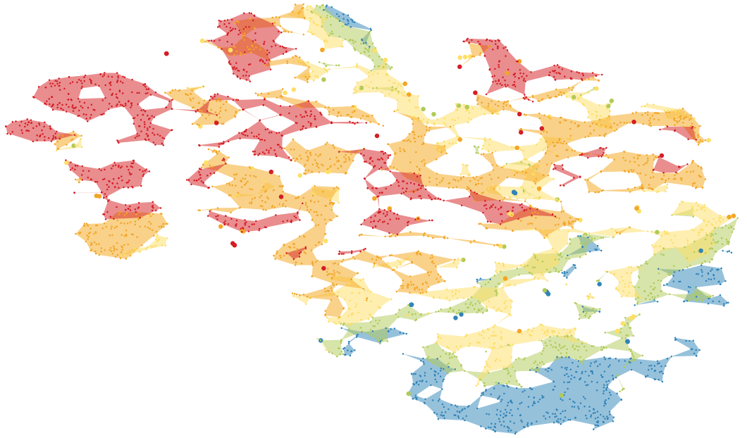
5.1 OECD Better Life
The OECD Better Life dataset [42] measures 25 attributes for 40 countries (+ OECD mean). The goal is to understand which factors promote a society’s well-being. For illustration purposes we chose 11 attributes that covered the general mix of topics, had varying attribute distribution profiles, and did not alter the general structure of the projected data too much. Fig. 9 shows the entire GUI view with all attributes enabled in the small multiples view.
The central chart renders the rangeset for self-reported life satisfaction (range (0,10)). The histogram on the left tells us that values range from 4.7 (South Africa - requires interaction to be determined) to 7.6 (Denmark, Finland, Norway) which were discretized into bins of width 0.5 ranging from satisfaction values of 5 to 7.5 (out of 10). Countries outside the histogram range are included in the two extremal bins. The small chart on projection quality shows that the MDS projection works in general very well and can retain the neighborhood structure (except for Luxembourg). We can observe that life satisfaction strongly correlates with the visual clusters in the 2D embedding and that the red and green class (very high and low happiness) contain most data points. The very unhappy countries (blue points) are spread across the plot. They are not grouped in a rangeset contour, but form all outliers which is reflected in the histogram (bar below the zero-line). We also observe some outliers in the orange class (large dots in the scatterplot; Chile and Mexico) who report high happiness, but are in many categories close to more unhappy countries.
To obtain an overview over the distribution of assessed attributes, we first look at the small multiples display in Figure 9 (right). Attributes with a blue checkbox are presented in the small multiples summary on the right (here all of them). We observe that the attribute ‘Feeling safe walking alone’ decreases from bottom-left to top-right. The histogram below the small multiple depicts the attribute distribution. We see that countries colored in red have agreement and blue countries less than , i.e., people in countries contained in the red polygons agree to with the statement that they feel safe when walking alone. Other attributes like ‘Labour market insecurity’ and ‘Student skills’ feature a more complex and harder to describe distribution of attribute values, which is expected in an MDS embedding.
Next we focus on the region outlined in gray, which contains all countries with very high life satisfaction. The outline was drawn manually using the selection tool. Concentrating on the colors inside the outline for each attribute, we can quickly observe that countries in the selection have diverse, but generally positive values in all attributes, except for labour market insecurity where low values are good. In summary, we can state that countries with very high life satisfaction do well in all assessed categories. This also discriminates the two major clusters (very happy (red) and unhappy (green) countries). Countries in the green cluster have at least one problematic category with low and very low values, disposable income, self-reported health, and safety being the most prominent ones.
The US and Luxembourg form their own small cluster close to the very happy countries, but only rate themselves with high life satisfaction. Comparing these two countries to colors inside the selection polygon for the very happy countries, we can identify attributes in which they diverge. Looking for color differences, we identify students skills (lower than in selection polygon) and household net income (higher than in selection polygon). From our investigation we can conclude that money alone does not make happy and that it probably is a combination of factors that result in (only) high life satisfaction in these two countries.
5.2 Forest Covertype
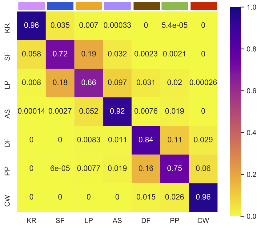
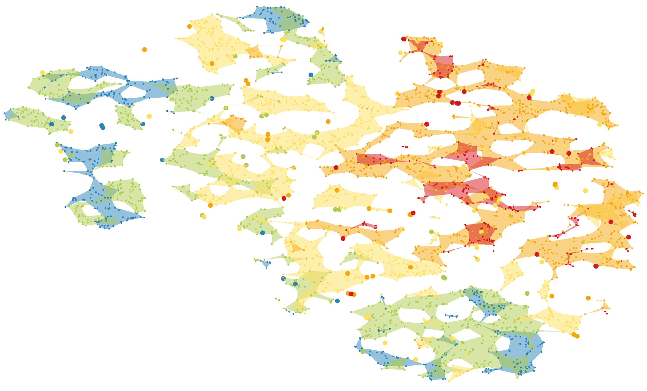
The forest covertype dataset [6] covers 581k datapoints and 54 cartographic attributes like elevation, slope, and shade. The goal is to predict the forest type (7 classes) using these attributes only. Blackard et al. [6] report 70% accuracy using an ANN. The misclassification as depicted in the confusion matrix (Fig. 10(a)) are extracted from their paper. Rows in the confusion matrix correspond to actual classes and columns to the predicted ones. We observe major misclassification between spruce/fir (SF) and lodgepole pine (LP) as well as douglas-fir (DF) and ponderosa pine (PP). Multiple other misclassifications occur (mainly close to the diagonal) and some classes are never confused, e.g. CW with KR/SF/LP/AS.
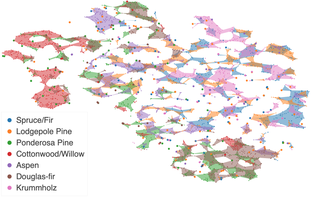
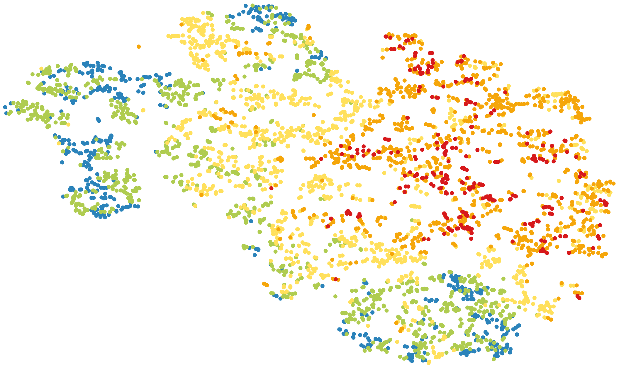
For the dimensionality reduction we sampled 600 data points from each of the 7 classes resulting in 4,200 data points. The embedding was computed using the 10 numeric attributes. The discarded 44 categorical attributes distinguish between wilderness areas (4 attributes) and soil types (40 attributes). The t-SNE-based embedding (perplexity: 30, early exaggeration: 30) is depicted in Figure 10(b). The rangeset coloring encodes the ground truth class labels. We observe that there is a lot of overlap between colors. On closer inspection, we find that only certain colors overlap, which is in agreement with the confusion analysis of the ANN model. We observe overlap, e.g., between blue/orange/pink for SF/LP/KR or brown/green for DF/PP. Additionally, we observe that some colors only occur in particular regions, e.g. red areas are located at top-left and in multiple small regions on the southern boundary of the purple region.
It is important to note that structural analysis of t-SNE plots is challenging and may easily lead to misreadings [59]. The overlay with rangesets can help to counteract common misperceptions. As stated by Wattenberg, cluster sizes mean nothing in t-SNE [59]. With the overlayed attribute-based rangesets, the user can reconstruct the underlying distances between datapoints. Figures 10c+11 augment the plot with two of the original attributes. Regions in the same color are close in high-dimensional space with respect to this attribute. For example, low elevation regions are split into two groups by t-SNE (top-left and bottom-right). For the red Cottonwood/Willow covertype, we can thus deduce that they mainly grow in areas with low elevation and high shade values at 9am. These observations can also be made using classical glyph-based color coding. We found in our experiments that the trust in the observations was higher using rangesets – a detailed elucidation, however, is subject to future studies.
5.3 Matrix Completion in Thermodynamics
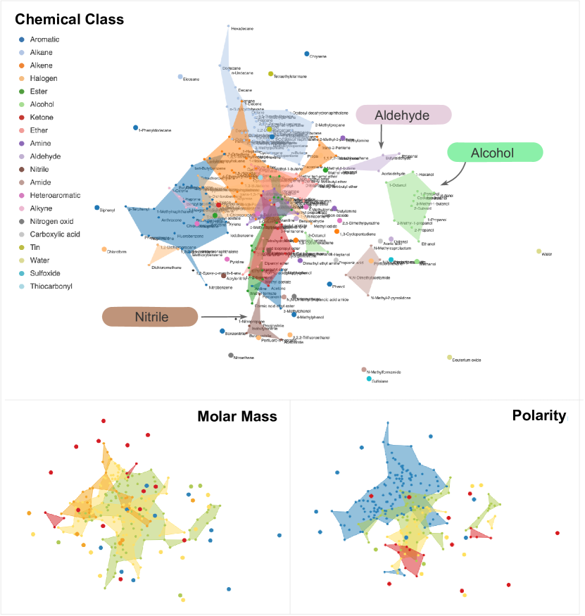
The prediction of fluid properties plays a central role in chemical engineering, e.g., for process design and optimization, since experimental measurements are usually cumbersome and expensive. Methods to predict the properties of binary mixtures are of particular importance, since also the properties of multi-component mixtures can often be described based on information on the binary ‘submixtures’ [9]. Matrix completion is a novel promising ML approach for this purpose [26, 27]. However, while data-driven matrix completion methods (MCM) yield great performance in predicting fluid properties, they are not intuitive and therefore difficult to understand from a physical perspective. This strongly reduces confidence among engineers and natural scientists and hampers their application. Hence, tools that enable a physical interpretation of MCM are paramount. In this case study, we apply NoLiES for this purpose. Note that alternative approaches using glyph coloring and clustering failed in communicating any relationship between latent MCM features and domain knowledge (Fig. Attribute-based Explanation of Non-Linear Embeddings of High-Dimensional Data). Figure 12 shows MDS projections of four MCM features of 240 solutes, which were trained to experimental data for the activity coefficients of these solutes at infinite dilution in 250 solvents (at a temperature of 298.15 K) [26]. Hence, these MCM features constitute latent descriptors of the solutes that are derived from mixture properties (here: activity coefficients) only.
The embedding features multiple clusters, which we overlay with expert knowledge on the chemical classes the solutes are allocated to (denoted by the color code of rangesets and glyphs) in Figure 12(top) and observe a surprising coherence. We learn that the chemical class of a solute is a suitable descriptor regarding the solute’s MCM features (and its activity coefficients in mixtures to which the MCM features were trained). We furthermore observe that some chemical classes are very characteristic, e.g., alcohol (right, light green), aldehyde (top right, light purple), and nitrile (bottom, dark brown), whereas the contours of others strongly overlap (mainly located in the center). Also note that water and deuterium oxide (heavy water) appear as exceptional solutes (bottom right edge, light olive green), which fits well with their exceptional macroscopic properties. In addition, correlations of the MCM features with other physical descriptors, such as the solute’s molar mass and polarity (Figure 12(bottom)), are found.
Looking at the rangesets for the four MCM features (Fig. Attribute-based Explanation of Non-Linear Embeddings of High-Dimensional Data(bottom)), we observe clear spatial structure. A detailed analysis of the link between MCM features and physical properties of the solutes is subject to future research and not within the scope of this paper. However, the results shown here indicate that NoLiES offers exciting physical insights into latent MCM features, which will serve as basis for a targeted enhancement of MCM, e.g., for selecting suitable physical descriptors to support the data-driven approach or predicting the MCM features of additional solutes based on readily available information on the solutes.
6 Discussion and Future Work
The goals that we set out to accomplish were as follows: Design a technique and system (i) that is easy to use and comprehend, (ii) that is applicable to all types of embedding techniques, (iii) that can be directly integrated into existing analysis pipelines, and most importantly (iv) that enables the user to quickly and correctly understand attribute value distributions in the embedded data. Goals (i + iv) are demonstrated in the use cases and were assessed in an informal expert user study with five domain scientists from various application fields that need to interpret high-dimensional data. We demonstrated NoLiES and gave them access to the notebooks. They all used data from their own work and explored structure and outliers therein (one application is reported in sect. 5.3). All experts commented directly that the visualization is visually appealing and easy to comprehend. One user commented that rangesets reminded him of cartography, which we deem an interesting analogy. The interactive GUI part proved directly accessible to all levels of computer literacy. The users with background in programming/python were additionally able to download NoLiES from GitHub and customize the notebook for the exploration of their own data. Goals (ii + iii) are ensured by the implementation in Python and Jupyter Notebooks and the lack of coupling to the embedding. We demonstrate rangesets for MDS and t-SNE, which are often used to reveal inherent structure and clusters in the data. We also tested rangesets on PCA and SVM projections with similar results. Rangesets are computed in a post-processing step and the code can be easily used outside of NoLiES.
Limitations that we encountered relate mainly to scalability issues. With increasing number of data points interactivity slows down. Computing contours in the forest covertype dataset with 4k data points takes about one second, which also holds for the computation of the embedding on a regular desktop PC. For both routines, we use external libraries that we cannot easily improve. As rangesets and the embedding are computed only once, we found the latency acceptable. Similarly, reading rangesets became challenging with many classes as in the thermodynamics example with 20 chemical classes. We currently use a bokeh default colormap. Colormaps optimized for perception that are aware of spatial overlap may further increase visibility [37].
The geometrical nature of rangesets directly suggests several extensions like the support of Boolean operations on the sets. This concept could also be applied for a further automation of the analysis process of cluster properties, which we currently did fully manually.
7 Conclusion
In this paper, we presented NoLiES, an interactive system for the interpretation of embeddings of multi-dimensional data projections. We introduced rangesets, an augmentation strategy for embeddings that outline datapoints with similar values in multiple non-convex contours. Rangesets have a dedicated handling of outliers and their only parameter is the maximal acceptable edge length between connected points. We discussed the relationship between rangesets and algebraic topology and demonstrated how the theory can be used to control the rangeset parameter. To work with rangesets of multiple data attributes, NoLiES integrates an interactive small multiples concept that is linked by selections and color coding. Important knowledge obtained during the analysis of a dataset can be stored in the notebook and used in future analysis.
8 Acknowledgements
This research was funded by the Deutsche Forschungsgemeinschaft (DFG, German Research Foundation) – 252408385 – IRTG 2057.
References
- [1] S. Aeberhard, D. Coomans, and O. De Vel. Comparative analysis of statistical pattern recognition methods in high dimensional settings. Pattern Recognition, 27(8):1065–1077, 1994.
- [2] E. M. Arkin, Y.-J. Chiang, M. Held, J. S. B. Mitchell, V. Sacristan, S. S. Skiena, and T.-C. Yang. On minimum-area hulls. Algorithmica, 21(1):119–136, 1998.
- [3] M. Aupetit. Visualizing distortions and recovering topology in continuous projection techniques. Neurocomput., 70(7–9):1304–1330, Mar. 2007. doi: 10 . 1016/j . neucom . 2006 . 11 . 018
- [4] S. Bachthaler and D. Weiskopf. Continuous scatterplots. IEEE Transactions on Visualization and Computer Graphics, 14, 2008.
- [5] U. Bauer. Ripser: efficient computation of vietoris–rips persistence barcodes. Journal of Applied and Computational Topology, pp. 1–33, 2021.
- [6] J. A. Blackard and D. Dean. Comparative accuracies of artificial neural networks and discriminant analysis in predicting forest cover types from cartographic variables. Computers and Electronics in Agriculture, 24:131–151, 1999.
- [7] Bokeh Development Team. Bokeh: Python library for interactive visualization, 2020.
- [8] B. Broeksema, A. C. Telea, and T. Baudel. Visual analysis of multi-dimensional categorical data sets. Computer Graphics Forum, 32(8):158–169, 2013. doi: 10 . 1111/cgf . 12194
- [9] H. C. Carlson and A. P. Colburn. Vapor-liquid equilibria of nonideal solutions. Industrial & Engineering Chemistry, 34(5):581–589, 1942.
- [10] H. Carr, J. Snoeyink, and U. Axen. Computing contour trees in all dimensions. Computational Geometry, 24(2):75–94, 2003.
- [11] M. Cavallo and c. Demiralp. A visual interaction framework for dimensionality reduction based data exploration. In Extended Abstracts of the 2018 CHI Conference on Human Factors in Computing Systems, CHI EA ’18, p. 1–4. Association for Computing Machinery, New York, NY, USA, 2018. doi: 10 . 1145/3170427 . 3186508
- [12] A. Chatzimparmpas, R. Martins, and A. Kerren. t-visne: Interactive assessment and interpretation of t-sne projections. IEEE Transactions on Visualization and Computer Graphics, 26:2696–2714, 2020.
- [13] S. Cheng, P. Cui, and K. Mueller. Extending scatterplots to scalar fields. ArXiv, abs/1608.05773, 2016.
- [14] S. Cheng and K. Mueller. The data context map: Fusing data and attributes into a unified display. IEEE Transactions on Visualization and Computer Graphics, 22(1):121–130, 2016.
- [15] C. Collins, G. Penn, and S. Carpendale. Bubble sets: Revealing set relations with isocontours over existing visualizations. IEEE Transactions on Visualization and Computer Graphics, 15(6):1009–1016, 2009. doi: 10 . 1109/TVCG . 2009 . 122
- [16] R. R. da Silva, P. E. Rauber, R. M. Martins, R. Minghim, and A. C. Telea. Attribute-based visual explanation of multidimensional projections. In EuroVA@ EuroVis, pp. 31–35, 2015.
- [17] M. De Berg, M. Van Kreveld, M. Overmars, and O. Schwarzkopf. Computational geometry. In Computational geometry, pp. 1–17. Springer, 1997.
- [18] H. Doraiswamy, J. Tierny, P. J. Silva, L. G. Nonato, and C. Silva. Topomap: A 0-dimensional homology preserving projection of high-dimensional data. IEEE VIS 2020 full paper, arXiv preprint arXiv:2009.01512, 2020.
- [19] M. Dowling, J. Wenskovitch, J. Fry, L. House, and C. North. Sirius: Dual, symmetric, interactive dimension reductions. IEEE Transactions on Visualization and Computer Graphics, 25(1):172–182, 2018.
- [20] D. Dua and C. Graff. UCI machine learning repository, 2017.
- [21] H. Edelsbrunner, D. Kirkpatrick, and R. Seidel. On the shape of a set of points in the plane. IEEE Trans. Inf. Theory, 29:551–558, 1981.
- [22] R. Farouki and C. Neff. Analytic properties of plane offset curves. Computer Aided Geometric Design, 7(1):83 – 99, 1990. doi: 10 . 1016/0167-8396(90)90023-K
- [23] R. Faust, D. Glickenstein, and C. Scheidegger. Dimreader: Axis lines that explain non-linear projections. IEEE Transactions on Visualization and Computer Graphics, 25:481–490, 2019.
- [24] D. Freedman, R. Pisani, and R. Purves. Statistics (Third ed.). W. W. Norton, 1998.
- [25] S. Gillies et al. Shapely: manipulation and analysis of geometric objects, 2007–.
- [26] F. Jirasek, R. A. S. Alves, J. Damay, R. A. Vandermeulen, R. Bamler, M. Bortz, S. Mandt, M. Kloft, and H. Hasse. Machine learning in thermodynamics: Prediction of activity coefficients by matrix completion. The Journal of Physical Chemistry Letters, 11(3):981–985, 2020. PMID: 31964142. doi: 10 . 1021/acs . jpclett . 9b03657
- [27] F. Jirasek, R. Bamler, and S. Mandt. Hybridizing physical and data-driven prediction methods for physicochemical properties. Chemical Communications, 56:12407–12410, 2020. doi: 10 . 1039/D0CC05258B
- [28] P. Joia, F. Petronetto, and L. G. Nonato. Uncovering representative groups in multidimensional projections. In Computer Graphics Forum, vol. 34, pp. 281–290. Wiley Online Library, 2015.
- [29] T. Kluyver, B. Ragan-Kelley, F. Pérez, B. Granger, M. Bussonnier, J. Frederic, K. Kelley, J. Hamrick, J. Grout, S. Corlay, P. Ivanov, D. Avila, S. Abdalla, and C. Willing. Jupyter notebooks – a publishing format for reproducible computational workflows. In F. Loizides and B. Schmidt, eds., Positioning and Power in Academic Publishing: Players, Agents and Agendas, pp. 87 – 90. IOS Press, 2016.
- [30] M. Kraus, K. Angerbauer, J. Buchmüller, D. Schweitzer, D. Keim, M. Sedlmair, and J. Fuchs. Assessing 2d and 3d heatmaps for comparative analysis: An empirical study. Proceedings of the 2020 CHI Conference on Human Factors in Computing Systems, 2020.
- [31] N. S.-N. Lam. Spatial interpolation methods: a review. The American Cartographer, 10(2):129–150, 1983.
- [32] H. Lee, J. Kihm, J. Choo, J. Stasko, and H. Park. ivisclustering: An interactive visual document clustering via topic modeling. Computer Graphics Forum, 31(3pt3):1155–1164, 2012. doi: 10 . 1111/j . 1467-8659 . 2012 . 03108 . x
- [33] D. J. Lehmann and H. Theisel. General projective maps for multidimensional data projection. In Computer Graphics Forum, vol. 35, pp. 443–453. Wiley Online Library, 2016.
- [34] S. Liu, D. Maljovec, B. Wang, P. Bremer, and V. Pascucci. Visualizing high-dimensional data: Advances in the past decade. IEEE Transactions on Visualization and Computer Graphics, 23(3):1249–1268, 2017.
- [35] S. Liu, B. Wang, P.-T. Bremer, and V. Pascucci. Distortion-guided structure-driven interactive exploration of high-dimensional data. In Computer Graphics Forum, vol. 33, pp. 101–110. Wiley Online Library, 2014.
- [36] J. P. May. Simplicial objects in algebraic topology, vol. 11. University of Chicago Press, 1992.
- [37] A. Mayorga and M. Gleicher. Splatterplots: Overcoming overdraw in scatter plots. IEEE Transactions on Visualization and Computer Graphics, 19:1526–1538, 2013.
- [38] L. McInnes, J. Healy, and J. Melville. Umap: Uniform manifold approximation and projection for dimension reduction. arXiv preprint arXiv:1802.03426, 2018.
- [39] L. Micallef, G. Palmas, A. Oulasvirta, and T. Weinkauf. Towards perceptual optimization of the visual design of scatterplots. IEEE Transactions on Visualization and Computer Graphics, 23:1588–1599, 2017.
- [40] R. Motta, R. Minghim, A. de Andrade Lopes, and M. C. F. Oliveira. Graph-based measures to assist user assessment of multidimensional projections. Neurocomputing, 150:583–598, 2015.
- [41] L. Nonato and M. Aupetit. Multidimensional projection for visual analytics: Linking techniques with distortions, tasks, and layout enrichment. IEEE Transactions on Visualization and Computer Graphics, 25:2650–2673, 2019.
- [42] OECD. Better life.
- [43] L. Pagliosa, P. Pagliosa, and L. G. Nonato. Understanding attribute variability in multidimensional projections. In 2016 29th SIBGRAPI Conference on Graphics, Patterns and Images (SIBGRAPI), pp. 297–304. IEEE, 2016.
- [44] F. Pedregosa, G. Varoquaux, A. Gramfort, V. Michel, B. Thirion, O. Grisel, M. Blondel, P. Prettenhofer, R. Weiss, V. Dubourg, J. Vanderplas, A. Passos, D. Cournapeau, M. Brucher, M. Perrot, and E. Duchesnay. Scikit-learn: Machine learning in Python. Journal of Machine Learning Research, 12:2825–2830, 2011.
- [45] B. Rieck and H. Leitte. Persistent homology for the evaluation of dimensionality reduction schemes. In Computer Graphics Forum, vol. 34, pp. 431–440. Wiley Online Library, 2015.
- [46] B. Rieck, H. Mara, and H. Leitte. Multivariate data analysis using persistence-based filtering and topological signatures. IEEE Transactions on Visualization and Computer Graphics, 18(12):2382–2391, 2012.
- [47] D. Sacha, L. Zhang, M. Sedlmair, J. A. Lee, J. Peltonen, D. Weiskopf, S. C. North, and D. A. Keim. Visual interaction with dimensionality reduction: A structured literature analysis. IEEE Transactions on Visualization and Computer Graphics, 23(1):241–250, 2017. doi: 10 . 1109/TVCG . 2016 . 2598495
- [48] T. Schreck, M. Schüßler, F. Zeilfelder, and K. Worm. Butterfly plots for visual analysis of large point cloud data, 2008.
- [49] C. Seifert, V. Sabol, and W. Kienreich. Stress maps: Analysing local phenomena in dimensionality reduction based visualisations. In EuroVAST@ EuroVis, 2010.
- [50] P. Simonetto, D. Auber, and D. Archambault. Fully automatic visualisation of overlapping sets. Computer Graphics Forum, 28(3):967–974, 2009. doi: 10 . 1111/j . 1467-8659 . 2009 . 01452 . x
- [51] A. Skupin. A cartographic approach to visualizing conference abstracts. IEEE Computer Graphics and Applications, 22(1):50–58, 2002. doi: 10 . 1109/38 . 974518
- [52] J. Stahnke, M. Dörk, B. Müller, and A. Thom. Probing projections: Interaction techniques for interpreting arrangements and errors of dimensionality reductions. IEEE Transactions on Visualization and Computer Graphics, 22:629–638, 2016.
- [53] J. Talbot, S. Lin, and P. Hanrahan. An extension of wilkinson’s algorithm for positioning tick labels on axes. IEEE Transactions on visualization and computer graphics, 16(6):1036–1043, 2010.
- [54] P. D. Team. Panel: A high-level app and dashboarding solution for python.
- [55] M. Tory, D. Sprague, F. Wu, W. Y. So, and T. Munzner. Spatialization design: Comparing points and landscapes. IEEE Transactions on Visualization and Computer Graphics, 13(6):1262–1269, 2007. doi: 10 . 1109/TVCG . 2007 . 70596
- [56] J. W. Tukey. Exploratory data analysis, vol. 2. Reading, MA, 1977.
- [57] D. van Driel, X. Zhai, Z. Tian, and A. Telea. Enhanced attribute-based explanations of multidimensional projections. Proc. EuroVA. Eurographics, 2020.
- [58] P. Van Kerm. Adaptive kernel density estimation. The Stata Journal, 3(2):148–156, 2003.
- [59] M. Wattenberg, F. Viégas, and I. Johnson. How to use t-sne effectively. Distill, 2016. doi: 10 . 23915/distill . 00002
- [60] Wes McKinney. Data Structures for Statistical Computing in Python. In Stéfan van der Walt and Jarrod Millman, eds., Proceedings of the 9th Python in Science Conference, pp. 56 – 61, 2010. doi: 10 . 25080/Majora-92bf1922-00a
- [61] L. Wilkinson. Visualizing big data outliers through distributed aggregation. IEEE transactions on visualization and computer graphics, 24(1):256–266, 2017.
- [62] L. Wilkinson, A. Anand, and R. Grossman. Graph-theoretic scagnostics. In IEEE Symposium on Information Visualization, 2005. INFOVIS 2005., pp. 157–164. IEEE, 2005.