A graphical method of cumulative differences
between two subpopulations
Abstract
Comparing the differences in outcomes (that is, in “dependent variables”) between two subpopulations is often most informative when comparing outcomes only for individuals from the subpopulations who are similar according to “independent variables.” The independent variables are generally known as “scores,” as in propensity scores for matching or as in the probabilities predicted by statistical or machine-learned models, for example. If the outcomes are discrete, then some averaging is necessary to reduce the noise arising from the outcomes varying randomly over those discrete values in the observed data. The traditional method of averaging is to bin the data according to the scores and plot the average outcome in each bin against the average score in the bin. However, such binning can be rather arbitrary and yet greatly impacts the interpretation of displayed deviation between the subpopulations and assessment of its statistical significance. Fortunately, such binning is entirely unnecessary in plots of cumulative differences and in the associated scalar summary metrics that are analogous to the workhorse statistics of comparing probability distributions — those due to Kolmogorov and Smirnov and their refinements due to Kuiper. The present paper develops such cumulative methods for the common case in which no score of any member of the subpopulations being compared is exactly equal to the score of any other member of either subpopulation.
Keywords: calibration, fairness, equity, forecast, prediction, stochastic, reliability diagram, histogram, plot, visualization
1 Introduction
A fundamental problem in statistics is to compare outcomes attained by two different subpopulations whose members are matched via numerical values known as “scores.” In this context, the scores are the independent variables, and the outcomes are the dependent variables. Propensity scores are a popular method for matching, as are the likelihoods assigned by statistical or machine-learned models. Synonyms for “outcome” include “response” and “result,” and the present paper will use all these synonyms interchangeably. The responses are random variables, whereas the scores are viewed as given, non-random. In many practical settings, no score from among either subpopulation’s members is exactly equal to any score from among the two subpopulations’ other members, complicating the comparison and very concept of “matching”; the present paper addresses precisely these practical settings. Some simpler settings are addressed already by [1] and others.
Prominent practical applications include the analysis of equity for subpopulations (often the subpopulations considered are sensitive groups, perhaps based on protected classes such as race, color, religion, gender, national origin, age, disability, veteran status, or genetic information), as by [2] and others, as well as the comparison of control to treated subpopulations in medical trials, as by [3] and the references in their introduction. Observational studies are another popular application, especially when investigating differences between healthy, diseased, infected, or treated subpopulations in biomedicine, as reviewed by [4].
Statistical questions arise when the responses are discrete, taking values at random according to probability distributions whose parameter values can only be estimated from the observed data. Perhaps the most common scenario is when each response is either a success or a failure, typically encoded as taking the values 1 or 0, respectively. If the underlying probability of success is 0.5, for example, then the actual observation will be 1 half the time and 0 half the time. Thus, some averaging is necessary to obtain reliable estimates when the responses are discrete.
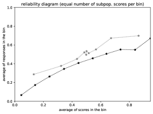
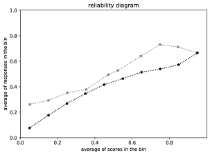
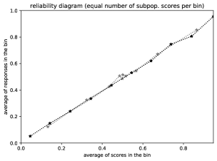
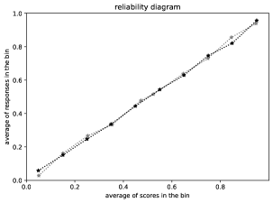
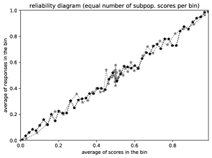
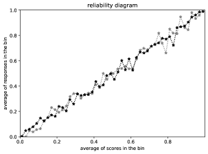
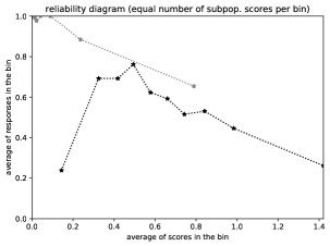
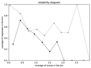
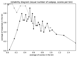
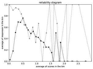
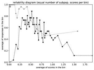
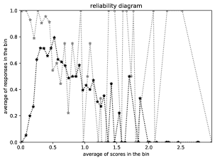
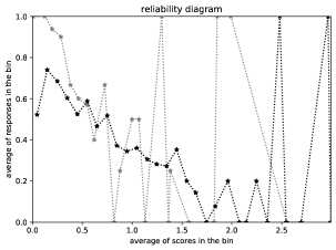
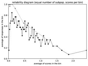
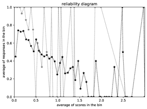
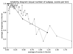
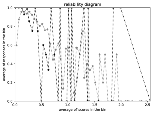
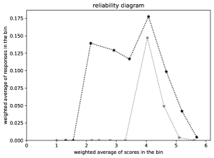
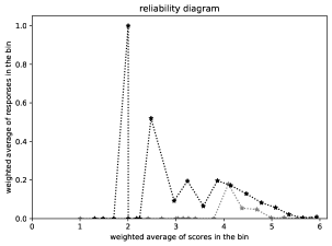
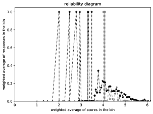
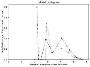
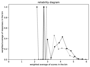
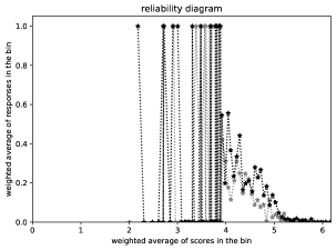
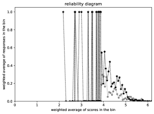
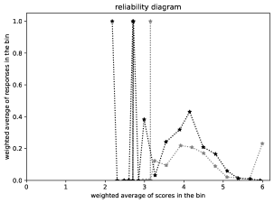
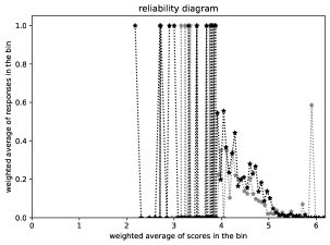
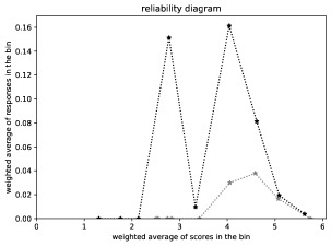
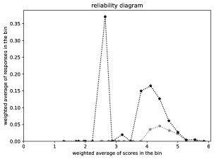
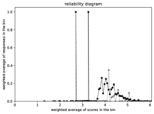
The traditional “reliability diagram” plots binned responses against binned scores. Namely, the diagram partitions the real line into disjoint intervals known as “bins” and takes the (arithmetic) average of the scores in each bin paired with the average of the responses corresponding to the scores in that bin. The reliability diagram then graphs the average responses against the average scores. Typically, each subpopulation under consideration gets its own graph, superimposed on the same diagram. Copious examples are available in the figures below, as detailed in Section 3 below. Another name for “reliability diagram” (popularized by [2]) is “calibration plot,” especially when the responses are Bernoulli variates. A comprehensive, textbook review of reliability diagrams for plotting calibration is available in Chapter 8 of [5].
There are two canonical choices for the bins that partition the real line in the reliability diagram: {1} make the width of every bin be the same or {2} set the widths of the bins such that each bin contains roughly the same number of scores from the observed data set. Naturally, the second choice can adapt to each subpopulation under consideration. In both cases, increasing the number of bins trades off statistical confidence in the estimates for enhanced resolution in detecting deviations as a function of score; after all, narrower bins perform less averaging, averaging away less of the randomness in the observations. The trade-off between resolution and statistical confidence is inherent in methods based on binning or kernel density estimation such as that of [6]. The methods proposed in the present paper avoid making such an explicit trade-off and also avoid the rather arbitrary decisions about which bins or kernels to use. The present paper extensively compares its methods against both standard choices of bins for the classical methods.
The present paper follows the cumulative approach introduced into statistics by [7] and [8]. The methodology of Kolmogorov and Smirnov, as well as the refinement (“Kuiper’s statistic”) introduced by [9], yields scalar summary statistics useful for screening large numbers of data sets and subpopulations. After identification via the scalar statistics of potentially statistically significant deviations in a data set for two subpopulations, graphical methods allow for in-depth investigation into the variation of the deviations as a function of score. The graphical methods (and hence an intuitive interpretation of the associated scalar summary statistics) rely on the weighting used by [10], [11], and [12], which is different from the weighting used by the otherwise closely related approach of [13] and the others cited by [14]. The scalar summary statistics of [10] are almost the same as those in the present paper, but for the simpler setting in which each score comes with precisely one observation from one subpopulation and one observation from the other subpopulation. The scalar summary statistics of [11] and [12] are analogues of those from the appendix of [1] in the special case that the parametric regression function they consider is nothing but the identity function on the unit interval .
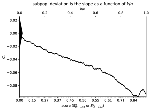
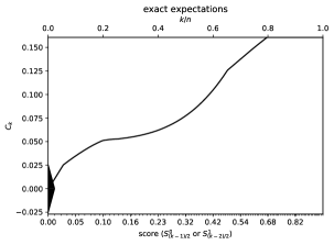
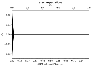
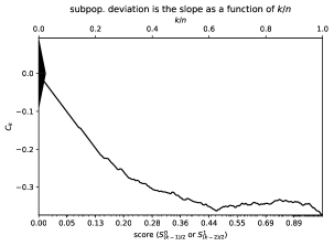
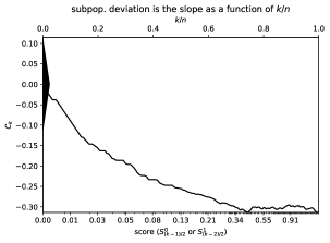
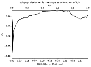
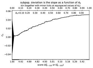
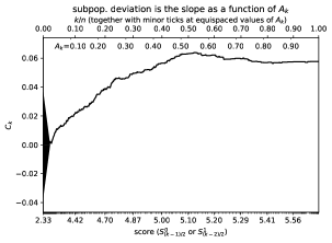
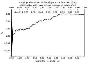
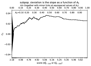
The graphs introduced in the present paper are easy to interpret. For instance, in the topmost plots (a and b) of Figure 1, the deviation between the two subpopulations over a range of scores is simply the expected slope of the secant line for the graph over that range of scores, as a function of the index (positive slope indicates that the responses for one subpopulation are greater on average than those for the other subpopulation, while negative slope indicates that the responses for the former subpopulation are less than the latter’s on average). Long ranges of steep slopes correspond to ranges of scores for which the average responses are significantly different between the two subpopulations; the triangle along the vertical axis on the left of each plot indicates the magnitude of the deviation across the full range of scores that would be statistically significant at around the 95% confidence level. The connection with statistical significance also motivated related works, including that of [15] and [16], which offer Kolmogorov-Smirnov metrics to help gauge calibration of probabilistic predictions, much like in the appendix of [1]. Similarly, Section 3.2 of [17] and Chapter 8 of [5] propose cumulative reliability diagrams, albeit without leveraging the key to the approach of the present paper, namely that slope is easy to assess visually even when the constant offset of the part of a graph under consideration is arbitrary and uninformative. Detailed explanation of statistical significance and Figure 1 is available in Sections 2 and 3 below.
Section 2 introduces the methodology of cumulative differences, both for graphs of the differences and for the scalar metrics of Kuiper and of Kolmogorov and Smirnov that summarize the graphs’ deviation away from being perfectly flat. Section 3 presents several illustrative examples, via both simple synthetic and complicated real data sets.111Permissively licensed open-source software that can automatically reproduce all figures and statistics reported below is available at https://github.com/facebookresearch/fbcddisgraph Section 4 concludes the paper with a brief discussion. Table 1 summarizes the notation used throughout the present paper. Readers interested mainly in seeing results and comparisons of the proposed methods to the old standbys may wish to start with Section 3.
(a)
 (b)
(b)
(c)
 (d)
(d)
(e)
 (f)
(f)
(g)
| equation for the | equation for the | ||
| symbol | meaning | unweighted case | case with weights |
| abscissa for the cumulative graph in the case with weights | (Not applicable) | (16) | |
| cumulative average difference between the subpopulations | (3) | (15) | |
| average difference between the subpopulations | (1) and (2) | (1) and (2) | |
| expected slope of from to | (6) | (20) | |
| Kolmogorov-Smirnov statistic | (11) | (11) | |
| Kuiper statistic | (12) | (12) | |
| (average) response for subpopulation ’s th block | (Step 4 within | (Readjusted in | |
| — random dependent variable, outcome, or result | Subsection 2.2) | Subsection 2.5) | |
| (average) score for subpopulation ’s th block | (Step 4 within | (Readjusted in | |
| — non-random independent variable | Subsection 2.2) | Subsection 2.5) | |
| scale of random fluctuations over the full range of scores | (13) | (21) | |
| total weight for or | (Not applicable) | (14) | |
| aggregated weight | (Not applicable) | (14) |
2 Methods
This section details the methodology proposed in the present paper. Subsection 2.1 breaks data analysis into two stages: a first, broad-brush stage of screening for potentially significant deviations across many data sets and pairs of subpopulations, and a second, finely detailed investigation of the variations in the deviations as a function of score. Subsection 2.2 develops the graphical method for the second stage, in the simplest case of unweighted sampling. Subsection 2.3 then collapses the graphs of Subsection 2.2 into scalar statistics useful for the first, broad-brush stage. Subsection 2.4 explains how to gauge statistical significance. Finally, Subsection 2.5 treats the case of weighted sampling, generalizing the previous subsections to the more complicated case of data with weights.
2.1 Approach to big data
This subsection proposes a two-step approach to analyzing multiple data sets and subpopulations (the same approach taken by [1] in a related setting):
-
1.
Calculate a single scalar summary statistic for each data set for each pair of subpopulations of interest, such that the size of the statistic measures the deviation between the subpopulations.
-
2.
Analyze in graphic detail each data set and pair of subpopulations whose scalar summary statistic is large, graphing how the deviation between the subpopulations varies as a function of score.
The scalar statistic for the first step simply summarizes the overall deviation across all scores, as either the maximum absolute deviation of the second step’s graph or the size of the range of deviations in the graph. Thus, both steps rely on a graph, with the first stage collapsing the graphical display into a single scalar summary statistic. The following subsection details the construction of this graph, for the case of unweighted sampling (later, Subsection 2.5 treats the weighted case).
2.2 Unweighted sampling
This subsection presents the special case in which the observations are unweighted (or, equivalently, uniformly or equally weighted). Subsection 2.5 treats the more general case of weighted observations, which is more complicated.
The present and all following subsections focus on a single data set together with a single pair of subpopulations; the previous subsection outlines a strategy for handling multiple data sets and pairs of subpopulations, based on the processing of individual cases. The data being considered should be observations of independent responses, with each response taking one of finitely many real-valued possibilities, and with each (random) response being paired with a real-valued score viewed as given not random (the responses across the different scores should be independent). Hence, the scores can take on any real values, whereas the responses should be drawn from discrete distributions. In the present paper, the scores from the observations in both subpopulations put together must be distinct — the score for every observation from either subpopulation must be unique or else slightly perturbed to become different from all the other scores (perturbing as little as possible while accounting for roundoff, for instance).
Under this assumption of uniqueness, a graphical method for analyzing deviation between the outcomes of the two subpopulations as a function of score comprises the following procedure:
-
1.
Merge all scores into a single sequence.
-
2.
Sort the merged sequence into ascending order and let “subpopulation 0” denote the subpopulation associated with the first (the least) score in the sorted sequence.
-
3.
Partition the sorted sequence into blocks such that the scores in every other block all come from subpopulation 0, interleaved with blocks in which all scores come from subpopulation 1; that is to say:
-
(a)
the scores in the first (lowest) block all come from subpopulation 0,
-
(b)
the scores in the second lowest block all come from subpopulation 1,
-
(c)
the scores in the third lowest block all come from subpopulation 0,
-
(d)
the scores in the fourth lowest block all come from subpopulation 1,
-
(e)
and so on, alternating between the two subpopulations, with all scores in each block coming from only one of the subpopulations.
-
(a)
-
4.
Denote by the (arithmetic) average of the scores in the th block and denote by the average of the scores in the th block; denote by the average of the responses (the random outcomes) corresponding to the scores in the th block and denote by the average of the responses (the random outcomes) corresponding to the scores in the th block.
-
5.
Form the sequence of average differences with even-indexed entries
(1) and odd-indexed entries
(2) -
6.
Graph as a function of the sequence of cumulative average differences
(3) for , , …, , where is the length of the sequence , , …, from the previous step. Supplement , , …, with
(4)
Figure 2 illustrates Steps 1–4, while Figure 3 illustrates Step 5. The increment in the expected cumulative average difference from to is
| (5) |
so that the expected slope of a graph of versus is
| (6) |
which is simply the expected value of the difference between the two subpopulations. Thus, the slope of a secant line over a long range of for the graph of versus becomes the average difference in responses between the subpopulations.
Figure 1 presents a synthetic example from Subsection 3.1 below for which the ground-truth is known explicitly. In accord with (5), the topmost plots (a and b) of Figure 1 display deviation between the two subpopulations over a range of scores as the expected slope of the secant line for the graph over that range of scores, as a function of the index given along the horizontal axis. As mentioned in the introduction, long ranges of steep slopes correspond to ranges of scores for which the average responses are significantly different between the two subpopulations, with the triangle along the vertical axis on the left of each plot indicating the magnitude of the deviation across the full range of scores that would be statistically significant at around the 95% confidence level. Subsection 2.4 below provides details on statistical significance and the computation of the triangle’s height.
Remark 1.
The blocked sequence of responses is , , , , , , …. The backward differences are
| (7) |
and
| (8) |
while the forward differences are
| (9) |
and
| (10) |
so that from (1) is the average of (7) and (9) while from (2) is the negative of the average of (8) and (10). The reason for to be the negative is to align with when summing them in (3) — the differences need to be in the same direction for the sum to make sense, and the negative synchronizes the directions of the differences (which would otherwise be alternating or staggered in the sequence); with the negative, the differences always compare subpopulation 0 to subpopulation 1, in that order.
Remark 2.
In the absence of any reason to prefer backward differences to forward differences (or vice versa), we opt to average the two possibilities together. In the absence of any reason to prefer entries in the sequence with even indices (, , , …) to entries with odd indices (, , , …), we include both.

(a)
 (b)
(b)

2.3 Scalar summary statistics
This subsection constructs standardized statistics which summarize in single scalars the plots of the previous subsection.
Two standard metrics for the overall deviation between the two subpopulations over the full range of scores and that take into account expected random fluctuations are that due to Kolmogorov and Smirnov, the maximum absolute deviation
| (11) |
and that due to Kuiper, the size of the range of the deviations
| (12) |
where is defined in (4) and , , …, are defined in (3). Under appropriate statistical models, and can form the basis for tests of statistical significance, the context in which they originally appeared; see, for example, Section 14.3.4 of [18]. To assess statistical significance (rather than absolute effect size), and should be rescaled larger by a factor proportional to ; further discussion of the rescaling is available in the next subsection. Needless to say, if the graph constructed in the previous subsection is fairly flat for all scores (which indicates a lack of deviation between the subpopulations for all scores), then both the maximum absolute deviation of the graph and the size of the range of deviations ( and , respectively) will be close to 0. The captions of the figures report the values of these scalar statistics for numerical examples.
2.4 Significance of stochastic fluctuations
This subsection discusses statistical significance both for the graphical methods of Subsection 2.2 and for the summary statistics of Subsection 2.3.
The graph of as a function of generally displays some “confidence bands” due to fluctuating randomly as the index increments; the “thickness” of the plot arising from the random fluctuations gives some sense of “error bars.” To indicate the rough size of the fluctuations of the maximum deviation expected under the hypothesis that the actual underlying response distributions of the two subpopulations are the same, the plots should include a triangle centered at the origin whose height above the origin is proportional to . The triangle is similar to the conventional confidence bands around an empirical cumulative distribution function introduced by Kolmogorov and Smirnov, as reviewed by [19] — a driftless, purely random walk deviates from zero by roughly after steps, so a random walk scaled by deviates from zero by roughly . Identification of deviation between the two subpopulations is reliable when focusing on long ranges of steep slopes (as a function of ) for ; the triangle gives a sense of the length scale for the largest stochastic variations that are likely to happen even when there is no underlying deviation between the subpopulations. The remainder of the present subsection derives this conservative upper bound on the length scale in cases for which the value of every observed response is either 0 or 1.
The long-range deviations of , , , …, from zero can be biased even when the two subpopulations are drawn from the same underlying distribution as a function of score; however, the use of centered, second-order differences in (1) and (2) makes this a second-order effect. In the sequel, we make two assumptions about bias: {1} the bias arising from averaging together multiple responses at slightly different scores into a single or is offset by the reduction in variance due to the averaging, and {2} the bias arising from taking differences of responses from the different subpopulations at slightly different scores is negligible in comparison with the square root of the accumulated variance. The first assumption can be especially reasonable when the scores considered for a single or are in reality drawn at random from some probability distribution, such that the variance in the probabilities of success for the associated Bernoulli responses is comparable to the variance of a Bernoulli variate with a given probability of success. In such cases, the first assumption permits us to regard each or as contributing no more to the long-range deviation than a single Bernoulli variate would. The second assumption means that we will neglect the second-order effect of accumulated bias, which is often reasonable due to the use of second-order differences in (1) and (2).
In cases for which the value of every observed response is either 0 or 1, the tip-to-tip height of the triangle centered at the origin should be times the standard deviation of the sum of independent Bernoulli variates. This is simply times the square root of the sum of the variances of Bernoulli variates, which could be at most , where
| (13) |
since the variance of a Bernoulli variate is , where is the unknown probability of success. Note that the factor 8 incorporates a factor of 2 for the triangle extending both above and below the origin, a factor of 2 to extend for 2 standard deviations rather than just 1 (setting the confidence level at approximately 95%), a factor of due to the dependency between the even- and odd-indexed entries in the sequence of second-order differences from (1) and (2), and a factor of to account for having 2 independently drawn subpopulations. Needless to say, the upper bound of is often somewhat loose in practice, as the two assumptions discussed in the previous paragraph yield rather conservative guarantees. Tighter bounds may exist in settings for which the scores are drawn from a specified probability distribution (unlike in the setting of the present paper).
2.5 Weighted sampling
This subsection presents the general case in which the observations come with weights, where each weight is a positive real number associated with the corresponding observation. Subsection 2.2 treats the special case of unweighted (or, equivalently, uniformly or equally weighted) observations, which is simpler.
The weighted case uses the same procedure as in Subsection 2.2, but with , , , and being weighted averages rather than unweighted averages (the weighted average for each , , , and should be normalized separately). Then, we define to be the average of the weights associated with the scores whose weighted average is , and define to be the average of the weights associated with the scores whose weighted average is . Setting to be the sum of the weights associated with defined in (1) and (2), that is,
| (14) |
the formula (3) generalizes to
| (15) |
for , , …, , while exactly as before in formula (4). In the weighted case, the abscissae (that is, the horizontal coordinates) for the graph consist of the normalized aggregated weights
| (16) |
for , , …, , and
| (17) |
The original, unweighted procedure of Subsection 2.2 yields precisely the same results as the weighted procedure of the present subsection in the special case that the weights for the original observations are all the same.
The increment in the expected cumulative weighted average difference from to is
| (18) |
while the increment in the normalized aggregated weights from to is
| (19) |
so that the expected slope of a graph of versus is the ratio of (18) to (19), that is,
| (20) |
which is none other than the expected value of the difference between the two subpopulations. Thus, the slope of a secant line over a long range of for the graph of versus becomes the average difference in responses between the subpopulations.
The scalar summary statistics in the weighted case are given by the same formulae from Subsection 2.3 as for the unweighted case, just using from (15) in place of from (3). In cases for which the value of every observed response is either 0 or 1, the tip-to-tip height of the triangle centered at the origin analogous to that from Subsection 2.4 could be set conservatively at , where
| (21) |
which is an upper bound on the worst case under the same two assumptions as in Subsection 2.4.
Remark 4.
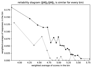
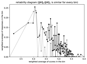
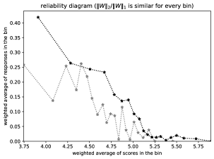
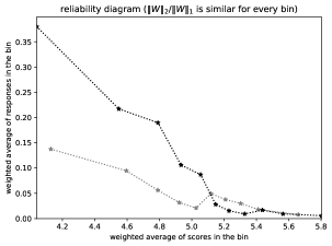
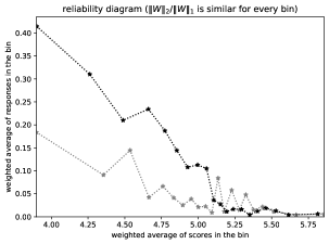
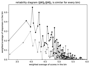
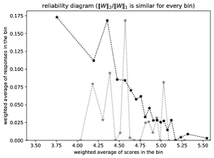
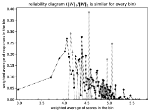
The classical methods for reliability diagrams discussed in the introduction easily adapt to the case of weighted sampling. Rather than plotting the plain, unweighted average of responses against the unweighted average of scores in each bin, the weighted case involves plotting the weighted average of responses against the weighted average of scores in each bin. Two natural choices of bins in the weighted case are {1} make the widths of the bins all be the same or {2} use the binning of the following remark (Remark 5). As in the unweighted case, the second choice can adapt to each subpopulation under consideration, with each subpopulation having its own binning.
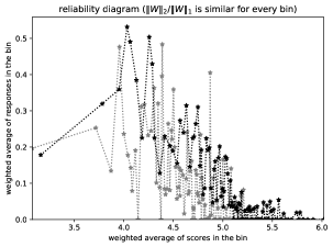
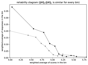
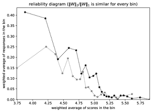
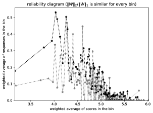
Remark 5.
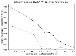
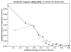
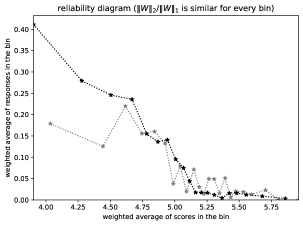
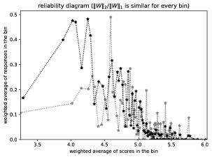
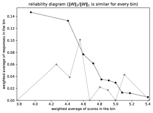
In the case of weighted sampling, the most useful reliability diagrams are usually those entitled, “reliability diagram ( is similar for every bin).” These diagrams construct bins such that, for every bin, the ratio of the sum of the squares of the bin’s weights to the square of the sum of the bin’s weights is similar for every bin. Remark 5 of [1] details the specific procedure employed for setting the bins.
3 Results and discussion
This section illustrates via numerous examples the previous section’s methods, including comparisons with the canonical plots — the “reliability diagrams” — discussed in the introduction.222Permissively licensed open-source software that can automatically reproduce all figures and statistics reported in the present paper is available at https://github.com/facebookresearch/fbcddisgraph Subsection 3.1 presents several synthetic examples. Subsection 3.2 gives examples from a popular, unweighted data set of images, ImageNet. Subsection 3.3 considers a weighted data set, the year 2019 American Community Survey of the United States Census Bureau. Finally, Subsection 3.4 issues a warning about possible overinterpretations of the plots (both for the cumulative graphs and for the classical reliability diagrams) and suggests following [1] by comparing a subpopulation to the full population (when apposite).
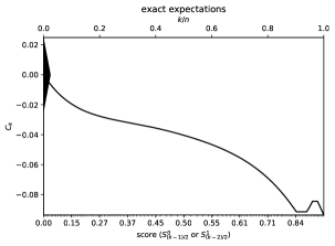
The figures display the reliability diagrams (that is, the classical calibration plots) as well as both the graphs of cumulative differences and the exact expectations in the absence of the random sampling’s noise (the figures include the exact expectations only when they are known, as for the synthetic data). The captions of the figures discuss the numerical results depicted.
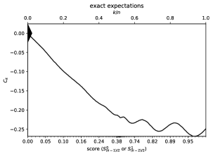
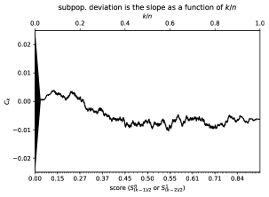
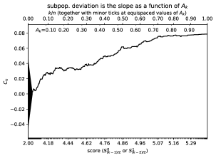
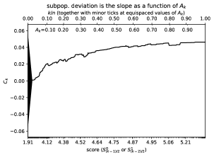
The title, “subpopulation deviation is the slope as a function of ,” labels a plot of from (3) as a function of . In each such plot, the upper axis specifies , while the lower axis specifies the score for the corresponding value of . The title, “subpopulation deviation is the slope as a function of ,” labels a plot of from (15) versus the cumulative weight from (16). In each such plot, the major ticks on the upper axis specify , while the major ticks on the lower axis specify the score for the corresponding value of ; the points in the plot are the ordered pairs for , , …, , with being the abscissa and being the ordinate. (The abscissa is the horizontal coordinate; the ordinate is the vertical coordinate.)
In all cases, if the second subpopulation ends up being subpopulation 0 in the notation of Section 2, then the cumulative graph technically actually plots rather than (in the same notation of Section 2).
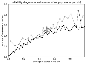
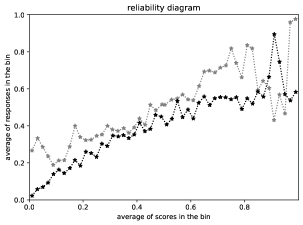
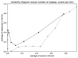
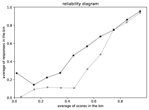
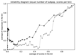
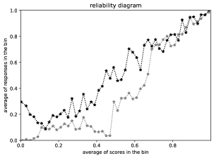
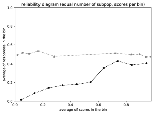
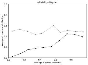
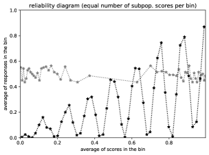
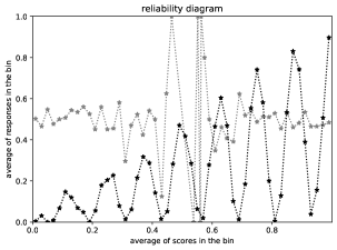
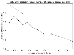
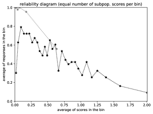
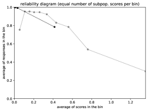
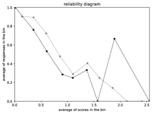
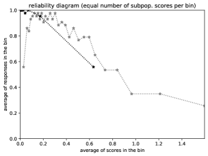
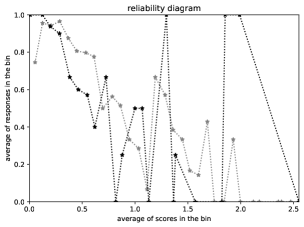
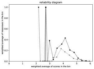
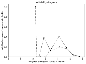
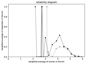
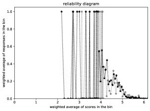
The titles, “reliability diagram,” “reliability diagram (equal number of subpopulation scores per bin),” and “reliability diagram ( is similar for every bin),” label plots of the pairs from the introduction (in the unweighted case) or from Remark 4 (in the case of weighted sampling), with the pairs from the first subpopulation in black and the pairs from the second subpopulation in gray.
In the traditional, binned plots, we vary the number of bins to see how the plotted values vary. Displaying the bin frequencies is another way to indicate uncertainties, as suggested, for example, by [20]. Still other possibilities for uncertainty quantification could use kernel density estimation, as suggested, for example, by [21], [6], and [5]. Such uncertainty estimates involve setting widths for the bins or kernel smoothing; such settings are fairly arbitrary and actually unnecessary when varying the widths as in the plots of the present paper. A comprehensive review of the various possibilities is available in Chapter 8 of [5].
As the introduction discusses, there are two standard choices for the bins when the sampling is unweighted (or uniformly weighted): {1} make the average of the scores in each bin be roughly equidistant from the average of the scores in each neighboring bin or {2} make the number of scores in every bin (except perhaps for the last) be the same. The figures label the first, more conventional possibility with the short title, “reliability diagram,” and the second possibility with the longer title, “reliability diagram (equal number of subpopulation scores per bin).” As noted in Remark 4, there are two typical choices for the bins when the sampling is weighted: {1} make the weighted average of the scores in each bin be roughly equidistant from the weighted average of the scores in each neighboring bin or {2} follow Remark 5 above. The figures label the first possibility with the short title, “reliability diagram,” and the second possibility with the longer title, “reliability diagram ( is similar for every bin).”
Needless to say, reliability diagrams with fewer bins provide estimates that are less noisy, at the cost of restricting the resolution for detecting deviations and for resolving variations as a function of the score.
3.1 Synthetic
This subsection presents several toy examples that consider instructive “ground-truth” statistical models and generate observations at random from them. The examples set values for the scores and expected values of the responses, and then independently draw the observed responses from the Bernoulli distributions whose probabilities of success are those expected values.
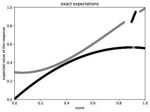
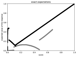
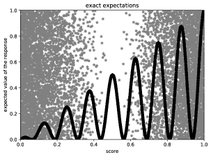
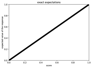
Each top row of Figures 1 and 4–6 plots , , …, from (3) as a function of , with the rightmost plot displaying its noiseless expected value rather than using the random observations ( and ). (Technically speaking, the top row of Figure 5 actually plots , , …, , since for Figure 5 the second subpopulation ends up being subpopulation 0 in the notation of Section 2.) Each bottom row of Figures 1 and 4–6 plots the pairs of scores and expected values for the first subpopulation in black, and plots the pairs for the second subpopulation in gray, producing ground-truth diagrams that the middle two rows of plots are trying to estimate using only the observations, without access to the underlying probabilities.
The first three examples include substantial deviations in the expected responses between the two subpopulations, while the fourth example omits any deviation in the expected responses between the two subpopulations. The first three examples illustrate how well the various plots can detect substantial deviations, while the fourth example illustrates how the plots look in the absence of any deviation.
For the first example, corresponding to Figure 1, the scores for the first subpopulation are for 10,000 values of drawn uniformly at random from the unit interval , whereas the scores for the second subpopulation are 7,000 values drawn uniformly at random from the unit interval (the latter values are also equal to for 7,000 values of drawn uniformly at random from the unit interval ). The expected values are as indicated in the lowermost plot of Figure 1, with the expected values for each subpopulation varying smoothly as a function of the score, aside from swapping the values between the two subpopulations for scores in a short range near 0.9. The deviation in the expected values between the subpopulations is substantial for this example.
For the second example, corresponding to Figure 4, the scores for the first subpopulation are for 10,000 values of drawn uniformly at random from the unit interval , whereas the scores for the second subpopulation are 7,000 values drawn uniformly at random from the unit interval . The expected values are as indicated in the lowermost plot of Figure 4, with several discontinuities in the expected values. The deviation in the expected values between the subpopulations is substantial for this example, too.
For the third example, corresponding to Figure 5, the scores for the first subpopulation are for 10,000 values of drawn uniformly at random from the unit interval , whereas the scores for the second subpopulation are 7,000 values drawn uniformly at random from the unit interval (the latter values are also equal to for 7,000 values of drawn uniformly at random from the unit interval ). The lowermost plot of Figure 5 displays the expected values, with the expected values for the first subpopulation varying sinusoidally within an envelope bounded below by 0 and bounded above by the diagonal line on the plot extending from the origin to the point , and with the expected values for the second subpopulation drawn uniformly at random from the unit interval . The deviation in the expected values between the subpopulations is substantial for this example, as well.
For the fourth example, corresponding to Figure 6, the scores are the same as in the first example, and the expected values are equal to the scores. Since the expected values are equal to the scores, the expected values are given by the same function of the score for both subpopulations, and thus there is no deviation between the expected responses for the subpopulations in this example.
The captions of the figures comment on the numerical results displayed.
(a)
 (b)
(b)
(c)
 (d)
(d)
(e)
 (f)
(f)
(g)
(a)
 (b)
(b)
(c)
 (d)
(d)
(e)
 (f)
(f)
(g)
(a)
 (b)
(b)
(c)
 (d)
(d)
(e)
 (f)
(f)
(g)
3.2 ImageNet
This subsection applies the methods of Section 2 to the training data set “ImageNet-1000” of [22], which contains a thousand labeled classes. Each class forms a natural subpopulation to consider, with each class considered consisting of 1,300 images of a particular noun (such as a “cheetah,” a “night snake,” or an “Eskimo Dog or Husky”). The total number of members of the data set over all classes is 1,281,167, as some classes in the data set contain fewer than 1,300 images, but each subpopulation considered below comes from a class with 1,300 images. The images are unweighted (or, equivalently, uniformly or equally weighted), not requiring the methods of Subsection 2.5 above. We calculate the scores using the pretrained ResNet18 classifier of [23] from the computer-vision module, “torchvision,” in the PyTorch software library of [24]; the score for an image is the negative of the natural logarithm of the probability assigned by the classifier to the class predicted to be most likely, with the scores randomly perturbed by about one part in to guarantee their uniqueness. The response (also known as “result” or “outcome”) corresponding to a given score takes the value 1 when the class predicted to be most likely is the correct class; the response takes the value 0 otherwise. Figures 7–9 present three examples; the captions first list the names of the classes for the subpopulations and then compare the different kinds of plots.
(a)
(b)
 (c)
(c)
(d)
 (e)
(e)
(f)
 (g)
(g)
(a)
(b)
 (c)
(c)

(d)
 (e)
(e)
(f)
 (g)
(g)
(a)
(b)
 (c)
(c)
(d)
 (e)
(e)
(f)
 (g)
(g)
3.3 American Community Survey of the U.S. Census Bureau
This subsection applies the methods of Subsection 2.5 to the latest (year 2019) microdata from the American Community Survey of the United States Census Bureau;333All microdata from the United States Census Bureau’s American Community Survey of 2019 is available for download at https://www.census.gov/programs-surveys/acs/microdata.html specifically, we consider each subpopulation to be the observations from a county in California. The sampling in this survey is weighted, and we retain only those members whose weights (“WGTP” in the microdata) are nonzero, omitting any member whose household personal income (“HINCP”) is zero or for which the adjustment factor to income (“ADJINC”) is missing. The scores are the logarithm to base 10 of the adjusted household personal income (the adjusted income is “HINCP” times “ADJINC,” divided by one million when “ADJINC” omits its decimal point in the integer-valued microdata), and we randomly perturb the scores by about one part in to guarantee their uniqueness. The response (also known as “result” or “outcome”) for a given score takes the value 1 when the corresponding household has limited English speaking (limited English speaking refers to a household in which every member strictly older than 13 has some difficulty speaking English); the response takes the value 0 when the corresponding household is fully English speaking. Table 2 lists the numbers of scores in the subpopulations prior to any binning. Figures 10–15 present several examples; the captions first list the names of the counties corresponding to the subpopulations considered and then compare the reliability diagrams with the cumulative graph.
| number of | number of scores for | number of scores for |
|---|---|---|
| the figure | the first subpop. | the second subpop. |
| 1, 4, 5, 6 | 10,000 | 7,000 |
| 7, 8, 9 | 1,300 | 1,300 |
| 10 | 6,415 | 1,616 |
| 11 | 3,440 | 2,276 |
| 12 | 3,440 | 3,697 |
| 13 | 3,440 | 2,282 |
| 14 | 3,440 | 2,888 |
| 15 | 7,826 | 843 |
(a)
(b)
 (c)
(c)
(d)
 (e)
(e)
(f)
 (g)
(g)
(a)
(b)
 (c)
(c)
(d)
 (e)
(e)
(f)
 (g)
(g)
(a)
(b)
 (c)
(c)

(d)
 (e)
(e)
(f)
 (g)
(g)
(a)
(b)
 (c)
(c)

(d)
 (e)
(e)
(f)
 (g)
(g)
(a)
(b)
 (c)
(c)
(d)
 (e)
(e)
(f)
 (g)
(g)
(a)
(b)
 (c)
(c)
(d)
 (e)
(e)
(f)
 (g)
(g)
3.4 Cautions
This subsection warns about some limitations of both the methods of the present paper and the conventional reliability diagrams.
The fourth example from Subsection 3.1, with its corresponding Figure 6, emphasizes a cautionary note: avoid hallucinating deviations between the subpopulations on account of statistically insignificant random fluctuations! The indicators such as and the triangle at the origin discussed in Subsections 2.3, 2.4, and 2.5 are critical for the proper interpretation of statistical significance. (Note that similar questions of significance also arise for the conventional reliability diagrams, on account of multiple testing: error bars for each bin could report 95% confidence intervals, for instance, but then 1 out of every 20 such bins would be expected to report results exceeding its error bar.)
A chief drawback of the approach of the present paper is the limitation highlighted in the abstract, in the introduction, and in an italicized sentence of Section 2, too: the score for every observation in either subpopulation must not be exactly equal to the score for any other observation from the subpopulations. Of course, one way to enforce the required uniqueness of scores is to perturb them at random slightly. Another drawback is that the observations from one subpopulation get compared to observations from the other subpopulation at slightly different scores; although the bias that this introduces in the cumulative approach is less than in the classical reliability diagrams, the bias is still there and potentially worrisome. An ideal means of circumventing such drawbacks is to compare a subpopulation to the full population as detailed by [1]. The approach of [1] is effectively ideal and should be the method of choice whenever applicable. The approach of the present paper is only relevant when comparing subpopulations directly is necessary.
4 Conclusion
The plot of cumulative differences between the two subpopulations is easy to interpret — the slope of a secant line for the graph over a long range becomes the average difference between the two subpopulations, and slope is easy to gauge irrespective of any constant offset of the secant line. The plots for the examples of Section 3 clearly demonstrate many advantages of the cumulative approach over the classical reliability diagrams, and the scalar summary statistics of Kuiper and of Kolmogorov and Smirnov usually faithfully reflect significant differences between the subpopulations if any occur across the full range of scores in the plots. The graphs of cumulative differences avoid explicitly making a trade-off between statistical confidence and resolution as a function of score — a trade-off that is inherent to the traditional binned diagrams.
References
- [1] Tygert M. Cumulative deviation of a subpopulation from the full population. J Big Data. 2021;8(117):1–60. Preprint available at https://arxiv.org/abs/2008.01779.
- [2] Corbett-Davies S, Pierson E, Feller A, Goel S, Huq A. Algorithmic decision making and the cost of fairness. In: Proc. 23rd ACM SIGKDD Int. Conf. Knowl. Disc. Data Min. Assoc. Comput. Mach.; 2017. p. 797–806.
- [3] Xu Z, Kalbfleisch JD. Propensity score matching in randomized clinical trials. Biometrics. 2010;66(3):813–823.
- [4] Luo Z, Gardiner JC, Bradley CJ. Applying propensity score methods in medical research: pitfalls and prospects. Med Care Res Rev. 2010;67(5):528–554.
- [5] Wilks DS. Statistical Methods in the Atmospheric Sciences. vol. 100 of International Geophysics. 3rd ed. Academic Press; 2011.
- [6] Srihera R, Stute W. Nonparametric comparison of regression functions. J Multivariate Anal. 2010;101(9):2039–2059.
- [7] Kolmogorov AN. Sulla determinazione empirica di una legge di distribuzione (On the empirical determination of a distribution function). Giorn Ist Ital Attuar. 1933;4:83–91.
- [8] Smirnov N. On the estimation of the discrepancy between empirical curves of distribution for two independent samples. Bulletin Mathématique de l’Université de Moscou. 1939;2(2):3–11.
- [9] Kuiper NH. Tests concerning random points on a circle. Proc Koninklijke Nederlandse Akademie van Wetenschappen Series A. 1962;63:38–47.
- [10] Delgado MA. Testing the equality of nonparametric regression curves. Statist Probab Lett. 1993;17(3):199–204.
- [11] Diebolt J. A nonparametric test for the regression function: asymptotic theory. J Statist Plann Inference. 1995;44(1):1–17.
- [12] Stute W. Nonparametric model checks for regression. Ann Statist. 1997;25(2):613–641.
- [13] Scheike TH. Comparison of non-parametric regression functions through their cumulatives. Statist Probab Lett. 2000;46(1):21–32.
- [14] González-Manteiga W, Crujeiras RM. An updated review of goodness-of-fit tests for regression models. Test. 2013;22(3):361–411.
- [15] Gupta K, Rahimi A, Ajanthan T, Mensink T, Sminchisescu C, Hartley R. Calibration of neural networks using splines. arXiv; 2020. 2006.12800. Also published as a poster and paper at the 2021 International Conference on Learned Representations (ICLR).
- [16] Roelofs R, Cain N, Shlens J, Mozer MC. Mitigating bias in calibration error estimation. arXiv; 2020. 2012.08668.
- [17] Gneiting T, Balabdaoui F, Raftery AE. Probabilistic forecasts, calibration, and sharpness. J Royal Stat Soc B. 2007;69(2):243–268.
- [18] Press WH, Teukolsky SA, Vetterling WT, Flannery BP. Numerical Recipes: the Art of Scientific Programming. 3rd ed. Cambridge, UK: Cambridge University Press; 2007.
- [19] Doksum KA. Some graphical methods in statistics: a review and some extensions. Statist Neerl. 1977;31(2):53–68.
- [20] Murphy AH, Winkler RL. Diagnostic verification of probability forecasts. Int J Forecast. 1992;7(4):435–455.
- [21] Bröcker J. Some remarks on the reliability of categorical probability forecasts. Mon Weather Rev. 2008;136(11):4488–4502.
- [22] Russakovsky O, Deng J, Su H, Krause J, Satheesh S, Ma S, et al. ImageNet large scale visual recognition challenge. Int J Comput Vis. 2015;115(3):211–252.
- [23] He K, Zhang X, Ren S, Sun J. Deep residual learning for image recognition. In: 2016 IEEE Conference on Computer Vision and Pattern Recognition (CVPR). IEEE; 2016. p. 770–778.
- [24] Paszke A, Gross S, Massa F, Lerer A, Bradbury J, Chanan G, et al. PyTorch: an imperative style, high-performance deep learning library. In: Advances in Neural Information Processing Systems 32. Curran Associates; 2019. p. 8026–8037.