1417 \vgtccategoryResearch \vgtcpapertypeevaluation \authorfooter Alex Kale is with the University of Washington. E-mail: kalea@uw.edu. Yifan Wu is with the University of California at Berkeley. E-mail: yifanwu@berkeley.edu. Jessica Hullman is with Northwestern University. E-mail: jhullman@northwestern.edu. \shortauthortitleKale et al.: Causal Support: Modeling Causal Inferences with Visualizations
Causal Support: Modeling Causal Inferences with Visualizations
Abstract
Analysts often make visual causal inferences about possible data-generating models. However, visual analytics (VA) software tends to leave these models implicit in the mind of the analyst, which casts doubt on the statistical validity of informal visual “insights”. We formally evaluate the quality of causal inferences from visualizations by adopting causal support—a Bayesian cognition model that learns the probability of alternative causal explanations given some data—as a normative benchmark for causal inferences. We contribute two experiments assessing how well crowdworkers can detect (1) a treatment effect and (2) a confounding relationship. We find that chart users’ causal inferences tend to be insensitive to sample size such that they deviate from our normative benchmark. While interactively cross-filtering data in visualizations can improve sensitivity, on average users do not perform reliably better with common visualizations than they do with textual contingency tables. These experiments demonstrate the utility of causal support as an evaluation framework for inferences in VA and point to opportunities to make analysts’ mental models more explicit in VA software.
keywords:
Causal inference, visualization, contingency tables, data cognitionH.mInformation SystemsMiscellaneous
\teaser
![[Uncaptioned image]](/html/2107.13485/assets/figures/teaser_02.png) Modeling causal inferences with visualizations: \raisebox{-.6pt} {A}⃝ Users view and may interact with data visualizations; \raisebox{-.8pt} {B}⃝ Ideally, users reason through a series of comparisons that allow them to allocate subjective probabilities to possible data generating processes; and \raisebox{-1pt} {C}⃝ We elicit users’ subjective probabilities as a Dirichlet distribution across possible causal explanations and compare these causal inferences to a computed benchmark of causal support, which we derive from Bayesian inference across possible causal models.
\vgtcinsertpkg
Modeling causal inferences with visualizations: \raisebox{-.6pt} {A}⃝ Users view and may interact with data visualizations; \raisebox{-.8pt} {B}⃝ Ideally, users reason through a series of comparisons that allow them to allocate subjective probabilities to possible data generating processes; and \raisebox{-1pt} {C}⃝ We elicit users’ subjective probabilities as a Dirichlet distribution across possible causal explanations and compare these causal inferences to a computed benchmark of causal support, which we derive from Bayesian inference across possible causal models.
\vgtcinsertpkg
Introduction
Data analysts engaged in sensemaking [9, 46, 48, 22] infer the compatibility of different causal explanations with their data. During exploratory analysis or provisional statistical modeling, analysts implicitly or explicitly compare their data to patterns they expect as logical consequences of hypothesized data generating processes [2, 16, 17, 25, 26]. Visualizations play a critical role in causal inference both because externalization reduces cognitive load [12] and because human capabilities for inference rely heavily on sensory expectations (e.g., mental imagery) and comparisons between expectations and experiences [7, 30].
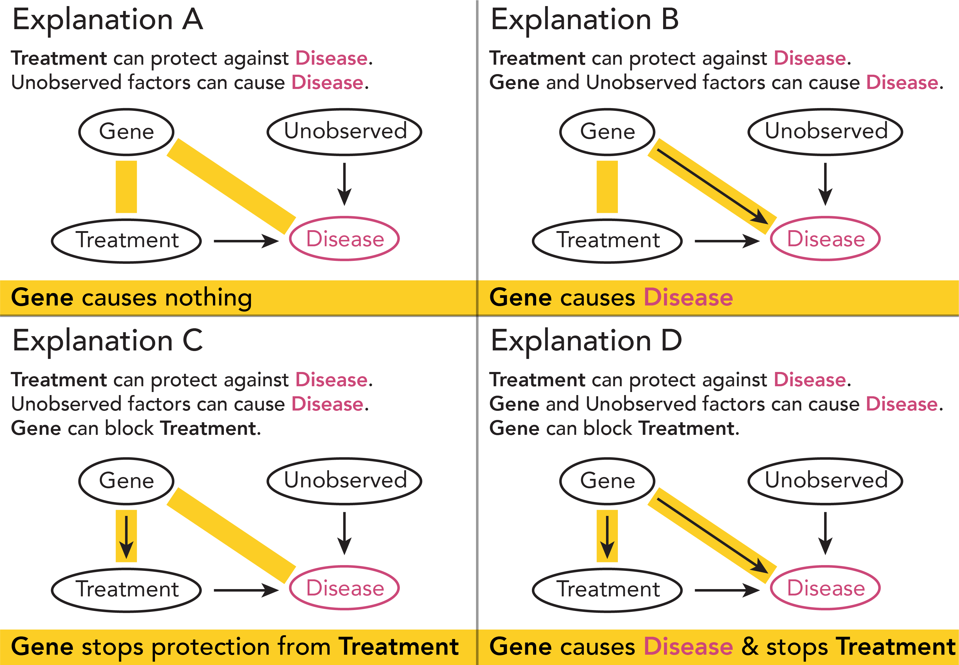
Data analysts and software designers need to anticipate how human capabilities for causal inference may be error prone. For instance, perceptual biases such as underestimation of sample size (e.g., [33]) contribute to errors in causal inferences insofar as perceived associations seem to be the basis for causal inferences [1, 59]. Analysts also err in their causal interpretations of data when the mapping between a potential causal explanation and an expected pattern in the data is unclear [4, 60]. For example, imagine an analyst trying to detect confounding in experiment results on the effectiveness of a treatment at preventing disease (Fig. Causal Support: Modeling Causal Inferences with Visualizations \raisebox{-.6pt} {A}⃝). To detect that ‘gene’ is a confounding factor, the analyst must see effects of gene on both treatment effectiveness (i.e., a difference between the top and bottom cells in the right column of table \raisebox{-.6pt} {A}⃝) and overall rate of disease (i.e., a difference between the top and bottom rows of \raisebox{-.6pt} {A}⃝). Attributing these signals in the data to confounding requires the analyst to know what they are looking for, rather than passively detecting the appropriate patterns.
To assess how well visual analytics (VA) tools support such causal inferences, we need to compare analysts’ inferences to a benchmark that is roughly ‘normative’, that captures important aspects of good causal inference. We adopt causal support, a model from mathematical psychology [21], as a benchmark for evaluating causal inferences from visualizations. Causal support models one’s belief in a set of possible data generating processes as a Bayesian update. Causal support is a good normative model for three reasons. (1) Causal support has numerous proprieties of valid statistical inference in light of the analyst’s prior knowledge. It captures the fact that belief in evidence should be stronger as sample size increases. It accounts for unknown unknowns about the space of possible models, such that causal support assigns no posterior probability to models that the analyst does not explicitly consider. (2) Prior work [21] shows through a system of experiments that causal support accounts for otherwise hard-to-explain patterns in human causal inferences, e.g., that subjective belief in a causal relationship varies as a function of the potential to detect that relationship in a given data set. (3) Since causal support is extensible to any generative model (i.e., models that can assign likelihood to data), it can be applied in a wide range of VA applications to evaluate causal inferences.
We contribute two experiments using causal inference problems involving count and proportion data to (1) study the utility of causal support for gaining insight into inferences from visualizations and (2) evaluate how well visualizations common in visual analytics (VA) software support causal inferences about possible data generating processes. We compare three common visual encodings for count and proportion data—bar charts, icon arrays, and text tables as a baseline—and we investigate how the ability to interactively aggregate or cross-filter data in bar charts impacts causal inferences. In Experiment 1, we ask participants to differentiate whether a treatment is effective by allocating probability across two different data generating processes. We find that chart users’ causal inferences are far from normative with all visualizations we tested, and interacting with visualizations can improve sensitivity to signal in predictable ways. Ultimately, however, no visualization reliably outperforms text tables. We also see that chart users are more sensitive to evidence against a treatment effect than evidence in favor of one, suggesting an unequal weighting of falsifying versus verifying evidence. In Experiment 2, we replicate the main findings Experiment 1 but with a confounding detection task where participants allocate probability across four alternative data generating processes. Experiment 2 demonstrates how casual support can be extended to study causal inferences about more complex data generating processes.
1 Related Work
1.1 Visualization for casual inference
Much of the psychology and statistics literature on visual aids for causal reasoning focuses on contingency tables (e.g., [1, 4, 11, 20, 21, 49]). Contingency tables support causal inferences by using layout to encode conditional probabilities, the same way trellis plots afford grouping by factors during visual data analysis [53, 5]. Whether or not a factor seems to be collapsible—whether or not patterns the data seem to change depending on whether the data are grouped by that factor—can be a visual signal for reasoning about causal relationships such as confounding [20]. However, empirical research on interpretation strategies for contingency tables [4] suggests that analysts often misinterpret signals like collapsability because they don’t ascertain the mapping between these visual signals and hypothesized causal relationships. Tools like Tableau enable users to explore collapsability by interactively grouping data. We investigate whether the ability to interactively control data aggregation improves the quality of causal inferences.
Research on visual analytics (VA) employs a broader range of representations to support causal reasoning, including parallel coordinates [55, 56], bar charts [60], “diff bar charts” showing counterfactual outcomes under different conditions as layered bars [58], and novel techniques using animation to show event sequences (e.g., [13, 28, 29]).
Some of these tools also incorporate directed acyclic graphs (DAGs) as interfaces to models and visualizations (e.g., [55, 56, 58, 60]). DAGs are devices for causal reasoning which have garnered attention in recent years [44]. DAGs encode hypothesized relationships among variables (e.g., Fig.Causal Support: Modeling Causal Inferences with Visualizations\raisebox{-.8pt} {B}⃝), making causal relationships and the assumptions they entail explicit and in some cases testable [3, 41, 43, 42]. We use DAGs to present differences between alternative causal explanations for data sets that we ask participants to judge (Figs. 1 & 8).
VA systems frequently use interaction techniques such as cross-filtering linked views of data (e.g., [55, 56]) and click- or drag-and-drop-based chart construction (e.g., [52, 58, 60]). The most similar prior research to our study111Also see https://logical-interactions.github.io/causal2020/ tests whether constructing charts by clicking on variables versus dragging variables onto a DAG makes a difference in analysts’ ability to differentiate between different kinds of causal relationships [60], specifically identifying mediating variables. Although they do not find an effect of interaction method on causal inferences, the authors provide a detailed strategy analysis extending evidence from psychological studies [4] that analysts struggle to reason about the exact set of visual signals they should look for to verify or falsify a causal relationship. We extend this line of work by studying whether the ability to (un)facet charts or cross-filter coordinated multiple views impacts the quality of untrained analysts’ causal inferences.
Prior work in visualization [36, 38] and risk communication [15, 50] suggests that icon arrays can improve Bayesian inferences, perhaps in part because of cognitive benefits of framing probabilities as frequencies of events [18, 23, 27, 32]. We compare icon arrays to text tables and bar charts since these visualizations span the design space for showing count data and are also easy to create in VA software like Tableau.
1.2 Modeling causal reasoning
In the present study, we draw on and extend a model of causal reasoning called causal support, first proposed by Griffiths and Tenenbaum [21]. Causal support formulates causal inferences as a Bayesian update on the log odds of a finite set of causal explanations given some observed data. Mathematically, causal support has similar properties to a Chi-squared test (i.e., Are the data in each cell of a contingency table likely generated by the same process?), which prior work analogizes to the kind of comparisons between data and model predictions that analysts visualize in “model checks” [16, 17, 26] such as QQ-plots. However, unlike a Chi-squared test, causal support relies on Monte Carlo simulations to assign likelihoods under alternative causal explanations, making causal support extensible to any finite set of generative causal models. For instance, Pacer and Griffiths extend causal support to handle continuous data [40] and event streams [39]. Similarly, in Experiment 2, we present an extension of causal support to evaluate inferences about more than two possible data generating models.
Previous cognitive models of causal inference explored in psychology share more in common with parameter estimation than statistical inference per se, a subtle but important distinction. One such model delta p posits that that people judge differences in conditional proportions of observed events when making causal inferences about count data [1]. Another such model causal power posits that people judge the magnitude of effect size when making causal inferences [11]. Both of these predecessors to causal support make the assumption that causal inferences are fundamentally a perceptual judgment, however, causal power rescales delta p based on the potential to detect any signal whatsoever within the observed data. In contrast, causal support assumes that the signal for causal inferences depends on the possible data generating models that the analyst has in mind and represents these alternative models explicitly. This makes causal support more flexible, with higher predictive validity for human judgments than delta p, causal power, and even Chi-squared [21]. Causal support reflects analysts’ natural tendency to dichotomize, for better or worse, reasoning about whether or not causal relationships exist rather than how strong they are.
2 Experiment 1
How well do different visualization designs that are common in visual analytics (VA) software support causal inferences about possible data generating processes? We evaluate visualizations of count data including text contingency tables, icon arrays, grouped bar charts, bars that users can interactively aggregate, and linked bars that users can interactively cross-filter. In Experiment 1, we investigate chart users’ ability to infer whether a treatment prevents a disease. By asking chart users about a treatment effect in count data, we build on the task and structural equation models used by Griffiths and Tenenbaum [21] to propose and validate causal support. Count data are also ideal for evaluating bar charts. The design requirements for supporting our causal inference task with count data are that visualizations should express both the proportion of people with disease and sample size. Based on these requirements, we ruled out testing pie charts and heatmaps, common ways of encoding proportions that do not encode sample size.
2.1 Method
We set out to study how well different visualizations support causal reasoning by using causal support as a benchmark for causal inferences.
2.1.1 Task scenario & response elicitation
Participants played the role of an analyst hired by a company to interpret samples of data on the effectiveness of experimental treatments at preventing various diseases. We showed participants visualizations of the number of people in each sample who did or did not receive treatment, get a disease, and have a gene known to cause the disease.
We asked participants to judge the underlying causal relationships in the data, rating their degree of belief that treatment protects against disease by allocating probability across the two DAGs in Figure 1. We chose to study causal inferences about treatments, genes, and diseases in order to create a scenario where users would find the possible causal explanations feasible, coherent, and memorable.
Question & elicitation. We asked participants the following question:
How much do you believe in each of the causal explanations described below? Imagine you have 100 votes to allocate across the two possible explanations. Split your 100 votes between explanations based on your degree of belief. For example, if you think one explanation is twice as likely as the other, you might give 67 votes (roughly two thirds) to that explanation and 33 votes (roughly one third) to the other. Assume no other explanations are possible.
Participants responded with two complementary probabilities. We used form validation to make sure their responses were both numbers between 0 and 100 that summed to 100. Following prior work on eliciting Dirichlet distributions [10, 37] (i.e., probabilities allocated across alternatives), when participants gave their first response, we imputed what the second response would need to be in order for their responses to sum to 100. This imputed value and a corresponding prompt, “Adjust your responses until both numbers reflect your beliefs.”, were both highlighted with the same color to indicate this imputation. We elicited probabilities as “votes out of 100” because frequency framing tends to reduce bias in probability estimates [18, 23, 37]. Participants received no feedback on their responses. We transformed these responses into perceived causal support, which we compared to our benchmark.
Perceived causal support. The dependent variable in our study was a measure of the perceived log odds of a target explanation over other possible causal explanations. Specifically, in Experiment 1 we targeted explanation A, which posited a treatment effect, requiring us to transform participants’ responses into a log response ratio (),
where and were the probabilities participants allocated to causal explanations A and B, respectively, on each trial. We used a log odds scale in order to make participants’ perceived causal support comparable to our normative benchmark of causal support.
Payment. Participants received a guaranteed reward of $2 plus a bonus of $0.25 for every trial where their estimate of the probability of causal explanation A222Bonuses in Experiment 2 were based on the probability of explanation D. was within 5 percentage points of the ground truth.
Apparatus. We collected data using a Flask application deployed on Heroku with a Firebase database and visualizations created with D3.333 E.g., see Experiment 2 interface at https://bit.ly/3rDcxfn
2.1.2 Visualization conditions
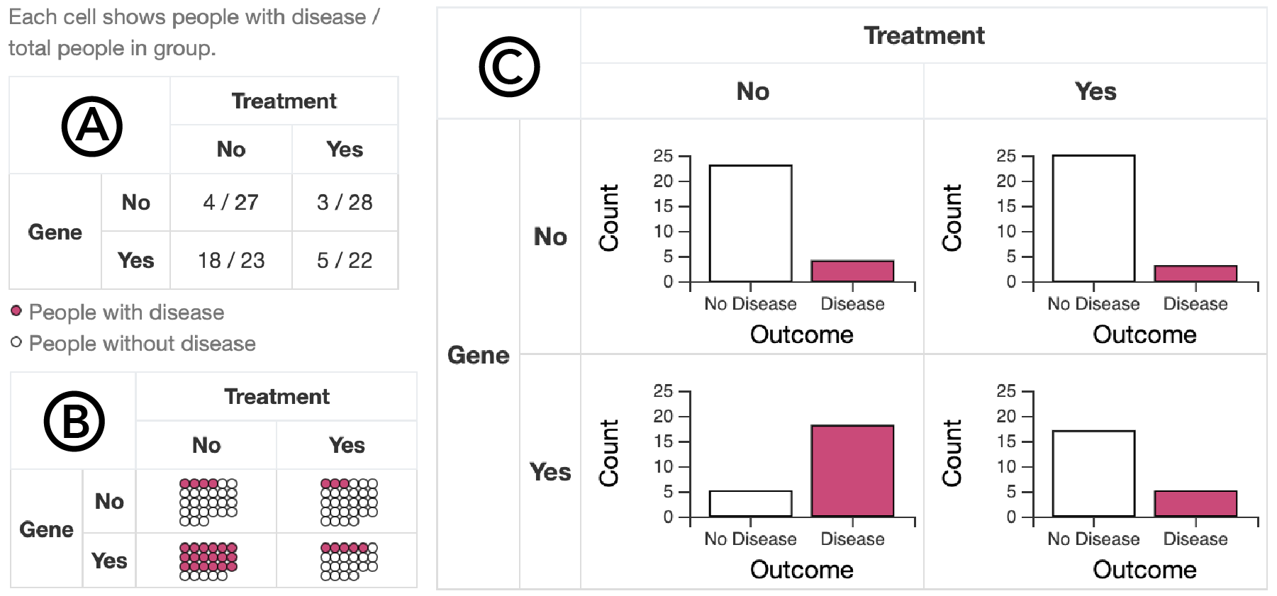
Our visualizations show the number of people with and without disease in each cell of a 2x2 contingency table faceted by treatment and gene, with the exception of cross-filter bars which use a different layout. We aimed to test visualizations of count data similar to what an analyst could produce using visual analytics software like Tableau.
Text contingency tables showed the number of people with disease as a fraction of the total number of people in each cell of a faceted table (Fig. 2 \raisebox{-.6pt} {A}⃝). Text tables, which have been studied in prior research on causal support, served as a baseline comparison for other visualizations.
Icon arrays showed counts of people with and without disease as filled and open circles, respectively (Fig. 2 \raisebox{-.8pt} {B}⃝). We set the number of dot columns to minimize the aspect ratio on each trial, similar to how analysts might create roughly square icon arrays in Tableau. Icon arrays express both proportion and sample size as natural frequencies, which prior work finds beneficial for statistical reasoning (e.g., [15, 18, 23]).
Bar charts showed counts of people with and without disease using a length/position encoding on a common scale (Fig. 2 \raisebox{-1pt} {C}⃝). On each trial, we set the -axis scale to the maximum count of the data in view, allowing scales to change from trial to trial as they do when users load a new data set in Tableau. Bar charts are ubiquitous for count data.
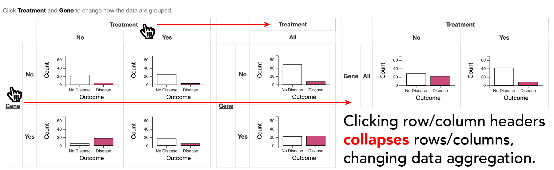
Aggregating bars (aggbars) were similar to bar charts, however, users could interactively toggle faceting by treatment or gene by clicking on the table headers (Fig. 3). On each trial, we set the -axis scale to the maximum count of the fully aggregated data. We designed aggbars to roughly mirror Tableau’s shelf interactions, where users control faceting by direct manipulation of table headers. Interactive faceting may facilitate causal inferences by enabling users to explore whether “collapsing” [20] over a factor changes patterns in the data.
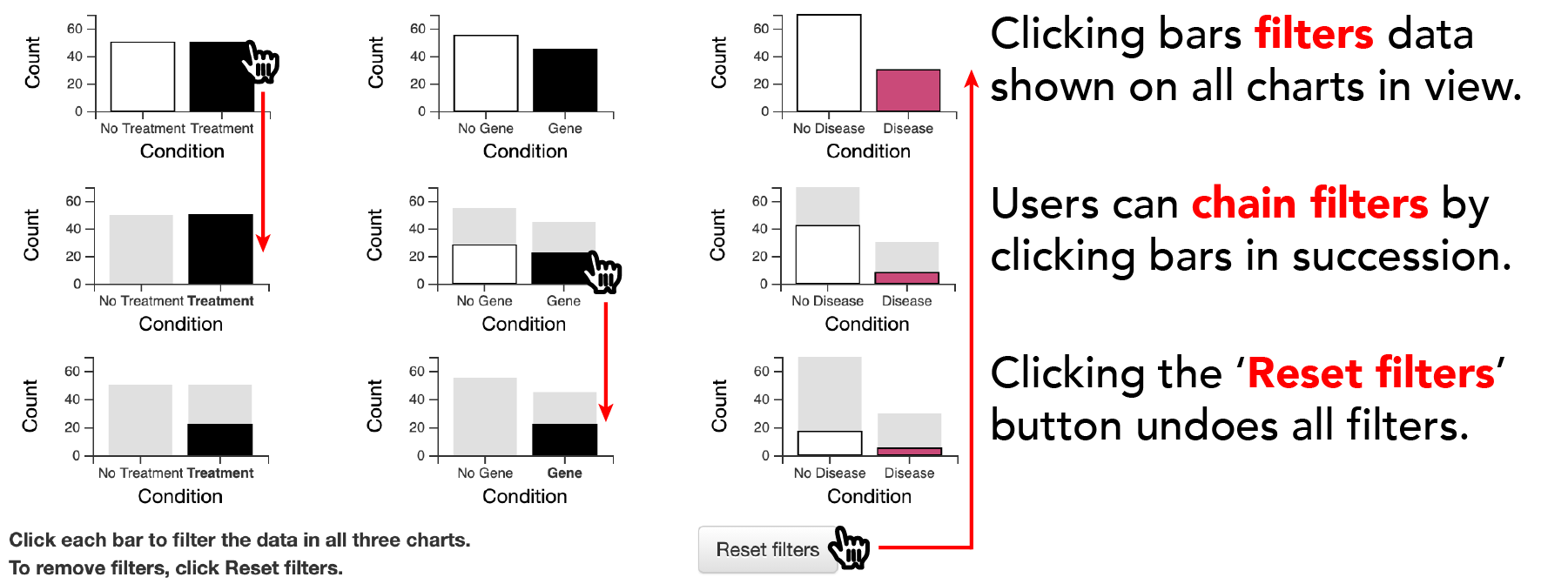
Cross-filtering bars were three bar charts showing the number of people with and without treatment, the gene, and disease, respectively (Fig. 4). We linked these bar charts such that clicking on one bar cross-filtered the rest of the data in view. When users applied a filter (e.g., only show people who received treatment), the corresponding axis label became bold and gray bars persisted in the background, so chart users could compare filtered and unfiltered views without relying on working memory. Users “reset filters” by clicking a button below the charts. Filterbars emulated coordinated multiple views such as a Tableau dashboard. Interactive cross-filtering might assist in causal inferences because conditioning the data in view based on a specific event is analogous to Pearl’s do operator (e.g., ), a notation for reasoning about counterfactuals in a causal networks [44].
2.1.3 Experimental design
We manipulated both the visualizations participants used for the task and the data sets that we showed. We randomly assigned each participant to use one of five visualizations (see Section 3.1.2), making comparisions of visualizations between-subjects. We showed each participant a total of 18 trials, which included 16 data conditions (see Section 3.1.4) presented within-subjects and two attention checks which we used for exclusion criteria (see Section 3.1.6). We randomized trial order for each participant, inserting attention checks on trials 7 and 13.
2.1.4 Stimulus generation
We evaluated causal inferences on realistic data sets, which spanned a range of ground truth causal support. Generating data sets required (1) manipulating data attributes which signaled causal support to participants, and (2) labeling each data set with ground truth causal support.
Our goal was to generate 16 data conditions (i.e., trials in our experiment) that varied delta p and sample size, two data attributes which in turn manipulate ground truth causal support. Delta p described the difference in the proportion of people with disease in each data set depending on whether they received treatment. Positive values of delta p indicated evidence that the treatment protected against disease; negative values indicated evidence against treatment effectiveness. Sample size was the number of people in each data set we showed participants.
Data conditions. To generate our 16 data conditions, we simulated data from structural models with one parameter per DAG arrow in Figure 1. We manipulated both the probability that treatment prevents disease (4 levels: ) and sample size (4 levels: ). We controlled the probability of disease due to the gene (), probability of disease due to unobserved causes (), base rate of the gene (), and the proportion of each sample with treatment (). We selected these parameters iteratively by sampling data sets and labeling ground truth until half of the trials had greater than a 50% chance of being generated by causal explanation A.
For each of the resulting 16 data conditions, we simulated many data sets using a binomial random number generator to approximate realistic sampling error. By simulating sampling error, we prevented the count data from appearing contrived. This sampling error resulted in a distribution of ground truth causal support under each data condition, with more variability in the ground truth at smaller sample sizes. To guarantee that each participant saw trials spanning a consistent range of causal support, we selected 16 data sets representing 16 quantiles of the ground truth distribution per data condition, and we counterbalanced the quantile shown for each data condition across participants within each visualization condition using a balanced latin square. For our attention check trials, we selected the two simulated data sets that had the minimum and maximum ground truth causal support.
Labeling ground truth causal support for each data set. We operationalized the ground truth for causal inferences using Griffiths and Tenenbaum’s causal support, a Bayesian cognition model that estimates the posterior log odds of a target data generating model over a set of alternative data generating models, given a data set. In Experiment 1, we targeted causal support for explanation A over explanation B:
where is the data set we label with ground truth, and models and correspond to causal explanations A and B (Fig. 1).
The first term in the formula for is a log likelihood ratio representing the relative compatibility of a given data set with causal explanations A and B. We computed the log likelihood of each data set given and using Monte Carlo simulations (Alg. 1, lines 28-30), based on structural models similar to those we used to generate data sets. In practical scenarios, we would not know the true data generating parameters, so we used Monte Carlo simulations of possible parameter values under each model to calculate likelihoods without needing to know the ground truth a priori. Under we sampled all three parameters uniformly on the interval , representing the assumptions that there is a treatment effect and that both gene and unobserved factors cause disease. Under we sampled and uniformly, but we fixed at zero, representing an assumption of no treatment effect (i.e., omitting the DAG arrow between treatment and gene in Fig. 1). In each simulation, we averaged log likelihood of a given data set over Monte Carlo iterations (Alg. 1, lines 25-26), marginalizing over sampled parameter values.
The second term in the formula for is a log ratio of the prior probability of explanations A versus B. Following Griffiths and Tenenbaum [21], we assume a uniform prior to be normative, assigning 50% probability to both explanations A and B (Alg. 1, lines 31-32). The prior encodes a bias in belief allocation across a finite set of alternative causal explanations. We assume a uniform prior because we want our benchmark to reflect no a priori bias toward causal explanations.444Uniform priors follow a convention of psychometric models that assume guessing responses are informed by the number of response alternatives [34].
2.1.5 Performance evaluation
We wanted to measure how much participants’ causal inferences deviated from our normative benchmark, causal support.
The linear in log odds model & causal support. By choosing to model perceived causal support (see Section 3.1.1) as a function of ground truth causal support on a log odds scale, we leverage a linear in log odds (LLO) model to extend causal support from a normative cognitive model into a descriptive one. Prior work shows that the LLO model accurately describes natural distortions in mental representations of probability [19, 24, 51, 61]. For example, visualization researchers [31] used the LLO model to measure perceptual distortions in probabilistic judgments about intervention effectiveness. Our normative model of causal support itself (see Section 3.1.4) is a sum in log odds units.
Derived measures. Using a LLO model to measure the correspondence between normative and perceived causal support enables us to estimate (1) participants’ sensitivity to changes in ground truth causal support and (2) bias in perceived causal support. From our model, we derive sensitivity and bias per condition as LLO slopes and intercepts, respectively. LLO slopes describe sensitivity to ground truth causal support such that a slope of one indicates ideal sensitivity. One can think of slopes as the weight participants assign to changes in the ground truth log likelihood ratio of explanations A versus B. LLO intercepts describe bias in participants’ probability allocations when causal support is zero such that an intercept of 50% indicates no bias. One can think of intercepts as the average prior probability that participants allocate to explanation A when there is no signal in the data.
Approach. We used the brms package [8] in R to fit Bayesian hierarchical models on perceived causal support. We adopted a Bayesian workflow called model expansion [14], where we started with a simple model and iteratively added predictors to build up to more complex models, running prior predictive checks, model diagnostics, posterior predictive checks, and leave-one-out cross validation for each version of the model. We centered each prior to reflect a null hypothesis of ideal performance and no bias, and we scaled each prior to be weakly informative while providing sufficient regularization for models to converge. We provide more details about our modeling workflow in our preregistrations555 See preregistrations for Experiment 1 (https://osf.io/vzmhu) and for Experiment 2 (https://osf.io/y46nw) and Supplemental Materials.666 https://github.com/kalealex/causal-support
Model specification. We used the following model (Wilkinson-Pinheiro-Bates notation [57, 8, 45]) to evaluate participants’ responses:
where was perceived causal support for a treatment effect, was our normative benchmark, was the difference in the proportion of people with disease given treatment versus no treatment, was the sample size as a factor, was a dummy variable for visualization condition, and was a unique identifier for each participant.
We primarily modeled effects on the mean of perceived causal support , but our model also learned the residual standard deviation . Both and the random effects in the submodel helped account for the empirical distribution, differentiating between response noise and effects of interest. The term enabled our model to learn how the slope on causal support varies as a function of the visual signal on each trial ( and ) and visualization condition.
2.1.6 Participants & exclusions
We recruited participants on Amazon Mechanical Turk. Workers had a HIT acceptance rate of at least 97% and were located in the US. We aimed to recruit a total of 400 participants after exclusions using our attention check trials, 80 per visualization condition. We determined this target sample size using a heuristic power analysis based on pilot data and the assumption that the width of confidence intervals would be inversely proportional to . We recruited a total of 548 participants, and after exclusions we used data from 408 participants in our analysis. We slightly overshot our target sample size because we could not anticipate perfectly how many participants would miss our attention checks (see Section 3.1.4). Although we preregistered that we would exclude participants who failed to allocate at least 50% subjective probability to the most likely causal explanation on either attention check, this criterion proved too strict and would have excluded 48% of our sample. Instead, we opted to use only the easier of the two attention checks for exclusions, resulting in the exclusion of 26% of our sample. All participants were paid regardless of exclusions. We compensated the average participant $2.50 for about 9 minutes.
2.2 Results
We evaluate chart users’ causal inferences using a linear in log odds (LLO) model to assess sensitivity to the ground truth and bias in probability allocations when each causal explanation is equally likely.
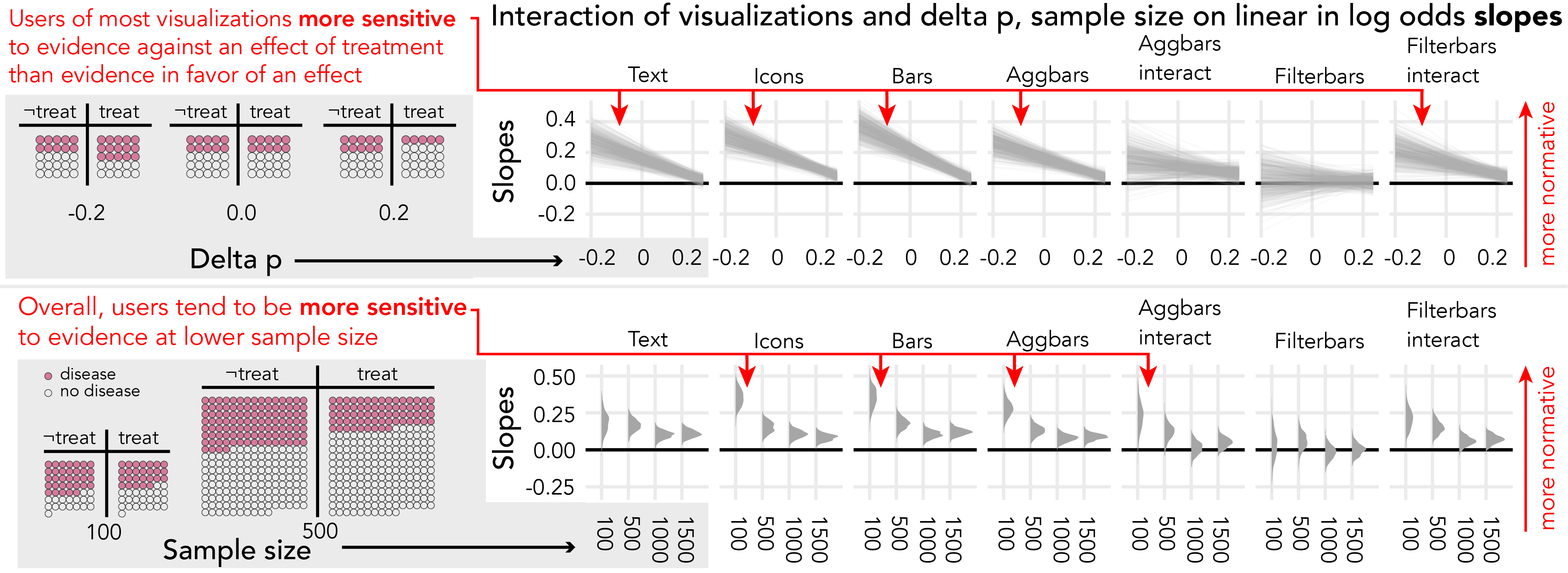
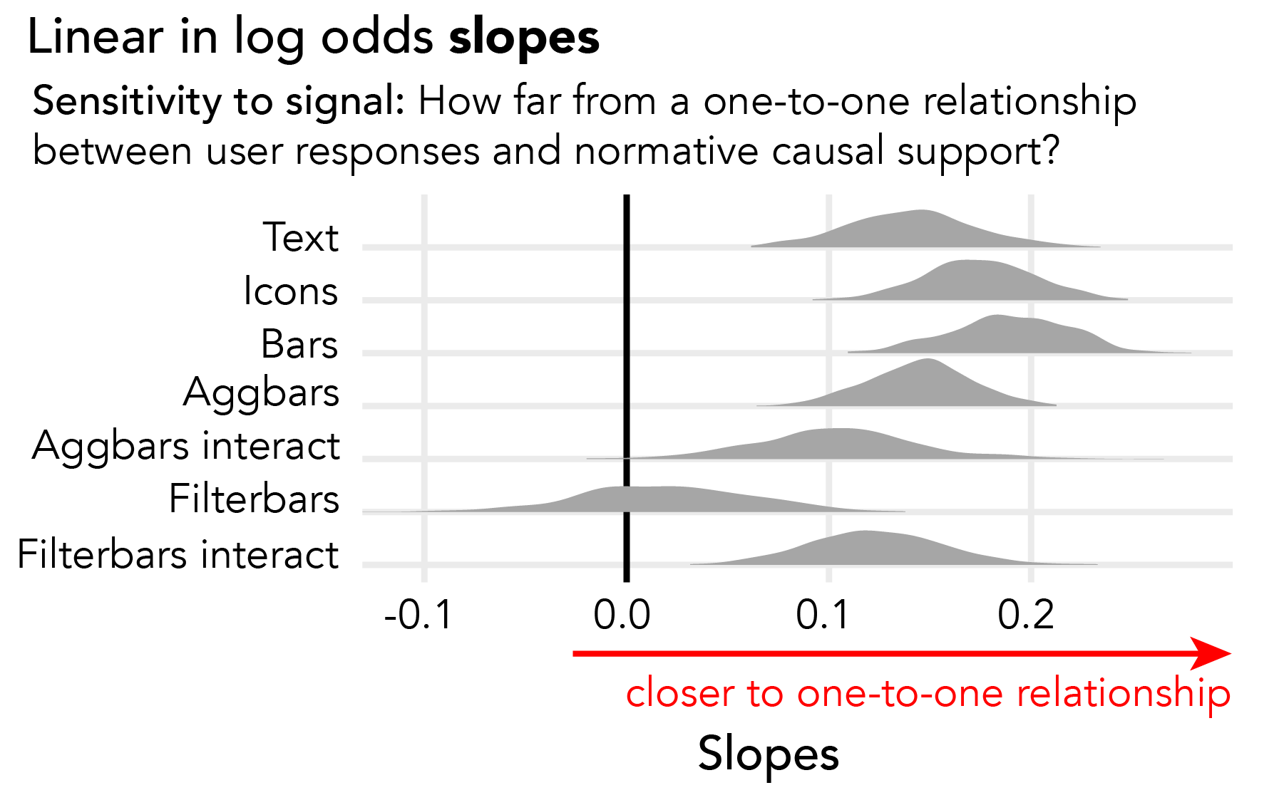
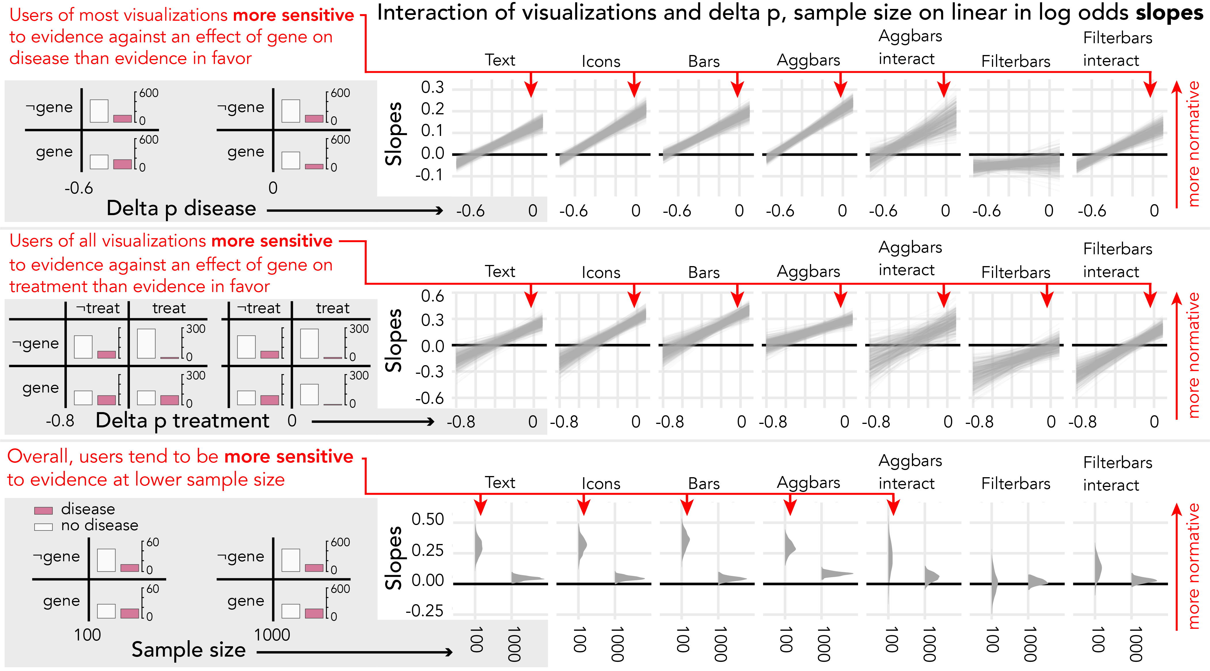
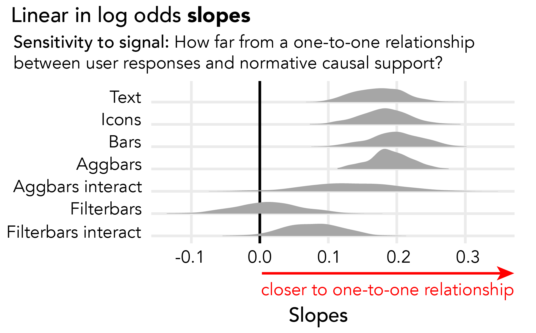
Sensitivity. A LLO slope of one indicates one-to-one correspondence between the ground truth and users’ probability allocations. In all visualization conditions (Fig. 6), we see slopes far below one, indicating that users are much less sensitive than ideal. The only reliable differences between visualization conditions are that filterbars users who do not interact are less sensitive than users in other conditions.
When filterbars users do not interact with the charts, slopes are approximately zero indicating that users are insensitive to signal. Performance improves reliably when users interact with the visualization by applying cross-filters to coordinated multiple views. This is expected because filterbars hide visual signal for the task behind interactions.
Surprisingly, when aggbars users interact with the charts to group by gene or treatment, this leads to lower sensitivity, though this difference is not reliable. To make sense of this result, we analyze interaction log data to see which variables chart users condition on. We find that aggbars users group the data by gene almost as often as treatment. Compare this to filterbars users, who condition on treatment much more often than gene (see Supplemental Material). This suggests that interacting with visualizations only improves sensitivity to causal support when users deliberately generate views of the data which show counterfactual predictions that can distinguish competing causal explanations.
Visual signal effects on sensitivity. We examine sensitivity in each visualization as function of attributes of the visual signal for our task. In Experiment 1, the signal breaks down into two data attributes, delta p and sample size (see Section 3.1.4). Normatively, LLO slopes equal one regardless of delta p and sample size, however, our model measures differences in sensitivity depending on these data attributes.
Figure 5 shows that in the conditions where slopes are largest—text, icons, bars, aggbars without interaction, and filterbars with interaction—users are more sensitive to causal support at negative values of delta p (e.g., Fig. 5, top inset). The average user in these conditions responds more to evidence against treatment (i.e., falsification) than evidence in favor of a treatment effect (i.e., verification). At positive values of delta p (e.g., Fig. 5, top inset), LLO slopes are similar across conditions, suggesting that differences in performance between conditions are driven in part by differences in sensitivity to falsifying evidence.
We also see in Figure 5 that users of icons, bars, and aggbars are more sensitive to signal when sample size is smaller. This finding is consistent with prior work showing that chart users tend to underestimate sample size when making inferences with data [33], which may be driven by logarithmic perception [54, 61]. Alternatively, we could interpret this result as a cognitive bias where users are unwilling to be certain even when sample size is large enough to support unambiguous inferences, related to non-belief in the law of large numbers [6].
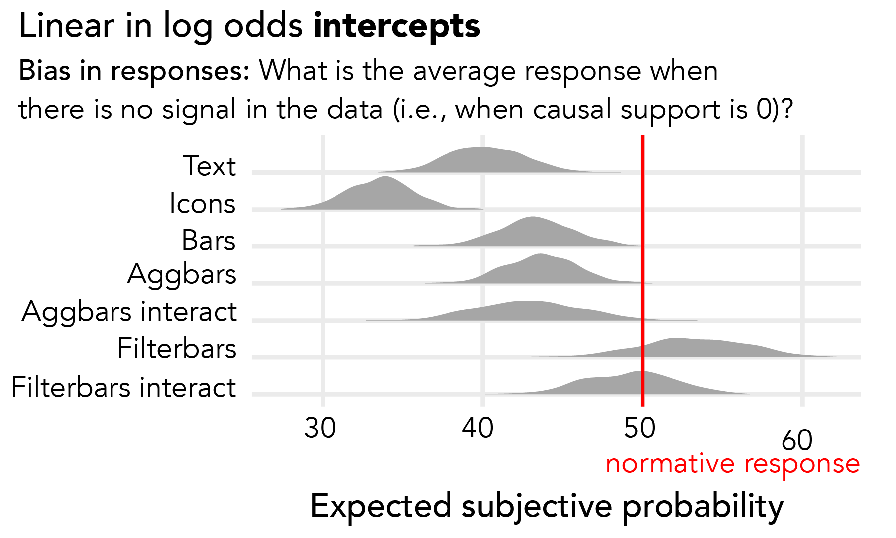
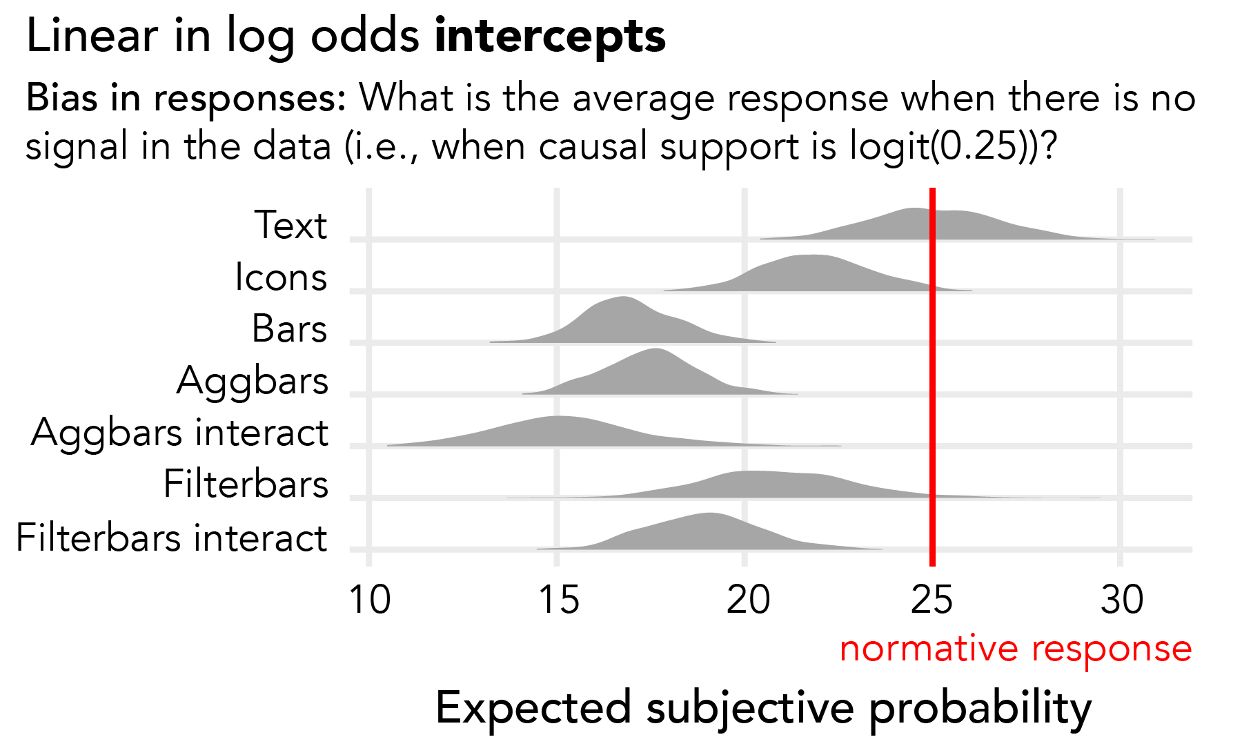
Bias. Intercepts in the LLO model describe bias in users’ probability allocations when ground truth causal support indicates that explanation A (i.e., treatment effect) is just as likely as explanation B (i.e., no treatment effect). Under this condition, a normative observer would allocate equal probability to both causal explanations. We derive expected probability allocated to explanation A based on a logistic transform of LLO intercepts, and compare this to the normative benchmark of 50%.
With all visualizations except for filterbars, probability allocations are far below 50% indicating substantial bias (Fig. 7). On average when causal support is zero, users of text tables, icons, bars, and aggbars allocate too little probability to causal explanation A. Users of filterbars, on the other hand, allocate approximately 50% to explanation A. We see the most extreme bias of up to 20% with icons arrays.
Unfortunately, we can only speculate about possible reasons for these biases. We expected that LLO intercepts would indicate average responses near 50% in the absence of signal for all conditions (i.e., a uniform prior), simply because this follows from the structure of the task. Because this pattern of biases across visualizations results from a non-preregistered exploratory comparison, we investigate in Experiment 2 whether these biases replicate for a more complex task.
3 Experiment 2
In Experiment 2, we evaluate the same visualization designs on a more difficult task. We asked participants to detect confounding in the presence of a known treatment effect by allocating probability across four possible “backdoor paths” [44] (Fig. 8). We extend causal support to handle more than two alternative causal explanations, demonstrating how causal support can be employed in more complex analyses.
3.1 Method
Experiment 2 was the same as Experiment 1 except for the following changes to response elicitation, modeling, and experimental design.
3.1.1 Task scenario & response elicitation
Participants judge the influence of a gene on both disease and treatment effectiveness by allocating probability across the four DAGs in Figure 8, separately assessing each DAG arrow in a confounding relationship.
Question & Elicitation. We asked participants a similar question as in Experiment 1, where participants allocated 100 votes (i.e., subjective probability) across alternative causal explanations. However, in Experiment 2 we elicited a Dirichlet distribution with four alternatives. Following Chalone et al. [10, 37] and extending our interface from Experiment 1, each time participants allocated a number of votes between 0 and 100 to an option, the remaining votes out of 100 were uniformly distributed across unused response options. These imputed responses were highlighted along with a prompt to, “Adjust your responses until all the numbers reflect your beliefs.” Participants iteratively set and adjusted their probability allocations. We combined these responses into perceived causal support, which we compared to our benchmark.
Perceived causal support. When estimating perceived causal support in Experiment 2, we separately evaluated multiple target explanations. Primarily, we targeted belief in explanation D (), confounding:
where , , , and were participants’ probability allocations to causal explanations A through D, respectively, on each trial. We also separately targeted belief in both of the component DAG arrows that constitute a confounding relationship (Fig. 8): () the effect of gene on disease, which appears in explanations B and D; and () the effect of gene on treatment effectiveness, which appears in explanations C and D. We define as follows,
and we define similarly. We compare log response ratios , , and to corresponding causal support , and .
Strategy. At the end of the experiment, we asked participants,
How did you use the charts to complete the task? Please tell us what patterns you looked for in the data and what comparisons you made.
We analyzed these qualitative responses to assess whether participants understood how to use the charts for the confounding detection task.
3.1.2 Experimental design
We manipulated both the visualizations (between-subjects) and the data sets we showed (within-subjects). We showed each participant 19 trials, 18 data conditions (see Section 4.1.3) and one attention check used for exclusions (see Section 4.1.5). We randomized trial order for each participant, inserting the attention check on trial 10.
3.1.3 Stimulus generation
We generated data sets that spanned a range of ground truth causal support for confounding. Creating these data sets required (1) manipulating data attributes which signaled whether the gene was a confounding factor, and (2) labeling each data set with ground truth causal support.
Our goal was to generate 18 data conditions that varied delta p disease, delta p treatment, and sample size, data attributes which manipulate causal support for confounding. Delta p disease described the difference in the proportion of people with disease in each data set depending on whether they had the gene. Negative values of delta p disease indicated evidence that the gene caused disease, whereas values near zero indicated evidence against a gene effect on disease. Delta p treatment described the difference in the proportion of people with disease within the treatment group depending on whether they had the gene. Negative values of delta p treatment indicated evidence that the gene stopped the treatment from preventing disease, whereas values near zero indicated evidence against a gene effect on treatment. Sample size was the number of people in each data set we showed chart users.
Data conditions. To generate 18 data conditions, we simulated data from structural models with one parameter per DAG arrow in Figure 8. We manipulated the probability that gene causes disease (3 levels: ), the probability that gene prevents treatment from working (3 levels: ), and sample size (2 levels: ). We controlled the probability that treatment prevents disease (), probability of disease due to unobserved causes (), base rate of the gene (), and the proportion of each sample with treatment (). We selected these parameters iteratively by sampling data sets and labeling ground truth until half of trials had greater than a 25% chance of having been generated by causal explanation D.
As in Experiment 1, we simulated many data sets for each data condition, and we counterbalanced quantiles of sampling error across participants (see Section 3.1.4). For our attention check trial, we selected the simulated data set that maximized causal support for confounding.
Labeling ground truth causal support. We extended Griffiths and Tenenbaum’s model of causal support [21] to account for more than two alternative causal explanations. We primarily targeted causal support for causal explanation D over explanations A, B or, C,
where is the data set we label with ground truth, and , , , and correspond to causal explanations A through D (Fig. 8), respectively. Since we separately targeted belief in both of the component DAG arrows that constitute a confounding relationship (see Section 4.1.1, perceived causal support), we needed to calculate () ground truth causal support for explanations B or D over A or C:
We similarly calculated () causal support for explanations C or D.
The first terms in the formulae for , , and are log likelihood ratios representing the relative compatibility of a given data set with causal explanations A, B, C, and D. We calculated the log likelihood of each data set we showed participants given , , , and using Monte Carlo simulations similar to Algorithm 1. In Experiment 2, we introduced one more parameter to our structural models, representing the probability that the gene prevents the treatment effect. We incorporate this parameter into our Monte Carlo simulations (Alg. 1) by making the following substitutions:
Under we sampled and uniformly on the interval and fixed and at zero, representing assumptions that the gene impacts neither disease or treatment. Under we sampled , , and uniformly and fixed at zero, representing the assumption that the gene has no effect on treatment. Under we sampled , , and uniformly and fixed at zero, representing the assumption that the gene has no effect on disease. Under we sampled all four parameters uniformly to represent confounding.
The second terms in the formulae for , , and are log ratios of the prior probabilities of the target explanation(s) versus other possible explanations. Again, we assumed a uniform prior to create an unbiased benchmark for our task such that 25% was the normative prior probability for each causal explanation A, B, C, and D, respectively.
3.1.4 Performance evaluation
Again, we used linear in log odds (LLO) models [19, 61] to describe discrepancies between perceived and normative causal support. We also conducted a qualitative analysis of participants’ reported strategies.
Model specification. We used three inferential models because we had three dependent variables, representing perceived causal support for confounding () and for the two constituent effects of confounding ( and ). Here, we show only the models on and because the models on and are identical in form, with and replacing and as predictors:
where , , and were perceived causal support for a confounding, the gene effect on disease, and the gene effect on treatment, respectively, , , and were our normative benchmarks corresponding to each log response ratio, was the difference in the proportion of people with disease given gene versus no gene, was the difference in the proportion of people with disease among those in the treatment group given gene versus no gene, was the sample size as a factor, was a dummy variable for visualization condition, and was a unique identifier for each participant.
We primarily modeled effects on the mean of perceived causal support , , and , but our models also learned residual standard deviations , , and . The residual standard deviations and random effects in each model helped us separate patterns in responses from noise and individual differences. In the first model, we used the term to learn how sensitivity to causal support for confounding varies as a function of sample size and visualization . In the second and third models, we used the terms and to learn how sensitive users in each visualization condition were to the gene effects on disease and treatment , respectively.
Qualitative analysis. We wondered how well participants would intuit how to perform the confounding detection task, considering it was more difficult than the task in Experiment 1, and we provided no training. To address this we applied a deductive coding scheme. We coded participants’ strategy descriptions as uninformative if they didn’t describe a strategy. Otherwise, we coded whether or not participants described adequate strategies for judging delta p disease, delta p treatment, or sample size (see Section 4.1.3), and we coded confusion if they stated they were confused or described an incorrect strategy.
3.1.5 Participants & exclusions
We used a similar approach to power analysis as in Experiment 1 to determine a target sample size of 500 participants after exclusions. We recruited a total of 703 participants, and after exclusions we used data from 519 participants in our analysis. Although we preregistered that we would exclude participants who allocated less than 25% probability to confounding on an attention check trial where confounding was very likely (see Section 4.1.3), this criterion would have excluded 39% of our sample. We relaxed the cutoff to less than 20% probability of confounding to allow for additional response error, resulting in a 26% exclusion rate. We paid participants $3.04 for 14 minutes on average.
3.2 Results
We use a linear in log odds (LLO) model to describe performance in terms of sensitivity to ground truth causal support and bias in probability allocations when all four causal explanations are equally likely.
Sensitivity. A LLO slope of one indicates ideal sensitivity to the log likelihood of the data given a set of causal explanations Similar to Experiment 1, slopes in all visualization conditions are closer to zero than one (Fig. 10), indicating under-sensitivity to the ground truth.
Interacting with filterbars seems to improve sensitivity, while interacting with aggbars seems to decrease sensitivity, although these differences are not reliable. It is surprising to see a similar pattern of results for interactive visualizations in both experiments, since we expected interactive visualizations to be more helpful for detecting confounding than for detecting a treatment effect. Detecting confounding requires users to look for more complex counterfactual patterns in order to distinguish between causal explanations, and manipulating data aggregation and filtering should help users to query visualizations for these patterns. When we analyze interaction logs (see Supplemental Materials), we see that filterbars users interacted with the visualizations more frequently and created more task-relevant views of the data than aggbars users, which may help to explain why interacting with filterbars was somewhat more helpful than interacting with aggbars.
Visual signal effects on sensitivity. We examine sensitivity in each visualization condition to the three visual signals for confounding in our task (delta p disease, delta p treatment, and sample size; see Section 4.1.3). Normatively, slopes are one regardless of these visual signals.
Figure 9 shows users are more sensitive to causal support at values of delta p disease and delta p treatment near zero, with the exception of filterbars users who don’t interact. This pattern is consistent with the findings of Experiment 1 in that chart users respond more to evidence against a given causal effect than evidence in favor of an effect.
In Figure 9, we also see that users of every visualization but filterbars are more sensitive when sample size is smaller. This pattern is consistent with prior work [6, 33] and the results of Experiment 1.
Bias. LLO intercepts describe bias in probability allocations when the data are equally likely under each alternative causal explanation. We derive expected probability allocated to explanation D based on LLO intercepts and compare this to the normative benchmark of 25%.
Figure 11 shows that, with all visualizations but text tables, users underestimate the probability of confounding in the absence of signal. The fact that biases for each visualization condition differ between Experiments 1 and 2 suggests that these results are task-specific. Future work should study reasons for these biases and what visual analytics software can do to help calibrate analysts’ probability allocations.
Strategies. We assess users’ self-reported strategy descriptions. 235 of 519 (45%) users included in our analysis gave uninformative responses and were excluded from further analysis. 42 of 284 (15%) remaining users either stated they were confused or described an incorrect strategy.
However, many users intuited the important signals in the data:
“I relied more on the ‘no treatment’ cells to consider whether the gene causes the [disease], trying to look at ratio of ‘disease’ and ‘no disease’ within those two quadrants… [I] tried to consider the actual counts remembering that small numbers mean loose estimates but this was easy to overlook. Then I compared the two purple bars in the ‘gene no’ top-half of graph to estimate the treatment effect… and did the same for the two lower purple bars to see if treatment equally effective in those with the gene.”
222 of 284 (79%) described an adequate strategy for inferring the gene effect on disease. 81 of 284 (29%) mentioned sample size information. 168 of 284 (59%) described an adequate strategy for inferring the gene effect on treatment effectiveness. These results suggest that much of our data represent a reasonable understanding of the task, yet participants still appeared to struggle to use the visualizations effectively.
4 Discussion
We demonstrate the utility of causal support for evaluating inferences with visualizations, successfully measuring expected patterns in the quality of chart users’ causal inferences. For example, filterbars users should not have been able to perform either task without interacting because the visual signals required to perform the tasks were hidden behind interactions. Our method shows that filterbars users were completely insensitive to the signal in data when they did not interact. Similarly, our models corroborate prior work suggesting that chart users underweight sample size when making inferences [6, 33]. Findings like these reassure us that causal support can help us understand how users struggle to use visualizations to evaluate causal hypotheses.
Our findings point to unsolved design challenges for supporting causal inferences with visual analytics (VA) tools. Contrary to what we might expect given the emphasis of visualization research on evaluating encodings and interaction techniques, using different encodings for count data doesn’t appear to improve sensitivity to evidence for causal inferences beyond text contingency tables. Similarly, common interaction techniques in VA tools, such as manipulating data aggregation or cross-filtering coordinated multiple views, don’t seem to improve causal inferences beyond what users can achieve with simpler static visualizations. Interacting with visualizations seems to help or hurt sensitivity depending on how deliberately signal-seeking users are and whether interacting is necessary in order to expose the visual signal in the data. This suggests that VA tools designed to optimize easy exposure of data are not sufficient for supporting causal inferences.
We also find systematic biases in the way that chart users respond to specific visual signals in charts. Chart users seem ubiquitously more sensitive to falsifying evidence than they are to verifying evidence. This may reflect a cognitive bias where analysts are more responsive to discrepancies, between observed data and the counterfactual patterns expected under a given causal explanation, than they are to similarities between observed data and counterfactual patterns. Interestingly, this bias may be somewhat rational to the extent that verifying an inference is probabilistic, whereas the logic of falsification is deductive and thus “more powerful” in that it can definitively rule out an explanation [47].
Insensitivity to sample size remains a major challenge for informal statistical inferences, and it appears not to be sufficiently addressed by common chart types for showing count data. Even icon arrays, which emphasize sample size as the number of equal-sized dots, don’t seem to mitigate this problem. Prior work [6, 33] suggests this may be due to perceptual underestimation of sample size and cognitive bias against claiming certainty in inferences. Additionally, our qualitative results suggest chart users may not intuitively pay as much attention to sample size as they do to other signals when making causal inferences.
Consistent with an aversion to believing causal relationships exist, we find that chart users tend to underestimate the probability of a given DAG arrow. In the absence of any signal differentiating between causal explanations, chart users allocate more probability to explanations that posit fewer relationships, rather than allocating probability uniformly across alternatives. Though this tendency interacts with task and visualization in ways that warrant further study, it may reflect an overall cognitive bias toward believing in simpler causal explanations.
4.1 Limitations & future work
We set out to run a proof-of-concept study establishing causal support as an evaluation method for VA tools, and our study raises many unanswered questions. A primary limitation of this work is that we recruited participants on Mechanical Turk, who may be less sensitive to causal support than real data analysts to the extent that they may use VA tools less deliberately. However, our qualitative analysis suggests that many participants understood the task and used reasonable strategies. Future work may find causal support helpful in evaluating current practices or novel interfaces with smaller pools of participants, insofar as real data analysts give less noisy responses than crowdworkers. Questions remain about whether our findings generalize for other data types (e.g., continuous [40] and event stream data [39]), for domains outside of medicine, and for analysis scenarios with more complex possible data generating models. Though we suspect our findings will persist in some form across user populations and analysis scenarios, visualizations probably will support some other causal inference tasks better than they support differentiating possible data generating processes.
4.2 Improving visual analytics for causal inference
A theme in visual causal inference is that analysts do not always know what to look for in data [4, 60]. Causal inferences differentiating between possible data generating processes (DGPs) require comparisons between patterns in observed data and counterfactual patterns under a specific DGP [20, 44]. Users of VA software may struggle with causal inferences insofar as they fail to imagine counterfactual predictions.
Prior work in statistics and visualization argues for model checks that make comparisons between data and model predictions explicit [16, 17, 26]. For example, workflows in Bayesian statistics frequently employ prior and posterior predictive checks [14].Visualizing model predictions alongside empirical data could support causal inference by externalizing discrepancies and similarities between observed and expected patterns.
We envision a VA workflow where analysts cycle between interactively specifying models (e.g., [35]) and generating model checks to gauge model compatibility with their data. This echos calls to make models themselves a primary goal of visual data analysis [2]. Causal support solves an important problem in realizing this vision, defining a “good” model check as one which supports sensitive inferences among a set of candidate DGPs. Though it may be difficult to come up with an exhaustive set of DGPs in many real world applications, we think that this approach would be fruitful even with a relatively simple set of models that a knowledgeable analyst might provisionally entertain. Causal support cannot guard against analysts ignoring possible models, but it can be used to evaluate visualization and interaction designs intended to help analysts collate and compare alternative models.
5 Conclusion
We contribute two crowdsourced experiments demonstrating an approach to evaluating causal inferences with visual analytics (VA) tools. No visualization or interaction designs we tested lead to reliably better causal inferences than text contingency tables, suggesting that common VA tools designed for data exposure may not be sufficient for supporting causal inferences. We point to perceptual and cognitive biases which seem to make visual causal inferences difficult, including tendencies to underweight both evidence verifying a causal relationship and evidence from large samples. We discuss how formal models of causal support can be used to evaluate VA systems that place an emphasis on helping users reason about possible data generating processes.
Acknowledgements.
We thank the UW IDL and the NU MU Collective for their feedback. We thank NSF (#1930642) for funding this work.References
- [1] J. R. Anderson and C. F. Sheu. Causal inferences as perceptual judgments. Memory & Cognition, 23(4):510–524, 1995. doi: 10 . 3758/BF03197251
- [2] N. Andrienko, T. Lammarsch, G. Andrienko, G. Fuchs, D. Keim, S. Miksch, and A. Rind. Viewing Visual Analytics as Model Building. Computer Graphics Forum, 37(6):275–299, 2018. doi: 10 . 1111/cgf . 13324
- [3] E. Bareinboim and J. Pearl. Causal inference and the data-fusion problem. Proceedings of the National Academy of Sciences, 113(27):7345–7352, 2016. doi: 10 . 1073/pnas . 1510507113
- [4] C. Batanero, A. Estepa, J. D. Godino, and D. R. Green. Intuitive Strategies and Preconceptions about Association in Contingency Tables. Journal for Research in Mathematics Education, 27(2):151–169, 1996.
- [5] R. A. Becker, W. S. Cleveland, and M.-J. Shyu. The visual design and control of trellis display. Journal of computational and Graphical Statistics, 5(2):123–155, 1996.
- [6] D. Benjamin, M. Rabin, and C. Raymond. A Model of Nonbelief in the Law of Large Numbers. Journal of the European Economic Association, 14(2):515–544, 2016. doi: doi:10 . 1111/jeea . 12139
- [7] J. L. Breedlove, G. St-Yves, C. A. Olman, and T. Naselaris. Generative Feedback Explains Distinct Brain Activity Codes for Seen and Mental Images. Current Biology, 30(12):2211–2224.e6, 2020. doi: 10 . 1016/j . cub . 2020 . 04 . 014
- [8] P.-C. Bürkner. brms: Bayesian Regression Models using ’Stan’, 2020.
- [9] S. K. Card, J. D. Mackinlay, and B. Shneiderman. Readings in Information Visualization Using Vision to Think. Morgan Kaufmann Publishers Inc., 1999.
- [10] K. Chalone and G. T. Duncan. Some properties of the dirichlet-multinominal distribution and its use in prior elicitation. Communications in Statistics - Theory and Methods, 16(2):511–523, 1987. doi: 10 . 1080/03610928708829384
- [11] P. W. Cheng. From covariation to causation: A causal power theory. Psychological Review, 104(2):367–405, 1997. doi: 10 . 1037//0033-295x . 104 . 2 . 367
- [12] R. Cox. Representation construction, externalised, cognition and individual differences. Learning and Instruction, 9(4):343–363, 1999. doi: 10 . 1016/S0959-4752(98)00051-6
- [13] N. Elmqvist and P. Tsigas. Causality visualization using animated Growing Polygons. Proceedings - IEEE Symposium on Information Visualization, INFO VIS, 2003:189–196, 2003. doi: 10 . 1109/INFVIS . 2003 . 1249025
- [14] J. Gabry, D. Simpson, A. Vehtari, M. Betancourt, and A. Gelman. Visualization in Bayesian workflow. Journal of the Royal Statistical Society. Series A: Statistics in Society, 182(2):389–402, 2019. doi: 10 . 1111/rssa . 12378
- [15] M. Galesic, R. Garcia-Retamero, and G. Gigerenzer. Using Icon Arrays to Communicate Medical Risks: Overcoming Low Numeracy. Health Psychology, 28(2):210–216, 2009. doi: 10 . 1037/a0014474
- [16] A. Gelman. A Bayesian formulation of exploratory data analysis and goodness-of-fit testing. International Statistical Review, 71(2):369–382, 2003. doi: 10 . 1111/j . 1751-5823 . 2003 . tb00203 . x
- [17] A. Gelman. Exploratory data analysis for complex models. Journal of Computational and Graphical Statistics, 13(4):755–779, 2004.
- [18] G. Gigerenzer and U. Hoffrage. How to Improve Bayesian Reasoning Without Instruction: Frequency Formats. Psychological review, 102(4):684–704, 1995. doi: 10 . 1037/0033-295X . 102 . 4 . 684
- [19] R. Gonzalez and G. Wu. On the Shape of the Probability Weighting Function. Cognitive Psychology, 38:129–166, 1999. doi: 10 . 1007/978-3-319-89824-7_85
- [20] S. Greenland, J. M. Robins, and J. Pearl. Confounding and collapsibility in causal inference. Statistical Science, 14(1):29–46, 1999. doi: 10 . 1214/ss/1009211805
- [21] T. L. Griffiths and J. B. Tenenbaum. Structure and strength in causal induction. Cognitive Psychology, 51(4):334–384, 2005. doi: 10 . 1016/j . cogpsych . 2005 . 05 . 004
- [22] G. Grolemund and H. Wickham. A cognitive interpretation of data analysis. International Statistical Review, 82(2):184–204, 2014. doi: 10 . 1111/insr . 12028
- [23] U. Hoffrage and G. Gigerenzer. Using natural frequencies to improve diagnostic inferences. Academic medicine: Journal of the Association of American Medical Colleges, 73(5):538–540, 1998. doi: 10 . 1097/00001888-199805000-00024
- [24] J. G. Hollands and B. P. Dyre. Bias in Proportion Judgments: The Cyclical Power Model. Psychological Review, 107(3):500–524, 2000. doi: 10 . 1037//0033-295X . 107 . 3 . 500
- [25] J. Hullman. Why Authors Don’t Visualize Uncertainty. In IEEE Transactions on Visualization and Computer Graphics, Institute of Electrical and Electronics Engineers, 2020.
- [26] J. Hullman and A. Gelman. To design interfaces for exploratory data analysis, we need theories of graphical inference. Harvard Data Science Review, 3, 2021.
- [27] J. Hullman, P. Resnick, and E. Adar. Hypothetical Outcome Plots Outperform Error Bars and Violin Plots for Inferences about Reliability of Variable Ordering. PloS one, 10(11):e0142444, 2015. doi: 10 . 1371/journal . pone . 0142444
- [28] Z. Jin, S. Guo, N. Chen, D. Weiskopf, D. Gotz, and N. Cao. Visual Causality Analysis of Event Sequence Data. IEEE Transactions on Visualization and Computer Graphics, (1):1–1, 2020. doi: 10 . 1109/tvcg . 2020 . 3030465
- [29] N. R. Kadaba, P. P. Irani, and J. Leboe. Visualizing causal semantics using animations. IEEE Transactions on Visualization and Computer Graphics, 13(6):1254–1261, 2007. doi: 10 . 1109/TVCG . 2007 . 70528
- [30] A. Kale and J. Hullman. Adaptation and learning priors in visual inference. In VisXVision Workshop at IEEE VIS 2019. Vancouver, BC, Canada, Oct 2019.
- [31] A. Kale, M. Kay, and J. Hullman. Visual reasoning strategies for effect size judgments and decisions. IEEE Trans. Vis. Comput. Graph., 27(2):272–282, 2021. doi: 10 . 1109/TVCG . 2020 . 3030335
- [32] M. Kay, T. Kola, J. R. Hullman, and S. A. Munson. When (ish) is My Bus? User-centered Visualizations of Uncertainty in Everyday, Mobile Predictive Systems. In Proceedings of the 2016 ACM annual conference on Human Factors in Computing Systems, 2016.
- [33] Y.-S. Kim, L. A. Walls, P. Krafft, and J. Hullman. A Bayesian Cognition Approach to Improve Data Visualization. In ACM Human Factors in Computing Systems (CHI), 2019.
- [34] F. A. Kingdom and N. Prins. Psychophysics: A Practical Introduction. Elsevier Ltd., first edition ed., 2010.
- [35] T. Kraska. Northstar: An interactive data science system. Proceedings of the VLDB Endowment, 11(12):2150–2164, 2018. doi: 10 . 14778/3229863 . 3240493
- [36] L. Micallef, P. Dragicevic, and J. Fekete. Assessing the effect of visualizations on Bayesian reasoning through crowdsourcing to cite this version. IEEE Transactions on Visualization and Computer Graphics, Institute of Electrical and Electronics Engineers, 18(12):2536–2545, 2012.
- [37] A. O’Hagan, C. . E. Buck, A. . Daneshkhah, J. R. Eiser, P. H. Garthwaite, D. J. Jenkinson, J. E. Oakley, and T. Rakow. Uncertain Judgements: Eliciting Experts’ Probabilities, vol. 170. John Wiley & Sons Inc., Chichester, West Sussex, England, 2006. doi: 10 . 1111/j . 1467-985x . 2007 . 00506_14 . x
- [38] A. Ottley, E. M. Peck, L. T. Harrison, D. Afergan, C. Ziemkiewicz, H. A. Taylor, P. K. J. Han, and R. Chang. Improving Bayesian Reasoning: The Effects of Phrasing, Visualization, and Spatial Ability. IEEE Transactions on Visualization and Computer Graphics, 22(1):529–538, 2016. doi: 10 . 1109/TVCG . 2015 . 2467758
- [39] M. Pacer and T. Griffiths. Upsetting the contingency table : Causal induction over sequences of point events. Proceedings of the 37th Annual Conference of the Cognitive Science Society (CogSci’15), 2015.
- [40] M. D. Pacer and T. L. Griffiths. A rational model of causal induction with continuous causes. Advances in Neural Information Processing Systems 24: 25th Annual Conference on Neural Information Processing Systems 2011, NIPS 2011, pp. 1–9, 2011.
- [41] J. Pearl. Causal inference in statistics: An overview. Statistics Surveys, 3(0):96–146, 2009. doi: 10 . 1214/09-SS057
- [42] J. Pearl. Generalizing Experimental Findings. 3(July):259–266, 2015. doi: 10 . 1515/jci-2015-0025
- [43] J. Pearl and E. Bareinboim. External Validity: From Do-Calculus to Transportability Across Populations. Statistical Science, 29(4):579–595, 2014. doi: 10 . 1214/14-STS486
- [44] J. Pearl and D. MacKenzie. The book of why: the new science of cause and effect. Basic Books, New York, 2018.
- [45] J. Pinheiro, D. Bates, S. DebRoy, D. Sarkar, E. authors, S. Heisterkamp, B. Van Willigen, and R-core. nlme: Linear and Nonlinear Mixed Effects Models, 2020.
- [46] P. Pirolli and S. Card. The sensemaking process and leverage points for analyst technology as identified through cognitive task analysis. Proceedings of International Conference on Intelligence Analysis, 2005(May 2014):2–4, 2005.
- [47] K. Popper. The problem of induction. In The logic of discovery, pp. 27–33. Hutchinson, London, 1959.
- [48] D. M. Russell, M. J. Stefii, P. Pirolli, and S. K. Card. The Cost Structure of Sensemaking. CHI ’93 Proceedings of the INTERACT ’93 and CHI ’93 Conference on Human Factors in Computing Systems, pp. 24–29, 1993.
- [49] M. E. Sobel. The Analysis of Contingency Tables. In G. Arminger, C. C. Clogg, and M. E. Sobel, eds., Handbook of Statistical Modeling for the Social and Behavioral Sciences, chap. Chaper 5 T, pp. 251–. Plenum Press, New York, 1995. doi: 10 . 2307/3617686
- [50] D. J. Spiegelhalter. Surgical Audit: Statistical Lessons from Nightingale and Codman. Journal of the Royal Statistical Society. Series A (Statistics in Society), 162(1):45–58, 1999.
- [51] S. S. Stevens. On the psychophysical law. Psychological Review, 64:153–181, 1957.
- [52] C. Stolte, D. Tang, and P. Hanrahan. Polaris: A system for query, analysis, and visualization of multidimensional relational databases. IEEE Transactions on Visualization and Computer Graphics, 8(1):52–65, 2002.
- [53] J. W. Tukey. Exploratory data analysis. Addison-Wesley Pub, Reading, Mass, 1977.
- [54] L. R. Varshney and J. Z. Sun. Why do we perceive logarithmically? Significance, February:28–31, 2013.
- [55] J. Wang and K. Mueller. The Visual Causality Analyst: An Interactive Interface for Causal Reasoning. IEEE Transactions on Visualization and Computer Graphics, 22(1):230–239, 2016. doi: 10 . 1109/TVCG . 2015 . 2467931
- [56] J. Wang and K. Mueller. Visual Causality Analysis Made Practical. 2017 IEEE Conference on Visual Analytics Science and Technology, VAST 2017 - Proceedings, (October):151–161, 2018. doi: 10 . 1109/VAST . 2017 . 8585647
- [57] G. N. Wilkinson and C. E. Rogers. Symbolic Description of Factorial Models for Analysis of Variance. Journal of the Royal Statistical Society. Series C (Applied Statistics), 22(3):392–399, 1973.
- [58] X. Xie, F. Du, and Y. Wu. A visual analytics approach for exploratory causal analysis: Exploration, validation, and applications. 09 2020.
- [59] C. Xiong, J. Shapiro, J. Hullman, and S. Franconeri. Illusion of causality in visualized data. arXiv, 2019.
- [60] C. H. E. Yen, A. Parameswaran, and W. T. Fu. An exploratory user study of visual causality analysis. Computer Graphics Forum, 38(3):173–184, 2019. doi: 10 . 1111/cgf . 13680
- [61] H. Zhang, L. T. Maloney, and D. Lange. Ubiquitous log odds: A common representation of probability and frequency distortion in perception, action, and cognition. Frontiers in Neuroscience, 6(January):1–14, 2012. doi: 10 . 3389/fnins . 2012 . 00001