SeismographAPI: Visualising Temporal-Spatial Crisis Data
Abstract.
Effective decision-making for crisis mitigation increasingly relies on visualisation of large amounts of data. While interactive dashboards are more informative than static visualisations, their development is far more time-demanding and requires a range of technical and financial capabilities. There are few open-source libraries available, which is blocking contributions from low-resource environments and impeding rapid crisis responses. To address these limitations, we present SeismographAPI, an open-source library for visualising temporal-spatial crisis data on the country- and sub-country level in two use cases — Conflict Monitoring Map and Pandemic Monitoring Map. The library provides easy-to-use data connectors, broad functionality, clear documentation and run time-efficiency.
1. Introduction
For mitigating large-scale crises such as armed conflicts, pandemics and natural disasters, incorporation of data in decision-making is becoming indispensable (Beck et al., 2000; Sornette, 2006; Weidmann and Ward, 2010; O’Brien, 2010; Falck et al., 2020). However, insights from large amounts of data remain untapped if they are not detected and communicated by means of intuitive, accurate and preferably interactive scientific visualisation (Piburn et al., 2015; Kim et al., 2017). Particularly, the development of interactive visualisation dashboards requires a broad skill set, ranging from statistical, design and programming knowledge to domain expertise (Lam et al., 2012). Academic environments, non-governmental and humanitarian aid organisations often lack the required resources which hinders urgently needed contributions. The demand for quick crisis responses stands in stark contrast to time-consuming, expensive development stages. SeismographAPI is an actively maintained, open-source library for the visualisation of temporal-spatial crisis data that combines plug-and-play visualisations with versatile functionality.

2. Exemplary Use Cases
SeismographAPI is designed for data analysts to identify patterns in rapid prototyping. Due to its run time and memory-efficiency, it can also be deployed as a permanent visualisation tool for use by decision-makers. To motivate and demonstrate SeismographAPI, we sketch out two practical use cases that are inspired by real-world visualisation needs (Weidmann and Ward, 2010; O’Brien, 2010; Hegre et al., 2013; Stephany et al., 2020; Dong et al., 2020).
Conflict Monitoring.
With the help of SeismographAPI, we visualise a huge dataset comprising 20 years of conflict data on 141 countries, constructed from ACLED (Raleigh et al., 2010) and UCDP GED (Sundberg and Melander, 2013) data. Per country and month, our dataset features 60 socio-economic and political indicators, which are all displayed in our Conflict Monitoring Map.
Pandemic Monitoring
Our second demonstration case is the Pandemic Monitoring Map, a visualisation of COVID-19 infection numbers. The data is borrowed from Johns Hopkins University (Dong et al., 2020).

3. Main Functionality
World Map (center).
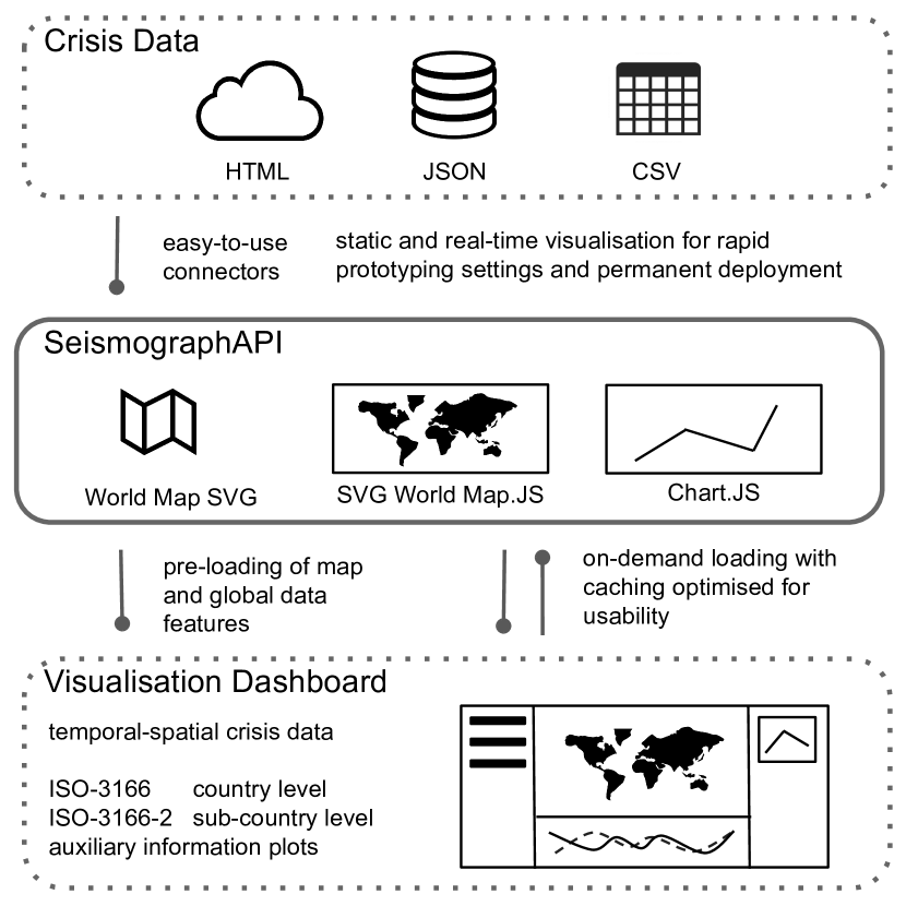
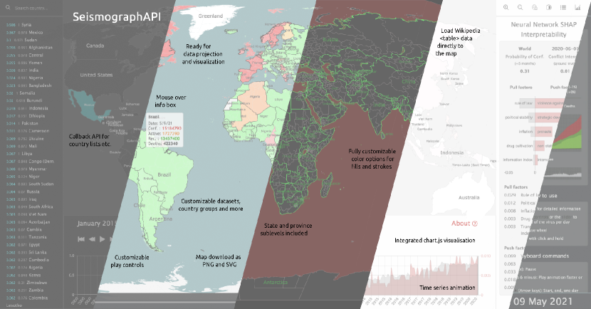
The SVG Choropleth map represents the core part of SeismographAPI. It allows visualising data at the country- and subcountry-level (political subdivisions) based on the ISO-3166 and ISO-3166-2 norm. Additional information, such as country-level infection numbers, can be easily displayed on click and hover as exemplified in the Pandemic Monitoring Map.
Time Series Chart (bottom).
The time series chart not only visualises, but allows navigating the temporal dimension. For instance, the Conflict Monitoring Map even features two time lines, one showing the prediction and another showing the ground truth conflict intensity. When hovering or clicking a point in time, all other panels synchronise. With the help of the “play” controls, users can watch all data panels as they change over time in a time-machine manner.
Auxiliary Information Panel (right).
At the top of the auxiliary information panel, our library provides a menu allowing to interactively customise the dashboard. Users can hide information and panels, such as country names and the country list on the left hand side, zoom-in, choose a night mode and open a “help” window. To simplify the interface between analysis, report and decision-making, the library has built-in functionality for screen recording. Due to tight integration with Chart.js, any chart visualisation can be selected and displayed in the right-hand panel based on data suitability and information needs. For instance, the Conflict Monitoring Map displays the most important data features considered for conflict prediction as a horizontal bar chart. The Pandemic Monitoring Map relies on stacked line charts to map out infection numbers.
4. Technical Background
Run time and Memory.
SeismographAPI builds upon two fast, open-source libraries, Chart.js and SVG World Map JS. The time required for data loading is mainly determined by the size of the central SVG world map: ~1,3 MB for ISO-3166-2 country-level and ~3,8 MB including all subdivision data. Depending on the chosen map, rendering starts between 300ms and 800ms, document completion is done between 400ms and 2.6s and the full loading time varies from ~3s to ~10s. To optimise loading and usability, SeismographAPI can also be initialised asynchronously with the JavaScript async/await/resolve method. After the first initialisation of the map, this enables loading data chunks on demand, which increases smoothness. This is demonstrated in the Conflict Monitoring Map, where all global conflict data (~1,1MB) is loaded at startup, but the large amount of detailed conflict data (~80KB per country, ~21MB in total) is loaded asynchronously on request. Thus, SeismographAPI is able to visualise more than data points in the Conflict Monitoring Map in about 3 seconds or nearly data points in the Pandemic Monitoring Map in about 10 seconds.
Ease of Use.
With an intuitive interface and simple data connectors, SeismographAPI is designed for ease of use in common visualisation tasks and workflows. Data can be loaded directly via JSON, CSV or as an HTML table. We even offer a Pandas extension to load Pandas Dataframes (as JSON) and Wikipedia tables. The library features clear readme instructions and rich documentation.
5. Conclusion
Future versions will include more data connectors, default charts, more detailed guidelines for deployment and options for switching between different data within one map. We presented SeismographAPI, an open-source library aimed at reducing resource constraints and easing swift data visualisation, thereby improving data-driven decision-making for humanitarian purposes.
References
- (1)
- Beck et al. (2000) Nathaniel Beck, Gary King, and Langche Zeng. 2000. Improving Quantitative Studies of International Conflict: A Conjecture. American Political Science Review 94, 1 (2000), 21–35. https://doi.org/10.1017/S0003055400220078 Edition: 2014/08/01 Publisher: Cambridge University Press.
- Dong et al. (2020) Ensheng Dong, Hongru Du, and Lauren Gardner. 2020. An interactive web-based dashboard to track COVID-19 in real time. Lancet Infectious Diseases (2020). https://doi.org/10.1016/S1473-3099(20)30120-1
- Falck et al. (2020) Fabian Falck, Julian Marstaller, Niklas Stoehr, Sören Maucher, Jeana Ren, Andreas Thalhammer, Achim Rettinger, and Rudi Studer. 2020. Measuring Proximity Between Newspapers and Political Parties: The Sentiment Political Compass. Policy & Internet 12, 3 (Sept. 2020), 367–399. https://doi.org/10.1002/poi3.222
- Hegre et al. (2013) Håvard Hegre, Joakim Karlsen, Håvard Mokleiv Nygård, Håvard Strand, and Henrik Urdal. 2013. Predicting Armed Conflict, 2010–2050. International Studies Quarterly 57, 2 (2013), 250–270. http://www.jstor.org/stable/24016137 Publisher: Wiley.
- Kim et al. (2017) Yea-Seul Kim, Katharina Reinecke, and Jessica Hullman. 2017. Explaining the Gap: Visualizing One’s Predictions Improves Recall and Comprehension of Data. In Proceedings of the 2017 CHI Conference on Human Factors in Computing Systems. ACM, Denver Colorado USA, 1375–1386. https://doi.org/10.1145/3025453.3025592
- Lam et al. (2012) Heidi Lam, Enrico Bertini, Petra Isenberg, Catherine Plaisant, and Sheelagh Carpendale. 2012. Empirical Studies in Information Visualization: Seven Scenarios. IEEE Transactions on Visualization and Computer Graphics 18, 9 (Sept. 2012), 1520–1536. https://doi.org/10.1109/TVCG.2011.279
- O’Brien (2010) Sean P. O’Brien. 2010. Crisis Early Warning and Decision Support: Contemporary Approaches and Thoughts on Future Research. International Studies Review 12, 1 (March 2010), 87–104. https://doi.org/10.1111/j.1468-2486.2009.00914.x
- Piburn et al. (2015) Jesse Piburn, Robert Steward, Aaron Myers, and Alexandre Sorokine. 2015. World Spatiotemporal Analytics and Mapping Project (WSTAMP): Discovering, Exploring, and Mapping Spatiotemporal Patters across the World’s Largest Open Source Data Sets. In ISPRS Annals of the Photogrammetry, Remote Sensing and Spatial Information Sciences, Vol. II-4/W2. 95–102. https://doi.org/10.5194/isprsannals-II-4-W2-95-2015
- Raleigh et al. (2010) Clionadh Raleigh, Andrew Linke, Håvard Hegre, and Joakim Karlsen. 2010. Introducing ACLED-Armed Conflict Location and Event Data. Journal of Peace Research 47, 5 (2010), 651–660. https://journals.sagepub.com/doi/10.1177/0022343310378914
- Sornette (2006) Didier Sornette. 2006. Endogenous versus Exogenous Origins of Crises. In Extreme Events in Nature and Society, The Frontiers Collection. Center for Frontier Sciences. https://doi.org/10.1007/3-540-28611-X_5
- Stephany et al. (2020) Fabian Stephany, Niklas Stoehr, Philipp Darius, Leonie Neuhauser, Ole Teutloff, and Fabian Braesemann. 2020. The CoRisk-Index: A data-mining approach to identify industry-specific risk assessments related to COVID-19 in real-time. arXiv 2003.12432 (2020). https://arxiv.org/abs/2003.12432
- Sundberg and Melander (2013) Ralph Sundberg and Erik Melander. 2013. Introducing the UCDP Georeferenced Event Dataset. Journal of Peace Research 50, 4 (July 2013), 523–532. https://doi.org/10.1177/0022343313484347
- Weidmann and Ward (2010) Nils Weidmann and Michael Ward. 2010. Predicting Conflict in Space and Time. Journal of Conflict Resolution 54, 6 (July 2010), 883–901. https://doi.org/10.1177/0022002710371669 Publisher: SAGE Publications Inc.
Appendix A Appendix
A.1. Links
SeismographAPI Github
https://github.com/conflict-AI/seismographAPI
Conflict Monitoring Map
https://conflict-ai.github.io/seismographAPI/conflict-map.html
Pandemic Monitoring Map
https://conflict-ai.github.io/seismographAPI/covid-map.html