1035 \vgtccategoryResearch \vgtcpapertypeSystem (Area 5: Data Transformations) \authorfooter A. Wu and H. Qu are from Hong Kong University of Science and Technology. E-mail: {awuac, huamin}@cse.ust.hk. This work was conducted when A. Wu was an intern at Microsoft Research Area. Y. Wang, M. Zhou, X. He, H. Zhang, and D. Zhang are from Microsoft Research Area. Email: {wangyun, mezho, v-hexin, haidong.zhang, dongmeiz}@microsoft.com. Y. Wang is the corresponding author. \shortauthortitleBiv et al.: Global Illumination for Fun and Profit
MultiVision: Designing Analytical Dashboards
with Deep Learning Based Recommendation
Abstract
We contribute a deep-learning-based method that assists in designing analytical dashboards for analyzing a data table. Given a data table, data workers usually need to experience a tedious and time-consuming process to select meaningful combinations of data columns for creating charts. This process is further complicated by the needs of creating dashboards composed of multiple views that unveil different perspectives of data. Existing automated approaches for recommending multiple-view visualizations mainly build on manually crafted design rules, producing sub-optimal or irrelevant suggestions. To address this gap, we present a deep learning approach for selecting data columns and recommending multiple charts. More importantly, we integrate the deep learning models into a mixed-initiative system. Our model could make recommendations given optional user-input selections of data columns. The model, in turn, learns from provenance data of authoring logs in an offline manner. We compare our deep learning model with existing methods for visualization recommendation and conduct a user study to evaluate the usefulness of the system.
keywords:
Visualization Recommendation, Deep Learning, Multiple-View, Dashboard, Mixed-Initiative, Visualization ProvenanceK.6.1Management of Computing and Information SystemsProject and People ManagementLife Cycle;
\CCScatK.7.mThe Computing ProfessionMiscellaneousEthics
\teaser
![[Uncaptioned image]](/html/2107.07823/assets/x1.png) The interface:
When uploading a tabular dataset, the Table Field shows data columns with the corresponding data type;
Clicking the Multiple-View Recommender will generate a dashboard containing a user-specified number of charts. The recommendation is conditioned on, if any, user-locked charts;
Users could specify the chart type, encoding channels, and data transformation in the Chart Editor;
Chart Ideas recommends charts based on the current dashboard;
The Dashboard View displays the charts in an interactive grid layout;
and Users could restore the history, change the theme, and save logs in Control Panel.
\vgtcinsertpkg
Introduction
Data visualization is becoming an increasingly used technique for analyzing a dataset,
contributing to the creation of visualization tools that empower laypeople and democratize data analytics.
In those visualization tools,
the basic workflow typically starts with uploading a dataset in a tabular format,
followed by selecting the data of interests and creating corresponding charts (e.g., Excel [10] and Tableau [56]).
However, users usually need to engage in a tedious and time-consuming process to explore different data selections through trial and error.
Besides,
it requires experience and expertise to create visualizations that effectively facilitate data analysis [38].
This process is further complicated by the demands for creating multiple-view visualizations that enable simultaneous exploration of the same data from different perspectives [43].
Due to those challenges,
there have been huge research efforts in developing visualization recommendation systems that assist laypeople in conducting visual data exploration.
The interface:
When uploading a tabular dataset, the Table Field shows data columns with the corresponding data type;
Clicking the Multiple-View Recommender will generate a dashboard containing a user-specified number of charts. The recommendation is conditioned on, if any, user-locked charts;
Users could specify the chart type, encoding channels, and data transformation in the Chart Editor;
Chart Ideas recommends charts based on the current dashboard;
The Dashboard View displays the charts in an interactive grid layout;
and Users could restore the history, change the theme, and save logs in Control Panel.
\vgtcinsertpkg
Introduction
Data visualization is becoming an increasingly used technique for analyzing a dataset,
contributing to the creation of visualization tools that empower laypeople and democratize data analytics.
In those visualization tools,
the basic workflow typically starts with uploading a dataset in a tabular format,
followed by selecting the data of interests and creating corresponding charts (e.g., Excel [10] and Tableau [56]).
However, users usually need to engage in a tedious and time-consuming process to explore different data selections through trial and error.
Besides,
it requires experience and expertise to create visualizations that effectively facilitate data analysis [38].
This process is further complicated by the demands for creating multiple-view visualizations that enable simultaneous exploration of the same data from different perspectives [43].
Due to those challenges,
there have been huge research efforts in developing visualization recommendation systems that assist laypeople in conducting visual data exploration.
Most existing recommendation systems build upon visualization design knowledge gained from empirical experiments. For instance, APT [31], Show Me [32], and Voyager [62] recommend visual encodings according to their effectiveness rankings based on perceptual principles. Recent systems extend those approaches with data recommendation support, i.e., to select data columns to be visualized. Those systems (e.g., Voder [53], DataShot [59], Calliope [51]) associate charts with insights, thereby proposing hand-crafted metrics to rank and recommend insights. However, hand-crafted metrics face limitations such as sub-optimal performances and high requirements for domain expertise [65].
In response, recent research starts to propose machine learning (ML) methods that learn to recommend visualizations from large-scale corpora. Existing approaches such as Draco [35], Data2Vis [9], and VizML [17] mainly focus on recommending visual encodings of a single chart. Although proven useful, they do not support data recommendation. This limitation results in a quasi-automated process that users need to manually select data columns prior to automated recommendation. However, manual selection is time-consuming and challenging due to two reasons: First, not every data column counts. The number of possible charts grows exponentially as the cardinality of data columns increases. Therefore, it is necessary to select data columns that are more “worthy of” visual analysis. Second, one chart does not fit all. It is crucial to design dashboards containing multiple charts that satisfy different criteria such as diversity and consistency [39]. Some combinations of charts might not be interesting or meaningful [61].
To address the above challenges, we aim to propose deep-learning-based approaches for recommending an analytical dashboard. Dashboards are typically a multiple-view visualization (MV), and we interchangeably use those two terms throughout this paper. We focus on the selection of MVs, i.e., to select important and meaningful data columns. Different from existing ML-based recommenders that generate charts in an end-to-end manner and hardly enable user control, we take a mixed-initiative perspective that integrates automated recommendation into an interactive system for authoring dashboards and exploring a dataset. In doing so, we hope to leverage the combined power of human agency and machine automation to solve the challenging task of constructing effective dashboards.
We present MultiVision, a mixed-initiative system for designing multiple-view visualizations for analyzing tabular datasets. MultiVision features deep-learning models for assessing the qualities of charts, whereby recommending best-scored charts. Specifically, we develop two deep-learning models for assessing a single chart and assessing multiple charts, respectively. The first model builds on a large corpus consisting of more than 200k Excel data tables and charts [71]. Due to the lack of large-scale datasets of MVs, we design the second model for learning from provenance data, i.e., authoring logs in MultiVision. More importantly, we design and implement an interactive system for users to interact with automated recommendations (MultiVision: Designing Analytical Dashboards with Deep Learning Based Recommendation). Once users edit charts in the MV, the system automatically makes recommendations based on the current MV to facilitate data exploration. While the deep-learning models focus on recommending data column selections, the system interface allows users to adjust the presentation of MVs (i.e., visual encodings and layouts) and interact with the MV (e.g., cross-chart filtering and highlighting).
To evaluate MultiVision, we conduct an experiment to compare our model with baseline approaches in existing ML-based visualization recommenders. We further conduct a user study with 12 participants to demonstrate the usefulness of our system, whereby discussing implications for future research regarding the challenging and important problem of recommending and authoring dashboards. Our codes are open-sourced111https://github.com/Franches/MultiVision. In conclusion, the contributions of this work include:
-
•
A deep-learning-based approach for recommending multiple-view visualizations
-
•
A mixed-initiative system that integrates automated recommendation into interactive authoring of multiple-view visualizations and data exploration
-
•
An experiment and a user study that demonstrates the effectiveness of our deep learning models and system, respectively
1 Related Work
This work is related to visualization recommendation, dashboards, visualization authoring tools, as well as mixed-initiative systems.
1.1 Visualization Recommendation
Decades of research have proposed many visualization recommendation systems that are thoroughly discussed in recent surveys [38, 73, 65]. There are growing research interests in leveraging machine learning (ML) for visualization recommendation [57]. ML-based methods learn visualization design knowledge from large-scale corpora, surpassing traditional rule-based approaches and even laypersons in some cases [17]. For instance, Data2Vis [9] and VizML [17] formulate a prediction problem, i.e., to predict the visual encodings given data columns to be visualized. These prediction-based methods output a single chart, which can be insufficient in unveiling different perspectives of data.
In contrast, other approaches learn to assess the “goodness” of visualizations, whereby recommending top-k assessed charts. DeepEye [29] trains a binary classifier to determine whether a chart is good or bad and subsequently ranks charts by pair-wise comparisons. Instead of rankings, other methods output scores that better reflect the absolute qualities of charts. Draco [35] uses RankSVM to learn the weighted hand-crafted constraints to obtain an overall score of visualization specifications. LQ2 [66] proposes a Siamese neural network to predict chart layout qualities from crowdsourcing comparison data. Those approaches recommend visual encodings, where the output has fixed cardinality. We address a different problem, i.e., to recommend data column selections and chart combinations, which has varying cardinality, e.g., charts might encode a varying number of data columns. Our method builds upon similar Siamese network structure, but extends it with recurrent neural networks and new chart embedding modules to overcame the above challenges, outperforming the naive Siamese structure in our experiment.
1.2 Dashboards and Multiple-View Visualizations
A multiple-view visualization (MV) composes multiple visualizations into a single cohesive representation that facilitates analyzing different perspectives of data [42]. One common genre of MVs is dashboards, which is a common technique for visual analytics [46]. Despite their prevalence, there exist few guidelines on designing effective MVs or dashboards. Baldonado et al\xperiod [42] drew upon workshop discussions to present eight guidelines for using multiple views in information visualizations. Qu et al\xperiod [39] emphasized the consistency constraints among multiple charts. Besides, several work studies how to extend MV to multiple devices [23, 45] or large displays [24]. However, those studies investigate design guidelines as qualitative reflections from empirical experiments rather than quantitative metrics. It remains unclear how to quantitatively encode those guidelines to promote automated design.
In response, recent research starts to quantify the MV and dashboard designs from a data-driven perspective. Al-maneea and Roberts [1] quantified the layout designs as seen from visualization publications. Chen et al\xperiod [6] investigated the composition and configuration patterns of MV, whereby developing a recommendation system for suggesting an exemplar design from visualization publications. LADV [30] generates dashboard visualizations by recognizing chart types from an input image or sketch. While helpful, those approaches mainly focus on the presentation of views such as layout design or colour palette. Different from them, we study selection of views, that is, how to select multiple charts from many candidates given a data table in order to facilitate data analysis. Inspired by Draco [35], we seek to propose quantitative metrics to encode MV design guidelines and learn to weight different metrics to recommend top-k MV designs.
1.3 Visualization Authoring Tools
Researchers have investigated ways of making it easy to design and create data visualizations. Numerous efforts support visualization design in the form of interactive authoring systems. For example, early research such as SageBrush [44] let users create visualizations by choosing chart types through drag-and-drop operations. Recently, more advanced tools such as Lyra [47], iVisDesigner [40], DDG [20], InfoNice [60], Data Illustrator [28], Charticulator [41] provide users with power of more customized visualization design of encodings and styles.
However, those tools mainly focus on encodings and designs of a single visualization. Tulip [2] and Cytoscape [11] support authoring MVs for graph data, which are incapable of tabular datasets. Commercial tools like Tableau and Microsoft Power BI have enabled users to encode data with different visual forms, which are further arranged together into MVs such as dashboards. Similarly, we enable users to create MVs for visual analytics with the additional power of ML-based recommendations.
In the field of data storytelling, researchers have investigated approaches of composing multiple visualizations in a logical form. For example, Hullman et al. [18] and Kim et al. [21] have proposed algorithms to generate a sequence of visualizations to support storytelling and sequencing. DataShot [59] and Calliope [51] organize visualizations into topics based on data insights. Different from them, we aim to assist users in designing MVs for data analysis.
1.4 Mixed-Initiative System for Visualizations
Mixed-initiative systems allow the human agency to collaborate with computer automation [16]. In the field of data visualization, many systems have been proposed to facilitate the design and use of visualizations. For example, VizAssist [4] guides users to find a relevant visualization through an interactive genetic algorithm that adapts to user needs. Bylinskii et al\xperiod [5] proposed a method for predicting and showing the visual importance of visualizations during interactive authoring. Other applications include managing ambiguity in natural language [13] or extracting data from chart images [19].
MultiVision differs from the above systems in two aspects. Firstly, human input or intervention is made compulsory in those systems. In contrast, MultiVision provides more significant value-added automation where human input is not mandatory. Instead, users can optionally request recommendations based on their current MV to obtain customized results. More importantly, we propose two recommendation strategies, including the passive recommendation that is triggered upon request and the active recommendation that automatically updates with user changes. We draw on the participants’ feedback in the user study to discuss our lessons learnt.
2 Overview
MultiVision aims to assist in designing multiple-view visualizations (MV) for analyzing a dataset in tabular formats. Since the design space of MVs is vast, we consider the following constraints to make our research focused. The design space of MV spans three dimensions: selection, presentation, and interaction among views [61]. We primarily focus on the selection of views, i.e., to select data columns for creating a chart, and to select multiple charts for creating a cohesive whole. That said, other design factors such as layouts, colours, and interactivity are beyond our scope of automated recommendation. Another simplifying assumption is that we support five primary chart types, including scatterplots, bar, line, pie, and area charts, which are found most commonly used online [3]. For visual encodings, we only recommend visualization-level design choices (i.e., chart types), leaving encoding-level design choice (e.g., color scales) to future work. Besides, we set the maximal number of encoded data columns per chart to be four, as we find that 93.5% charts in our training dataset encode no more than 4 data columns. We make this decision to balance the trade-offs between resource usage and efficiency, as the number of chart candidates grows exponentially with the cardinality of data columns.
It should be noted that we interchangeably use some terms in pair throughout the paper, including views and charts, as well as MVs and multiple-charts. In the remaining text of this section, we discuss the design considerations of MultiVision and the overview of our method.
2.1 Design Considerations
The design of MultiVision is guided by the following considerations:
C1: Reducing the overheads of data selection. Given a data table, data workers often need to select a few data columns for creating meaningful charts through trial and error. This repetitive, tedious task should be delegated and automated.
C2: Automating the selection for multiple charts. The system should select multiple charts from the candidate pool of exponentially growing size and further combine selected charts into a cohesive, meaningful multiple-view presentation.
C3: Recommending charts conditioned on optional manual selections. Machine learning models are imperfect and could generate sub-optimal recommendations. Besides, data workers often leverage their domain knowledge to specify partial selections regarding data columns or charts [63]. Thus, the system should blend human-input selections to provide conditional recommendations.
C4: Leveraging the provenance data about authoring logs. The lack of MV corpora hinders the deployment of ML approaches [57]. We propose to leverage provenance as training datasets which receive growing research attentions through “learning from users” [67].
2.2 Method and Problem Abstraction
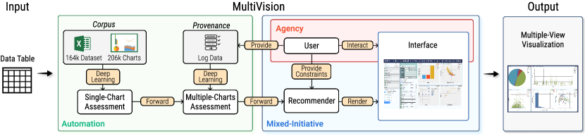
Figure 1 provides an overview of our system pipeline that consists of the automation, agency, and mixed-initiative module. Given an input data table, the automation module leverages deep learning models to predict an assessment score for all possible charts (i.e., combinations of data columns) and MVs (i.e., combinations of charts) (C1, C2). Subsequently, the scores are forwarded to recommend MVs through optimization, i.e., to generate an MV that maximizes the scores predicted by deep-learning models. Critically, the optimizer takes optional user specification as constraints to generate conditional recommendation (C3). As users edit the recommended results, their authoring logs are fed into the deep learning model in an offline manner (C4).
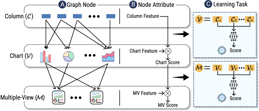
Our method highlights a perspective that treats the visualization construction process as a multi-layered heterogeneous graph. As shown in Figure 2, the graph consists of three layers where the nodes at each layer represent data columns, charts, and MVs, respectively. Each link represents a “composing” relationship, e.g., several data columns compose a chart, and several charts compose an MV. In this way, the node features are forwarded along the links to accomplish the machine learning task, i.e., to predict the assessment score. For instance, the chart feature is fused with the features with corresponding columns to predict the chart score. Since the “composing” relationships can be expressed as a sequence (e.g., an MV is a sequence of charts), the score prediction problem is abstracted into a sequence-to-one regression task, which is widely studied in deep learning research.
3 Deep Learning Model
Our deep learning model aims to predict an assessment score for charts and multiple-view visualizations (MVs). As discussed in subsection 2.2, we abstract this assessment problem into two sequence-to-one regression tasks at the chart- and MV-level, respectively. This task abstraction allows us to design a shared architecture for both the chart assessment model and the MV assessment model. In this section, we first discuss the shared model architecture, followed by descriptions of dedicated designs for single-chart assessment and multiple-chart assessment.
3.1 Model Architecture
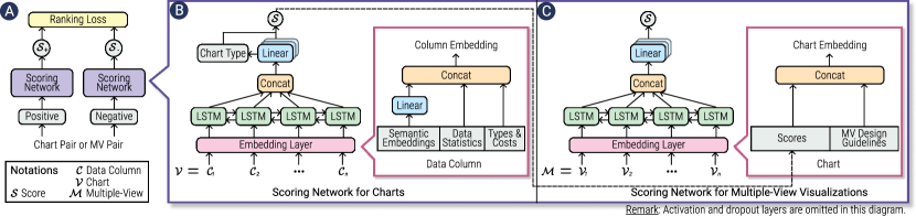
We propose to solve the assessment problem through a learning-to-rank approach [27], which aims to compute the overall rankings according to many partial orders. Inspired by LQ2 [66], we use a Siamese neural network structure [22] which consists of two identical scoring networks (Figure 3 ). Two scoring networks share the same weight and work in parallel to calculate comparable results. Given an input ranked pair, denoted as , where is ranked higher than , the scoring network, denoted , is a function that converts an input to a score, denoted . Thus, the training goal becomes:
| (1) |
To that end, we use the margin ranking loss, which imposes penalty to mistakes that assign a higher score to a lower ranked input:
| (2) |
where is a hyper-parameter for margins.
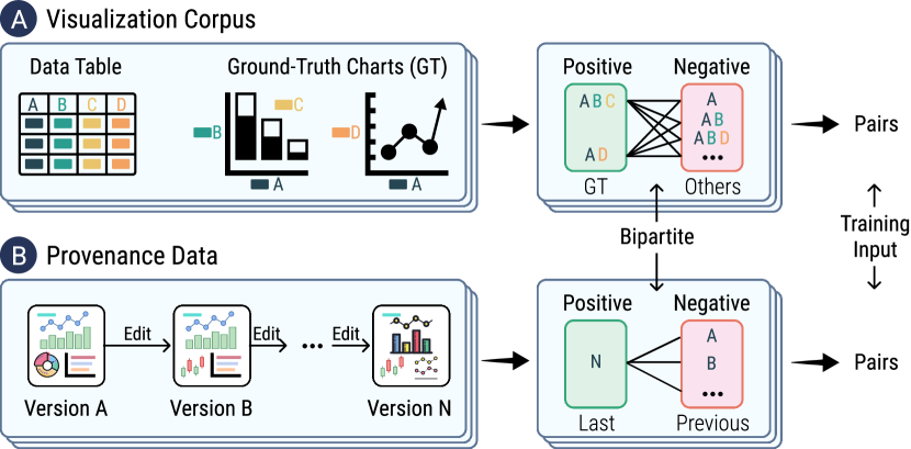
A key benefit of the above learning-to-rank problem formulation is the flexible and compatible mechanism for constructing and collecting training datasets, that is, ranked pairs. As shown in Figure 4, the ranked pairs can be collected from both visualization corpus and provenance data. For visualization corpus (Figure 4 ), we consider the ground-truth charts to be better, i.e., higher ranked, than all the remaining possible combinations of data columns. For provenance data (Figure 4 ), we select the final output as the positive one, while the intermediate historical versions are marked negative. We ignore the partial rankings among intermediate versions, since the process of editing charts might be back-and-forth. For example, it is possible that users find the edited version to get worse.
Despite the flexibility and compatibility, we acknowledge the downsides of this learning-to-rank problem formulation, i.e., the scalability. Specifically, we obtain pairs through bipartite matching between the positive and the negative. However, the number of possible charts and MVs grows exponentially with the cardinally of data columns and charts, respectively, which theoretically results in an exponential time complexity. Although we find the training time to be acceptable in our experiments, future research should propose more efficient algorithms for selecting “important” pairs instead of enumeration to cope with the data explosion.
3.2 Single-Chart Assessment
We abstract the single-chart assessment into a sequence-to-one regression task, which is widely studied in deep learning research for different types of sequences. However, this task in the context of visualizations poses distinct challenges from common sequences. Common sequences such as natural language sentences and event sequences have a fixed vocabulary set, i.e., words and event types, respectively. Correspondingly, there exist many off-the-shelf methods for converting a vocabulary to a multiple-dimensional vector (e.g., word embeddings), which are often essential for deep learning models [33].
In contrast, most data columns in a data table tend to be distinct from each other and columns in different data tables. In other words, there does not exist a vocabulary set of data columns. To solve this problem, we adopt the strategy proposed by Zhou et al\xperiod [71, 72] to derive the data column embeddings through feature engineering. Their column embedding mechanism consists of three types of information, including the semantic text embeddings from column header text, data statistics such as mean values, and data types. As shown in Figure 3 , the embeddings are fed into a bidirectional Long Short-Term Memory (LSTM) layer to learn the sequence features, which are subsequently forwarded into linear layers to predict an assessment score regarding data column selections (denoted for a subset of data columns ).We implement an add-on feature for recommending visual encodings, which is a basic component for practical visualization recommendation systems. Specially, we add another layer to predict the visual encoding (i.e., five chart types including scatterplots, bar, line, pie, and area charts), which is the likelihood (or posterior probability) of the data column selection belonging to chart type , denoted . Therefore, the overall assessment score for both the data column selection and visual encodings is calculated by:
| (3) |
While we only consider the visualization-level encodings (i.e., chart type) in this work, other visual encodings can be added in a similar manner, i.e., to add a layer for predicting the visual encodings and compute the likelihood. The key challenge here is that the detailed visual encodings vary among different chart types, which requires simplifying abstraction (e.g., VizML [17]) or comprehensive nested decision-tree-like models. Besides, it might need encoding visualization design rules to yield satisfactory performances (e.g., Draco [35]).
There exists an alternative to our approach in Equation 3. To be specific, we can train a model that directly learns . This can be achieved by adding the visual encodings to the training input, i.e., the embeddings. However, a major downside is, again, the scalability, as this alternative requires enumerating all possible combinations between data column selections and encodings. This enumeration adds more degrees, depending on the cardinality of visual encodings, to the exponential complexity that “explode” the training time.
3.3 Multiple-Chart Assessment
The multi-chart assessment model is similar to the single-chart assessment model, since it shares a similar challenge that almost every chart is distinct. However, unlike charts, there does not exist mechanism for computationally describing a multiple-view visualization (MV) in terms of data column selections and chart types. Therefore, we propose a novel method for modelling an MV as a sequence of chart embeddings. The chart embeddings enable learning a shared MV representation, i.e., the MVs created for one particular dataset can be used as training data to recommend MVs for another dataset.
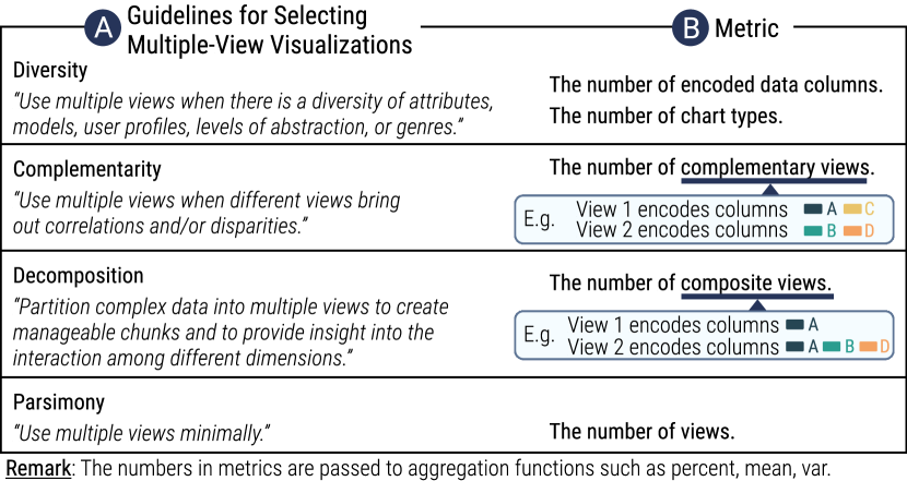
Our chart embedding mechanism involves two types of information. First, we use the scores predicted by the single-chart assessment model, since our single-chart scoring network achieves satisfactory performances on assessment and encoding prediction. Second, we propose to leverage design guidelines of MVs to improve the recommendation results, inspired by Draco [35]. As shown in Figure 5, we propose several novel functions to computationally encode the guidelines for the selection of multiple views in information visualization proposed by Baldonado et al\xperiod [61]. However, the guidelines do not provide thresholds (e.g., the maximal number of views) so that we cannot encode those guidelines to constraints in the same way with Draco. Instead, we describe those guidelines as statistical features and fed it into deep learning models in an attempt to learn the “best” values of those guidelines (Figure 3 ).
It should be noted that Baldonado et al\xperiod [61] proposed another four guidelines for the presentation and interaction of MVs such as consistency and space optimization, which are beyond the scope of this work and warrant future research.
4 Interface
MultiVision features an interactive interface that integrates the deep-learning-based recommendation into data exploration. MultiVision: Designing Analytical Dashboards with Deep Learning Based Recommendation shows the interface, which is vertically divided into three panes. The leftmost pane offers system-wise services including uploading and viewing datasets, making MV recommendation, and other system functions such as changing themes. The middle pane provides chart-wise functionalities including editing charts and browsing chart recommendation. Finally, users can explore and interact with the charts in the right-most pane ( ).
4.1 Multiple-View Recommender
Multiple-View Recommender directly generates an MV based on user specifications. To be specific, it allows users to specify the number of charts in an MV and optionally locked charts. Locked charts are taken into consideration during recommendation. There is no limitation to the number of locked charts. Figure 6 illustrates an example where MultiVision recommends a MV composed of five charts based on one user-locked chart.
We abstract the recommendation into a constrained optimization problem, i.e., to find a combination of charts that maximize the scores predicted by the multiple-chart assessment model (subsection 3.3). However, this is a challenging problem due to the huge, exponentially growing space of chart combinations. For the sake of running time and user experience, we implement a naive greedy algorithm that takes locked charts as the initial selection and incrementally picks one chart that leads to the highest score. In this way, MultiVision can make a recommendation responsively within few seconds, which, however, might not always yield the optimal solution. Future work should study and propose advanced algorithms to further improve the performance, e.g., possibility-based approximation algorithms [29].
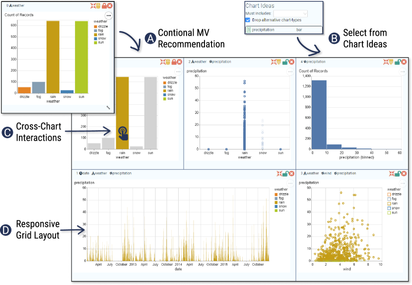
4.2 Chart Ideas
Chart Ideas offers an alternative method for users to interact with automatic recommendations. As shown in MultiVision: Designing Analytical Dashboards with Deep Learning Based Recommendation , it provides chart recommendations based on the current MV. Specifically, it lists and ranks charts from top to bottom in the order of the assessment score, i.e., the score of the MV after adding the chart to the current MV. This process shares the same computation procedure with Multiple-View Recommender since it can be seen as one step in the greedy algorithm. User could click a chart to add it to Dashboard View (Figure 6 ). To facilitate browsing and selecting charts of interest, users could select data columns in the “Must Includes” drop-down list to view charts containing selected columns. Dashboard View by default considers charts encoding the same data columns to be the same, irrespective of the chart type. Users could un-check the “drop alternative chart-types” to view all alternative chart types.
Different from Multiple-View Recommender which is passive and triggered upon request, Chart Ideas makes active recommendation, i.e., it is automatically updated upon user changes to the current MV, including adding, editing, and removing charts. We design those two recommendation strategies in an attempt to probe into the open challenge in designing mixed-initiative user interfaces, i.e., “to what degree will such systems promote behavior characterized by user control vs. more passive acceptance of algorithmic recommendations?” [15]. We reflect on our findings about the active and passive recommendation in subsection 6.2.
4.3 Chart Editor
Chart Editor allows users to edit chart specifications, including visual encodings, chart types, and data transformation. We implemented Chart Editor since users might need to make adjustments to recommended results or create charts that satisfy personal needs. We borrowed the editor design in Voyager [62] which has proven to be easy to use. To be specific, Chart Editor supports editing chart specifications in the Vega-Lite grammar [48]. For example, MultiVision: Designing Analytical Dashboards with Deep Learning Based Recommendation illustrates the visual specification of the top-right chart in MultiVision: Designing Analytical Dashboards with Deep Learning Based Recommendation , which is highlighted with the same background color. MultiVision currently supports five chart types including area, bar, line, pie charts and scatterplots that are found most commonly used online [3].
Since the deep learning model only recommends chart types, we decided the visual encodings according to the heuristics in Voyager [63], e.g., nominal data types are firstly assigned to the x/y channel. Chart Editor provides six encoding channels, including x, y, column, row, size, and color. We acknowledge that those heuristics might return sub-optimal visual encodings. Future work could implement advanced visual encoding recommender such as Draco [35] and InfoColorizer [69] to improve the system.
4.4 Presentation and Interaction
Although MultiVision primarily focuses on the selection of MVs, we provided basic support for interaction and presentation of MVs. As shown in Figure 6 , users could perform cross-chart filtering between multiple charts through mouse clicking or brushing. Besides, users could move and resize a chart in a responsive grid layout (Figure 6 ). Finally, users could change the theme, restore historical versions, and save logs in Control Panel (MultiVision: Designing Analytical Dashboards with Deep Learning Based Recommendation ). The logs contain the uploaded data table, the computed features of the data table, event logs for the functionality above, as well as the rendered charts of all historical versions. It is up to users to decide whether the logs will be stored.
5 Evaluation
To evaluate MultiVision, we conduct an experiment to evaluate the model performance from the perspective of techniques, as well as a user study to understand MultiVision from a system perspective.
5.1 Model Experiment
We evaluate the algorithm performance of our deep learning model as introduced in section 3. We report the dataset, baselines, implementation details, results and discussions in the following text.
5.1.1 Dataset
We collect and construct two datasets for single-chart and multiple-charts assessment, respectively. For single-chart assessment, we adopt the Excel corpus in Table2Charts [72] which consists of 271,250 charts from 167,329 data tables. After filtering out data tables consisting of more than ten columns (14.2%) and charts encoding over four columns (6.5%), we obtain 3,920,941 pairs following the procedure described in Figure 4 . Since the number of possible chart pair is huge, we only keep pairs where two charts encoding the same number of data columns. Each chart in a pair is described as a sequence of data columns with feature vectors sized , where is the maximal sequence length and is the feature size per column.
However, the aforementioned Excel dataset is not suited to multiple-chart assessment, since most Excel sheet consists of a single chart (75.6%). Thus, we decide to use the user logs of editing MVs as the training dataset, as illustrated in Figure 4 . Here we report the performance over the provenance data that we obtained from the user study (subsection 5.2), which consists of 692 pairs from 11 participants222One participant decided not to share the logs with us.. Each chart is described as a feature vector sized , and the maximal sequence length of an MV is 12 in our dataset.
5.1.2 Comparison with Baseline Model Structures
Since existing machine-learning-based visualization recommenders do not focus on generating multiple charts, we do not identify a fair baseline recommender for comparing the recommendation performances. Instead, we compare our model structure in Figure 3 against two machine learning model structures used in previous visualization recommenders:
- •
- •
5.1.3 Implementation and Model Detail
We implement our deep-learning models using PyTorch [37]. We manually tune the hyper-parameters of our and baseline NN models by diagnosing the training curves, i.e., until both the validation and training scores converge to a desired level with small gaps in between them. We find that the margin hyper-parameter in the loss function (Equation 2) plays a dominant role in the performance, while other parameters such as dropout rates and learning rates have a smaller effect on the model behaviour.
We run the experiment on a Linux server with a Tesla P100 GPU. The number of epochs is set to 10. We split the dataset with an 80/20 training-testing ratio and run Monte-Carlo cross validation [68] 10 times.
| Ours | NN | RankSVM | |
|---|---|---|---|
| Single Chart | 97.86 | 96.59 | 93.42 |
| Multiple Charts | 94.05 | 88.99 | 84.78 |
5.1.4 Result and Discussion
Table 1 presents the performance of our models and baselines. Our model outperforms baseline approaches in both single-chart and multiple-chart assessment tasks. We note that multiple-chart assessment performs poorer than single-chart assessment, suggesting that our feature engineering methods for describing an MV might be insufficient and unrepresentative. Therefore, future research should propose efficient methods for modelling and describing MVs.
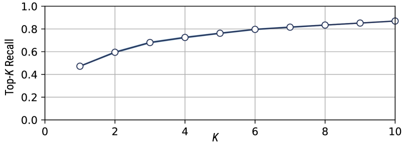
The results in Table 1 should be interpreted carefully since it represents the ranking accuracy on the pairs. In other words, it does not directly reflect the quality of recommended results. To better understand the performance of recommendation, we run an additional experiment to evaluate the top- recall on single-chart assessment, i.e., the proportion of ground-truth charts found in the top- recommendations. As shown in Figure 7, our model on average reaches 47.2%, 68.1%, 76.2%, and 87.0% at , respectively. That said, 87% of the ground-truths can be found within the top-10 recommended results. The standard deviation is small, i.e., , suggesting the model stability. It should be noted that we do not run this additional experiment on multiple-chart assessment at the current state, since the data size is small () and thus insufficient in proving statistically meaningful results. Moving forward, we are excited to involve more participants, collect large-scale MV datasets, and further investigate the performance.
Critically, our model achieves satisfying performance at the cost of algorithm complexity and training time. Our method for collecting training data (Figure 4) can be considered a “brute-force” strategy that enumerates possible pairs between good and bad selections. This brute-force manner is expensive, e.g., we convert 271k charts into 3,920k pairs. Subsequently, this growth imposes additional costs on the computational resources for deep learning. Thus, continued research on problem formulation and model architecture will be beneficial to the resource-performance tradeoff.
5.2 User Study
We conducted a formal user study to evaluate MultiVision from a system perspective. Our overall goal is to investigate: (1) whether MultiVision helps data workers create multiple-view visualizations and conduct data analysis; and (2) whether the deep-learning-based recommendation assists and engages users in exploring tabular datasets.
5.2.1 Study Design
Based on the above goals, we conducted a usability test to understand how users interacted with MultiVision and gather their feedback.
Participants. We recruited 12 participants including five females. We asked participants to specify their experience in charting software (e.g., Excel, Tableau) and programming tools (e.g., Matplotlib, Vega) on a five-point Likert scale, where 1-point denotes “never heard of it” and 5-point means “very familiar”. Their responses suggested varying degrees of experience in data visualizations, i.e., charting software () and programming tools (). Two participants (E1,2) were experts in data analysis and visualization from a global high tech company. Remaining participants (P1-10) were undergraduate or postgraduate students with different majors including computer science, mathematics, and finance.
Datasets and Settings. We prepared five datasets from Vega-lite dataset333https://github.com/vega/vega-datasets, including cars, gapminder, penguins, countries, and Seattle-weather. Those datasets consisted of 6-9 data columns, which had a suitable level of complexity and exploration efforts for running user studies. To train the initial multiple-chart assessment model and enable recommenders, we conducted a pilot study to collect a small dataset of editing logs. We only used the cars dataset in the pilot study to qualitatively investigate how well the trained models generalize to other new datasets.
Procedure. A study session lasted between 50-60 minutes. We first asked participants to read and sign the consent form, especially that “I understand that my editing logs and comments will be collected”. Participants were then given a tutorial about MultiVision and allowed to try out and get familar with the system (15 minutes). Next, we instructed participants to “select a dataset that you have not heard of and conduct data analysis” (20 minutes). For the sake of accountability, we asked participants to report findings during exploration and “finally create an MV to communicate important findings”. The study ended with an exit questionnaire on the subjective ratings of MultiVision functions and a short interview.
Interview Questions. We asked participants’ opinions on the pros and cons of each functionality in MultiVision and the overall system. Then we asked them to compare MultiVision with their previous experience in analyzing tabular datasets, and if any, in multiple-view visualizations or dashboards. To elicit fair comments, questions were one-off to avoid being double-barreled, and we avoided potentially leading questions such as “how about MultiVision in terms of conveniency” [26]. As such, we collected explicit immediate reactions from participants. Although this setting might have hindered us from assembling in-depth thoughts through detailed inquiries, our expectation was that immediate responses reflected the foremost thoughts about MultiVision. The interview session ended with questions regarding the performance of automated recommendation and the user experience about the mixed-initiative system.
5.2.2 Participant Feedback
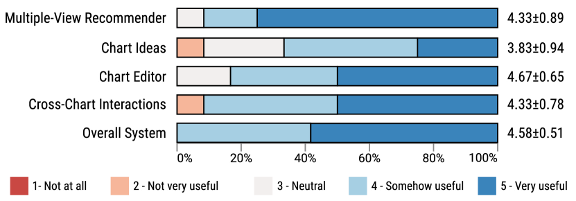
Overall, MultiVision received an enthusiastic reaction from the participants. As shown in Figure 8, participants, in general, deemed the functionality of MultiVision and the overall system to be useful. In the following text, we summarized participants’ feedback on the advantages of MultiVision.
MultiVision is useful, convenient, and easy to learn. From a tool perspective, MultiVision scored a high usefulness rating among participants (). When asked to compare MultiVision with their previous experience with charting software or libraries for analyzing tabular datasets, eleven participants explicitly commented on the convenience of MultiVision, i.e., it required few efforts to browse, select, create, and edit multiple charts. Four participants (P5,6,9,10) emphasized that MultiVision has a short learning curve, e.g., “it is a plain and simple tool for the masses”.
MultiVision facilitates exploratory data analysis. Participants expressed that the recommendation provides helpful starting points (P5,8,10) or inspiration when they get stuck (P9). E2 positioned the prototype to exploratory data analytical scenarios when users had little understanding and no clear analytic tasks about the dataset. Nine of twelve participants made their first attempt at creating multiple-view visualizations (MVs), all appreciating that MVs helped them explore datasets from different perspectives effectively. P4 who had previously created dashboards for the purposes of monitoring commented that “it takes some yet small costs to learn (the use of MVs in MultiVision). Everything is intuitive”.
MultiVision weighs automation and human intervention. Participants exhibit generally satisfactory yet diverse feelings on the “overall performance of machine learning models” during interviews. Their responses from “roughly 40% of results need manual adjustments” (P10) to “I tried to create charts myself but found the recommended results to be better than my decisions” (P3). This was further evidenced by the large negative correlation () between the usefulness ratings of Multiple-View Recommender (automation) and Chart Editor (human intervention), i.e., the more participants consider automation to be useful, the less they appreciate manual efforts. During interviews, all participants appreciated the “semi-automated” or “human-computer collaborative” paradigm of MultiVision, i.e., users could modify the automatically recommended charts which are dynamically updated in line with their current selections.
5.2.3 Log Analysis
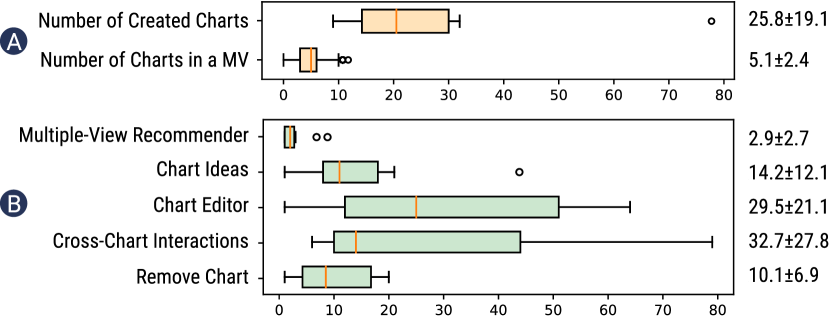
We investigated the user behaviour about the usage of charts and each functionality, which is described in subsection 4.4. As shown in Figure 9, participants on average created 25.8 charts which indicated a high user engagement. The number of charts in an MV during exploration averaged 5.1, showing that overmuch charts were not desirable.
We observed differences among the usage count of each functionality. Participants had engaged more in Cross-Chart Interactions and Chart Editor, showing that participants had actively interacted with automated support and engaged in their own creative practice. Those high usage counts also conformed to the high usefulness ratings of those two functionalities. From the aspect of recommendation, Chart Ideas was much more frequently used than Multiple-View Recommender, which was in contrast to the usefulness ratings. During interviews, participants explained that they used Multiple-View Recommender at the beginning and found it helpful to offer initial ideas. Afterwards, they preferred to use Chart Ideas to create and explore charts incrementally. However, Chart Ideas suffered few minor design flaws such as lacking previews that lowered their rankings.
6 Implication and Lessons Learned
In this section, we reflect on the lessons learned for designing more effective MVs, balancing agency and automation, and creating visualization authoring tools.
6.1 Designing More Efficient MVs
All participants, including those who were new to MVs, considered MVs to be useful and intuitive for data analysis. Despite enthusiastic feedback, we identify several future directions to further improve the usefulness and user experience (UX) of MVs.
Integrating methodology of visual analytics. E2 drew on the high autonomy and freedom in MultiVision, saying that our design was proper in terms of user experience but might lack guidance for laypersons. This comment was exemplified by P7, a beginner to MVs who commented “I had no idea how to analyze data with MVs at the beginning”. Different from P7, some other MV beginners explained their methodology, e.g., “I want to see the distributions of each variable first and then explore the correlations” (P1), to which we refer as breadth-first exploration. In contrast, other participants (P2,8,9) adopt depth-first exploration, e.g., “I focus on (a variable) and examine how it influences others”. Those comments underscore the importance of methodology for efficient data analysis with MVs. Therefore, future research should better understand the analytical pipelines of MVs and integrate them into automated creation of MVs to provide guided exploration, e.g., “overview-first, detailed on demaind”.
Enhancing the interactions among views. Participants thought highly of the usefulness of Cross-Chart Interactions (), commenting that interactions helped reveal new insights (P6,8), scope to data of interest (P7), and reduce clutter (P3,10). A major UX issue arises that “it is unclear which charts are connected” (P1). P1 suggested to put linked charts nearby, and P2 recommended explicit representations of inter-chart relationships such as an addition figure showing the relationships. Besides, P11 noted that “clicking and brushing is insufficient”. Those comments call for continued research on the presentation and interaction of MVs.
Modeling the analytical progress of MVs. MultiVision implements a linear model for tracking and restoring authoring history, which is common in UX design such as text editors. However, we find that this linear model is insufficient in visualization authoring. Specifically, participants often experienced iterative and back-and-forth exploration processes, i.e., to reach back previous charts and explore alternative chart combinations. Future research might represent analytical progress using non-linear, tree-like models that better reflect the iterative changes of MVs. Besides, they expressed demands for more detailed history tracking due to the huge pool of charts, e.g., “there are many charts. I want the system to tell which charts I have checked” (P6) and “I need to know columns that I have not examined” (P8).
Recommending theme-based and explainable MVs. Although all participants agreed that MVs promoted data analysis, some participants pointed that a single MV might be insufficient. For instance, P8 wished to create multiple MVs, each focusing on several data columns. Similarly, E2 commented that a dashboard typically consists of 4-6 views to avoid being overwhelming and embody a core theme. Besides, participants felt that it was not always easy to understand the recommended MV (P1,2,6) and a “readme” might help (P4). Therefore, an interesting question is how to summarize an MV into a theme, which in turn could inform research in recommending more explainable theme-based MVs. Besides, it is helpful to conduct user studies with laypersons (e.g., [52]) to investigate the understandability of MVs.
6.2 Balancing Agency and Automation
E2 describes MultiVision as a “conversation” between users and machines - both could update the current MV according to the feedback from another. In this subsection, we reflect on the participants’ feedback about their “conversations” with automation.
Automation might be disrupting. MultiVision offers two methods for recommending MVs, including Multiple-View Recommender that generates multiple charts at once and Chart Ideas that recommends a single chart dynamically upon each manual change to the MV. Chart Ideas received a lower rating of usefulness () than the former (). Although participants generally agreed that it was helpful to make recommendation bases on the current MV, concerns arose that each update required rethinking the newly recommended charts and thus sometimes became disturbing (P5,7,8 and E1,2). Besides, the rethink was cognitively costly as Chart Ideas listed charts as text descriptions which were less intuitive than chart images. Future research should investigate how to alleviate this problem to leverage the combined power of agent and automation.
Personalization is in-demand. Participants were inconsistent in conducting data analysis with MultiVision, e.g., breath-first and depth-first exploration. As such, they exhibited conflicting feelings over the recommended results, including “lacking diversity” (P6,11) and “diverging from my current selection” (P8). Similar opinions include that “it did not learn that I dislike pie charts although I had removed pie charts for many times” (P3). Those problems require further research on recommendation systems that counter-balance the short-time user satisfaction and long-term model converge [50]. One promising solution might be personalized recommendations that allow users to specify their intent on different criteria (e.g., Calliope [51]). Besides, future recommendation system should propose collaborative filtering approaches [55] by grouping similar peer users and generating recommendations using the neighbourhood.
Leveraging user data warrants deeper studies. We proposed to recommend MVs by learning from user provenance data. Despite being useful and generalizable, such systems suffered from the “cold-start” problem that the recommended results were far from being perfect due to limited training datasets at the beginning. Thus, a clear next step is to collect more provenance data on new datasets to improve the performance and better evaluate the system. Another interesting problem is to explore strategies such as few-shot learning to cope with the “cold-start” problem. When asked for opinions for gathering user data, all participants exhibited open-minded attitudes if “I am informed”. However, concerns regarding the data quality arose among participants, such as “I am not confident that my data is of high-quality and helpful” (P5) and “many of my operations were meaningless” (P9). E2 similarly expressed this point, saying “charts are similar to paintings. It is easy to differentiate ‘rubbish’ but much harder to compare ‘masterpieces’. How to ensure the quality of collected logs?”. Therefore, it warrants more studies to understand how to leverage user data effectively (e.g., data wrangling and cleaning).
6.3 Creating More Useful Charting Tools
From a charting tool perspective, MultiVision receives enthusiastic comments on its convenience, usefulness, and short learning curves. Still, participants required more functionality for further improvements.
Data Transformation. Nine participants expressed the needs for applying data transformation to the raw data table. MultiVision supported limited operations of data transformation (e.g., bin) that were insufficient. A promising research question would be to predict the data transformation given a data table. Besides, E1 suggested leveraging natural language interface for specifying data transformation, which was easy-to-use for novice users and could be integrated into MultiVision.
Expressiveness. In general, participants felt that the chart types supported in MultiVision were sufficient in basic data analysis and rated highly of the Chart Editor (). This feedback conformed to our findings in the training dataset that those basic types were dominant. However, two participants demanded additional chart types such as box-plots (P2,11). In addition, participants presented various requirements for editing access to scales (P4,10) and text (E2).
7 Conclusion and Future Work
We present MultiVision, a mixed-initiative system that leverages deep-learning-based recommendation for creating and authoring dashboards to analyze a data table. We believe that this is an important and challenging problem and there are several open directions for future work.
Investigating visualization-tailed machine learning. From a broader sense, it remains an open challenge to propose proper machine learning model and feature representation techniques for visualization research [65, 57, 7, 70]. Future research should investigate and propose advanced deep learning models, e.g., generative models [58]. Besides, we see that Graph Neural Network (GNN) [49] is promising, which has recently demonstrated success across various application domains. For instance, Graphiti [54] models tabular datasets as a homogeneous graph where a node represents a column and a link indicate the linking conditions. As shown in Figure 2, we could extend this model to a heterogeneous graph where data columns, charts, and MVs are nodes and an edge represents a composing relationship (e.g., several columns compose a chart). In this way, the recommendation problem could be abstracted into edge regression or edge cutting tasks that might be solved by GNNs. However, the graph model of MVs suffer an “open-vocabulary” problem, i.e., each node, including columns, charts, and MVs, is distinct. This differs from the application of GNN in other domains where there exists a fixed, closed vocabulary of nodes (e.g., scholars in citation network). Future research should be aware of the particularity of visualization research and study visualization-tailored solutions.
Continuing research on multiple-view visualizations. Despite the wide usage of multiple-view visualizations, research efforts on MVs remain relatively limited. From a theoretical perspective, there exist limited understandings about the guidelines and the design space of MVs [6]. Thus, it is vital to continue research on the empirical studies of MVs to understand the user engagement, the strategies for data analytics, design considerations and “best practices” of MVs. From a practical perspective, there are limited grammars or language that allow describing MVs in a shared representation. Shared representations are critical since they can be authored and edited by both human and machines, which in turn contribute to or learn from solutions to design better visualizations [15]. Recent research (e.g., [17, 64]) has suggested that declarative grammars (i.e., parameters) are effective and compact representations for data visualizations that benefit the use of machine learning, while visualization images are expensive and inefficient representations [65, 14, 12]. That said, continued research on declarative grammars for the presentation and interactions of MVs is essential.
Benchmarking recommendation and systems. In both model experiment and user study, we do not directly compare MultiVision with a baseline approach. This is because we do not identify a fair baseline for both the deep learning model and the system. Specifically, existing visualization recommenders do not focus on generating an MV. Sequential single-chart recommenders do not consider the relationships among charts (e.g., DeepEye [29]) or target at a logically coherent data story for storytelling purposes (e.g., Calliope [51]) instead of a cohesive, linked MV for analyzing different perspective of data. Thus, our experiments compare our deep-learning model with the machine learning methods in existing recommenders on our dataset. In the future, we plan to compare models using other datasets (e.g., DeepEye [29]) to better evaluate our approach. Similarly, we do not find a fair baseline system that supports both editing multiple-view visualizations and providing recommendations. We hope that our initial results will inspire and provide benchmarks for future work.
Understanding users in mixed-initiative visualization systems. MultiVision only takes one of the initial steps in integrating deep learning models into visualization authoring systems. We draw on participants’ feedback to discuss the effects of different recommendation strategies. We found that active recommendation might be disrupting while passive recommendation are much less likely to be used. That said, it remains challenging to propose approximate interaction designs that prompt efficient usage and understandings of automation while reducing disruptions to users. Another exciting idea is to characterize user behaviour [8] and make recommendations through collaborative filtering approaches [36]. Finally, it is important to consider visualization tools as a social system where users could share and communicate their visualizations with each other. Recent research in mining user behaviour in visualization systems [34] seems a promising direction.
Acknowledgements.
The authors wish to thank anonymous reviewers for their suggestions. This work was supported in part by a grant from XYZ.References
- [1] H. M. Al-maneea and J. C. Roberts. Towards quantifying multiple view layouts in visualisation as seen from research publications. In Proc. of the IEEE Visualization Conference (VIS), pp. 121–121. IEEE, 2019.
- [2] D. Auber. Tulip—a huge graph visualization framework. In Graph Drawing Software, pp. 105–126. Springer, 2004.
- [3] L. Battle, P. Duan, Z. Miranda, D. Mukusheva, R. Chang, and M. Stonebraker. Beagle: Automated extraction and interpretation of visualizations from the web. In Proc. of the ACM Conference on Human Factors in Computing Systems (CHI), pp. 1–8, 2018.
- [4] F. Bouali, A. Guettala, and G. Venturini. Vizassist: an interactive user assistant for visual data mining. The Visual Computer, 32(11):1447–1463, 2016.
- [5] Z. Bylinskii, N. W. Kim, P. O’Donovan, S. Alsheikh, S. Madan, H. Pfister, F. Durand, B. Russell, and A. Hertzmann. Learning visual importance for graphic designs and data visualizations. In Proceedings of the Annual ACM symposium on User Interface Software and Technology (UIST), pp. 57–69, 2017.
- [6] X. Chen, W. Zeng, Y. Lin, H. M. Al-Maneea, J. Roberts, and R. Chang. Composition and configuration patterns in multiple-view visualizations. IEEE Transactions on Visualization and Computer Graphics, 2020.
- [7] Z. Chen, Y. Wang, Q. Wang, Y. Wang, and H. Qu. Towards automated infographic design: Deep learning-based auto-extraction of extensible timeline. IEEE Transactions on Visualization and Computer Graphics, 26(1):917–926, 2019.
- [8] Z. Chen, W. Zeng, Z. Yang, L. Yu, C.-W. Fu, and H. Qu. Lassonet: Deep lasso-selection of 3d point clouds. IEEE Transactions on Visualization and Computer Graphics, 26(1):195–204, 2019.
- [9] V. Dibia and Ç. Demiralp. Data2vis: Automatic generation of data visualizations using sequence-to-sequence recurrent neural networks. IEEE Computer Graphics and Applications, 39(5):33–46, 2019.
- [10] M. Excel. Create a chart in excel for mac. https://support.microsoft.com/en-us/office/create-a-chart-in-excel-for-mac-9407d77e-9695-488a-8e0a-7cb3fd507862, Feb 2021.
- [11] M. Franz, C. T. Lopes, G. Huck, Y. Dong, O. Sumer, and G. D. Bader. Cytoscape.js: a graph theory library for visualisation and analysis. Bioinformatics, 32(2):309–311, 2016.
- [12] X. Fu, Y. Wang, H. Dong, W. Cui, and H. Zhang. Visualization assessment: A machine learning approach. In Proc. of the IEEE Visualization Conference (VIS), pp. 126–130. IEEE, 2019.
- [13] T. Gao, M. Dontcheva, E. Adar, Z. Liu, and K. G. Karahalios. Datatone: Managing ambiguity in natural language interfaces for data visualization. In Proc. of the Annual ACM Symposium on User Interface Software & Technology (UIST), pp. 489–500, 2015.
- [14] D. Haehn, J. Tompkin, and H. Pfister. Evaluating ‘graphical perception’with cnns. IEEE Transactions on Visualization and Computer Graphics, 25(1):641–650, 2018.
- [15] J. Heer. Agency plus automation: Designing artificial intelligence into interactive systems. In Proc. of the National Academy of Sciences, vol. 116, pp. 1844–1850. National Acad Sciences, 2019.
- [16] E. Horvitz. Principles of mixed-initiative user interfaces. In Proc. of the ACM Conference on Human Factors in Computing Systems (CHI), pp. 159–166, 1999.
- [17] K. Hu, M. A. Bakker, S. Li, T. Kraska, and C. Hidalgo. Vizml: A machine learning approach to visualization recommendation. In Proc. of the ACM Conference on Human Factors in Computing Systems (CHI), pp. 1–12. ACM, 2019.
- [18] J. Hullman, S. Drucker, N. H. Riche, B. Lee, D. Fisher, and E. Adar. A deeper understanding of sequence in narrative visualization. IEEE Transactions on Visualization and Computer Graphics, 19(12):2406–2415, 2013.
- [19] D. Jung, W. Kim, H. Song, J.-i. Hwang, B. Lee, B. Kim, and J. Seo. Chartsense: Interactive data extraction from chart images. In Proc. of the ACM Conference on Human Factors in Computing Systems (CHI), pp. 6706–6717, 2017.
- [20] N. W. Kim, E. Schweickart, Z. Liu, M. Dontcheva, W. Li, J. Popovic, and H. Pfister. Data-driven guides: Supporting expressive design for information graphics. IEEE Transactions on Visualization and Computer Graphics, 23(1):491–500, Jan 2017.
- [21] Y. Kim, K. Wongsuphasawat, J. Hullman, and J. Heer. Graphscape: A model for automated reasoning about visualization similarity and sequencing. In Proc. of the ACM Conference on Human Factors in Computing Systems (CHI), pp. 2628–2638, 2017.
- [22] G. Koch, R. Zemel, and R. Salakhutdinov. Siamese neural networks for one-shot image recognition. In ICML Deep Learning Workshop, vol. 2. Lille, 2015.
- [23] R. Langner, T. Horak, and R. Dachselt. Vistiles: Coordinating and combining co-located mobile devices for visual data exploration. IEEE Transactions on Visualization and Computer Graphics, 24(1):626–636, 2017.
- [24] R. Langner, U. Kister, and R. Dachselt. Multiple coordinated views at large displays for multiple users: Empirical findings on user behavior, movements, and distances. IEEE Transactions on Visualization and Computer Graphics, 25(1):608–618, 2018.
- [25] C.-P. Lee and C.-J. Lin. Large-scale linear ranksvm. Neural Computation, 26(4):781–817, 2014.
- [26] E. Litwak. A classification of biased questions. American Journal of Sociology, 62(2):182–186, 1956.
- [27] T.-Y. Liu. Learning to rank for information retrieval. Springer Science & Business Media, Berlin, Germany, 2011.
- [28] Z. Liu, J. Thompson, A. Wilson, M. Dontcheva, J. Delorey, S. Grigg, B. Kerr, and J. Stasko. Data illustrator: Augmenting vector design tools with lazy data binding for expressive visualization authoring. In Proc. of the ACM Conference on Human Factors in Computing Systems (CHI), CHI ’18, pp. 123:1–123:13. ACM, New York, NY, USA, 2018.
- [29] Y. Luo, X. Qin, N. Tang, and G. Li. Deepeye: Towards automatic data visualization. In Proc. of the International Conference on Data Engineering (ICDE), pp. 101–112. IEEE, 2018.
- [30] R. Ma, H. Mei, H. Guan, W. Huang, F. Zhang, C. Xin, W. Dai, X. Wen, and W. Chen. Ladv: Deep learning assisted authoring of dashboard visualizations from images and sketches. IEEE Transactions on Visualization and Computer Graphics, 2020.
- [31] J. Mackinlay. Automating the design of graphical presentations of relational information. ACM Transactions on Graphics, 5(2):110–141, 1986.
- [32] J. Mackinlay, P. Hanrahan, and C. Stolte. Show me: Automatic presentation for visual analysis. IEEE Transactions on Visualization and Computer Graphics, 13(6):1137–1144, 2007.
- [33] T. Mikolov, K. Chen, G. Corrado, and J. Dean. Efficient estimation of word representations in vector space. arXiv preprint arXiv:1301.3781, 2013.
- [34] S. Monadjemi, R. Garnett, and A. Ottley. Competing models: Inferring exploration patterns and information relevance via bayesian model selection. IEEE Transactions on Visualization and Computer Graphics, 2020.
- [35] D. Moritz, C. Wang, G. L. Nelson, H. Lin, A. M. Smith, B. Howe, and J. Heer. Formalizing visualization design knowledge as constraints: Actionable and extensible models in draco. IEEE Transactions on Visualization and Computer Graphics, 25(1):438–448, 2018.
- [36] M. Oppermann, R. Kincaid, and T. Munzner. Vizcommender: Computing text-based similarity in visualization repositories for content-based recommendations. IEEE Transactions on Visualization and Computer Graphics, 2020.
- [37] A. Paszke, S. Gross, F. Massa, A. Lerer, J. Bradbury, G. Chanan, T. Killeen, Z. Lin, N. Gimelshein, L. Antiga, et al. Pytorch: An imperative style, high-performance deep learning library. arXiv preprint arXiv:1912.01703, 2019.
- [38] X. Qin, Y. Luo, N. Tang, and G. Li. Making data visualization more efficient and effective: a survey. The VLDB Journal, 29:93–117, 2020.
- [39] Z. Qu and J. Hullman. Keeping multiple views consistent: Constraints, validations, and exceptions in visualization authoring. IEEE Transactions on Visualization and Computer Graphics, 24(1):468–477, 2017.
- [40] D. Ren, T. Höllerer, and X. Yuan. ivisdesigner: Expressive interactive design of information visualizations. IEEE Transactions on Visualization and Computer Graphics, 20(12):2092–2101, Dec 2014.
- [41] D. Ren, B. Lee, and M. Brehmer. Charticulator: Interactive construction of bespoke chart layouts. IEEE Transactions on Visualization and Computer Graphics, 25(1):789–799, Jan 2019.
- [42] J. C. Roberts. On encouraging multiple views for visualization. In Proc. of the IEEE Conference on Information Visualization (IV), pp. 8–14. IEEE, 1998.
- [43] J. C. Roberts. State of the art: Coordinated & multiple views in exploratory visualization. In Proc. of the International Conference on Coordinated and Multiple Views in Exploratory Visualization (CMV), pp. 61–71. IEEE, 2007.
- [44] S. F. Roth, J. Kolojejchick, J. Mattis, and J. Goldstein. Interactive graphic design using automatic presentation knowledge. In Proc. of the ACM Conference on Human Factors in Computing Systems (CHI), pp. 112–117, 1994.
- [45] R. Sadana and J. Stasko. Designing multiple coordinated visualizations for tablets. In Computer Graphics Forum, vol. 35, pp. 261–270. Wiley Online Library, 2016.
- [46] A. Sarikaya, M. Correll, L. Bartram, M. Tory, and D. Fisher. What do we talk about when we talk about dashboards? IEEE Transactions on Visualization and Computer Graphics, 25(1):682–692, 2018.
- [47] A. Satyanarayan and J. Heer. Lyra: An interactive visualization design environment. In Computer Graphics Forum, vol. 33, pp. 351–360. Wiley Online Library, 2014.
- [48] A. Satyanarayan, D. Moritz, K. Wongsuphasawat, and J. Heer. Vega-lite: A grammar of interactive graphics. IEEE Transactions on Visualization and Computer Graphics, 23(1):341–350, 2016.
- [49] F. Scarselli, M. Gori, A. C. Tsoi, M. Hagenbuchner, and G. Monfardini. The graph neural network model. IEEE Transactions on Neural Networks, 20(1):61–80, 2008.
- [50] T. Schnabel, P. N. Bennett, S. T. Dumais, and T. Joachims. Short-term satisfaction and long-term coverage: Understanding how users tolerate algorithmic exploration. In Proc. of the ACM International Conference on Web Search and Data Mining (WSDM), pp. 513–521, 2018.
- [51] D. Shi, X. Xu, F. Sun, Y. Shi, and N. Cao. Calliope: Automatic visual data story generation from a spreadsheet. IEEE Transactions on Visualization and Computer Graphics, 2020.
- [52] X. Shu, A. Wu, J. Tang, B. Bach, Y. Wu, and H. Qu. What makes a data-gif understandable? IEEE Transactions on Visualization and Computer Graphics, 27(2):1492–1502, 2020.
- [53] A. Srinivasan, S. M. Drucker, A. Endert, and J. Stasko. Augmenting visualizations with interactive data facts to facilitate interpretation and communication. IEEE Transactions on Visualization and Computer Graphics, 25(1):672–681, 2018.
- [54] A. Srinivasan, H. Park, A. Endert, and R. C. Basole. Graphiti: Interactive specification of attribute-based edges for network modeling and visualization. IEEE Transactions on Visualization and Computer Graphics, 24(1):226–235, 2017.
- [55] X. Su and T. M. Khoshgoftaar. A survey of collaborative filtering techniques. Advances in Artificial Intelligence, 2009, 2009.
- [56] Tableau. Get started. https://help.tableau.com/current/pro/desktop/en-us/gettingstarted_overview.htm, Apr 2020.
- [57] Q. Wang, Z. Chen, Y. Wang, and H. Qu. Applying machine learning advances to data visualization: A survey on ml4vis. arXiv preprint arXiv:2012.00467, 2020.
- [58] Y. Wang, Z. Jin, Q. Wang, W. Cui, T. Ma, and H. Qu. Deepdrawing: A deep learning approach to graph drawing. IEEE Transactions on Visualization and Computer Graphics, 26(1):676–686, 2019.
- [59] Y. Wang, Z. Sun, H. Zhang, W. Cui, K. Xu, X. Ma, and D. Zhang. Datashot: Automatic generation of fact sheets from tabular data. IEEE Transactions on Visualization and Computer Graphics, 26(1):895–905, 2019.
- [60] Y. Wang, H. Zhang, H. Huang, X. Chen, Q. Yin, Z. Hou, D. Zhang, Q. Luo, and H. Qu. Infonice: Easy creation of information graphics. In Proc. of the ACM Conference on Human Factors in Computing Systems (CHI), CHI ’18, pp. 335:1–335:12. ACM, New York, NY, USA, 2018.
- [61] M. Q. Wang Baldonado, A. Woodruff, and A. Kuchinsky. Guidelines for using multiple views in information visualization. In Proc. of the Working Conference on Advanced Visual Interfaces (AVI), pp. 110–119, 2000.
- [62] K. Wongsuphasawat, D. Moritz, A. Anand, J. Mackinlay, B. Howe, and J. Heer. Voyager: Exploratory analysis via faceted browsing of visualization recommendations. IEEE Transactions on Visualization and Computer Graphics, 22(1):649–658, 2015.
- [63] K. Wongsuphasawat, Z. Qu, D. Moritz, R. Chang, F. Ouk, A. Anand, J. Mackinlay, B. Howe, and J. Heer. Voyager 2: Augmenting visual analysis with partial view specifications. In Proc. of the ACM Conference on Human Factors in Computing Systems (CHI), pp. 2648–2659. ACM, 2017.
- [64] A. Wu, W. Tong, T. Dwyer, B. Lee, P. Isenberg, and H. Qu. Mobilevisfixer: Tailoring web visualizations for mobile phones leveraging an explainable reinforcement learning framework. IEEE Transactions on Visualization and Computer Graphics, 2020.
- [65] A. Wu, Y. Wang, X. Shu, D. Moritz, W. Cui, H. Zhang, D. Zhang, and H. Qu. Survey on artificial intelligence approaches for visualization data. arXiv preprint arXiv:2102.01330, 2021.
- [66] A. Wu, L. Xie, B. Lee, Y. Wang, W. Cui, and H. Qu. Learning to automate chart layout configurations using crowdsourced paired comparison. arXiv preprint arXiv:2101.03680, 2021.
- [67] K. Xu, A. Ottley, C. Walchshofer, M. Streit, R. Chang, and J. Wenskovitch. Survey on the analysis of user interactions and visualization provenance. Computer Graphics Forum, 39(3), 2020.
- [68] Q.-S. Xu and Y.-Z. Liang. Monte carlo cross validation. Chemometrics and Intelligent Laboratory Systems, 56(1):1–11, 2001.
- [69] L. Yuan, Z. Zhou, J. Zhao, Y. Guo, F. Du, and H. Qu. Infocolorizer: Interactive recommendation of color palettes for infographics. IEEE Transactions on Visualization and Computer Graphics, 2021.
- [70] L.-P. Yuan, W. Zeng, S. Fu, Z. Zeng, H. Li, C.-W. Fu, and H. Qu. Deep colormap extraction from visualizations. arXiv preprint arXiv:2103.00741, 2021.
- [71] M. Zhou, Q. Li, X. He, Y. Li, Y. Liu, W. Ji, S. Han, Y. Chen, D. Jiang, and D. Zhang. Table2charts: Recommending charts by learning shared representations. In The 27th ACM SIGKDD Conference on Knowledge Discovery and Data Mining (KDD ’21), August 2021.
- [72] M. Zhou, T. Wang, P. Ji, S. Han, and D. Zhang. Table2analysis: Modeling and recommendation of common analysis patterns for multi-dimensional data. In Proc. of the AAAI Conference on Artificial Intelligence, vol. 34, pp. 320–328, 2020.
- [73] S. Zhu, G. Sun, Q. Jiang, M. Zha, and R. Liang. A survey on automatic infographics and visualization recommendations. Visual Informatics, 4(3):24–40, 2020.