largesymbols"00 largesymbols"01
Pheno-Mapper: An Interactive Toolbox for the Visual Exploration of Phenomics Data
Abstract
High-throughput technologies to collect field data have made observations possible at scale in several branches of life sciences. The data collected can range from the molecular level (genotypes) to physiological (phenotypic traits) and environmental observations (e.g., weather, soil conditions). These vast swathes of data, collectively referred to as phenomics data, represent a treasure trove of key scientific knowledge on the dynamics of the underlying biological system. However, extracting information and insights from these complex datasets remains a significant challenge owing to their multidimensionality and lack of prior knowledge about their complex structure. In this paper, we present Pheno-Mapper, an interactive toolbox for the exploratory analysis and visualization of large-scale phenomics data. Our approach uses the mapper framework to perform a topological analysis of the data, and subsequently render visual representations with built-in data analysis and machine learning capabilities. We demonstrate the utility of this new tool on real-world plant (e.g., maize) phenomics datasets. In comparison to existing approaches, the main advantage of Pheno-Mapper is that it provides rich, interactive capabilities in the exploratory analysis of phenomics data, and it integrates visual analytics with data analysis and machine learning in an easily extensible way. In particular, Pheno-Mapper allows the interactive selection of subpopulations guided by a topological summary of the data and applies data mining and machine learning to these selected subpopulations for in-depth exploration.
Keywords— Phenomics, interactive visualization, topological data analysis, multidimensional biological data
1 Introduction
High-throughput technologies have made field observations possible at scale in numerous branches of life sciences. In medicine, easy and increased access to imaging technologies and assay instruments have made it possible to capture a patient’s biomedical trajectory in hospitals as the patient responds to various drugs and therapies. Similarly, in agricultural biotechnology, crop phenotyping technologies and on-field sensors are being widely adopted to capture a whole array of plant phenotypic traits (both morphological and physical) and growth environments (weather and soil parameters). Consequently, there has been an explosion of a new type of complex, multidimensional data called phenomics data [6, 21], which is a combination of phenotypic and environmental data and genotypic data collected using sequencing technologies. Phenomics is the branch of modern biology that deals with the analysis of phenomics data to elucidate the science behind genotype () to environment () interactions toward controlling phenotypic () performance, that is, the study of the mapping [6, 17, 21].
The use of phenomics has been exemplified in plant and agricultural biotechnology. Consider a commodity crop such as corn grown in various regions across the continental United States, Canada, and Mexico. With hundreds of varieties (genotypes) grown over thousands of geographical locations, the effects of growth environment on different genotypes can be significant. More specifically, the same genotype could show varying phenotypic trait performances in different environments (plasticity) [11], or different genotypes may respond to environmental stresses differently [4]. Under these circumstances, conducting only genotype to phenotype association studies is inadequate [19]. Formulation of hypotheses on phenotypic control should involve the role of environment as well [20]. Consequently, projects such as the Genomes-to-Field initiative [1, 12] have initiated a community-wide call to generate large-scale phenomics data collections. These projects are collecting vast swathes of phenomic data spanning hundreds of genotypes grown in diverse geographical regions, and tracking multiple phenotypic traits and their growth environments.
Analyzing these large-scale high-dimensional datasets can be challenging. Firstly, these datasets are generated without any particular central driving hypothesis. In fact, the role of bioinformaticians is to use data analysis to extract data-guided hypotheses. Secondly, the more traditional Genome Wide Association Studies (GWAS) [3] tools are not readily suited to handle environmental data. The multitude of dimensions poses a more severe challenge to more traditional multivariate statistical methods. Whereas the recourse is to use dimensionality reduction tools such as principal component analysis (PCA), these tools typically work well only to elucidate coarse population-level correlations or dominant dimensions. However, what is of interest to this community are the subpopulation-level variabilities, e.g., certain environmental factors tend to better control a specific trait in a certain subset of genotypes (subpopulations) than in others. Furthermore, the lack of effective large-scale data visualization tools poses additional challenges to the domain scientist trying to explore the data.
In this paper, we present a software tool called Pheno-Mapper that is designed to overcome the above challenges associated with phenomics data analysis. Pheno-Mapper is a domain-specific adaptation of a toolbox called the Mapper Interactive [22] and specifically targets the analysis and visualization of multidimensional phenomics data. More specifically, in comparison to existing approaches, the main advantage of Pheno-Mapper is two-fold. First, it provides rich, interactive capabilities in the exploratory analysis of phenomics data. In particular, users can select subpopulations of the data guided by their graph-based, multiscale topological summaries for in-depth analysis. Second, as a property inherent from the design of Mapper Interactive, Pheno-Mapper integrates visual analytics with data analysis and machine learning module in an easily extensible way, thus supporting the exploration of selected subpopulations of phenomics data with built-in and new analysis and visualization modules. Finally, Pheno-Mapper is open source, available at https://github.com/tdavislab/PhenoMapper.
2 Related Work
We review the state-of-the-art computational tools for phenomics data analysis and visualization, with a focus on topological techniques.
Phenomics data analysis.. Phenomics is a relatively nascent field. Most of the current automated tools focus on phenotyping, i.e., phenotypic data gathering, which predominantly involves image analysis to extract spatiotemporal features of interest on the field [21]. Analysis of genotypic data in relation to their role in controlling a phenotype is typically conducted through Genome Wide Association Studies (GWAS) [3] tools, which aim to identify correlations between the genomic variations (i.e., Single Nucleotide Polymorphisms or SNPs) and phenotypic trait values. However, environmental variability is not captured with these tools.
Topological data analysis for phenomics.. Topological data analysis, and more specifically the mapper framework proposed by Singh et al. [16, 14], offers a scalable approach to exploration of the multidimensional phenomic datasets. The coordinate-free representations supported by the mapper framework alongside other desirable features such as its robustness to noise and its readiness to visualization [14] make the framework suited for phenomics data analysis. In a recent work, Kamruzzaman et al. [9] developed Hyppo-X, an open-source implementation of the mapper framework. Given a large phenomics data collection as a -dimensional point cloud, Hyppo-X first generates topological objects (1D-skeletons of simplicial complexes, referred to as mapper graphs) of the data based on a user-specified selection of filter functions (i.e., environmental dimensions) and phenotypic variable(s) of interest. Furthermore, the tool supports visualization of this mapper graph and extraction of several structural features such as paths [7] and flares [8]. Domain scientists use Hyppo-X to combine the visual representations and extracted features to formulate specific hypotheses. The Hyppo-X tool has demonstrated the utility of topological data analysis on both plant phenomics data [9] and biomedical patient trajectories [15], but the tool lacks interactivity and downstream machine learning (ML) capabilities – both important from the perspective of domain scientists trying to navigate and explore the data for hypothesis discovery.
Table 1 presents a summary of the functional differences between Hyppo-X [9] and Pheno-Mapper. The main differences are that (a) Pheno-Mapper offers more interactive capabilities in exploring phenomics data via its mapper graph representation, including easily extensible GUI, and (b) it provides easily extensible data analysis and ML capabilities including regression, feature selection, and dimensionality reduction. As a domain-specific adaptation of Mapper Interactive [22], Pheno-Mapper inherits a number of properties including extendability and interactivity. With these additional capabilities, Pheno-Mapper is well suited for the analysis and visualization of phenomics data, in particular, for exploring the subpopulations.
| Features | HX | PM |
| Mapper graph computation and visualization | ||
| Mapper graph layout adjustment | N | Y |
| Interactive parameter adjustment | Y | Y |
| On-the-fly mapper graph computation | Y | Y |
| Interactive visualization | ||
| Node selection | Y | Y |
| Path selection | Y | Y |
| Subgraph (connected component/cluster) selection | N | Y |
| Structural feature extraction (flares and special paths) | Y | N |
| Easily extensible GUI | N | Y |
| Data analysis and ML modules | ||
| Semi-automatic hypothesis formulation | Y | Y |
| Easily extensible analysis and ML modules | N | Y |
| Regression | N | Y |
| Feature selection | N | Y |
| Dimensionality reduction | N | Y |
| Controls and other features | ||
| Import and export selected subpopulations | N | Y |
| Open source implementation | Y | Y |
3 Technical Background
Pheno-Mapper is created with the mapper framework at its core [16]. It visualizes the 1D skeleton of a mapper construction, called the mapper graph, for a phenomics dataset given as a point cloud.
To define the mapper graph, we first explain the nerve of a cover. Let (for ) denote a potentially multidimensional point cloud. A cover of is a set of open sets in , such that . The 1D nerve of is a graph and is denoted as . Each node in represents a cover element , and an edge exists between two nodes and if is nonempty for the corresponding cover elements. Figure 1a gives an example in which is a 2D point cloud sampled from the silhouette of a kite. The cover of consists of a collection of 10 rectangles on the plane. The 1D nerve of is the graph in Figure 1c.
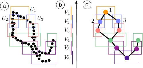
In the original mapper construction introduced by Singh et al. [16], obtaining a cover is guided by a set of scalar functions defined on . For simplicity, we define a mapper graph with a single scalar function . We start with a finite cover of using intervals, that is, a cover of such that , see Figure 1b. We obtain a cover of by considering the clusters induced by points in for each as a cover element. The 1D mapper graph of , denoted as , is the 1D nerve of , .
We use Figure 1 as an example where the point cloud is equipped with a height function . A cover of is formed by six intervals. For each (), induces a number of clusters that are subsets of . Such clusters form elements of a cover of . For instance, as illustrated in Figure 1a, induces a single cluster of points that is enclosed by the orange cover element , and induces two clusters of points enclosed by the blue cover elements and . The mapper graph in Figure 1c has an edge between nodes and since . Note how the mapper graph captures the overall shape of the kite.
Given a point cloud , several parameters are needed to compute the mapper graph , including a function , referred to as the filter function, the number of cover elements and their percentage of overlaps , the metric on , and the clustering method. For example, in Figure 1, is the height function, and , is the Euclidean distance, and the clustering method is DBSCAN [5].
In practice, the choice of the filter function is nontrivial. Typically, a different choice of gives rise to a different type of summary. Common choices for include the -norm, variants of geodesic distances, and eccentricity [2, 16]. A common choice for the clustering method is DBSCAN [5], which is a density-based clustering algorithm. DBSCAN has two parameters: is the neighborhood size of a given point, and is the minimum number of points needed to consider a collection of points as a cluster.
The filter function may be generalized to a multivariate function, that is, (for ). In most practical scenarios, , and the resulting mapper graph is referred to as a 2D mapper graph. The corresponding cover elements of become rectangles. Pheno-Mapper supports the computation of both 1D and 2D mapper graphs.
4 Design and Implementation
Pheno-Mapper is a domain-specific adaptation of Mapper Interactive [22], which is an interactive, extendable, and scalable toolbox for exploring generic, high-dimensional point clouds. We extend the original toolbox of Mapper Interactive by adding new capabilities that are desirable for studying phenomics datasets.
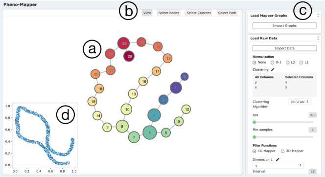
The user interface of Pheno-Mapper is shown in Figure 2. The interface consists of three panels. The graph visualization panel (a) visualizes a resulting mapper graph. The selection panel (b) enables three ways to select groups of nodes (subpopulations), including the selection of individual nodes, connected components (clusters), and nodes connected along a path. The control panel (c) provides various parameter controls for computing a mapper graph. Here, (a) displays a mapper graph computed from the point cloud of the silhouette of a kite (d) from Figure 1.
Compared with Mapper Interactive, Pheno-Mapper has the following new features to support in-depth exploration of phenomics data, with a specific focus on the analysis and visualization of subpopulations.
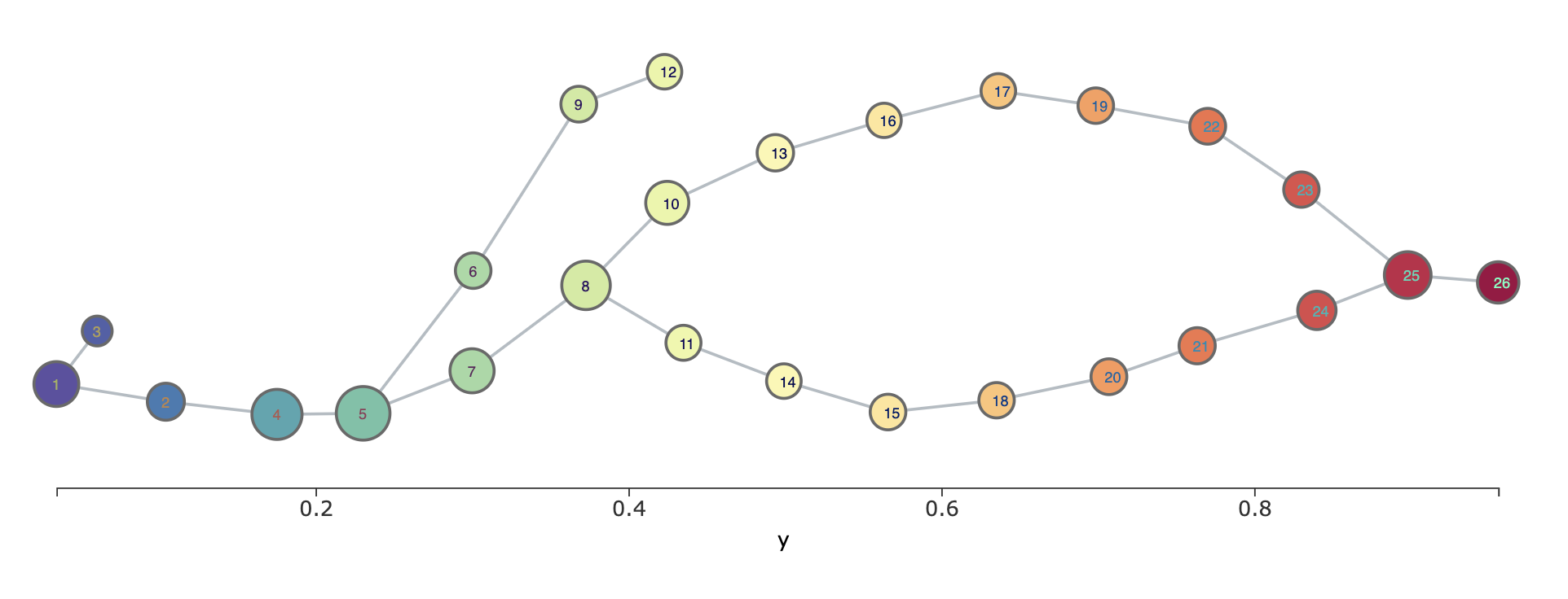
Alternative mapper graph layouts.. The default layout of a mapper graph is a force-directed layout [10]. Force-directed layouts are a class of graph drawing algorithms that assign forces among the edges and nodes of a graph and minimize the energy associated with these forces to achieve an aesthetically pleasing graph visualization. To study plant phenomics data with Pheno-Mapper, we provide an alternative layout option, which aligns the nodes of the graph along with a filter function that increases in the x-axis direction. For a 2D mapper graph, users are able to select one of the two filter functions for aligning the nodes. An example of this layout is shown in Figure 3. Under this layout, nodes can be adjusted vertically to produce a more readable mapper graph w.r.t. the changes of a chosen filter function. In the setting of multidimensional plant phenomics datasets (see section 5 and section 6), variables/dimensions such as time or days after planting (DAP) are important factors that characterize the growth of a plant; thus such an alternative mapper graph layout is particularly useful to emphasize the organizational principle of the population w.r.t. such variables.
We provide a number of new modules for in-depth analysis of mapper graphs, using feature selection, scatter plots, and nonlinear dimensionality reduction (t-SNE).
Feature selection.. Since phenomics datasets usually contain information related to categorical variables such as genotypes, we provide a feature selection module, which can be used to determine important features for classification tasks related to various genotypes. Feature selection is performed using a linear support vector classification model (e.g., SVM), and the selected features can then be included to construct mapper graphs and to help separate nodes into different subpopulations based on the targeting genotypes for downstream analysis and visualization.
Scatter plots.. We provide a scatter plot module to highlight correlations between a pair of dimensions, where points can be colored with any numerical or categorical dimension. Using scatter plots, for instance, users are able to identify the relation between two environmental variables and determine whether to include these variables within a mapper graph construction process. Furthermore, scatter plots can also be used to further investigate and confirm certain hypothesis generated by the mapper graph or another analysis module.
Dimensionality reduction.. The t-SNE module is used as a supplement to the existing PCA module. Using either linear (e.g., PCA) or nonlinear (e.g., t-SNE) dimensionality reduction with selected subpopulations from a mapper graph, users will have a better understanding of the nature of the data.
Export and import selected subpopulations.. With Pheno-Mapper, users can export either the entire point cloud associated with a mapper graph (the entire population) or selected subgraphs of a mapper graph (subpopulations) for analysis. The exported population or subpopulations are saved into a JSON file, which contains the information of nodes, node relations (edges), and node cluster memberships. Such information can be used for further analysis, such as comparisons between different subpopulations.
Implementation details.. Pheno-Mapper – as an extension of Mapper Interactive [22] – is implemented using the standard HTML, CSS, Javascript stack with D3.js, and JQuery libraries. It is equipped with a Python backend using a Flask-based server. The mapper graph computation is an accelerated version of KeplerMapper [18] implementation. The ML modules (linear regression, feature selection, etc.) interface with Python libraries scikit-learn and statsmodels; such a design makes Pheno-Mapper easily extendible to include other ML modules available from scikit-learn with only a few lines of code.
5 Use Case: KS/NE Dataset
With Pheno-Mapper, users can summarize and interactively interpret phenomics datasets under the mapper framework. In this and the next section, we showcase the analysis and visualization capabilities of Pheno-Mapper using two real-world plant (e.g., maize) phenomics datasets first studied by Kamruzzaman et al. [9]. A portion of the findings in these use cases can be obtained from existing frameworks (e.g., Hyppo-X [9]), but the main advantage of Pheno-Mapper is that (a) it provides interactive explorations of phenomics data, and (b) it integrates visual analytics with machine learning in an easily extensible way. Pheno-Mapper not only provides insights into variabilities across different subpopulations of the maize datasets across multiple scales, but also supports in-depth analysis of such subpopulations with machine learning techniques such as feature selection and regression.
The first maize dataset, referred to as the KS/NE dataset [9], contains the growth information of two maize genotypes (type A and type B) that were cultivated in Kansas (KS) and Nebraska (NE) in the United States. It consists of 400 rows (data points) describing the phenotypic and environmental measurements for a number of maize plants. It describes daily measurements of maize plants across the first 100 days of the growing season for each of the four (location, genotype) combinations: (KS, A), (KS, B), (NE, A), and (NE, B). The columns consist of the genotype of each plant (A or B), a time measurement recording the days after planting (DAP), the growth rate of each plant, and 10 environmental variables such as humidity, temperature, rainfall, solar radiation, soil moisture, and soil temperature.
5.1 Reproducing Known Results
To first reproduce the experimental result of Kamruzzaman et al. [9], we use the growth rate to form our point cloud and DAP as the filter function to construct a 1D mapper graph.
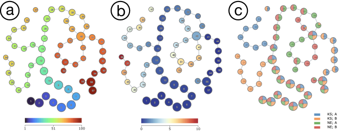
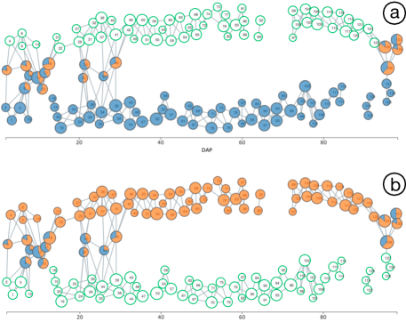
The resulting mapper graphs are shown in Figure 4. In Figure 4a, the node color represents the average DAP of points contained within the node. In Figure 4b, the node color represents the average growth rate of points contained within the node. In Figure 4c, the pie chart on each node represents the variations among (location, phenotype) combinations for plants contained in the node. The node size represents the number of points contained in each node.
To highlight the time axis, we use an alternative mapper graph layout of Figure 4 by aligning a chosen dimension (DAP) along the -axis, as shown in Figure 5.
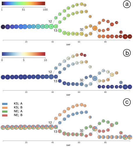
We observe from Figure 5b that for the first few days (nodes 1 to 11), all plants have similar growth rates. Starting from node 12 (40 days), type B plants grown in KS, i.e., the orange (KS; B) category in Figure 5c, bifurcate from the main branch, and their growth rates start to accelerate faster than other plants (Figure 5b). Starting from node 13 (43 days), type A plants grown in KS, i.e., the blue (KS, A) category, also bifurcate from the main branch with a faster growth rate than those grown in NE. The plants grown in NE from both genotypes and have a similar growth rate until node 32 (62 days) before bifurcating further into subpopulations. These results demonstrate that Pheno-Mapper helps the users quickly identify interesting subpopulations of plants that have different growth behaviors, and how such behaviors vary according to their phenotypes.
5.2 Conducting New in-Depth Analysis
The main advantage of Pheno-Mapper over existing tools such as Hyppo-X is that Pheno-Mapper integrates the visual selection of subpopulations with various data analysis and ML modules for in-depth analysis. In addition, Pheno-Mapper can be easily extended to include additional analysis modules with a few lines of code. By using Pheno-Mapper for the KS/NE dataset, we will perform in-depth analysis of the entire population as well as selected subpopulations using feature selection and regression. In particular, we will use the KS/NS dataset to highlight Pheno-Mapper’s analysis and visualization capabilities.
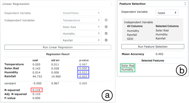
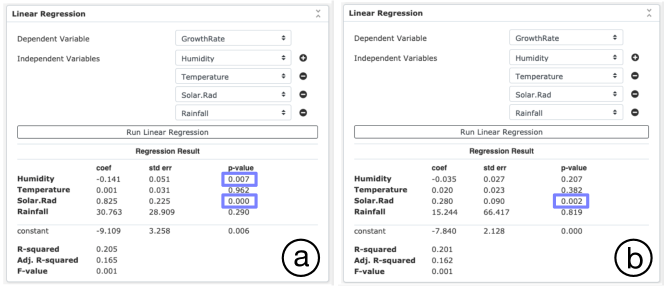
Linear regression of the entire population.. From the mapper graphs in Figure 5, we can see that plants from the same genotype might have different phenotypes (e.g., growth rate) when they were grown in different locations. Since each data point contains dimensions describing the environmental information, we employ the linear regression module in Pheno-Mapper to further explore how the environmental factors affect the growth rate.
The linear regression result is shown in Figure 6a. The R-squared value (, red box) is low, meaning that the proportion of variability explained by this model is low, and getting precise predictions from the model is difficult. However, under the significant level (-value) of , the variables solar radiation, humidity, and rainfall are significantly correlated with growth rate (blue boxes), which means the relation between these environmental variables and the growth rate is still statistically significant. This result indicates that the phenotypic behaviors of the plants are likely affected by these environmental factors.
Feature selection.. To further explore how the environmental variables can help better separate different (location, genotype) combinations in the resulting mapper graph, we consider two ways to incorporate the environmental information to the mapper framework. The first way is to add one environmental variable as a filter function and construct 2D mapper graphs. The second way is to encode the environmental variables as additional dimensions within a multidimensional point cloud for analysis.
To determine which environmental variables to considered as filter functions, we have added a new feature selection module within Pheno-Mapper to select the best variables based on the linear support vector classification model (e.g., SVM). The feature selection result is shown in Figure 6b. The selected environmental variables are humidity and solar radiation (green boxes).
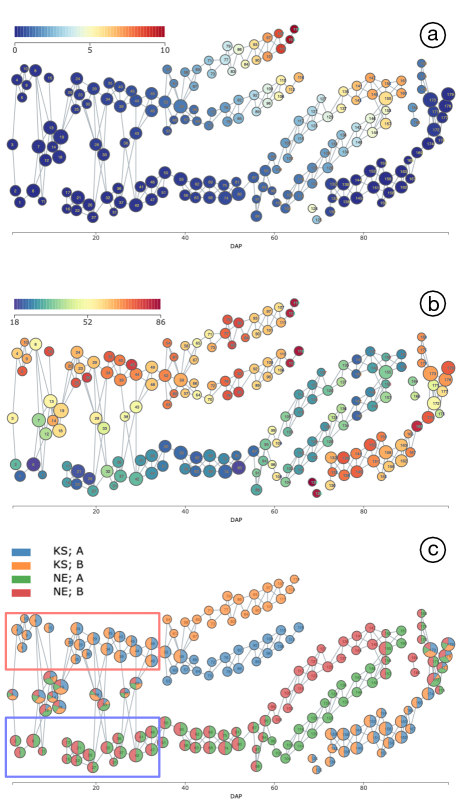
2D mapper graphs with humidity and DAP.. We first add humidity as a second filter function in addition to DAP and construct a 2D mapper graph. The result is shown in Figure 7. The 2D mapper graph retains a similar structure to the 1D mapper graph, but the plants are split earlier (w.r.t. to the DAP – the x-axis) based on their planting locations. As shown in Figure 7c, at the beginning of planting, a subpopulation of plants from KS (in the red box) bifurcates from other plants, and also a subpopulation of plants from NE (in the blue box) bifurcates as well. The result implies that the humidity variable provides additional information that helps split plants from different locations. In Figure 7b, the nodes are colored with the average humidity values, which confirms that, in general, the average humidity values in KS are higher than those values in NE.
Analyzing subpopulations with the same genotype.. To better understand how humidity affects the growth rate of plants, we are interested in analyzing and comparing subpopulations of nodes from the same genotype but different locations. Figure 8 demonstrates the 2D mapper graph constructed with plants from genotype B only at locations KS and NE using export/import function of Pheno-Mapper. In Figure 8c, we see that using DAP and humidity as filter functions clearly separate the two categories: (KS, B) and (NE, B).
We now perform linear regression on selected subpopulations, which are highlighted as green nodes in Figure 9a-b, respectively. Green nodes in Figure 9a form a subpopulation with plants from KS only, whereas those in Figure 9b are from NE only.
In the regression model (Figure 10a) for the KS subpopulation (Figure 9a), solar radiation is significantly correlated with growth rate under the significant-level of , whereas humidity is at the margin of statistical significance with a p-value (blue boxes in Figure 10a). On the other hand, for the NE subpopulation (Figure 9b), only solar radiation is shown to be significantly correlated with the growth rate with a p-value (blue box in Figure 10b). We obtained different regression models from these two selected subpopulations, meaning that the environmental variables have different influences on plants from the same genotype but grown in different locations.
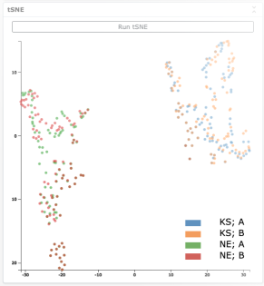
Encoding environmental variables as additional dimensions.. Finally, we include the environmental variables, solar radiation and humidity, together with growth rate, to form a 3D point cloud for the mapper framework. We construct a 1D mapper graph using DAP as the filter function. The resulting mapper graph is shown in Figure 11. The plants are now separated perfectly by location starting from the beginning of planting. However, compared to the mapper graph of Figure 5, this mapper graph does not adequately distinguish the two genotypes (A vs B).

The above observation indeed aligns with our analysis of this 3D point cloud data using the built-in dimensionality reduction module. As shown in Figure 12, we see that a t-SNE embedding of this point cloud clearly shows the separation by location.
Scatter plot analysis.. To investigate such an observation further, we utilize the scatter plot modules provided by Pheno-Mapper. As shown in Figure 13a, the scatter plot of humidity (x-axis) vs. growth rate (y-axis) shows a clear separation between KS subpopulations and NE subpopulations by location (see the grey dotted separating boundary). The same is true for the scatter plot of solar radiation vs. growth rate (not shown here). The scatter plot, again, confirms that the environmental variable humidity (or solar radiation) alone differentiate the plants by their planting locations.
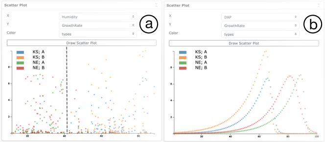
We push our exploratory analysis further by studying DAP vs growth rate using the scatter plot module. We observe a unimodal distribution for each of the four (location, phenotype) categories, as shown in Figure 13b, which is quite interesting.
6 Use Case: Irrigation Dataset
For the second maize dataset, referred to as the Irrigation dataset, data are collected from two field locations in NE with identical conditions except for the irrigation environmental variable: one location was irrigated but the other was not; this dataset has been explored previously by Kamruzzaman et al. [9]. The measured maize plants have more biodiversity since they come from 80 different genotypes. Similar to the KS/NE dataset, the columns consist of the genotype of each plant (among 80 genotypes), DAP, its growth information such as the height difference and the growth rate difference, and the weather information of each day, such as the temperature, humidity, etc. The dataset contains 6400 rows (data points).
6.1 Reproducing Known Results
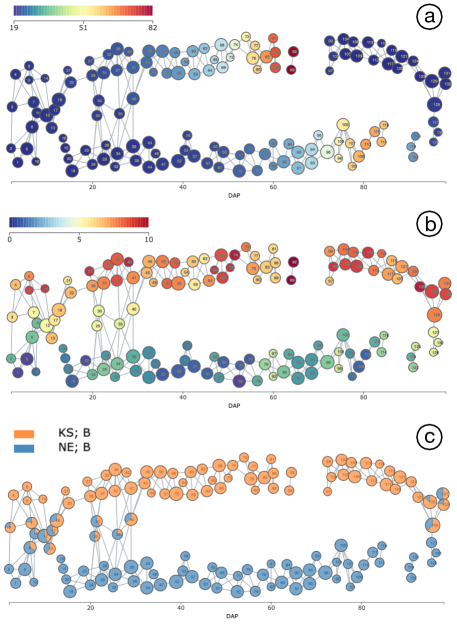
To reproduce the experimental results of Kamruzzaman et al. [9], we use the growth rate difference to form our point cloud and DAP as the filter function to construct a 1D mapper graph.
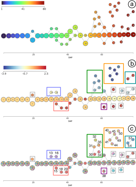
We again work with an alternative mapper graph layout that aligns DAP along the x-axis, as shown in Figure 14. We are interested in identifying genotypes that have varying growth rate differences between the two field locations; such genotypes are considered as anomalies in the population. As shown in Figure 14c, we observe that at nodes 13 (30 days) and 16 (34 days), the genotype PHW52 x LH123HT bifurcates from other genotypes (blue box). At nodes 15 (34 days), 18, and 20 (40 days), the genotype PHB47 x PHR55 bifurcates from other genotypes (red box). Among nodes 30, 31, 32, 34, and 35 ( 55 - 59 days, green box), four genotypes bifurcate from other genotypes, including LH198 x PHW30, PHW52 x Q381, PHB47 x PHG83, and LH198 x LH51. At node 38 ( 62 days, purple box), the genotypes PHB47 x LH185 and PHP02 x PHB47 bifurcate from other genotypes. Among nodes 40, 41, 44, 45, 49, and 50 ( 65 - 70 days, orange box), three genotypes bifurcate from other genotypes, including PHB47 x PHG83, LH198 x LH51, and PHB47 x LH38. Finally, at nodes 54 (75 days) and 57(79 days), the genotype ICI 441 x PHZ51 bifurcates from other genotypes (teal box). The same anomaly detection applies to the nodes enclosed by gray boxes as well. As shown in Figure 14b, these genotypes/subpopulations enclosed by colored boxes have distinct growth rate differences, and thus are considered as anomalies based on our topological analysis.
This result demonstrates that using Pheno-Mapper, we are able to reproduce the insights regarding when specific genotypes with different growth rates start to deviate from the main population of plants. Such subpopulations of anomalies can be further used to study the characteristics of these specific genotypes.
6.2 Conducting New In-depth Analysis
With Pheno-Mapper, we can now perform new, in-depth analysis of selected subpopulations. Using the Irrigation dataset, we demonstrate the analysis and visualization capabilities of Pheno-Mapper in studying subpopulations. Specifically, we perform linear regression on the entire population of 80 genotypes as well as selected abnormalities as shown in Figure 14c.
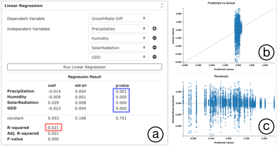
Linear regression on the entire population.. We first perform a linear regression on the entire population of the Irrigation dataset. For this dataset, we treat growing degree days (GDD) as a temperature measurement when plants show a phenotypic response. As shown in Figure 15a, all the environmental variables are significantly related to the growth rate difference based on the p-values (blue box). However, the R-squared value (, red box) is low, which informs us of the relative low predictive capability of the model based on these variables (see [13] for an interpretation of the R-squared). We extend the tool by adding the predicted values versus actual values plot and the residual plot under the regression result panel; see Figure 15b-c, which further confirm the low predictive capability of the model.
Linear regression on selected subpopulations.. We are also interested in studying how environmental variables affect the plants of different genotypes. We study a few abnormal subpopulations with growth rate differences that are noticeably distinct from the rest of the population, such as those enclosed by colored boxed in Figure 14b-c.
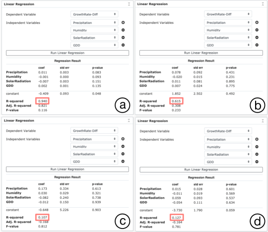
These selected subpopulations are shown in Figure 16. We now apply linear regression to these subpopulations. Recall from the previous section, the subpopulation (blue box in Figure 16a) containing nodes 13 and 16 is related to genotype PHW52 x LH123HT. The subpopulation containing nodes 15, 18, and 20 (red box in Figure 16b) is related to genotype PHB47 x PHR55. Linear regression applied to these subpopulations shows relatively high R-squared values, as shown in Figure 17a and Figure 17b (red boxes), respectively.
However, for the subpopulation (green box in Figure 16c) containing nodes 31, 32, 34, and 35 with four genotypes, and the subpopulation containing nodes 40, 41, 44, 45, 49, and 50 (orange box in Figure 16d) with three genotypes, the R-squared values are both relatively low, as shown in Figure 17c-d (red boxes), respectively.
The different regression results for these four subpopulations indicate that the environment variables tend to have different effects on plants from different genotypes with abnormal behaviors.
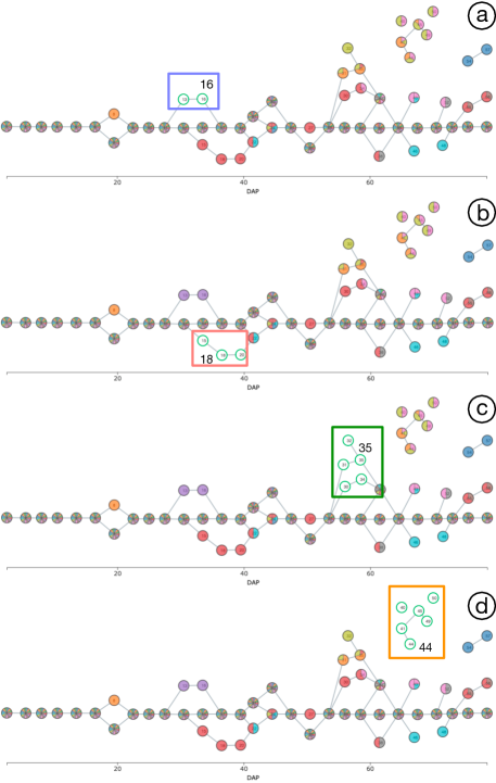
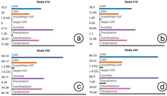
Bar charts of selected nodes.. For each selected node in a mapper graph, Pheno-Mapper provides a bar chart that treats each dimension (column) as a separate category, and represents the average values of each dimension with rectangular bars. We utilize these bar charts to further explore how selected nodes/genotypes differ from one another in terms of the environmental conditions. As shown in Figure 18, we select nodes from each subpopulation of abnormalities (Figure 16b-d) and observe the differences among the average environmental variables of plants contained in these nodes, such as the average temperature, humidity, precipitation, and solar radiation.
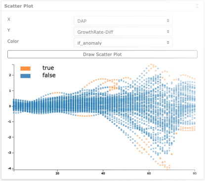
Scatter plot analysis of abnormal subpopulations.. Finally, we apply scatter plot analysis of the abnormalities identified using the mapper graph based analysis (as seen in Figure 14c). As shown in Figure 19, as time (DAP) increases, different genotypes have increased diversity in terms of their growth rate differences. At the same time, the anomalies identified by our topological approach are now shown to be on the boundaries of the scatter plot. The scatter plot indicates that the mapper graph helps to identify “extremities” as anomalies in this setting.
7 Conclusion
We presented Pheno-Mapper, an interactive visualization tool for complex multidimensional phenomics data. Notably, the tool provides the user a way to interactively explore the data and perform in-depth analysis by visually exploring and comparing subpopulations. For example, Pheno-Mapper contains a number of built-in data analysis and ML modules useful for feature selection, linear regression, and detection of anomalous subpopulations. These capabilities enable users to answer important questions such as “Which subsets of my population phenotypically differ from one another?”, “Which subsets of environment variables best correlate with those phenotypic changes?”, “Which genotypes display more plasticity than the others?”, and so on. The ability to answer such questions is central to hypothesis formulation, which is, in particular, very challenging for multidimensional phenomics data. Pheno-Mapper provides interactive and ML capabilities towards this direction.
Furthermore, our case studies have not substantively examined the effects of different environments on given genotypes at the same developmental stage (i.e., interactions). To do this, we would need to collect data for the same genotypes from multiple (ideally many) locations and/or years; this would make for an excellent follow-up study.
Acknowledgement
This work was in parts funded by U.S. National Science Foundation (NSF) awards DBI-1661375 and DBI-1661348.
References
- [1] N. AlKhalifah, D. A. Campbell, C. M. Falcon, J. M. Gardiner, N. D. Miller, M. C. Romay, R. Walls, R. Walton, C.-T. Yeh, M. Bohn, et al. Maize genomes to fields: 2014 and 2015 field season genotype, phenotype, environment, and inbred ear image datasets. BMC research notes, 11(1):1–5, 2018.
- [2] S. Biasotti, D. Giorgi, M. Spagnuolo, and B. Falcidieno. Reeb graphs for shape analysis and applications. Theoretical Computer Science, 392:5–22, 2008.
- [3] W. S. Bush and J. H. Moore. Genome-wide association studies. PLOS Computational Biology, 8(12):e1002822, 2012.
- [4] J. E. Cairns, K. Sonder, P. H. Zaidi, N. Verhulst, G. Mahuku, R. Babu, S. K. Nair, B. Das, B. Govaerts, M. T. Vinayan, et al. Maize production in a changing climate: impacts, adaptation, and mitigation strategies. Advances in agronomy, 114:1–58, 2012.
- [5] M. Ester, H.-P. Kriegel, J. Sander, and X. Xu. A density-based algorithm for discovering clusters in large spatial databases with noise. In Proceedings of the 2nd International Conference on Knowledge Discovery and Data Mining, pages 226–231. AAAI Press, 1996.
- [6] D. Houle, D. R. Govindaraju, and S. Omholt. Phenomics: the next challenge. Nature reviews genetics, 11(12):855–866, 2010.
- [7] A. Kalyanaraman, M. Kamruzzaman, and B. Krishnamoorthy. Interesting paths in the mapper complex. Journal of Computational Geometry, 10(1):500–531, 2019.
- [8] M. Kamruzzaman, A. Kalyanaraman, and B. Krishnamoorthy. Detecting divergent subpopulations in phenomics data using interesting flares. In Proceedings of the 2018 ACM International Conference on Bioinformatics, Computational Biology, and Health Informatics, pages 155–164, 2018.
- [9] M. Kamruzzaman, A. Kalyanaraman, B. Krishnamoorthy, S. Hey, and P. Schnable. Hyppo-X: A scalable exploratory framework for analyzing complex phenomics data. IEEE/ACM Transactions on Computational Biology and Bioinformatics, 2019.
- [10] S. G. Kobourov. Force-directed drawing algorithms. In Handbook of Graph Drawing and Visualization, pages 383–408. Chapman and Hall/CRC, 2013.
- [11] A. Kusmec, N. de Leon, and P. S. Schnable. Harnessing phenotypic plasticity to improve maize yields. Frontiers in plant science, 9:1377, 2018.
- [12] C. J. Lawrence-Dill, P. S. Schnable, and N. M. Springer. Idea factory: the maize genomes to fields initiative. Crop Science, 59(4):1406–1410, 2019.
- [13] M. S. Lewis-Beck and A. Skalaban. The R-squared: Some straight talk. Political Analysis, 2:153–171, 1990.
- [14] P. Y. Lum, G. Singh, A. Lehman, T. Ishkanov, M. Vejdemo-Johansson, M. Alagappan, J. Carlsson, and G. Carlsson. Extracting insights from the shape of complex data using topology. Scientific reports, 3:1236, 2013.
- [15] K. F. Madhobi, M. Kamruzzaman, A. Kalyanaraman, E. Lofgren, R. Moehring, and B. Krishnamoorthy. A visual analytics framework for analysis of patient trajectories. In Proceedings of the 10th ACM International Conference on Bioinformatics, Computational Biology and Health Informatics, pages 15–24, 2019.
- [16] G. Singh, F. Mémoli, and G. Carlsson. Topological methods for the analysis of high dimensional data sets and 3D object recognition. In Eurographics Symposium on Point-Based Graphics, pages 91–100, 2007.
- [17] F. Tardieu, L. Cabrera-Bosquet, T. Pridmore, and M. Bennett. Plant phenomics, from sensors to knowledge. Current Biology, 27(15):R770–R783, 2017.
- [18] H. J. van Veen, N. Saul, D. Eargle, and S. W. Mangham. Kepler Mapper: A flexible python implementation of the Mapper algorithm. Journal of Open Source Software, 4(42):1315, 2019.
- [19] N. R. Wray, J. Yang, B. J. Hayes, A. L. Price, M. E. Goddard, and P. M. Visscher. Pitfalls of predicting complex traits from snps. Nature Reviews Genetics, 14(7):507–515, 2013.
- [20] Y. Xu. Envirotyping for deciphering environmental impacts on crop plants. Theoretical and Applied Genetics, 129(4):653–673, 2016.
- [21] C. Zhao, Y. Zhang, J. Du, X. Guo, W. Wen, S. Gu, J. Wang, and J. Fan. Crop phenomics: current status and perspectives. Frontiers in Plant Science, 10:714, 2019.
- [22] Y. Zhou, Nithin Chalapathi, Archit Rathore, Y. Zhao, and B. Wang. Mapper Interactive: A scalable, extendable, and interactive toolbox for the visual exploration of high-dimensional data. In IEEE 14th Pacific Visualization Symposium, pages 101–110, 2021.