An Approach to Symbolic Regression Using Feyn
Abstract
In this article we introduce the supervised machine learning tool called Feyn. The simulation engine that powers this tool is called the QLattice. The QLattice is a supervised machine learning tool inspired by Richard Feynman’s path integral formulation, that explores many potential models that solves a given problem. It formulates these models as graphs that can be interpreted as mathematical equations, allowing the user to completely decide on the trade-off between interpretability, complexity and model performance.
We touch briefly upon the inner workings of the QLattice, and show how to apply the python package, Feyn, to scientific problems. We show how it differs from traditional machine learning approaches, what it has in common with them, as well as some of its commonalities with symbolic regression. We describe the benefits of this approach as opposed to black box models.
To illustrate this, we go through an investigative workflow using a basic data set and show how the QLattice can help you reason about the relationships between your features and do data discovery.
Keywords Abzu Feyn QLattice QGraph Symbolic Regression Artificial Intelligence Machine Learning
1 Introduction
The QLattice is a supervised machine learning tool for symbolic regression. It composes functions together to build graphs of mathematical models, adding interactions between the features in your data set and your target variable. The functions vary from elementary ones such as addition, multiplication, squaring, to more complex ones such as natural logarithm, exponential and tanh. The QLattice is a technology developed by Abzu that is inspired by Richard Feynman’s path integral formulation. Symbolic regression, which is gaining a lot of momentum these days[1, 2, 3, 4, 5, 6, 7]. Other symbolic regression methods inspired by physics are also getting traction[8, 9, 10]. Overall, symbolic regression approaches are showing signs of keeping a high performance, while still maintaining generalisability[11], which separates it from other popular graph-like models such as decision trees or random forests[12].
These mathematical models are represented by graphs that are fitted using Feyn, a Python module that allows you to interface with the QLattice. Each graph is generated from a probability distribution, that is tuned over time. Initially, this probability distribution is uniform.
So how do you tune this probability distribution?
This follows an iterative process. You’ll fit thousands of graphs representing different function compositions, suggested to you by the QLattice. You’ll then select the best ones, and update the QLattice with them. This helps the QLattice converge and shape the probability distribution towards better solutions.
The space of all possible models is very large, and without guidance the QLattice will take a very long time to converge. This requires you to be specific on what you want to investigate in your data set. Typically, this means restricting the types of graphs that the QLattice will produce. The QLattice is useful when you want insights and investigate relationships between your features, rather than focus exclusively on predictive power. This process is what we’ll go through in this paper.
2 A quick primer on the QLattice and Feyn
2.1 The QLattice in a nutshell
The QLattice is an environment to simulate discrete paths from multiple inputs to an output. It does this in a finite multi-dimensional lattice-space. This is where the inspiration from Feynman’s path integral comes in. The QLattice simulates inputs as originating anywhere, taking a (short) path through the lattice space, before emerging to an output. If you imagine doing this thousands of times, until a solid path has been shaped, you’ll experience a convergence to the most likely or, in this case, most useful path to explain the problem you’re trying to model. Along the path that we take, we’ll randomly sample from a selection of "interactions" – functions that transform the inputs to a new output. These can vary from elementary ones such as addition, multiplication, squaring, to more complex ones such as natural logarithm, exponential and tanh.
We determine the interactions based on probabilities, guided by repeated reinforcement of the best solutions provided by the QLattice, as you fit the thousands of paths (models), that are discovered. During repeated reinforcement, another phenomenon that happens, is that islands in the QLattice space starts to form, each with their own independent evolution. This narrows the search space, and gives way to many separate evolutionary spaces. Another benefit to this process, is that the user helps decide which models are useful, and through that which paths will be reinforced. The user also decides how to constrain the decision space, giving the user full control over the shapes the models will be taking.
Altogether, this approach has some benefits, such as:
-
•
there are far fewer nodes and connections (and we also call the nodes ‘interactions‘)
-
•
there are functions you wouldn’t normally see in a neural network (such as ‘gaussian‘, ‘inverse‘ and ‘multiply‘)
-
•
the graphs are more inspectable, simpler and less prone to overfitting
-
•
the graphs allow you to interpret them as a mathematical formula, allowing you to reason about the consequences of your hypothesis.
2.2 Introducing the QGraph
So let’s talk more about how it does this. If you recall the paths with interactions above, these are represented by unidirectional, acyclic graphs. But before we can start getting to these graphs, we need to consider the concept of the QGraph. The QGraph is a generator, that represents a subset of the possibilities of the QLattice. This subset is defined by you by deciding on things like: Is it a classification or regression problem, which features do I want to learn about, what interactions do I want, how deep will I allow my graphs to be, and other such constraints.
So instead of producing a graph, the QLattice produces a QGraph. In an ideal world, the QGraph would contain the infinite list of graphs that matches your constraints. In the practical world, it is limited to a list of a few thousand graphs at a time, and will instead continuously replenish this list, and discard the worst graphs based on your evaluation criteria. The criteria available are common ones, such as cross-entropy, RMSE, Bayesian Information Criterion, Akaike Information Criterion[13], etc.
2.3 Feyn
Feyn[14] is the python module for interfacing with the QLattice, through QGraphs.
In Feyn, like other machine learning tools, a model is fitted using a variation of backpropagation[15] on the dataset. The similarities end quickly, however, as the QLattice helps you try many different alternative models, and is typically used with the purpose of understanding and explaining your problem, or answering the questions you wish to know more about.
On top of this, we’ve added some quality-of-life features for explainability and inspection, as well as automatic encoding of input features. This means that normalisation is not necessary, and you should also not one-hot encode categorical variables, as it gets automatically handled and represented as a single feature that’s easier to understand.
Throughout the next few sections you’ll see plenty of examples of what these models look like, but let’s go a little into how it’s used.
2.4 Privacy and transfer of information
It’s worth noting there, that the information sent to the QLattice only consists of:
-
•
The token and QLattice identifiers when you connect.
-
•
The names of your columns (text strings)
-
•
The graphs you want to reinforce, containing column names, function names (interactions), along with the unweighted edges in the graph that connect inputs to functions, functions to functions and functions to outputs.
None of your data is at any point exchanged and does not leave your machine.
2.5 Features and functions
We should also talk a bit more about:
-
•
the semantic types
-
•
the interactions in a graph
2.5.1 Semantic types
In order to create your QGraph, you first need to tell the QLattice what type of data the inputs and output are. This is a way of telling it what types of data it should expect and from that how to behave. We call these semantic types or stypes. There are two stypes:
-
•
Numerical: This is for features that are continuous in nature such as: height, number of rooms, latitude and longitude etc.
-
•
Categorical: This is for features that are discrete in nature such as: neighbourhoods, room type etc.
If no type is assigned to the feature, the numerical semantic type is assumed. This means you will only need to assign an stype to each categorical feature. This is how the graph knows to do the automatic encoding of the categories.
2.5.2 Interaction
Interactions are the basic computation units of each model. They take in data, transform it and then emit it out to be used in the next interaction. Here are the current possible interactions:
| Type | Function |
|---|---|
| Addition | |
| Multiply | |
| Squared | |
| Linear | |
| Tanh | |
| Single-legged Gaussian | |
| Double-legged Gaussian | |
| Exponential | |
| Logarithmic | |
| Inverse |
3 Connecting the scientific method and the QLattice
At Abzu, we put the scientific method at the core of our workflow, and use this approach to understand data, generate hypotheses and validate the findings against the actual observations.
The scientific method can be summed up in short with a diagram (Figure 1)
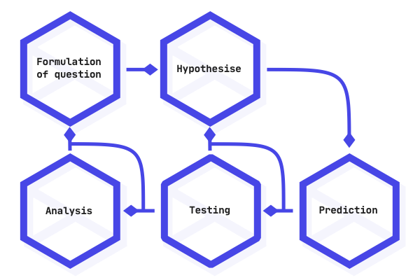
In summary, using Feyn and the QLattice would look something like this:
| Scientific Method | In practice |
|---|---|
| Formulation of question | Determine what your research question is. |
| Hypothesise | Use the QLattice to generate possible hypotheses in the form of graphs that answer your question. |
| Prediction | Determine how your graph predicts existing data and plot what the graph tells you about the things you haven’t seen before. |
| Testing | Take your hypothesis to the lab, real life, or validate it on a holdout set, depending on your needs and capabilities. |
| Analysis | Accept or reject a hypothesis based on the results you get from your experiments. |
4 Asking the right question to the QLattice
Following from the workflow overview, we’ll go through the first two steps - namely making observations and posing interesting questions.
4.1 Make observations
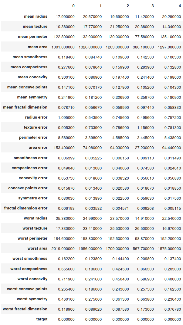
Let’s take the following simple dataset. This is the well-known UCI ML Breast Cancer Wisconsin (Diagnostic) dataset[16]. We load it through the commonly used sklearn[17] machine learning package.
Features are computed from a digitized image of a fine needle aspiration (FNA) of a breast mass. They describe characteristics of the cell nuclei present in the image.
The defined target variable is the diagnosis, as ‘Malignant’ or ‘Benign’.
4.1.1 Preparation
This dataset comes prepared already so you don’t have to do quite as much. The QLattice workflow typically starts after data preparation, however, it is worth mentioning that with the QLattice, you don’t need to do any normalization of input features, and we have an input that explicitly handles categorical variables without the need for one-hot encoding.
4.1.2 The features
In Figure 2 we have printed the head of the dataframe so we can see what we’re working with.
4.2 Asking Questions
We’ll now go through some examples of interesting questions you could pose to this dataset. This comes down to your domain expertise and figuring out what you want to learn about, such as:
-
•
What is your measurable - also known as the target variable. This forms the basis of our questions as the variable you want to explain.
-
•
What are you trying to learn?
-
1.
Example: What is evidence for a malignant or benign tumor?
-
2.
Example: We have a specific feature we suspect is evidence for malignant tumors based on previous studies. We could ask whether this feature relates to the diagnosis, and if so, how?
-
1.
If you don’t have specific knowledge, but are trying to learn things about the problem domain, maybe you’ll ask more general questions:
-
•
Is there a single feature that captures a large part of the signal?
-
1.
If it does, how does it capture it - i.e. linearly or non-linearly?
-
2.
Are there some features that tend to explain the same signal?
-
3.
Are there some features that tend to explain different parts of the signal?
-
1.
-
•
If there’s one feature that captures part of the signal, does it then combine with another to capture even more?
-
1.
How do the features relate to explain the measurable?
-
2.
Does it make sense from a domain perspective?
-
3.
Would that give way for new questions to ask?
-
1.
-
•
Or whichever other question you might have.
Other datasets might have multiple interesting targets to measure against, so remember to choose the measurable(s) that will be the strongest indicator of the questions you’re asking.
This is an iterative process, so you can always go back and change this as you learn more.
4.2.1 On to hypotheses
As your next step, you will be using the QLattice to pose questions and formulate hypotheses as answers to some of these questions.
5 Formulating hypotheses
From the previous page, we started asking questions about our data. Our overarching question is: ‘What is evidence for a malignant or benign tumor?’. Throughout the guides we will pose more specific questions and hypotheses which will help us in answering this main question.
We now want to use the QLattice to help us find good hypotheses to these questions.
5.1 From questions to hypotheses
First we need to translate the question into a QGraph. Take for instance the question ‘Is area indicative of a tumor being benign or malignant?’, the corresponding QGraph would look like the following:
Throughout our investigation we will fix a train/validation/holdout split. We will generate hypotheses based on the train set, analyse and select them on the validation set. Lastly, when we settle on a hypothesis we are satisfied with we will test it on the holdout set.
We have told the QGraph to take mean area as an input feature and to map it to the output, target. The max_depth = 1 ensures that the input feature enters a single interaction cell as we will soon show.
The QGraph is a list of potential hypotheses to the question. At the moment, the QGraph has no knowledge of the data. So any hypothesis in the QGraph will be random.
In order to change that, we need to fit the QGraph to the data.
We can find the best hypotheses in the QGraph by calling qgraph.best(). This is usually a list of 3 to 4 top hypotheses based on the closest fit to the data i.e. a loss function.
The QLattice is an environment that searches all possible hypotheses to questions posed to it. In order to refine its search we need to tell the QLattice the best hypotheses we have seen so far. We do this by calling ql.update(qgraph.best()).
Note that you can choose the number of threads to allow for parallel QGraph fitting. That will accelerate the process.
After this fitting loop we want to take a look at what the QLattice came up with.
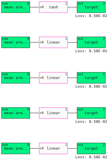
The output graphs in Figure 3 illustrate what we said about mean area entering a single interaction cell to predict the target variable.
Let’s increase complexity by posing another question to the QGraph: ‘What feature could mean area combine with to predict the target variable?’.
We want to explore the possible features mean area could combine to predict the target. So we include a list of potential ones. We choose the means because we are trying to find a simple set of explanations to the problem. The features mean radius and mean perimeter were excluded since they correlate heavily with mean area.
We use the filters module to ensure that only hypotheses that correspond the question being asked are generated. The QGraph will then only show hypotheses that satisfy the conditions imposed by the filters. In the case above, feyn.filters.Contains(’mean area’) ensures that mean area is included in every hypothesis in the QGraph (Figure 4).
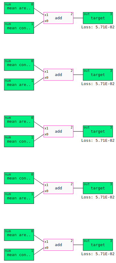
In the example above mean concave points was the most prevalent, suggesting that it is one of the features that best combine with mean area. Note how the loss has decreased in comparison to the previous figure. This leads us to refine our previous question: “how does mean area and mean concave points combine to predict the target variable?”.
The next step consists in selecting a hypothesis and diving deeper into it. The QGraph is sorted by loss, so qgraph[0] is the hypothesis that best fit the data passed to the QGraph. Most likely this will be the hypothesis we further explore.
6 Analysing and selecting hypotheses
In this section we lay the arsenal of tools to analyse and aid in the selection of the most interesting hypotheses. Previously, we posed the question of how mean area combines with mean concave points to predict the target variable. We then generated a list of hypotheses, the QGraph, that could answer said question. Lastly, we selected qgraph[0] as the hypothesis to further investigate. This process is recapped below:
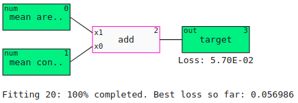
Our hypothesis (Figure 5) states that the target variable is a linear function of mean area and mean concave points. We can convert this graph to a mathematical equation using SymPy (Figure 6):
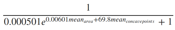
As this is a classification problem the linear relationship is passed to a logisitic function to obtain values between 0 and 1. This represents the probability of a tumor being benign.
6.1 Analysing a hypothesis
Let’s check the performance of the hypothesis above by plotting the ROC-curve (Figure 7) on the train and validation sets. This can also tell us about overfitting, especially if their AUC scores differ significantly.
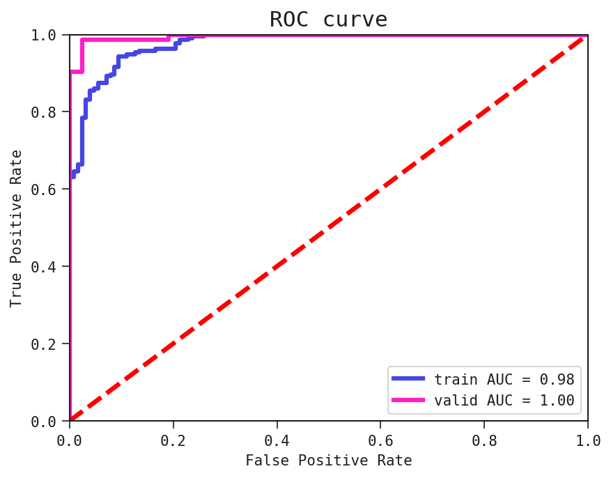
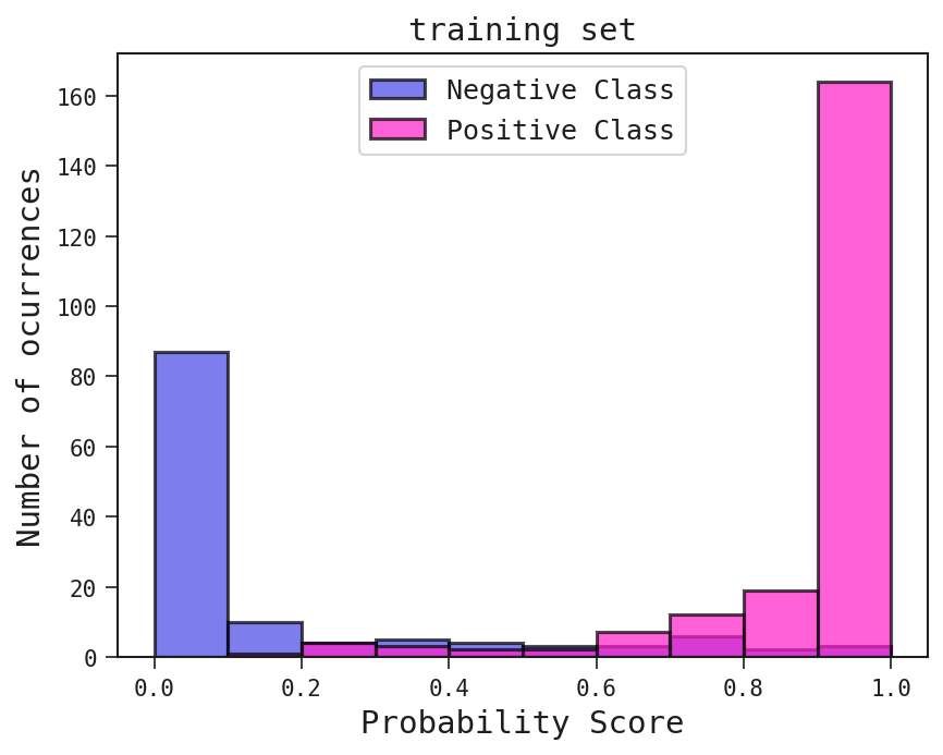
The ROC curve in Figure 7 tells us that the hypothesis’ predictions are not just result of random guessing. A ROC curve can be complemented by plotting the probability scores, i.e. the values predicted by our current hypothesis.
The higher the AUC score, the easier it will be to separate the negative (target = 0) and positive (target = 1) classes in the probability score plot on Figure 8.
We can also visualise the hypothesis with a two-dimensional partial plot:
The red dots in Figure 9 represent the positive class, benign tumors, while the blue ones represent the negative class, malignant tumors. The background colours represent what our hypothesis predicts: the yellow regions as 1, and the grey regions as 0. Since the hypothesis is a linear function it formed a straight boundary between the red and blue dots and the ROC curve above shows that this is a good separation.
The next question is how we can point to the feature values the model has difficulties classifying. This is when we use the plot_segmented_loss method.
In the left diagram of Figure 10, the blue bars is the histogram of mean area. On top of the histogram is a pink curve where each point is the average loss across that bin. For mean area, values greater than 1250 the average loss is very close to zero. Meanwhile, the loss is much higher between the values 500 and 750. This means the hypothesis yields predictions closer to the observed data when mean area than for mean area . We can say something similar about mean concave points.
6.2 Concluding remarks
Let’s go back to our overarching question: ‘What is evidence for a malignant or benign tumor?’. Throughout the sessions, we refined it to a question on how does mean area and mean concave points predict the target variable. At last we reached the hypothesis that the probability of having a benign tumor is the linear function of mean area and mean concave points shown above.
In addition to testing this hypothesis with more data, like the holdout or newly gathered data, we can refine the question, come up with new hypotheses, etc. In order words, our investigation of this dataset doesn’t need to stop now.
7 Conclusion
The hypothesis in the previous section combined mean area and mean concave points to differentiate between malignant and benign tumors. However there could be other features, other relationships to explore. So the question really comes to:
Are we satisfied with the hypothesis we’ve chosen?
A guideline to answer this question might be in assessing whether your hypothesis points towards something we didn’t know before.
If we are not satisfied, then we can go back and refine the questions we’ve made based on our analysis so far. For example we could ask how much can mean concave points explain the target variable on its own or whether it can combine with other features that do not correlate so heavily with it (check Pearson’s correlation between mean area and mean concave points).
On the other hand, if we are satisfied we should check whether other sets of observations agree or conflict with the hypothesis. For instance we could test our hypothesis on women from different parts of the world. We could collect data on mean area and mean concave points that we were not part in our initial observations.
Sometimes it is not possible to perform another experiment. The next best thing is to test the hypothesis on the holdout set. The disadvantage of this is that the data comes from the same place as the initial training data and so it inherits the same observational bias.
Notice the [*] symbols in the code cell above. They indicate the points of iteration in the question-hypothesis process. In other words, they represent where we pose questions, extract hypotheses and analyse them to further refine said questions and get more robust hypotheses.
Suppose we are satisfied with the hypothesis that the target variable is a linear function of mean area and mean concave points. Let’s see how it performs on the holdout set:

From the AUC score and the ROC curve in Figure 11, we see that this simple hypothesis generalises to the holdout set.
If the hypothesis had not generalised to the holdout set, then we are in trouble. Our holdout set is contaminated, i.e. the knowledge on this performance would bias further investigations. Basically the holdout set became another validation set. Ideally, we should get more unseen data.
Even though this is a simple data set, hypotheses formed by the QLattice often show this tendency to perform consistently on the holdout set as compared to the train and validation sets. This allows you to have better confidence in the results you get, and know what to expect. Not giving in to excess complexity, having models you can reason about and the mathematical nature of symbolic regression is in part to thank for this.
8 Conflicts of interest
All of the authors are employees of either Abzu or Abzu Barcelona.
References
- [1] Vipul K. Dabhi and Sanjay K. Vij. Empirical modeling using symbolic regression via postfix genetic programming. 2011.
- [2] Ekaterina J. Vladislavleva, Guido F. Smits, and Dick den Hertog. Order of nonlinearity as a complexity measure for models generated by symbolic regression via pareto genetic programming. IEEE Transactions on Evolutionary Computation, 13, 2009.
- [3] Michael Schmidt and Hod Lipson. Distilling free-form natural laws from experimental data. Science, 324(5923):81–85, 2009.
- [4] Miles Cranmer, Alvaro Sanchez-Gonzalez, Peter Battaglia, Rui Xu, Kyle Cranmer, David Spergel, and Shirley Ho. Discovering symbolic models from deep learning with inductive biases. 2020.
- [5] Francisco Villaescusa-Navarro, Daniel Anglés-Alcázar, Shy Genel, David Spergel, Rachel Somerville, Romeel Davé, Annalisa Pillepich, Lars Hernquist, Dylan Nelson, Paul Torrey, Desika Narayanan, Yin Li, Oliver Philcox, Valentina Torre, Ana Delgado, Sanh ho, Sultan Hassan, Blakesley Burkhart, Digvijay Wadekar, and Gabriella Contardo. The camels project: Cosmology and astrophysics with machine learning simulations. 10 2020.
- [6] Samuel Kim, Peter Y. Lu, Srijon Mukherjee, Michael Gilbert, Li Jing, Vladimir Čeperić, and Marin Soljačić. Integration of neural network-based symbolic regression in deep learning for scientific discovery. 2020.
- [7] Miles D. Cranmer, Rui Xu, Peter Battaglia, and Shirley Ho. Learning symbolic physics with graph networks. 2019.
- [8] Silviu-Marian Udrescu and Max Tegmark. Ai feynman: A physics-inspired method for symbolic regression. Science Advances, 6(16), 2020.
- [9] Tailin Wu and Max Tegmark. Toward an artificial intelligence physicist for unsupervised learning. Phys. Rev. E, 100:033311, 09 2019.
- [10] Ziming Liu and Max Tegmark. Ai poincaré: Machine learning conservation laws from trajectories. 2020.
- [11] Patryk Orzechowski, William La Cava, and Jason H. Moore. Where are we now? Proceedings of the Genetic and Evolutionary Computation Conference, 07 2018.
- [12] Leo Breiman. Random forests. Machine Learning, 45, 2001.
- [13] Hirotugu Akaike. A new look at the statistical model identification. IEEE Transactions on Automatic Control, 19, 1974.
- [14] Abzu. Feyn software, 12 2020.
- [15] D. E. Rumelhart, G. E. Hinton, and R. J. Williams. Learning representations by back-propagating errors. Nature, 323:533–536, 1986.
- [16] W.H. Wolberg W.N. Street and O.L. Mangasarian. Nuclear feature extraction for breast tumor diagnosis. IS&T/SPIE 1993 International Symposium on Electronic Imaging: Science and Technology, 1905:861–870, 1993.
- [17] F. Pedregosa, G. Varoquaux, A. Gramfort, V. Michel, B. Thirion, O. Grisel, M. Blondel, P. Prettenhofer, R. Weiss, V. Dubourg, J. Vanderplas, A. Passos, D. Cournapeau, M. Brucher, M. Perrot, and E. Duchesnay. Scikit-learn: Machine learning in Python. Journal of Machine Learning Research, 12:2825–2830, 2011.