DataPrep.EDA: Task-Centric Exploratory Data Analysis
for Statistical Modeling in Python
Abstract.
Exploratory Data Analysis (EDA) is a crucial step in any data science project. However, existing Python libraries fall short in supporting data scientists to complete common EDA tasks for statistical modeling. Their API design is either too low level, which is optimized for plotting rather than EDA, or too high level, which is hard to specify more fine-grained EDA tasks. In response, we propose DataPrep.EDA, a novel task-centric EDA system in Python. DataPrep.EDA allows data scientists to declaratively specify a wide range of EDA tasks in different granularity with a single function call. We identify a number of challenges to implement DataPrep.EDA, and propose effective solutions to improve the scalability, usability, customizability of the system. In particular, we discuss some lessons learned from using Dask to build the data processing pipelines for EDA tasks and describe our approaches to accelerate the pipelines. We conduct extensive experiments to compare DataPrep.EDA with Pandas-profiling, the state-of-the-art EDA system in Python. The experiments show that DataPrep.EDA significantly outperforms Pandas-profiling in terms of both speed and user experience. DataPrep.EDA is open-sourced as an EDA component of DataPrep: https://github.com/sfu-db/dataprep.
1. Introduction
Python has grown to be one of the most popular programming languages in the world (tio, 2020) and is widely adopted in the data science community. For example, the Python data science ecosystem, called PyData, is used by universities and online learning platforms to teach data science essentials (ucb, 2020; ibm, 2020; edx, 2020; ude, 2020). The ecosystem contains a wide range of tools such as Pandas for data manipulation and analysis, Matplotlib for data visualization, and Scikit-learn for machine learning, all aimed towards simplifying different stages of the data science pipeline.
In this paper we focus on one part of the pipeline, exploratory data analysis (EDA) for statistical modeling, the process of understanding data through data manipulation and visualization. It is an essential step in every data science project(Yan et al., 2021). For statistical modeling, EDA often involves routine tasks such as understanding a single variable (univariate analysis), understanding the relationship between two random variables (bivariate analysis), and understanding the impact of missing values (missing value analysis).
Currently, there are two EDA solutions in Python. Each of them provide APIs in different granularity and have different drawbacks.
| Pandas+Plotting | Pandas-profiling | DataPrep.EDA | |
|---|---|---|---|
| Easy to Use | ✓ | ✓ | |
| Interactive Speed | ✓ | ✓ | |
| Easy to Customize | ✓ | ✓ |
Pandas+Plotting. The first one is Pandas+Plotting, where Plotting represents a Python plotting library, such as Matplotlib (Hunter, 2007), Seaborn (Waskom and the seaborn development team, 2020), and Bokeh (Bokeh Development Team, 2018). Fundamentally, plotting libraries are not designed for EDA but for plotting. Their APIs are at a very low level, hence they are not easy to use: To complete an EDA task, a data scientist needs to think about what plots to create, then using Pandas to manipulate the data so that it can be fed into a plotting library to create these plots. Often there is a gap between an EDA task and the available plots – a data scientist must write lengthy and repetitive code to bridge the gap.
Pandas-profiling. The second one is Pandas-profiling (Brugman, 2019). It provides a very high level API and allows a data scientist to generate a comprehensive profile report. The report has five main sections: Overview, Variables, Interactions, Correlation, and Missing Values. Its general utility makes it the most popular EDA library in Python. As of September, 2020, Pandas-profiling had over 2.5M downloads on PyPI and over 5.9K GitHub stars.
While Pandas-profiling is effective for one-time profiling, it suffers from two limitations for EDA due to its high-level API design: (i) Firstly, it does not achieve interactive speed since generating a profile report often takes a long time. This is suffering as EDA is an iterative process. Furthermore, the report shows information for all columns, potentially misdirecting the user and adding processing time. (ii) Secondly, it is not easy to customize a profile report. In a profile report, the plots are automatically generated thus it is very likely that the user wants to fine tune the parameters of each plot (e.g., the number of bins in a histogram). There could be hundreds of parameters associated with a profile report. It is not easy for users to figure out what they can customize and how to customize to meet their needs.
Table 1 summarizes the drawbacks of Pandas+Plotting and Pandas-profiling. The key challenge is how to overcome the limitations of existing tools and design a new EDA system that can achieve three design goals: easy to use, with interactive speed, and easy to customize. To address this challenge, we build DataPrep.EDA, a novel task-centric EDA system in Python. We identify a list of common EDA tasks for statistical modeling, mapping each task to a single function call through careful API design. As a result of this task-oriented approach, DataPrep.EDA affords many more fine-grained tasks such as univariate analysis and correlation analysis. Figure 1-1 illustrates how our example user might use DataPrep.EDA to do a univariate analysis task after removing their outliers. The analyst calls the plot(df, ”price”) in DataPrep.EDA, where df is a dataframe and ”price” is the column name. DataPrep.EDA detects price as a numerical variable and automatically generates suitable statistics (e.g., max, mean, quantile) and plots (e.g., histogram, box plot), which help the user gain a deeper understanding of the price column quickly and effectively.
With the task-centric approach, DataPrep.EDA is able to achieve all three design goals: (i) Easy to Use. Since each EDA task is directly mapped to a single function call, users only need to think about what tasks to work on rather than what to plot and how to plot. To further improve usability, we design an auto-insight component to automatically highlight possible interesting patterns in visualizations. (ii) Interactive Speed. Different from Pandas-profiling, DataPrep.EDA supports fine-grained tasks thus it can avoid unnecessary computation on irrelevant information. To further improve the speed, we carefully design our data processing pipeline based on Dask, a scalable computing framework in Python. (iii) Easy to Customize. With the task-centric API design, the parameters are grouped by different EDA tasks and each API only contains a small number of task-related parameters, making it much easier to customize. Besides, we implement a how-to guide component in DataPrep.EDA to further improve the customizability.
We conduct extensive experiments to compare DataPrep.EDA with Pandas-profiling. The performance results on 15 real-world datasets from Kaggle (kag, 2020) show that i) DataPrep.EDA responded to a fine-grained EDA task in seconds while Pandas-profiling spent several orders of magnitude more time in creating a profile report on the same dataset; ii) if the task is to create a profile report, DataPrep.EDA was faster than Pandas-profiling. Through a user study we show that i) real world participants of varying skill levels completed times more tasks on average with DataPrep.EDA than with Pandas-profiling; ii) DataPrep.EDA helped participants answering times more correct answers.
The following summarizes our contributions:
-
•
We explore the limitations of existing EDA solutions in Python and propose a task-centric framework to overcome them.
-
•
We design a task-centric EDA API for statistical modeling, allowing to declaratively specify an EDA task in one function call.
-
•
We identify three challenges to implement DataPrep.EDA, and propose effective solutions to enhance the scalability, usability, and customizability of the system.
-
•
We conduct extensive experiments to compare DataPrep.EDA with Pandas-profiling, the state-of-the-art EDA system in Python. The results show that DataPrep.EDA significantly outperforms Pandas-profiling in speed, effectiveness, and user preference.
2. Related Work
EDA Tools in Python and R. Python and R are the two most popular programming languages in data science. Similar to Python, there are many EDA libraries in R including DataExplorer (dat, 2020g) and visdat (Tierney, 2017) (see (Staniak and Biecek, 2019) for a recent survey). However, they are either similar to Pandas+Plotting or Pandas-profiling, thus having the same limitations as them. In the database community, recently, there is a growing interest in building EDA systems for Python programmers in order to benefit a large number of real-world data scientists (Deutch et al., 2020; lux, 2020). To the best our knowledge, DataPrep.EDA is the first task-centric EDA system in Python, and the only EDA system dedicated specifically to the notion of task-centric EDA.
GUI-based EDA. A GUI-based environment is commonly used for doing EDA, particularly among non-programmers. In such an environment, an EDA task is triggered by a click, drag, drop, etc (rather than a Python function call). Many commercial systems including Tableau (tab, 2020), Excel (exc, 2020), Spotfire (spo, 2020), Qlik (qli, 2020), Splunk (spl, 2020), Alteryx (alt, 2020), SAS (sas, 2020), JMP (jmp, 2020) and SPSS (sps, 2020) support doing EDA using a GUI. Although these systems are suitable in many cases, they all have the fundamental limitations of being removed from the programming environment and lacking flexibility.
In recent years, there has been abundant research in visualization recommendation systems (Wongsuphasawat et al., 2015, 2017; Mackinlay et al., 2007; Cui et al., 2019; Siddiqui et al., 2016; Dibia and Demiralp, 2019; Hu et al., 2019; Luo et al., 2018; Moritz et al., 2019). Visualization recommendation is the process of automatically determining an interesting visualization and presenting it to the user. Another related area is automated insight generation (auto-insights). An auto-insight system mines a dataset for statistical properties of interest (Ding et al., 2019; Lin et al., 2018; Tang et al., 2017; pow, 2020; Demiralp et al., 2017; Vartak et al., 2015). Unlike these systems, DataPrep.EDA is a programming-based EDA tool that has several advantages over GUI-based EDA systems including seamless integration in the Python data science ecosystem, and flexibility since the data scientist is not restricted to one GUI’s functionalities.
Data Profiling. Data profiling is the process of deriving summary information (e.g., data types, the number of unique values in columns) from a dataset (see (Abedjan et al., 2015) for a data profiling survey). Metanome (Papenbrock et al., 2015) is a data profiling platform where the user can run profiling algorithms on their data to generate different summary information. Data profiling can be used in the tasks of data quality assessment (e.g., Profiler (Kandel et al., 2012)) and data cleaning (e.g., Potter’s Wheel (Raman and Hellerstein, 2001)). Although DataPrep.EDA performs data profiling, unlike the above systems it is integrated effectively in a Python programming environment.
3. Task-Centric EDA
In this section, we first introduce common EDA tasks for statistical modeling, and then describe our task-centric EDA API design.
3.1. Common EDA Tasks for Statistical Modeling
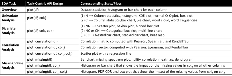
Inspired by the profile report generated by Pandas-profiling and existing work (Peng, 2012; Seltman, 2012; Bilogur, 2018), we identify five common EDA tasks. We will use a running example to illustrate why they are needed in the process of statistical modeling.
Suppose a data scientist wants to build a regression model to predict house prices. The training data consists of four features (size, year_built, city, and house_type) and the target (price).
-
•
Overview. At the beginning, the data scientist has no idea about what’s inside the dataset, so she wants to get a quick overview of the entire dataset. This involves computing some basic statistics and creating some simple visualizations. For example, she may want to check the number of features, the data type of each feature (numerical or categorical), and create a histogram for each numerical feature and a bar chart for each categorical feature.
-
•
Correlation Analysis. To select important features or identify redundant features, correlation analysis is commonly used. It computes a correlation matrix, where each cell in the matrix represents the correlation between two columns. A correlation matrix can show which features are highly correlated with the target and which two features are highly correlated with each other. For example, if the feature, size, is highly correlated with the target, price, then knowing size will reveal a lot of information about price, thus it is an important feature. If two features, city and house_type, are highly correlated, then one of the features is redundant and can be removed
-
•
Missing Value Analysis. It is more common than not for a dataset to have missing values. The data scientist needs to create customized visualizations to understand missing values. For example, she may create a bar chart, which depicts the amount of missing values in each column, or a missing spectrum plot, which visualizes which rows has more missing values.
-
•
Univariate Analysis. Univariate analysis aims to gain a deeper understanding of a single column. It creates various statistics and visualizations of that column. For example, to deeply understand the feature year_built, the data scientist may want to compute the min, max, distinct count, median, variance of year_built, and create a box plot to examine outliers, a normal Q-Q plot to compare its distribution with the normal distribution.
-
•
Bivariate Analysis. Bivariate analysis is to understand the relationship between two columns (e.g., a feature and the target). There are many visualizations to facilitate the understanding. For example, to understand the relationship between year_built and price, she may want to create a scatter plot to check whether they have a linear relationship, and a hexbin plot to check the distribution of price in different year ranges.
There are certainly other EDA tasks used for statistical modeling, however we have opted to focus on the main tasks systems such as Pandas-profiling commonly present in their reports. This allows us to make a fair comparison between our system design approaches. In the future we intend to address more tasks, such as time-series analysis and multi-variate analysis (more than two variables).
3.2. DataPrep.EDA’s Task-Centric API Design
The goal of our API design is to enable the user to trigger an EDA task through a single function call. We consider simplicity and consistency as the principle of API design. The simple and consistent API makes our system more accessible in practice (Buitinck et al., 2013). However, it is challenging to design simple and consistent APIs for a variety of EDA tasks. Our key observation is that the EDA tasks for statistical modeling tend to follow a similar pattern (Wickham and Grolemund, 2016): start with an overview analysis and then dive into detailed analysis. Hence, we design the API in the following form:
where plot_tasktype is the function name, tasktype is a concise description of the task, the first argument is a DataFrame, the second argument is a list of column names, and the third argument is a dictionary of configuration parameters. If column names are not specified, the task will be performed on all the columns in the DataFrame (overview analysis); otherwise, it will be performed on the specified column(s) (detailed analysis). This design makes the API extensible, i.e., it is easy to add an API for a new task.
Following this pattern, we design three functions in DataPrep.EDA to support the five EDA tasks:
plot. We use the plot function with different arguments to represent the overview task, the univariate analysis task, and the bivariate analysis task, respectively. To understand how to perform EDA effectively with this function, the following gives the syntax of the function call with the intent of the data scientist:
-
•
plot(df): “I want an overview of the dataset”
-
•
plot(df, col1): “I want to understand col1”
-
•
plot(df, col1, col2): “I want to understand the relationship between col1 and col2”
plot_correlation. The plot_correlation function triggers the correlation analysis task. The user can get more detailed correlation analysis results by calling plot_correlation(df, col1) or plot_correlation(df, col1, col2).
-
•
plot_correlation(df): “I want an overview of the correlation analysis result of the dataset”
-
•
plot_correlation(df, col1): “I want to understand the correlation between col1 and the other columns”
-
•
plot_correlation(df, col1, col2): “I want to understand the correlation between col1 and col2”
plot_missing. The plot_missing function triggers the missing value analysis task. Similar to plot_correlation, the user can call plot_missing(df, col1) or plot_missing(df, col1, col2) to get more detailed analysis results.
-
•
plot_missing(df): “I want an overview of the missing value analysis result of the dataset”
-
•
plot_missing(df, col1): “I want to understand the impact of removing the missing values from col1 on other columns”
-
•
plot_missing(df, col1, col2): “I want to understand the impact of removing the missing values from col1 on col2”
The key observation that makes task-centric EDA possible is that there are nearly universal kinds of stats or plots that analysts employ in a given EDA task. For example, if the user wants to perform univariate analysis on a numerical column, she will create a histogram to check the distribution, a box plot to check the outliers, a normal Q-Q plot to compare with the normal distribution, etc. Based on this observation, we pre-define a set of mapping rules as shown in Figure 2, where each rule defines what stats/plots to create for each EDA task. Once a function, e.g., plot(df,"price"), is called, DataPrep.EDA first detects the data type of price, which is numerical. Based on the second row in Figure 2, since col1 = N, DataPrep.EDA will automatically generate the column statistics, histogram, KDE plot, normal Q-Q plot, and box plot of price.
The mapping rules are selected from existing literature and open-source tools in the statistics and machine learning community. For univariate, bivariate, and correlation analysis, we refer to the data-to-viz project (dat, 2020j), ‘Exploratory Graphs’ section in (Peng, 2012) and Section 4 in (Seltman, 2012). For overview analysis and missing value analysis, the mapping rules are derived from the Pandas-profiling library and the Missingno library (Bilogur, 2018), respectively. DataPrep.EDA also leverages the open-source community to keep adding and improving its rules. For example, one user has created an issue in our GitHub repository to suggest adding violin plots to the plot(df,x) function. As DataPrep.EDA is being used by more users, we expect to see more suggestions like this in the future.
4. System Architecture
This section describes DataPrep.EDA’s front-end user experience and introduces the back-end system architecture.
4.1. Front-end User Experience
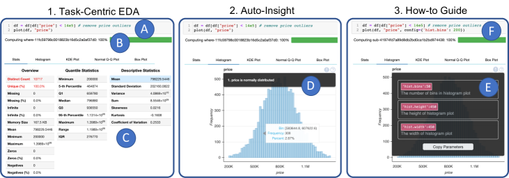
To demonstrate DataPrep.EDA, we will continue our house price prediction example, using DataPrep.EDA to assist in removing outliers from the price variable, assessing the resulting distribution, and determining how to further customize the analysis. Figure 1 depicts the steps to perform this task using Pandas and DataPrep.EDA in a Jupyter notebook. Part shows the required code: in line 1, the records with an outlying price value are removed (the threshold is $1,400,000), and in line 2 the DataPrep.EDA function plot is called to analyze the filtered distribution of the variable price. Part shows the progress bar. Part shows the default output tab which consists of tables containing various statistics of the column’s distribution. Note that each data visualization is output in a separate panel, and tabs are used to navigate between panels.
-
•
Auto-Insight. If an insight is discovered by DataPrep.EDA, a ( ) icon will be shown on the top right corner of the associated plot. Part shows an insight associated with the histogram plot: price is normally distributed.
-
•
How-to Guide. A how-to guide will pop up after clicking a ( ) icon. As shown in Part , it contains the information about customizing the associated plot. In this example, the data scientist may want to create a histogram with more bins, so she can copy the code ("hist.bins":50) in the how-to guide, paste it as a parameter to the plot function, and increase the number of bins from 50 to 200 as shown in Part .
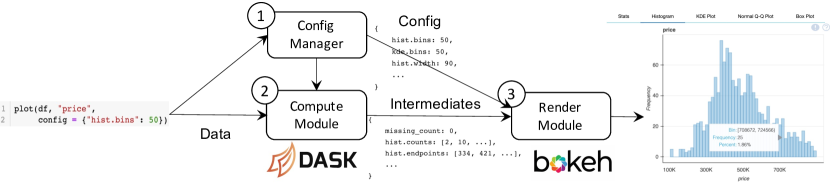
4.2. Back-end System Architecture
The DataPrep.EDA back-end is presented in Figure 3, consisting of three components: The Config Manager configures the system’s parameters, the Compute module performs the computations on the data, and the Render module creates the visualizations and layouts. The Config Manager is used to organize the user-defined parameters and set default parameters in order to avoid setting and passing many parameters through the Compute and Render modules. The separation of the Compute module and the Render module has two benefits: First, the computations can be distributed to multiple visualizations. For example, in plot(df, col1=N) in Figure 2, the column statistics, normal Q-Q plot, and box plot all require quantiles of the distribution. Therefore, the quantiles are computed once and distributed appropriately to each visualization. Second, the intermediate computations (see Section 4.2.2) can be exposed to the user. This allows the user to create the visualizations with her desired plotting library.
4.2.1. Config Manager
The Config Manager ( in Figure 3) sets values for all configurable parameters in DataPrep.EDA, and stores them in a data structure, called the config, which is passed through the rest of the system. Many components of DataPrep.EDA are configurable including which visualizations to produce, the insight thresholds (see Section 4.2.2), and visualization customizations such as the size of the figures. In Figure 3, the plot function is called with the user specification bins=50; the Config Manager sets each bin parameter to have a value of 50, and default values are set for parameters not specified by the user. The config is then passed to the Compute and Render modules and referenced when needed.
4.2.2. Compute module
The Compute module takes the data and config as input, and computes the intermediates. The intermediates are the results of all the computations on the data that are required to generate the visualizations for the EDA task. Figure 3 shows example intermediates. The first element is the count of missing values which is shown in the Stats tab, and the next two elements are the counts and bin endpoints of the histogram. Such statistics are ready to be fed into a visualization.
Insights are calculated in the Compute module. A data fact is classified as an insight if its value is above a threshold (each insight has its own, user-definable threshold). For example, in Figure 1 (Part ), the distinct value count is high, so the entry in the table is highlighted red to alert the user about this insight. DataPrep.EDA supports a variety of insights including data quality insights (e.g., missing, infinite values), distribution shape insights (e.g., uniformity, skewness) and whether two distributions are similar.
4.2.3. Render module
The last system component is the Render module, which converts the intermediates into data visualizations. There is a plethora of Python plotting libraries (e.g., Matplotlib, Seaborn, and Bokeh), however, they provide limited or no support for customizing a plot’s layout. A layout is the surrounding environment in which visualizations are organized and embedded. Our layouts need to consolidate many elements including charts, tables, insights, and how-to guides. To meet our needs, we use the library Bokeh to create the plots, and embed them in our own HTML/JS layout.
5. Implementation
In this section, we introduce the detailed implementation of DataPrep.EDA’s Compute module. We first introduce the background of Dask and discuss why we choose Dask as the back-end engine. We then present our ideas for using Dask to optimize DataPrep.EDA.
5.1. Why Dask
Dask Background. Dask is an open source library providing scalable analytics in Python. It offers similar APIs and data structures with other popular Python libraries, such as NumPy, Pandas, and Scikit-Learn. Internally, it partitions data into chunks, and runs computations over chunks in parallel.
The computations in Dask are lazy. Dask will first construct a computational graph that expresses the relationship between tasks. Then, it optimizes the graph to reduce computations such as removing unnecessary operators. Finally, it executes the graph when an eager operation like compute is called.
Choice of Back-end Engine. We use Dask as the back-end engine of DataPrep.EDA for three reasons: (i) it is lightweight and fast in a single-node environment, (ii) it can scale to a distributed cluster, and (iii) it can optimize the computations required for multiple visualizations via lazy evaluation. We considered other engines like Spark variants (Zaharia et al., 2010; koa, 2021) (PySpark and Koalas) and Modin (Petersohn et al., 2020), but found that they were less suitable for DataPrep.EDA than Dask. Since Spark is designed for computations on very big data (TB to PB) in a large cluster, PySpark and Koalas are not lightweight like Dask and have a high scheduling overhead on a single node. For Modin, most of its operations are eager, so for each operation a separate computational graph is created. This approach does not optimize across operations, unlike Dask’s approach. In Section 6.2, we further justify our choice to use Dask experimentally.
5.2. Performance Optimization
Given an EDA task, e.g., plot_missing(df), we discuss how to efficiently compute its intermediates using Dask. We observe that there are many redundant computations between visualizations. For example, as shown in Figure 2, plot_missing(df) creates four visualizations (bar chart, missing spectrum plot, nullity correlation heatmap, and dendrogram). They share many computations, such as computing the number of rows, checking whether a cell is missing or not. To leverage Dask to remove redundant computations, we seek to express all the computations in a single computational graph. To implement this idea, we can make all the computations lazy and call an eager operation at the end. In this way, Dask will optimize the whole graph before actual computations happen.
However, there are several issues with this implementation. In the following, we will discuss them and propose our solutions.
Dask graph fails to build. The first issue is that the rechunk function in Dask cannot be directly incorporated into the big computational graph. This is because that its first argument, a Dask array, requires knowing the chunk size information, i.e., the size of each chunk in each dimension. If rechunk was put into our computational graph, an error would be raised since the chunk size information is unknown for a delayed Dask array.
Since rechunk is needed in multiple plot functions in DataPrep.EDA, we have to address this issue. One solution is to replace the rechunk function call in each plot function with the code written by the low-level Dask task graph API. However, this solution has a high engineering cost, which requires writing hundreds of lines of Dask code. It also has a high maintenance cost compared to using the Dask built-in rechunk function.
We propose to add an additional stage before constructing the computational graph. In this stage, we precompute the chunk size information of the dataset and pass the precomputed chunk size to the Dask graph. In this way, the Dask graph can be constructed successfully by adding one line of code.
Dask is slow on tiny data. Although putting all possible operations in the graph can fully leverage Dask’s optimizations, it also increases the overhead caused by scheduling. When data is large, the scheduling overhead is negligible compared to the computing overhead. However, when data is tiny, the scheduling may be the bottleneck and using Dask is less efficient than using Pandas.
For the nine plot functions in Figure 2, we observe that they all follow the same pattern: the computational graph takes as input a DataFrame (large data) and continuously reduces its size by aggregation, filtering, etc. Based on this observation, we separate the computational graph into two parts: Dask Computation and Pandas Computation. In the Dask Computation, the data is computed in Dask and the result is transformed into a Pandas DataFrame. In the Pandas Computation, it takes the DataFrame as input and does some further processing to generate the intermediate results, which will be used to create visualizations.
Currently, we heuristically determine the boundary between the two parts. For example, the computation for plot_correlation(df) is separated into two stages. In the first stage we use Dask to compute the correlation matrix from the user input and then in the second stage we use Pandas to transform and filter the correlation matrix. This is because for a dataset with rows and columns, it is usually the case that . As a result, it would be beneficial to let Pandas handle the correlation matrix, which has the size . Since we only need to handle nine plot functions, it is still manageable. We will investigate how to automatically separate the two parts in the future.
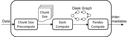
Putting everything together. Figure 4 shows the data processing pipeline in the Compute module of DataPrep.EDA. When data comes, DataPrep.EDA first precomputes the chunk size information using Dask. After that, it constructs the computational graph using Dask again with the precomputed chunk size filled. Then, it computes the graph. After that, it transforms the computed data into Pandas and finishes the Pandas computation. In the end, the intermediates are returned.
6. Experimental Evaluation
In this section, we conduct extensive experiments to evaluate the efficiency and the user experience of DataPrep.EDA.
6.1. Performance Evaluation
We first evaluate the performance of DataPrep.EDA by comparing its report functionality with Pandas-profiling. Afterwards, we conduct a self comparison, which evaluates each plot function with different variations, in order to gain a deep understanding of the performance. We used 15 different datasets varying in number of rows, number of columns and categorical/numerical column ratio, as listed in Table 2. The experiments were performed on an Ubuntu 16.04 Linux server with 64 GB memory and 8 Intel E7-4830 cores.
Comparing with Pandas-profiling. To test the general efficiency of DataPrep.EDA, we compared the end-to-end running time of generating reports over the 15 datasets in both tools. For Pandas-profiling, we first used read_csv from Pandas to read the data, then we created a report in Pandas-profiling with PhiK, Recoded and Cramer’s V correlations disabled (since DataPrep.EDA does not implement these correlation types). For DataPrep.EDA, we used read_csv from Dask to read the dataset. Since it is a one-time task to create a profiling report, loading the data using the most suitable function for each tool is reasonable. Results are shown in Table 2. We observe that using DataPrep.EDA to generate reports is 4x 20x faster compared to Pandas-profiling in general. The acceleration mainly comes from the optimization to make the tasks into a single Dask graph so that they can be fully parallelized. We also observe that DataPrep.EDA usually gains more performance compared to Pandas-profiling on numerical data and data with fewer categorical columns (driving performance on credit, basketball, and diabetes).
| Dataset | Size | #Rows | #Cols (N/C) | PP | DataPrep | Faster |
|---|---|---|---|---|---|---|
| heart (dat, 2020k) | 11KB | 303 | 14 (14/0) | 17.7s | 2.0s | 8.6 |
| diabetes (dat, 2020m) | 23KB | 768 | 9 (9/0) | 28.3s | 1.6s | 17.7 |
| automobile (dat, 2020c) | 26KB | 205 | 26 (10/16) | 38.2s | 3.9s | 9.8 |
| titanic (dat, 2020q) | 64KB | 891 | 12 (7/5) | 17.8s | 2.1s | 8.5 |
| women (dat, 2020r) | 500KB | 8553 | 10 (5/5) | 19.8s | 2.3s | 8.6 |
| credit (dat, 2020h) | 2.7MB | 30K | 25 (25/0) | 127.0s | 6.1s | 20.8 |
| solar (dat, 2020o) | 2.8MB | 33K | 11 (7/4) | 25.1s | 2.7s | 9.3 |
| suicide (dat, 2020p) | 2.8MB | 28K | 12 (6/6) | 20.6s | 2.8s | 7.4 |
| diamonds (dat, 2020i) | 3MB | 54K | 11 (8/3) | 28.2s | 3.1s | 9 |
| chess (dat, 2020f) | 7.3MB | 20K | 16 (6/10) | 23.6s | 4.3s | 5.5 |
| adult (dat, 2020b) | 5.7MB | 49K | 15 (6/9) | 23.2s | 4.0s | 5.8 |
| basketball (dat, 2020d) | 9.2MB | 53K | 31 (21/10) | 126.2s | 9.9s | 12.7 |
| conflicts (dat, 2020a) | 13MB | 34K | 25 (10/15) | 34.9s | 8.6s | 4 |
| rain (dat, 2020n) | 13.5MB | 142K | 24 (17/7) | 100.1s | 11.6s | 8.6 |
| hotel (dat, 2020l) | 16MB | 119K | 32 (20/12) | 83.2s | 13s | 6.4 |
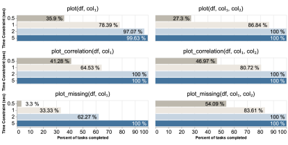
Self-comparison. We analyzed the running time of DataPrep.EDA’s functions to determine whether they can complete within a reasonable response time for interactivity. We ran plot(), plot_correlation(), and plot_missing() for each column in each dataset, and we ran the three functions for all unique pairs of columns in each dataset (limited to categorical columns with no more than 100 unique values for plot(df, col1, col2) so the resulting visualizations contain a reasonable amount of information). Figure 5 shows the percent of total tasks for each function that finish within 0.5, 1, 2 and 5 seconds. Note that dataset loading time is also included in the reported run times. The majority of tasks completed within 1 second for each function except plot_missing(df, col1). plot_missing(df, col1) is computationally intensive because it computes two frequency distributions for each column (before and after dropping the missing values in column col1).
6.2. Experiments on Large Data
We conduct experiments to justify the choice of Dask (see Section 5.1) and evaluate the scalability of DataPrep.EDA. We use the bitcoin dataset (dat, 2020e) which contains 4.7 million rows and 8 columns.
Comparing Engines. We compare the time required for Dask, Modin, Koalas, and PySpark to compute the intermediates of plot(df). The results are shown in Figure 6(a). The reason why Dask is the fastest is explained in Section 5.1: Modin eagerly evaluates the computations and does not make full use of parallelization when computing multiple visualizations, and Koalas/PySpark have a high scheduling overhead in a single-node environment.
Varying Data Size. To evaluate the scalability of DataPrep.EDA, we compare the report functionality of DataPrep.EDA with Pandas-profiling and vary the data size from 10 million to 100 million rows. The data size is increased by repeated duplication. The results are shown in Figure 6(b). Both DataPrep.EDA and Pandas-profiling scale linearly, but DataPrep.EDA is around six times faster. This is because DataPrep.EDA leverages lazy evaluation to express all the computations in a single computational graph so that the computations can be fully parallelized by Dask.
Varying # of Nodes. To evaluate the performance of DataPrep.EDA in a cluster environment, we run the report functionality on a cluster and vary the number of nodes. The cluster consists of a maximum of 8 nodes, each with 64GB of memory and 16 2.0GHz E7-4830 CPUs dedicated to the Dask workers. There are also HDFS services running on the 8 nodes for data storage; the memory for these services is not shared with the Dask workers. The data is fixed at 100 million rows and stored in HDFS. We do not compare with Pandas-profiling since it cannot run on a cluster. The result is shown in Figure 6(c). We can see that DataPrep.EDA is able to run on a cluster and achieves better performance as increasing the number of nodes. This is because adding more compute nodes can reduce the I/O cost of reading data from HDFS. It is worth noting that the 1 worker setting in Figure 6(c) is different from the single node setting in Figure 6(b) where the former needs to read data from HDFS while the latter reads data from a local disk. Therefore, the 1 worker setting took longer to process 100 million rows than the single node setting.
6.3. User Study
Finally, we conducted a user study to validate the usability of our tool and its utility in supporting analytics. We focus on two questions using Pandas-profiling as a comparison baseline: (1) For different groups of participants, how do they benefit from the task-centric features introduced by DataPrep.EDA, and (2) Does DataPrep.EDA reduce participants’ false discovery rate. We hypothesize that the intuitive API in DataPrep.EDA will lead participants to complete more tasks in less time versus Pandas-profiling, and that the additional tools provided by DataPrep.EDA will help participants to reduce their false discovery rate.

(a) Comparing Engines (Single Node) (b) Varying Data Size (Single Node) (c) Varying # of Nodes
Methodology. In our study, all recruited participants used both DataPrep.EDA and Pandas-profiling to complete two different sets of tasks in a 50 minute session with software logging: one tool is used for one set of tasks. Afterwards, they assessed both systems in surveys. Our study employs two datasets paired with task sets: (1) BirdStrike: columns related to bird strike damage on airplanes. The dataset compiles approximately strike reports from USA airports and foreign airports. (2) DelayedFlights: columns related to the causes of flight cancellations or delays. The dataset is curated by the Department of Transportation of United States, and contains records of cancelled flights.
We followed a within-subjects design, with all participants making use of either tool to complete one set of tasks. We counterbalanced our allocation to account for all tool-dataset permutations and order effects. Within each task, participants finished five sequential tasks using one tool. As experience might influence how much an individual benefits from each tool, we recruited both skilled and novice analysts using a pre-screen concerning knowledge of python, data analysis, and the datasets in the study. To make sure that all participants had base knowledge of how to use both Pandas-profiling and DataPrep.EDA, we gave participants with two introductory videos, a cheat sheet, and API documentation.
Participants were asked to complete 5 tasks sequentially using the data analysis tool. The tasks are designed to evaluate different functions provided by DataPrep.EDA, which is similar to the design of existing work (Battle and Heer, 2019). They cover a relatively wide spectrum of the kinds of tasks that are frequently encountered in EDA, including gathering descriptive multivariate statistics of one or multiple columns, identifying missing values, and finding correlations. Though datasets have their own specific task instructions, each of the respective items shares the same goal across both datasets. For example, the first task of both sessions asks participants to investigate data distribution over multiple columns.
In Task 1-3, participants use the provided tool to analyze the distribution of single or multiple columns. Participants conduct a univariate analysis in task 1 and a variate analysis in task 2. The task 3 asked the participant to examine distribution skewness. Task 4 examines missing values and their impact. Participants are expected to examine the distribution of missing values to come to a conclusion. Task 5 asks users to find columns with high correlation.
We use the fraction to show the relative accuracy of participants, since we noticed that a number of participants failed to finish tasks. Compared to traditional accuracy, relative accuracy therefore may better demonstrate positive discovery rate (Card and Mackinlay, 1997).
Examining Participants’ Performance. We examine accuracy and completed tasks to evaluate system performance. The average number of completed tasks per participant using DataPrep.EDA (M:4.02, SD:1.21) was 2.05 times higher than that using Pandas-profiling (M:1.96, SD: 2.59, t(29)=5.26, ). When we compared skill levels, we could detect no difference (t(14)=, ). Together, this suggests that DataPrep.EDA generally improved participants’ efficiency in performing EDA tasks. Factoring in dataset, we find that Pandas-profiling performs better in small datasets(M:3, SD:4.13) compared to a more complex one (M:1.1, SD:1.20, t(14)=, ). As dataset complexity grows, Pandas-profiling fails to scale up. No participants finished all tasks, and 42% finished at most one task using Pandas-profiling. On the other hand, 35% of DataPrep.EDA participants finished all five tasks for the delayed dataset. We did not observe a dataset difference for DataPrep.EDA (t(14)=, ), which suggests that it scaled well and might have pushed participants towards an efficiency ceiling.
In terms of the number of correct answers versus ground truth, participants who used DataPrep.EDA (M:, SD:) were 2.2 times more accurate compared to those using Pandas-profiling (M:, SD:3.56, t(29)=, ), which suggests that DataPrep.EDA better assisted users in analyzing and reduced the risk of false discoveries. We again found that there was no significant difference detected between datasets (t(14)=, ), however, as in completed tasks, we find that Pandas-profiling did a significantly better job for small datasets and failed to guide users for larger ones (t(14)=, ). These results are encouraging: DataPrep.EDA can help participants with different skill-levels complete many tasks with fewer errors.
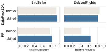
As the number of completed tasks affects the amount of (in)correct answers, we used our relative accuracy metric. The average relative accuracy of DataPrep.EDA (M: .82 , SD: 0.07) among participants was 1.5 times higher than Pandas-profiling (M: .53 , SD: 1.35). Considering expertise and dataset complexity (Figure 7), we find that users from both skill levels achieve similar relative accuracy in both datasets, but skilled participants did significantly better than novice participants only for Pandas-profiling in complex datasets. This suggests that DataPrep.EDA performed better at leveling skill differences and dataset complexity.
Qualitative feedback. In our post-survey we also asked participants to share comments and feedback to add context to the performance differences we observed. In our quantitative results, participants often referenced the responsiveness and efficiency of DataPrep.EDA (“fast and responsive”) and took issue with the speed of Pandas-profiling (“it didn’t work, took forever to process”, ”I would also like to use Pandas-profiling if the efficiency is not the bottleneck”). We also asked how more granular information affected their performance. Participants reflected that they felt more control (“I can find the necessary information very quickly, and that really helps a lot for me to solve the problems and questions very quickly”, “felt like I had more control, simpler results”) and accessible (“I find all the answers I need, and DataPrep.EDA is more easy to understand”).
7. Conclusion & Future Work
In this paper, we proposed a task-centric EDA tool design pattern and built such a system in Python, called DataPrep.EDA. We carefully designed the API in DataPrep.EDA, mapping common EDA tasks in statistical modeling to corresponding stats/plots. Additionally, DataPrep.EDA provides tools for automatically generating insights and providing guides. Through our implementation, we discussed several issues in building data processing pipelines using Dask and presented our solutions. We conducted a performance evaluation on 15 real-world data science datasets from Kaggle and a user study with 32 participants. The results showed that DataPrep.EDA significantly outperformed Pandas-profiling in terms of both speed and user experience.
We believe that task-centric EDA is a promising research direction. There are many interesting research problems to explore in the future. Firstly, there are some other EDA tasks for statistical modeling. For example, time-series analysis is a common EDA task in finance (e.g., stock price analysis). It would be interesting to study how to design a task-centric API for these tasks as well. Secondly, we notice that the speedup of DataPrep.EDA over Pandas tends to get small when IO becomes the bottleneck. We plan to investigate how to reduce IO cost using data compression techniques and column store. Thirdly, we plan to leverage sampling and sketches to speed up computation. The challenges are i) how to detect the scenarios of applying sampling/sketches; ii) how to notify users of the possible risk of sampling/sketches in a user-friendly way.
References
- (1)
- dat (2020a) 2020a. ACLED Asian Conflicts, 2015-2017. Retrieved September 22, 2020 from https://www.kaggle.com/jboysen/asian-conflicts
- dat (2020b) 2020b. Adult Census Income. Retrieved September 22, 2020 from https://www.kaggle.com/uciml/adult-census-income
- alt (2020) 2020. Alteryx: Automation that lets data speak and people think. Retrieved September 22, 2020 from https://www.alteryx.com/
- dat (2020c) 2020c. Automobile Dataset. Retrieved September 22, 2020 from https://www.kaggle.com/toramky/automobile-dataset
- aut (2020) 2020. AutoViz: Automatically Visualize any dataset, any size with a single line of code. Retrieved September 22, 2020 from https://github.com/AutoViML/AutoViz
- dat (2020d) 2020d. Basketball Players Stats per Season - 49 Leagues. Retrieved September 22, 2020 from https://www.kaggle.com/jacobbaruch/basketball-players-stats-per-season-49-leagues
- dat (2020e) 2020e. Bitcoin Dataset. Retrieved September 22, 2020 from https://www.kaggle.com/mczielinski/bitcoin-historical-data
- dat (2020f) 2020f. Chess Game Dataset (Lichess). Retrieved September 22, 2020 from https://www.kaggle.com/datasnaek/chess
- edx (2020) 2020. Data science courses on edX. Retrieved September 22, 2020 from https://www.edx.org/course/subject/data-science#python
- dat (2020g) 2020g. DataExplorer: Automate Data Exploration and Treatment. Retrieved September 22, 2020 from https://cran.r-project.org/web/packages/DataExplorer/vignettes/dataexplorer-intro.html
- dat (2020h) 2020h. Default of Credit Card Clients Dataset. Retrieved September 22, 2020 from https://www.kaggle.com/uciml/default-of-credit-card-clients-dataset
- dat (2020i) 2020i. Diamonds. Retrieved September 22, 2020 from https://www.kaggle.com/shivam2503/diamonds
- dat (2020j) 2020j. From Data to Viz. Retrieved September 22, 2020 from https://www.data-to-viz.com/
- dat (2020k) 2020k. Heart Disease UCI. Retrieved September 22, 2020 from https://www.kaggle.com/ronitf/heart-disease-uci
- dat (2020l) 2020l. Hotel booking demand. Retrieved September 22, 2020 from https://www.kaggle.com/jessemostipak/hotel-booking-demand
- ibm (2020) 2020. IBM Data Science Professional Certificate. Retrieved September 22, 2020 from https://www.coursera.org/professional-certificates/ibm-data-science
- sps (2020) 2020. IBM SPSS Statistics: Easy-to-Use Data Analysis. Retrieved September 22, 2020 from https://www.ibm.com/analytics/spss-statistics-software
- jmp (2020) 2020. JMP: Statistical Discovery From SAS. Retrieved September 22, 2020 from https://www.jmp.com
- kag (2020) 2020. Kaggle: Your Machine Learning and Data Science Community. Retrieved September 22, 2020 from https://www.kaggle.com/
- lux (2020) 2020. Lux: A Python API for Intelligent Visual Discovery. Retrieved September 22, 2020 from https://github.com/lux-org/lux
- exc (2020) 2020. Microsoft Excel: Work together on Excel spreadsheets. Retrieved September 22, 2020 from https://www.microsoft.com/en-us/microsoft-365/excel
- pow (2020) 2020. Microsoft Power BI: Data Visualization. Retrieved September 22, 2020 from https://powerbi.microsoft.com/en-us/
- dat (2020m) 2020m. Pima Indians Diabetes Database. Retrieved September 22, 2020 from https://www.kaggle.com/uciml/pima-indians-diabetes-database
- ude (2020) 2020. Python for Data Science and Machine Learning Bootcamp. Retrieved September 22, 2020 from https://www.udemy.com/course/python-for-data-science-and-machine-learning-bootcamp/
- qli (2020) 2020. Qlik: Data Analytics and Data Integration Solutions. Retrieved September 22, 2020 from https://www.qlik.com/us/
- dat (2020n) 2020n. Rain in Australia. Retrieved September 22, 2020 from https://www.kaggle.com/jsphyg/weather-dataset-rattle-package
- sas (2020) 2020. SAS: Analytics, Artificial Intelligence and Data Management. Retrieved September 22, 2020 from https://www.sas.com/
- dat (2020o) 2020o. Solar Radiation Prediction. Retrieved September 22, 2020 from https://www.kaggle.com/dronio/SolarEnergy
- spl (2020) 2020. splunk: The Data-to-Everything Platform. Retrieved September 22, 2020 from https://www.splunk.com/
- dat (2020p) 2020p. Suicide Rates Overview 1985 to 2016. Retrieved September 22, 2020 from https://www.kaggle.com/russellyates88/suicide-rates-overview-1985-to-2016
- swe (2020) 2020. Sweetviz: an open source Python library that generates beautiful, high-density visualizations to kickstart EDA (Exploratory Data Analysis) with a single line of code. Retrieved September 22, 2020 from https://github.com/fbdesignpro/sweetviz
- tab (2020) 2020. Tableau: an interactive data visualization software company. Retrieved September 22, 2020 from https://www.tableau.com/
- tio (2020) 2020. The TIOBE Programming Community Index. Retrieved September 22, 2020 from https://www.tiobe.com/tiobe-index
- ucb (2020) 2020. The UC Berkeley Foundations of Data Science Course. Retrieved September 22, 2020 from http://data8.org/
- spo (2020) 2020. TIBCO Spotfire Data Visualization and Analytics Software. Retrieved September 22, 2020 from https://www.tibco.com/products/tibco-spotfire
- dat (2020q) 2020q. Titanic: Machine Learning from Disaster. Retrieved September 22, 2020 from https://www.kaggle.com/c/titanic/data?select=train.csv
- dat (2020r) 2020r. Top Women Chess Players. Retrieved September 22, 2020 from https://www.kaggle.com/vikasojha98/top-women-chess-players
- koa (2021) 2021. Koalas: pandas API on Apache Spark. Retrieved February 9, 2021 from https://github.com/databricks/koalas
- Abedjan et al. (2015) Ziawasch Abedjan, Lukasz Golab, and Felix Naumann. 2015. Profiling relational data: a survey. The VLDB Journal 24, 4 (2015), 557–581.
- Battle and Heer (2019) Leilani Battle and Jeffrey Heer. 2019. Characterizing exploratory visual analysis: A literature review and evaluation of analytic provenance in tableau. In Computer Graphics Forum, Vol. 38. Wiley Online Library, 145–159.
- Bilogur (2018) Aleksey Bilogur. 2018. Missingno: a missing data visualization suite. Journal of Open Source Software 3, 22 (2018), 547.
- Bokeh Development Team (2018) Bokeh Development Team. 2018. Bokeh: Python library for interactive visualization. https://bokeh.pydata.org/en/latest/
- Brugman (2019) Simon Brugman. 2019. Pandas-profiling: Exploratory Data Analysis for Python. https://github.com/pandas-profiling/pandas-profiling.
- Buitinck et al. (2013) Lars Buitinck, Gilles Louppe, Mathieu Blondel, Fabian Pedregosa, Andreas Mueller, Olivier Grisel, Vlad Niculae, Peter Prettenhofer, Alexandre Gramfort, Jaques Grobler, et al. 2013. API design for machine learning software: experiences from the scikit-learn project. arXiv preprint arXiv:1309.0238 (2013).
- Card and Mackinlay (1997) Stuart K Card and Jock Mackinlay. 1997. The structure of the information visualization design space. In Proceedings of VIZ’97: Visualization Conference, Information Visualization Symposium and Parallel Rendering Symposium. IEEE, 92–99.
- Cui et al. (2019) Zhe Cui, Sriram Karthik Badam, M Adil Yalçin, and Niklas Elmqvist. 2019. Datasite: Proactive visual data exploration with computation of insight-based recommendations. Information Visualization 18, 2 (2019), 251–267.
- Demiralp et al. (2017) Çağatay Demiralp, Peter J Haas, Srinivasan Parthasarathy, and Tejaswini Pedapati. 2017. Foresight: Recommending visual insights. arXiv preprint arXiv:1707.03877 (2017).
- Deutch et al. (2020) Daniel Deutch, Amir Gilad, Tova Milo, and Amit Somech. 2020. ExplainED: explanations for EDA notebooks. Proceedings of the VLDB Endowment 13, 12 (2020), 2917–2920.
- Dibia and Demiralp (2019) Victor Dibia and Çağatay Demiralp. 2019. Data2vis: Automatic generation of data visualizations using sequence-to-sequence recurrent neural networks. IEEE computer graphics and applications 39, 5 (2019), 33–46.
- Ding et al. (2019) Rui Ding, Shi Han, Yong Xu, Haidong Zhang, and Dongmei Zhang. 2019. Quickinsights: Quick and automatic discovery of insights from multi-dimensional data. In Proceedings of the 2019 International Conference on Management of Data. 317–332.
- Hu et al. (2019) Kevin Hu, Michiel A Bakker, Stephen Li, Tim Kraska, and César Hidalgo. 2019. Vizml: A machine learning approach to visualization recommendation. In Proceedings of the 2019 CHI Conference on Human Factors in Computing Systems. 1–12.
- Hunter (2007) J. D. Hunter. 2007. Matplotlib: A 2D graphics environment. Computing in Science & Engineering 9, 3 (2007), 90–95. https://doi.org/10.1109/MCSE.2007.55
- Kandel et al. (2012) Sean Kandel, Ravi Parikh, Andreas Paepcke, Joseph M Hellerstein, and Jeffrey Heer. 2012. Profiler: Integrated statistical analysis and visualization for data quality assessment. In Proceedings of the International Working Conference on Advanced Visual Interfaces. 547–554.
- Lin et al. (2018) Qingwei Lin, Weichen Ke, Jian-Guang Lou, Hongyu Zhang, Kaixin Sui, Yong Xu, Ziyi Zhou, Bo Qiao, and Dongmei Zhang. 2018. BigIN4: Instant, Interactive Insight Identification for Multi-Dimensional Big Data. In Proceedings of the 24th ACM SIGKDD International Conference on Knowledge Discovery & Data Mining. 547–555.
- Luo et al. (2018) Yuyu Luo, Xuedi Qin, Nan Tang, and Guoliang Li. 2018. Deepeye: Towards automatic data visualization. In 2018 IEEE 34th International Conference on Data Engineering (ICDE). IEEE, 101–112.
- Mackinlay et al. (2007) Jock Mackinlay, Pat Hanrahan, and Chris Stolte. 2007. Show me: Automatic presentation for visual analysis. IEEE transactions on visualization and computer graphics 13, 6 (2007), 1137–1144.
- Moritz et al. (2019) Dominik Moritz, Chenglong Wang, Gregory Nelson, Halden Lin, Adam M. Smith, Bill Howe, and Jeffrey Heer. 2019. Formalizing Visualization Design Knowledge as Constraints: Actionable and Extensible Models in Draco. IEEE Trans. Visualization & Comp. Graphics (Proc. InfoVis) (2019). http://idl.cs.washington.edu/papers/draco
- Papenbrock et al. (2015) Thorsten Papenbrock, Tanja Bergmann, Moritz Finke, Jakob Zwiener, and Felix Naumann. 2015. Data profiling with metanome. Proceedings of the VLDB Endowment 8, 12 (2015), 1860–1863.
- Peng (2012) Roger Peng. 2012. Exploratory data analysis with R. Lulu. com.
- Petersohn et al. (2020) Devin Petersohn, William W. Ma, Doris Jung Lin Lee, Stephen Macke, Doris Xin, Xiangxi Mo, Joseph E. Gonzalez, Joseph M. Hellerstein, Anthony D. Joseph, and Aditya G. Parameswaran. 2020. Towards Scalable Dataframe Systems. CoRR abs/2001.00888 (2020). arXiv:2001.00888 http://arxiv.org/abs/2001.00888
- Raman and Hellerstein (2001) Vijayshankar Raman and Joseph M Hellerstein. 2001. Potter’s wheel: An interactive data cleaning system. In VLDB, Vol. 1. 381–390.
- Seltman (2012) Howard J Seltman. 2012. Experimental design and analysis.
- Siddiqui et al. (2016) Tarique Siddiqui, Albert Kim, John Lee, Karrie Karahalios, and Aditya Parameswaran. 2016. zenvisage: Effortless visual data exploration. In Proceedings of the 2016 ACM SIGMOD International Conference on Management of Data.
- Staniak and Biecek (2019) Mateusz Staniak and Przemyslaw Biecek. 2019. The Landscape of R Packages for Automated Exploratory Data Analysis. arXiv preprint arXiv:1904.02101 (2019).
- Tang et al. (2017) Bo Tang, Shi Han, Man Yiu, Rui Ding, and Dongmei Zhang. 2017. Extracting Top-K Insights from Multi-dimensional Data. 1509–1524. https://doi.org/10.1145/3035918.3035922
- Tierney (2017) Nicholas Tierney. 2017. visdat: Visualising whole data frames. Journal of Open Source Software 2, 16 (2017), 355.
- Vartak et al. (2015) Manasi Vartak, Sajjadur Rahman, Samuel Madden, Aditya Parameswaran, and Neoklis Polyzotis. 2015. Seedb: Efficient data-driven visualization recommendations to support visual analytics. In Proceedings of the VLDB Endowment International Conference on Very Large Data Bases, Vol. 8. NIH Public Access, 2182.
- Waskom and the seaborn development team (2020) Michael Waskom and the seaborn development team. 2020. mwaskom/seaborn. https://doi.org/10.5281/zenodo.592845
- Wickham and Grolemund (2016) Hadley Wickham and Garrett Grolemund. 2016. R for data science: import, tidy, transform, visualize, and model data. ” O’Reilly Media, Inc.”.
- Wongsuphasawat et al. (2015) Kanit Wongsuphasawat, Dominik Moritz, Anushka Anand, Jock Mackinlay, Bill Howe, and Jeffrey Heer. 2015. Voyager: Exploratory analysis via faceted browsing of visualization recommendations. IEEE transactions on visualization and computer graphics 22, 1 (2015), 649–658.
- Wongsuphasawat et al. (2017) Kanit Wongsuphasawat, Zening Qu, Dominik Moritz, Riley Chang, Felix Ouk, Anushka Anand, Jock Mackinlay, Bill Howe, and Jeffrey Heer. 2017. Voyager 2: Augmenting visual analysis with partial view specifications. In Proceedings of the 2017 CHI Conference on Human Factors in Computing Systems. 2648–2659.
- Yan et al. (2021) Jing Nathan Yan, Ziwei Gu, and Jeffrey M. Rzeszotarski. 2021. Tessera: Discretizing Data Analysis Workflows on a Task Level. In CHI ’21: CHI Conference on Human Factors in Computing Systems, Yokohama, Japan, May 8–13, 2021. ACM, 1–15. https://doi.org/10.1145/3411764.3445728
- Zaharia et al. (2010) Matei Zaharia, Mosharaf Chowdhury, Michael J. Franklin, Scott Shenker, and Ion Stoica. 2010. Spark: Cluster Computing with Working Sets. In 2nd USENIX Workshop on Hot Topics in Cloud Computing, HotCloud’10, Boston, MA, USA, June 22, 2010, Erich M. Nahum and Dongyan Xu (Eds.). USENIX Association. https://www.usenix.org/conference/hotcloud-10/spark-cluster-computing-working-sets