[cor1]E-mails: wilson.marcilio@unesp.br, danilo.eler@unesp.br
Explaining dimensionality reduction results using Shapley values
Abstract
Dimensionality reduction (DR) techniques have been consistently supporting high-dimensional data analysis in various applications. Besides the patterns uncovered by these techniques, the interpretation of DR results based on each feature’s contribution to the low-dimensional representation supports new finds through exploratory analysis. Current literature approaches designed to interpret DR techniques do not explain the features’ contributions well since they focus only on the low-dimensional representation or do not consider the relationship among features. This paper presents ClusterShapley to address these problems, using Shapley values to generate explanations of dimensionality reduction techniques and interpret these algorithms using a cluster-oriented analysis. ClusterShapley explains the formation of clusters and the meaning of their relationship, which is useful for exploratory data analysis in various domains. We propose novel visualization techniques to guide the interpretation of features’ contributions on clustering formation and validate our methodology through case studies of publicly available datasets. The results demonstrate our approach’s interpretability and analysis power to generate insights about pathologies and patients in different conditions using DR results.
keywords:
explainability; dimensionality reduction; shapley values, visualization1 Introduction
Dimensionality reduction (DR) techniques help analyze high-dimensional datasets by mapping data from high dimensions () to data in low dimensions (). These techniques try to preserve, as much as possible, the relationship among data samples present in the original space (). Thus, researchers employ scatter plot-based representations in exploratory analysis to look for patterns and other relevant information in data. There are several examples of studies DR techniques for exploratory data analysis, such as understanding the learned features by CNNs during different epochs (Pezzotti et al., 2018) or investigating gene expression patterns to discover new cell types (van Unen et al., 2018) and many others. Although DR techniques offer an excellent opportunity for high-dimensional data analysis, analysts must interpret the decisions made by these algorithms to understand if the DR results encode the information in the high-dimensional space. For example, understanding the DR result helps machine learning practitioners assess the quality of feature spaces regarding class separation (Marcilio-Jr et al., 2020).
For the interpretation of dimensionality reduction techniques, one possible solution consists of analyzing the features’ contributions to the DR result, assessing how much each feature contributed to forming clusters or other visible structures in the projected space (e.g., ). For example, in gene expression analysis, bioinformaticians want to know which genes influence each cluster to annotate cell types or discover new ones (Lähnemann et al., 2020). Finding the contribution of these features to the dimensionality reduction result is mainly related to non-linear DR techniques (Maaten and Hinton, 2008; McInnes et al., 2018), in which there is no current way to inverse calculations and keep track of feature contributions during algorithm execution (Fujiwara et al., 2019). Nevertheless, non-linear DR techniques are the most suitable for dealing with most datasets due to their ability to uncover complex structures.
Existing techniques for DR interpretation present a few problems. For example, works that focus on feature values (Coimbra et al., 2016; Pagliosa et al., 2016; Marcilio-Jr et al., 2020) do not account for the dimensionality reduction process and only focus on the reduced low-dimensional space. Other more elaborated works (Turkay et al., 2012; Joia et al., 2015) obtain feature importance through principal components (PC). Using the PCs returns biased outputs for classes with high variation (Joia et al., 2015), and their inability to focus on local information (Fujiwara et al., 2019) impairs cluster-oriented analysis. A robust approach, called ccPCA (Fujiwara et al., 2019), uses contrastive PCA (Abid et al., 2018) to understand DR results based on each cluster’s specific information. Using contrastive analysis, ccPCA emphasizes what is different from each cluster. For example, for a dataset of machine learning papers talking about classification, it would return the information that differentiates them, such as the classification method. These techniques cannot explain how much each feature contributed to the DR result. The importance measure assigned to the features does not capture their contribution to clusters and other structures. More importantly, these feature importance measures do not interact with each other to construct an explanation measure. Instead, the importance of each feature is independent of the other.
In this work, we push to the state-of-the-art problem of interpreting dimensionality reduction results. More specifically, we propose a novel methodology to explain the feature contributions in cluster formation in dimensionality reduction results. Using Shapley values (Shapley, 1953) to derive explanations, we interpret DR results using the features’ contributions in an addictive way to show how much each feature contributes to the resulting projection in the visual space (). Besides explaining DR results and supporting data sample analysis using the similarity among Shapley values, our methodology allows the extrapolation from feature contribution to feature importance concerning cluster formation. Our method, called ClusterShapley, consists of a novel application of Shapley values, and it helps analysts to understand the decisions of DR techniques after projection. Finally, we also propose summary visualizations to depict Shapley values, and Kernel Density Estimation (Rosenblatt, 1956; Parzen, 1962) to aggregate highly correlated feature contributions.
In the case studies, we show how the feature contributions can explain interesting patterns and reveal insights about medical and social datasets. Then, we discuss the implications of our work by delineating possible applications using ClusterShapley. Finally, we emphasize this is the first research study using Shapley values to explain dimensionality reduction results in a cluster-oriented analysis. Summarily, the contributions of this paper are:
-
•
A methodology for applying Shapley values to explain dimensionality reduction results upon a cluster-oriented analysis;
-
•
Summary visualizations to encode feature contributions based on Shapley values;
-
•
Categorization of important features in datasets about pathologies and patients in different conditions.
This paper is organized as follows: we delineate the related works in Section 2, a brief background on Shapley values is provided in Section 3, we explain our methodology and the visualization design in Section 4, validation of our approach is performed through case studies in Section 6, a discussion is provided in Section 7, we conclude our work in Section 8.
2 Related Works
To improve interpretation capabilities of dimensionality reduction (DR) techniques, researchers provide additional information to these methods’ results. Usually, a few works include visual information such as bar charts and color encoding to interpret three-dimensional projections (Coimbra et al., 2016) or encode attribute variation using Delaunay triangulation to assess neighborhood relations in two-dimensional projections (Silva et al., 2015). Probing Projections (Stahnke et al., 2016), for example, depicts error information by dis-playing a halo around each dot in a DR layout besides providing interaction mechanisms to understand distortions in the projection process. The majority of the works use traditional statistical charts to visualize attribute variability (Pagliosa et al., 2016), neighborhood and class errors (Marcilio et al., 2017), or quality metrics (Kwon et al., 2018).
More related to our work are the techniques that try to find important features given clusters of data samples. For example, the Linear Discriminative Coordinates (Wang et al., 2017) use LDA (Izenman, 2008) to produce cohesive clusters by discarding the least important features. Joia et al. (2015) use PCA to find the most important features by a simple matrix decomposition and visualize feature names as word clouds within each cluster region. Although useful and fast, classes with high variation influence the result. Another work, proposed by Turkay et al. (2012), also uses PCA’s principal components to obtain the representative features of a multidimensional scaling (Kruskal and Wish, 1978) projection. Recently, Fujiwara et al. (2019) proposed a cluster contrastive PCA (ccPCA) technique that finds the most important features for a given cluster in contrast with the other clusters in a DR result. Fujiwara et al.’s approach is different from Joia et al.’s and Turkay et al.’s works. It provides a way to understand which features positively contribute to the differentiation of clusters.
These works cannot explain how much a feature contributes to the dimensionality reduction result. That is, the feature importance does not show its contribution to the dimensionality reduction result.
Our work adds to the state-of-the-art interpreting dimensionality reduction results by showing how each feature contributes to the results. It explains the position of the data samples on the DR result through the combination of each feature’s contribution.
3 Review of Shapley values
One crucial consideration when explaining machine learning models is how to explain predictions without taking the model itself into account. As discussed by Štrumbelj and Kononenko (2014), the critical component of a model-agnostic explanation consists of each feature’s contributions to the prediction. In other words, the influence of each feature of the dataset explains a prediction. Let be a machine learning model, and be an instance from a dataset . The situational importance (Achen, 1982) of the feature (Equation 1) computes how a particular value influences a prediction. It consists of the difference between the feature contribution when its value is and its expected contribution (Štrumbelj and Kononenko, 2014), where denotes the th feature’s global importance.
| (1) |
For feature , the situational importance signal indicates positive, negative, or no contribution. Although such contributions are easy to compute for addictive models (such as linear regression models), it is a difficult task for complex models due to the interaction among features. The conditional expectation of a model’s prediction (Štrumbelj and Kononenko, 2014), defined in Equation 2, takes all subsets of features () into account.
| (2) |
Shapley values – a concept from coalitional game theory (Shapley, 1953) – can be used (Lundberg and Lee, 2017) to measure each feature’s contribution to the prediction of a model using Equation 2. Shapley values are computed by averaging each feature permutation on the conditional expectation of a model prediction, or in other words, measuring the change in the prediction after adding a feature into Equation 2. Thus, in the equation Equation 3 (Lundberg et al., 2020), represents all feature permutations, is the set of all features that come before feature in the permutation , is the union of the set of all features that come before feature in the permutation and the feature itself, and corresponds to the number of input features for the model.
| (3) |
For a dataset with features, model evaluations would be necessary to compute Shapley values, making it prohibitive for moderate numbers of . So, in this work, we use KernelSHAP (Lundberg and Lee, 2017) to approximate Shapley values using a linear regression model.
3.1 Shapley values exemplification
To illustrate how Shapley values help understand the contributions to a model’s prediction, we could think about a synthetic scenario (Molnar, 2019). Suppose we trained a machine learning model to predict house prices, and for a particular house, it predicts thousand dollars. For such a prediction, our model used the following features: pets allowed, one-bedroom, size of , and two bathrooms.
The average prediction of our synthetic scenario was thousand dollars. For our particular example, Shapley values tell us how much each feature contributed to the prediction compared to the average. Shapley values explain the difference between the contributions for the prediction ( thousand dollars) (Molnar, 2019) and the average prediction (290 thousand dollars), which is thousand dollars. In the end, one possible solution for this problem could be: pets allowed contributed thousand dollars, one-bedroom contributed - thousand dollars, size of contributed thousand dollars, and two bathrooms with thousand dollars. Notice that these values sum to thousand dollars.
Now, following the idea discussed to formulate Equation 3, the Shapley value for a particular feature consists of the average contribution of such a feature according to all possible feature permutations. To estimate the Shapley value for the pets allowed feature, one has to compute the prediction with: pets allowed; pets allowed and size of ; pets allowed, size of , and two bathrooms, and so on. One particular important thing is that the feature pets allowed also has to be removed for each permutation. Finally, by removing a feature for the prediction, we mean to assign a random value (from another data sample) to the “removed” feature. Also, one can get a better estimation when repeating the sampling process and contributions averaged.
Due to its exponential nature, the application of Shapleyvalues is infeasible for high-dimensional datasets. Thus, as discussed previously, we use a technique called KernelSHAP that estimates Shapley values through a linear regression upon sampled permutations.
4 Using Shapley values to explain clusters of dimensionality reduction results
In this section, we explain how to define clusters for computing the explanations using Shapley values. Then, we delineate the visualization system used to help analysts with hypothesis generation.
Figure 1 shows the two main components to derive explanations after dimensionality reduction. The “Dataset annotation” (1.) component defines the clusters explained in the second component, “Shapley estimation” (2.). Notice that, instead of showing the Shapley values as a measure of importance to the dimensionality reduction result, we provide novel visual metaphors to facilitate analysis and exploratory analysis.
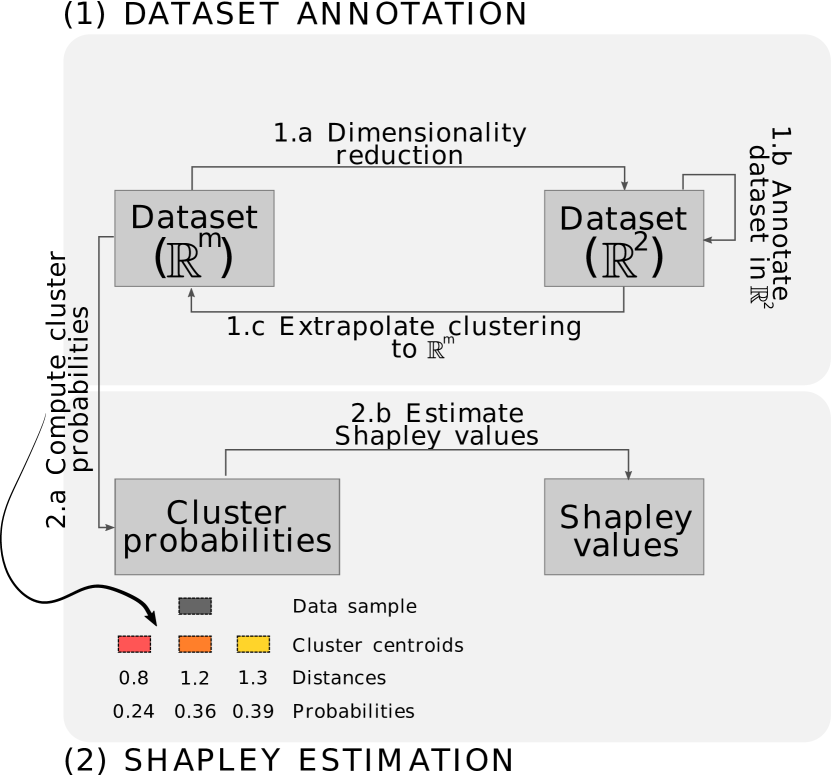
4.1 Dataset annotation
To explain dimensionality reduction (DR) techniques, we rely on interpreting the clusters formed on the projected space (). DR techniques aim to reduce the dimensionality of a high-dimensional dataset () to a low-dimensional dataset () while preserving (as much as possible) the structures present in the data. We usually use to visualize the result of a DR technique, in which the visual proximity among data points encodes similarity. For instance, clusters are rapidly perceived in the visual space () since humans quickly notice groups of visual markers (Bertin, 1983).
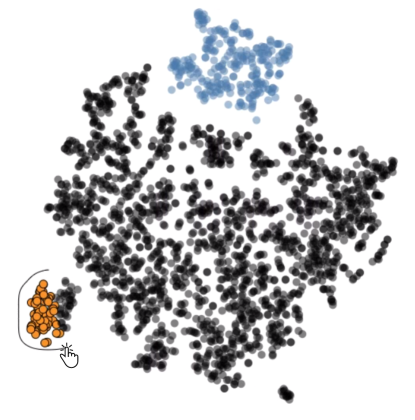
To understand the DR technique’s decisions to produce the projection, we use the clusters on to annotate the dataset in the high-dimensional space. In this case, users can freely define clusters with mouse interaction, as shown in Figure 2 – where black color encodes data samples not assigned to any cluster. Notice that by using such an approach, users might select data samples of different classes projected on the same cluster when using labeled datasets. Such an idea is reasonable and consistent with our proposal since we want to understand and explain the visual space clusters. Section 6.2 presents a study case where we manually annotate clusters on data with mixed classes.
Other possible ways to define clusters are to precompute a clustering algorithm (Kaufman and Rousseuw, 2005) or to use labeled datasets. Using one of these three strategies, we aim to define as many clusters as the number of clusters perceived in the visual space. For example, for the projection of Figure 2, one may define seven clusters (as shown for a study case Section 6.4).
Algorithm 1 shows the steps performed to annotate clusters. We receive a high-dimensional dataset , the data annotation method, and the arguments (args) for the techniques. There is nothing to do for labeled datasets (Line 2), and we return the annodated high-dimensional data (Line 3). Suppose the annotation method is clustering or manual annotation. In that case, we have to reduce the dimensionality of the dataset to (Line 4) so that analysts can investigate the clusters in the visual space. Users either run a clustering algorithm (Line 6) or use mouse interaction to manually define the clusters (Line 8). The labels produced by one of these methods annotate the high-dimensional dataset in Lines 9 and 10.
4.2 Shapley estimation
After the cluster definition, we can generate Shapley values for each data sample. Thus, we need to define a model that returns the prediction probabilities for a data sample based on the cluster definition – discussed in the previous section.
To return the prediction probabilities for a data sample , we measure the distance from to each cluster centroid. Figure 1 (2.a – bottom) illustrates such a process for three cluster centroids (![]() ,
, ![]() ,
, ![]() ) and, consequently, a three-dimensional distance vector. To convert the distances into probabilities, we apply an L1 normalization. The Shapley estimator (in our case, KernelSHAP (Lundberg and Lee, 2017)) uses these probabilities (for each data sample) to generate explanations discussed in Section 3. Notice that while estimating the Shapley values using KernelSHAP accounts for most of the dataset, we only compute the estimation for 20% of the data. The result of this procedure will be a matrix of dimensions for each cluster, where corresponds to 20% of the dataset size and represents the dimensionality of the dataset – each cell of the matrix will contain the Shapley value of the datapoint for the feature .
) and, consequently, a three-dimensional distance vector. To convert the distances into probabilities, we apply an L1 normalization. The Shapley estimator (in our case, KernelSHAP (Lundberg and Lee, 2017)) uses these probabilities (for each data sample) to generate explanations discussed in Section 3. Notice that while estimating the Shapley values using KernelSHAP accounts for most of the dataset, we only compute the estimation for 20% of the data. The result of this procedure will be a matrix of dimensions for each cluster, where corresponds to 20% of the dataset size and represents the dimensionality of the dataset – each cell of the matrix will contain the Shapley value of the datapoint for the feature .
Algorithm 2 further illustrates the Shapley values estimation process. First, we call the estimation procedure with the annotated high-dimensional dataset (). Then, we split the dataset into training and test sets (Line 8) to compute Shapley values for the test set (Line 1) using the training set to fit the algorithms (Line 9). To create an instance for Shapley estimation, we have to provide a function that will return the prediction probabilities. Such a function (cluster_probability) uses the clusters’ centroids (Line 2) to compute the distance from a data sample to these centroids (Lines 4 and 5) and then returns the prediction probabilities in Line 6.
An essential consideration of the L1 normalization is that lower probabilities will indicate better cohesion with clusters. As we will see in the following section, negative Shap-ley values indicate that a feature contributed to the cluster cohesion, while positive Shapley values influence the non-cohesion of clusters. Such a characteristic fits well for the visual space, where visual proximity encodes similarity.
Finally, we emphasize that any technique can perform the dimensionality reduction process, such as t-SNE (Maaten and Hinton, 2008), LSP (Paulovich et al., 2008), or UMAP (McInnes et al., 2018). Different clusters may be perceived in the visual space when using different dimensionality reduction techniques. Thus, labeling these clusters (see Section 4.1) would be the first step to apply our methodology.
The estimated Shapley values correspond to each feature’s contribution to the dimensionality reduction result. Thus, a feature with a high absolute Shapley value contributes a lot to the projected dataset cluster formation. In this case, each data point used for Shapley values estimation contains the correspondent Shapley value. Negative Shapley values mean that a feature contributes to the cluster formation, and positive Shapley values mean that a feature does not contribute to cluster formation. The following section provides novel visualization approaches to interpret dimensionality reduction results using the estimated Shapley values.
5 Visualization Design
Figure 3 shows a prototype system using ClusterShapley for explaining a dimensionality reduction result for the Iris (Dua and Graff, 2017) dataset. The system has three components. In the first component (A), users can provide datasets to generate explanations and load stored explanations. The scatter plot representation of DR results is drawn in the second component (B). Finally, the third component corresponds to the visualizations provided to support DR results using Shapley values. The tool-tip (C) next to the blue cluster shows a visual summarization of the Shapley values for the four most important features. Users can also click on a circle to show a detailed analysis of the Shapley values, as shown in (D). The detailed analysis is based on a dot plot and aggregated Kernel Density Estimation (Rosenblatt, 1956; Parzen, 1962) of the absolute sum of Shapley values. The Importance Summary is shown in (E), where users assess the mean values for each class’s four most important features and the contribution of these features for characterizing the clusters depicted by bar-plots. Finally, we also provide a heatmap of the sum of Shapley values in (F). The following sections present details of each component.
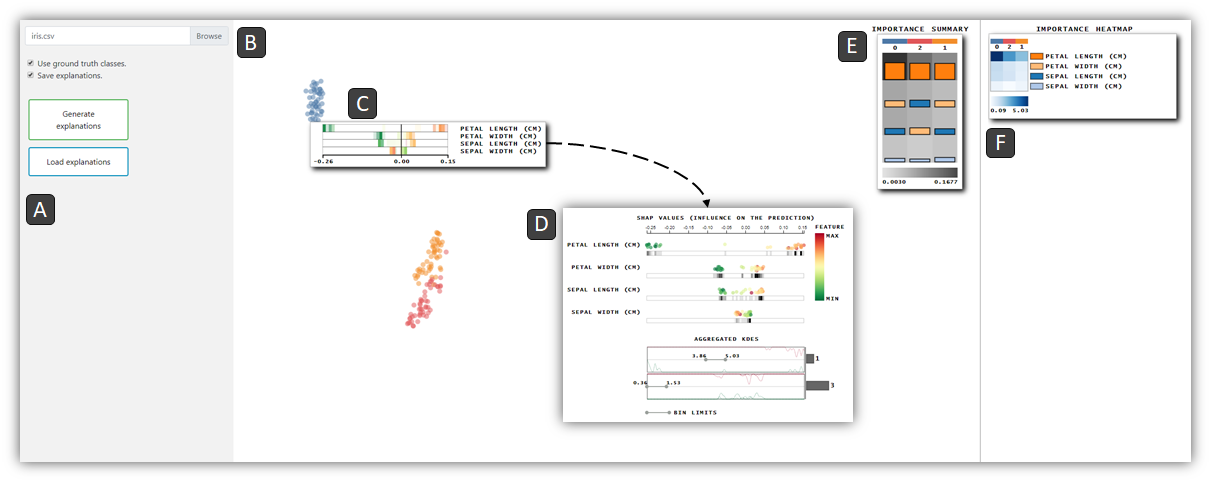
5.1 Scatter plot component
To provide a rapid assessment of Shapley values, we use a tool-tip with summarized information about the interactions among feature values and Shapley values when users hover circles of a particular class. The process of summarizing the Shapley values and features values works as follows. and are the histograms created from the Shapley values for the feature , where stores information for values equal or greater than the mean () and stores information lower than the mean of feature values for feature . Knowing that Shapleymin and Shapleymax consist of the lowest and the greatest Shapley values for the visualized features, we divide the histograms and in the same number of bins using Shapleymin and Shapleymax as bin limits.
Color saturation encodes each histogram’s density – green for and red for – and the two histograms have their bins sequentially drawn one next to another. That is, while takes the even positions, takes the odd ones. Figure 4 illustrates this process. If only one histogram has a density greater than zero for a given bin, it will use the even and odd positions.
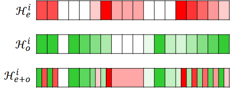
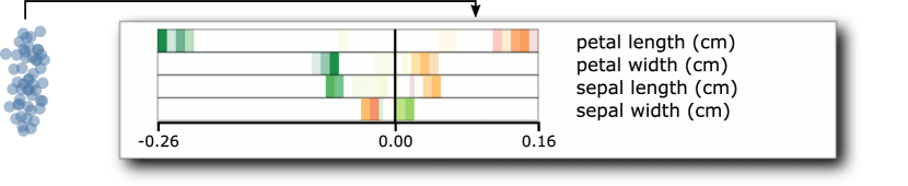
On real data, the summarized information looks like in Figure 5, where reddish colors encode feature values greater than the mean and greenish colors encode feature values lower than the mean. The contribution of the feature value is encoded using position, which corresponds to the Shapley values – the contribution is proportional to the distance from , indicated by a vertical line segment. The ordering in the representation indicates overall feature importance, i.e., petal length (cm) is the most important, petal width (cm) is the second most important, and so on.
5.2 Coordination between scatter plot and Shapley values
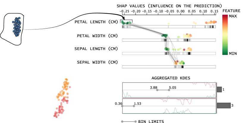
Analyzing the correlation among feature values and Shapley values is essential for our scenario. We provide a detailed analysis when users click on a circle representing a particular class. Such a detailed analysis is supported by dot plots of the four most important features, as shown in Figure 6. For instance, the four most important features ordered according to their importance are petal length (cm), petal width (cm), sepal length (cm), and sepal width (cm). Notice that as the absolute Shapley values (encoded as horizontal position) assume values far from zero, the more influence the feature will have in characterizing the cluster. So, the density bars below each dot plot help assess how much the feature values contribute to the cluster characterization.
In the dot plot representation, we visualize the subset of data samples used for computing Shapley values. Each circle encodes a feature value of a data point. While color encodes the feature value, the points’ position encodes the Shapley values of the inspected cluster. Lastly, suppose the dataset has more than four features. In that case, they can also be inspected based on the absolute sum of their Shapley values using a histogram, as shown in Figure 6 (Aggregated KDEs). We draw only the bins with elements (specified by the bin limits), while the bars encode how many features are in the corresponding bin limit. For instance, in Figure 6, there is one feature inside and three features inside . Two Kernel Density Estimation (KDE) curves encode each bin’s aggregation: the red curves encode the feature values equal or greater than the mean, and the green curves encode the feature values lower than the mean. Here, we have petal length (cm), inside the bin with limits and petal width (cm), sepal length (cm), and sepal width (cm) inside the bin with limits .
For the detailed inspection, The coordination mechanism between the scatter plot and the Shapley values helps users identify which features contributed to the cluster cohesion and which features contributed to dispersing the clusters. Figure 6 illustrates the result of these operations, where we highlight in the dot plot representation the data points selected in the scatter plots.
5.3 Importance Summary and Importance Heatmap
In the Importance Summary (see Figure 3 (E)), color intensity depicts the mean of absolute Shapley values for the four most important features. Bar height depicts the contribution of each feature, where color encodes the features. By positioning the features bar with different colors, users assess the heterogeneity of the importance of feature importance for different clusters.
The Importance Heatmap (see Figure 3 (F)) provides an overview of the features’ contribution by showing the Shapley values’ absolute sum for each feature. After computing the absolute sum for each pair of feature and cluster, we use Fujiwara et al.’s (Fujiwara et al., 2019) approach to order the cells to facilitate cluster identification. That is, we apply a hierarchical clustering (Müllner, 2011) on rows and columns of the heatmap. Then, optimal-leaf-ordering (Bar-Joseph et al., 2001) orders the clustering leaves to give more understandable results, positioning similar heatmap values appear close to each other.
The main difference between our heatmap to Fujiwara et al.’s (Fujiwara et al., 2019) is how we summarize information for datasets with too many features. We find the most important features for each cluster, showing at most features, where denotes the dataset’s dimensionality.
5.4 Analysis example
To make readers familiar with the analysis using ClusterShapley, we inspect the explanations for a dimensionality reduction result on the Iris dataset. Moreover, we use an icon (such as ![]() ) and the cluster’s indices to facilitate reading.
) and the cluster’s indices to facilitate reading.
Figure 3 shows a separation of cluster ![]() from the others. The Importance Summary shows that petal length has much more influence on the cluster. The summary visualization of Shapley values in Figure 3 (C) gives a hint of how feature values influence the cluster formation, i.e., there is a clear separation of lower values and higher values for petal length. In Figure 6, the coordination between the scatter plot and dot plot shows that due to lower values of petal length, petal width, and sepal length, instances of cluster
from the others. The Importance Summary shows that petal length has much more influence on the cluster. The summary visualization of Shapley values in Figure 3 (C) gives a hint of how feature values influence the cluster formation, i.e., there is a clear separation of lower values and higher values for petal length. In Figure 6, the coordination between the scatter plot and dot plot shows that due to lower values of petal length, petal width, and sepal length, instances of cluster ![]() are very different from the others. The negative Shapley values show that their feature values contributed to the cluster cohesion.
are very different from the others. The negative Shapley values show that their feature values contributed to the cluster cohesion.
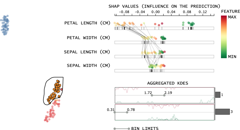
The inspection of clusters ![]() and
and ![]() (see Figure 7) presents similar petal length patterns (the most important feature). Higher values for such a feature are essential for cohesion (see negative Shapley values) for both clusters. Also, while the features of sepal length and petal width assume a different position on the importance ordering, their overall importance seems not to have much effect if we consider the density plot patterns. Finally, unlike clusters
(see Figure 7) presents similar petal length patterns (the most important feature). Higher values for such a feature are essential for cohesion (see negative Shapley values) for both clusters. Also, while the features of sepal length and petal width assume a different position on the importance ordering, their overall importance seems not to have much effect if we consider the density plot patterns. Finally, unlike clusters ![]() and
and ![]() , sepal width has a substantial influence on cluster
, sepal width has a substantial influence on cluster ![]() , where lower values help characterize the clusters – see higher density for green areas of the dot plot in Figure 7a.
, where lower values help characterize the clusters – see higher density for green areas of the dot plot in Figure 7a.
6 Case Studies
We start our analysis by focusing on medical datasets. We provide empirical evidence that Shapley values help to generate insights about pathologies and patients in different conditions. Then we analyze a dataset of quality indices in red wines, where we compare the characteristic found using Shapley values with their provided quality. Finally, we analyze a social dataset.
All the projections were performed using sklearn implementation of t-SNE (Maaten and Hinton, 2008), on a computer with the following configuration: Intel(R) Core(TM) i7-8700 CPU @ 3.20GHz, 32GB RAM, Windows 10 64 bits.
6.1 Vertebral Column
In this first case study, we analyze a dataset containing six biomechanical features. The Vertebral Column dataset (Dua and Graff, 2017) is composed by instances described by six features derived from the shape and orientation of the pelvis and lumbar spine: pelvic incidence, pelvic tilt, lumbar lordosis angle, sacral slope, pelvic radius, and grade of spondylolisthesis. Figure 8 shows the projected instances, colored based on the ground truth classes: class ![]() for normal patients, class
for normal patients, class ![]() for patients with Hernia, and class
for patients with Hernia, and class ![]() for patients with Spondylolisthesis – a disturbance of the spine in which a bone (vertebra) slides forward over the bone below it. There is a clearly separation of class
for patients with Spondylolisthesis – a disturbance of the spine in which a bone (vertebra) slides forward over the bone below it. There is a clearly separation of class ![]() among the remaining data points.
among the remaining data points.

The Importance Summary in Figure 8 shows that the degree of spondylolisthesis is a determinant factor for the presence of Spondylolisthesis – notice the feature legend next to the Importance Heatmap. Although it is important for characterizing all clusters, the color intensity and the heatmap values show that lower means of Shapley values can characterize the absence of Spondylolisthesis. By coordinating the scatter plot and the dot plot for class 1 ![]() (see Figure 9, we visualize that this class’s data points have higher values for the degree of spondylolisthesis. Further that, these higher feature values assume negative Shapley values and contribute to cluster formation. The other three most important features also contributed to clustering cohesion. The pelvic incidence angle measures the pelvic shape and determines the position of the sacral endplate (Tebet, 2014). According to Labelle et al. (2005), pelvic incidence, sacral hill, pelvic tilt, and lumbar lordosis are greater in patients with developmental Spondylolisthesis.
(see Figure 9, we visualize that this class’s data points have higher values for the degree of spondylolisthesis. Further that, these higher feature values assume negative Shapley values and contribute to cluster formation. The other three most important features also contributed to clustering cohesion. The pelvic incidence angle measures the pelvic shape and determines the position of the sacral endplate (Tebet, 2014). According to Labelle et al. (2005), pelvic incidence, sacral hill, pelvic tilt, and lumbar lordosis are greater in patients with developmental Spondylolisthesis.
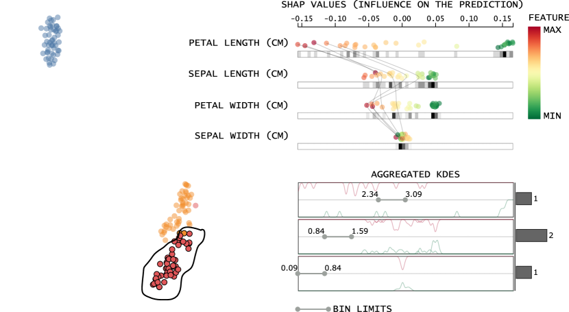
Figure 10 shows the dot plots for classes ![]() and
and ![]() . Given the influence of the degree of spondylolisthesis for both classes, Spondylolisthesis’s disturbance is not likely to be present in those instances due to the low feature values. The DR technique did not impose a clear separation between these classes because the features are not distinctive. However, there is a slight separation due to the degree of feature contribution – as visualized in the aggregated KDEs. Finally, we see evidence for differentiating Hernia patients (B) from regular patients (A). That is, patients with Hernia have low values for sacral slope (see this pattern for patients with Hernia
. Given the influence of the degree of spondylolisthesis for both classes, Spondylolisthesis’s disturbance is not likely to be present in those instances due to the low feature values. The DR technique did not impose a clear separation between these classes because the features are not distinctive. However, there is a slight separation due to the degree of feature contribution – as visualized in the aggregated KDEs. Finally, we see evidence for differentiating Hernia patients (B) from regular patients (A). That is, patients with Hernia have low values for sacral slope (see this pattern for patients with Hernia ![]() in Figure 10(b)), which can indicate centralistic herniation (Roussouly and Pinheiro-Fraco, 2011).
in Figure 10(b)), which can indicate centralistic herniation (Roussouly and Pinheiro-Fraco, 2011).
6.2 Indian Liver
In this case study, we investigate a dataset containing liver patient records and non-liver patient records. The instances are described by features: Age, Gender, Total Bilirubin, Direct Bilirubin, Alkaline Phosphotase, Alamine Aminotransferase, Aspartate Aminotransferase, Total Proteins, Albumin, and Albumin and Globulin Ratio. Coloring the projection based on the ground truth classes, we get nearly no distinction among the features’ importance, where ![]() encodes patients with liver disease and
encodes patients with liver disease and ![]() encodes patients without liver disease. This characteristic is due to the similarity of data points– see how the two classes’ instances are projected near to each other on the visual space in Figure 11.
encodes patients without liver disease. This characteristic is due to the similarity of data points– see how the two classes’ instances are projected near to each other on the visual space in Figure 11.
Since our tool allows for the manually definition of clusters, we inspect the clusters imposed by the DR technique. Figure 11 shows the clusters defined for this study case and respective Importance Summary. We used the following criteria for defining the clusters: select clusters with a majority of only one class (clusters ![]() ,
, ![]() , and
, and ![]() ); select clusters with data points of mixed classes (clusters
); select clusters with data points of mixed classes (clusters ![]() and
and ![]() ); and select well-defined clusters (cluster
); and select well-defined clusters (cluster ![]() ). All clusters have the same important features ’and different contributions to the overall importance. Secondly, each cluster’s three most determinant features consists of Alamine Aminotransferase, Aspartate Aminotransferase, and Alkaline Phosphotase, the latter playing a major role in categorizing cluster
). All clusters have the same important features ’and different contributions to the overall importance. Secondly, each cluster’s three most determinant features consists of Alamine Aminotransferase, Aspartate Aminotransferase, and Alkaline Phosphotase, the latter playing a major role in categorizing cluster ![]() . Lastly, as a pattern noticed in the projection of Figure 11 (Ground truth labels), we can see that clusters
. Lastly, as a pattern noticed in the projection of Figure 11 (Ground truth labels), we can see that clusters ![]() ,
, ![]() , and
, and ![]() are the most distinctive.
are the most distinctive.
Assessing the dot plot of cluster ![]() (see Figure 12) and recalling that such cluster has a majority of patients with liver disease, there is an evident influence of patients with higher Alkaline Phosphotase. According to Lowe and John (2018), high values of Alkaline Phosphotase lies in the diagnosis of cholestatic liver disease (Dhillon and Steadman, 2012). Alkaline Phosphotase can also present higher values when the bile ducts are blocked or by liver cancer (Targher and Byrne, 2015). Finally, readers may ask why a few patients with no liver pathology have high Alkaline Phosphotase as well. This happens because the levels increase for young people and the elderly (Lowe and John, 2018) (our case).
(see Figure 12) and recalling that such cluster has a majority of patients with liver disease, there is an evident influence of patients with higher Alkaline Phosphotase. According to Lowe and John (2018), high values of Alkaline Phosphotase lies in the diagnosis of cholestatic liver disease (Dhillon and Steadman, 2012). Alkaline Phosphotase can also present higher values when the bile ducts are blocked or by liver cancer (Targher and Byrne, 2015). Finally, readers may ask why a few patients with no liver pathology have high Alkaline Phosphotase as well. This happens because the levels increase for young people and the elderly (Lowe and John, 2018) (our case).

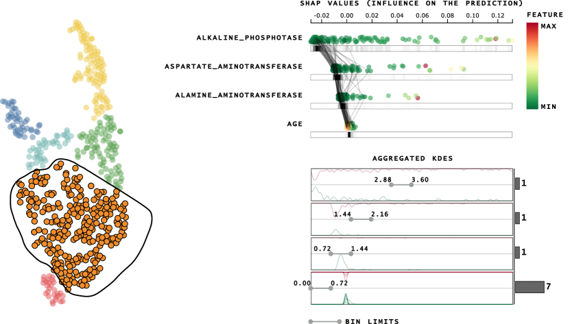
Another interesting pattern appears when analyzing the dot plot of cluster ![]() in Figure 13. We can note that while almost every feature contributed to the no cohesion of the clusters – see the density of points around for Alkaline Phosphotase, around for Age and the aggregated KDE’s – the high values of features Aspartate and Alamine Aminotransferase contributed for the distinction of the clusters. Accordingly, since all the instances of cluster
in Figure 13. We can note that while almost every feature contributed to the no cohesion of the clusters – see the density of points around for Alkaline Phosphotase, around for Age and the aggregated KDE’s – the high values of features Aspartate and Alamine Aminotransferase contributed for the distinction of the clusters. Accordingly, since all the instances of cluster ![]() have liver disease, the two features are likely to influence the pathology. While lower levels of Aspartate and Alamine Aminotransferase are expected, higher levels of these two features indicate liver diseases, such as viral infection or acute Hepatitis (Dhillon and Steadman, 2012; Anadón et al., 2019). For this set of features, all of the patients present liver disease and lower Alkaline Phosphotase levels. Although we would need a more detailed dataset to confirm our hypothesis, these instances could be patients with Hepatitis, where Alkaline Phosphotase is usually much less elevated than Aspartate and Alamine Aminotransferase.
have liver disease, the two features are likely to influence the pathology. While lower levels of Aspartate and Alamine Aminotransferase are expected, higher levels of these two features indicate liver diseases, such as viral infection or acute Hepatitis (Dhillon and Steadman, 2012; Anadón et al., 2019). For this set of features, all of the patients present liver disease and lower Alkaline Phosphotase levels. Although we would need a more detailed dataset to confirm our hypothesis, these instances could be patients with Hepatitis, where Alkaline Phosphotase is usually much less elevated than Aspartate and Alamine Aminotransferase.
Figure 14 shows the dot plots for classes ![]() and
and ![]() . Notice that these classes present lower feature values for the three most important features, contributing to the spatial distance from the well-defined clusters where most patients have liver disease. Moreover, note how these clusters differ only on the patients’ age, which helped determine a separation among the two clusters.
. Notice that these classes present lower feature values for the three most important features, contributing to the spatial distance from the well-defined clusters where most patients have liver disease. Moreover, note how these clusters differ only on the patients’ age, which helped determine a separation among the two clusters.
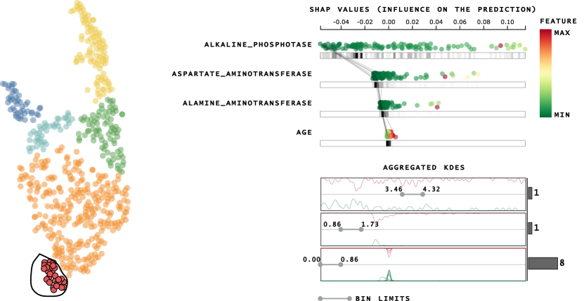
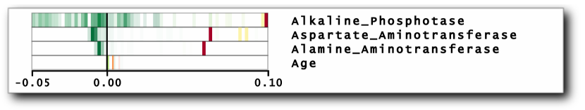
The question is why several instances of patients with the disease have low values for features Alk. Phosphotase, Asp. Aminotransferase, and Alam. Aminotransferase. There are two possible answers: first, the feature space may not be enough to describe and impose a separation between the two classes; second, levels of Aspartate Aminotransferase and Alamine Aminotransferase do not present high levels for some liver disease, such as chronic hepatitis, obstruction of bile ducts, or cirrhosis (Targher and Byrne, 2015; Goyal and May, 2017). Cluster ![]() , for example, has more patients with liver disease. The summary of Shapley values in Figure 15 shows much lower values of the three most important features. In other words, by having negative Shapley values (which help at characterizing the cluster) for the features with lower values, we hypothesize that this cluster corresponds to patients with a liver pathology due to the lower values of the Alkaline Phosphotase, Aspartate, and Alamine Aminotransferase features.
, for example, has more patients with liver disease. The summary of Shapley values in Figure 15 shows much lower values of the three most important features. In other words, by having negative Shapley values (which help at characterizing the cluster) for the features with lower values, we hypothesize that this cluster corresponds to patients with a liver pathology due to the lower values of the Alkaline Phosphotase, Aspartate, and Alamine Aminotransferase features.
6.3 Red Wine Quality
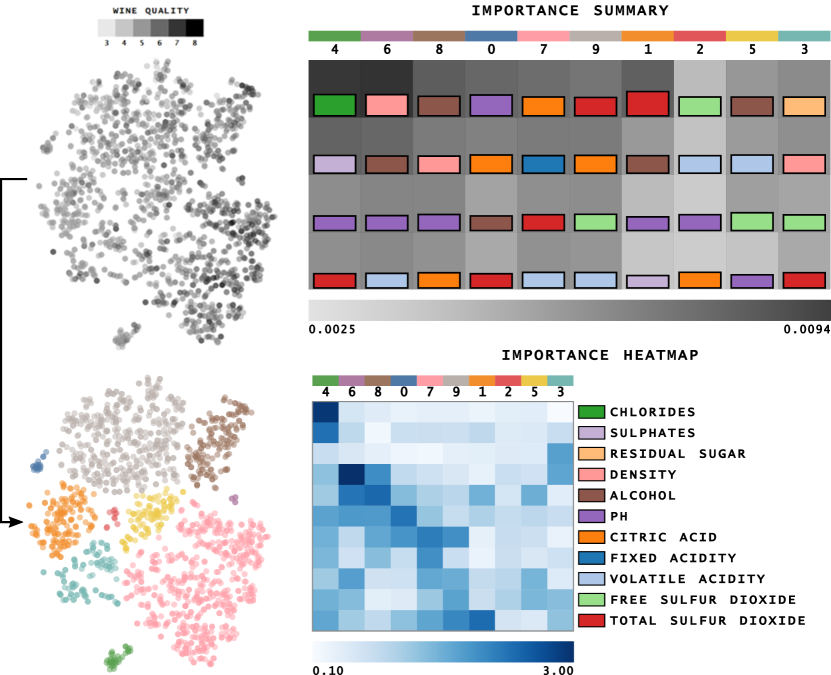
For this case study, we understand the quality of red wines (Dua and Graff, 2017) by explaining manually defined clusters after dimensionality reduction. Figure 16 shows a t-SNE projection with grayscale encoding wine quality. The dataset contains instances described by features: fixed acidity, volatile acidity, citric acid, residual sugar, chlorides, free sulfur dioxide, total sulfur dioxide, density, pH, sulphates, and alcohol.
Unlike the previous case studies, ClusterShapley reveals a more heterogeneous set of feature importance for this dataset. However, certain similarities can be noticed, such as clusters ![]() and
and ![]() and clusters
and clusters ![]() and
and ![]() . The most cohesive cluster (
. The most cohesive cluster ( ![]() ) – more spatially distant from the others – has a few features that contributed to its distinction: chlorides and sulphates. There are other characteristics. For example, the pH index was determinant for characterizing cluster
) – more spatially distant from the others – has a few features that contributed to its distinction: chlorides and sulphates. There are other characteristics. For example, the pH index was determinant for characterizing cluster ![]() , density in cluster
, density in cluster ![]() , and for cluster
, and for cluster ![]() , the features contributed equally.
, the features contributed equally.
Now let us inspect cluster ![]() to assess the contribution of chlorides and sulphates. Figure 17 shows the line segments and Shapley values for class
to assess the contribution of chlorides and sulphates. Figure 17 shows the line segments and Shapley values for class ![]() . Notice that while other clusters present lower chloride values and sulphates, cluster
. Notice that while other clusters present lower chloride values and sulphates, cluster ![]() presents higher values for these features. Compared with the other Shapley values, chlorides and sulphates contributed a lot to the cluster separation, i.e., Shapley values’ negative contribution. While chlorides measure salt in the wine, sulphates contribute to sulfur dioxide gas levels and act as an antimicrobial and antioxidant (Cortez et al., 2009). Thus, such a cluster describes salty wines, being very distinguishable from the others.
presents higher values for these features. Compared with the other Shapley values, chlorides and sulphates contributed a lot to the cluster separation, i.e., Shapley values’ negative contribution. While chlorides measure salt in the wine, sulphates contribute to sulfur dioxide gas levels and act as an antimicrobial and antioxidant (Cortez et al., 2009). Thus, such a cluster describes salty wines, being very distinguishable from the others.
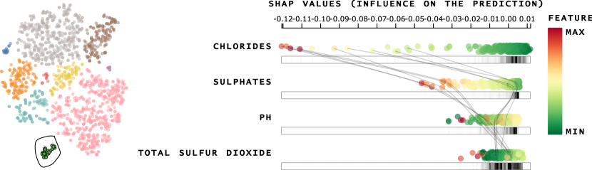
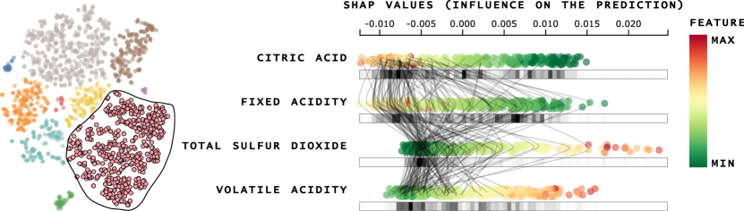
Figure 18 shows the dot plot of clusters ![]() and
and ![]() . Both of the clusters influence higher values of pH index. However, the two most influential features of cluster
. Both of the clusters influence higher values of pH index. However, the two most influential features of cluster ![]() are only the third and fourth in the ordering of cluster
are only the third and fourth in the ordering of cluster ![]() . Moreover, the two groups of instances benefit from higher pH values and lower values of critic ACID; cluster
. Moreover, the two groups of instances benefit from higher pH values and lower values of critic ACID; cluster ![]() presents higher values for alcohol, configuring among the more alcoholic wines and more tasteful according to the quality index.
presents higher values for alcohol, configuring among the more alcoholic wines and more tasteful according to the quality index.
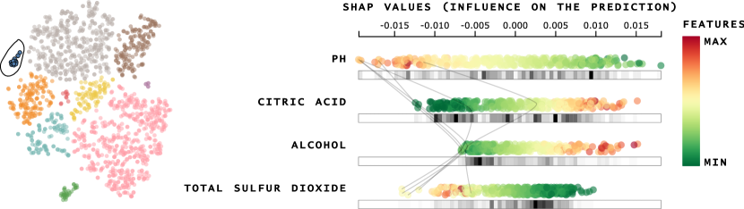
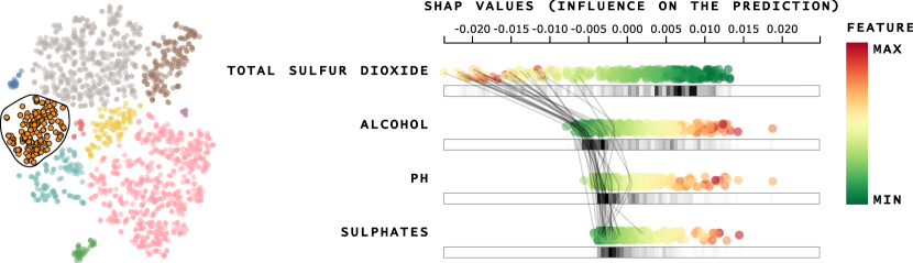
Recalling the DR result encoding the quality index, we now inspect cluster ![]() with higher quality wines (higher intensity in Figure 16). Cluster
with higher quality wines (higher intensity in Figure 16). Cluster ![]() presents Fixed Acidity as the second most important feature. A combination of higher values Fixed Acidity and lower Volatile Acidity values means higher quality for the wines. For instance, volatile acid in higher concentrations results in an unpleasant aroma and taste (Davis, 2004). Another characteristic that explains the concentration of higher quality is the higher levels of Citric Acid, which contributes to the wine’s freshness. Besides that, lower values for Total Sulfur Dioxide feature also contribute to the higher quality, i.e., when in lower values, Total Sulfur Dioxide do not add flavor or smell to the wine (Cortez et al., 2009).
presents Fixed Acidity as the second most important feature. A combination of higher values Fixed Acidity and lower Volatile Acidity values means higher quality for the wines. For instance, volatile acid in higher concentrations results in an unpleasant aroma and taste (Davis, 2004). Another characteristic that explains the concentration of higher quality is the higher levels of Citric Acid, which contributes to the wine’s freshness. Besides that, lower values for Total Sulfur Dioxide feature also contribute to the higher quality, i.e., when in lower values, Total Sulfur Dioxide do not add flavor or smell to the wine (Cortez et al., 2009).
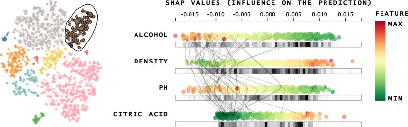
Finally, focusing on cluster ![]() , Figure 20 shows that Total Sulfur Dioxide (SO2) is a determinant for the concentration of lower quality wines. While lower concentrations of S02 are mostly undetectable, higher concentrations of S02 becomes evident in the nose and taste. The other most important feature contributes to the quality as well. As we could see for clusters
, Figure 20 shows that Total Sulfur Dioxide (SO2) is a determinant for the concentration of lower quality wines. While lower concentrations of S02 are mostly undetectable, higher concentrations of S02 becomes evident in the nose and taste. The other most important feature contributes to the quality as well. As we could see for clusters ![]() and
and ![]() , lower values for Alcohol were also responsible for lower quality in cluster
, lower values for Alcohol were also responsible for lower quality in cluster ![]() .
.
6.4 Communities and Crime
In this final case study, we explore the Communities and Crime dataset (Redmond and Baveja, 2002; Dua and Graff, 2017). We used the dataset preprocessed by Fujiwara et al. (2019) to compare the patterns returned by our approach. The dataset contains instances described by features. Figure 21 shows the projection result with clusters manually selected together with the overview visualization of feature importance.
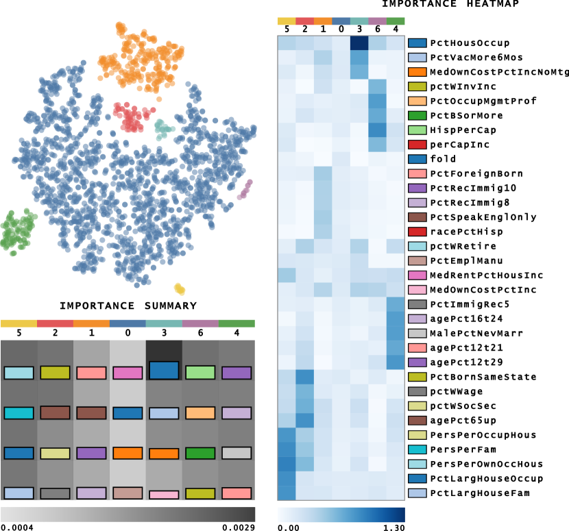
Apart from clusters ![]() and
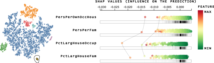
and ![]() , the most important features are very heterogeneous among the clusters. The first thing to notice is how PctHousOccup (percent of occupied houses) is important for characterizing cluster
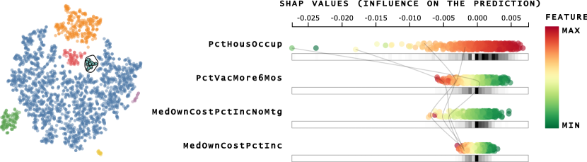
, the most important features are very heterogeneous among the clusters. The first thing to notice is how PctHousOccup (percent of occupied houses) is important for characterizing cluster ![]() . Such cluster is different from the others by having a lower percentage of houses occupied – as shown in the dot plot of Figure 22 – indicating communities in safer areas.
. Such cluster is different from the others by having a lower percentage of houses occupied – as shown in the dot plot of Figure 22 – indicating communities in safer areas.
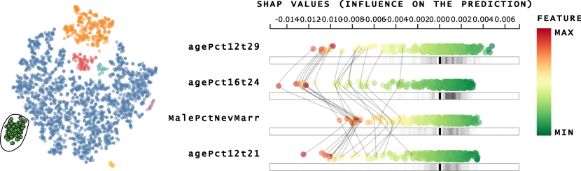
Another interesting pattern is the importance of the features PctLargHouseFam (percent of large family households) and PctLargHouseOccup (percent of large house occupied) for cluster ![]() (see Figure 23a), as well as the features AgePct12T29, AgePct16T24 (percent of population between and , and percent of population between and , respectively), and for the feature MalePctNevMarr (percent of Males who have never married) for cluster
(see Figure 23a), as well as the features AgePct12T29, AgePct16T24 (percent of population between and , and percent of population between and , respectively), and for the feature MalePctNevMarr (percent of Males who have never married) for cluster ![]() (see Figure 23b). For cluster
(see Figure 23b). For cluster ![]() , these features’ higher values contribute to cohesion, representing bigger families and houses. The same pattern happens to cluster
, these features’ higher values contribute to cohesion, representing bigger families and houses. The same pattern happens to cluster ![]() , the higher percentage of age explains the higher percentage of males that have never married. Since the age range in these features is somewhat low, the percentage of males who have never married tends to be high due to cultural aspects.
, the higher percentage of age explains the higher percentage of males that have never married. Since the age range in these features is somewhat low, the percentage of males who have never married tends to be high due to cultural aspects.
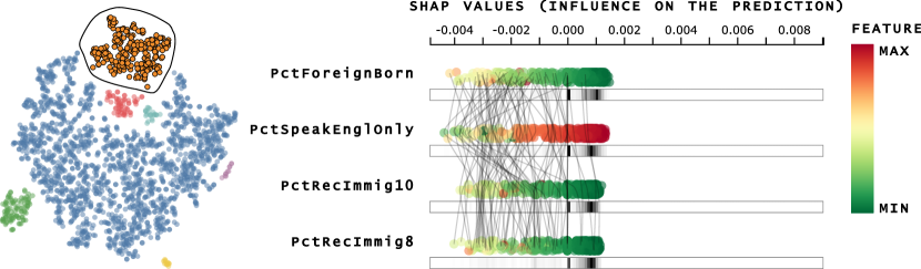
Finally, cluster ![]() corresponds to a group of immigrants. The four most important features are PctForeignBorn (percent of people born in another country), PctRecImmig8, PctRecImmig10 (percent of the population who have immigrated within the last 8 and 10 years), and PctSpeakEngOnly (percent of people who speak only English). While the first three features present high values, the latter shows low values. People who have immigrated are more likely to speak another language. Such analysis exemplifies the semantic power of our approach.
corresponds to a group of immigrants. The four most important features are PctForeignBorn (percent of people born in another country), PctRecImmig8, PctRecImmig10 (percent of the population who have immigrated within the last 8 and 10 years), and PctSpeakEngOnly (percent of people who speak only English). While the first three features present high values, the latter shows low values. People who have immigrated are more likely to speak another language. Such analysis exemplifies the semantic power of our approach.
6.5 Using clustering techniques
In this section, we aim to analyze ClusterShapley using clustering algorithms. To this end, we choose the CBR-ILP-IR (Paulovich et al., 2008) document collection, also aiming to evaluate our technique for thousands of dimensions. The CBR-ILP-IR dataset contains documents representing papers of three fields: Case-based Reasoning (CBR), Intuitive Logic Programming (ILP), and Information Retrieval (IR). We followed Eler et al. (2018) to preprocess the dataset, using Porter Stemming, removing terms with a frequency below one and tf-idf transformation. The resulting dataset consists of papers per terms. Figure 25 shows the resulting clusters on a UMAP (McInnes et al., 2018) projection and the contribution analysis for Original labels, k-Means with four clusters (-Means 1), k-Means with eight clusters (-Means 2), and Agglomerative clustering with nine clusters.
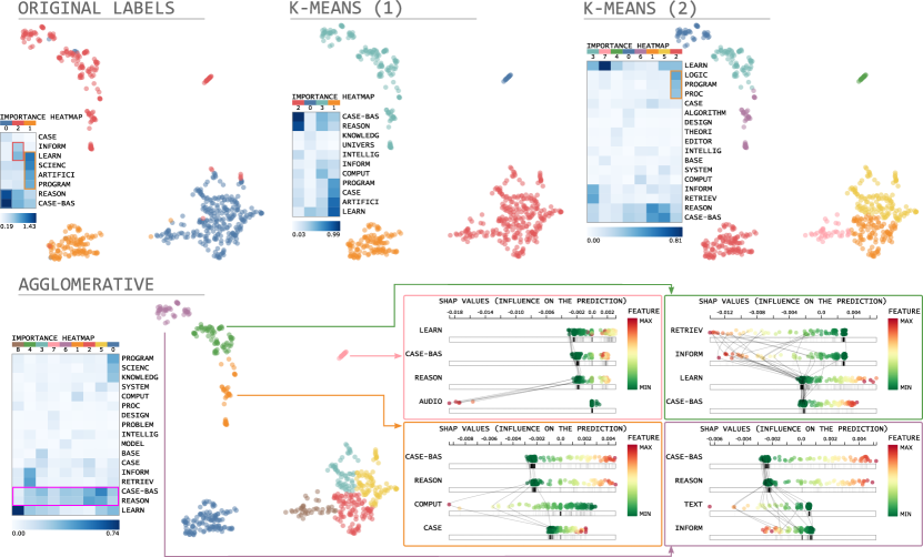
The Original labels show that this is a straightforward dataset in terms of class separation. The Importance Heatmap helps us to realize which cluster represents the main area of the dataset: Case-based Reasoning (CBR) in blue (![]() ) (see important terms reason and case-bas); Intuitive Logic Programming (ILP) in orange (
) (see important terms reason and case-bas); Intuitive Logic Programming (ILP) in orange (![]() ) (see important terms program); and Information Retrieval (IR) in red (
) (see important terms program); and Information Retrieval (IR) in red (![]() ) (see important term inform) – we highlight these terms in the heatmap. The clustering result with four clusters (k-Means (1)) can uncover the information that the smaller cluster is positioned distant from the others since it has no unique influence by specific terms, such as case-bas, reason, inform, or program. The clustering result with eight clusters (k-Means (2)) and its respective Importance Heatmap further adds information to the analysis. More terms about Intuitive Logic Program (ILP) appear for the cluster in red (
) (see important term inform) – we highlight these terms in the heatmap. The clustering result with four clusters (k-Means (1)) can uncover the information that the smaller cluster is positioned distant from the others since it has no unique influence by specific terms, such as case-bas, reason, inform, or program. The clustering result with eight clusters (k-Means (2)) and its respective Importance Heatmap further adds information to the analysis. More terms about Intuitive Logic Program (ILP) appear for the cluster in red (![]() ) (such as logic and program) – see these terms in the heatmap highlighted in red. Another important aspect of this clustering result is that the learn, inform, retrieve, reason, and case-bas seem to make cluster
) (such as logic and program) – see these terms in the heatmap highlighted in red. Another important aspect of this clustering result is that the learn, inform, retrieve, reason, and case-bas seem to make cluster ![]() relate with cluster
relate with cluster ![]() . This characteristic is because these terms have similar (with a more significant difference for the term learn) important terms for both clusters.
. This characteristic is because these terms have similar (with a more significant difference for the term learn) important terms for both clusters.
The third clustering result (Agglomerative) shows other interesting characteristics. Here, although only the clusters positioned on the right-bottom of the projections talk about Case-based Reasoning, the Importance Heatmap shows that all clusters contribute from terms of case-base and reason. While these terms contribute to the cluster formation after dimensionality reduction, they could have a negative contribution – meaning that for these clusters not talking about Case-based Reasoning, these terms contribute for these data points to be positioned far away from the bottom-right cluster. The Shapley values representation explain this characteristic for the clusters positioned on top (![]() ,
, ![]() ,
, ![]() , and
, and ![]() ). Each cluster has terms that the presence in the document contributes to its formation. For example, the documents of clusters
). Each cluster has terms that the presence in the document contributes to its formation. For example, the documents of clusters ![]() seem to be influenced by the term audio; the documents of cluster
seem to be influenced by the term audio; the documents of cluster ![]() seem to talk about information retrieval (see terms retrieve and inform); and so on. However, the dimensionality reduction technique also considered the absence of terms case-bas and reason as an important characteristic for cluster definition.
seem to talk about information retrieval (see terms retrieve and inform); and so on. However, the dimensionality reduction technique also considered the absence of terms case-bas and reason as an important characteristic for cluster definition.
In this case study, we show that our approach benefits the understanding of dimensionality reduction results after automatically defining clusters. However, as we address in the limitation section (see Section 7.2), this is a good approach when the clustering result truly captures the projection’s clusters and subclusters.
7 Discussion
The main contribution of this study consists of explaining dimensionality reduction results using the clusters present in the projected space. Such characteristic is important because the majority of dimensionality reduction techniques are non-linear. While non-linearity is essential for unfolding complex structures in high-dimensional spaces, there is no current way to inverse the calculations and track the features’ contributions for generating the projection.
Our methodology provides a correlation between feature values and their importance on cluster results. Such correlation allows analysts to answer questions like “How increasing/decreasing values for a given feature will influence the classes/clusters in the dataset?” – useful information when working with medical datasets, as seen in the case studies. Finally, our coordination mechanism (between the scatter plot and the dot plot) allows identifying intra-cluster patterns.
7.1 Supporting exploratory analysis
In exploratory data analysis, analysts want to confirm a hypothesis about a high-dimensional dataset or even want to discover unseen information (Munzner, 2015), making dimensionality reduction techniques an appropriate approach. These aspects make ClusterShapley a valuable tool to interpret dimensionality reduction techniques and help in high-dimensional data analysis. Through the explanations derived using ClusterShapley, analysts can understand various aspects of the data, such as why data samples pertain to a cluster, why different clusters present a relationship, or why data samples of different classes appear very dissimilar in the projected space.
The number of applications for ClusterShapley is numerous, which stresses the contribution of our technique. To cite a few, machine learning practitioners might use ClusterShapley to investigate the quality of feature spaces and understand how different classes appear similar and cause confusion for classification tasks. ClusterShapley can also support annotation of datasets since it gives distinct characteristics about different clusters. Biologists would use ClusterShapley to discover new cell types analyzing the contribution of genes in each cluster visible in the projected space. Finally, ClusterShapley may be useful in applications for monitoring the training process of deep learning models. In this case, an exploratory method using ClusterShapley consists of an early-stopping strategy when the model’s learned features investigated through a DR technique and ClusterShapley corresponds to the analyst’s mental model.
7.2 Limitations
Run-time execution
Computing Shapley values is a difficult task. While model-specific strategies (Lundberg et al., 2020) present reasonable execution time, general model implementations such as KernelSHAP (Lundberg and Lee, 2017) (the one we used in this work) can take too much time to produce explanations for bigger datasets since it uses a weighted linear regression. Thus, we plan to develop approximate strategies for computing Shapley values to explain dimensionality reduction results in future works. For example, one could use a sampling technique that preserves the dataset structures to feed the Shapley estimator. Table 1 shows how the execution time of estimating Shapley values with KernelSHAP correlates to the size of the dataset, number of clusters, and number of features. Such a characteristic opens the possibility for developing novel strategies that would hierarchically estimate Shapley values. Further that, we plan to develop parallel strategies to estimate Shapley values in the future.
| Dataset | Size | Dim. | Clusters | Time (s) |
| Iris | 150 | 4 | 3 | 0.1698 |
| Vertebral Column | 310 | 6 | 3 | 0.2555 |
| Indian Liver | 167 | 10 | 6 | 38.22 |
| Red Wine | 1599 | 11 | 10 | 315.71 |
| Com. and Crime | 2215 | 128 | 7 | 462.93 |
| CBR-ILP-IR | 574 | 18694 | 3 | 1098.67 |
| CBR-ILP-IR KM 1 | 574 | 18694 | 4 | 1259.23 |
| CBR-ILP-IR KM 2 | 574 | 18694 | 8 | 1646.52 |
| CBR-ILP-IR Aggl. | 574 | 18694 | 9 | 1659.87 |
Cluster-oriented analysis
We use a cluster-oriented analysis to explain the contribution of features on the data organization in imposed by dimensionality reduction techniques. That means ClusterShapley returns each feature’s contribution to the formation of each cluster of the projected dataset. However, in some cases, it would be useful to understand how features contribute to parts of the projection compared to the remaining of the dataset. While we do not address this scenario, we plan to develop other strategies in future works. For example, through the definition of two clusters (the area of interest and the remaining of the projection), we could compute Shapley values on-the-fly.
Another limitation of our work is related to the quality of the clusters when using by clustering algorithms. In Figure 25, the clusters returned by the k-means and agglomerative clustering defined the dataset labels as the first step before using ClusterShapley. Suppose the clusters returned by the clustering algorithm do not convey the real clusters present in the dataset. In that case, ClusterShapley will generate results in which explanations consider dissimilar data points (in different real clusters) as similar data points and consequently mislead analysis. Nevertheless, the visualizations provided in this work make it easy for analysts to be aware of these issues.
8 Conclusion
Analyzing the clusters imposed by dimensionality reduction techniques is a recurrent task. Understanding which features influenced cluster formation can help discover patterns in data and reveal ubiquitous information. However, most dimensionality reduction techniques are non-linear, which imposes difficulties in tracking the features that contributed to the resulting clusters.
In this work, we use Shapley values to explain the clusters resulted from dimensionality reduction techniques. After defining clusters on visual space, the labels annotate the high-dimensional space to compute each feature’s contribution to the projection. From the correlation among contributions and feature values, we discover patterns on medical and social datasets, proving our method’s applicability to explain dimensionality reduction results.
In future works, we plan to novel methods to compute Shapley values for dimensionality reduction techniques so that the computation for large sets is not prohibitive. Moreover, we plan to investigate ways to apply dimensionality reduction results in various levels of detail since subclusters provide much insightful information.
Acknowledgements
This work was supported by Fundação de Amparo à Pesquisa (FAPESP) [grant numbers #2018/17881-3, #2018/25755-8]; the Coordenação de Aperfeiçoamento de Pessoal de Nível Superior (CAPES) [grant number #88887.487331/2020-00].
References
- Abid et al. (2018) Abid, A., Zhang, M.J., Bagaria, V.K., Zou, J., 2018. Exploring patterns enriched in a dataset with contrastive principal component analysis. Nature communications 9, 2134.
- Achen (1982) Achen, C., 1982. Interpreting and Using Regression. Thousand Oaks, California. doi:10.4135/9781412984560.
- Anadón et al. (2019) Anadón, A., Martínez-Larrañaga, M.R., Ares, I., Martínez, M.A., 2019. Chapter 38 - biomarkers of drug toxicity and safety evaluation, in: Gupta, R.C. (Ed.), Biomarkers in Toxicology (Second Edition). second edition ed.. Academic Press, pp. 655 – 691.
- Bar-Joseph et al. (2001) Bar-Joseph, Z., Gifford, D.K., Jaakkola, T.S., 2001. Fast optimal leaf ordering for hierarchical clustering. Bioinformatics 17 Suppl 1, S22–9.
- Bertin (1983) Bertin, J., 1983. Semiology of Graphics. University of Wisconsin Press.
- Coimbra et al. (2016) Coimbra, D.B., Martins, R.M., Neves, T.T., Telea, A.C., Paulovich, F.V., 2016. Explaining three-dimensional dimensionality reduction plots. Information Visualization 15, 154–172.
- Cortez et al. (2009) Cortez, P., Cerdeira, A., Almeida, F., Matos, T., Reis, J., 2009. Modeling wine preferences by data mining from physicochemical properties. Decision Support Systems 47, 547 – 553. Smart Business Networks: Concepts and Empirical Evidence.
- Davis (2004) Davis, E.N.U., 2004. Wine spoilage is legally defined by volatile acidity, largely composed of acetic acid. URL: https://waterhouse.ucdavis.edu/whats-in-wine/volatile-acidity. [Online; accessed 01-29-2020].
- Dhillon and Steadman (2012) Dhillon, A., Steadman, R.H., 2012. Chapter 5 - liver diseases, in: Fleisher, L.A. (Ed.), Anesthesia and Uncommon Diseases (Sixth Edition). sixth edition ed.. W.B. Saunders, Philadelphia, pp. 162 – 214.
- Dua and Graff (2017) Dua, D., Graff, C., 2017. UCI machine learning repository. URL: http://archive.ics.uci.edu/ml.
- Eler et al. (2018) Eler, D.M., Grosa, D., Pola, I., Garcia, R., Correia, R., Teixeira, J., 2018. Analysis of document pre-processing effects in text and opinion mining. Information 9. URL: https://www.mdpi.com/2078-2489/9/4/100, doi:10.3390/info9040100.
- Fujiwara et al. (2019) Fujiwara, T., Kwon, O.H., Ma, K.L., 2019. Supporting analysis of dimensionality reduction results with contrastive learning. IEEE Trans. Vis. and Comp. Graph. 26, 45–55.
- Goyal and May (2017) Goyal, H., May, E., 2017. Roadmap for evaluation of abnormal liver chemistries. Journal of Laboratory and Precision Medicine 2.
- Izenman (2008) Izenman, A.J., 2008. Linear Discriminant Analysis. Springer New York, New York, NY. pp. 237–280.
- Joia et al. (2015) Joia, P., Petronetto, F., Nonato, L., 2015. Uncovering representative groups in multidimensional projections. CGF 34, 281–290.
- Kaufman and Rousseuw (2005) Kaufman, L., Rousseuw, P.J., 2005. Finding Groups in Data: An Introduction to Cluster Analysis. Wiley-Interscience, Principles and Practice.
- Kruskal and Wish (1978) Kruskal, J., Wish, M., 1978. Multidimensional Scaling. Sage Publications.
- Kwon et al. (2018) Kwon, B., Eysenbach, B., Verma, J., Ng, K., Filippi, C.D., Stewart, W.F., Perer, A., 2018. Clustervision: Visual supervision of unsupervised clustering. IEEE Trans. Vis. Comput. Graph. 24, 142–151.
- Labelle et al. (2005) Labelle, H., Roussouly, P., Berthonnaud, E., Dimnet, J., O’Brien, M., 2005. The importance of spino-pelvic balance in l5-s1 developmental spondylolisthesis: A review of pertinent radiologic measurements. Spine 30, 27–34.
- Lowe and John (2018) Lowe, D., John, S., 2018. Alkaline phosphatase. URL: https://www.ncbi.nlm.nih.gov/books/NBK459201/. [Online; accessed 01-29-2020].
- Lundberg et al. (2020) Lundberg, S.M., Erion, G., Chen, H., DeGrave, A., Prutkin, J.M., Nair, B., Katz, R., Himmelfarb, J., Bansal, N., Lee, S.I., 2020. From local explanations to global understanding with explainable ai for trees. Nature Machine Intelligence 2, 2522–5839.
- Lundberg and Lee (2017) Lundberg, S.M., Lee, S.I., 2017. A unified approach to interpreting model predictions, in: Guyon, I., Luxburg, U.V., Bengio, S., Wallach, H., Fergus, R., Vishwanathan, S., Garnett, R. (Eds.), Advances in Neural Information Processing Systems 30, pp. 4765–4774.
- Lähnemann et al. (2020) Lähnemann, D., Köster, J., Szczurek, E.e.a., 2020. Eleven grand challenges in single-cell data science. Genome Biol 31.
- Maaten and Hinton (2008) Maaten, L.J.P., Hinton, G.E., 2008. Visualizing high-dimensional data using t-sne. Journal of Machine Learning Research 9, 2579––2605.
- Marcilio et al. (2017) Marcilio, W.E., Eler, D.M., Garcia, R.E., 2017. An approach to perform local analysis on multidimensional projection. 30th SIBGRAPI Conf. on Graph., Patterns and Images (SIBGRAPI) , 351–358.
- Marcilio-Jr et al. (2020) Marcilio-Jr, W., Eler, D., Garcia, R., Correia, R., Silva, L.F., 2020. A hybrid visualization approach to perform analysis of feature spaces. International Conference on Information Technology–New Generations 1134.
- McInnes et al. (2018) McInnes, L., Healy, J., Melville, J., 2018. UMAP: Uniform Manifold Approximation and Projection for Dimension Reduction. ArXiv e-prints arXiv:1802.03426.
- Molnar (2019) Molnar, C., 2019. Interpretable Machine Learning. https://christophm.github.io/interpretable-ml-book/.
- Munzner (2015) Munzner, T., 2015. Visualization Analysis and Design. AK Peters Visualization Series, CRC Press. URL: https://books.google.de/books?id=NfkYCwAAQBAJ.
- Müllner (2011) Müllner, D., 2011. Modern hierarchical, agglomerative clustering algorithms. CoRR abs/1109.2378.
- Pagliosa et al. (2016) Pagliosa, L.C., Pagliosa, P.A., Nonato, L.G., 2016. Understanding attribute variability in multidimensional projections, in: 29th Conf. Graphics, Patterns and Images (SIBGRAPI), pp. 297--304.
- Parzen (1962) Parzen, E., 1962. On estimation of a probability density function and mode. The Annals of Mathematical Statistics 33, 1065--1076.
- Paulovich et al. (2008) Paulovich, F.V., Nonato, L.G., Rosane, M., Levkowitz, H., 2008. Least square projection: A fast high-precision multidimensional projection technique and its application to document mapping. IEEE Transactions on Visulization and Computer Graphics 3, 564--575.
- Pezzotti et al. (2018) Pezzotti, N., Höllt, T., van Gemert, J., Lelieveldt, B., Eisemann, E., Vilanova, A., 2018. Deepeyes: Progressive visual analytics for designing deep neural networks. IEEE Transactions on Visualization and Computer Graphics (Proceedings of IEEE VAST 2017) 24, 98 -- 108. doi:10.1109/TVCG.2017.2744358.
- Redmond and Baveja (2002) Redmond, M., Baveja, A., 2002. A data-driven software tool for enabling cooperative information sharing among police departments. European Journal of Operational Research 141, 660--678.
- Rosenblatt (1956) Rosenblatt, M., 1956. Remarks on some nonparametric estimates of a density function. Annals of Mathematical Statistics 27, 832--837.
- Roussouly and Pinheiro-Fraco (2011) Roussouly, P., Pinheiro-Fraco, J., 2011. Biomechanical analysis of the spino-pelvic organization and adaptation in pathology. Eur Spine Journal .
- Shapley (1953) Shapley, L., 1953. A value for n-person games, vol ii of contributions to the theory of games .
- Silva et al. (2015) Silva, R.R.O.d., Rauber, P.E., Martins, R.M., Minghim, R., Telea, A.C., 2015. Attribute-based Visual Explanation of Multidimensional Projections, in: Bertini, E., Roberts, J.C. (Eds.), EuroVis Workshop on Visual Analytics (EuroVA).
- Stahnke et al. (2016) Stahnke, J., Dörk, M., Müller, B., Thom, A., 2016. Probing projections: Interaction techniques for interpreting arrangements and errors of dimensionality reductions. IEEE Trans. on Vis. and Comp. Graph. 22, 629--638.
- Targher and Byrne (2015) Targher, G., Byrne, C., 2015. Circulating markers of liver function and cardiovascular disease risk. Arteriosclerosis, Thrombosis, and Vascular Biology 35, 2290–2296.
- Tebet (2014) Tebet, M., 2014. Current concepts on the sagittal balance and classification of spondylolysis and spondylolisthesis. Rev Bras Ortop , 3--12.
- Turkay et al. (2012) Turkay, C., Lundervold, A., Lundervold, A.J., Hauser, H., 2012. Representative factor generation for the interactive visual analysis of high-dimensional data. IEEE Trans. Vis. Comput. Graph. 18, 2621--2630.
- van Unen et al. (2018) van Unen, V., Höllt, T., Pezzotti, N.e.a., 2018. Visual analysis of mass cytometry data by hierarchical stochastic neighbour embedding reveals rare cell types. Nat Commun doi:10.1038/s41467-017-01689-9.
- Štrumbelj and Kononenko (2014) Štrumbelj, E., Kononenko, I., 2014. Explaining prediction models and individual predictions with feature contributions. Knowl. Inf. Syst. 41, 647–665.
- Wang et al. (2017) Wang, Y., Li, J., Nie, F., Theisel, H., Gong, M., Lehmann, D.J., 2017. Linear discriminative star coordinates for exploring class and cluster separation of high dimensional data. Computer Graphics Forum 36, 401--410.