[cor1]E-mails: wilson.marcilio@unesp.br, danilo.eler@unesp.br, fabricio.breve@unesp.br
Model-agnostic interpretation by visualization of feature perturbations
Abstract
Interpretation of machine learning models has become one of the most important research topics due to the necessity of maintaining control and avoiding bias in these algorithms. Since many machine learning algorithms are published every day, there is a need for novel model-agnostic interpretation approaches that could be used to interpret a great variety of algorithms. Thus, one advantageous way to interpret machine learning models is to feed different input data to understand the changes in the prediction. Using such an approach, practitioners can define relations among data patterns and a model’s decision. This work proposes a model-agnostic interpretation approach that uses visualization of feature perturbations induced by the PSO algorithm. We validate our approach on publicly available datasets, showing the capability to enhance the interpretation of different classifiers while yielding very stable results compared with state-of-the-art algorithms.
keywords:
machine learning interpretation; PSO; visualization1 Introduction
Machine learning (ML) algorithms have been achieving unprecedented capability in various tasks, such as in Natural Language Processing [1, 2], Computer Vision [3, 4, 5, 6], and others. Nevertheless, the employment of ML models on applications where the consequences of mistakes could be catastrophic for organizations [7] has required the necessity to include model interpretation capabilities when developing ML solutions. Interpretability increases the performance of human-model teams [8] and improves the ability of practitioners to debug models [9], leading to better hyper-parameter tuning.
To this end, Explainable Artificial Intelligence (XAI) efforts focus on the interpretability side-by-side of model performance. In this case, the literature presents various approaches to decrease the lack of interpretation faced by complex models. For example, the surrogate models mimic machine learning models to provide global or local explanations [10, 11]. At the same time, visualization techniques usually focus on specific models to devise graphical representations and enhance understanding of models’ decisions and functionality [12, 13, 14]. Such visualization techniques can emphasize nuances and provide insights into the execution of these black-box models to indicate a bias towards a specific class. Another class of XAI methods that has been receiving much attention is the model-agnostic explanation methods, which create surrogate models to return the contribution of each feature to a model’s prediction [15, 16]. Using these strategies, specialists could look at the model’s prediction, analyze which features contribute the most, and further assess if these contributions make sense with the problem domain. For example, a doctor would look to the features considered after a model predicts a tumor as benign or not. Then, such prediction could be assessed as reliable or not even if the model’s prediction was correct. The characteristic of gaining insights even if a model does not have high performance is one of the most important and valuable aspects of XAI methods. Although much research focuses on interpretability aspects of machine learning models, only a few provide model-agnostic interpretation based on visual exploration [17, 18]. These existing approaches still lack flexibility regarding whether they could be applied to interpret classification, regression tasks [18], or assign feature importance that could not correspond to the true importance of machine learning models [17].
In this work, we propose a novel model-agnostic interpretation approach based on the visualization of feature perturbations generated by the PSO algorithm [19]. Our approach uses the PSO algorithm to minimize a function that induces the most change in a model’s prediction. Then, with carefully chosen visual encodings, the decisions of a model can be inspected. We use a prototype tool with coordinated views to visualize the similarity between classes using a hybrid visualization of a radial layout and node-link diagram, besides using detailed and summary visualizations based on dot plot to encode the importance of features to a model’s prediction. Our tool focuses on visualizing the PSO particles representing weights and the model’s performance after multiplying these weights using the x-axis and model performance using a color scale. We also provide histograms of feature values to help users compare the feature importance and their actual distributions. Finally, we design a summary visualization to encode the PSO execution using a strategy based on heatmaps and a node-link strategy that emphasizes the relationship among dataset classes according to how PSO particles (perturbing weights) affect their correct classification. Our methodology is validated through several case studies by showing its applicability to understanding machine learning models. Then, we numerically evaluate our approach according to feature importance, showing that our method yields very stable results across different datasets and surpass a few well-established methods in the sense of assigning correct importance to features. This is the first research study exploring the PSO algorithm to generate perturbation of feature spaces to interpret machine learning models to the best of our knowledge. Moreover, this is the first research study visualizing the execution of the PSO algorithm.
-
•
Support machine learning models and feature spaces interpretation using the PSO algorithm.;
-
•
Novel visual metaphors to visualize PSO execution and to interpret machine learning models.
This work is organized as follows: Section 2 presents the related works on model explainability; in Section 3 we delineate our methodology; in Section 4, we explain our visualization design; in Section 5 we show use cases to demonstrate how our method can be used to interpret a model’s prediction; Section 6 provides a numerical evaluation of our technique regarding its ability to truly reflect the feature importance; discussions are provided in Section 7; we conclude our work in Section 8.
2 Related Works
The adoption of machine learning-based approaches in healthcare [20, 21, 12], finance [22], government [23], and other areas must account for explainability factors. For example, doctors would like to understand a model’s decisions after predicting a tumor as benign or not. Besides defining the interpretability of machine learning with scientific rigor [10, 11] and identifying the human factors in model interpretability, such as practices, challenges, and needs [24], the literature is focused on proposing novel techniques to interpret machine learning models.
These techniques are often categorized into two classes: global and local [11]. Global methods summarize the input features’ contributions to the model as a whole [25], which could deceive one understanding of the structures of the internal model’s decisions. Such methods usually try to understand a model structure and functionality by applying input-output combinations to build a mental map of a model’s decision, such as building surrogate models to measure the importance of features by adding perturbation. On the other hand, local interpretability methods explain each data observation separately. LIME [16] and SHAP [15], for example, propose model-agnostic explanations by explaining models’ predictions through the contribution of features. In this case, this set of feature contributions help explain the model’s prediction. Note that global interpretation for LIME and SHAP is achieved by averaging the local contributions. Other methods apply various model-agnostic approaches that require repeatedly executing the model for each explanation [26, 27, 28]—note that LIME and SHAP also repeatedly execute the model.
Finally, the visualization community has been putting much effort into using graphical representations to help researchers interpret neural networks [29, 30] and understand deep learning models’ training processes [31, 13, 14], such as visualizing neurons’ activations using heatmap representations [32].
In this work, we present a model-agnostic explanation approach in which perturbation weights are found through PSO. Our method searches for the minimum weight that induces the greater change in the model performance to find the importance of a feature. Besides, we present a visualization approach to interpreting the results generated by our algorithm.
3 Methodology
This work aims to interpret a model’s prediction by understanding which decisions it took to classify data samples correctly or incorrectly. Such an understanding is achieved by inspecting the importance of the features regarding the classification outcome.
To devise an interpretation for a model’s prediction, let us first discuss how this could be done using the confusion of a trained classifier (when a classifier assigns an incorrect class to a data sample). To explore the confusions of a classifier, we create perturbations on the test set (data samples used to evaluate a model’s performance). These perturbations correspond to real numbers greater than zero multiplied by the feature values of the test set. Here, if a classifier maintains its performance after perturbing a specific feature, the classifier is stable to such a feature since perturbations do not influence the prediction. Thus, the feature perturbations can measure the stability of a model.
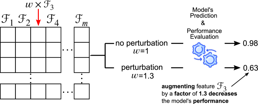
Fixing a class of interest () and a feature () from the test set, we measure the stability of the model upon feature based on two variables: a perturbation weight () inducing changes on all of the values of and the performance score of the model after predicting labels for the test set with perturbation applied to . In other words, we multiply a weight to all values of feature in the test set and use the model (trained with original training set) to measure the classifier performance after perturbation. Figure 1 illustrates this process for a dataset with features (, , …, ). Suppose a model was trained on these features, focused on the perturbation of by an arbitrary weight (see highlighted). Without the perturbation on (), the model’s performance is 0.98. Then, perturbing this feature with , the model’s performance decreases to 0.68.
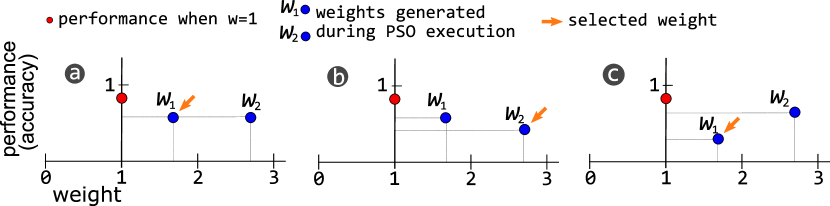
Based on such an approach, changing the weight of important features (the ones that influence the classification) produces instability to the model by decreasing its performance. Thus, the higher is the decrease the more important is the feature associated with it. Notice that, since we multiply the perturbation weights by the features, these weights must have two characteristics: to induce a lot of decrease in the performance and to be close to one (i.e., when there is no perturbation). Figure 2 illustrates three possible scenarios for comparing perturbation weights and their respective model’s performance: in the first case (a), two different weights induce the same accuracy, thus, we select which is the closest to one; in the second case (b), we select the second weight () since it induces the greater decrease; finally, we pick the select weight () in the third case (c) since it induces the greater decrease.
Notice that we try to minimize the performance and the perturbation at the same time. In other words, we try to induce more errors in the model using perturbation weights as close to one as possible. From these two objectives, minimizing performance is more important. For instance, to minimize the performance using the accuracy score as the performance measure, we can maximize Equation 1. Notice that is just a jargon of the PSO technique (the algorithm we used to maximize the function, explained in the following paragraphs), which is usually the name of the function that has to be optimized.
| (1) |
where measures the accuracy of a model using the predicted labels and the true labels . Since corresponds to the labels returned by prediction on a perturbed test set and recalling that perfect accuracy (when equals ) assumes value , maximizing Equation 1 essentially means that we are looking for the weight that induces the most decrease in accuracy value. In other words, we try to minimize Accuracy(, ) by inducing errors through perturbations, which leads to maximizing Equation 1.
Equation 1 depends only on , which depends on the , thus, we have to define how labels are predicted by the model after perturbation using . First, the perturbation weights have to be separately defined for each pair of class and feature since the importance of features can be different from one class to another. For example, while a feature that describes the number of goals scored in a football game can be important for a forward player getting the prize of woman-of-the-match, it could have no importance for a goalkeeper getting the same prize. So that, to generate , the model () receives the matrix that joins disturbed and non-disturbed data samples, where the disturbing data samples corresponding to the instances of the same class as the analyzed (). Equation 2 illustrates the idea, where denotes a classification model, denotes the sub-matrix whose data samples have class equals to and denotes the sub-matrix whose data samples are not from class —notice that corresponds to the test set. Finally, means the multiplication of all feature values of by .
| (2) |
Now, the question is how to find these weights. In this work, we use the PSO [19] algorithm, a bio-inspired optimization algorithm that uses particles in the search space to optimize a given function. The PSO considers a set of particles used to cooperate in searching for the solution to an optimization problem. Each particle has its behavior and its group behavior (defined by a neighborhood). At the beginning of the algorithm, all particles receive a random position in the search space. Then, they are evaluated in each iteration according to an optimization function to verify if they are close or not to the solution of the problem. Notice that each particle update is influenced by the position of the best particle in its neighborhood and its past positions. During iterations, the best particles will lead the others throughout the search space.
Our implementation of the PSO algorithm (see Algorithm 1) tries to find the best weights that would maximize Equation 2 while considering the importance of these weights according to the scheme of Figure 2. The first lines of the algorithm (lines 1-3) correspond to the initialization step of the particles ( and ) and the velocity of movement () of these particles. Notice that and are initialized as matrices with ones since they represent the weights for each feature and we choose to initialize the search with no perturbation (i.e., with all weights equals one). These matrices have the dimensions of the number of particles () by the number of features (). For a fixed number of iterations, we set as one all of the weights except for the weight corresponding to the feature in the analysis (lines and )—notice that corresponds to the best particles’ positions until the current iteration and corresponds to the positions of the particles in the current iteration. Setting to one all of the weights will induce change only in the feature of interest.
The main part of the algorithm is used to find the best position for the particle () and the position of the best neighbor of (). For each particle (line ), we use the function (see Equation 1) to verify if the current position of the particle is better than the previous position () or if is closer than to one when the induced performance by these two weights are equal—remember that from Figure 2 we choose the weight closest to one if the performance is the same. Having set the best particle () in line , we initialize the best particle in the group () as being as well. Lines 12-14 do essentially the same thing as discussed for lines 8-10, however, looking only to the neighborhood of . In the end, contains the index of the best particle and contains the index of the best particle in the group.
The final part of the iteration of the algorithm consists of updating (the matrix row storing the best position of the particle ) based on the positions of the best particle () and the best in the group (). Line 15 uses such information to compute the new velocity vector based on the previous velocity () and the position of the particle (). According to the PSO algorithm, and are random vectors and the multiplication corresponds to the individual behavior of the particle while corresponds to the social behavior of the particle. In other words, these two equations mean to move particle based on its current best value and based on the state of its neighborhood. Finally, the parameter is the constriction coefficient and it helps the algorithm in the convergence, we set since it is a well-established value in the literature.
Although the algorithm has a lot of parameters, the literature shows that and works fine, so we fixed them. The neighborhood was defined as following a ring pattern, i.e., for each particle , its set of neighbors correspond to the indices , , . Finally, at each iteration, we normalize set values to be inside the range .
After execution, || weights in the column vector are available for the feature in analysis to compute the feature’s importance. Thus, the mean of the absolute difference between the weights and one and the mean of the scores when predicting using each weight minus the score with no perturbation is taken. Then, the importance for each feature is computed as follows:
| (3) |
where is the set of weights with respective score same as . Essentially, with Equation 3 we derive a number that depends on the mean weight and its contribution to the model’s performance. In this case, with multiplied by we can order the importance based on accuracy, then, multiplied by the normalized weight (among those with same mean score ) results in an ordering for the features with the same . After computing the importance of each feature, they can be ordered in a decreasing way. Table 1 exemplifies such an ordering for the Iris dataset, notice that the features are arranged as if they were ordered based on and , consecutively. Notice that, the higher is the more important is the feature.
| Feature | |||
| petal width (cm) | |||
| petal length (cm) | |||
| sepal length (cm) | |||
| sepal width (cm) |
4 Visualization Design
Using the methodology described in the previous section, we defined several design requirements (DR) to help with the interpretation of classification models using the PSO algorithm. The visualization is based on the visual inspection of the PSO algorithm execution with carefully chosen visual variables to help interpret classification results. Using the information generated by the PSO algorithm and other requirements to interpret a model’s decision, we want to be able to visualize:
-
•
DR1: the weights that most influence the classifier decision;
-
•
DR2: the strength of influence of a feature;
-
•
DR3: the confusion of the classifier based on different perturbation weights;
-
•
DR4: the distribution of values for the features;
-
•
DR5: the PSO execution;
-
•
DR6: the similarity among the classes in the dataset.
To accomplish these design requirements (DR), we follow a strategy to create the visualization tool centered on the PSO execution. The interpretation of the classifier’s decisions consists of inspecting the feature perturbations generated by PSO particles. In the following sections, we explain the detailed and the summary visualization for a class of interest. Then, we show how to measure the similarity between classes in terms of classifier confusion.
4.1 Detailed View
In the PSO algorithm, the particles assume different values (weights) during iterations. These weights correspond to the perturbations we want to find to interpret a model’s prediction. When we multiply a weight to a feature , we can assess how much the perturbation induces change on the classification performance—notice that represents the particle index and represents the current iteration of the PSO algorithm. With such an idea in mind, we can use graphical variables to encode the relationship between the perturbation () and the feature. Notice that the perturbation consists of multiplying by , in other words, multiplying by the column of the test set.
To visualize the perturbations and the result on the performance measure after a model’s prediction, we encode the weights as circles in a horizontal axis. At the same time, a color scale represents the change in the model’s performance, as illustrated in Figure 3. Such an encoding shows consistency with PSO execution since we move the weights from the initial position (close to one) to positions with much perturbation to the model. Each circle corresponds to a weight assumed by a particle during PSO execution—notice that the -axis does not have any meaning.
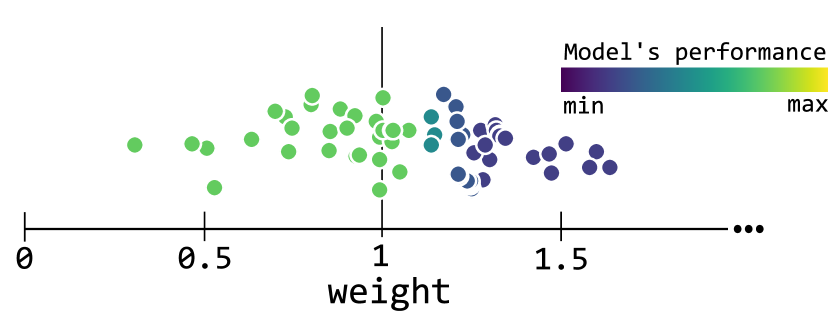
Using the visual encoding of Figure 3 we can visualize the weights that most influence the classifier decision (DR1) by comparing the position (distance to one) and the induced model’s performance. The circles and their color also help to understand the strength of influence (DR2) and the PSO execution (DR5) throughout iterations based on the weights assumed by the particles. However, other additional information could help to interpret the classifier decisions and learning processes. Firstly, the distribution of values (DR4) for the feature helps to contrast the classifier performance with the pattern seen in data samples for a particular class. Lastly, for the non-binary classification problem, it is interesting to know how different weights influence the classifier’s confusion with other classes (DR3). Figure 4 shows information for two features. Apart from distribution plots showing the feature values (c), we encode the confusion of the classifier after perturbation using proportions of the confused classes (b) (indicated by color hue)—notice that higher bars show a greater number of data samples classified as that specific class. The circles in (a) encode the information already discussed and exemplified with the scheme of Figure 3. Finally, the horizontal red segment (d) shows the best weight (among all of the weights generated by the particle) for the feature concerning the definition of our optimization problem, that is, the minimum weight that induces the higher loss to the model’s performance.
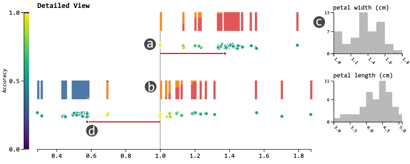
One important thing to mention is that the proportion displaying the confusion is not computed using one weight but a range of weights inside a window. More specifically, we divide the weight space in windows of length and use all weights inside each window to calculate the proportion. Since each perturbation weight generates predictions—where is the number of data samples in the test set—, we compute the mean of classification for each class to derive the proportion of the bars in the stacked bar chart.
4.2 Summary View
The visualization design presented in the previous section suffers from visual scalability issues when analyzing a large dataset (in terms of dimensionality). So, we designed a summary version of the information presented in the detailed view where users can choose which features to explore throughout the interaction. More specifically, in the Summary View, we show the relationship between perturbation weights and the model’s performance.
To summarize the information contained in the Detailed View, we use a variable to create windows on the weight axis, as illustrated in Figure 5. Then, each feature weight inside a window induces a performance score () to the model being analyzed. Since the mean of performance score inside a window still lies inside the score range (from to for accuracy), windows are color-coded based on the same color-scale used for the Detailed View. Notice that for some weights, there is no influence on the model’s prediction (see the performance for weights lower than one in Figure 5) while there is an upper bound for how much change on the performance a feature perturbation can induce (see the performance for weights greater than approximately ).
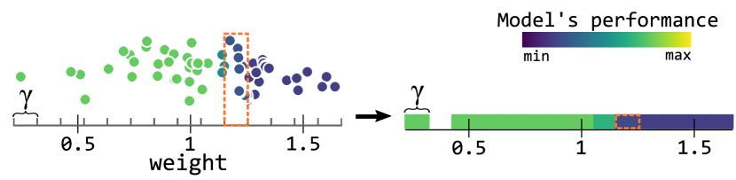
Figure 6 shows the results of summarizing information using the discussed strategy. Besides the performance of the classifiers inside the windows defined using , the best weight (as the one for the Detailed View) is shown through a vertical segment in red. Lastly, the boxes on the right of each axis show which features are being currently inspected on the Detailed View. Users can toggle the boxes to show (when the boxes are filled with gray) or hide (when the boxes are filled with white) feature information.

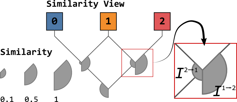
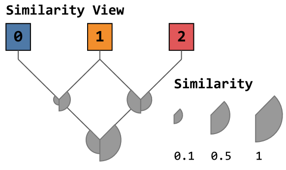
4.3 Similarity View
Besides assessing how the perturbations affect a model’s performance based on a local perspective, a global view, where we understand how the classification of class is confused with class , can be helpful to guide users on the detailed inspection. Notice that confusion is not reflexive, that is, the confusion from to is not the same as the confusion from to .
Let us define the similarity between two classes and (from to ) as a measure of confusion of the classifier between these classes. Firstly, we must give higher weight to the data points confused with when the weight induced to such confusion is closer to one. This means we give more interaction to the classes in which little perturbation induces more confusion. So that, the similarity from class to class for feature is defined as it follows:
| (4) |
Equation 4 ranges from to , where means that all of the test data samples were classified as . Notice that denotes the number of data points classified as after multiplying to the column corresponding to feature . corresponds to the greatest value that a particle can assume in the PSO algorithm (here, we set ). Using that equation, we can define the similarity from to as the mean of similarities of each feature, as shown in Equation 5.
| (5) |
To visualize the similarity information among all classes, we use a node-link layout together with an encoding inspired on the UpSet [33] visualization. As illustrated in Figure 7, every pair of combination is encoded by a cross on the lines of the classes. Then, to communicate the interaction to for every pair of (), we use the outer radius of an arc positioned on the crossing between and . Notice in Figure 7, the encoding for interaction between two classes follows the direction of the source class to the target, as demonstrated for and . For instance, the figure shows the example of a Similarity View for the Iris dataset. Notice that, as it is very understanding about this well-known dataset, two classes interact the most and are responsible for errors in the classification.
5 Use cases
In this section, we use the feature perturbations generated by PSO to interpret the model’s behavior upon the classification of several datasets. All of the experiments were performed with a computer with the following configuration: Intel (R) Core(TM) i7-8700 CPU @ 3.20 GHz, 32GB RAM, Windows 10 64 bits. Since the focus is on the interpretation of the results rather than the performance of the classifier, all of the hyper-parameters and details are described in the Supplementary File.
5.1 Vertebral Column
In this first use case, we interpret the XGBoost Classifier [34] applied to the Vertebral Column [35] dataset, composed by instances described by six biomechanical features derived from the shape and orientation of the pelvis and lumbar spine: pelvic incidence, pelvic tilt, lumbar lordosis angle, sacral slope, pelvic radius, and grade of spondylolisthesis. The dataset is divided into three classes: class ![]() for patients with Hernia, class
for patients with Hernia, class ![]() for patients with Spondylolisthesis – a disturbance of the spine in which a bone (vertebra) slides forward over the bone below it, and class
for patients with Spondylolisthesis – a disturbance of the spine in which a bone (vertebra) slides forward over the bone below it, and class ![]() for normal patients. Figure 8 shows the interaction among these three classes. From the Similarity View, we can understand that there is a lot of confusion between classes
for normal patients. Figure 8 shows the interaction among these three classes. From the Similarity View, we can understand that there is a lot of confusion between classes ![]() and
and ![]() induced by the perturbation weights generated by the PSO execution, which indicates that it is a difficult task to determine whether a data sample belongs to either of these two classes. On the other hand, class
induced by the perturbation weights generated by the PSO execution, which indicates that it is a difficult task to determine whether a data sample belongs to either of these two classes. On the other hand, class ![]() seems to have very distinctive features from the other two classes, where the confusion is mostly present in the backward form ( and ).
seems to have very distinctive features from the other two classes, where the confusion is mostly present in the backward form ( and ).
To inspect how the classes ![]() and
and ![]() present such complexity to the classifier, Figure 9 shows the summary result of all features in the dataset and detail of only the most distinctive features for these two classes. The first thing to notice is that the classifier confuses both of the classes with class
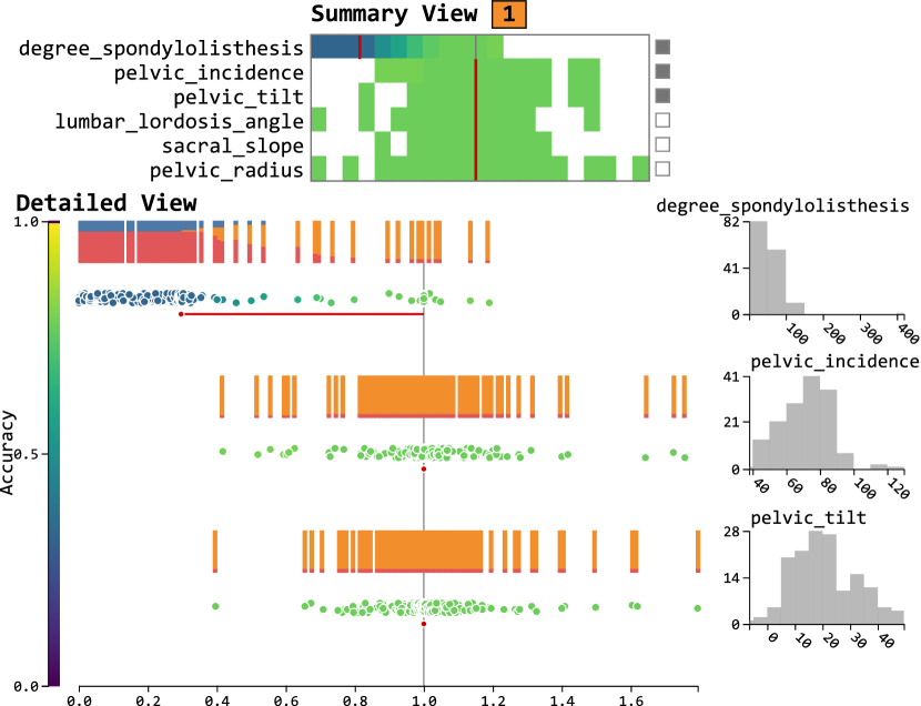
present such complexity to the classifier, Figure 9 shows the summary result of all features in the dataset and detail of only the most distinctive features for these two classes. The first thing to notice is that the classifier confuses both of the classes with class ![]() when degree_spondylolisthesis increases – as we show later, the degree of spondylolisthesis is the most determinant feature for patients with Spondylolisthesis. Further that, we can identify that those normal patients (class
when degree_spondylolisthesis increases – as we show later, the degree of spondylolisthesis is the most determinant feature for patients with Spondylolisthesis. Further that, we can identify that those normal patients (class ![]() ) present lower values for pelvic tilt and higher values for sacral slope and pelvic radius, that is, see how the confusion from class
) present lower values for pelvic tilt and higher values for sacral slope and pelvic radius, that is, see how the confusion from class ![]() to class
to class ![]() increases when the feature pelvic tilt is multiplied by a number below one or when the feature sacral slopse is multiplied by a number higher than one in Figure 9a. On the other hand, the values for these features are found to be the opposite in patients with Hernia [36, 37, 38]. We can see that by analyzing the changes induced by the perturbations generated with the PSO algorithm, we could understand a lot of characteristics of the dataset together with the classifier decisions. Here, while the classifier could learn the parameters to be more confident when the features are pushed to the limit (higher or lower values), it seems that the classifier needs improvement to correctly classify data samples that share class boundaries – when feature values are similar.
increases when the feature pelvic tilt is multiplied by a number below one or when the feature sacral slopse is multiplied by a number higher than one in Figure 9a. On the other hand, the values for these features are found to be the opposite in patients with Hernia [36, 37, 38]. We can see that by analyzing the changes induced by the perturbations generated with the PSO algorithm, we could understand a lot of characteristics of the dataset together with the classifier decisions. Here, while the classifier could learn the parameters to be more confident when the features are pushed to the limit (higher or lower values), it seems that the classifier needs improvement to correctly classify data samples that share class boundaries – when feature values are similar.
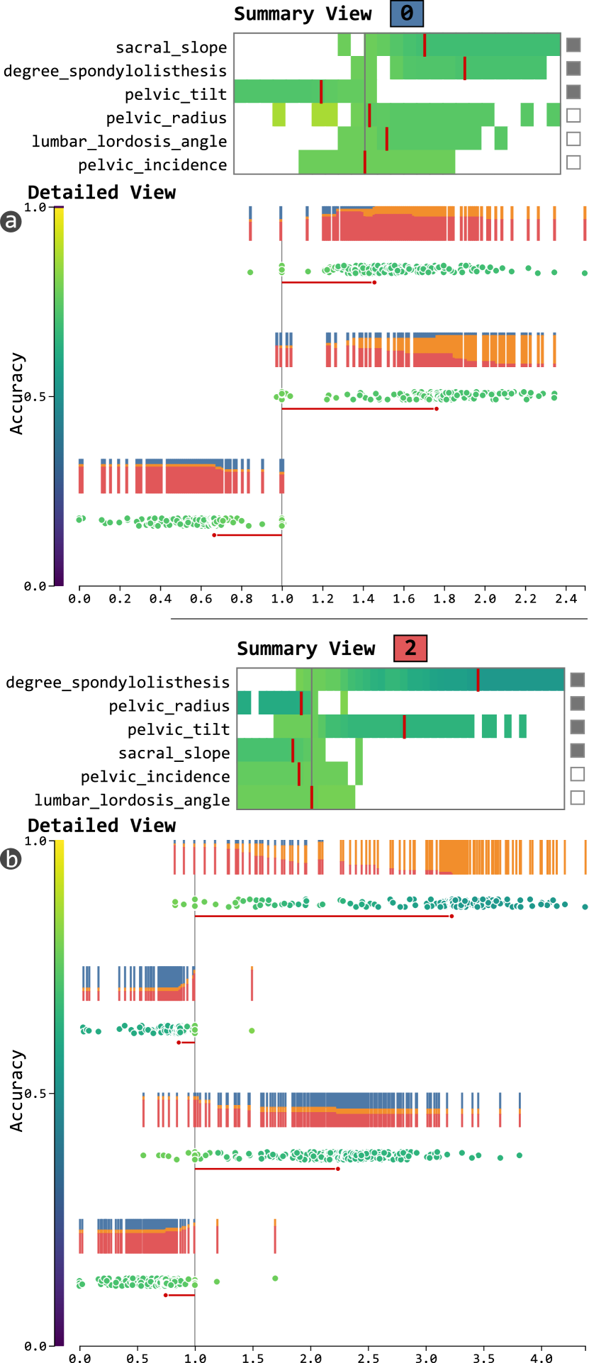
The class ![]() , as shown in Figure 10, presents different results only when the perturbations are applied to the degree_spondylolisthesis feature. Notice that how the results are consistent with the Similarity Plot, in which there are very low similarity going from class
, as shown in Figure 10, presents different results only when the perturbations are applied to the degree_spondylolisthesis feature. Notice that how the results are consistent with the Similarity Plot, in which there are very low similarity going from class ![]() to the others.
to the others.
Now, we must verify if the results of the classifier explained by the PSO perturbation weights make sense. That is, to verify if the patients with Spondylolisthesis, the degree of spondylolisthesis are known to be greater. Interestingly, the degree of spondylolisthesis is the most important factor to determine if a patient has Spondylolisthesis or not [36]. This makes sense if, with a higher degree, a vertebra bone presents more deviation from a bone below it – which constitutes the Spondylolisthesis. Here, we see that the classifier used degree_spondylolisthesis to induce a separation between class ![]() and the other two classes
and the other two classes ![]() and
and ![]() .
.
5.2 Heart disease
In this second case study, we use our approach to inspect and understand the features used by Random Forest Classifier [39] to differentiate between patients with healthy and unhealthy hearts. The dataset contains two classes: healthy hearts (![]() ) and unhealthy hearts (
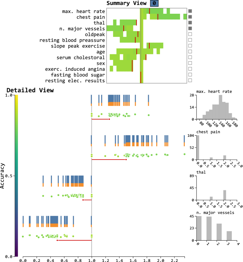
) and unhealthy hearts (![]() ). Each data sample is described by the following features: age, sex (1 - male; 0 - female), chest pain type, resting blood pressure, serum cholesterol (in mg/ml), fasting blood sugar, (> mg/ml), resting electrocardiographic results (values ), maximum heart rate achieved, exercise induced angina, oldpeak = ST depression induced by exercise relative to rest, the slope of the peak exercise ST segment, number of major vessels (0-3), and thal (3 - normal, 6 - fixed defect, 7 - reversable defect). Since there are only two classes, the Summary View does not add much information to the analysis, thus, we omitted it for this case study.
). Each data sample is described by the following features: age, sex (1 - male; 0 - female), chest pain type, resting blood pressure, serum cholesterol (in mg/ml), fasting blood sugar, (> mg/ml), resting electrocardiographic results (values ), maximum heart rate achieved, exercise induced angina, oldpeak = ST depression induced by exercise relative to rest, the slope of the peak exercise ST segment, number of major vessels (0-3), and thal (3 - normal, 6 - fixed defect, 7 - reversable defect). Since there are only two classes, the Summary View does not add much information to the analysis, thus, we omitted it for this case study.
Figure 11 shows the summary and detailed (for some features) of the importance given by the classifier to classify data samples as healthy hearts. The most important feature, that according to the classification model constitutes a healthy heart, is max. heart rate. In this case, healthy hearts are seen by the classification model as the ones with moderate rate beat – when the heartbeat gets higher, the model starts to confuse with unhealthy hearts. Then, the chest pain, defined by increasing values related to the severity (from to ), constitutes the second most important feature. As learned by the algorithm, healthy hearts present lower levels of severe pain (see the distribution plot of chest pain). The third most influential feature, thal, corresponds to an inherited blood disorder (Thalassemia) that causes one’s body to have less hemoglobin than normal. Interestingly, heart problems (such as congestive heart failure and abnormal heart rhythms) can be associated with Thalassemia [40, 41]. Finally, the model also gave importance to the number of major vessels feature. This feature indicates how many arteries are visible after a special dye (fluoroscopy) is injected into the blood vessels of the heart. Unlike the previously discussed feature (thal), there is a consistency to the algorithm as defining healthy hearts the one with a higher number of visible vessels.
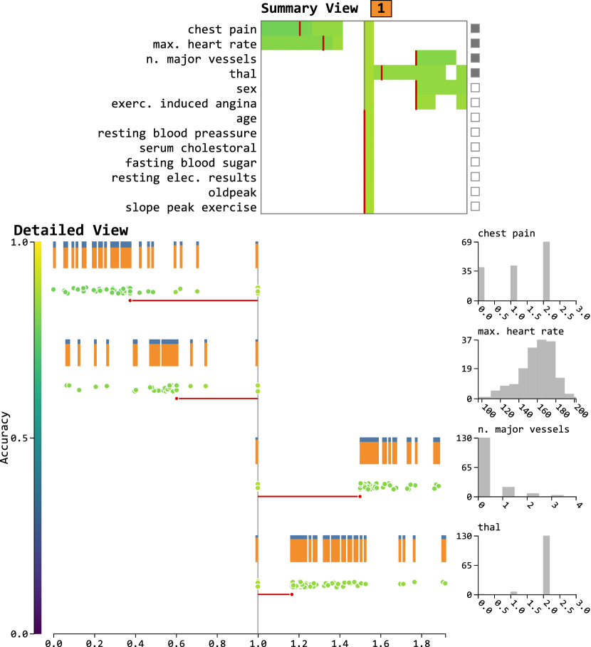
The pattern perceived for unhealthy hearts (class ![]() ) is nearly the opposite of the ones perceived for healthy hearts, as shown in Figure 12. Although the four most important features of class
) is nearly the opposite of the ones perceived for healthy hearts, as shown in Figure 12. Although the four most important features of class ![]() are the same four most important features of class
are the same four most important features of class ![]() , there is a change in the ordering. For the case of chest pain, the feature weights are lower than one since unhealthy hearts present more severe chest pain, encode by greater values. The second most important feature, max. heart rate shows how unhealthy hearts present a beat rate greater than healthy hearts. Then, the narrowing of blood vessels, which is related to the number of major vessels, is usually due to arteriosclerosis, a common arterial disease in which increased areas of degeneration and cholesterol deposit plaques form on the inner surfaces of the particles blocking the blood flow [42, 43]. Finally, one must understand the organization of the dataset and the field in which the problem is inserted before taking any particular assumption. That is, besides preventing analysts from defining erroneous hypothesis, carefully analyze the results returned by our algorithm will help one to understand the decisions of the model and the structures of the dataset, such as data mismatch. For example, after receiving a high score in a classification task, one could analyze and understand if there is bias in the features learned by the models.
, there is a change in the ordering. For the case of chest pain, the feature weights are lower than one since unhealthy hearts present more severe chest pain, encode by greater values. The second most important feature, max. heart rate shows how unhealthy hearts present a beat rate greater than healthy hearts. Then, the narrowing of blood vessels, which is related to the number of major vessels, is usually due to arteriosclerosis, a common arterial disease in which increased areas of degeneration and cholesterol deposit plaques form on the inner surfaces of the particles blocking the blood flow [42, 43]. Finally, one must understand the organization of the dataset and the field in which the problem is inserted before taking any particular assumption. That is, besides preventing analysts from defining erroneous hypothesis, carefully analyze the results returned by our algorithm will help one to understand the decisions of the model and the structures of the dataset, such as data mismatch. For example, after receiving a high score in a classification task, one could analyze and understand if there is bias in the features learned by the models.
5.3 Diabetes
In this final case study, we interpret CatBoost [44] classifier’s prediction on a dataset containing data samples of patients described by eight medical features concerning the presence of diabetes: data samples of patients with diabetes (class ![]() ) and data samples of non-diabetic patients (class
) and data samples of non-diabetic patients (class ![]() ). The features used for classification are: preg (number of times pregnant), plas (plasma glucose concentration after 2 hours in an oral glucose tolerance test), pres (diastolic blood pressure), skin (triceps skin fold thickness (mm)), insulin (2-hour serum insulin (mU/ml)), mass (body mass index (weight in kg/(height in m)2), pedi (diabetes pedigree function), age (age in years). As we discussed for the previous case study, we do not rely on the similarity view to extract information of this dataset since it consists in a binary classification.
). The features used for classification are: preg (number of times pregnant), plas (plasma glucose concentration after 2 hours in an oral glucose tolerance test), pres (diastolic blood pressure), skin (triceps skin fold thickness (mm)), insulin (2-hour serum insulin (mU/ml)), mass (body mass index (weight in kg/(height in m)2), pedi (diabetes pedigree function), age (age in years). As we discussed for the previous case study, we do not rely on the similarity view to extract information of this dataset since it consists in a binary classification.
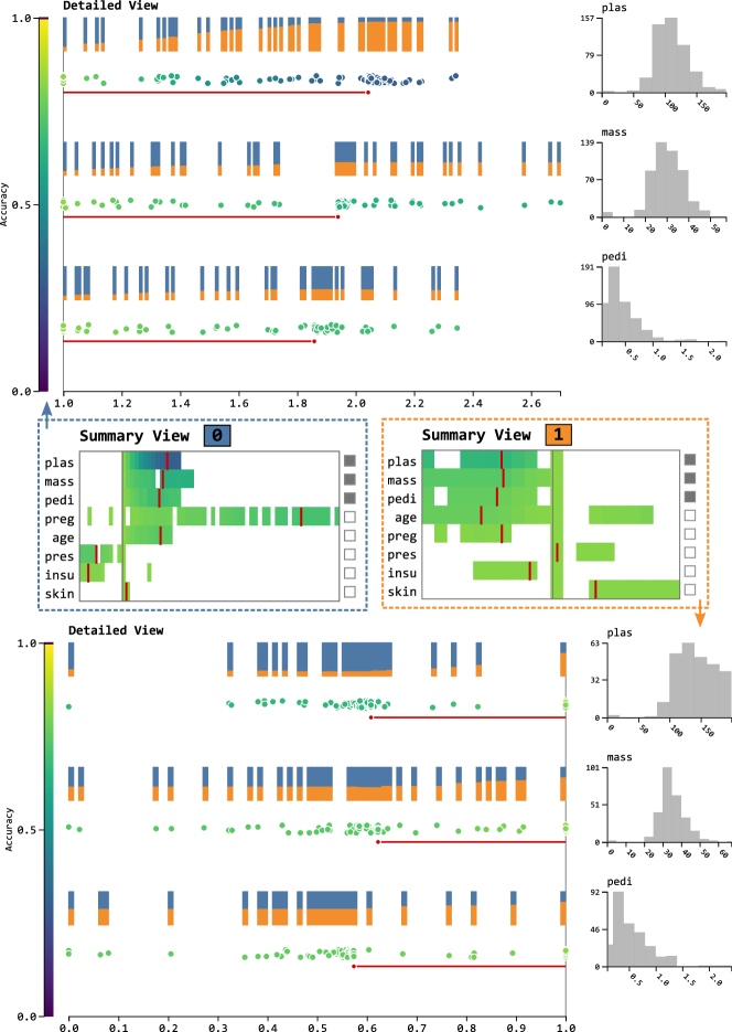
Figure 13 shows the result for both classes: patients with diabetes ![]() and patients without diabetes
and patients without diabetes ![]() . Here, we focus on the three most important features returned by our technique for both of the classes, in which three importance ordering is the same: plasma glucose concentration (plas), body mass index (mass), diabetes pedigree function (pedi). Recalling that plasma glucose concentration (or simply blood sugar level) is a well-known indicator of prediabetes when the levels are high [45], our approach consistently shows how a healthy patient (class
. Here, we focus on the three most important features returned by our technique for both of the classes, in which three importance ordering is the same: plasma glucose concentration (plas), body mass index (mass), diabetes pedigree function (pedi). Recalling that plasma glucose concentration (or simply blood sugar level) is a well-known indicator of prediabetes when the levels are high [45], our approach consistently shows how a healthy patient (class ![]() ) must increase his blood sugar levels to become diabetic—notice that it consistently identified this feature as the most important one. Looking at the distribution of values for plas for patients without diabetes, there is a concentration of around . Further, the second most important feature also shows that increased body fat will result in patients with a higher probability of having diabetes. Interestingly, such a result is consistent with the literature since an increase in body fat is generally associated with an increase in the risk of metabolic diseases such as Type diabetes mellitus [46]. Finally, the diabetes pedigree function feature (pedi) also illustrates the applicability of our visualization design and method of model explanation. Since such a feature measures the likelihood of diabetes based on family history, it is clear that higher pedigree function valuers will induce more chances for patients to be classified as diabetic.
) must increase his blood sugar levels to become diabetic—notice that it consistently identified this feature as the most important one. Looking at the distribution of values for plas for patients without diabetes, there is a concentration of around . Further, the second most important feature also shows that increased body fat will result in patients with a higher probability of having diabetes. Interestingly, such a result is consistent with the literature since an increase in body fat is generally associated with an increase in the risk of metabolic diseases such as Type diabetes mellitus [46]. Finally, the diabetes pedigree function feature (pedi) also illustrates the applicability of our visualization design and method of model explanation. Since such a feature measures the likelihood of diabetes based on family history, it is clear that higher pedigree function valuers will induce more chances for patients to be classified as diabetic.
Interestingly, looking at the perturbations of class ![]() , the algorithm consistently imposed weight that would result in the levels of features shown by healthy patients. That is, normal levels for plas, mass, and pedi.
, the algorithm consistently imposed weight that would result in the levels of features shown by healthy patients. That is, normal levels for plas, mass, and pedi.
6 Numerical evaluation
In this section, we compare our proposal against two well-established techniques at their ability to retrieve important features. The techniques were evaluated using the Keep Absolute [25] metric, which measures the impact of selected features on the model accuracy. In this case, the impact is measured by adding the most important features from the dataset and training the model. Figure 14 exemplifies the strategy for the Keep Absolute metric, note that as more features are added, the accuracy of the model on cross-validation (5 fold) setting increases. Also, to further validate our methodology, we evaluate it against feature selection algorithms (Permutation Importance [47], ANOVA [48], Mutual Information [49], and Recursive Feature Selection [50]) using the same metric.
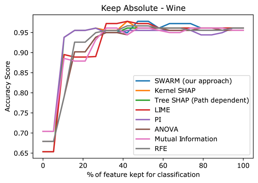
Table 2 shows the values for the Keep Absolute metric using the XGBoost classifier. Our technique performed better than all of the feature selection techniques—although for the Vertebral dataset presented a difference of only 0.0009 to the best result. Focusing only on the model explanation techniques, our method provides explanation with better ordering of feature importance than at least one state-of-the-art method. From these results, we emphasize two important things. Firstly, our method performs very similar to well-established techniques in the literature. Second, the small differences among scores in Table 2 shows great agreements among the model explanation approaches.
| Vertebral | Indian Liver | Heart | Wine | Breast Cancer | Iris | |
| SWARM | 0.8071 | 0.6687 | 0.8172 | 0.9413 | 0.9639 | 0.9615 |
| Kernel SHAP | 0.8047 | 0.6672 | 0.8108 | 0.9393 | 0.9628 | 0.9615 |
| Tree SHAP (PD) | 0.8056 | 0.6692 | 0.8194 | 0.9338 | 0.9650 | 0.9615 |
| LIME | 0.8074 | 0.6658 | 0.8197 | 0.9253 | 0.9645 | 0.9615 |
| PI | 0.8080 | 0.6636 | 0.8209 | 0.9333 | 0.9637 | 0.9615 |
| ANOVA | 0.7849 | 0.6632 | 0.7940 | 0.9187 | 0.9510 | 0.9615 |
| M. Information | 0.7933 | 0.6603 | 0.7922 | 0.9239 | 0.9505 | 0.9615 |
| RFE | 0.7960 | 0.6585 | 0.7795 | 0.9246 | 0.9617 | 0.9560 |
As seen for XGBoost Classifier in Table 2, we also evaluated the techniques by using Random Forest Classifier. Table 3 summarizes the results. We can see from the table that although our technique was not able to present the best results for all of the datasets, it presented the second-best score for Indian Liver, Heart, and Breast Cancer. Finally, the significative difference was only reported for the Wine dataset.
| Vertebral | Indian Liver | Heart | Wine | Breast Cancer | Iris | |
| SWARM | 0.8155 | 0.6756 | 0.8178 | 0.9208 | 0.9563 | 0.9541 |
| Kernel SHAP | 0.8128 | 0.6820 | 0.8165 | 0.9433 | 0.9537 | 0.9535 |
| LIME | 0.7931 | 0.6723 | 0.8212 | 0.9332 | 0.9559 | 0.9551 |
| PI | 0.8144 | 0.6666 | 0.8115 | 0.9283 | 0.9566 | 0.9551 |
| ANOVA | 0.7916 | 0.6681 | 0.7897 | 0.9282 | 0.9490 | 0.9534 |
| M. Information | 0.7978 | 0.6652 | 0.7906 | 0.9332 | 0.9474 | 0.9551 |
| RFE | 0.7966 | 0.6706 | 0.7740 | 0.9407 | 0.9514 | 0.9602 |
To illustrate the stability of our method in returning stable results compared with other techniques, we show the rankings of each method according to XGBoost Classifier and Random Forest Classifier. Based on the results for XGBoost Classifier in Table 5, our method has a mean ranking of (underlined) while losing only for TreeSHAP (in bold) with a mean ranking of . Finally, the results in Table 4 for Random Forest Classifier show that our method got the third position with behind the first two methods (KernelSHAP and LIME, both with a mean ranking of ). These results confirm the stability of the proposed technique.
| Vertebral | Indian Liver | Heart | Wine | Breast Cancer | Iris | Mean ranking | St.d. | |
| SWARM | 3 | 2 | 4 | 1 | 3 | 1 | 2.33 | 1.21 |
| Kernel SHAP | 5 | 3 | 5 | 2 | 5 | 1 | 3.50 | 1.76 |
| Tree SHAP (PD) | 4 | 1 | 3 | 3 | 1 | 1 | 2.17 | 1.33 |
| LIME | 2 | 4 | 2 | 5 | 2 | 1 | 2.67 | 1.51 |
| PI | 1 | 5 | 1 | 4 | 4 | 1 | 2.67 | 1.86 |
| ANOVA | 8 | 6 | 6 | 8 | 7 | 1 | 6.00 | 2.61 |
| M. Information | 7 | 7 | 7 | 7 | 8 | 1 | 6.17 | 2.56 |
| RFE | 6 | 8 | 8 | 6 | 6 | 8 | 7.00 | 1.10 |
| Vertebral | Indian Liver | Heart | Wine | Breast Cancer | Iris | Mean ranking | St.d. | |
| SWARM | 1 | 2 | 2 | 7 | 2 | 5 | 3.17 | 2.32 |
| Kernel SHAP | 3 | 1 | 3 | 1 | 4 | 6 | 3.00 | 1.90 |
| LIME | 6 | 3 | 1 | 3 | 3 | 2 | 3.00 | 1.67 |
| PI | 2 | 6 | 4 | 5 | 1 | 2 | 3.33 | 1.97 |
| ANOVA | 7 | 5 | 6 | 6 | 6 | 7 | 6.17 | 0.75 |
| M. Information | 4 | 7 | 5 | 3 | 7 | 2 | 4.67 | 2.07 |
| RFE | 5 | 4 | 7 | 2 | 5 | 1 | 4.00 | 2.19 |
6.1 Parameter analysis
In this section, we provide an evaluation on a few parameters of PSO algorithm and their influence on the result of our model. We evaluate the velocity parameters (, )—indicated by Limits in the graphs—, which influence the changes of particles in each algorithm iteration. The number of particles () used by the swarm optimization, and the number of iterations. Figure 15 shows the result for the datasets used in the numerical evaluation using the Keep Absolute metric after five runs using the same configuration.
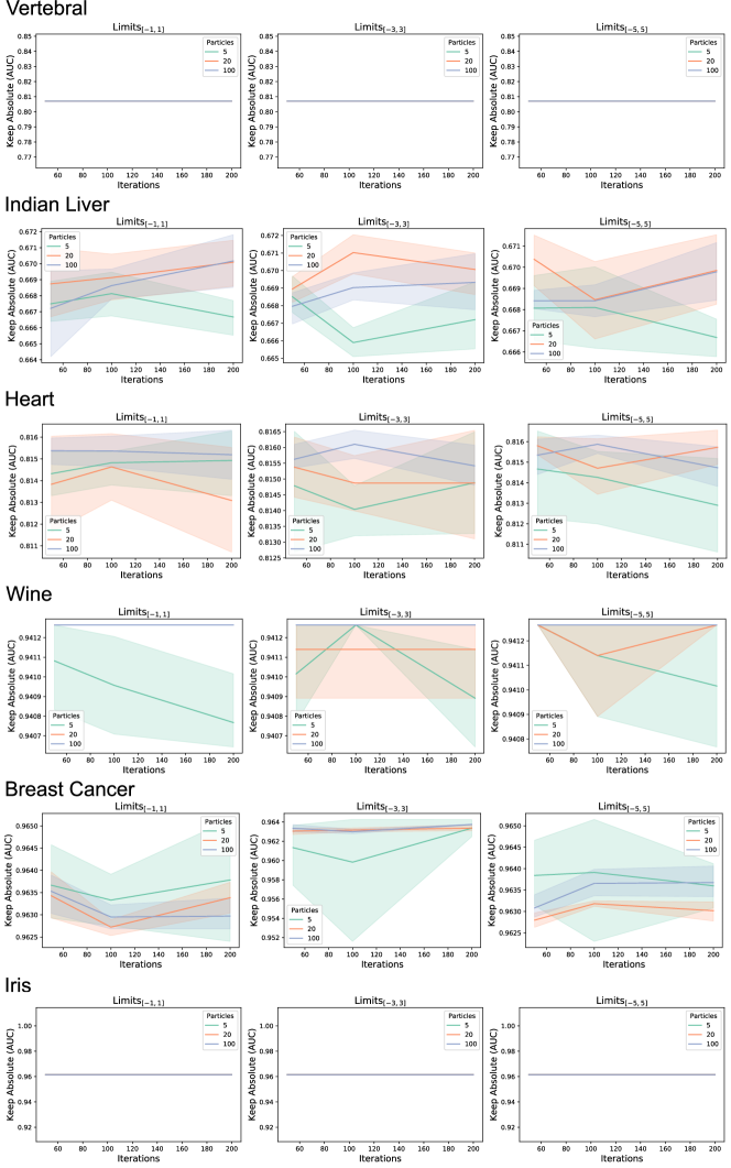
The results of Figure 15 show the robustness of our model regarding the changes in the parameters. That is, although there are differences among the Keep Absolute (AUC) values when considering different parameter combinations, the overall performance is maintained. Another important thing to mention is that the number of iterations together with the number of particles define the runtime execution for each dataset (please, see Figure 1 in Supplementary File). Thus, the analysis of Figure 15 provides the information that using a few particles (< 10) is sufficient for a trustful analysis using our model.
7 Discussions
In this work, we presented a novel model interpretation approach using PSO. Our method, defined as a global interpretation approach, can be employed as a local approach by feeding one instance at a time to our PSO implementation. The main strength of our method is its simplicity and ability to be adapted to various performance scores and optimization functions, which is a strength of our method over the state-of-the-art algorithms LIME [16] and SHAP [15].
In the numerical evaluation, our method performed better than feature selection algorithms on tasks that measure the performance of defining the input features’ proper importance ordering. Although it could not uncover the best results for all of the datasets used in training, our method provided stable results on higher positions.
Preprocessing.
One important thing to mention is the need to preprocess some datasets to use the proposed approach with PSO perturbation weights. For instance, a value needs to be added to datasets with zero entries. Such a preprocessing step is important since our explanations consist of using instructions in the form , and having will make the particles of the PSO algorithm stay still and not make any progress. Adding to will solve such an problem—here we used . Notice that this preprocessing is only applied to help the algorithm, and the visualization aspects are created based on the original data.
Finally, while we demonstrated our technique’s ability to explain classifiers’ predictions, it can be easily modified to work with regression models. In this case, the PSO algorithm can be used to produce perturbation weights that would maximize an error metric (e.g., mean squared error) while reducing the distance between the position with no perturbation ().
Other nature-inspired algorithms.
As demonstrated in the paper, the PSO and the visualization design help understand the learned patterns by machine learning techniques. However, the reader may notice that the optimization performed to search for the perturbing features cannot be performed only by PSO. Other algorithms, such as genetic or evolutionary approaches, could also be employed for this task. The two components of our approach (optimization and visualization) are uncoupled and provide flexibility on which algorithm to use. Thus, we plan to investigate other nature-inspired strategies with a few updates on the visualization component to explain machine learning techniques in future works.
7.1 Limitations
The main limitation of our work is the run-time execution since we have to execute the PSO algorithm for each combination of feature and class. Although we plan to investigate faster optimization algorithms in further works, a subset of the data used to feed our algorithm could also decrease the execution time. Besides that, we could use a subset of the most important features for a dataset with higher dimensionality.
Another limitation of our work is the need for preprocessing steps, as discussed above, which could break the desire patterns introduced by users or during dataset acquisition. In future works, we plan to investigate alternatives to reduce the dependency on these steps. For example, instead of multiplying a feature by an optimized value, each data sample could receive a random perturbation (negative or positive) created using a Gaussian function with an optimized kernel. So, less important features could receive a strong perturbation without a relevant change in the model’s performance. On the other hand, an essential feature would cause performance loss even with a weak perturbation.
7.2 Implementation
Our technique was implemented using Python, while the prototype system with the visualization uses D3.js [51]. We also created a Python module (it will be available after publication) with lightweight visualizations similar to those presented here so users can use our approach in notebooks.
8 Conclusion
As machine learning algorithms take over traditional approaches to solve problems, their reliability becomes more critical in applications where wrong decisions can lead to severe issues. Understanding a model’s decisions is now an essential process of the development and execution of machine learning strategies to assess if such decisions make sense to domain experts.
In this work, we proposed a novel model-agnostic approach to interpret any classification algorithm by using PSO. We validated our approach on its ability to explain classifiers’ decisions throughout several case studies. Finally, our methodology was also numerically evaluated on its ability to classify input features according to their importance. The results showed that our method could return very stable orderings with good results for all of the datasets—a result that only one state-of-the-art method was able to provide.
We plan to investigate our methodology on regression tasks in future works and use other optimization algorithms to find the perturbation weights. Besides that, since SHAP approximates Shapley values, we also want to investigate nature-inspired optimization techniques to approximate them.
Acknowledgements
This work was supported by the agencies Fundação de Amparo à Pesquisa (FAPESP)—grant #2018/17881-3, and Coordenação de Aperfeiçoamento de Pessoal de Nível Superior (CAPES)—grant #88887.487331/2020-00.
References
- Peters et al. [2018] M. E. Peters, M. Neumann, M. Iyyer, M. Gardner, C. Clark, K. Lee, L. Zettlemoyer, Deep contextualized word representations, in: Proc. of NAACL.
- Devlin et al. [2018] J. Devlin, M.-W. Chang, K. Lee, K. Toutanova, Bert: Pre-training of deep bidirectional transformers for language understanding, 2018.
- Szegedy et al. [2015] C. Szegedy, Wei Liu, Yangqing Jia, P. Sermanet, S. Reed, D. Anguelov, D. Erhan, V. Vanhoucke, A. Rabinovich, Going deeper with convolutions, in: 2015 IEEE Conference on Computer Vision and Pattern Recognition (CVPR), pp. 1–9.
- Krizhevsky et al. [2012] A. Krizhevsky, I. Sutskever, G. E. Hinton, Imagenet classification with deep convolutional neural networks, in: F. Pereira, C. J. C. Burges, L. Bottou, K. Q. Weinberger (Eds.), Advances in Neural Information Processing Systems 25, Curran Associates, Inc., 2012, pp. 1097–1105.
- He et al. [2016] K. He, X. Zhang, S. Ren, J. Sun, Deep residual learning for image recognition, in: 2016 IEEE Conference on Computer Vision and Pattern Recognition (CVPR), pp. 770–778.
- Chollet [2017] F. Chollet, Xception: Deep learning with depthwise separable convolutions, in: 2017 IEEE Conference on Computer Vision and Pattern Recognition (CVPR), pp. 1800–1807.
- Luo [2016] G. Luo, Automatically explaining machine learning prediction results: a demonstration on type 2 diabetes risk prediction, Health Information Science and Systems 4 (2016).
- Bansal et al. [2019] G. Bansal, B. Nushi, E. Kamar, D. S. Weld, W. S. Lasecki, E. Horvitz, Updates in human-ai teams: Understanding and addressing the performance/compatibility tradeoff, in: AAAI.
- Kulesza et al. [2015] T. Kulesza, M. Burnett, W.-K. Wong, S. Stumpf, Principles of explanatory debugging to personalize interactive machine learning, in: Proceedings of the 20th International Conference on Intelligent User Interfaces, IUI ’15, ACM, 2015, p. 126–137.
- Doshi-Velez and Kim [2017] F. Doshi-Velez, B. Kim, Towards a rigorous science of interpretable machine learning, arXiv (2017).
- Doshi-Velez and Kim [2018] F. Doshi-Velez, B. Kim, Considerations for evaluation and generalization in interpretable machine learning.
- Krause et al. [2016] J. Krause, A. Perer, K. Ng, Interacting with predictions: Visual inspection of black-box machine learning models, in: Proceedings of the 2016 CHI Conference on Human Factors in Computing Systems, CHI ’16, ACM, 2016, p. 5686–5697.
- Pezzotti et al. [2018] N. Pezzotti, T. Höllt, J. Van Gemert, B. P. F. Lelieveldt, E. Eisemann, A. Vilanova, Deepeyes: Progressive visual analytics for designing deep neural networks, IEEE Transactions on Visualization and Computer Graphics 24 (2018) 98–108.
- Marcilio-Jr et al. [2020] W. E. Marcilio-Jr, D. M. Eler, R. E. Garcia, R. C. M. Correia, L. F. Silva, A hybrid visualization approach to perform analysis of feature spaces, in: S. Latifi (Ed.), 17th International Conference on Information Technology–New Generations (ITNG 2020), Springer International Publishing, Cham, 2020, pp. 241–247.
- Lundberg and Lee [2017] S. M. Lundberg, S.-I. Lee, A unified approach to interpreting model predictions, in: I. Guyon, U. V. Luxburg, S. Bengio, H. Wallach, R. Fergus, S. Vishwanathan, R. Garnett (Eds.), Advances in Neural Information Processing Systems 30, Curran Associates, Inc., 2017, pp. 4765–4774.
- Ribeiro et al. [2016] M. T. Ribeiro, S. Singh, C. Guestrin, "why should I trust you?": Explaining the predictions of any classifier, in: Proceedings of the 22nd ACM SIGKDD International Conference on Knowledge Discovery and Data Mining, San Francisco, CA, USA, August 13-17, 2016, pp. 1135–1144.
- Zhang et al. [2019] J. Zhang, Y. Wang, P. Molino, L. Li, D. S. Ebert, Manifold: A model-agnostic framework for interpretation and diagnosis of machine learning models, IEEE Transactions on Visualization and Computer Graphics 25 (2019) 364–373.
- Hinterreiter et al. [2020] A. Hinterreiter, P. Ruch, H. Stitz, M. Ennemoser, J. Bernard, H. Strobelt, M. Streit, Confusionflow: A model-agnostic visualization for temporal analysis of classifier confusion, IEEE Transactions on Visualization and Computer Graphics (2020) 1–1.
- Olsson [2010] A. E. Olsson, Particle Swarm Optimization: Theory, Techniques and Applications, Nova Science Publishers, Inc., USA, 2010.
- Balagopalan et al. [2018] A. Balagopalan, J. Novikova, F. Rudzicz, M. Ghassemi, The effect of heterogeneous data for alzheimer’s disease detection from speech, ArXiv abs/1811.12254 (2018).
- Esteva et al. [2017] A. Esteva, B. Kuprel, R. A. Novoa, J. Ko, S. M. Swetter, H. M. Blau, S. Thrun, Dermatologist-level classification of skin cancer with deep neural networks, Nature 542 (2017) 115–118.
- Modarres et al. [2018] C. Modarres, M. Ibrahim, M. Louie, J. W. Paisley, Towards explainable deep learning for credit lending: A case study, ArXiv abs/1811.06471 (2018).
- Meijer and Wessels [2019] A. Meijer, M. Wessels, Predictive policing: Review of benefits and drawbacks, International Journal of Public Administration 42 (2019) 1031–1039.
- Hong et al. [2020] S. R. Hong, J. Hullman, E. Bertini, Human factors in model interpretability: Industry practices, challenges, and needs, Proc. ACM Hum.-Comput. Interact. 4 (2020).
- Lundberg et al. [2020] S. M. Lundberg, G. Erion, H. Chen, A. DeGrave, J. M. Prutkin, B. Nair, R. Katz, J. Himmelfarb, N. Bansal, S.-I. Lee, From local explanations to global understanding with explainable ai for trees, Nature Machine Intelligence 2 (2020) 2522–5839.
- Baehrens et al. [2010] D. Baehrens, T. Schroeter, S. Harmeling, M. Kawanabe, K. Hansen, K.-R. Müller, How to explain individual classification decisions, J. Mach. Learn. Res. 11 (2010) 1803–1831.
- Strumbelj and Kononenko [2013] E. Strumbelj, I. Kononenko, Explaining prediction models and individual predictions with feature contributions, Knowledge and Information Systems 41 (2013) 647–665.
- Datta et al. [2016] A. Datta, S. Sen, Y. Zick, Algorithmic transparency via quantitative input influence: Theory and experiments with learning systems, in: 2016 IEEE Symposium on Security and Privacy (SP), pp. 598–617.
- Smilkov et al. [2017] D. Smilkov, S. Carter, D. Sculley, F. B. Viégas, M. Wattenberg, Direct-manipulation visualization of deep networks, ArXiv abs/1708.03788 (2017).
- Kahng et al. [2018] M. Kahng, P. Y. Andrews, A. Kalro, D. H. Polo Chau, Activis: Visual exploration of industry-scale deep neural network models, IEEE transactions on visualization and computer graphics 24 (2018) 88—97.
- Rauber et al. [2017] P. E. Rauber, S. G. Fadel, A. X. Falcão, A. C. Telea, Visualizing the hidden activity of artificial neural networks, IEEE Transactions on Visualization and Computer Graphics 23 (2017) 101–110.
- Clavien et al. [2019] G. Clavien, M. Alberti, V. Pondenkandath, R. Ingold, M. Liwicki, Dnnviz: Training evolution visualization for deep neural network, in: 2019 6th Swiss Conference on Data Science (SDS), pp. 19–24.
- Lex et al. [2014] A. Lex, N. Gehlenborg, H. Strobelt, R. Vuillemot, H. Pfister, Upset: Visualization of intersecting sets, IEEE Transactions on Visualization and Computer Graphics 20 (2014) 1983–1992.
- Chen and Guestrin [2016] T. Chen, C. Guestrin, Xgboost: A scalable tree boosting system, KDD ’16, Association for Computing Machinery, New York, NY, USA, 2016, p. 785–794.
- Dua and Graff [2017] D. Dua, C. Graff, UCI machine learning repository, 2017.
- Labelle et al. [2005] H. Labelle, P. Roussouly, E. Berthonnaud, J. Dimnet, M. Obrien, The importance of spino-pelvic balance in l5–s1 developmental spondylolisthesis: A review of pertinent radiologic measurements, Spine 30 (2005) S27–S34.
- Roussouly and Pinheiro-Franco [2011a] P. Roussouly, J. L. Pinheiro-Franco, Biomechanical analysis of the spino-pelvic organization and adaptation in pathology, European Spine Journal 20 (2011a) 609–618.
- Roussouly and Pinheiro-Franco [2011b] P. Roussouly, J. L. Pinheiro-Franco, Sagittal spino-pelvic balance is a crucial analysis for normal and degenerative spine, Eur Spine J 20 (2011b) 556–557.
- Breiman [2001] L. Breiman, Random forests, Machine Learning 45 (2001) 5–32.
- GJameson JL [2019] e. a. GJameson JL, Disorders of hemoglobin, Harrison’s Principles of Internal Medicine., 2019.
- Tha [2019] National heart, lung, and blood institute, Harrison’s Principles of Internal Medicine., 2019.
- Gersh [2000] B. J. Gersh, Mayo Clinic Heart Book, HarperCollins, 2nd edition, 2000.
- Khatibi and Montazer [2010] V. Khatibi, G. A. Montazer, A fuzzy-evidential hybrid inference engine for coronary heart disease risk assessment, Expert Systems with Applications 37 (2010) 8536 – 8542.
- Dorogush et al. [2018] A. V. Dorogush, V. Ershov, A. Gulin, Catboost: gradient boosting with categorical features support, ArXiv abs/1810.11363 (2018).
- Abdul-Ghani and DeFronzo [2009] M. A. Abdul-Ghani, R. A. DeFronzo, Plasma glucose concentration and prediction of future risk of type 2 diabetes, Diabetes care 32 (2009) 194–198.
- Bays et al. [2007] H. E. Bays, R. H. Chapman, S. Grandy, The relationship of body mass index to diabetes mellitus, hypertension and dyslipidaemia: comparison of data from two national surveys, International journal of clinical practice 61 (2007) 737–747.
- Altmann et al. [2010] A. Altmann, L. Tolosi, O. Sander, T. Lengauer, Permutation importance: a corrected feature importance measure., Bioinform. 26 (2010) 1340–1347.
- Pedregosa et al. [2011] F. Pedregosa, G. Varoquaux, A. Gramfort, V. Michel, B. Thirion, O. Grisel, M. Blondel, P. Prettenhofer, R. Weiss, V. Dubourg, et al., Scikit-learn: Machine learning in python, Journal of machine learning research 12 (2011) 2825–2830.
- Ross [2014] B. C. Ross, Mutual information between discrete and continuous data sets 9 (2014) e87357.
- Guyon et al. [????] I. Guyon, J. Weston, S. Barnhill, V. Vapnik, N. Cristianini, Gene selection for cancer classification using support vector machines, in: Machine Learning, p. 2002.
- Bostock et al. [2011] M. Bostock, V. Ogievetsky, J. Heer, D3 data-driven documents, IEEE Transactions on Visualization and Computer Graphics 17 (2011) 2301–2309.