Interactive slice visualization for exploring machine learning models
Abstract
Machine learning models fit complex algorithms to arbitrarily large datasets. These algorithms are well-known to be high on performance and low on interpretability. We use interactive visualization of slices of predictor space to address the interpretability deficit; in effect opening up the black-box of machine learning algorithms, for the purpose of interrogating, explaining, validating and comparing model fits. Slices are specified directly through interaction, or using various touring algorithms designed to visit high-occupancy sections, or regions where the model fits have interesting properties. The methods presented here are implemented in the R package condvis2.
Keywords: Black-Box Models; Supervised and Unsupervised learning; Model explanation; XAI; Sectioning; Conditioning
1 Introduction
Machine learning models fit complex algorithms to extract predictions from datasets. Numerical model summaries such as mean squared residuals and feature importance measures are commonly used for assessing model performance, feature importance and for comparing various fits. Visualization is a powerful way of drilling down, going beyond numerical summaries to explore how predictors impact on the fit, assess goodness of fit and compare multiple fits in different regions of predictor space, and perhaps ultimately developing improved fits. Coupled with interaction, visualization becomes an even more powerful model exploratory tool.
Currently, explainable artificial intelligence (XAI) is a very active research topic, with the goal of making models understandable to humans. There have been many efforts to use visualization to understand machine learning fits in a model-agnostic way. Many of these show how features locally explain a fit (Ribeiro et al., 2016; Lundberg and Lee, 2017). Staniak and Biecek (2018) give an overview of R packages for local explanations and present some nice visualizations. Other visualizations such as partial dependence plots (Friedman, 2001) shows how a predictor affects the fit on average. Drilling down, more detail is obtained by exploring the effect of a designated predictor on the fit, conditioning on fixed values of other predictors, for example using the individual conditional expectation (ICE) curves of Goldstein et al. (2015). Interactive visualizations are perhaps under-utilized in this context. Baniecki and Biecek (2020) offer a recent discussion. Britton (2019) uses small multiple displays of clustered ICE curves in an interactive framework to visualize interaction effects.
Visualizing data via conditioning or slicing was popularised by the “small multiples” of Tufte (Tufte, 1986) and the trellis displays of Becker et al. (1996). Nowadays, the concept is widely known as faceting, courtesy of Wickham (2016). Wilkinson (2005) (chapter 11) gives a comprehensive description. In the context of machine learning models, the conditioning concept is used in ICE plots, which show a family of curves giving the fitted response for one predictor, fixing other predictors at observed values. These ICE plots simultaneously show all observations and overlaid fitted curves, one for each observation in the dataset. Partial dependence plots which show the average of the ice curves are more popular but these are known to suffer from bias in the presence of correlated predictors. A recent paper (Hurley, 2021) gives a comparison of these and other model visualization techniques based on conditioning.
Visualization along with interactivity is a natural and powerful way of exploring data; so-called brushing (Stuetzle, 1987) is probably the best-known example. Other data visualization applications have used interaction in creative ways, for high-dimensional data ggobi (see for example Cook and Swayne (2007)) offers various kinds of low-dimensional dynamic projection tours while the recent R package loon (Waddell and Oldford, 2020) has a graph-based interface for moving through series of scatterplots. The interactive display paradigm has also been applied to exploratory modelling analysis, for example Urbanek (2002) describes an application for exploratory analysis of trees. With interactive displays, the data analyst has the ability to sift through many plots quickly and easily, discovering interesting and perhaps unexpected patterns.
In this paper, we present model visualization techniques based on slicing high-dimensional space, where interaction is used to navigate the slices through the space. The idea of using interactive visualization in this way was introduced in O’Connell et al. (2017). The basic concept is to fix the values of all but one or two predictors, and to display the conditional fitted curve or surface. Observations from a slice close to the fixed predictors are overlaid on the curve or surface. The resulting visualizations will show how predictors affect the fitted model and the model goodness of fit, and how this varies as the slice is navigated through predictor space. We also describe touring algorithms for exploring predictor space. These algorithms make conditional visualization a practical and valuable tool for model exploration as dimensions increase. Our techniques are model agnostic and are appropriate for any regression or classification problem. The concepts of conditional visualization are also relevant for “fits” provided by clustering and density estimation algorithms. Our model visualization techniques are implemented in our R package condvis2 (Hurley et al., 2020), which provides a highly-interactive application for model exploration.
The outline of the paper is as follows. In Section 2 we describe the basic ideas of conditional visualization for model fits, and follow that with our tour constructions for visiting interesting and relevant slices of data space. Section 3 focuses on our implementation, and describes the embedding of conditional model visualizations in an interactive application. In Section 4 we present examples, illustrating how our methods are used to understand predictor effects, explore lack of fit and to compare multiple fits. We conclude with a discussion.
2 Slice visualization and construction
In this section we describe the construction of slice visualizations for exploring machine learning models. We begin with notation and terminology. Then we explain how observations near a slice are identified, and then visualized using a color gradient. We present new touring algorithms designed to visit high-occupancy slices and slices where model fits have interesting properties. In practical applications, these touring algorithms mean our model exploration techniques are useful for exploring fits with up to 30 predictors.
Consider data , where is a vector of predictors and is the response. Let denote a fitted model that maps the predictors to fitted responses . (In many applications we will have two or more fits which we wish to compare, but we use just one here for ease of explanation.) Suppose there are just a few predictors of primary interest. We call these the section predictors and index them by . The remaining predictors are called conditioning predictors, indexed by . Corresponding to and , partition the feature coordinates into and . Similarly, let and denote the coordinates of observation for the predictors in and respectively. We have interest in observing the relationship between the response , fit , and , conditional on . For our purposes, a section or slice is constructed as a region around a single point in the space of , i.e. , where is called the section point.
2.1 Visualizations
Two related visualizations show the fit and the data. This first display is the so-called section plot which shows how the fit varies over the predictors in . The second display shows plots of the predictors in and the current setting of the section point . We call these the condition selector plots, as the section point is under interactive control.
More specifically, the section plot consists of versus , shown on a grid covering , overlaid on a subset of observations , where is near the designated section point . For displaying model fits, we use , though having more variables in would be possible with faceted displays.
2.1.1 Similarity scores and color
A key feature of the section plot is that only observations local to the section point are included. To determine these local observations, we start with a distance measure , and for each observation, , we compute how far it is from the section point as
| (1) |
This distance is converted to a similarity score as
| (2) |
where is a threshold parameter. Distances exceeding the threshold are accorded a similarity score of zero. Points on the section, that is, identical to the section point , receive the maximum similarity of 1. Plotting colors for points are then faded to the background white color using these similarity scores. Points with a similarity score of zero become white, that is, are not shown. Non-zero similarities are binned into equal-width intervals. The colors of observations whose similarity belongs to the right-most interval are left unchanged. Other observations are faded to white, with the amount of fade decreasing from the first interval to the last.
2.1.2 Distances for similarity scores
We use two different notions of “distance” in calculating similarity scores. The first is a Minkowski distance between numeric coordinates (Equation 5). For two vectors and , where indexes numeric predictors and its complement indexes the categorical predictors in the conditioning set ,
| (5) |
In practice we use Euclidean distance given by and the maxnorm distance which is the limit as (equivalently ). With the Minkowski distance, points whose categorical coordinates do not match those of the section exactly will receive a similarity of zero and will not be visible in the section plots. Using Euclidean distance, visible observations in the section plot will be in the hypersphere of radius centered at . Switching to the maxnorm distance means that visible observations will be in the unit hypercube with sides of length .
If there are many categorical conditioning predictors, requiring an exact match on categorical predictors could mean that there are no visible observations. For this situation, we include a Gower distance (Gower, 1971) given in Equation 6 which combines absolute differences in numeric coordinates and mismatch counts in categorical coordinates,
| (6) |
where is the range of the th predictor in .
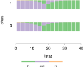
2.1.3 A toy example
To demonstrate the ideas of the previous subsections, we use an illustration in the simple setting with just two predictors. Figure 1(a)
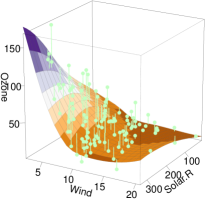 |
 |
 |
| (a) 3d-surface | (b) 2d-slice at Solar.R = 250 | (c) Fading point color |
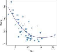
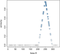
shows a loess surface relating Ozone to Solar.R and Wind in the air quality data (Chambers et al., 1983). Consider = Wind and = Solar.R, and fix the value of Solar.R as . Figure 1(b) is the resulting section plot, where we see how the surface varies with Wind, with Solar.R fixed at 250. Only observations with Solar.R near 250 (here about 250 50) are shown. Observations in this window receive a similarity score related to their distance from 250, which is used to fade the color by distance. Observations outside the window receive a similarity score of zero and are not displayed in Figure 1(b). In Figure 1(c), the similarity scores assigned to observations using their distance to Solar.R=250 are plotted, non-zero similarity scores are faded by decreasing similarity.
From the section plot in Figure 1(b) it is apparent that there is just one observation at Wind 20, so the fit in this region may not be too reliable. By decreasing the Solar.R value to and then to 50 we learn that the dependence of Ozone on Wind also decreases.
2.2 Choosing section points
The simplest way of specifying is to choose a particular observation, or to supply a value of each predictor in . As an alternative to this, we can find areas where the data lives and visualize these. This is particularly important as the number of predictors increases: the well-known curse of dimensionality Bellman (1961) implies that as the dimension of the conditioning space increases, conditioning on arbitrary predictor settings will yield mostly empty sections. Or, we can look for interesting sections exhibiting features such as lack of fit, curvature or interaction. In the case of multiple fits, we can chase differences between them.
We describe algorithms for the construction of tours, which for our purposes are a series of section points . The tours are visualized by section plots , showing slices formed around the series of section points. We note that the tours presented here are quite different to grand tours (Asimov, 1985) and guided tours (Cook et al., 1995), which are formed as sequences of projection planes and do not involve slicing.
2.2.1 Tour construction: visiting regions with data
The simplest strategy to find where the data lives is to pick random observations and use their coordinates for the conditioning predictors as sections points. We call this the randomPath tour. Other touring options cluster the data using the variables in , and use the cluster centers as section points. It is important to note that we are not trying to identify actual clusters in the data, rather to visit the parts of -predictor space where observations are located. We consider two tours based on clustering algorithms: (i) kmeansPath which uses centroids of k-means clusters as sections and (ii) kmedPath which uses medoids of k-medoid clustering, available from the pam algorithm of package cluster (Maechler et al., 2019). Recall that medoids are observations in the dataset, so slices around them are guaranteed to have at least one observation.
Both kmeansPath and kmedPath work for categorical as well as numerical variables. kmeansPath standardizes numeric variables and hot-encodes categorical variables. kmedPath uses a distance matrix based on standardized Euclidean distances for numeric variables and the Gower distance (Gower, 1971) for variables of mixed type, as provided by daisy from package cluster. For our application we are not concerned with optimal clustering or choice of number of clusters, our goal is simply to visit regions where the data live.
To evaluate our tour algorithms, we calculate randomPath, kmeansPath and kmedPath tours of length on datasets of 2,000 rows and 15 numeric variables obtained from the Ames (De Cock, 2011) and Decathlon (Unwin, 2015) datasets. For comparison, we also use simulated independent Normal and Uniform datasets of the same dimension. The results are summarized Table 1.
| random | kmeans | kmed | |
|---|---|---|---|
| Decathlon | 8.2 (1.8) | 23.3 (3) | 22.4 (3.7) |
| Ames | 16.0 (4.3) | 33.6 (8.4) | 25.4 (7.6) |
| Normal | 1.0 (1.0) | 1.8 (0.2) | 1.8 (1.1) |
| Uniform | 1.1 (1.0) | 0.9 (0.1) | 1.3 (1.0) |
In general, the number of observations visible in sections from real data far exceeds that from the simulated datasets, as real data tends to be clumpy. Not surprisingly, paths based on both the clustering methods k-means and k-medoids find sections with many more observations than simply picking random observations.
We also investigate in Figure 2
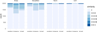
the distribution of the maximum similarity per observation over the 30 section points for the three path algorithms and four datasets. Here, paths based on clustering algorithms from both real datasets visit over 25% of the observations, again demonstrating that our algorithms perform much better on real data than on simulated data.
2.2.2 Tour construction: visiting regions exhibiting lack of fit
Other goals of touring algorithms might be to find regions where the model fits the data poorly, or where two or more fits give differing results. For numeric responses, the tour lofPath (for lack of fit) finds observations whose value of
is among the (path length) largest, where is the prediction for observation from fit . For categorical responses, it finds observations where the predicted class does not match the observed class.
Another tour called diffitsPath (for difference of fit) finds observations whose value of
is among the (path length) largest for numeric fits. For fits to categorical responses, diffitsPath currently finds observations where there is the largest number of distinct predicted categories, or differences in prediction probabilities. Other paths could be constructed to identify sections with high amount of fit curvature or the presence of interaction.
There are a few other simple tours that we have found useful in practice: tours that visit observations with high and low response values and tours that move along a selected condition variable, keeping other condition variables fixed.
2.2.3 A smoother tour
For each of the path algorithms, the section points are ordered using a seriation algorithm to form a short path through the section points —dendrogram seriation (Earle and Hurley, 2015) is used here. If a smoother tour is desired, the section points may be supplemented with intermediate points formed by interpolation between and . Interpolation constructs a sequence of evenly spaced points between each pair of ordered section points. For quantitative predictors, this means linear interpolation, and for categorical predictors, we simply transition from one category to the next at the midpoints on the linear scale.
3 An interactive implementation
The model visualizations on sections and associated touring algorithms described in Section 2 are implemented in our highly-interactive R package condvis2. In the R environment, there are a number of platforms for building interactive applications. The most primitive of these is base R with its function getGraphicsEvent which offers control of mouse and keyboard clicks, used by our previous package condvis (O’Connell et al., 2016; O’Connell, 2017), but the lack of support for other input mechanisms such as menus and sliders limits the range of interactivity. Tcltk is another option, which is used by the package loon. We have chosen to use the Shiny platform Chang et al. (2020) which is relatively easy to use, provides a browser-based interface and supports web sharing.
First we describe the section plot and condition selector plot panel and the connections between them. These two displays are combined together with interactive controls into an arrangement that Unwin and Valero-Mora (2018) refer to as an ensemble layout.
3.1 Section plots
As described in Section 2.1, the section plot shows how a fit (or fits) varies with one or two section predictors, for fixed values of the conditioning predictors. Observations near the fixed values are displayed on the section plot. A suitable choice of section plot display depends on the prediction (numerical, factor, or probability matrix) and predictor type (numerical or factor). Figure 3
| n/f | p | |
|---|---|---|
| (a) | (b) | |
| n/f |  |
 |
| (c) | (d) | |
| (n/f,f) |  |
 |
| (e) | (f) | |
| (n,n) | 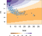 |
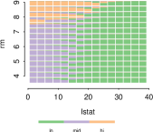 |
shows different section plots. For two numeric section variables, we also use perspective displays. When section predictors are factors these are converted to numeric, so the displays are similar to those shown in the rows and columns labelled n/f. When the prediction is the probability of factor level, the display uses a curve for one of the two levels as in Figure 3(b) and barplot arrays otherwise, see Figure 3(d) and (f). Here the bars show the predicted class probabilities, for levels of a categorical section variable, and bins of a numeric section variable. For section plot displays such as Figure 3(e) where fit is shown as an image, faded points would be hard to see, so instead we shrink the overlaid observations in proportion to the similarity score. We do not add a layer of observations to the barplot arrays in Figure 3(d) and (f), as this would likely overload the plots.
3.2 Condition selector plots
The condition selector plots display predictors in the conditioning set . Predictors are plotted singly or in pairs using scatterplots, histograms, boxplots or barplots as appropriate. They show the distributions of conditioning predictors and also serve as an input vehicle for new settings of these predictors. We use the strategy presented in O’Connell et al. (2017) for ordering conditioning predictors to avoid unwitting extrapolation. A pink cross overlaid on the condition selector plots shows the current settings of the section point . See the panel on the right of Figure 4.
Alternatively, predictors may be plotted using a parallel coordinates display. It is more natural in this setting to restrict conditioning values to observations. In this case, the current settings of the section point are shown as a highlighted observation. In principle a scatterplot matrix could be used, but we do not provide for this option as it uses too much screen real estate.
3.3 The condvis2 layout
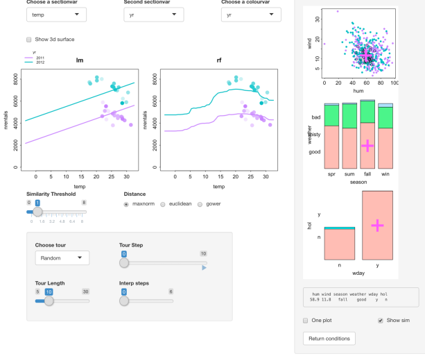
We introduce a dataset here which we will visit again in Section 4.1. The bike sharing dataset (Fanaee-T and Gama, 2013) available from the UCI machine learning repository has a response which is the count of rental bikes (nrentals) and the goal is to relate this to weather and seasonal information, through features which are season, hol (holiday or not), wday (working day or not), yr (year 2011 or 2012), weather (good, misty, bad), temp (degrees Celsius), hum (relative humidity in percent) and wind (speed in km per hour). The aim is to model the count of rental bikes between years 2011 and 2012 in a bike share system from the corresponding weather and seasonal information. We build a random forest (Breiman, 2001) fit relating nrentals to other features for all 750 observations. Setting up an interactive model exploration requires a call to the function condvis specifying the data, fit, response, and one or two section variables (here temp). Other dataset variables become the condition variables. The resulting ensemble graphic (see Figure 4)
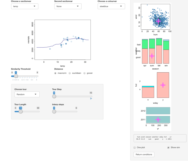
has a section plot of nrentals versus temp with superimposed random forest fit on the left, the panel on the right has the condition selector plots and the remaining items on the display are interactive controls.
The pink crosses on the condition selector plots shows the current setting of the conditioning predictors . If the initial value of the conditioning predictors is not specified in the call to condvis, this is set to the medoid of all predictors, calculated using standardized Euclidean distance, or Gower for predictors of mixed type. Here values are also listed underneath the condition selector plots. The distance measure used defaults to maxnorm, so the observations appearing on the section plot all have season=sum, weather=good, wday=y, hol=n, yr=2011, and have wind and hum values within one (the default value of in Equation 2) standard deviation of hum=58.0, wind=11.8. The point colors are faded as the maxnorm distance from (hum=58.0, wind=11.8) increases. These observations also appear with a black outline on the (hum, wind) condition selector plot.
3.4 Interaction with condvis2
The choice of the section point is under interactive control. The most direct way of selecting is by interacting with the condition selector plots, For example, clicking on the (hum, wind) plot in Figure 4 at location (hum=90, wind=10) moves the coordinates of for these two variables to the new location, while the values for other predictors in are left unchanged. Immediately the section plot of nrentals versus temp shows the random forest fit at the newly specified location, but now there is only one observation barely visible in the section plot, telling us that the current combination of the conditioning predictors is in a near-empty slice. Double-clicking on the (hum, wind) plot sets the section point to the closest observation on this plot. If there is more than one such observation, then the section point becomes the medoid of these closest observations. It is also possible to click on an observation in the section plot, and this has the effect of moving the section point to the coordinates of the selected observation for the conditioning predictors.
The light grey panel on the lower left has the tour options (described in Section 2.2) which offer another way of navigating slices of predictor space. The “Choose tour” menu offers a choice of tour algorithm, and “Tour length” controls the length of the computed path. The “Tour Step” slider controls the position along the current path; by clicking the arrow on the right the tour progresses automatically through the tour section points. An interpolation option is available for smoothly changing paths.
Clicking on the similarity threshold slider increases or decreases the value of , including more or less observations in the nrentals versus temp plot. The distance used for calculating similarities may be changed from maxnorm to Euclidean or Gower (see Equations 3 and 4) via the radio buttons. When the threshold slider is moved to the right-most position, all observations are included in the section plot display.
One or two section variables may be selected from the “Choose a sectionvar” and “Second sectionvar” menus. If the second section variable is hum, say, this variable is removed from the condition selector plots. With two numeric section variables, the section plot appears as an image as in Figure 3(e). Another checkbox “Show 3d surface” appears, and clicking this shows how the fit relates to (temp, hum) as a rotatable 3d plot. Furthermore, a variable used to color observations may be chosen from the “Choose a colorvar” menu.
Clicking the “One plot” checkbox on the lower right changes the condition selector plots to a single parallel coordinate plot. Deselecting the “Show sim” box causes the black outline on the observations in the current slice to be removed, which is a useful option if the dataset is large and display speed is an issue. Clicking on the “Return conditions” button causes the app to exit, returning all section points visited as a data frame.
3.5 Which fits?
Visualizations in condvis2 are constructed in a model-agnostic way. In principle all that is required is that a fit produces predictions. Readers familiar with R will know that algorithms from random forest to logistic regression to support vector machines all have some form of predict method, but they have different arguments and interfaces.
We have solved this by writing a predict wrapper called CVpredict (for condvis predict) that operates in a consistent way for a wide range of fits. We provide over 30 CVpredict methods, for fits ranging from neural nets, to trees to bart machine. And, it should be relatively straightforward for others to write their own CVpredict method, using the template we provide.
Others have tackled the problem of providing a standard interface to the model fitting and prediction tasks. The parsnip package (Kuhn and Vaughan, 2021) part of the so-called tidyverse world streamlines the process and currently includes drivers for about 40 supervised learners including those offered by spark and stan. The packages caret (Kuhn, 2019), mlr (Bischl et al., 2016), and its most recent incarnation mlr3 (Lang et al., 2019), interface with hundreds of learners and also support parameter tuning. As part of condvis2, we have written CVpredict methods for the model fit classes from parsnip, mlr, mlr3 and caret. Therefore our visualizations are accessible from fits produced by most of R’s machine learning algorithms.
3.6 Dataset size
Visualization of large datasets is challenging, particularly so in interactive settings where a user expects near-instant response. We have used our application in settings with and and the computational burden is manageable.
For section displays, the number of points displayed is controlled by the similarity threshold and is usually far below the dataset size . For reasons of efficiency, condition selector displays by default show at most 1,000 observations, randomly selected in the case where . Calculation of the medoid for the initial section point and the kmedPath requires calculation of a distance matrix which has complexity . For interactive use speed is more important than accuracy so we base these calculations on a maximum of 4,000 rows by default.
The conditioning displays show panels of one or two predictors or one parallel coordinate display. Up to will fit on screen space using the parallel coordinate display, perhaps 10-15 otherwise. Of course many data sets have much larger feature sets. In this situation, we recommend selecting a subset of features which are important for prediction, to be used as the section and conditioning predictors and . The remaining set of predictors, say , are hidden from view in the condition selector plots and are fixed at some initial value which does not change throughout the slice exploration.
Note that though the predictors are ignored in the calculation of distances in Equations 5 and 6 and thus in the similarity scores of Equation 2, the initial values of these predictors are used throughout in constructing predictions; thus the section plot shows . If the set of important predictors is not carefully selected, the fit displayed will not be representative of the fit for all observations visible in the section plot.
In the situation where some predictors designated as unimportant are relegated to thus not appearing in the condvis display, the settings for predictors in remain at their initial values throughout all tours. This means that section points for the tours based on selected observations (randomPath, kmedPath, lofPath and diffitsPath) will not in fact correspond exactly to dataset observations. An alternative strategy would be to let the settings for the predictors in vary, but then there is a danger of being “lost in space”.
4 Applications
In our first example, we compare a linear fit with a random forest for a regression problem. Interactive exploration leads us to discard the linear fit as not capturing feature effects in the data, but patterns in the random forest fit suggests a particular generalized additive model that overall fits the data well.
Our second example concerns a classification problem where we compare random forest and tree fits. We learn that both fits have generally similar classification surfaces. In some boundary regions the random forest overfits the training data avoiding the mis-classifications which occur for the tree fit.
Finally, we review briefly how interactive slice visualization techniques can be used in unsupervised learning problems, namely to explore density functions and estimates, and clustering results. Furthermore, we demonstrate that interactive slice visualization is insightful even in situations where there is no fit curve or surface to be plotted.
4.1 Regression: Bike sharing data
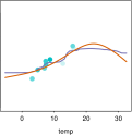
Here we investigate predictor effects and goodness of fit for models fit to the bike sharing dataset, introduced in Section 3.3. To start with, we divide the data into training and testing sets using a 60/40 split. For the training data, we fit a linear model with no interaction terms, and a random forest which halves the RMSE by comparison with the linear fit. Comparing the two fits we see that the more flexible fit is much better supported by the data, see for example Figure 5.
In the fall, bike rentals are affected negatively by temperature according to the observed data. The linear fit does not pick up this trend, and even the random forest seems to underestimate the effect of temperature. Year is an important predictor: people used the bikes more in 2012 than in 2011. At the current setting of the condition variables, there is no data below a temperature of 15C, so we would not trust the predictions in this region.
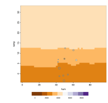
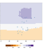
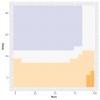
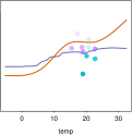
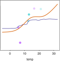
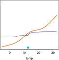
Focusing on the random forest only, we explore the combined effect on nrentals of the two predictors temperature and humidity) (Figure 6).
 |
 |
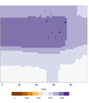 |
| (a) Spring 2011 | (b) Spring 2012 | (c) Fall 2012 |
The three plots have different settings of the time condition variables selected interactively, other conditioning variables were set to good weather, weekend and no holiday. In spring 2011, temperature is the main driver of bike rentals, humidity has negligible impact. In spring 2012 the number of bike rentals is higher than the previous year, especially at higher temperatures. In fall 2012, bike rentals are higher than in spring, and high humidity reduces bike rentals. With further interactive exploration, we see that this three-way interaction effect is consistent at other levels of weather, weekend and holiday.
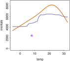
In the absence of an interactive exploratory tool such as ours, one might summarize the joint effect of temperature and humidity through a partial dependence plot (Figure 7).

The plot combines the main effect of the featuress and their interaction effect, and shows that people cycle more when temperature is above 12C, and this effect depends on humidity. The partial dependence plot is a summary of plots such as those in Figure 6, averaging over all observations in the training data for the conditioning variables, and so it cannot uncover a three-way interaction. A further issue is that the partial dependence curve or surface is averaging over fits which are extrapolations, leading to conclusions which may not be reliable.
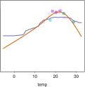
Based on the information we have gleaned from our interactive exploration, an alternative parametric fit to the random forest is suggested. We build a generalized additive model (gam), with a smooth joint term for temperature, humidity, an interaction between temperature and season, a smooth term for wind, and a linear term for the remaining predictors. A gam fit is parametric and will be easier to understand and explain than a random forest, and has the additional advantage of providing confidence intervals, which may be added to the condvis2 display. Though the training RMSE for the random forest is considerably lower than that for the gam, on the test data the gam is a clear winner, see Table 2.
| train | test | |
|---|---|---|
| RF | 438.1 | 748.1 |
| GAM | 573.1 | 670.2 |
For a deep-dive comparison of the two fits, we use the tours of Section 2.2 to move through various slices, here using the combined training and testing datasets. Figure 8


shows a k-medoid tour in the first row and lack of fit tour in the second row, with temp as the section variable and the remaining features forming the condition variables. (Here for purposes of illustration both tours are constructed to be of length 5). The last two rows of Figure 8 show the condition variable settings for each of the ten tour points as stars, where a long (short) radial line-segment indicates a high (low) value for a condition variable. To the naked eye the gam fit looks to give better results for most of the locations visited by the k-medoid tour. Switching to the lack of fit tour, we see that the poorly-fit observation in each of the second row panels in Figure 8 has a large residual for both the random forest and the gam fits. Furthermore, the poorly-fit observations identified were all recorded in 2012, as is evident from the stars in the last row.
4.2 Classification: Glaucoma data
Glaucoma is an eye disease caused by damage to the optic nerve, which can lead to blindness if left untreated. In Kim et al. (2017), the authors explored various machine learning fits relating the occurrence of glaucoma to age and various other features measured on the eye. The provided dataset comes pre-split into a training set of size 399 and a test set of size 100. Here we focus on a random forest and a C5.0 classification tree (Salzberg, 1994) fit to the training data. The random forest classified all training observations perfectly, mis-classifying just two test set observations, whereas the tree misclassified 20 and 6 cases for the training and test data respectively. In a clinical setting however, as the authors in Kim et al. (2017) pointed out, the results from a classification tree are easier to understand and implement.
We will use interactive explorations to reduce the interpretability deficit for the random forest, and to check if the simpler tree provides an adequate fit by comparison with the random forest, despite its inferior test set performance.
Figure 9
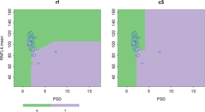
shows the training data with both classifiers. Here the section variables are PSD and RNFL.mean (the two most important features according to random forest importance), and conditioning variables are set to values from the first case, who is glaucoma free. Both classifiers give similar results for this condition, ignoring section plot regions with no data nearby. Points whose color in the section plots disagrees with the background color of the classification surface are not necessarily mis-classified, they are just near (according to the similarity score) a region whose classification differs. Reducing the similarity threshold to zero would show points whose values on the conditioning predictors are identical to those of the first case, here just the first case itself, which is correctly classified by both classifiers. Clicking around on the condition selector plots and moving through the random, k-means and k-medoid tour paths shows that both classifiers give similar classification surfaces for section predictors PSD and RNFL.mean, in areas where observations live.
Using the lack of fit tour to explore where the C5 tree gives incorrect predictions, in Figure 10
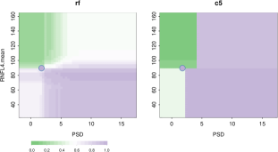 |
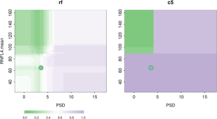 |
| (a) C5 false negative | (b) C5 false positive |
the section plots show probability of glaucoma, on a green (for no glaucoma) to purple (for glaucoma) scale. Here the similarity threshold is set to zero, so only the mis-classified observations are visible. In the left hand side panel figure 10(a) the C5 tree fit shows a false negative, which is quite close to the decision boundary. Though the random forest fit correctly classifies the observation, it does not do so with high probability. Figure 10(b) shows a situation where the tree gives a false positive, which is well-removed from the decision boundary. The random forest correctly predicts this observation as a negative, but the fitted surface is rough. Generally training mis-classifications from the tree fit occur for PSD 2.5 and RNL4.mean 90, where the random forest probability surface is jumpy. So glaucoma prediction is this region is difficult based on this training dataset.
4.3 Other application areas
Typical ways to display clustering results include assigning colors to observations reflecting cluster membership, and visualizing the colored observations in a scatterplot matrix, parallel coordinate plot or in a plot of the first two principal components. Some clustering algorithms such as k-means and model-based clustering algorithms offer predictions for arbitrary points. The results of such algorithms can be visualized with our methodology. Section plots show the cluster assignment for various slices in the conditioning predictors. As in the classification example, we can compare clustering results, and check the cluster boundaries where there is likely to be uncertainty in the cluster assignment. Suitable tours in this setting visit the centroid or medoid of the data clusters. See the vignette https://cran.r-project.org/web/packages/condvis2/vignettes/mclust.html for an example.
One can also think of density estimation algorithms as providing a “fit”. For such fits, the CVpredict function gives the density value, which is renormalized over the section plot to integrate to 1. This way section plots show the density conditional on the settings of the conditional variables. With our condvis visualizations, we can compare two or more density functions or estimates by their conditional densities for one or two section variables, assessing goodness of fit, and features such as number of modes and smoothness. See the vignette https://cran.r-project.org/web/packages/condvis2/vignettes/mclust.html for an example.
The ideas of conditional visualization may also be applied to situations where there is no fit function to be plotted. In this case, the section plot shows observations for the section variables colored by similarity score which are determined to be near the designated section point. This is a situation where we provide section plots with . One application of this is to compare predictions or residuals for an ensemble of model fits. For the bike example of Section 4.1, consider the dataset augmented with predictions from the gam and random forest fits. Figure 11
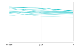
shows a parallel coordinate of three section variables, nrentals, and with the similarity threshold set so that the plot shows all summer, weekday, good weather days in 2012. The gam predictions are similar to the response as indicated by the mostly parallel line segment in the first panel, but the random forest underestimates the observed number of bike rentals. This pattern does not hold for 2011 data.
5 Discussion
We have described a new, highly interactive application for deep-dive exploration of supervised and unsupervised learning model fits. This casts light on the black-box of machine learning algorithms, going far beyond simple numerical summaries such as mean squared error, accuracy and predictor importance measures. With interaction, the analyst can interrogate predictor effects and pickup higher-order interactions in a way not possible with partial dependence and ICE plots, explore goodness of fit to training or test datasets, and compare multiple fits. Our new methodology will help machine learning practioners, educators and students seeking to interpret, understand and explain model results. The application is currently useful for moderate sized datasets, up to 100,000 cases and 30 predictors in our experience. Beyond that, we recommend using case and predictor subsets to avoid lags in response time which make interactive use intolerable.
A previous paper (O’Connell et al., 2017) described an early version of this project. Since then, in condvis2 we have developed the project much further, and moved the implementation to a Shiny platform which supports a far superior level of interactivity. The choice of section plots and distance measures have been expanded. As an alternative to direct navigation through conditioning space, we provide various algorithms for constructing tours, designed to visit non-empty slices (randomPath, kmeansPath and kmedPath) or slices showing lack of fit (lofPath) or fit disparities (diffitsPath). We now offer an interface to a wide and extensible range of machine learning fits, through CVpredict methods, including clustering algorithms and density fits. By providing an interface to the popular caret, parsnip, mlr and mlr3 model-building platforms our new interactive visualizations are widely accessible.
We recommend using variable importance measures to choose relevant section predictors, as in the case study of Section 4.2. For pairs of variables, feature interaction measures such as the H-statistic (Friedman and Popescu, 2008) and its visualization available in vivid (Inglis et al., 2020) could be used to identify interesting pairs of section variables for interactive exploration. New section touring methods could be developed to uncover other plot patterns, but this needs to be done in a computationally efficient way. As mentioned previously, the tours presented here are quite different to grand tours, as it is the slice that changes, not the projection. In a recent paper (Laa et al., 2020), following on ideas from Furnas and Buja (1994), grand tours are combined with slicing, where slices are formed in the space orthogonal to the current projection, but these techniques are not as yet designed for the model fit setting.
There are some limitations in the specification of the section points through interaction with the condition selector plots, beyond the fact that large numbers of predictors will not fit in the space allocated to these plots (see Section 3.6). If a factor has a large number of levels, then space becomes an issue. One possibility is to display only the most frequent categories in the condition selector plots, gathering other categories into an “other” category, which of course is not selectable. Also, we have not as yet addressed the situation where predictors are nested.
Currently we offer a choice of three distance measures (Euclidean, maxnorm and Gower) driving the similarity weights used in section plot displays. Distances are calculated over predictors in , other than the hidden predictors . Predictors are scaled to unit standard deviation before distance is calculated which may not be appropriate for highly skewed predictors, where a robust scaling is likely more suitable. We could also consider an option to to interactively exclude some predictors from the distance calculation.
Other approaches could also be investigated for our section plot displays. Currently, the section plot shows the fit versus , overlaid on a subset of observations , where belongs to the section around (assuming ). An alternative might be to display the average fit for observations in the section, that is
or, form a weighted average using the similarity weights. Such a version of a section plot is analogous to a local version of a partial dependence plot.
We note that the popular lime algorithm of Ribeiro et al. (2016) also uses the concept of conditioning to derive explanations for fits from machine learning models. In their setup, all predictors are designated as conditioning predictors, so . Lime explanations use a local ridge regression to approximate at using nearby sampled data, and the result is visualized in a barplot-type display of the local predictor contributions. For the purposes of the local approximation, the sampled data is weighted by a similarity score. This contrasts with the approach presented here, where the similarity scores of Equation 2 are purely for visualization purposes. In Hurley (2021), we discussed how lime explanations could be generalized to the setting with one or two designated section variables, and this could usefully be embedded in an interactive application like ours.
References
- Asimov (1985) Asimov, D., 1985. The grand tour: a tool for viewing multidimensional data. Siam Journal on Scientific and Statistical Computing 6, 128–143.
- Baniecki and Biecek (2020) Baniecki, H., Biecek, P., 2020. The grammar of interactive explanatory model analysis. CoRR abs/2005.00497. URL: https://arxiv.org/abs/2005.00497, arXiv:2005.00497.
- Becker et al. (1996) Becker, R.A., Cleveland, W.S., Shyu, M.J., 1996. The visual design and control of trellis display. Journal of Computational and Graphical Statistics 5, 123–155. URL: https://amstat.tandfonline.com/doi/abs/10.1080/10618600.1996.10474701, doi:10.1080/10618600.1996.10474701, arXiv:https://amstat.tandfonline.com/doi/pdf/10.1080/10618600.1996.10474701.
- Bellman (1961) Bellman, R., 1961. Adaptive Control Processes: A Guided Tour. ’Rand Corporation. Research studies, Princeton University Press. URL: https://books.google.ie/books?id=POAmAAAAMAAJ.
- Bischl et al. (2016) Bischl, B., Lang, M., Kotthoff, L., Schiffner, J., Richter, J., Studerus, E., Casalicchio, G., Jones, Z.M., 2016. mlr: Machine learning in r. Journal of Machine Learning Research 17, 1–5. URL: http://jmlr.org/papers/v17/15-066.html.
- Breiman (2001) Breiman, L., 2001. Random forests. Machine Learning 45, 5–32. URL: https://doi.org/10.1023/A:1010933404324, doi:10.1023/A:1010933404324.
- Britton (2019) Britton, M., 2019. Vine: Visualizing statistical interactions in black box models. arXiv 1904.00561 .
- Chambers et al. (1983) Chambers, J., Cleveland, W., Kleiner, B., Tukey, P., 1983. Graphical Methods for Data Analysis. Wadsworth, Belmont, CA.
- Chang et al. (2020) Chang, W., Cheng, J., Allaire, J., Xie, Y., McPherson, J., 2020. Shiny: Web Application Framework for R. URL: https://CRAN.R-project.org/package=shiny. R package version 1.5.0.
- Cook et al. (1995) Cook, D., Buja, A., Cabrera, J., Hurley, C., 1995. Grand tour and projection pursuit. Journal of Computational and Graphical Statistics 4, 155–172. URL: http://www.jstor.org/stable/1390844.
- Cook and Swayne (2007) Cook, D., Swayne, D.F., 2007. Interactive and Dynamic Graphics for Data Analysis With R and GGobi. 1st ed., Springer Publishing Company, Incorporated.
- De Cock (2011) De Cock, D., 2011. Ames, iowa: Alternative to the boston housing data as an end of semester regression project. Journal of Statistics Education 19. URL: https://doi.org/10.1080/10691898.2011.11889627, doi:10.1080/10691898.2011.11889627, arXiv:https://doi.org/10.1080/10691898.2011.11889627.
- Earle and Hurley (2015) Earle, D., Hurley, C.B., 2015. Advances in dendrogram seriation for application to visualization. Journal of Computational and Graphical Statistics 24, 1–25. URL: http://dx.doi.org/10.1080/10618600.2013.874295, doi:10.1080/10618600.2013.874295, arXiv:http://dx.doi.org/10.1080/10618600.2013.874295.
- Fanaee-T and Gama (2013) Fanaee-T, H., Gama, J., 2013. Event labeling combining ensemble detectors and background knowledge. Progress in Artificial Intelligence , 1–15URL: [WebLink], doi:10.1007/s13748-013-0040-3.
- Friedman (2001) Friedman, J.H., 2001. Greedy function approximation: A gradient boosting machine. The Annals of Statistics 29, 1189–1232. URL: http://www.jstor.org/stable/2699986.
- Friedman and Popescu (2008) Friedman, J.H., Popescu, B.E., 2008. Predictive learning via rule ensembles. Ann. Appl. Stat. 2, 916–954. URL: https://doi.org/10.1214/07-AOAS148, doi:10.1214/07-AOAS148.
- Furnas and Buja (1994) Furnas, G.W., Buja, A., 1994. Prosection views: Dimensional inference through sections and projections. Journal of Computational and Graphical Statistics 3, 323–353. URL: https://www.tandfonline.com/doi/abs/10.1080/10618600.1994.10474649, doi:10.1080/10618600.1994.10474649, arXiv:https://www.tandfonline.com/doi/pdf/10.1080/10618600.1994.10474649.
- Goldstein et al. (2015) Goldstein, A., Kapelner, A., Bleich, J., Pitkin, E., 2015. Peeking inside the black box: Visualizing statistical learning with plots of individual conditional expectation. Journal of Computational and Graphical Statistics 24, 44–65. doi:10.1080/10618600.2014.907095.
- Gower (1971) Gower, J.C., 1971. A general coefficient of similarity and some of its properties. Biometrics 27, 857–871. URL: http://www.jstor.org/stable/2528823.
- Hurley et al. (2020) Hurley, C., O’Connell, M., Domijan, K., 2020. Condvis2: Conditional Visualization for supervised and unsupervised models in Shiny. URL: https://CRAN.R-project.org/package=condvis. R package version 0.1.1.
- Hurley (2021) Hurley, C.B., 2021. Model exploration using conditional visualization. WIREs Computational Statistics 13, e1503. URL: https://onlinelibrary.wiley.com/doi/abs/10.1002/wics.1503, doi:https://doi.org/10.1002/wics.1503, arXiv:https://onlinelibrary.wiley.com/doi/pdf/10.1002/wics.1503.
- Inglis et al. (2020) Inglis, A., Parnell, A., Hurley, C., 2020. Vivid: Variable Importance and Variable Interaction Displays. URL: https://CRAN.R-project.org/package=vivid. R package version 0.1.0.
- Kim et al. (2017) Kim, S., J., C.K., Oh, S., 2017. Development of machine learning models for diagnosis of glaucoma. PLoS ONE 5.
- Kuhn (2019) Kuhn, M., 2019. caret: Classification and Regression Training. URL: https://CRAN.R-project.org/package=caret. R package version 6.0-84.
- Kuhn and Vaughan (2021) Kuhn, M., Vaughan, D., 2021. parsnip: A Common API to Modeling and Analysis Functions. URL: https://CRAN.R-project.org/package=parsnip. R package version 0.1.25.
- Laa et al. (2020) Laa, U., Cook, D., Valencia, G., 2020. A slice tour for finding hollowness in high-dimensional data. Journal of Computational and Graphical Statistics 29, 681–687. URL: https://doi.org/10.1080/10618600.2020.1777140, doi:10.1080/10618600.2020.1777140, arXiv:https://doi.org/10.1080/10618600.2020.1777140.
- Lang et al. (2019) Lang, M., Binder, M., Richter, J., Schratz, P., Pfisterer, F., Coors, S., Au, Q., Casalicchio, G., Kotthoff, L., Bischl, B., 2019. mlr3: A modern object-oriented machine learning framework in R. Journal of Open Source Software URL: https://joss.theoj.org/papers/10.21105/joss.01903, doi:10.21105/joss.01903.
- Lundberg and Lee (2017) Lundberg, S.M., Lee, S.I., 2017. A unified approach to interpreting model predictions, in: Guyon, I., Luxburg, U.V., Bengio, S., Wallach, H., Fergus, R., Vishwanathan, S., Garnett, R. (Eds.), Advances in Neural Information Processing Systems 30. Curran Associates, Inc., pp. 4765–4774. URL: http://papers.nips.cc/paper/7062-a-unified-approach-to-interpreting-model-predictions.pdf.
- Maechler et al. (2019) Maechler, M., Rousseeuw, P., Struyf, A., Hubert, M., Hornik, K., 2019. cluster: Cluster Analysis Basics and Extensions. URL: https://CRAN.R-project.org/package=cluster. R package version 2.1.0.
- O’Connell (2017) O’Connell, M., 2017. Conditional Visualisation for Statistical Models. Ph.D. thesis. National University of Ireland Maynooth. URL: http://mural.maynoothuniversity.ie/8141/.
- O’Connell et al. (2016) O’Connell, M., Hurley, C., Domijan, K., 2016. Condvis: Conditional Visualization for Statistical Models. URL: https://CRAN.R-project.org/package=condvis. R package version 0.1.1.
- O’Connell et al. (2017) O’Connell, M., Hurley, C., Domijan, K., 2017. Conditional visualization for statistical models: An introduction to the condvis package in R. Journal of Statistical Software, Articles 81, 1–20. URL: https://www.jstatsoft.org/v081/i05, doi:10.18637/jss.v081.i05.
- Ribeiro et al. (2016) Ribeiro, M.T., Singh, S., Guestrin, C., 2016. “Why should I trust you?”: Explaining the predictions of any classifier, in: Proceedings of the 22nd ACM SIGKDD International Conference on Knowledge Discovery and Data Mining, San Francisco, CA, USA, August 13-17, 2016, pp. 1135–1144.
- Salzberg (1994) Salzberg, S.L., 1994. C4.5: Programs for machine learning by j. ross quinlan. morgan kaufmann publishers, inc., 1993. Machine Learning 16, 235–240. URL: https://doi.org/10.1007/BF00993309, doi:10.1007/BF00993309.
- Staniak and Biecek (2018) Staniak, M., Biecek, P., 2018. Explanations of Model Predictions with live and breakDown Packages. The R Journal 10, 395–409. URL: https://doi.org/10.32614/RJ-2018-072, doi:10.32614/RJ-2018-072.
- Stuetzle (1987) Stuetzle, W., 1987. Plot windows. Journal of the American Statistical Association 82, 466–475. URL: http://www.jstor.org/stable/2289448.
- Tufte (1986) Tufte, E.R., 1986. The Visual Display of Quantitative Information. Graphics Press, Cheshire, CT, USA.
- Unwin (2015) Unwin, A., 2015. GDAdata: Datasets for the Book Graphical Data Analysis with R. URL: https://CRAN.R-project.org/package=GDAdata. R package version 0.93.
- Unwin and Valero-Mora (2018) Unwin, A., Valero-Mora, P., 2018. Ensemble graphics. Journal of Computational and Graphical Statistics 27, 157–165. URL: https://doi.org/10.1080/10618600.2017.1383264, doi:10.1080/10618600.2017.1383264, arXiv:https://doi.org/10.1080/10618600.2017.1383264.
- Urbanek (2002) Urbanek, S., 2002. Different ways to see a tree - klimt, in: Härdle, W., Rönz, B. (Eds.), Compstat, Physica-Verlag HD, Heidelberg. pp. 303–308.
- Waddell and Oldford (2020) Waddell, A., Oldford, R.W., 2020. loon: Interactive Statistical Data Visualization. URL: https://CRAN.R-project.org/package=loon. r package version 1.3.1.
- Wickham (2016) Wickham, H., 2016. ggplot2: Elegant Graphics for Data Analysis. Springer-Verlag New York. URL: https://ggplot2.tidyverse.org.
- Wilkinson (2005) Wilkinson, L., 2005. The Grammar of Graphics (Statistics and Computing). Springer-Verlag New York, Inc., Secaucus, NJ, USA.