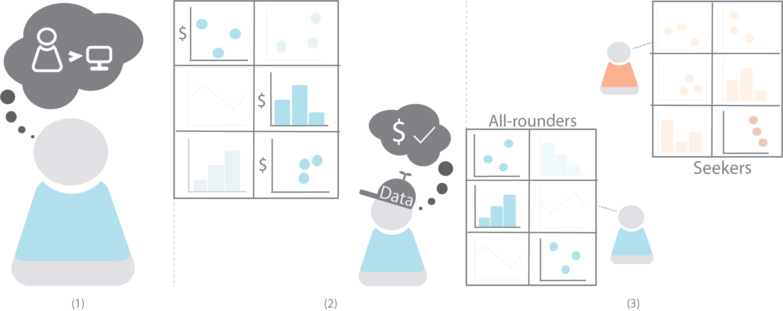
Subfigure 1 has an icon of a person thinking that humans are greater than computers, expressing that they have a preference for human recommendations. Subfigure 2 shows an icon wearing a ”data” thinking cap, and examining a panel of 6 visualizations. 3 of the visualizations contain a ”dollar sign” attribute, and the icon likes that it contains those attributes. Subfigure 3 has 2 icons looking at 2 different panels. One of the panels is labelled all-rounders and the other is labelled seeker. The all-rounder panel has 3 emphasized graphs, and the seeker has only 1 emphasized graph.
Vis Ex Machina: An Analysis of Trust in Human versus Algorithmically Generated Visualization Recommendations
Abstract.
More visualization systems are simplifying the data analysis process by automatically suggesting relevant visualizations. However, little work has been done to understand if users trust these automated recommendations. In this paper, we present the results of a crowd-sourced study exploring preferences and perceived quality of recommendations that have been positioned as either human-curated or algorithmically generated. We observe that while participants initially prefer human recommenders, their actions suggest an indifference for recommendation source when evaluating visualization recommendations. The relevance of presented information (e.g., the presence of certain data fields) was the most critical factor, followed by a belief in the recommender’s ability to create accurate visualizations. Our findings suggest a general indifference towards the provenance of recommendations, and point to idiosyncratic definitions of visualization quality and trustworthiness that may not be captured by simple measures. We suggest that recommendation systems should be tailored to the information-foraging strategies of specific users.
1. Introduction
As a field and industry, visual analytics is beginning to incorporate increasingly automated methods into its processes (Heer, 2019), often to create visualization recommendations. From academia, visualization systems like Draco (Moritz et al., 2018), Data2Vis (Dibia and Demiralp, 2019), and Tableau’s Show Me Feature (Mackinlay et al., 2007) attempt to automatically generate expressive and informative visualizations from a dataset. In industry, features like PowerBI’s “Quick Insights” panel (Microsoft, 2019) attempt to present quick visual summaries of interesting or important aspects of a dataset.
While the relative trustworthiness of machine learning models has been investigated in other contexts (Castelo et al., 2019; Jakesch et al., 2019; Yin et al., 2019) there has been little investigation of viewers’ trust of recommendations in visual analytics. Though widely used visualization authoring software like Tableau and PowerBI incorporate recommendations, users may adopt the authoring portion of the tool without trusting or utilizing the recommendation features; many recommendation systems in popular tools such as “Explain Data” in Tableau (Tableau, 2021) are relatively new, with unclear adoption. If analysts are wholly trusting of algorithmic recommendations, potentially biased or inaccurate results could result in poor decision-making (Correll, 2019). However, if analysts habitually devalue automated insights or recommendations, existing research efforts into automated visualization recommendations may be misaligned with their needs.
In this paper, we present the results of a pre-registered, exploratory human-subjects study on how the perceived source (human or algorithmic) of visualization recommendations impacts assessments of the utility of those recommendations for general audiences. We sought to determine if existing attitudes and biases regarding algorithmic recommendations on the whole would impact people’s assessments of the quality of visualization recommendations, and whether these biases would persist even as we adjusted the anticipated relevance of the recommendations.
Through a quantitative and qualitative analysis of our collected data 111Our study materials, including data tables and analyses scripts, are available at https://osf.io/zmnh3/?view_only=c3a9a1568d554c3587132b339c72f22e, we found that participants initially preferred human-curated recommendations, but tended to be source-agnostic when evaluating visualization recommendations of equal quality. This appeared to hold even across different levels of analytics experience. Participants’ evaluations of recommendation sources seemed to emphasize the degree of overlap between the participant’s top attributes of interest and the attributes displayed in the recommendations. In stating their rationale for preferring one set of recommendations over another, participants fell into two categories of behavior: all-rounders tended to focus on the quality of recommendations as a whole, while seekers honed in on the presence of particular visualizations or attributes.
Our findings partially support existing assumptions in the community that users trust automated visualization recommendation systems. Though some participants held onto folk theories about the capabilities of a given recommendation source, users on the whole exhibited different mental models on evaluating the utility of recommendation panels. These observations suggest that users are not uniform in how they evaluate, and subsequently determine the utility of, visualization recommendations. We reflect on how designers can present recommendations to a broad range of users in a way that mitigates the risk of user bias in interpreting the results, contributing to an emerging body of work on algorithmic trust.
2. Related Work
Our research questions and experiment design are informed by existing assumptions for visualization recommendation systems, as well as studies measuring users’ preferences for algorithmically generated recommendations in other contexts. We highlight three topics of related research: visualization recommendation systems, inclusion of contextual information, and trust in algorithmic decision making.
2.1. Visualization Recommendations
A number of systems recommend sets of visualizations based on various assumptions (or explicit solicitation) of information and patterns that users would find valuable. Golfarelli et al. (Golfarelli and Rizzi, 2020) propose a pipeline for generating visualization recommendations based on a set of predefined user objectives. Wongsuphasawat et al. (Wongsuphasawat et al., 2016, 2017) provide flexibility by allowing users to specify partial visualization designs, and recommend visualizations that extend these partial specifications. Vartak et al. identify statistically significant differences between sub-populations within a dataset, and recommend bar charts capturing these differences (Vartak et al., 2015).
The number of recommendations vary per system as well, which impacted our experimental design. Some systems, such as Calliope (Shi et al., 2020) and “Retrieve Then Adapt” (Qian et al., 2020), focus on recommending a single visualization, such as a data story or infographic. In most cases, users are provided an ensemble of recommendations grouped together in a single panel. Voyager is a salient example, and so we adopted a similar design for our study (Wongsuphasawat et al., 2016, 2017).
Though these systems employ differing strategies, they appear to be developed under the implicit assumption that users generally want and trust algorithmically-generated visualization recommendations. Given that the differences between human and algorithmically-generated visualizations are not well understood, we shed light on user trust in recommendation source through the use of labelling, similar to Jakesch et al. and Shank et al. (Jakesch et al., 2019; Shank, 2013). That is, we present participants with visualizations that were all created by humans, but some were labelled otherwise.
2.2. Inclusion of Contextual Information
Several projects have explored the potential ways in which additional contextual information impacts how people interpret and evaluate visualizations.
The “Contestability in Algorithmic Systems” Workshop at CSCW 2019 argues for the inclusion of humans in the loop of algorithmic decision making, especially as decisions made by machine learning systems have greater consequence. One of their design objectives to do so is through legibility, in which systems would include explanations for the decisions made and conclusions drawn (Vaccaro et al., 2019).
There are many projects that explore legibility, especially in machine learning systems. Yang et al. (Yang et al., 2020) found that additional metadata, in the form of example-based explanations for machine-learning classifiers, did improve user trust, although Kizilcec (Kizilcec, 2016) found that that providing too much explanatory information can erode trust. Cheng et al. (Cheng et al., 2020) take this one step further and propose DECE, a visual interactive system to better understand the decision rules of machine learning systems through counterfactual explanations.
However, these systems are focused on machine learning in particular. Peck et al. explore the notion of metadata, in this case the source of the data, in relation to perceptions of visualizations (Peck et al., 2019). Through semi-structured interviews with residents of rural Pennsylvania, they gathered initial perceptions and rankings of visualizations without participants knowing the sources of visualizations. Afterwards, they revealed the sources and asked whether knowing the sources of the graphs impacted how participants viewed them, as well as their overall ranking. They found that 60% of participants chose not to re-rank their visualizations after revealing the sources, indicating that for some, additional context about source may not impact the perceived utility or credibility of a visualization.
We seek to understand the impact of additional contextual information on users’ visualization preferences. However, we study this topic from the higher-level perspective of gauging trust in particular sources of recommendations (i.e., human or algorithm).
2.3. Algorithmic Decisions and Trust
Several projects investigate how people respond to recommendations or decisions made by algorithms. Victor et al. (Victor et al., 2011) explain how users tend to trust recommendations from known entities (particularly people) more than unknown entities (i.e., complete strangers or algorithms); Lee (Lee, 2018) finds that users seem to distrust managerial decisions made by algorithms, due in part to a feeling of dehumanization by algorithms and a lack of shared social understanding. In contrast to the above studies that showcase negative responses to algorithmic decision-making, Logg et al. (M. Logg et al., 2019) found that people were more likely to adhere to advice when they believed it was given by an algorithm than by a person. In situations where algorithmic performance is ambiguous (i.e., neither clearly good nor clearly poor), users’ generalized implicit attitudes towards automation impact their propensity to trust a specific automated system (Merritt et al., 2013). These studies indicate that user trust in algorithmic decisions appears to be very situational in nature.
A number of projects evaluate people’s perception of interactions with agents declared to be algorithmic or human, when in fact, the source is held constant. Shank (Shank, 2013) finds that people perceive “organizations as more responsible and in control when they have employed human, not computer, representatives.” Jakesch et al. (Jakesch et al., 2019) find that people seem to trust renters on Airbnb more when they write their own profiles compared to renters whose profiles they believe are generated by AI; however, this effect is only observed when human-written and AI-generated profiles are compared side-by-side. Graefe et al. (Graefe et al., 2016) go one step further by modifying both the declared and actual source of news articles (computer or human written). They find that while modifying the declared source had small but consistent effects in favor of human-written articles, modifying the actual source had larger effects. Participants generally regarded computer-written articles as more credible but less readable.
We see many observations in the literature of users preferring interactions with, recommendations from, and unilateral decisions by humans over algorithms, with some exceptions (e.g., (Edwards et al., 2014)). However, no existing studies explicitly measure user trust in sources of recommendations for visual analytics, so it is unclear to what degree these results also apply to visualization. In this paper, we present a first step towards measuring user trust in human-curated versus algorithm-generated visualization recommendations.
3. Motivation and Research Questions
When we compare the literature on user trust in algorithmic decision-making to that of visualization recommendations, we find a contradiction: visualization recommendation features are designed as if users will naturally trust them, yet in other contexts users express a clear distrust of algorithmic decision-making. To the best of our knowledge, no existing studies explicitly measure user trust in algorithm-generated (versus human-curated) visualization recommendations.
The absence of research on the perceived trustworthiness of existing recommendation systems, as well as the potential mismatch between these systems and human mental models, serve as the core motivation for our work: if the user is biased against recommenders, then expending resources on generating recommendations may prove wasteful, but if the user blindly trusts all recommendations (including occasional bad ones), the user may inadvertently draw inaccurate (and potentially dangerous (Bresciani and Eppler, 2015)) conclusions. In this work, we seek to explore the following research question:
Research Question 1: How do existing preferences for human-curated versus algorithmically-generated recommendations affect the evaluation of recommendation quality or utility?
Specifically, we seek to understand whether the source of recommendations (human or algorithmic) may alter a user’s perception of the recommended charts. Obtaining a deeper understanding of why users prefer certain recommendations over others can help visualization system designers to better employ techniques to support a wide range of users. To further understand the context for user preferences, we explore the following secondary analysis questions:
Research Question 2: If clear preferences are observed, what reasons do users give for preferring certain recommenders?
Research Question 3: What effect (if any) does statistical or data analysis experience have on user preferences?
Exploratory Hypotheses: Based on the above research questions, and to capture our expectations for how user trust may (or may not) manifest in our study, we formulated two exploratory hypotheses:
-
•
People will rate recommenders based on how much the recommendations overlap with preferred data attributes.
-
•
Prior preferences for human or algorithmic recommendations will bias participants towards the corresponding panel, even in the face of differing amounts of recommendation relevance.
4. Experimental Design
| Attribute Category | Attribute Names | ||
|---|---|---|---|
| Ratings |
|
||
| Finances |
|
||
| Details |
|
||
| Popularity |
|
There are four attribute categories: ratings, finances, details, and popularity. Ratings includes the IMDB Vote Average (Q) and the IMDB Vote Count (Q). Finances includes Budget (Q), DOmestic Gross (Q), Profit (Q), and Worldwide Gross (Q). Details includes MPAA Rating ()), Country (N), Genre (N), Release Date (T), and Runtime (Q). Popularity includes Facebook Likes by Cast (Q), Facebook Likes by Lead Actor (Q), Facebook Likes by Movie (Q), and Popularity (Q).
We designed an online experiment to explore the relationships between visualization recommendations, user preference and trust. 222Our research questions and exploratory hypotheses were pre-registered before running the experiment, available at https://aspredicted.org/blind.php?x=tu5jk3 In this section, we detail the design of our experiment, as well its limitations and trade-offs.
4.1. Participants
We recruited 114 participants via Prolific.ac, a crowdsourcing platform comparable to Amazon Mechanical Turk (Peer et al., 2017). They were compensated $3.35 for completing the experiment with an estimated completion time of 20 minutes, resulting in a projected $10.05 hourly wage (and actual average wage of $12.57 per hour).
Recruited participants were at least 18 years of age with baseline data analysis experience (e.g., having taken a data science course, or worked in analytics). We chose to not impose more restrictive filters on experience to allow for a more diverse participant pool. 77% of our participants identified as female. 80.5% of participants were 18-24 years of age. 66.4% had at least some college education.
4.2. Experiment Dataset
In keeping with our broad recruitment criteria, we used movies as the basis for our experimental task because it is a domain with which the general public is somewhat familiar, and has extensive publicly available data. We pooled attributes from three movies datasets from Kaggle (Kaggle, 2019a, b, c) and the-numbers.com (Numbers, 2019) to provide a diversity of data attributes to explore. Certain attributes were omitted from our analysis for the following reasons:
-
•
the attribute was redundant with another, already selected attribute
-
•
the distribution of values was highly skewed (e.g., language)
-
•
the attribute caused excessive visual clutter due to high cardinality (e.g., title, director)
-
•
the attribute contained multiple values per tuple
The attributes list (Table 1) was provided to participants to give them an idea and explanation of what attributes could be explored, and was later used to create visualization recommendations.
The dataset was cleaned to prevent visualizations from having significant occlusion, extreme outliers, or other distracting artifacts. First, we sampled 200 tuples. Then for each visualization, we filtered out any outliers (i.e., tuples outside of the interquartile range) for each attribute rendered in the visualization. As our study examines the relevance of a visualization in terms of attributes, bivariate visualizations were generated that employ standard best practices for attribute encodings. Quantitative and temporal data is encoded using position, and categorical data with length (Mackinlay et al., 2007).
4.3. Experiment Overview
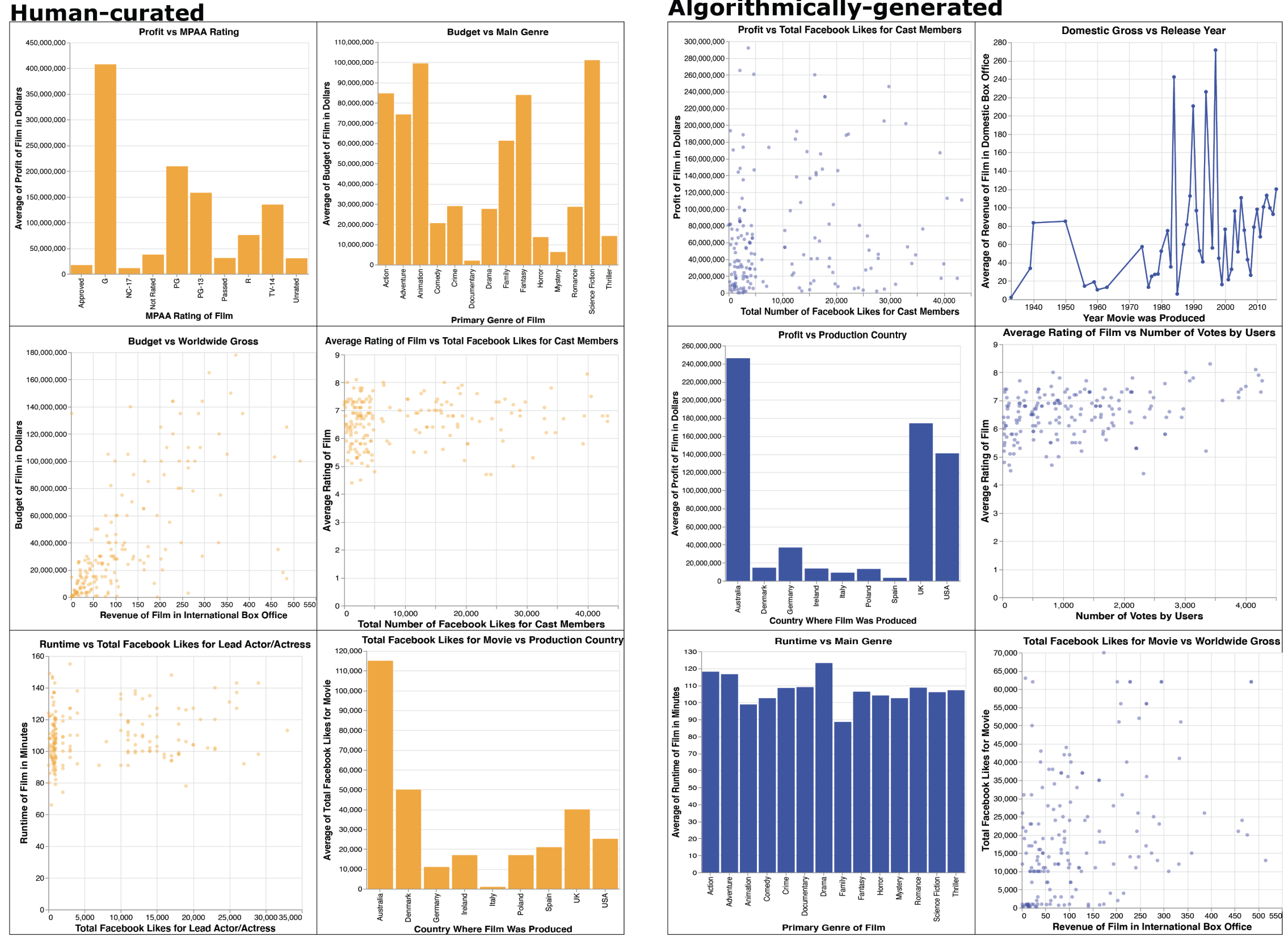
2 panels of 6 visualizations each are placed side by side, with the human curated panel on the left, and algorithmically curated panel on the right. Each panel is comprised of bivariate graphs, and are either bar graphs, scatter plots, or line graphs.
Participants were given time to review and complete the consent form before beginning the study, and could withdraw at any point. Participants took 17 minutes on average (s.d. 9 minutes) to complete the survey. Those that were 3 standard deviations below the average time were to be excluded from our analysis, though none fell into this category.
We then gave participants the following scenario: “a well-known film studio is hosting a competition for new movie ideas, and you are currently gathering information in preparation for a pitch on why your movie would be successful. To help you extract insights about successful movies, the studio has provided you with various metrics about movies that have been created in the past.”
Our study progressed in three phases, where participants:
-
•
Phase 1: record recommendation source preferences and attribute preferences for a given movies dataset;
-
•
Phase 2: rate two separate groups (or panels) of visualization recommendations, and select one panel to proceed with; and
-
•
Phase 3: complete surveys collecting experiences with the recommendation panels and demographic information.
A pilot study of 12 participants was run prior to our main study to test our materials and procedure.
4.4. Phase 1: Recording Prior Preferences
We captured participants’ priors in two ways: by asking participants to rank the movies attributes they were most interested in analyzing, and by asking participants about their general prior preferences for human-curated versus algorithm-generated recommendations.
4.4.1. Ranking Attributes of Interest
Before seeing any visualization recommendations, participants were provided a list of all data attributes (with corresponding explanations) present in the movies dataset, and asked to rank the top five attributes they would like to reference while creating their pitch.
This ranking task helped participants to familiarize themselves with the available attributes for analysis, and helped us to gain an initial understanding of the attributes participants wanted to see in later visualization recommendation panels. While these rankings were not used to generate visualizations, they helped us assess the expected relevance and utility of the panels that were displayed to participants in the later stages of the experiment.
4.4.2. Soliciting Prior Recommendation Preferences
We then asked participants whether they prefer recommendations from humans, algorithms, or neither (i.e., no preference), in the context of song recommendations. Though song recommendations may not fully generalize to the context of visualization recommendations, we aimed to capture prior preferences in a familiar context where many people encounter both automated (e.g., Spotify mixes (Spotify, 2020)) and human recommendations (e.g., personally curated playlists). This mixture of familiarity and transferability was useful for the task without narrowing the participant pool to those with direct experience with visualization recommendation systems.
4.5. Phase 2: Comparing Recommendation Panels
Once the participant’s initial preferences were recorded, the participant was then asked to compare two separate panels of visualizations (see Figure 2 for example panels). These panels are comprised of 6 visualizations of 3 possible types: line chart, bar chart, or scatterplot. Our focus on panels over individual charts is motivated by the design of existing recommendation systems (e.g., (Wongsuphasawat et al., 2016; Mackinlay et al., 2007; Vartak et al., 2015)) which present multiple visualization recommendations at a time. One panel was labeled as “Human-Curated” and the other as “Algorithmically-Generated.” However, both were in fact generated by the authors and these labels were assigned randomly.
Participants were asked to rate how useful each panel would be for completing the task (analyzing data to support a movie pitch) on a ten point Likert scale, and to select a single panel for their analysis. After making a selection, participants were asked to explain their choice of panel. The ratings and final selection enabled us to gather information on the perceived relevance of each panel.
After a specific recommendation panel was selected (either human or algorithm), the participant was asked to describe what they learned from this panel that would help them in writing a movie pitch. The participant was then asked to rate the panel based on how helpful it was in forming insights based on a 10 point Likert scale, and asked if there was anything they would have liked to see as part of the recommendations.
4.6. Phase 3: Completing Final Surveys
The final phase of the experiment involved completing two surveys for capturing participants’ decision-making processes and overall impressions, as well as demographic information.
First, participants were asked a series of 8 questions asking the extent to which participants agreed to various statements about the quality of human recommendations and algorithm recommendations, and any perceived differences between the two recommendation sources. For example, participants indicated their agreement with such statements as “The algorithm did a good job in selecting the visualizations that I should analyze,” “I felt that key visualizations were often missing from the recommendations,” and “There was a noticeable difference in the quality of recommendations between humans and algorithms” on a 5 point Likert scale. The survey concluded with demographic questions, including collecting gender, age, and educational attainment to prevent priming.
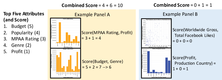
Examples of how to calculate visualization panel relevance scores based on 5 attributes (budget with a weight of 5, popularity with a weight of 4, MPAA Rating with 3, Genre with 2, and Profit with 1). 2 example panels are displayed. Panel A has a score of 10, because one visualization has a score of 6 and the other score a 4. These visualizations got their scores because one visualized MPAA Rating (3) with profit (1), which sums to 4. Similarly, the other visualization was budget(5) and Genre (2) which sums to 7. All ratings greater than 6 get mapped to 6.
4.7. Computing Recommendation Panel Relevance
To better understand how participants’ panel selections may be influenced by prior preferences, we designed four panels of varying relevance. In this way, we could see whether participants’ panel selections were in alignment with the perceived relevance of the panels (i.e., in alignment with their top five attributes of interest).
4.7.1. Scoring Individual Visualizations
Before scoring the quality of entire panels, we first created a method to score individual visualizations. We had performed an initial pilot study with 12 participants, where we created panels from 5 randomly selected attributes but otherwise followed the current study design. Through that pilot, we found that the top five most popular data attributes were (in order of frequency): budget, popularity, MPAA rating, genre, and profit (also shown in Figure 3). These attributes served as the basis for constructing high and low relevance visualization recommendations. We applied a simple linear weighting system to assign a weight to each of these attributes (budget received a weight of five, popularity a weight of four, and so on). All other attributes were assigned a weight of zero. Though other weighting mechanisms, such as exponential or quadratic, could have been used, as participants were ranking them in a linear fashion, we felt it prudent to use a linear weighting to match.
At first, a single visualization ranged from a score of 0–9. As only a few visualizations could have a score of 6–9, we clamped all scores higher than 6. The resulting 0–6 per-visualization scoring lends itself to a more even distribution. Relevance for the bivariate visualization was calculated by summing the weights of the two corresponding attributes. For example, consider the first visualization in example panel A of Figure 3, which visualizes MPAA Rating versus Profit. MPAA Rating has a weight of 3, and Profit a weight of 1, producing a summed score of 4. In contrast, the first visualization of example panel B has no relevant attributes, producing a relevance score of 0.
4.7.2. Panel Generation Strategy
Using the scoring mechanism for individual visualizations, we then computed scores for entire recommendation panels. For example, to calculate the final scores for example panels A and B in Figure 3, we sum the corresponding visualizations, producing combined scores of ten and one, respectively. Note however that each panel from our study consists of six separate visualization recommendations. Three of these visualizations were chosen to be relevant (i.e., with a score greater than zero), and the rest were selected to be irrelevant (i.e., have a score of zero). With possible panel scores ranging from 3–18, to compute two “high relevance” panels, we generated two recommendation panels with scores in the range of 13–18. To compute two “low relevance” panels, we generated two panels with scores in the range of 3–8. For example, panel A from Figure 3 could be the starting point for building a “high-relevance” panel, and panel B a “low-relevance” one. Panels were also chosen to have at most one repeating data attribute to ensure a breadth of visualized attributes.
4.7.3. Permuting Panel Pairings
Given our two “high relevance” panels and two “low relevance” panels, we have six total pairing scenarios: high-high (one pairing), high-low (four pairings), and low-low (one pairing). Taking panel order into account, we have 12 possible ordered pairs for comparison. Each ordered pair represents a separate condition of our experiment. Color and ordering of human versus algorithm labels were controlled by randomizing across participants. We collected data until at least eight participants completed each of our 12 experiment conditions.
4.8. Experiment Design Limitations & Trade-offs
features, or attribute overlap.
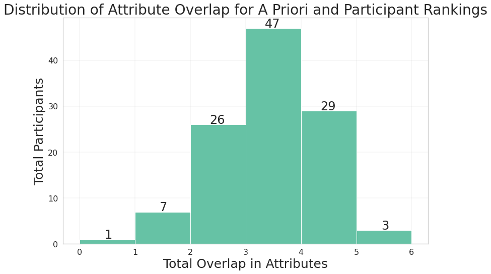
A histogram of total attribute overlap. The histogram has a slight right skew, with most participants having at least 3 attributes overlap.
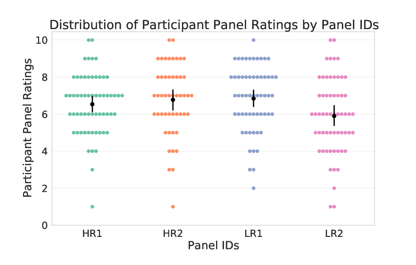
A swarm plot visualizing the distribution of relevance scores by panel ID (HR1, HR2, LR1, and LR2). Participants rated all panels similarly, with ratings around 6 out of 10.
To design our experiment, we had to consider multiple trade-offs, which we discuss here.
All panels were human-curated: Human-curated and algorithmically generated recommendations are likely to be qualitatively different. Our decision to make the panels identical, but changing only the purported source, allows us to isolate the impact of source alone, but does not capture these potential visual and semantic differences.
Fixed Panels and Relevance: Four panels were computed in advance, based on a fixed set of attributes collected from our pilot study. Features such as visual encoding, information density, and attribute pairing were uniform across these panels, as we chose to vary only attribute relevance across these panels. While we considered tailoring panels based on participants’ rankings, as well as varying the visual encodings, the strength of this design is that it keeps the number of experiment conditions at a manageable level. However, we acknowledge that attribute relevance is only one dimension of visualization quality, and that visual encodings and interaction effects of attribute pairings were not accounted for. We chose a simple relevance metric as a starting point rather than a more complex reactive measure or stimuli generation procedure.
Single Trial Design: In our experiment, a single trial consists of participants evaluating one pair of panels. While one recorded preference per participant limits statistical power, it also avoids bias from multiple explorations of the same dataset. It also allows the experiment to be easily crowdsourced to a platform like Prolific.
Wide Range in Participant Expertise: By not constraining participation by experience, our user population may not accurately reflect the population that commonly use visualization recommendation features. Though another study with a different population would help generalize the results, this design allows us to directly observe how data analysis experience influences user recommendation preferences.
Using Color to Distinguish Algorithm and Human Panels: Though color was randomly assigned as a way to distinguish between recommendation source, a small number of participants used it as a basis for their decision. In consideration of this subgroup, other means of distinguishing between algorithm versus human could have been used.
5. Analysis
In this section, we investigate our research questions via a mixture of quantitative and qualitative methods, focusing our analysis on the link between participants’ prior preferences regarding recommendation sources, the participants’ measured relevance of the displayed visualization panels, and their self-reported rationales for choosing one panel of visualization recommendations over another.
5.1. Preliminaries
In this section, we define specific concepts and calculations used throughout our analysis, and summarize our analysis methods. We compute panel relevance based on a fixed set of attributes collected in a pilot study, as well as by using participants’ top five selected attributes (see subsection 4.7 and subsection 4.8). The specific relevance measures we analyze are as follows:
- A Priori or Participant Ranking:
-
The ranking of the five most frequently selected attributes from our pilot study or by a specific participant respectively.
- Panel Rating:
-
The rating that a participant assigned to a specific panel, using a ten point Likert scale.
- Attribute Overlap:
-
Given two sets of attributes, we calculate the cardinality of the intersection of the two sets.
Note that each recommendation panel (and individual visualization within this panel) represents a unique subset of attributes, which may or may not overlap with a user’s preferred attributes.
5.1.1. Quantitative Analysis Methods Overview
Our quantitative measures aim to uniformly assess the decisions made by participants, such as the frequency of when each source was selected or the distribution of ratings assigned to each recommendation panel. Given the context of our study design and tentative hypotheses, we also opted for a more exploratory rather than confirmatory design for analyzing our study data. Rather than relying on inferential statistical analysis, we used our quantitative analysis to identify patterns in participants’ visualization preferences and analysis behaviors, and report on general effect sizes and confidence intervals to provide additional context for our findings.
5.1.2. Qualitative Analysis Methods Overview
In our experiment, we explicitly asked participants to explain their choice in recommendation panel (see subsection 4.5). These responses form the basis for our qualitative analysis. We note that two responses were excluded from the analysis. One response was not written in English, preventing an accurate evaluation, and the other was empty. We qualitatively coded 112 responses for this analysis.
We performed open coding (Lazar et al., 2017) on participants’ free text responses explaining the reasons for their panel selection; the codes are provided in Table 2. To develop a consistent coding scheme, two researchers coded the first 40 responses individually, then discussed to resolve discrepancies. One researcher coded the remaining responses, which the other reviewed. We used a multi-phase coding process to refine and merge similar codes. Then, the resulting 24 codes were organized into six high-level themes describing the reasoning behind participants’ decision-making processes.
5.2. Verifying Recommendation Relevance
Before evaluating the effects of recommendation source preference on decision-making, we assess the alignment between participants’ perceptions of panel relevance and our calculated relevance scores. This analysis serves to not only anchor our measures, but also to explore our first hypothesis – that people will rate recommendation sources according to the degree of attribute overlap. Our results are as follows:
A priori rankings have high attribute overlap with participant rankings: We first analyze attribute overlap between a priori and participant rankings, shown in Figure 4, where the range of attribute overlap is from 0 (i.e. no overlap) to 5 (i.e. both sets are identical). We find similarities between a priori and participant rankings. 70% of participants selected at least three of the same attributes used in the a priori rankings. This indicates that our a priori relevance seems to be aligned with participant relevance, and thus was a reasonable starting point for generating high- and low-relevance panels.
Participants seem to emphasize relative rather than absolute panel ratings:
Participants rated the presented panels similarly. However, since participants were asked to compare pairs of panels rather than panels in isolation, it is possible that participants are focusing on relative differences when assigning ratings to panels. To evaluate this scenario, we first compare each panel to the corresponding ranking assigned by each participant. One panel will overlap more or equally with the participants’ rankings than the other. Subtracting the lower overlap value from the higher produces a new value between zero and five. We then apply the corresponding calculation for panel ratings: subtracting the rating of the low-overlap panel from the rating of the high-overlap panel. Figure 5 illustrates the results, where the x-axis represents the difference in attribute overlap for a pair of panels, and the y-axis represents the corresponding difference in panel ratings. The figure illustrates a trend where as the difference in attribute overlap increases, so does the difference in panel rating. This suggests that participants may view relevance as a function of attribute overlap, and so rating alone may not be sufficient to describe the perceived utility of a panel. Thus, the panel ratings may be useful in terms of measuring relative preference between a given pair of recommendation panels.
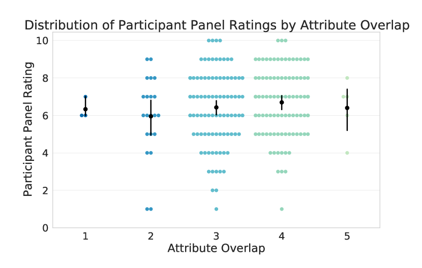
Swarm plot of panel ratings, separated by attribute overlap. Despite different levels of attribute overlap, participants generally rated panels similarly.
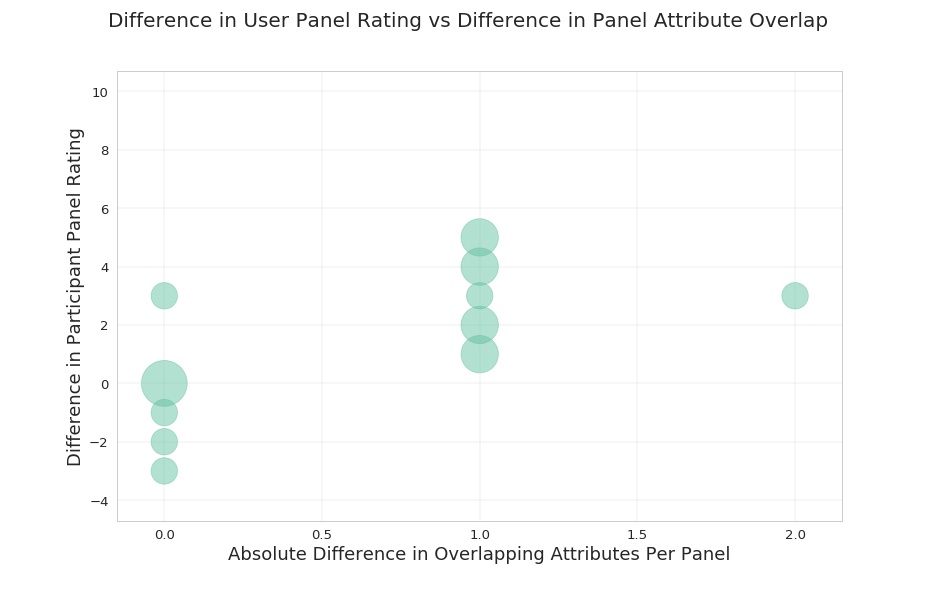
Bubble plot with the absolute difference in panel ratings vs absolute differences in attribute overlap. Bubble size encodes the number of participants with the corresponding score difference. There is an upward trend indicating that participants are giving increasingly different ratings when the panels exhibit increasingly different levels of attribute overlap.
| Themes | Codes | |
|---|---|---|
| Data-driven Decisions (60) | Information quality (11), information usability (25), relevance (5), visualizations of interest (23), attributes of interest (27) | |
| Trust in Source (22) |
|
|
| Reliability of Source (21) | Reliability (11), accuracy (10), errors (4) | |
| Participant Comprehension (17) | Comprehension (16), ease of analysis (2) | |
| Personal Experiences (16) |
|
|
| Visual Aesthetics (7) | Visual aesthetics (7), color preference (1) |
A 2 column table, with the first column containing all of the themes from our qualitative analysis and the frequency of occurrence. The second column contains the codes associated with that theme, as well as their frequency of occurrence. The 6 themes are Data-driven decisions, Trust in Source, Reliability of Source, Participant Comprehension, Personal Experiences, and Visual Aesthetics.
5.3. Assessing Bias in Participant Preferences and Panel Selections
In this section, we explore our first research question: How do existing preferences for human-curated versus algorithmically-generated recommendations affect the evaluation of recommendation quality or utility? This will also help us explore our second hypothesis – that an a priori preference towards a particular recommendation source predisposes participants to select a particular panel, regardless of recommendation relevance.
Though participants initially prefer human recommendations, they are neutral to source in their panel selections: First, we delved into understanding the existing preferences and subsequent decisions made by our participants. 60% indicate a prior preference for human recommendations, 15% prefer algorithmic recommendations, and 25% have no preference. Though this suggests an existing preference for human recommendation sources, participants’ subsequent recommendation source choices are evenly split between humans and algorithms (see Figure 6).
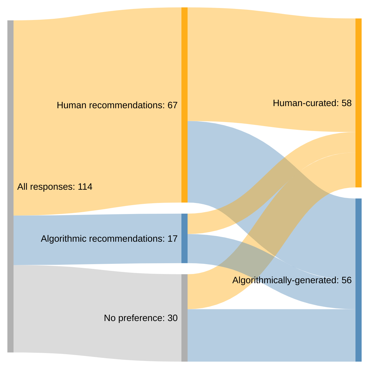
Sankey diagram of prior preferences of recommendation sources and posterior selection of panels. Most people expressed a prior preference for human sources, but the resulting posteriors are split nearly 50/50
Prior preferences are not highly predictive of visualization recommendation choices: For participants who initially preferred human recommendations, 58% selected the “Human-Curated” panel. For participants who initially preferred algorithmic recommendations, 59% selected the “Algorithmically-Generated” panel. 62% of participants with no initial preference selected the “Algorithmically-Generated” panel. Given that we controlled for relevance across all conditions, these findings suggest that participants did not primarily select panels based on their a priori preference for human or algorithmic recommendations. Nevertheless, there was a subset of participants that did not follow this trend.
A fraction of adherents chose their panel despite estimated lower relevance: We find that 14% of all participants stick with their prior preferences, even when the calculated relevance of the chosen panel is lower than that of the unchosen panel (average relevance of chosen of 8, unchosen is 11). Though far from a majority, this result may suggest that some participants may still make allowances for their preferred recommendation source, and thus may be susceptible to recommendation errors.
It is possible that our relevance metric did not align with how these specific participants’ models of relevance. Our metric was calculated using participants’ attribute rankings only, and does not account for interaction effects between attributes or other potential indicators of utility. As a result, we qualitatively explore alternative measures of relevance from participants in the next section.
In summary, though our participants initially appeared to have preferences for human recommendation sources, they were ultimately neutral to visualization recommendation sources. However, there is a minority of people that appear to make allowances for their prior preferences, which may drive their choice of recommendation source.
5.4. Understanding Participants’ Decision Making Models
After observing that most participants claim to prefer human recommendations yet in practice are insensitive towards recommendation source, we explore our second research question: If clear preferences are observed, what reasons do users give for preferring a certain recommendation source? We qualitatively analyze participant responses to understand their reasoning for choosing a certain panel.
Many participants reported selecting panels in an analysis-driven way: The most common theme (60 out of 112 responses) was analysis-driven decisions, meaning that participants evaluated panels based on their own analysis interests and the corresponding applicability of the information encoded within the visualizations. Within that umbrella category, participants fell into different clusters of reasoning. Some participants seemed to regard each panel as a whole and chose a panel based on the combined utility of the component visualizations. As an example, one participant noted:
Although the selection doesnt reflect all of the attributes picked earlier on, i think the data in this set matches more so what i want to focus on in the pitch. (P91)
These participants seem to suggest that they prioritized the cumulative information gained when choosing one panel versus the other. On the other hand, there were participants who noted specific visualizations or attributes that swayed their decision to choose a particular panel, and thus recommendation source. In particular, 19 of these 60 participants mention specific visualizations within their justification. For example, one participant wrote:
[the] last bit of human curated (domestic gross v release year) was really convincing chart (P33)
Lastly, many participants expressed interest in specific attributes or visualizations, situated with respect to the context of their movie pitches. For example, another participant stated:
[the] algorithmically-generated grid has some very useful graphs, such as profit/mpaa rating and budget/genre…the company that the movie is being pitched to would be really interested in these particular sets of data. (P54)
Overall, even within the data-driven decisions theme, there was a significant diversity in rationales, be it the combined utility of visualizations, a singular visualization, or focusing on potentially interesting attributes for the target audience.
Trust in the source of recommendations was the second most common reason for choosing a particular panel. In examining adherents in subsection 5.3, we became interested in understanding the potential biases people harbor towards a particular recommendation source. We observed the theme “Trust in Source” in 22 of 112 responses.
Some participants believed that algorithms are more efficient and less likely to make errors than humans (6 of 22 responses). As P75 explained,
“Although they [the panels] both seemed equally helpful to me, I chose the algorithmical one because human curated may have some mistakes in it but algorithmical one most probably does not.”
This reasoning came from a general impression that algorithms are more accurate, or from the participant’s personal background, as one participant notes: …I inhere[n]tly tend to trust Algorithms more since I am a computer s[c]ience student. (P97)
Conversely, some participants indicated a preference for humans due to the presence of a “human touch” in the recommendation panels (3 of 22 responses). For example, one participant references this notion of a uniquely human quality in the human-curated visualizations by explaining that
“Both [panels] had good information but I think the human touch is required to get the best feel for the data” (P65).
Along a similar vein, one participant made their choice based upon the notion that because a human recommended these visualizations, it had intrinsic value:
“I prefer things made by actual people and not algorithms, although the later could be useful too” (P94)
When both recommendation options are perceived as equally relevant, factors outside of the data relevance become increasingly important. Some participants will incorporate prior preferences for algorithmic or human recommendations into their decision making process. In the case of participant P65, the “human touch” becomes the deciding factor in selecting the “Human-Curated” panel. For participant P75, it was the added legitimacy and accuracy that an algorithm lends to recommendations.
5.5. Exploring How Analysis Experience And Other Factors Influence Participant Preferences
Given the wide range of factors that could affect a participant’s evaluation strategies, we seek to better understand how data analysis experience may influence how these factors are prioritized by participants. In this section, we explore our third research question: What effect (if any) does statistical or data analysis experience have on user preferences?
Analysis experience does not seem to impact prior preference or panel selections: We recorded four measures of data analysis experience: statistics, visualization, general data analysis, and data analysis tool (Excel, R, Matlab, etc.) experience. For all measures, we failed to find a notable difference across experience levels. For sake of space, we only present a single salient example. We found that participants selected the “Algorithmically-Generated” panel at similar rates regardless of frequency of performing data analysis tasks, used as an indicator for general data analysis experience level: 55% (almost never), 53%(less than monthly), 50% (less than weekly), 33%(weekly), and 67% (daily). Thus, data analysis experience does not appear to be predictive of panel selection, answering our third research question.
Visualization comprehension may affect participants’ ability to evaluate recommendations: Despite this, a notable number of responses were categorized under “Participant Comprehension” (17 of 112 responses). In particular, we find that some participants had trouble interpreting the visualizations in some of the panels. For example, one participant mentions that “the ones with the little dots are very confusing” (P61). This issue touches on one of the limitations of our experiment design (see subsection 4.8), and poses a challenge for recommendations in general: not everyone values the relevance of a recommendation in the same way, and relevance can mean different things for users of differing levels of experience. For example, novice users may prioritize comprehension and ease of understanding, whereas more experienced users may prioritize insight density.
Aesthetics can be a deciding factor in choosing between visualization recommendation panels: The aesthetics of visualizations also seems to be a relevant factor in judging recommendations. Seven of 112 responses contained the “Visual Aesthetics” theme, which refers to the artistic appearance of the visualizations themselves. Two participants cited the “cleanness” and “simplicity” of certain panels as the reasons for their selections. One participant in particular selected their chosen panel because the “blue color is visually more impactful” (P55). These sorts of design choices are often overlooked in making recommendations, to the detriment of users who value them.
Based on these findings, we summarize how participants seem to choose between panels: participants often approach the evaluation of visualization recommendations in an analysis-driven way, but an inherent trust in recommendation source may play a role as well. For some, comprehension and visual aesthetics were also notable determining factors in selecting specific recommendation panels.
6. Discussion
From our quantitative and qualitative observations, we synthesize the following preliminary findings:
People seemed to choose panels by focusing on the information presented in the visualizations. In examining the rationale behind panel choices we found that, for a majority of participants, their decision-making process often focuses on the relevance of the data itself. We found some evidence that that people may rate recommendation panels based on the level of attribute overlap. For example, participants may emphasize the cumulative information gained from a panel. We refer to these participants as all-rounders, as they seem to obtain value from the quantity of information in a panel. However, some participants rely on a particular visualization as a deciding factor, indicating that prior preferences (and therefore biases) may still play a role in subsequent decision-making. We refer to this cohort as seekers, as they seem to be looking for a specific chart or set of charts to investigate specific hypotheses.
Our results point to the existence of differing patterns of information foraging among viewers, suggesting that there may not be a one-size-fits-all solution to the problem of recommending useful visualizations. To better support these different user groups, we suggest tailoring recommendations towards different patterns of analyses. For instance, recommendations for all-rounders could focus on presenting dashboards that present overviews of many key metrics, whereas recommendations for seekers could focus on specific attributes of interest or particularly informative visualizations (in the information-theory sense (Chen and Jaenicke, 2010)). These suggestions might require the collection of priors or other data-driven inference about data, rather than just the surfacing of arbitrary “data facts” (Srinivasan et al., 2019) such as outliers or strong correlations.
Existing preferences are not predictive of subsequent recommendation choice, though perceptions of source can contribute. While participants initially preferred human recommendations, their subsequent panel choices revealed an insensitivity to recommendation source. Similarly, Peck et al. found that over half of participants did not change their initial rankings of the usefulness of visualizations after the sources (e.g., government agencies, universities) of each visualization were revealed (Peck et al., 2019). That said, around a fifth of participants in our study indicated that the source of recommendations was important to them, and some perceived differences in the reliability and accuracy of human and algorithmic recommendations.
Designers should consider how to present information in an unbiased manner for these individuals with clear preferences for recommendation source. For example, visualization recommendation systems might provide more detailed information on how the recommendations were curated to help users develop more trust in the system as a whole (Yang et al., 2020). However, more research is needed to determine an appropriate threshold for transparency: providing too much or too little transparency can erode trust in algorithmic recommendations (Kizilcec, 2016).
Data analysis experience does not have a substantial impact on preferences or panel selections, although visualization comprehension and aesthetics may play a role. Challenges in understanding certain visualizations (e.g., scatterplots) may have hindered some participants’ ability to effectively evaluate recommendations. Although a recommendation panel may have useful information, it is only relevant if the user can meaningfully interpret its data. Future work may solicit more information about participants’ personal backgrounds to gain deeper insight into factors that influence people’s perceptions of relevance beyond data analysis experience. While analysis experience did not seem to impact participants’ panel selections, aesthetics shaped a minority of participants’ decisions. As the audience of visualization tools broadens over time, designers should consider the aesthetics of visualizations as a means of supporting users’ understanding of the data and encouraging them to interact with the system (Moere and Purchase, 2011).
Overall, our results are positive news for the designers of visualization recommendation systems. Neither of the failure cases we mention in this paper, either the uncritical acceptance of recommendations from algorithmic sources, nor the knee-jerk rejection of the same, appear to occur with high frequency. However, we note that this pattern of apparent rationality is not universal: a sizable portion of our adherents stuck with their preferred choice of recommendation source even given measurable mismatches in expected utility. This behavior suggests that we either lack appropriate measures to assess the utility of visualization recommendations, or that users rely on additional factors to evaluate perceived differences between recommenders. As a consequence, future work may investigate the qualitative and quantitative differences between human and algorithmic data visualizations to identify specific factors influencing trust. The presence of these adherents, combined with a substantial initial preference for human recommendations, also suggests that there is value (and some risk) in providing human recommendations, which may be perceived as having intrinsic authority and relevance over algorithmic choices.
7. Conclusion
As visualization systems increasingly rely on automated or semi-automated methods, and as the population of people who encounter visualization tools becomes larger and less specialized, the attitudes and beliefs of our users towards algorithmic recommendations will become increasingly important. The results of our experiment show that, for the most part, people seem to assess visualization recommendations in terms of relevance, rather than source; this seemed to hold across groups of varying statistical experience. However, there was a minority of people who did not seem to act in a data driven way. For instance, visual comprehension and aesthetics choices seemed to drive the decision-making of some participants, who should also be considered when designing large-scale systems. In that way, people are (with some exceptions) generally capable of adjusting their beliefs about the source of recommendations to fit their analytical needs, and making informed decisions about what recommendations to trust.
8. Acknowledgements
We thank all the reviewers, study participants, and members of both the Human-Computer Interaction Lab and the Battle Data Lab for their valuable feedback.
References
- (1)
- Bresciani and Eppler (2015) Sabrina Bresciani and Martin J Eppler. 2015. The pitfalls of visual representations: A review and classification of common errors made while designing and interpreting visualizations. Sage Open 5, 4 (2015), 2158244015611451. https://doi.org/10.1177/2158244015611451
- Castelo et al. (2019) Noah Castelo, Maarten W Bos, and Donald Lehmann. 2019. Let the Machine Decide: When Consumers Trust or Distrust Algorithms. NIM Marketing Intelligence Review 11, 2 (2019), 24–29. https://doi.org/10.2478/nimmir-2019-0012
- Chen and Jaenicke (2010) Min Chen and Heike Jaenicke. 2010. An information-theoretic framework for visualization. IEEE Transactions on Visualization and Computer Graphics 16, 6 (2010), 1206–1215. https://doi.org/10.1109/TVCG.2010.131
- Cheng et al. (2020) Furui Cheng, Yao Ming, and Huamin Qu. 2020. DECE: Decision Explorer with Counterfactual Explanations for Machine Learning Models. arXiv:2008.08353 [cs.LG]
- Correll (2019) Michael Correll. 2019. Ethical Dimensions of Visualization Research. In Proceedings of the 2019 CHI Conference on Human Factors in Computing Systems. Association for Computing Machinery, New York, NY, USA, 1–13. https://doi.org/10.1145/3290605.3300418
- Dibia and Demiralp (2019) Victor Dibia and Çağatay Demiralp. 2019. Data2Vis: Automatic generation of data visualizations using sequence to sequence recurrent neural networks. IEEE Computer Graphics and Applications 39, 5 (2019), 33–46. https://doi.org/10.1109/MCG.2019.2924636
- Edwards et al. (2014) Chad Edwards, Autumn Edwards, Patric R Spence, and Ashleigh K Shelton. 2014. Is that a bot running the social media feed? Testing the differences in perceptions of communication quality for a human agent and a bot agent on Twitter. Computers in Human Behavior 33 (2014), 372–376. https://doi.org/10.1016/j.chb.2013.08.013
- Golfarelli and Rizzi (2020) Matteo Golfarelli and Stefano Rizzi. 2020. A model-driven approach to automate data visualization in big data analytics. Information Visualization 19, 1 (2020), 24–47. https://doi.org/10.1177/1473871619858933
- Graefe et al. (2016) Andreas Graefe, Mario Haim, Bastian Haarmann, and Hans-Bernd Brosius. 2016. Perception of Automated Computer-Generated News: Credibility, Expertise, and Readability. Journalism 19 (2016). https://doi.org/10.1177/1464884916641269
- Heer (2019) Jeffrey Heer. 2019. Agency plus automation: Designing artificial intelligence into interactive systems. Proceedings of the National Academy of Sciences 116, 6 (2019), 1844–1850. https://doi.org/10.1073/pnas.1807184115
- Jakesch et al. (2019) Maurice Jakesch, Megan French, Xiao Ma, Jeffrey T. Hancock, and Mor Naaman. 2019. AI-Mediated Communication: How the Perception That Profile Text Was Written by AI Affects Trustworthiness. In Proceedings of the 2019 CHI Conference on Human Factors in Computing Systems. Association for Computing Machinery, New York, NY, USA, 1–13. https://doi.org/10.1145/3290605.3300469
- Kaggle (2019a) Kaggle. 2019 (accessed December 5, 2019)a. IMDB 5000 Movie Dataset. https://www.kaggle.com/carolzhangdc/imdb-5000-movie-dataset
- Kaggle (2019b) Kaggle. 2019 (accessed December 5, 2019)b. The Movies Dataset. https://www.kaggle.com/rounakbanik/the-movies-dataset
- Kaggle (2019c) Kaggle. 2019 (accessed December 5, 2019)c. The Story of Film. https://www.kaggle.com/rounakbanik/the-story-of-film
- Kizilcec (2016) René F. Kizilcec. 2016. How Much Information? Effects of Transparency on Trust in an Algorithmic Interface. In Proceedings of the 2016 CHI Conference on Human Factors in Computing Systems. Association for Computing Machinery, New York, NY, USA, 2390–2395. https://doi.org/10.1145/2858036.2858402
- Lazar et al. (2017) Jonathan Lazar, Jinjuan Heidi Feng, and Harry Hochheiser. 2017. Research methods in human-computer interaction. Morgan Kaufmann, San Francisco.
- Lee (2018) Min Kyung Lee. 2018. Understanding perception of algorithmic decisions: Fairness, trust, and emotion in response to algorithmic management. Big Data & Society 5, 1 (2018), 2053951718756684. https://doi.org/10.1177/2053951718756684
- M. Logg et al. (2019) Jennifer M. Logg, Julia A. Minson, and Don A. Moore. 2019. Algorithm appreciation: People prefer algorithmic to human judgment. Organizational Behavior and Human Decision Processes 151 (2019), 90–103. https://doi.org/10.1016/j.obhdp.2018.12.005
- Mackinlay et al. (2007) Jock Mackinlay, Pat Hanrahan, and Chris Stolte. 2007. Show me: Automatic presentation for visual analysis. IEEE Transactions on Visualization and Computer Graphics 13, 6 (2007), 1137–1144. https://doi.org/10.1109/TVCG.2007.70594
- Merritt et al. (2013) Stephanie M. Merritt, Heather Heimbaugh, Jennifer LaChapell, and Deborah Lee. 2013. I Trust It, but I Don’t Know Why: Effects of Implicit Attitudes Toward Automation on Trust in an Automated System. Human Factors 55, 3 (2013), 520–534. https://doi.org/10.1177/0018720812465081
- Microsoft (2019) Microsoft. 2019 (accessed December 5, 2019). Generate data insights automatically with Power BI. https://docs.microsoft.com/en-us/power-bi/service-insights
- Moere and Purchase (2011) Andrew Vande Moere and Helen Purchase. 2011. On the role of design in information visualization. Information Visualization 10, 4 (2011), 356–371. https://doi.org/10.1177/1473871611415996
- Moritz et al. (2018) Dominik Moritz, Chenglong Wang, Greg L Nelson, Halden Lin, Adam M Smith, Bill Howe, and Jeffrey Heer. 2018. Formalizing visualization design knowledge as constraints: Actionable and extensible models in Draco. IEEE Transactions on Visualization and Computer Graphics 25, 1 (2018), 438–448. https://doi.org/10.1109/TVCG.2018.2865240
- Numbers (2019) The Numbers. 2019 (accessed December 5, 2019). All Time Worldwide Box Office. https://www.the-numbers.com/box-office-records/worldwide/all-movies/cumulative/all-time
- Peck et al. (2019) Evan M Peck, Sofia E Ayuso, and Omar El-Etr. 2019. Data is personal: Attitudes and Perceptions of Data Visualization in Rural Pennsylvania. In Proceedings of the 2019 CHI Conference on Human Factors in Computing Systems. Association for Computing Machinery, New York, NY, USA, 1–12. https://doi.org/10.1145/3290605.3300474
- Peer et al. (2017) Eyal Peer, Laura Brandimarte, Sonam Samat, and Alessandro Acquisti. 2017. Beyond the Turk: Alternative platforms for crowdsourcing behavioral research. Journal of Experimental Social Psychology 70 (2017), 153 – 163. https://doi.org/10.1016/j.jesp.2017.01.006
- Qian et al. (2020) Chunyao Qian, Shizhao Sun, Weiwei Cui, Jian-Guang Lou, Haidong Zhang, and Dongmei Zhang. 2020. Retrieve-Then-Adapt: Example-based Automatic Generation for Proportion-related Infographics. arXiv:2008.01177 [cs.HC]
- Shank (2013) Daniel B. Shank. 2013. Are Computers Good or Bad for Business? How Mediated Customer-Computer Interaction Alters Emotions, Impressions, and Patronage toward Organizations. Computers in Human Behavior 29, 3 (May 2013), 715–725. https://doi.org/10.1016/j.chb.2012.11.006
- Shi et al. (2020) Danqing Shi, Xinyue Xu, Fuling Sun, Yang Shi, and Nan Cao. 2020. Calliope: Automatic Visual Data Story Generation from a Spreadsheet. , 1 pages. https://doi.org/10.1109/tvcg.2020.3030403
- Spotify (2020) Spotify. 2020. Spotify. https://www.spotify.com/. Accessed on (2020/01/09).
- Srinivasan et al. (2019) A. Srinivasan, S. M. Drucker, A. Endert, and J. Stasko. 2019. Augmenting Visualizations with Interactive Data Facts to Facilitate Interpretation and Communication. IEEE Transactions on Visualization and Computer Graphics 25, 1 (2019), 672–681. https://doi.org/10.1109/TVCG.2018.2865145
- Tableau (2021) Tableau. 2021 (accessed January 5, 2021). Explain Data. https://www.tableau.com/products/new-features/explain-data
- Vaccaro et al. (2019) Kristen Vaccaro, Karrie Karahalios, Deirdre K. Mulligan, Daniel Kluttz, and Tad Hirsch. 2019. Contestability in Algorithmic Systems. In Conference Companion Publication of the 2019 on Computer Supported Cooperative Work and Social Computing. Association for Computing Machinery, New York, NY, USA, 523–527. https://doi.org/10.1145/3311957.3359435
- Vartak et al. (2015) Manasi Vartak, Sajjadur Rahman, Samuel Madden, Aditya Parameswaran, and Neoklis Polyzotis. 2015. SeeDB: Efficient Data-Driven Visualization Recommendations to Support Visual Analytics. Proc. VLDB Endow. 8, 13 (Sept. 2015), 2182–2193. https://doi.org/10.14778/2831360.2831371
- Victor et al. (2011) Patricia Victor, Martine De Cock, and Chris Cornelis. 2011. Trust and recommendations. In Recommender systems handbook. Springer, Boston, MA, USA, 645–675. https://doi.org/10.1007/978-0-387-85820-3_20
- Wongsuphasawat et al. (2016) Kanit Wongsuphasawat, Dominik Moritz, Anushka Anand, Jock Mackinlay, Bill Howe, and Jeffrey Heer. 2016. Voyager: Exploratory Analysis via Faceted Browsing of Visualization Recommendations. IEEE Transactions on Visualization and Computer Graphics 22, 1 (2016), 649–658. https://doi.org/10.1109/TVCG.2015.2467191
- Wongsuphasawat et al. (2017) Kanit Wongsuphasawat, Zening Qu, Dominik Moritz, Riley Chang, Felix Ouk, Anushka Anand, Jock Mackinlay, Bill Howe, and Jeffrey Heer. 2017. Voyager 2: Augmenting Visual Analysis with Partial View Specifications. In Proceedings of the 2017 CHI Conference on Human Factors in Computing Systems. Association for Computing Machinery, New York, NY, USA, 2648–2659. https://doi.org/10.1145/3025453.3025768
- Yang et al. (2020) Fumeng Yang, Zhuanyi Huang, Jean Scholtz, and Dustin L. Arendt. 2020. How Do Visual Explanations Foster End Users’ Appropriate Trust in Machine Learning?. In Proceedings of the 25th International Conference on Intelligent User Interfaces (Cagliari, Italy) (IUI ’20). Association for Computing Machinery, New York, NY, USA, 189–201. https://doi.org/10.1145/3377325.3377480
- Yin et al. (2019) Ming Yin, Jennifer Wortman Vaughan, and Hanna Wallach. 2019. Understanding the Effect of Accuracy on Trust in Machine Learning Models. In Proceedings of the 2019 CHI Conference on Human Factors in Computing Systems (Glasgow, Scotland Uk) (CHI ’19). Association for Computing Machinery, New York, NY, USA, 1–12. https://doi.org/10.1145/3290605.3300509