Visualization of Contributions to Open-Source Projects
Abstract
We want to analyze visually, to what extend team members and external developers contribute to open-source projects. This gives a high-level impression about collaboration in that projects. We achieve this by recording provenance of the development process and use graph drawing on the resulting provenance graph. Our graph drawings show, which developers are jointly changed the same files—and to what extend—which we show at Germany’s COVID-19 exposure notification app ’Corona-Warn-App’.
Keywords graph visualization software visualization provenance open source
1 Introduction
In open-source projects, team composition and development process is transparent and traceable, which is one of the advantages of the open-source model [11]. Understanding of patterns and characteristics of open-source projects, where—sometime many—developers with different roles [26] work together, is an important research question; especially for projects with high public interests.
The COVID-19 pandemic [3] raises challenges for scientists of many disciplines. Computer scientists and software developers help to fight the pandemic with software systems, which must be developed under time pressure [2]. For example, apps for mobile devices that support contact tracing of infected persons are useful to identify local COVID-19 hot-spots and find other persons, who are potentially infected, too. We focus on Germany’s exposure notification app Corona-Warn-App (CWA; see Section 4).
For the CWA, we want to analyze and see visually, to what extend team members and external contributors contributed to the various sub-projects of CWA on GitHub.
Our method is to record the provenance of software development processes [13, 28] and store it according to a standard provenance data model. Technically, we do repository mining to extract provenance and store it as a labeled property graph in graph databases. We query the graph for information to answer our research questions directly or for parts of the graph to visualize it with “standard” graph drawing.
We describe the contributions and the emerging results of our works as follows:
-
•
A brief description of provenance of software development processes with focus on open-source processes that use the version control system git (Section 2).
-
•
An overview how we draw graphs that visually show contributions by developers with different roles (Section 3).
-
•
As an example towards a user study, we present graph drawings for the Corona-Warn-App (Section 4).
2 Provenance of Software Development Processes
Provenance can be expressed in many formats. We focus on the standard W3C PROV [14], which defines the provenance data model PROV-DM [15]. The core structure of PROV-DM relies on the definition of the model class elements entities
![]() , activities
, activities
![]() , and agents
, and agents
![]() that are involved in producing a piece of data or artifact and on definitions of relations to relate these class elements, such as wasGeneratedBy, wasAssociatedWith, wasAttributedTo, and used. Each of the class elements and relations can have additional attributes.
that are involved in producing a piece of data or artifact and on definitions of relations to relate these class elements, such as wasGeneratedBy, wasAssociatedWith, wasAttributedTo, and used. Each of the class elements and relations can have additional attributes.
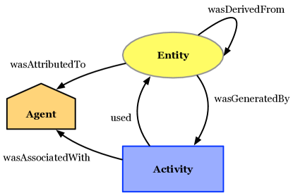
Provenance of an entity (e.g., a software artefact) is a directed acyclic graph (DAG). Since all nodes and edges of this graph have a defined semantics, the provenance graph is a specific knowledge graph. The provenance graph can be stored in graph databases as a labeled property graph.
2.1 Provenance for git Repositories
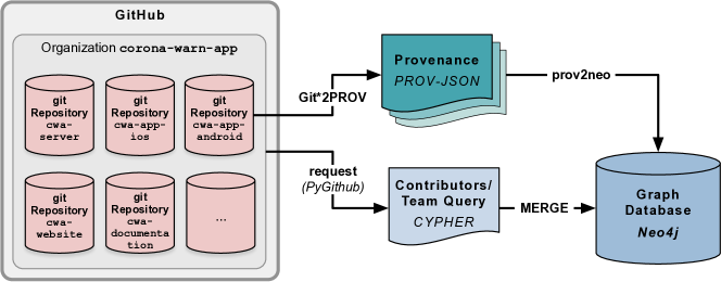
To analyze software development processes, we extract retrospective provenance [10] from repositories and store it in a graph database for further analysis (Figure 2) [22].
2.2 Using and Analyzing Provenance
To analyze provenance graphs, many visual and analytical methods exist—including graph summarization [12, 24], or visual exploration [27] .
For example, we illustrate querying and using the provenance graph to answer the question: “Which files have commits by team members as well as external contributors?”
We generate a Cypher query, that adds information about contributors roles. We retrieve member information via the GitHub API and store it in Python lists of team members and external contributors, which we insert in a Cypher template.
This Cypher query creates new directed relations between persons
![]() and files
and files
![]() ; for example, the relation for team members is:
; for example, the relation for team members is:
(:Agent)-[:CONTRIBUTES_TO {role: ’team’}]->(:Entity)
Then we query for files, where team members and external contributor made changes at any of the files revisions (the query result is exported for visualization (see Section 3):
MATCH (team_member:Agent) -[r1:CONTRIBUTES_TO {role: ’team’}] ->(file:Entity) <-[r2:CONTRIBUTES_TO {role: ’contributor’}] -(external_contributor:Agent) RETURN team_member,file,external_contributor
3 Graph Visualization
We visualize parts of the property graph that is derived from the provenance graph. We use a graph visualization that is readable and faithful [16, 17].
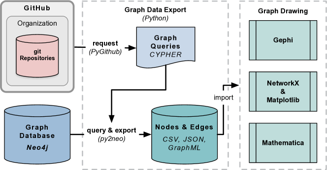
Using a Python script, we export the relevant nodes and edges from Neo4j and store them in intermediate files; specifically in CSV, JSON, and GraphML files, which we import into graph drawing software (Figure 3). In the following, we use Gephi [1] to draw our graphs.
During querying and exporting for visualization, we map the property graph as follows:
-
•
PROV elements entities
![[Uncaptioned image]](/html/2010.08874/assets/x9.png) (i.e., files) and agents
(i.e., files) and agents
![[Uncaptioned image]](/html/2010.08874/assets/x10.png) (i.e., contributors) become graph nodes with two distinct colors.
(i.e., contributors) become graph nodes with two distinct colors. -
•
The relations CONTRIBUTES_TO become edges, which color depends on the property role.
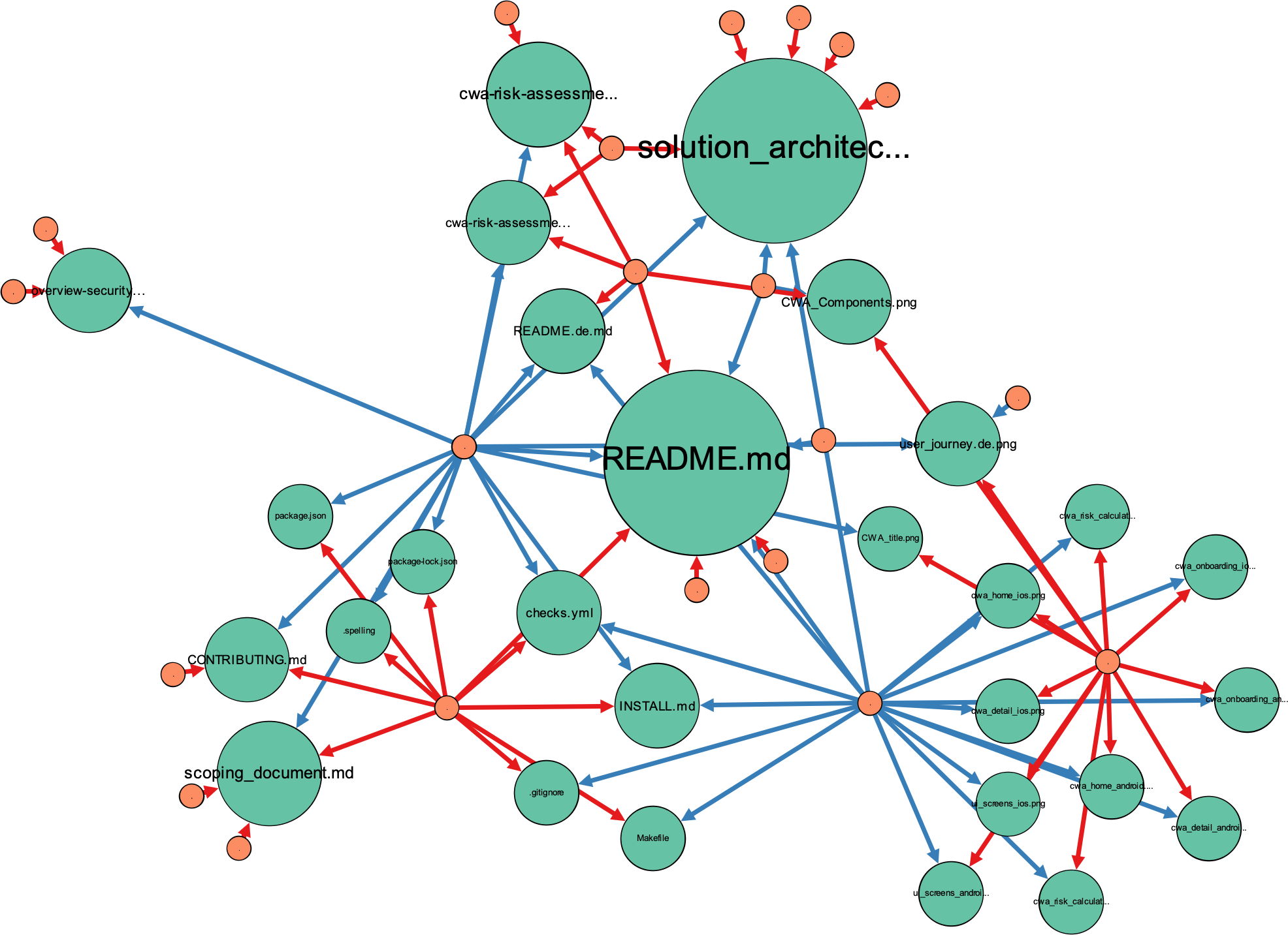
For the coloring [9], we choose distinct colors from two different qualitative color schemes generated by ColorBrewer [7]. Nodes use colors from the “3-class Set2” schema111https://colorbrewer2.org/?type=qualitative&scheme=Set2&n=3: files have a green color () and contributors have an orange color (). Edges use colors from the “3-class Set1” schema222https://colorbrewer2.org/?type=qualitative&scheme=Set1&n=3: contributions from team members have a blue color () and contributions from external contributors have a red color (). While the chosen colors are ‘print-friendly’, they are not safe regarding color blindness.
The size of nodes are proportional to their degree. In our current approach, we generate two drawings for each project; one where we scale the node sizes according to the in-degree of file nodes and a second one where we scale according to the out-degree of contributors.
For the layout we experimented with layout algorithms that are implemented in Gephi, such as Fruchterman Reingold [5], the algorithms that comes with Graphviz [6], and ForceAtlas2 [8].
| GitHub Project | Entities | Agents | Activities | Team contr. | Ext. contr. | Nodes Vis | Edges Vis |
|---|---|---|---|---|---|---|---|
| cwa-server | 4182 | 57 | 366 | 1088 | 849 | 491 | 1209 |
| cwa-documentation | 340 | 31 | 140 | 84 | 45 | 49 | 80 |
| cwa-app-android | 3672 | 56 | 379 | 571 | 1230 | 380 | 1261 |
| cwa-app-ios | 7552 | 53 | 1859 | 809 | 1107 | 287 | 909 |
See Figure 4 for an example of a graph drawing for an relatively small project using the ForceAtlas2 layout algorithm.
4 Graph Drawings for the Corona-Warn-App
The Corona-Warn-App (CWA) has been developed in a short time frame: development started in April 2020 and the app was released on \formatdate1662020 for Android and iOS. CWA is developed by SAP and Telekom using an open development process—publicly available from 12 repositories333https://github.com/corona-warn-app. CWA has a decentralized architecture, accompanied by centrally-managed Java-based server applications to distribute findings about infected users and store test results uploaded by the laboratories.
We selected four of the CWA projects for visualization, for which we stored the provenance in Neo4j444The database dump is available [21] as of \formatdate2772020. These projects differ in their projects statistics regarding number of files in the repository, number of contributing developers, number of commits, and number of files where both team members and external developers made changes—which all leads to different number of nodes and edges for the graph drawings (Table 1).
For each project, we generate two graph drawings with Gephi555The Gephi file is available [20]. as described in Section 3: one where we scale node sizes proportional to the in-degree of file nodes (see Figures 5a and 6a) and a second one where we scale proportional to the out-degree of contributors (see Figures 5b and 6b).
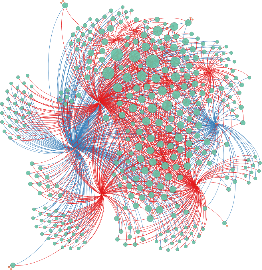
of nodes that represent files.
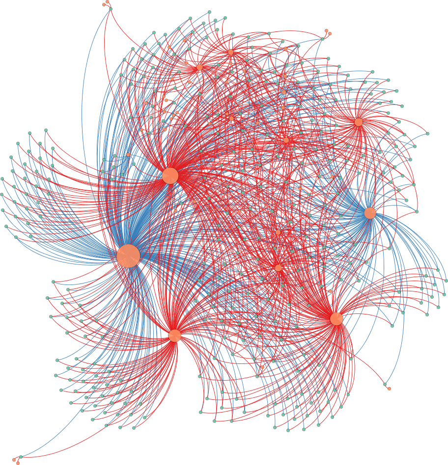
of nodes that represent contributors.
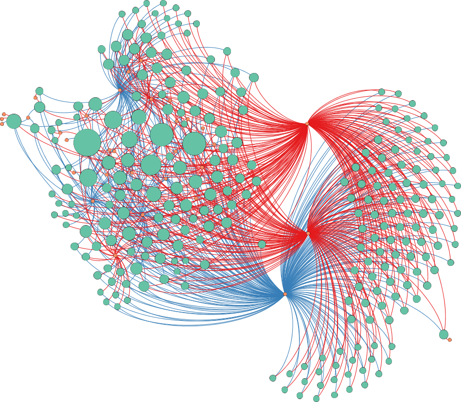
of nodes that represent files.
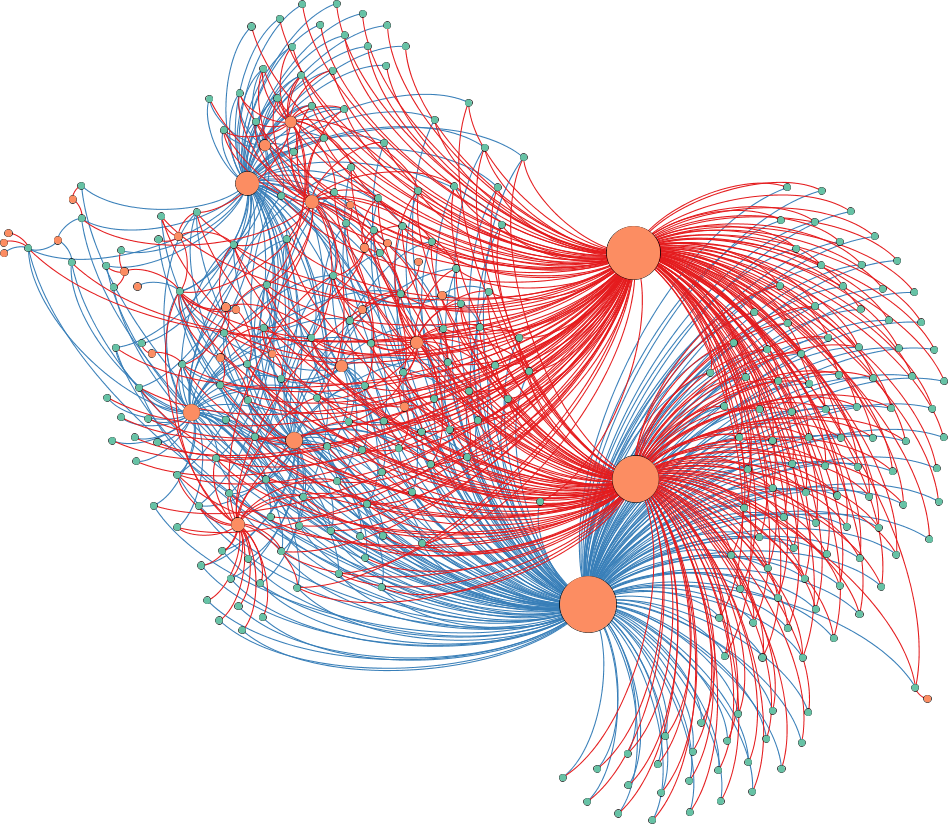
In our graph drawing, typical patterns are visible: team members and external contributors work collaboratively on many files. Because the drawing are based on provenance data, the interpretation is that over the time of development many files were changed by developers with different roles; where a small numbers of developers made most of the changes.
Further, more detailed interpretations and studies of the graph drawing metrics for faithfulness and readability is ongoing work.
5 Related Work
There are many tools for dynamic history visualization of repository changes over time. A widely used tool is Gource666https://gource.io, which generated movies that show changed files and developer activities. This different to our approach, since we visualize “condensed” information about the development history that is stored in the provenance data.
Especially for visualizing social interaction in open-source software projects, Ogawa et al. [18] use an intuitive, time-series, interactive summary view of the social groups that form, evolve and vanish during the entire lifetime of the project.
6 Conclusion and Future Work
We presented graph drawings to visually see how team members and external contributor worked on the same files in open-source projects over the course of development.
Since our goal is better understanding of such development patterns, future work foremost is to conduct user studies to evaluate readability and faithfulness. The graph drawings surely can be improved in many ways, for example, with other layouts, color schemes (especially to support color blindness), transparency, or shapes.
We plan, to apply our methods to other projects than CWA; especially, to huge projects with a very long development history. We plan to compare different projects, where the proportion of regular team member and external contributors is different.
We already work on using the provenance data for non-visual analytics of open-source projects. For example, to investigate whether vulnerabilities are introduced by external contributors (e.g., via pull requests)—we apply static code analysis for revisions in development history determined on the provenance data [23].
References
- [1] Mathieu Bastian, Sebastien Heymann, and Mathieu Jacomy. Gephi: An open source software for exploring and manipulating networks. 2009. URL: http://www.aaai.org/ocs/index.php/ICWSM/09/paper/view/154.
- [2] Noel Carroll and Kieran Conboy. Normalising the “new normal”: Changing tech-driven work practices under pandemic time pressure. International Journal of Information Management, 2020.
- [3] Qingyu Chen, Alexis Allot, and Zhiyong Lu. Keep up with the latest coronavirus research. Nature, 579(7798):193, 2020.
- [4] Tom De Nies, Sara Magliacane, Ruben Verborgh, Sam Coppens, Paul Groth, Erik Mannens, and Rik Van De Walle. Git2PROV: Exposing version control system content as W3C PROV. In Proceedings of the 12th International Semantic Web Conference (Posters and Demonstrations Track) – Volume 1035, ISWC-PD ’13, pages 125–128. CEUR-WS.org, 2013.
- [5] Thomas M. J. Fruchterman and Edward M. Reingold. Graph drawing by force-directed placement. Software: Practice and Experience, 21(11):1129–1164, 1991. doi:10.1002/spe.4380211102.
- [6] Emden R. Gansner and Stephen C. North. An open graph visualization system and its applications to software engineering. Software: Practice and Experience, 30(11):1203–1233, 2000.
- [7] Mark Harrower and Cynthia A. Brewer. ColorBrewer.org: An online tool for selecting colour schemes for maps. The Cartographic Journal, 40(1):27–37, 2003. doi:10.1179/000870403235002042.
- [8] Mathieu Jacomy, Tommaso Venturini, Sebastien Heymann, and Mathieu Bastian. ForceAtlas2, a continuous graph layout algorithm for handy network visualization designed for the Gephi software. PLOS ONE, 9(6):1–12, 06 2014. doi:10.1371/journal.pone.0098679.
- [9] Raja Mubashar Karim, Oh-Hyun Kwon, Chanhee Park, and Kyungwon Lee. A study of colormaps in network visualization. Applied Sciences, 9(20), 2019. URL: https://www.mdpi.com/2076-3417/9/20/4228, doi:10.3390/app9204228.
- [10] Timothy McPhillips, Shawn Bowers, Khalid Belhajjame, and Bertram Ludäscher. Retrospective provenance without a runtime provenance recorder. In Proceedings of the 7th USENIX Conference on Theory and Practice of Provenance, TaPP’15, USA, 2015. USENIX Association.
- [11] Vishal Midha and Prashant Palvia. Factors affecting the success of open source software. Journal of Systems and Software, 85(4):895–905, 2012. URL: http://www.sciencedirect.com/science/article/pii/S016412121100286X, doi:https://doi.org/10.1016/j.jss.2011.11.010.
- [12] Luc Moreau. Aggregation by provenance types: A technique for summarising provenance graphs. arXiv:1504.02616v1, doi:10.4204/EPTCS.181.9.
- [13] Luc Moreau, Paul Groth, Simon Miles, Javier Vazquez-Salceda, John Ibbotson, Sheng Jiang, Steve Munroe, Omer Rana, Andreas Schreiber, Victor Tan, and Laszlo Varga. The provenance of electronic data. Communications of the ACM, 51(4):52–58, 2008.
- [14] Luc Moreau and Paul T. Groth. Provenance: An Introduction to PROV. Synthesis Lectures on the Semantic Web: Theory and Technology. Morgan & Claypool Publishers, 2013. doi:10.2200/S00528ED1V01Y201308WBE007.
- [15] Luc Moreau, Paolo Missier, Khalid Belhajjame, Reza B’Far, James Cheney, Sam Coppens, Stephen Cresswell, Yolanda Gil, Paul Groth, Graham Klyne, Timothy Lebo, Jim McCusker, Simon Miles, James Myers, Satya Sahoo, and Curt Tilmes. PROV-DM: The PROV data model, 30 April 2013 2013. URL: http://www.w3.org/TR/2013/REC-prov-dm-20130430/.
- [16] Quan Nguyen, Peter Eades, and Seok-Hee Hong. On the faithfulness of graph visualizations. In Walter Didimo and Maurizio Patrignani, editors, Graph Drawing, pages 566–568, Berlin, Heidelberg, 2013. Springer Berlin Heidelberg.
- [17] Quan Hoang Nguyen and Peter Eades. Towards faithful graph visualizations. arXiv:1701.00921v2.
- [18] Michael Ogawa, Kwan liu Ma, Christian Bird, Premkumar Devanbu, and Alex Gourley. Visualizing social interaction in open source software projects. In 2007 6th International Asia-Pacific Symposium on Visualization, pages 25–32, 2007.
- [19] Heather S. Packer, Adriane Chapman, and Leslie Carr. GitHub2PROV: Provenance for supporting software project management. In Proceedings of the 11th USENIX Conference on Theory and Practice of Provenance, TAPP’19, USA, 2019. USENIX Association.
- [20] Andreas Schreiber. Graph Visualizations of Corona-Warn-App- Repositories (Gephi), July 2020. doi:10.5281/zenodo.3968251.
- [21] Andreas Schreiber. Neo4j Database Dump of Corona-Warn-App Repository Provenance Graphs, July 2020. doi:10.5281/zenodo.3967891.
- [22] Andreas Schreiber and Claas de Boer. Modelling knowledge about software processes using provenance graphs and its application to git-based version control systems. In 42nd International Conference on Software Engineering Workshops, Seoul, Republic of Korea, May 2020. IEEE/ACM.
- [23] Tim Sonnekalb, Thomas S. Heinze, Lynn von Kurnatowski, Andreas Schreiber, Jesus M. Gonzalez-Barahona, and Heather Packer. Towards automated, provenance-driven security audit for git-based repositories: Applied to Germany’s Corona-Warn-App. In Proceedings of the 3rd ACM SIGSOFT International Workshop on Software Security from Design to Deployment (SEAD ’20), New York, NY, USA, 2020. ACM. doi:10.1145/3416507.3423190.
- [24] Yuanyuan Tian, Richard A. Hankins, and Jignesh M. Patel. Efficient aggregation for graph summarization. In Proceedings of the 2008 ACM SIGMOD International Conference on Management of Data, SIGMOD ’08, page 567–580, New York, NY, USA, 2008. Association for Computing Machinery. doi:10.1145/1376616.1376675.
- [25] Ruben Verborgh, Sara Magliacane, Andreas Schreiber, and Vlad Korolev. onyame/git2prov: Improved error handling., July 2020. doi:10.5281/zenodo.3942169.
- [26] Zhendong Wang, Yang Feng, Yi Wang, James A. Jones, and David Redmiles. Unveiling elite developers’ activities in open source projects. ACM Trans. Softw. Eng. Methodol., 29(3), June 2020. URL: https://doi.org/10.1145/3387111.
- [27] Martin Wattenberg. Visual exploration of multivariate graphs. In Proceedings of the SIGCHI Conference on Human Factors in Computing Systems, CHI ’06, page 811–819, New York, NY, USA, 2006. Association for Computing Machinery. doi:10.1145/1124772.1124891.
- [28] Heinrich Wendel, Markus Kunde, and Andreas Schreiber. Provenance of software development processes. In Deborah L. McGuinness, James R. Michaelis, and Luc Moreau, editors, Provenance and Annotation of Data and Processes, pages 59–63. Springer Berlin Heidelberg, 2010.