Describing Subjective Experiment Consistency
by -Value P–P Plot
Abstract
There are phenomena that cannot be measured without subjective testing. However, subjective testing is a complex issue with many influencing factors. These interplay to yield either precise or incorrect results. Researchers require a tool to classify results of subjective experiment as either consistent or inconsistent. This is necessary in order to decide whether to treat the gathered scores as quality ground truth data. Knowing if subjective scores can be trusted is key to drawing valid conclusions and building functional tools based on those scores (e.g., algorithms assessing the perceived quality of multimedia materials). We provide a tool to classify subjective experiment (and all its results) as either consistent or inconsistent. Additionally, the tool identifies stimuli having irregular score distribution. The approach is based on treating subjective scores as a random variable coming from the discrete Generalized Score Distribution (GSD). The GSD, in combination with a bootstrapped G-test of goodness-of-fit, allows to construct -value P–P plot that visualizes experiment’s consistency. The tool safeguards researchers from using inconsistent subjective data. In this way, it makes sure that conclusions they draw and tools they build are more precise and trustworthy. The proposed approach works in line with expectations drawn solely on experiment design descriptions of 21 real-life multimedia quality subjective experiments.
I Introduction
Any system built with an end-user in mind should provide excellent experience for that user. In telecommunications we say that the system should provide high Quality of Experience (QoE). Therefore, numerous works focus on QoE optimization in various contexts. Many target quality improvement by better network resources utilization [3, 34]. Some go beyond that and use the QoE to optimize parameters like power consumption of mobile device displays [46] or to improve user-perceived quality when watching 360∘ videos. All this research is based on the concept of measuring the QoE through subjective experiments (i.e., by asking selected end-users about their perception of quality of a service, system or a single multimedia material of interest). The key takeaway here is that subjective experiments are necessary to assess the QoE.
Subjective experiments are not precise measuring systems. People are able to differentiate a limited number of intensities of a given stimulus [26]. Additionally, they are not perfectly consistent with their actual perception when formulating their judgement. We thus classify collecting subjective scores as a noisy process. There are recommended ways to analyse subjective scores and correct for typical errors. These include subject bias removal or discarding study participants with opinion not correlated with the general opinion of others (cf. Rec. ITU-T P.913). However, there is no tool for classifying the whole subjective experiment as either consistent or inconsistent. Such a tool could protect researchers and practitioners from using erroneous data and reaching ill-founded conclusions. Since discarding all the results at once is expensive (because it translates to re-organizing the whole experiment again), it would be also helpful to have a tool that can point to individual problematic stimuli (e.g., images or videos). Hopefully, such a tool could point to stimuli for which study participants do not agree (or express any other unwanted behaviour). By investigating these stimuli in greater detail and, potentially, discarding them, the general data consistency would improve (not necessitating the whole experiment to be discarded).
The main contribution of this paper is a tool classifying the whole subjective experiment as either consistent or inconsistent. The tool also points to specific stimuli with irregular (also referred to as atypical) score distribution. The overall consistency of an experiment is visualised using -value P–P plot (cf. Fig. 1).
There are four goals we address with this paper. First, we introduce the new data analysis method. Second, we present which score distributions the method classifies as typical (and thus consistent). Third, we show how the method operates on real-life subjective data. At last, we hope to convince the community that -value P–P plots are a useful data analysis tool.
To validate the proposed method we use results from 21 real-life subjective experiments. These test the quality of the total of 4,360 stimuli and contain 98,282 individual scores. Among the stimuli are: videos (with and without audio), images, and audio samples. The analysed experiments cover different experiment designs and have a varying number of scores per stimulus (between 9 and 33) with most of them having the typical number of 24 scores per stimulus.
Having validated our method on the real-life data sets we believe it can be used to assess consistency of many different subjective experiments. Furthermore, method’s ability to point to specific problematic stimuli eases data analysis and has a potential to provide new per-stimulus insights (e.g., indicate that a given image is especially difficult to score).
Next section highlights related work. Section III describes the theoretical background underlying -value P–P plot and the proposed method. In Section IV -value P–P plot is explained. In Section V the real-life data sets are described and analysed using our method. At last, Section VI concludes the paper.
II Related Work
Subjective scores analysis is a broad topic. It is considered by numerous publications. This includes ITU standards and, among these, the ITU-T Rec. P.1401. Although focused on objective quality algorithms, it gives important guidelines regarding good practices related with subjective data analysis in general. In the similar vein, the work of Brunnström and Barkowsky [4] looks into appropriate sample sizes for subjective experiments. In particular, they devise a methodology to select the number of participants necessary to measure a certain MOS score difference between stimuli. An important observation here is that both mentioned publications rely on MOS score analysis. They also implicitly assume correctness (also referred to as consistency) of data stemming from subjective experiments. Our work complements the toolkit introduced by these works allowing to check whether subjective experiment consistency is a valid assumption. Additionally, our method gives per-stimulus information (which is in contrast to MOS-only approach).
Search for analysis methods going beyond the MOS is present in few existing works. One of these is [11], where authors explore several measures related to user behavior and service acceptance. Both [17] and [39] go beyond the MOS by targeting score distributions. They propose to model the probability of each single score, rather than focusing on just the mean. Finally, works like [7] operate on higher levels of abstraction and propose a mapping between QoE and Quality of Service (QoS). With our work we also go beyond the MOS, but do not take into account the QoE–QoS mapping.
Not many publications analyse subjective scores by focusing on the answering process. An important exception here is [14]. There, the relation between the MOS and the standard deviation of opinion scores is studied. Authors of [14] introduce the HSE parameter.111In the original paper the parameter is labelled as SOS . Since SOS is traditionally used to denote the standard deviation of opinion scores, not wanting to introduce ambiguous name we refer to the parameter using first letters of surnames of its authors. They argue that it can be used to both comprehensively summarize subjective experiment results and check their consistency. Another interesting approach to subjective scores consistency is shown in [12]. There, various confidence intervals for MOS values are analysed. Our approach is to analyse consistency on a per-stimulus basis and is thus distinct both from [14] and [12].
Our method is based on the concept of subject model. The idea was first presented in [19] and later in [23]. The subject model further extends the toolkit for subjective data analysis [10, 21]. It also helps make existing analyses more precise [22, 9]. The initial shape of the subject model is modified in [40, 41] and [43]. The derived models helped discover new phenomena (e.g., observing that content has a significant influence on both the standard deviation and mean of opinion scores [40]). The analysis presented in our paper is based on a yet different subject model that was introduced in [20].
We do not compare our method to similar methods present in other fields that also deal with quality assessment. This is because they require different set of data than what is usually gathered in QoE subjective experiments. One example is a tool used by the food industry called “Panel Check” [36, 42]. Its main drawback is the assumption of no tied answers. When using the 5-point scale (typical for QoE experiments) this assumption is difficult to satisfy. Another example is the signal detection theory (SDT), extensively used in psychology [25, 8]. Again, it requires measurements that are often not available in QoE experiments. Specifically, both the recognition score and quality score are needed. In the typical QoE experiment only the latter is provided.
P–P plots we use are a member of the family of plots referred to as probability plots. The second member of this family are more popular Q–Q plots. Both types of plots were introduced by Wilk and Gnanadesikan in 1968 [45]. Their general purpose is to compare two sets of data. Commonly, this is used to juxtapose a set of observations with a theoretical model. The probability plots are used throughout various disciplines, including astrophysics [24] and landscape and urban planning [5].
III Subjective Score as a Random Variable
Scores (also referred to as answers) collected for a single stimulus in a subjective experiment can be modelled by a probability distribution. Expressing an answer as a random variable has numerous advantages. One is the ability to formally describe typical and atypical distributions. In this section we start from a discussion about possible score distributions and then describe a discrete distribution which is used to model these.
III-A Typical or Atypical?
People do not usually use numbers to describe service quality. Instead, they voice their judgement as single words (e.g., “ok”) or more complex verbal explanations. Nevertheless, their opinion can typically be mapped to selected categories. Therefore, the most popular scale used in subjective experiments is a categorical five-point scale (1—“Bad,” 2—“Poor,” 3—“Fair,” 4—“Good” and 5—“Excellent”). We also use this scale, but note that the analysis can be extended to other scales as well (see [20] for the explanation).
Even in an ideal world a subject (i.e., study participant) using a discrete scale naturally generates scores with some degree of randomness. For example, if stimulus quality is not satisfactory enough to obtain rating “Good,” but also not sufficiently bad to obtain rating “Fair,” an ideal subject would not use the same answer each time the same stimulus is shown. In other words, they would alternate between ratings “Good” and “Fair.” This phenomenon alone makes score distribution analysis both important and challenging. It also justifies why it would be valuable to be able to discern between typical and atypical score distributions. Importantly, by typical we mean score distributions that we would expect to observe in a consistent subjective experiment. On the other hand, by atypical we mean distributions appearance of which would be justifiable only by referring to some external factors influencing the scoring process—e.g., a bias [47].
We now analyse typical and atypical score distributions. To do so we divide the two classes (i.e., typical and atypical) into more granular classes. We name each class and shortly describe it. Additionally, next to the name of each class we show an exemplary sample of scores corresponding to this class. This sample is presented as , where denotes the number of answers of category . To simplify the discussion we assume we are always considering a single stimulus having the true quality .222By true quality we understand a non-directly-observable true quality of a stimulus. We use as defined by SAM (Statistical Analysis Methods) of VQEG (Video Quality Expert Group) [16]. Additionally, we assume this stimulus is assigned 24 scores. In other words, . At last, it is worth pointing out that the Mean Opinion Score (MOS) for the exemplary sample should be close to 2.5 (i.e., ).
These are score distributions that we treat as typical:
-
•
Perfect —represents the most stable answers we can image. All answers are as close to as possible. In a typical subjective experiment subjects do not agree perfectly with each other so this is not the most common class.
-
•
Common 333Note that this time the sample mean is not 2.5. Since is the true and hidden parameter, not always the observed sample has the mean of 2.5.—shows answers spread around . This class is common in real-life subjective experiments.
-
•
Strongly spread —it is still typical but starts to contain a surprisingly large spread of scores. The border line between common and strongly spread depends on the experiment, stimulus difficulty, subject pool, and possibly other factors.
To some extent it is more interesting to consider score distributions that are atypical. Here is a list of these that we treat as such:
-
•
Random answer(s) —represents single answers appearing away from the majority of other answers.
-
•
Bimodal —represents a mixture of very different opinions. Lack of answers “Poor” in the sample shows that we have non-uniform groups of subjects. Potentially, some of them are experts and other are naïve observers. In such a case we should not analyze the scores as though they were coming from a single group of observers. For example, stating that this stimulus has the true quality of 2.5 would be incorrect. This is because for one group the quality is “Bad” and for the other it is a little bit better than “Fair.”
-
•
Sudden cut-off —does not represent an obvious error. We could imagine that this exemplary sample is related with a stimulus of the quality slightly below rating “Fair.” Nevertheless, we should still observe more “Poor” scores and less “Fair” ones. The lack of “Good” answers also seems unusual, especially since there are so many “Fair” ratings. Importantly, all of this can be due to chance since 24 scores may not be enough to accurately represent the true underlying distribution. Another explanation is presence of some specific disturbance in the voting process.
-
•
Hate or love —we doubt that such distribution can be observed in subjective experiments.
-
•
Wrong MOS—any sample with the mean value very far from 2.5. Significantly, this problem can be detected only if we know the true quality.
III-B Subject Model
In order to distinguish between typical and atypical score distribution we need a subject model444Probably “scoring model” would be a better name. Sill, since it has already been called subject model in the literature [19] we stick to this convention. accepting typical samples and excluding the atypical ones. It should have as few parameters as possible. The smallest number of parameters is two. One is the true quality , while the other describes the answers spread . We consider a model where an answer for a stimulus is a random variable drawn from a distribution:
| (1) |
where is a cumulative distribution function.
We could use two types of models: (i) continuous (proposed in [13], [19] and [23]) and discrete (proposed in [20]). Since the discrete model better fits data from multiple subjective experiments [20] we use it as the basis of the presented method. The continuous model could be used as well.
We refer to the discrete model as discrete distribution. We use this term (instead of discrete model) purposely. We are looking for a discrete distribution which is a function of two parameters. A distribution satisfying our constraint is the Generalized Score Distribution (GSD) described in [20]. Since the complete description of the distribution is lengthy we refer the reader to [20]. Here, we only describe GSD properties that are relevant for this work.
For a distribution with limited support the variance is limited as well. Moreover, if a distribution is discrete the lower and the upper values of the variance are limited and depend on the mean value. For a five-point scale and the mean () equal to 1.5, the smallest possible variance is obtained for 50% answers 1 and 50% answers 2. In contrast, if only scores 1 and 5 are used we obtain the maximum variance. The obtained variance limitations (for ) are: and . For a different , for example , the minimal and maximal values are: and , respectively. Connection between the variance and the mean makes the analysis difficult since the variance cannot be analysed without knowledge of the mean. One way to deal with this problem is to use the HSE parameter [14].
GSD distribution parameters are the true quality (defining the stimulus quality) and (describing answer spread with answers closer to if is closer to 1). is limited to the interval, regardless of the value. This addresses the previously mentioned problem of the variance-mean dependency. Tab. I presents the GSD distribution for various values.
| 1 | 2 | 3 | 4 | 5 | |
|---|---|---|---|---|---|
| 0.95 | 0.061 | 0.795 | 0.130 | 0.013 | 0.001 |
| 0.88 | 0.145 | 0.647 | 0.173 | 0.032 | 0.003 |
| 0.81 | 0.230 | 0.500 | 0.215 | 0.050 | 0.005 |
| 0.72 | 0.317 | 0.370 | 0.222 | 0.078 | 0.013 |
| 0.61 | 0.394 | 0.285 | 0.184 | 0.100 | 0.037 |
| 0.38 | 0.532 | 0.153 | 0.108 | 0.096 | 0.111 |
All the typical score distribution classes described in Section III-A (i.e., perfect, common, and strongly spread) come from the GSD distribution. On the other hand, the atypical classes (i.e., random answer(s), bimodal, and sudden cut-off) are not part of GSD. The only atypical class that comes from the GSD distribution is hate or love. This class is part of GSD since it is a generalization of the strongly spread class. Therefore, we have to manually set a boundary score spread that would still correspond to the strongly spread class and not to hate or love. We leave for future research the task of quantifying this boundary condition. Significantly, our data analysis have shown that hate or love samples are rare.
Typical score distribution classes are from the GSD distribution and atypical are not. We can thus claim that GSD reflects intuitions of the subjective testing community developed over the years through practical encounters with subjective data. As such, it shows which stimuli have score distributions that would be counter-intuitive to practitioners and which follow their intuitions and experiences. Naturally, GSD is a model that tries to simplify the complex nature of reality. This means it should not be used as the ultimate measure of subjective data consistency. Instead, it should be juxtaposed with other consistency measures.
To check whether a sample of scores follows the GSD distribution we have to first estimate the GSD parameters for the sample and then validate whether the sample comes from GSD with these estimated parameters. This is presented in next section. The section also shows how to extend this reasoning to multiple samples.
IV -Value P–P Plot
The main contribution of this paper is a new, for the QoE community, tool assessing subjective experiment consistency that also detects which stimuli should be analyzed in greater detail. The algorithm, philosophy behind it and practical issues related with its usage are described in this section.
We start from the overview of the philosophy behind the proposed methodology:
-
1.
A consistent experiment contains stimuli with typical score distributions.
-
2.
Typical distributions are described by the GSD distribution.
-
3.
For each stimulus we can estimate the probability of whether its score distribution comes from the GSD.
-
4.
If for many stimuli this probability is low, we should analyze the data in greater detail.
-
5.
-Value P–P plot reveals when the detailed analysis is needed and when the experiment can be treated as consistent.
In order to check if any assumed distribution fits specific data we have to perform a two-step procedure. In the first step, distribution parameters are estimated for an observed sample. In our case, we treat scores assigned to a single stimulus as a single sample. The second step is to use a goodness-of-fit (GoF) test to see how well the selected distribution (with the estimated parameter values) describes the sample. The GoF test returns a -value, which states how likely it is to observe the sample, assuming it comes from the considered distribution. Fig. 2 visualizes the procedure.
The GoF test we use is a standard likelihood ratio approach called G-test (cf. Sec. 14.3.4 of [2]). Since our sample sizes are usually small we do not use the asymptotic distribution for calculating the -value (as is the case for the popular test of GoF—cf. Ch. 11 of [28]). Instead, we estimate the -value using the bootstrapped version of G-test. The approach is described in our GitHub repository [27]. Broader theoretical considerations are in [6].
The analysis shown in Fig. 2 generates as many -values as there are stimuli in the experiment. With multiple -values the analysis is more involved than usually [4]. Since we are not interested in detecting which stimulus is not from the GSD distribution, but rather in concluding about the experiment consistency as a whole, the -value P–P plot is our main analytical tool [38].555To grasp why -value P–P plot is the better choice here we suggest to read [37].
-Value P–P plot (see Fig. 1 or Fig. 3) presents a one dimensional sample of observed quantities (in our case, a vector of -values) in relation to a theoretical, expected probability distribution (in our case, the uniform distribution spanning the range from 0 to 1). The plot is based on empirical cumulative distribution function (ECDF) of the observed sample ( axis) and CDF of the expected probability distribution ( axis). Happily, since -values are in the range from 0 to 1 and our expected uniform distribution is defined over the same range, values on the axis not only correspond to the expected CDF but also to the observed -values.
For a Simple Hypothesis,666Any hypothesis that specifies population distribution completely. such as the one stating that the sample is from the standard Gaussian distribution, the expected shape of the -value P–P plot is a straight line (). This is because we expect -values to follow the uniform distribution [35]. Still, deviating from the line does not necessarily prove that the obtained -value distribution is odd. Slight deviations are tolerable due to the random nature of the underlying process. Importantly, the assumption about the line is not valid if we consider a Composite Hypothesis.777Any hypothesis that does not specify population distribution completely. One such example is a hypothesis stating that a sample is from the GSD distribution with unknown parameters. In this case, the expected shape of the -value P–P plot is best described by a set of points falling below the line (see Fig. 1a). Only if the points significantly exceed the line can we reject our hypothesis.
To quantify what it means to significantly exceed the line we use the following procedure. For each considered (i.e., a specific value on the axis of -value P–P plot) we change each -value to 0 or 1. We do it by checking whether it is larger (0) or smaller (1) than . Now, the whole experiment is changed to a vector of zeros and ones with its length equal to the number of stimuli. The question under investigation is: “is the number of stimuli with small -value significant?” (Note that “small” is defined by .) This can be understood as hypothesis testing verifying the null hypothesis stating that the probability of finding a stimulus with -value below is smaller than . This is a classical problem with the solution given by:
| (2) |
where is the observed proportion of -values smaller than (i.e., the axis value on -value P–P plot), is the conjectured proportion of such stimuli, is the quantile of order for the standard normal distribution and is the significance level of this test. (We use 5% and hence .) Importantly, if Eq. (2) is satisfied we reject the null hypothesis and say that around stimuli truly have their -value below . Substituting the LHS of Eq. (2) by and equating both sides we get a formula for drawing a line spanning the whole range of values (from 0 to 1). This is the black line visible in Fig. 1 and Fig. 3. When points on -value P–P plot significantly exceed this threshold line we say that an experiment is inconsistent. In other words, we reject our composite hypothesis stating that score distributions of stimuli in an experiment come from the GSD distribution.
As stated in the previous paragraph Eq. (2) is used to draw the theoretical threshold line in -value P–P plot. Now, if data points are crossing this line (i.e., falling above it) or are close to it we should analyse all stimuli with -values smaller than of the crossing point. Note that of the crossing point is found by looking at the axis value on the P–P plot for which the data crosses the theoretical threshold. Analysing the stimuli with -values smaller than the crossing point it is important to remember that it is natural to observe a fraction of stimuli with -value below as high as . In other words, even if we draw the scores from the GSD itself, still the fraction of stimuli with -value below could be close to . In any case we are not allowed to simply remove all stimuli with -value smaller than . Instead, we should analyse their score distribution one-by-one and look for specific problems. Section V-B demonstrates such an analysis.
Describing the above algorithm from the practical perspective let us consider generating 160 samples, each time drawing 24 values from the GSD distribution. This way we simulate a subjective experiment with 160 stimuli, each assigned 24 scores. Since scores come from the GSD distribution we know that each stimulus has a typical score distribution. We now apply the procedure from Fig. 2 to get -value for each stimulus. This generates a range of -values, some of which are small (e.g., smaller than 0.05). These small -values appear even though we know the input data is generated from typical score distributions only. Hence, the decision of whether to classify some real experiment, as a whole, as inconsistent cannot be based on observing few small -values. Also, just a single stimulus with low -value cannot be labelled as odd [35]. Instead, the proportion of -values (relative to the total number of stimuli) smaller than certain should be analysed—cf. Eq. (2).
Our simulation study proved that if the data comes from the GSD distribution points on -value P–P plot fall below or spontaneously coincide with the threshold line. Since this holds for the region of -values that is critical for drawing conclusions (i.e., for ), we can follow the standard recommended analysis from [38].
GSD Parameters Estimation
A practical issue related with -value P–P plot is GSD parameters estimation. GSD has a complicated form of its likelihood function. Thus, it is not possible to provide analytical solution for parameters estimation. To simplify the estimation we pre-calculate probabilities of each score for a grid of and values. Specifically, we use 399 values of , spanning the interval , with the step of 0.01; and 400 values of , spanning the interval , with the step of 0.0025. The pre-calculated grid accelerates the estimation process and protects us from any potential difficulties that arise when using dynamic parameter optimization. Using simulation studies we have validated that the proposed estimation method works as expected. In other words, we are able to recover correct GSD parameters from synthetic data that is itself generated from the GSD.
V Subjective Data Analysis
This section puts our idea into practice. We first describe six real-life subjective studies we use. The descriptions highlight reasonable expectations about studies consistency. We then verify these expectations by applying our method.
V-A Data Sets
To check the practical distribution of subjective scores we use data from 21 subjective experiments. The data comes from six studies representing various stimulus types: (i) VQEG HDTV Phase I [29] (six experiments; video-only), (ii) ITS4S [30] (two experiments; video-only), (iii) AGH/NTIA [18, 32] (one experiment; video-only), (iv) MM2 [33] (ten experiments; audiovisual), (v) ITS4S2 [31] (one experiment; image), and (vi) ITU-T Supp. 23 [15] (one experiment; speech). This gives a total of 98,282 subjective scores.
All the experiments use the 5-level Absolute Category Rating (ACR) experiment design. Importantly, all the data we use is publicly accessible. Please refer to the references provided for each study or go to our repository [27] to download a single CSV file with all the results combined (and put into the tidy data format [44]).
VQEG HDTV Phase I
All the six experiments from this study took place in a controlled environment. Test participants were screened for normal vision acuity and normal colour vision. Only scores of those testers who correlated well with the average opinion were kept. Impairments included compression and lossy transmission. All these suggest that it is fair to expect consistent results.
ITS4S
Utilizing the unrepeated scene design this study has a potential to strongly emphasize personal preference differences between participants. With no strict vision acuity and colour blindness testing the study has a higher chance to include unreliable subjects. Furthermore, it uses content that can trigger strong emotional response. Topping this with the scores originating from a mixture of experts and naïve subjects, we expect this data to be less consistent than that of HDTV Phase I. Still, the study setting was not completely uncontrolled as participants were seated in a lab-like environment. They were briefed and trained as well. This suggests better scores consistency than that of crowdsourced studies. Due to experiment design choices (other than those described above), we expect the first experiment to be more consistent than the second one. For one reason, the second experiment allowed participants to take the test simultaneously in groups of ten.
AGH/NTIA
Non-standard procedures in this test are: lack of screening for normal vision acuity and colour vision; distance to the screen was not strictly controlled; two testers received intentionally erroneous instructions and one tester was a video quality expert. However, the study generally complied with Rec. ITU-T P.910, recruited testers through a temporary job recruitment agency and investigated compression as the only distortion. We expect this study to be less consistent than HDTV Phase I, but more consistent than other more loose experiment designs.
MM2
Five out of ten experiments took place in a laboratory-like environment. The other half took place in a less controlled setting.888For a detailed specification please refer to Table IV in [33]. All the experiments used the same set of audio-visual sequences. Significantly, the presence of audio might have increased inter-tester difference of opinion. The study investigated compression as the only distortion source. Furthermore, all participants went through training and briefing. In general, we expect MM2’s laboratory experiments to be more stable than those with the loose setting.
ITS4S2
Although compliant with Rec. ITU-T P.913 this study has the greatest potential for inconsistent results. It investigates non-standard distortions related to consumer-grade cameras. This makes the study novel but also means that different (than those recommended) best practices may apply. At last, it includes content that may trigger strong emotional response.
ITU-T Supp. 23
This study investigates the subjective performance of a speech codec. Since it follows a strict and well-controlled experiment design we expect its scores to be very consistent. Importantly, we only utilize data from the experiment conducted by Nortel (although the study contains three experiments in total).
V-B Case Study on Real Data
We start from classifying each of the 21 experiments as either consistent or inconsistent. For this purpose we use the hypothesis testing approach described in Section IV. Selecting the we identify four experiments as inconsistent. Table II lists those, starting from the one with the smallest -value.999Please note that this -value describes the hypothesis testing outcome and not the goodness-of-fit test for a particular stimulus.
| Experiment | -Value |
|---|---|
| ITS4S2 | 0.00263 |
| ITS4S—2nd experiment | 0.02320 |
| ITS4S—1st experiment | 0.02476 |
| MM2—IRCCyN (lab env.) | 0.02634 |
Recalling study descriptions from Section V-A only the inconsistency of the one laboratory experiment from MM2 is a surprise. It would be logical to expect inconsistency in the experiments with loose settings rather than in the one done in a lab. One potential explanation of this result is that the MM2 study is generally consistent. However, when repeating the same experiment ten times, the chances of randomly observing at least one experiment being inconsistent is significant. Furthermore, we use the MM2 data as is. This means we do not perform any post-experimental screening of subjects before we do our analyses. The experiment we label as inconsistent includes data from three subjects poorly correlated with the general opinion (with correlations of 0.49, 0.59 and 0.64). In fact, this experiment includes two of the least correlated subjects among all of the ten MM2 experiments (compare Fig. 2 in [33]). We know from experience that -value P–P plot is sensitive to poorly correlated subjects. Thus, we hypothesize that the three outlying subjects are the main reason our method marks the one MM2 experiment as inconsistent.
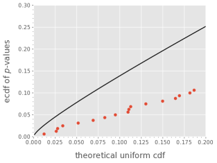
Though the above analysis is based on hypothesis testing alone, we recommend to take a look at -value P–P plot of each experiment. One argument for using the P–P plot is that it applies the same reasoning as above, but for a range of values. In fact, by looking at the -value P–P plot of the AGH/NTIA experiment (see Fig. 3a) we see that it consistently fails the hypothesis testing for values below 0.08. This points to at least partial inconsistency of the experiment, which is in line with the expectations given in Section V-A.
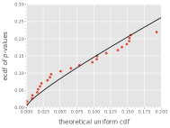
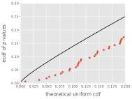
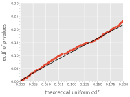
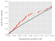
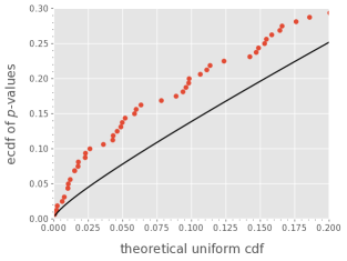
We decide not to show -value P–P plot for each experiment. However, we do provide a complete, detailed analysis of three selected experiments. We use data from: (i) the first experiment from the VQEG HDTV Phase I study (later referred to as HDTV1), (ii) one (and only) experiment from the ITS4S2 study (later referred to as ITS4S2) and (iii) the second experiment from the ITS4S study (later referred to as ITS4S). Figures 3b, 3c and 3d present -value P–P plots for each experiment, respectively.
By looking at the figures we can say that the experiments are sorted in accordance with their consistency. With all points in Fig. 3b falling bellow the black line, the HDTV1 experiment is certainly consistent. This means that we do not have to investigate it further. In Fig. 3c we see points oscillating around the black line. This suggests that the ITS4S2 experiment is neither totally consistent nor inconsistent. In order to decide about its consistency we have to take a close look at stimuli with low -values. At last, from Fig. 3d we can quickly conclude that the ITS4S experiment is inconsistent. This is because all the points fall on or above the black line. Furthermore, the points falling above the line deviate from it significantly. Here also we have to take a close look at stimuli with low -values. However, this time we expect to find more such stimuli (relative to the total number of stimuli in this experiment).
Proceeding to the detailed analysis of low -value stimuli we suggest to consider all stimuli with -value lower than that of the right-most point exceeding the theoretical threshold. Please note that we only take into account the -value range from 0 to 0.2 (cf. Section IV for the explanation). This means that even if there are points exceeding the black line with corresponding -value above 0.2, we still take 0.2 as the upper limit defining which stimuli should be analysed in detail. By applying this rule we observe that we need to analyse all stimuli with -value below 0.2 for both ITS4S and ITS4S2. This corresponds to 328 stimuli from ITS4S2 and 54 stimuli from ITS4S. Although the number for ITS4S2 is greater, when analysing the figures in relative terms (i.e., comparing them to the total number of stimuli in each experiment), we notice that there are actually more potentially problematic stimuli in ITS4S (25.47%) rather than in ITS4S2 (22.95%). To keep this case study concise we only take a look at five stimuli with lowest -values from both experiments. Tables III and IV present score counts for these stimuli for ITS4S and ITS4S2, respectively.
Studying Table III we can classify score distribution of problematic stimuli into one of three classes (representing a subset of the classes described in Section III-A): (i) bimodal, (ii) random answer(s) and (iii) sudden cut-off.
| ID | Score Count | -Value | ||||
| 1 | 2 | 3 | 4 | 5 | ||
| a | 0 | 0 | 13 | 5 | 6 | 0.0014 |
| b | 2 | 0 | 0 | 9 | 13 | 0.0021 |
| c | 0 | 0 | 14 | 6 | 4 | 0.0067 |
| d | 1 | 13 | 4 | 6 | 0 | 0.0076 |
| e | 0 | 9 | 3 | 8 | 3 | 0.0113 |
| ID | Score Count | -Value | ||||
| 1 | 2 | 3 | 4 | 5 | ||
| f | 0 | 11 | 3 | 0 | 2 | 0.0002 |
| g | 2 | 0 | 3 | 11 | 0 | 0.0004 |
| h | 1 | 2 | 1 | 12 | 0 | 0.0008 |
| i | 4 | 6 | 0 | 6 | 0 | 0.0012 |
| j | 1 | 0 | 0 | 9 | 6 | 0.0014 |
Stimuli a, d and e fall into the bimodal class. Their score count suggests that there are two modes of the score distribution. One potential explanation for this is that there are two groups of participants, both expressing a significant bias. If individual biases are similar within the group and significantly disjoint between the groups, we observe the score distribution similar to the one of stimuli a, d, and e. It is also possible that the bimodal distribution does not come solely from characteristics of the participants as a whole. It may be that these stimuli present content that highlights individual preferences of the participants. In other words, participants who disagree when scoring these particular stimuli agree when scoring other stimuli. It would be audacious to suggest these stimuli should be discarded. Instead, we advise to treat this case as a valuable insight about study participants and stimulus itself. Our framework classifies these stimuli as a source of inconsistency, because they do not fit the general assumptions about the score distribution. For example, it is difficult to believe that the MOS provides meaningful information for such cases. The mean falls between the two modes and expresses the general opinion of neither of the two hypothetical participant groups.
Stimulus b can be assigned to the random answer(s) class. Here, it seems fairly safe to claim that the two 1s are a result of some error. Discarding these two answers we are still at risk of removing a genuine opinion. However, we claim that many practitioners would agree to remove these.
Stimulus c fits into the sudden cut-off class. We observe many 3s, but no 2s and no 1s. Though this is not outright wrong, it is hard to believe that there would be no one assigning this stimulus the score of 2. This type of stimulus is difficult to handle. Even if we discard selected scores thanks to, for example, removing poorly correlated study participants, the sudden cut-off in the middle of the scale is likely to remain. We advise to take a close look at stimulus’ content. One hypothesis is that this stimulus is difficult to score and people choose the middle of the scale as the safest option conveying the “I do not know” message. If true, this suggests that debriefing study participants may provide crucial insights about how to analyse such stimuli. Another option (although usually not feasible) is to try to gather more scores on the stimulus. It is worth remembering that 24 observations may be too few to rightfully represent the shape of the underlying score distribution. Finally, we point out that stimulus a also seems to be of the sudden cut-off class.
Applying a similar analysis to the data in Table IV we note that: stimuli h and i belong to the bimodal class, and stimuli f, g and j to the random answer(s) class. However, upon closer inspection more peculiarities become visible. Please note that all stimuli represent data following the description of the sudden cut-off class. For example, even if we discard two outlying 1s from the scores of stimulus g, the sudden cut-off at score 4 remains.
A careful reader will notice that the HDTV1 experiment contains stimuli with -value below the 0.2 threshold (although we stated the experiment is consistent). Those stimuli could be analysed but we are advising not to do so. Statistically speaking it is not unusual to observe few low -values. According to our framework the low -values are rare enough to classify the experiment as consistent.
This case study shows that our framework detects stimuli with atypical score distribution. Additional information (apart from the scores) and a closer inspection may still be necessary to decide what to do with the identified stimuli. Still, the method provides a handy tool reliably detecting potential defects present in the data.
VI Conclusions
We introduce a new tool classifying results of a subjective experiment as either consistent or inconsistent. The tool also highlights stimuli with irregular score distribution. We show that the method works by using data from 21 subjective experiments. Apart from the theoretical description we provide a software implementation. To download it please go to: https://github.com/Qub3k/subjective-exp-consistency-check. There, we share the data set and Python scripts used for the data analysis and a cookbook-style tutorial on how to apply our method on arbitrary subjective data. The data set and scripts are also provided in the auxiliary material.101010This is not valid for the arXiv version of the paper. To download the auxiliary material please take a look at the ACM Digital Library entry for this paper.
The procedure behind our method can be summarized in two steps. First, generate a -value P–P plot for a subjective experiment and check whether data points fall above the line defining the theoretical threshold. Second, if they do—the experiment is potentially inconsistent and score distributions of low -value stimuli should be analysed; if they do not—the experiment is consistent.
Though practical our method has its limitations. It cannot be directly used to show which study participants are potential outliers. Likewise, it does not show which observed inconsistencies are obtained by chance and which are the result of some true underlying phenomenon (e.g., a bias influencing the scoring process). Finally, if GSD does not cover all real score distributions (i.e., the ones being the result of a valid subjective evaluation) we will observe false negatives (negative meaning classifying an experiment as inconsistent). For the explanation why this last risk seems to be small we refer the reader to [20].
We do not directly compare out method with other screening techniques since none of them targets consistency of a whole subjective experiment. They rather focus on discarding individual study participants or quantifying mean-variance relationship. (Significantly, the latter is also addressed when using GSD to model score distribution.)
There are two topics that we would like to explore in our further work. First, we would like to test if a different subject model could be used instead of the GSD model. In particular, we would like to test the quantized normal model [19]. Second, we would like to run thorough simulation studies. This would help explore limitations of our method and show how typical problems with subjective data influence -value P–P plots.
We hope our work will serve as a useful tool for the research community and invite everyone to test it on their subjective data.
Acknowledgment
The authors would like to thank Netflix, Inc. for sponsoring this research and especially Zhi Li for his support and challenging questions. This work was supported by the Polish Ministry of Science and Higher Education with the subvention funds of the Faculty of Computer Science, Electronics and Telecommunications of AGH University and by the PL-Grid Infrastructure.
References
- [1]
- Agresti [2002] A. Agresti. 2002. Categorical Data Analysis (2th ed.). Wiley.
- Bhat et al. [2018] Divyashri Bhat, Rajvardhan Deshmukh, and Michael Zink. 2018. Improving QoE of ABR Streaming Sessions through QUIC Retransmissions. In Proceedings of the 26th ACM International Conference on Multimedia (Seoul, Republic of Korea) (MM ’18). Association for Computing Machinery, New York, NY, USA, 1616–1624. https://doi.org/10.1145/3240508.3240664
- Brunnström and Barkowsky [2018] Kjell Brunnström and Marcus Barkowsky. 2018. Statistical quality of experience analysis: on planning the sample size and statistical significance testing. Journal of Electronic Imaging 27, 5 (2018), 1–11. https://doi.org/10.1117/1.JEI.27.5.053013
- De Montis and Caschili [2012] Andrea De Montis and Simone Caschili. 2012. Nuraghes and landscape planning: Coupling viewshed with complex network analysis. Landscape and Urban Planning 105, 3 (2012), 315–324. https://doi.org/10.1016/j.landurbplan.2012.01.005
- Efron and Tibshirani [1993] B. Efron and R. J. Tibshirani. 1993. An Introduction to the Bootstrap. Chapman and Hall.
- Fiedler et al. [2010] Markus Fiedler, Tobias Hossfeld, and Phuoc Tran-Gia. 2010. A generic quantitative relationship between quality of experience and quality of service. IEEE Network 24, 2 (2010), 36–41. https://doi.org/10.1109/MNET.2010.5430142
- Fleming and D. Daw [2017] Stephen Fleming and Nathaniel D. Daw. 2017. Self-Evaluation of Decision-Making: A General Bayesian Framework for Metacognitive Computation. Psychological Review 124 (Jan 2017), 91–114. https://doi.org/10.1037/rev0000045
- Freitas et al. [2018] Pedro Garcia Freitas, Alexandre Fieno Silva, Judith A. Redi, and Mylène C. Q. Farias. 2018. Performance analysis of a video quality ruler methodology for subjective quality assessment. Journal of Electronic Imaging 27, 5 (2018), 1–10. https://doi.org/10.1117/1.JEI.27.5.053020
- Hoßfeld et al. [2017] Tobias Hoßfeld, Poul E. Heegaard, Lea Skorin-Kapov, and Martin Varela. 2017. No silver bullet: QoE metrics, QoE fairness, and user diversity in the context of QoE management. In 2017 Ninth International Conference on Quality of Multimedia Experience (QoMEX). 1–6. https://doi.org/10.1109/QoMEX.2017.7965671
- Hoßfeld et al. [2016] Tobias Hoßfeld, Poul E. Heegaard, Martin Varela, and Sebastian Möller. 2016. Formal Definition of QoE Metrics. (2016), 1–23. https://doi.org/10.1007/s41233-016-0002-1 arXiv:1607.00321
- Hossfeld et al. [2018] Tobias Hossfeld, Poul E. Heegaard, Martin Varela, and Lea Skorin-Kapov. 2018. Confidence Interval Estimators for MOS Values. (2018). arXiv:1806.01126 http://arxiv.org/abs/1806.01126
- Hoßfeld et al. [2020] Tobias Hoßfeld, Poul E. Heegaard, Martin Varela, Lea Skorin-Kapov, and Markus Fiedler. 2020. From QoS Distributions to QoE Distributions: a System’s Perspective. In 4th International Workshop on Quality of Experience Management (QoE Management 2020), featured by IEEE Conference on Network Softwarization (IEEE NetSoft 2020), Ghent, Belgium. 1–7. arXiv:2003.12742 http://arxiv.org/abs/2003.12742
- Hoßfeld et al. [2011] Tobias Hoßfeld, Raimund Schatz, and Sebastian Egger. 2011. SOS: The MOS is not enough! 2011 3rd International Workshop on Quality of Multimedia Experience, QoMEX 2011 (2011), 131–136. https://doi.org/10.1109/QoMEX.2011.6065690
- ITU-T Study Group 12 [1998] ITU-T Study Group 12. 1998. ITU-T Coded-Speech Database. http://handle.itu.int/11.1002/1000/4415
- Janowski et al. [2019a] Lucjan Janowski, Jakub Nawała, Werner Robitza, Zhi Li, Lukáš Krasula, and Krzysztof Rusek. 2019a. Notation for Subject Answer Analysis. arXiv:1903.05940 [cs.MM]
- Janowski and Papir [2009] Lucjan Janowski and Zdzislaw Papir. 2009. Modeling subjective tests of quality of experience with a generalized linear model. 2009 International Workshop on Quality of Multimedia Experience, QoMEx 2009 (2009), 35–40. https://doi.org/10.1109/QOMEX.2009.5246979
- Janowski and Pinson [2014] Lucjan Janowski and Margaret Pinson. 2014. Subject bias: Introducing a theoretical user model. In 2014 Sixth International Workshop on Quality of Multimedia Experience (QoMEX). 251–256. https://doi.org/10.1109/QoMEX.2014.6982327
- Janowski and Pinson [2015] Lucjan Janowski and Margaret Pinson. 2015. The Accuracy of Subjects in a Quality Experiment: A Theoretical Subject Model. IEEE Transactions on Multimedia 17, 12 (Dec 2015), 2210–2224. https://doi.org/10.1109/TMM.2015.2484963
- Janowski et al. [2019b] Lucjan Janowski, Bogdan Ćmiel, Krzysztof Rusek, Jakub Nawała, and Zhi Li. 2019b. Generalized Score Distribution. arXiv:1909.04369 [stat.ME]
- Kumcu et al. [2017] A. Kumcu, K. Bombeke, L. Platiša, L. Jovanov, J. Van Looy, and W. Philips. 2017. Performance of Four Subjective Video Quality Assessment Protocols and Impact of Different Rating Preprocessing and Analysis Methods. IEEE Journal of Selected Topics in Signal Processing 11, 1 (Feb 2017), 48–63. https://doi.org/10.1109/JSTSP.2016.2638681
- Li and Callet [2018] Jing Li and Patrick Le Callet. 2018. Improving the discriminability of standard subjective quality assessment methods: a case study. In 2018 Tenth International Conference on Quality of Multimedia Experience (QoMEX). 1–3. https://doi.org/10.1109/QoMEX.2018.8463400
- Li and Bampis [2017] Zhi Li and Christos G. Bampis. 2017. Recover Subjective Quality Scores from Noisy Measurements. Data Compression Conference Proceedings Part F127767 (2017), 52–61. https://doi.org/10.1109/DCC.2017.26 arXiv:1611.01715
- Lupu et al. [2012] R. E. Lupu, K. S. Scott, J. E. Aguirre, I. Aretxaga, R. Auld, E. Barton, A. Beelen, F. Bertoldi, J. J. Bock, D. Bonfield, C. M. Bradford, S. Buttiglione, A. Cava, D. L. Clements, J. Cooke, A. Cooray, H. Dannerbauer, A. Dariush, G. De Zotti, L. Dunne, S. Dye, S. Eales, D. Frayer, J. Fritz, J. Glenn, D. H. Hughes, E. Ibar, R. J. Ivison, M. J. Jarvis, J. Kamenetzky, S. Kim, G. Lagache, L. Leeuw, S. Maddox, P. R. Maloney, H. Matsuhara, E. J. Murphy, B. J. Naylor, M. Negrello, H. Nguyen, A. Omont, E. Pascale, M. Pohlen, E. Rigby, G. Rodighiero, S. Serjeant, D. Smith, P. Temi, M. Thompson, I. Valtchanov, A. Verma, J. D. Vieira, and J. Zmuidzinas. 2012. Measurements of CO redshifts with Z-spec for lensed submillimeter galaxies discovered in the H-atlas survey. Astrophysical Journal 757, 2 (2012). https://doi.org/10.1088/0004-637X/757/2/135 arXiv:1009.5983
- Maniscalco and Lau [2012] Brian Maniscalco and Hakwan Lau. 2012. A signal detection theoretic approach for estimating metacognitive sensitivity from confidence ratings. Consciousness and Cognition 21 (2012), 422–430.
- Miller [1956] George A. Miller. 1956. The Magical Number Seven, Plus or Minus Two: Some Limits on Our Capacity for Processing Information. The Psychological Review 63, 2 (Mar 1956), 81–97. http://www.musanim.com/miller1956/
- Nawała et al. [2020] Jakub Nawała, Lucjan Janowski, Bogdan Ćmiel, and Krzysztof Rusek. 2020. subjective-exp-consistency-check GitHub Repository. https://github.com/Qub3k/subjective-exp-consistency-check
- Næs et al. [2010] Tormod Næs, Per B. Brockhoff, and Oliver Tomic. 2010. Statistics for Sensory and Consumer Science. John Wiley & Sons, Ltd.
- Pinson et al. [2010] Margaret Pinson, Filippo Speranza, Akira Takahashi, Christian Schmidmer, Chulhee Lee, Jun Okamoto, Kjell Brunnström, Lucjan Janowski, Marcus Barkowsky, Nicolas Staelens, Quan Huynh-Thu, Rima Green, Roland Bitto, Ron Renaud, Silvio Borer, Taichi Kawano, Vittorio Baroncini, and Yves Dhondt. 2010. Report on the Validation of Video Quality Models for High Definition Video Content (HDTV Phase I). Technical Report. https://www.its.bldrdoc.gov/vqeg/projects/hdtv/hdtv.aspx
- Pinson [2018] Margaret H. Pinson. 2018. ITS4S: A Video Quality Dataset with Four-Second Unrepeated Scenes. Technical Report NTIA Technical Memorandum 18-532. U.S. Department of Commerce, National Telecommunications and Information Administration, Institute for Telecommunication Sciences.
- Pinson [2019] Margaret H. Pinson. 2019. ITS4S2: An Image Quality Dataset With Unrepeated Images From Consumer Cameras. Technical Report NTIA Technical Memorandum 19-537. U.S. Department of Commerce, National Telecommunications and Information Administration, Institute for Telecommunication Sciences.
- Pinson and Janowski [2014] Margaret H. Pinson and Lucjan Janowski. 2014. AGH/NTIA: A Video Quality Subjective Test with Repeated Sequences. Technical Report NTIA Technical Memorandum 14-505. U.S. Department of Commerce, National Telecommunications and Information Administration, Institute for Telecommunication Sciences.
- Pinson et al. [2012] Margaret H. Pinson, Lucjan Janowski, Romuald Pepion, Quan Huynh-Thu, Christian Schmidmer, Phillip Corriveau, Audrey Younkin, Patrick Le Callet, Marcus Barkowsky, and William Ingram. 2012. The Influence of Subjects and Environment on Audiovisual Subjective Tests: An International Study. IEEE Journal of Selected Topics in Signal Processing 6, 6 (Oct 2012), 640–651. https://doi.org/10.1109/JSTSP.2012.2215306
- Qin et al. [2019] Yanyuan Qin, Shuai Hao, Krishna R. Pattipati, Feng Qian, Subhabrata Sen, Bing Wang, and Chaoqun Yue. 2019. Quality-Aware Strategies for Optimizing ABR Video Streaming QoE and Reducing Data Usage. In Proceedings of the 10th ACM Multimedia Systems Conference (Amherst, Massachusetts) (MMSys ’19). Association for Computing Machinery, New York, NY, USA, 189–200. https://doi.org/10.1145/3304109.3306231
- Robinson [2014] David Robinson. 2014. How to interpret a p-value histogram. http://varianceexplained.org/statistics/interpreting-pvalue-histogram/
- Romano et al. [2008] Rosaria Romano, Per Bruun Brockhoff, Margrethe Hersleth, Oliver Tomic, and Tormod Næs. 2008. Correcting for different use of the scale and the need for further analysis of individual differences in sensory analysis. Food Quality and Preference 19, 2 (2008), 197–209. 8th Sensometrics Meeting.
- Rosenblatt [2013] Jonathan Rosenblatt. 2013. A Practitioner’s Guide to Multiple Testing Error Rates. arXiv:1304.4920 [stat.ME]
- Schweder and Spjøtvoll [1982] T. Schweder and E. Spjøtvoll. 1982. Plots of P-Values to Evaluate Many Tests Simultaneously. Biometrika 69, 3 (12 1982), 493–502. https://doi.org/10.1093/biomet/69.3.493 arXiv:https://academic.oup.com/biomet/article-pdf/69/3/493/589074/69-3-493.pdf
- Seufert [2019] M. Seufert. 2019. Fundamental Advantages of Considering Quality of Experience Distributions over Mean Opinion Scores. In 2019 Eleventh International Conference on Quality of Multimedia Experience (QoMEX). 1–6. https://doi.org/10.1109/QoMEX.2019.8743296
- Singh et al. [2012] K. D. Singh, Y. Hadjadj-Aoul, and G. Rubino. 2012. Quality of experience estimation for adaptive HTTP/TCP video streaming using H.264/AVC. In 2012 IEEE Consumer Communications and Networking Conference (CCNC). 127–131.
- Tasaka [2017] S. Tasaka. 2017. Bayesian Hierarchical Regression Models for QoE Estimation and Prediction in Audiovisual Communications. IEEE Transactions on Multimedia 19, 6 (Jun 2017), 1195–1208. https://doi.org/10.1109/TMM.2017.2652064
- Tomic et al. [2007] Oliver Tomic, Asgeir Nilsen, Magni Martens, and Tormod Næs. 2007. Visualization of sensory profiling data for performance monitoring. LWT - Food Science and Technology 40, 2 (2007), 262–269.
- Wang et al. [2018] Haiqiang Wang, Ioannis Katsavounidis, Xinfeng Zhang, Chao Yang, and C.-C. Jay Kuo. 2018. A user model for JND-based video quality assessment: theory and applications. In Applications of Digital Image Processing XLI, Andrew G. Tescher (Ed.), Vol. 10752. International Society for Optics and Photonics, SPIE, 219–226. https://doi.org/10.1117/12.2320813
- Wickham [2014] Hadley Wickham. 2014. Tidy Data. Journal of Statistical Software, Articles 59, 10 (2014), 1–23. https://doi.org/10.18637/jss.v059.i10
- Wilk and Gnanadesikan [1968] M. B. Wilk and R Gnanadesikan. 1968. Probability Plotting Methods for the Analysis of Data. Biometrika 55, 1 (1968), 1–17. https://www.jstor.org/stable/2334448
- Yan et al. [2015] Zhisheng Yan, Qian Liu, Tong Zhang, and Chang Wen Chen. 2015. Exploring QoE for Power Efficiency: A Field Study on Mobile Videos with LCD Displays. In Proceedings of the 23rd ACM International Conference on Multimedia (Brisbane, Australia) (MM ’15). Association for Computing Machinery, New York, NY, USA, 431–440. https://doi.org/10.1145/2733373.2806269
- Zieliński et al. [2008] Sławomir Zieliński, Francis Rumsey, and Søren Bech. 2008. On some biases encountered in modern listening tests. Journal of the Audio Engineering Society 56, 6 (Jun 2008), 427–451. https://doi.org/10.17743/jaes.2015.0094