A grammar of graphics framework for generalized parallel coordinate plots
Abstract
Parallel coordinate plots (PCP) are a useful tool in exploratory data analysis of high-dimensional numerical data. The use of PCPs is limited when working with categorical variables or a mix of categorical and continuous variables. In this paper, we propose generalized parallel coordinate plots (GPCP) to extend the ability of PCPs from just numeric variables to dealing seamlessly with a mix of categorical and numeric variables in a single plot. In this process we find that existing solutions for categorical values only, such as hammock plots or parsets become edge cases in the new framework. By focusing on individual observation rather a marginal frequency we gain additional flexibility. The resulting approach is implemented in the R package ggpcp.
Keywords: high dimensional visualization, data exploration, categorical variables
1 Introduction
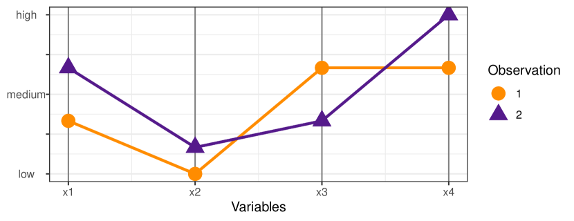
Few approaches in data visualization exist that are truly high-dimensional. Most visualizations are (projections of data into) two or three dimensions enhanced by additional mappings to plot aesthetics, such as point size and color, or facetting. Parallel coordinate plots are one of the exceptions: in parallel coordinate plots we can actually visualize an arbitrary many number of variables to get a visual summary of a high-dimensional data set. In a parallel coordinate plot each variable takes the role of a vertical (or parallel) axis (giving the visualization its name). Multivariate observations are then plotted by connecting their respective values on each axis across all axes using polylines (cf. Figure 1). For just two variables this switch from orthogonal axes to parallel axes is equivalent to a switch from the familiar Euclidean geometry to the Projective Space. In the projective space, points take the role of lines, while lines are replaced by points, i.e. points falling on a line in the Euclidean space correspond to lines crossing in a single point in the Projective Space. This duality provides a good basis for interpreting geometric features observed in a parallel coordinate plot (Inselberg, 1985).
The origins of parallel coordinate plots date back to the 19th century and are, depending on the source, either attributed to Maurice d’Ocagne (1885) or Henry Gannett (1880). Modern era parallel coordinate plots go back to Inselberg (1985) and Wegman (1990). Parallel coordinate plots are used in an exploratory setting as a way to get a high-level overview of the marginal distributions involved, to identify outliers in the data and to find potential clusters of points. In the absence of those, Parallel Coordinate Plots are often criticized for the amount of clutter they produce, resembling a game of mikado rather than organized data. This clutter is sometimes combated by the use of -blending (Miller & Wegman, 1991), density estimation (Heinrich & Weiskopf, 2009), or edge-bundling parallel coordinate plots (McDonnell & Mueller, 2008). For a detailed overview of these and other techniques see Heinrich & Weiskopf (2013).
However, parallel coordinate plots have some shortcomings. The biggest challenge comes when working with categorical variables. In current solutions, levels of categorical variables are transformed to numbers and variables are then used as if they were numeric. This introduces a lot of ties into the data, and the resulting parallel coordinate plot becomes uninformative, as it only shows lines from each level of one variable to all levels of the next variable. Some versions of parallel coordinate plots have been specifically developed to deal with categorical data, e.g. parallel set plots (Kosara et al., 2006), Hammock plots (Schonlau, 2003), and common angle plots (Hofmann & Vendettuoli, 2013). These solutions all have in common that they work with tabularized data and show bands of observations from one categorical variable to the next. Hammock plots and common angle plots provide solutions to mitigate the sine-illusion’s effects (Day & Stecher, 1991) on parallel sets plots.
An attempt to combine categorical and numeric variables in a parallel coordinate plot is introduced in the categorical parallel coordinate plots of Pilhöfer & Unwin (2013). These plots provide an extension to parallel sets that allows numeric variables to be included in the plot. Similar to parallel sets, this approach is also based on marginal frequencies for the categorical variables. Categorical parallel coordinate plots are the closest of these variations to our solution, but they are not implemented in the ggplot2 framework and can therefore not be further extended.
Various packages in R (R Core Team, 2019) exist that contain an implementation of one of the parallel coordinate plots. The function “parcoord” in the MASS package (Venables & Ripley, 2002) make use of the base plot system of R to draw parallel coordinate plots. The function cpcp in package iplots implements the parallel coordinate plot (Pilhöfer & Unwin, 2013). Developments based on the grammar of graphics (Wilkinson, 2005) and the ggplot2 (Wickham, 2016) framework are, e.g. GGally (Schloerke et al., 2018) or ggparallel (Hofmann & Vendettuoli, 2016) which provides an implementation of Hammock and common-angle plots. Those packages based on ggplot2 make use of ggplot2, but are actually wrapper of existing functions for highly specialized plots with tens of parameters, which do not allow the full flexibility of ggplot2 and do not make use of ggplot2’s layer framework.
The remainder of the paper is organized as follows: section 2 presents the conceptual framework of generalized parallel coordinate plots and general principles informing their construction. Section 3 describes the connection between generalized parallel coordinates and the grammar of graphics. Section 4 provides three examples highlighting different aspects of the use of generalized parallel coordinate plots in an exploratory setting.
2 The Generalized Parallel Coordinate Plot
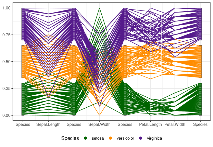
Figure 2 shows a first example of a generalized parallel coordinate plot. Shown are Edgar Anderson’s (in)famous iris data (Anderson, 1935). Each iris is shown by one polyline. Lines are colored by species. The species variable is included several times as an axis in the plot. Sepal widths of irises shows the worst discrimination by species, their petal widths the best. As can be seen, the categorical variable species is seamlessly incorporated into the parallel coordinate plot.
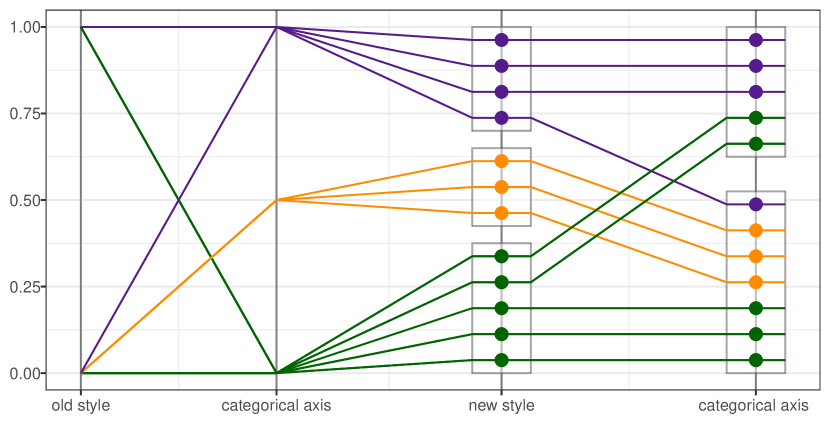
The main idea of generalized parallel coordinate plots is that we integrate categorical variables in a way that allows us to keep track of individual observations across all variables. This means that we need to address the inherently existing ties of each level of a categorical variable. Figure 3 shows an implementation of this approach. The same variables are shown on the left as on the right (in an A-B-B-A pattern). Instead of using one value for each level, the observations within each level are spread out uniformly. A rectangle around these values visually groups all observations of a level together. Some additional space is inserted between rectangles (for a total of 10% of the vertical space) to visually separate the levels. With this modification we preserve the spirit of parallel coordinate plots by drawing a trackable polyline across the variables. In comparison, by using a single point for each level of a categorical variable as on the left hand side of Figure 3, we end up with a plot that is much less informative. The most interesting piece of information from the left hand-side of the plot is that there are no observations in the top level of the first variable that go into the middle level of the second variable.
In the remainder of this section we discuss different conceptual aspects of the construction of generalized parallel coordinate plots before discussing the specific implementation in the ggpcp package.
2.1 Breaking Ties
What might not be apparent at first glance is that the order of the observations within each level has to be chosen carefully in order to create a visualization with as little visual clutter as possible. As all of the observations in each level of a categorical variable share the same value, the “values” on a categorical axis are not determined by the data, instead they are just positions based on tie-breaking considerations and therefore provide us with a lot of freedom in choosing them. This way we are able resolve a lot of potential line crossings between adjacent axes.
There are four combinations of adjacent variables (N-N, N-C, C-N, and C-C) to be considered with respect to their tie-breaking behavior in constructing generalized parallel coordinate plots. While there might be ties in some numeric variables, we are not changing any of the established behavior of parallel coordinate plots, i.e. values any numeric variable are marked along the axis (after appropriately scaling the axis) and connected to their respective counterparts on adjacent axes. When we are dealing with adjacent numeric and categorical variables (N-C, C-N), we use the values of the numeric variable to inform the position of the observations within each level of the categorical variable. Note, however, that it is not possible to sort a categorical variable with respect to numeric variables on both sides (N-C-N), shown in Figure 4. In that situation, our choice is to always sort the categorical variable according to the numeric variable on the left hand side first and only regard the values on the right if there is no numeric variable on the left.

In dealing with adjacent categorical variables, we make use of the basic idea of parallel set plots (Kosara et al., 2006), applied to individual observations rather than based on frequencies, with the aforementioned advantages. For categorical variables, we extend the construction of tie breakers to include all adjacent categorical variables. We will call these sets of categorical variables factor blocks. Within each factor block the position of observations within each level of a categorical variable is informed by the joint distribution of a categorical variable with all of its right-sided categorical neighbors.
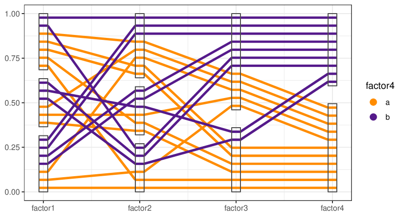
That means, that for the left most categorical variable, the positions of the observations within each level are ordered according to their corresponding positions in its adjacent categorical right-hand neighbor, which itself is ordered by the position of observations of its right-hand categorical neighbor. This is equivalent to an order given by hierarchically sorting categorical variables from right to left. Any remaining ties within a level are, as in the N-C case, resolved by the order of values of the variable on the left. As a result, the parallel coordinate plot appears to become gradually more ordered to the right, as can be seen in Figure 5. This approach minimizes the number of crossed lines.
2.2 Break Factor Blocks
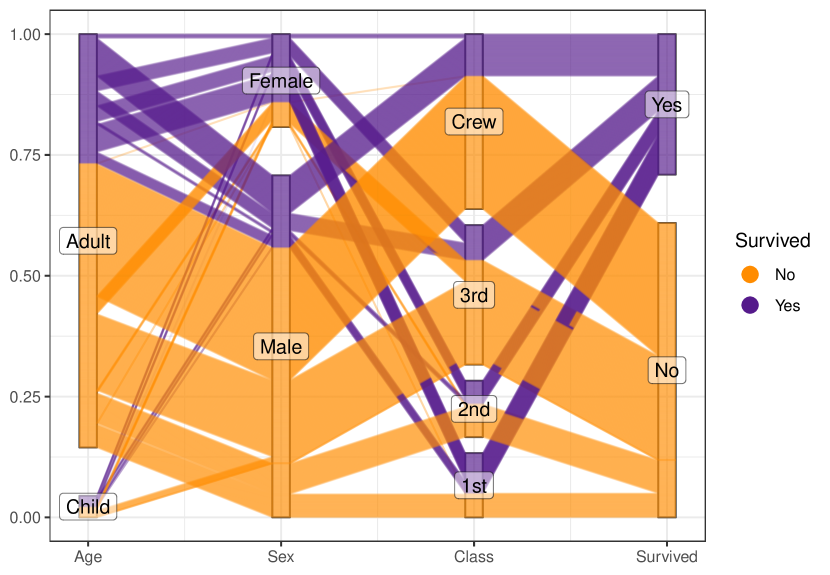
While generalized parallel coordinate plots can now deal with multiple categorical variables, we do have to pay a price in terms of complexity by adding more and more categorical variables into the plot. As the number of categorical variables in a factor block increases, the total number of combinations in the corresponding joint distribution increases multiplicatively. We can see the rapidly increasing number of combinations in Figure 6. This figure shows survival on board the RMS Titanic by gender, age, and class (Dawson, 1995). Only for the right most section in the factor block can we see a simple relationship between the eight possible combinations of survival and passenger status/crew. The number of combinations rapidly devolves into an incomprehensible mess moving from the ordered right hand side to the left, as a result of utilizing the full joint distribution of the factor combinations.
In order to direct visual attention to the useful structure within the data, rather than the increasing fragmentation of the joint distribution of all of the displayed variables, we introduce a method for breaking factor blocks into sub-blocks. The joint distribution of variables within the sub-blocks is preserved, but between adjacent sub-blocks, only the immediately relevant relationships are maintained. Visually, this is manifested in a re-ordering of cases within a factor block, shown by diagonal lines contained within the factor boxes. This hides some of the complexity of the full joint distribution, but allows the viewer to focus on the primary relationships of interest while preserving most of the utility of the ordering described above. Figure 7 shows the same data as Figure 6, but has breakpoints inserted at each of the interior variables; the re-ordering can be seen within the interior blocks, and the resulting chart is cleaner and easier to read.
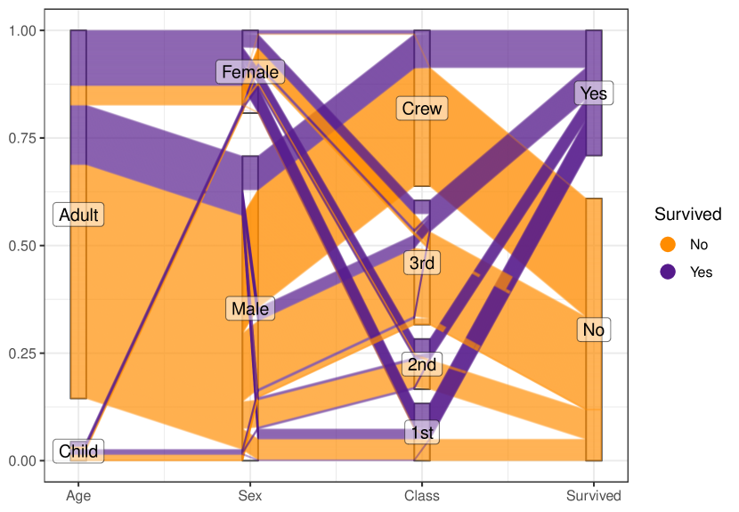
Computationally, the logic behind the factor block break points is as follows: At each breakpoint, we arrange the right and left side of the data separately, and then reconcile the two orderings within the breakpoint box. This contains much of the visual clutter within the box indicating the factor level, which reduces the visual impact of the reordering significantly, but also makes it harder to track individual observations across the plot.
2.3 Organized Over-plotting
One of the primary advantages of the generalized approach to categorical variables described above is the ability to follow a single observation throughout the plot. As the number of observations increase, this becomes less feasible because with more polylines, there are more intersections between polylines, exponentially increasing the effort required to follow a polyline from one side of the plot to the other. To reduce this tendency toward chaos, it is necessary to carefully control the order in which lines are plotted to ensure that it is relatively easy to follow a line (or group of polylines) across the plot. We have developed three different methods to control this overplotting in order to maintain visual order:
-
1.
Plot the smaller groups of lines on top of the larger groups,
-
2.
Plot the larger groups of lines on top of the smaller groups of lines,
-
3.
Use the hierarchical arrangement of factor variables to order the line plotting.
The user can specify which ordering method should be used with an additional parameter. When there are multiple factor blocks, or breakpoints between factor blocks, it is necessary to reconcile plotting order within axes as well, using the same type of logic. Note that we have used two different overplotting methods in Figure 6 and Figure 7. In Figure 6 we plotted larger groups of lines on top of smaller groups of lines, while for Figure 7 we plotted smaller groups of lines on top of the larger groups. The fact that we can still see smaller lines in the first figure is due to the additional use of -blending, i.e. we are not drawing lines at full saturation, but make them partially see-through. Usually, the hierarchical arrangement produces the best plots.
3 A Layered Approach to Parallel Coordinate Plots
Since its publication on CRAN in 2005, the R package ggplot2 has seen a stellar rise in use with now tens of thousands of downloads a day.
This success is due to the underlying conceptual framework. ggplot2 is based on the Grammar of Graphics (Wilkinson, 2005), implemented and adjusted for usability in R (Wickham, 2010). This means that a plot in ggplot2 is assembled descriptively as a set of layers. Each of these layers consists of a functional mapping between the variables in the data set and a component of the plot, such as an or a axis, or plot specific aesthetics, such as the color or size of points. Generally, layers have a single geometric representation (such as e.g. points, lines or rectangles).
What is unique about ggplot2 is that its implementation facilitates the creation of extensions. Our package ggpcp is one such extension for generalized parallel coordinate plots.
In accordance with the modular design principle of the tidyverse (Wickham et al., 2019) we have developed a set of functions to deal with separate aspects of generalized parallel coordinate plots.
Parallel coordinate plots are somewhat unique in that there is no one-to-one mapping between a variable and an axis; instead, there are arbitrarily many variables provided, and both the x and y positions are calculated for each variable, and thus, each polyline. To accommodate this complication, we have utilized the vars function used throughout the tidyverse to allow the user to specify a set of variables using the familiar syntax of the select helper functions found in the tidyselect package. Interestingly, this also enables us to specify variables multiple times in a plot, as shown in Figure 2.
The user primarily interacts with the geom_pcp function, which is constructed to handle the different aspects of parallel coordinate plots through a consistent API. This function allows us to draw a set of polylines as in a traditional parallel coordinate plot.
Consistent with the modular approach of ggplot2, this function only draws lines, and the user must specify additional layers for additional plot components, such as the boxes for categorical variables or text for labels.
The code below generates Figure 4. As can be seen, the layers of ggpcp work seamlessly with functionality from the tidyverse and elements of ggplot2.
set.seed(20191019)
iris %>%
  group_by(Species) %>%
  sample_n(10) %>%
  ggplot(aes(vars = vars(Sepal.Length, Species,
                         Sepal.Width))) +
  geom_pcp(boxwidth = 0.1, aes(color = Species),
           size = 1.25) +
  geom_pcp_box(boxwidth = 0.1) +
  geom_pcp_label(boxwidth = 0.1) +
  theme_bw() +
  scale_colour_manual(
    values = c("purple4", "darkorange", "darkgreen"))
In the next section we will discuss some examples highlighting some more sophisticated aspects of the plot.
4 Examples
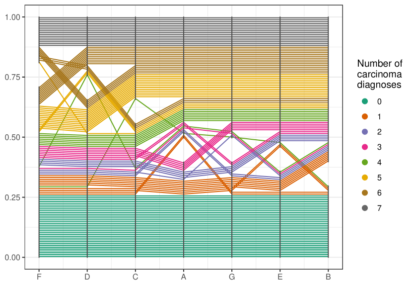
4.1 Getting a second, third, … and seventh opinion
Figure 8 shows data from Agresti (2002) published as
part of the poLCA package (Linzer & Lewis, 2011). Seven pathologists were asked
to assess the same 118 slides for the presence or absence of carcinoma
in the uterine cervix. Binary responses for each slide were recorded
(yes/no). Pathologists all agreed on about 25% of slides, which they
considered to be carcinoma free, and a further 12.5% of slides, which
were considered to show carcinoma by all pathologists.
For the remaining 62.5% of slides there was some disagreement. However,
we see that this disagreement is not random. When pathologists are
ordered (by moving the corresponding axes) left to right from fewest
number of overall carcinoma diagnoses to highest number, we see that
generally for a slide more pathologists make a carcinoma diagnosis from
left to right.
4.2 Missing migrants
The Missing Migrants Project (https://missingmigrants.iom.int/) tracks incidents involving asylum seekers who have gone missing, were injured or have died on the way to their destination. The project aims to identify and track missing migrants and provide a reliable data source for media, researchers and the general public. The Missing Migrants Project started as a response to the tragedies of October 2013, when at least 368 migrants died in shipwrecks near the Italian island of Lampedusa. Here, we are exploring data from the three regions with the highest number of incidents: North Africa, the Mediterranean and the US-Mexico Border. In total we are considering 3273 incidents between Jan 1 2015 and Dec 31 2018.
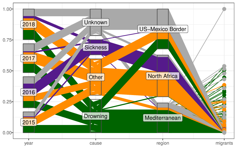
Incidents are reported with several hundred classifications of causes. Here, we are focusing on the top three: drowning, sickness, and unknown and combine all other causes under ‘other’.
Figure 9 shows a generalized parallel coordinate plot of the Missing Migrant Project data. Each line corresponds to one incident, lines are colored by the cause of the incident. We can see that the number of incidents in each of the three regions is similar, but in terms of the number of people involved, the Mediterranean clearly dominates the picture, with the worst incident estimated to have cost the lives of more than 1000 people.
We see that in 2016 one leading cause of reported incidents were sickness and diseases, mostly reported in North Africa. Further investigation reveals that these are likely experienced by refugees from Sudanese camps, where poor sanitation and complete lack of medical care led to epidemic outbreaks of cholera, typhus and other preventable diseases.
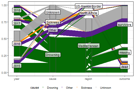
Figure 10 shows a generalized parallel coordinate plot of a different aspect of the same data. Each line now corresponds to an individual instead of a group involved in an incident. An outcome variable is added to report on each individual’s presumed status.
The number of migrants involved in incidents peaked in 2016 and numbers have since decreased. Drowning is the leading cause of death for migrants in the Mediterranean, but as can be seen in Figure 9 there are a substantial number of drowning incidents along the US-Mexico border.
Even though we saw in Figure 9 sickness as one of the leading number of incident reports in 2016, fortunately the number of migrants affected is relatively small.
4.3 ASA Data expo 2006
In this last example, we re-visit a data set that was used for the ASA Data Expo in 2006. The nasa data, made available as part of the ggpcp package provides an extension to the data provided in the GGally package (Schloerke et al., 2018). It consists of monthly measurements of several climate variables, such as cloud coverage, temperature, pressure, and ozone values, captured on a 24x24 grid across Central America between 1995 and 2000.
Using a hierarchical clustering (based on Ward’s distance) of all January and July measurements of all climate variables and the elevation, we group locations into 6 clusters. The resulting cluster membership can then be summarized visually. Figure 11 shows a tile plot of the geography colored by cluster. We see that the clusters have a very distinct geographic pattern.
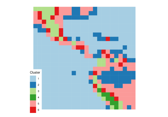
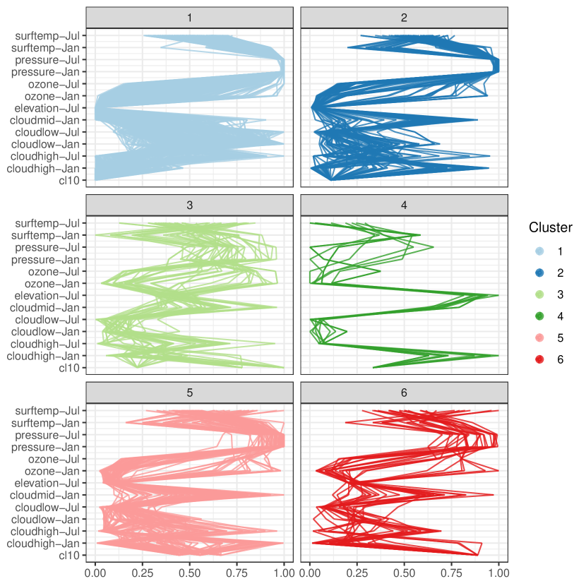
From the parallel coordinate plot in Figure 12 we see that cloud coverage in low, medium and high altitude distinguishes quite succinctly between some of the clusters. (Relative) temperatures in January and July are very effective at separating between clusters in the Southern and Northern hemisphere. The connection between the US gulf coast line and the upper region of the Amazon (cluster 2) can probably be explained by a relatively low elevation combined with similar humidity levels.
A parallel coordinate plot allows us to visualize a part of the dendrogram corresponding to the hierarchical clustering.
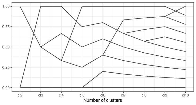
Using the generalized parallel coordinate plots we can visualize the clustering process in plots similar to what Schonlau (Schonlau, 2002, 2004) coined the clustergram, see Figure 13 and Figure 14.
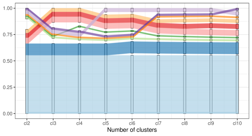
Along the x-axis the number of clusters are plotted with one PCP axis each, from two clusters (left) to 10 clusters (right most PCP axis). Each line corresponds to one location, lines are colored by cluster assignment in the ten-cluster solution. This essentially replicates the dendrogram while providing information about the number of observations in each cluster as well as the relationship between successive clustering steps.
5 Discussion and Further Work
The generalized parallel coordinate plot provides a visualization for a mix of categorical and numeric variables, that incorporates existing variants of numeric only and categorical variables only as (trivial) special cases. Fundamental to this modified framework is the switch from a frequency based representation of categorical variables to an observation-based representation, which allows the viewer to track an individual observation across the entire plot. While the observations are drawn individually, visually the proximity of lines creates an implicit grouping that characterizes the joint distribution of the data and preserves the functionality of the original implementations of both the categorical and the numeric variants of parallel sets/parallel coordinate plots. Drawing lines for each individual might not be the fastest strategy computationally, but it allows us to focus on the human behind the data instead of aggregating the same information into a faceless statistic.
In the implementation in ggpcp we combined the extended PCP framework with the powerful grammar of graphics implementation of ggplot2. The layer-based construction of generalized parallel coordinate plots allows the user to explicitly describe each layer of the plot in a familiar manner and therefore provides flexibility in specifying and changing each aspect of the plot’s appearance. As shown in the example of migrant casualties, the tidyverse facilitates transitioning between different levels of aggregation; the generalized parallel coordinate plots tap into that power to provide visualizations for different observational units. The ability to link between these plots in an interactive manner might be achievable by additionally leveraging the plotly framework (Sievert, 2018) and would further improve upon the usefulness of generalized parallel coordinate plots
While we are quite convinced that the generalized parallel coordinate plots are indeed an improvement over the traditional parallel coordinate plot or parallel sets, we would like to confirm this in future user studies.
While the -blending of the lines mitigates some of the effect of the sine illusion, the exact magnitude of the mitigation heavily depends on the choice of and the data set. Future versions of the package might implement the idea of the common angle plot, therefore adjusting for the effect by forcing all lines to appear under the same angle. This might also help with reducing the visual complexity.
References
- (1)
- Agresti (2002) Agresti, A. (2002), Categorical Data Analysis, 2 edn, John Wiley & Sons, Hoboken.
- Anderson (1935) Anderson, E. (1935), ‘The irises of the gaspe peninsula’, Bulletin of the American Iris Society 59, 2–5.
- Dawson (1995) Dawson, R. J. M. (1995), ‘The “unusual episode” data revisited.’, Journal of Statistics Education 3(3).
- Day & Stecher (1991) Day, R. H. & Stecher, E. J. (1991), ‘Sine of an illusion’, Perception 20, 49–55.
-
d’Ocagne (1885)
d’Ocagne, M. (1885), ‘Coordonnées
parallèles et axiales : Méthode de transformation géométrique et
procédé nouveau de calcul graphique déduits de la considération des
coordonnées parallèles’, Gauthier-Villars p. 112.
https://archive.org/details/coordonnesparal00ocaggoog/page/n10 - Gannett (1880) Gannett, H. (1880), General summary showing the rank of states by ratios 1880, plate 71, in ‘Scribner’s statistical atlas of the United States, showing by graphic methods their present condition and their political, social and industrial development’, Charles Scribner’s Sons, New York.
-
Heinrich & Weiskopf (2009)
Heinrich, J. & Weiskopf, D. (2009), ‘Continuous Parallel Coordinates’, IEEE Transactions on
Visualization and Computer Graphics 15(6), 1531–1538.
http://ieeexplore.ieee.org/document/5290770/ - Heinrich & Weiskopf (2013) Heinrich, J. & Weiskopf, D. (2013), State of the Art of Parallel Coordinates, in M. Sbert & L. Szirmay-Kalos, eds, ‘Eurographics 2013 - State of the Art Reports’, The Eurographics Association.
-
Hofmann & Vendettuoli (2013)
Hofmann, H. & Vendettuoli, M. (2013), ‘Common Angle Plots as Perception-True
Visualizations of Categorical Associations’, IEEE Transactions on
Visualization and Computer Graphics 19(12), 2297–2305.
http://ieeexplore.ieee.org/lpdocs/epic03/wrapper.htm?arnumber=6634157 -
Hofmann & Vendettuoli (2016)
Hofmann, H. & Vendettuoli, M. (2016), ggparallel: Variations of Parallel Coordinate
Plots for Categorical Data.
R package version 0.2.0.
https://cran.r-project.org/package=ggparallel -
Inselberg (1985)
Inselberg, A. (1985), ‘The plane with
parallel coordinates’, The Visual Computer 1(2), 69–91.
http://link.springer.com/10.1007/BF01898350 -
Kosara et al. (2006)
Kosara, R., Bendix, F. & Hauser, H. (2006), ‘Parallel Sets: interactive exploration and visual
analysis of categorical data’, IEEE Transactions on Visualization and
Computer Graphics 12(4), 558–568.
http://ieeexplore.ieee.org/document/1634321/ -
Linzer & Lewis (2011)
Linzer, D. A. & Lewis, J. B. (2011), ‘poLCA: An R package for polytomous variable latent class analysis’,
Journal of Statistical Software 42(10), 1–29.
http://www.jstatsoft.org/v42/i10/ -
McDonnell & Mueller (2008)
McDonnell, K. T. & Mueller, K. (2008), ‘Illustrative Parallel Coordinates’, Computer
Graphics Forum 27(3), 1031–1038.
http://doi.wiley.com/10.1111/j.1467-8659.2008.01239.x -
Miller & Wegman (1991)
Miller, J. J. & Wegman, E. J. (1991), Computing and graphics in statistics, Springer-Verlag
New York, Inc., New York, NY, USA, chapter Construction of Line Densities for
Parallel Coordinate Plots, pp. 107–123.
http://dl.acm.org/citation.cfm?id=140806.140816 -
Pilhöfer & Unwin (2013)
Pilhöfer, A. & Unwin, A. (2013), ‘New Approaches in Visualization of Categorical Data: R Package
extracat’, Journal of Statistical Software 53(7).
http://www.jstatsoft.org/v53/i07/ -
R Core Team (2019)
R Core Team (2019), R: A Language and
Environment for Statistical Computing, R Foundation for Statistical
Computing, Vienna, Austria.
https://www.R-project.org/ -
Schloerke et al. (2018)
Schloerke, B., Crowley, J., Cook, D., Briatte, F., Marbach, M., Thoen, E.,
Elberg, A. & Larmarange, J. (2018), GGally: Extension to ’ggplot2’.
R package version 1.4.0.
https://CRAN.R-project.org/package=GGally - Schonlau (2002) Schonlau, M. (2002), ‘The clustergram: a graph for visualizing hierarchical and non-hierarchical cluster analyses’, The Stata Journal 2(4), 391–402.
- Schonlau (2003) Schonlau, M. (2003), Visualizing Categorical Data Arising in the Health Sciences Using Hammock Plots., in ‘Proceedings of the Section on Statistical Graphics, American Statistical Association’.
- Schonlau (2004) Schonlau, M. (2004), ‘Visualizing hierarchical and non-hierarchical cluster analyses with clustergrams’, Computational Statistics 19(1), 95–111.
-
Sievert (2018)
Sievert, C. (2018), plotly for R.
https://plotly-r.com -
Venables & Ripley (2002)
Venables, W. N. & Ripley, B. D. (2002), Modern Applied Statistics with S, 4 edn,
Springer.
http://www.stats.ox.ac.uk/pub/MASS4/ - Wegman (1990) Wegman, E. J. (1990), ‘Hyperdimensional data analysis using parallel coordinates’, Journal of the American Statistical Assoiation 85, 664–675.
-
Wickham (2010)
Wickham, H. (2010), ‘A layered grammar of
graphics’, Journal of Computational and Graphical Statistics 19, 3–28.
https://doi.org/10.1198/jcgs.2009.07098 -
Wickham (2016)
Wickham, H. (2016), ggplot2: Elegant
Graphics for Data Analysis, 2 edn, Springer-Verlag New York.
https://ggplot2.tidyverse.org - Wickham et al. (2019) Wickham, H., Averick, M., Bryan, J., Chang, W., McGowan, L. D., François, R., Grolemund, G., Hayes, A., Henry, L., Hester, J., Kuhn, M., Pedersen, T. L., Miller, E., Bache, S. M., Müller, K., Ooms, J., Robinson, D., Seidel, D. P., Spinu, V., Takahashi, K., Vaughan, D., Wilke, C., Woo, K. & Yutani, H. (2019), ‘Welcome to the tidyverse’, Journal of Open Source Software 4(43), 1686.
- Wilkinson (2005) Wilkinson, L. (2005), The Grammar of Graphics, 2 edn, NY: Springer, New York.