1234 \vgtccategoryResearch \vgtcpapertypeapplication/design study \shortauthortitleBiv et al.: Global Illumination for Fun and Profit \authorfooter M. Xia, R.P. Velumani, Y. Wang, H. Qu, and X. Ma are with Hong Kong University of Science and Technology. Email: @connect.ust.hk, reshikapv, jiayouwyhit@gmail.com, huamin, mxj@cse.ust.hk
QLens: Visual Analytics of Multi-step Problem-solving
Behaviors for Improving Question Design
Abstract
With the rapid development of online education in recent years, there has been an increasing number of learning platforms that provide students with multi-step questions to cultivate their problem-solving skills. To guarantee the high quality of such learning materials, question designers need to inspect how students’ problem-solving processes unfold step by step to infer whether students’ problem-solving logic matches their design intent. They also need to compare the behaviors of different groups (e.g., students from different grades) to distribute questions to students with the right level of knowledge. The availability of fine-grained interaction data, such as mouse movement trajectories from the online platforms, provides the opportunity to analyze problem-solving behaviors. However, it is still challenging to interpret, summarize, and compare the high dimensional problem-solving sequence data. In this paper, we present a visual analytics system, QLens, to help question designers inspect detailed problem-solving trajectories, compare different student groups, distill insights for design improvements. In particular, QLens models problem-solving behavior as a hybrid state transition graph and visualizes it through a novel glyph-embedded Sankey diagram, which reflects students’ problem-solving logic, engagement, and encountered difficulties. We conduct three case studies and three expert interviews to demonstrate the usefulness of QLens on real-world datasets that consist of thousands of problem-solving traces.
keywords:
Learning Behavior Analysis, Visual Analytics, Time Series DataK.6.1Management of Computing and Information SystemsProject and People ManagementLife Cycle;
\CCScatK.7.mThe Computing ProfessionMiscellaneousEthics
\teaser
![[Uncaptioned image]](/html/2009.12833/assets/teaser.png) QLens enables question designers to analyze students’ multi-step problem-solving behaviors for design improvements from levels of detail. (1) Macro-level: Overview (a) shows the question’s preview (a1), students’ overall performance (a2) and the ranking of common wrong answers based on the frequency of occurence(a3). (2) Meso-level: Transition View (b) visualizes the problem-solving processes to reflect how a group of students proceed step by step (problem-solving logic) using a novel glyph-embedded Sankey diagram (b2) and the amount of efforts (engagement) using a contextual axis (b3). In addition, Comparison View (c) enables users to compare the problem-solving logic, engagement, and encountered difficulties of different groups (c1, c2, c3). (3) Micro-level (the highlighted path in b): typical incorrect paths and the corresponding data-driven recommended paths are demonstrated for question designers to evaluate the feasibility of the data-driven feedback. Rich interactions are also provided for exploration (e.g., filters in b1).
\vgtcinsertpkg
QLens enables question designers to analyze students’ multi-step problem-solving behaviors for design improvements from levels of detail. (1) Macro-level: Overview (a) shows the question’s preview (a1), students’ overall performance (a2) and the ranking of common wrong answers based on the frequency of occurence(a3). (2) Meso-level: Transition View (b) visualizes the problem-solving processes to reflect how a group of students proceed step by step (problem-solving logic) using a novel glyph-embedded Sankey diagram (b2) and the amount of efforts (engagement) using a contextual axis (b3). In addition, Comparison View (c) enables users to compare the problem-solving logic, engagement, and encountered difficulties of different groups (c1, c2, c3). (3) Micro-level (the highlighted path in b): typical incorrect paths and the corresponding data-driven recommended paths are demonstrated for question designers to evaluate the feasibility of the data-driven feedback. Rich interactions are also provided for exploration (e.g., filters in b1).
\vgtcinsertpkg
1 Introduction
With online education becoming increasingly popular in the past decades, various types of online learning materials including multi-step questions are provided for students to cultivate their problem-solving skills. For example, online question pools (e.g., LeetCode [2], LearnLex [1]), and intelligent tutoring systems (e.g., SimStudent [3]) offers interactive maths questions and/or programming exercises [49]. Different from traditional multiple-choice questions, these newly-designed questions require students to construct a solution that fulfills a series of conditions by conducting multi-step interactions [19], which are called multi-step questions. A step is “the smallest user interface actions for which it makes sense to call it correct or incorrect” [40]. For example, interactions (e.g., drag-and-drops) that change the answer of the question is a step, but mouse movements without changing the answer is not regarded as a step. There are different types of multi-step questions, for example, questions with multiple blanks to fill, questions with multiple elements to drag. Such questions are becoming popular learning materials practised by tens of thousands of students [49].
Prior studies [34, 19] have shown that linking students’ fine-grained problem-solving behaviors with the educators’ expectation of students’ performance can improve the design of learning materials (e.g., online questions). Problem-solving behaviors are a sequence of steps that a student takes to produce the final answer [36]. Exploring the patterns emerged from thousands of such processes can provide deep insights in understanding students’ problem-solving process, and a set of crucial questions can also be answered. For example, What approaches do the students take? How much effort do students spend on solving a problem? What kind of difficulties do students commonly encounter in their practices? By knowing why and how students may fail on a question, educators and question designers are able to adjust the learning designs (e.g., the setting of testing cases), distribute questions to students with the right level of knowledge, and provide students with suitable on-the-fly guidance.
Existing research on analyzing problem-solving behaviors mainly focus on the outer loop (i.e., how students master the knowledge by solving a series of problems) [29, 39]. But these methods only took the final answers of the attempts (correct or incorrect) on each question into consideration and detailed processes within a particular question are not included, making them insufficient to guide the question designs [31]. Some recent studies try to look into the inner loop (i.e., the detailed process of solving a multi-step problem), as the fine-grained interaction data is becoming available. For example, Chris et at. [37] collected the snapshots capturing students’ practice process on the programming exercises and used Hidden Markov Chain to find their common steps. However, the results are difficult for educators and question designers to interpret. Meanwhile, some studies have utilized visualizations to facilitate the interpretation of students’ problem-solving behaviors. For example, Wang et al. [44] used a flow diagram to show intermediate results on testing cases in a programming exercise and discovered unexpected patterns caused by the unreasonable testing cases. Andersen et al. applied directed node diagrams [7] to emphasize certain patterns (e.g., loops) in the educational game. However, they do not support analytical tasks such as comparison of students’ problem-solving behaviors from different groups. These issues hinder question designers from understanding the difficulties students may encounter and limit the practical insights distilled to guide further question designs.
In this paper, we propose a novel visual analytics system, QLens, to help question designers analyze students’ problem-solving behaviors in multi-step questions. The system first models students’ problem-solving processes as a hybrid state transition to reflect students’ problem-solving logic, engagement level, and encountered difficulties. Based on the modeling results, multiple coordinated views are designed to facilitate analytical tasks including interpretation, summarization, and comparison of multiple answer construction sequences at three different levels. (1) Macro-level: the Overview shows the overall performance achieved by a given pool of students. (2) Meso-level: the Transition View visualizes the problem-solving processes intuitively to reflect how a selected group of students proceed over time. In addition, the Comparison View enables users to compare different clusters of students in terms of these three aspects. (3) Micro-level: typical incorrect solution paths and the corresponding recommended paths derived from peer data, if any, are demonstrated in Transition View for question designers to evaluate the feasibility of generating high-quality data-driven feedback for students in need. Moreover, QLens enables rich interactions (e.g., the tooltip and filter) to show the detailed information such as common intermediate answers and facilitates the detailed exploration and inspection. Three case studies with real-world datasets and detailed interviews with three domain experts demonstrate the usefulness and effectiveness of our system.
The contributions of this paper are summarized as follows:
-
•
Interactive System: An interactive visual analytics system, QLens, to help educators and question designers evaluate question designs by analyzing and comparing students’ problem-solving behaviors from three levels of details.
-
•
Visualization Design: A novel glyph-embedded Sankey diagram to represent problem-solving behaviors with the problem-solving logic, engagement level, and difficulties encountered in an informative and intuitive manner.
-
•
Evaluations: Three case studies and interviews with domain experts provide support for the usefulness and effectiveness of QLens in enabling interactive investigation of students’ problem-solving processes and guiding future question designs.
2 Related Work
The related work of this paper includes problem-solving behavior modeling, problem-solving process, and event sequence visualization.
2.1 Problem-solving Behavior Modeling
Much research has been conducted on modeling students’ problem-solving behaviors. They mainly focus on the outer loop, that is how students master the knowledge by solving a series of problems [29, 39, 28]. For example, Bayesian knowledge tracing was proposed to build procedural models for problem-solving processes [15]. It takes binary variables to model learners’ latent knowledge. Each variable represents the understanding/non-understanding of a concept. Since learning concepts are not independent as assumed in Beyesian knowledge tracing, Learning Factor Analysis [13] and Performance Factor Analysis [35] then modeled learners’ knowledge states using logistic regression with more learner features. Further, GNN has been applied to model students’ performance based peer’s data [28]. However, these methods only considered final answers of the attempts (correct or incorrect), which is insufficient to guide the question design.
An increasing amount of research has been done to analyze the inner loop, that is, detailed process for solving a multi-step problem, which is more complicated. Some works use machine learning methods to cluster students’ detailed problem-solving behavior. For example, Chris et al. [37] recorded the snapshots of students’ code during the programming, and modeled problem-solving process using Hidden Markov Model. They discovered the “sink states” where students cannot succeed in solving the problem once entered. In addition, they clustered all sequences to find the common patterns when students solve the programming exercise. However, they had not considered contextual information (e.g., the order how students fulfill different conditions, the time spent in each step), which are essential for understanding the reasons behind students’ confusions. The states in these methods are also difficult to interpret, which hinders further analysis.
2.2 Problem-solving Process Visualization
Visualization techniques have also been widely applied to analyzing students’ problem-solving processes. Some studies visualized students’ learning processes on solving a set of questions. For example, Xia et al. [49] used a zip-like visualization to facilitate students to plan their personal learning path. Other studies applied visual analytics to students’ problem-solving sequences for questions with multiple steps. Hosseini et al. [25] used scatter plots to represent the changes in programming concepts and whether these changes increased or decreased the correctness of the program. Furthermore, Berland et al. [9] used a node-link visualization to track students’ program processes and the links between states show the portion of students who made the transition. PathViewer [44] modeled the state in programming exercise as a binary string of testing cases and used flow diagram to show the transition among different states. Glassman et al. [19, 20] summarized the possible correct solutions made by students in math and circuit designs using the sankey diagram. Xia et al. [50] designed transition graphs to show problem-solving logic based on the order they pass different regions of interest. However, these visualizations suffered considerably from the scalability issue due to the limitation of the modelling approach and had difficulty supporting other analytical tasks.
The task of visualizing pathways in students’ problem-solving processes is similar to that video games, where it is also necessary to view the pathways that game players take. For instance, some works on educational game [7, 30, 42]. They usually built a state transition model that stores the number of people who reached a particular state and the transition between states, and displayed similar states close to each other using node diagram. However, their states are too abstract for users to understand the semantic meanings.
2.3 Event Sequence Visualization
Plenty of research has been done on event sequence visualization and they mainly focus on two major tasks [5, 8, 24]: visual summarization and visual comparison. For visual summarization of event sequences, early studies mainly summarize and visualize event sequences using timestamps and place them along a horizontal time axis, such as LifeLines [43, 46] and CloudLines [26]. Some more recent studies (e.g., EventFlow [33] and EventPad [12]) have also shifted the event sequences to make them better aligned horizontally or vertically. Other studies also considered using the circular or spiral layout to summarize event sequences visually. For example, ClockMap [18] is designed to show 24-hour network traffic and SpiraClock [16] visualizes the upcoming events with a clock-like design. To improve the scalability of event sequence visualization, hierarchical visualization is also proposed to further summarize event sequences, for instance, Timeline Trees [11] and Sequence Surveyor [6]. Further, advanced data mining and machine learning methods are utilized to summarize the common patterns [27, 38, 14, 22, 23]. Event sequence comparison mainly contains three types of comparisons among sequences, including one-to-one sequence comparison, one-to-many sequence comparison, and comparison of two collections of sequences. For example, Similan [47] compares two sequences by separately comparing each individual event. Matrixwave [51] uses a specialized matrix design to compare two sequences of clickstreams. As for the one to many sequences, EventAction [17] shows the sequences by ordering multiple similar sequences according to their similarity with the target sequence to facilitate easy comparison. COCO [32] and integrate statistical information and the evolution of a group of sequences.
However, the visual analysis of problem-solving process in our scenario is more complicated than the visual analysis of sequences in prior studies. First, we need to compare multiple groups of sequences rather than only summarizing one group. Second, more than one event can appear at the same time, as students can fulfill different conditions at once. Thus, new visual designs need to be proposed to enable analytical tasks of problem-solving behaviors on multi-step questions.
3 System Overview
Our system was designed on the basis of real-world requirements of question designers to analyze and determine students’ problem-solving behaviors to better design the questions. In our application scenario, we collaborate with one educational company that offers interactive math questions online for 30+ elementary and middle schools and tens of thousands of students. The online learning platform they run contains 1718 mathematical questions. We interviewed four domain experts (E1 - E4) from the company. E1 is the general manager; E2 is the product manager; E3 and E4 are the curriculum and question designers. We list the following four primary design requirements (R1-R4) derived from the interviews that guided the system design.
R1: Show students’ overall problem-solving performance. Experts need an overview about the problem-solving results from students towards the questions they designed. For a particular question, they want to know what grades are the students from, what are the scores they get and the time they spent. In addition, E3 mentioned that the common incorrect answers can be summarized and ranked to help question designers grasp a general understanding of students’ knowledge level and the problem difficulty.
R2: Summarize and present the multi-step problem-solving behaviors. Experts require a summarization and presentation of the multi-step problem-solving behaviors to reflect students’ logic of thinking, engagement, and difficulties encountered. E3 mentioned that the questions they designed aim to cultivate students’ computational thinking and encourage creative ways to interact with the question. Nearly all the questions have the knowledge they hope students to grasp. Thus, they required the system to summarize students’ approaches for them to understand whether students’ problem-solving processes are consistent with the intent of the question they designed and how much effort is needed to solve the problem. E3 and E4 added that, they also want to identify where and when students get stuck, which would be beneficial for designing feedback to students.
R3: Enable the comparison of students from different groups. The system should also enable question designers to compare two or more groups of students with different grades or scores and explore their differences in the logic of thinking and engagement. As mentioned by E1, each problem has its main targeted group of students (e.g., a certain grade) even though they allow students from different grades to access the question. E3 and E4 said they hope the question can be assigned to a group of students who can interact more with it while not feeling too difficult, which is based on the zone of proximal development (ZPD) principle in education [41]. Thus, he wanted to know whether students from different grades confront different difficulties and which groups the question is more suitable for.
R4: Evaluate the feasibility of providing data-driven feedback. E2 mentioned that they consider enhancing the current platform by providing data-driven feedback, e.g., recommended solution paths or next-step hints using existing data. For example, providing recommendations based on correct paths produced by existing users to those students who tried the incorrect answers. However, they are unsure whether this method can be applied based on the existing data. He suggested that the system provides a way for them to evaluate the feasibility of such data-driven approaches. This could also give them insights into how to design on-the-fly guidance in the future.
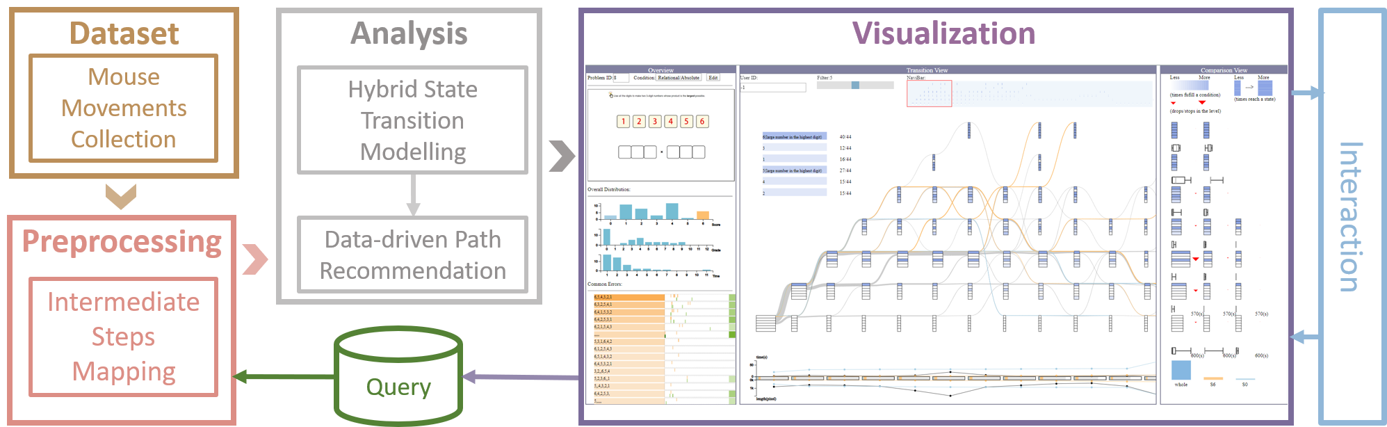
Based on the aforementioned requirements, we have designed QLens to provide a visual representation and an enhanced analysis of problem-solving processes and behaviors for question designs. Fig. 1 displays the overview of the system architecture, containing four modules: (1) data collection module collects mouse movement data and preprocesses it to sequences of intermediate answers indexed by learners’ IDs (R1); (2) analysis module models the problem-solving steps as hybrid state transitions (R2, R3) and implements a data-driven solution recommendation system (R4); (3) visualization module makes use of linked views to facilitate interpretation and comparison of problem-solving behaviors (R1, R2, R3, R4); and (4) interaction module supports exploration based on users’ preference or input (R3, R4).
4 Data and Modeling
In this section, we introduce the mouse movement data and its preprocessing, the problem-solving behavior modelling, and the data-driven feedback construction.
4.1 Data Preprocessing
We have collaborated with an online education company and collected students’ problem-solving data from their popular online education platform, which offers interactive math questions/quizzes online to over five thousands students from elementary and middle schools. We focus on problem-solving records from April 2019 to January 2020, which consist of 2,30,644 records from 5,266 students and 1,718 mathematical questions. Each record consists of a question ID, a student ID, and the mouse movement data along the problem-solving process. The mouse movement data contain mouse positions, mouse event types (i.e., up, down, and move), and time stamps. Specifically, "move" event is recorded at most 50 times per second; "up" and "down" are recorded whenever they are triggered. Students’ grade and question content information are also recorded and further considered in our analysis.
To understand how students solve a multi-step question, we have to map the raw mouse movement trajectories into a sequence of steps. More specifically, for our scenario of analyzing multi-step problem-solving behaviors, a step is the smallest user interface interaction that changes the intermediate answer (e.g., ) filled in the blanks. The mapping from raw mouse movement trajectories to steps can be generalized to other multi-step questions according to the concrete format of the answer.
For each question, we first extract the regions of interest (ROI) by drawing bounding boxes around all graphical components using Canny’s edge detection algorithm [21], as shown in Fig. 2(a). We then remove undesirable bounding boxes that are not interactive using predefined rules (e.g., the question description area). Then, we number the ROIs as 1,2,3, etc., with an order from the top left to the bottom right. For each student, we generate an ROI sequence by checking whether each mouse position lies inside one of the ROIs and replacing it with the ROI number and 0 if the mouse position does not fall within ROIs. Since only drag-and-drop mouse interactions (a mouse down followed by a mouse up event) [45] may change the answers, we make ROI pairs if two consecutive ROIs have mouse down and mouse up events, respectively. We then construct the paired ROI sequence and generate an intermediate answer sequence. For example, initially the intermediate answer sequence will be all null, i.e., null, null, null, null, null. After the first interaction, we replace the null value with values from the corresponding ROIs and this is repeated for all the interactions throughout the whole problem-solving session. At the end of this process, we arrive at the final answer of the student for that particular question.
4.2 Problem-solving Behavior Modeling
To reflect the problem-solving logic, engagement level, and difficulties students encountered and facilitate further visualization tasks, we use a hybrid state Markov Chain to model students’ problem-solving behaviors [4]. Before introducing the detailed problem-solving behavior modeling, we first define the following terms as below:
-
•
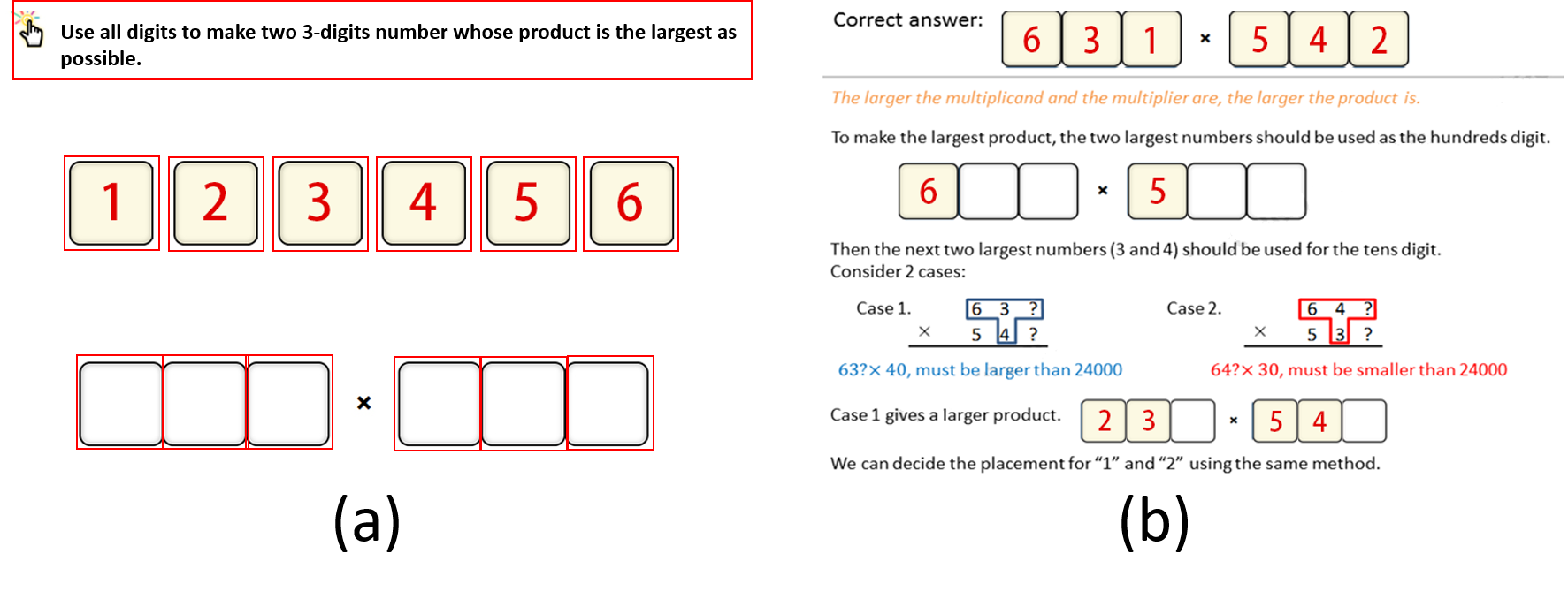
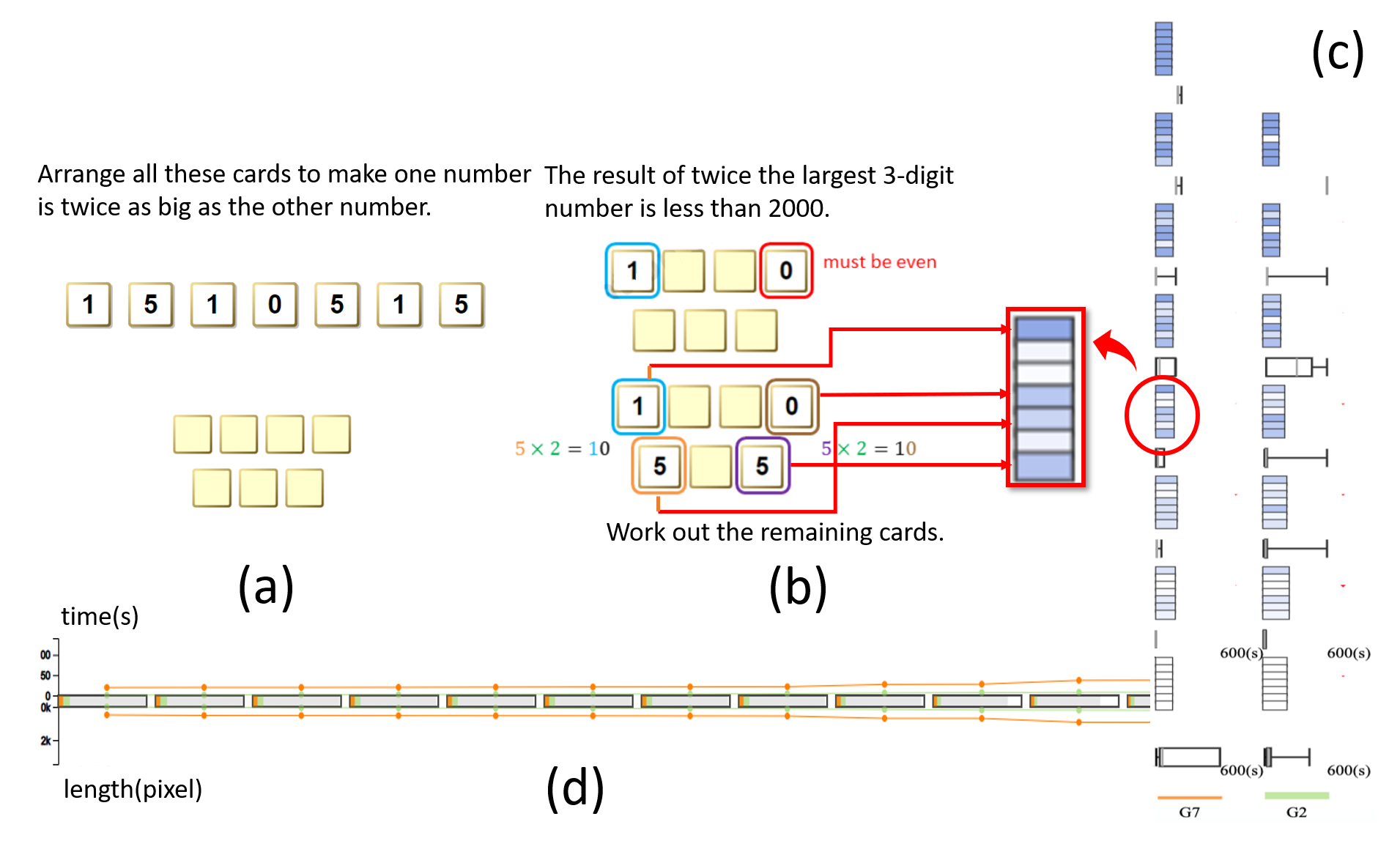
Condition: One criteria that students need to fulfill to get part of the score. For example, in Fig 2(a), placing one of the six digits in the correct position accounts for one condition being satisfied.
-
•
Condition array: a string consisting of and to indicate whether a set of conditions are fulfilled or not. The length of the string is the number of the conditions. For example, the length is six for the question in Fig 2(a).
-
•
Stage: the number of conditions the current answer fulfills. For example, for the question in Fig 2(a), fulfills one condition and at Stage one.
-
•
Time elapse: the time period between the time a student starts to solve the problem and the time he/she reaches a certain step.
-
•
Trajectory length: the length (pixels) of the cursor moves on the screen from the time the student starts to solve the problem to the time he/she reaches a certain step.
Based on the definitions above, State () is modeled as a two-level hybrid structure:
-
•
Level1: {Step, Stage} + {Condition array, Time elapse, Trajectory length}
-
•
Level2: {Intermediate answer}
For a particular student, the change of the conditions satisfied along the way can reflect the problem-solving logic. If a student’s stage cannot steadily go up as the step continues (e.g., the stage remains the same for several steps or drops continuously), it often indicates that a student probably encounters difficulties, as suggested by the domain experts. For example, if a student’s problem-solving sequence is as follows: , , , , , , this shows that from the third step, he/she cannot fulfill more conditions and stays at Stage two (the correct answer is ).
We introduce the two-level hybrid state because of the following reasons. First, {, } in Level1 keeps the number of possible states in a reasonable size. If we directly use the answers student fill in as the state, then a huge state space would appear. As shown in Fig. 2, given six blanks and six possible answers, there would be 5040 () possible outcomes (starting from 7 instead of 6 as students can fill nothing in each blank). With such a big search space, it is difficult to extract and further visualize the transition patterns among these states. Previous work [44] used one binary bit to represent one testing case in the programming exercise and a string of binary bits (0 or 1) to represent the state, which can reduce the state space. However, the state space is still large. If we consider one testing case as one number being correctly placed in one blank, then the state space is 64 () for the given example. Inspired by a previous study [49], we use the number of conditions to be satisfied as the key component of the state, which reduces the state space to in the given example. By doing this, it is intuitive to show the and , as it captures how a learner proceeds along the way, i.e., whether he/she is progressing towards the correct solution or deviating from it. However, only representing the state using step and stage is still too coarse. Further information should be added to provide additional contextual and semantic meanings for diagnosing where and why students get confused, e.g, spending more time to fulfill a certain condition. Thus, Level 1 {Condition Set, Time elapse, Trajectory length} enriches the state with contextual information.
However, a problem arises if we only consider Level 1. One condition set may contain many possible intermediate answers. For example, and satisfy two conditions while they represent different thinking styles. Without the detailed answers, recommending the path or next step for students who currently have not satisfied all the conditions is difficult. Thus, we represent the intermediate answer in Level 2. Such information can be interactively shown in the visualization during the exploration of a user.
By using the states, we finally construct a hybrid State Markov Chain to model the problem-solving behaviors of a group of students from two levels. Level 1 is mainly used for visualization and Level 2 is mainly used for data-driven path recommendation. In summary, we can display and utilize students’ problem-solving information for different tasks intuitively and effectively by constructing the states into two-level hybrid state transition.
4.3 Data-driven Feedback Construction
According to the requirement (R4) raised by domain experts, question designers need to evaluate the feasibility of using existing data to provide data-driven feedback to guide students’ problem-solving process. The common questions that question designers want to explore include: Which incorrect answers are the most common one that fewer students can pass? Which conditions can students fulfill? Can the sequences from those students be used for the feedback design? Since question designers focus on the feasibility instead of the quality of the feedback design at the current step, we selected a basic path recommendation algorithm adapted from Markov Chain model to show the representative answers students fulfill [49], where the next step is chosen based on the highest transition probability. More specifically, for an incorrect answer, we find all the problem-solving paths (1) that satisfy all the conditions at the end and (2) whose states cover the incorrect answer. If more than one path satisfies these constraints, then we construct the data-driven path according to the transition probabilities among different states and select states with the highest transition probability.
5 Visualization
5.1 Design Tasks
Based on requirements (R1-R4) from expert interviews and the problem-solving model, we have derived the follwoing design tasks (T1-T6).
T1 Show the overall performance of students’ problem-solving behavior (R1). The visual design need to provide the overall distribution of students’ scores, grades, and time spent to facilitate question designers to evaluate the overall performance and the difficulty level of the question at a glance. Common incorrect answers should also be ranked according to the frequency for question designers to check students’ understanding.
T2 Demonstrate students’ problem-solving logic intuitively (R2). The visualization should demonstrate students’ problem-solving logic by showing the order they fulfill different conditions step by step. In addition, it should show intuitively where students get confused and what are the common approaches taken, for questions designers to better understand the problem-solving behaviors of a group of students.
T3 Display the efforts (time and trajectory length) students pay along the way of problem-solving (R2). Question designers want to know whether students take the question seriously and how much effort they pay on the question. Thus, the time they spent and the trajectory length of the cursor should be displayed to show whether students are engaged in the problem-solving process.
T4 Support the comparison of the problem-solving logic, engagement, and difficulties of different groups from multiple granularities R3. The visualization designs should enable the comparison of problem-solving behaviors (i.e., the problem-solving logic, engagement, and difficulties) from students with different grades or scores. The design should support the comparison at both a high level (i.e., statistical information such as the total time spent) and a detailed level (i.e., step-wise information such as condition fulfilled on each step).
T5 Facilitate the evaluation of data availability for providing data-driven feedback (R4). To improve the question design by providing data-driven feedback on students who cannot solve the question, question designers need to evaluate whether the existing data covers the common errors. The visual design should show the common errors and the number of students that bypassed these errors and solved the question correctly at the end for the availability evaluation.
T6 Demo the data-driven feedback to verify the confidence for providing such feedback (R4). For the data-driven feedback for each incorrect answer, question designers need to check the detail of how many students make that error and what is the data-driven feedback, to verify the confidence for providing such feedback.
5.2 Visual Design
We present a novel visual analytics system QLens to accomplish the aforementioned tasks. This system can aid educators and question designers in exploring, analyzing, and understanding the problem-solving processes of students in multi-step questions. The visual analysis module of QLens incorporates the following three views. 1) Overview, as shown in Fig. QLens: Visual Analytics of Multi-step Problem-solving Behaviors for Improving Question Design(a), displays basic information about the students, which includes the background of students, score distribution, time spent by students and also information about common errors (T1, T2, T6). 2) Transition View, as shown in Fig. QLens: Visual Analytics of Multi-step Problem-solving Behaviors for Improving Question Design(b), visualizes the steps and stages involved in solving a problem which helps in understanding the different approaches and problem-solving logic that the students apply to solve the problem. This view also displays the data-driven recommended paths of common errors for question designers to evaluate the feasibility for providing data-driven feedback (T3,T7). 3) Comparison View, as shown in Fig. QLens: Visual Analytics of Multi-step Problem-solving Behaviors for Improving Question Design(c), facilitates a detailed comparison of the problem-solving process of two or more groups of students based on users’ selection (T4, T5). Moreover, a collection of interactions, such as filtering, highlighting, and tooltips, is also available for the users to explore the dataset freely.
5.2.1 Overview
The Overview (Fig. QLens: Visual Analytics of Multi-step Problem-solving Behaviors for Improving Question Design(a)) aims to provide a macro-level view of the information about the students and their overall performance using distribution charts and zipper-like visual metaphor. This view aids users to acquire a comprehensive understanding of students’ knowledge level, their background, engagement in the problem-solving process, and the difficulty level of the question.
The Overview has three panels. Question panel (Fig. QLens: Visual Analytics of Multi-step Problem-solving Behaviors for Improving Question Design(a1)) displays the preview of the question for which the mouse trajectories are being analyzed. Distribution panel (Fig. QLens: Visual Analytics of Multi-step Problem-solving Behaviors for Improving Question Design(a2)) shows the distribution of students among different scores, grades, and also time invested in the problem-solving process using the bar chart. The y-axis always denotes the number of students and the x-axis denotes the scores, grades, and time (in minutes) respectively. Common errors panel (Fig. QLens: Visual Analytics of Multi-step Problem-solving Behaviors for Improving Question Design(a3)) gives an overall insight into the errors student made when solving the problem. Error related information is also displayed, such as the number of students who encountered the error, number of students who bypassed the error, where they encountered the error and so on.
The common error panel has three parts. Fig. 3 is an enlarged version of Fig. QLens: Visual Analytics of Multi-step Problem-solving Behaviors for Improving Question Design(a3). Fig. 3(a) shows a ranking list of the common incorrect answers. The color encoding is based on the frequency of occurrence, where the frequent error has a darker shade of orange, and vice versa. Fig. 3(b) uses a zipper-like visual metaphor to highlight the steps where the students encounter these errors. For each common error, the upper teeth uses the orange color to indicate the steps where students who cannot solve the question submit these incorrect answer. Similarly, the lower teeth uses the green color to indicate the steps where students who can solve the question encounter the same error. The zipper-like visual metaphor also uses a color gradient to encode the number of submission information. For example, the step where more number of students submit the incorrect answer has darker shade and lighter shade indicates less number of submissions. If the error steps appear at the beginning of the zipper-like metaphor, then this error was more likely to be caused by students’ carelessness, while later represents that the error is difficult to overcome. Fig. 3(c) shows the number of students who were able to overcome these common incorrect answers. Here the color gradient is used to encode the number, darker the shade higher the number of students.
Further, this view also supports interactive options such as selecting the question of interest and filtering the group of students based on the score or the grade. It also enables question designers to edit the conditions and provides two types of conditions by default: absolute and relational. Relational condition utilizes the relationship between different interactive elements in the question to construct the required conditions to be fulfilled, whereas absolute condition considers the actual position of the interactive element in answer to construct the required conditions. For example, if element_1 is greater than element_2 then element_1 > element_2 can be one of the several Relational conditions to be fulfilled. Likewise, placing element_1 in first the answer blank becomes an absolute condition.
5.2.2 Transition View
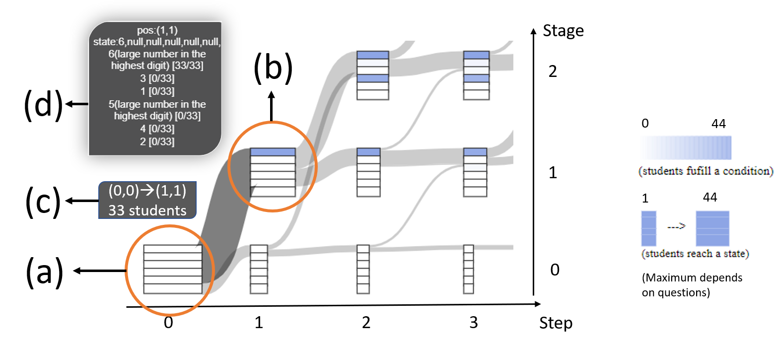
The Transition View (Fig. QLens: Visual Analytics of Multi-step Problem-solving Behaviors for Improving Question Design(b)) aims to provide a holistic view of the multi-step problem-solving behavior to reflect students’ problem-solving logic, engagement, and difficulties encountered by using a glyph embedded Sankey diagram and a contextual line chart. The view has three parts: control panel (Fig. QLens: Visual Analytics of Multi-step Problem-solving Behaviors for Improving Question Design(b1)), transition graph (Fig. QLens: Visual Analytics of Multi-step Problem-solving Behaviors for Improving Question Design(b2)), and engagement chart (Fig. QLens: Visual Analytics of Multi-step Problem-solving Behaviors for Improving Question Design(b3)). Transition graph, as shown in Fig. 4, intuitively visualizes how a group of students fulfill a set of conditions step by step in order to reach the final answer (i.e., the problem-solving logic). The x-axis represents the step and a student makes a step when he/she changes the answer by deleting/inserting/exchanging/translating element(s). The y-axis represents the stage, where the stage is the number of conditions fulfilled in each step. For example, if a student has a sequence starting with , , he/she moves from Fig. 4(a) (Step zero, Stage zero) to Fig. 4(b) (Step one, Stage one). By placing 6 in the correct position, one condition is fulfilled. A student moves to a higher stage only when one or more conditions are satisfied otherwise the student remains in the same stage or drops to a lower stage if he/she breaks one or more condition(s) no matter how many steps he/she makes. The transition lines between the glyph show the number of students going from one state (step, stage) to another. For example, as shown in Fig. 4(a), all students fulfill zero conditions at the beginning. The 33 students (Fig. 4(c)) move from Stage zero (zero conditions fulfilled) to Stage one (one condition fulfilled) at the second step. By hovering the mouse to the glyph, we can check the details like the number of students fulfilled each condition (Fig. 4(d)). When a student is selected, his/her path will be shown in red in the transition graph and the recommended path, if any, will also be shown in green (as highlighted in Fig. QLens: Visual Analytics of Multi-step Problem-solving Behaviors for Improving Question Design(b)). The corresponding intermediate answers are shown in different lines to avoid overlap, with green text representing the recommended path.
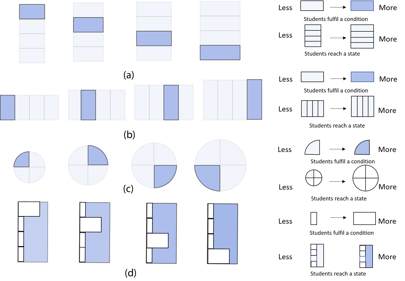
Condition Glyph. As shown in Fig. 6(a), condition glyph is designed to describe how a group of students fulfill the conditions at a certain step and stage. The glyph we designed consists of a block of vertically stacked rectangles. The number of rectangles in the block is determined by the number of conditions to be satisfied in order to solve the question, and each rectangle represents a specific condition. For example, question in Fig. QLens: Visual Analytics of Multi-step Problem-solving Behaviors for Improving Question Design(b) has six conditions(Fig. 2). The number of students who fulfilled the conditions is encoded using color. The dark shade in the rectangle indicates more number of students have fulfilled the condition, whereas a relatively lighter shade or no shade indicates fewer students or no student have satisfied the condition. The width of the glyph represents the number of students who have reached/dropped to that state (step, stage).
Glyph Alternatives. The condition glyph is designed and refined several times based on feedbacks/comments from the four experts. We came up three alternative designs in the process which were later rejected for different reasons. The first alternative design (Fig. 6(b)) is much similar to our final design except that the rectangles are horizontally stacked. However, this design was rejected because, the number of steps is larger than the number of conditions for all questions. Less information would be shown on one page if we use (b). The second alternative design (Fig. 6(c)) is adapted from the paper [48] to use a pie chart to show the condition distribution. Each sector represents a condition. Different from the work [48] that uses the angle to show the portion of different conditions, we use the color to show the number of students that fulfilled each condition to guarantee that the position of each condition is fixed to facilitate comparison among different glyphs. The area of the circle represents the number of students. This design was not adopted since we focus on the order of how students fulfill these conditions. For example, a large difference exists between students who start with the first condition and students who start with the last condition. As shown in Fig. 6(b), such differences cannot be reflected explicitly. The alternative design Fig. 6(d), uses the width of the bar to show the distribution and the color of the background to present the number of students in that block. The alternative design (d) is accurate in terms of comparing the number of students within a glyph. However, we abandoned this alternative, since it will be difficult to figure out the total number of conditions as well as the index of each condition from this alternative design, if no student fulfills two or more consecutive conditions.
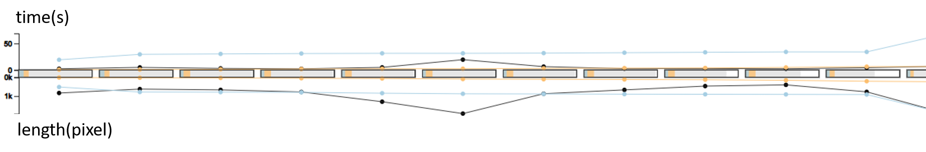
Engagement Chart. The engagement chart (Fig. 5) shows the efforts students pay on each step when solving the question. It consists of a dual-axis line chart (top and bottom). The upper line chart shows the average time spent in seconds on each step, and the lower line chart shows the trajectory length of the cursor in pixels in each step. The middle blocks between the two line charts indicate the total number of students who tried that particular question and the shaded portions in the -th block represents the number of students who have progressed from -th step to -th step. This contextual line chart helps users in understanding how much effort the students make or how much they engage in solving the question based on the time spent and the interactions. It also servers as part of task T4. When one or more subgroups are selected, a line with a different color is added to show the average time and interaction in each step of that particular group. In Fig. 5, the light blue line represents students fulfilling zero conditions and the orange line represents students fulfilling all the six conditions. We can see that students got zero score actually exert more efforts for each step.
Control Panel. The control panel, as shown in (Fig. QLens: Visual Analytics of Multi-step Problem-solving Behaviors for Improving Question Design(b1)), provides filter options to facilitate exploration. The leftmost filter enables question designers to select a single student and analyze his/her problem-solving path. The middle filter filters the transitions less than a certain number and makes the common path appealing. It also incorporates a navigation bar to provide question designer an overall impression of the length of total steps students take by highlighting the current page using a red rectangle.
5.2.3 Comparison View
The Comparison View, as shown in Fig. QLens: Visual Analytics of Multi-step Problem-solving Behaviors for Improving Question Design(c), aims to provide a summarized representation and comparison on how different groups of students’ approach a question presented to them. For example, differences in the order of fulfilling the conditions (problem-solving logic), efforts made (engagement) and difficulties encountered by different groups of students could be learned from this view.
Each group is represented as a column in the Comparison View, such as (Fig. QLens: Visual Analytics of Multi-step Problem-solving Behaviors for Improving Question Design(c1), (c2), and (c3)). Without any selection/filtering from the user, the Comparison View shows only the information of the whole group of students who tried the current question (Fig. QLens: Visual Analytics of Multi-step Problem-solving Behaviors for Improving Question Design(c1)). For each column, the bottom part has a bar chart representing the total number of students who attended the problem along with a box plot that indicates the distribution of the time spent on the problem. Above this part is a series of glyphs stacked vertically up from a lower stage to a higher stage, representing which conditions are satisfied by how many times on each stage. The unit of the condition glyph in Comparison View is “time(s)”, which is different from “student(s)” in the Transition View. Given that a student may hit a stage many times at different steps (as shown in the highlighted path in Fig. QLens: Visual Analytics of Multi-step Problem-solving Behaviors for Improving Question Design(b)), and if we only show the number of students who finally hit a stage, the procedure information is lost. Therefore, we summarized the conditions satisfied whenever the group of students hit a certain stage and a darker color represents more times students satisfy the condition, which is different from the transition view. The width of the glyph represents the number of times students reach a particular stage. In addition, box plots are presented between each stage and downward arrow on the right side of each glyph. The box plot represents the average transition time for that particular stage. The size of arrow mark on the side indicates the number of drops/stops on that stage (i.e. the times students dropped to a lower stage or stayed on that particular stage). For example, the larger the size of the arrow, the larger the number of drops/stops in that stage. This visual cue gives users an insight about which stage is most difficult for the students.
When the user makes a selection/filtering to compare two or more groups, the Comparison View shows cases with similar visualization portraying the information according to the selected group. Fig. QLens: Visual Analytics of Multi-step Problem-solving Behaviors for Improving Question Design(c2) and (c3) show the summarized information of students with zero mark (i.e students fulfilling zero condition, S0) and students with full mark (i.e students fulfilling all six conditions, S6). This view also incorporates a legend on the topmost part which aids the users to get a sense of the visual encoding used in the system.
6 Evaluation
We evaluate the usefulness and usability of our system through three case studies on real-word datasets (four questions) and interviews with three new domain experts. Their exploration processes generally follow a macro-meso-micro level of analysis while different users may have various tasks and focus, and may not necessarily use all the three analysis levels for one task.
6.1 Case Studies
We report three case studies that were observed by the two question designers (E3 and E6) during their exploration of our system. The background of the two question designers are introduced in Section 3.
Check the Gap between Design Intention and Behavior. In this case, we describe how our system can help question designers inspect students’ problem-solving behaviors and check whether students’ problem-solving logic matches the question designer’s design intention. The design intention referred here is reflected in the step-wise solution provided by the question designer. We will show two question examples found by the domain experts, where the student behaviors either match or deviate from the question designers’ design intention.

Example 1: The question in Fig. QLens: Visual Analytics of Multi-step Problem-solving Behaviors for Improving Question Design(a1) asks students to position the six digits in a way such that the result of its product is as large as possible. E3 thought students may first figure out putting the largest two numbers in the hundred digits and estimated that students may encounter difficulties when dealing with the tenth digits, which was inferred from the post-question solution as shown in Fig. 2(b). Then, E3 checked the Transition View (Fig. QLens: Visual Analytics of Multi-step Problem-solving Behaviors for Improving Question Design(b2)) to see whether students’ practical behaviors met their design intention. He noticed a thick line in the middle of the Sankey diagram as indicated by the orange arrow. This thick line shows that most students got stuck at Stage two and cannot move further to higher stages (i.e., fulfilling more conditions) even after making several steps. Further, by checking the condition glyphs on Stage two, E3 saw that the first and fourth rectangles have darker shade than other rectangles, which represents that these two conditions are fulfilled by more students than other conditions. Referring to the condition description in the top left corner of Fig. QLens: Visual Analytics of Multi-step Problem-solving Behaviors for Improving Question Design(b2), E3 confirmed that the students were clear that the first step is to position the largest numbers (5 and 6) to the hundredths place. He further checked the detailed information shown in the tooltip (Fig. 7) when hovering the cursor on each step of Stage two. E3 found that the most popular answers given by the students are as follows: , , , . It verifies that students were indeed confused in deciding the number for tenths place. In this case, we can safely conclude that the design intention is consistent with students’ problem-solving behaviours.
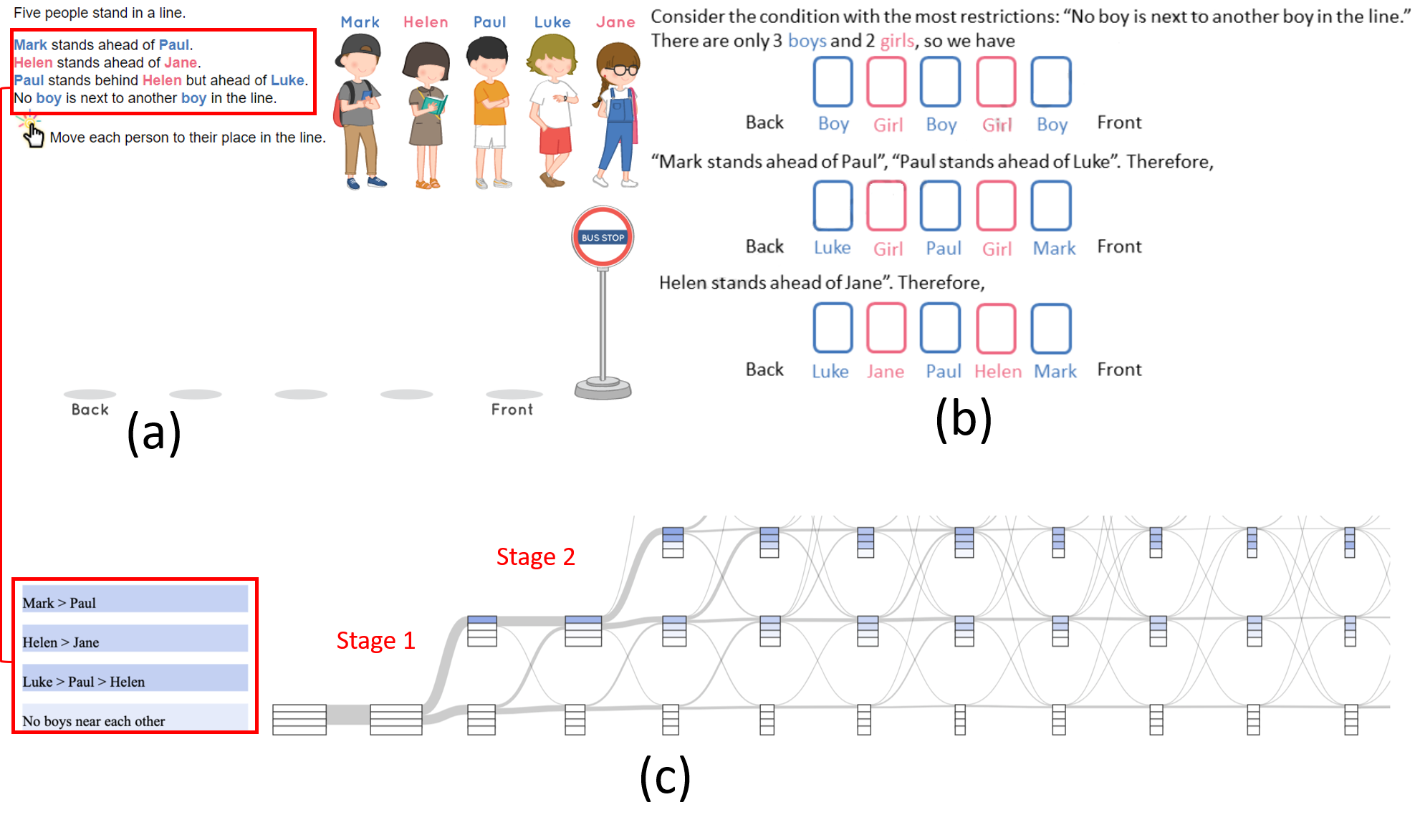
Example 2: The question in Fig. 8(a) requires students to position five different characters in a way such that it satisfies the four conditions described in the question:(1) Mark stands ahead of Paul; (2) Helen stands ahead of Jane; (3) Paul stands behind Helen but ahead of Luke; (4) No boy is next to another boy in the line. This question intends to cultivate students’ reverse thinking ability, which means that the students should start solving this problem by fulfilling the last condition first. This thinking logic can achieve a shortest path to solve the problem. Based on this, the provided solution is shown in Fig. 8(b). Then E3 inspected students’ problem-solving processes in the Transition View, as shown in Fig. 8(c) and checked whether students have this thinking style. The rectangles in the condition glyphs have the same order with conditions given in the question description as highlighted by the red rectangle. E3 found that all the condition glyphs on Stage one have a darker shade in the first rectangle. In addition, on Stage two, most glyphs have darker shades on the first three rectangles and white in the fourth rectangle. This indicates that all the students started solving the problem by fulfilling the first condition and none started from the last condition. This pattern implies that students may have difficulty coming up with the idea to start from the last condition and also find hard to follow the solution offered. Therefore, this example shows that the design intention, i.e., cultivating the reverse thinking ability, is not matched with students’ problem-solving behaviours.
Determine the Target Group. This case describes that question designers need to compare the problem-solving behaviors of different groups to determine the target group. According to the zone of proximal development (ZPD) principle in education [41], the question should be assigned to a group of students who can interact more with it and do not have major difficulties in solving it.
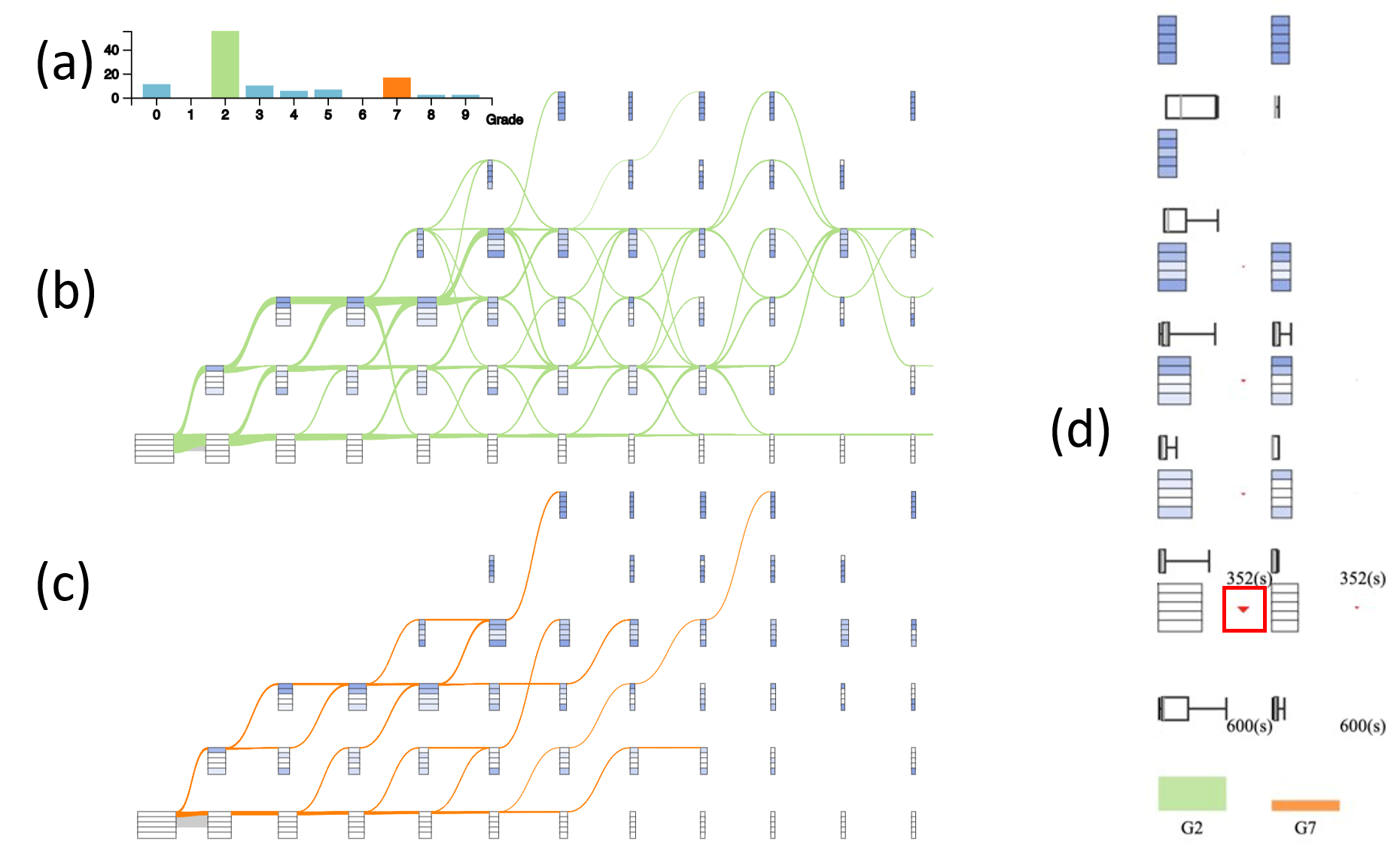
In this case, the other question designer, E4, analyzed a question that asks students to sort five numbers: in an ascending order. From the grade distribution chart (Fig. 9(a)), she found that students from Grade two and Grade seven have tried this problem more than students from other grades. Then, E4 compared the behavior of students from the two grades. In the Transition View of Grade two (Fig. 9(b)), we can see the green lines have lots of ups-and-downs, while the Transition View of students from Grade seven (Fig. 9(b)) have fewer steps and very few transition lines that go down (Fig. 9(c)). Further, E4 compared their problem-solving logic and engagement in detail in the Comparison View (Fig. 9(d)). She quickly noticed that there is an explicit red triangle beside the first stage of Grade two (highlighted with the red rectangle in Fig. 9(d)), which gives her a clue that it is not easy to progress for students from Grade two at the beginning. They check the color distributions of condition glpyhs for these two groups on each stage from the bottom to the top and find that Grade seven has no glyphs on Stage five. The reason is that some students in Grade seven made a step that fulfilled two of the several conditions required for solving the question. Thus, the Grade seven students directly jumped from Stage four to Stage six. Based on these observations, E4 believed that the question is difficult for students from Grade two than Grade Seven. However, she found the color distribution of students from Grade two and seven are generally similar, which means they fulfill conditions in a similar order. Based on above explorations and observations, E4 thought that this question can be assigned to a lower grade, such as Grade two, since they can follow the logic and are also engaged in the problem-solving process, while it would be too easy for students from Grade seven.
The question in Fig. 10(a) asks students to place the seven digits such that the upper number is twice as the bottom number. By referring to the solution in Fig. 10(b), the intention of this question is to fix the highest and lowest digits first and then fill the remaining positions. E4 first checked whether students from different grades can catch up with this thinking logic and how much effort they spent on each step. By inspecting the condition glyphs of Grade seven in Comparison View (Fig. 10(c)), E4 found that the first, fourth, fifth, and seventh rectangles become darker from the bottom to the top gradually. Particularly at Stage four, as highlighted by the red circle (Fig. 10(c)), students got these four conditions correct. This indicates that the students in Grade seven followed the design intention to fix the highest and lowest digits at first. However, no such pattern can be found in the condition glyphs of students from Grade two. By comparing the effort students paid on each step in Fig. 10(d), E4 noticed that the orange line (Grade seven) always has a larger value on each step than that of the green line (Grade two) and the green line approaches the x-axis with nearly zero values. This means that students from Grade seven took more time to think for each step while students from Grade two tried the question randomly with less thinking time. Based on these findings, E4 believed that this question may be too difficult for students of a lower grade (e.g., Grade two) since they could not catch up on the design intention.
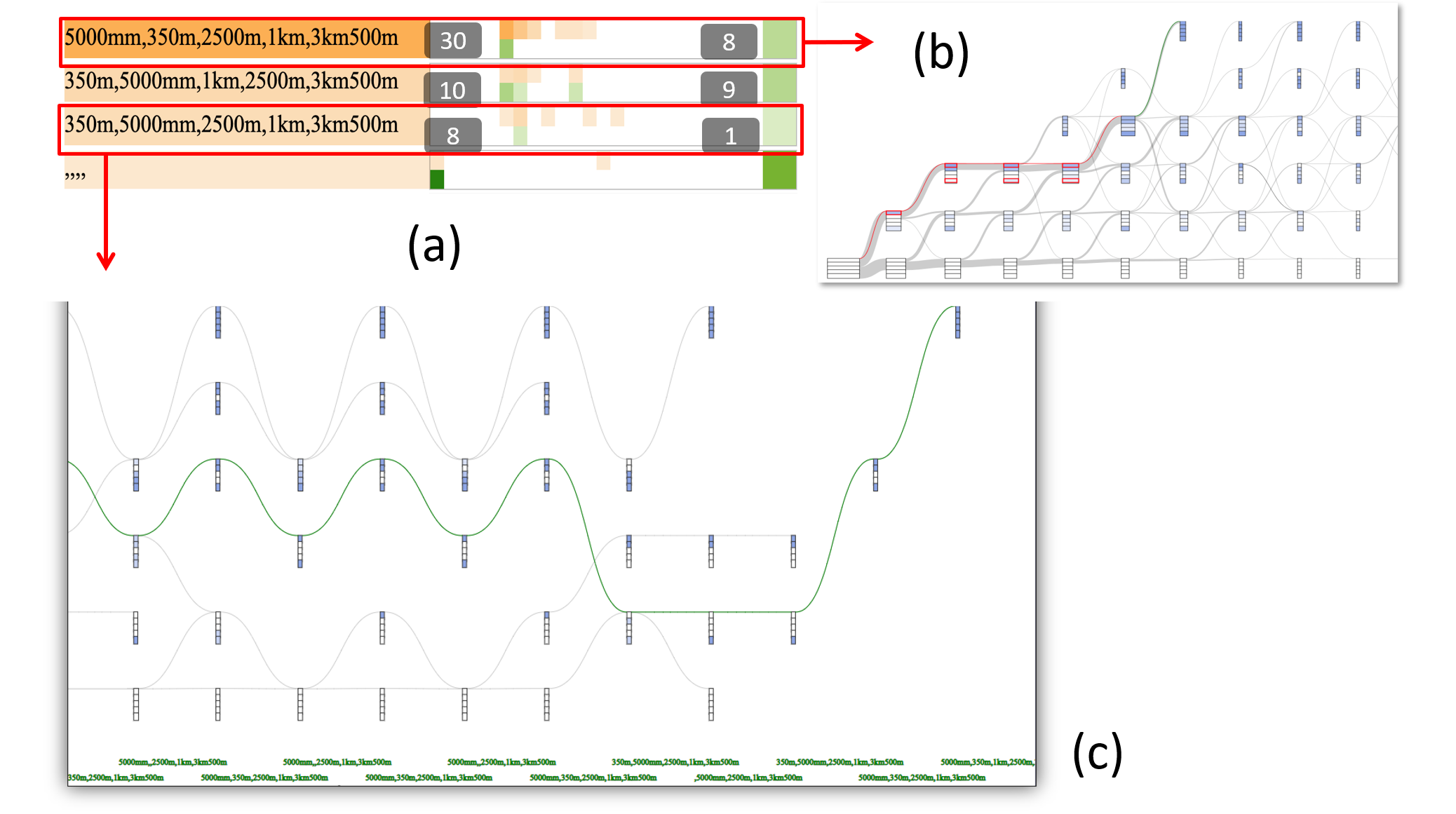
Evaluate the Feasibility of Data-driven Feedback. This case describes how question designers check whether existing data are sufficient to construct and provide data-driven feedback, which is the recommended solution path calculated in Section 4.3. E4 analyzed the same question as in the case “Determine the Target Group”, which asks students to sort five numbers: from the smallest to the largest. E4 first checked the common error panel to see the frequent incorrect answers in Fig. 11(a) and found the four most common errors. For each of the four errors, E4 checked how many students surpassed the incorrect answers and solved the question in the end. For the first error, 30 students have made mistakes and eight students got a full mark.
Then E4 inspected how this mistake was made and what was the data-driven feedback given by the system. By clicking on the first error, the result is shown in Fig. 11(b). The red path in the figure is the incorrect path of that error and the green path is the recommended path based on the existing data. E4 felt that the data-driven feedback for this error is of high quality and reasonable. From the shade of the green squares on the right-hand side, E4 found that not many students have passed the third error, which is indicated by a relatively lighter shade of the square when compared with other squares (Fig. 11(a)). By clicking on the third error, E4 noticed that the recommended path had a lot of ups and downs as shown in Fig. 11(c). The quality of this recommended path was not good and cannot be directly used as feedback for the students. Therefore, by using QLens, E4 concluded that current data is insufficient to provide data-driven feedback for all the errors and that some feedback needs to be crafted.
6.2 Expert Interviews
Apart from the cases derived together with the four experts during our iterative design process, we also interviewed another three domain experts (E5, E6, and E7), who are not the authors of this paper and have not seen QLens before the interviews, to further evaluate the effectiveness and usability of QLens. E5 and E6 work in the question design team of an online education company that offers interactive online math questions for primary and secondary school students. E7 works as a senior manager in a popular education company that provides practice questions of all kinds of subjects for K-12 (Grade one to Grade 12) students. E7 is responsible for professional events, such as developing a website for an exam, and also recruitment. The experts are introduced to our system for the first time.. We conducted semi-structured interviews with the experts.
Procedure Each interview had three sections which altogether lasted for 90 minutes. First, we introduced the system and explained various aspects including the purpose of the system, the data we used, the visualization views available and its functionalities, the visual encoding used in different panels through several examples. Then, we show three cases (as introduced in the case studies) to the experts to explain the usability and interactivity of the system and also asked their comments on each case. Third, we invited the experts to spend some time exploring the system and getting themselves familiar with the system. After the exploration part, we ask them several questions regarding visual design, interactive functionality and the overall usability for enhancing the system. We summed up our observations along with the expert’s feedback as follows.
System Usefulness On a comprehensive note, all the three experts commented that QLens is useful.The experts mentioned that the Overview gives them basic knowledge about the question, diversity of the students who attempted it and the difficulty level of the question which can be assessed from the score distribution. This part helped them quickly gain an understanding of the question. All the experts stated that the Transition View is novel and interesting and intuitively conveys the information about the students’ problem-solving logic and engagement by representing the trajectory data in various steps and stages. E5 mentioned that the Transition View helps him identify the inconsistency in their design intention and students’ current practices and is useful for refining the question to guide students to think in the way question designers intended. In terms of the Comparison View, E5 stated that comparing the problem-solving logic of students from different grades can help the question designers to assign the different questions for students from the appropriate grade. E6 explicitly mentioned that, “The insights from Transition View will be very useful for the question designer (for example to decide which question is more suitable for which grade students) and the system developer.” E7 added that “As more and more learning activities conducted are online, it was also very useful to compare students from different schools (e.g., international and local ones) or regions”. E7 stated that despite the types of questions used in the system are different, our method to summarise the mouse trajectories in steps and stages is very meaningful.
E5 and E6 acknowledged the use of the data-driven method for on-the-fly recommendation guidance for the students. E5 expressed that in the future they would like to incorporate hints to their e-Learning platform in order to help students solve difficult problems. They said the common errors and other summarized related information can help them focus on certain errors. E5 mentioned, “It would be nice if I can edit the data-driven feedback in the interface when the automatic one is not good.” E7 said that it would be helpful for him to give guidance to interviewees in the technical interviews. He also pointed out a challenge that collecting data might be difficult if the educational platform is accessed using mobile apps.
Visual Designs and Interactions After the experts have spent a considerable amount of time in exploring different functionalities of the system, we collected their feedback on the visual design of the system. Overall, all the experts were satisfied and comfortable in understanding various visual cues and encoding of the system. They also felt that the designs were intuitive. E7 said, “it is so clear to view the problem-solving process using the visualization like this (Transition View).” In terms of the interactions, all the experts appreciated the interactions supported by the system. E5 and E6 praised the smooth interactions to inspect data form different questions, groups, and a particular student. Further, E7 suggested that though the common error panel seems very useful and intuitive, it can be improved in a way that might help a layman understand its functionality (like adding a tooltip). He stated that, "Visualizations like the common error panel may not be self-explainable, so adding tooltips in the Transition View about its functionality and visual encoding can help users understand its usage."
7 Discussion
Limitation Our evaluation demonstrates the effectiveness of QLens. Nevertheless, there is still space for improvement. (1) Scalability: The number of steps of some problems is larger than 12, which means the whole transition graph cannot be displayed on one page. To mitigate this issue, we add a navigation bar showing the thumbnail image on top of the transition view to achieve focus + context analysis [10]. The number of conditions in most questions is less than 10, while if the number of conditions in other application scenarios is more than 15 then the height of one condition rectangle would be small and not easy to observe. (2) Data issue: first, as mobile learning is becoming popular recently, the touch-screen data should also be considered for analysis. We can replace the mouse movement data with the touch-screen data by modifying the trajectory length attribute. Second, the mouse movement data sometimes cannot be converted into the sequence of intermediate answers if the graphical components are overlapped. Additional information is needed for the data conversion, for example, the id of the web component clicked. Third, an underlying assumption of QLens is that most students’ mouse interactions should reflect their overall thinking logic in their problem-solving process. However, whether all these mouse interactions accurately reflect all the students’ thinking logic needs further research, which, however, is beyond the scope of this paper. Generalization QLens is designed for analyzing the problem-solving behaviors of multi-step questions. But its applications are not limited to the online education domain and can also be extended to other application scenarios that involve dense mouse interactions. For example, when playing video games, different players may have different actions at the same time and game designers need to analyze the common strategies that players will employ or the common difficulties that players are facing in various stages to evaluate the game designs. QLens can be easily extended to facilitate an insightful behavior analysis of video game players. Also, QLens can be applied in analyzing the product-browsing behaviors of customers in online shopping platforms (e.g., Amazon, Taobao). By quickly exploring the detailed mouse interactions of customers, data analysts can gain deep insights into customers’ online shopping behaviors and design better product recommendation algorithms.
8 Conclusion and Future Work
In this paper, we proposed QLens, a visual analytics system that assists question designers in exploring students’ step-wise problem-solving behaviors in terms of their problem-solving logic, engagement, and also difficulties encountered. The system integrates a novel glyph-embeded Sankey diagram to facilitate the analysis with multiple coordinated views (Overview, Transition View, and Comparison View). The insights learned from the exploring process further guided question designers to improve the design of the question. In future work, we plan to extend this system to an authoring tool for question designers to directly edit the question designs and also derive more intuitive visual designs to provide students with on-the-fly guidance.
Acknowledgements.
This research is partially supported by Theme-based Research Scheme of the Hong Kong RGC under grant T44-707/16-N. We would like to thank our industry sponsor, Trumptech (Hong Kong) Ltd, for providing with the data and the research platform.References
- [1] Learnlex. https://mad.learnlex.com/, 2019. Accessed: 2020-4-18.
- [2] Leetcode. https://leetcode.com/, 2019. Accessed: 2020-3-18.
- [3] Simstudent. https://hcii.cmu.edu/research/simstudent, 2019. Accessed: 2020-3-18.
- [4] A. Abate, A. D’Innocenzo, M. D. Di Benedetto, and S. S. Sastry. Markov set-chains as abstractions of stochastic hybrid systems. In International Workshop on Hybrid Systems: Computation and Control, pp. 1–15. Springer, 2008.
- [5] W. Aigner, S. Miksch, H. Schumann, and C. Tominski. Visualization of time-oriented data. Springer Science & Business Media, 2011.
- [6] D. Albers, C. Dewey, and M. Gleicher. Sequence surveyor: Leveraging overview for scalable genomic alignment visualization. IEEE Transactions on Visualization and Computer Graphics, 17(12):2392–2401, 2011.
- [7] E. Andersen, Y.-E. Liu, E. Apter, F. Boucher-Genesse, and Z. Popović. Gameplay analysis through state projection. In Proceedings of the fifth International Conference on the Foundations of Digital Games, pp. 1–8, 2010.
- [8] B. Bach, P. Dragicevic, D. Archambault, C. Hurter, and S. Carpendale. A review of temporal data visualizations based on space-time cube operations. In Eurographics conference on visualization, 2014.
- [9] M. Berland, T. Martin, T. Benton, C. Petrick Smith, and D. Davis. Using learning analytics to understand the learning pathways of novice programmers. Journal of the Learning Sciences, 22(4):564–599, 2013.
- [10] S. Bjork and J. Redstrom. Redefining the focus and context of focus+ context visualization. In IEEE Symposium on Information Visualization 2000. INFOVIS 2000. Proceedings, pp. 85–89. IEEE, 2000.
- [11] M. Burch, F. Beck, and S. Diehl. Timeline trees: visualizing sequences of transactions in information hierarchies. In Proceedings of the working conference on Advanced visual interfaces, pp. 75–82, 2008.
- [12] B. C. Cappers and J. J. van Wijk. Exploring multivariate event sequences using rules, aggregations, and selections. IEEE Transactions on Visualization and Computer Graphics, 24(1):532–541, 2017.
- [13] H. Cen, K. Koedinger, and B. Junker. Learning factors analysis–a general method for cognitive model evaluation and improvement. In International Conference on Intelligent Tutoring Systems, pp. 164–175. Springer, 2006.
- [14] Y. Chen, P. Xu, and L. Ren. Sequence synopsis: Optimize visual summary of temporal event data. IEEE transactions on visualization and computer graphics, 24(1):45–55, 2017.
- [15] A. T. Corbett and J. R. Anderson. Knowledge tracing: Modeling the acquisition of procedural knowledge. User modeling and user-adapted interaction, 4(4):253–278, 1994.
- [16] P. Dragicevic and S. Huot. Spiraclock: a continuous and non-intrusive display for upcoming events. In CHI’02 extended abstracts on Human factors in computer systems, pp. 604–605. ACM Press, 2002.
- [17] F. Du, C. Plaisant, N. Spring, and B. Shneiderman. Eventaction: Visual analytics for temporal event sequence recommendation. In 2016 IEEE Conference on Visual Analytics Science and Technology (VAST), pp. 61–70. IEEE, 2016.
- [18] F. Fischer, J. Fuchs, and F. Mansmann. Clockmap: Enhancing circular treemaps with temporal glyphs for time-series data. Proc. EuroVis Short Papers, Eurographics, pp. 97–101, 2012.
- [19] E. L. Glassman, N. Gulley, and R. C. Miller. Toward facilitating assistance to students attempting engineering design problems. In Proceedings of the ninth annual international ACM conference on International computing education research, pp. 41–46, 2013.
- [20] E. L. Glassman, A. Lin, C. J. Cai, and R. C. Miller. Learnersourcing personalized hints. In Proceedings of the 19th ACM Conference on Computer-Supported Cooperative Work & Social Computing, pp. 1626–1636, 2016.
- [21] B. Green. Canny edge detection tutorial. Retrieved: March, 6:2005, 2002.
- [22] S. Guo, Z. Jin, D. Gotz, F. Du, H. Zha, and N. Cao. Visual progression analysis of event sequence data. IEEE transactions on visualization and computer graphics, 2018.
- [23] S. Guo, K. Xu, R. Zhao, D. Gotz, H. Zha, and N. Cao. Eventthread: Visual summarization and stage analysis of event sequence data. IEEE transactions on visualization and computer graphics, 24(1):56–65, 2017.
- [24] Y. Guo, S. Guo, Z. Jin, S. Kaul, D. Gotz, and N. Cao. Survey on visual analysis of event sequence data. arXiv preprint arXiv:2006.14291, 2020.
- [25] R. Hosseini, A. Vihavainen, and P. Brusilovsky. Exploring problem solving paths in a java programming course. 2014.
- [26] M. Krstajic, E. Bertini, and D. Keim. Cloudlines: Compact display of event episodes in multiple time-series. IEEE Transactions on Visualization and Computer Graphics, 17(12):2432–2439, 2011.
- [27] M. Kultys, L. Nicholas, R. Schwarz, N. Goldman, and J. King. Sequence bundles: a novel method for visualising, discovering and exploring sequence motifs. In BMC proceedings, vol. 8, p. S8. Springer, 2014.
- [28] H. Li, H. Wei, Y. Wang, Y. Song, and H. Qu. Peer-inspired student performance prediction in interactive online question pools with graph neural network. arXiv preprint arXiv:2008.01613, 2020.
- [29] R. Liu and K. Koedinger. Going beyond better data prediction to create explanatory models of educational data. The Handbook of Learning Analytics, pp. 69–76, 2017.
- [30] Y.-E. Liu, E. Andersen, R. Snider, S. Cooper, and Z. Popović. Feature-based projections for effective playtrace analysis. In Proceedings of the 6th international conference on foundations of digital games, pp. 69–76, 2011.
- [31] Y. Long, K. Holstein, and V. Aleven. What exactly do students learn when they practice equation solving? refining knowledge components with the additive factors model. In Proceedings of the 8th International Conference on Learning Analytics and Knowledge, pp. 399–408, 2018.
- [32] S. Malik, F. Du, M. Monroe, E. Onukwugha, C. Plaisant, and B. Shneiderman. Cohort comparison of event sequences with balanced integration of visual analytics and statistics. In Proceedings of the 20th International Conference on Intelligent User Interfaces, pp. 38–49, 2015.
- [33] M. Monroe, R. Lan, H. Lee, C. Plaisant, and B. Shneiderman. Temporal event sequence simplification. IEEE transactions on visualization and computer graphics, 19(12):2227–2236, 2013.
- [34] H. Nguyen, E. Harpstead, Y. Wang, and B. M. McLaren. Student agency and game-based learning: A study comparing low and high agency. In International Conference on Artificial Intelligence in Education, pp. 338–351. Springer, 2018.
- [35] P. I. Pavlik Jr, H. Cen, and K. R. Koedinger. Performance factors analysis–a new alternative to knowledge tracing. Online Submission, 2009.
- [36] C. Piech, M. Sahami, J. Huang, and L. Guibas. Autonomously generating hints by inferring problem solving policies. In Proceedings of the second (2015) acm conference on learning@ scale, pp. 195–204, 2015.
- [37] C. Piech, M. Sahami, D. Koller, S. Cooper, and P. Blikstein. Modeling how students learn to program. In Proceedings of the 43rd ACM technical symposium on Computer Science Education, pp. 153–160, 2012.
- [38] R. Sakai and J. Aerts. Sequence diversity diagram for comparative analysis of multiple sequence alignments. In BMC proceedings, vol. 8, p. S9. Springer, 2014.
- [39] K. Vanlehn. The behavior of tutoring systems. International journal of artificial intelligence in education, 16(3):227–265, 2006.
- [40] K. VanLehn. Regulative loops, step loops and task loops. International Journal of Artificial Intelligence in Education, 26(1):107–112, 2016.
- [41] N. Veresov. Zone of proximal development (zpd): the hidden dimension? development, pp. 42–48, 2004.
- [42] G. Wallner and S. Kriglstein. A spatiotemporal visualization approach for the analysis of gameplay data. In Proceedings of the SIGCHI Conference on Human Factors in Computing Systems, pp. 1115–1124, 2012.
- [43] T. D. Wang, C. Plaisant, A. J. Quinn, R. Stanchak, S. Murphy, and B. Shneiderman. Aligning temporal data by sentinel events: discovering patterns in electronic health records. In Proceedings of the SIGCHI Conference on Human Factors in Computing Systems, pp. 457–466, 2008.
- [44] Y. Wang, W. M. White, and E. Andersen. Pathviewer: Visualizing pathways through student data. In Proceedings of the 2017 CHI Conference on Human Factors in Computing Systems, pp. 960–964, 2017.
- [45] H. Wei, H. Li, M. Xia, Y. Wang, and H. Qu. Predicting student performance in interactive online question pools using mouse interaction features. arXiv preprint arXiv:2001.03012, 2020.
- [46] K. Wongsuphasawat, C. Plaisant, M. Taieb-Maimon, and B. Shneiderman. Querying event sequences by exact match or similarity search: Design and empirical evaluation. Interacting with computers, 24(2):55–68, 2012.
- [47] K. Wongsuphasawat and B. Shneiderman. Finding comparable temporal categorical records: A similarity measure with an interactive visualization. In 2009 IEEE Symposium on Visual Analytics Science and Technology, pp. 27–34. IEEE, 2009.
- [48] Y. Wu, N. Pitipornvivat, J. Zhao, S. Yang, G. Huang, and H. Qu. egoslider: Visual analysis of egocentric network evolution. IEEE Transactions on Visualization and Computer Graphics, 22(1):260–269, 2015.
- [49] M. Xia, M. Sun, H. Wei, Q. Chen, Y. Wang, L. Shi, H. Qu, and X. Ma. Peerlens: Peer-inspired interactive learning path planning in online question pool. In Proceedings of the 2019 CHI Conference on Human Factors in Computing Systems, pp. 1–12, 2019.
- [50] M. Xia, H. Wei, M. Xu, L. Y. H. Lo, Y. Wang, R. Zhang, and H. Qu. Visual analytics of student learning behaviors on k-12 mathematics e-learning platforms. arXiv preprint arXiv:1909.04749, 2019.
- [51] J. Zhao, Z. Liu, M. Dontcheva, A. Hertzmann, and A. Wilson. Matrixwave: Visual comparison of event sequence data. In Proceedings of the 33rd Annual ACM Conference on Human Factors in Computing Systems, pp. 259–268, 2015.