Burning sage: Reversing the curse of dimensionality in the visualization of high-dimensional data
Abstract
In high-dimensional data analysis the curse of dimensionality reasons that points tend to be far away from the center of the distribution and on the edge of high-dimensional space. Contrary to this, is that projected data tends to clump at the center. This gives a sense that any structure near the center of the projection is obscured, whether this is true or not. A transformation to reverse the curse, is defined in this paper, which uses radial transformations on the projected data. It is integrated seamlessly into the grand tour algorithm, and we have called it a burning sage tour, to indicate that it reverses the curse. The work is implemented into the tourr package in R. Several case studies are included that show how the sage visualizations enhance exploratory clustering and classification problems.
keywords:
data visualisation; grand tour; statistical computing; statistical graphics; multivariate data; dynamic graphics; data science; machine learning1 Introduction
The term “curse of dimensionality” was originally introduced by Bellman (1961), to express the difficulty of doing optimization in high dimensions because of the exponential growth in space as dimension increases. A way to think about it is, that the volume of the space grows exponentially with dimension, which makes it infeasible to sample enough points – any sample will be less densely covering the space as dimension increases. The effect is that most points will be far from the sample mean, on the edge of the sample space. Hall, Marron, and Neeman (2005) have shown that in the extreme case of high-dimension, low-sample size data, observations are on the vertices of a simplex.
This affects many aspects of data analysis: minimizing the error during model fitting relies on effective optimization techniques, non-parametric modeling requires finding nearest neighbors which may be far away and sampling from high-dimensional distributions is likely to have points far from the population mean. Donoho (2000) considers the curse of dimensionality as a blessing, because the sparsity can be leveraged for computational efficiency. This is used in regularization methods, like lasso, to penalize model complexity. The penalty term results in shrinking (some of) the parameter estimates towards zero.
Paradoxically, the curse of dimensionality inverts for dimension reduction, resulting in an excessive amount of observations near the center of the distribution. This affects visualizations made on low-dimensional projections, like the tour (Asimov 1985, Buja et al. (2005)). The effect is described by Diaconis and Freedman (1984), that most low-dimensional linear projections are approximately Gaussian, with observations concentrating in the center. This has motivated the development of indexes for projection pursuit which search for departure from normality. It is also related to what is called “data piling” in high-dimension low-sample size data (Marron, Todd, and Ahn 2007, Ahn and Marron (2010)): all observations can collapse into a single point. These issues also persist with non-linear dimension reduction techniques, and are often referred to as the “crowding problem”, which methods like t-Distributed Stochastic Neighbor Embedding (t-SNE) (van der Maaten and Hinton 2008) aim to alleviate. Figure 1 illustrates the crowding problem. Two-dimensional linear projections of points sampled uniformly within -dimensional hyperspheres () are displayed as hexbin plots. Color indicates log count of the bin, with yellow mapping the highest counts. As increases the density concentrates in the center of the projection.

In this work we address data crowding in low-dimensional linear projections by providing a reverse transformation for tour methods. Tours show interpolated sequences of low-dimensional projections of the data. When exploring data with a tour we can discover features that are only visible in linear combinations of variables. However, the data crowding could hide these features. To reverse the effect, we introduce a radial transformation that magnifies the center of the distribution. This is called a burning sage tour, to reflect that the crowding caused by the curse of dimensionality is being removed.
The paper is structured as follows. The radial transformation and its implementation is described in Section 2. Section 3 illustrates the use of the sage tour with examples in clustering, supervised classification and a classical needle-in-the-haystack problem. Section 4 describes possible extensions to the method.
2 Burning sage algorithm
To understand why points tend to be away from the center in the high-dimensional space, but crowd the center in low-dimensional projections, it is helpful to consider the projected volume relative to high-dimensional volume. To avoid edge effects and to impose rotation invariance, we will start from the data being uniformly distributed in a hypersphere, i.e. all data points are within a specified distance from the center. This makes calculations more tractable than assuming a uniform distribution in hypercube (box).
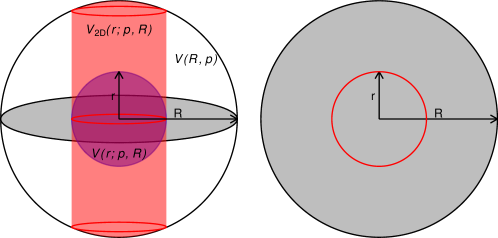
Figure 2 illustrates the comparison to be made, using something we can easily picture, a 3D sphere. Projecting the data from within a 3D sphere to 2D (grey disk) will result in mass being condensed into the disk. Imagine comparing the volume of a cylinder at different locations in the disk. A centered cylinder has more volume. This is exaggerated as increases: the centered cylinder has much more volume than any other cylinder.
To reverse this effect, we introduce a radial transformation that redistributes the projected points, such that equal volume in the original (-dimensional) space is projected onto equal area in a 2-dimensional projection. Note that this can be generalized for -dimensional projections by mapping onto equal -dimensional volume instead.
2.1 Definition of the relative projected volume
To understand how the -dimensional volume is projected onto a -dimensional plane, we study what fraction of the total volume is projected onto the area of a disk depending on its radius. This dependence was described in Laa et al. (2020). We start from a -dimensional hypersphere, with radius and volume , and its projected volume onto a centered -dimensional disk of radius , , where can be any radius within . The relative projected volume is then given as the ratio of these two quantities,
| (1) |
This ratio is of particular interest because it gives the 2-dimensional radial cumulative distribution function (CDF) of points when assuming a uniform distribution within the -dimensional hypersphere.
We can compare to the relative volume within a radius in the original -dimensional hypersphere,
| (2) |
Figure 3 compares these two quantities (Eq. 1 and 2), for . On the left is and on the right is . The function shapes change in opposite directions as increases: peaks earlier and gets flatter. This is the paradox of the curse of dimensionality in that projected volume at the center increases with .

2.2 Calculating the radial transformation
The aim of the algorithm is to redistribute the projected volume such that equal relative areas on the disk, as given by , contain equal relative projected volume, given by . This is achieved through a transformation of the projected radius that can be defined for any , and is applied to the projected data points in the plane, . We work with polar coordinates and represent the data points as . The angular component is uniform for this distribution, by the rotation invariance of the sphere, and thus does not need to be transformed. The radial component is transformed in two steps.
The first transformation is to replace with . Since this is the radial CDF of the assumed underlying distribution, we expect that is approximately uniformly distributed in radius. We then transform using the inverse of , to go from a uniform distribution in radius to a uniform distribution in area of the disk. This inverse is defined via
| (3) |
and thus
| (4) |
The full radial transformation is therefore given by
| (5) |
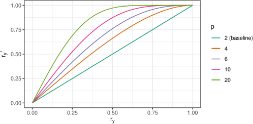
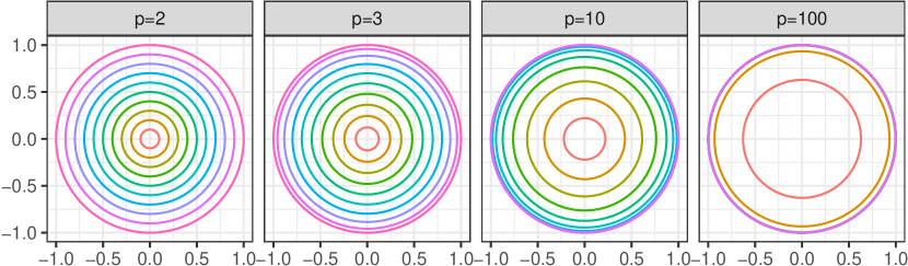
The relation between and depends on the number of dimensions , and is illustrated for selected values in Figure 4. We see that the transformation is approximately linear near the center. As increases it becomes non-linear faster, and for , for example, the points with radius will already be highly distorted and pushed out towards the last eighth in . Figure 5 demonstrates this for different values of by showing equidistant circles for which the radius has been transformed according to Eq. 5.
2.3 Trimming and tuning
The transformation in Eq. 5 is fixed for a given input dataset, by evaluating the number of dimensions and the maximum distance from the center . However, in practice we may wish to trim the projected data or tune the transformation. A combination of both adjustments can be used to further zoom in on the center of the distribution, or alternatively, to soften the transformation.
2.3.1 Trimming
The overall scale of the transformation is determined by . In the case of an approximately spherical and uniform distribution the maximum distance from the center works well and ensures the validity of the rescaling in Eq. 5. But this is not robust and might result in a much larger scale than desired, especially when it is determined by outlying observations.
We therefore allow trimming of the projected observations, using as a free parameter of the display function. When selecting a value that is smaller than the maximum distance from the center, we need to ensure that the projected radius of points is always smaller than , by trimming as
| (6) |
for each observation.
2.3.2 Tuning
The dimension of the input might not reflect the intrinsic dimensionality of the dataset. This could be the case when dimension reduction was used prior to visualization, e.g. displaying only the first few principal components. In this case the effective dimensionality is likely between the original number of dimensions and the selected number of principal components. We can think of omitted components as being in the orthogonal space of all considered projections, with some directions being pure noise, while others may still carry relevant information.
We allow tuning by selecting the scaling parameter . By default, and . When the rescaling will be softer, and results in more aggressive rescaling than suggested by alone. Note that when we actually invert the behavior and shift the focus away from the center, in general this is not recommended.
2.4 Implementation as a dynamic display
While the radial transformation can in general be used with any low-dimensional display that suffers from data crowding, it is most useful when combined with a dynamic display showing a sequence of interpolated low-dimensional projections obtained when running a tour. We have implemented it as a new display method called display_sage in the tourr package (Wickham et al. 2011) in R (R Core Team 2020).
We can think of the display functions as part of a data pipeline obtained when running a tour. The initial step is pre-processing the data, given by , an matrix containing observations in dimensions. Typically, this includes centering and scaling, using either the overall range or the variance. Ensuring a common scale of all variables, comparable to the selected scale parameter , is especially important with the new display. The tour then iterates over the following steps:
-
1.
Obtain projection matrix . For -dimensional projections this is an orthonormal matrix. To ensure the smooth rotation of projections, each new is obtained as an interpolated step in the sequence, as explained in Buja et al. (2005).
-
2.
Project the data by computing .
-
3.
Map to the display to re-draw the projected data. For this typically maps the projected points onto a scatter plot display. With the new display we first transform as:
-
•
Center the 2-dimensional matrix and compute its polar coordinate representation .
- •
-
•
Use the transformed radial coordinate to re-compute the mapping onto Euclidean coordinates .
-
•
-
4.
To fit the final projection onto the plotting canvas ranging between , we rescale each mapped observation using a scaling parameter .
The display can be added when calling the animate function in tourr, as
tourr::animate(
data,
tour_path = tourr::grand_tour(),
display = display_sage(gam, R, half_range)
)
and uses gam to set the parameter for computing , and the overall range R used for trimming. Both these parameters are described in Section 2.3 above. Finally, half_range sets the scale parameter to adjust the scale to the drawing canvas. The ratio sets the scale for fitting the displayed data on the plotting canvas, by default and we apply the scaling factor to contain the projected points within the display. When adjusting the user should take care to adjust accordingly.
3 Applications
To illustrate the benefit of using the reverse transformation for examining data using a tour, four applications are shown: clustering of single cell RNA-seq, classifying hand-sketched images, comparing physics experiments, and the classical pollen data. The pollen data example is used to illustrate the effect of parameter choices in the sage tour.
3.1 Clustering single-cell RNA-seq data sets
In the analysis of single cell RNA-seq data, cluster analysis is performed to detect cell types and characterize the expression of genes that define those cell types, and the relative orientation of the cell types to each other (trajectory analysis) (Amezquita et al. 2020). Generally, for cluster verification, analysts use embedding methods like t-SNE to verify the placement and meaning of clusters from a clustering algorithm. An alternative is to use a tour on a small number of principal components to examine the clusters relative to gene expression.
Here we compare the sage display and regular tour display on mouse retinal single cell RNA-seq data from Macosko et al. (2015). The raw data consists of a 49,300 cells and was downloaded using the using the scRNAseq Bioconductor package (Risso and Cole 2019). We use a standard workflow for pre-processing and normalizing this data (described by Amezquita et al. (2020)): quality control was performed using the scater package (McCarthy et al. 2017) and scran (Lun, McCarthy, and Marioni 2016) was used to transform and normalize the expression values and select highly variable genes (HVGs). The top ten percent of the most HVGs were used as features to subset the normalized expression matrix and compute the principal components. Using the first 25 PCs we built a shared nearest neighbors graph (with ) and clustered this graph using Louvain clustering, resulting in 11 clusters being formed (Blondel et al. 2008).
A tour is run on the first five PCs (approximately 20% of the variance in expression), on a weighted subsample of cells based on their cluster membership - 4,590 cells. For the sage display, we set , fixing the effective dimensionality of the data to . The PCs are scaled to have zero mean and unit variance. Here we focus on comparing three of the clusters. In the PC plots they look very similar, begging the question whether they should be considered to be separate groups. Figure 6 shows selected frames from a default tour (top row) and the sage tour (bottom row). The columns show the same projection, with the difference being that the sage transformation is applied in the sage tour projections. The full animations are available in the supplementary material. The static plots serve to illustrate the main points, but we encourage the reader to look at the tour animations to fully appreciate the advantage of the sage display.
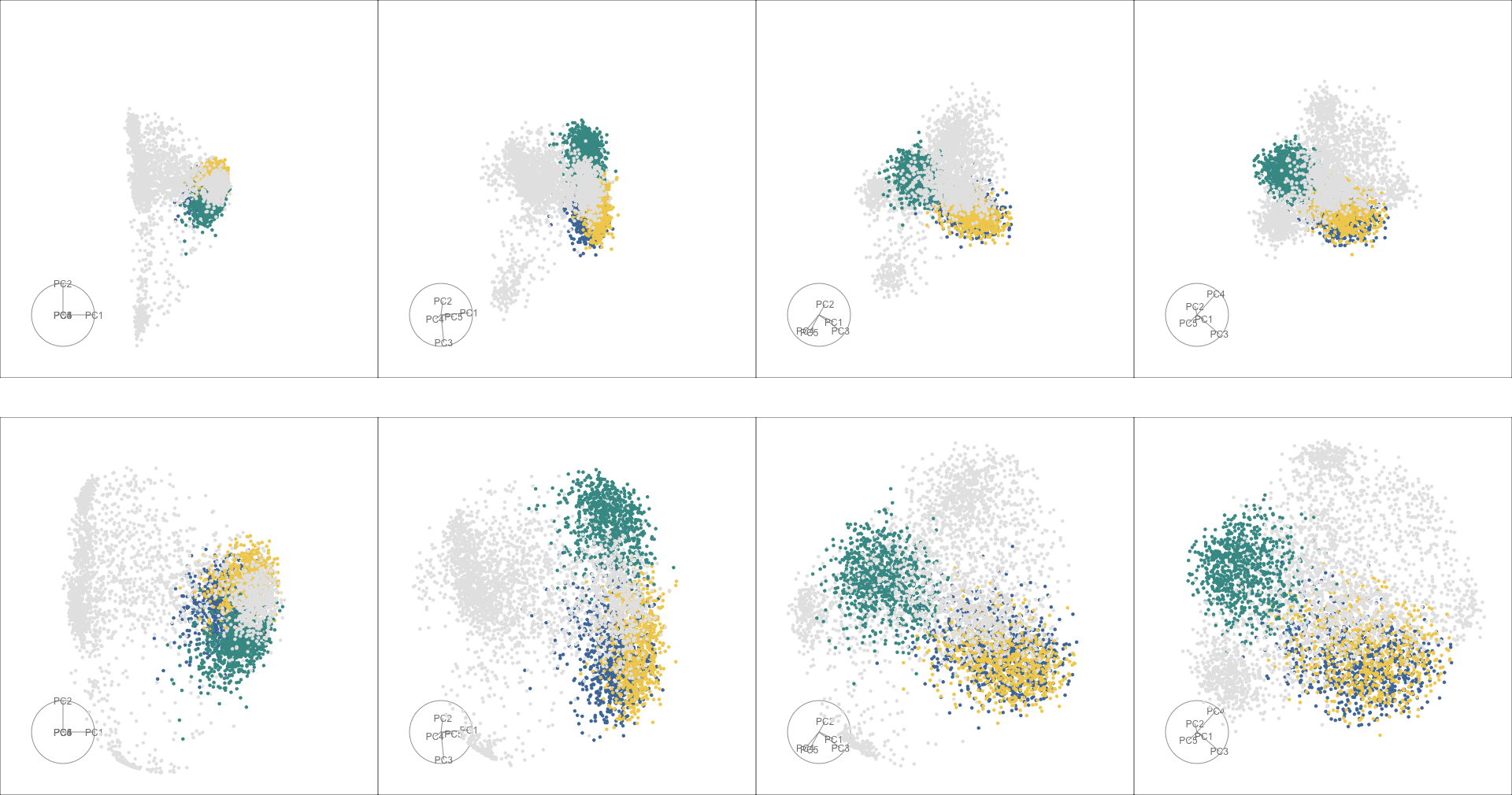
Using the default tour display (Figure 6, top), the three clusters (dark green, blue, and yellow) are obscured by points in other clusters as we move through the frames of the animation. The points in the dark green cluster are overlapping those found in the yellow and blue clusters; and it is difficult to see if there is any separation between the blue and yellow clusters. In contrast, the sage display (Figure 6, bottom), expands the center of projection, and results in the differences between the three clusters being more visible. Particularly, the relative positions of the yellow and blue clusters are easier to see. While these clusters are distinct from the dark green cluster, in most frames they are still overlapping and mixed together, providing evidence that it may be appropriate to consider them a single cluster. Conversely, it can be seen that the dark green cluster is distinctly separated from the other two in some projections. The sage tour makes these comparisons a little easier.
3.2 Classifying hand-sketches
We next use the new display to look at different distributions of images from the Google QuickDraw collection (Google, Inc 2020). These are pixel grey scale data that are available publicly. In this example, we sample 1000 images from three types of sketches (banana, cactus, crab) and see if we can separate the classes in the high-dimensional parameter space.
We reduce the dimensionality from 784 variables to the first 5 PCs, which captures approximately 20 per cent of the variation of the data. Before applying the tour we rescale each component to have mean zero and unit variance. To account for the dimension reduction before visualization we set for the sage display.
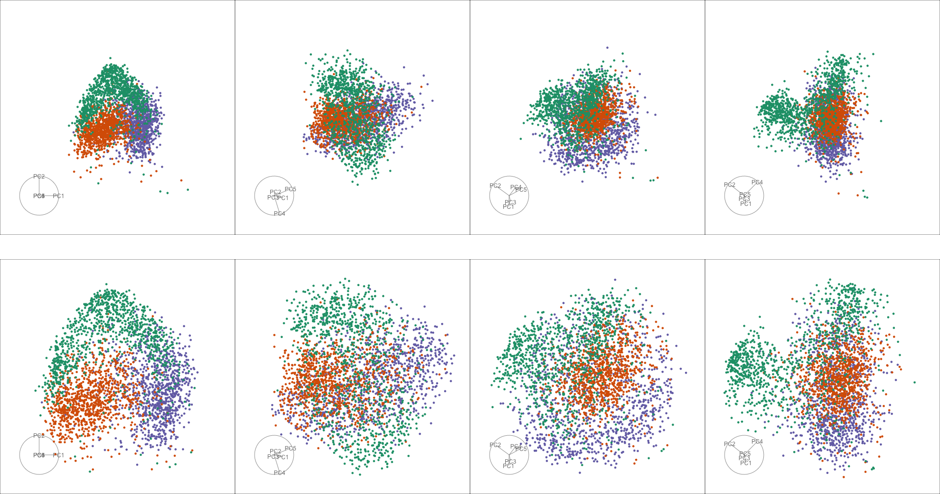
Figure 7 shows the grand tour on the PCs, where green points correspond to the banana class, orange points represent the cactus class and purple points are the crab class. In the selected frames of both displays points belonging to the cactus class are concentrated near the center, however on the default display (Figure 7, top) there is overplotting: points from other classes overlap those in the cactus class. The sage display (Figure 7, bottom) helps reduce overplotting, it is easier to see that the centers of class are separated and that there is substructure in the banana class, which further collapses into two subgroups.
The animated sage tour available in the supplementary material further reveals a low density of points near the center of the distribution: observing the movement of points when rotating the viewing angle shows that even the cactus class is clustering away from the mean.
3.3 Comparing physics experiments: PDFSense
Data were obtained from CT14HERA2 parton distribution function fits and describe the sensitivity of fit parameters to experimental measurements (Wang et al. 2018). There are 28 parameters, and varying one at a time to move away from the ‘best fit point’ (maximum likelihood estimate) provides our input variables, labelled X1-X56. Each of the 2808 observations corresponds to a physical observable and measures how the fit prediction changes along the 56 directions in parameter space. Points are grouped based on the underlying process in the experiment, which is mapped to color in the following. With the analysis of the distribution along these variables X1-X56 we can understand to what extent each experimental measurement provides new information for the global fit. For example, orthogonality between groups marks complementary constraints, and outlying points are considered as important for future fits, see discussion in Cook, Laa, and Valencia (2018).
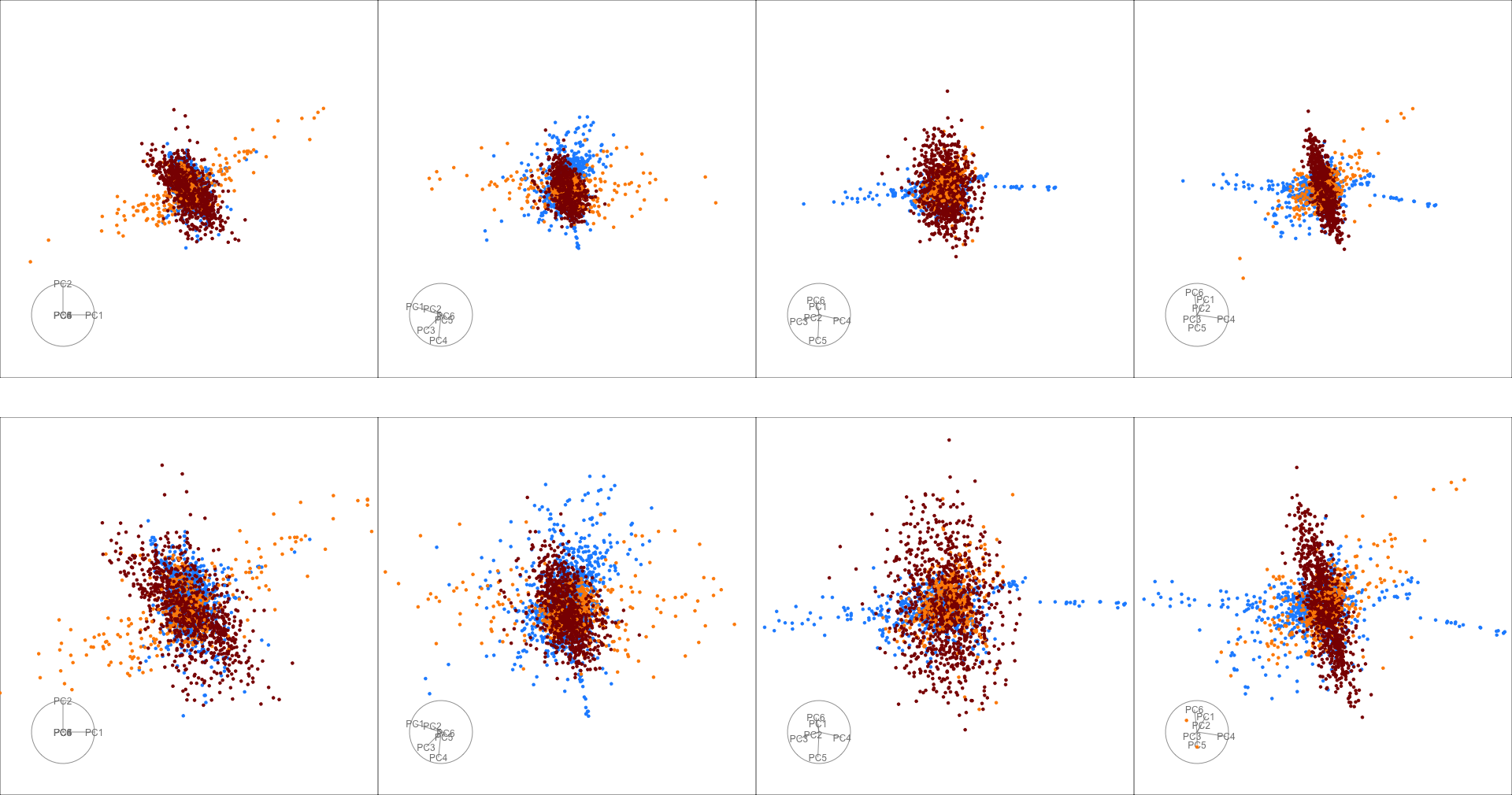
Following the processing described there, we tour the first 6 PCs, rescaled to have zero mean and unit variance. In Figure 8 we see that the sage display with (Figure 8, bottom), maintains the overall shape of the data seen using the default tour display (Figure 8, top). The different physical process, shown in different colors, are indeed orthogonal in the parameter space, as can be seen most clearly by looking at the animations available in the supplementary material.
The particular structure of this distribution, with some clusters extending linearly away from the center and a set of outlying points, results in poor use of the plotting space, and high level of clustering near the center. For example, focusing on the blue cluster, we can see that it extends out along different directions, but it can be challenging to observe how the points move under the tour rotation, as overplotting becomes an issue when points move through the center. Here, the new display (bottom row) shows a clearer view.
3.4 Tuning the parameters: Pollen
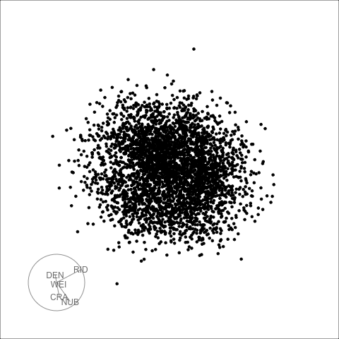
The classical pollen data is useful to demonstrate the trimming and tuning parameters. The five-dimensional data set was simulated by David Coleman of RCA Labs, for the Joint Statistics Meetings 1986 Data Expo (Coleman 1986), and is an example of a hidden structure near the center of a distribution. The data are standardized by centering and scaling such that the standard deviation of each variable is equal to one.
Neither the standard tour display nor the sage display with default settings ( which is set by the data scale, and ) reveals the structure (left plot in Figure 9). We can use either , or a combination of the two to zoom in further near the center. For example, we can use trimming (middle plot) or tuning (right plot) as shown in Figure 9. There is an approximate equivalence between the results obtained using either tuning or trimming, and both views clearly reveal the word “EUREKA” hidden in the distribution.
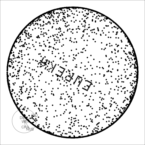
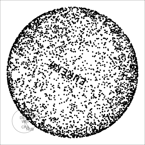
While the static views look very similar, comparing the tour animations (available in the supplementary material) reveals some differences between the display with trimming or tuning. When trimming (by setting ) the focus is clearly on the center of the distribution, and most points get pushed out towards a maximum radius circle. On the other hand, tuning the display by setting preserves the elliptical shape of the distribution, making it easier to see correlation patterns.
4 Discussion
This paper has introduced the sage tour, which reduces the data crowding effects that occur when taking low-dimensional projections of high-dimensional data. This new technique is easily incorporated into exploratory high-dimensional data analysis, and applications shown in Section 3 provide examples of the following tasks:
-
•
clustering: the sage display uncovered clusters that were originally obscured by data piling, while still giving the viewer an accurate assessment of the size of a cluster, and their relative orientation, as shown in the single cell RNA-seq example (Section 3.1)
-
•
classification: the sage display decreases the number of overlapping points between classes and provides better visual separation between classes compared to the regular tour, as shown in the sketches example (Section 3.2)
-
•
shape analysis: the sage display helps us understand structures across multiple dimensions, for example orthogonality between multiple groups, as shown in the pdfsense example (Section 3.3)
-
•
needle discovery: the sage display allows to find hidden signal that is concealed by the density of points around the center of the projection, as shown in the pollen example (Section 3.4)
The approach provides interpretable visualization that captures high dimensional information and preserves global structure, and it is complementary to non-linear dimension reduction techniques. For example, when visualizing clusters, the sage display enables an assessment of cluster shapes, and accurately captures relative position and orientation. The burning sage transformation is global and does not magnify local structure like t-SNE does.
An alternative is the slice tour (Laa, Cook, and Valencia 2020) which allows distributions of points around the center of the data to be explored using sections instead of projections. The slice tour is useful when there are large numbers of observations or if there is concave structure in the data.
The tuning parameters can be used to more aggressively expand the center of the display. All of the examples shown had some tuning. The last example demonstrated how points away from the projected center get moved to the edge of the hypersphere as is increased or is decreased. With more center magnification, the non-linear transformation can introduce distortions, but this is a well known problem for any non-linear dimension reduction technique including t-SNE. However, unlike t-SNE, any distortion introduced by the sage display is interpretable because it is controlled by a simple function (Eq. 5).
The sage display is fast to compute, which lends itself to being embedded into an interactive interface. An ideal interface would allow real time changes to the parameters of the transformation. This would be especially useful when coupled with linked brushing in complementary views.
Acknowledgements
Supplementary material
The source material for this paper is available at https://github.com/uschiLaa/burning-sage. The animated gifs for all applications are also included in html files in the supplementary material.
References
- Ahn and Marron (2010) Ahn, Jeongyoun, and J. S. Marron. 2010. “The maximal data piling direction for discrimination.” Biometrika 97 (1): 254–259. https://doi.org/10.1093/biomet/asp084.
- Amezquita et al. (2020) Amezquita, Robert A, Aaron T L Lun, Etienne Becht, Vince J Carey, Lindsay N Carpp, Ludwig Geistlinger, Federico Marini, et al. 2020. “Orchestrating single-cell analysis with Bioconductor.” Nat. Methods 17 (2): 137–145. http://dx.doi.org/10.1038/s41592-019-0654-x.
- Asimov (1985) Asimov, D. 1985. “The Grand Tour: A Tool for Viewing Multidimensional Data.” SIAM Journal of Scientific and Statistical Computing 6 (1): 128–143.
- Bellman (1961) Bellman, Richard. 1961. Adaptive control processes : a guided tour. Princeton Legacy Library.
- Blondel et al. (2008) Blondel, Vincent D, Jean-Loup Guillaume, Renaud Lambiotte, and Etienne Lefebvre. 2008. “Fast unfolding of communities in large networks.” J. Stat. Mech. 2008 (10): P10008. https://iopscience.iop.org/article/10.1088/1742-5468/2008/10/P10008/meta.
- Buja et al. (2005) Buja, Andreas, Dianne Cook, Daniel Asimov, and Catherine Hurley. 2005. “14 - Computational Methods for High-Dimensional Rotations in Data Visualization.” In Data Mining and Data Visualization, edited by C.R. Rao, E.J. Wegman, and J.L. Solka, Vol. 24 of Handbook of Statistics, 391 – 413. Elsevier. http://www.sciencedirect.com/science/article/pii/S0169716104240147.
- Coleman (1986) Coleman, David. 1986. “Geometric Features of Pollen Grains.” http://lib.stat.cmu.edu/data-expo/.
- Cook, Laa, and Valencia (2018) Cook, Dianne, Ursula Laa, and German Valencia. 2018. “Dynamical projections for the visualization of PDFSense data.” Eur. Phys. J. C 78 (9): 742.
- Diaconis and Freedman (1984) Diaconis, Persi, and David Freedman. 1984. “Asymptotics of Graphical Projection Pursuit.” Ann. Statist. 12 (3): 793–815. https://doi.org/10.1214/aos/1176346703.
- Donoho (2000) Donoho, David L. 2000. “High-dimensional data analysis: The curses and blessings of dimensionality.” http://citeseerx.ist.psu.edu/viewdoc/summary?doi=10.1.1.329.3392. Accessed: 2020-09-15.
- Google, Inc (2020) Google, Inc. 2020. “Quick, Draw! The Data.” https://quickdraw.withgoogle.com/data. Accessed: 2020-4-23, https://quickdraw.withgoogle.com/data.
- Hall, Marron, and Neeman (2005) Hall, Peter, J. S. Marron, and Amnon Neeman. 2005. “Geometric representation of high dimension, low sample size data.” Journal of the Royal Statistical Society: Series B (Statistical Methodology) 67 (3): 427–444. https://rss.onlinelibrary.wiley.com/doi/abs/10.1111/j.1467-9868.2005.00510.x.
- Laa et al. (2020) Laa, Ursula, Dianne Cook, Andreas Buja, and German Valencia. 2020. “Hole or grain? A Section Pursuit Index for Finding Hidden Structure in Multiple Dimensions.” .
- Laa, Cook, and Valencia (2020) Laa, Ursula, Dianne Cook, and German Valencia. 2020. “A slice tour for finding hollowness in high-dimensional data.” Journal of Computational and Graphical Statistics 0 (ja): 1–10. https://doi.org/10.1080/10618600.2020.1777140.
- Lun, McCarthy, and Marioni (2016) Lun, Aaron T. L., Davis J. McCarthy, and John C. Marioni. 2016. “A step-by-step workflow for low-level analysis of single-cell RNA-seq data with Bioconductor.” F1000Res. 5: 2122.
- Macosko et al. (2015) Macosko, Evan Z, Anindita Basu, Rahul Satija, James Nemesh, Karthik Shekhar, Melissa Goldman, Itay Tirosh, et al. 2015. “Highly Parallel Genome-wide Expression Profiling of Individual Cells Using Nanoliter Droplets.” Cell 161 (5): 1202–1214. http://dx.doi.org/10.1016/j.cell.2015.05.002.
- Marron, Todd, and Ahn (2007) Marron, J. S., Michael J. Todd, and Jeongyoun Ahn. 2007. “Distance-Weighted Discrimination.” Journal of the American Statistical Association 102 (480): 1267–1271. http://www.jstor.org/stable/27639976.
- McCarthy et al. (2017) McCarthy, Davis J., Kieran R. Campbell, Aaron T. L. Lun, and Quin F. Willis. 2017. “Scater: pre-processing, quality control, normalisation and visualisation of single-cell RNA-seq data in R.” Bioinformatics 33: 1179–1186.
- R Core Team (2020) R Core Team. 2020. R: A Language and Environment for Statistical Computing. Vienna, Austria: R Foundation for Statistical Computing. https://www.R-project.org/.
- Risso and Cole (2019) Risso, Davide, and Michael Cole. 2019. scRNAseq: Collection of Public Single-Cell RNA-Seq Datasets. R package version 2.0.2.
- van der Maaten and Hinton (2008) van der Maaten, L., and G. Hinton. 2008. “Visualizing Data using t-SNE.” Journal of Machine Learning Research 9: 2579–2605.
- Wang et al. (2018) Wang, Bo-Ting, T.J. Hobbs, Sean Doyle, Jun Gao, Tie-Jiun Hou, Pavel M. Nadolsky, and Fredrick I. Olness. 2018. “Mapping the sensitivity of hadronic experiments to nucleon structure.” Phys. Rev. D 98 (9): 094030.
- Wickham et al. (2011) Wickham, Hadley, Dianne Cook, Heike Hofmann, and Andreas Buja. 2011. “tourr: An R Package for Exploring Multivariate Data with Projections.” Journal of Statistical Software 40 (2): 1–18. http://www.jstatsoft.org/v40/i02/.
- Xie (2015) Xie, Yihui. 2015. Dynamic Documents with R and knitr. 2nd ed. Boca Raton, Florida: Chapman and Hall/CRC. https://yihui.name/knitr/.
- Xie, Allaire, and Grolemund (2018) Xie, Yihui, Joseph J. Allaire, and Garrett Grolemund. 2018. R Markdown: The Definitive Guide. Chapman and Hall/CRC. https://bookdown.org/yihui/rmarkdown.