algorithm \enitkv@keyenumitemnosep[true] \enitkv@keyenumitemnotopsep[true] \onlineid1070 \vgtccategoryResearch \vgtcpapertypeapplication/design study \authorfooter Xiaoyi Wang and Kasper Hornbæk are with the University of Copenhagen, Denmark. E-Mail: {xiaoyi.wang, kash}@diku.dk. Alexander Eiselmayer and Chat Wacharamanotham are with the University of Zurich, Switzerland. E-Mail: {eiselmayer, chat}@ifi.uzh.ch. Wendy E. Mackay is with Univ. Paris-Sud, CNRS, Inria, Université Paris-Saclay, France. E-Mail: mackay@lri.fr. \shortauthortitleWang et al.: Argus: Interactive a priori Power Analysis
Argus: Interactive a priori Power Analysis
Abstract
A key challenge HCI researchers face when designing a controlled experiment is choosing the appropriate number of participants, or sample size. A priori power analysis examines the relationships among multiple parameters, including the complexity associated with human participants, e.g., order and fatigue effects, to calculate the statistical power of a given experiment design. We created Argus, a tool that supports interactive exploration of statistical power: Researchers specify experiment design scenarios with varying confounds and effect sizes. Argus then simulates data and visualizes statistical power across these scenarios, which lets researchers interactively weigh various trade-offs and make informed decisions about sample size. We describe the design and implementation of Argus, a usage scenario designing a visualization experiment, and a think-aloud study.
keywords:
Experiment design, power analysis, simulationK.6.1Management of Computing and Information SystemsProject and People ManagementLife Cycle;
\CCScatK.7.mThe Computing ProfessionMiscellaneousEthics
\teaser
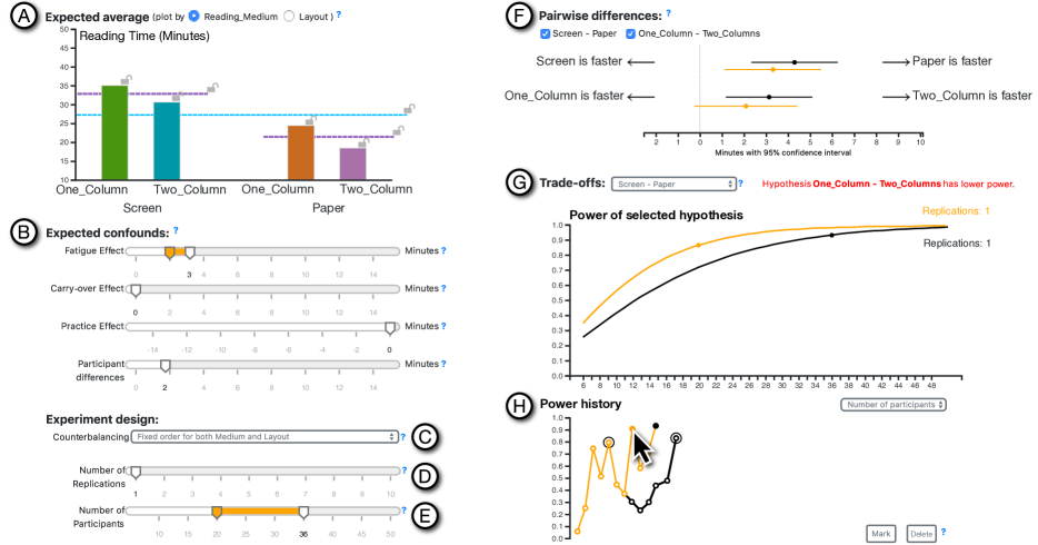
![[Uncaptioned image]](/html/2009.07564/assets/x1.png) Argus interface:
(A) Expected-averages view helps users estimate the means of the dependent variables through interactive chart.
(B) Confound sliders incorporate potential confounds, e.g., fatigue or practice effects.
(C) Power trade-off view simulates data to calculate statistical power; and
(D) Pairwise-difference view displays confidence intervals for mean differences,
animated as a dance of intervals.
(E) History view displays an interactive power history tree so users can quickly compare statistical power with previously explored configurations.
\vgtcinsertpkg
Argus interface:
(A) Expected-averages view helps users estimate the means of the dependent variables through interactive chart.
(B) Confound sliders incorporate potential confounds, e.g., fatigue or practice effects.
(C) Power trade-off view simulates data to calculate statistical power; and
(D) Pairwise-difference view displays confidence intervals for mean differences,
animated as a dance of intervals.
(E) History view displays an interactive power history tree so users can quickly compare statistical power with previously explored configurations.
\vgtcinsertpkg
1 Introduction
Determining sample size is a major challenge when designing experiments with human participants, e.g., in Information Visualization (VIS) and Human-Computer Interaction (HCI) [20, 30, 42]. Researchers want to save time and resources by choosing the minimum number of participants that let them reliably detect an effect that truly exists in the population. However, if they underestimate the sample size, i.e. the experiment lacks statistical power, they risk missing the effect – a Type II error. Researchers are also less likely to publish these negative or null results, the so-called “file drawer problem” [54]. Researchers cannot simply add participants until the results are significant, which is considered a malpractice, and are strongly encouraged to preregister the sample size to increase the credibility of the investigation [11].
The sample size can be determined statistically with an a priori power analysis. However, this requires approximating the effect size, which quantifies the strength and consistency of the influences of the experimental conditions on the measure of interest. Estimating an effect size must account for the relationships between experimental conditions; the inherent variability of the measures, e.g., differences among study participants; and variation in the structure of the experiment conditions, e.g., blocking and order effects. This complexity acts as a major barrier to performing power analysis [45, 50].
Studies in the natural sciences can rely on meta-analyses of multiple replication studies to suggest effect and sample sizes. However, in VIS and HCI, such replications are rare [31, 38] and not highly valued [28]. Sample sizes () are often chosen based on rules of thumb e.g., 12 [20], or drawn from small numbers of studies [7, 35, 31]. Studies with human participants also risk confounding effects such as fatigue, carry-over, and learning effects. Analytical methods implemented with power analysis tools such as pwr [9] or G*Power [23], are not usually sophisticated enough to account for these effects. Furthermore, researchers must often weigh the benefit of statistical power against high recruitment costs, overly long experiment duration, and the inconvenience of switching between experiment conditions [46]. Although several interactive tools help explore trade-offs among plausible experiment design configurations [20, 46, 47], few address the complex relationship between statistical power and relevant experiment parameters.
Existing power analysis tools are designed as calculators: The user specifies acceptable Type I and Type II error rates, test statistics, experimental design, and an approximate size of the effect. The tool then produces either a single sample size or a chart showing how statistical power increases in conjunction with the sample size, at several effect sizes. We argue that researchers need tools for exploring possible trade-offs between statistical power and the costs of other experimental parameters, especially when the effect size is uncertain.
We propose Argus, an interactive tool for exploring the relationship between sample size and statistical power, given particular configurations of the experimental design. Users can estimate parameters – effect sizes, confounding effects, the number of replications, and the number of participants – and see how they influence statistical power and the likely results in an interactive data simulation.
Contributions: We identify challenges and analyze the tasks involved in a priori power analysis. We propose Argus—which combines interactive visualization and simulation to aid exploration and decision-making in experiment design and power analysis. To demonstrate its efficacy, we describe a use case and a think-aloud study.
2 Background and Task Analysis
a_prioriAlthough one can calculate achieved power from data collected during an experiment, such post-hoc analysis is impractical for planning experiments or interpreting the results [8, p. 110] and [63, section 5.9.4]. This paper thus uses the term ‘power analysis’ to refer to a priori power analysis.
When planning an experiment, researchers use a strategy called a priori power analysis\sepfootnotea_priori to choose which sample size will allow the experiment to detect an expected effect. Power analysis uses the relationship between the sample size and the following parameters:
-
is the probability of detecting an effect from an experiment when it is actually absent in the population (Type I error: false alarm). Researchers usually set based on the convention of each academic field, typically .05 for VIS, HCI, psychology, and the social sciences.
-
, or statistical power, is the probability that a long run of experiments will successfully detect an effect that is true in the population. ( is the probability of a Type II Error: missing the true effect.) If no existing basis exists, Cohen proposed a convention of 0.8 [13, p.56].
-
Effect size is the difference across means calculated from data under each condition. Researchers make an educated guess of the effect size based on previous research or their experience. Effect sizes are standardized for the calculation, as described in C3 below.
The sample size can be calculated with these parameters, either with software or from a statistics textbook e.g. [13]. When facing resource constraints, such as personpower, time or budget, researchers sometimes sacrifice statistical power in exchange for a more attainable sample size. In cases where access to participants is limited e.g. patients, children or other special populations, power analysis may be skipped altogether. Even if the power analysis suggests an unrealistic sample size, it might still offer a useful cost-benefit assessment. In any case, researchers who choose to conduct a power analysis still face the following challenges:
C1: Estimating a reasonable effect size is difficult. Researchers who wish to estimate the effect size face a paradox: The goal of conducting the experiment is to discover the true effect size in the population, but selecting the correct sample size for revealing that effect requires an initial estimate of the effect size. Overestimating the effect size often leads to a sample size that exceeds available resources. Even for studies that can easily scale up the sample size, using an overly large sample size is “wasteful” and an “unethical” use of study participants’ time [6]. Although researchers can conduct pilot studies, finding a large effect size in a pilot with few participants may be misleading and result in an underpowered final experiment [40, p. 280]. Cohen proposed a guideline for standardized effect sizes derived from data on human heights and intelligence quotients [12]. However, reviews in domains such as software engineering [37] found that the distribution of effect sizes from experiments differ from Cohen’s guideline. Therefore, many researchers recommend against using guidelines that are not specific to the domain of study [43, 18, 1]. In fields where replication studies are scarce, e.g., VIS and HCI [38, 32]), researchers must generate possible effect-size scenarios.
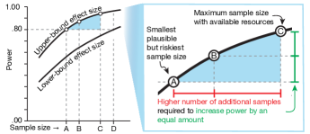
C2: Comparing power at multiple effect size scenarios is necessary. Instead of estimating a single value for the effect size, some researchers estimate the upper-bound––to represent the best case––and the lower-bound––below which the effect is too small to be practically meaningful [43, 45, p. 57]––which results in a range of sample sizes to consider (Figure 1, A–D). However, in many experiments, the largest attainable sample size may be lower than the one required by the lower-bound effect size (Figure 1, C). Researchers must then weigh the benefit of further mitigating risk by increasing the power and the cost of a larger sample size. Because the function between the power and sample size is concave, improving power is increasingly costly [39, p. 702] (Figure 1, A–B vs. B–C). Among existing software for calculating statistical power, only a few plot the statistical power and the sample size at different effect sizes (see Related Work).
C3: Standardized effect sizes are not intuitive. The difference between means is an example of a simple effect size, which is based on the original unit of the dependent variable and thus has intuitive meaning for researchers. However, power calculation requires a standardized effect size, which is calculated by dividing the simple effect size with a standardizer. The formula for the standardized effect size depends on how the sources of the variances are structured, which in turn depends on the experiment design. (See Appendix A for an example on how blocking influences calculation of effect size.) Note how an estimate in the form of a simple effect size may yield different standardized effect sizes. Researchers often have difficulty using standardized effect sizes when choosing their sample size, since these are “not meaningful to non-statisticians” [1].
C4: Power analysis excludes the temporal aspect of experiment design. Power analysis simplifies sources of variations into a few standard deviations within effect size formulæ. (See Appendix A for an example.) Potential confounds—e.g., the fatigue effect or the practice effect—lose their temporality once encoded into standard deviations. This loss could be a reason that separates power analysis from the rest of the experiment design process [20]. Better integration of temporal effects and design parameters—e.g., number of replications and how conditions are presented to study participants—could allow better exploration of trade-offs.
2.1 Task Analysis
Under the What-Why-How framework [4, 49], the task abstraction could be described as follows. All of the attributes below are quantitative unless stated otherwise.
T1: Come up with an effect size estimate. Simple effect sizes—the difference in the responses between conditions—could have been estimated directly. Alternatively, the estimation can be simplified by first estimating the mean in a baseline experimental condition, and then deriving the value of other conditions by comparing each with the baseline. The conversion from the simple effect size to the standardized effect size (C3) could be automated when the information about experiment design is available in a computable form.
T2: Check the potential outcome effect size. For experiments with two independent variables or more, the possibilities of the interaction effects could obfuscate how the a priori effect sizes influence the final results. (More details in subsection 4.2.) A data simulation could allow the users to compare the simulated effect sizes among themselves or to compare them with the specified input—especially in the presence of interaction effects.
T3: Determine candidate sample sizes. Researchers browse for the sample size with a reasonable trade-off within a set of constraints (e.g., resources for participant recruitment). To facilitate efficient browsing, they identify features of the relationship between power and sample sizes, e.g., where the power-gain is steep or where it plateaus. Multiple scenarios (C2) of effect sizes could also generate different relationships, leading to the need to compare their trends.
T4: Try out potential scenarios. Due to uncertainties in effect size estimation (C1), researchers need to be able to explore the dependency between their effect size estimates and other parameters—e.g., the fatigue effect (C4)—to the power-sample size relationship. Thus, they need to be able to record and review the scenarios. Some changes to the scenarios are categorical—e.g., different choices of counterbalancing strategies. Others are quantitative—e.g., different amounts of the fatigue effect. The abstract data type of the scenarios could be a multidimensional table with each input parameter as a key and the resulting power as an attribute. However, this abstraction does not capture researchers’ exploration traces. Such traces could be abstracted as a tree in which each child node is a scenario that is derived based on its parent node.
3 Related Work
Before the prevalence of personal computers, researchers used look-up tables [13, pp. 28—39]) and charts [57]) in textbooks to determine the relationship between sample size, effect size, statistical power, and Type I error rate, usually fixed at .05. Early software packages simplified the process by providing command-line or menu interfaces to specify parameters, and displayed a single value for statistical power. Goldstein [26] surveyed 13 power analysis software packages and highlighted the lack of two key functions: plotting a chart of the trade-offs between parameters, and capturing intermediate results for comparison. Borenstein et al. [3] pioneered the use of visualization to specify input parameters and inspect relationships among parameters. For input, the tool shows a box plot of the dependent variable by condition on the screen. The simple effect size can be specified by moving the mean and standard deviation of each group with arrow keys or function keys. The software then outputs the effect size and power in real-time. It also produces a chart showing the relationship between power and sample size under multiple effect-size scenarios (see Figure 1, left). Nevertheless, due to the low screen resolution, the relationship chart is presented on a separate screen from the input specification, hindering interactive exploration. This tool also restricts analysis to between-subjects designs with two conditions and does not support exploration of the impact of choices in experimental design.
G*Power [22, 21, 23] is one of the most widely used power analysis software tools today. G*Power developers prioritize covering multiple types of statistical tests and high-precision calculation rather then facilitating exploration [21]. G*Power calculates power from one set of input parameters at a time. This forces them to record parameters and output at each step of the exploration process. G*Power generates a static chart from a given range of standardized effect sizes.
Some software packages integrate power analysis with experiment design. JMP’s design of experiment (DOE) function [56] provides a menu interface for power calculation and generates static charts similar to those of G*Power. The R package skpr [48] provides a menu-based interface for generating experiment designs. However, it only calculates and shows a single power estimate at a time. To explore different effect size scenarios, users must manually save and restore states via their web browser’s bookmark function. skpr provides a menu interface for generating experiment trial tables and calculating power. However, it provides only the power of the entire experiment design: all variables that take part in the counterbalancing contributes to the power analysis. Touchstone2 [20] provides a direct manipulation interface for specifying experiment design and displays an interactive chart that visualizes the relationship between the number of participants and power. Unlike skpr, users can select a subset of independent variables to include in the power calculation. This lets researchers include nuisance variables in the counterbalancing design, without affecting power calculation. Even so, Touchstone2 does not include confounding effects and relies on menus to specify effect size.
Several researchers have shown that graphical user interfaces (GUI) are better than menus for specifying estimations. Goldstein & Rothschild [25] compared numerical and graphical interfaces to elicit laypeople’s intuitions about the probability distributions of events. They show that users achieve greater accuracy when they can specify distributions graphically. Hullman et al. [34] support these results in the context of estimating effect sizes for experiments. We argue that power analysis software would benefit from such graphical representations of relationships among parameters, with a GUI to manipulate them.
4 Argus User Interface Design
The Argus interface is organized into: parameter specification (A–E), simulation output (F–G), and the history view (H) (Figure 2). Users begin by specifying metadata about the independent variables in a pop-up window (subsection 4.1). They can then explore various effect-size scenarios by manipulating the means of the dependent variables for each condition (A). They can also estimate potential confounds (B); and explore how different experiment designs (C–E) influence the outcome (F–G). The history view (H) automatically saves the exploration process and lets users re-load previous scenarios. The rest of this section describes the interface using the example of a 2 2 experiment on how Medium (Paper vs. Screen) and Layout (One_Column vs. Two_Column) influences ReadingTime.
4.1 Metadata
To facilitate interpretation of simple effect sizes (C3), Argus needs the semantics of the dependent variables. Researchers supply this information once, at the start of the session. Note that, since many domains use a common set of dependent variables, such as time and error for VIS and HCI, in future, we expect researchers to select relevant dependent variables retrieved automatically from a public domain ontology. Similar ontologies already exist in bioinformatics [60] , and Papadopoulos et al. [52] have proposed an ontology that specifies dependent variables for VIS and HCI. The current metadata interface is thus a makeshift.
Argus requests the name, unit, expected range, interpretation, and the variability of each dependent variable (DV). Argus computes initial ranges for both axes of the interactive charts (subsection 4.2), and the sliders that adjust various confounds (subsubsection 4.4.1). Argus uses the natural-language interpretation, e.g., “30 minutes is faster than 50 minutes”, to make it easier to read the pairwise plot (subsection 4.3).
4.2 Expected-averages View
Argus uses a direct manipulation interface to determine effect sizes, which lets users work with simple effect sizes (T1) and explore multiple effect-size scenarios. Instead of specifying mean differences, Argus lets users specify the expected mean of each experimental condition. This condition-mean specification lowers user’s cognitive load because they can flexibly estimate each condition individually.
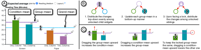
Argus presents the condition-mean relationship as a bar chart (Figure 2.A), and the bar colors are drawn from the 2D colormap of Bremm et al. [5] by assigning one dimension per variable111We use the Color2D library: dominikjaeckle.com/projects/color2d/. Users can estimate each condition-mean by dragging the bar vertically. Horizontal lines encode the group-mean — calculated from all conditions of an independent variable — and the grand-mean — calculated from all independent variables (Figure 3.left). Despite the potential for within-the-bar bias [14], encoding the bars keeps condition-mean visually distinct from the group-means and the grand-mean. Users can switch the hierarchy level of the condition axis in the bar chart via radio buttons. We describe two common use cases for expressing effect size:
Main effects occur when a particular level of an independent variable causes the same change in the dependent variable, regardless of the level of other independent variables. For example, a main effect of Medium on ReadingTime could be that reading on a Screen is generally slower than reading on Paper. To specify this as a main effect, the user would have to drag two bars (One_Column and Two_Column of the Screen condition) upward by equivalent amounts. This becomes tedious when the independent variable has many levels.
Interaction effects occur when the mean within each group differs according to the level of another independent variable. Suppose we want to express how the Layout affects ReadingTime. As above, we register Medium as a main effect, but ensure that the group means for Screen and Paper remain the same.
If the user changes the One_Column, Screen bar, the group-mean of the Screen condition will also change. To keep the same group mean, the user must first remember the group-mean prior, and then adjust the other bars to compensate.
Both scenarios involve manipulating multiple conditions simultaneously by dragging group-means and the grand-mean. Users can also lock some means while changing the rest, and the system automatically propagates the changes. However, enabling this interaction technique is tricky because of the hierarchical dependency among these values.
Argus implements a propagation algorithm (Appendix B and Figure 3, right). The relationship between the hierarchy of means is represented as a tree rooted at the grand-mean. A change to a parent node–––the grand-mean–––is first recursively propagated to the children, e.g. group-means and then the condition-mean. The amount of change is distributed evenly to all unlocked children. After finishing the change propagation, the update moves upward. If the update reaches a locked parent, the change is distributed to any unlocked siblings. The propagation algorithm offers users flexibility, letting them switch seamlessly through different representations at different levels, not only individual conditions, but also main and interaction effects.
4.3 Pairwise-difference View
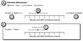
To help users evaluate the consequences of their effect size estimates (T2), we simulate the data and show the difference between means and their confidence intervals in the Pairwise-difference view (Figure 4). The horizontal axis shows the difference in the original unit of the dependent variable—a simple effect size (C3). The horizontal axis lists all possible comparison pairs. An independent variable with levels can accommodate pairwise comparisons. For each pair, we show the mean difference, displayed as a black dot, together with its 95% confidence interval, displayed as a black line. Unlike the bar charts used for input (subsection 4.2) this reduces bias [14]. Although violin plots reduce bias somewhat, we chose the dot-and-line display because they can fit more lines into a limited space. This is crucial when comparing two sets of parameters side-by-side with the history function (subsubsection 4.4.4).
In Figure 4.B, the difference appears to the left of the zero indicator. Had we presented the result on a normal number line, it would have appeared on the negative side, and the chart could have been interpreted as: “the difference is around minus 4 minutes”. Since reading double negatives is cognitively demanding, we present absolute values on both sides of zero on the horizontal axis, and add annotations on the left and the right margin (C and D). This makes it easier for users to interpret, e.g., “Screen is faster for around 4 minutes”. Users can press-and-hold the shift key to show the normal number line with negative values on the left of the zero, in Figure 2.E. This mode lets users change the label on the left margin to present a mathematical difference (“Screen- Paper”). For advanced users, Argus also annotates Cohen’s standardized effect size above each confidence interval.
In Figure 2.F, both Screen-Paper and One_Column-Two_Column are selected. Suppose we are only interested in comparing reading media because the layouts were included as a nuisance variable. Deselecting the “One_Column- Two_Column” checkbox might yield a slightly narrower confidence interval for the “Screen- Paper” difference. The reason for this improvement is that the difference between the two layouts is slightly smaller in the Paper condition (Figure 2.A), i.e. there is an interaction effect.
Since Argus shows simulated data instead of real data collected from an experiment, we need to ensure that users are aware of the uncertainty generated by the simulation. We thus use the dance of the CIs, a time-multiplexing approach that shows the results of multiple simulations in the same figure [16, 19]. The animation runs in 2 fps, to allow the user to notice changes between frames [61]. An alternative to the dance animation is a forest plot that displays all confidence intervals from the simulation next to each other, with a diamond shape to summarize them [17, Chapter 9].
We chose the dance because it uses less screen space, and motion is a strong visual cue. Even when the user focuses somewhere else on the screen, the animation is registered in their peripheral vision. In addition, users can pause the animation and navigate individual frames by the left and right arrow keys on the keyboard.

4.4 Exploring Trade-offs
At each effect-size scenario, users can increase power by adding more participants, increase the number of trial replications in the counterbalancing design, or both. Some experiments may be constrained by participant fatigue and need to limit the duration, whereas for other experiments, the cost of recruiting additional participants may outweigh the drawbacks from the fatigue effect. Argus lets users explore how different experiment design scenarios and confounds can influence power (T4), as shown in Figure 2. Users estimate levels for each potential confounding effect (B) and select an experiment design parameter accordingly (C–E). They explore how the trade offs change based on sample size and power (G), and can revisit and compare earlier explorations with the History view (H).
4.4.1 Confound Sliders
Confounding effects can be specified by sliders (Figure 2.B). When users drag a confound slider, Argus shows a pop-up overlay to preview its effect (Figure 5). The pop-up is a bar chart showing how the measurement of the dependent variable (vertical axis) could change along with the experiment trials (horizontal axis). The order of trials and the effects are calculated based on the choices in the Experiment-design view (subsubsection 4.4.2).
Four types of confounds are of interest in power analysis [41] . For readability, we will explain each of them in terms of reading time. Increasing the fatigue effect (Figure 5.A) would cumulatively increase the reading time for each subsequent trial (Figure 5.B). The carry-over effect (Figure 5.C) occurs when the user is unfamiliar with the task itself: Their performance is worst in the first trial, but gradually improves over subsequent trials, regardless of the experimental condition. The practice effect has two variations: The within-condition practice effect (Figure 5.D) represents improvements resulting from the participants’ familiarity with each experimental condition. Thus, improvement in one condition does not influence subsequent trials in other conditions. The whole-experiment practice effect (Figure 5.E) results from users’ familiarity with the task, regardless of experimental condition. This is the opposite of the fatigue effect. A participant in our think-aloud study (Appendix D) pointed out the difference between these two practice effects, and we plan to incorporate the whole-experiment practice effect in the next version of Argus.
The confound pop-ups use a bar chart to encode the level of the dependent variable. We take advantage of the Gestalt law of similarity to let the user associate the color-coding of conditions to those in the Expected-averages view. Future versions of Argus could include a more advanced interaction technique that lets users specify a range or a probability distribution for each confounding variable.
Argus uses the dependent variable metadata (subsection 4.1) to determine the range for each slider. The direction of the available values depends upon which direction users specify as the “better” direction. For example, in Figure 2.B, the variability is set to minutes, and the interpretation is specified as “slower is better”. These settings create a fatigue-effect slider ranging from 0–15, and a practice-effect slider ranging from -15–0. All sliders are initially set to zero to represent no confounding effects. Argus also provides an additional slider for specifying variations across participants.
4.4.2 Experiment-design View
The effect of confounds such as the fatigue effect could even out across participants if the experiment is properly counterbalanced. In the running example, the experiment has four conditions. A complete counterbalancing would require covering the possible orderings of the conditions, which would in turn require recruiting a multiple of 24 participants. Alternatively, users might consider using a standard Latin Square design, which addresses the order effect between adjacent trials. This Latin Square design requires only multiples of four participants, allowing for greater flexibility in the sample size.
Recruiting fewer participants than required multiple may lead to an imbalanced experiment, and affect both the observed effect and power. Finally, users could collect several replications of data from each participant. This number of replications influences the trial table, and thus influences how the confounding effects contribute to the data.
In the field of HCI, several tools exist for counterbalancing design [20, 46, 47]. Eiselmayer et al. [20]’s interview study suggests that counterbalancing design and power analysis are performed in two separate loops. We envision that users should use one of these tools to come up with experiment design candidates. Then, these candidates can be imported to Argus. For these reasons, we present a minimal user interface for counterbalancing design: a drop down list for selecting the counterbalancing strategy (Figure 2.C) and two sliders for the number of replications (D) and the number of participants (E). These controls work together with the Power Trade-off view and History view.
4.4.3 Power Trade-off View
The Power Trade-off view (Figure 2.G) is the heart of power exploration (T3). It visualizes the outcome of the adjustments in Expected-averages view, Confound sliders, and Experiment-design view. The visual encoding is based on the chart relating power vs. sample size, commonly used in statistics textbooks, e.g. [57]. The sample size appears on the horizontal axis and the power on the vertical axis. The current selection of the sample size is represented as a dot, and the relationship between these two parameters are displayed as a black curve. We used this encoding despite the fact that the underlying data is discrete—the sample sizes are integer—because curves facilitate interpretation of the local rate of change [10], which is usually the case when researchers assess power trade-offs.
Touchstone2 [20] enhanced this textbook chart by automatically showing the confidence band around the current parameter set, which was calculated from a single “margin” parameter. In Argus, variations in power can originate from any of a combination of multiple sources, e.g., effect size or confounds, making it difficult to determine which are associated with the confidence band.
Argus enhances this chart in two ways: First, Users can switch the horizontal axis between the sample size and the number of replications. Setting the axis to the sample size shows the number of replications annotated on the right end of the power curve. This switch could be used when the sample size faces a stricter constraint than the number of replications, or vice versa. In Figure 2(G), suppose the resource constraint allows the recruitment of a maximum of 24 participants, which results in the power of 0.7. Users can now consider the trade-off between the number of replications and power.
Second, Argus shows the chart individually for each of the pairs of independent variable levels, e.g., Figure 2.G, shows “Screen- Paper ”). Users can change the pair with a drop-down menu. Argus shows a warning if any pairs produce lower power than the current pair. The user can also select the “Minimum power” option to always display the pair with the lowest power. Although this pair-selection is also present in the Pairwise-difference view, the selection in Power Trade-off view is independent: Switching it does not trigger a simulation. This independence allows the user to explore nuisance factors without changing how the confidence interval of differences is calculated.
4.4.4 History View
The History view (Figure 2.H) ties together all above-mentioned views to enable exploration of scenarios in light of uncertainty from effect size estimation and confounds (T4). Argus thus improves on other power analysis systems that force users to record each scenario’s output before manually comparing them. (section 3).
Each step of parameter adjustment is recorded automatically in an abstract tree. The root of the tree is the initial setting of zero effect size with no confounding variables. The tree is visualized on a two-dimensional cartesian coordinate with the vertical axis showing the power. The horizontal axis shows the depth of the node from the root. Each node is encoded as a white circle with black outline, and it is connected to its parent node with a line. The current node is encoded in a black circle to associate it to the the dot in the Power Trade-off view with the Gestalt principle of similarity. Adjusting a widgets in the views mentioned above creates a child node. Clicking on a past node restores its parameters all other views. The restoration excludes the selections in the Power Trade-off view to enable users to retain their current focus, as described in subsubsection 4.4.3. During exploration, it is likely that only a few nodes will be of interest. Users can mark/unmark a node by clicking a button. An additional concentric outline circle is added to each of the marked nodes.
In addition to restoring the parameters, users may hover their mouse cursor over a node to preview its parameters and output. The preview values are shown in orange, simultaneously with the values of the current node in black (Figure 2). We use juxtaposition and superposition faceting techniques. These two techniques were analyzed in Javed et al.’s survey of composite visualization [36]. Their analysis found that for tasks that focus on direct comparison in the same visual space, superposition is more effective than juxtaposition. For the Power Trade-off view, since decisions about sample size usually take place around the few crucial values (see C2 and Figure 1), we superpose the curves. For the Confound sliders and Experiment-design view, the sliders and the drop-down list, preview values are also superposed. For the Expected-averages view, however, both superposition and juxtaposition would be appropriate. Here, superposition allows the bars representing the current state to provide a stable visual anchor.
For the Pairwise-difference view, the uncertainty communicated by the animation would be muddled when two superposed confidence intervals overlap. Therefore, we juxtapose the preview error bars side-by-side (Figure 2.F). For the History view itself, we highlight nodes and edges in the current branch during preview.
We also decided to limit the comparison to two nodes—the current node and the preview node—to reduce visual complexity. A pairwise comparison of historical nodes together with the marking functions allows users to gradually narrow down the parameter choices.
4.5 Scaling the Design for More Complex Experiments
Our prototype supports within-participants designs with two independent variables. More complex experiment designs may have more than two independent variables, and each independent variable could have more levels. Only two views will be affected: The Expected-averages view could present more levels by incorporating the fish-eye technique [53]. To address more independent variables, the system should allow the users to reorder the hierarchy in the horizontal axis—e.g., by drag-and-drop. Users should also be able to exclude some of the independent variables from the axis, which will summarize several bars of the same level into one, which further reduces the visual complexity. As for the Pairwise-difference view, scrolling and panning could be necessary to handle the increased number of pairs. When their effect sizes are very different in the magnitude or sign, the comparison could be broken down into subsets, presented in separate windows.
5 Implementation Details
Argus was written in HTML and JavaScript. We used D3.js222d3js.org for interactive visualizations. Experiment designs are implemented in the TSL language and trial tables are generated on the client-side with the TSL compiler [20]. Statistical calculations are implemented in R333r-project.org, and Shiny444shiny.rstudio.com. We used a MacBook Pro (2.5GHz, 16GB memory, MacOS 10.14) for all benchmark response times.
To enable interactive exploration in Argus, we make the following three implementation details that differs from standard statistical procedure for a priori power analysis and post-study statistical analysis.
5.1 Monte Carlo Data Simulation
Power can be calculated from an probability value, a standardized effect size, and a sample size. However, incorporating confounds, e.g., a fatigue effect, is analytically complex (C4). Instead, we use a Monte Carlo simulation, based on algorithm 1 of [64]: First, a population model is created programmatically, based on an estimate of the mean and the standard deviation (SD) of each condition. From this population, we sample data sets and use them to calculate statistics. The Monte Carlo paradigm has been shown to be robust for tricky cases such as data that are not normally distributed, missing data, or mixed distributions [51, 58, 64].
We extend the algorithm to incorporate confounding variables: First, we obtain a trial table for the specified experiment design from the TSL compiler. Based on the trial table’s structure, we generate each confounding effect specified by the user in the interface (subsubsection 4.4.1). For example, a two-second fatigue effect for movement time cumulatively lengthens each subsequent trial by two seconds. All confounding effects are added to each simulated data set before calculating statistics. Data simulation and confounding calculations are vectorized. On average, we can generate a data set with 50 participants and 10 replications with all confounding effects in place, in less than 30 ms on our benchmark machine.
5.2 Making Power Calculation Responsive
Calculating statistical power is computationally expensive because it requires a numerical integration between two overlapping probability distributions (see Fig. 11 of [20]). Furthermore, post-hoc power calculation uses an observed effects size from the data, which may differ from the input effect size due to confounding effects. To calculate observed effect sizes, we must fit a general linear model for each data set. In normal statistical analysis, such model-fitting is done only once, so results appear almost instantaneously. However, plotting the chart of sample size and power (Figure 1) requires one calculation per simulated data set. By default, Argus generates 1000 data sets for each sample size. Here, we show the sample size from 6 to 50. On our benchmark machine, the entire calculation takes around two–three minutes.
To ensure the responsiveness of the user interface, we first approximate the observed effect size with a pairwise Cohen’s calculated with the pwr.t.test function from the pwr package [9]. The average turn-around time is 200 ms. Model-fitting results are sent progressively to the user interface, which updates accordingly. We further ensure responsiveness, we also make further tweaks in the communication between R, Shiny, and Javascript as detailed in Appendix C.
5.3 Statistical Model and Pairwise Difference Calculation
After modeling participants as a random intercept, we derive the observed effect size and the pairwise difference in terms of means and confidence intervals from mixed-effect models. (See Fry et al.’s [24] HCI statistics textbook for more details on the model choice.) Argus automatically formulates a mixed-effect model and a contrast matrix for generalized linear hypothesis testing, based on the user’s choice of the condition pairs of interest (subsection 4.3), We use the lme4 package [2] for model fitting and the multcomp R package [33] for the test. Confidence intervals are calculated with a single-step adjustment with the family-wise error rate set at .
6 Use Case
To demonstrate how to use Argus, we draw an example from a study on color ramps from Smart et al. [59]—of which the study plan could have been informed by a similar study by Correll et al. [15]. Additionally, both studies made their data publicly available, allowing us to derive additional information for planning and testing. We first describe the background of both studies—which constrains the parameter space to be later explored with Argus. To aid cross-referencing, we highlight relevant values in bold. Calculation details are provided with R code in supplementary S2.
6.1 Background
Smart et al. propose to generate color ramps based on a corpus of expert-designed ramps by using Bayesian-curve clustering and k-means clustering. Their experiment compared four types of ramps (Bayesian, K-Means, Designer, and the baseline Linear) in three visualization types (scatterplots, heatmaps, choropleth maps), in a total of 12 conditions. In each experimental trial, study participants are asked to identify a mark on the visualization that matches a given numerical value. They measured errors and aesthetic ratings. Because a comparable aesthetic data were unavailable in prior works, this use case focus only on the errors, which is defined as .
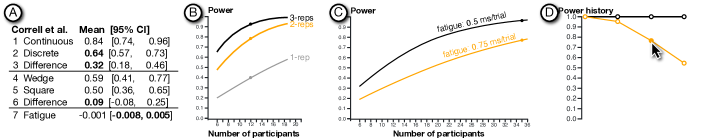
To plan their study, Smart et al.’s study could have leverage information from Correll et al.’s experiment555Although Smart et al. mentioned that their study was similar to [27], the latter concerns categorical palettes rather than quantitative color maps.. The latter used the same identification task, albeit only heatmaps are used as the visualization. Their study investigated how color ramps can be used to encode both values and uncertainty. Although their experiments have different conditions compared to Smart et al.’s, two of their results are relevant: (1) the significant difference between continuous vs. discrete color map, and (2) the absence of a statistically significant difference between wedge-shaped vs. square-shaped color legend. The former can be used as an upper-bound and the latter as a lower-bound for the effect sizes. Since Correll et al.’s accuracy was defined differently from Smart et al.’s error, we use Correll et al.’s data to calculate the errors—which result in the statistics shown in Figure 6.A.
In addition to the effect sizes, we also retrieved the duration information. In each trial of the relevant experimental condition, participants took 8.5 seconds. Since the stimuli of Smart et al.’s study was four times larger, we extrapolate each trial to take 34 seconds. In Correll et al.’s study, the median session duration was 13.5 minutes. We also analyzed the data for the fatigue effect and found it negligible with the estimate in Figure 6.A, row 7.
Smart et al. recruited 35 expert designers as their study participants; we use this number as a maximum number of participants. On the opposite, we consider 12 as a minimum number of participants based on a rule of thumb [20]. Since the participants were experts, they might be less willing to participate in a long study. Therefore, we constrained the longest session duration to 30 minutes. Leaving 5 minutes aside for instruction and informed consent, this results in the maximum of 3 replications ((25 minutes 60 seconds) (12 conditions 34 seconds) = 3.6, rounding down) We used the randomized counterbalancing according to Correll et al.’s design. We will aim for power above 0.8—according to Cohen’s recommendation [13, p. 56].
6.2 A priori Power Analysis
In the following scenario, the goal of the researcher666The researcher will be further referred to as a gender-neutral “he”.is to determine the sample size (number of replications and number of participants) for his experiment. As mentioned above, these decisions are constrained by the total duration of the session, maximum number of participants, and potential for confounding effects. The exploration starts with the upper-bound and lower-bound scenarios and proceeds to explore a potential fatigue effect.
6.2.1 Upper-bound Scenario
He started with 12 participants and 1 replication. He moves the grand mean to 0.64 and the group-means of conditions other than the Linear to 0.32 (T1). These values are from Correll et al. discrete conditions (Figure 6.A, row 2), and its difference to the continuous conditions (Figure 6.A, row 3). On the Power Trade-off view, the researcher sees that the power of the effect between Linear – Designer pair almost 1.0, which is very high—indicating that if the effect size is large, only 12 participants would be adequate (T3).
6.2.2 Lower-bound Scenarios
He moved the group-mean of the Designer condition to 0.55 (from Figure 6.A, row 6). The power drops to around 0.4. One way to address this is to increase the number of replications to 2 and 3, resulting in the power of 0.7 and 0.9 respectively (T3). He hovers his mouse cursor on the history nodes to superpose the power curves in Power Trade-off trends (Figure 6.B). According to the curve, for one- and two-replication designs, adding participants would dramatically increase power. However, for 3-replication setting already have relatively high power (T3).
Naturally, the researcher would hope that the Bayesian and K-Means will be better than Designer ones. However, he does not know a priori which of the two algorithmically-generated ramps will be better. To reflect these beliefs, he moved both Bayesian and K-Means to 0.46 (T1). These values reflect a small effect when comparing with Designer condition. However, when comparing with Linear condition, the difference is sizable. In the Power Trade-off view, he switches to the pair Designer – Bayesian and found the power to be above 0.8 (T3). The pair-wise difference (Figure 7) shows the difference between all pairs except Bayesian vs. K-Means to be larger than zero. Also, the difference between Linear and the two algorithmic conditions is larger than between Linear and Designer. Results like these matches the researcher’s expectation; therefore, he marked this point in the History view as a plausible design (T2).
6.2.3 Fatigue Effect Scenarios
From the scenario above, the total duration of a study session is 20.4 minutes (3 replications 12 conditions 34 seconds/trial). This duration is longer than Correll et al.’s median of 13.5 minutes. Therefore, it is possible that the fatigue effect may have influenced the experiment. To explore its impact, he adjusts the fatigue effect to 5, 7.5, and 10 ms per trial—according to Figure 6.A, row 7—and found that the power drops very low (T4). Therefore, he changes his exploration strategy to determine how much of the fatigue effect could his study design tolerate at the maximum number of participants of 35.
He set up the 35 participants without any fatigue effect as a starting point and mark it in the History view. Then, he creates two branches of scenarios: two- and three-replications. In each branch, the explore the three levels of fatigue effects mentioned above (T4), resulting in Figure 6.D. The two-replication scenarios seem not to change the power much (T3)—and hence robust to the fatigue effect. However, collecting two data points per condition could be susceptible to outliers.
On the other hand, in the three-replication branch, the power reduces dramatically as the fatigue effect increases (T3). By selecting one node (fatigue: 5 ms/trial) and hovering on another (fatigue: 7.5 ms/trial), he can compare the two corresponding curves in the Power Trade-off view (Figure 6.C). From the orange line in this chart, he can see that if the fatigue effect is higher than 7.5 ms, the experiment will need more than 35 participants to achieve power at least 0.8. He could not effort this scenario (T3).
To decide between the susceptibility to outliers or the fatigue effect, he could run a pilot study to assess the impact of the fatigue effect with the three-replication setting. If the fatigue effect is 0.5 ms/trial or lower, an experiment with only 22 participants would be adequately powerful. We validated this potential choice by a simulation that resamples data from Smart et al.’s result and found that recruiting only 22 participants are likely to generate similar outcome as those reported in Smart et al.’s paper. The simulation details is provided in supplementary S2.

7 Think-aloud Study
To better understand how Argus users could be used in power analysis, we conducted a formative study that aims to answer the following research question: What insights can researchers gain from being able to interactively explore the impact of design choices for their experiments. The study was preregistered (Anonymized URL) and is fully described in Appendix D. This section provides a summary.
7.1 Method Summary
Participants: Nine researchers in HCI and/or VIS participated in our study. Five of them were experienced researchers who has conducted three or more experiments. They were either senior scientists (post-doc or higher), and one was a senior-year Ph.D. student. The rest of them were Ph.D. students or post-docs who had learned about experimental method, but had planned less than three experiments. Henceforth, the participants in our study will be referred to as “users” To avoid confusion with the “number of participants” term in Argus.
Task and procedure: We used a think-aloud protocol where users voice their observations and reasoning [44]. The users watched a video explaining Argus and relevant concepts in experiment design and statistics. Then, they used Argus to determine a sample size for a Fitts’s law experiment based on a summary of prior findings. At the end of the session, we interviewed and asked them to rate their experience.
Data analysis: We recorded users’ screen and audio think-aloud and interview responses. We performed a qualitative analysis with bottom-up affinity diagramming with the focus on insights [55].
7.2 Selected Results
Overall, the majority of the users reported that they have gained new insights about experiment design:“the preview is very useful to understand the confound effects.”(P9N). P7N, P8N were not familiar with carry-over effect and practice effect but they expressed their understanding of the difference between these effects when they saw the previews. Five users applied their experience in conducting experiment to consider potential confounds. For example, P8N said “adding more replications can yield higher power but participants may be tired [so] I need to increase the fatigue.” after increased the number of replications.
The influences of the number of replications and participants to power were explicitly observed: “The power is very high now. I am going to tweak replications and participants to see how power is going to change […] reduce the number of participants, power drops down. It makes sense” (P4). Participants also interpret the characteristics of the curve in Power Trade-off view: “The power get stabled after a certain number of participants. The current number of participant is a bit too much. We can reduce the number” (P5).
However, three of the expert users were initially puzzled why changing the practice effect slider did not influence the mean-differences nor the power. The study moderator had to point out that the effect was prevented by the Latin-square counterbalancing, or because only one replication was used. This result suggests an opportunity to improve users’ awareness when causal links are muted by a moderating parameter. (See the transition matrix in Appendix D for how users inferred the causality between power analysis parameters)
Five users tweaked expected confounds and observe how the power of adjacent nodes in the History view gradually changes. Four users repeatedly used the hover function to preview the difference. Two expert users use the branching to explore multiple strands of parameter configurations. These behaviors show that the History view successfully facilitates the exploration of statistical power.
8 Lessons Learned
We have went through many cycles of design, prototyping, and testing. It was fascinating to see how the context of use (statistics) influence users’ expectation and behavior when interacting with Argus. We would like to share three lessons:
L1: Enabling visual exploration and close-loop feedback generates curiosity about causal relationships. The History view enables users to compare different scenarios. Our task analysis shows that the focus of comparison is the relationship between the statistical power and sample sizes. Therefore, in an early version, hovering the mouse cursor on a historical node showed the differences only in the Power Trade-off view and the Pairwise-difference view. For other views, the input parameters were temporarily reverted back to the state of the historical node. For example, the knob of confound sliders is positioned at the state of the historical node. However, users who tested this version of Argus are curious to see the differences in the input parameters as well. We surmised that the immediate feedback from simulated data and the the affordance for parameter exploration piqued their curiosity of the causal relationship between each of the input parameter to the power. This evolution of users’ need is another evidence that visualization design is essentially iterative.
L2: The ease of verbalization could be important for integrating the domain knowledge to interpret visualized data. In Pairwise-difference view, we used points and error bars to visualize the results of simulation. An early version of Argus shows output in terms of arithmetical difference (Figure 4, E). Some users struggled to understand the effect when the difference falls on the left of the zero. To address this problem, we changed the default display mode to show natural language labels (subsection 4.3). After this addition, we did not observe this difficulty. Automatically-generated verbal description of visualization has been shown to help users understanding statistical test procedures [62] and to support understanding of machine-learning models [29]. We conjecture that, for the tasks that requires users to combine visual interpretation with their domain knowledge, verbalization is important for the users to successfully integrate visual processing with their knowledge.
L3: When asking for a ballpark, avoid precise terms. Argus needs a rough approximation of the standard deviation (SD) of the population of the dependent variable to initialize the range of the confound sliders. This initial value is important to set an appropriate range and granularity of the sliders. However, it does not need to be precise. After the sliders are initialized, users can come back to change this value any time to expand or contract the range of the slider. In an earlier version, the UI simply asked the user to input a number into a text field with the label “Approximated SD”. This question turned out to be difficult for people we pilot-tested the software with. Some of our colleagues even invested time to lookup research papers in order to give an accurate value. In a later version of Argus, we reworded it to “Variability”, which is a broader term that could be understood as, e.g., SD, variance, or simply a range. This change seems to lower the users’ anxiety and proceed to use Argus faster. We conjecture that the context might have also putting the users unnecessarily on guard. Pilot testing with users are helpful to identify such unintended barriers, especially for the choke points of the task flow.
9 Discussion
Argus is another addition to the ecology of tools developed in the VIS and HCI community aiming to improve practices in experiment design and statistical analysis. Like previous works [62, 20], Argus demonstrates the power of direct manipulation interfaces to assist in the tasks previously dominated by menu- or command-based interfaces. These works add interactivity to existing domain objects (statistical charts and trial tables) to allow the users to specify, compare, and explore diverse outcome possibilities. These common interaction capabilities and the mappings between abstract concepts in experiment design and statistics to interactive visualizations seems to suggest an emerging design pattern for a more usable software tools for research scientists.
The challenges that these works—including Argus—face is the limited user to participate in evaluation studies. In other words, our studies have low power— while we are advocating for the importance of powerful studies. Specifically, we face a trade-off between the coverage of use cases (e.g., which experiment designs to support) and realism of the studies. For Argus, we set the scope of use cases by pre-determining the scenarios for the study participants. Although this makes the implementation tractable, the participants might be less motivated to explore—compared to when they design their own experiments. However, researchers usually design and conduct only a few experiments per year, which imposes a challenge of collecting meaningful longitudinal data. On the other hand, one could assess learning achievements by novices (e.g., as in [62]), but it is unclear how much the design implications drawn from such learning studies could apply to experts. In summary, we need a methodology that allows studying infrequent knowledge works being conducted by experts.
10 Conclusion
Our goal is to help VIS and HCI researchers consider statistical power when planning their experiments with human participants, which requires performing a priori power analysis. This paper provides four key contributions. First, we present a detailed analysis of the problems faced by experimenters and identified key challenges and abstract tasks.
Second, we describe the design and implementation of Argus777Argus is openly available at https://zpac-uzh.github.io/argus/, an interactive tool for exploring statistical power, and illustrate how it addresses each of the challenges above. Argus is the first direct-manipulation tool that lets researchers (1) dynamically explore the relationships among input parameters such as expected averages or potential confounds, statistical outcome, and power; and (2) evaluate the trade-offs across different experiment design choices.
Third, we describe a use case of designing a visualization experiment based on real studies published in TVCG and CHI. The use case illustrates how Argus could be used to incorporate information from prior work and explore possible outcome and power scenarios, resulting in an informed decisions for pilot studies and the actual experiment.
Finally, we conducted a think-aloud study to assess how Argus helps researchers gain insights from exploring relationships among experiment design concepts and statistical power. We found that Argus helped both junior and senior researchers to better understand and appreciate the importance of statistical power when conducting controlled experiments.
We view Argus as a first step towards an ecology of interactive software tools that improve the rigor of designing and conducting experiments in VIS, HCI, and beyond.
Acknowledgements.
This work is partially is supported by the Innovation Fund Denmark, the BIOPRO2 strategic research center grant № 4105-00020B, the European Research Council (ERC) grants № 695464 “ONE: Unified Principles of Interaction”, and the University of Zurich GRC Travel Grant. We also thank Michel Beaudouin-Lafon for initial feedback and some vision directions in the beginning of the project.References
- [1] T. Baguley. Understanding statistical power in the context of applied research. Applied Ergonomics, 35(2):73–80, 2004. doi: 10 . 1016/j . apergo . 2004 . 01 . 002
- [2] D. Bates, M. Mächler, B. Bolker, and S. Walker. Fitting linear mixed-effects models using lme4. Journal of Statistical Software, 67(1):1–48, 2015. doi: 10 . 18637/jss . v067 . i01
- [3] M. Borenstein, J. Cohen, H. R. Rothstein, S. Pollack, and J. M. Kane. A visual approach to statistical power analysis on the microcomputer. Behavior Research Methods, Instruments, & Computers, 24(4):565–572, 1992. doi: 10 . 3758/BF03203606
- [4] M. Brehmer and T. Munzner. A multi-level typology of abstract visualization tasks. IEEE Transactions on Visualization and Computer Graphics, 19(12):2376–2385, 2013.
- [5] S. Bremm, T. von Landesberger, J. Bernard, and T. Schreck. Assisted descriptor selection based on visual comparative data analysis. Computer Graphics Forum, 30(3):891–900, 2011. doi: 10 . 1111/j . 1467-8659 . 2011 . 01938 . x
- [6] K. S. Button, J. P. A. Ioannidis, C. Mokrysz, B. A. Nosek, J. Flint, E. S. J. Robinson, and M. R. Munafò. Power failure: why small sample size undermines the reliability of neuroscience. Nature Reviews Neuroscience, 14(5):365–376, 2013. doi: 10 . 1038/nrn3475
- [7] K. Caine. Local standards for sample size at chi. In Proceedings of the 2016 CHI Conference on Human Factors in Computing Systems, CHI ’16, pp. 981–992. ACM, New York, NY, USA, 2016. doi: 10 . 1145/2858036 . 2858498
- [8] P. Cairns. Doing better statistics in human-computer interaction. Cambridge University Press, 2019.
- [9] S. Champely. pwr: Basic Functions for Power Analysis, 2018. R package version 1.2-2.
- [10] W. S. Cleveland and R. McGill. An experiment in graphical perception. International Journal of Man-Machine Studies, 25(5):491–500, 1986. doi: 10 . 1016/S0020-7373(86)80019-0
- [11] A. Cockburn, C. Gutwin, and A. Dix. Hark no more: On the preregistration of chi experiments. In Proceedings of the 2018 CHI Conference on Human Factors in Computing Systems, CHI ’18, pp. 141:1–141:12. ACM, New York, NY, USA, 2018. doi: 10 . 1145/3173574 . 3173715
- [12] J. Cohen. The t Test for Means. In Statistical Power Analysis for the Behavioral Sciences, pp. 19–74. Academic Press, revised ed ed., 1977. doi: 10 . 1016/B978-0-12-179060-8 . 50007-4
- [13] J. Cohen. Statistical power analysis for the behavioral sciences. 2nd. Hillsdale, NJ: erlbaum, 1988.
- [14] M. Correll and M. Gleicher. Error bars considered harmful: Exploring alternate encodings for mean and error. IEEE Transactions on Visualization and Computer Graphics, 20(12):2142–2151, 2014.
- [15] M. Correll, D. Moritz, and J. Heer. Value-suppressing uncertainty palettes. In Proceedings of the 2018 CHI Conference on Human Factors in Computing Systems, CHI ’18, pp. 1–11. Association for Computing Machinery, New York, NY, USA, 2018. doi: 10 . 1145/3173574 . 3174216
- [16] G. Cumming. Understanding the new statistics: Effect sizes, confidence intervals, and meta-analysis. Understanding the new statistics: Effect sizes, confidence intervals, and meta-analysis. Routledge/Taylor & Francis Group, New York, NY, US, 2012.
- [17] G. Cumming and R. Calin-Jageman. Introduction to the new statistics: Estimation, open science, and beyond. Routledge, 2017.
- [18] P. Cummings. Arguments for and Against Standardized Mean Differences (Effect Sizes). Archives of Pediatrics & Adolescent Medicine, 165(7):592, jul 2011. doi: 10 . 1001/archpediatrics . 2011 . 97
- [19] P. Dragicevic, Y. Jansen, A. Sarma, M. Kay, and F. Chevalier. Increasing the transparency of research papers with explorable multiverse analyses. In Proceedings of the 2019 CHI Conference on Human Factors in Computing Systems, CHI ’19, pp. 65:1–65:15. ACM, New York, NY, USA, 2019. doi: 10 . 1145/3290605 . 3300295
- [20] A. Eiselmayer, C. Wacharamanotham, M. Beaudouin-Lafon, and W. E. Mackay. Touchstone2: An interactive environment for exploring trade-offs in hci experiment design. In Proceedings of the 2019 CHI Conference on Human Factors in Computing Systems, CHI ’19, pp. 217:1–217:11. ACM, New York, NY, USA, 2019. doi: 10 . 1145/3290605 . 3300447
- [21] E. Erdfelder, F. Faul, and A. Buchner. Gpower: A general power analysis program. Behavior Research Methods, Instruments, & Computers, 28(1):1–11, 1996. doi: 10 . 3758/BF03203630
- [22] F. Faul and E. Erdfelder. Gpower: A priori, post-hoc, and compromise power analyses for ms-dos [computer program]. 2004.
- [23] F. Faul, E. Erdfelder, A.-G. Lang, and A. Buchner. G*power 3: A flexible statistical power analysis program for the social, behavioral, and biomedical sciences. Behavior Research Methods, 39(2):175–191, May 2007. doi: 10 . 3758/BF03193146
- [24] D. Fry, K. Wazny, and N. Anderson. Using r for repeated and time-series observations. In J. Robertson and M. Kaptein, eds., Modern Statistical Methods for HCI, pp. 111–133. Springer, 2016.
- [25] D. G. Goldstein and D. Rothschild. Lay understanding of probability distributions. Judgment and Decision Making, 9(1):1–14, 2014.
- [26] R. Goldstein. Power and sample size via ms/pc-dos computers. The American Statistician, 43(4):253–260, 1989. doi: 10 . 1080/00031305 . 1989 . 10475670
- [27] C. C. Gramazio, D. H. Laidlaw, and K. B. Schloss. Colorgorical: Creating discriminable and preferable color palettes for information visualization. IEEE Transactions on Visualization and Computer Graphics, 23(1):521–530, 2017.
- [28] S. Greenberg and B. Buxton. Usability evaluation considered harmful (some of the time). In Proceedings of the SIGCHI Conference on Human Factors in Computing Systems, CHI ’08, pp. 111–120. ACM, New York, NY, USA, 2008. doi: 10 . 1145/1357054 . 1357074
- [29] F. Hohman, A. Srinivasan, and S. M. Drucker. Telegam: Combining visualization and verbalization for interpretable machine learning. In 2019 IEEE Visualization Conference (VIS), pp. 151–155, 2019.
- [30] K. Hornbæk. Some whys and hows of experiments in human–computer interaction. Found. Trends Hum.-Comput. Interact., 5(4):299–373, June 2013. doi: 10 . 1561/1100000043
- [31] K. Hornbæk and E. L.-C. Law. Meta-analysis of correlations among usability measures. In Proceedings of the SIGCHI Conference on Human Factors in Computing Systems, CHI ’07, pp. 617–626. ACM, New York, NY, USA, 2007. doi: 10 . 1145/1240624 . 1240722
- [32] K. Hornbæk, S. S. Sander, J. A. Bargas-Avila, and J. Grue Simonsen. Is once enough?: On the extent and content of replications in human-computer interaction. In Proceedings of the 32Nd Annual ACM Conference on Human Factors in Computing Systems, CHI ’14, pp. 3523–3532. ACM, New York, NY, USA, 2014. doi: 10 . 1145/2556288 . 2557004
- [33] T. Hothorn, F. Bretz, and P. Westfall. Simultaneous inference in general parametric models. Biometrical Journal, 50(3):346–363, 2008.
- [34] J. Hullman, M. Kay, Y. Kim, and S. Shrestha. Imagining replications: Graphical prediction discrete visualizations improve recall estimation of effect uncertainty. IEEE Transactions on Visualization and Computer Graphics, 24(1):446–456, Jan 2018. doi: 10 . 1109/TVCG . 2017 . 2743898
- [35] W. Hwang and G. Salvendy. Number of people required for usability evaluation: The 10±2 rule. Commun. ACM, 53(5):130–133, May 2010. doi: 10 . 1145/1735223 . 1735255
- [36] W. Javed and N. Elmqvist. Exploring the design space of composite visualization. In 2012 IEEE Pacific Visualization Symposium, pp. 1–8, 2012.
- [37] V. B. Kampenes, T. Dybå, J. E. Hannay, and D. I. Sjøberg. A systematic review of effect size in software engineering experiments. Information and Software Technology, 49(11):1073 – 1086, 2007. doi: 10 . 1016/j . infsof . 2007 . 02 . 015
- [38] R. Kosara and S. Haroz. Skipping the replication crisis in visualization: Threats to study validity and how to address them : Position paper. In 2018 IEEE Evaluation and Beyond - Methodological Approaches for Visualization (BELIV), pp. 102–107, Oct 2018. doi: 10 . 1109/BELIV . 2018 . 8634392
- [39] D. Lakens. Performing high-powered studies efficiently with sequential analyses. European Journal of Social Psychology, 44(7):701–710, 2014. doi: 10 . 1002/ejsp . 2023
- [40] D. Lakens and E. R. K. Evers. Sailing from the seas of chaos into the corridor of stability: Practical recommendations to increase the informational value of studies. Perspectives on Psychological Science, 9(3):278–292, 2014. PMID: 26173264. doi: 10 . 1177/1745691614528520
- [41] J. Lazar, J. H. Feng, and H. Hochheiser. Chapter 3 - experimental design. In J. Lazar, J. H. Feng, and H. Hochheiser, eds., Research Methods in Human Computer Interaction (Second Edition), pp. 45 – 69. Morgan Kaufmann, Boston, second edition ed., 2017. doi: 10 . 1016/B978-0-12-805390-4 . 00003-0
- [42] J. Lazar, J. H. Feng, and H. Hochheiser. Research methods in human-computer interaction. Morgan Kaufmann, 2017.
- [43] R. V. Lenth. Some practical guidelines for effective sample size determination. The American Statistician, 55(3):187–193, 2001. doi: 10 . 1198/000313001317098149
- [44] C. Lewis. Using the “thinking-aloud” method in cognitive interface design. Research Report RC 9265 (#40713), IBM Thomas J. Watson Research Center, Yorktown Heights, NY, February 1982.
- [45] M. W. Lipsey. Design sensitivity: Statistical power for experimental research. In L. Bickman and D. J. Rog, eds., The SAGE handbook of applied social research methods, vol. 19, chap. 2. Sage, 2 ed., 2009.
- [46] W. E. Mackay, C. Appert, M. Beaudouin-Lafon, O. Chapuis, Y. Du, J.-D. Fekete, and Y. Guiard. Touchstone: Exploratory design of experiments. In Proceedings of the SIGCHI Conference on Human Factors in Computing Systems, CHI ’07, pp. 1425–1434. ACM, New York, NY, USA, 2007. doi: 10 . 1145/1240624 . 1240840
- [47] X. Meng, P. S. Foong, S. Perrault, and S. Zhao. Nexp: A beginner friendly toolkit for designing and conducting controlled experiments. In R. Bernhaupt, G. Dalvi, A. Joshi, D. K. Balkrishan, J. O’Neill, and M. Winckler, eds., Human-Computer Interaction – INTERACT 2017, pp. 132–141. Springer International Publishing, Cham, 2017.
- [48] T. Morgan-Wall and G. Khoury. skpr: Design of Experiments Suite: Generate and Evaluate Optimal Designs, 2018. R package version 0.54.3.
- [49] T. Munzner. Visualization Analysis and Design. AK Peters Visualization Series. CRC Press, 2015.
- [50] K. R. Murphy, B. Myors, and A. Wolach. Statistical power analysis: A simple and general model for traditional and modern hypothesis tests. Routledge, 2014.
- [51] L. K. Muthén and B. O. Muthén. How to use a monte carlo study to decide on sample size and determine power. Structural Equation Modeling: A Multidisciplinary Journal, 9(4):599–620, 2002. doi: 10 . 1207/S15328007SEM0904_8
- [52] C. Papadopoulos, I. Gutenko, and A. E. Kaufman. Veevvie: Visual explorer for empirical visualization, vr and interaction experiments. IEEE Transactions on Visualization and Computer Graphics, 22(1):111–120, Jan 2016. doi: 10 . 1109/TVCG . 2015 . 2467954
- [53] R. Rao and S. K. Card. The table lens: Merging graphical and symbolic representations in an interactive focus + context visualization for tabular information. In Proceedings of the SIGCHI Conference on Human Factors in Computing Systems, CHI ’94, pp. 318–322. ACM, New York, NY, USA, 1994. doi: 10 . 1145/191666 . 191776
- [54] R. Rosenthal. The file drawer problem and tolerance for null results. Psychological bulletin, 86(3):638, 1979.
- [55] P. Saraiya, C. North, and K. Duca. An insight-based methodology for evaluating bioinformatics visualizations. IEEE Transactions on Visualization and Computer Graphics, 11(4):443–456, 2005.
- [56] SAS Institute Inc. JMP ®13 Design of experiments guide. SAS Institute Inc., SAS Institute Inc., Cary, NC, USA, 9 2016.
- [57] H. Scheffe. The analysis of variance. John Wiley & Sons, 1959.
- [58] A. M. Schoemann, P. Miller, S. Pornprasertmanit, and W. Wu. Using monte carlo simulations to determine power and sample size for planned missing designs. International Journal of Behavioral Development, 38(5):471–479, 2014. doi: 10 . 1177/0165025413515169
- [59] S. Smart, K. Wu, and D. A. Szafir. Color crafting: Automating the construction of designer quality color ramps. IEEE Transactions on Visualization and Computer Graphics, 26(1):1215–1225, 2020.
- [60] L. N. Soldatova and R. D. King. An ontology of scientific experiments. Journal of The Royal Society Interface, 3(11):795–803, 2006. doi: 10 . 1098/rsif . 2006 . 0134
- [61] L. M. Trick and Z. W. Pylyshyn. Why are small and large numbers enumerated differently? A limited-capacity preattentive stage in vision. Psychological Review, 101(1):80–102, 1994. doi: 10 . 1037/0033-295X . 101 . 1 . 80
- [62] C. Wacharamanotham, K. Subramanian, S. T. Völkel, and J. Borchers. Statsplorer: Guiding novices in statistical analysis. In Proceedings of the 33rd Annual ACM Conference on Human Factors in Computing Systems, pp. 2693–2702. ACM, 2015.
- [63] K. Yatani. Effect sizes and power analysis in hci. In J. Robertson and M. Kaptein, eds., Modern Statistical Methods for HCI, pp. 87–110. Springer, 2016.
- [64] Z. Zhang. Monte carlo based statistical power analysis for mediation models: methods and software. Behavior Research Methods, 46(4):1184–1198, 2014. doi: 10 . 3758/s13428-013-0424-0