1062 \vgtccategoryResearch \authorfooter J. Yuan, S. Xiang and S. Liu are with Tsinghua University. E-mail: {yuanj19, xsx18}@mails.tsinghua.edu.cn, shixia@tsinghua.edu.cn. Shixia Liu is the corresponding author. J. Xia is with Central South University. E-mail: xiajiazhi@csu.edu.cn. L. Yu is with Xi’an Jiaotong-Liverpool University. E-mail: lingyun.yu@xjtlu.edu.cn. \shortauthortitleYuan et al.: Evaluation of Sampling Methods for Scatterplots \teaser \begin{overpic}[width=433.62pt]{fig/teaser-new.pdf} \put(0.5,1.0){(a)} \put(25.5,1.0){(b)} \put(50.5,1.0){(c)} \put(75.5,1.0){(d)} \end{overpic} Different sampling results of the MNIST dataset: (a) the original scatterplot; (b) the result of random sampling; (c) the result of outlier biased density based sampling; (d) the result of blue noise sampling. The three sampling methods obtain satisfying performances in preserving relative region density, outliers and the overall shapes in terms of human perception, respectively.
Evaluation of Sampling Methods for Scatterplots
Abstract
Given a scatterplot with tens of thousands of points or even more, a natural question is which sampling method should be used to create a small but ”good” scatterplot for a better abstraction. We present the results of a user study that investigates the influence of different sampling strategies on multi-class scatterplots. The main goal of this study is to understand the capability of sampling methods in preserving the density, outliers, and overall shape of a scatterplot. To this end, we comprehensively review the literature and select seven typical sampling strategies as well as eight representative datasets. We then design four experiments to understand the performance of different strategies in maintaining: 1) region density; 2) class density; 3) outliers; and 4) overall shape in the sampling results. The results show that: 1) random sampling is preferred for preserving region density; 2) blue noise sampling and random sampling have comparable performance with the three multi-class sampling strategies in preserving class density; 3) outlier biased density based sampling, recursive subdivision based sampling, and blue noise sampling perform the best in keeping outliers; and 4) blue noise sampling outperforms the others in maintaining the overall shape of a scatterplot.
keywords:
Scatterplot, data sampling, empirical evaluation.Introduction Scatterplots are one of the most widely used visual representations in exploratory data analysis [35, 47]. Their flexibility enables the discovery of free-form patterns in two-dimensional data, such as trends, clusters, and outliers [21]. In conjunction with dimensionality reduction approaches, scatterplots are also the dominant visualization tool for exploring high-dimensional data [30, 46, 48]. However, scatterplots become less effective when data grows in size. First, the overdraw issue will adversely impact the ability to comprehend scatterplots [34]. Second, the speed of producing visualization, i.e. , loading and rendering source data, will become a considerable issue [40].
Many efforts have been devoted to addressing the overplotting issues in scatterplots, including sampling [12, 16], abstraction [28, 65], modifying the size [25, 58] and the opacity [26, 34] of the visual marks, and other hybrid methods [33]. However, many of them still suffer from the scalability problem [17] since they still need to render a large number of data points or execute complex computations to produce the visualization, which restricts their practical use due to limited visualization capability of the display devices or computational resources. To overcome the scalability issue in scatterplots, sampling has been well studied in data mining [40] and visualization [5, 7, 63]. Generally, sampling aims to select a statistically unbiased representation of the full dataset. In different scenarios, many sampling strategies have been developed to enhance specific aspects of the full dataset, e.g. , density [5], outlier [61], shape [27], and class ratio [7, 8, 18]. As shown in Fig. Evaluation of Sampling Methods for Scatterplots, the three sampling strategies preserve different features in their sampling results. Rojas et al. [45] interviewed 22 data scientists and concluded that random sampling, which is statistically unbiased, is the only appropriate choice open to these scientists for data exploration. Although other sampling strategies can provide different insights for data exploration, data scientists are not familiar with them, and they do not know which strategy to use in a specific scenario. For instance, although blue noise sampling has been widely used in computer graphics and visualization, we have not found examples of its application in data mining in our literature review.
Nevertheless, the researches into sampling strategy design have conducted many quality comparisons. However, performing a perception-based evaluation study is still essential for providing guidelines for choosing sampling strategies. On the one hand, most of the existing comparisons are based on objective quality measures, e.g. , density, class ratio, and the number of outliers. Their conclusions may not be suitable for visualization tasks due to perceptual biases [32, 56]. On the other hand, these strategy-oriented evaluations are limited to a subset of tasks and approaches. Thus, a comprehensive evaluation of representative approaches is missing.
In this paper, we conduct four experiments to study the effects of typical sampling strategies on 2D scatterplots. First, we select seven strategies based on a comprehensive literature review. They are either widely used or task-specific sampling strategies that have specific goals. The strategies include random sampling [37], blue noise sampling [10], density biased sampling [39], multi-class blue noise sampling [7, 55], outlier biased density based sampling [61], multi-view Z-order sampling [18], and recursive subdivision based sampling [8]. Second, we identify four typical analytical tasks in multi-class scatterplot analysis, including identifying relative region density, relative class density, outliers, and shapes. Third, we formulate four hypotheses based on our experience and literature review. We hypothesize that (1) for a scatterplot without class information, all other sampling strategies perform better than random sampling in relative region density identification tasks in terms of accuracy and efficiency; (2) for a scatterplot with class information, multi-class sampling strategies perform better than other sampling strategies in relative class density identification tasks in terms of accuracy and efficiency; (3) outlier biased density based sampling is the best in the outlier identification task; (4) blue noise sampling and multi-class blue noise sampling perform better than other strategies in preserving the overall shape.
We select eight datasets that present different patterns and various degrees of visual clutter. 100 participants are recruited for the formal experiments. Before the formal study, we perform a pre-study with 160 participants to determine the sampling ratio and color stimuli. In the formal study, we conduct a series of experiments on different sampling strategies and datasets. We also design subjective questionnaires to obtain the subjective experience of the participants.
Based on the experiment results, we perform a comprehensive statistical analysis. The analysis results of the objective metrics suggest that (1) H1 is rejected; with random sampling, participants use less time to complete the region density identification tasks with higher accuracy; (2) H2 is partially confirmed; multi-class sampling strategies achieved higher accuracy than other strategies except for blue noise sampling; with random sampling, participants use less time to complete the class density identification tasks. (3) H3 is partially confirmed; outlier biased density based sampling, recursive subdivision based sampling, and blue noise sampling perform better than other strategies in identifying outliers. (4) H4 is partially confirmed; blue noise sampling performs the best in shape preservation while multi-class blue noise sampling performs at a middle level. The analysis results of the subjective questionnaires provide useful insights into the sampling strategies. They disclose subjective reasons for the objective metric results. After the analysis, we summarize the ability of the seven sampling strategies to support our identified tasks.
In summary, we present a comprehensive perception-based evaluation of sampling strategies for scatterplots. We contribute a carefully designed evaluation and a series of instructive findings, offering guidelines for choosing sampling strategies in task-specific scenarios. In addition, we also contribute a Python library for scatterplot sampling, which contains 14 commonly used sampling algorithms and is available at https://github.com/libsampling/libsampling.
1 Related Work
1.1 Sampling Strategies for Scatterplots
The scatterplot sampling methods can be categorized into two classes: single-class sampling and multi-class sampling.
Single-class sampling. This category of sampling strategies aims to preserve the properties of interest (e.g. , density) of the original dataset without considering class information. Random sampling, the most widely used sampling method, is a classical single-class sampling method. It employs a uniform sampling strategy that treats all samples equally and selects each sample with the same probability.
On the contrary, non-uniform sampling strategies assign varying sampling probability to data so that some specific properties of the original datasets can be better preserved. For example, in some cases, samples are required to be better spatially separated [27, 64]. Blue noise sampling [64, 62] achieves this by selecting samples with blue noise properties so that the selected samples will distribute evenly in the sample space. Farthest point sampling [3] can also select samples with better spatial separation. It randomly picks the first sample, and then iteratively selects samples of maximal minimum distances to the previously selected ones. Liu et al. [27] developed a dual space sampling strategy. It computes a density field of the original sample space and maps the samples from the original density space to a uniform density space through a warping function. Then it selects the samples via orthogonal least squares or weight sample elimination in the mapped space in order to maintain good spatial separation among the selected samples. Lastly, the selected samples are mapped back into the original density space.
There are also sampling strategies that have been developed to preserve density-related properties. Density biased sampling [39] tends to over-sample sparse regions and under-sample dense regions in the sample space. It can counterbalance samples from both regions, thus preserving small clusters and more solitary samples. Bertini et al. [4, 5] proposed a non-uniform sampling strategy aiming at preserving the relative region density difference. It divides the sample space into uniform grids, and then determines the represented density of each grid and finally selects samples from each grid according to the density. Joia et al. [20] formulated the sampling problem as a matrix decomposition problem and solved it with singular value decomposition (SVD). This method performs SVD on the original dataset and selects the samples with the biggest correlation with top- basis vectors in the SVD result, where is a rank parameter indicating the number of principal components of interest. The SVD based sampling strategy can counterbalance the number of points from regions with different densities.
Outlier preservation is another common goal in sampling strategies. A typical method for achieving this goal is to alter existing sampling strategies, making them probabilistically accept more outliers according to specified outlier scores [31, 61]. For instance, Liu et al. [31] proposed outlier biased random sampling that assigns higher sampling probabilities to outliers in random sampling. Xiang et al. [61] increased the accepting probability of outliers in the sampling process of blue noise sampling and density biased sampling and developed outlier biased blue noise sampling and outlier biased density based sampling, respectively. Moreover, Cheng et al. [9] sampled the point clouds on their color mapping display using a hashmap based stratified sampling technique to preserve outliers while keeping the main distribution.
| Sampling strategy | Works | MC | NU | S | D | O |
| Random sampling (RS) | [13], [29], [42], [44], [50], [60], [67] | |||||
| Blue noise sampling (BNS) | [7], [61], [64] | |||||
| Farthest point sampling | [3] | |||||
| Dual space sampling | [27] | |||||
| Density biased sampling (DBS) | [61] | |||||
| Non-uniform sampling | [4], [5] | |||||
| SVD based sampling | [20] | |||||
| Outlier biased random sampling | [31], [66] | |||||
| Outlier biased density based sampling (OBDBS) | [61] | |||||
| Outlier biased blue noise sampling | [61] | |||||
| Hashmap based sampling | [9] | |||||
| Multi-class blue noise sampling (MCBNS) | [7] | |||||
| Multi-view Z-order sampling (MVZS) | [18] | |||||
| Recursive subdivision based sampling (RSBS) | [8] |
Multi-class sampling. Unlike single-class sampling strategies, multi-class sampling strategies aim to preserve the properties of interest (e.g. , density) of each individual class as well as their union. Thus, all the multi-class sampling methods are non-uniform. Wei [55] extended blue noise sampling to multi-class scenarios to maintain the blue noise properties of each class of samples and of the whole dataset. Based on the multi-class blue noise sampling, Chen et al. [7] employed a hierarchical sampling strategy that selects samples round by round. It first selects samples from the coarsest level using multi-class blue noise sampling, and when the selected samples are not enough, it reduces the restricted distance of the selected samples by half and adds more samples in the final result. Recently, a recursive subdivision based sampling strategy proposed by Chen et al. [8] met several requirements for multi-class scatterplot exploration, including preserving relative densities, maintaining outliers, and minimizing visual artifacts. It splits the visual space into a binary KD-tree and determines which class of instances should be selected at each leaf node based on relative class density by a backtracking procedure. Additionally, Hu et al. [18] developed multi-view Z-order sampling based on Z-order curve methods [68] and formulated it as a set cover problem. The sets were constructed by segmenting the Z-order curves of the samples in each class and the whole dataset, respectively. This strategy selects samples by greedily solving such set cover problems and gets satisfying results in terms of minimizing kernel density estimation error.
1.2 Evaluation Studies of Sampling Methods
A few previous studies paid attention to the evaluation of sampling methods. However, they either evaluated the sampling methods in certain situations (e.g. , graph sampling) or evaluated a specific sampling method to show its capability.
Generic Evaluation. Previous studies concentrated on evaluating sampling methods for graph data [59, 38]. Wu et al. [59] conducted a survey on graph sampling methods and performed an empirical evaluation of the preservation of the three most important visual factors on five selected methods. Later, Nguyen et al. [38] proposed a family of quality metrics to evaluate the stochastic graph sampling methods in an objective manner.
Instance-oriented Evaluation. When proposing new sampling methods, researchers also conduct evaluations to demonstrate their effectiveness. Some of them used quality measures to make a quantitative evaluation in terms of data features. Chen et al. [8] adopted four measures based on their design requirements and compared their results with three baseline methods. They also presented three case studies to show the usefulness of their method in multi-dimension data analysis. However, as numerical measures do not always agree with human perception [54], other efforts focused on empirically evaluating perceptual subjects through user studies. For example, both hierarchical multi-class blue noise sampling [7] and multi-view Z-order sampling [18] employed user studies to confirm their superiority in the recognition of data classes and densities.
To the best of our knowledge, there has never been a systematic evaluation of sampling on scatterplots from the perspective of visualization. In this paper, we collect the representative sampling strategies on scatterplots from the visualization community and then conduct four experiments to evaluate their ability to retain data features on perception.
2 Evaluation Landscape
2.1 Selection of Sampling Strategies
To comprehensively summarize the sampling strategies used in the visualization community, we first surveyed papers from the journal of IEEE TVCG and three mainstream visualization conferences (IEEE VIS, PacificVis, and EuroVis) published from 2010 to 2019. We used Google Scholar to search for the papers with the keyword ”sampling” from the above sources. There are 1,562 papers in the initial result. Next, we filtered out papers that are not relevant to sampling in visualization. We kept papers that either applied sampling for visualization purposes or proposed new sampling strategies in visual analytics or information visualization. Finally, 25 papers remained in our survey. We further summarized the sampling strategies discussed in these papers.
The collection of the sampling strategies are listed in Table 1. We decided to focus on the widely used or recently advanced task-specific sampling strategies since there are diverse sampling strategies used for different visualization purposes, and it is obviously impractical to evaluate all of them in our work. As a result, we selected sampling strategies that cover all four categories in two dimensions, single-class/multi-class sampling and uniform/non-uniform sampling. We first selected random sampling (RS) [37], because it is the most widely used sampling strategy. We also selected other representative strategies, including blue noise sampling (BNS) [10], density biased sampling (DBS) [39], and multi-class blue noise sampling (MCBNS) [7, 55]. In addition, outlier biased density based sampling (OBDBS) [61], multi-view Z-order sampling (MVZS) [18], and recursive subdivision based sampling (RSBS) [8] are selected, since they are reported to perform the best in terms of their design requirements based on the experiment results from the previous studies, respectively. For instance, outlier biased blue noise sampling outperforms four other sampling methods in terms of preserving outliers and class consistency in the experiment [61]. These seven strategies have all been included in our study.
2.2 Selection of Datasets
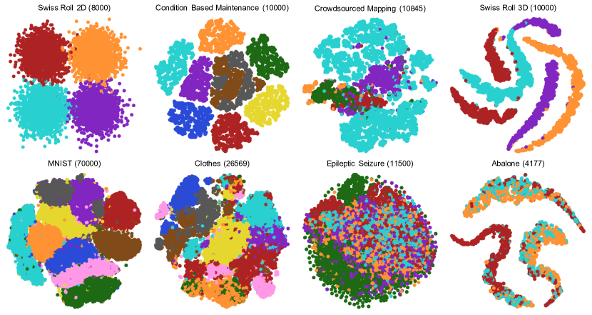
To ensure the reliability of the evaluation results, we selected datasets from the previous studies in visualization as our experiment data. More specifically, we collected datasets that were used in the works in our survey. Since most of them are high-dimensional data, we first transformed them into 2D data using t-SNE and normalized them to . In the results, points are located as clusters in different shapes in the obtained multi-class scatterplots. In addition, the number of points and the clutter degrees of these scatterplots vary within a wide range. According to the observations above, we selected eight representative datasets shown in Fig. 1 with different characteristics: six datasets where points are located as clusters (Swiss Roll 2D [49], Condition Based Maintenance [11], Crowdsourced Mapping [19], MNIST [23], Clothes [61], and Epileptic Seizure [2]); and two where points are located as curved stripes (Swiss Roll 3D [49] and Abalone [14]). The clutter degrees of them vary from slight to severe as the order listed in each bracket. The number of points in the selected datasets ranges from thousands to tens of thousands, as listed in Fig. 1.
2.3 Selection of Visual Factors
We identified the most critical visual factors for the sampling strategies by comprehensively reviewing existing works on sampling and scatterplots. Previous studies have shown that there are basically five goals related to scatterplot exploration, including outlier identification, shape examination, trend analysis, density detection, and coherence analysis [35, 57]. In order to determine which of these factors mentioned in the aforementioned goals are concerned in the existing sampling strategies, we carefully examined the 25 selected papers and extracted the visual factors that are considered in these works. Specifically, outlier maintenance is mentioned most often, as it appears in seven out of the 25 papers. Three papers concern preserving the relative density and two concern the overall shape of a scatterplot, respectively. Here, the overall shape refers to the geometric properties of the distribution of samples on a scatterplot, e.g. , whether a set of scatter points are convex or not. As a result, in the study, we decided to investigate the capabilities of different sampling strategies in preserving outliers, density, and the overall shape of a scatterplot.
3 Pre-Study
The purpose of the pre-study is to specify two experiment choices for the formal study: (1) how many points should be sampled from each dataset, and (2) whether color encoding should be used in the experiment for comparing region densities of multi-class scatterplots in the formal study. Region density refers to the density of data points regardless of class information.
3.1 Experiment 1: Sampling Number Identification
We conducted a subjective experiment to specify the proper number of sampling points for each dataset. On the one hand, we want set a small sampling number to clearly show the motivation of sampling, i.e. , addressing the issue of visual clutter. On the other hand, the patterns of the original scatterplots will not be preserved if the sampling number is too small. Because the patterns are different in different datasets, it is essential to choose a proper sampling number for each dataset.
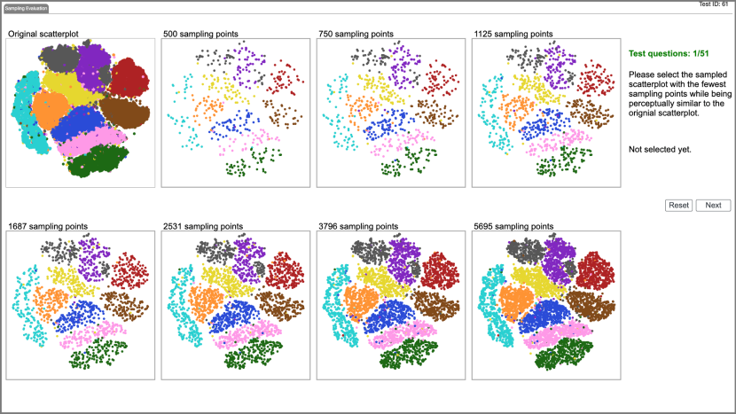
Task and Procedure. We used the same eight datasets as those in the formal study. For each dataset, we showed the participants the original scatterplot as well as a series of sampled scatterplots with different sampling numbers. Participants were asked to select the sampled scatterplot that has the smallest number of points while being perceptually similar to the original scatterplot. Weber-Fechner Law states that the perceived intensity is proportional to the logarithm of the stimulus [43]. Therefore, we adopted a seven-level sampling with , , , …, points (a geometric sequence) by random sampling.We chose random sampling because it has no preference for preserving certain properties of the datasets. In addition, random sampling will not introduce bias to the sampled data statistically and guarantee the representativeness of the sampled data [51]. Leskovec et al. [24] show that different sampling strategies produce very similar results when the sampling rate is greater than 50%. Therefore, we cut off the sampled scatterplots in a sequence if their sampling rate was greater than 50% to avoid meaningless comparison. As a result, there were seven sampled scatterplots (at most), along with the original scatterplot with all points, to be displayed. The eight scatterplots were arranged in a matrix layout, as shown in Fig. 2. There were eight trials for each participant in this experiment, corresponding to eight datasets, respectively. It took about 5 minutes for each participant to finish the experiment. Participants were asked which visual factors they were concerned with in the post-experiment questionnaire.
Participants and Apparatus. We recruited 160 participants (130 males, 30 females, aged 18 – 60 years). All the participants were either students or researchers with a computer science background. 69 participants reported being familiar or very familiar with visualization, 32 moderately familiar, and 61 unfamiliar or very unfamiliar. 65 participants reported previous experience with sampling.
The experiment was conducted through a web prototype. Participants were asked to perform the experiment on a screen with a resolution higher than . The points in the scatterplots were rendered with a radius of 3 pixels, which was preliminarily confirmed by iterative adjustments within a common range (1–5 pixels). Moreover, we rendered the points without transparency to avoid affecting the color perception [15].
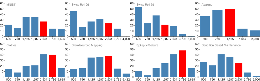
Results. Given the fact that when there are more points in a sampled scatterplot, it will look more like the original scatterplot, we assumed that participants would consider the sampling results still similar to the original scatterplot when the sampling number was more than the selected one. In addition, considering that other sampling strategies may perform better than random sampling, we needed to leave the space to show their superiority in our experiments. Based on these considerations, we have chosen the optimal sampling number by requiring that the sampling numbers of the scatterplots selected by 80%, rather than 100%, of the participants were smaller than the optimal one. Fig. 3 presents the results, which shows that the optimal sampling number for most datasets (MNIST, Swiss Roll 2D, Crowdsourced Mapping, and Condition Based Maintenance) is 2,531, while the sampling rates of them were , , , and , respectively. Four exceptions were the datasets Clothes, Epileptic Seizure, Swiss Roll 3D, and Abalone, whose optimal sampling numbers with the corresponding sampling rates were 3,796 (), 3,796 (), 1,687 (), and 1,125 (), respectively. According to the results of the subjective questionnaire in the experiment, when judging the similarity between scatterplots, over 75% of the participants took the overall shape of each class of points into consideration, followed by density () and outliers ().
3.2 Experiment 2: Understanding Color Effect on Region Density Identification
This controlled experiment aims to understand the effect of color when comparing region density in multi-class scatterplots. Though color is not related to the definition of region density, encoding class labels with color may affect human perception. Therefore, we should figure out whether color affects the perception of region density to decide whether color to be used in the formal study.
Task and Experiment design. We generated ten synthetic datasets using mixed Gaussian distributions with 3 to 10 classes. These datasets were different from the ones in the formal study. In each question, two rectangular regions were marked on the same scatterplot, and participants were asked to select the region with the higher density. This experiment adopted a within-subject design, and the only variable was whether the scatterplot was colored or not. We asked the same questions with multiple colors or with only a dark grey color. We provided two questions on each synthetic dataset, so there were 20 different questions. Thus, in total, we had
results. In order to eliminate the learning effect, the multi-colored and single-colored versions of the same question were arranged to appear in random order and not consecutively. It took about 5 minutes for each participant to finish the experiment.
Procedure. In order to help the participants become familiar with the task, the experiment started with a training session of three questions. In the training session, the correct answers were shown to the participants after they submitted their answers. Participants could ask questions during the training session. Time and accuracy were not recorded. As long as the participants reported that they had fully understood the experiment, we started the real test, where completion time and accuracy for each question were recorded. Thus, in the real study, we reminded participants that they needed to finish the experiment as fast and precisely as possible. After the experiment, participants were asked to finish a questionnaire and rate the color effect on a five-point Likert scale.
Participants and Apparatus. We had the same participants and used the same apparatus as in Experiment 1.
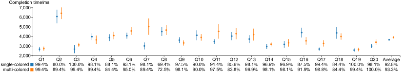
Results. As Fig. 4 shows, the average accuracy of the multi-colored and single-colored questions were 92.9% and 93.3%, respectively, while the average completion time of the multi-colored questions was 3,581ms and that of the single-colored ones was 3,616ms. Since the data was not subject to the normal distribution according to the Shapiro-Wilk test, we conducted the Wilcoxon test to examine the significance of their difference with a significance level of . No statistical significance in the difference of their accuracy is reported through hypothesis tests (). But a significant difference was shown in terms of completion time (), indicating that participants spent significantly less time in completing single-colored questions than multi-colored ones. The subject feedback reflected that participants felt that color affected the region density comparison slightly with an average score of 2.03 of the color deficiency. This is also consistent with our numerical results. A participant commented that ”the salient color may have an influence on my judgment of density.” Consequently, we decided to use single-colored scatterplots in the experiment of region density comparison in the formal study to eliminate the color effect.
4 Formal Study
4.1 Hypotheses
This formal study aims to evaluate the performance of seven selected sampling strategies based on preserving three identified visual factors, including relative density, outlier, and overall shape. According to the three visual factors, we formulated four hypotheses to guide the experiment design. Specifically, we formulated two hypotheses on relative density in terms of region density and class density, respectively. Region density refers to the density of data points regardless of class information. Class density is the density of data points belonging to a certain class.
H1:
All other sampling strategies perform better than random sampling in preserving relative region density.
Maintaining relative density is a common goal for many sampling strategies [7, 8, 18]. Compared to random sampling, these strategies are designed with delicate algorithms.
They often report positive results when compared with random sampling in different scenarios [8].
Therefore, we assume all other sampling strategies should perform better than random sampling in preserving relative region density.
H2: Multi-class adapted sampling strategies perform better than other sampling strategies in preserving relative class density.
Many sampling strategies are customized for multi-class scatterplots.
In these strategies, preserving the individual class properties, e.g. , density, is an important goal.
Therefore, we assume that multi-class adapted sampling strategies, including multi-view Z-order sampling [18], recursive subdivision based sampling [8], and multi-class blue noise sampling [7], perform better than the other four sampling strategies in preserving relative class density.
H3:
Outlier biased density based sampling is the best in preserving outliers.
Many sampling strategies have shown an ability to preserve outliers in their reports. Among them, outlier biased density based sampling is designed especially for preserving outliers. It is the only strategy that integrates outlier measures into the sampling process. Therefore, we assume that outlier biased density based sampling is the best strategy for preserving outliers.
H4:
Blue noise sampling and multi-class blue noise sampling perform better than other strategies in preserving the overall shape.
In our observation, uniform distribution facilitates the description of shapes by minimizing the effects of other visual factors, such as outliers and inhomogeneous density.
Based on this observation, we assume that sampling strategies that aim to generate uniform samples with blue noise property, i.e. , blue noise sampling and multi-class blue noise sampling, should perform the best in preserving the overall shape.
4.2 Experiments
Guided by the four hypotheses (H1–H4), we designed four experiments: Experiment 1 (E1) was designed for the perception of relative region density preservation (H1), and Experiment 2 (E2) was designed for the perception of relative class density preservation (H2); Experiment 3 (E3) was designed for the perception of outlier maintenance (H3); Experiment 4 (E4) was for the perception of overall shape preservation (H4). Note that E1–E3 were controlled experiments, and E4 was a subjective experiment.
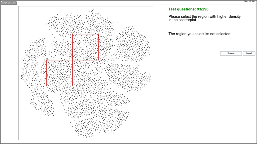
E1: Perception of relative region density preservation. This experiment was used to evaluate the ability of different sampling strategies to preserve relative region density in the aspect of visual perception. Specifically, in this experiment, we aimed to test if the region with higher region density can still be recognized as the higher one after sampling. Thus, in each question, we randomly marked out two rectangle regions with the size of , where is the width of scatterplots. Participants were asked to select the region with a higher density without considering class labels.
Based on the result of the pre-study, color would interfere and slow down the judgments of the participants. Thus, we rendered all data points in dark grey regardless of their labels. We had eight datasets, and we generated two questions for each dataset. For each question, we generated seven trials corresponding to seven sampling strategies, respectively. In the seven trials of the same question, the locations of the rectangle regions were the same. In total, we had
trials for each participant.
E2: Perception of relative class density preservation. This experiment was used to test whether the class with a higher density can still be recognized as the higher one after sampling. In contrast to E1, E2 focuses on preserving relative density of specific classes in the same region instead of relative region density. Thus, the scatterplots are rendered using color to encode class labels. Specifically, in each question, we marked out a rectangle region with the size of in a scatterplot. We specified two classes in the question, and the participants were asked to choose the class with higher average density in the marked region. In order to ensure fairness, the color assigned to each class in a specific dataset was identical across all sampling strategies. Similar to E1, we generated two questions for each dataset and seven trials for each question. In total, we had
trials for each participant.
E3: Perception of outlier maintenance. This experiment was used to evaluate the ability of sampling strategies in preserving outliers in the aspect of perception. We tested: (1) whether an outlier in the original dataset can still be preserved and perceived as an outlier after sampling; and (2) in case a point is perceived as an outlier after sampling, whether it is indeed an outlier in the original dataset.
There are diverse definitions of outliers, however, here we focused on the outliers in two situations: first, when considering class labels, the point that is of a different class from its neighboring points; second, when not considering class labels, the points which are located at abnormal distances from its class. We followed the definition in the class purity algorithm [36] in the first scenario and followed the local outlier factor algorithm [41] in the second scenario.
In each question, we marked out a region in a scatterplot. Participants were asked to mark the outliers assuming they believed the outliers existed in the marked region. Note that, the outliers were referring to all points in the entire scatterplot, instead of the marked region. We considered three ways for participants to identify outliers: first, marking out all the outliers in the entire scatterplot; second, marking out a specified number of outliers (e.g. , 10) in the entire scatterplot; and third, marking out all outliers in a given rectangle region. Considering the huge number of outliers in the entire dataset, it is not feasible to mark all of them in the entire range in the limited experiment time. In addition, the accuracy would be very low since many outliers would be missed. If we limit the number of target outliers as noted in the second option, due to the large number of outliers, participants may easily mark the requested number of outliers. The accuracy would be high for all the strategies, and it would be hard to distinguish the performances of different sampling strategies, so we chose the third option and asked the participants to mark all the outliers in a fixed range. The only disadvantage with this option was that participants might mis-select outliers referring to the local distribution. To avoid this, we reminded the participants to refer to global distribution, and we also corrected the observed errors in the training session. In total, we had
trials for each participant in this experiment.
E4: Perception of overall shape preservation. This experiment was used to compare the abilities of sampling strategies to preserve the overall shape of scatterplots in terms of visual perception. In contrast to E1–E3, E4 was a subjective experiment. In each trial, we sampled a dataset using seven strategies and displayed these seven sampling results together with the original scatterplot (see Fig. 2). Participants were asked to rank the seven sampling results based on the shape similarities between the sampling results and the original scatterplot. Participants were reminded that class labels should be taken into account in comparing the shape similarities. Parallel rankings were allowed when participants could not distinguish the difference among the sampling results. Each participant had one trial for each dataset. Thus, in total, we had eight trials for each participant in this experiment.
4.3 Participants, Apparatus and Testing Data
Participants. We recruited 100 participants (78 males, 22 females, aged 18–50 years, average: 24) for the formal study. 16 of them are researchers in visualization and computer graphics. The others are undergraduates or graduated students majoring in computer science. 34 participants reported previous experience with sampling. None of them reported color blindness or color weakness. Each participant was rewarded $20 per hour for completing the experiments.
Apparatus. The experiments were conducted online through a web prototype (see Figure 5). Participants were required to visit it remotely on the Chrome browser and finish the experiment on a screen with a resolution of . They were asked to share their screen with the instructor during the experiments to enable remote monitoring.
Testing data. We generated scatterplots based on the eight selected datasets for the experiments in advance. For each dataset, we created one scatterplot of the original dataset and seven scatterplots of sampling results by the seven sampling strategies, respectively. The sampling rates of each dataset were determined based on the results of the pre-study. Since multi-view Z-order sampling and recursive subdivision based sampling cannot set the exact sampling rate, we controlled the error at . The points were rendered with a radius of 3 pixels without transparency. The size of the scatterplots was pixels in E1–E3, and pixels in E4. In order to avoid imbalanced occlusion between classes, the points in the scatterplots were rendered in random order. Except for E1, we selected Boynton’s color palette [6] to encode classes in the scatterplots. For the training session, we generated synthetic datasets following the Gaussian mixed distribution. In the real testing session, the order of all the questions was counterbalanced by following a Latin square to avoid the learning effect.
4.4 Procedure
Each experiment included a training session and a real test session. At the beginning of the training session, the instructor explained the experiments as well as the related concepts (e.g. , outliers). After the explanation, several practice trials (three for E1–E3, and one for E4) were presented to help participants get familiar with the experiments. For controlled experiments, E1–E3, the correct answers were shown to the participants after the answers were submitted. The participants were encouraged to ask questions in the training sessions to facilitate their understanding of the experiments. After they reported that they have fully understood the tasks, we started the real test session. Participants were allowed to have a break of five minutes before each experiment. After the participants completed all the experiments, they were asked to answer a questionnaire for their backgrounds and subjective feedback on the experiments. The entire process lasted approximately one hour and 20 minutes for each participant. During the online experiments, network error occurred in nine trials, resulting in unusual long response time (more than 30 seconds). Considering that repeating these nine trials will also introduce bias into the result, we simply discarded these nine trials to preserve the validity of result.
The questionnaire included three parts. First, we asked participants about their backgrounds and basic information, familiarity with visualization, and experience with sampling strategies. Second, participants were asked to rate the importance of preserving relative density, outliers, and overall shape for a sampling strategy using a five-point Likert scale. They were also encouraged to add extra abilities that a sampling method should provide. Finally, we asked about their focus in each experiment in order to learn the important visual factors for human perception.
5 Experimental Results
5.1 Analysis Approach
We recorded the objective measurements from E1–E3 and the subjective measurement from E4. For E1 and E2, we recorded the correctness and completion time of each trial. For E3, we calculated the precision and recall of each trial. In each trial, we denoted the set of outliers marked out by a participant as and the ground truth as . The precision is the ratio of to , and the recall is the ratio of to , where denotes to the cardinality of a finite set. Note that the recall refers to the ratio of outliers that are preserved by sampling and then perceived by participants. To avoid small values, we normalized the recall by the maximal outlier preserving ratio among seven sampling strategies on each dataset. Without loss of clarity, we use the term recall to refer to normalized recall in the rest of this paper. For E4, we recorded the ranking of each sampling strategy in each trial and transformed the rankings into scores. Specifically, the 1st–7th sampling strategies get 7–1 point, respectively.
Following the common methods for evaluating user performance [22], we reported the mean values and confidence intervals of the objective measurements and performed significance analyses to test our hypotheses. For the results of E1–E3, we performed the Shapiro-Wilk test and found that they do not follow the normal distribution. Therefore, we employed a non-parametric method to examine whether significant differences exist among the sampling strategies. Specifically, we chose the Friedman test with the standard significance level of in our analysis. If there were significant differences, we conducted the Conover test as the post-hoc test to examine the pairwise significance. In E4, we also reported the mean value and the confidence interval of the rating score for each sampling strategy.
5.2 Results Analysis
H1: We assume that all other sampling strategies perform better than random sampling in preserving relative region density.
H1 is rejected as random sampling performs the best in preserving relative region density.
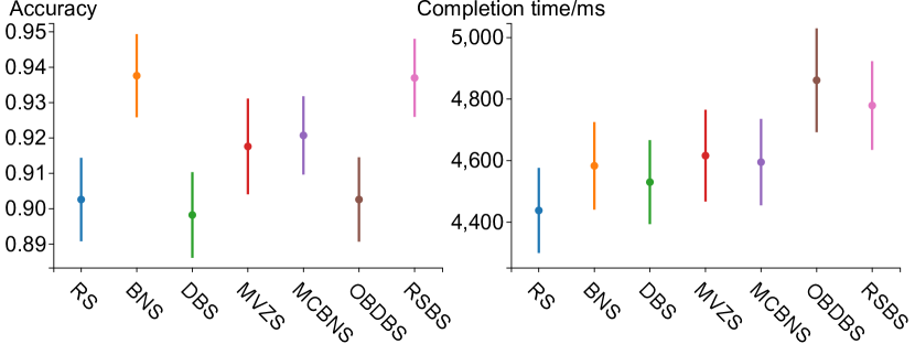
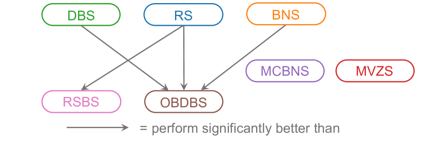
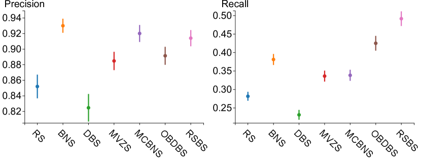
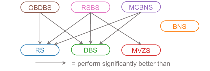
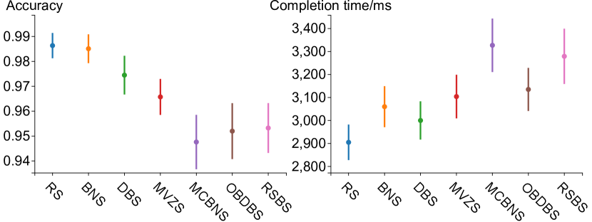
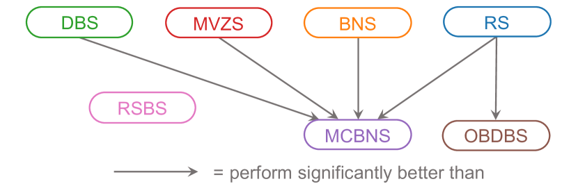
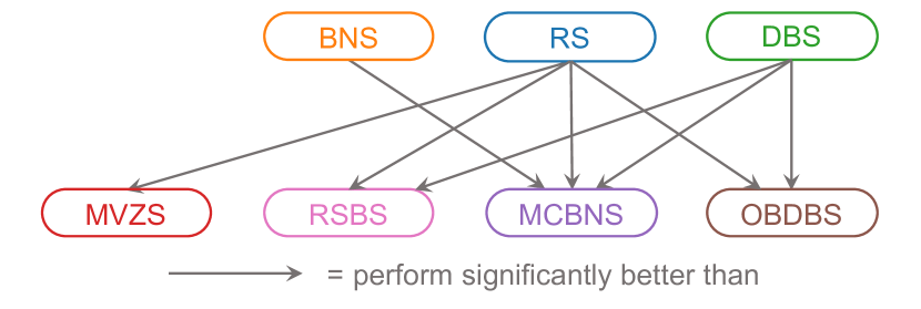
Fig. 6 shows the results of E1. Among all sampling strategies, the accuracy ranges from to , while the average completion time ranges from 2,855ms to 3,283ms. Random sampling has the highest accuracy () and the shortest completion time () in E1. The Friedman tests show that statistical significance among different sampling strategies exist in terms of accuracy () and average completion time (). Fig. 7 depicts the pairwise significance relationships between each pair of sampling strategies in terms of accuracy. Random sampling performs significantly better than multi-class blue noise sampling () and outlier biased density based sampling () in terms of accuracy. Fig. 8 depicts the pairwise significance relationships in terms of average completion time. Random sampling performs significantly better than multi-view Z-order sampling (), multi-class blue noise sampling (), outlier biased density based sampling (), and recursive subdivision based sampling () in terms of average completion time. No sampling strategy performs significantly better than random sampling, either in terms of accuracy or average completion time.
H2: We assume that multi-class adapted sampling strategies, including multi-class blue noise sampling, multi-view Z-order sampling, and recursive subdivision based sampling, perform better than random sampling, blue noise sampling, density biased sampling and outlier biased density based sampling in preserving relative class density.
H2 is partially confirmed as multi-class sampling strategies achieve higher accuracy except for blue noise sampling, while random sampling performs the best in terms of completion time.
The results of E2 are displayed in Fig. 9. Blue noise sampling has the highest accuracy at . The accuracies of recursive subdivision based sampling (), multi-class blue noise sampling (), and multi-view Z-order sampling () are higher than the remaining three strategies. With an accuracy range of nearly (–), however, no significant difference in accuracy is reported using the Friedman test ().
In terms of average completion time, random sampling performs the best, obtaining a result of 4,437ms, while the worst one, outlier biased density based sampling, is more than 400ms slower. The three multi-class adapted sampling strategies offer no clear advantage compared to other strategies. The Friedman test shows that a significant difference exists in completion time (). Fig. 10 shows the pairwise significance relationships in terms of average completion time. Random sampling performs significantly better than recursive subdivision based sampling (). Besides testing the hypothesis, we also find that outlier biased density based sampling performs significantly worse than density biased sampling (), random sampling (), and blue noise sampling ().
H3: We assume that outlier biased density based sampling is the best in preserving outliers.
H3 is partially confirmed as recursive subdivision based sampling and outlier biased density based sampling achieve higher recall than other strategies, while blue noise sampling has the highest precision.
As shown in Fig. 11, outlier biased density based sampling is ranked fourth in terms of precision. Blue noise sampling, multi-class blue noise sampling, and recursive subdivision based sampling have higher precision than outlier biased density based sampling. The precision data span more than (–) among all strategies. However, the Friedman test finds no significant differences in the precision of the sampling strategies (). In terms of recall, outlier biased density based sampling is ranked second, while recursive subdivision based sampling has the highest recall. The range of recall is about , from to , and the Friedman test shows that significant differences exist (). The post-hoc tests show that outlier biased density based sampling performs significantly better than random sampling and density based sampling (Fig. 12). Fig. 12 shows the discovered pairwise significance relationships. In addition to the hypothesis test, we also find some other interesting results. First, blue noise sampling has the highest precision and the third-highest recall. Although it has no significance relationship with other strategies in terms of precision and recall, it is worth recommending it for outlier preservation along with outlier biased density based sampling and recursive subdivision based sampling. In contrast, random sampling and density biased sampling have relatively lower precision and recall than the other strategies. Significance differences are found to exist between them and outlier biased density based sampling, multi-class blue noise sampling, and recursive subdivision based sampling.
H4: We assume that blue noise sampling and multi-class blue noise sampling perform better than other strategies in preserving the overall shape.
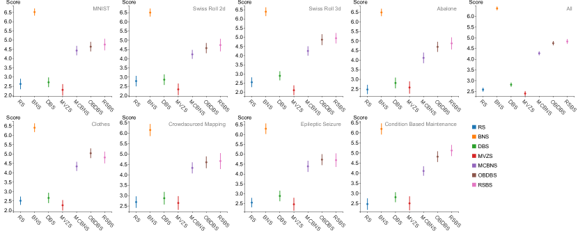
H4 is also partially confirmed as blue noise sampling gets the highest score, but multi-class blue noise sampling only ranks 4th.
Fig. 13 shows the average ranking scores of sampling strategies in eight datasets and their average. Blue noise sampling has the highest ranking score in all eight datasets with an average score of , while the performance of multi-class blue noise sampling is near the middle. Moreover, recursive subdivision based sampling, outlier biased density based sampling, and multi-class blue noise sampling has similar scores and rank 2nd, 3rd, and 4th with averages of , , and , respectively. The ranking is stable across all eight datasets.
Takeaways. Since blue noise sampling has competitive results in all experiments, it is suggested to be more generally used in data exploration. Random sampling performs comparatively well in both E1 and E2, indicating that it is still a competitive choice when users seek to preserve the relative density in the sampled scatterplot given its simplicity. In addition, as outlier biased density based sampling and recursive subdivision based sampling show their capabilities in outlier maintenance and shape preservation, users may pay more attention to them when encountering such practical needs.
6 Discussion
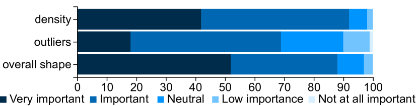
6.1 Important Visual Factors in Sampling
The subjective questionnaire on the important visual factors provided insights into sampling strategy selection in different scenarios. The results are presented in Fig. 14. The average ratings of relative density, outliers, and overall shape, are 4.32, 3.76, and 4.37, respectively. The high ratings confirm that the evaluated visual factors are common concerns in scatterplot sampling. We also got interesting findings when considering the difference between participants from different fields. The participants in visualization and computer graphics rated 4.00 for outliers and 4.23 for overall shape. Compared to the averages, they were more interested in outlier maintenance than the participants in other fields. In contrast, the participants in computer vision and deep learning rated 3.39 for outliers, but 4.69 for overall shape. The participants commented that they were particularly interested in classification and regression tasks, and the overall shape is helpful in understanding the pattern of classification and correlation. The participants in computer graphics paid more attention to relative density preservation with a rating of 4.63. This is because density is important in geometry modeling tasks of computer graphics. Therefore, we can recommend sampling strategies according to the specific task. For instance, although people in computer vision and deep learning are not familiar with blue noise sampling, they are suggested to try it because blue noise sampling performs the best in overall shape preservation. In addition, extra visual factors were proposed in the subjective questionnaire. For instance, the position relationship among classes (e.g. , whether two classes are separated or mixed together) was proposed by 15 participants. Three participants commented that the trends regarding points should also be preserved. These ideas might shed light on new design requirements for sampling.
6.2 Influencing Factors of Perception and Design Considerations for Sampling
The subjective questionnaire also contained factors that affect perceptions during the experiments. These results provided insights into possible revisits of our experiment design and shed light on sampling strategy design for different tasks. In E1, the covering area (by 60% of the participants) and the distance among points (by 50% of the participants) were reported to affect region density judgments. The occupancy model [1] shows that how these factors affect human perception of region density on scatterplots, and there are some previous works [52, 5] that measured the perceptual density difference of some factors through user studies. Bertini et al. [5] leverage an ad-hoc perception study result and propose a sampling framework to strengthen the perception of relative density differences. Further exploration of integrating perceptual effects with sampling strategy design will be an interesting direction. In E2, the covering area, the distance among points, and the colors of two classes (25%) were reported to be effective visual factors when making class density judgments. Specifically, 56% of the respondents commented that bright color leads to over-estimation of the density. In our experiment, we randomly set colors from Boynton’s color palette [6] that are considered to be almost never confused. The color issue may be further alleviated by optimizing the color assignments to classes after sampling like Wang et al. [53]. In E4, 66% of participants commented that the outline of the shape was the most important visual factor when comparing overall shapes. Inspired by this report, a sampling strategy aimed at overall shape preservation should pay more attention to the boundary of clusters.
6.3 Limitations and Future Work
As mentioned above, there are many factors affecting the perception of the evaluated visual factors. On the one hand, these factors, for example, the color in E2, may introduce perceptual bias in our experiments. Considering that we have a large number of trials, such bias can be reduced by random settings for the trails. On the other hand, understanding the relationships between them and the visual factors we are concerned with would be inspiring for future sampling strategy design. However, a controlled experiment containing all of these variables would make it hard to conduct a practical evaluation. It would be interesting to perform further evaluation of the relationships among them.
In addition, our evaluation only considered sampling on 2D data. However, scatterplots are usually employed to visualize high-dimensional data in conjunction with dimensionality reduction approaches. Sampling is performed in the high-dimensional space rather than 2D space for efficiency. A promising future direction is to explore the perception effects of sampling strategies when they are performed in the high-dimensional space.
7 Conclusion
In this paper, we present an empirical evaluation of sampling strategies for scatterplots from the perspective of perception. We identify seven representative sampling strategies and three critical visual factors for scatterplots following a comprehensive survey of the existing literature. Based on the results, we formulate four hypotheses and design four experiments to evaluate the ability of the selected sampling strategies to preserve the identified visual factors. We first conduct a pre-study to determine the proper sampling number of each dataset and confirm the negative effect on region density identification caused by color. The results of the formal study show that (1) random sampling is the best in region density preservation in terms of time and accuracy; (2) blue noise sampling and multi-class sampling strategies are accurate at class density preservation, while random sampling is highly efficient at this task; (3) recursive subdivision based sampling, outlier biased density based sampling, and blue noise sampling are favored in outlier maintenance; and (4) blue noise sampling is the best in overall shape preservation. These results offer practical guidance for the selection of sampling strategies in different application scenarios.
Acknowledgements.
This research is supported by the National Key R&D Program of China (No.s 2018YFB1004300, 2019YFB1405703), the National Natural Science Foundation of China (No.s 61761136020, 61672307, 61672308, 61872389, 61936002), XJTLU Research Development Funding RDF-19-02-11, and TC190A4DA/3.References
- [1] J. Allïk and T. Tuulmets. Occupancy model of perceived numerosity. Perception & Psychophysics, 49(4):303–314, 1991.
- [2] R. G. Andrzejak, K. Lehnertz, F. Mormann, C. Rieke, P. David, and C. E. Elger. Indications of nonlinear deterministic and finite-dimensional structures in time series of brain electrical activity: Dependence on recording region and brain state. Physical Review E, 64(6):061907, 2001.
- [3] M. Berger, K. McDonough, and L. M. Seversky. cite2vec: Citation-driven document exploration via word embeddings. IEEE transactions on visualization and computer graphics, 23(1):691–700, 2016.
- [4] E. Bertini and G. Santucci. By chance is not enough: preserving relative density through nonuniform sampling. In Proceedings of the Eighth International Conference on Information Visualisation, pages 622–629. IEEE, 2004.
- [5] E. Bertini and G. Santucci. Give chance a chance: Modeling density to enhance scatter plot quality through random data sampling. Information Visualization, 5(2):95–110, 2006.
- [6] R. M. Boynton. Eleven colors that are almost never confused. In B. E. Rogowitz, editor, Proceedings of the Human Vision, Visual Processing, and Digital Display, volume 1077, pages 322–332. SPIE, 1989.
- [7] H. Chen, W. Chen, H. Mei, Z. Liu, K. Zhou, W. Chen, W. Gu, and K. Ma. Visual abstraction and exploration of multi-class scatterplots. IEEE Transactions on Visualization and Computer Graphics, 20(12):1683–1692, 2014.
- [8] X. Chen, T. Ge, J. Zhang, B. Chen, C. Fu, O. Deussen, and Y. Wang. A recursive subdivision technique for sampling multi-class scatterplots. IEEE Transactions on Visualization and Computer Graphics, 26(1):729–738, 2020.
- [9] S. Cheng, W. Xu, and K. Mueller. ColorMapND: A data-driven approach and tool for mapping multivariate data to color. IEEE Transactions on Visualization and Computer Graphics, 25(2):1361–1377, 2019.
- [10] R. L. Cook. Stochastic sampling in computer graphics. ACM Transactions on Graphics, 5(1):51–72, 1986.
- [11] A. Coraddu, L. Oneto, A. Ghio, S. Savio, D. Anguita, and M. Figari. Machine learning approaches for improving condition-based maintenance of naval propulsion plants. Proceedings of the Institution of Mechanical Engineers, Part M: Journal of Engineering for the Maritime Environment, 230(1):136–153, 2014.
- [12] A. Dix and G. Ellis. By chance enhancing interaction with large data sets through statistical sampling. In Proceedings of the Working Conference on Advanced Visual Interfaces, pages 167–176, 2002.
- [13] E. P. dos Santos Amorim, E. V. Brazil, J. Daniels, P. Joia, L. G. Nonato, and M. C. Sousa. iLAMP: Exploring high-dimensional spacing through backward multidimensional projection. In Proceedings of the IEEE Conference on Visual Analytics Science and Technology, pages 53–62, 2012.
- [14] D. Dua and C. Graff. UCI machine learning repository, 2017.
- [15] M. D’Zmura, P. Colantoni, K. Knoblauch, and B. Laget. Color transparency. Perception, 26(4):471–492, 1997.
- [16] G. Ellis, E. Bertini, and A. Dix. The sampling lens: making sense of saturated visualisations. In CHI’05 extended abstracts on Human Factors in Computing Systems, pages 1351–1354, 2005.
- [17] G. Ellis and A. Dix. A taxonomy of clutter reduction for information visualisation. IEEE Transactions on Visualization and Computer Graphics, 13(6):1216–1223, 2007.
- [18] R. Hu, T. Sha, O. Van Kaick, O. Deussen, and H. Huang. Data sampling in multi-view and multi-class scatterplots via set cover optimization. IEEE Transactions on Visualization and Computer Graphics, 26(1):739–748, 2020.
- [19] B. A. Johnson and K. Iizuka. Integrating OpenStreetMap crowdsourced data and landsat time-series imagery for rapid land use/land cover (LULC) mapping: Case study of the laguna de bay area of the philippines. Applied Geography, 67:140–149, 2016.
- [20] P. Joia, F. Petronetto, and L. Nonato. Uncovering representative groups in multidimensional projections. Computer Graphics Forum, 34(3):281–290, 2015.
- [21] E. Kandogan. Just-in-time annotation of clusters, outliers, and trends in point-based data visualizations. In Proceedings of the IEEE Conference on Visual Analytics Science and Technology, pages 73–82, 2012.
- [22] H. Lam, E. Bertini, P. Isenberg, C. Plaisant, and S. Carpendale. Empirical Studies in Information Visualization: Seven Scenarios. IEEE Transactions on Visualization and Computer Graphics, 18(9):1520–1536, 2012.
- [23] Y. Lecun, L. Bottou, Y. Bengio, and P. Haffner. Gradient-based learning applied to document recognition. Proceedings of the IEEE, 86(11):2278–2324, 1998.
- [24] J. Leskovec and C. Faloutsos. Sampling from large graphs. In Proceedings of the 12th ACM SIGKDD International Conference on Knowledge Discovery and Data Mining, pages 631–636. ACM Press, 2006.
- [25] J. Li, J.-B. Martens, and J. J. van Wijk. A model of symbol size discrimination in scatterplots. In Proceedings of the SIGCHI Conference on Human Factors in Computing Systems, pages 2553–2562, 2010.
- [26] J. Li, J. J. van Wijk, and J.-B. Martens. A model of symbol lightness discrimination in sparse scatterplots. In 2010 IEEE Pacific visualization symposium (PacificVis), pages 105–112. IEEE, 2010.
- [27] L. Liu, A. P. Boone, I. T. Ruginski, L. Padilla, M. Hegarty, S. H. Creem-Regehr, W. B. Thompson, C. Yuksel, and D. H. House. Uncertainty visualization by representative sampling from prediction ensembles. IEEE Transactions on Visualization and Computer Graphics, 23(9):2165–2178, 2017.
- [28] M. Liu, J. Shi, Z. Li, C. Li, J. Zhu, and S. Liu. Towards better analysis of deep convolutional neural networks. IEEE Transactions on Visualization and Computer Graphics, 23(1):91–100, 2017.
- [29] S. Liu, P.-T. Bremer, J. J. Jayaraman, B. Wang, B. Summa, and V. Pascucci. The grassmannian atlas: A general framework for exploring linear projections of high-dimensional data. Computer Graphics Forum, 35(3):1–10, June 2016.
- [30] S. Liu, C. Chen, Y. Lu, F. Ouyang, and B. Wang. An interactive method to improve crowdsourced annotations. IEEE Transactions on Visualization and Computer Graphics, 25(1):235–245, 2019.
- [31] S. Liu, J. Xiao, J. Liu, X. Wang, J. Wu, and J. Zhu. Visual diagnosis of tree boosting methods. IEEE transactions on visualization and computer graphics, 24(1):163–173, 2017.
- [32] Y. Ma, A. K. H. Tung, W. Wang, X. Gao, Z. Pan, and W. Chen. Scatternet: A deep subjective similarity model for visual analysis of scatterplots. IEEE Transactions on Visualization and Computer Graphics, 26(3):1562–1576, 2018.
- [33] J. Matejka, F. Anderson, and G. Fitzmaurice. Dynamic opacity optimization for scatter plots. In Proceedings of the 33rd Annual ACM Conference on Human Factors in Computing Systems, pages 2707–2710, 2015.
- [34] A. Mayorga and M. Gleicher. Splatterplots: Overcoming overdraw in scatter plots. IEEE Transactions on Visualization and Computer Graphics, 19(9):1526–1538, 2013.
- [35] L. Micallef, G. Palmas, A. Oulasvirta, and T. Weinkauf. Towards perceptual optimization of the visual design of scatterplots. IEEE transactions on visualization and computer graphics, 23(6):1588–1599, 2017.
- [36] R. Motta, R. Minghim, A. de Andrade Lopes, and M. C. F. Oliveira. Graph-based measures to assist user assessment of multidimensional projections. Neurocomputing, 150:583–598, 2015.
- [37] P. Mukhopadhyay. Theory and methods of survey sampling. PHI Learning Pvt. Ltd., 2008.
- [38] Q. H. Nguyen, S.-H. Hong, P. Eades, and A. Meidiana. Proxy graph: Visual quality metrics of big graph sampling. IEEE transactions on visualization and computer graphics, 23(6):1600–1611, 2017.
- [39] C. R. Palmer and C. Faloutsos. Density biased sampling: An improved method for data mining and clustering. In Proceedings of the ACM SIGMOD International Conference on Management of Data, pages 82–92, 2000.
- [40] Y. Park, M. J. Cafarella, and B. Mozafari. Visualization-aware sampling for very large databases. In Proceedings of the IEEE 32nd International Conference on Data Engineering, pages 755–766, 2015.
- [41] F. Pedregosa, G. Varoquaux, A. Gramfort, V. Michel, B. Thirion, O. Grisel, M. Blondel, P. Prettenhofer, R. Weiss, V. Dubourg, J. Vanderplas, A. Passos, D. Cournapeau, M. Brucher, M. Perrot, and E. Duchesnay. Scikit-learn: Machine learning in Python. Journal of Machine Learning Research, 12(85):2825–2830, 2011.
- [42] J. Poco, R. Etemadpour, F. Paulovich, T. Long, P. Rosenthal, M. Oliveira, L. Linsen, and R. Minghim. A framework for exploring multidimensional data with 3d projections. Computer Graphics Forum, 30(3):1111–1120, 2011.
- [43] R. Portugal and B. F. Svaiter. Weber-fechner law and the optimality of the logarithmic scale. Minds and Machines, 21(1):73–81, 2011.
- [44] B. Rieck and H. Leitte. Persistent homology for the evaluation of dimensionality reduction schemes. Computer Graphics Forum, 34(3):431–440, 2015.
- [45] J. A. R. Rojas, M. Beth Kery, S. Rosenthal, and A. Dey. Sampling techniques to improve big data exploration. In Proceedings of the IEEE 7th Symposium on Large Data Analysis and Visualization, pages 26–35, 2017.
- [46] D. Sacha, L. Zhang, M. Sedlmair, J. A. Lee, J. Peltonen, D. Weiskopf, S. C. North, and D. A. Keim. Visual interaction with dimensionality reduction: A structured literature analysis. IEEE Transactions on Visualization and Computer Graphics, 23(1):241–250, 2017.
- [47] A. Sarikaya and M. Gleicher. Scatterplots: Tasks, data, and designs. IEEE Transactions on Visualization and Computer Graphics, 24(1):402–412, 2018.
- [48] M. Sedlmair, T. Munzner, and M. Tory. Empirical guidance on scatterplot and dimension reduction technique choices. IEEE transactions on visualization and computer graphics, 19(12):2634–2643, 2013.
- [49] D. Surendran. Swiss roll dataset. https://people.cs.uchicago.edu/~dinoj/manifold/swissroll.html, 2004. Last accessed 2019-04-30.
- [50] W. Tao, X. Liu, Y. Wang, L. Battle, Ç. Demiralp, R. Chang, and M. Stonebraker. Kyrix: Interactive pan/zoom visualizations at scale. Computer Graphics Forum, 38(3):529–540, 2019.
- [51] J. Verma. Statistics and Research Methods in Psychology with Excel. Springer, 2019.
- [52] P. G. Vos, M. P. van Oeffelen, H. J. Tibosch, and J. Allik. Interactions between area and numerosity. Psychological Research, 50(3):148–154, 1988.
- [53] Y. Wang, X. Chen, T. Ge, C. Bao, M. Sedlmair, C.-W. Fu, O. Deussen, and B. Chen. Optimizing color assignment for perception of class separability in multiclass scatterplots. IEEE Transactions on Visualization and Computer Graphics, 25(1):820–829, 2019.
- [54] Y. Wang, Z. Wang, T. Liu, M. Correll, Z. Cheng, O. Deussen, and M. Sedlmair. Improving the robustness of scagnostics. IEEE transactions on visualization and computer graphics, 26(1):759–769, 2019.
- [55] L.-Y. Wei. Multi-class blue noise sampling. ACM Transactions on Graphics, 29(4):79, 2010.
- [56] Y. Wei, H. Mei, Y. Zhao, S. Zhou, B. Lin, H. Jiang, and W. Chen. Evaluating perceptual bias during geometric scaling of scatterplots. IEEE Transactions on Visualization and Computer Graphics, 26(1):321–331, 2020.
- [57] L. Wilkinson, A. Anand, and R. Grossman. Graph-theoretic scagnostics. In Proceedings of the IEEE Symposium on Information Visualization, pages 157–164, 2005.
- [58] A. Woodruff, J. Landay, and M. Stonebraker. Constant density visualizations of non-uniform distributions of data. In Proceedings of the 11th annual ACM symposium on User interface software and technology, pages 19–28, 1998.
- [59] Y. Wu, N. Cao, D. Archambault, Q. Shen, H. Qu, and W. Cui. Evaluation of graph sampling: A visualization perspective. IEEE transactions on visualization and computer graphics, 23(1):401–410, 2016.
- [60] J. Xia, F. Ye, W. Chen, Y. Wang, W. Chen, Y. Ma, and A. K. Tung. LDSScanner: Exploratory analysis of low-dimensional structures in high-dimensional datasets. IEEE Transactions on Visualization and Computer Graphics, 24(1):236–245, 2018.
- [61] S. Xiang, X. Ye, J. Xia, J. Wu, Y. Chen, and S. Liu. Interactive correction of mislabeled training data. In Proceedings of the IEEE Conference on Visual Analytics Science and Technology, pages 57–68, 2019.
- [62] D.-M. Yan, J.-W. Guo, B. Wang, X.-P. Zhang, and P. Wonka. A survey of blue-noise sampling and its applications. Journal of Computer Science and Technology, 30(3):439–452, 2015.
- [63] J. Yuan, C. Chen, W. Yang, M. Liu, J. Xia, and S. Liu. A survey of visual analytics techniques for machine learning. Computational Visual Media, 7(1):1–31, 2021.
- [64] J. Zhang, E. Yanli, J. Ma, Y. Zhao, B. Xu, L. Sun, J. Chen, and X. Yuan. Visual analysis of public utility service problems in a metropolis. IEEE transactions on visualization and computer graphics, 20(12):1843–1852, 2014.
- [65] J. Zhao, X. Liu, C. Guo, C. Qian, and Y. V. Chen. Phoenixmap: An abstract approach to visualize 2d spatial distributions. IEEE Transactions on Visualization and Computer Graphics, 2019. doi:10.1109/TVCG.2019.2945960.
- [66] X. Zhao, W. Cui, Y. Wu, H. Zhang, H. Qu, and D. Zhang. Oui! outlier interpretation on multi-dimensional data via visual analytics. Computer Graphics Forum, 38(3):213–224, 2019.
- [67] Y. Zhao, X. Luo, X. Lin, H. Wang, X. Kui, F. Zhou, J. Wang, Y. Chen, and W. Chen. Visual analytics for electromagnetic situation awareness in radio monitoring and management. IEEE Transactions on Visualization and Computer Graphics, 26(1):590–600, 2020.
- [68] Y. Zheng, J. Jestes, J. M. Phillips, and F. Li. Quality and efficiency for kernel density estimates in large data. In Proceedings of the ACM SIGMOD International Conference on Management of Data, pages 433–444. ACM Press, 2013.