*latexText page 0 contains only floats
Class maps for visualizing
classification results
Abstract
Classification is a major tool of statistics and machine learning. A classification method first processes a training set of objects with given classes (labels), with the goal of afterward assigning new objects to one of these classes. When running the resulting prediction method on the training data or on test data, it can happen that an object is predicted to lie in a class that differs from its given label. This is sometimes called label bias, and raises the question whether the object was mislabeled. The proposed class map reflects the probability that an object belongs to an alternative class, how far it is from the other objects in its given class, and whether some objects lie far from all classes. The goal is to visualize aspects of the classification results to obtain insight in the data. The display is constructed for discriminant analysis, the k-nearest neighbor classifier, support vector machines, logistic regression, and coupling pairwise classifications. It is illustrated on several benchmark datasets, including some about images and texts.
Keywords: discriminant analysis,
k-nearest neighbors, mislabeling, pairwise
coupling,support vector machines.
1 Introduction
Classification is a major tool of statistics and machine learning. For an extensive introduction to classification methods see Hastie et al. (2017). A classification method first processes a training set of objects with given classes (labels), with the goal of afterward assigning new objects to one of these classes. When running the resulting prediction method on the training data or on validation data or test data, it can happen that an object is predicted to lie in a class that differs from its given label. This is sometimes called label bias, and raises the question whether the object might have been mislabeled. Our goal is to visualize aspects of the data classification to obtain insight in the data. For consistency, we will depict the predictions in the vertical direction throughout.
We start with a simple illustrative example. The floral bud data originate from Wouters et al. (2015) and were kindly provided to us by Dr. Bart De Ketelaere. They arose from an experiment in a pear orchard with the goal of detecting floral buds in their environment with branches, bud scales, and supports for the trees. The data contain 550 observations and 6 variables. There are four classes: ‘branch’ (49 members), ‘bud’ (363), ‘scale’ (94), and ‘support’ (44). The classification in Section 3 yields the confusion matrix
in which the rows are the given classes and the columns are the predicted classes.
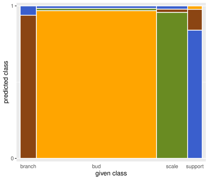
After a classification is carried out, we can display the result in a stacked bar chart or a mosaic plot (Hartigan and Kleiner, 1981; Friendly, 1994). Figure 1 shows such a stacked mosaic plot, which graphically represents the confusion matrix. The classes are represented by colors reminiscent of their meaning. The given classes are on the horizontal axis, and the predicted labels are on the vertical axis. The area of each rectangle is proportional to the number of objects in it. The display immediately shows that the given classes have different numbers of objects. Several variations of this plot are possible. One could rank the vertical labels in the order of the original classes, but we choose to put the given class at the bottom so that the lower part of each bar reflects the objects that were classified in accordance with their label. For the other labels in each bar we take the order of the remaining original classes. Here we see that buds are often classified correctly but that there is some confusion between branch and support.
Figure 1 does not yet give us an idea why some object is predicted to belong to a different class. Is it because the object lies in or near a region where classes overlap? Or is it deeply inside its predicted class and far from its given class, arousing suspicion that its original label was wrong? Or is it actually far from both its given and predicted classes? To assist with these questions we will propose a display that incorporates additional information.
Section 2 gives general definitions and illustrates the display on an example. The subsequent sections apply it to discriminant analysis, the k-nearest neighbor method, support vector machines, logistic regression, and pairwise coupling.
2 Basic principles of a class map
Suppose we have objects denoted by their index where , and there are classes (labels, groups) with . The target is thus a discrete variable with levels. Consider a case in the training set or a test set. Either explicitly or implicitly, most classifiers provide posterior probabilities of object belonging to each of the classes , with for each . For instance, in discriminant analysis the posterior probabilities are based on the estimated densities of the classes, whereas the k-nearest neighbor classifier estimates them by the class frequencies in the -neighborhood of .
The object is then classified according to the rule
| (1) |
Now assume that object has a known given label . We wish to measure to what extent the given label agrees with the classification. For this purpose we define the highest attained by a class different from as
| (2) |
The class attaining this maximum can be seen as the best alternative class. If it follows that attains the overall highest value of so the classifier agrees with the given class . On the other hand, if the classifier will not assign object to class .
We now compute the conditional posterior probability of the best alternative class when comparing it with the given class as
| (3) |
The abbreviation PAC stands for Probability of the Alternative Class. Note that when the classifier does predict the given class , whereas indicates that the best alternative class outperforms in the eyes of the classifier. corresponds to a class that fits very well, and to a class that does not fit well at all. In cluster analysis, the silhouette plot of Rousseeuw (1987) is based on the same idea of quantifying how well an object is positioned in its class by a comparison with the best alternative class.
Note that the denominator of (3) is strictly positive by construction. When there are classes, the alternative class is the only other class, the denominator of (3) simplifies to 1, and becomes an unconditional probability. The PAC bears some similarity to the notion of margin given by , whose distribution is used by Cai et al. (2009) to measure the classification capability of an ensemble of classifiers.
The second component of the proposed display reflects how far the object is from its given class , again in the eyes of the classifier. For this we start by computing a distance of to . The choice of needs to be relevant for the type of classifier, because different classifiers make different assumptions about the data. For instance, discriminant analysis assumes roughly elliptical point clouds, k-nearest neighbors assume no particular shape but focus on local inter-point dissimilarities, and support vector machines allow for disconnected classes. Next we estimate the cumulative distribution function (cdf) of where is a random object generated from class . Then we define the farness of the object to its class as that cdf in , that is,
| (4) |
Therefore lies in the range, just like . Our implementation estimates the cdf of by pooling the for and applying the function transfo of the R-package cellWise (Raymaekers et al., 2020). This method is described in Raymaekers and Rousseeuw (2021a) and in Section A.1 of the Supplementary Material.
We propose to draw a so-called class map for each class , which plots versus for all objects in . Figure 2 is such a class map where is the class ‘bud’ in Figure 1. Both axes are expressed in probabilities. Most points lie in the grey region where , meaning that the classifier has assigned them to their given class, ‘bud’, and they are shown in orange, the color of the class ‘bud’ in Figure 1. The lower , the more the classifier is convinced they belong to their class. For instance, point a has . There are also some points above the grey region, where so the classifier has assigned them to their best alternative class instead of ‘bud’, with much conviction when PAC is high. Point b is like that, and its green color indicates that it was assigned to the class ‘scale’. Points with high do not sit well inside their given class, the graphical analogy being that of a fish out of water (the grey zone). There can also be boundary cases, such as point c with , meaning that the classifier does not have much conviction to assign it to either its given class or its alternative class.
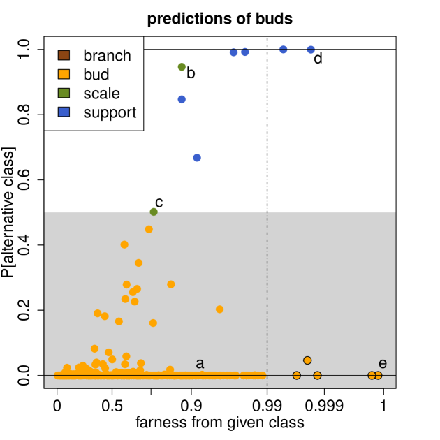
Let us now consider as well. This is a probability, but the tick marks on the horizontal axis are shown on the scale of the quantiles of the standard Gaussian distribution restricted to , in order to better distinguish the objects with relatively high farness. The dashed vertical line is at 0.99 here, but the user can choose a different value if so desired. (It is not a canonical cutoff like that of , where is the boundary between assigning to its given class or not.) Points a, b and c have typical farness values, meaning they are relatively close to ‘bud’. We can say that point a is in the best quadrant, since it is assigned to its own class where it is not far from the center. Point b is not far from the center of ‘bud’ but nevertheless assigned to ‘scale’ with much conviction, so there is likely some overlap between these two classes, with b closer to ‘scale’ than to ‘bud’, and c roughly equally far from both.
What about the remaining two quadrants? Point d is far from ‘bud’, and at the same time assigned to ‘support’ (blue color) with much conviction. In this quadrant the situation is quite clear: point d has two arguments in favor of belonging to its alternative class ‘support’. In the final quadrant, point e lies quite far from ‘bud’ but it is still assigned to ‘bud’ with much conviction. This can happen when a case is far from its class but in the opposite direction of the best alternative class.
A final piece of information incorporated in the class map is whether a point with unusually high to its own class is also far from the other classes. To find out we compute the ‘overall farness’ of each object as
| (5) |
When exceeds the cutoff (here ) it can be considered an outlier, and we put more emphasis on that point by using a different plotting symbol which has a black border around it. For such a point no class seems really suitable. This happens for point e, but not for point d.
When we are dealing with training data, the given class labels are known, which allows us to compute (2)–(4). For cases without given label, these are not defined. But we can also have test data or validation data with given labels. Then we apply the trained model to the new data, yielding new posterior probabilities, the prediction based on (1), as well as from (2)–(3). For one needs to compute the with the same parameters as in the training data, and ensure that (4) uses the distribution fitted on the training data. So for each object in the test set, , , and only depend on the training set and that case , and not on the remainder of the test set. The test set may even consist of a single case.
The main purpose of class maps is to learn more about the objects in a classification. For instance, class maps can give an indication of potential mislabeling. When cases have a high PAC, and especially when their farness is large too, one may want to check whether their original label was correct. When mislabeling is detected in the training data, it may be beneficial to retrain the classifier without the mislabeled cases.
Class maps may also reveal subgroups in the data, which can indicate that a class is not really homogeneous, and should perhaps be split up. (An example of a subgroup will be shown in Figure 7.) Class maps may also alert us to the possibility that the classifier is less suitable for the data at hand. In Section 8 we will illustrate this in an example where several classifiers are applied to the same dataset.
3 Discriminant analysis
One of the oldest and best understood classification techniques is discriminant analysis (DA), intended for objects that can be represented as points with numerical coordinates. The underlying model is the normal mixture model as described in e.g. Chapter 3 of McLachlan (2004). It assumes the points in class follow a normal distribution with unknown class mean and covariance matrix , and unknown class probability . To train the classifier we compute estimates and which are typically the empirical mean and covariance of the points in class . The class probability is estimated as where is the number of objects in class . The estimated density of the mixture distribution is then with the multivariate normal density
| (6) |
where is the squared Mahalanobis distance.
The Quadratic Discriminant Analysis (QDA) model allows the to be different. On the other hand, the Linear Discriminant Analysis (LDA) model assumes that all are equal, so one needs a single covariance estimate. We can for instance compute from the pooled data for where is the given label of object . We then set all in (6).
In either case, for a given object the posterior probability of any class is thus
so , and we assign by the maximum a posteriori classification rule (1). Applying (2) and (3) yields the conditional probability of the best alternative class :
| (7) |
in which the denominators of the posterior probabilities have canceled.
The second ingredient of the class map is the farness. In the setting of discriminant analysis it is natural to set the distance of object to class equal to
| (8) |
which is the well-known unsquared Mahalanobis distance in (6) used by the classifier. We then compute the farness of object to any class by formula (4).
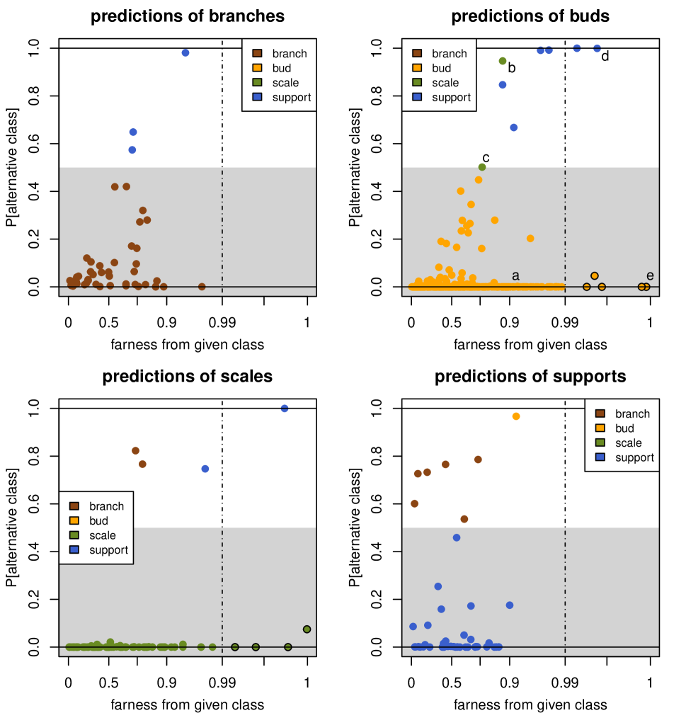
We classified the floral bud data described in the introduction by QDA, yielding the stacked plot in Figure 1 and the class map of ‘bud’ in Figure 2. Figure 3 shows the class map of each given class separately. We already interpreted that of buds in Section 2. In the class map of scales, most points have a very low , meaning that they were assigned to their given class with much conviction. In the class map of branches we see less conviction, and the three points with are in blue so they were assigned to class ‘support’. Since their farness is unexceptional, they can be assumed to lie in a region where ‘branch’ and ‘support’ overlap. Conversely, in the class map of supports we see six brown points, so we may conclude that ‘branch’ and ‘support’ are not that well-separated.
When we have a labeled test set (validation set) the same formulas can be applied. When case is in the test set its prediction is still given by (1), and we use the formulas (7)–(8) where the , , and are those of the training set.
We now illustrate class maps on the MNIST benchmark dataset due to LeCun et al. (1998). It contains 70,000 images of handwritten digits, ranging from 0 to 9, of which 60,000 serve as a training set and 10,000 as a test set. Each image has been size-normalized and centered in a fixed-size image of pixels on a grayscale.
The top row of Figure 4 shows some randomly sampled images from the dataset, one of each digit, and the bottom row shows the averaged image per class.


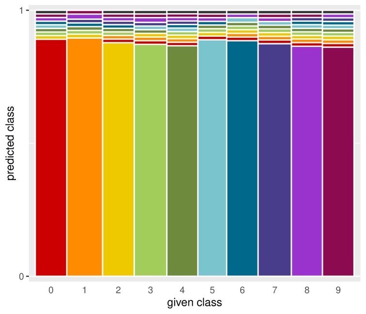
To predict digits from images we first reduced the dimension of the data from 784 to 50 by PCA. This avoids numerical instability due to the inversion of covariance matrices in QDA. The misclassification rate of QDA is quite low here, around 4%. Figure 5 is the stacked mosaic plot of the QDA classification. Unlike Figure 1, here we opted to see the outliers [given by in (5)] as an extra predicted class in dark grey at the top. Fortunately there are not many outliers here.
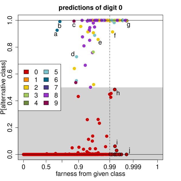
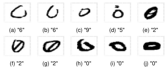
The top panel of Figure 6 is the class map of the digit 0. The large majority of points have , meaning they lie well within the class. Some more exceptional points have been marked, and the corresponding images are shown under the class map. Let us start with points above the grey zone, that is, whose predictions differ from 0. Points a and b have a high PAC but a relatively low farness. We see that QDA predicts them as a 6, which is not surprising when looking at their images. We also see why the farness is not very high, since the images look a lot like a zero, but without fully closing the circle. Point c is a very small circle, positioned somewhat higher than the average zero. This makes it look as though it could be the top part of the digit 9. QDA indeed considers it a 9, but its low farness indicates that it is not far from the class of zeroes. Point d has a , but not quite as high as the other marked points. QDA considers this a 5, and from the image we understand why. It is a 0 with an extra horizontal stroke on top, which gives it several characteristics of a 5. Note that its farness is not extreme, so this image is in between both classes. Points e to g are all classified as 2, and their images are zeroes with an extra line. In f and g the extra line becomes more slanted and pronounced, increasing the resemblance with the digit 2 which also has such a slanted stroke, and increasing their PAC. Note that these two points also have a higher farness and that g has a black border so it is an outlier, indicating that it is rather distant from all classes. Finally, points h, i and j are outliers with a PAC below 0.5, so they are assigned to class 0, but their images are flat zeroes written with thick pen strokes, unlike most zeroes in the data.
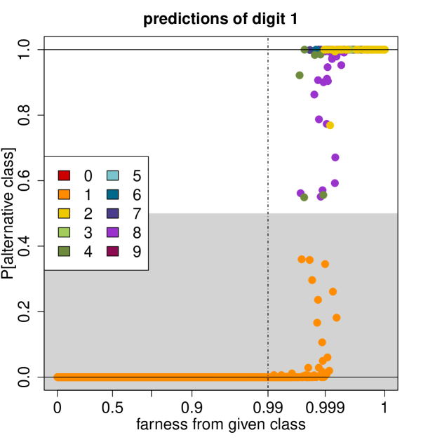
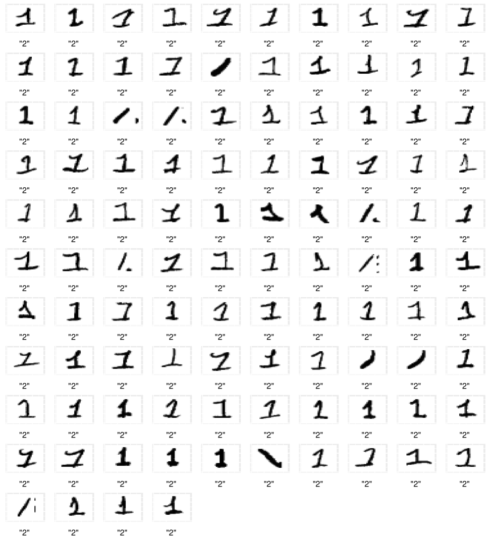
The class map of digit 1 is in Figure 7. Unlike the other class maps, all the digits with have a high farness. This may be due to the fact that most images of 1 are just vertical lines, so they look very similar to each other. As a result, deviations from that shape get a high Mahalanobis distance. Out of the 6742 images, QDA predicts 306 in a different class, so their . Of these, 104 are predicted in class 2 (yellow points). The fact that these points are relatively concentrated in the class map suggests that they may have some properties in common. Figure 8 shows all the images of 1’s predicted as 2. Most of these digits are indeed 1’s but written with a horizontal line at the bottom (which often occurs in a 2). This is unlike the vast majority of 1’s in the data, as can be inferred from the averaged image of 1 in Figure 4. We have thus identified a subgroup of class 1, which corresponds with a particular writing style that is not recognized by the classifier.
The class maps of the remaining digits, as well as the relevant images, can be found in Section A.2 of the Supplementary Material.
When classifying the MNIST test data using the trained QDA model, the misclassification rate is about the same as on the training data. Therefore the classification is stable, without indication that the training data was overfitted. The class maps of the test data, shown in Section A.3, also look similar to those of the training data.
4 Classification by k-nearest neighbors
Another popular classifier is the k-nearest neighbor method (kNN) of Fix and Hodges (1951), which has several appealing properties. It is not restricted to data points with coordinates, as it can take data in the form of dissimilarities between objects. Such a dissimilarity matrix may for instance originate from subjective judgments, in which case there were no coordinates to begin with, and the axioms of a metric need not be satisfied. Of course, if there are coordinates one can always compute dissimilarities from them. This even works when the variables are of mixed types. Chapter 1 of (Kaufman and Rousseeuw, 1990) describes how one can compute a dissimilarity matrix from mixed variables of continuous, symmetric binary, asymmetric binary, nominal and ordinal types, and this is implemented in the function daisy() of the R package cluster (Maechler et al., 2019).
Around each object the kNN method determines its k-neighborhood consisting of the objects with the smallest . Let us denote the -th such dissimilarity as . Such a neighborhood is not always unique, as it can happen that there are other objects with the same dissimilarity . To make the neighborhood unique a common option is to include such points as well, so we get neighborhoods with members where always .
The kNN method then estimates the probabilities of object belonging to each of the classes by the relative frequencies
| (9) |
where counts how many objects in the neighborhood have label . These estimated probabilities again satisfy . The kNN classifier then predicts the label of as the class with highest , in line with (1). Also here ties can occur. Some implementations choose randomly between tied labels. Our implementation breaks ties by assigning to the tied label for which the average dissimilarity between and the members of in is lowest.
From its definition we see that kNN makes no explicit assumptions about underlying distributions, and that it can focus on local structure (nearby objects) rather than global structure. Both aspects are quite different from DA. For a given dataset, a typical way to select an appropriate value of is to cross validate the misclassification rate. Here we will assume that has already been selected.
The conditional probability of the best alternative class is obtained by applying (2) and (3) to (9). When it means that all members of have the same label . At the other extreme, says that all members of have the same label which differs from . The boundary is again at , with signifying that the predicted label fits better than the given label . Unlike DA, here takes discrete values, which are multiples of .
For computing farness we can no longer use (8) since the kNN classifier does not require coordinates, only interpoint dissimilarities. The farness should thus be based on those dissimilarities. For each object and class we compute as the median of the smallest dissimilarities to all objects of class . For each class we then divide by . This makes the farness values from all classes more comparable to each other. (This definition did not originate from the literature.) Finally, we estimate the distribution of the as we did for DA, and compute from (4). The overall farness is then given by (5) as before.
The above formulas can also be used when we have a test set (validation set) with labels. For a test case we consider a neighborhood consisting only of cases in the training set. Maximizing (9) yields the predicted class as before. In the farness computation we reuse the quantities from the training set, as well as the distribution fitted to the of the training set.
We illustrate the resulting display on the benchmark spam data. These consist of 4601 emails collected by George Forman at the Hewlett-Packard Labs, and are labeled as spam (1813 mails) or non-spam (2788 mails). The data is publicly available in the R-package kernlab (Karatzoglou et al., 2019). The mails were converted to a numerical characterization using 57 variables. Section A.4 of the Supplementary Material lists the variables and their interpretation. Unfortunately, the mails themselves are not available.
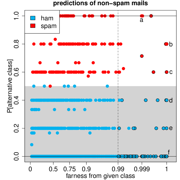
The data are classified by kNN with , yielding an in-sample misclassification rate under 9%. Figure 9 shows the class map of the non-spam (also called ham) mails. As expected, most of the PAC values are at one of the six main levels between and by steps of . The PAC values in between these levels come from the neighborhoods that contain members due to tied dissimilarities.
Some atypical points are marked. Point a has maximal so it is strongly predicted as spam. It corresponds to a mail containing 1506 capitalized characters, 1488 of which in a single string. Capitalization is more common in spam messages, explaining why it was predicted as spam. Point b is a mail of which 20% consists of the word ‘free’. This word is more common in spam mails, so its frequent occurrence makes the mail suspicious. In mail c, 7.5% of the characters are ‘#’ which appears more often in spam mails than in non-spam, and 7.5% is the highest percentage in any non-spam mail. Note that b and c are marked as outliers, that is, they are unusual and don’t lie well within either class.
The next points are correctly predicted as non-spam. Point d has a high farness because 30% of its characters are exclamation marks, but it also contains some non-spam features such as a high frequency of ‘re’ (since spam mails are usually not replies). Mail e has no special characteristics except for the highest frequency of the word ‘report’. Mail f is classified perfectly with but has a high farness because it contains the number 85 much more often than any other mail in the dataset. This number is characteristic for the non-spam class however, since it occurs in all the telephone and fax numbers of the HP labs, including those of the person collecting the data.
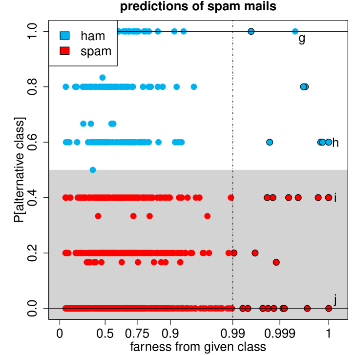
Figure 10 is the class map of the spam messages. Also here some points stand out. Mail g has so the classifier predicted it as non-spam with high conviction. It has a very high frequency of the round bracket character, typically associated with non-spam mails. Similarly, mail h also contains many round brackets, in addition to the word ‘technology’. On the other hand it also has an extreme number of ‘#’ symbols (indicative of spam) which explains its high farness. Mail i contains a string of 9989 capitalized characters. This causes it to be correctly classified as spam, but it also gets a high farness. Similarly, mail j is perfectly (since ) classified as spam, but has a high farness as well. It contains a very high frequency (almost 20%) of the word ‘credit’. This is a common word in spam messages, but 20% is unusually high.
5 Support vector machines for two classes
A support vector machine (SVM) is based on a kernel. Starting from a training set with objects, the kernel matrix is of the form . The values play the role of inner products, unlike the entries of the dissimilarity matrix in the kNN method which played the role of distances. The kernel may be derived from a coordinate data set . Many kernel functions exist for that situation. The linear kernel is just where is the usual inner product. The polynomial kernel is with tuning constants , and the degree. The radial basis kernel is given by . Each of these can be seen as where maps the original data to a feature space. For the linear kernel we can just take so there is no transformation. The other two kernels have a feature space of a higher dimension than the original space, in fact for the radial basis kernel that dimension is even infinite. However, the feature space is often left implicit since all computations can be carried out on the kernel matrix itself. An advantage of kernels is the added flexibility, as it is often easier to separate classes in a higher dimensional feature space than in the original space.
The SVM applies the support vector (SV) classifier in feature space, i.e. to data . The SV classifier is a method for classes which looks for a linear boundary that separates the classes as well as possible. This is achieved by an optimization with a tuning constant cost that determines to what extent some points are allowed to be poorly classified. The value of cost is typically selected by cross-validation. The end result is an estimated vector and intercept yielding the prediction
| (10) |
One often calls the decision value. Note that also classification by linear discriminant analysis (LDA) is in function of a quantity but it is not the same as it derives from a different optimization.
The standard C++ library for SVM is LIBSVM by Chang and Lin (2019), and it is called by the function svm in the R-package e1071 (Meyer et al., 2020). They compute posterior probabilities by a form of logistic regression with the decision value as the only regressor, and put . The final prediction is then given by (1). The conditional probability of the best alternative class then follows immediately by applying (2) and (3).
Farness needs to be defined in relation to how the classifier works. The SVM attempts to linearly separate the points in the feature space. Since the kernel matrix is invariant to multiplying the by an orthogonal matrix, also the farness needs to be. Orthogonally equivariant linear structures suggest using principal component analysis (PCA). Since the PCA must be applied in the feature space it is, in fact, kernel PCA (KPCA), but here we will write everything in terms of the feature vectors .
Carrying out a PCA on the in class 1 yields an estimated center of class 1, a matrix with the loadings in its columns, and scores for all . Here we keep all components, so the scores have the same dimension as the space spanned by the in class 1. We then compute the score distance of any object relative to class 1 as
| (11) |
where is the median absolute deviation. In this formula ranges over the members of class 1, whereas can belong to either class. We compute in the same way.
When the spaces and are equal, the score distances are all we need. Otherwise, and/or is a proper subset of the space spanned by the of both classes together. This often happens when using the radial basis kernel because then the dimension of can be very high (but not infinite). In such situations a point of class 1 may not be in . We then compute how far is from by the euclidean distance between and its projection on given by
| (12) |
which is called the orthogonal distance, and is computed analogously.
Next we have to combine the score and orthogonal distances into a single farness measure. For this we first scale all by the median of the where ranges over the members of class . Next we scale all by the median of the where ranges over all cases not belonging to class (since when belongs to ). Then the distance of an object to a class is given by
| (13) |
This definition is new, but when the class has a Gaussian distribution in low dimension, is very similar to the Mahalanobis distance (8). Finally we estimate the distribution of as in the previous sections, and apply (4) to obtain .
Note that SVM can also be applied to classes by combining pairwise classifications. Since this technique is also used with other classifiers, it will be discussed separately in Section 7.
We illustrate the class maps for SVM on a benchmark data set in which the data do not originate from coordinates (measurements). It is one of the datasets collected and studied by Prettenhofer and Stein (2010) and consists of 4000 book reviews on Amazon. The reviews were binned into two categories: positive (with 4 or more stars out of 5) and negative (under 3 stars). The 4000 reviews were split up, the first 2000 forming the training set and the next 2000 the test set.
The data are actual texts, some of them quite long. The kernel matrix was constructed by a string kernel, in fact the function kernlab::stringdot() with type="spectrum" and length=7. Afterward the SVM was trained with parameter cost=2 using the R-package e1071. The combination of length and cost was selected by 10-fold cross validation.
On the training data itself the SVM overfits, with not a single misclassified book review. Perhaps this is not so surprising since kernel PCA requires as many as 1803 components to explain 95% of the variance, so we are in a truly high dimensional setting. Since the training data has rather low PAC values, its class maps are relegated to Section A.5 of the Supplementary Material. On the test data, the trained SVM obtained a correct classification rate of 82%.
| marked | excerpts from the book reviews |
|---|---|
| a |
“ptt may well be one of heinein’s
masterworks”
“this collection looses the continuity that made the ptt a great read” |
| b |
“i have liked his other books in the
past”
“this one didn’t have enough insight” |
| c | “especially aquinas‘ arguements”, “you will definitly not understand” |
| d | “not at all as interesting as i hoped it would be” |
| e |
“i have read history books more interesting than this book.”
“i thought that it would be an interesting work.” |
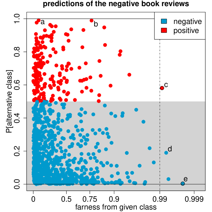
The class map of the negative reviews in the test data is shown in Figure 11. About 80% of these reviews were correctly classified as negative (blue). Let’s look at some points that stand out. Reviews a, b and c have very high PAC. Excerpts of these reviews are in Table 1. Why was it so hard to classify them correctly? Review a has both positive and negative elements. The reviewer is positive about the author and the stories, but negative about the selection of stories presented in this particular book. Review b is similar in that it praises the author and his past works, but is negative about the current book. Point c corresponds with a review containing some grammatical errors. It also contains a substantial part that is rather neutral and the negative opinion in the review is rather indirectly expressed. Review d is definitely negative, but rather short (147 characters), which often leads to larger farness values due to few matches of the string kernel. Finally, review e is again negative, but relatively short and with a substantial neutral/uninformative part.
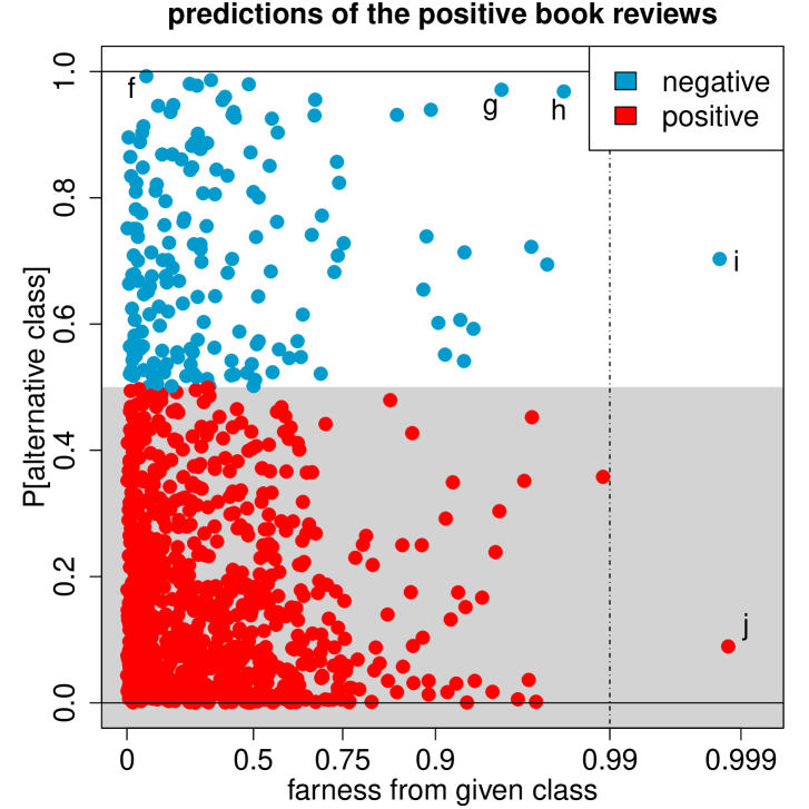
The class maps of the positive reviews in the test data are in Figure 12. Also here some points stand out from the others, and we have marked a few for illustration. Review f has the highest PAC, indicating that the classifier strongly wants to put it in the negative class. It is nevertheless a positive review, but not unequivocally so since it also indicates for which purposes you should not use this book, as seen in the excerpt in Table 2. Book reviews g and h both have high PAC values, and their farness is relatively high. These two reviews contain a mix of positive and negative comments. Book reviews i and j have high farness values. This can be explained by the fact that these reviews are quite short. Review i has 101 characters, whereas j only contains 22 characters, making it the shortest review in the test data. The mean length of the reviews is 864 characters. Review i is assigned to the negative class, due to a mix of positive and negative comments.
| marked | excerpts from the book reviews |
|---|---|
| f |
“i have not found any other c++ reference that is
as complete or as
useful as this books” “this is not an introduction to c++ but rather a reference book” |
| g |
“i felt that the book could have been much better”
“do not expect any groundbreaking plot” |
| h | “this book is not for everyone”, “i was disappointed in the end” |
| i | “i really loved the book”, “ i just wish the author of the book would” |
| j | “like the book very muc” |
6 Logistic regression
In the context of logistic regression the classes are typically denoted as 0 and 1 (instead of 1 and 2 as in the other sections), so we are predicting a binary variable . The coordinates of the can be continuous and/or binary. The logistic model assumes that the response in has probability to be 1 and to be 0, with ). Here is the logistic function, and the unknown parameters and are typically estimated by maximum likelihood, yielding and . Each object then obtains the posterior probabilities
| (14) |
Unlike the SVM with two classes, here the posterior probabilities follow directly from the statistical model. Formulas (1)–(3) are applied in exactly the same way, yielding the probability of the alternative class
| (15) |
The farness measure we use depends on the dimensionality of the regressors . If the regressors are continuous and low-dimensional we can use the farness as in Section 3 on discriminant analysis, which is based on the Mahalanobis distance. We have the choice between estimating a single for both classes as in linear DA, or separate and as in quadratic DA.
Note that for multiple linear regression we can replace (15) by the residual and plot it versus the Mahalanobis distance relative to a robust covariance matrix of the , yielding the outlier map of Rousseeuw and van Zomeren (1990), later extended to multivariate regression (Rousseeuw et al., 2004).
When the are high dimensional it is less likely that the covariance matrices of the classes are well-conditioned, and then one can compute farness as in Section 5 on support vector machines. Note that in that situation one may prefer to run sparse logistic regression, for instance using the R-package glmnet (Friedman et al., 2020), after which (15) can be applied.
7 Combining pairwise classifications
When the data has labels but the preferred classifier was designed for 2 labels, like the support vector machine, one often resorts to ‘one versus one’ pairwise classifications. In this approach one carries out a binary classification on each pair of classes, yielding comparisons.
These computations yield a matrix with columns and rows. Each column corresponds to a pair of classes with and contains the estimated probabilities of the classification into classes and . In the past one typically counted how often each class came out on top, which is called majority voting. In recent times the pairwise coupling approach has become more popular. In this approach one estimates a set of posterior probabilities that match the pairwise probabilities in the sense that
| (16) |
for all pairs . For this one often uses the second method of Wu et al. (2004) which minimizes a quadratic loss function. It is implemented in the function couple in the R-package kernlab (Karatzoglou et al., 2019), with option coupler="minpair".
From the resulting posterior probabilities one immediately obtains the multiclass prediction from (1). Applying (2) and (3) then yields .
For drawing class maps we also need a measure of farness. For this we use one of the methods described in the earlier sections, a summary table of which is given in Section A.6. If the data have continuous coordinates and the dimension is not too high, we can compute the Mahalanobis distance as in (8). If the data has coordinates of mixed types or is given in the form of a dissimilarity matrix we can run the same farness computation as for the -nearest neighbor method in Section 4. And if we have high-dimensional continuous data or the input is a kernel matrix, we can apply formulas (11)–(13).
As an illustration of pairwise coupling we analyze the sweets data. This is a subset of the nutrients_branded dataset which is publicly available in the R-package robCompositions (Templ et al., 2020). It contains data on 9 nutritional values of 804 different sweets sold in Switzerland, which are divided into 4 categories: ‘Cookies and Biscuits’, ‘Milk based ice cream’, ‘Cakes and tarts’, and ‘Creams and puddings’. The nutritional variables are the contents of energy (kcal), protein, water, carbohydrates, sugars, dietary fibers, total fat, saturated fatty acids, and salt.
We fit an SVM model by the function svm() in the R-package e1071 (Meyer et al., 2020), with kernel="linear" and probability=TRUE. The parameter cost=10 was selected by 10-fold cross-validation, yielding a misclassification rate of 13%. The function predict.svm with again option probability=TRUE internally carries out pairwise coupling by the same algorithm of Wu et al. (2004). We used the farness measure of Section 5 on SVM. Figure 14 shows the maps of all classes, whose names were abbreviated to ‘biscuits’, ‘ice cream’, ‘cakes’, and ‘puddings’.
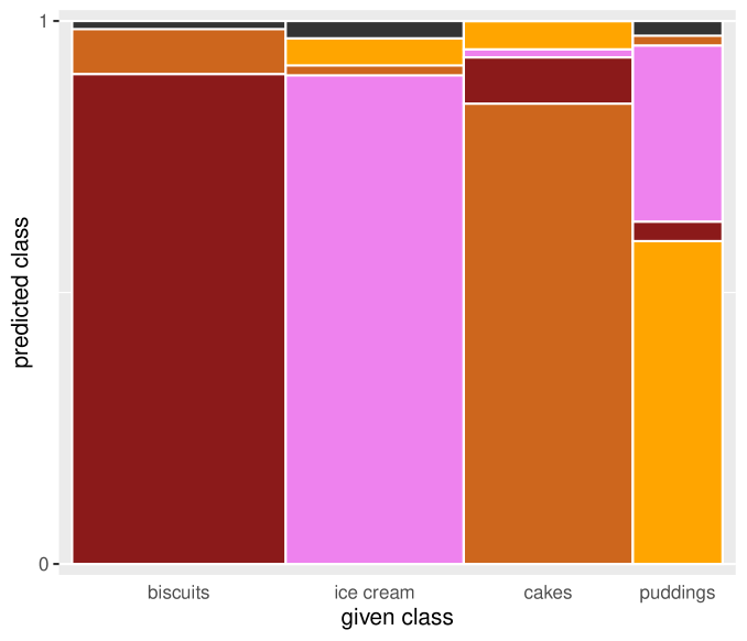
Figure 13 shows the stacked mosaic plot of this classification. We see at a glance that puddings (the yellow stack at the right) are often predicted as pink, the color of the stack of ice cream. Unlike Figure 1, here the option to show the outliers is switched on. They are visible as an extra predicted class in dark grey at the top for those classes where they occur.
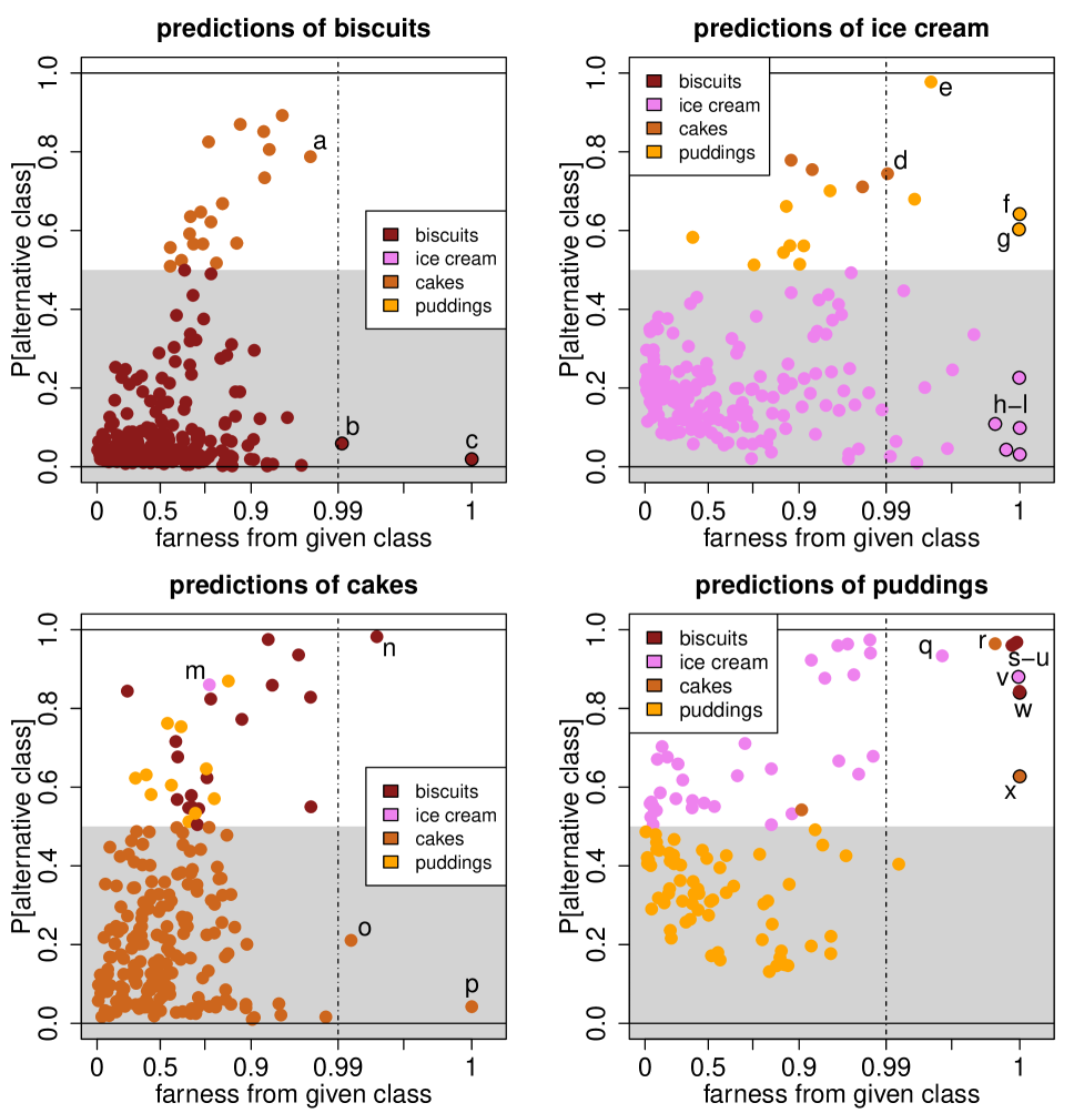
The class maps in Figure 14 contain a lot of structure. Not being experts in nutrition, we have only marked the atypical points we can say something about. The names of the objects a to x are listed in Section A.7 of the Supplementary Material.
Let’s start with the biscuits. A number of points have a PAC over 0.5, and their color indicates they are classified as cakes. Most of these are in fact doughs rather than finished cookies. They all have a significantly higher water content than most of the biscuits in the data. This results in them being classified as cakes, as cakes are similar to cookies but with a higher water content. The point marked a is a brownie produced by Burger King. Point b has an extreme level of dietary fibers, actually the highest in the whole data set. This causes it to be flagged as an outlier, as it does not really fit well within any of the classes. Point c is even further away. It corresponds to a biscuit with relatively high salt and very low water content.
Among the ice creams, the products with are of two types: one is classified as puddings, the other as cakes. The points classified as cakes correspond to ice creams that contain a substantial percentage of cookie. Point d is a mini ice cream cone with relatively little ice cream compared with the amount of cookie. The ice creams classified as puddings are nearly all Burger King products, with a much higher salt content than average for ice cream. Point e is an example of such a product, a strawberry sundae. There are also several outliers, as indicated by their black border. Products f and g have and are predicted as puddings. Products h tot l are classified correctly as ice cream. It turns out that all of these outliers, from f to l, are dietary products. They have very low sugar, very low fat and high dietary fiber contents. The points f and g also have unusually high salt levels, making them more similar to puddings.
In the class map of cakes, object m is a strawberry tart, with high water content and low sugar relative to most of the cakes. Due to its high water content it is misclassified as ice cream. There is also a group of cakes classified as biscuits. Nearly all of them have very low water contents, that are more common for biscuits than for cakes. These points correspond to either cake mixes or fairly dry cakes based on nuts. The carrot cake n is an extreme example of such a product, as it also has very high levels of protein and dietary fibers. The lentil tart o is a dietary product. It has many characteristics of a cake, but its salt levels are rather low and its dietary fiber is very high. Finally, point p is a dough, rather than a baked cake.
In the class of puddings the PAC values are higher on average than in the other classes, so this class is the least well-separated. Most of the misclassified puddings were assigned to the ice cream class. The classifier has a hard time distinguishing between pudding and ice cream. (There is no variable indicating the product’s storage temperature.) Most of the puddings misclassified as ice cream are milk-based, causing relatively high fat levels. For instance, product q is a chocolate mousse. Point r has both a high PAC and a high farness, and is classified as a cake. Nearly all of its nutritional values are exceptional for pudding but normal for cake. On the store website it looks like a small chocolate cake, so it may actually have been mislabeled. The “puddings” marked s to u are in fact dry pudding mixes rather than finished products. They have extremely low water and extremely high carbohydrate contents, causing them to be misclassified as biscuits, which are drier than puddings. Point v is an outlier, which leans most towards ice cream. It is a dietary product, with extremely low sugars and extremely high dietary fibers. The outlier w is again a dry pudding mix, this time with the highest sugar content in the whole data set. Finally, pudding x has the highest salt level of any product in the data set. This causes it to be flagged as an outlier and classified as a cake.
8 Comparing different classifiers on the same data
Even though class maps are primarily intended to learn more about the objects in a classification, it can be interesting to compare the class maps obtained by several classifiers on the same data. To illustrate this we consider a simple toy example with 200 points in two dimensions, for which the ground truth is clear. The data are shown in the top row of Figure 15. The red and blue classes cannot be separated by a straight line
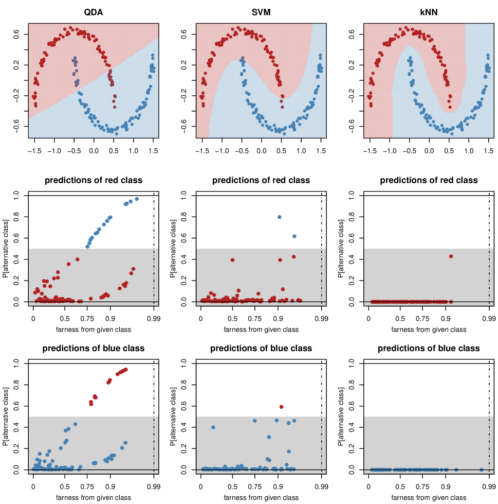
The left column of Figure 15 shows the result of the QDA classifier. The light red and light blue regions in the top plot were obtained by classifying a dense grid of new data by the trained model, so a new data point in the light blue region will be assigned to the blue class. There are about 16% of misclassifications, indicating that QDA is not a suitable classifier here. Its underlying assumption of roughly elliptical classes indeed does not hold. Below this plot is the class map of the red class. There we see that quite a few points have and are assigned to the blue class. The class map has a pattern with thin threads that correspond to the shape of the class. The map of the blue class is similar.
Since the data cannot be separated linearly in the original space, a kernel transform may be helpful. Here we applied the radial kernel with gamma = 0.5, followed by the SVM with cost = 1.0. For the purpose of this illustration we did not try to overfit the values of gamma and cost. The results are in the middle column of Figure 15. The assignment regions now have very different shapes, and are much better adapted to the particular forms of these classes. Now only three points are misclassified, and they are clearly visible in the class maps. A few other points, that lie close to the boundary between the light blue and light red regions, have substantial values below .
The third column in Figure 15 shows the result of k-nearest neighbors with . This classifier turns out to work best in this particular example. It has no misclassifications, so one would likely choose kNN here, but the class maps give a finer picture. Not only are there no points with (which would be misclassified), but also below the map looks quite different from that of SVM. Here only a single point has , meaning that its k-neighborhood contains points from the other class. Since it occurs in the map of the red class, it is clear which point it is.
9 Conclusions
The proposed class map reflects two basic notions, for each object in the class. In the vertical direction it shows the posterior probability of it belonging to its best alternative class rather than its given class. In the horizontal direction we see how far the object is from its given class, with a separate plotting symbol when it is far from all classes.
This visualization often provides useful
information about the data, as illustrated
with examples of discriminant analysis,
k-nearest neighbors, support vector machines,
and pairwise coupling.
It also allows to compare the results
obtained by different classifiers.
Software availability.
The methods in this paper have been implemented
in the R package classmap
(Raymaekers and
Rousseeuw, 2021b).
It contains three vignettes that reproduce
the examples shown here.
Acknowledgement. This research was funded by projects of Internal Funds KU Leuven. We thank the Editor, Associate Editor, and two reviewers for their constructive comments.
References
- Cai et al. (2009) Cai, Q., C. Zhang, and C. Peng (2009). Analysis of classification margin for classification accuracy with applications. Neurocomputing 72, 1960–1968.
- Chang and Lin (2019) Chang, C.-C. and C.-J. Lin (2019). LIBSVM: A Library for Support Vector Machines. National Taiwan University.
- Fix and Hodges (1951) Fix, E. and J.L. Hodges (1951). Discriminatory analysis. Nonparametric discrimination; consistency properties. Report Number 4, Project Number 21-49-004, USAF School of Aviation Medicine, Randolph Field, Texas. Reprinted in International Statistical Review 57, 238–247 (1989).
- Friedman et al. (2020) Friedman, J., T. Hastie, R. Tibshirani, B. Narasimhan, K. Tay, and N. Simon (2020). Package glmnet: Lasso and Elastic Net Regularized Generalized Linear Models. CRAN, R package version 4.0-2.
- Friendly (1994) Friendly, M. (1994). Mosaic displays for multi-way contingency tables. Journal of the American Statistical Association 89, 190–200.
- Hartigan and Kleiner (1981) Hartigan, J. and B. Kleiner (1981). Mosaics for contingency tables. In Computer Science and Statistics: Proceedings of the 13th Symposium on the Interface, New York, pp. 268–273. Springer.
- Hastie et al. (2017) Hastie, T., R. Tibshirani, and J. Friedman (2017). The Elements of Statistical Learning: Data Mining, Inference, and Prediction, 12th printing. Springer Series in Statistics.
- Karatzoglou et al. (2019) Karatzoglou, A., A. Smola, and K. Hornik (2019). kernlab, the kernel-based machine learning lab. CRAN, R package version 0.9-29.
- Kaufman and Rousseeuw (1990) Kaufman, L. and P. Rousseeuw (1990). Finding Groups in Data: An Introduction to Cluster Analysis. Wiley-Interscience, Hoboken, New Jersey.
- LeCun et al. (1998) Le Cun, Y., L. Bottou, Y. Bengio, and P. Haffner (1998). Gradient-based learning applied to document recognition. In Proceedings of the IEEE, Volume 86, pp. 2278–2324. IEEE.
- Maechler et al. (2019) Maechler, M., P. J. Rousseeuw, A. Struyf, and M. Hubert (2019). cluster. CRAN, R package version 2.1.0.
- McLachlan (2004) McLachlan, G. J. (2004). Discriminant Analysis and Statistical Pattern Recognition. Wiley-Interscience, Hoboken, USA.
- Meyer et al. (2020) Meyer, D., E. Dimitriadou, K. Hornik, A. Weingessel, and F. Leisch (2020). e1071. CRAN, R package version 1.7-4.
- Prettenhofer and Stein (2010) Prettenhofer, P. and B. Stein (2010). Cross-language text classification using structural correspondence learning. In Proc. 48th Meeting of the ACL, pp. 1118–1127.
- Raymaekers et al. (2020) Raymaekers, J. and P. J. Rousseeuw (2020). cellWise: Analyzing Data with Cellwise Outliers. CRAN, R package.
- Raymaekers and Rousseeuw (2021a) Raymaekers, J. and P. J. Rousseeuw (2021a). Transforming variables to central normality. Machine Learning, https://link.springer.com/article/10.1007/s10994-021-05960-5 ,open access.
- Raymaekers and Rousseeuw (2021b) Raymaekers, J. and P. J. Rousseeuw (2021b). classmap: Visualizing Classification Results. CRAN, R package.
- Rousseeuw (1987) Rousseeuw, P. J. (1987). Silhouettes: a graphical aid to the interpretation and validation of cluster analysis. Journal of Computational and Applied Mathematics 20, 53–65.
- Rousseeuw et al. (2004) Rousseeuw, P. J., S. Van Aelst, K. Van Driessen, and J. Agulló (2004). Robust multivariate regression. Technometrics 46, 293–305.
- Rousseeuw and van Zomeren (1990) Rousseeuw, P. J. and B. van Zomeren (1990). Unmasking multivariate outliers and leverage points. Journal of the American Statistical Association 85, 633–651.
- Templ et al. (2020) Templ, M., K. Hron, and P. Filzmoser (2020). robCompositions: an R-package for robust statistical analysis of compositional data. CRAN, R package version 2.2.1.
- Wouters et al. (2015) Wouters, N., B. De Ketelaere, T. Deckers, J. D. Baerdemaeker, and W. Saeys (2015). Multispectral detection of floral buds for automated thinning of pear. Computers and Electronics in Agriculture 113, 93–103.
- Wu et al. (2004) Wu, T. F., C. J. Lin, and R. C. Weng (2004). Probability estimates for multi-class classification by pairwise coupling. Journal of Machine Learning Research 5, 975–1005.
- Yeo and Johnson (2000) Yeo, I. K. and R. A. Johnson (2000). A new family of power transformations to improve normality or symmetry. Biometrika 87, 954–959.
Appendix A Supplementary Material
A.1 Fitting a cdf to distances
The definition of farness (4) requires an estimated cumulative distribution function of the distance where is a random object generated from class . The available data are the of each object to its given class . In view of possible heteroskedasticity between classes, we start by normalizing per class. For a given class we divide all the where is a member of class by . The resulting distances are more homoskedastic, and we pool them to obtain distances for . The empirical distribution of the is typically right-skewed.
In order to account for skewness, we apply the function transfo of the R-package cellWise (Raymaekers et al., 2020) with default options. This function first standardizes the to
where and Mad is the median absolute deviation given by as implemented in the standard function mad() in R. Next, transfo carries out the transform of Yeo and Johnson (2000) given by
| (A.1) |
which aims to bring the distribution close to a normal distribution. The transformation is characterized by a parameter that has to be estimated from the data. This estimation is typically done by maximum likelihood, but the default in transfo is to apply the weighted maximum likelihood estimator of Raymaekers and Rousseeuw (2021a) which is less sensitive to outliers. The resulting are in turn standardized by their own Med and Mad, yielding whose distribution is approximately standard normal. The estimated cdf of the distances is then given by where is the standard normal cdf.
A.2 More on the MNIST data
Figure 16 is the image plot of the confusion matrix of the MNIST data. Like the stacked mosaic plot in Figure 5, it clearly indicates that most cases are assigned to their given class.
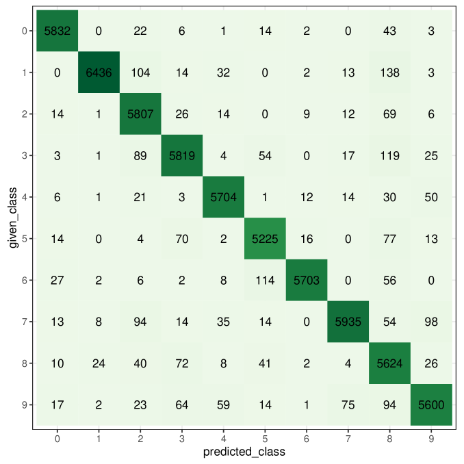

Figure 17 shows the farness of each image from its own class, binned by class (digit). Second from left is digit 1, whose farness has the longest tail. We saw in the main text that this class indeed has an interesting class map.
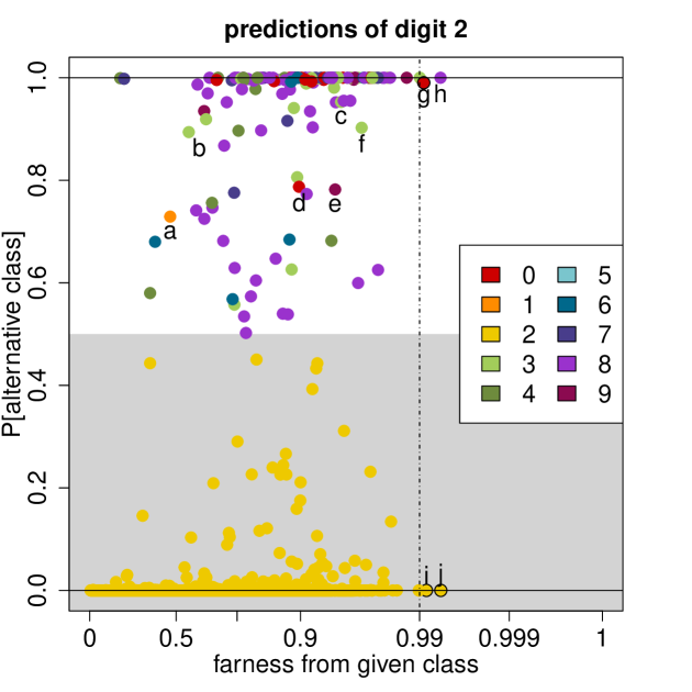
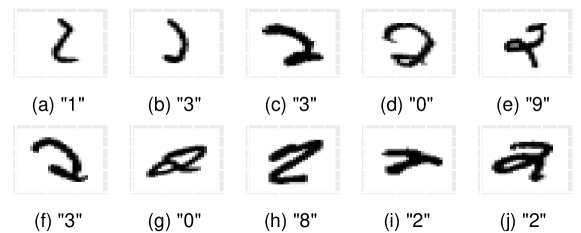
Figure 18 shows the class map of digit 2, in which most points have a favorably low PAC. Out of the 5958 images of this digit, 151 were misclassified. We see that most points have an unexceptional farness, indicating that they are relatively close to class 2, despite some of them being misclassified. A few points have been marked for further inspection. Digits a to e are misclassified with medium to high conviction. We see that the corresponding images are very poorly written 2’s. Images b and c could be seen as the top part of the digit 3, whereas d is almost a closed circle, explaining its misclassification as a 0. Digit f also looks like the top part of the digit 3, g is basically a zero with an extra pen stroke, and h resembles part of an 8. Finally, points i and j are not close to any class. Especially image i does not look like a digit.
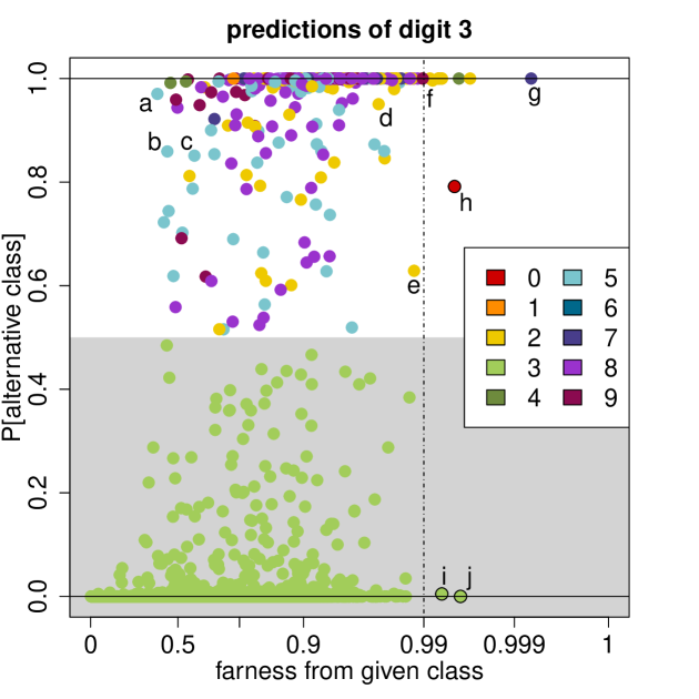
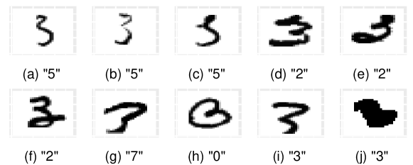
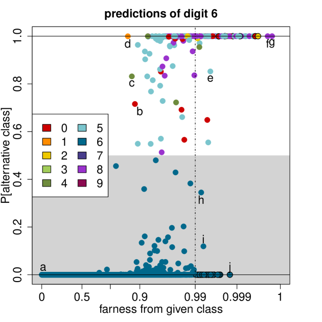
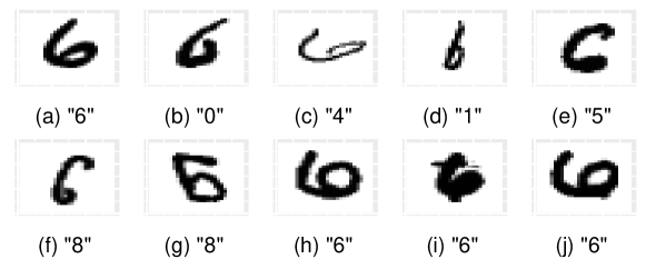
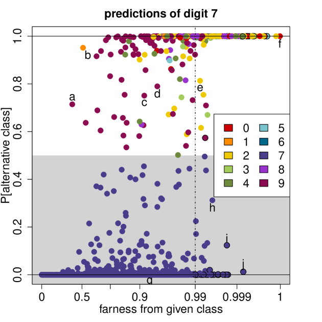
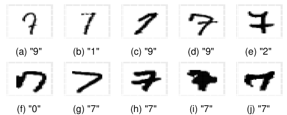
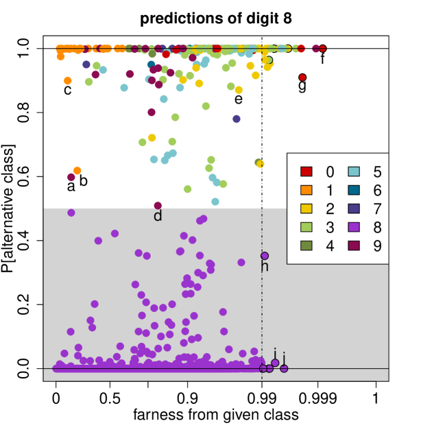
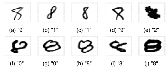
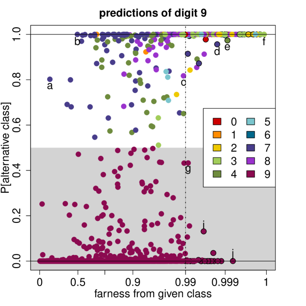
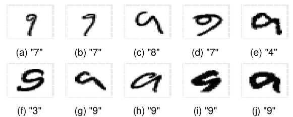
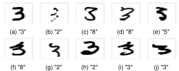
The class map of digit 3 in Figure 19 is also interesting. Quite a few digits are misclassified as a 5 instead of a 3, such as a, b and c. The images under the class map explain why: when the top part of the digit 3 is written much smaller than the lower part, it indeed bears similarity to a 5. Points d, e and f are predicted in class 2, as confirmed by their images. Especially images e and f, written with an extra curl at the bottom, look as though they are a combination of a 2 and a 3. Points g to j are outliers, meaning that they have a high farness to all classes. Their images are barely recognizable. Image g looks like a 7, and h is heart-shaped. Image i is a 3 with a missing bottom, and image j looks like a stain rather than a digit. The class maps of the remaining digits below are interpreted analogously.
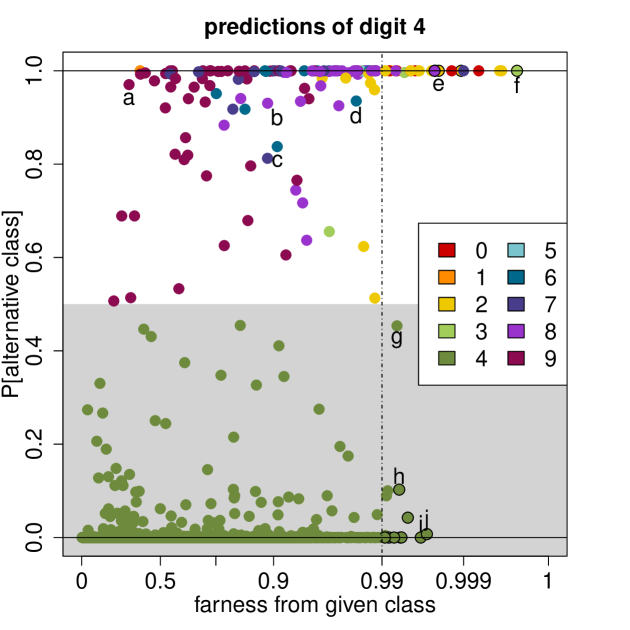
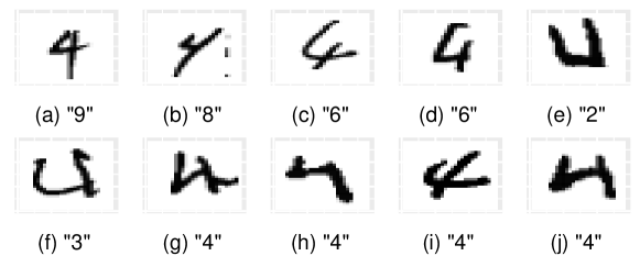
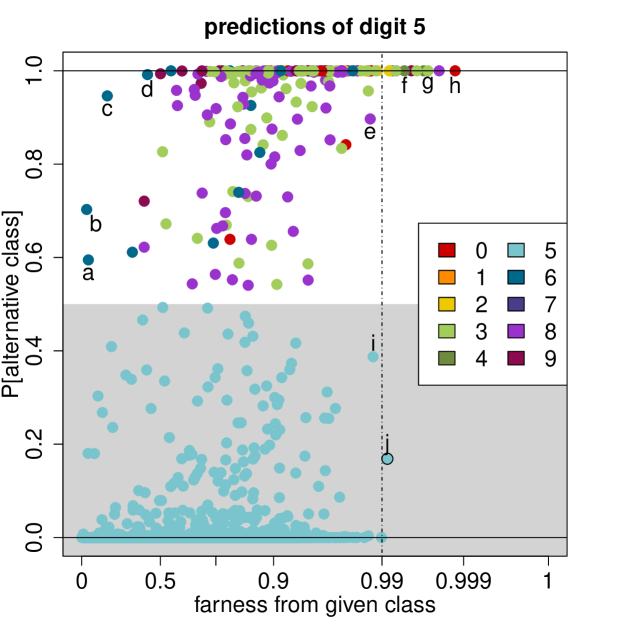
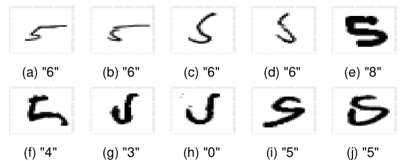
A.3 MNIST test data
When classifying the MNIST test data using the trained QDA model, the misclassification rate is about the same as on the training data. Therefore the classification is stable, there is no indication that the model was overfitted on the training data.
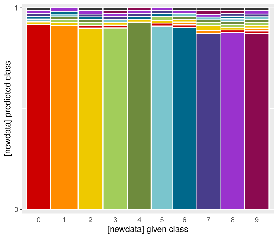
The stacked mosaic plot of the test data in Figure 26 is extremely similar to that of the training data in Figure 5.
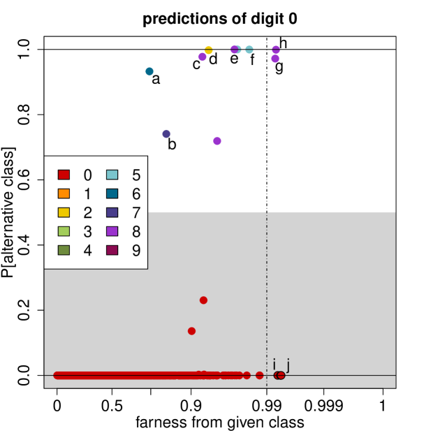
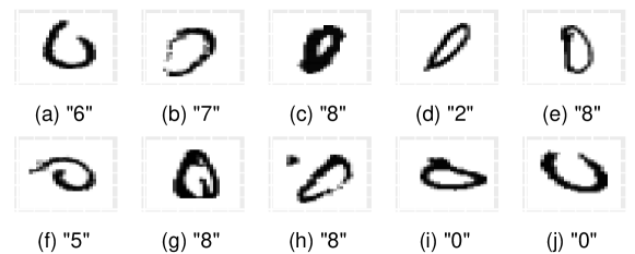
The class maps of the test data also look similar to those of the training data. When comparing the class map of the digit 0 in the test data in Figure 27 to that of the same digit in the training data in Figure 6, we see the main characteristics are the same. The large majority of points again have , meaning they lie well within the class. There would seem to be fewer points with , but that is due to the size of the test set, which is 6 times smaller than the training set. As before, a few points are assigned to classes 0, 2, 6 and some others.
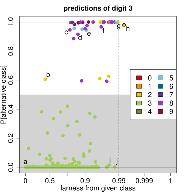
Also the class map of digit 3 in Figure 28 resembles the one in the training data (Figure 19). Point a has low PAC and farness, and its image looks rather perfect. But overall the PAC values remain more dispersed than with digit 0, with more misclassifications. The images corresponding to the points marked b to h indicate why they were misclassified. Points i and j are classified correctly with , but look quite ugly which explains their high farness.
A.4 Variables in the spam data
| Variable number(s) | Variable name(s) | Interpretation |
|---|---|---|
| 1-48 | make, address, all, num3d, our, over, remove, internet, order, mail, receive, will, people, report, addresses, free, business, email, you, credit, your, font, 000, money, hp, hpl, george, 650, lab, labs, telnet, 857, data, 415, 85, technology, 1999, parts, pm, direct, cs, meeting, original, project, re, edu, table, conference | percentage of words equal to the given word |
| 49-54 | charSemicolon,charRoundbracket,charSquarebracket,charExclamation,charDollar,charHash | fraction of characters equal to ; ( [ ! $ # |
| 55 | capitalAve | average run length ofcapital letters |
| 56 | capitalLong | longest run length of capital letters |
| 57 | capitalTotal | total run length of capital letters |
A.5 More on the book review data
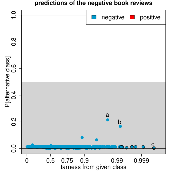
Figure 29 shows the class map of the negative reviews in the training data. Most of the farness values are uneventful, and all values of PAC are small. Point a stands out a bit because it has the highest PAC. Indeed, review a is very positive, as seen in Table 4. This review is mislabeled, perhaps the reviewer made a mistake when filling in the stars. Nevertheless, because the classifier was trained on these data, review a is predicted as negative. Review b has a high farness. It is correctly predicted as negative. The high farness can be explained by the sheer length of this book review. It is over 20,000 characters long, whereas the next longest review in the data is under 10,000 characters and the average length of negative reviews is 940 characters. Finally, point c corresponds to a very short review of only 88 characters, which explains why it lies far from both groups, as indicated by its black border.
| marked | excerpts from the book reviews |
|---|---|
| a |
“the left behind series is the best reading
i have ever read.”
“when i read the very first book i was hooked” “thank you tim and jerry for such great books” |
| b |
“there is not quite the neglect that nash
claimed in these fields”
“nash is not the lone voice for these ’forgotten’ as he claimed” |
| c |
“very disappointed in the contents of this book.
i expected more
information and patterns” |
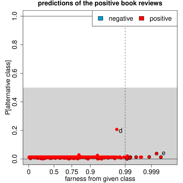
Figure 30 shows the class map of the positive book reviews in the training data. We discuss two of the more extreme points. Review d has the highest PAC, indicating that the classifier is less convinced that it is positive. It is in fact positive, but it contains many negative words due to its rant against other reviews that were negative about the book. Review e has a high farness with respect to both the positive and negative reviews. This positive review is very short as it contains only 102 characters, whereas the positive reviews have an average length of 873 characters.
| marked | excerpts from the book reviews |
|---|---|
| d |
“i cannot believe the only 2 bad reviews were
given by people who didn’t know the book was
written in spanish”
“if you want to blame somebody because you cannot read the book, blame the editors for not publishing an english version” “you were careless/stup.. enough to buy a book that you could not read” |
| e |
“very interesting look at the the makeup of the new hampshire
primary and interesting facts and history” |
A.6 Distance measures used in the paper
The table below shows the three measures
used in the paper, with the data types and
classifiers for which they can be used.
![[Uncaptioned image]](/html/2007.14495/assets/x43.png)
A.7 More on the sweets data
The table below
provides the names (in German and French) of the
products marked in Figure 14
in the paper.
| marked | Name of the product |
|---|---|
| a | Hot Brownie (Burger King), 1 Stuck = 80g |
| b | Actilife Ballastino Biscuit (Migros) |
| c | Ovomaltine Crunchy Biscuit (Wander) |
| d | Frisco Extreme Mini Mini Chocolat Cornet (Nestle) |
| e | X-Cream Sundae Strawberry (Burger King), 1 Portion = 170g |
| f | Weight Watchers Ice Mokka Becher (Coop) |
| g | Weight Watchers Ice Schokolade Becher (Coop) |
| h | Leger Kakao Glace (Migros) |
| i | Leger Mini Vanille Glace-Stangel (Migros) |
| j | Weight Watchers Ice Camarello mit Caramelaroma Becher (Coop) |
| k | Weight Watchers Ice Exotic Becher (Coop) |
| l | Weight Watchers Lutscher Mini Exotic Ice (Coop) |
| m | Erdbeer-Torte, zubereitet (Dr. Oetker) |
| n | Qualite&Prix Backmischung Rueblitorte (Coop) |
| o | Weight Watchers Linzertortli (Coop) |
| p | Leisi Cake Chocolat, Flussigteig (Nestle) |
| q | Duo Mousse Chocolat (Migros) |
| r | Dessert Tradition Fondant au Chocolat (Migros) |
| s | Milchreis klassisch, Fertigmischung (Migros) |
| t | Griessbrei Fertigmischung (Migros) |
| u | Varieta Basis-Creme-Pulver (Migros) |
| v | Pudding Creme Vanille ohne Zucker, Fertigmischung (Migros) |
| w | Dawa Flan Caramel, Pulver (Wander) |
| x | Mousse au Chocolat zartbitter (Dr. Oetker), zubereitet |