Visualizing the Finer Cluster Structure of Large-Scale and High-Dimensional Data
Abstract
Dimension reduction and visualization of high-dimensional data have become very important research topics because of the rapid growth of large databases in data science. In this paper, we propose using a generalized sigmoid function to model the distance similarity in both high- and low-dimensional spaces. In particular, the parameter is introduced to the generalized sigmoid function in low-dimensional space, so that we can adjust the heaviness of the function tail by changing the value of . Using both simulated and real-world data sets, we show that our proposed method can generate visualization results comparable to those of uniform manifold approximation and projection (UMAP), which is a newly developed manifold learning technique with fast running speed, better global structure, and scalability to massive data sets. In addition, according to the purpose of the study and the data structure, we can decrease or increase the value of to either reveal the finer cluster structure of the data or maintain the neighborhood continuity of the embedding for better visualization. Finally, we use domain knowledge to demonstrate that the finer subclusters revealed with small values of are meaningful.
Keywords Dimension Reduction Manifold Learning Data Visualization
1 Introduction
Dimension reduction and visualization of high-dimensional data have become very important research topics in many scientific fields because of the rapid growth of data sets with large sample size and/or dimensions.
In the literature of dimension reduction and information visualization, linear methods such as principal component analysis (PCA) [7] and classical scaling [17] mainly focus on preserving the most significant structure or maximum variance in data; nonlinear methods such as multidimensional scaling [2], isomap [16], and curvilinear component analysis (CCA) [5] mainly focus on preserving the long or short distances in the high-dimensional space. They generally perform well in preserving the global structure of data but can fail to preserve the local structure. In recent years, the manifold learning methods, such as SNE [6], Laplacian eigenmap [1], LINE [15], LARGEVIS [14], t-SNE [19] [18], and UMAP [10], have gained popularity because of their ability to preserve both the local and some aspects of the global structure of data. These methods generally assume that data lie on a low-dimensional manifold of the high-dimensional input space. They seek to find the manifold that preserves the intrinsic structure of the high-dimensional data.
Many of the manifold learning methods suffer from something called the “crowding problem” while preserving local distance of high-dimensional data in low-dimensional space. This means that, if you want to describe small distances in high-dimensional space faithfully, the points with moderate or large distances between them in high-dimensional space are placed too far away from each other in low-dimensional space. Therefore, in the visualization, the points with small or moderate distances between them crash together. To solve this problem, UNI-SNE [4] adds a slight repulsion strength to any pair of points in low-dimensional space to prevent the points from moving too far away from each other. Alternatively, t-SNE [19] [18] uses the Student’s -distribution in low-dimensional space, which has a heavy tail compared with the Gaussian distribution used in high-dimensional space. Kobak et al. [8] further extended the idea to use the -distribution with one degree of freedom . They show that for some data sets, setting would reveal additional local structure of the data compared with the Student’s -distribution with . On the other hand, UMAP uses a curve that is similar to the -distribution but with two hyperparameters, and , in low-dimensional space. The two parameters are estimated by approximating an exponential function with the parameter . By adjusting , UMAP governs the appearance of the embedding.
In this paper, we propose using a generalized sigmoid function to model the distance similarity in both high- and low-dimensional spaces. In particular, the parameter is introduced to the generalized sigmoid function in low-dimensional space, and we can adjust the heaviness of the function tail by changing the value of . We use both simulated and real-world data sets to show that our proposed method can generate visualization results that are competitive with those of UMAP. In addition, can be easily adjusted either to reveal the finer cluster structure of the data or to assist the visualization of data by increasing the continuity of neighbors. For some data sets, decreasing the value of can provide greater visibility of the intrinsic structure of the data that might not be visible using conventional UMAP. Finally, we use domain knowledge to demonstrate that the finer subclusters are meaningful.
2 Methodology
Let be input data in high-dimensional space , and let be the distance between and under the metric . Let be the k-nearest neighbors of , and let be the shortest distance from to its k-nearest neighbors. Here is defined as
For each , we use the sigmoid function with the parameter to model the distance similarity between points and , which is
Using the same approach as UMAP, we can determine the value of through the following equation:
For the simplicity of optimizing the loss function and also extracting more structure information in high-dimensional space, is symmetrized as
where stands for componentwise multiplication. In addition, let denote the matrix of .
Let denote the representation of in low-dimensional space. UMAP uses the curve
to model the distance distribution in low-dimensional space, where stands for the distance between points and . The curve is similar to the distribution with two parameters, and , which are estimated by approximating the following function:
The parameter is an important parameter in the UMAP algorithm. It controls how closely the points in low-dimensional representations are packed together. The larger the value of is, the more the embeddings spread out; the smaller the value of is, the more likely the data in the same cluster are densely packed. As shown in our experiments, when the value of is smaller than 0.01, further decreasing the value of usually does not change the embeddings much. In order to reveal a finer cluster structure, manually decreasing the values of parameters and might be needed. However, because there are two hyperparameters, more experiments might be necessary to find the proper values of and . This is beyond the scope of the paper.
Here we assume that the membership strength of and can be modeled using a generalized sigmoid function [3], which can be expressed as
| (1) |
Let and . Then Equation (1) can be rewritten as
| (2) |
When , becomes
This is equivalent to the model of UMAP with and .
Here we consider a simplified version of by rescaling by , so that we have
| (3) |
In other words, the solution of Equation (3) will have a scale change by compared with the solution of Equation (2).
As with the probabilistic model [14], the loss function can be written as
where is the collection of points for which either or .
Using the negative sampling strategy proposed by [11], the loss function can be further written as
where is the number of negative samples for each vertex . The gradient of the loss function can be written as
where
As with UMAP, the stochastic gradient descent algorithm can be used to optimize the loss function.
In our experiments, we found that the proper range of is . The value of is less important than the value of , and setting generally gives us satisfactory results. So, in our experiments, we set . Because controls the rate of the curve approaching 0 and 1, adjusting the value of can affect the embeddings in low-dimensional space and the data visualization. To understand how the family of Equation (3) behaves with varying , we draw plots by setting and . The results are summarized in Figure 1.

We can see from the graph that the smaller the value is, the more heavy-tailed the curve is. The heavy-tail property of the curve can greatly alleviate the crowding problem when you are embedding high-dimensional data in low-dimensional space and thus provide the possibility of revealing the finer structure of the data.
3 Experimental Results
3.1 Simulated Data
To study the embeddings with different values, we randomly generate a data set that contains 1,000 data points and 20 dimensions. These data points are evenly distributed among 10 clusters (each cluster has 100 data points). Within each cluster, the first 50 data points are randomly sampled from a Gaussian distribution with mean ; and the other 50 data points have mean , where is the th basis vector and . All the data points have covariance . The similar experiment is also considered in [8]. In this experiment, we set (10 nearest neighbors), , and , and . For comparison, we also run UMAP by setting , and , and . For both settings, the initial values of the embedding are set to be the eigenvectors of the normalized Laplacian. And 500 epochs are used in the stochastic gradient descent algorithm. The results are summarized in Figure 2.
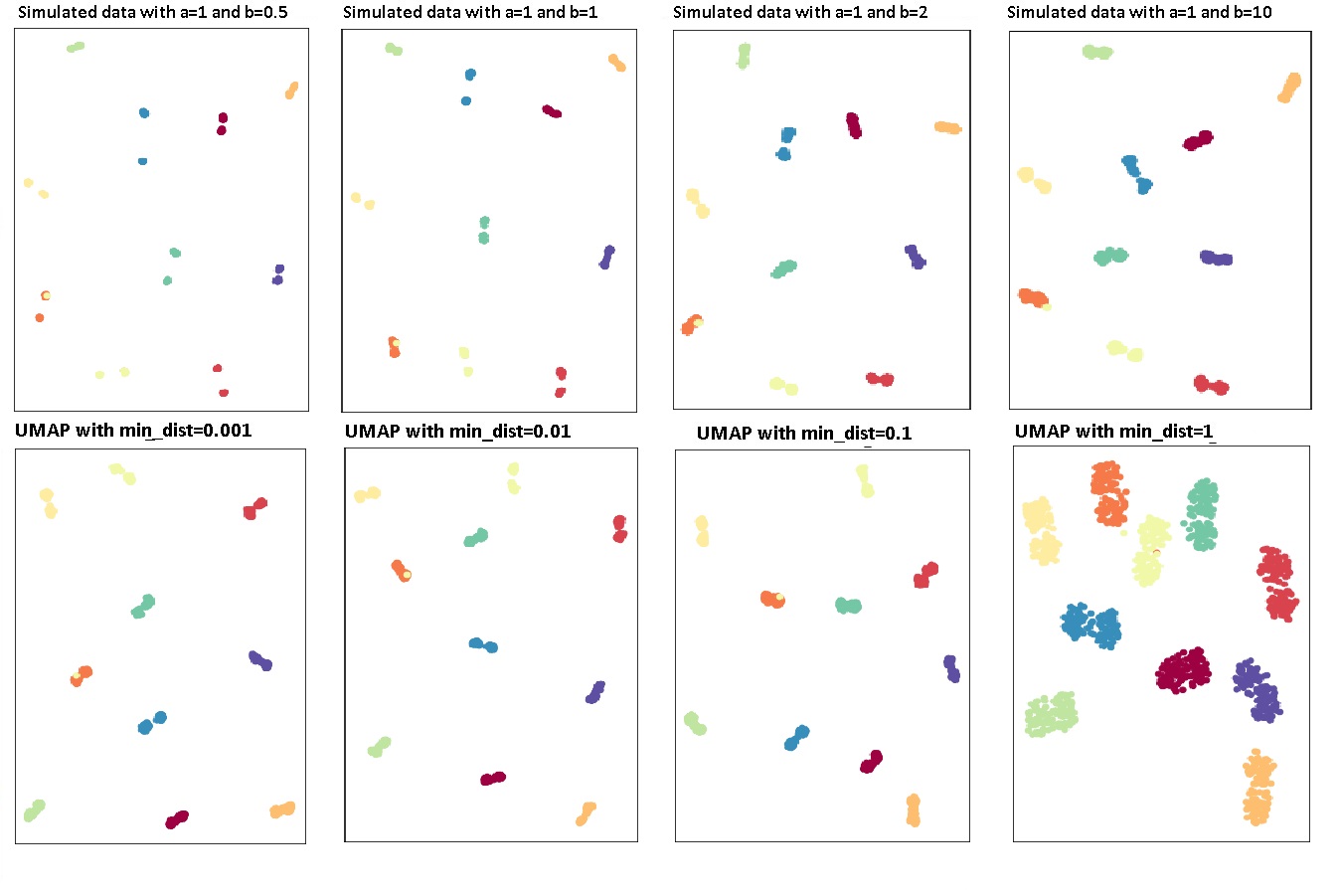
From the setup, we expect that the data will be separated into 10 distinct clusters. Within each big cluster, the data can be classified into two subclusters or at least have a “dumbbell” shape, because they have different mean values.
We can see from the embeddings, for our proposed method, that all the big clusters are well separated from each other with various values of . In addition, when or , the majority of the big clusters are separated into two isolated subclusters. For the rest of the big clusters, we can see the dumbbell shape very well. With the value increasing, the two subclusters within each cluster get closer and closer and eventually merge into one cluster. However, even with , we can still see the dumbbell shape within each big cluster.
For UMAP, even with , the subclusters within each big cluster are not well separated. However, we can still see the dumbbell shape for some of the clusters, such as the blue, light red, and yellow clusters. With the increases of , the distances between different clusters decrease. In addition, we further lose the dumbbell shapes within several clusters. We also notice that there is not much difference between the graphs with and the graphs with . A possible reason is that when , further decreasing the value of does not change the values of and much.
3.2 Real Data Sets
To further test the performance of our proposed method, we apply the method to the following real data sets with either large or small sample sizes:
-
1.
MNIST [9]: Data set includes 70,000 images of the handwritten digits 0–9. Each image is pixels in size.
-
2.
Fashion-MNIST [20]: Data set includes 70,000 images of 10 classes of fashion items (clothing, footwear, and bags). Because the images are gray-scale images, pixels in size, the feature dimension is 784.
-
3.
Turbofan Engine Degradation Simulation data set [13]: Engine degradation data are simulated under different combinations of operational conditions. In the data set, 21 sensor measurements for 260 engines under six operational conditions are recorded until the engine fails. We assume that all the engines operate normally at the beginning of the study. There are a total 53,759 observations in the data set.
-
4.
COIL-20 [12]: Data set includes 1,440 gray-scale images, pixels in size, of 20 objects under 72 rotations spanning 360 degrees.
For all the data sets, we considered Euclidean distance. We set and vary values from 1, 2, 5, to 10. As with the simulated data, the initial values of the embedding are set to be the eigenvectors of the normalized Laplacian. The visualizations are summarized in Figure 3.
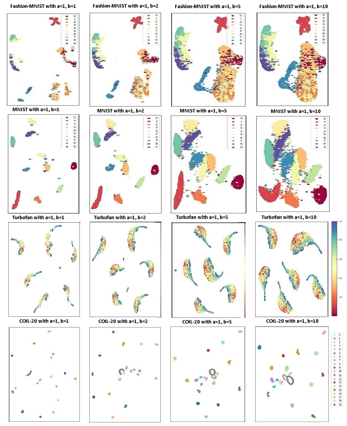
We can see from the graphs, that when , the clusters for each data set have the biggest separation and the greatest distance. For example, all the digits are separated into distinct clusters in the MNIST data set when . With the increases in the value of , the distances between different digits get smaller and smaller. Some digits, such as 4, 7, and 9, and 3, 5, and 8, join together eventually. Based on the embeddings, we use k-means to do classification and find that when and , we get the smallest error, 4.4%.
For the Fashion-MNIST data set, with various values, trousers (red) and bags (blue) always have the greatest distance from each other. In addition, shoes, bags, trousers, and other clothes (T-shirts, dresses, pullovers, shirts, and coats) are well separated when or . When and , bags, and other clothes get much closer to each other. They are not distinct clusters anymore. It is also worth pointing out that when or , we also see a few subclusters that are invisible when or . For example, the majority of the T-shirts (dark red) and dresses (orange) are separated from coats (yellow), pullovers (vermilion), and shirts (light green); sneakers (green), ankle boots (purple), and sandals (lemon) have certain separation as well. In addition, sandals are now separated into two subclusters. Among them, one subcluster is close to sneakers and the other is close to ankle boots. Furthermore, bags (blue) are separated into two subclusters as well.
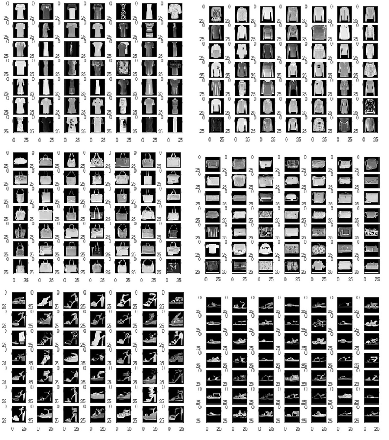
To verify whether these subclusters are meaningful or not, we randomly sampled 100 images from each of the subclusters that we mentioned earlier and compared the images. We found that the separation of T-shirts and dresses from other clothing is due to long or short sleeves. For bags, in one subcluster, the majority of the bags have handles showing at the top of the image. However, in the other subcluster, either the bags do not have a handle or the handle is not showing at the top of the image. In addition, the images of sandals also show that the majority of the sandals in one subcluster have middle or high heels, whereas the sandals in the other subcluster are relatively flat. These image comparisons clearly show that the subclusters revealed by small values are meaningful. They provide additional insights into the data structure of Fashion-MNIST. The comparison results are summarized in Figure 4.
In the Turbofan Engine Degradation Simulation data set, the flight condition indicator is removed from the data. Using the readings only from 21 sensors, our proposed method successfully classified the data into six categories with high accuracy. For each cluster, we can see that the readings that are taken close to the fault points are approximately on the edge of the embedding (blue color). To further investigate the engine degradation process, we remove the impact of different flight conditions by subtracting the average reading measurement for each sensor at each flight condition and redo the embedding. The resulting embeddings are shown in Figure 5.
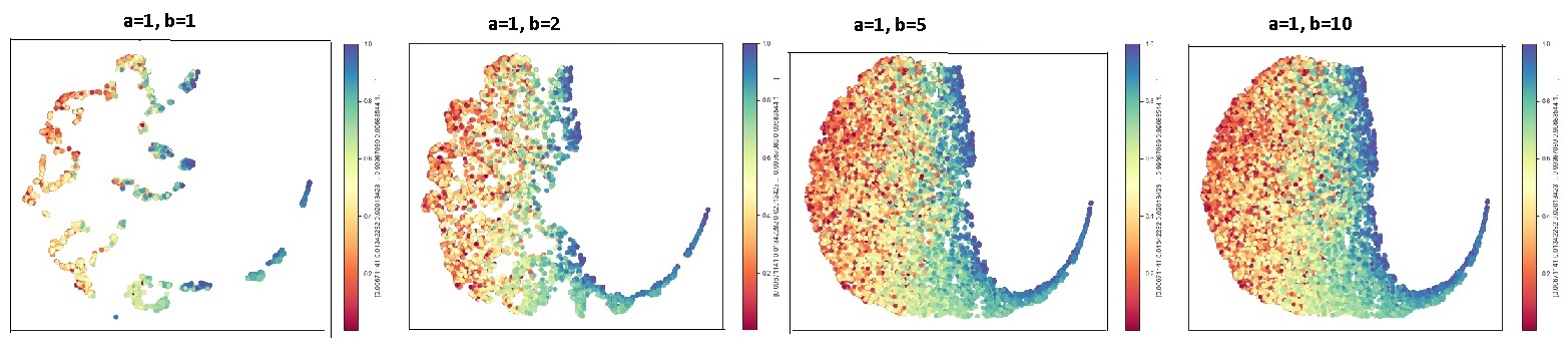
The embeddings clearly show that the sensor readings in the early stage of the study mainly concentrate on one side of the graph and the readings close to the fault points mainly concentrate on the other side of the graph with the tail. With a small value of , we can see that the readings recorded at a similar stage of an engine’s life cycle tend to concentrate together.
For the COIL-20 data set, with different values, the majority of the objects are well separated, except for cars (objects 3, 6, and 19), Anacin, and Tylenol. With the increases in the value of , the between-class distance for different objects gets smaller and smaller, which can cause problems for data clustering. However, we can see more clearly the circular structure of each object with a higher value of . One interesting fact is that we find that object 1 is classified into three subclusters (light blue color). We randomly sampled some of the images from each subcluster and found that the subclusters are formed mainly according to the direction of the arrow (downward, upward, and horizontally). Some of the images are displayed in Figure 6.
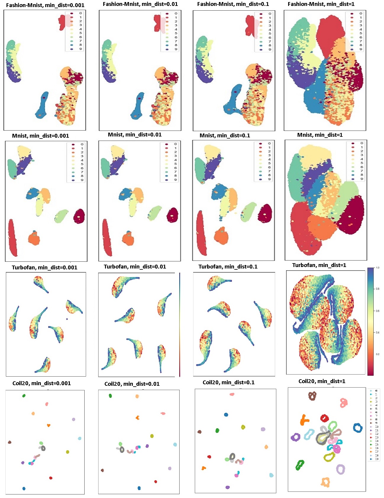
For comparison, we also run UMAP by setting and to 0.001, 0.01, 0.1, and 1 while keeping other settings the same as in our proposed method. The results are summarized in Figure 7. From the graph we can see that UMAP generates excellent visualization for every data set in general, with the majority of the clusters well separated. However, it fails to separate some clusters that are very similar to each other and fails to reveal the subtle subclusters as we see for the Fashion-MNIST and MNIST data sets with various values. It is not sufficient to get a finer cluster structure by reducing only the value of . Manually decreasing the values of the parameters and in UMAP might be needed.
4 Conclusions
In this paper, we propose using a generalized sigmoid function to model the distance similarity in both high-dimensional and low-dimensional spaces. In particular, the parameter is introduced to the generalized sigmoid function in low-dimensional space. By changing the value of , we can adjust the heaviness of the function tail. Using both simulated and real data sets, we show that decreasing the value of can help us reveal the finer cluster structure of the data. Using visualization and domain knowledge, we show that the subclusters in the Fashion-MNIST, MNIST, Turbofan Engine Degradation Simulation, and COIL-20 data sets are meaningful.
In practice, however, as with the finding in UMAP that a low value of might lead you to spuriously interpret the data structure, a small value of might also result in the discovery of some clusters of random sampling noise. In addition, we learn from the curves with varying values that the smaller the value is, the flatter the tail of the curve is. So embedding convergence might be slower with a low value of , especially when the sample size is small, the number of features is high, and there are many clusters. For example, the COIL-20 data set has only 1,440 images of 20 different objects, but the images have 16,384 features. In order to get a stable embedding, we increase the number of epochs to 5,000 with small values.
In the literature of information visualization, how to assess the quality of graph visualizations is a long-standing problem. If the purpose of the study is classification or data exploration, then reducing the value of properly might give us more insights into the data structure. However, if the purpose of the study is to maintain pairwise distance of neighbors in high-dimensional space, then reducing the value of can also reduce the continuity of the neighbors. In practice, there is no unanimous criterion for choosing the value. We suggest trying out different values for data exploration to get a comprehensive understanding of the data.
5 Acknowledgments
The authors would like to thank Ed Huddleston, Senior Technical Editor for his assistance in editing this paper, and Anya McGuirk, Distinguished Research Statistician Developer, and Byron Biggs, Principal Research Statistician Developer, for their advice and comments.
References
-
[1]
Belkin, M., and Niyogi, P. (2002). “Laplacian Eigenmaps and
Spectral Techniques for Embedding and Clustering.” In Advances in
Neural Information Processing Systems, 585–591. Cambridge, MA: MIT Press.
-
[2]
Borg, I., and Groenen, P. J. (2005). Modern
Multidimensional Scaling: Theory and Applications. New York: Springer
Science and Business Media.
-
[3]
Ceriotti, M., Tribello, G. A., and Parrinello,
M. (2011). “Simplifying the Representation of Complex Free
Energy Landscapes Using Sketch-Map.” Proceedings of the National
Academy of Sciences 108:13023–13028.
-
[4]
Cook, J., Sutskever, I., Mnih, A., and Hinton,
G. (2007). “Visualizing Similarity Data with a Mixture of Maps.”
In Artificial Intelligence and Statistics, 67–74. San Juan,
Puerto Rico.
-
[5]
Demartines, P., and Hérault,
J. (1997). “Curvilinear Component Analysis: A Self-Organizing
Neural Network for Nonlinear Mapping of Data Sets.” IEEE
Transactions on Neural Networks 8:148–154.
-
[6]
Hinton, G. E., and Roweis, S. T. (2003). “Stochastic
Neighbor Embedding.” In Advances in Neural Information Processing
Systems, 857–864. Cambridge, MA: MIT Press.
-
[7]
Hotelling, H. (1933). “Analysis of a Complex of Statistical
Variables into Principal Components.” Journal of Educational
Psychology 24:417.
-
[8]
Kobak, D., Linderman, G., Steinerberger, S., Kluger, Y., and Berens,
P. (2019). “Heavy-Tailed Kernels Reveal a Finer Cluster
Structure in t-SNE Visualisations.” arXiv preprint, arXiv:1902.05804.
-
[9]
Lecun, Y., and Cortes, C. (2012). “The MNIST Database of
Handwritten Digit Images for Machine Learning Research.” IEEE
Signal Processing Magazine 29:141–142.
-
[10]
McInnes, L., Healy, J., and Melville, L. (2018). “UMAP:
Uniform Manifold Approximation and Projection for Dimension Reduction.”
arXiv preprint, arXiv:1802.03426.
-
[11]
Mikolov, T., Sutskever, I., Chen, K., Corrado, G. S., and Dean,
J. (2013). “Distributed Representations of Words and Phrases and
Their Compositionality.” In Advances in Neural Information
Processing Systems, 3111–3119. La Jolla, CA: Neural Information
Processing Systems Foundation.
-
[12]
Nene, S. A., Nayar, S. K., Murase, H., et al. (1996). Columbia
Object Image Library (COIL-20).
-
[13]
Saxena, A., and Goebel, K. (2008). Turbofan Engine Degradation
Simulation data set. NASA Ames Prognostics Data Repository, NASA Ames
Research Center, Moffett Field, CA.
- [14] Tang, J., Liu, J., Zhang, M., and Mei, Q. (2016). “Visualizing Large-Scale and High-Dimensional Data.” In Proceedings of the 25th International Conference on World Wide Web, 287–297. Geneva: International World Wide Web Conferences Steering Committee.
-
[15]
Tang, J., Qu, M., Wang, M., Zhang, M., Yan, J., and Mei,
Q. (2015). “LINE: Large-Scale Information Network Embedding.” In
Proceedings of the 24th International Conference on World Wide
Web, 1067–1077. Geneva: International World Wide Web Conferences
Steering Committee.
-
[16]
Tenenbaum, J. B., De Silva, V., and
Langford, J. C. (2000). “A Global Geometric Framework for Nonlinear
Dimensionality Reduction.” Science 290:2319–2323.
-
[17]
Torgerson, W. (1952). “The First Major MDS Breakthrough.”
Psychometrika 17:401–419.
-
[18]
Van der Maaten, L. (2014). “Accelerating t-SNE Using
Tree-Based Algorithms.” Journal of Machine Learning Research
15:3221–3245.
-
[19]
Van der Maaten, L., and Hinton, G. (2008). “Visualizing
Data Using t-SNE.” Journal of Machine Learning Research
9:2579–2605.
-
[20]
Xiao, H., Rasul, K., and Vollgraf,
R. (2017). “Fashion-MNIST: A Novel Image Dataset for
Benchmarking Machine Learning Algorithms.” arXiv preprint,
arXiv:1708.07747.