Racial Impact on Infections and Deaths due to COVID-19 in New York City
Abstract
Redlining is the discriminatory practice whereby institutions avoided investment in certain neighborhoods due to their demographics. Here we explore the lasting impacts of redlining on the spread of COVID-19 in New York City (NYC). Using data available through the Home Mortgage Disclosure Act, we construct a redlining index for each NYC census tract via a multi-level logistical model. We compare this redlining index with the COVID-19 statistics for each NYC Zip Code Tabulation Area. Accurate mappings of the pandemic would aid the identification of the most vulnerable areas and permit the most effective allocation of medical resources, while reducing ethnic health disparities.
Keywords: COVID-19, Redlining, Institutional Racism; Pandemic.
I Introduction
Systemic racial segregation has left many United States (US) citizens—especially black Americans—cloistered in adverse living conditions. Broadly, institutionalized racism encompasses policies, norms, and institutional practices (both intended and unintended) that amount to racial disparity McKenzie . Historically, institutionalized racism has left nonwhite or racially mixed communities with inadequate housing, disinvestment, and relatively low employment rates redlining_effects . Many health researchers hypothesize that such practices of institutionalized racism are to blame for health disparities between ethnic groups in the US at individual and neighborhood levels redlining_health . Moreover, such health disparities are a particular concern during the current COVID-19 pandemic.
Current efforts to quantify inequalities surrounding the COVID-19 pandemic in the US (see e.g. Garg ; Raifman ) rely on identifying the vulnerability of subgroups according to traditional CDC-defined risk factors such as old age and underlying conditions CDC . However, racial differences in the number of COVID-19 cases and deaths are so severe that traditional risk factors alone cannot fully explain such disparity Yancy ; Laurencin ; Khmaissia ; Coven ; Schmitt ; Almagro ; Hooper . In this study, we show that in New York City (NYC) the demographics of a neighborhood can imply enhanced risk for its residents and should be considered when measuring an individual’s vulnerability to COVID-19, in addition to the CDC traditionally defined risk factors. While several studies make use of the preexisting health surveys to arrive at their results, we make use of the data from the actual spread of the disease in New York City to arrive at our conclusions. For other COVID-19 studies focused on NYC, see e.g. Petrilli ; Wadhera ; Borjas ; Coven ; Schmitt ; Almagro ; Khmaissia ; hospitalization .
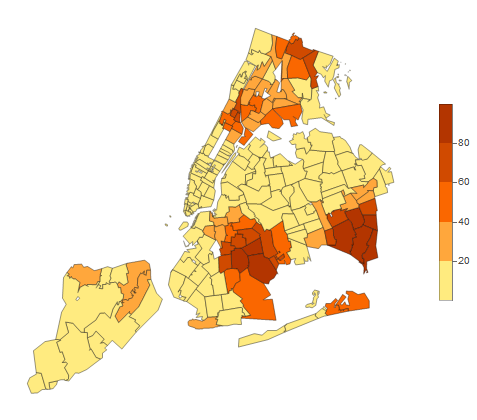
Specifically, here we compare COVID-19 data to a “redlining” index we construct for New York City (NYC). The term ”redlining” refers to discriminatory practices in which banks historically avoided investments based on neighborhood demographics: therefore, denying services to specific ethnic groups based on the locations of their residences hmda_def . Historically, banks disproportionately denied mortgage applications from black Americans, barring them from entering more affluent, traditionally white communities. Such practices have been a real and significant detriment to black Americans. In the context of health research, redlining and other mortgage discrimination have been empirically blamed for racial health disparities as such practices would assign black Americans to poor neighborhoods with lower standards of living. Limited access to nearby health care, poor air and water quality, and stress from high levels of crime and impoverishment mean that living standards can be closely linked with to health levels in the community redlining_health . Figure 1 shows the distribution of black residents in NYC.
This paper is structured as follows: In Section II, we outline the construction of a redlining index for each census tract. Then in Section III, we discuss the COVID-19 statistics for NYC and compare these to the redlining index of Section II. In Section IV, we discuss certain limitations of our model and possible extensions, and in Section V, we highlight the significance of our findings.
II Redlining Index
To assuage the public’s concern on mortgage discrimination, since 1975, the Federal Reserve Board has made it compulsory for financial institutions to release information about the mortgage applicants and their applications through the Home Mortgage Disclosure Act (HMDA) hmda_def . Currently, this data is publicly available online HMDA . However, only a few researchers to-date have made use of the HMDA database in the context of health research. In these existing studies, the impacts of redlining on long-term, noncommunicable diseases such as cancer and those relating to perinatal health have been studied Beyer ; Mendez ; Bemanian . Another study Gee explored the effects of redlining on access to medical resources. These studies concluded that redlining has a statistically significant influence in increasing the rates of noncommunicable diseases and in decreasing access to healthcare.
Here we examine the relationship between redlining and COVID-19 infections and outcomes. As such, we also present the first study of the impact of redlining on the spread of communicable diseases. To construct a redlining index we follow similar method to that in Beyer ; Mendez ; Bemanian and make use of the publicly available HMDA data sets for years 2013-2017 HMDA . In these data sets, information about the applicant such as the applicant’s ethnicity, income, loan amount, and sex was reported. Information about the application, which includes the purpose of the mortgage and the property type, was also reported. The smallest unit of neighborhood reported in the HMDA data set is the census tract.
Since we are interested in the health disparities between black and white ethnic groups, we excluded primary applicants that did not identify as black or white. We also excluded applications for multi-family housing or home improvement purposes, as well as incomplete and withdrawn applications, from our analysis. After this filtering, there was a total of applications accounted for across census tracts111There are census tracts within NYC, those with very small or no population or no population where omitted. With this omission the analysis still covers all Zip Codes of NYC. within the five year span of 2013-2017. We then geocoded the census tracts into Zip Code Tabulation Areas (ZCTA) using the Census Bureau’s Relationship File USCB2 .
Using the HMDA data, we constructed a redlining index using a multilevel logistical model and then evaluated it on each census tract in NYC. The main predictor of the logistical model was the ethnicity of the primary applicant. The outcome to be measured was the log-odds of the probability of mortgage acceptance , where indexes each census tract and indicates each individual within census tract . Two covariates were utilysed, based on the variables shown to be influential in previous studies Beyer ; Mendez ; Bemanian : the applicant’s sex and the ratio between the amount of loan requested given their income.
The index was computed from the two-level equations:
where, and are the ethnicity and sex of an applicant in census tract (with for white and for black; for a male and for a female), and where is the loan to income ratio of the applicant.
In level 2, the coefficients are then identified with a fixed factor , the coefficient that best fits all of the data points, and a variation between census tracts captured by , with an assigned value such that each best fits all of the data points within census tract .
Notably, , which tracks the ethnicity of the applicants, provides a measure of the black-to-white difference in mortgage acceptance for census tract . Each of the four variations (with ) were tested on whether they improve the fit in terms of the statistic. Permitting for variations due to the sex of the applicant, , was shown to not improve the fit, and therefore, was excluded from the final model. However, the fixed effect on the sex of the applicant was retained.
From fits of the logistical model to the HMDA data we constructed the redlining index: and quantified each census tract along a continuous scale of mortgage loan discrimination. In addition to this, one can identify the global component of the redlining index such that . For the 5-year dataset analysed, the index took values in the range to over the 177 NYC ZCTA. For reference, implies the probability of mortgage acceptance of a white individual is twice that of a black individual in a given census tract (adjusting for sex and loan to income ratio). An average of applications were considered from each census tract, and an average of applications were considered for each ZCTA. The percentage of mortgage denial from 2013-2017 in NYC ranged from to .
Table 1 displays the the adjusted likelihood ratio of loan acceptance between 2013-2017 after each applicant was adjusted for their loan to income ratio and their sex. In addition to calculating the index from all of the data from 2013-2017, an unadjusted (for sex or income) index with was also calculated for individual years. For reference, in the unadjusted case the global component of the index was found to be for 2013 and for 2017. In both the adjusted index and unadjusted index , a white applicant was about twice as likely to have their loan accepted than a black applicant in each of the years spanning 2013-2017.
| Applicant Race | |||||
| Black | White | ||||
| Year | # | % denied | # | % denied | Global redlining index () |
| 2013 | 9930 | 40.2 | 46475 | 23.8 | 1.88 (1.77, 1.99) |
| 2014 | 7203 | 37.8 | 29848 | 23.4 | 1.93 (1.81, 2.01) |
| 2015 | 7487 | 34.8 | 32249 | 20.8 | 1.95 (1.83, 2.07) |
| 2016 | 8090 | 37.1 | 32930 | 20.6 | 2.19 (2,06, 2.33) |
| 2017 | 7200 | 29.9 | 27548 | 17.0 | 2.06 (1.92, 2.22) |
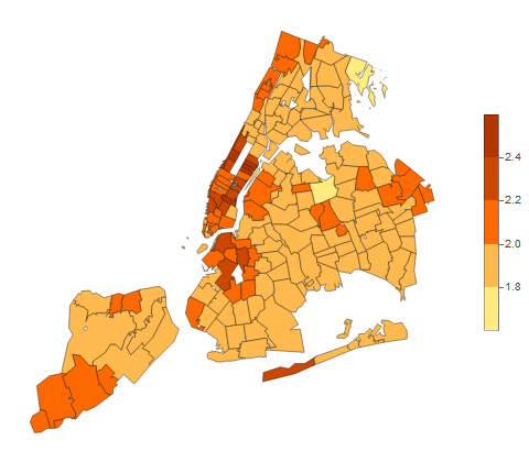
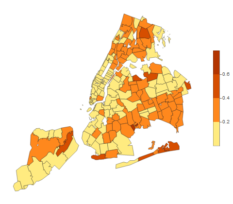
After the redlining indices were calculated for each census tract, we geocoded the census tracts into ZCTA. We then weighed each census tract by their population and calculated the redlining index for each ZCTA. The results are illustrated in Figure 2. Higher index scores indicate predominantly white, more affluent areas. Neighborhoods with the highest indices were Upper West and Upper East , and those with the lowest scores were Rockaways and Southeast Bronx .
III COVID-19 Spread in NYC
COVID-19 is an infectious disease caused by the severe acute respiratory syndrome coronavirus 2 (SARS-CoV-2). The pathogen was first identified in Wuhan, China in December 2019 and rapidly led to a worldwide pandemic, this was particularly pronounced in the US. Our analysis focuses on the spread of COVID-19 in NYC, which was an early epicentre for the pandemic in 2020.
Data on the spread of COVID-19 was retrieved from NYC’s official website NY , which was updated daily.222Specifically, two data sets were used: ‘tests-by-zcta’, detailing the number of total tests and the number of positive tests across the 177 NYC ZCTA since April 1st; and ‘data-by-modzcta’, detailing the number of deaths in each ZCTA since May 18th. Tests and cases with unknown ZCTA were excluded from our analysis. As of , the ZCTA of of all positive tests and that of of all tests could not be identified. We assigned ZCTA to neighborhoods using the ‘Zip Code Definitions of NYC Neighborhoods’ Zip . In Figures 3-5 we illustrate the variation in the number of confirmed cases, percentage of positive tests, and total deaths resulting from COVID-19 as of June 30 2020.
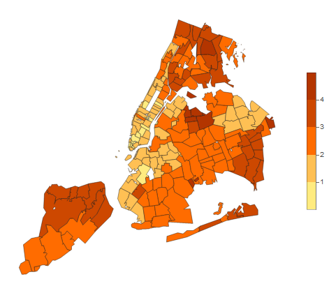
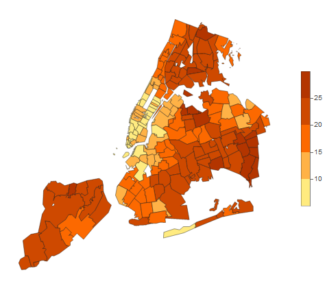
The predominantly white neighborhoods of Greenwich Village/Soho reported cases per 100 residents (phr), and lower manhattan had 0.078 phr, the lowest infection numbers in NYC. While West Queens and Rockaways were among the highest numbers of cases ( and phr, respectively), and both also had very low redlining scores (). Similar statements hold for the proportion of positive tests. Moreover, Greenwich Village/Soho had the least COVID deaths ( phr), whilst Rockaways which is predominantly Black/Latino, reported the most deaths ( phr).
Using the redlining index constructed in Section II, we compute the Pearson correlation coefficient Pearson between the redlining index and three COVID-19 data sets:
-
•
The number confirmed COVID infections case.
-
•
The percentage of positive tests ‘test’.
-
•
The number of COVID deaths.
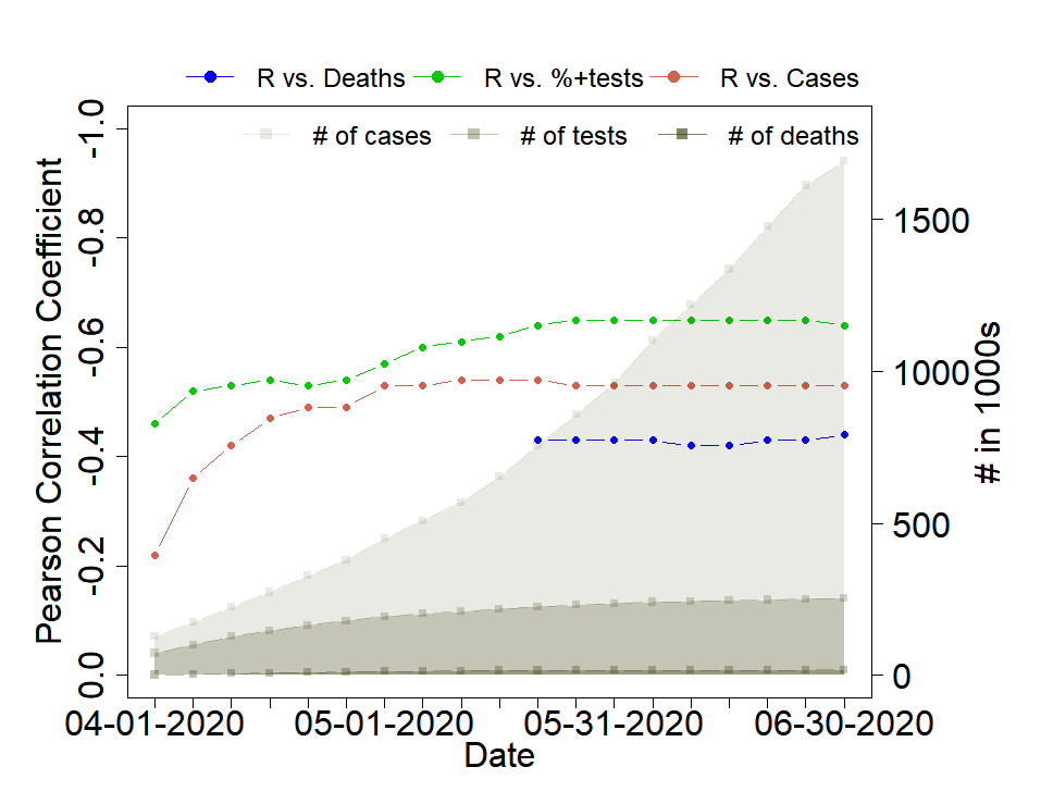
Specifically, we computed the correlation coefficient over five day periods starting from April 1 2020 until June 30 2020. Over this 90 day period, the cumulative number of cases increased from 73,533 to 252,585, the cumulative number of tests rose from 127,550 to 1,691,978, and the number of deaths spiked from 1374 to 18,492.
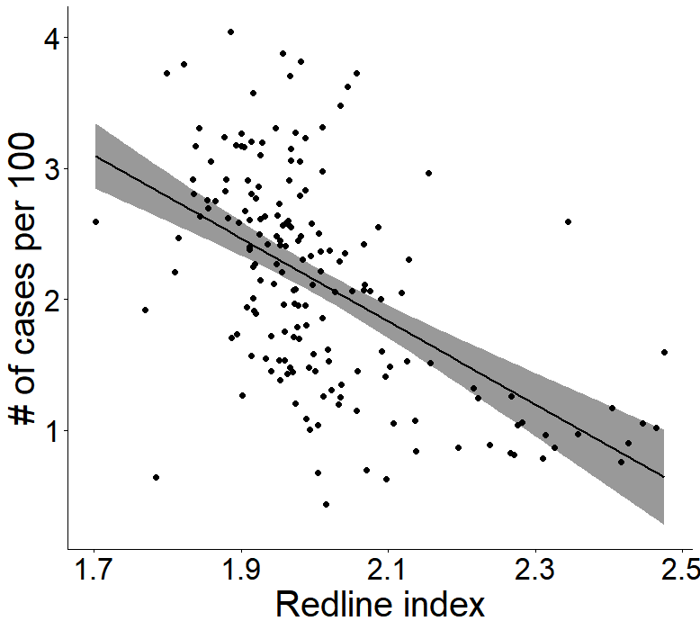
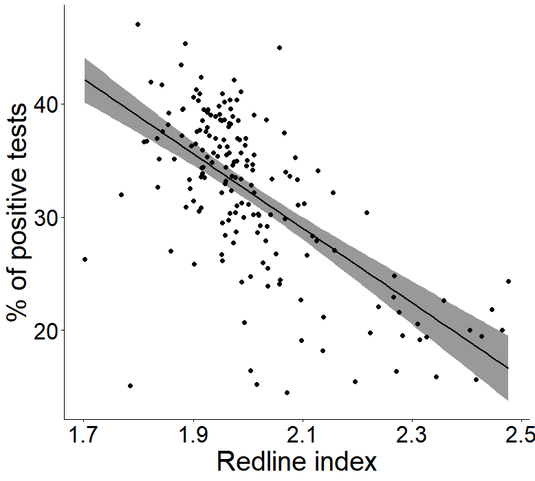
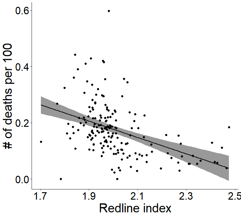
To gain some intuition, we took the data for each 5-day period for which we calculated the correlation coefficient and mapped each ZCTA to points on scatterplots in the planes of versus cases, percentage of positive tests, and deaths. We show one set of plots for 15th - 20th of May 2020 in Figure 6. Moreover, Figure 7 shows the evolution of the correlation coefficients over time (and a table of the coefficients is given in the appendix, along with the associated values). Inspecting Figure 7, we note that while the correlations started out relatively weak, they all significantly strengthened over time and also settled.
It can be seen that the redlining index establishes a significant negative correlation with all three COVID data sets. This suggests that in redlined neighborhoods, the containment of the disease is harder, likely due to a lack of sufficient medical resources. It may also suggest that less individuals tend to seek medical care, and perhaps that more individuals have to work and thus are at risk of infection. Regardless the reason, the results emphasize the need for more medical resources in redlined areas.
IV Discussion
Since COVID-19 data was only reported in NYC in each ZCTA, in our analysis we worked at the ZCTA-level. However, had COVID-19 data been released at the census tract level, a more detailed analysis could have been conducted. Such a fine detailed analysis would be interesting for identifying sub-pockets of vulnerable individuals. Furthermore, while the HMDA data does significantly increase the transparency of mortgage discrimination, potentially critical information such as the applicant’s employment status, debt, and credit score were not reported. As such, these factors could not be included.
Notably, a previous study on the 1993-1999 HMDA data set Dietrich observed that an application from a black applicant was more likely to have missing ethnicity information than that of a white applicant. The study thus concluded that mortgage discrimination visible in the HMDA database is an underestimation of the true severity of the problem. This may imply that redlining may have an even larger impact on racial health disparities than found in our analysis leading to even stronger correlations than reported in Figure 7.
Moreover, although we focused on black and white ethnic groups in this study, a potential future research directions would be to observe the impacts of residential segregation on the spread of pandemic on other ethnic groups. In particular, previous studies have concluded that the healthiness of the Hispanics in Milwaukee Bemanian and that of Chinese Americans Gee in Los Angeles are affected by residential segregation.
V Conclusion
Our analysis quantifies the impact of the COVID-19 pandemic on black Americans, a sub-group which has previously shown to be disproportionately affected by the pandemic Coven ; Schmitt ; Almagro ; Hooper ; Khmaissia ; Laurencin ; Yancy . As of June 2020, the rate of confirmed COVID-19 cases among black NYC residents were roughly higher that of the white population after age adjustment NY and the number of COVID related deaths was double for black Americans, compared to white Americans. The risk factors determined by the CDC CDC —old age and various underlying conditions—alone are not enough to explain such disparity. This naturally raises the question about whether medical resources were distributed equally among neighborhoods or whether certain subgroups are more or less likely to reach out of medical assistance. This study has endeavored to address these apparent health disparities through the lens of historical residential segregation.
Moreover, this work contributes to measuring the lasting impacts of institutionalized racism on the spread of communicable diseases (taking COVID-19 as a prime example). While the medical literature is clear that environmental factors influence healthiness, very few studies have quantified residential segregation and measured its relationship with racial health disparities and even those that have primarily examined exclusively noncommunicable diseases Beyer ; Mendez ; Bemanian ; Gee . Notably, reasons for why neighborhood-level factors should influence healthiness—such as stress and scarce medical resources—apply similarly to communicable and noncommunicable diseases.
This work aims to minimize racial health disparities as a consequence of the lasting impacts of institutionalized racism, specifically during a pandemic when such disparities are amplified. As demonstrated by the present case study of NYC, we suggest that such index based analyses may be helpful in predicting the vulnerability of subgroups in other cities that the COVID-19 has yet to hit and to prepare for future pandemics.
Accurate mappings of this pandemic allow us to predict the spread of a communicable diseases and identify the most vulnerable subgroups. This information should be acted upon to more appropriately allocate medical resources in the future, to support the communities and neighborhoods that are the most in need. Ultimately, an accurate model of the spread of the COVID-19 can minimize the lasting impacts of institutionalized racism and ensure that ethnicity is not what guarantees good healthcare. In the long run, quantitative analyses, such as presented here, can guide policies to aid in the reduction of health disparities in the post-COVID-19 era.
Acknowledgements. This research was undertaken as part of the MIT-PRIMES program.
Appendix: Tables of correlation coefficients
This appendix provides a tabulation in Table 2 of the Pearson correlation coefficients calculated in Section III. These tabulated results are presented graphically in Figure 7 of the main text. Note that deaths were only recorded in each ZCTA from May 18th. The table also indicates the associated -values for each time period. Observe that while for the earliest date (4/1/2020) the -value was of marginal significance (), for subsequent dates the correlation was found to be pronounced between all quantities with .
-
Date Cases tests Deaths 4/1 -0.22* -0.46** - 4/6 -0.36** -0.52** - 4/11 -0.42** -0.53** - 4/16 -0.47** -0.54** - 4/21 -0.49** -0.53** - 4/26 -0.49** -0.54** - 5/1 -0.53** -0.57** - 5/6 -0.53** -0.60** - 5/11 -0.54** -0.61** - 5/16 -0.54** -0.64** - 5/21 -0.54** -0.64** -0.43** 5/26 -0.53** -0.65** -0.43** 5/31 -0.53** -0.65** -0.43** 6/5 -0.53** -0.65** -0.43** 6/10 -0.53** -0.65** -0.42** 6/15 -0.53** -0.65** -0.42** 6/20 -0.53** -0.65 **-0.43** 6/25 -0.53** -0.65** -0.43** 6/30 -0.53** -0.64** -0.44**
References
- (1) K. McKenzie and K. Bhui, Institutional racism in mental health care. BMJ 334 (2007), 649-650.
- (2) John R. Logan and Todd Swanstrom, Redlining To Reinvestment, Temple University Press (1992).
- (3) L. L. Black, R. Johnson, and L. VanHoose The Relationship Between Perceived Racism/Discrimination and Health Among Black American Women: A Review of the Literature From 2003 to 2013 J Racial Ethn Health Disparities, 2 (2015), 11-20
- (4) S. Garg et al., Hospitalization Rates and Characteristics of Patients Hospitalized with Laboratory-Confirmed Coronavirus Disease 2019 - COVID-NET. MMWR Morb Mortal Wkly Rep (2020).
- (5) M. Raifman and J. Raifman, Disparities in the Population at Risk of Severe Illness From COVID-19 by Race/Ethnicity and Income. American Journal of Preventive Medicine (2020).
-
(6)
Center for Disease Control and Prevention,
Coronavirus Disease 2019: People who are at Higher Risk.
[link]
www.cdc.gov/coronavirus/2019-ncov/need-extra
-precautions/people-at-increased-risk.html
- (7) C. W. Yancy, COVID-19 and African Americans. JAMA 323.19 (May 2020), 1891-1892.
- (8) C. T. Laurencin and A. McClinton, The COVID-19 Pandemic: a Call to Action to Identify and Address Racial and Ethnic Disparities. Journal of Racial and Ethnic Health Disparities 7 (2020), 398-402.
- (9) M. Webb Hooper, A. M Napoles, and E. J. Perez-Stable, COVID-19 and racial/ethnic disparities, JAMA (2020) 323 (24): 2466-2467.
- (10) J. Coven and A. Gupta, Disparities in mobility responses to COVID-19, NYU Stern Working Paper, 2020.
- (11) S. Schmitt-Grohe, K. Teoh, and M. Uribe, COVID-19: Testing Inequality in New York City, No. w27019. National Bureau of Economic Research, 2020.
- (12) M. Almagro and A. Orane-Hutchinson, The Determinants of the Differential Exposure to COVID-19 in New York City and Their Evolution Over Time, Covid Economics: Vetted and Real-Time Papers 13 (2020).
- (13) F. Khamaissia, et al., An Unsupervised Machine Learning Approach to Assess the ZIP Code Level Impact of COVID-19 in NYC. arXiv:2006.08361 (2020), 1-8.
- (14) C. M. Petrilli, et al., Factors associated with hospitalization and critical illness among 4,103 patients with COVID-19 disease in New York City. BMJ (2020) 369.
- (15) R. Wadhera, et al., Variation in COVID-19 hospitalizations and deaths across New York City boroughs, JAMA (2020) 323 (21): 2192-2195.
- (16) G. J. Borjas, Demographic determinants of testing incidence and COVID-19 infections in New York City neighborhoods, No. w26952. National Bureau of Economic Research, 2020.
- (17) G. Kozyreff, Hospitilization dynamics during the first COVID-19 pandemic wave: SIR modeling compared to Belgium, France, Italy, Switzerland and New York City Data. arXiv:2007.01411 (2020), 1-6.
- (18) P. McCoy, The Home Mortgage Disclosure Act: A Synopsis and Recent Legislative History, Journal of Real Estate Research, 29, No. 4 (2007)
-
(19)
US Census Bureau, American Community Survey
https://data.census.gov/cedsci/table?q=B02001
-
(20)
Federal Financial Institutions Examination Council, Home Mortgage Disclosure Act.
[link]
www.ffiec.gov/hmda
- (21) K. M. Beyer et al., New spatially continuous indices of redlining and racial bias in mortgage lending: links to survival after breast cancer diagnosis and implications for health disparities research. Health Place 40 (2016), 34-43.
- (22) D. D. Mendez, V. K. Hogan, and J. Culhane, Institutional racism and pregnancy health: using Home Mortgage Disclosure act data to develop an index for Mortgage discrimination at the community level. Public Health Rep 126 (2011), 102-114.
- (23) A. Bemanian Y. Zhou and K. Beyer, Housing Discrimination, Residential Racial Segregation, and Colorectal Cancer Survival in Southeastern Wisconsin, Cancer Epidemiology Biomarkers & Prevention 26 (2017), 561.
- (24) G. C. Gee, A Multilevel Analysis of the Relationship Between Institutional and Individual Racial Discrimination and Health Status. Am J of Public Health 92 (2000), 615.
-
(25)
United States Census Bureau, Relationship Files [link]
www.census.gov/geographies/reference-files
/time-series/geo/relationship-files.html
-
(26)
Website of the City of New York, COVID-19: Data
[link]
www1.nyc.gov/site/doh/covid/covid-19-data.page
-
(27)
New York State Department of Health. ZIP Code Definitions of New York City Neighborhoods
[link]
www.health.ny.gov/statistics/cancer/registry
/appendix/neighborhoods.htm
- (28) K. Pearson, Notes on Regression and Inheritance in the Case of Two Parents, Proceedings of the Royal Society of London, 58, 240-242 (1895).
- (29) J. Dietrich. Missing Race Data in HMDA and the Implications for the Monitoring of Fair Lending Compliance. OCC Economics Working Paper (2001), 1-28.