Disproportionate incidence of COVID-19 in African Americans correlates with dynamic segregation
Abstract
Socio-economic disparities quite often have a central role in the unfolding of large-scale catastrophic events. One of the most concerning aspects of the ongoing COVID-19 pandemics CDC and Team (2020) is that it disproportionately affects people from Black and African American backgrounds Millett et al. (2020); DiMaggio et al. (2020); Goldstein and Atherwood (2020); Cyrus et al. (2020); England (2020), creating an unexpected infection gap. Interestingly, the abnormal impact on these ethnic groups seem to be almost uncorrelated with other risk factors, including co-morbidity, poverty, level of education, access to healthcare, residential segregation, and response to cures Raisi-Estabragh et al. (2020); Li et al. (2020); Prats-Uribe et al. (2020); Takagi et al. (2020); Khanijahani (2020). A proposed explanation for the observed incidence gap is that people from African American backgrounds are more often employed in low-income service jobs, and are thus more exposed to infection through face-to-face contacts Bilal et al. (2020), but the lack of direct data has not allowed to draw strong conclusions in this sense so far. Here we introduce the concept of dynamic segregation, that is the extent to which a given group of people is internally clustered or exposed to other groups, as a result of mobility and commuting habits. By analysing census and mobility data on more than 120 major US cities, we found that the dynamic segregation of African American communities is significantly associated with the weekly excess COVID-19 incidence and mortality in those communities. The results confirm that knowing where people commute to, rather than where they live, is much more relevant for disease modelling.
The spread of a non-air-borne virus like COVID-19 is mostly mediated by direct face-to-face contacts with other infected people. This is why the first measures attempting at containing the spread of the virus included the introduction of travel restrictions, social distancing, curfews, and stay-at-home orders Chinazzi et al. (2020); Buckee et al. (2020); Kraemer et al. (2020); Aleta et al. (2020). However, the distribution of the number of contacts per person is known to be fat-tailed Brown et al. (2013), so that most of the infections are actually caused by a relatively small set of individuals, called super-spreaders Galvani and May (2005); Stein (2011), who normally have a disproportionately high number of face-to-face contacts. Intuitively enough, super-spreaders are most commonly found among service workers –cashiers, postmen, clerks, cooks, bus drivers, waiters, etc.– since their job involves being in direct contact with a large number of people on a regular basis. This fact makes super-spreaders more prone to catch diseases that propagate preferentially through direct contacts, like COVID-19 does, and –involuntarily– more efficient at spreading them.
The fact that mainly African Americans seem to be affected by such a markedly unusual COVID-19 incidencePareek et al. (2020); Laurencin and McClinton (2020); Yancy (2020), rather than, say, people with low-income, little access to healthcare, or with other increased risk factors Raisi-Estabragh et al. (2020); Li et al. (2020); Prats-Uribe et al. (2020); Takagi et al. (2020); Khanijahani (2020), points to ethnic segregation, i.e., the tendency of people belonging to the same ethnic group to live closer in space, as a possible culprit Dawkins (2004, 2006); Brown and Chung (2006); Cliff and Ord (1981); Rey and Smith (2013). Indeed, ethnic segregation is long-standing problem across the US Sethi and Somanathan (2004), so the idea that the abnormal proportion of COVID-19 infections among African Americans could be due to spatial segregation does not sound unreasonable. However, the results available so far confirm that, although there is a correlation between ethnic segregation and overall incidence of COVID-19 in the population, there seems to be little evidence of an association with infection gap in African Americans Hendryx and Luo (2020).
Our hypothesis is that the observed infection gap is most probably due to a prevalence of super-spreading behaviours in African American communities, i.e., activities that contribute to increase the typical number and variety of face-to-face contacts of individuals —including for instance their job, habits, social life, commuting and mobility patterns— and that effectively make them more exposed to the infection. In particular, we argue that these super-spreading behaviours are connected to the presence of what we call dynamic segregation. By dynamic segregation we mean the extent to which individuals of a certain class or group are either preferentially exposed to other groups, or internally clustered, as a result of their mobility patterns. In this sense, dynamic segregation is somehow complementary to the classical notion of segregation based on residential data, and is instead related with similar measures of segregation based on the concept of activity space Wong and Shaw (2011). In principle, the fact that a certain residential neighbourhood has an overabundance of people belonging to a single ethnic group might have per se little or no role in increasing the probability that those people catch COVID-19. Conversely, the fact that a group of people works preferentially in specific sectors, or in specific areas of a city, almost automatically increases the typical number of face-to-face contacts they have during a day, e.g., by forcing them to commute long distances in packed public transport services.
Results
.1 Model
We quantify the dynamic segregation of a certain group in a urban area by means of the typical time needed by individuals of that group to get in touch with individuals of other groups when they move around the city. In our model, a city is represented by a graph where nodes are census tracts and each edge indicates a relation between two areas, namely either physical adjacency or the existence of commuting flows between them. Each node is assigned to a class, according to the ethnicity distribution in the corresponding area (see Methods for details). Then, we consider a random walk on the graph , and we look at the statistics of Class Mean First Passage Times (CMFPT) and Class Coverage Times (CCT). The former is the number of steps needed to a walker starting on a node of a certain class to end up for the first time on a node of class , while the latter is related to the time needed to a random walk to visit all the classes in the system (see Methods for details). The underlying idea is that a random walk through the graph preserves most of the information about correlations and heterogeneity of node classes Nicosia et al. (2014). Consequently, if a system is dynamically segregated, the statistics of CMFPT and CCT will be substantially different from those observed on a null-model graph having exactly the same set of nodes and edges, but where a node is assigned a class at random from the underlying ethnicity distribution.
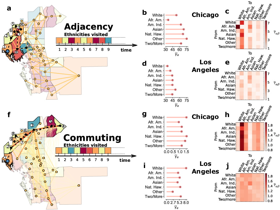
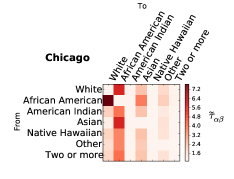
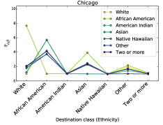
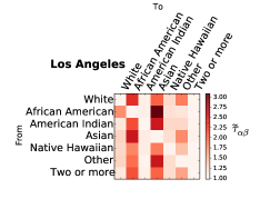
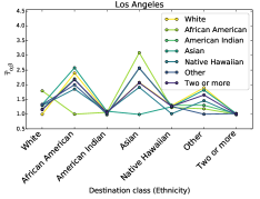
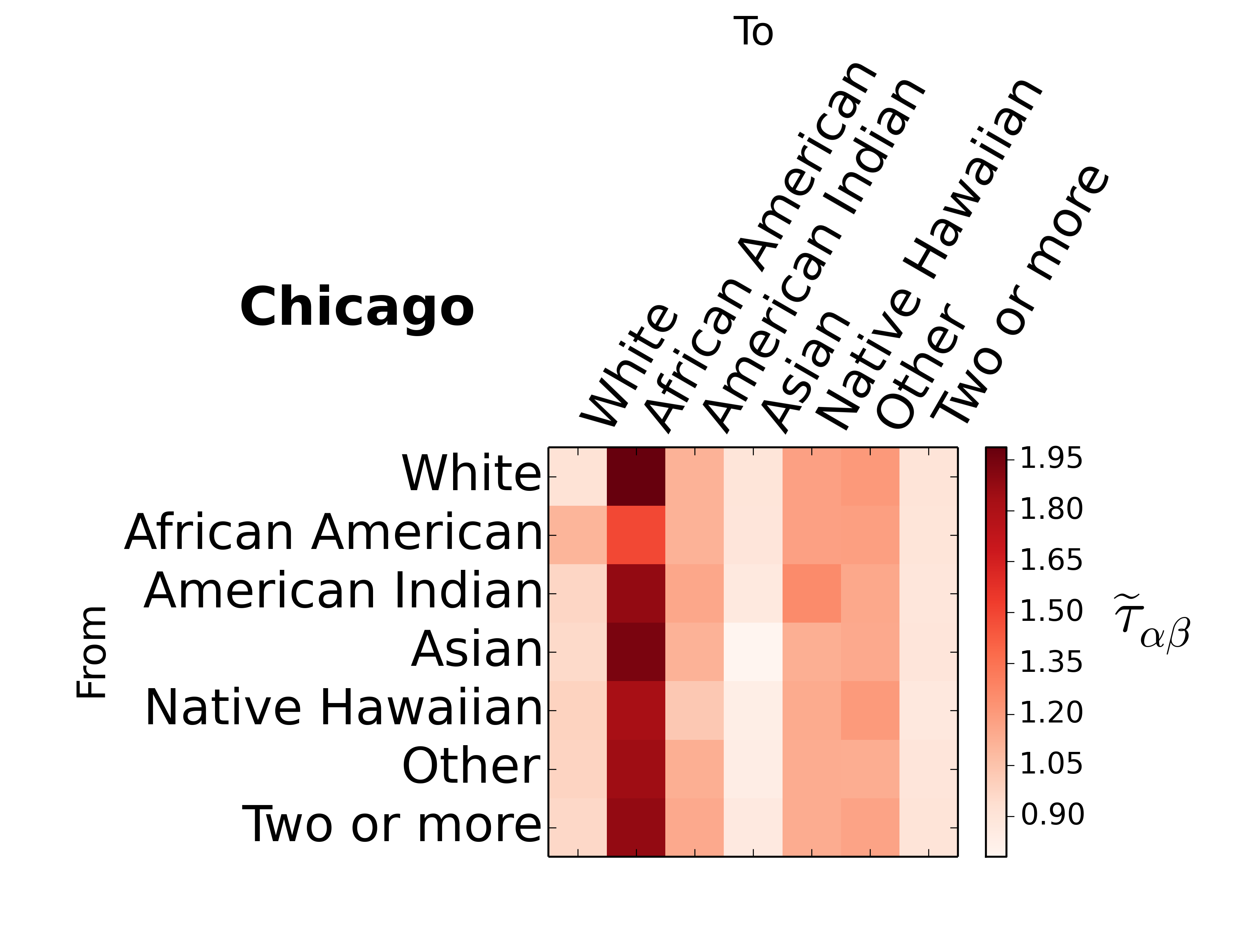
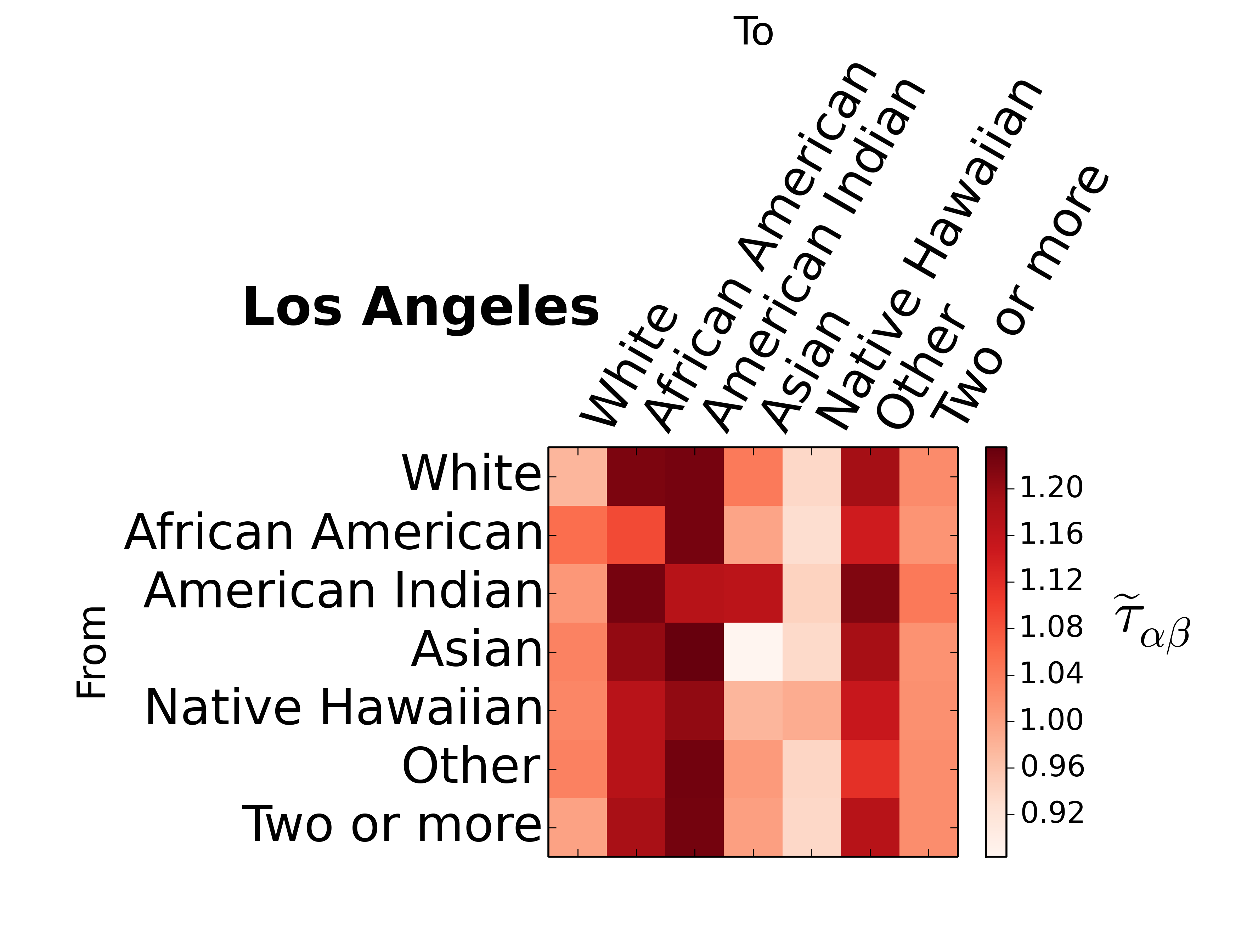
In Fig. 1 we provide a visual sketch of the model and we show the distributions of CMFPT and CCT in Chicago and Los Angeles. We chose these two specific cities since Illinois and California are two states respectively characterised by a relatively high and a relatively low incidence gap Dat (2016a, b) (a detail of incidence gap across US states is available in Supplementary Figures 18-19). Here each node is associated to one of the seven high-level ethnic groups defined by the US Census Borough Manson et al. , with a probability proportional to the abundance of that ethnicity in the corresponding census tract. The variables of interest are and . These are, respectively, the ratio of the CMFPT from class to class in the real system and in the null-model, and the ratio of the CCT when the walker starts from class in the real system and in the null model (see Eq. 8 and Eq. 10 in Methods). In short, the farther away is from , the higher the dynamic segregation from class to class . Similarly, the higher the value of the more isolated ethnicity is from all the other ones.
The top panels of Fig. 1 correspond to the unweighted network of physical adjacency between census tracts, while the bottom panels are obtained on the weighted network of typical daily commute flows among the same set of census tracts Com (2016) (see Methods for details). Notice that the two graphs have quite different structures: the adjacency graph is planar and each edge connects only nodes that are physically close, while in the commuting graph long edges between physically separated tracts are not only possible, but quite frequent. As a consequence, the adjacency graph provides information about short trips, e.g., for daily shopping and access to local services, while the commuting graph represents long-range trips, e.g., related to commuting to and from work. It is clear that each ethnicity has a peculiar pattern of passage times to the other ethnicities, and this pattern varies across cities. For instance, in Chicago the two largest values of on the adjacency graph are observed between African Americans and White, and between Asian and African Americans. Conversely, in Los Angeles the two largest values of are between African American and Asian and between Other and Asian. As expected, the profile of for a given class is quite different if we consider the commuting network instead of the adjacency graph. In Chicago, the largest value of is from White to African American, while in Los Angeles there are a lot of pairs of classes with pretty similar values of , indicating that in this city dynamic segregation for African Americans is less prominent than in Chicago. The value of for African Americans is especially low in Chicago, but noticeably different from that of the other ethnicities in Los Angeles. Results for other cities are discussed in Appendix A Supplementary Figures 1-4. As we shall see in a moment, is related to the isolation of a class, so that lower values correspond to increased exposure to all the other classes.
.2 Dynamic segregation and infection gap
Starting from the statistics of CMFPT and CCT at the level of each city, we defined three indices of dynamic segregation, namely dynamic clustering (C), dynamic exposure (E), and dynamic isolation (I), and we associated to each state in the US the weighted average of each of those indices across the largest metropolitan areas of the state (the definitions of these measures are provided in Methods, while a ranking of US states by each segregation index is reported in Appendix B and in Supplementary Figure 5). We considered two temporal data sets of weekly percentage of African Americans infected by and deceased due to COVID-19 for each state in the US Dat (2016a, b) (more details available in Methods), and we calculated the incidence gap in each state as the difference between the percentage of infected of that state that are African Americans and the percentage of African American population in the same state. Hence, Positive values of correspond to a disproportionate incidence of COVID-19 on African American communities.
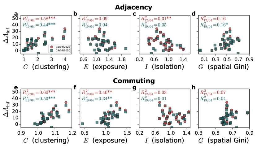
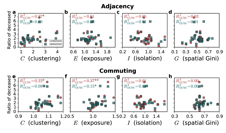
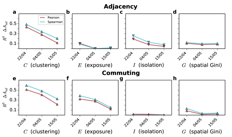
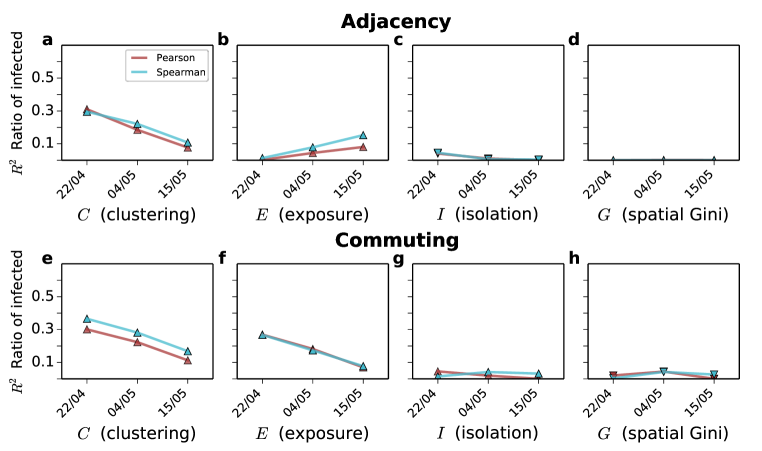
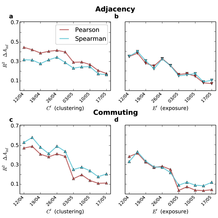
In Fig. 2 we show the scatter plots of the average dynamic clustering, exposure, and isolation of African Americans at state level, and of the corresponding COVID-19 infection gap in the first two weeks after major lock-down measures were introduced across the US. We chose these two temporal snapshots because the number of confirmed infected individuals in a week actually depends on their contacts up to two weeks before, due to the COVID-19 incubation period Linton et al. (2020). The top panels report the results on the adjacency networks of census tracts, while the bottom panels are for the commuting graphs. Interestingly, there exists a quite strong correlation between dynamic segregation and the disproportionate number of infected in African American communities. In particular, the dynamic clustering of African Americans in a state correlates positively and quite strongly with the infection gap observed in that state in the first two weeks of the data set, both on the adjacency (respectively and in the first two weeks) and in the commuting network (respectively and ). This means that if African American citizens normally require more time than citizens from other ethnic groups before ending up in a non-African American neighbourhood, then the incidence gap will be considerably higher.
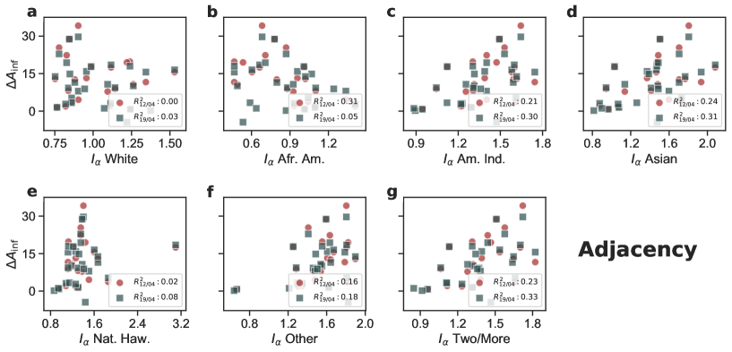
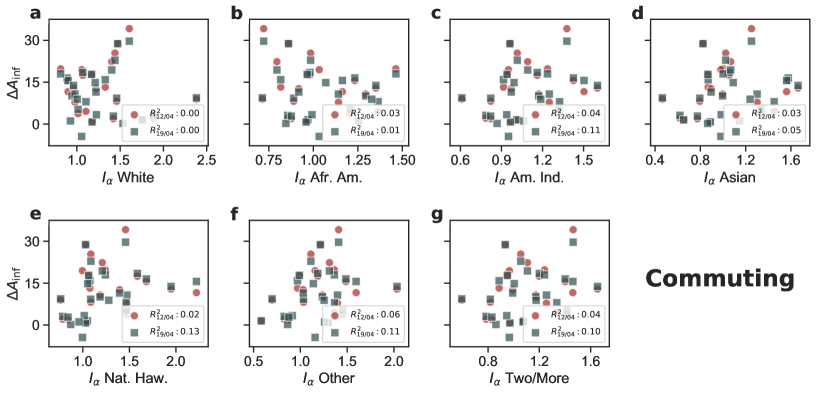
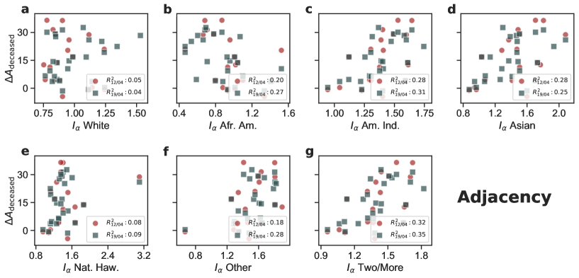
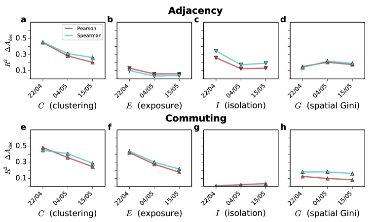
The role of dynamic exposure is even more interesting. Indeed, the dynamic exposure on the adjacency network is not correlated at all with incidence gap, while it is a good predictor of incidence gap in the commuting graph (respectively and ). Conversely, the dynamic isolation of African Americans in the adjacency graph is negatively correlated with incidence gap in the early stages of the epidemics (). Similar results are obtained when we consider the correlation with the death gap , and the ratios of infection/deaths incidence instead of the difference (see Supplementary Figures 8-10). In particular, dynamic isolation exhibits a somehow stronger correlation with death gap (). It is worth noting that the isolation of other ethnicities has poor or no correlation with incidence gap (see Supplementary Figures 11-14).
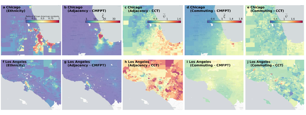
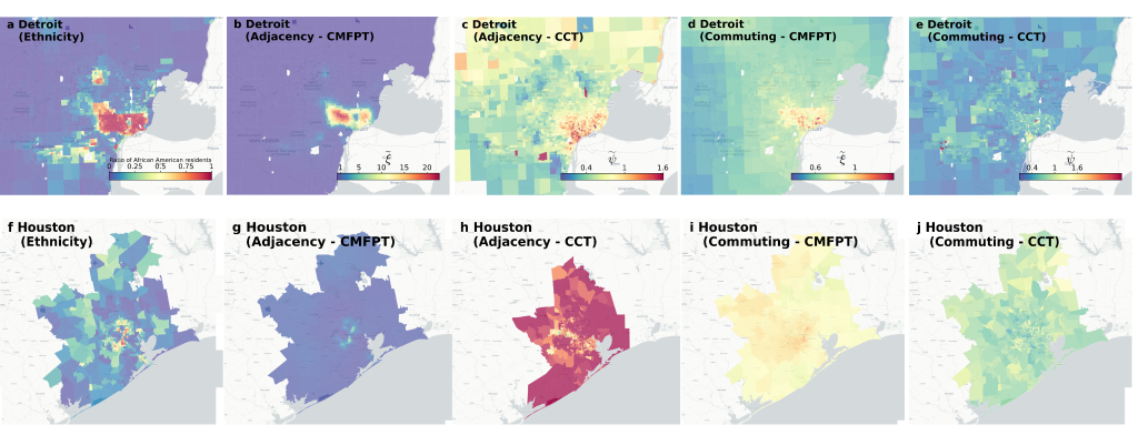
The fact that ethnic segregation does not correlate with infection gap as much as dynamic segregation indices can bet better explained by looking at how residential data and dynamic segregation are distributed across a city. In Fig. 3 we show the heat-maps of abundance of African American residents in Chicago and Los Angeles together with the local segregation indices and , respectively derived from passage times and coverage times, on the adjacency and on the commuting graph of census tracts (see the definitions provided in Methods, additional maps for Detroit and Houston are reported in Appendix C and Supplementary Figure 15). It is true that in Chicago in the adjacency graph is still somehow correlated with the fraction of African American population (see Supplementary Figure 16). But the distribution of in the commuting graph is totally different. In particular, the regions characterised by residential clusters of African Americans exhibit lower values of , meaning that the commuting patterns make those neighbourhoods overall less isolated. Conversely, new hot-spots are identified in the South-Eastern region of Gary, likely due to the fact that people in this region do not commute much to the city centre anyway. Similarly, the areas of Los Angeles with the largest local isolation are not the neighbourhoods with a higher percentage of African Americans residents, rather the suburbs characterised by high commuting.
.3 Combined effects of dynamic segregation and use of public transport
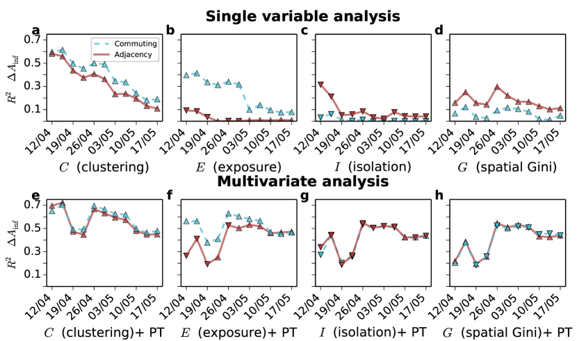
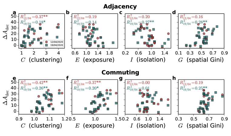
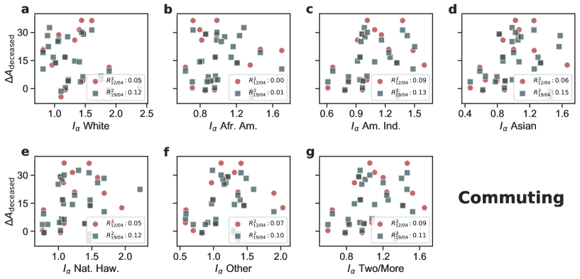
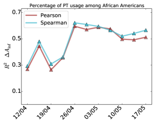
Finally, in Fig. 4a-d we show the correlation between the infection gap and the different segregation measures as the pandemic progresses. Unsurprisingly, the correlation with any single measure decreases over time for all the indices, and both on the adjacency and on the commuting graph. Similar results are found for the correlation with death gap and with ratios of incidence and deaths in African Americans (see Appendix D and Supplementary Figures 20-22) as well as with a second dataset we had access to Dat (2016b) (see Supplementary Figures 23-26). The main reason for the observed decreases is that once large-scale mobility restrictions are put in place —as it happened between the end of March and the beginning of April across all the US states with stay-at-home orders and curfews— the overall mobility structure of each city is massively disrupted. As a result, super-spreading behaviours due to usual commuting patterns are massively reduced, and the contagion progresses mainly through face-to-face interactions happening close to the residential place of each individual, and are not captured well by CMFPT and CCT on the commuting graph.
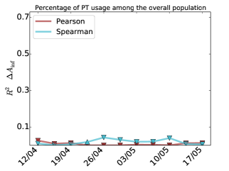
In order to capture the focus on local transport after lock-downs are enforced, in Fig. 4e-h we show the results of the multivariate analysis of the same set of segregation indices shown in Fig. 2 and of the fraction of African American population using public transport in each city (see Methods for details). The combination of dynamic segregation and use of public transport correlates quite consistently with the incidence gap. These findings are made more relevant by the fact that the incidence gap in African Americans in the same period is quite poorly correlated with the overall usage of public transport in the population, as well as with a variety of other socio-economic indices, as shown in Supplementary Figures 30-31. Since cities are complex interconnected systems, it is plausible to hypothesise that segregation and public transport usage are related in subtle and intricate ways, so that it is practically impossible to establish whether the former has caused the latter, or instead the two phenomena have co-evolved over time.
Discussion
The vulnerability of African American communities and their higher socio-economic disparities has been a standing issue in the US long before the pandemic, the disproportional infection rates simple highlighted and amplified the problem. The presence of a COVID-19 incidence gap in Black and African American population is somehow unexpected, since no specific biological risk factor has been strongly associated with an increased vulnerability to the virus of any specific ethnic group. Hence, the most unbiased assumption to explain such a disproportionate incidence, which in some areas is three to five times higher than the fraction of African American population, is that it should be related to behavioural and social factors, rather than to biological ones. The most frequently whispered theory is that African Americans are more exposed to COVID-19 because they are more frequently employed in service works. This explanation is indeed reasonable, since service workers normally have hundreds of face-to-face interactions during a day. Indeed, some recent studies have estimated that the switching to remote-working was mainly available to people employed in non-essential services, and amounted to 22%-25% of the work force before April Dey et al. (2020). As expected, service workers are one of those categories to which the option to switching to remote-working during the lock-down was not available at all, especially in sectors deemed vital for the functioning of a country during lock-down, including food production and retailers, healthcare, transportation, and logistics. According to the US Labor Force Statistics of Labor Statistics (2020), the occupations with the highest concentration of African Americans are indeed jobs characterised by face-to-face interaction, and most of them fall in the area of essential jobs: postal service sorters/processors (42%), nursing (37%), postal service clerks (35%), protective service workers (34%) and barbers (32%). It would not then come as a surprise to discover that one of the major early COVID-19 outbreaks happened in South Dakota, in a meat-processing plant, whose workers were mainly of African American background Mea .
The potential relation between ethnicity and mobility was somehow hinted to in a recent study Sy et al. (2020) which found that the decrease in the usage of subway transport in New York during the lock-down was uneven across ethnicities, with African Americans experiencing the smallest relative drop. But unfortunately, the publicly available data about COVID-19 incidence do not contain detailed information about socio-economic characteristics of infected individuals, so drawing an association between African Americans, employment in essential service jobs, availability of remote-working options, and increased COVID-19 exposure is very hard.
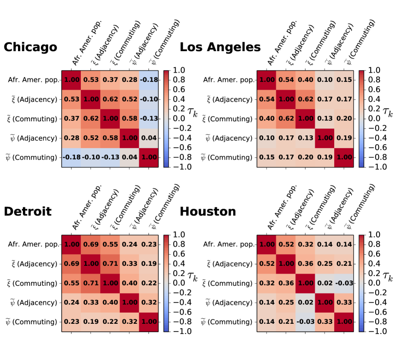
An interesting finding of the present work is that the combination of dynamic segregation and use of public transport seems to explain the persistence of infection gap throughout the early phases of the pandemic. Indeed, before lock-downs are put in place, African Americans are found to be more exposed to the virus, mainly due to the structure of their daily commuting patterns. After lock-downs are enforced, instead, they are more likely to pass the virus over to other African Americans, as a result of the high levels of clustering and isolation of these communities measured in the adjacency graphs of census tracts, which are a more reliable proxy for face-to-face interactions when long-distance commuting is disrupted. In general, the states where African Americans are more exposed with respect to long-distance trips are also those where they are more clustered with respect to short-range mobility (the rank correlation between the two measures is , as shown in Supplementary Figure 6-7 and Supplementary Table I).
The importance of considering the interaction of different classes due to mobility through the urbanscape has recently received some attention Farber et al. (2012); Ballester and Vorsatz (2014); Olteanu et al. (2019); Kawabata and Shen (2007); Wong and Shaw (2011); Graif et al. (2017); Wang et al. (2018). In this sense, it is quite interesting that the simple diffusion model we used here to quantify the presence of dynamic segregation, and the corresponding indices of clustering, exposure, and isolation, are able to unveil a relatively strong correlation between the structure of mobility in a metropolitan area and the excess incidence of COVID-19 infections and deaths in African Americans. Although the model we consider uses relatively small and coarse-grained information about a city —placement of census tracts, local ethnicity distribution, and commuting trips among them— the strong correlation between dynamic segregation and incidence gap allows to conclude that when it comes to predicting the exposure of a group to a non-airborne virus, knowing the places where the members of that group commute for work is more important and more relevant than knowing where they actually live. This is also confirmed by the quite poor association of incidence gap with other classical measures of racial segregation (see Supplementary Figures 28-29).
The results presented in this work suggest that policy makers should definitely take into account mobility patterns when modelling the spread of a disease in a urban area, and in predicting the impact of specific countermeasures. In particular, a strategy to mitigate incidence gap should focus on reducing as much as possible long-distance trips for people that are naturally more exposed to face-to-face contacts, e.g., due to their occupation, and enforcing stricter measures of social distancing on local activities.
Methods
Geographic network data sets
Ethnicity data was obtained from Manson et al. and includes the data from the 2010 decennial census. Commuting trips data comes from the 2011 US census Com (2016), focusing on the seven highest-level ethnicity classes, namely: White, Black or African American, American Indian and Alaska Native, Asian, Native Hawaiian and Other Pacific Islander, Some Other Race, Two or More Races. Population is updated to the latest American Community Survey 2014-2018 5-yeas Data Release Bureau (2019).
For each metropolitan area we constructed two distinct spatial networks. The first one is the adjacency network, denoted by and obtained by associating each cell to a node and connecting two nodes with a link if the corresponding cells border each other. Notice that is an undirected and unweighted graph,. The second graph is the commuting network, denoted as . In this network each node is a tract and the directed and weighted link between node and indicates the number of commuting trips from to as obtained from census information. To reconstruct a mobility network that resembles the real one (which amounts to something between and of the total mobility in a city) we aggregated both the trips from home to work and the corresponding return trip from work to home.
Each node of the adjacency network preserves information about the ethnicity distribution on the corresponding census tract. We use the matrix , where is the number of ethnicities present in the city. The generic element of indicates the number of citizens of ethnicity living on node . We denote by the vector of population distribution at node , and by the total number of individuals of class present in the system. In the commuting network , instead, we attribute to each node both the resident population at the corresponding tract and the population commuting to node , so that the abundance of individuals of class on node becomes:
| (1) |
where is the number of daily commuting trips from node to node . By doing so we aim to capture the fact that a commuter to cell will potentially have face-to-face interactions with both residents in that area and other workers commuting to that area every day. Moreover, since the commuting network accounts for both work-home and home-work trips, the adjusted population on the commuting network accounts for the potential contacts that individuals had at the origin of a trip as well.
Class Mean First Passage Time (CMFPT)
Let us consider a generic graph with edges on nodes, and a colouring function that associates to each node of a discrete label from the finite set with cardinality . Let us also consider a random walk on , defined by the transition matrix where is the probability that the walk jumps from node to node in one step. On the adjacency network we use a uniform random walk, i.e., , while on the commuting graph we have , where is the out-strength of node .
Here we focus on the statistical properties of the trajectories of node labels visited by the random walk at each time when starting from at time . This dynamics contains information about the existence of correlation and heterogeneity in the distribution of colours. For instance, if the graph is a regular lattice and the function associates colours to nodes uniformly at random, we expect that, for long-enough time, all the trajectories starting from each of the nodes will be statistically indistinguishable.
We denote as the Mean First Passage Time from a given node to nodes of class , i.e., the expected number of steps needed to a walk starting on to visit for the first time any node such that . We can write a self-consistent forward equation for Masuda et al. (2017):
| (2) |
The Mean First Passage Time from class to class is defined as:
| (3) |
where is the number of nodes in the graph associated to class . Notice that in practice the value of is obtained as an average over many realisations of the random walk.
A notable issue of the MFPT defined in Eq. (3) is the fact that its values might depend on the specific distribution of colours (i.e., on their abundance) and on the size of the network under consideration, which makes it difficult to compare Mean First Passage Times computed on different systems. To obviate to this problem, we define the normalised Class Mean First Passage Time between class and class as:
| (4) |
where is the MFPT from class to class obtained in a null-model graph. The null-model considered here is the graph having the same topology of the original one, and where node colours have been reassigned uniformly at random, i.e., reshuffled by keeping their relative abundance. Notice that is a pure number: if (resp., it means that the expected time to hit a node of class when starting from a node of class is higher (resp., lower) than in the corresponding null-model. In general, a value different from indicates the presence of correlations and heterogeneity.
Class Coverage Time (CCT)
The coverage time is classically defined as the number of steps needed to a random walk to visit a certain percentage of the nodes of a graph when starting from a given node Masuda et al. (2017). In the case of a network with coloured nodes, a walk started at node will be associated to the generic trajectory of node labels visited by the walk at each time. Since we are interested in quantifying the heterogeneity of ethnicity distributions, we consider the time series where is the distribution of ethnicities at node visited by the walk at time . If we consider the trajectory up to time , the vector is the distribution of ethnicities visited up to time by the walker started at (here is a normalisation constant that guarantees ). We quantify the discrepancy between and the global ethnicity distribution across the city by means of the Jensen-Shannon divergence:
| (5) |
where and is the Kullback-Liebler divergence between and . We define the Class Coverage Time from node at threshold as:
| (6) |
and the associated normalised Class Coverage Time:
| (7) |
where is the Class Coverage Time from node in a null-model where the colours associated to the nodes have been reshuffled uniformly at random.
CMFPT and CCT in census networks
In the case of ethnicity distributions in geographical networks, each node is not uniquely associated to a colour, but it has instead a local distribution of ethnicities. Nevertheless, the formalism for the computation of Class Mean First Passage Times and Class Coverage Time described above can still be used in this case as well. We consider a stochastic colouring function that associates to each node of the adjacency graph one of the ethnicities with probability (respectively, with probability in the commuting graph), i.e., proportionally to the abundance of ethnicity in node .
To compute the CMFPT we consider independent realisations of the stochastic colouring process for each network. On each realisation , we estimate the MFPT among all classes as in Eq. (3), and the corresponding null-model MFPT. Then, we compute the average Class Mean First Passage Time from class to class as:
| (8) |
where is the CMFPT computed on the -th realisation and is the corresponding value in the null-model. For each system we computed on 500 realisations of the null model, with 500 independent colour assignments per realisations, and 2000 walks per node.
The computation of CCT works in a similar way. In order to take into account the heterogeneous distribution of ethnicities across nodes, before a walker starts from node we sample one of the ethnicities present on , according to their local abundance at , and we attribute node to it. Then, we compute the CCT from node of class as the average CCT from node across all the walks starting from where node was actually assigned to class , and we call this quantity . Notice that in this case we consider the trajectories where is the distribution of ethnicities at the -th node visited by the walker, which does not include class . The normalised Class Coverage Time from class when starting from node is defined as:
| (9) |
where is the CCT from node of class in the null-model. Finally, the average CCT from class is simply obtained as:
| (10) |
For all the computations of CCT shown in the paper we considered averages over 5000 walks per node and we set . This value was obtained by using the Pinsker’s inequality for the Kullback-Leibler divergence and imposing a total variation distance smaller than .
Global indices of dynamic ethnic segregation
We constructed three global indices of dynamic segregation based on the values of CMFPT and CCT. In particular, we focused on the observed discrepancies of CMFPT and CCT between African Americans and other ethnicities. In the following the index will always indicate African Americans, while the index will indicate all the other ethnicities. We start by defining the following quantities:
In practice: is the expected CMFPT from African Americans to African Americans; is the expected CMFPT from African Americans to all the other classes (weighted by ethnicity distribution); is the expected CMFPT from all the other classes to African Americans (again, weighted by ethnicity distribution); and is the expected CMFPT among all the other ethnicities. Notice that all these quantities are pure numbers, since they are based on the corresponding quantities defined in Eq. (8) which are correctly normalised with respect to the null-model.
The clustering of African Americans is quantified as:
| (11) |
so that values of larger than indicate that for an African American finding any other ethnicity is harder (i.e., requires more time) than for all other ethnicities. Similarly, we define the exposure of African Americans to other ethnicities as:
| (12) |
where values of larger than indicate that it is easier for African American to be found in touch with any other ethnicity than for people from all the other ethnicities to be found in touch with African Americans.
We define similar quantities for the of African Americans and other ethnicities, namely as in Eq. (9), and:
| (13) |
Finally, we define the isolation of African Americans for the whole system by the average ratio:
| (14) |
over all the nodes. Notice that values of larger than indicate that the normalised CCT from nodes of class (African American) is higher than the CCT from nodes of all the other classes. The State-level value of each index is obtained as an average of the corresponding index on the cities of the state, weighted by the population of each city.
Local dynamic ethnic segregation
We define two local segregation indices for African Americans in a census tract . The first index is based on CMFPT:
| (15) |
where corresponds to the normalised Mean First Passage Time to a generic class when a random walker starts from node , while is the CMFPT to African Americans tracts. Values of larger than 1 indicate that the time to reach any other ethnicity is higher than the time needed to reach African Americans, hence indicating a local clustering of African Americans around node .
The local index of isolation is derived from CCT:
| (16) |
where is the CCT from node for African Americans and is the average CCT from node for all the other ethnicities, as defined in Eq. (13). In general, if is larger than then African Americans living at node are isolated, since they will require more time to visit all the other classes than required by individuals from other ethnicities.
Data on COVID-19 incidence among the African American Population
The data related to the percentage of infected African Americans was obtained from two different sources Dat (2016a) and Dat (2016b). The first data set reports the number of infected and deceased of each ethnicity along with those unknown. To calculate the percentage of African Americans we have removed first the unknown from the total, otherwise our analysis would also capture the fraction of unknown. For the other data set we just extract the data they provide in tables.
Public Transportation data set
The public transportation data set was obtained from the 2018 American Community Survey from U.S. Census Bureau Manson et al. . It includes information about the percentage of public transportation usage per ethnicity and State.
Multivariate Analysis
The multivariate analysis was performed using R and the ANOVA model in the car package.
Acknowledgements
A.B. and V.N. acknowledge support from the EPSRC New Investigator Award Grant No. EP/S027920/1. This work made use of the MidPLUS cluster, EPSRC Grant No. EP/K000128/1. This research utilised Queen Mary’s Apocrita HPC facility, supported by QMUL Research-IT. doi.org/10.5281/zenodo.438045.
Author Contributions
All the authors devised the study. A.B. and S. S. performed the simulations and computations. All the authors provided methods and analysed the results. A. B. and S. S. prepared the figures and all the visual material. All the authors wrote the paper and approved the final submitted version.
Appendix A Quantifying ethnic segregation through CMFPT and CCT
Ethnic segregation and COVID-19 incidence through CMFPT
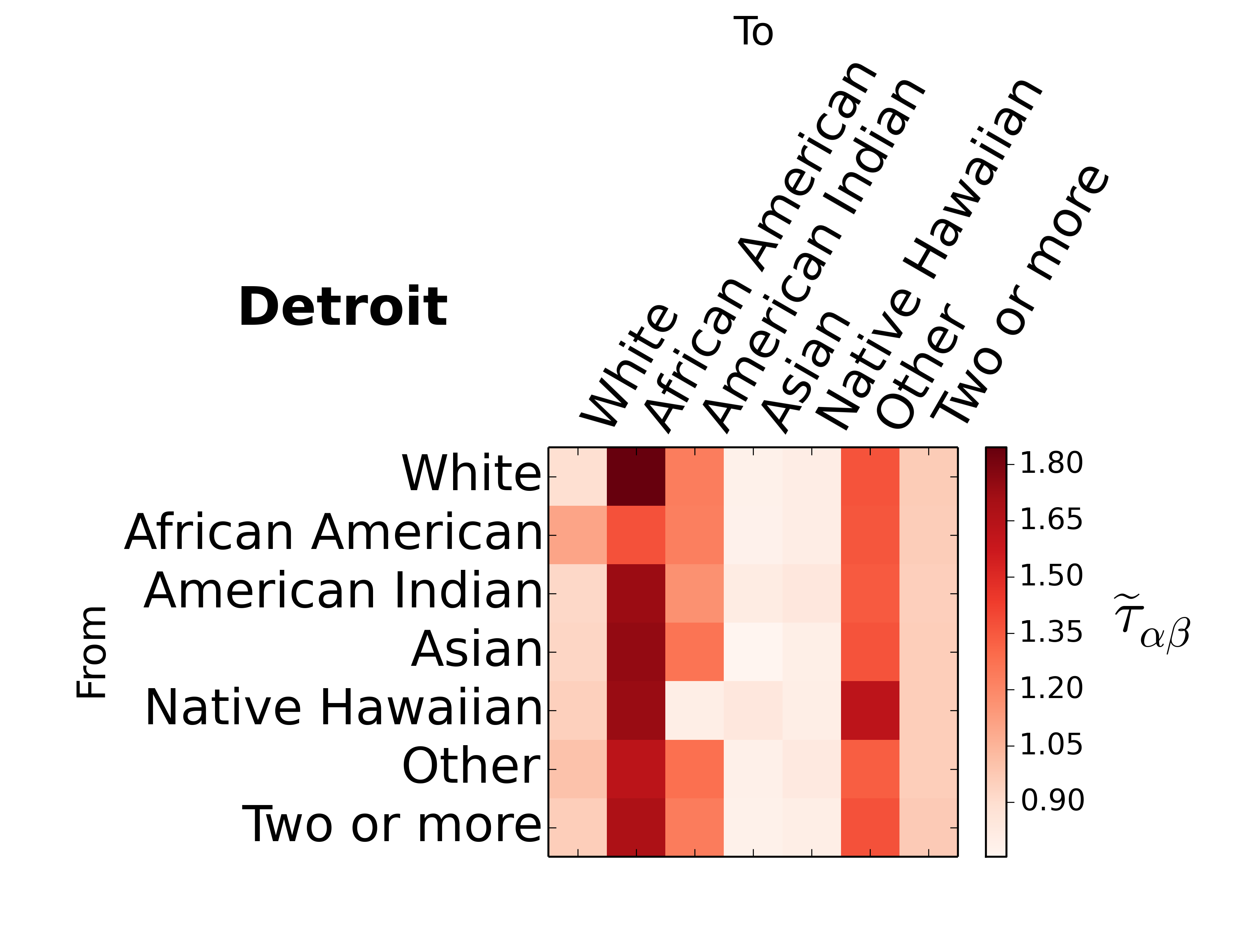
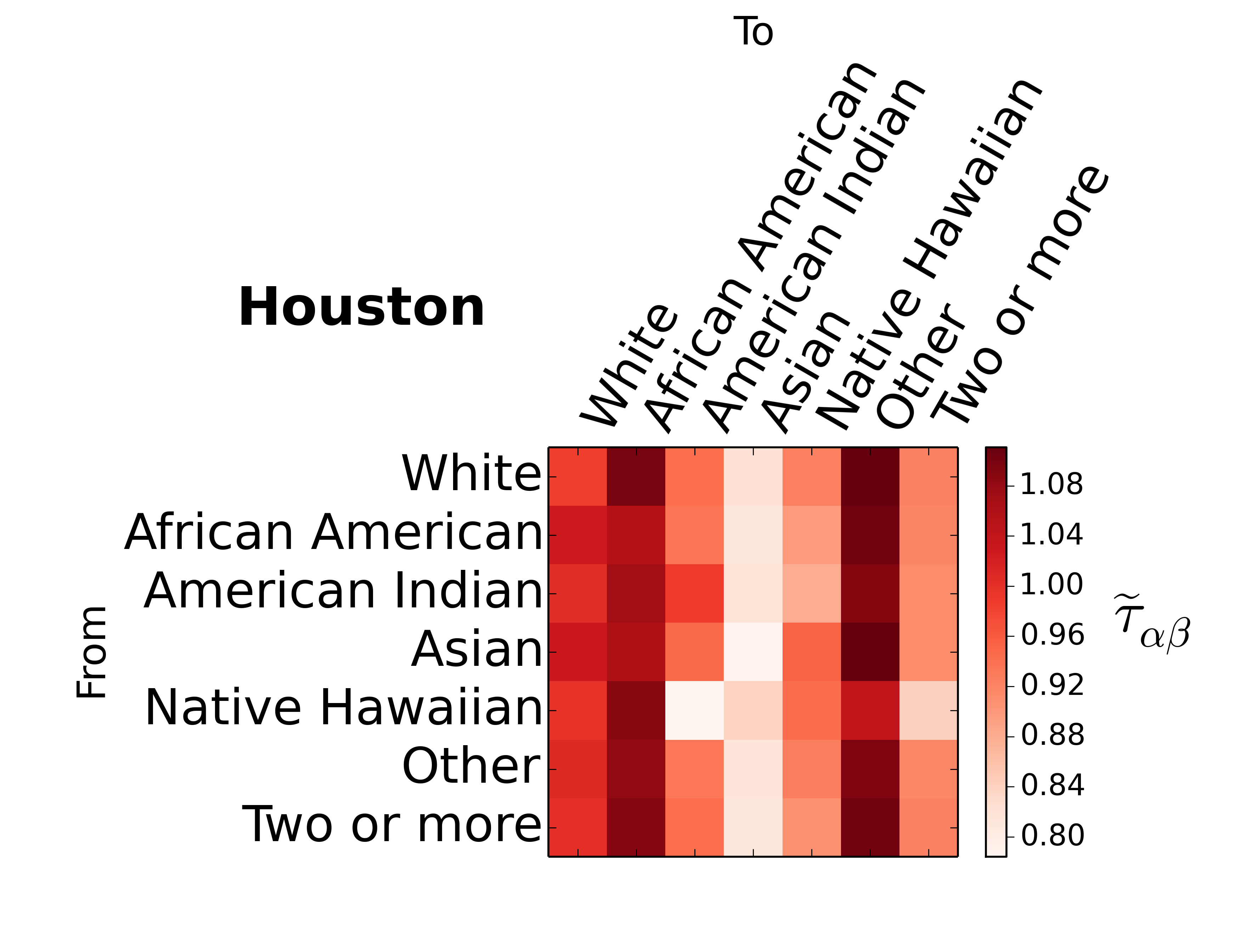
Ethnic segregation is quantified here through random walks, and more precisely, class mean first passage times (CMFPT). Given a set of classes present in a city – ethnicities in this case– we are interested in the number of steps you need to reach one as a function of the ethnicity at the origin. Random walks start from each of the city cells –or tracts– and move until they have visited each of the distinct classes or ethnicities present in a city. If we average the passage times across all the city cells and then divide by the same quantity from the null model we obtain the normalised CMFPT between class and . It is important to note that this matrix is not necessarily symmetric and depends on the spatial distribution of classes. We show in Supplementary Figure S-1 the CMFPT on the adjacency graph for four cities: Detroit, Chicago, Houston and Los Angeles. On a first look, strong differences can be detected between those cities on the left and those on the right. The normalised CMFPT are substantially higher in Detroit and Chicago when compared to Houston and Los Angeles. Despite the difference in the maximum values, the shape of the matrix and curves is not so different across cities, with African Americans much more isolated than the rest of ethnicities. Reaching African Americans is much harder for any other class, while it is considerably low for other African Americans. As can be seen, there are not only strong differences between both cities but also between the type of network used (See Supplementary Figure S-2). One significant change that appears in some cities when is computed over the adjacency graph is that for African Americans, Whites are more easy to reach than themselves, which means that mobility plays a crucial role on approaching African Americans to the rest of the population and exposing them. Additionally, the normalised CMFPT seems to be less dependent on the ethnicity of the origin and more on the ethnicity of the destination. Likely as a consequence of the higher mixing produced by the long-range links present in the mobility network. Not only that, but the differences between each ethnicity are also reduced. Overall, to properly quantify segregation we need to take into account not only the residences but also how the ethnicities move in cities.
Ethnic segregation and COVID-19 incidence through CCT
We consider a number of Consolidated Statistical Areas (CSA) in the US, 128 networks are constructed based on adjacency while 171 networks were constructed for commuting. These systems are represented as a spatial graph and we look at the statistical properties of the trajectories of a random walk on . Each walk starting at node is associated to an ethnicity sampled from and it stops at time when . When the ethnicity is sampled, the corresponding bin is removed from the computation so that the effect that has on the coverage time at threshold can be quantified.
Trajectories from each node are averaged over 5000 repetitions for the adjacency network and 2000 for commuting. The null model for is obtained by randomly reassigning the vector to a new node in and the concentration of an ethnicity in a region - if such spatial pattern is present - is dissolved across . Here we consider 20 independent repetitions of the null model for each CSA on both adjacency and commuting networks, then, the Class Coverage Time () for the null model of a city is the average behaviour over 20 independent realisations.
The normalised is reported for the two spatial configurations in Fig. S-3 a-b. The coverage times obtained for the adjacency networks a are considerably larger compared to commuting b, where on the later, the majority of values spams in a small range between 0 and 4. The distributions of for each ethnicity have a comparable shape within the network type where most values are contained in a common interval, yet, they are distinguishable and differences between the ethnicities can be observed. The corresponding non-normalised quantities can be read on panels c-d where the of the real system and the equivalent null model are reported.
It is important to note that the difference on the of the real system and the null model is significantly large on the adjacency networks, with the former having cases where coverage times are two orders of magnitude larger (See Fig. S-3 c). Although the null model corresponds to the non-segregated counterpart of the city and coverage times are expected to be smaller, these large differences suggest caution and open an interesting question for further investigation. In particular, to understand what factors influence the large differences, for instance if it is mainly driven by the population distribution, the threshold , the network topology or the combination of two or more factors.
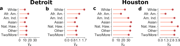
In addition to the cities discussed in the main manuscript, we report two other systems in Fig. S-4 where individual values of for each ethnicity can be observed on the adjacency and commute networks. African Americans are substantially less isolated in Houston compared to the other ethnicities in both adjacency and commute networks. In Detroit, The adjacency information gives the opposite picture for African Americas while Whites are the most isolated on the commute network.
Appendix B Correlations between the incidence of COVID-19 among the African American population cases and ethnic segregation)
Rankings and comparisons
We detail the cities studied in Supplementary Table S-I, it is important to note that those are the cities studied disregarding if those states provide ethnic information on the impact of COVID-19.
| City name | City name | City name | City name |
|---|---|---|---|
| Albany-Schenectady | Albuquerque-Santa Fe-Las Vegas | Appleton-Oshkosh-Neenah | Asheville-Brevard |
| Atlanta–Athens-Clarke County–Sandy Springs | Bend-Redmond-Prineville | Birmingham-Hoover-Talladega | Bloomington-Bedford |
| Bloomington-Pontiac | Bloomsburg-Berwick-Sunbury | Boston-Worcester-Providence | Bowling Green-Glasgow |
| Brownsville-Harlingen-Raymondville | Buffalo-Cheektowaga | Cape Coral-Fort Myers-Naples | Cape Girardeau-Sikeston |
| Charleston-Huntington-Ashland | Charlotte-Concord | Chattanooga-Cleveland-Dalton | Chicago-Naperville |
| Cincinnati-Wilmington-Maysville | Cleveland-Akron-Canton | Clovis-Portales | Columbia-Moberly-Mexico |
| Columbia-Orangeburg-Newberry | Columbus-Auburn-Opelika | Columbus-Marion-Zanesville | Columbus-West Point |
| Corpus Christi-Kingsville-Alice | Dallas-Fort Worth | Davenport-Moline | Dayton-Springfield-Sidney |
| Denver-Aurora | DeRidder-Fort Polk South | Des Moines-Ames-West Des Moines | Detroit-Warren-Ann Arbor |
| Dixon-Sterling | Dothan-Enterprise-Ozark | Eau Claire-Menomonie | Edwards-Glenwood Springs |
| Elmira-Corning | El Paso-Las Cruces | Erie-Meadville | Fargo-Wahpeton |
| Fayetteville-Lumberton-Laurinburg | Findlay-Tiffin | Fort Wayne-Huntington-Auburn | Fresno-Madera |
| Gainesville-Lake City | Grand Rapids-Wyoming-Muskegon | Green Bay-Shawano | Greensboro–Winston-Salem–High Point |
| Greenville-Spartanburg-Anderson | Greenville-Washington | Harrisburg-York-Lebanon | Harrisonburg-Staunton-Waynesboro |
| Hartford-West Hartford | Hickory-Lenoir | Hot Springs-Malvern | Houston-The Woodlands |
| Huntsville-Decatur-Albertville | Idaho Falls-Rexburg-Blackfoot | Indianapolis-Carmel-Muncie | Ithaca-Cortland |
| Jackson-Brownsville | Jackson-Vicksburg-Brookhaven | Jacksonville-St. Marys-Palatka | Johnson City-Kingsport-Bristol |
| Johnstown-Somerset | Jonesboro-Paragould | Joplin-Miami | Kalamazoo-Battle Creek-Portage |
| Kansas City-Overland Park-Kansas City | Knoxville-Morristown-Sevierville | Kokomo-Peru | Lafayette-Opelousas-Morgan City |
| Lafayette-West Lafayette-Frankfort | Lake Charles-Jennings | Lansing-East Lansing-Owosso | Las Vegas-Henderson |
| Lexington-Fayette–Richmond–Frankfort | Lima-Van Wert-Celina | Lincoln-Beatrice | Little Rock-North Little Rock |
| Longview-Marshall | Los Angeles-Long Beach | Louisville/Jefferson County–Elizabethtown–Madison | Lubbock-Levelland |
| Macon-Bibb County–Warner Robins | Madison-Janesville-Beloit | Manhattan-Junction City | Mankato-New Ulm-North Mankato |
| Mansfield-Ashland-Bucyrus | Martin-Union City | McAllen-Edinburg | Medford-Grants Pass |
| Memphis-Forrest City | Miami-Fort Lauderdale-Port St. Lucie | Midland-Odessa | Milwaukee-Racine-Waukesha |
| Minneapolis-St. Paul | Mobile-Daphne-Fairhope | Modesto-Merced | Monroe-Ruston-Bastrop |
| Morgantown-Fairmont | Moses Lake-Othello | Mount Pleasant-Alma | Myrtle Beach-Conway |
| Nashville-Davidson–Murfreesboro | New Bern-Morehead City | New Orleans-Metairie-Hammond | New York-Newark |
| North Port-Sarasota | Oklahoma City-Shawnee | Omaha-Council Bluffs-Fremont | Orlando-Deltona-Daytona Beach |
| Oskaloosa-Pella | Paducah-Mayfield | Parkersburg-Marietta-Vienna | Pensacola-Ferry Pass |
| Peoria-Canton | Philadelphia-Reading-Camden | Pittsburgh-New Castle-Weirton | Portland-Lewiston-South Portland |
| Portland-Vancouver-Salem | Pueblo-Canyon City | Pullman-Moscow | Quincy-Hannibal |
| Raleigh-Durham-Chapel Hill | Rapid City-Spearfish | Redding-Red Bluff | Reno-Carson City-Fernley |
| Richmond-Connersville | Rochester-Austin | Rochester-Batavia-Seneca Falls | Rockford-Freeport-Rochelle |
| Rocky Mount-Wilson-Roanoke Rapids | Rome-Summerville | Sacramento-Roseville | Saginaw-Midland-Bay City |
| St. Louis-St. Charles-Farmington | Salt Lake City-Provo-Orem | San Jose-San Francisco-Oakland | Savannah-Hinesville-Statesboro |
| Seattle-Tacoma | Sioux City-Vermillion | South Bend-Elkhart-Mishawaka | Spokane-Spokane Valley-Coeur d’Alene |
| Springfield-Branson | Springfield-Greenfield Town | Springfield-Jacksonville-Lincoln | State College-DuBois |
| Steamboat Springs-Craig | Syracuse-Auburn | Tallahassee-Bainbridge | Toledo-Port Clinton |
| Tucson-Nogales | Tulsa-Muskogee-Bartlesville | Tyler-Jacksonville | Victoria-Port Lavaca |
| Virginia Beach-Norfolk | Visalia-Porterville-Hanford | Washington-Baltimore-Arlington | Wausau-Stevens Point-Wisconsin Rapids |
| Wichita-Arkansas City-Winfield | Williamsport-Lock Haven | Youngstown-Warren |
Supplementary Figure S-5 displays the ranking of values for each of the four metrics studied in the main manuscript computed over the adjacency or commuting graphs. As can be seen, strong similarities between rankings appear.
a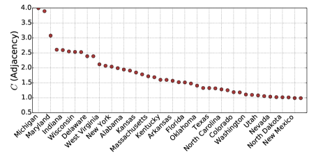 b
b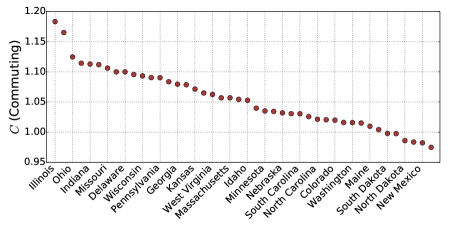 c
c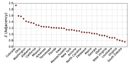 d
d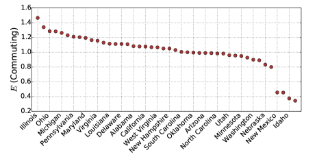 e
e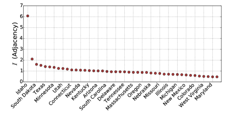 f
f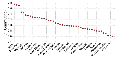 g
g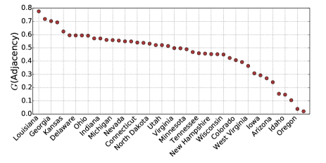 h
h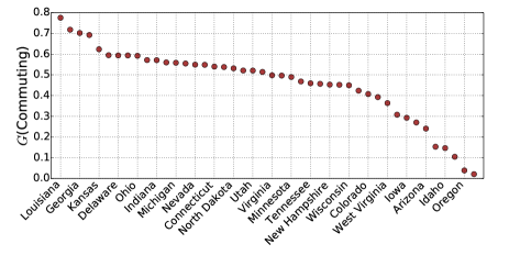
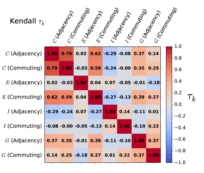
To evaluate how similar are those rankings we have calculated the Kendall between each pair of rankings. Supplementary Figure S-6 displays the values of between each pair of the four metrics studied in the main manuscript computed in the adjacency and commuting graphs. For instance, there is a high correlation between the index computed in the adjacency and the commuting graphs while for the exposure index there is almost no correlation between both. Likely pointing out that exposure can only be effectively measured by including the commuting network. Another additional observation is the connection between and measured on the commuting graph, which seems to point out that in those states where African Americans are more segregated they are also more exposed.
a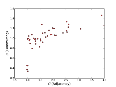 b
b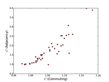 c
c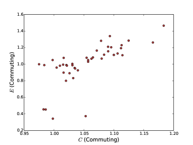 d
d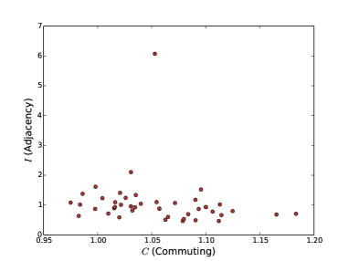 e
e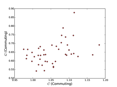 f
f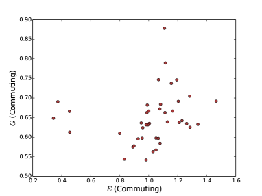 g
g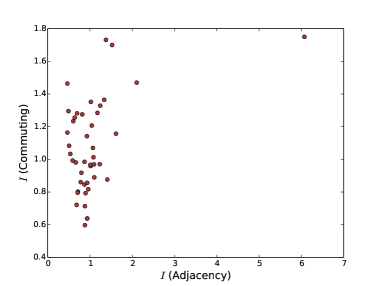 h
h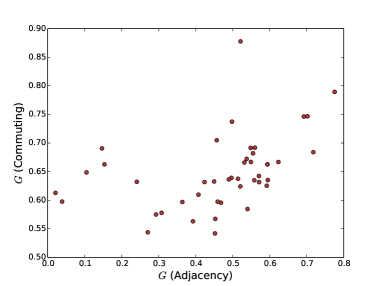
In Supplementary Figure S-7, we compare the indices studied in this work, showing that most of them are related to each other yet not necessarily linearly. We find that those indices capturing the clustering of African Americans are also related to those related to mixing and exposure. The more clustered together, more sensible and exposed to the rest of the population. When comparing the same indices in the commuting and adjacency graphs, we observe that they have a non-linear relation, highlight again the importance of considering both of them.
Correlations between the segregation indices and other measures of COVID-19 incidence
The COVID-19 data used was obtained from Dat (2016a) and includes several temporal snapshots until mid-may. The main variables we used are the difference on infected/deceased African Americans, where would mean that the percentage of African Americans in the population of a state is the same than the percentage of infected, and the ratio calculated as the percentage of infected African Americans divided by their percentage among the overall population, which will be one if they are equal and higher than one if there are more African Americans infected/deceased among the overall population. Supplementary Table S-II summarises the results obtained for the linear fit for the Figure 2 in the main manuscript.
| Date | Index | Network type | slope | intercept |
|---|---|---|---|---|
| 12/04/2020 | Adjacency | 8.26 | -3.47 | |
| 12/04/2020 | Adjacency | -12.35 | 27.82 | |
| 12/04/2020 | Adjacency | -19.66 | 30.01 | |
| 12/04/2020 | Adjacency | 31.86 | -3.28 | |
| 12/04/2020 | Commuting | 139.14 | -135.94 | |
| 12/04/2020 | Commuting | 38.83 | -29.92 | |
| 12/04/2020 | Commuting | -7.70 | 20.99 | |
| 12/04/2020 | Commuting | 33.65 | -9.10 | |
| 19/04/2020 | Adjacency | 6.95 | -1.87 | |
| 19/04/2020 | Adjacency | -6.45 | 19.04 | |
| 19/04/2020 | Adjacency | -7.633 | 17.77 | |
| 19/04/2020 | Adjacency | 20.20 | 1.65 | |
| 19/04/2020 | Commuting | 117.98 | -114.11 | |
| 19/04/2020 | Commuting | 25.93 | -16.45 | |
| 19/04/2020 | Commuting | -4.79 | 16.15 | |
| 19/04/2020 | Commuting | 24.88 | -5.02 |
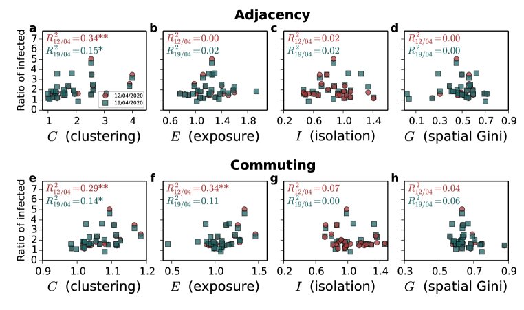
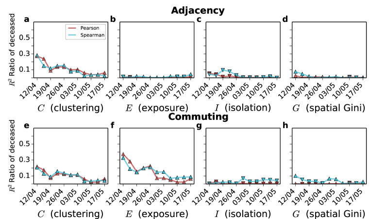
Supplementary Figure S-8 summarises the results obtained in the case of the ratio of infected African Americans. As detailed in the main manuscript, there are two versions of each index depending on whether the walkers move upon the adjacency or the commuting network. Compared to the difference in percentage correlations are much lower for the ratio, likely as a consequence of the several outliers. While states with a low percentage of African Americans among the overall population might easily suffer a huge increase on the ratio, those with a higher percentage of African Americans among the population might have a lower increase.
We have also evaluated how our metrics relate to the ratio and difference among the deceased African Americans (See Supplementary Figures S-9 and S-10 ). Despite many more factors such as the age or underlying health conditions might influence the deceased individuals, still, most of the correlations remain significant to some extent, especially those related to their exposure. Moreover, those indices computed on the commuting network seem to be more informative than those based on the adjacency, which seems to point out that residential segregation provides only a partial picture of ethnic inequality. Mobility is also crucial to understand the mixing between different ethnicities, it is not only relevant where certain ethnicities live but also where they work and with whom they interact when they do so.
Overall, despite our metrics are informative in both cases, they seem to be more related to the difference in percentage more than the ratio. There are states in which the percentage of African Americans among the population is low and, therefore, the ratio can increase drastically.
Ideally, each ethnicity should be compared with the corresponding ratio to the overall population and the incidence of COVID-19 cases. As this data was not available during the preparation of this work, we look at the gap of African American and the relation with the Isolation level of all other ethnicities in this study. Considering the quantity for all other ethnicities defined as:
| (S-1) |
the Isolation index for an ethnicity is given by:
| (S-2) |
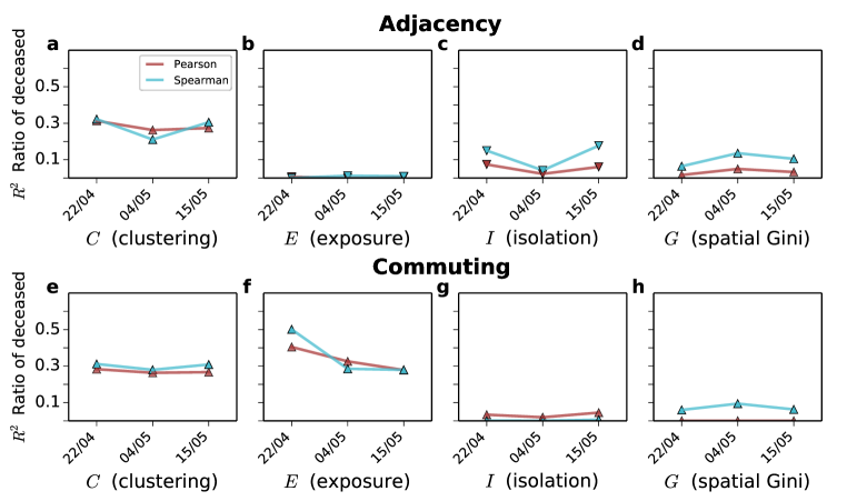
Correlations with the infection rate gap on the adjacency and commute network are reported on Fig. S-11 and S-12 for all ethnicities. Quantities are obtained from the COVID-19 data set at 2 different periods, 12-04-2020 and 19-04-2020 respectively. The corresponding of the Pearson correlation is reported in the inset of each panel. There is a negative correlation in b which indicates that less isolated African Americans have a higher incidence of infection cases. Whites a and Native Hawaiians e exhibit no correlation while the remaining ethnicities c-d and f-g have a positive which decreases over time. We found no correlation for any ethnicity on the commuting network.
Similarly, correlations with are computed for the deceased data on the adjacency and commute networks (See Fig. S-13 and S-14). We can observe a similar pattern with the results obtained from infected rates where there is correlations for the same group of ethnicities and no significant relationship on the commuting network.
Appendix C Local segregation maps through CMFPT and CCT and spatial correlation
In the main manuscript, we show the values for the local segregation indices and for Chicago and Los Angeles showing that there were significant differences on their spatial distribution as well as in their maximum values. Here we provide also results for Detroit and Houston to show that again there are significant differences. In this case, Detroit is the most populated city in Michigan, which is one of the states with highest values in most of the indices considered and Houston is the most populated city in Texas, which is a state with consistent low values in most segregation indices. Regarding the impact of COVID-19 among the African Americans of those states, in Michigan the gap is around 34 in early April and 24 in mid-may. In Texas, instead, the gap is around 2 at the beginning of April and 5 in mid-May.
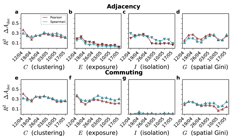
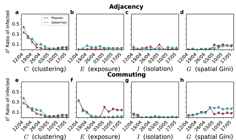
In the main manuscript and Supplementary Figure S-15 we plot the local measures of segregation in each of the census tracts of Chicago, Los Angeles, Detroit and Houston. Those maps display certain common patterns that we quantify in Supplementary Figure S-16. Therein we have calculated the Kendall correlation coefficient performing pairwise comparisons of the values for each tract unit. Additionally to the segregation indices, we also compared the values for the ratio of African American population. It is relevant to note that while the value of for the ratio of African American population and computed in the adjacency graph is around for all the four cities studied, there are stronger variations when is computed in the commuting graph – i.e., in Detroit and in Houston – meaning that the effect of commuting in the segregation of African American population can display strong differences across cities and, therefore, mobility offers a different picture of urban segregation.
Appendix D Temporal analysis of correlations with segregation indices and other socioeconomic indicators
Statistical analysis of the COVID-19 incidence data
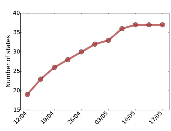
In this section, we provide the temporal evolution of correlations between the difference in the percentage of COVID-19 incidence among African Americans and other segregation indices. First of all, Supplementary Figure S-17 shows the number of states included in each of the temporal snapshots. As can be seen, it increases with time yet already in the first temporal snapshots there are almost 20 of them. It is important to note that by mid-April, the US reached the first peak of the pandemic.
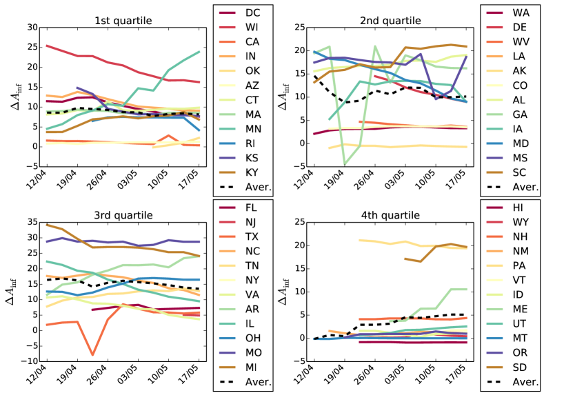
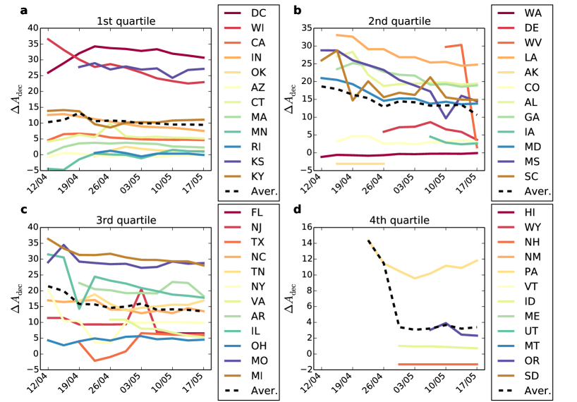
Additionally to the number of states included in the analysis we also observe significant changes in the values across time for the different states analysed. We provide in Supplementary Figures S-18 and S-19 the evolution of the difference in percentage of infected and deceased African Americans. States are split in quartiles of the distribution of the percentage of African Americans among the overall population. While the average seems almost stable in most of the quartiles this is more a product of compensating changes than of stability in the values for a single state. For instance, in the first quartile there is a sharp increase in Minnesota compensated by a decrease in DC. On the third quartile, the sharp decrease in Illinois is compensated by the increase in Arkansas. It is also important to note that some states display strong discrepancies between the percentage on deceased and infected as, for instance, Minnesota.
Correlations with the ratio of infected African Americans and the difference in percentage and the ratio of deceased African Americans
In the main manuscript, the main variable analysed is the difference in the percentage of African Americans since other factors might influence the deceased and the ratio that can lead to several outliers. In Supplementary Figures S-20, S-21 and S-22, we show respectively the correlation with the difference in percentage of deceased African Americans, the ratio of infected and the ratio of deceased. In the case of the difference in percentage we can see that despite correlations are lower they are stable across time. It is important to note that in the case of deceased individuals other factors like the age or the underlying health conditions might play a significant role. In the case of both ratios, correlations are slightly high in the first snapshots suffer a steeper decrease. Again and computed in the commuting graph seem to outperform the rest of metrics.
Temporal evolution of correlations with another data set
We also had access to another project that aggregates data on the ethnicity of both infected and deceased African Americans by COVID-19 through three different temporal snapshots , and Dat (2016b). In Supplementary Figure S-23, we report the correlations in each of the three snapshots for the difference in the percentage of infected African Americans, which are in line with the results obtained for the other data set. Correlations are considerably high and significant for the first stages of the pandemic and decrease with time as the different lock-downs take place. As in the results provided in the main manuscript, those indices computed on the commuting graph seem to provide a better correlation than those computed on the adjacency one. Again those indices connected to the exposure of African Americans only yield significant correlation on the commuting network. The results obtained for the ratio of infected and deceased African Americans as well as the difference on the percentage of deceased are also compatible with those obtained with the previous data set (See Supplementary Figures S-26, S-24 and S-25).
Formulation of the alternative indices and
In the main manuscript we have studied the metrics and which are computed from the elements of the normalised CMFPT . However, there are more potential ways to capture the clustering and exposure of an ethnicity by doing the other calculations from that matrix. Here we propose the two alternative formulations for those two metrics
The first quantity comes from the ratio between the time from other ethnicities to African Americans and the time from other ethnicities to others, where higher values correspond more isolated African Americans compared to other ethnicities. The second quantity instead, is the ratio between the time separating African Americans and the time between African Americans and any other ethnicity, where higher values correspond to African Americans more exposed to others than to themselves. The correlation between our alternative proposals and the difference in the percentage of African Americans infected is shown in Supplementary Figure S-27. While correlations are slightly lower, they are still significant. One interesting finding is that changes the sign of the correlation when computed over the adjacency graph and the commuting network. Highlighting once again the need of considering mobility to understand the segregation and exposure of ethnicities in urbanscapes.
Temporal evolution of correlations with other segregation indices from the literature
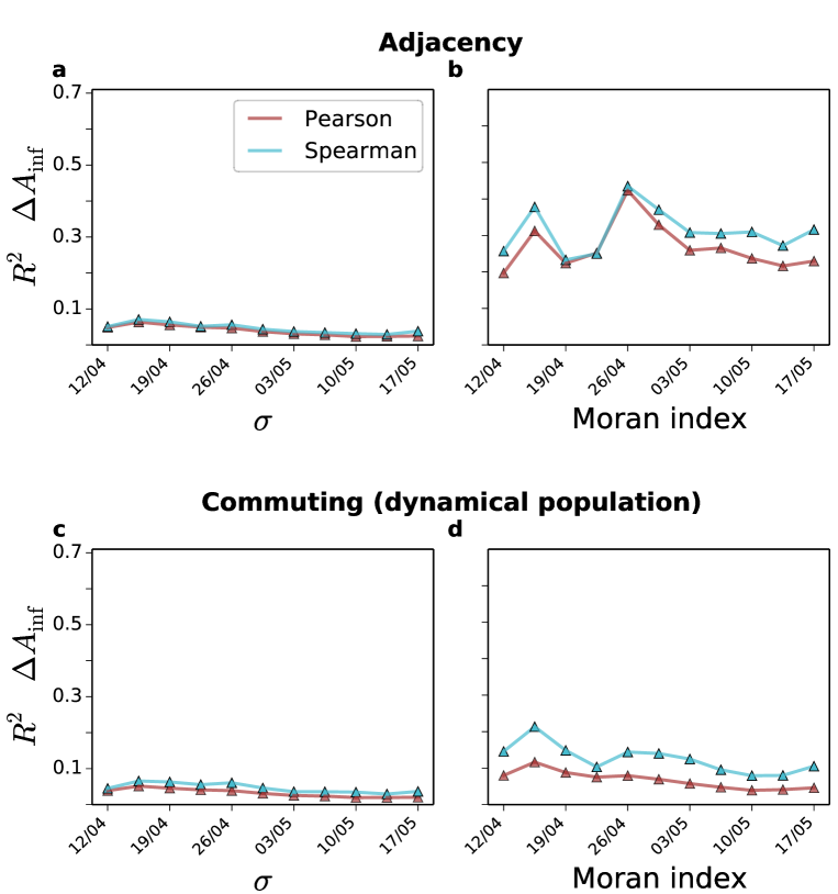
We have also studied the correlations between the difference in the percentage of COVID-19 incidence among African Americans and other segregation indices from the literature. First of all, we obtained the segregation index proposed in Ballester and Vorsatz (2014), which is also based on the movement of random walks is spatial systems and captures the probability that a randomly chosen individual of group meets another individual of the same group, or in this case, ethnicity. Additionally, we also computed Moran’s I, which is a measure of spatial auto-correlation and compares the ethnic composition of neighbourhoods Cliff and Ord (1981). The correlation of both metrics with the difference in the percentage of infected among African Americans. The evolution of the correlations is shown in Supplementary Figure S-28, where only the Moran index calculated over the adjacency graph seems to display a significant correlation.
For the second metric we have build a matrix of distance between ethnicities similar to the one obtained for using a measure proposed by Farber et al. (2012). Inspired by the Getis and Ord statistic Getis and Ord (2010), the metric proposed Farber et al. (2012) quantifies for each location the exposure of ethnicity to ethnicity as
| (S-3) |
where each is the total number of location in a city, corresponds to each of those locations and is the population of ethnicity in location , is an estimate of trip length and is a function of the distance that is equal to when and otherwise. In the case of the adjacency graph only adjacent pair of tracts were considered whereas in the case of the commuting network only pairs connected by commuting trips were considered. Overall quantify the ratio of population of ethnicity to which the individuals residing in are exposed. In our case we set the threshold equal to the average commuting distance in each of the cities. Succinctly, is a value between and that encapsulates the fraction of the population of ethnicity. We average the value of to obtain a distance matrix between ethnicities in each of the cities as
| (S-4) |
so that we take into account the fraction of population of ethnicity in location . Finally from the matrix we compute the same exposure and clustering indices computed from in the main text. Calculating first
to finally obtain
Additionally to the calculation of the indices in the adjacency and the commuting network with dynamical population we also computed it with the residential population and the commuting network to investigate the role played by the dynamical population. As can be seen in Supplementary Figure S-29, significant correlations appear with all indices yet the higher ones are with the exposure index especially when computed on the commuting network with dynamical population. Correlations are, however, lower and less stable than those obtained in the main manuscript.
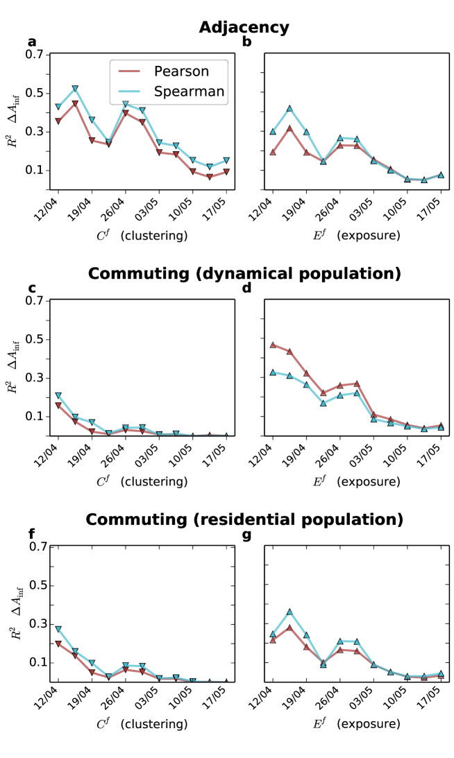
Overall, it is important to note that none of the additional segregation metrics we have studied in this section is more informative than the ones we proposed on the main manuscript based on CMFPT and CCT. Moreover, the use of the dynamical population together with the commuting network seems to improve some of the indices.
The relation between the incidence of COVID-19 in African Americans and socio-economic indicators
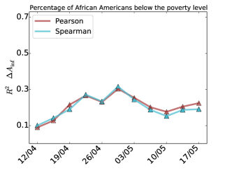
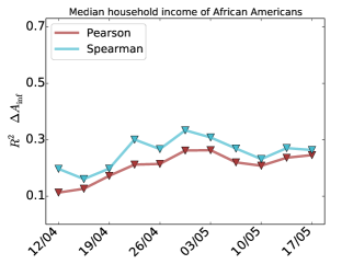
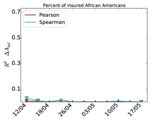
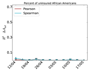
We present in this section the correlations between a set of socio-economic indicators and the incidence of COVID-19 in African Americans. For the sake of brevity, we focus here only on the data set used in the main manuscript as well as in the difference in the percentage of infections which is the case where correlations are higher. The set of indicators we have studied are the median household income, the percentage of the population below the poverty level, the percentage of insured and uninsured African Americans, the usage of public transportation by both African Americans and the overall population, the percentage of African American population in a state, the average commuting distance and the ratio between the average commuting distance of African Americans and the overall population. All of the metrics are provided at the level of the African American population and the results are shown in Supplementary Figure S-30. The median household income, the percentage of the population below the poverty level, the percentage of insured and uninsured African Americans were obtained from the 2018 American Community Survey elaborated by the U.S. Census Bureau Manson et al. . Most of the variables yield low or very low correlations except for the usage of public transportation by African Americans. Economic indicators such as median income or percentage of poverty seem to slightly correlate with the incidence of COVID-19, which could because because a more deprived African American community puts them in a more risky situation. Regarding the health indicators related to the degree of insurance of African Americans, it seems there is no direct relation with the number of infected. Not so surprising results since we are analysing the percentage of infected and, therefore, the fact of having insurance might not change significantly the risk of getting the illness. Finally, the usage of public transportation seems to play a crucial role in the spread of the disease, especially if we compare the use done by the African American population and the overall population where no correlation appears. The fact that African Americans use more public transportation might put them on a more dangerous position as well as might a reflection of their economic status. Moreover, it could happen that in those cities in which African Americans are more segregated they also have to use more the public transportation.
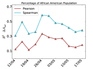
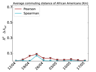
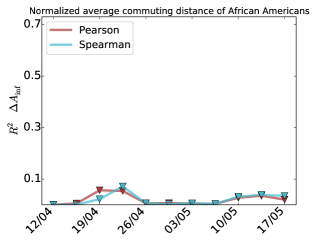
Additionally to those socio-economic variables we also tested if the overall African American population can also be used as a proxy for the difference in percentage. We also computed on our commuting networks the average commuting distance of the African American population as well as the ratio with the commuting distance of the overall population. As displayed in Supplementary Figure S-31, the overall percentage of African American population seems to be related to the difference in the percentage of infected. However, there is a striking difference between the Pearson and the Spearman correlation coefficients, which means that the rank is more or less conserved yet there are strong outliers. In other words, a state with more percentage of African American population will more easily have a higher difference on the infected yet the population does not align the points in a straight trend. Regarding the mobility indicators, none of them yields a significant correlation, meaning that it is not so relevant how far African Americans travel and where they travel and whom they meet.
References
- CDC and Team (2020) C. CDC and R. Team, MMWR Morb Mortal Wkly Rep 69, 343 (2020).
- Millett et al. (2020) G. A. Millett, A. T. Jones, D. Benkeser, S. Baral, L. Mercer, C. Beyrer, B. Honermann, E. Lankiewicz, L. Mena, J. S. Crowley, J. Sherwood, and P. Sullivan, Annals of Epidemiology (2020), https://doi.org/10.1016/j.annepidem.2020.05.003.
- DiMaggio et al. (2020) C. DiMaggio, M. Klein, C. Berry, and S. Frangos, medRxiv (2020), 10.1101/2020.05.14.20101691, .
- Goldstein and Atherwood (2020) J. R. Goldstein and S. Atherwood, medRxiv (2020), 10.1101/2020.05.21.20109116, .
- Cyrus et al. (2020) E. Cyrus, R. Clarke, D. Hadley, Z. Bursac, M. J. Trepka, J. G. Devieux, U. Bagci, D. Furr-Holden, M. S. Coudray, Y. Mariano, S. Kiplagat, I. Noel, G. Ravelo, M. Paley, and E. F. Wagner, medRxiv (2020), 10.1101/2020.05.15.20096552, .
- England (2020) P. H. England, COVID-19: review of disparities in risks and outcomes, Tech. Rep. (UK Government, 2020).
- Raisi-Estabragh et al. (2020) Z. Raisi-Estabragh, C. McCracken, M. S. Bethell, J. Cooper, C. Cooper, M. J. Caulfield, P. B. Munroe, N. C. Harvey, and S. E. Petersen, medRxiv (2020), 10.1101/2020.06.01.20118943, .
- Li et al. (2020) A. Y. Li, T. C. Hannah, J. Durbin, N. Dreher, F. M. McAuley, N. F. Marayati, Z. Spiera, M. Ali, A. Gometz, J. Kostman, and T. F. Choudhri, medRxiv (2020), 10.1101/2020.04.17.20069708, .
- Prats-Uribe et al. (2020) A. Prats-Uribe, R. Paredes, and D. PRIETO-ALHAMBRA, medRxiv (2020), 10.1101/2020.05.06.20092676, .
- Takagi et al. (2020) H. Takagi, T. Kuno, Y. Yokoyama, H. Ueyama, T. Matsushiro, Y. Hari, and T. Ando, medRxiv (2020), 10.1101/2020.05.25.20112599, .
- Khanijahani (2020) A. Khanijahani, medRxiv (2020), 10.1101/2020.06.03.20120667, .
- Bilal et al. (2020) U. Bilal, S. Barber, and A. V. Diez-Roux, medRxiv (2020), 10.1101/2020.05.01.20087833, .
- Chinazzi et al. (2020) M. Chinazzi, J. T. Davis, M. Ajelli, C. Gioannini, M. Litvinova, S. Merler, A. P. y Piontti, K. Mu, L. Rossi, K. Sun, et al., Science 368, 395 (2020).
- Buckee et al. (2020) C. O. Buckee, S. Balsari, J. Chan, M. Crosas, F. Dominici, U. Gasser, Y. H. Grad, B. Grenfell, M. E. Halloran, M. U. Kraemer, et al., Science (New York, NY) 368, 145 (2020).
- Kraemer et al. (2020) M. U. Kraemer, C.-H. Yang, B. Gutierrez, C.-H. Wu, B. Klein, D. M. Pigott, L. Du Plessis, N. R. Faria, R. Li, W. P. Hanage, et al., Science 368, 493 (2020).
- Aleta et al. (2020) A. Aleta, D. Martin-Corral, A. P. y Piontti, M. Ajelli, M. Litvinova, M. Chinazzi, N. E. Dean, M. E. Halloran, I. M. Longini Jr, S. Merler, et al., medRxiv (2020).
- Brown et al. (2013) C. Brown, V. Nicosia, S. Scellato, A. Noulas, and C. Mascolo, The European Physical Journal B 86, 290 (2013).
- Galvani and May (2005) A. P. Galvani and R. M. May, Nature 438, 293 (2005).
- Stein (2011) R. A. Stein, International Journal of Infectious Diseases 15, E510 (2011).
- Pareek et al. (2020) M. Pareek, M. N. Bangash, N. Pareek, D. Pan, S. Sze, J. S. Minhas, W. Hanif, and K. Khunti, The Lancet (2020).
- Laurencin and McClinton (2020) C. T. Laurencin and A. McClinton, Journal of Racial and Ethnic Health Disparities , 1 (2020).
- Yancy (2020) C. W. Yancy, Jama (2020).
- Dawkins (2004) C. J. Dawkins, Urban Studies 41, 833 (2004).
- Dawkins (2006) C. Dawkins, Urban Studies 43, 1943 (2006).
- Brown and Chung (2006) L. A. Brown and S.-Y. Chung, Population, space and place 12, 125 (2006).
- Cliff and Ord (1981) A. D. Cliff and J. K. Ord, Spatial processes: models & applications (Taylor & Francis, 1981).
- Rey and Smith (2013) S. J. Rey and R. J. Smith, Letters in Spatial and Resource Sciences 6, 55 (2013).
- Sethi and Somanathan (2004) R. Sethi and R. Somanathan, Journal of Political Economy 112, 1296 (2004), .
- Hendryx and Luo (2020) M. Hendryx and J. Luo, Available at SSRN 3582857 (2020).
- Wong and Shaw (2011) D. W. Wong and S.-L. Shaw, Journal of geographical systems 13, 127 (2011).
- Nicosia et al. (2014) V. Nicosia, M. D. Domenico, and V. Latora, EPL (Europhysics Letters) 106, 58005 (2014).
- Dat (2016a) “Black Population in US — BlackDemographics.com,” https://blackdemographics.com/black-covid-19-tracker/ (2016a), [Online; accessed 2020-05-30].
- Dat (2016b) “COVID Racial Data Tracker,” https://covidtracking.com/race (2016b), [Online; accessed 2020-05-30].
- (34) S. Manson, J. Schroeder, D. V. Riper, and S. Ruggles, “IPUMS National Historical Geographic Information System: Version 14.0 [Database]. Minneapolis, MN: IPUMS. 2019.” http://doi.org/10.18128/D050.V14.0.
- Com (2016) “Longitudinal Employer-Household Dynamics,” https://lehd.ces.census.gov/ (2016), online; accessed 2020-05-30.
- Linton et al. (2020) N. M. Linton, T. Kobayashi, Y. Yang, K. Hayashi, A. R. Akhmetzhanov, S.-m. Jung, B. Yuan, R. Kinoshita, and H. Nishiura, Journal of Clinical Medicine 9 (2020), 10.3390/jcm9020538.
- Dey et al. (2020) M. Dey, H. Frazis, M. A. Loewenstein, and H. Sun, “Ability to work from home: evidence from two surveys and implications for the labor market in the COVID-19 pandemic,” https://doi.org/10.21916/mlr.2020.14 (2020).
- of Labor Statistics (2020) B. of Labor Statistics, Tech. Rep. (US Government, 2020).
- (39) .
- Sy et al. (2020) K. T. L. Sy, M. E. Martinez, B. Rader, and L. F. White, medRxiv (2020), 10.1101/2020.05.28.20115949, .
- Farber et al. (2012) S. Farber, A. Páez, and C. Morency, Environment and Planning A 44, 315 (2012).
- Ballester and Vorsatz (2014) C. Ballester and M. Vorsatz, The Review of Economics and Statistics 96, 383 (2014).
- Olteanu et al. (2019) M. Olteanu, J. Randon-Furling, and W. A. Clark, Proceedings of the National Academy of Sciences 116, 12250 (2019).
- Kawabata and Shen (2007) M. Kawabata and Q. Shen, Urban Studies 44, 1759 (2007).
- Graif et al. (2017) C. Graif, A. Lungeanu, and A. M. Yetter, Social Networks 51, 40 (2017).
- Wang et al. (2018) Q. Wang, N. E. Phillips, M. L. Small, and R. J. Sampson, Proceedings of the National Academy of Sciences USA 115, 7735 (2018).
- Bureau (2019) U. C. Bureau, American Community Survey 2014-2018 5-Year Data Release, Tech. Rep. (US Government, 2019).
- Masuda et al. (2017) N. Masuda, M. A. Porter, and R. Lambiotte, Physics Reports 716-717, 1 (2017).
- Getis and Ord (2010) A. Getis and J. K. Ord, in Perspectives on spatial data analysis (Springer, 2010) pp. 127–145.